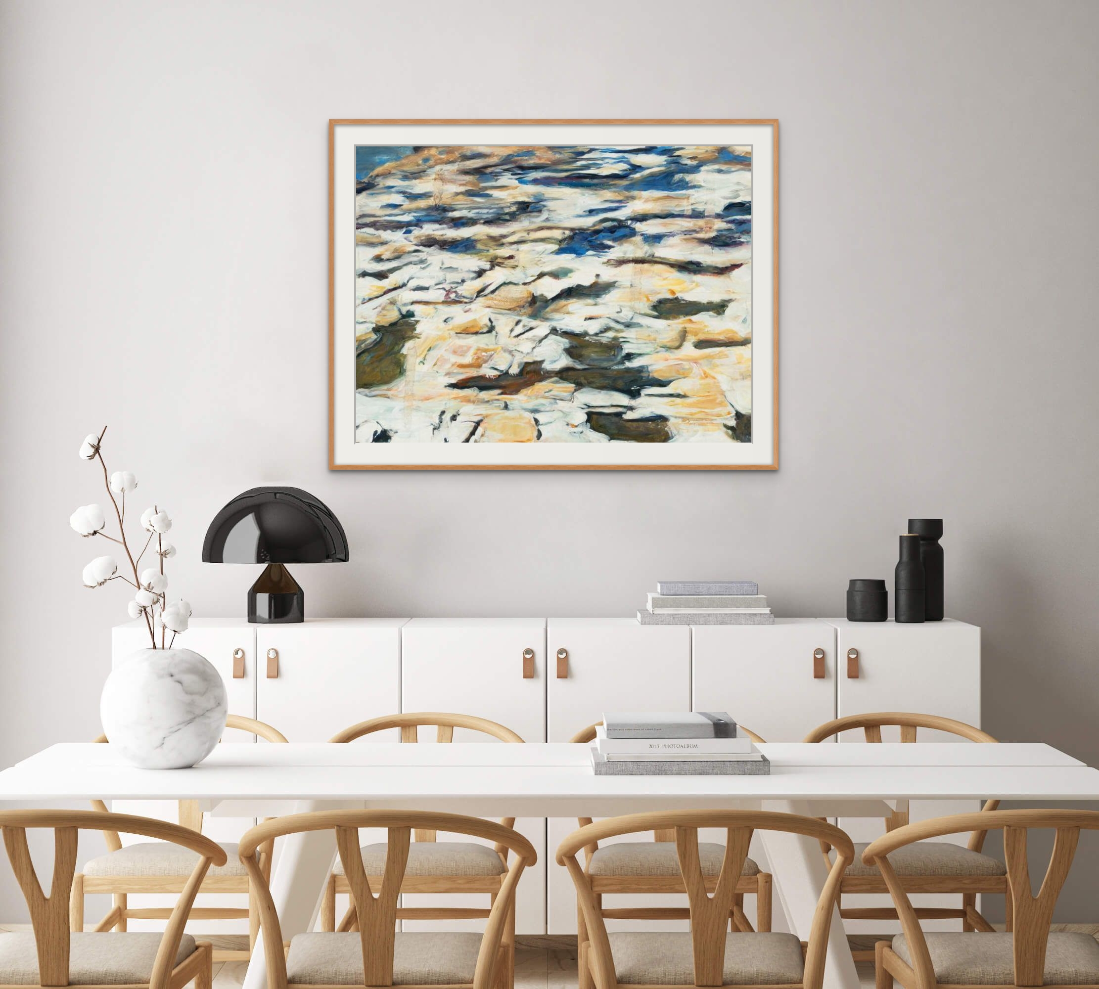
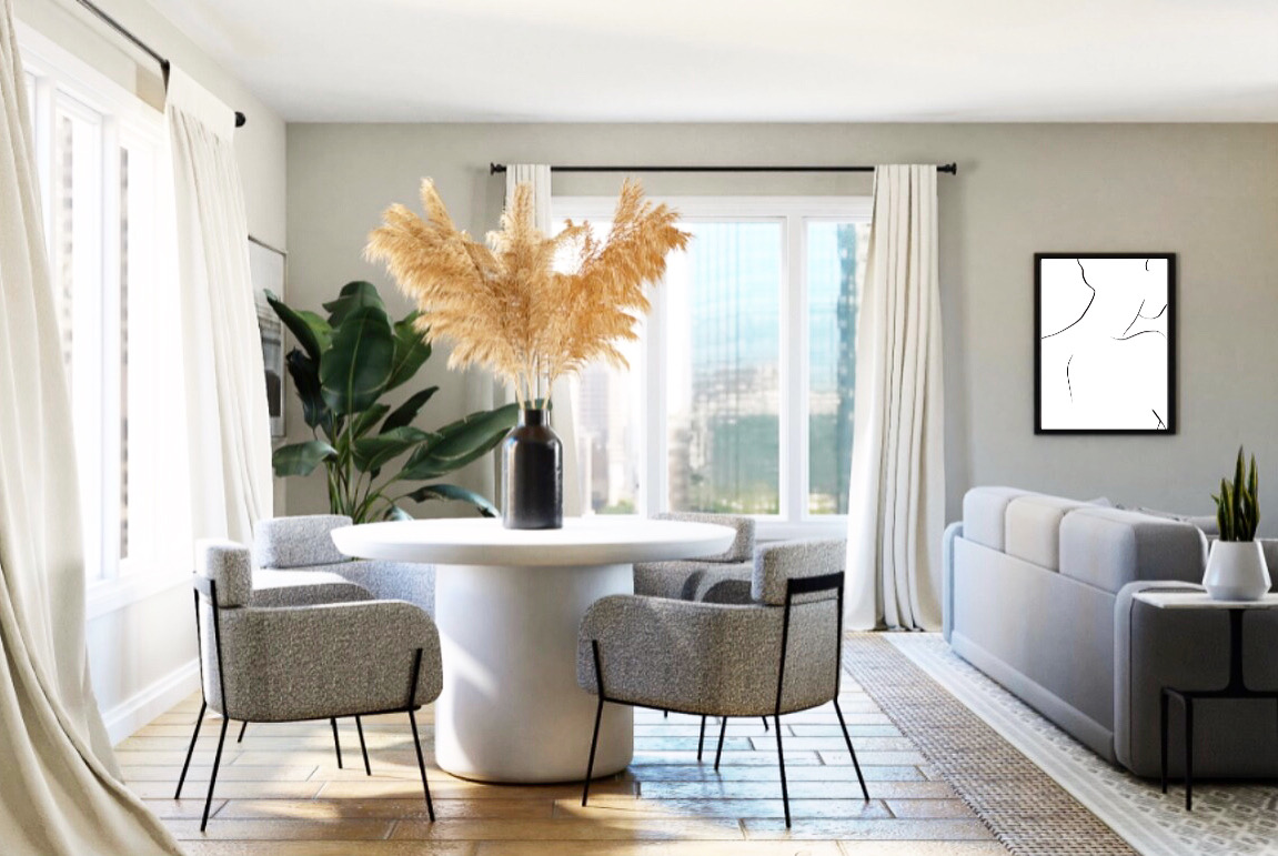
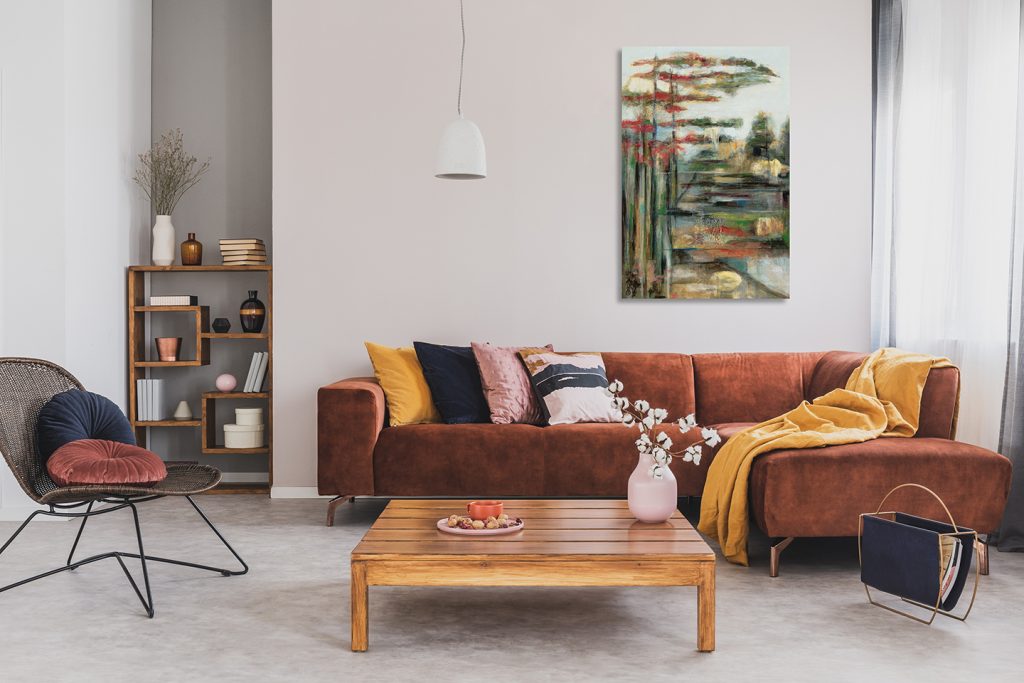
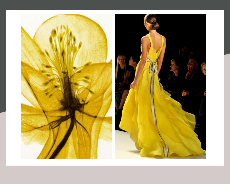
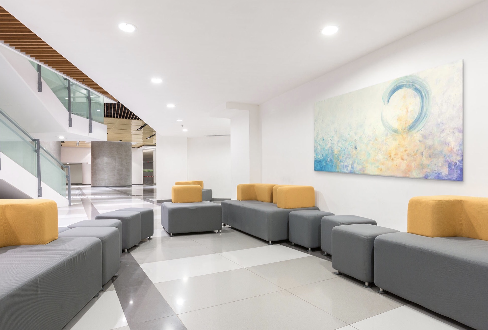
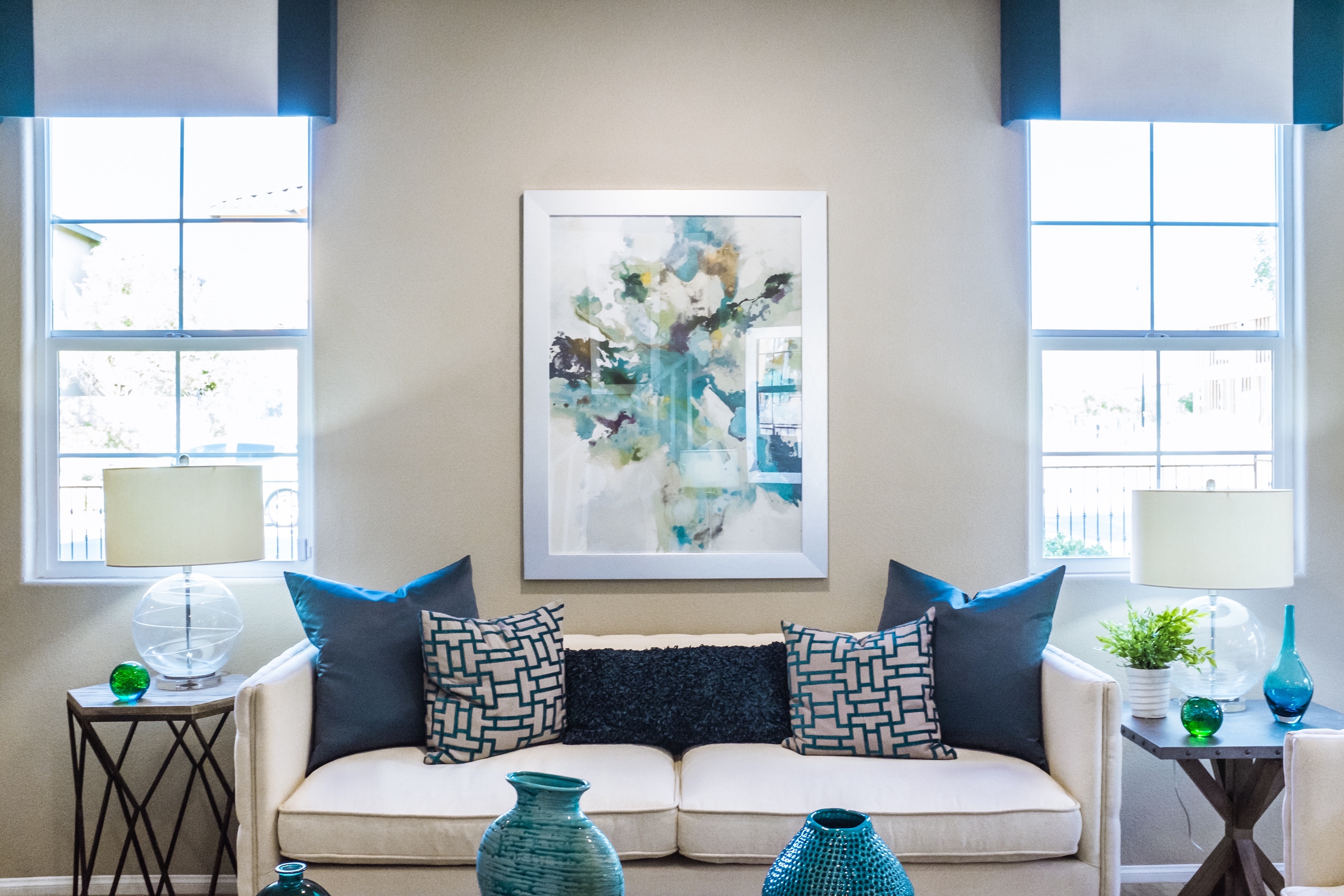
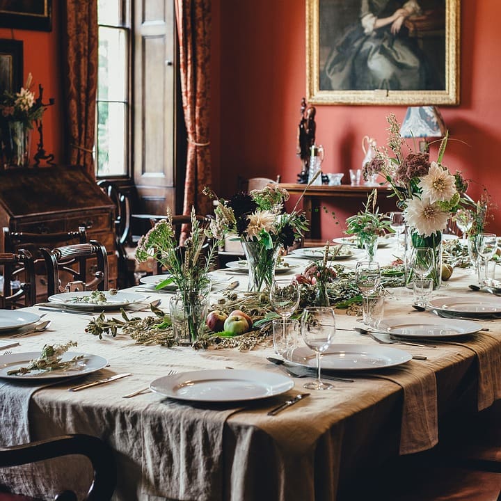
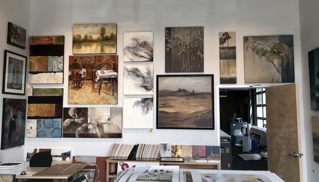
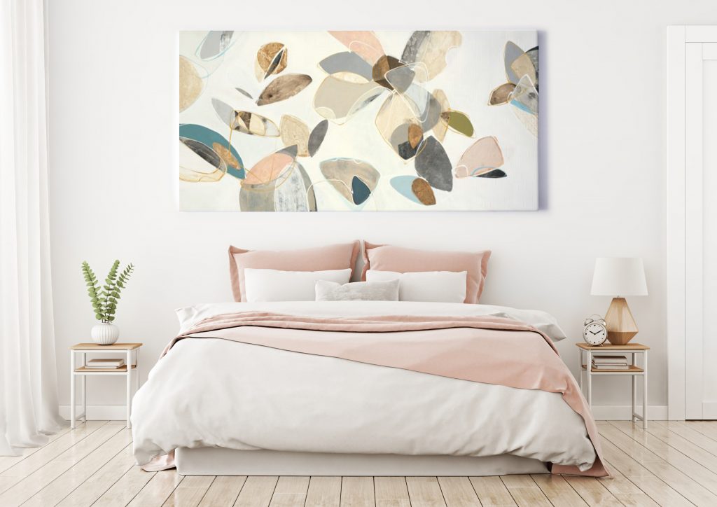
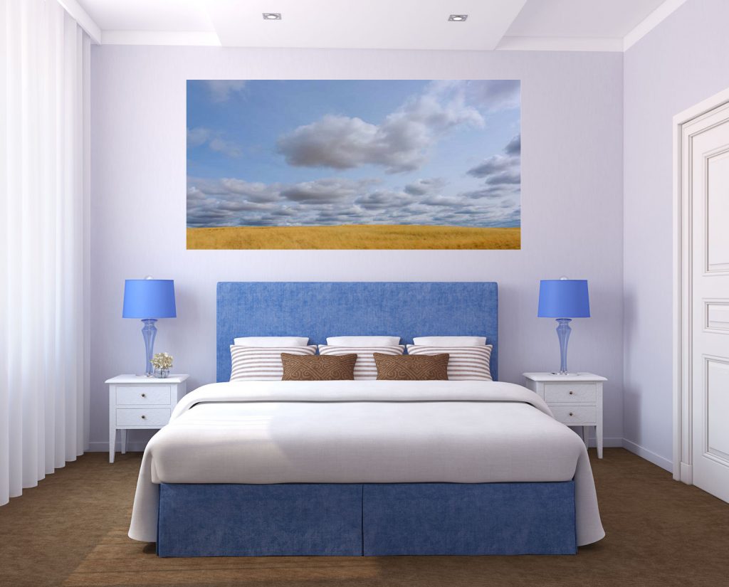
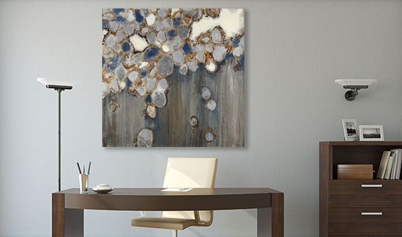
Over the last couple of years, hospitality interiors have had to adjust their accommodations to meet new and growing needs in the industry, so it’s no surprise that designing for flexibility is one of the biggest trends in hospitality spaces. Similarly, healthcare interiors have had to adapt to new expectations and demands in the field. From creating cozy and inviting spaces outside of the home to tailoring rooms to fit unique needs, bringing comfort and wellness to hospitality and healthcare interiors has become a priority. With the importance of design and decor being recognized in these spaces, design trends are blending more than ever to bring personality and warmth to these interiors.

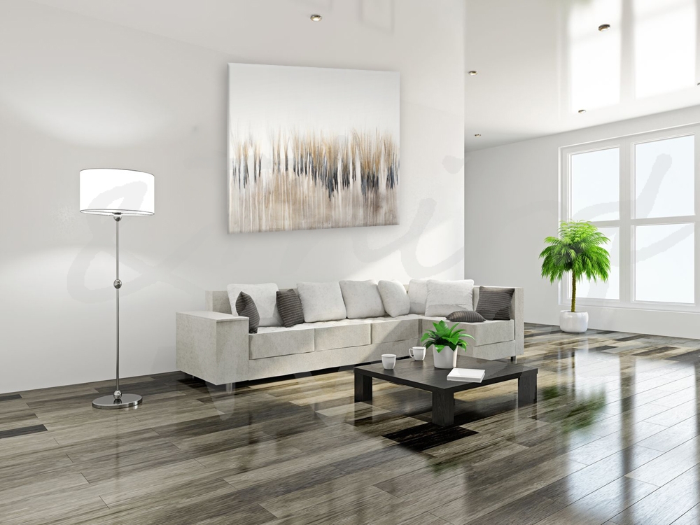
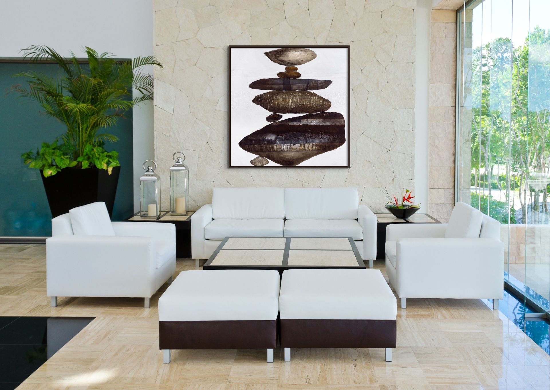
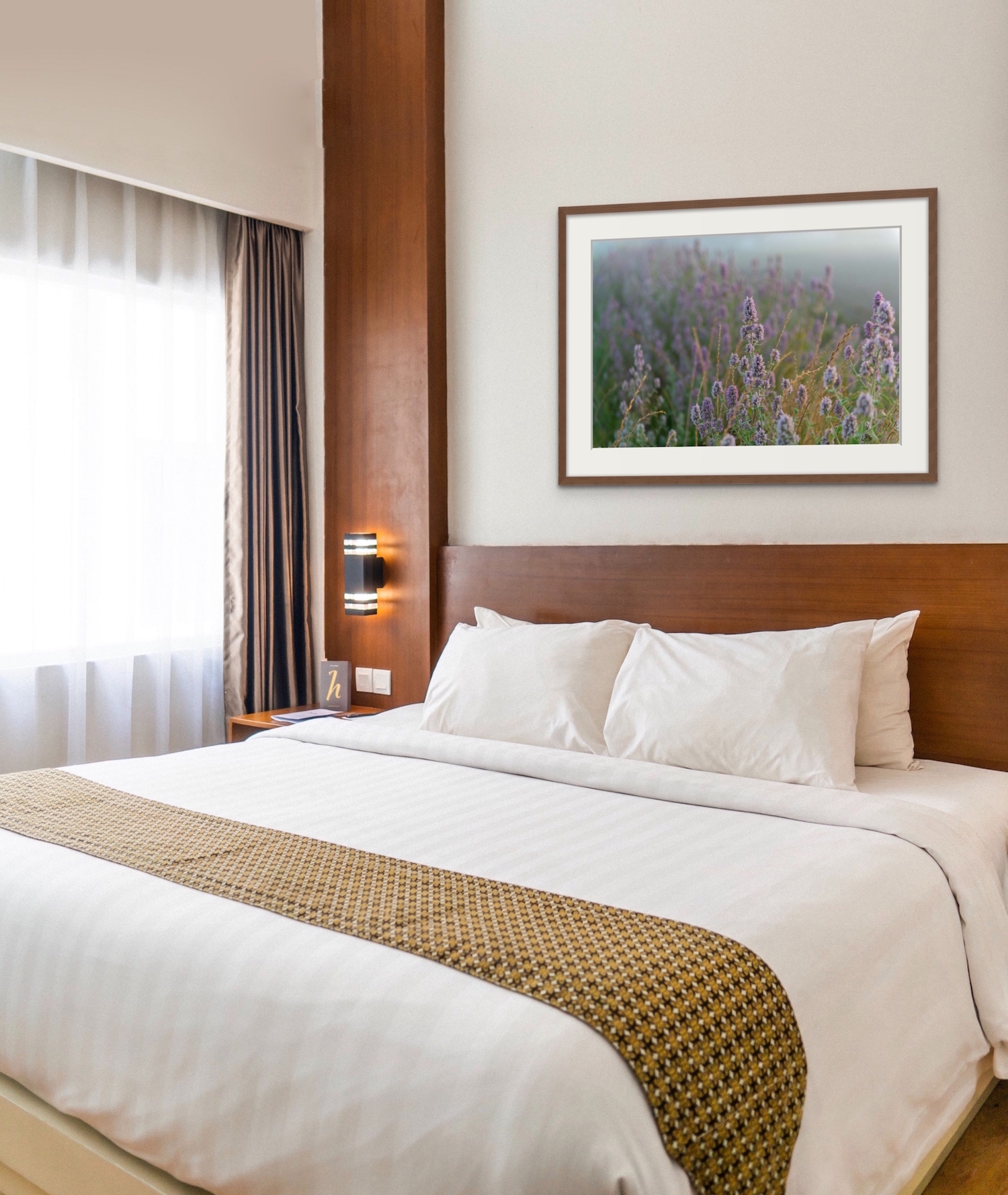
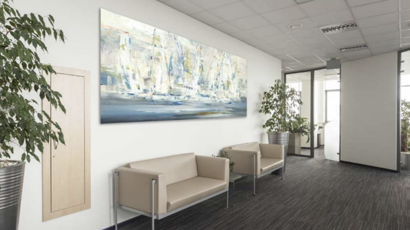
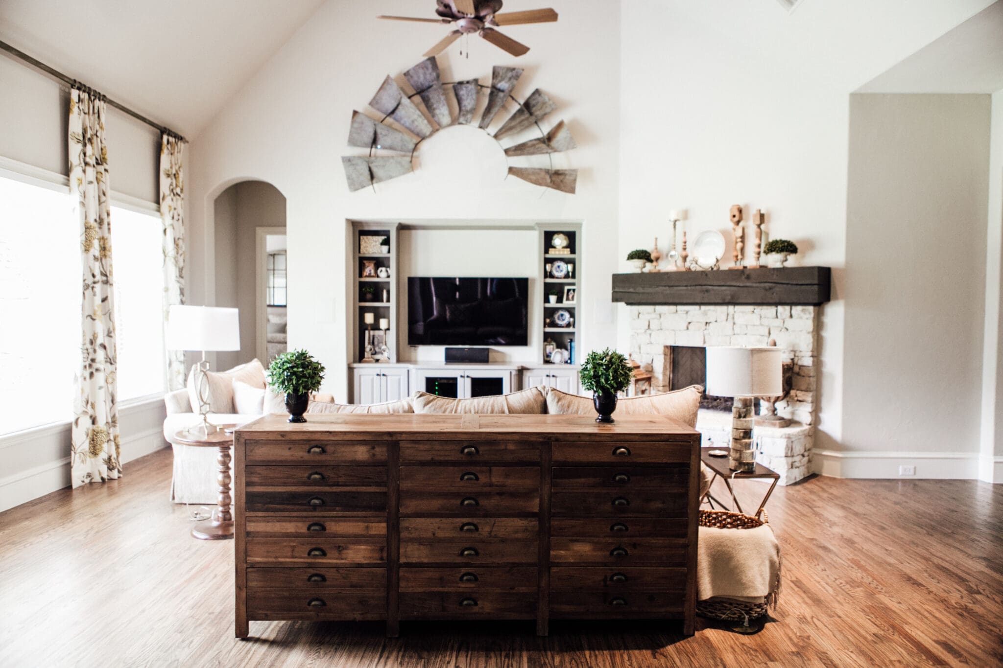
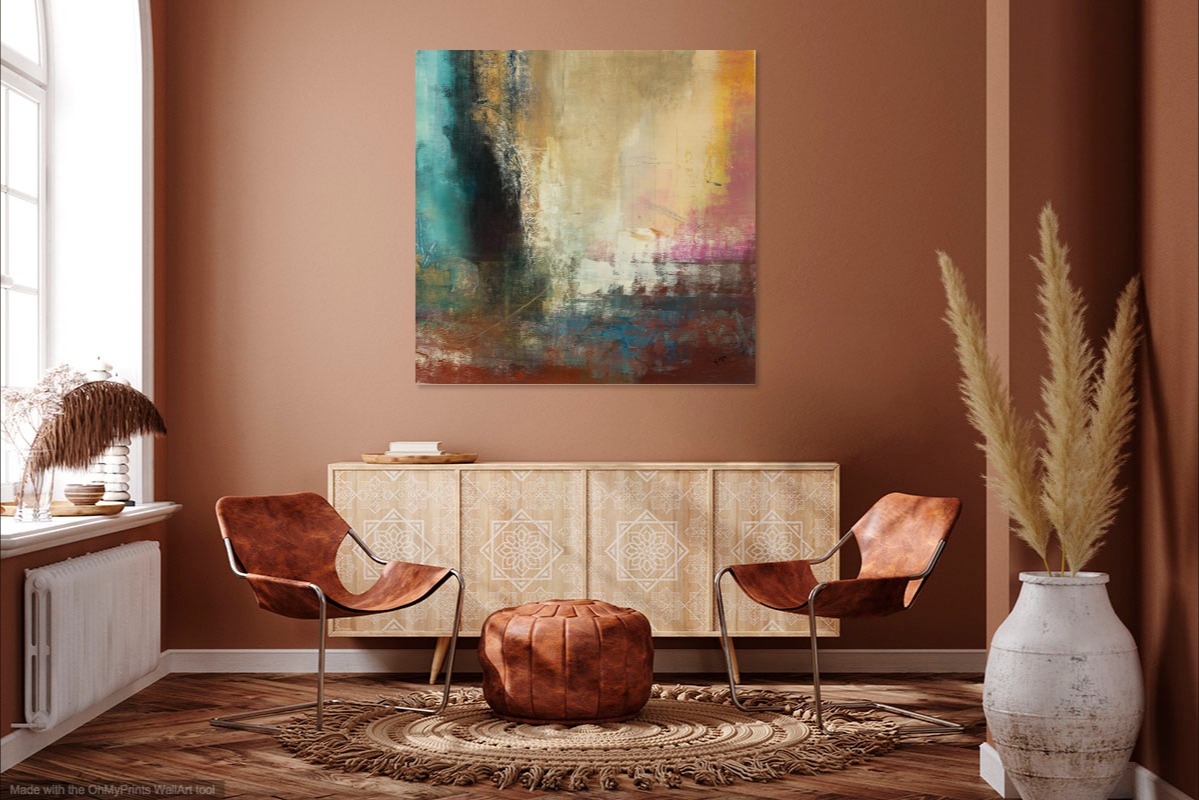
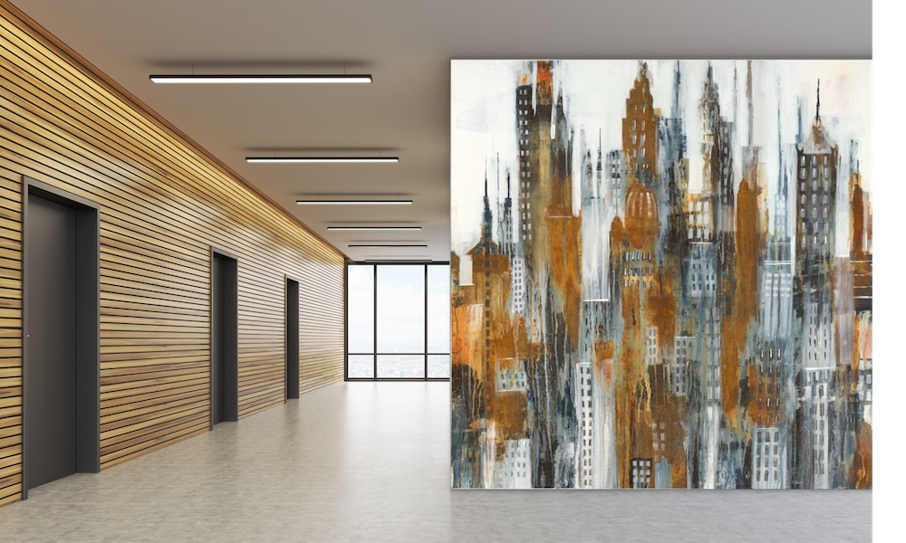
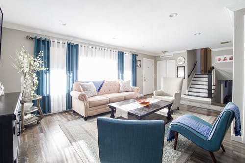
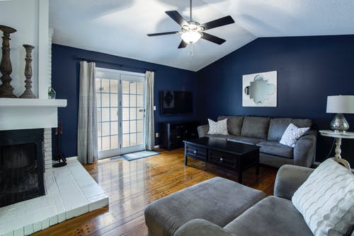
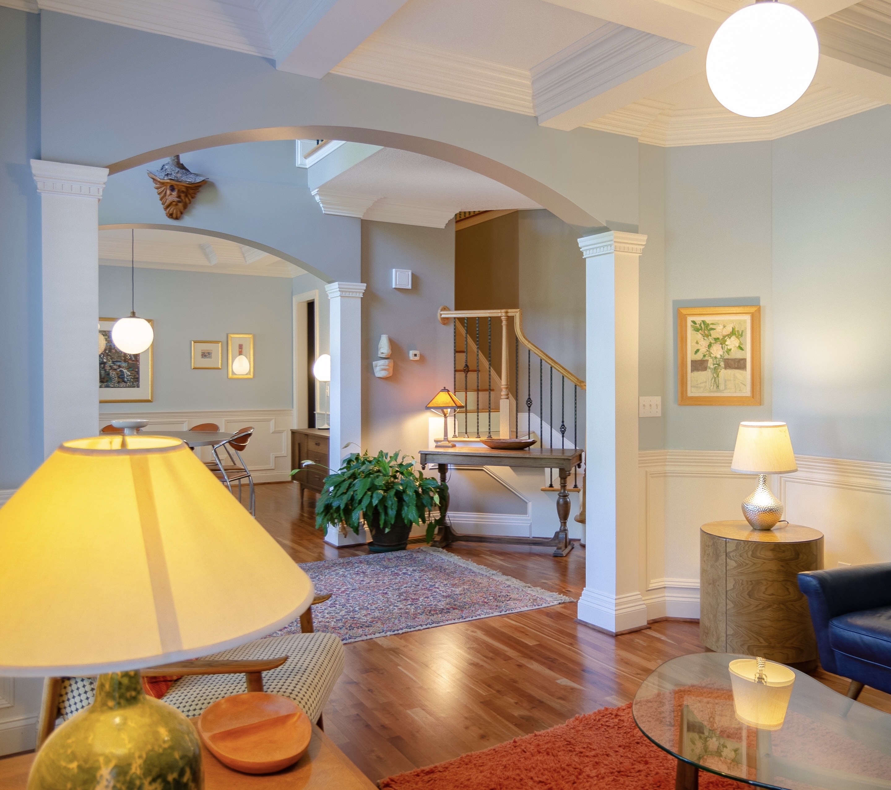
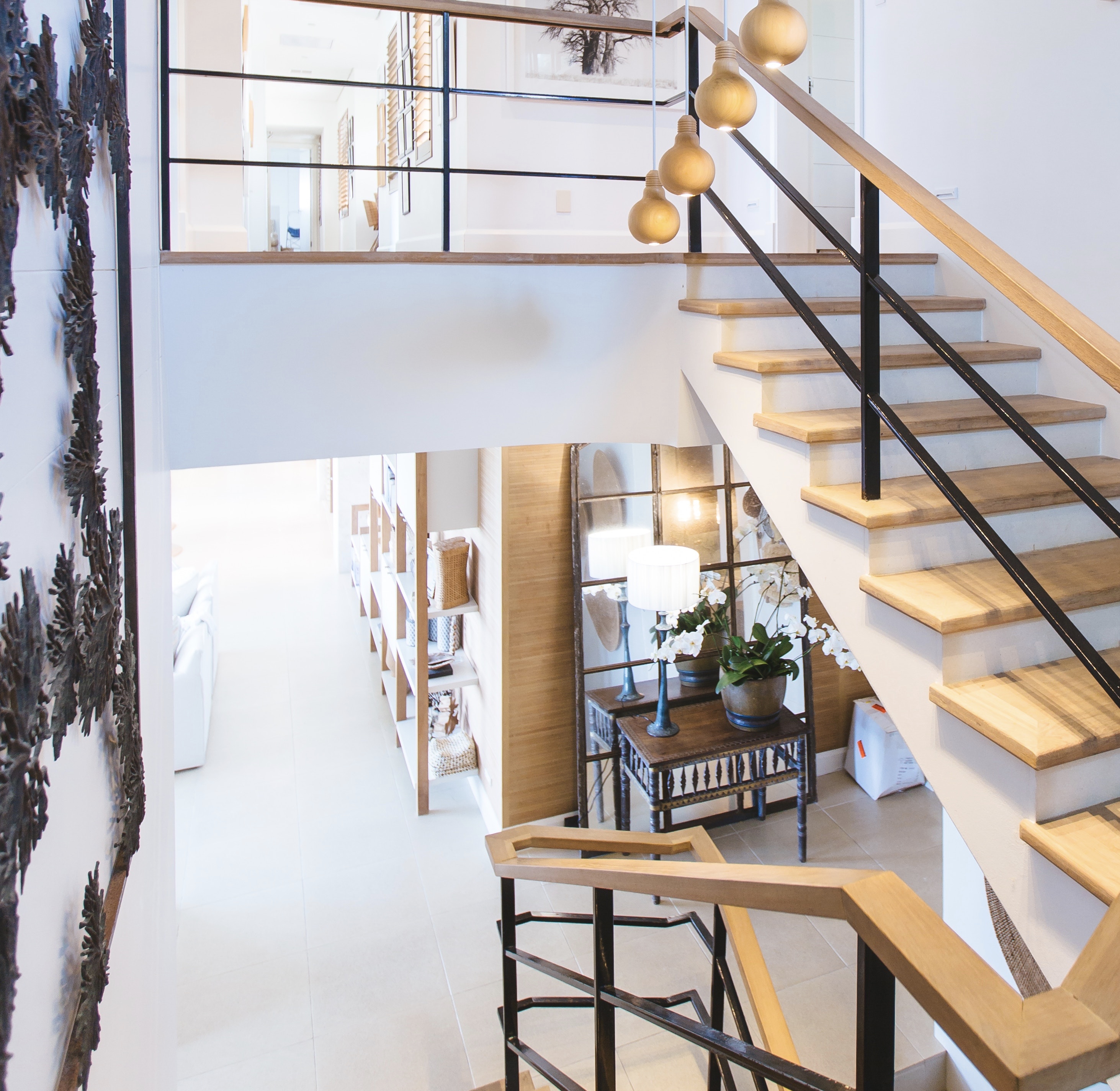
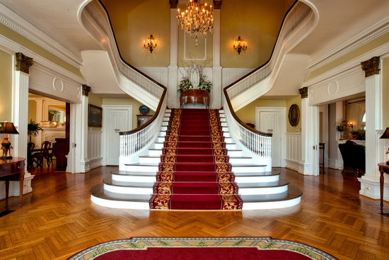
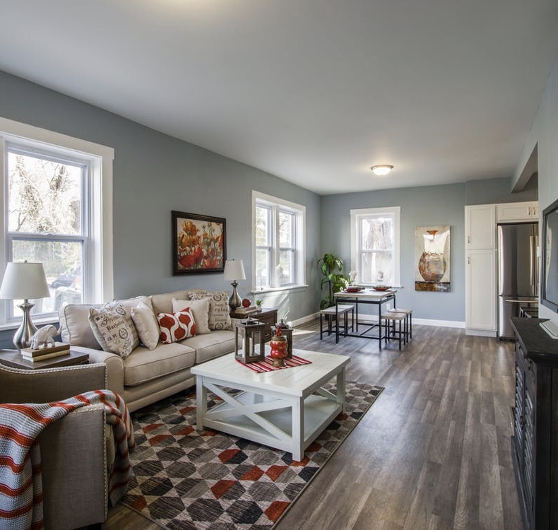
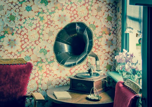
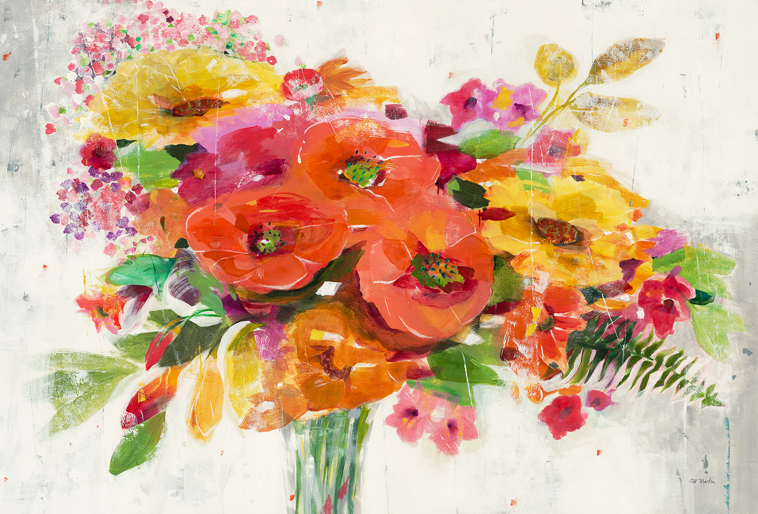
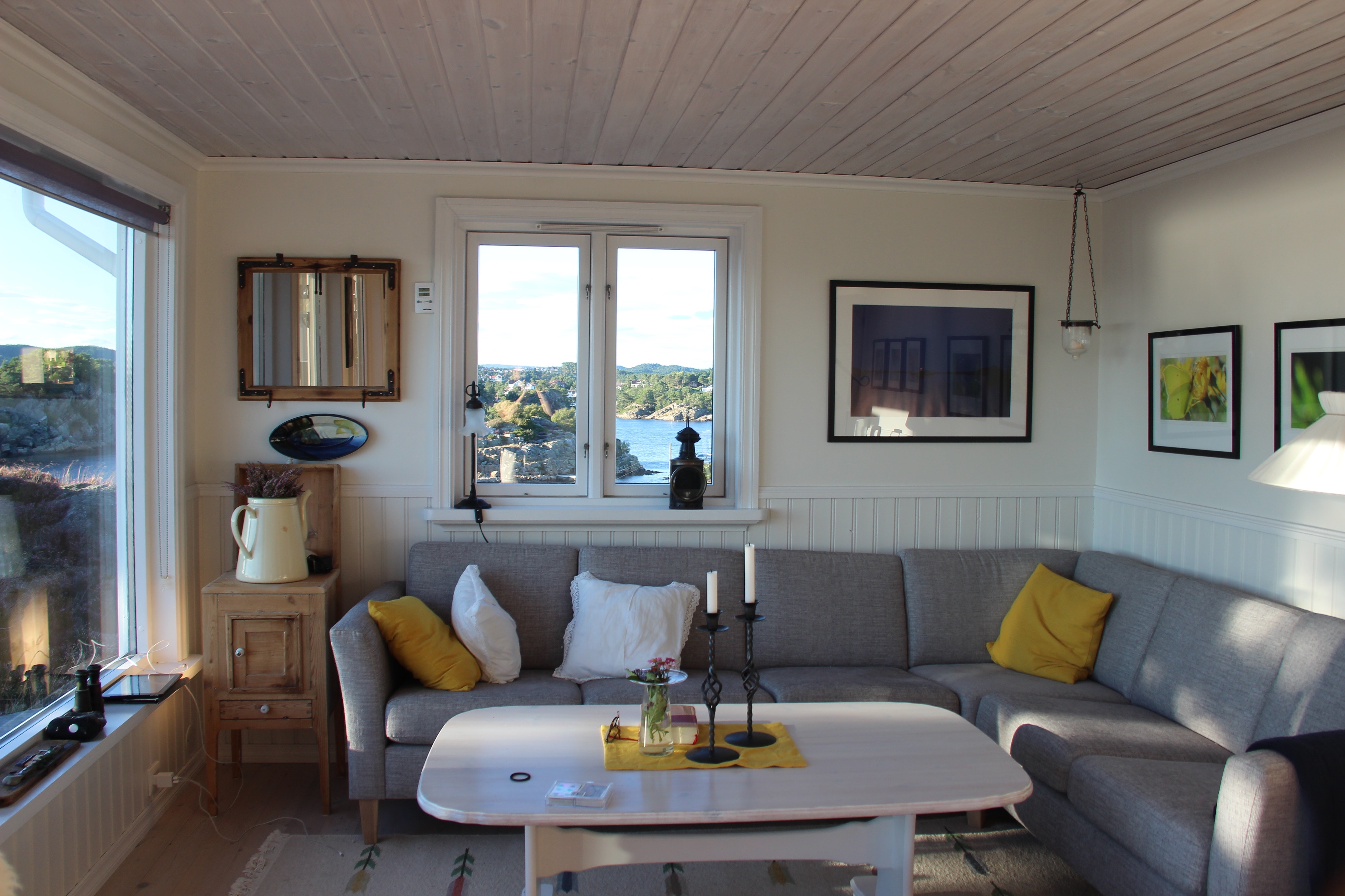
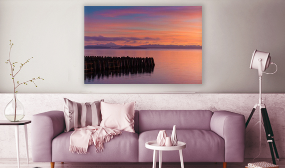
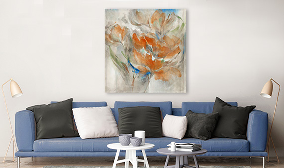
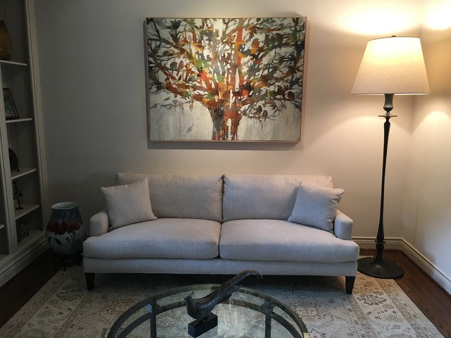
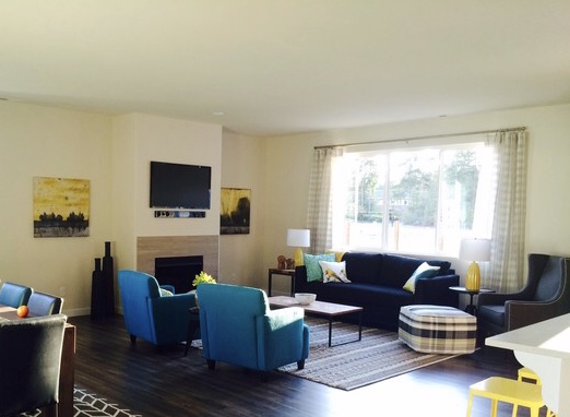
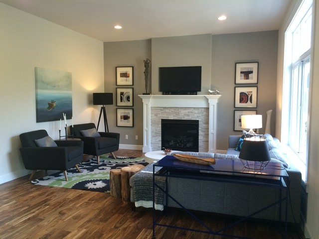
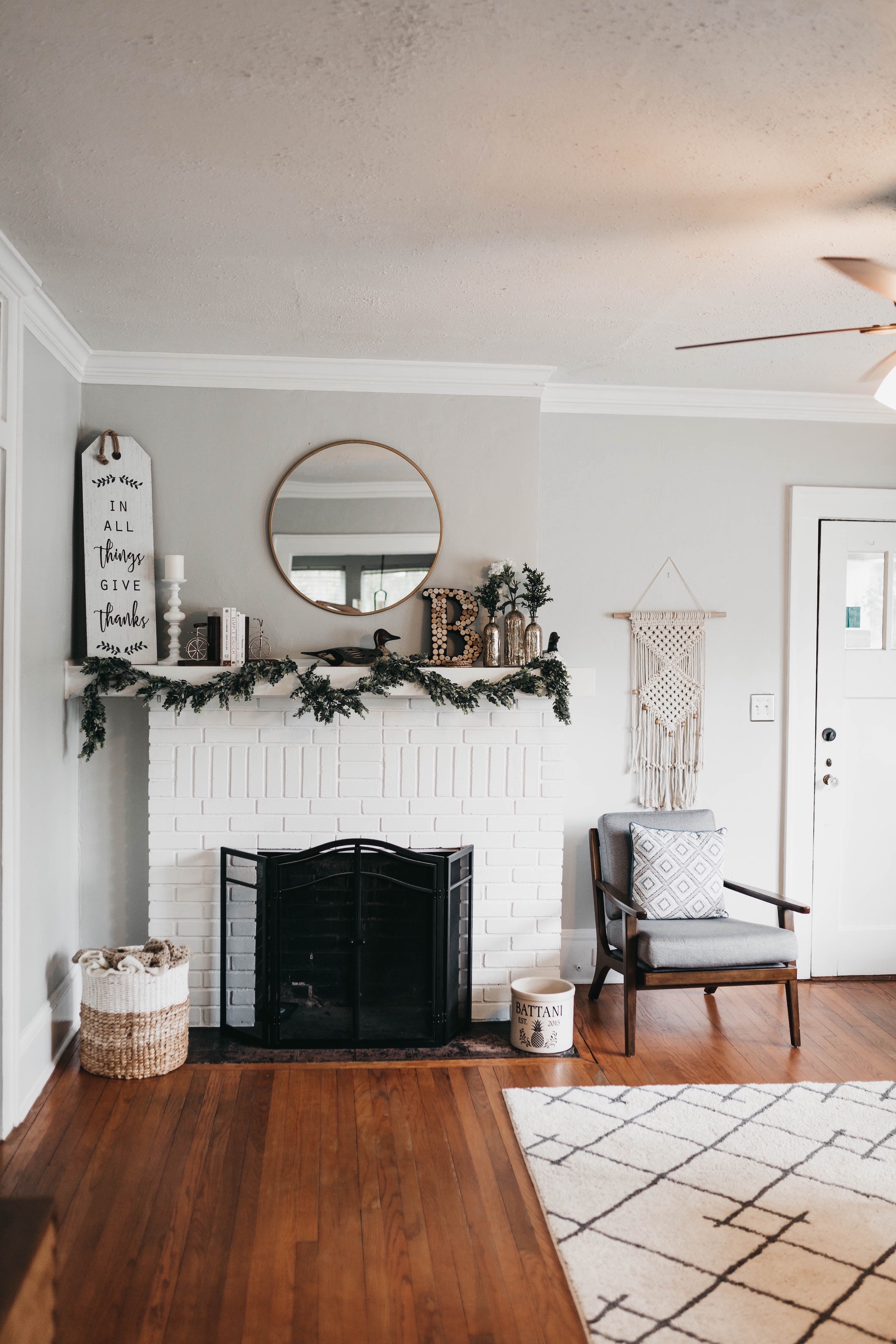
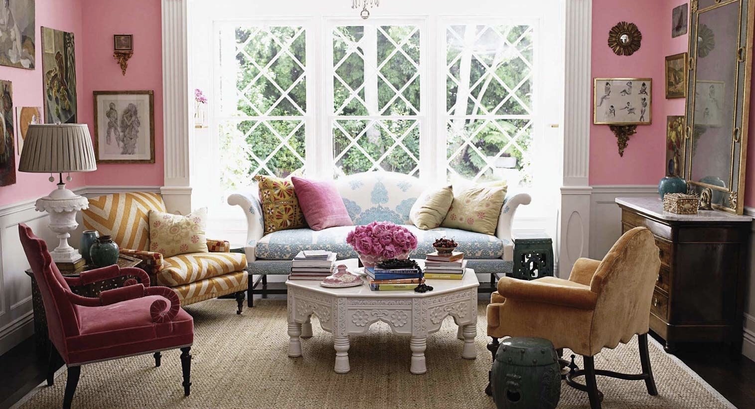
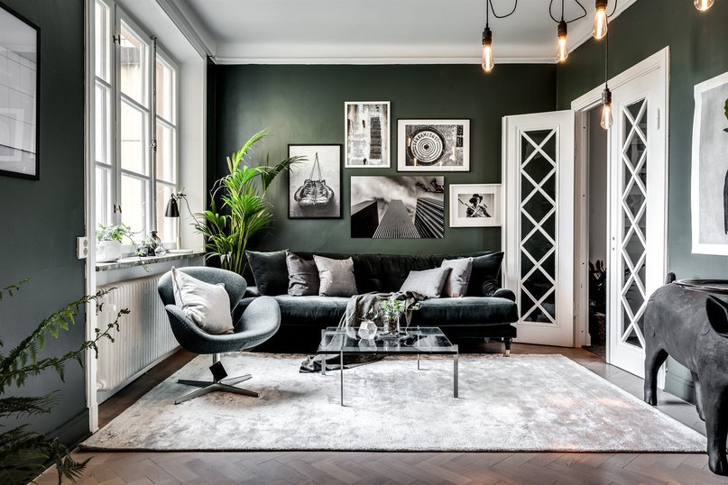
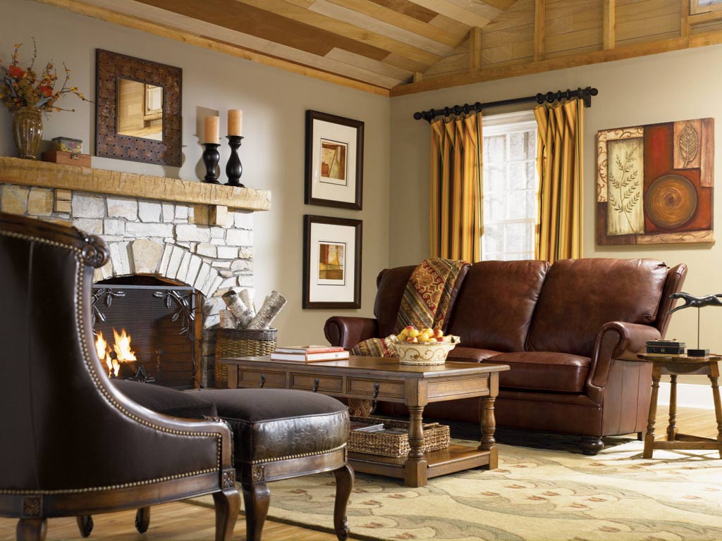
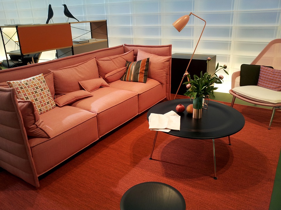
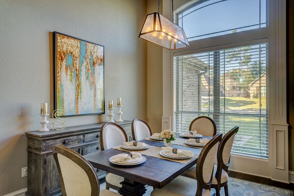
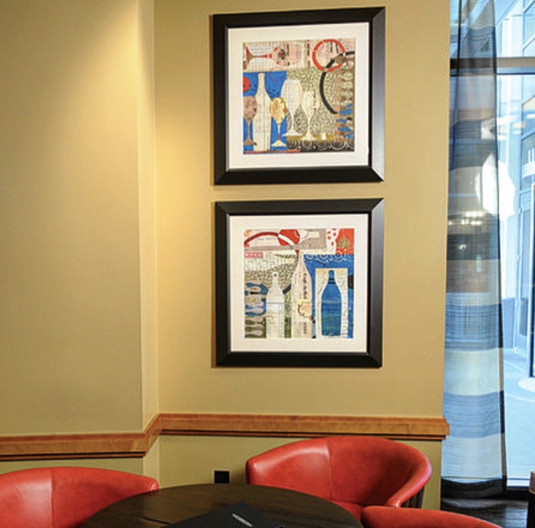
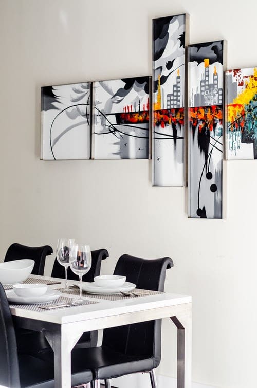
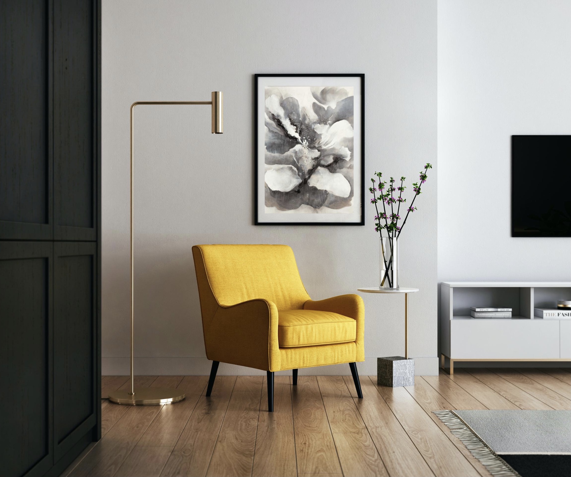
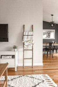
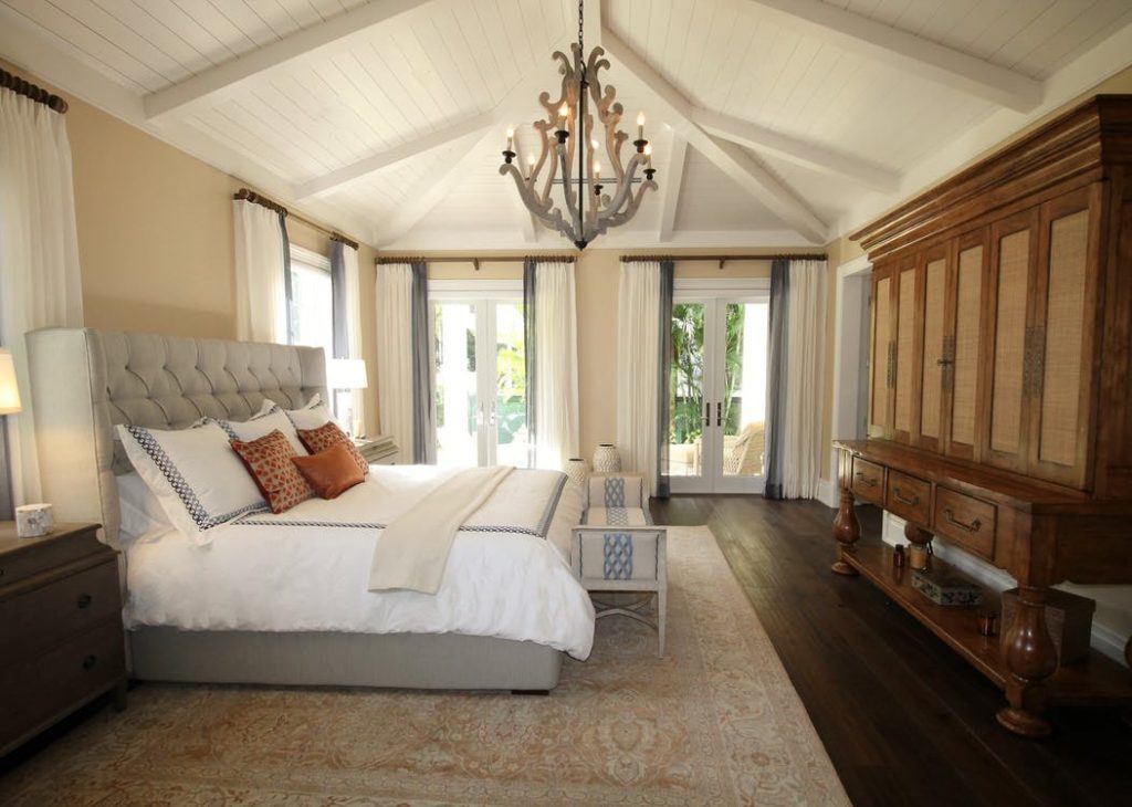
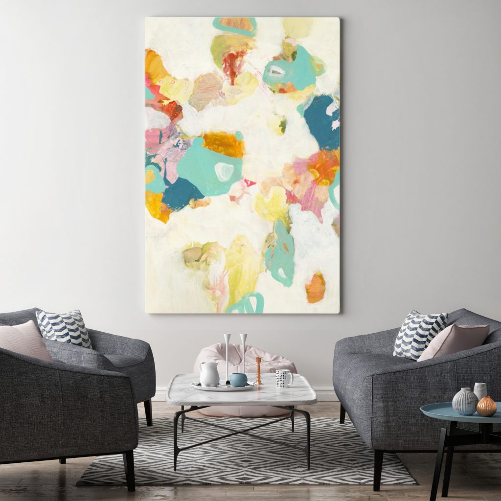
Having experienced a shift in how and where we work, live, and vacation, hotel spaces have had to provide accommodations for guests that want it all. The lines between home and hospitality are blurring, and hotel design has become even more focused on creating a home-away-from-home. Function meets comfort in hotel design, as spaces are made to feel cozy and less formal but also adapt to the needs of their guests. Multi-use spaces that can be transformed from a conference room to an intimate lounge are becoming necessities, empowering guests to use spaces as they choose. With design features such as spa-like bathrooms, thematic restaurants, local art, and plant decor, hotels are creating unique and memorable experiences for guests. Emphasizing wellness, comfort, and creating a joyful atmosphere, hospitality design trends focus on decorating in earth tones, warm woods and natural materials, blending the indoors and outdoors, and going bold with their decor. Making a lasting impression, both in design and experience, is key in hotel design.
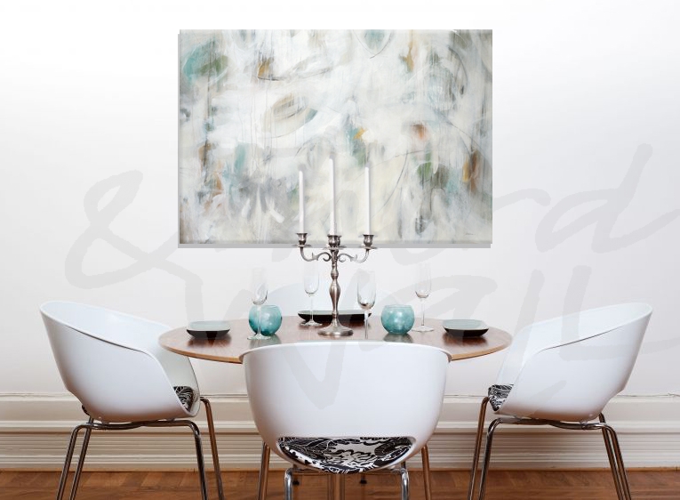
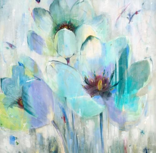
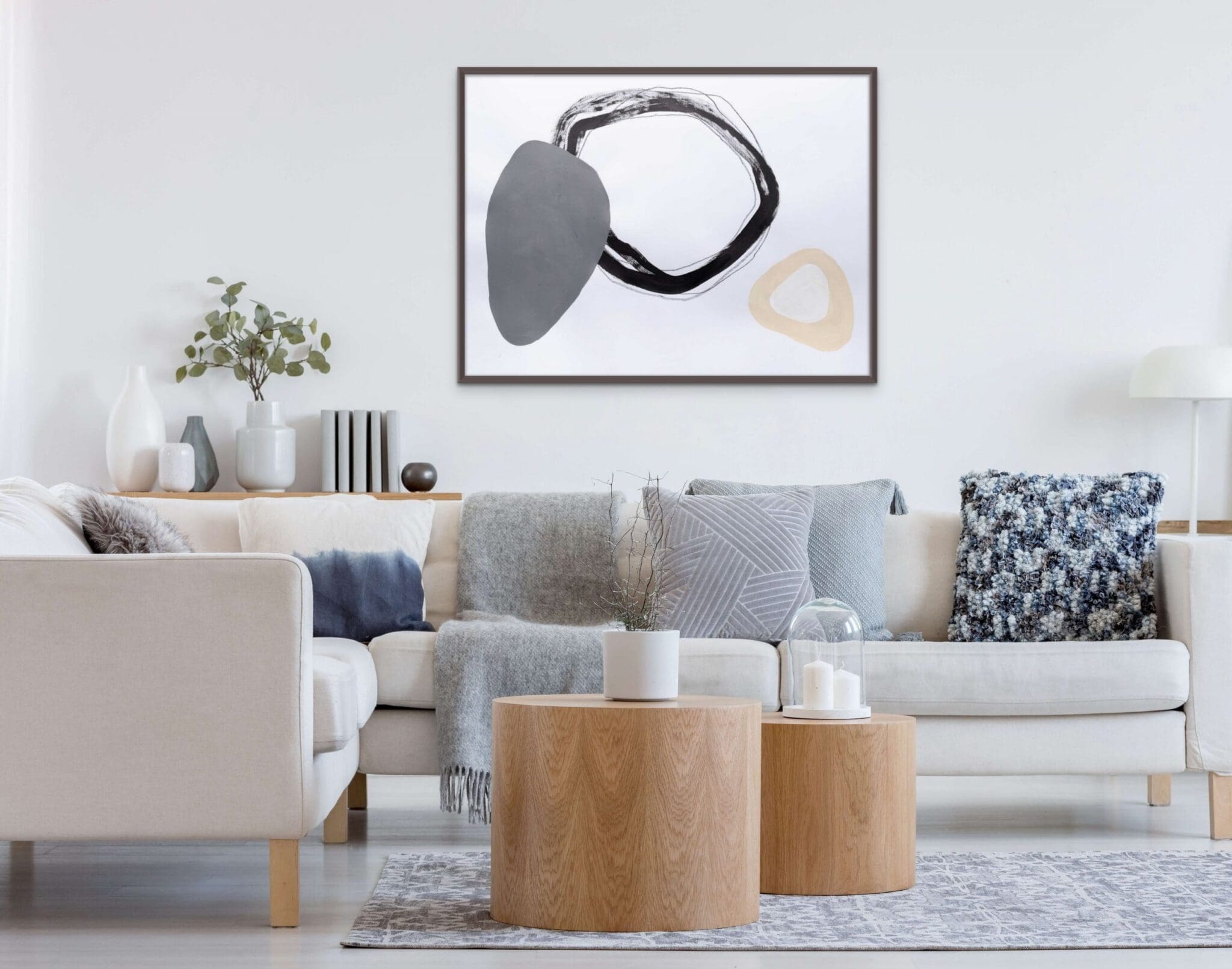
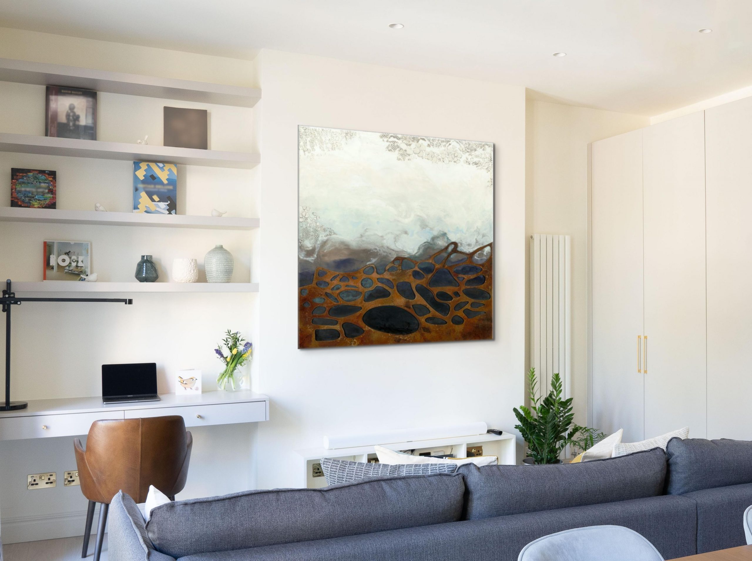
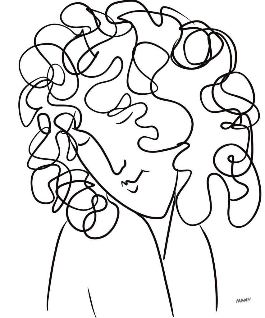
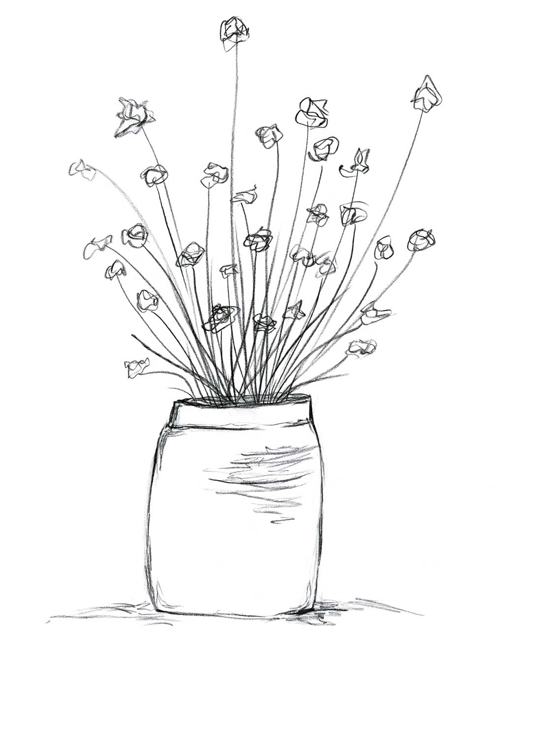
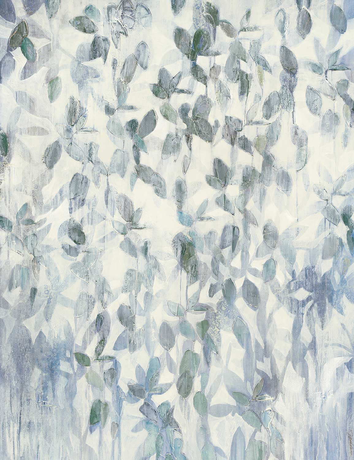
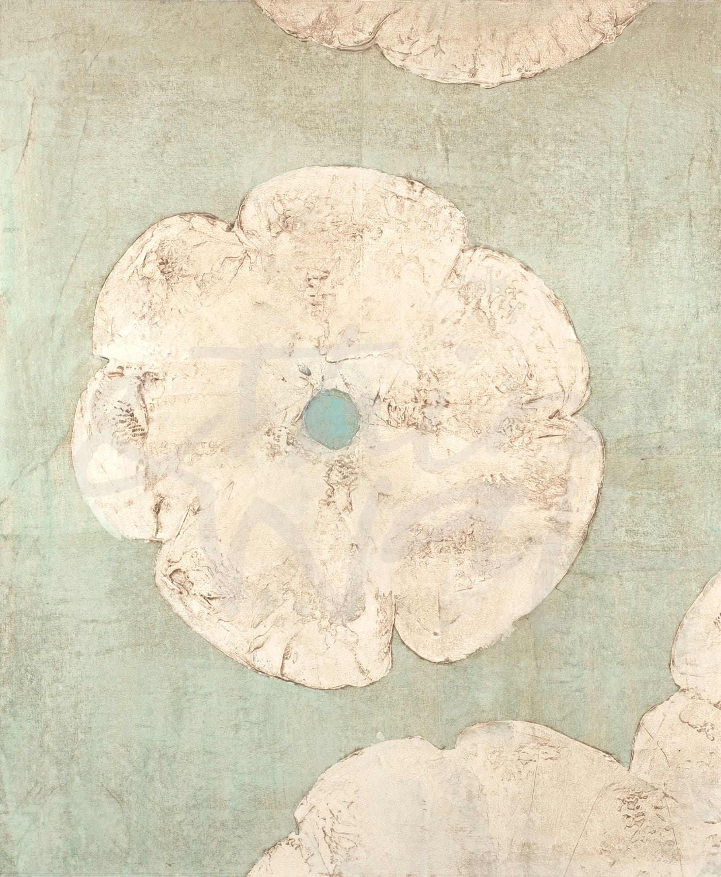
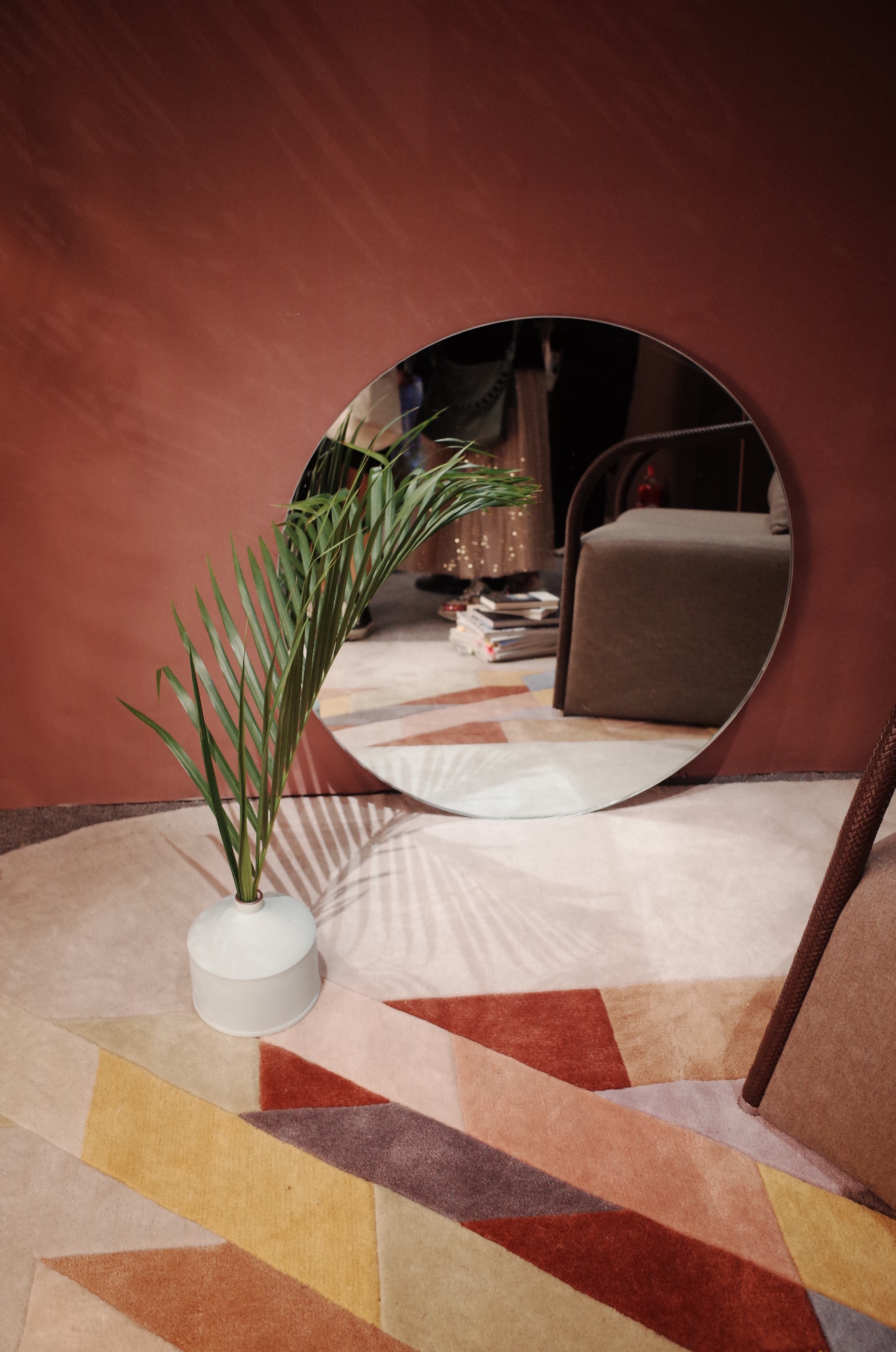
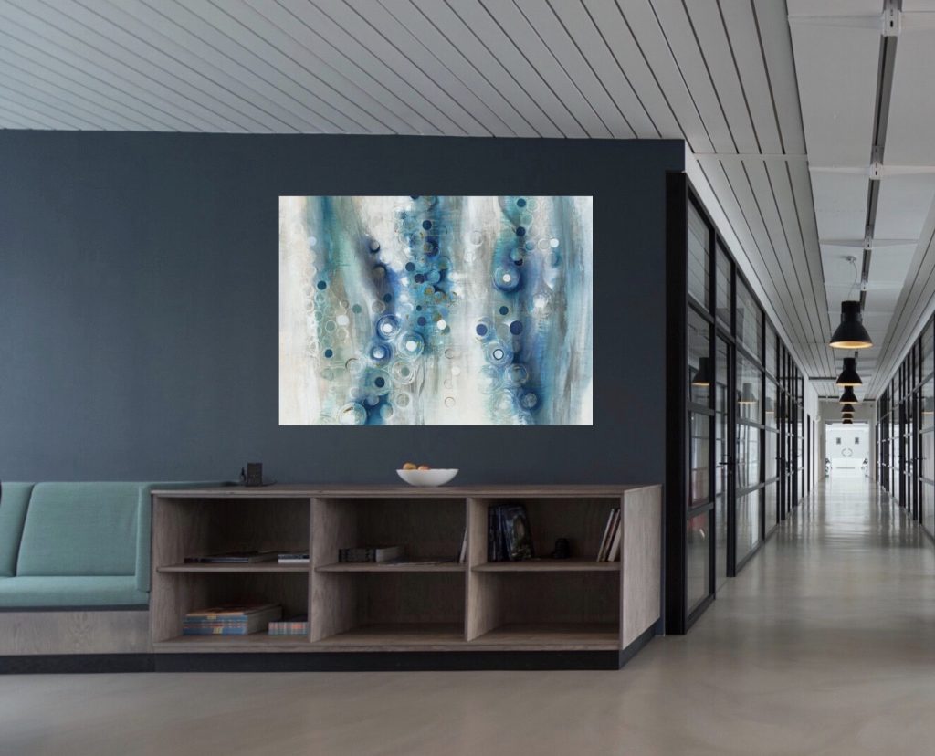
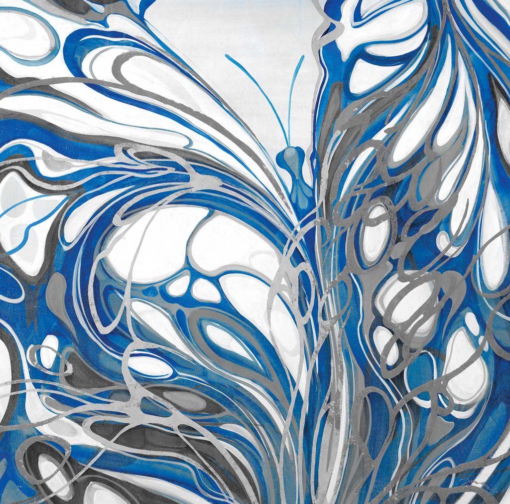
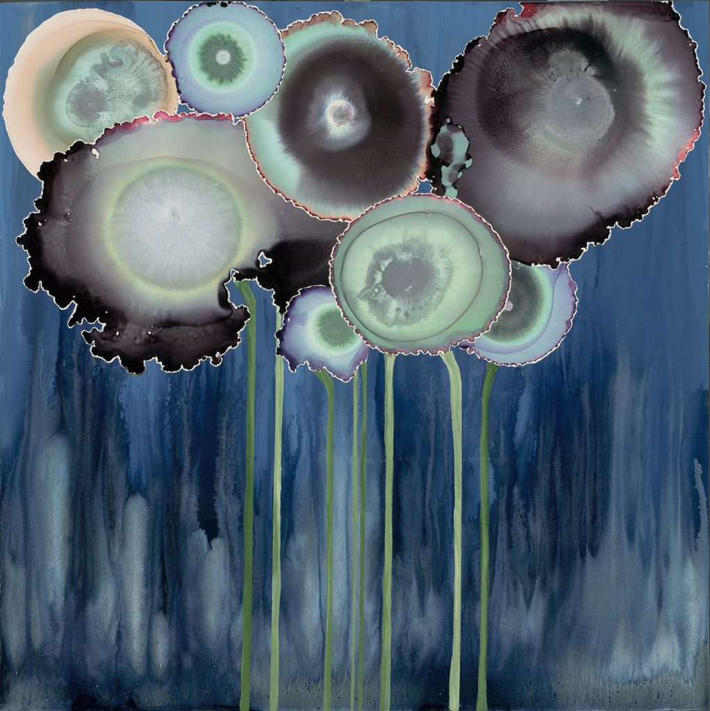
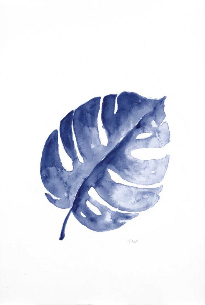
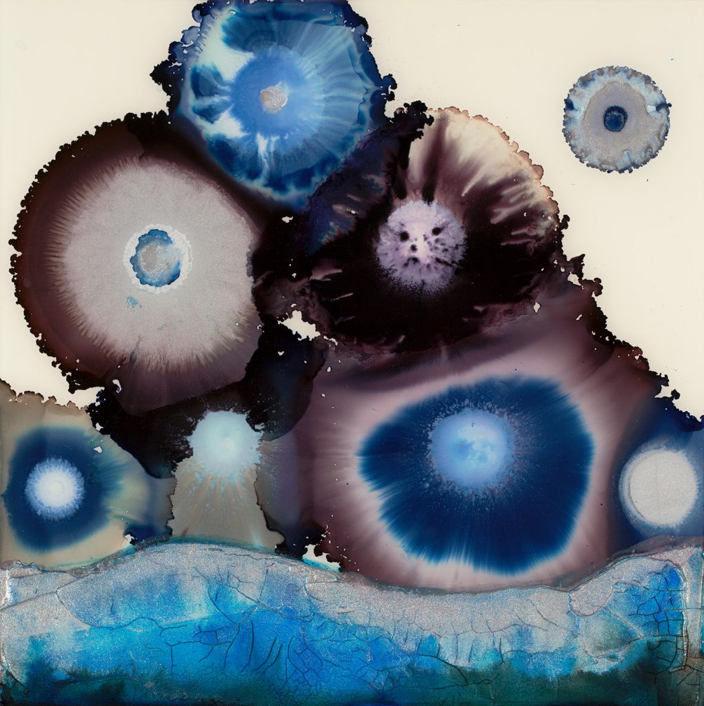
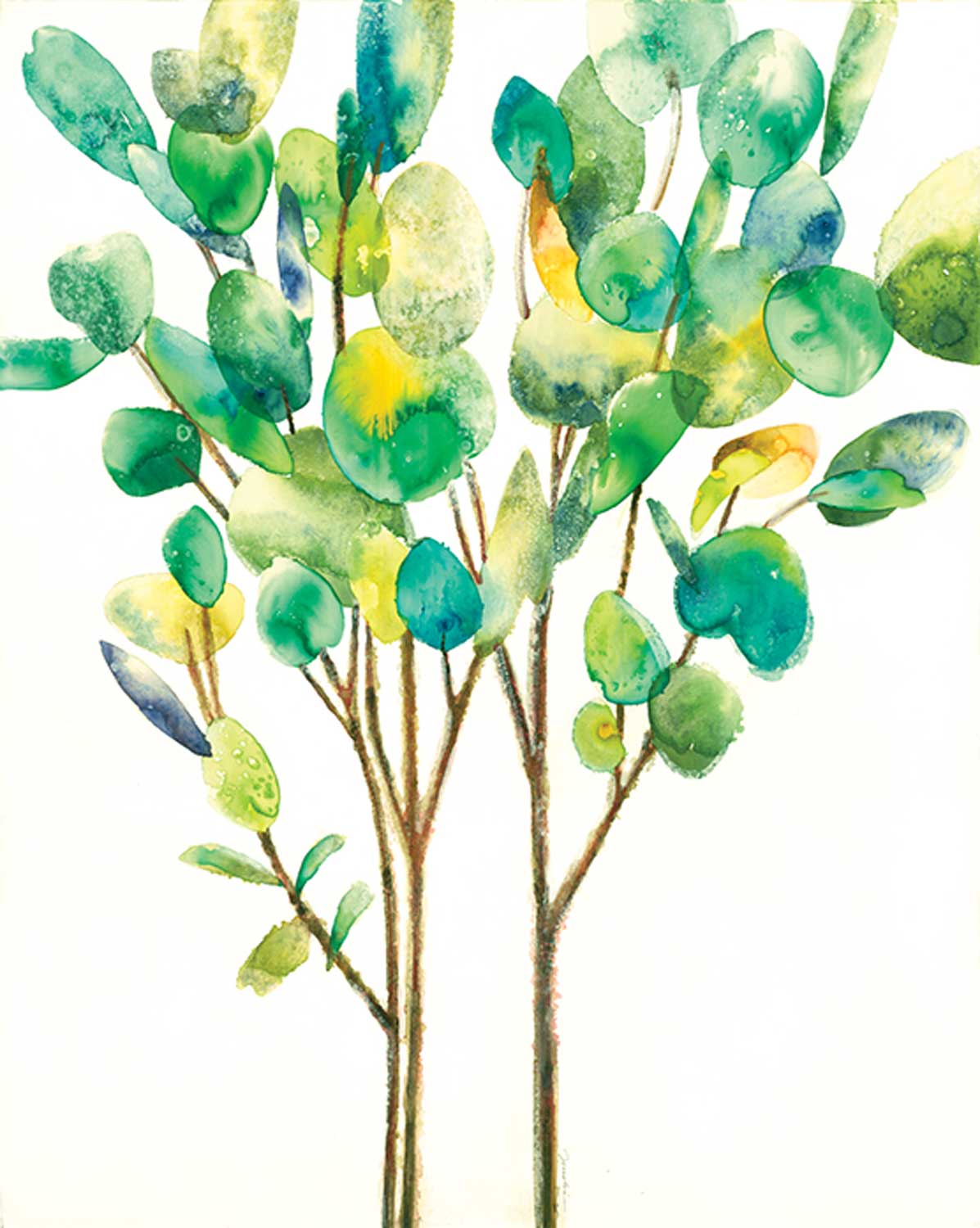
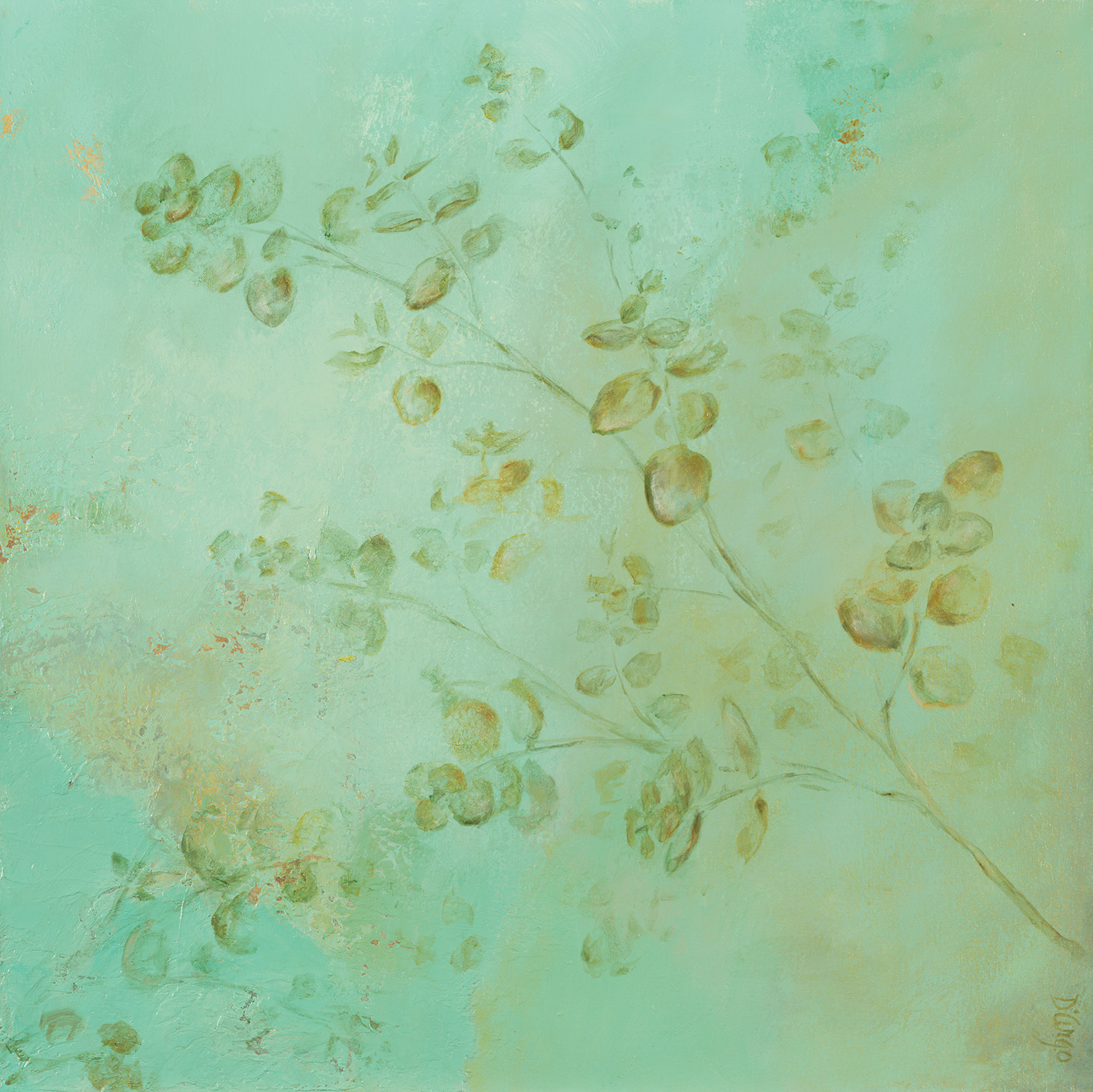
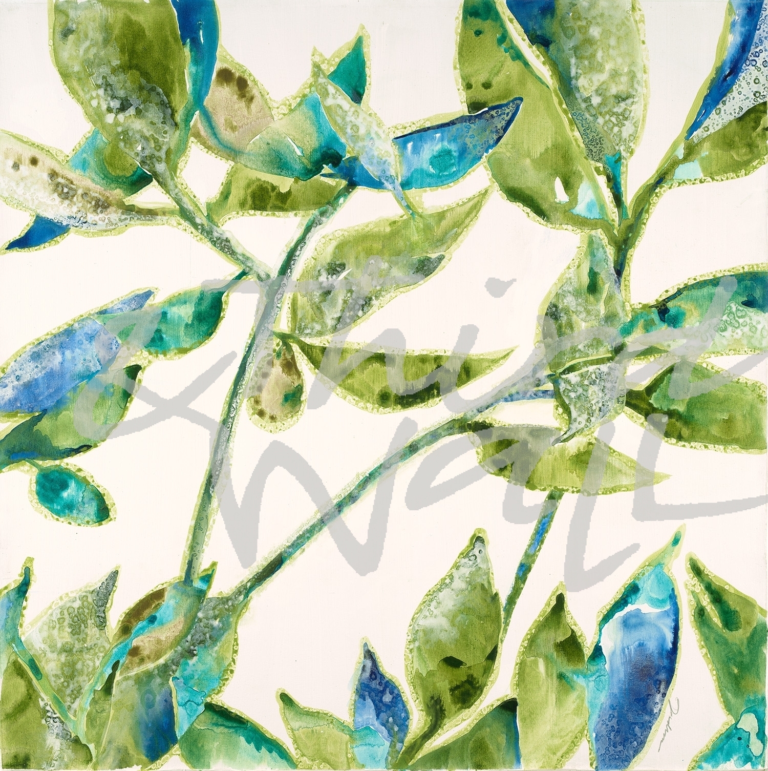
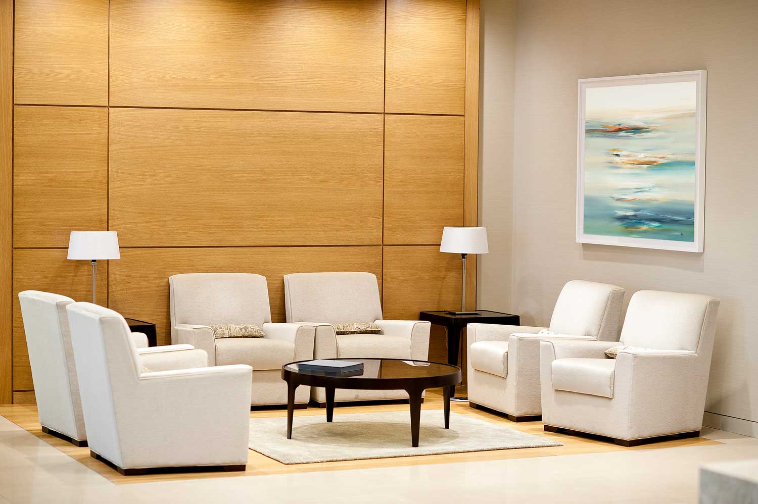
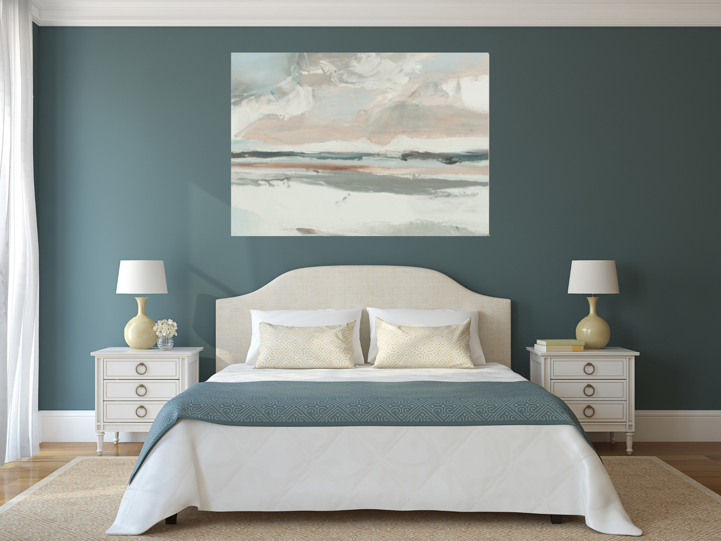
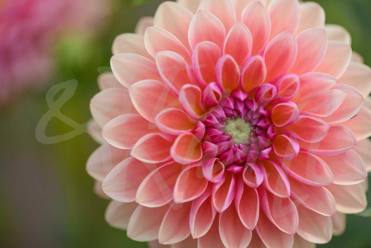
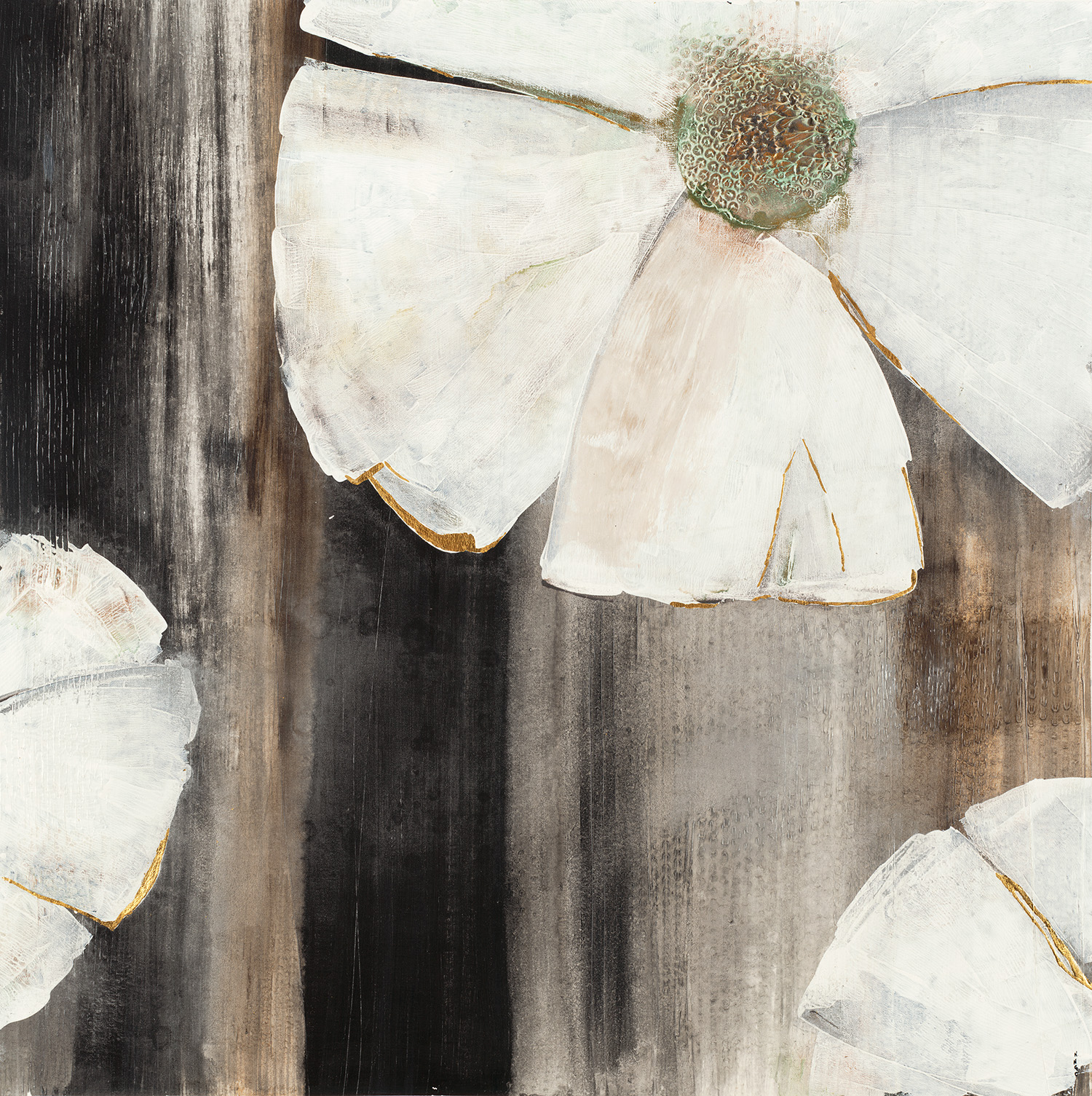
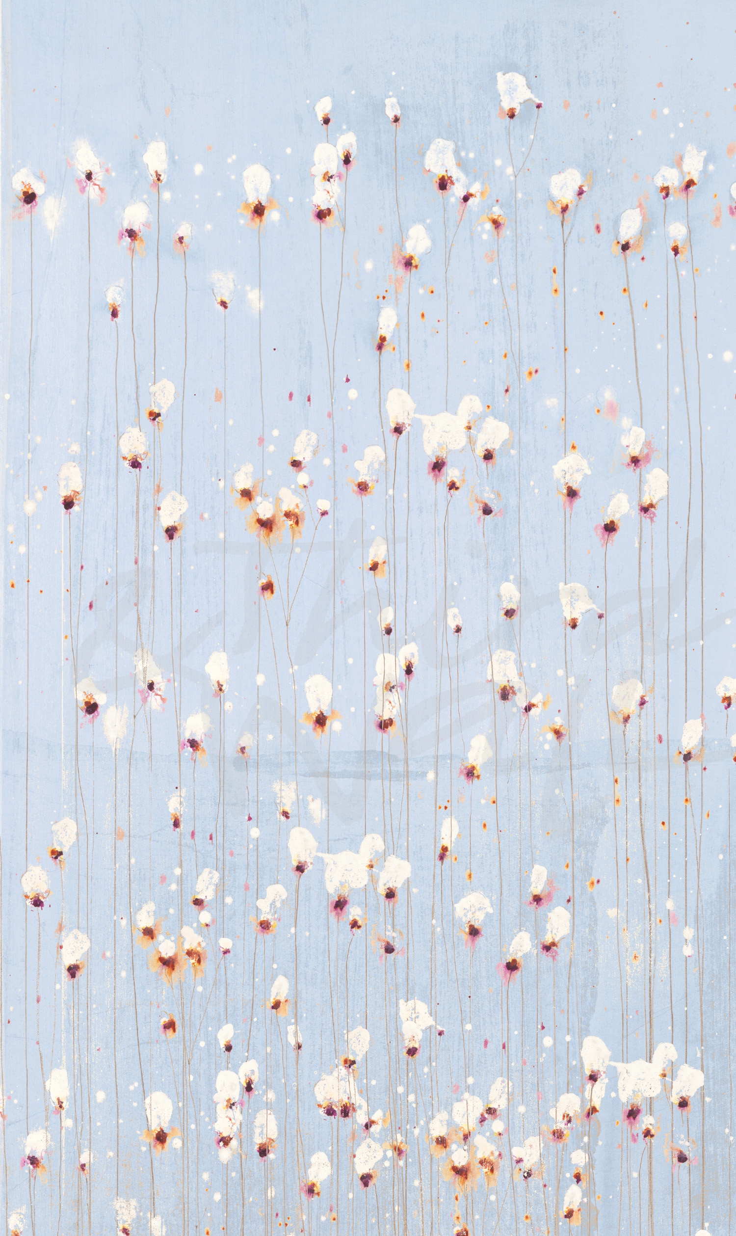
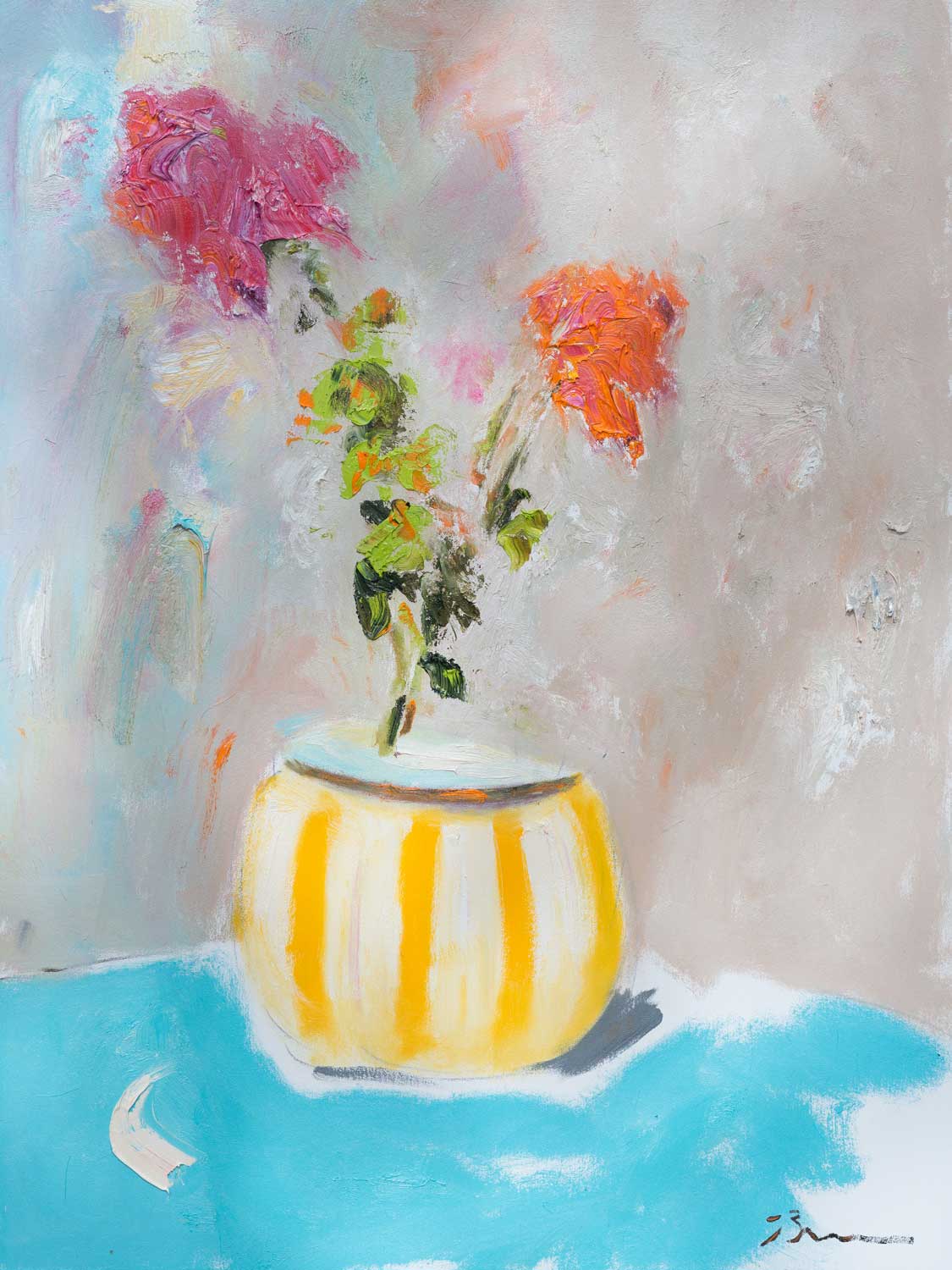
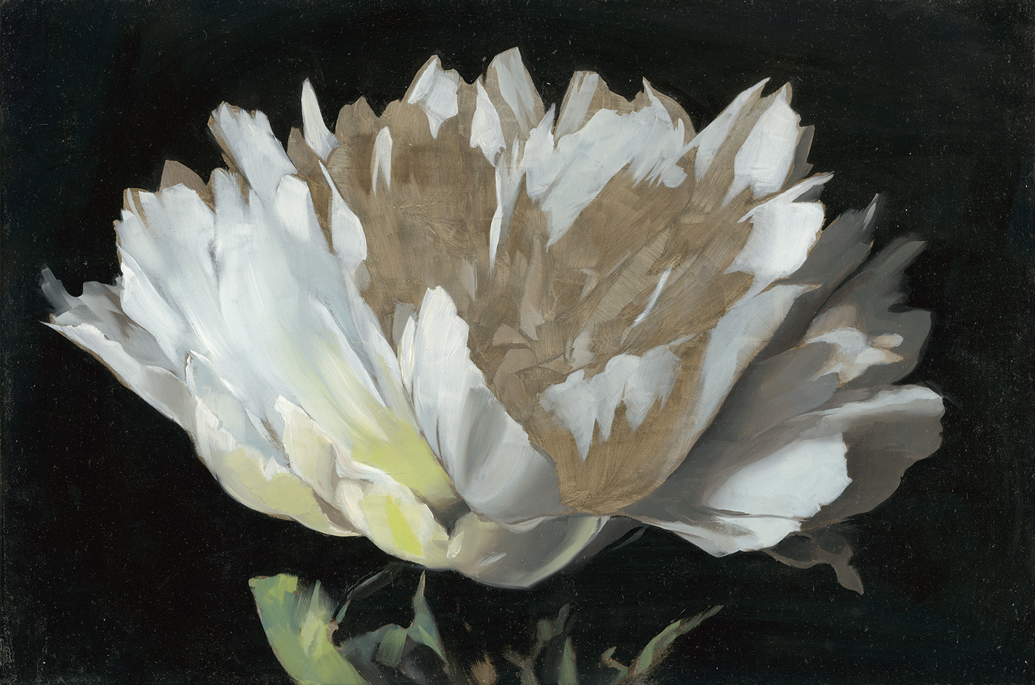
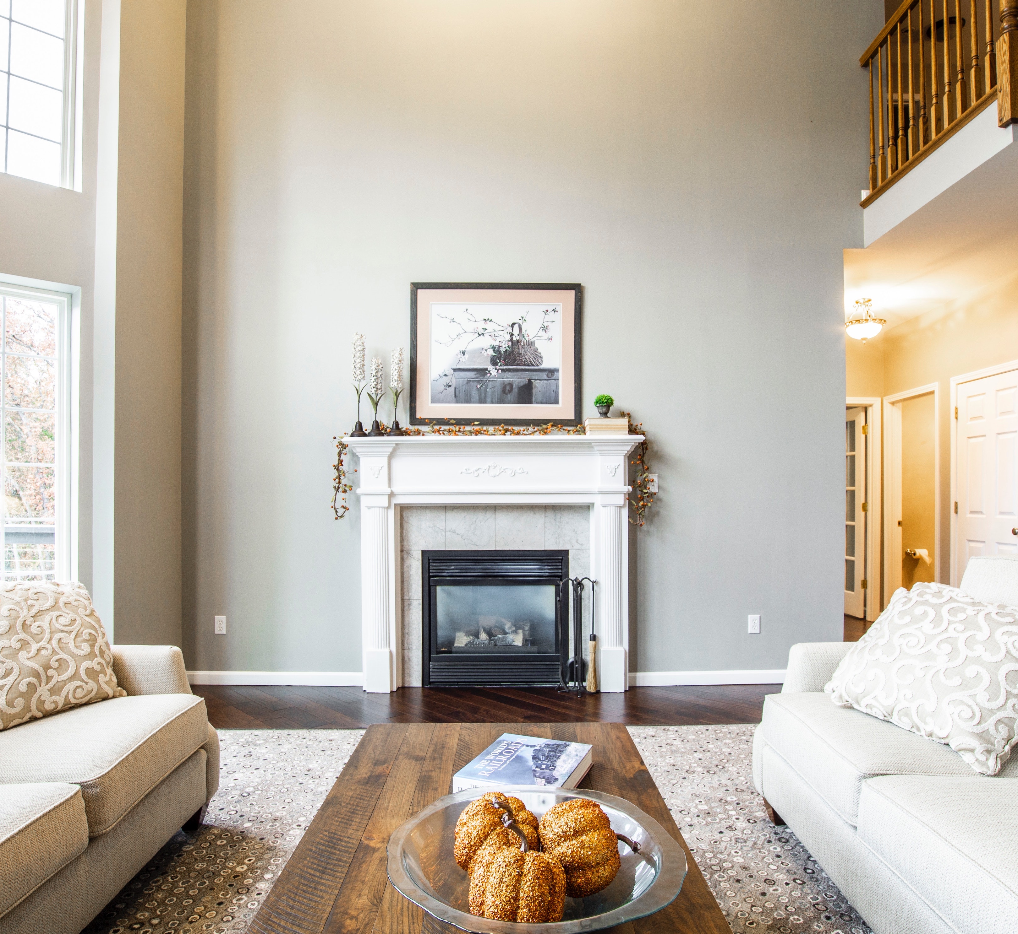
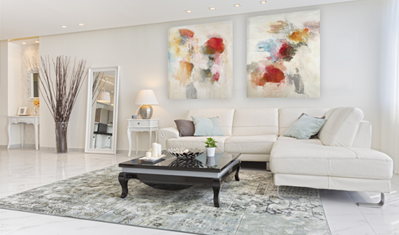
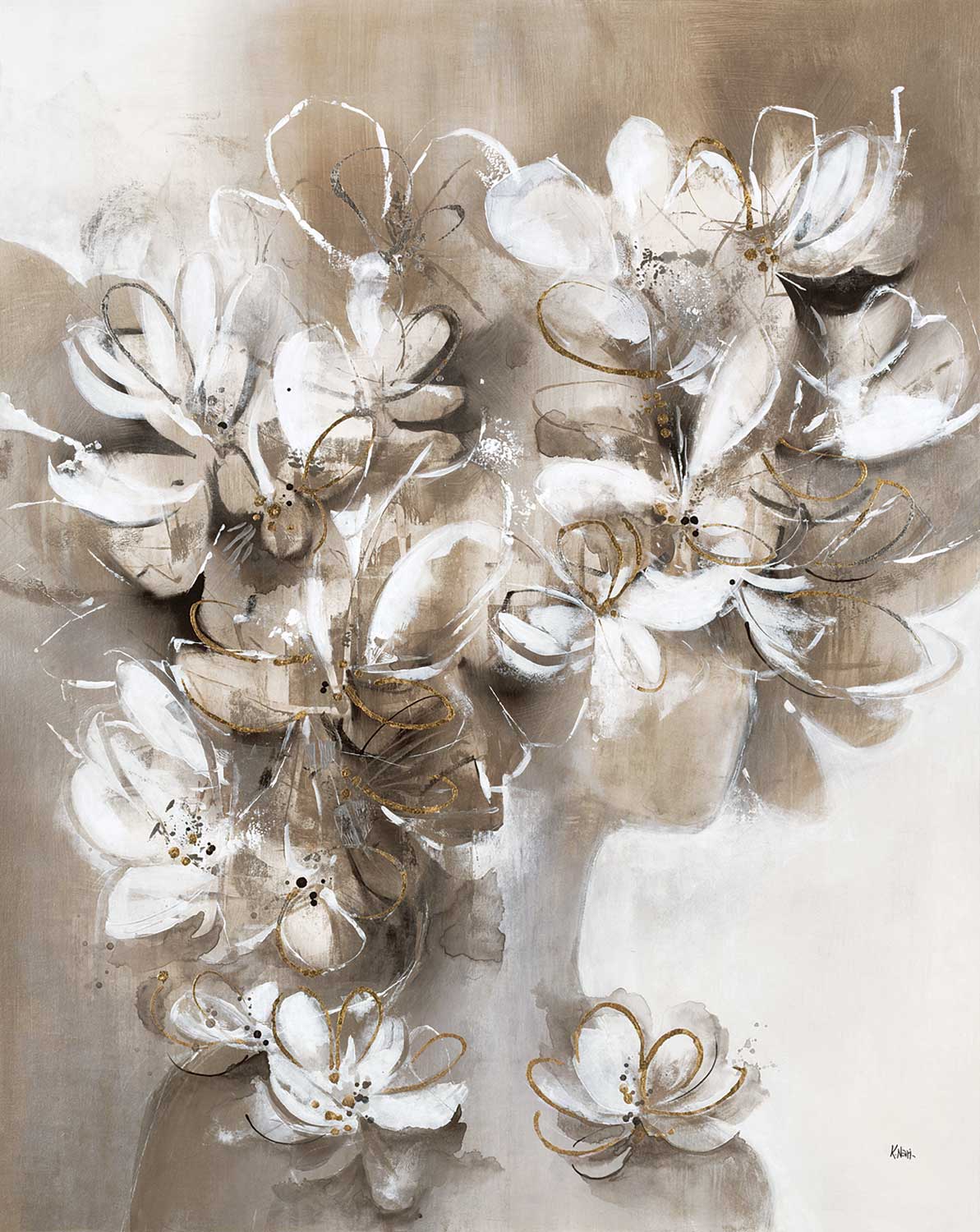
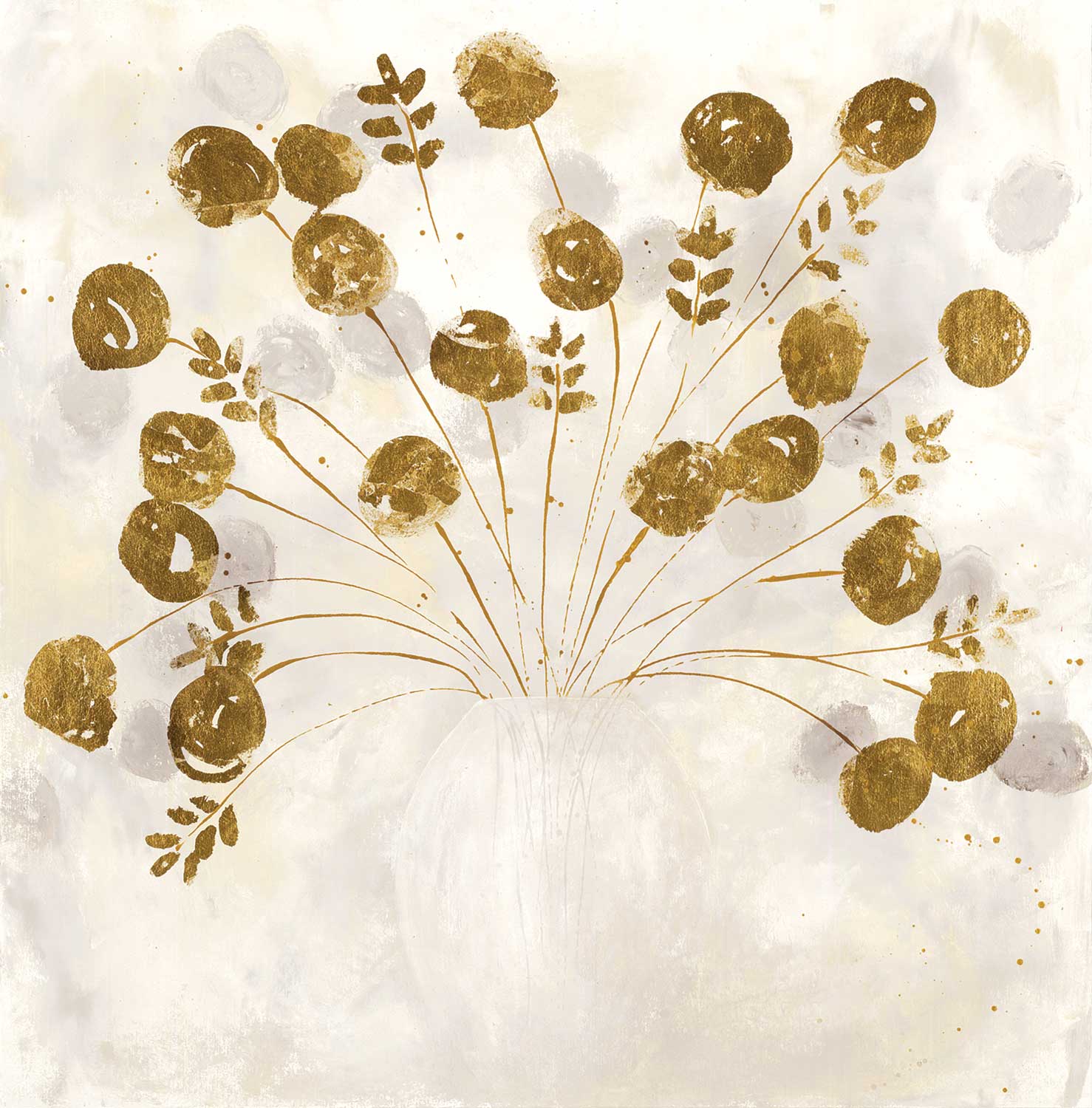
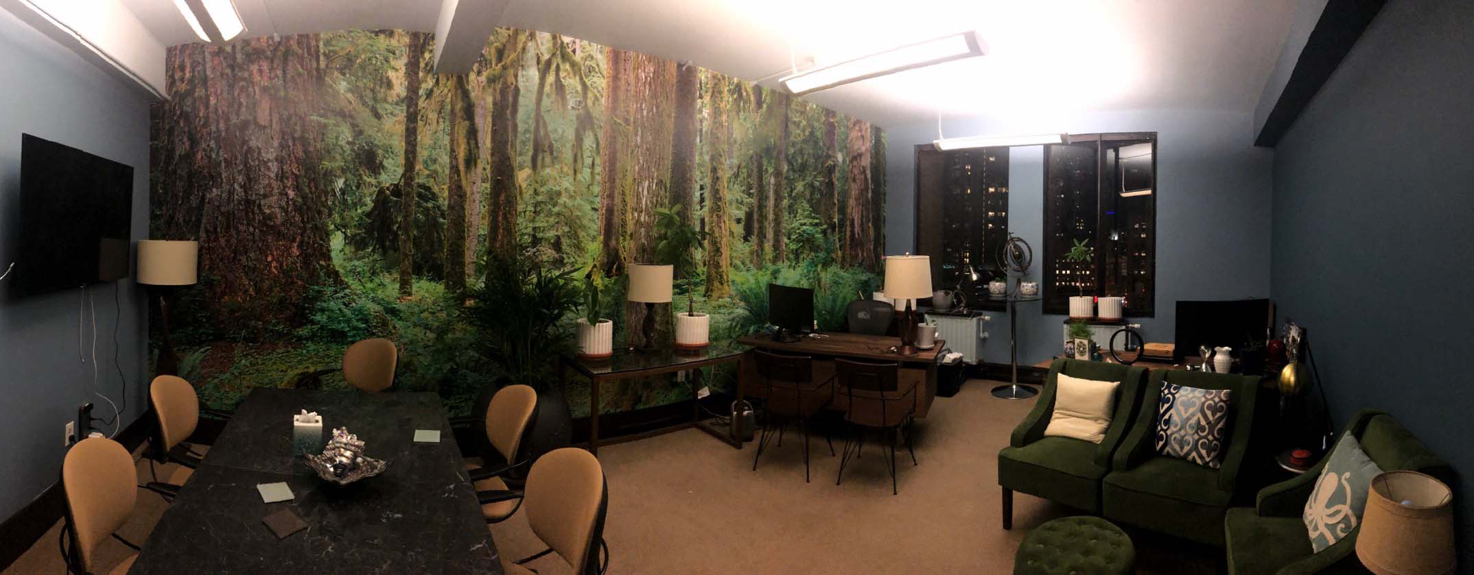
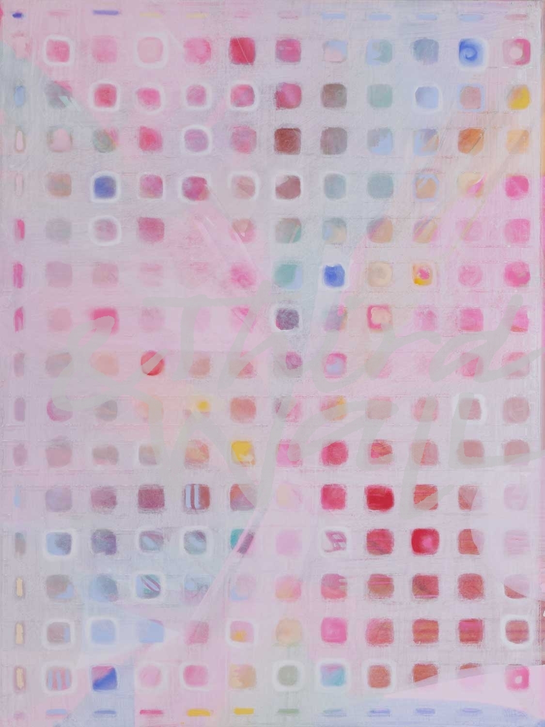
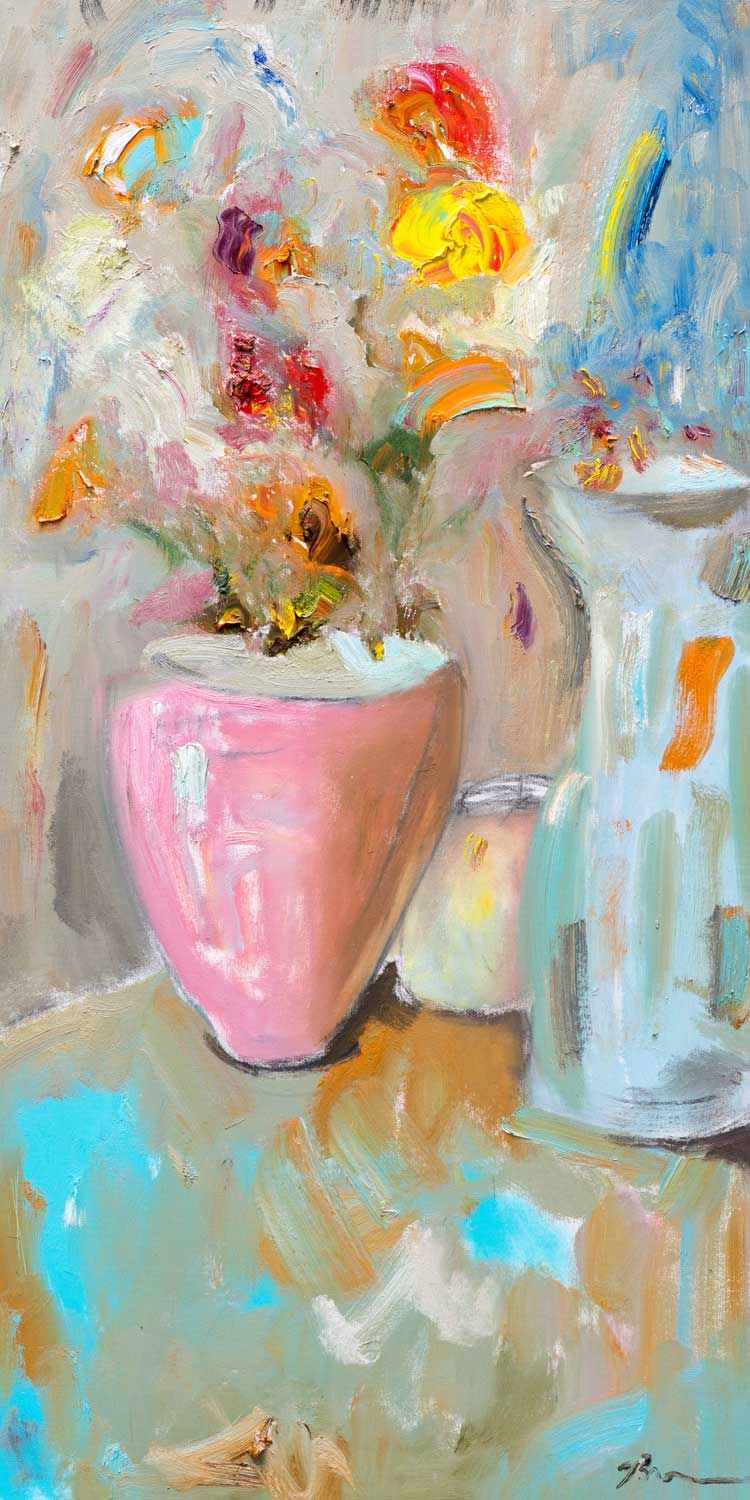
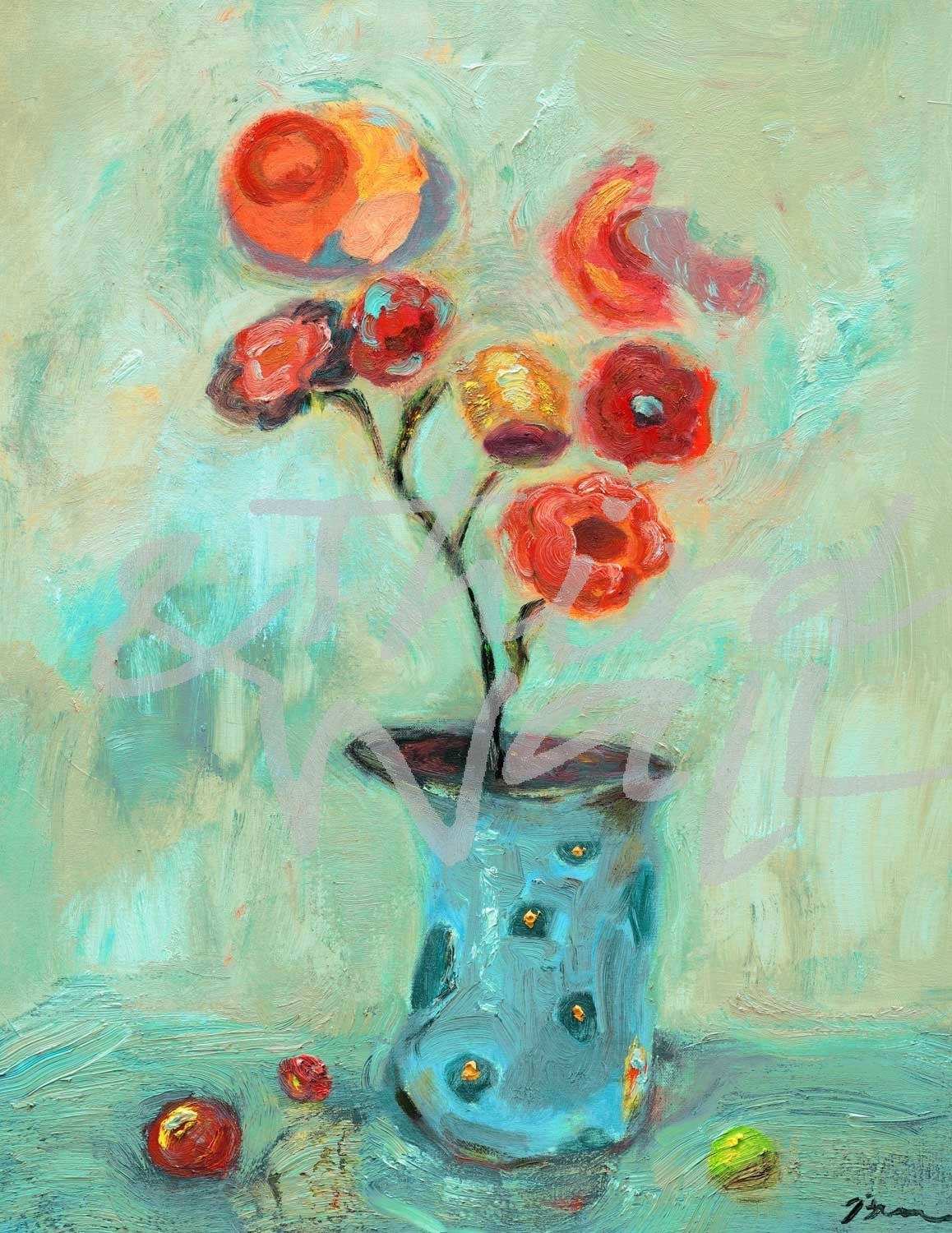
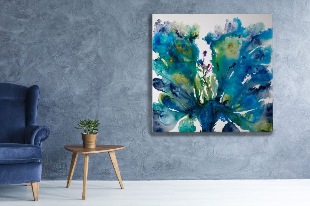
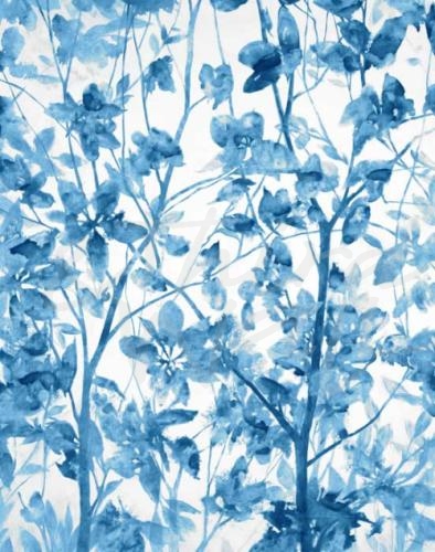
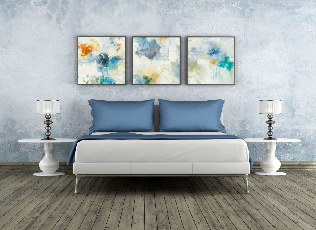
In healthcare design, creating spaces that improve the lives of patients and staff is at the top of mind. Fostering an inviting and serene environment is so important when choosing the decor for spaces like hospitals and senior living centers. For this reason, trends that include soothing blues and greens, botanical decor, and fun abstract art are often used. But more than just creating a look or feel of a space, these designs need to consider the care of patients and the function of the space. In decor for senior living centers, fostering an inviting and serene environment is so important. Although there is no one-size fits-all in healthcare design, choosing the right wall decor can provide a calming atmosphere and support overwhelmed patients, providers, and caretakers. Soft tones, transitional artwork, natural light, and personal touches are creating more comforting healthcare spaces, proving that design can help heal.
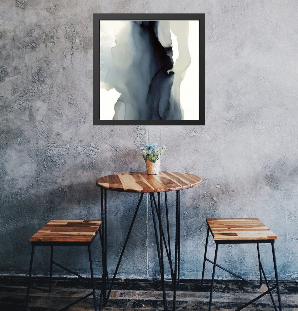
Designing meaningful and comfortable spaces that people can enjoy outside of the home has never felt so important, especially in hospitality and healthcare interiors. Decorating in soothing color palettes, adding organic and bespoke details, and incorporating a connection to the outdoors lends itself to warmth and character in a space. Hospitality and healthcare design is rising to meet the unique needs of those using the spaces, and bringing a connection to wellness that we can all use.
What To Read Next…
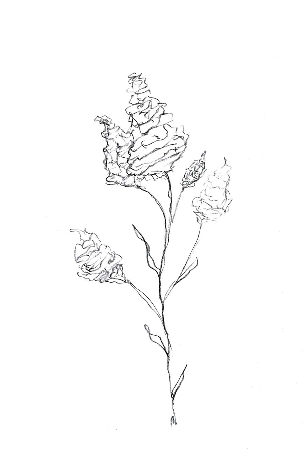
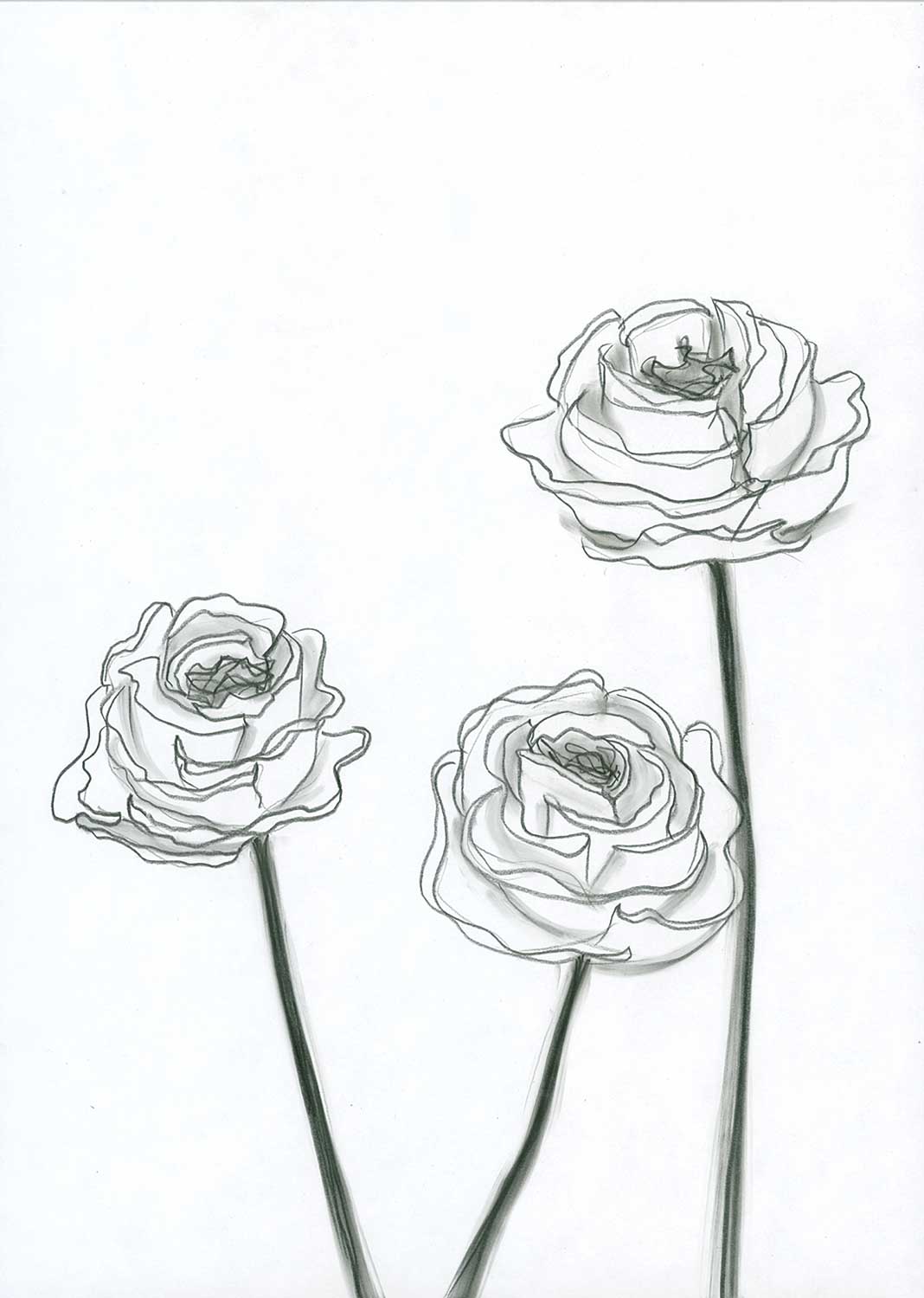
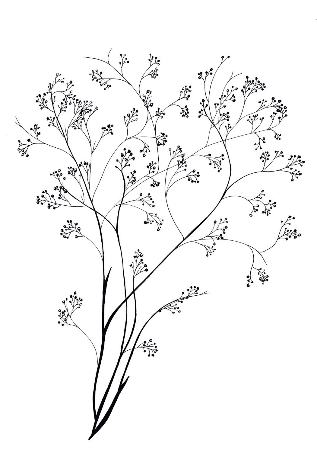
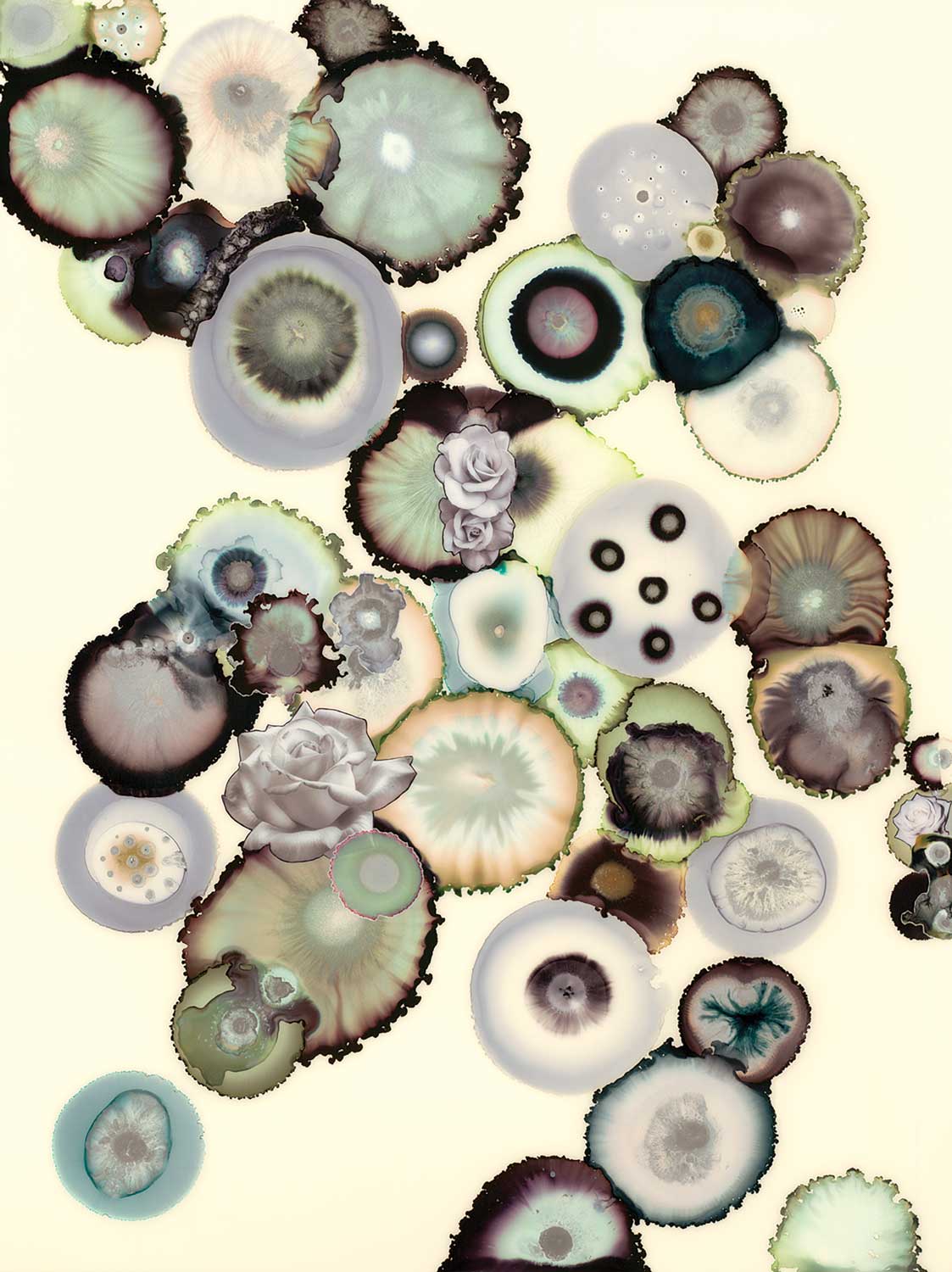
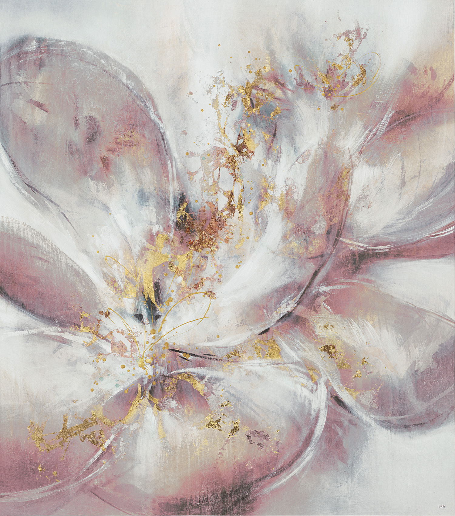
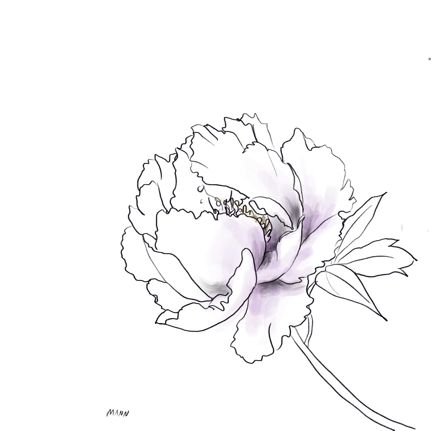
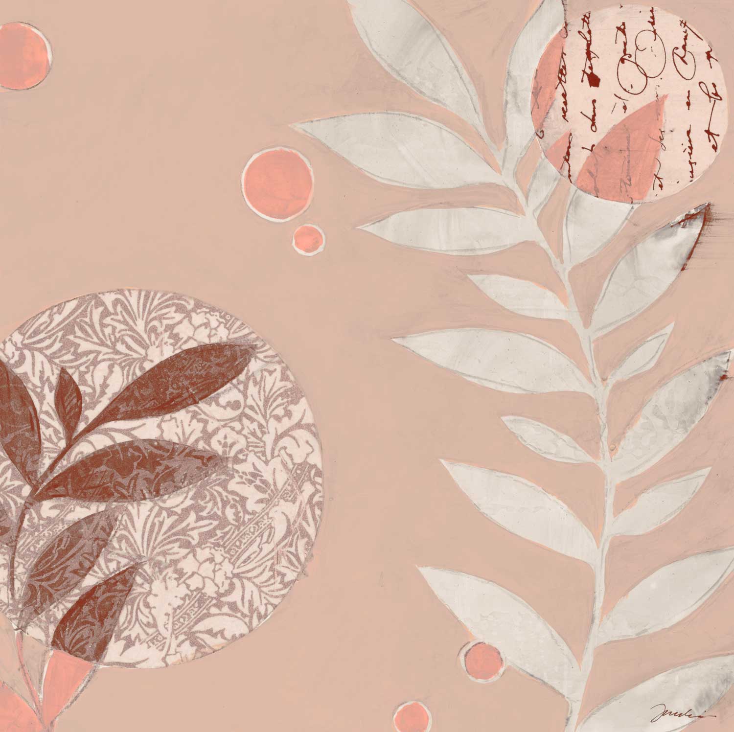
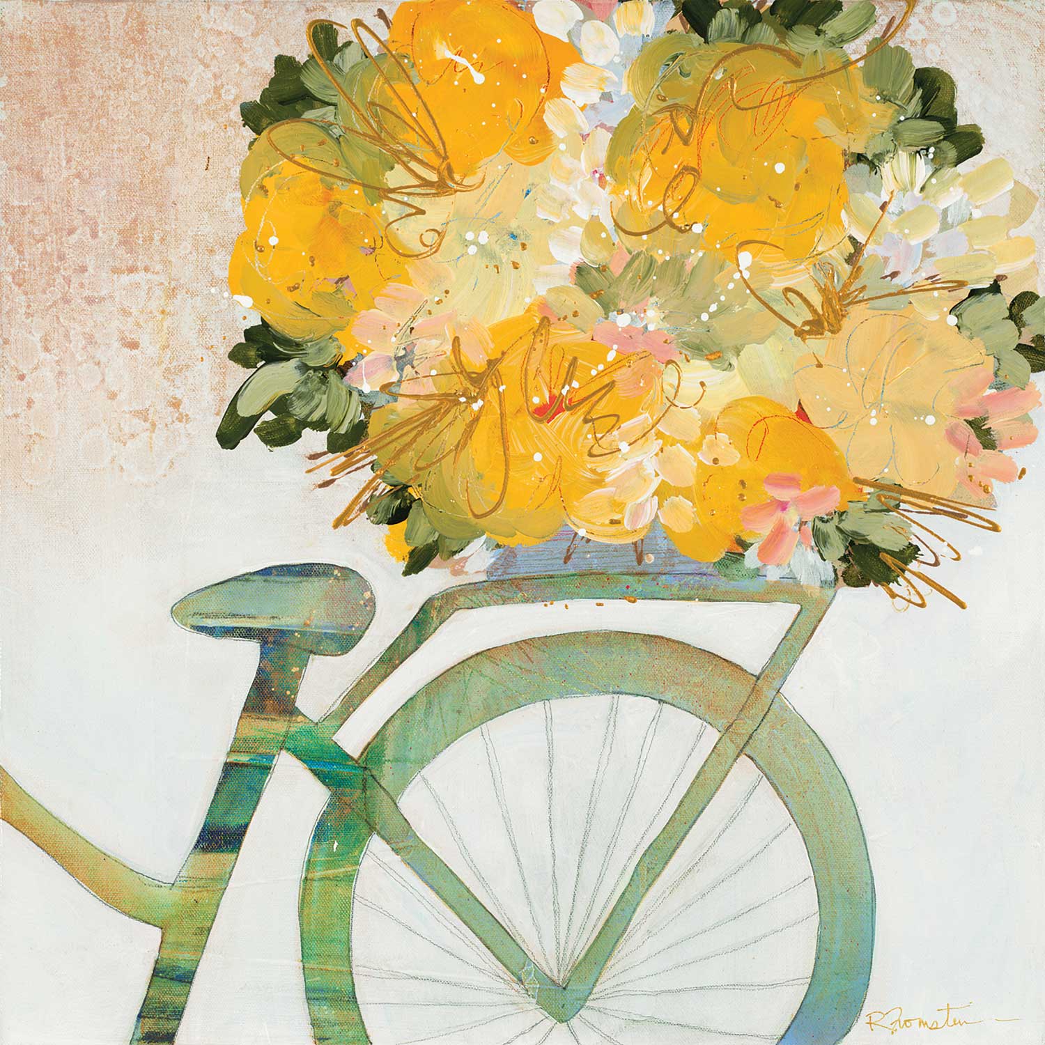
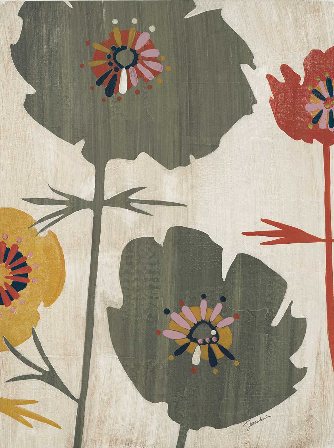
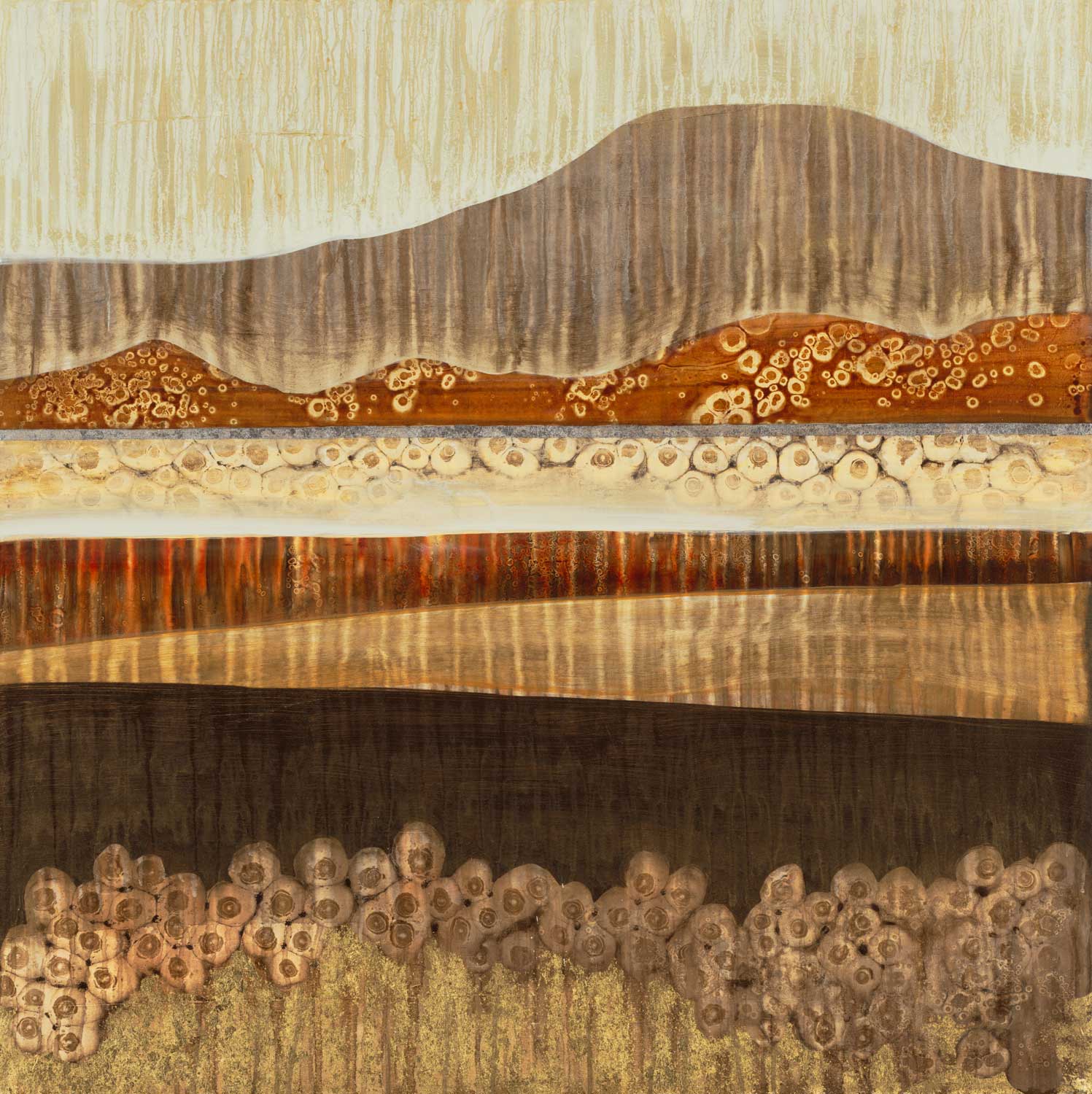
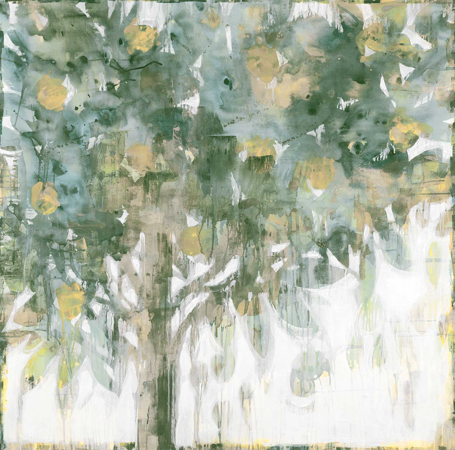
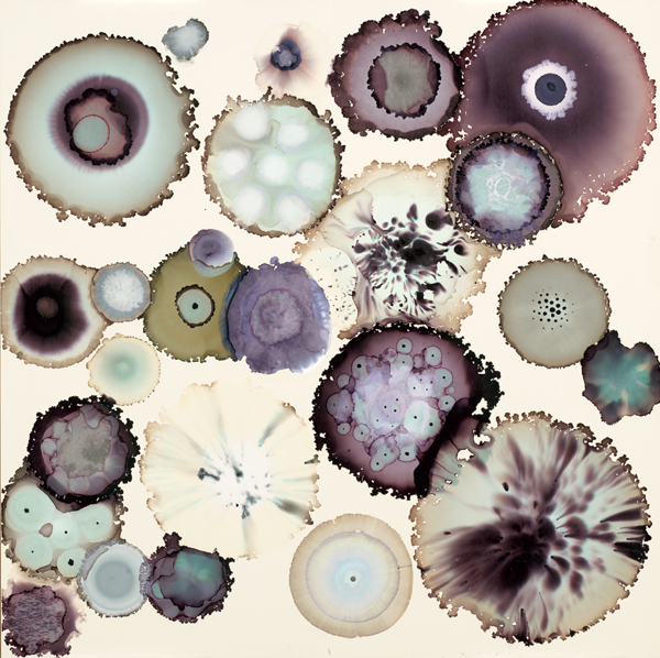
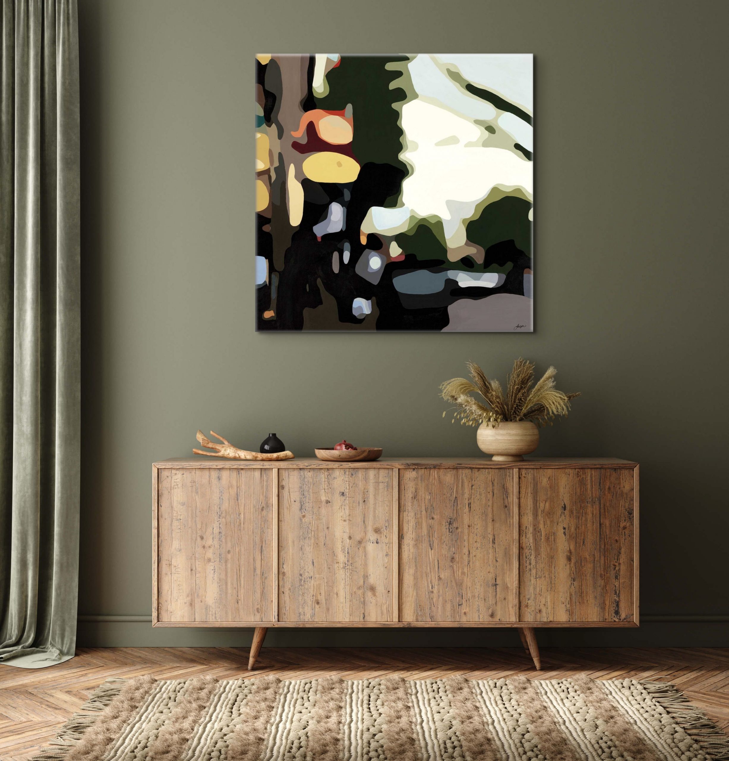
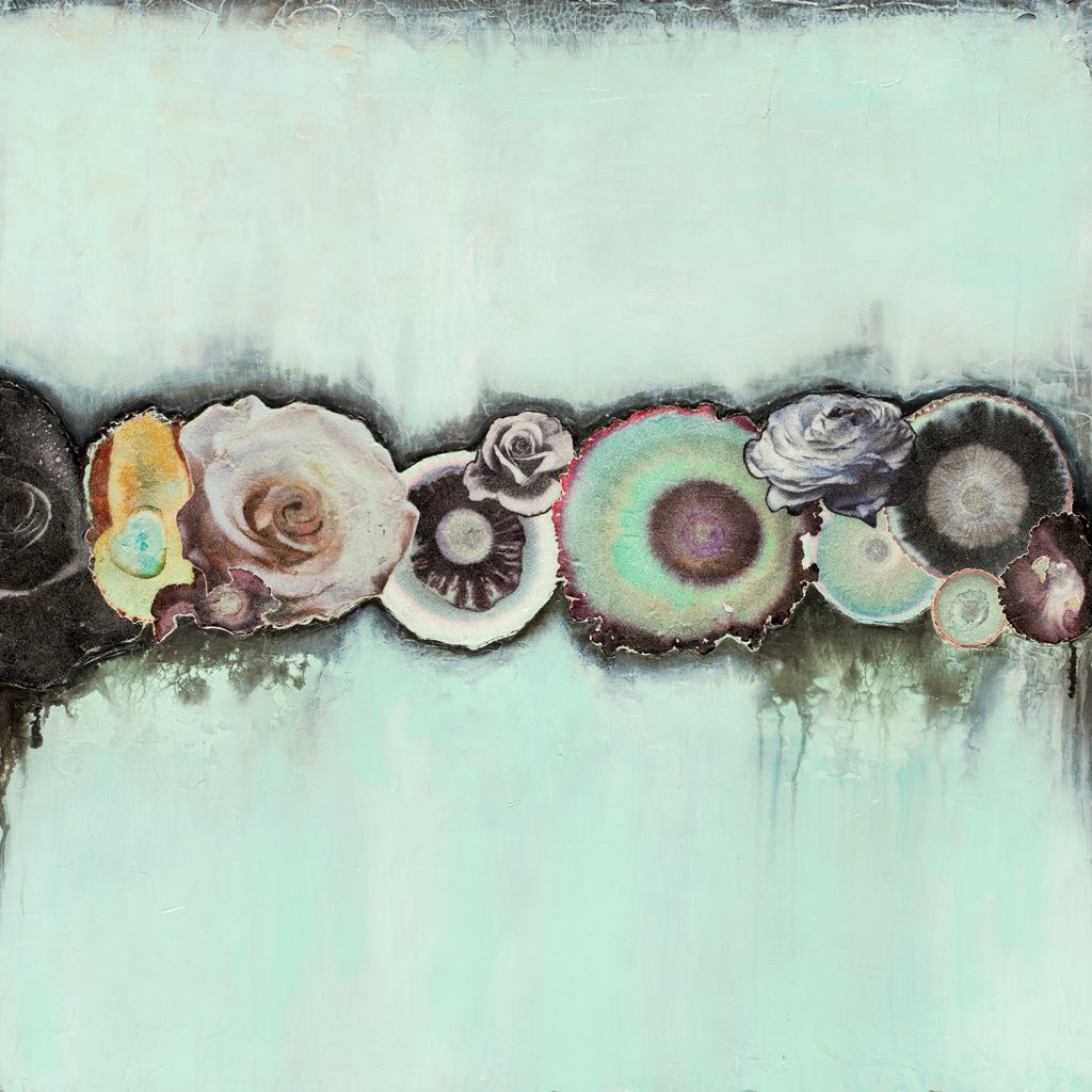
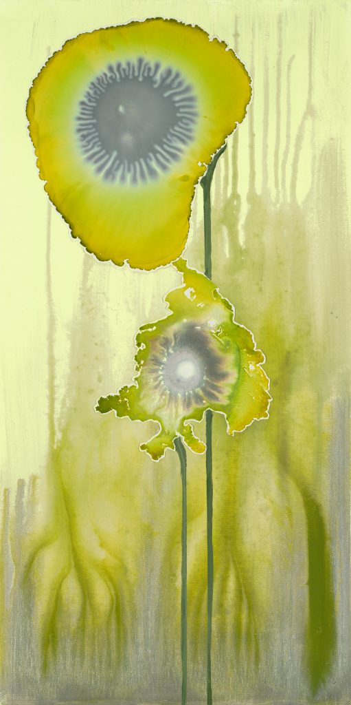
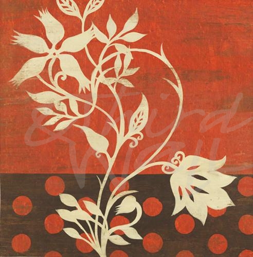
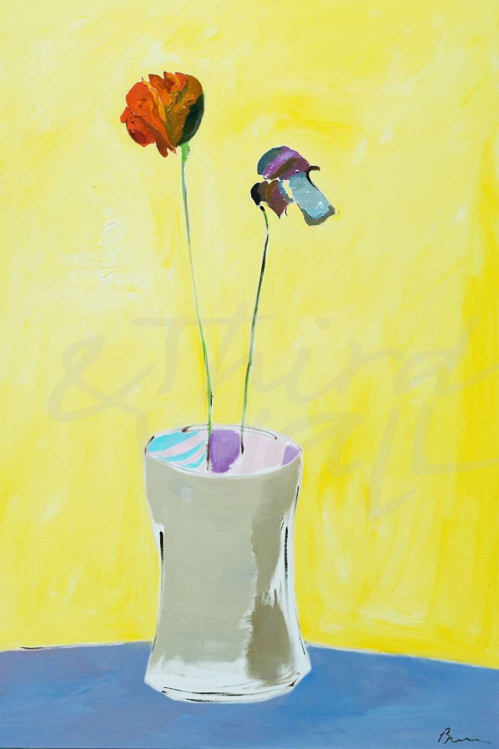
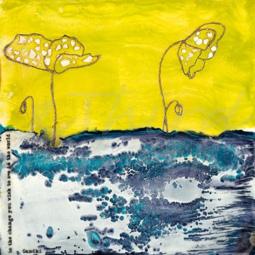
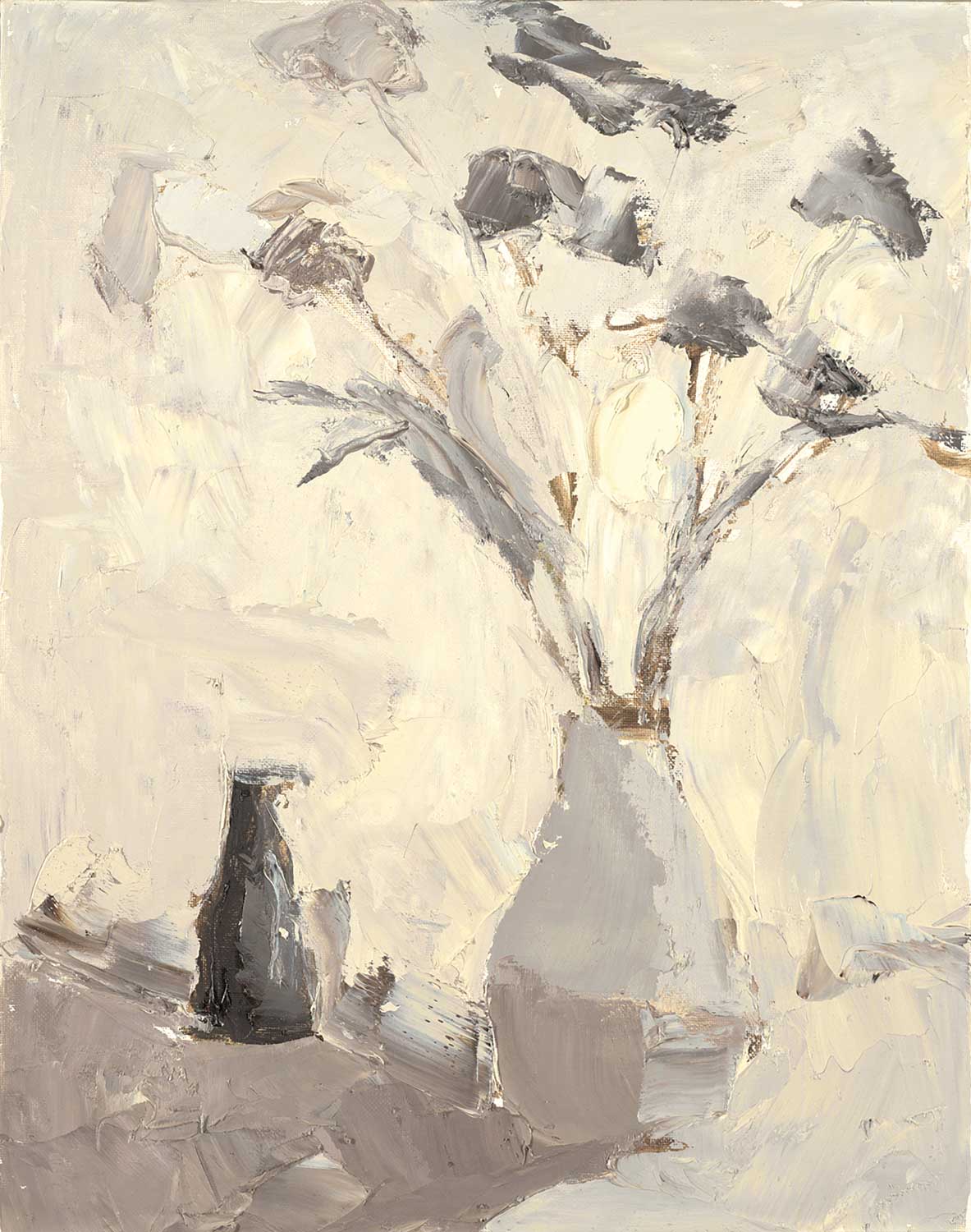
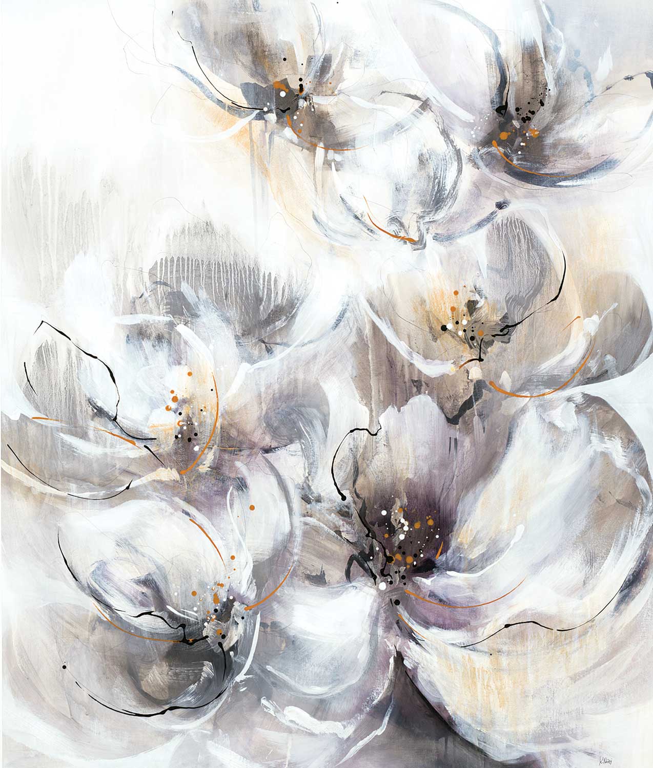
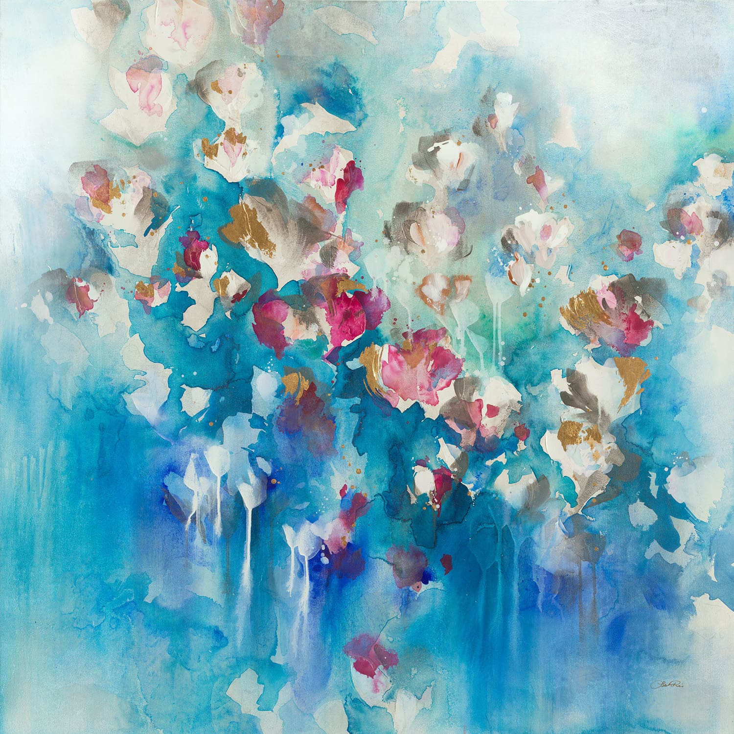
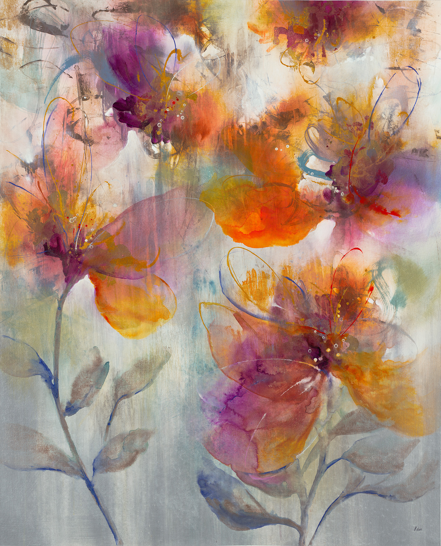
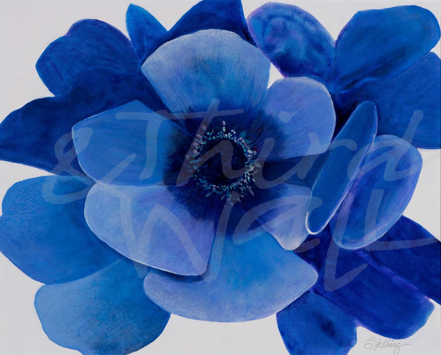
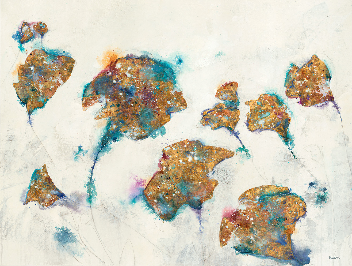
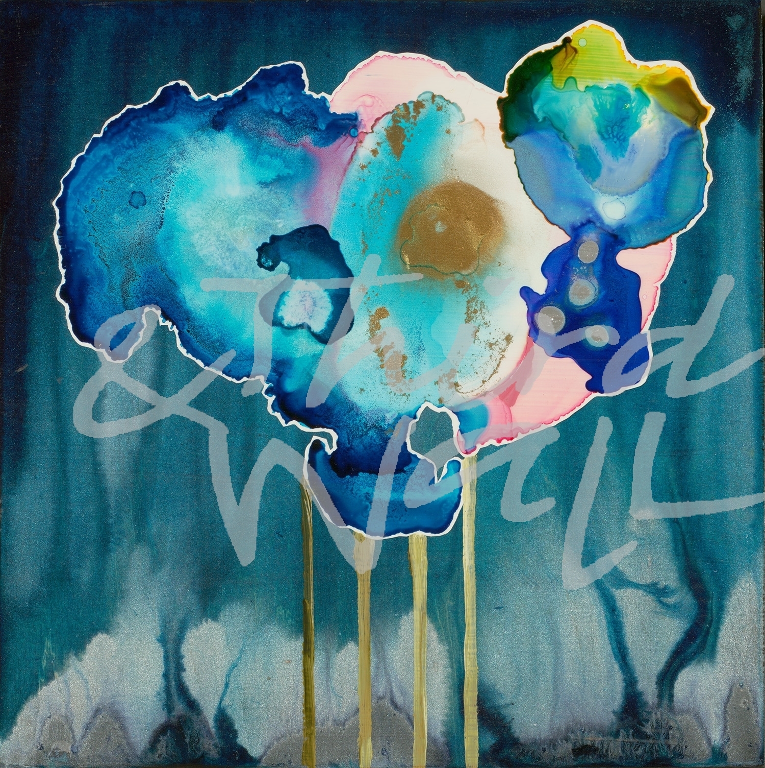
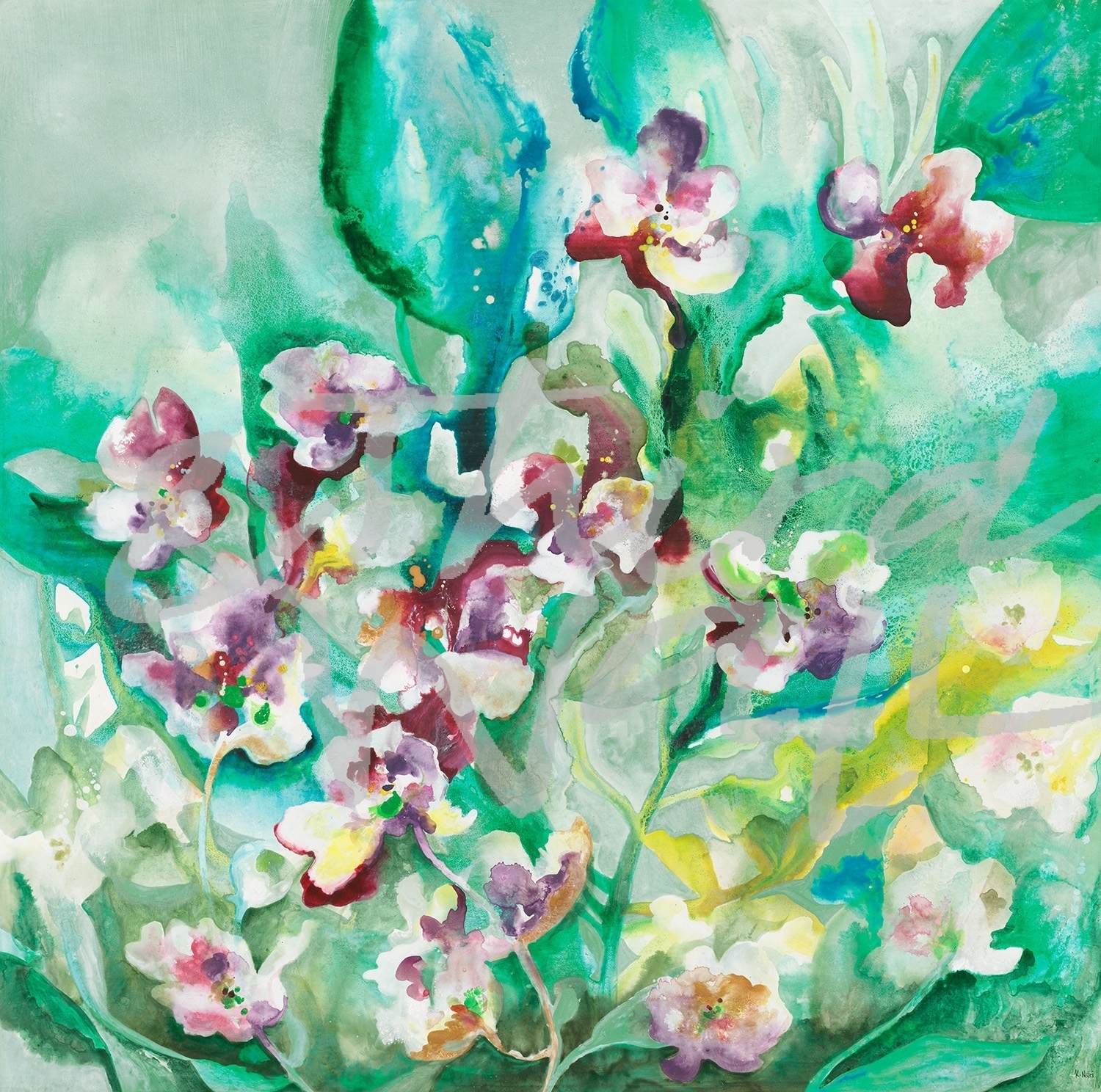
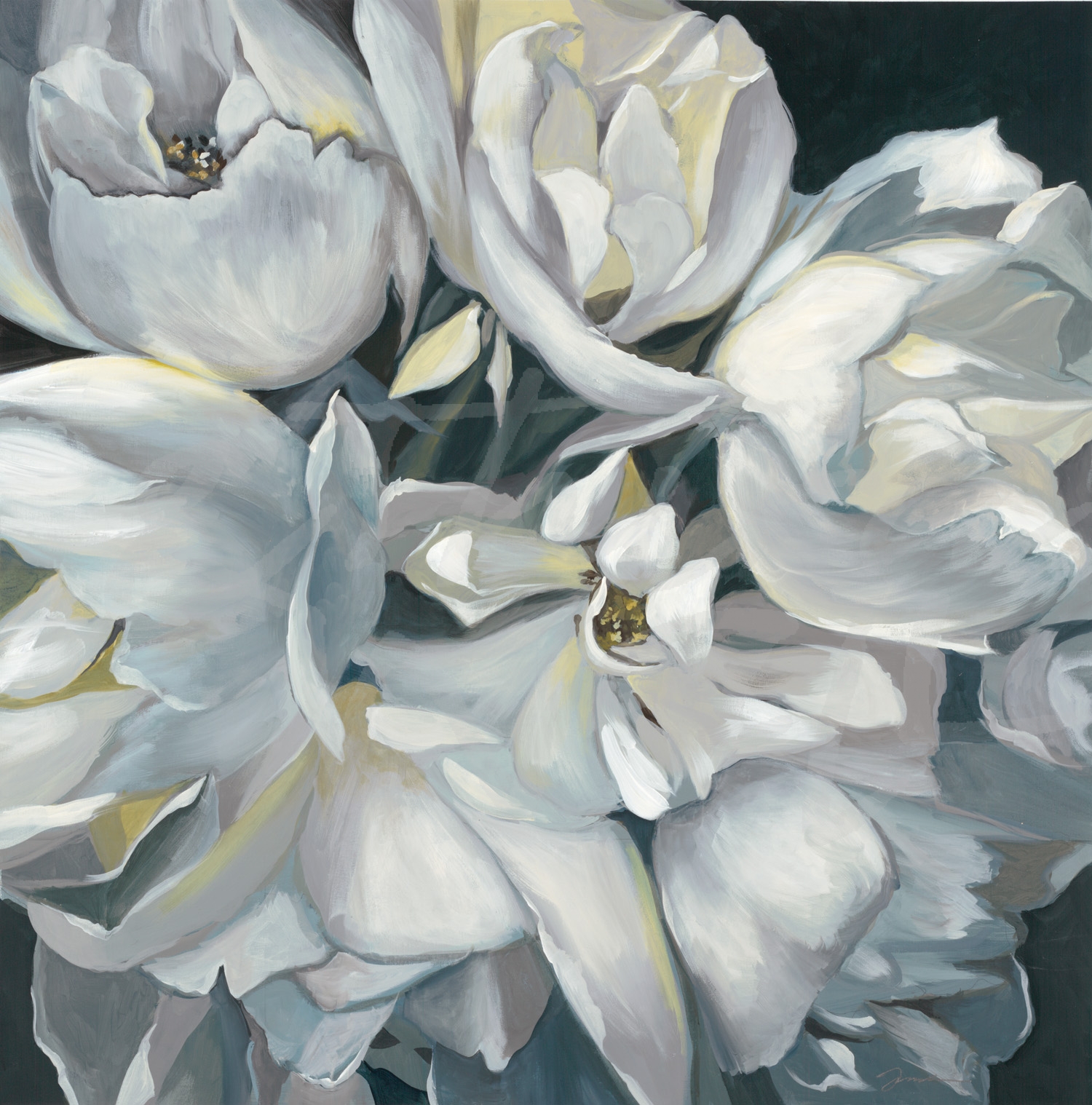
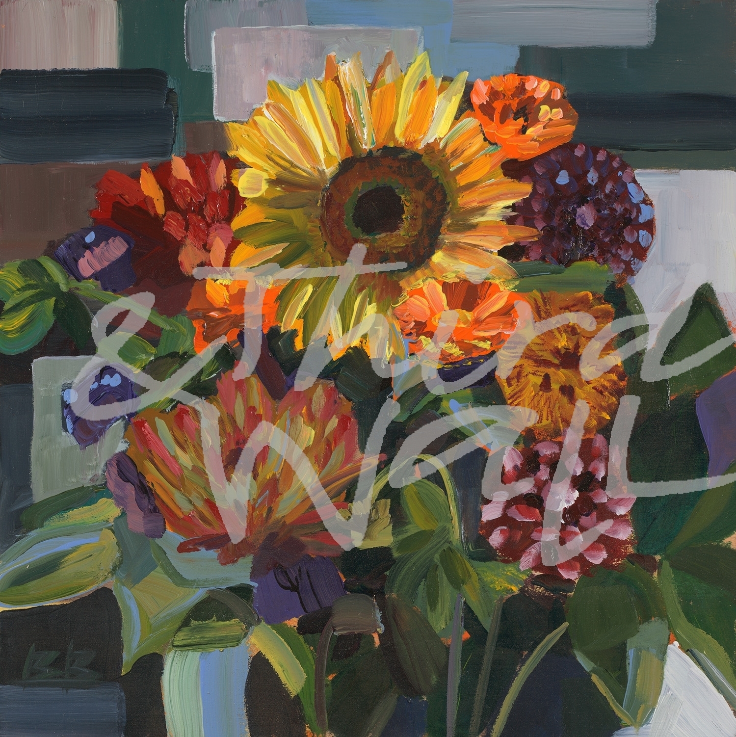
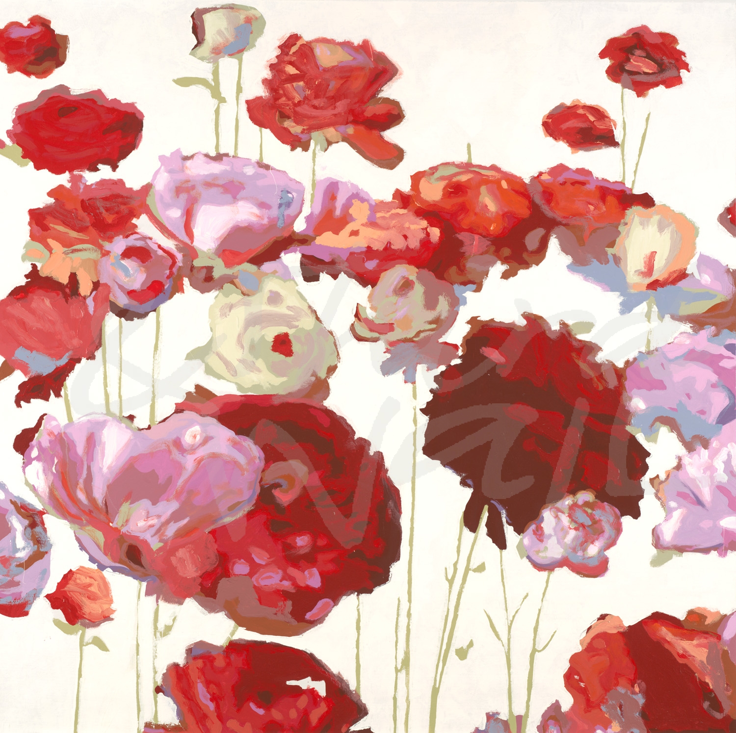
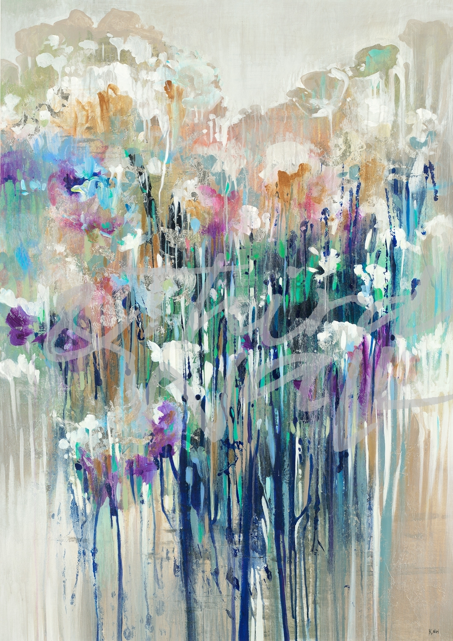
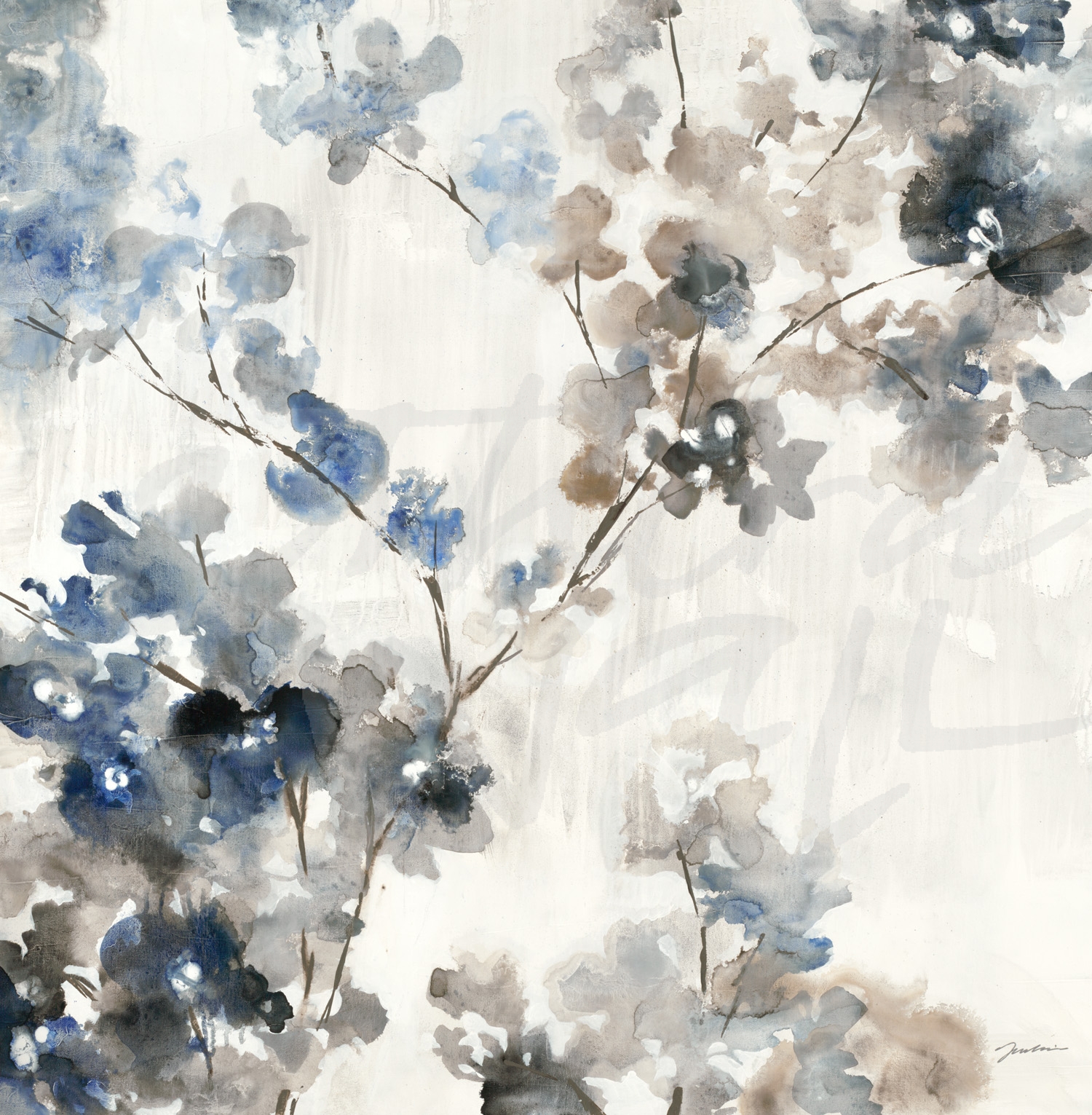
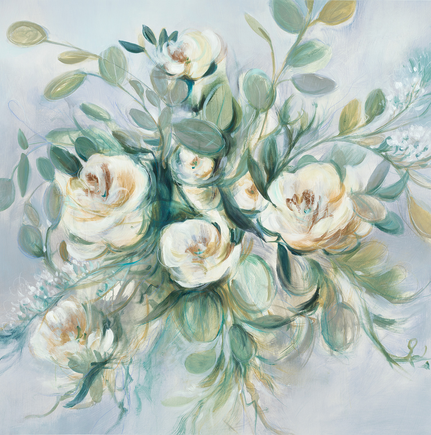
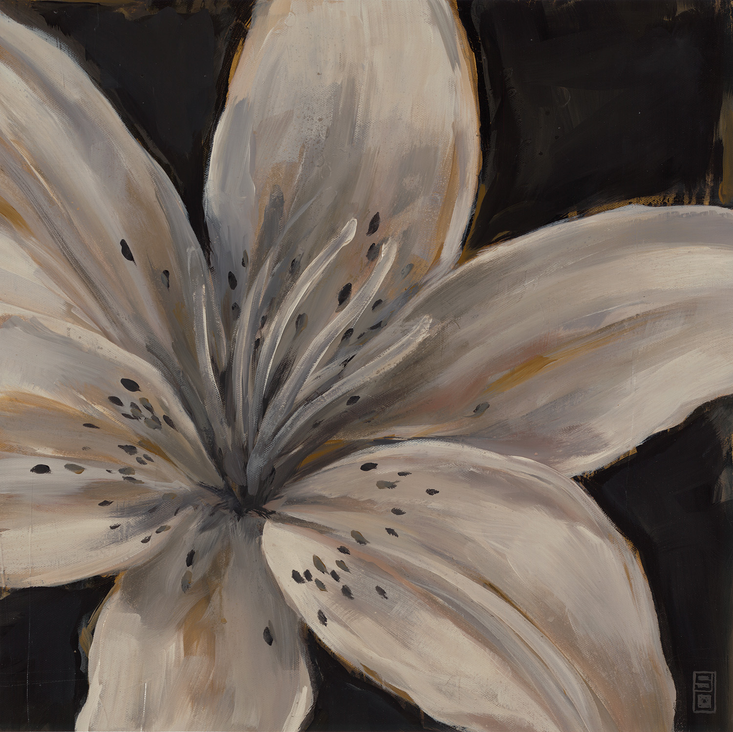
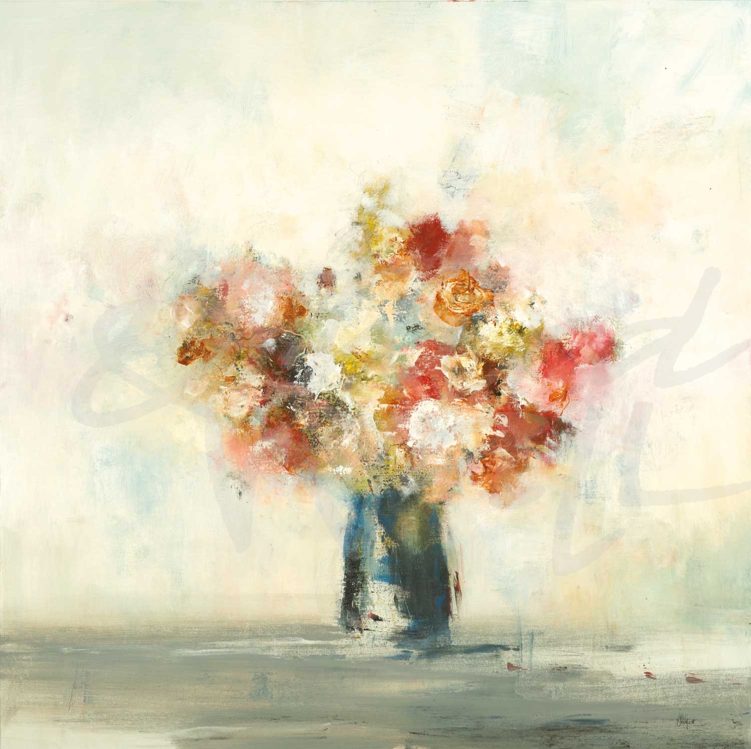
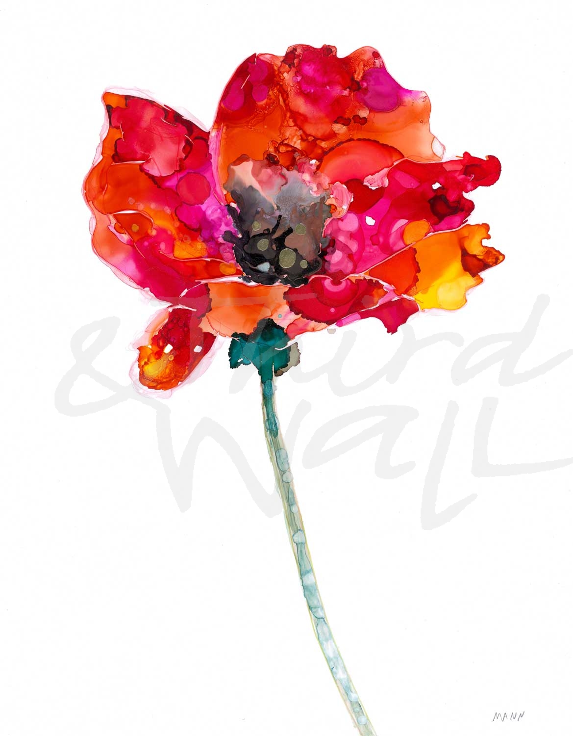
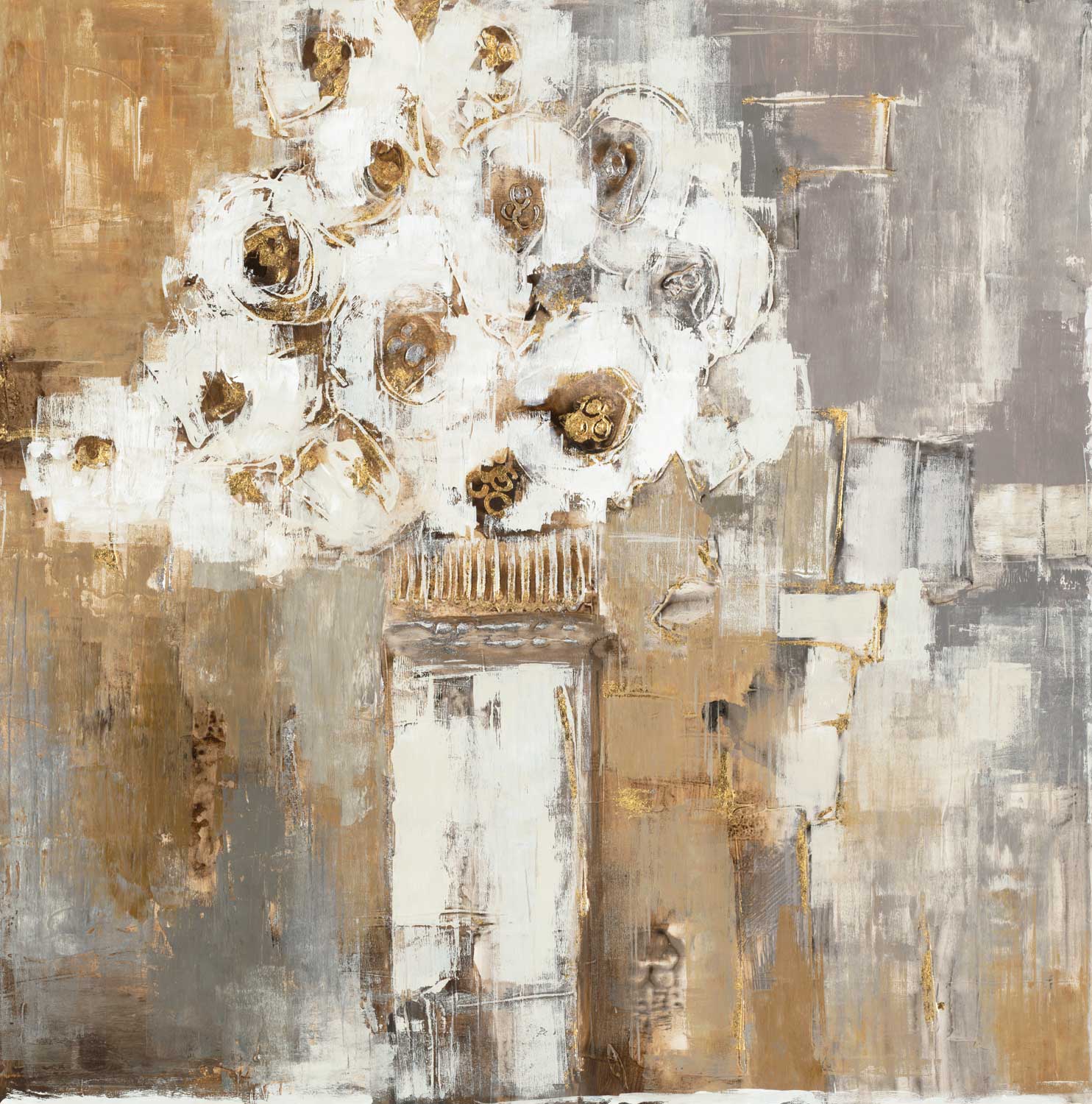
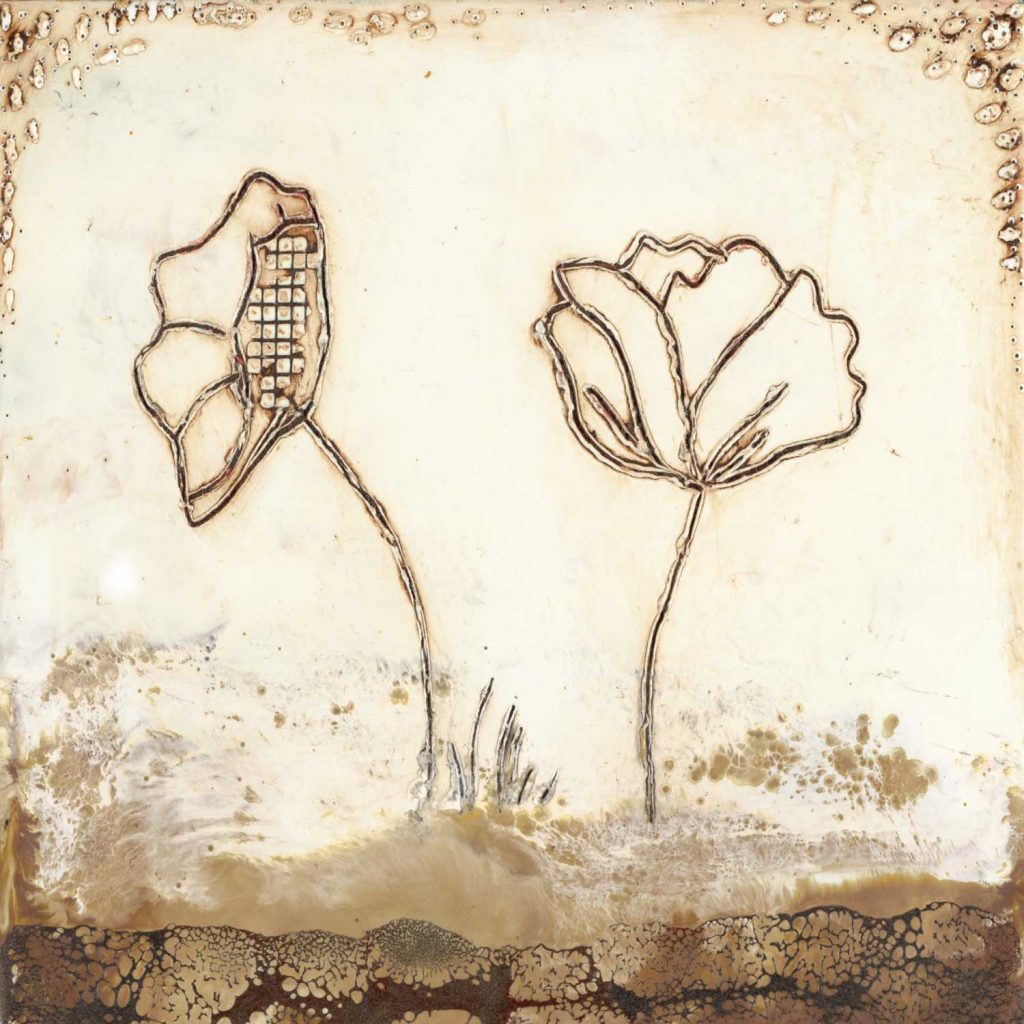
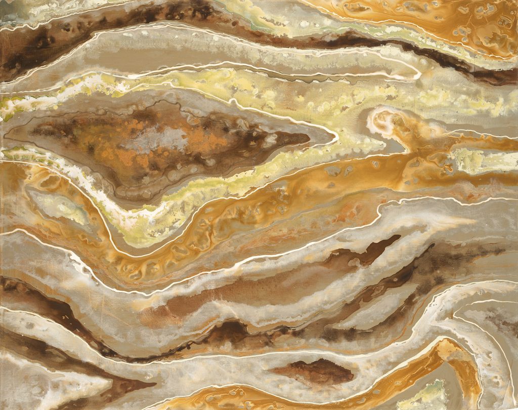
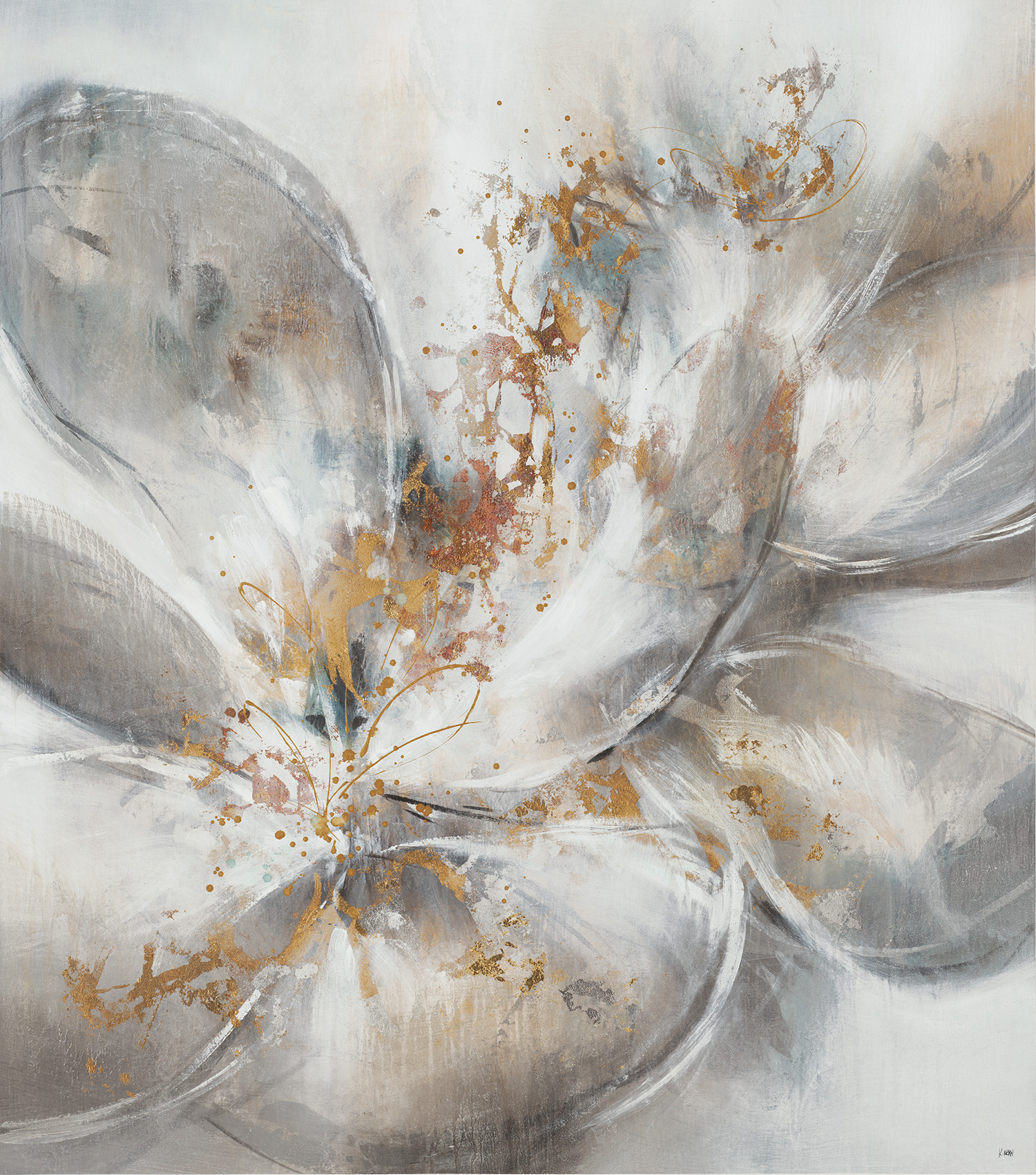
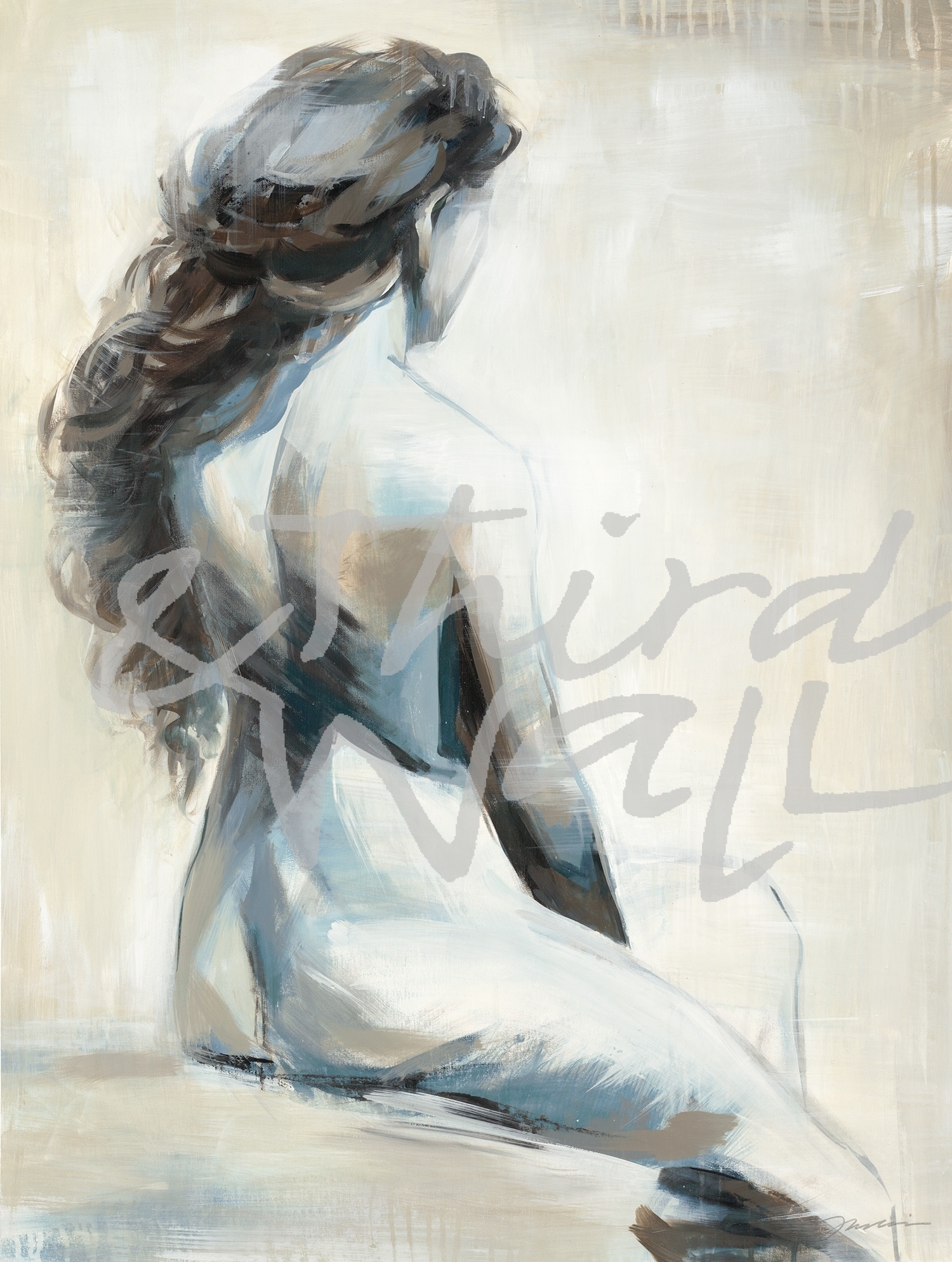
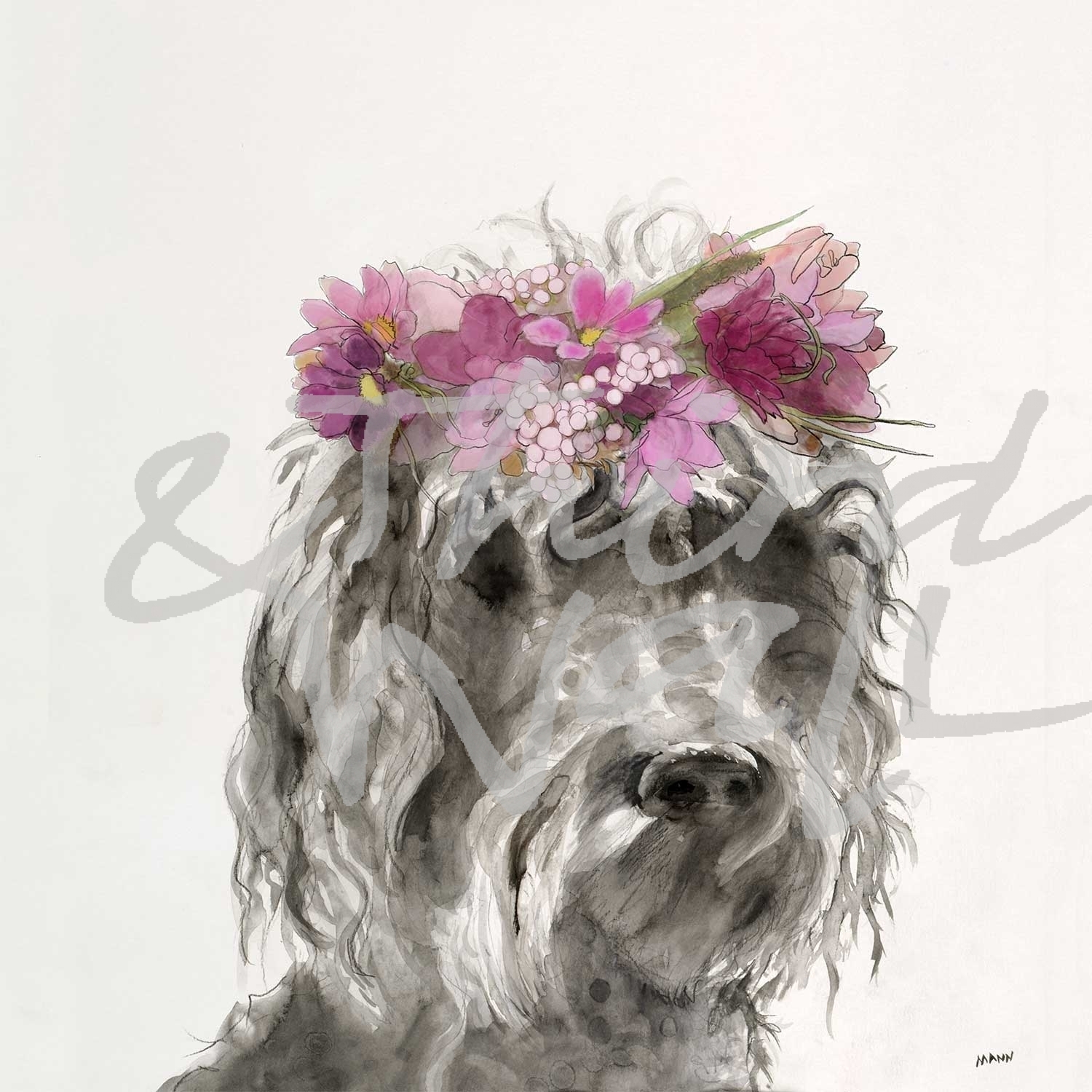
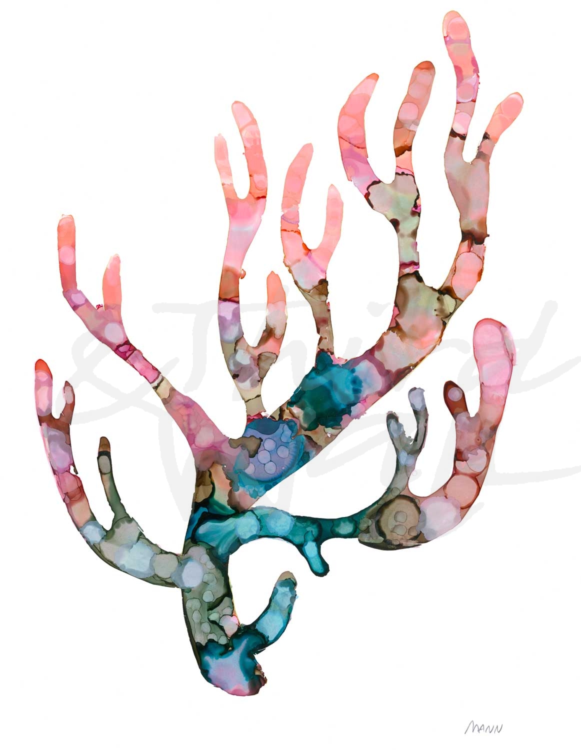
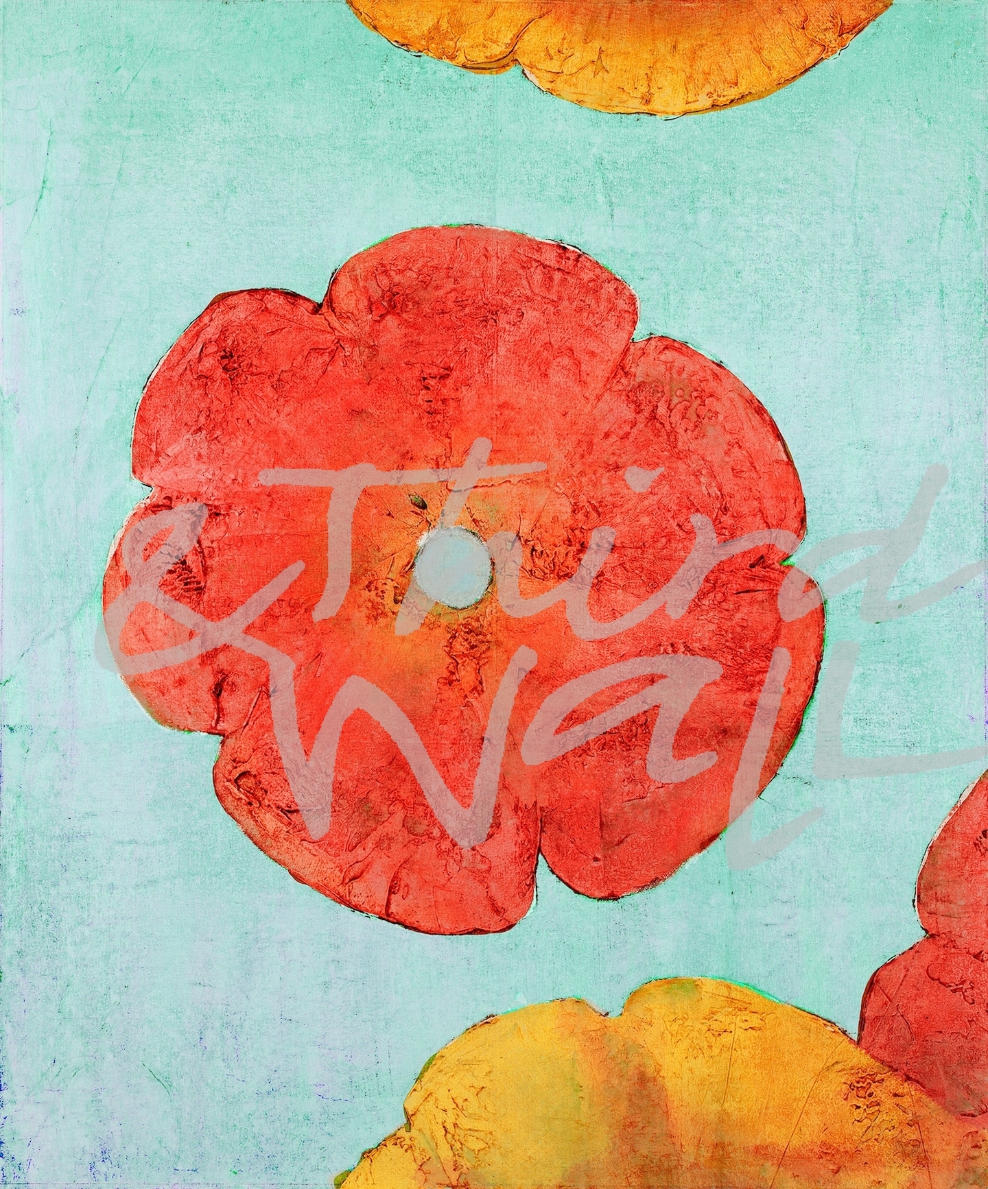
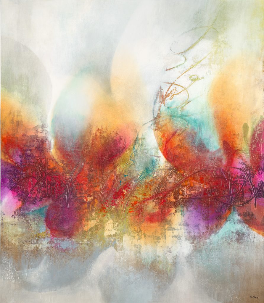
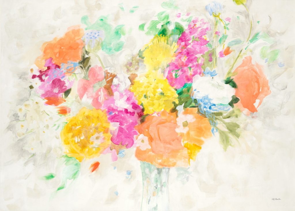
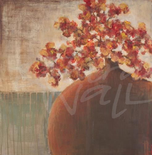
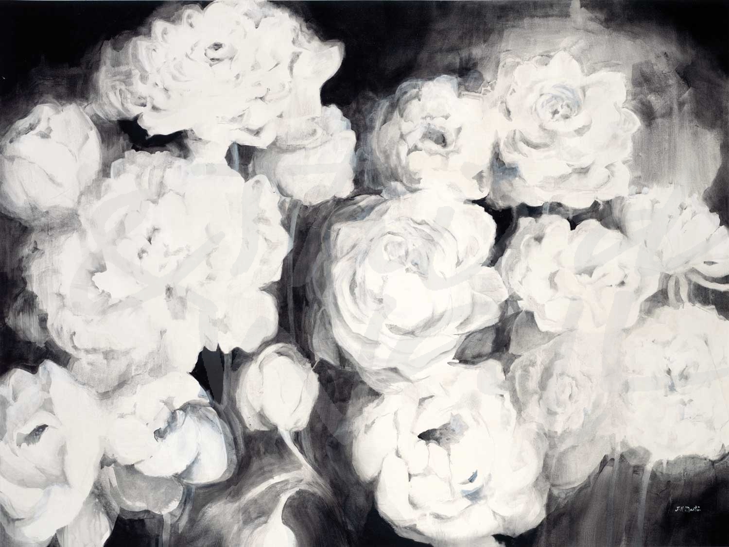
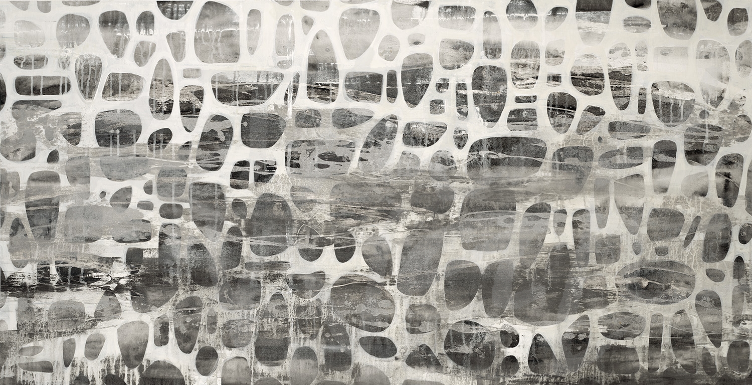
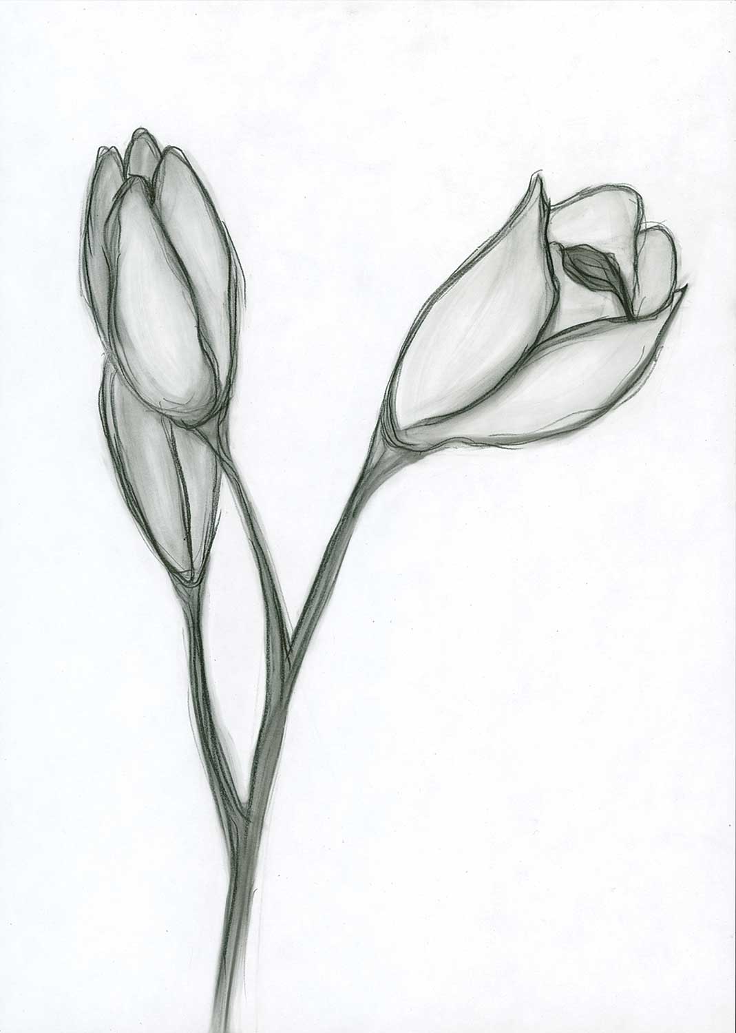
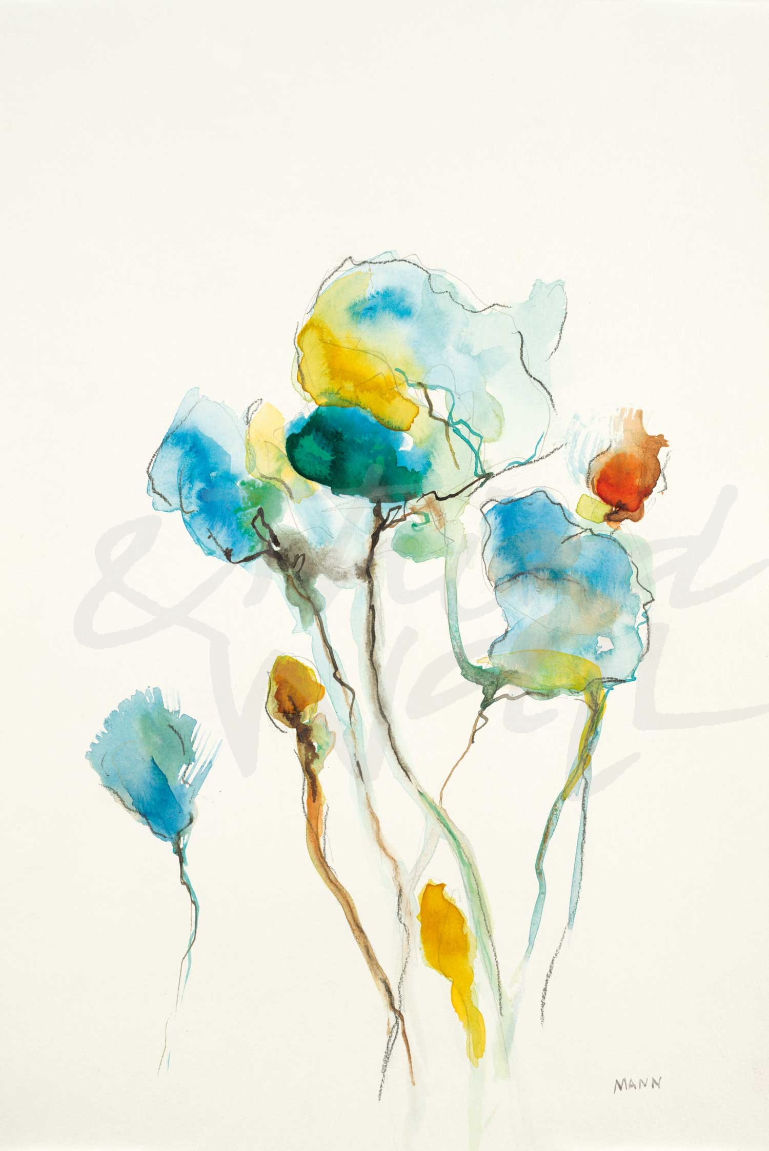
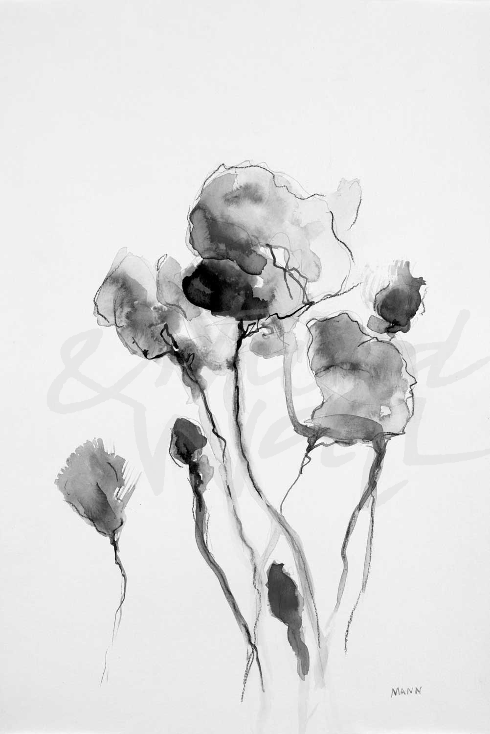
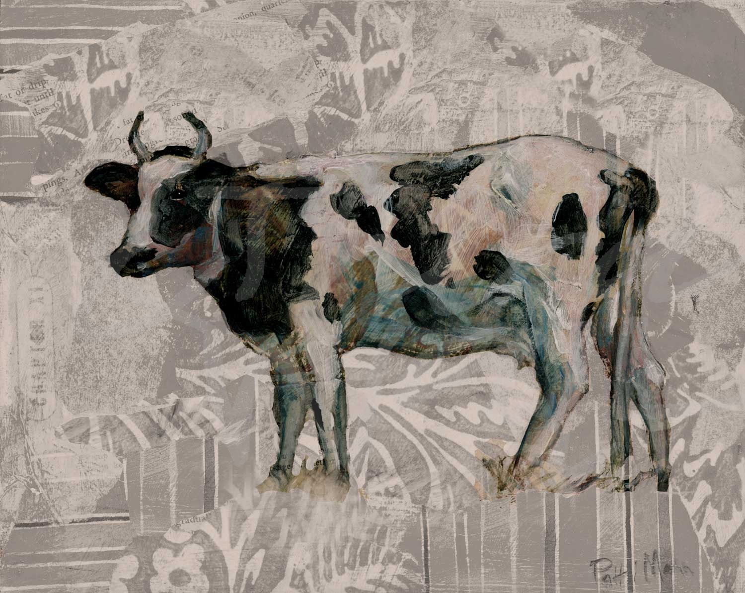
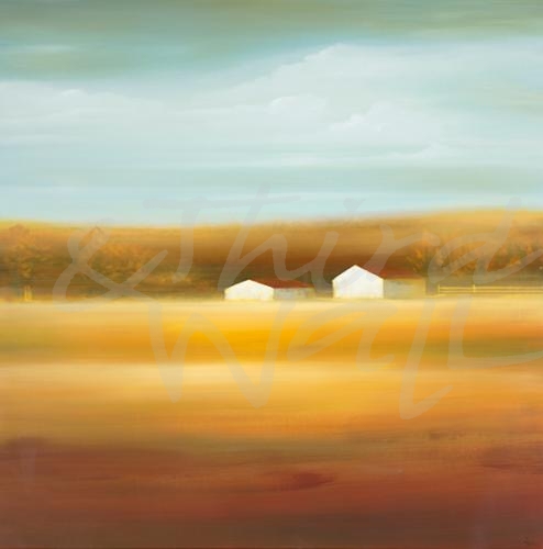
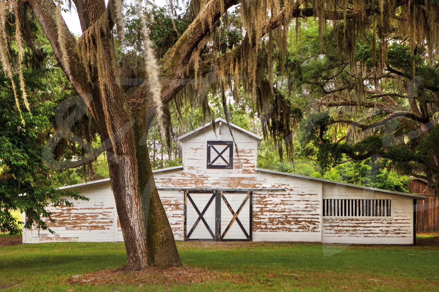
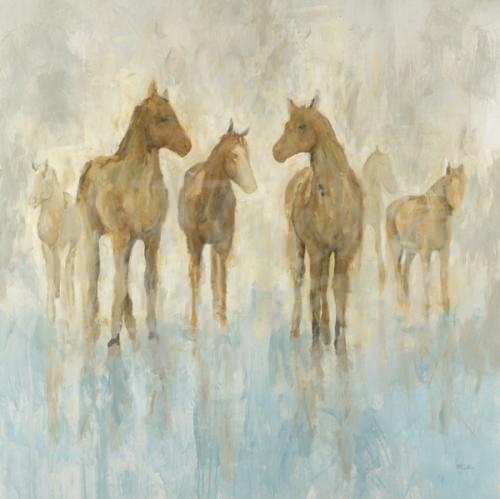
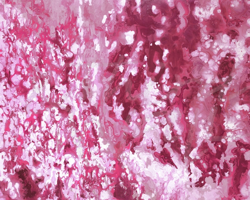
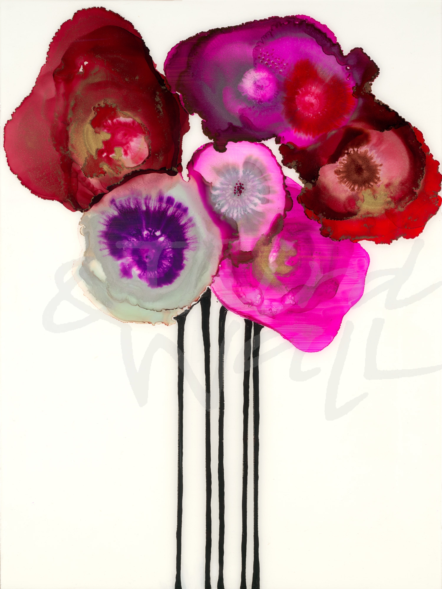
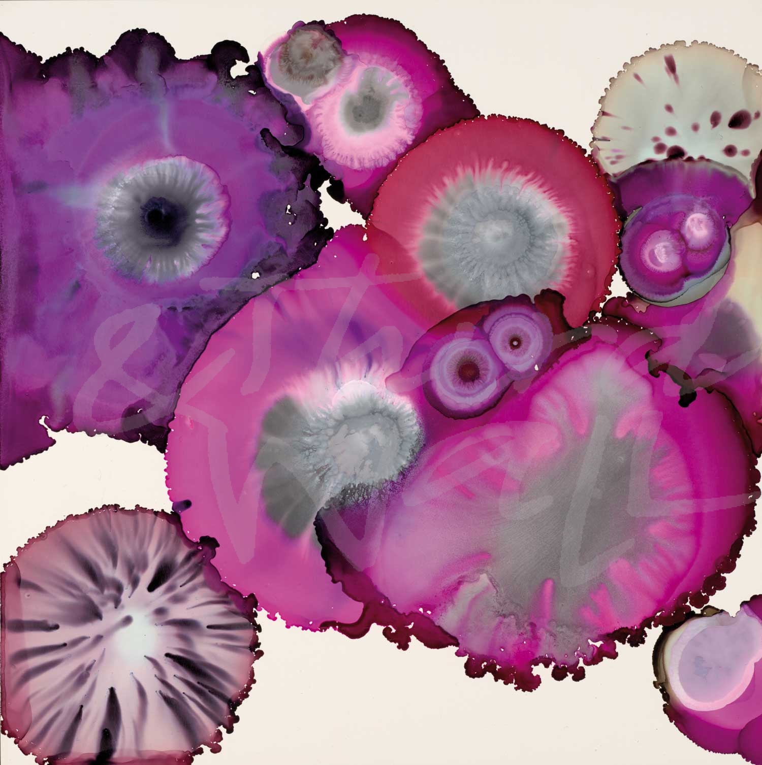
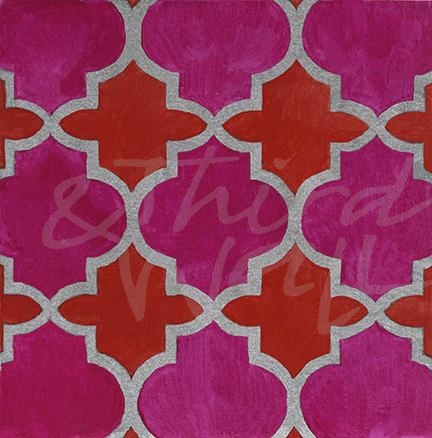
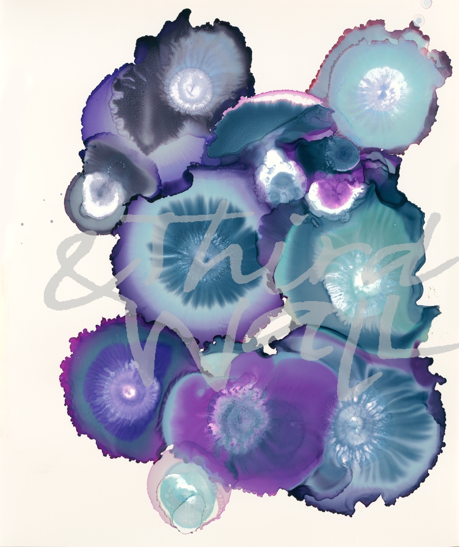
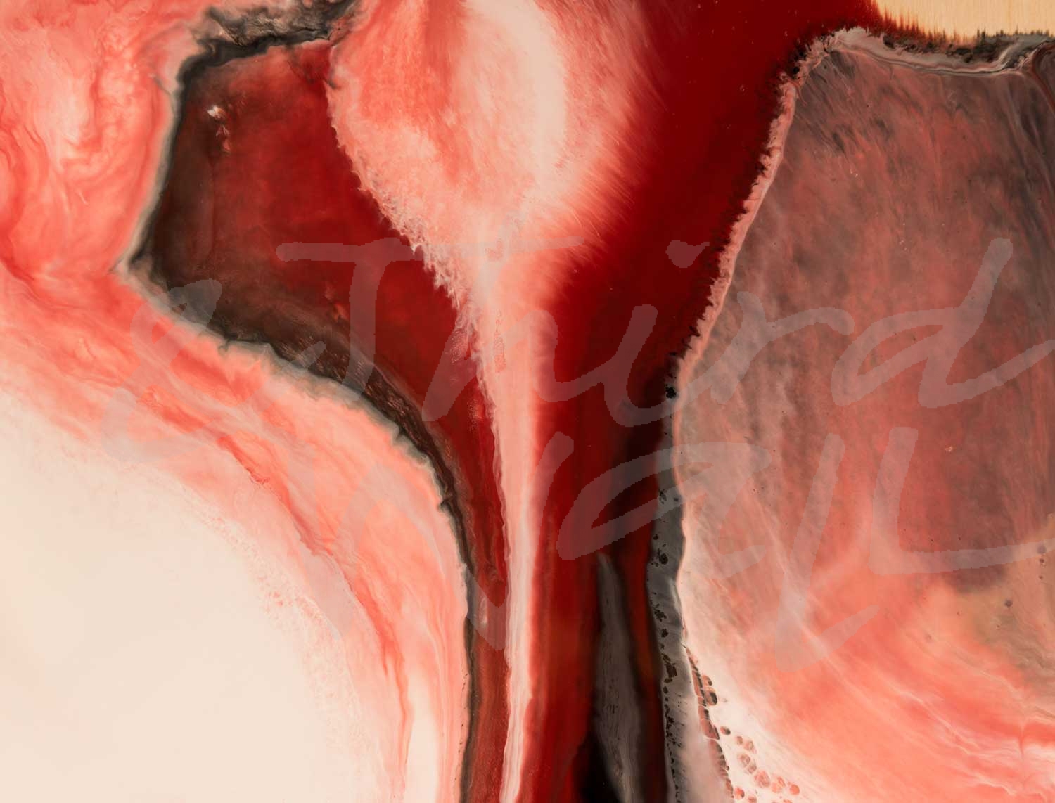
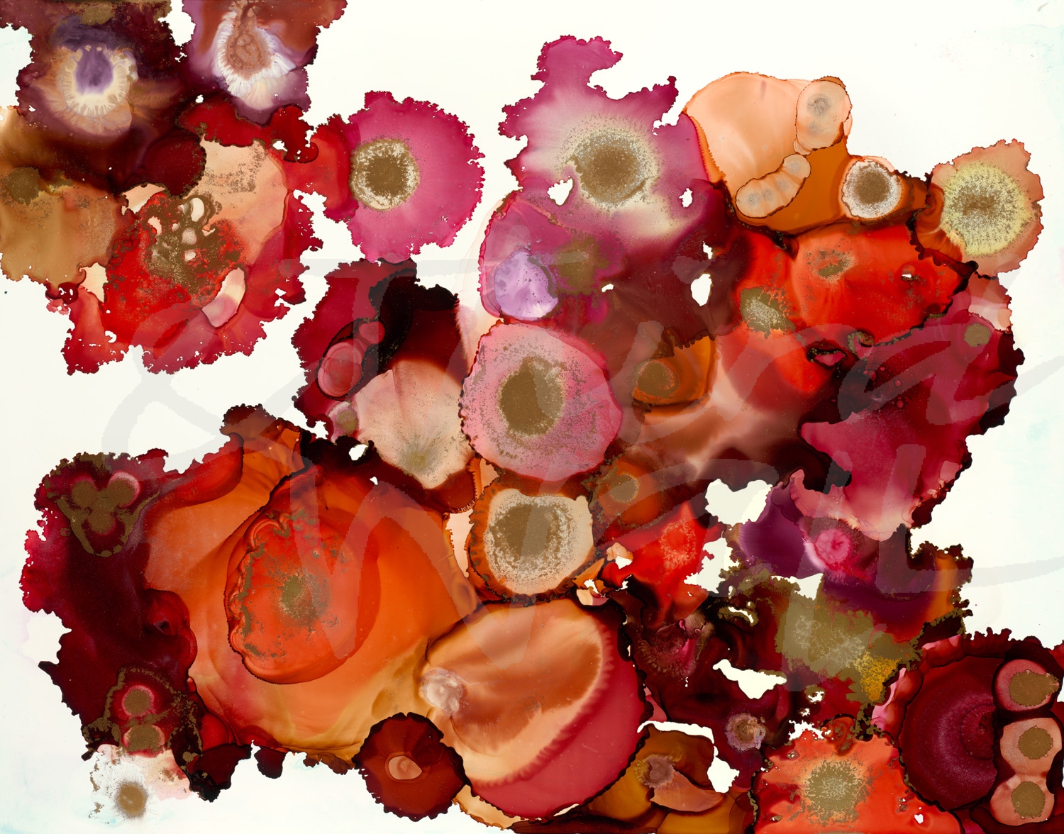
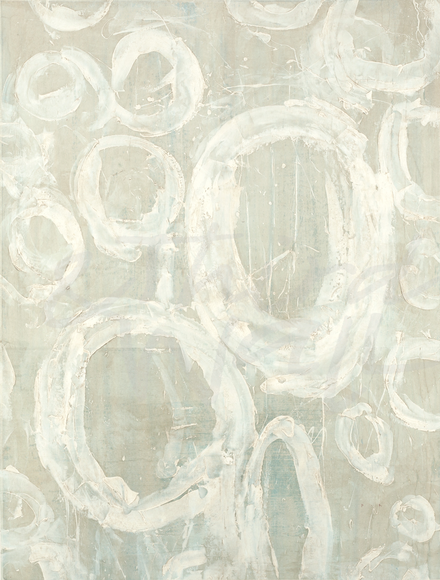
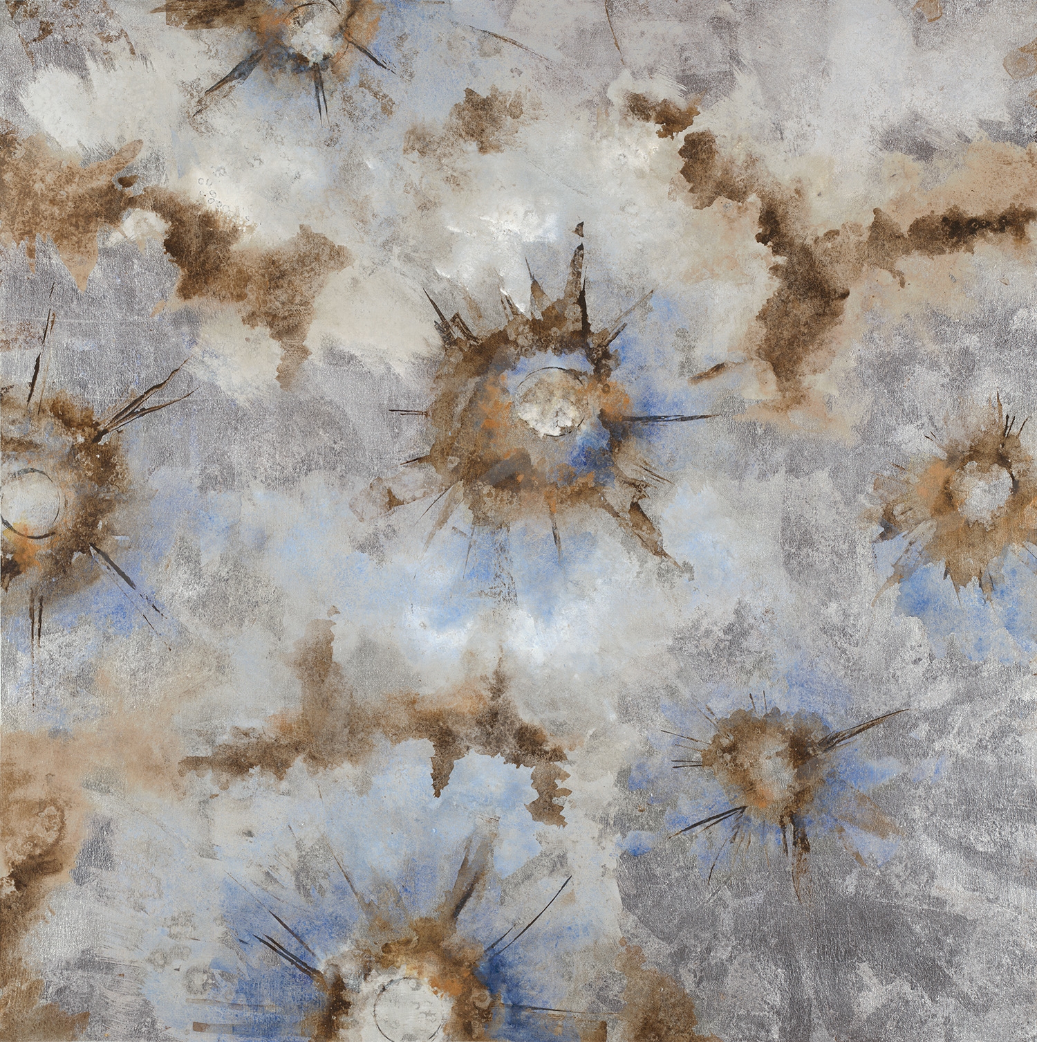
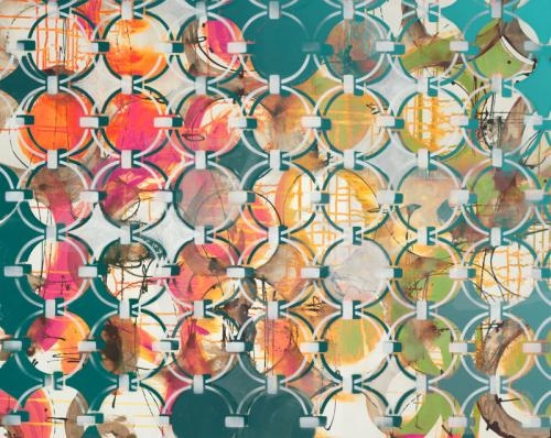
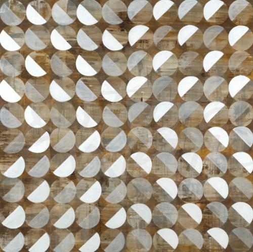
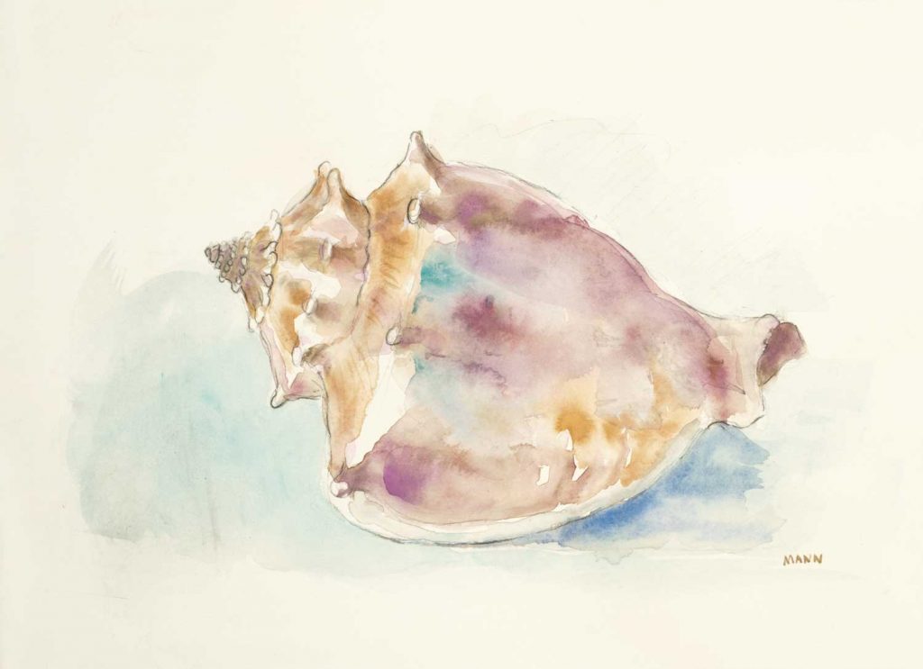
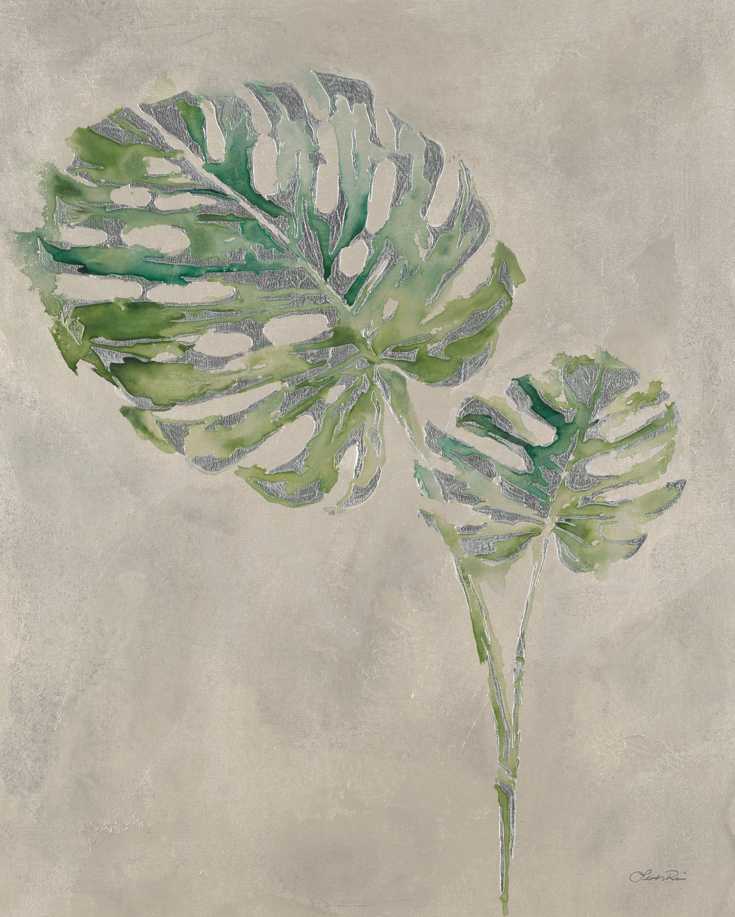
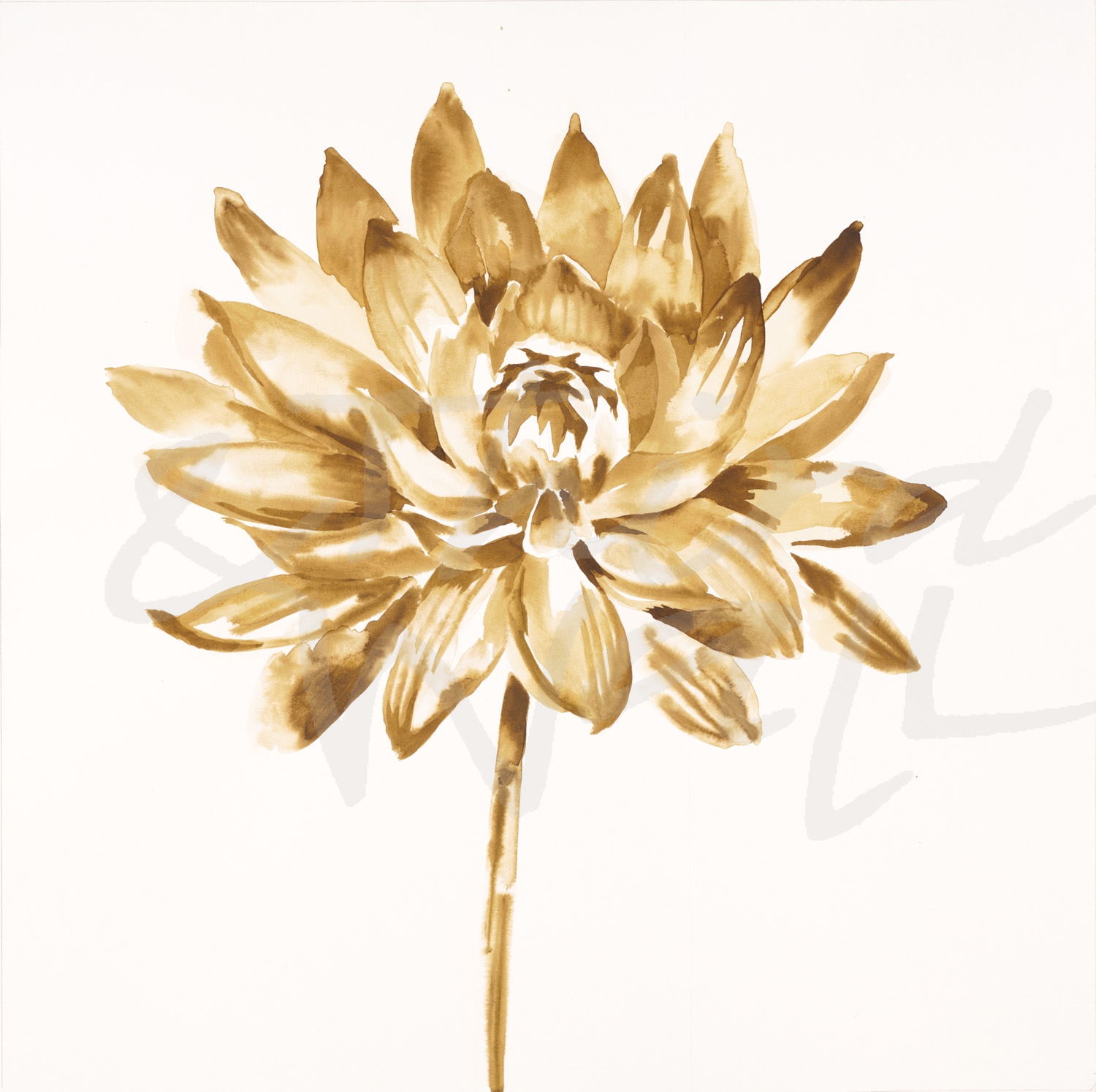
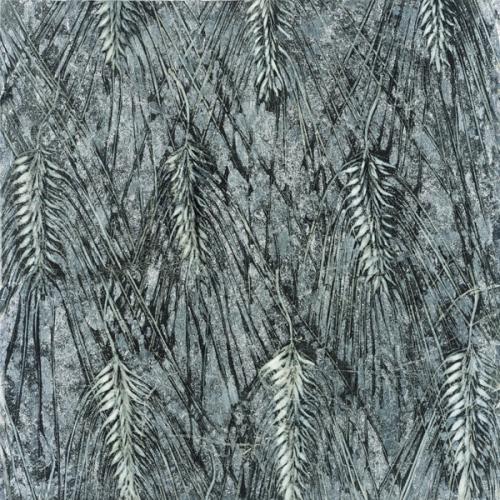
The images featured above are available in our Print-On-Demand collection. Some areas of our website are password-protected. If you are a member of the trade but don’t have full access to our website, www.thirdandwall.com, please contact us at customerservice@thirdandwall.com.


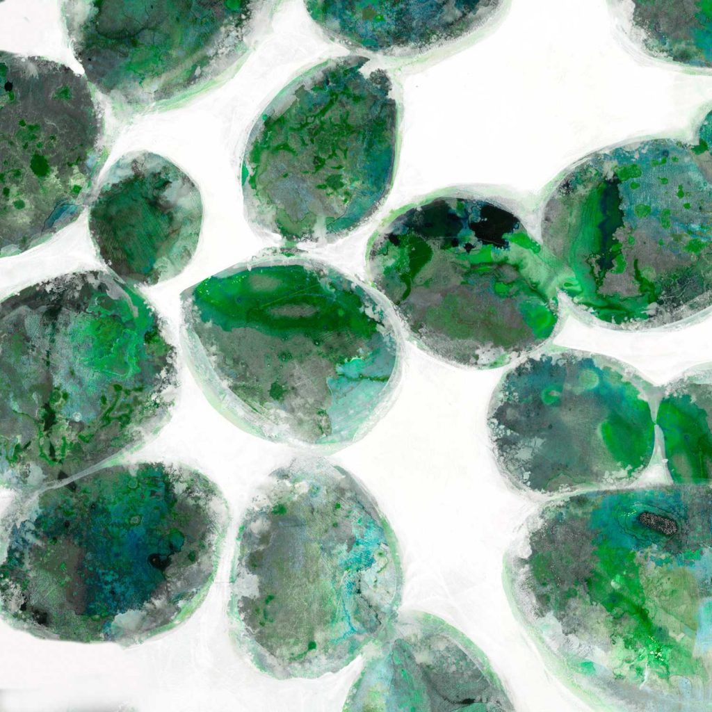


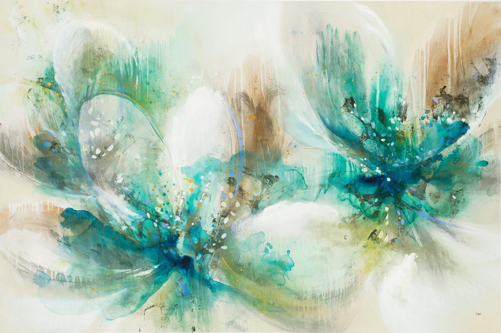


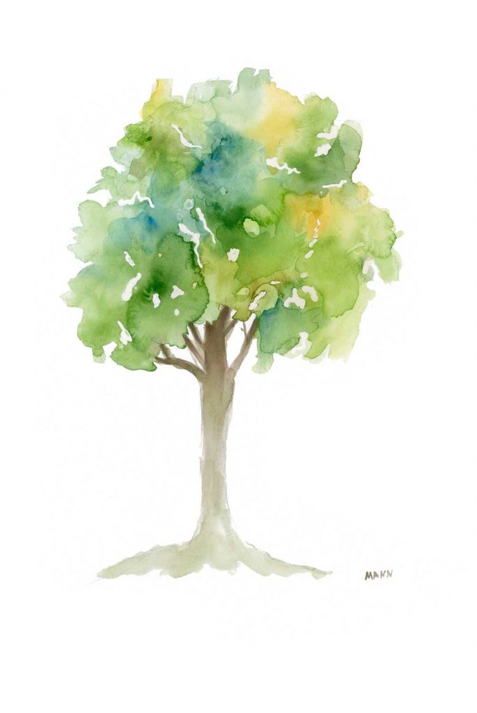


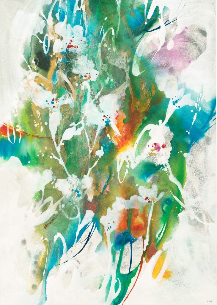


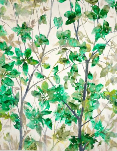


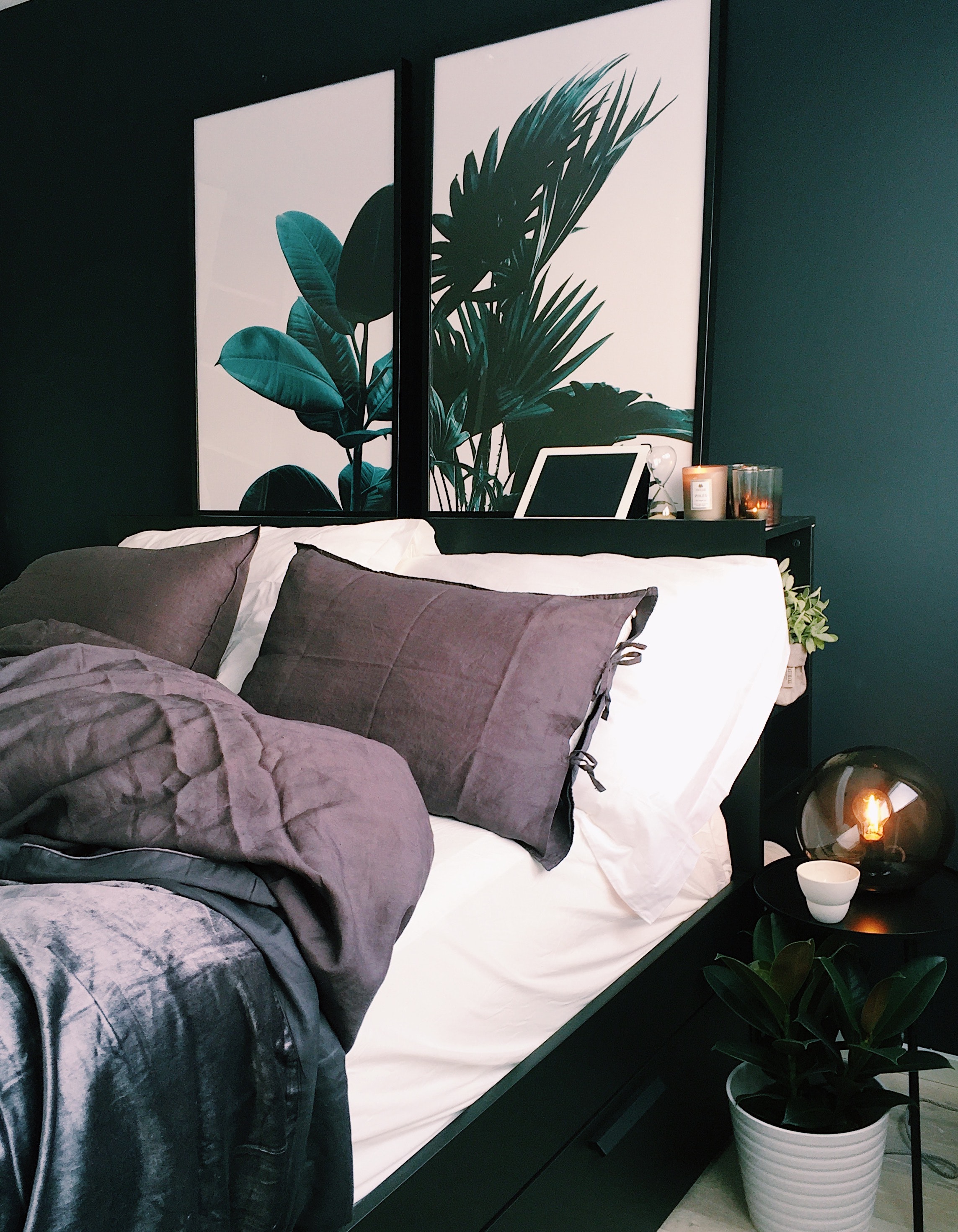


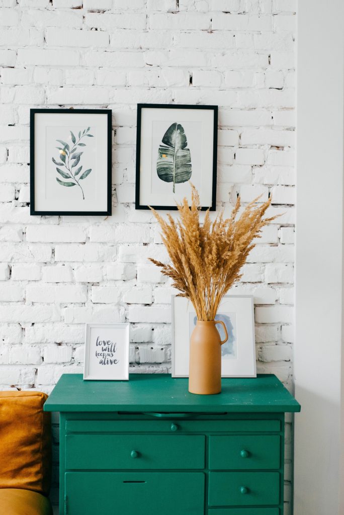
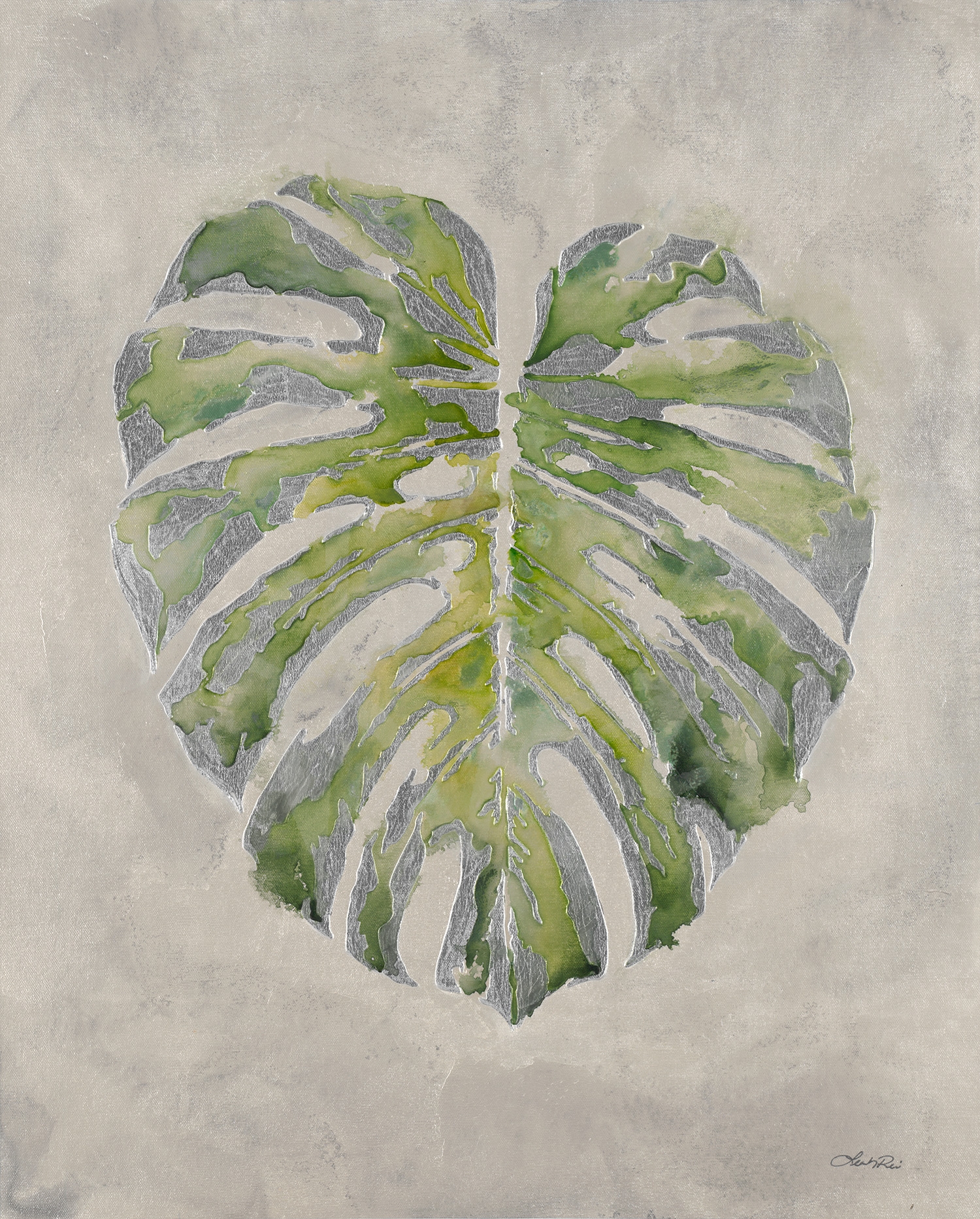


 St. Patrick’s Day is upon us. Everyone from schoolchildren to our coworkers will be wearing green on the 17th in order to avoid the dreaded pinch. If your wardrobe is short on green we can’t save you from a pinching incident, but we do have plenty of green for your walls to wear!