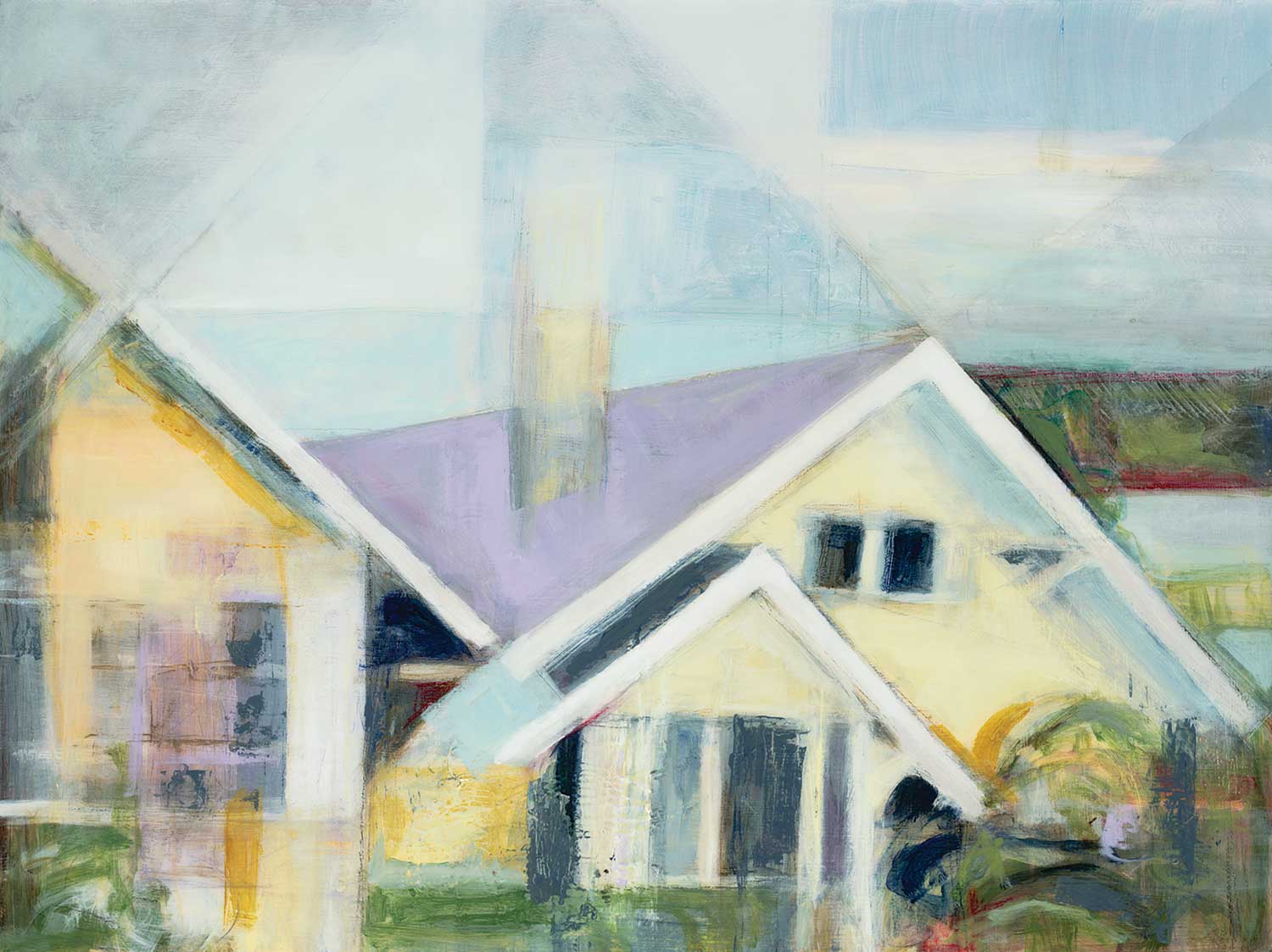
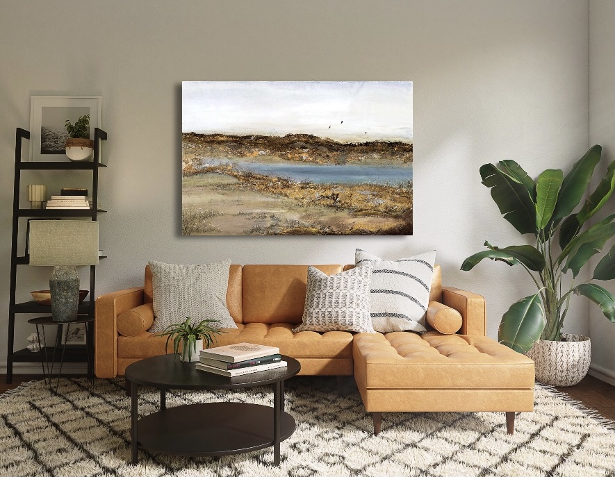
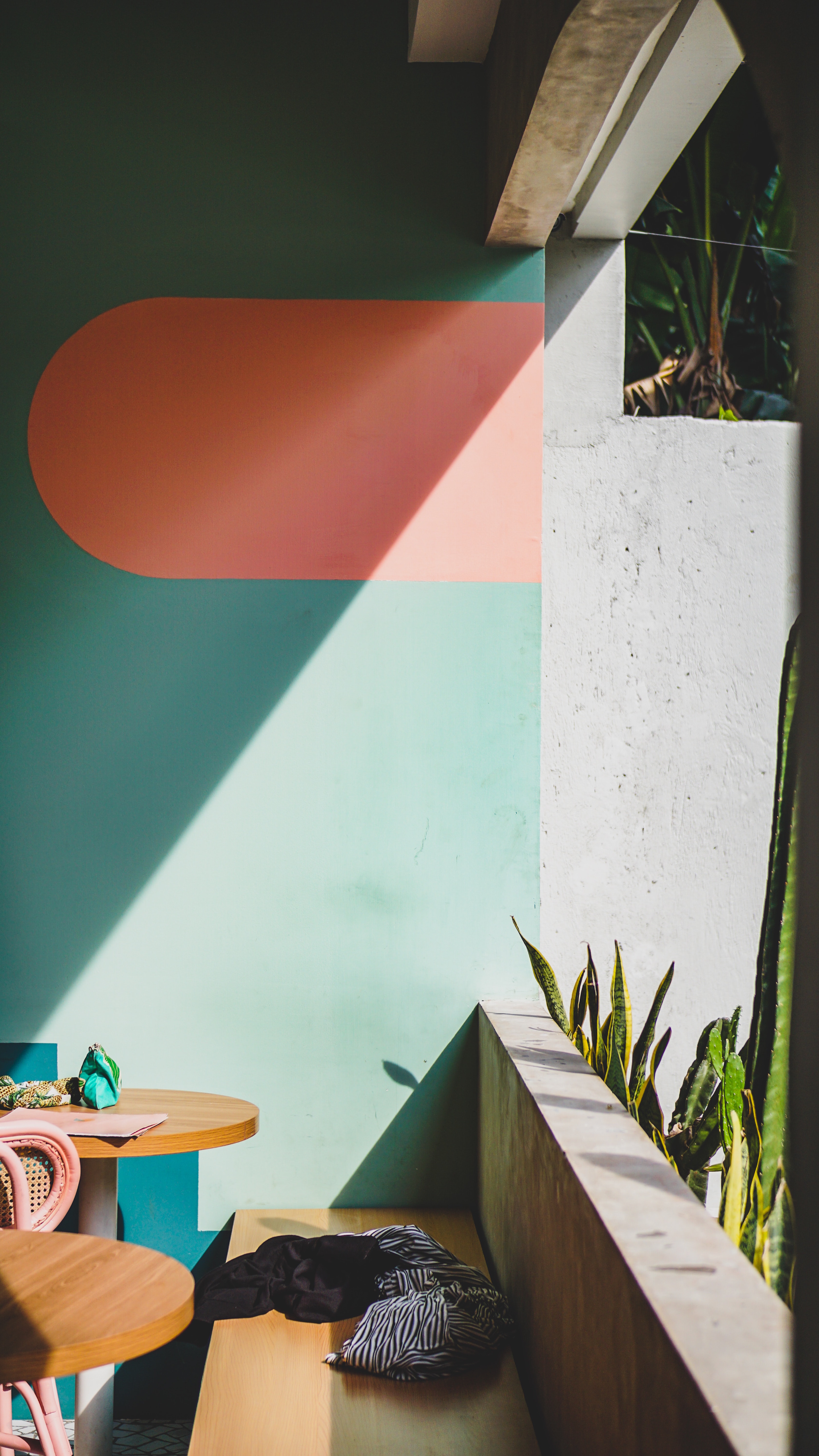
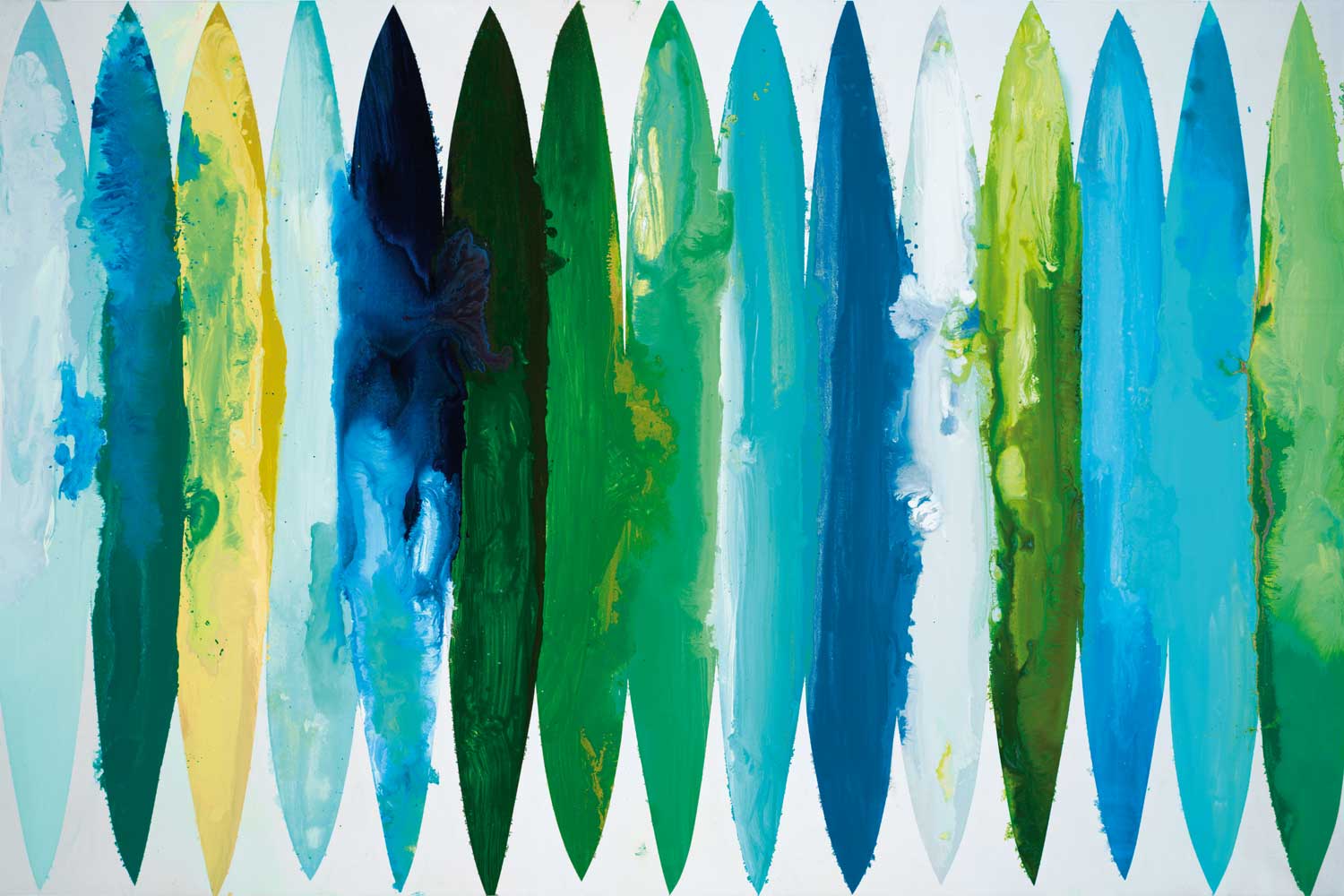
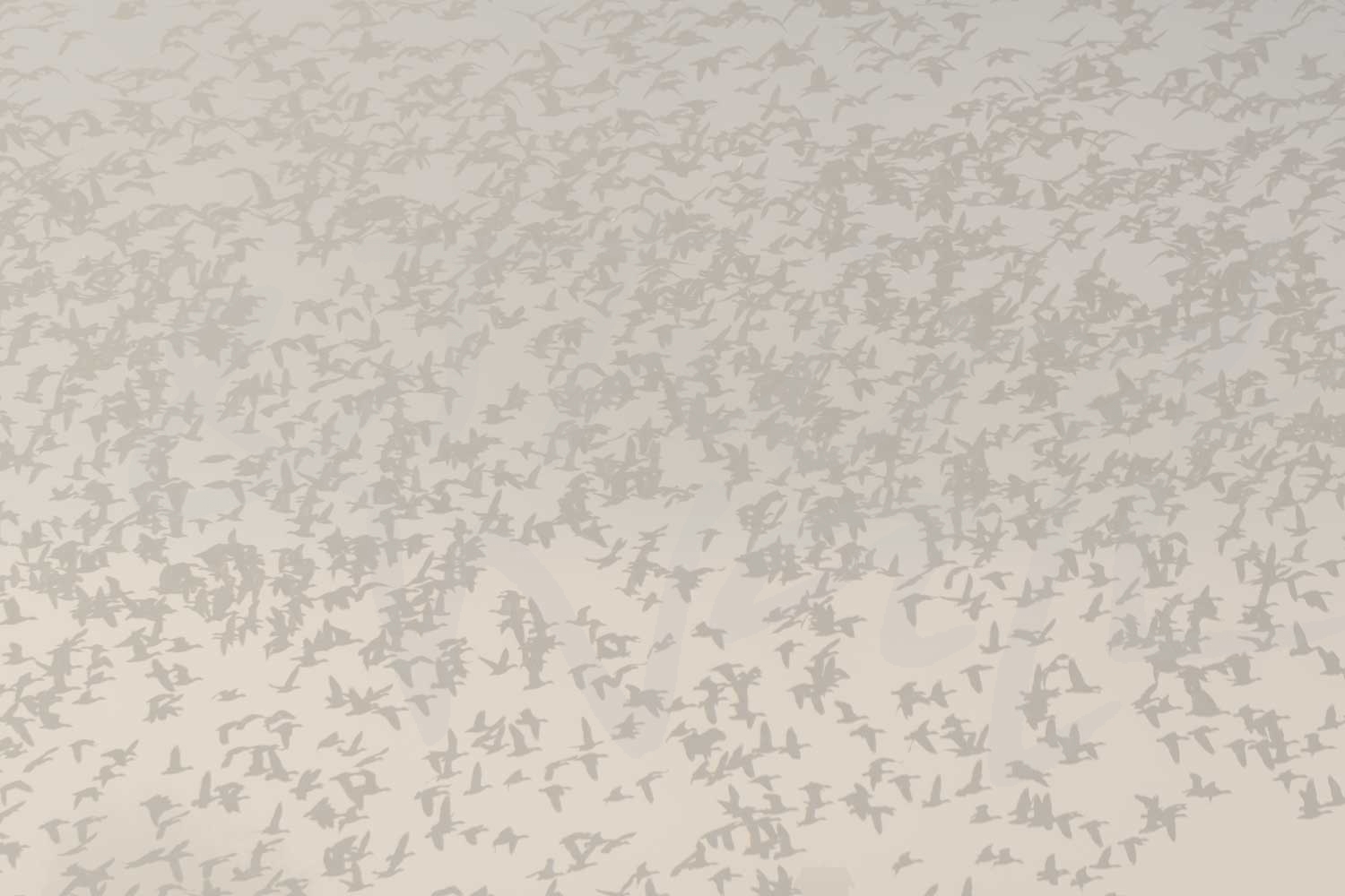
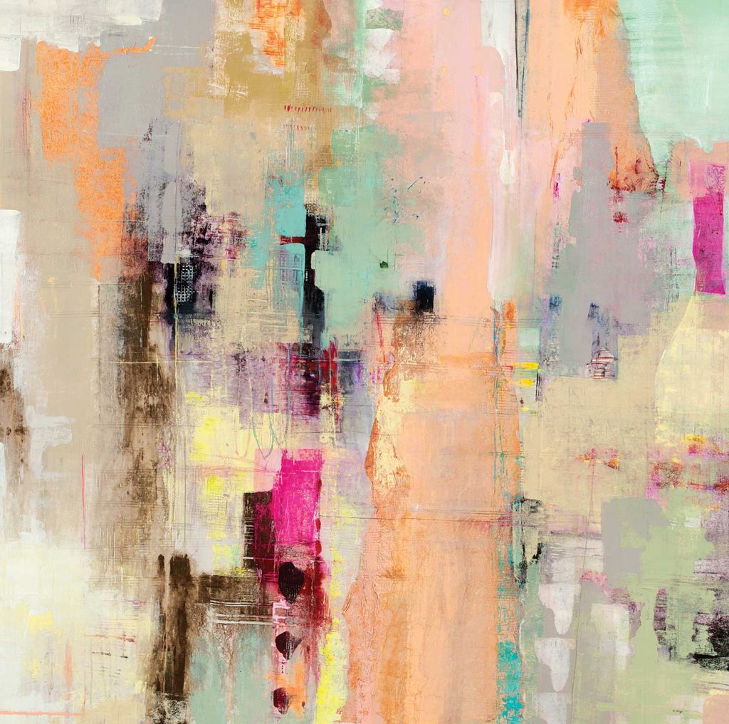
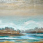
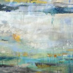
We could all use spaces that bring some calm and comforting energy, and decorating with tranquil pastel tones is an easy way to keep your interiors feeling effortlessly serene! Forecasted color trends and multiple paint companies’ ‘Color of the Year’ announcements for 2021 also reflect the growing popularity of this soothing color scheme. The predicted palettes for this year are full of light and fresh pastels, cool blue hues, and muted earth tones. These soothing shades are perfect for any design style, whether you use them to paint your wall or add accent pieces in these soft and dreamy hues.
These calm and inviting colors are great for a rustic-inspired kitchen, a modern bathroom, and, especially, a relaxing bedroom. They can create comfortable & sophisticated spaces while still adding color and showcasing your unique style. As our world becomes more technologically focused, it’s no surprise that connection and places of comfort are becoming priorities. Incorporating tranquil tones like dusty pinks, botanically inspired greens, soft blues, and light, warm neutrals in your color palettes will brighten and balance any residential or commercial space. Add some woven and natural textures for extra depth, accent your tranquil space with darker hues for more drama, or pair your subdued pastels with soft curved edges for maximum comfort. Decorating with artwork in these soft and relaxing hues is an easy way to bring those serene vibes to your space!
The images featured above are available in our Print-On-Demand collection. Some areas of our website are password-protected. If you are a member of the trade but don’t have full access to our website, www.thirdandwall.com, please contact us at customerservice@thirdandwall.com.
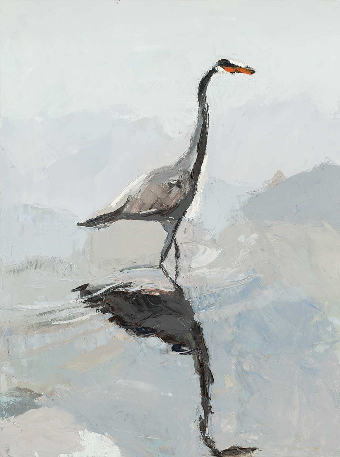
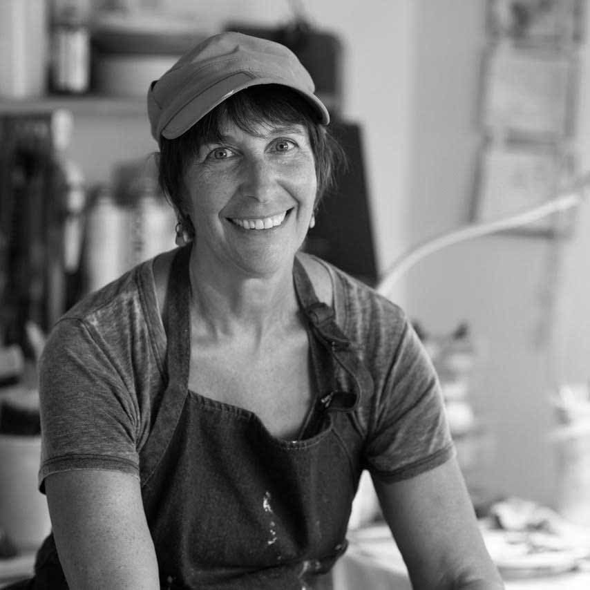
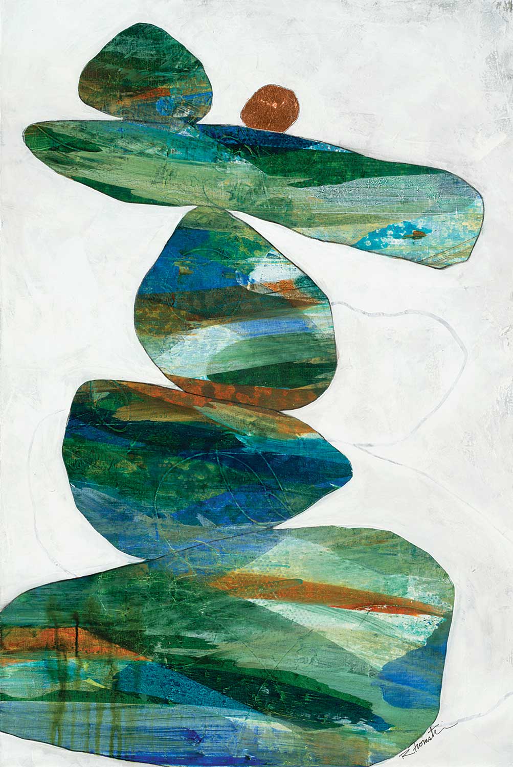
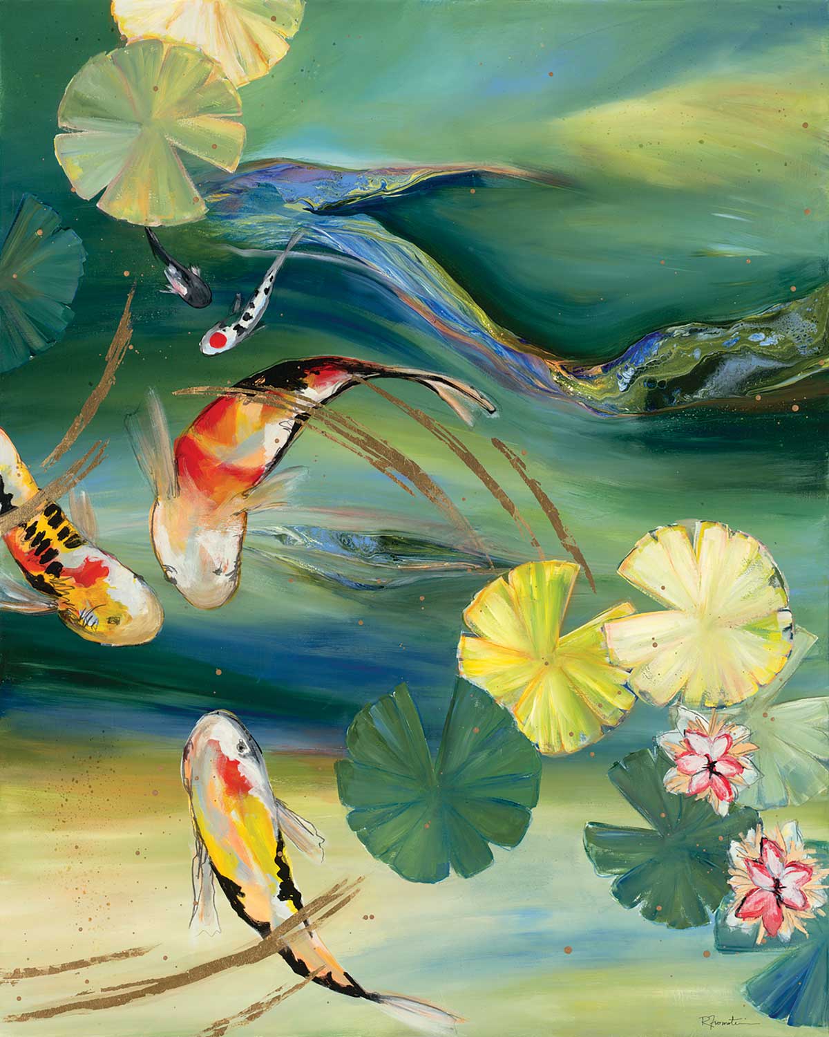
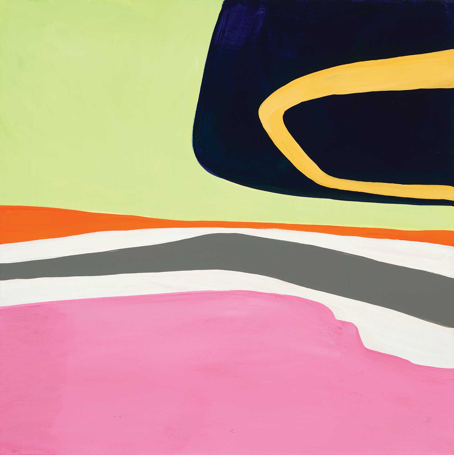
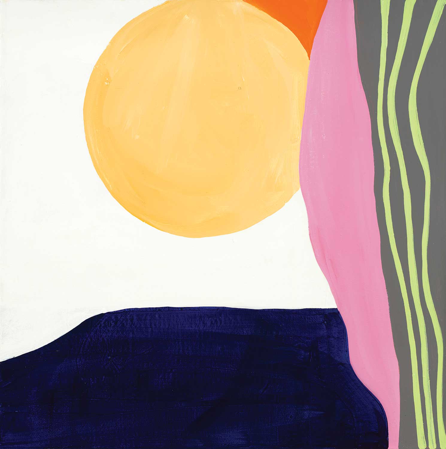
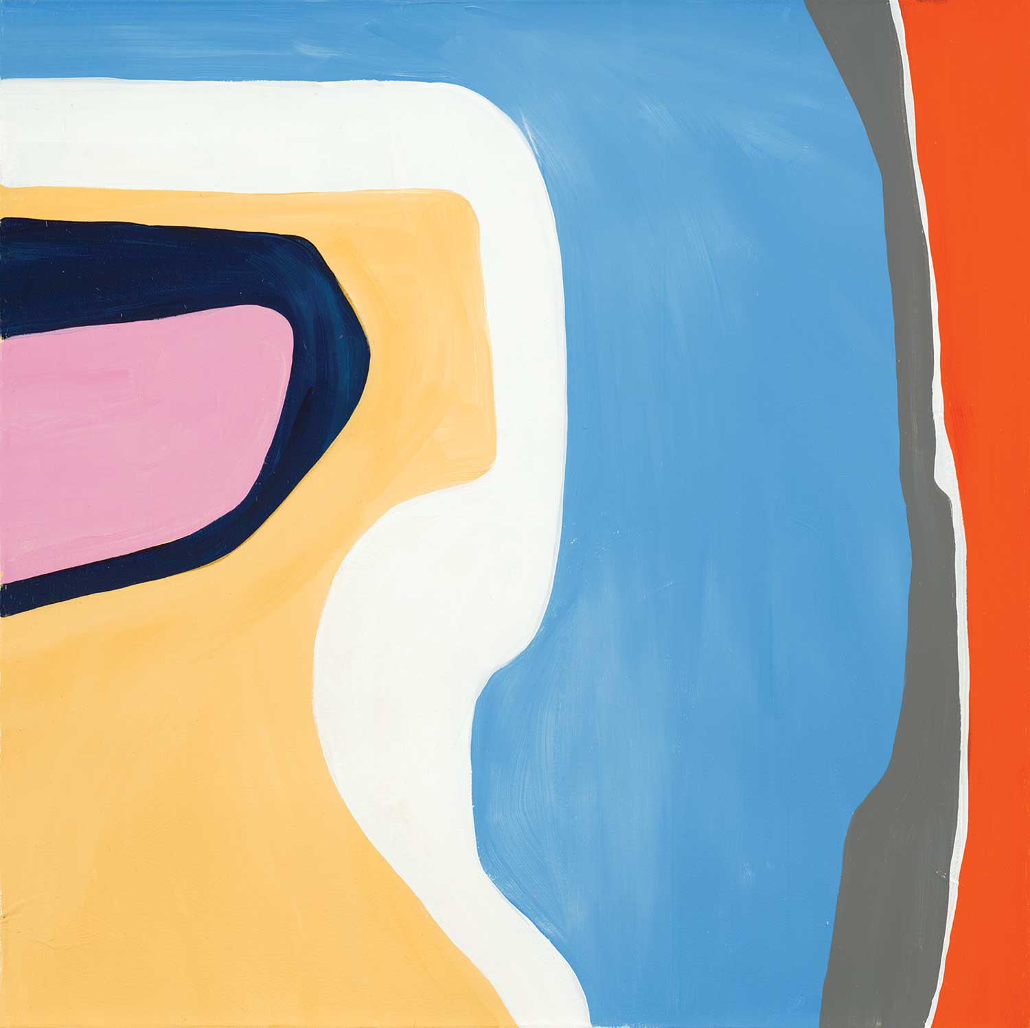
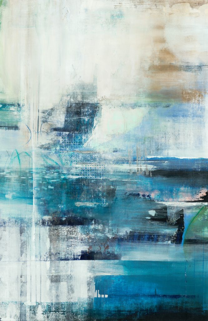
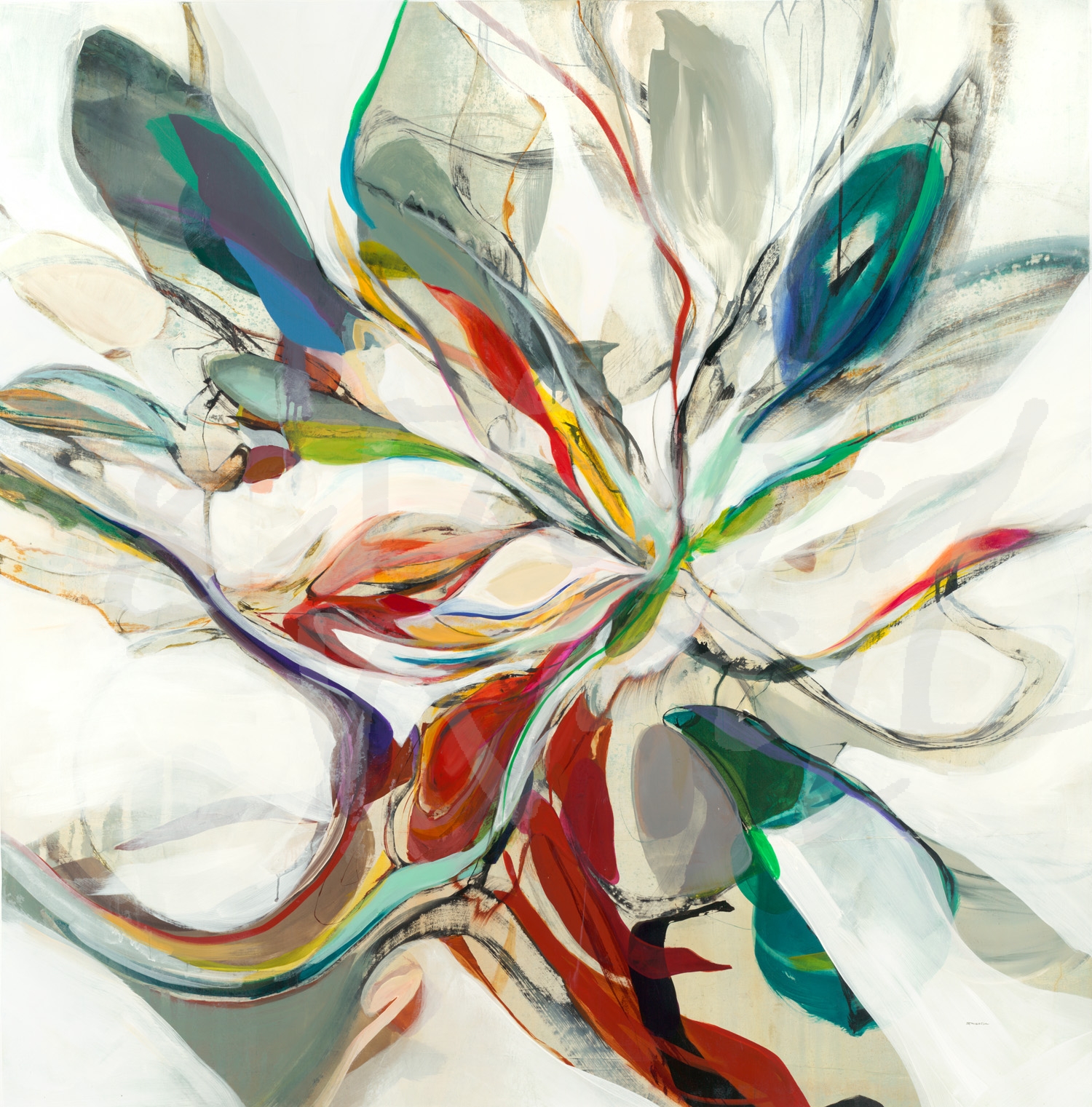
Meet one of Third & Wall’s newest artists, Ruth Fromstein! While currently residing in San Diego, Ruth has had a close relationship with art since picking up a brush and canvas while a child in small-town Wisconsin. Creating has been the only constant in Ruth’s life and an important form of self-expression.
While her Bachelors degree is in Vocal Rehabilitation, it was the various art classes that inspired her. She experimented with drawing, design, art, metals, and weaving. Her art took inspiration from her love of dancing, hiking, backpacking, and nature, imbuing her work with movement, life, and a palate as varied as an expansive field of wildflowers gracing the horizon. Ruth is constantly experimenting with new materials and techniques striving to embody in her work the beauty and excitement of the world she sees around and within herself. Creating images that dance and play in the viewer’s imagination, her abstract paintings have been described as anything from tranquil and relaxing to thrilling and startling. She embraces her brush as her dance partner, and, with it, swings across the canvas in a chorus of control and spontaneity. While Ruth paints with a goal, she is always excited to stumble into new territory as the materials she experiments with lead her in unexpected directions!
“Dancing With Passion”
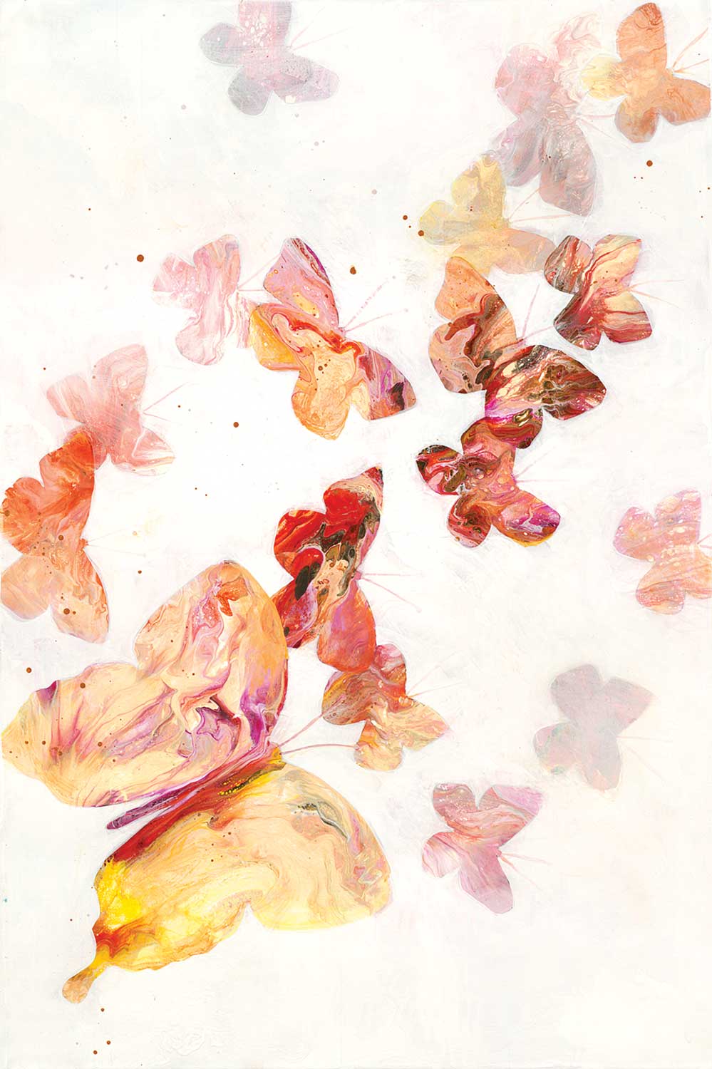
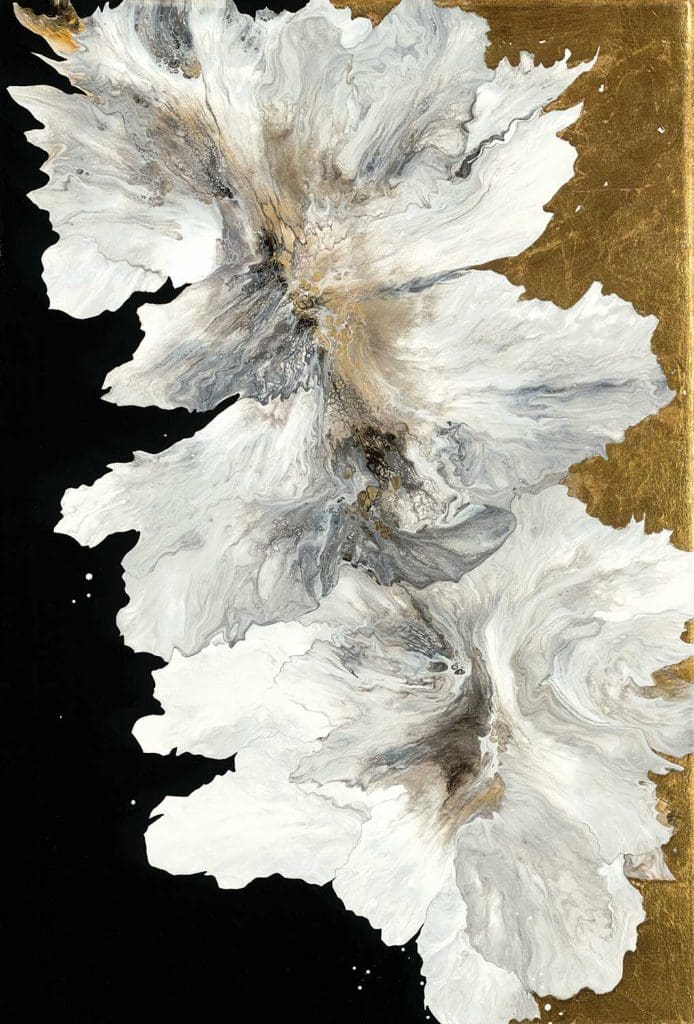
“All A Flutter”
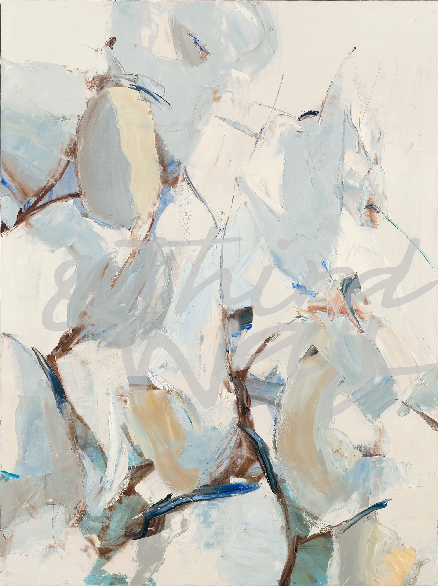
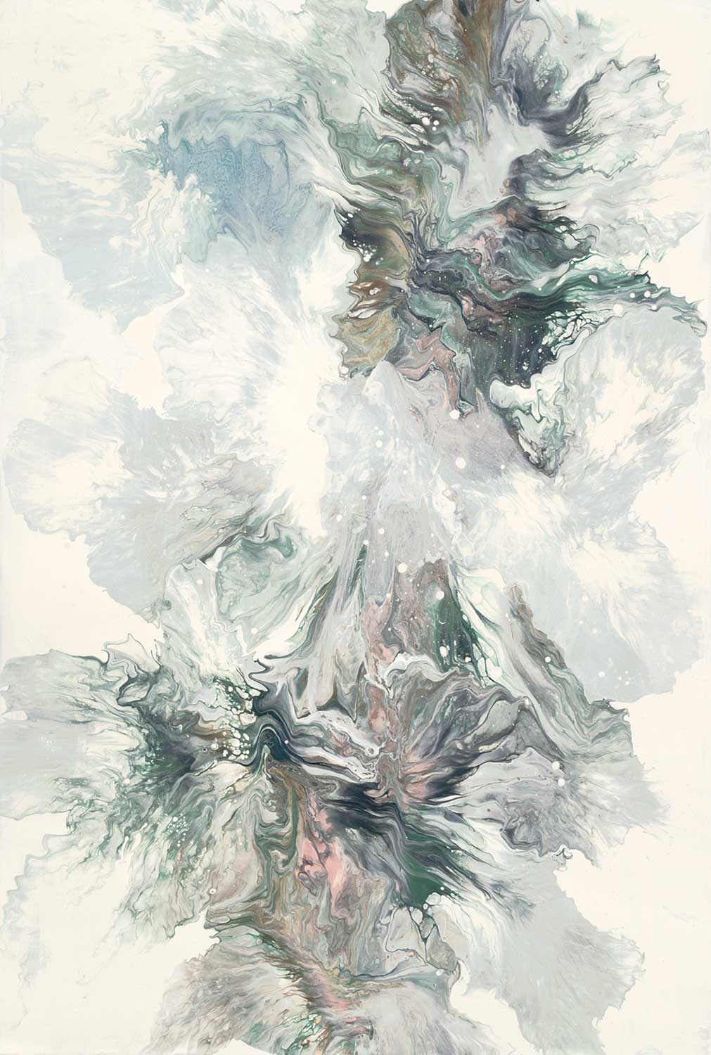
“How They Stack Up II”
What do you first do when you get to the studio in the morning?
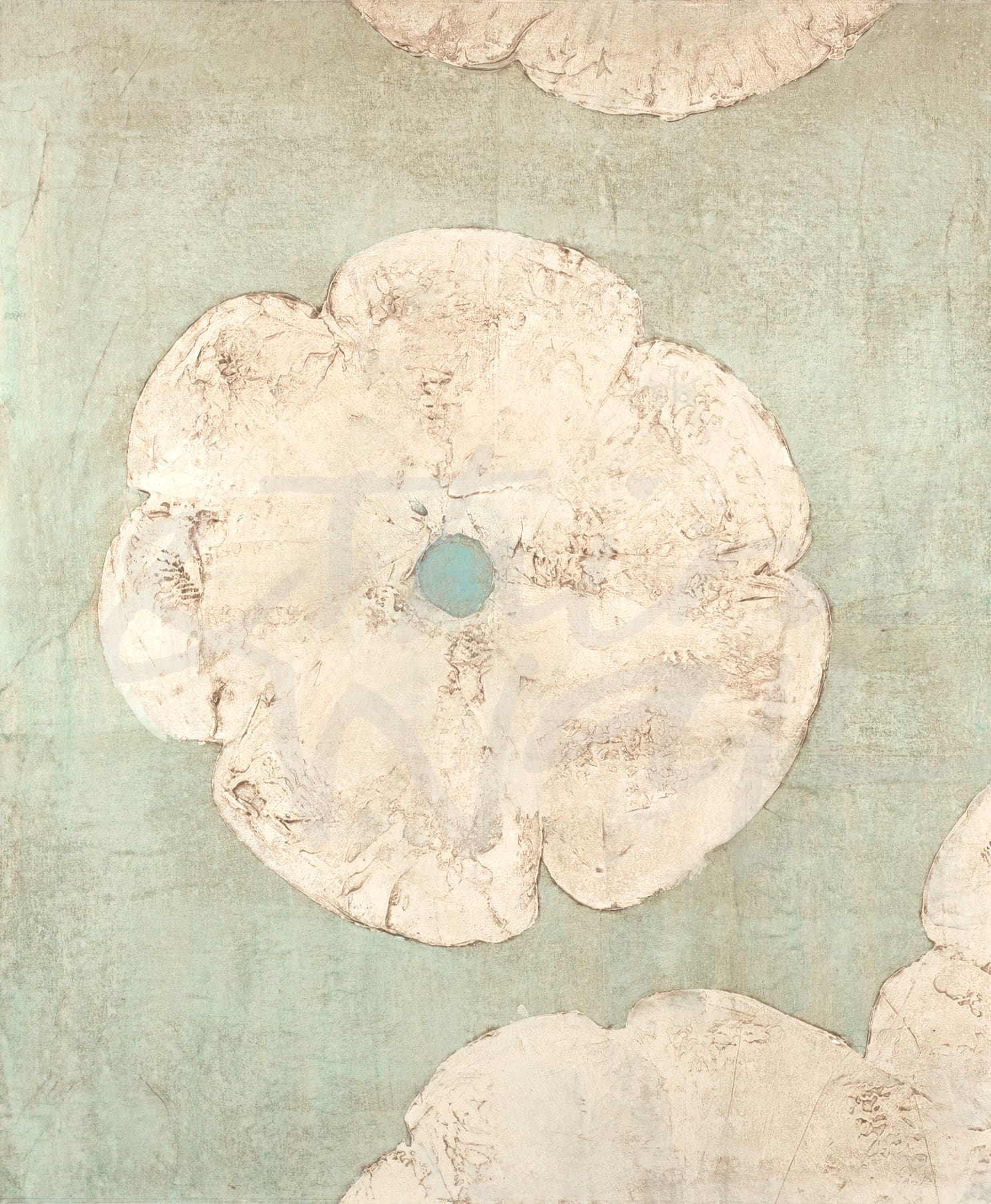
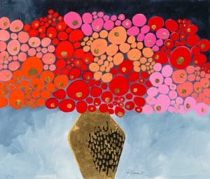
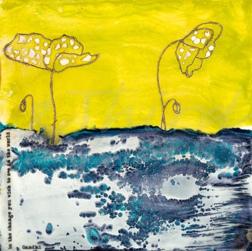
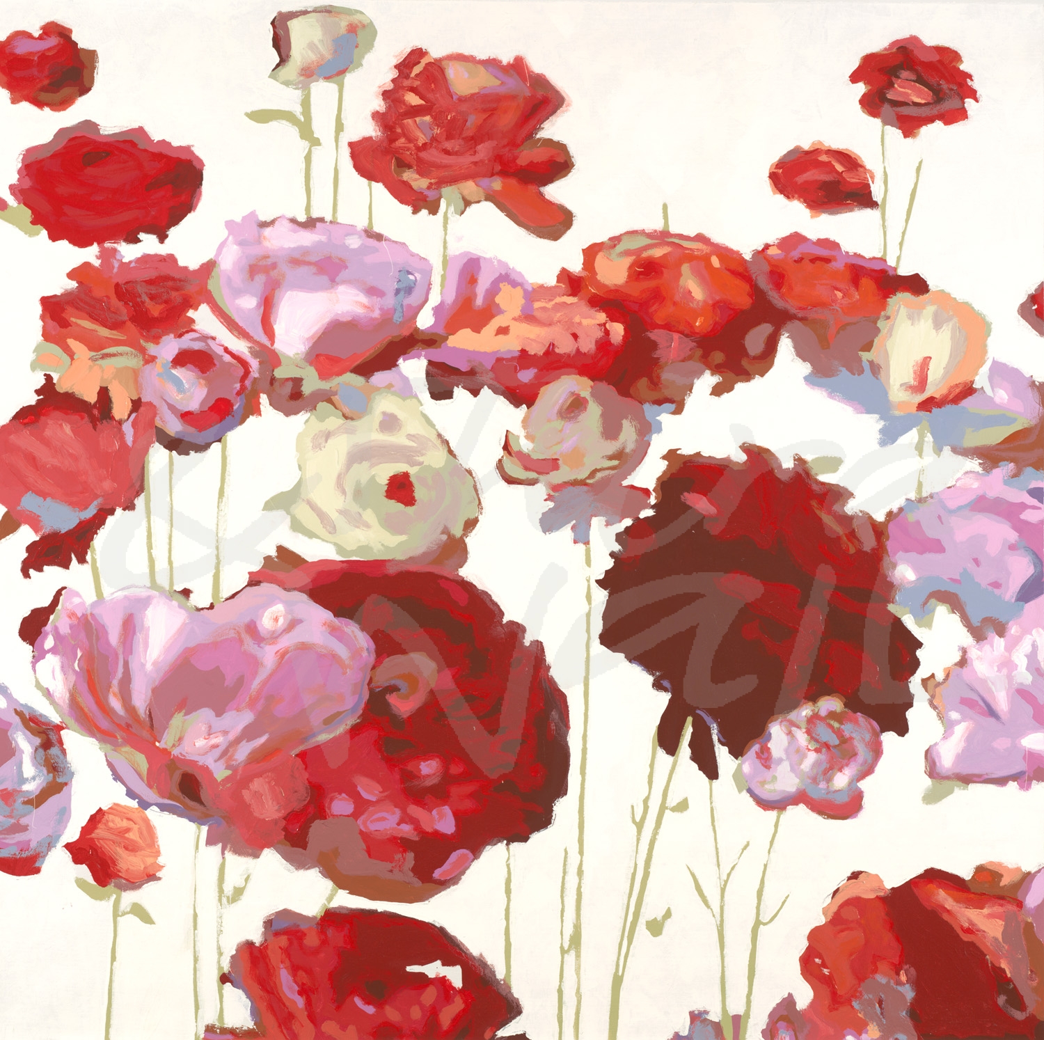
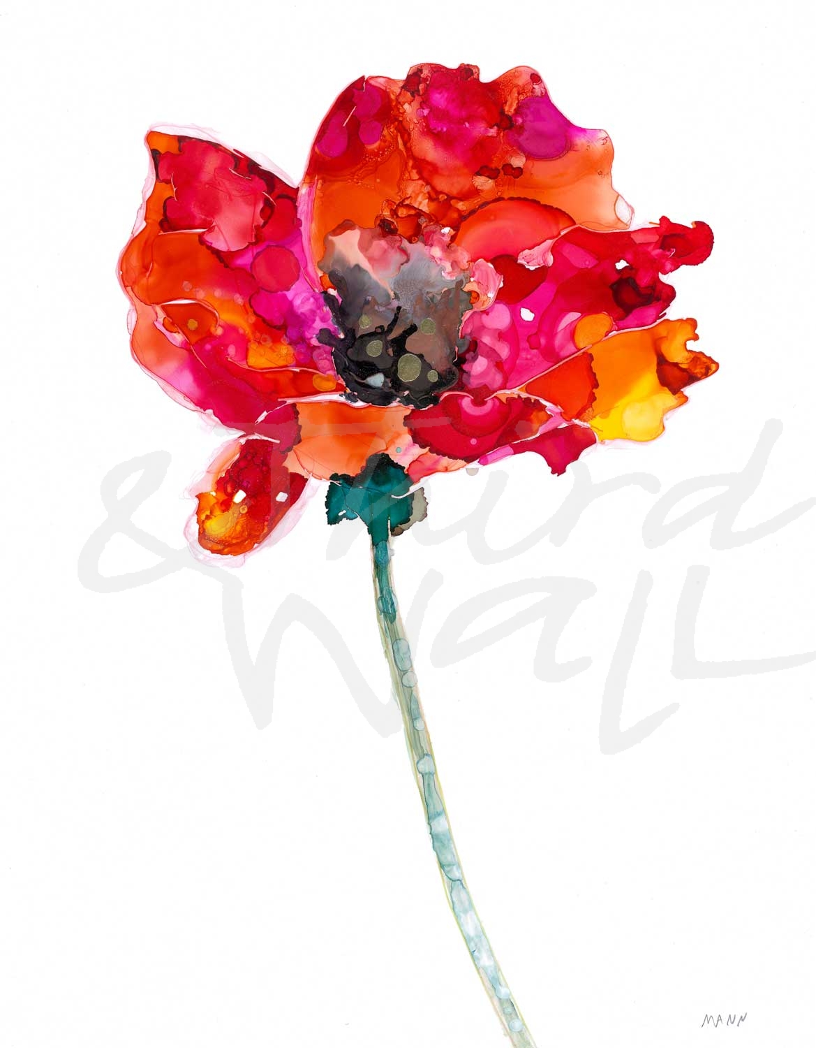
“Red Poppies II”
I take a deep breath and evaluate what I had done the previous day, looking at my work with fresh eyes.
How many paintings do you work on at a time?
I like to work on multiple paintings at one time, usually at least 4.
Do you have a dream project that you would like to work on?
It would be cool to paint a mural.
If you could paint with anyone, who would it be?
Oh my goodness… who to choose? A master like Monet or Angus Wilson, or a painter I would like to take a class with? How about my incredibly talented friend from high school, Leslie Stewart? I choose them all!
What’s your favorite way of generating ideas and inspiration?
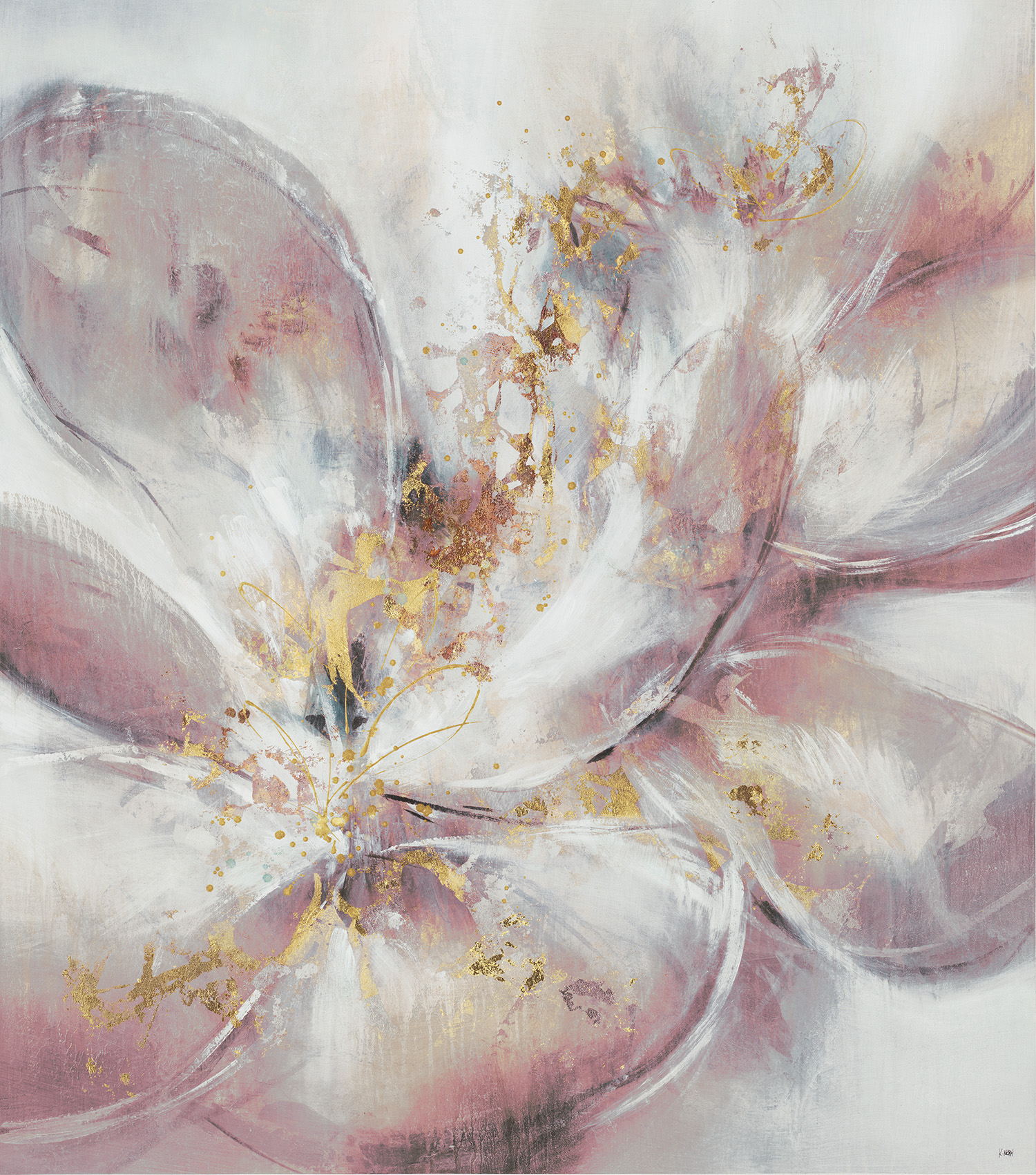
“Satin & Silk”
I frequently get inspired when I go hiking. I am influenced by my surroundings as well as my own thoughts and feelings.
How has your art evolved over time?
My work continues to evolve as I experiment with new techniques, colors, and tools. I enjoy learning from other artists who introduce me to new processes then I like to take the information and apply it to my paintings in interesting ways.
What do you like most about your work?
I like that my paintings pull the viewer in and take them on a journey. I enjoy looking at my paintings, and every time I do, I see something different.
I like the variety of work that I create. I am attracted to color, texture and movement.
My head is exploding with ideas, however, I need to see if these concepts will successfully translate onto my canvas. Follow along and see what emerges!
“A Moment In Time”
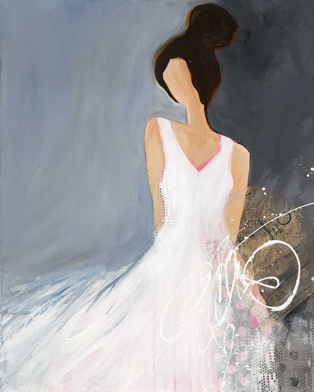
“Lady With Big Bun”
“Falling Leaves”
What is your favorite time of day to paint?
“Big Bloom VI”
My mind is fresh in the morning, and I like the natural light that shines through my windows.
Do you ever get “stuck” on a piece? If so what do you do?
Oh, yes! Sometimes I need to tuck a painting away and pull it out another day, or rotate the orientation. Other times, it is best to simply “paint over”.
What is next up on your easel?
I have one of those “tucked away” paintings waiting for fresh inspiration, as well as an abstract landscape and floral.
“Play Date I”
“Play Date II”
“Play Date III”
The images featured here are available in our Print-On-Demand collection. Some areas of our website are password-protected. If you are a member of the trade but don’t have full access to our website, www.thirdandwall.com, please contact us at customerservice@thirdandwall.com.
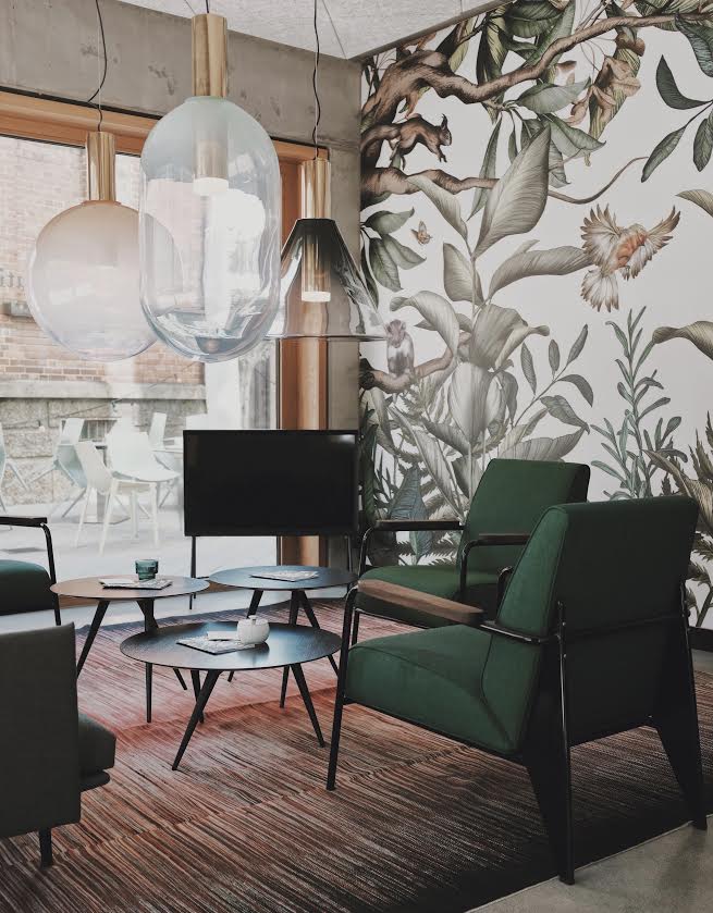
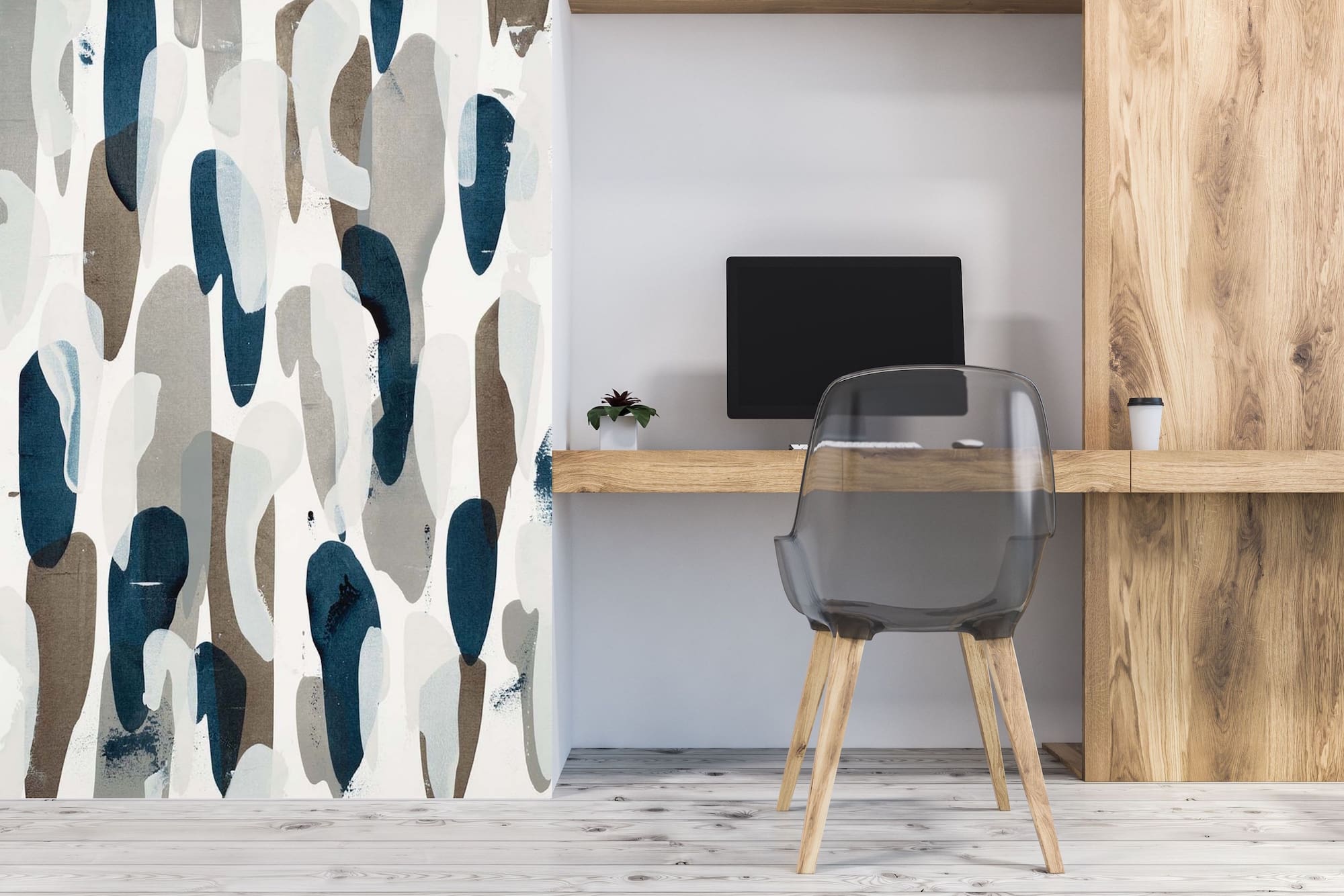
The beginning of a new month can be the perfect time to refresh your interiors and find new trends to try. And as we kick off this new decade, we can’t help but want to go big! Wallcovering and wallpaper will continue to be a growing design trend this year and one that we love! From soft, subtle scenes to bold and expressive patterns, wallcovering can add style and personality to any room. It’s a great way to bring color and texture into your space in unique and unexpected ways. This popular trend works great in residential and commercial design, so we wanted to share a few ways to include different wallcovering prints and textures in your space.
featuring “Sound & Color” by Kippi Leonard
One of our favorite things about wallcovering is that there are various ways to decorate your walls with it. You can cover all of your walls, use it to make a statement accent wall, or (particularly if you have an oddly shaped wall) you can easily wallpaper half or parts of a wall. And for drama and detail in an unexpected place, you can try covering your ceiling!
Murals
Why not blow up that landscape to full wall size? Murals and serene scenes are great for accent walls and infusing your space with natural inspiration. A global-inspired scene can add some wanderlust while silhouette prints can add a twist on a classic look. Visually rich wallcovering that resembles different materials, such as marble, wood, or terrazzo, will add a luxe and modern style to your space. And wallcovering can be an easy way to introduce metallics into your wall décor to make a memorable moment in your room. Mural wallcovering can turn your design into one-of-a-kind!
Patterns
Patterns are a common wallcovering trend, but there are many different ways to infuse it with your own style. Geometric patterns are popular in design, especially with Art Deco design having a resurgence, and the symmetrical nature allows for bold, playful colors. Simple tonal stripes and small-scale prints, such as dots, can help make a room feel larger. Large solid and color-blocked prints in wallcovering can create a timeless design, especially in a dramatic black and white color scheme or crisp, classic blue hues. For a light and minimal space, try oversized prints in botanical, fruit, and bird imagery!
Florals & Painterly Prints
A floral print might initially come to mind when you think of wallpaper or wallcovering. Florals are a traditional décor staple that is getting an updated look, helping to create modern spaces with bold colors and large-scale, abstracted patterns. Painterly florals and imagery can be unique and easy on the eye, while lively abstracts are energizing and great for an eclectic look.
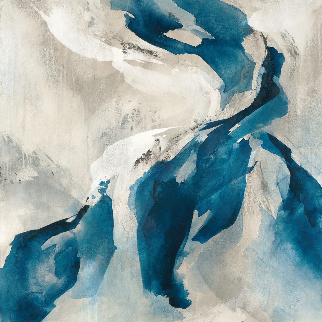
featuring “River’s Run” by Jeff Iorillo
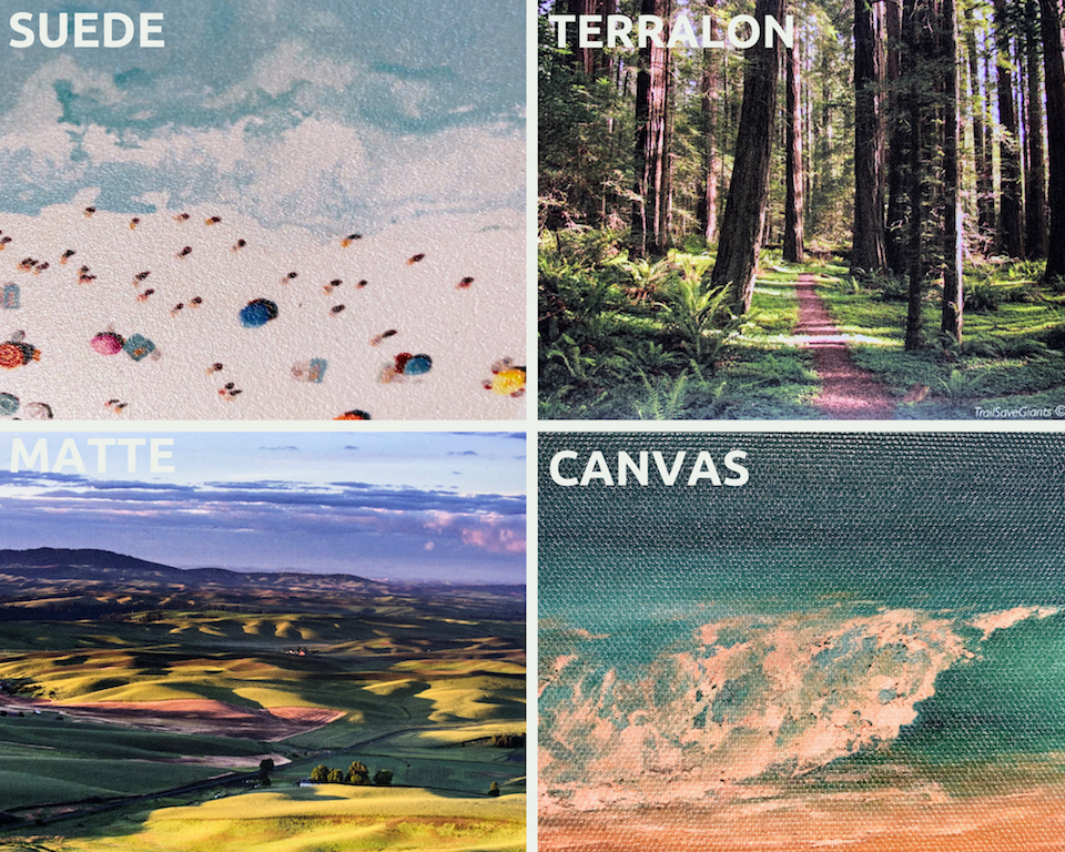
At Third & Wall, we not only have many different images to choose from for your wallcovering, but also several different styles and textures to add extra detail to your walls. Textured wallcovering is great for a monochrome look, as it adds dimension and character while keeping it simple. A suede wallcovering has a similar texture to, you guessed it, suede fabric. This light texture works well to reduce glare from direct light, while adding warmth to the print. With a flat, smooth, and low-gloss finish, we recommend a matte wallcovering for crisp, sharp-edged prints such as photography or detailed designs. A canvas wallcovering will give your wall an elegant and painterly effect, as it mimics the texture of a painter’s canvas. Lastly, Terralon wallcovering is a PVC-free alternative wallcovering material made from 31% post-consumer recycled materials, with various LEED credits. It is smooth and breathable for a sleek finish!
wallcovering samples
However you decide to decorate with this trend, we want to help you find the best image and wallcovering option! Some areas of our website are password-protected. If you are a member of the trade but don’t have full access to our website, www.thirdandwall.com, please contact us at customerservice@thirdandwall.com.
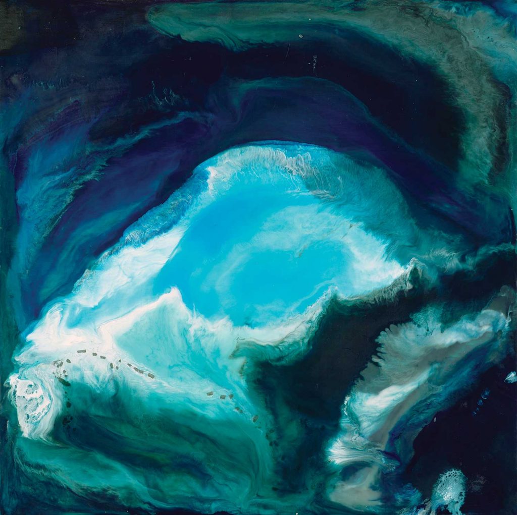
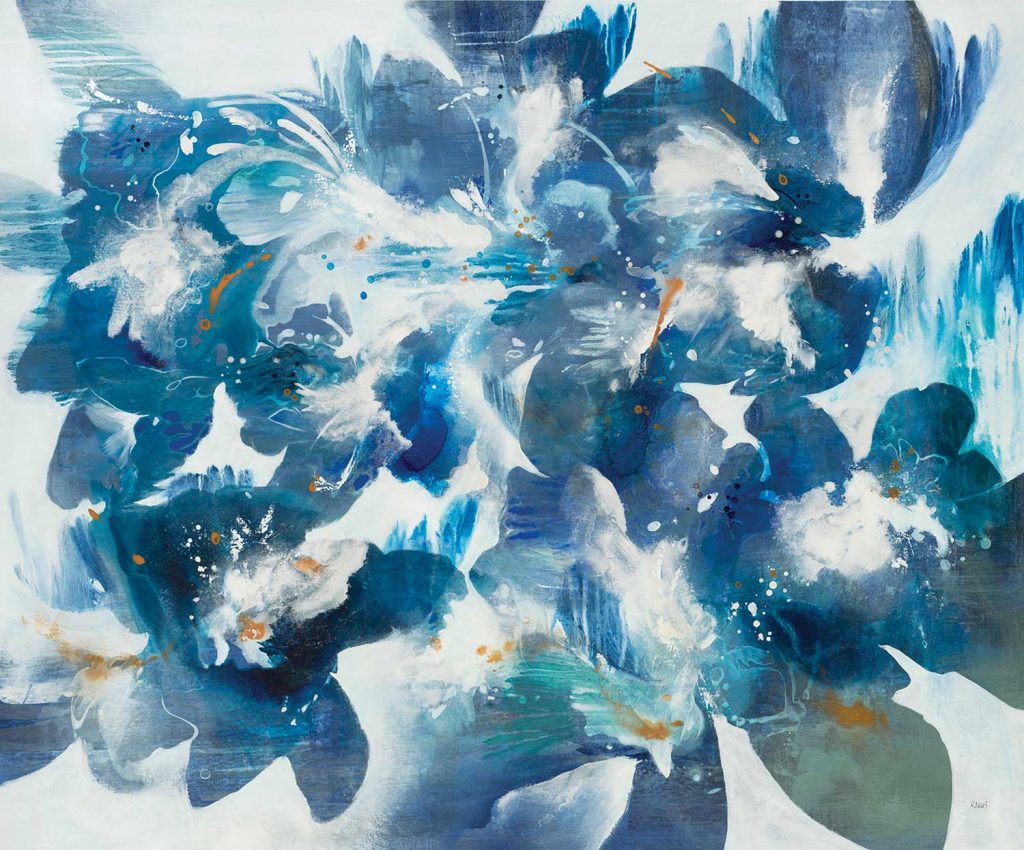
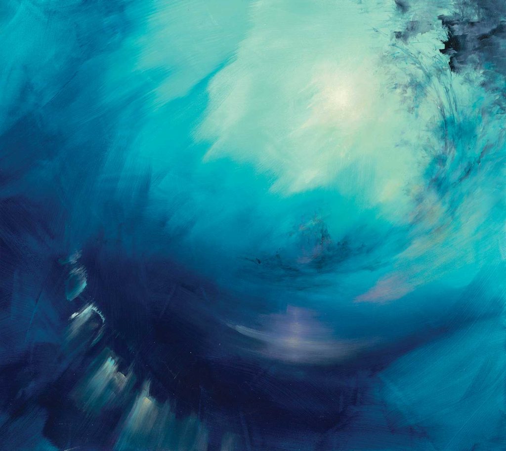
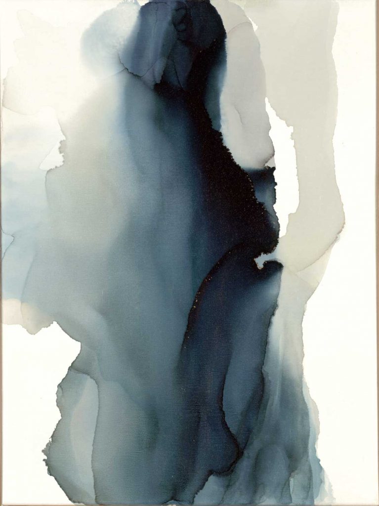
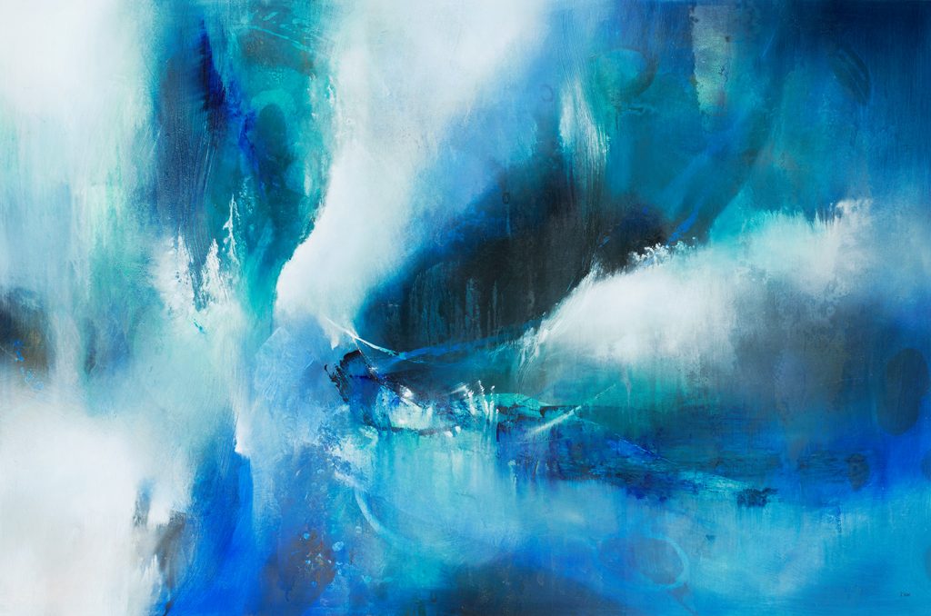
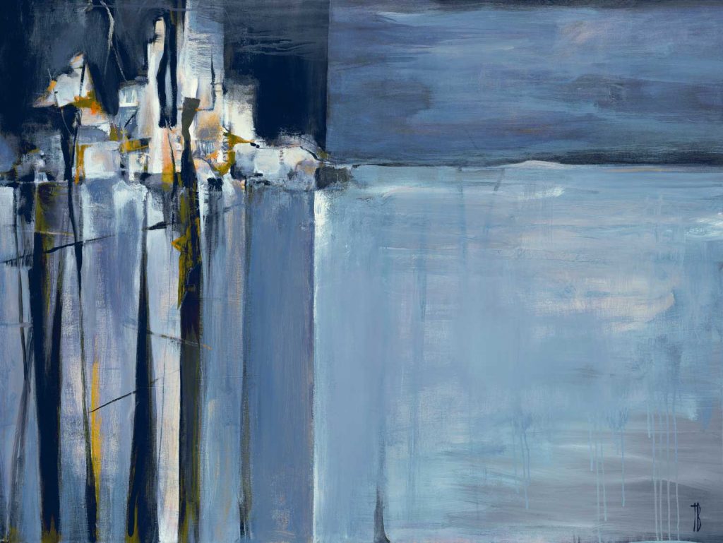
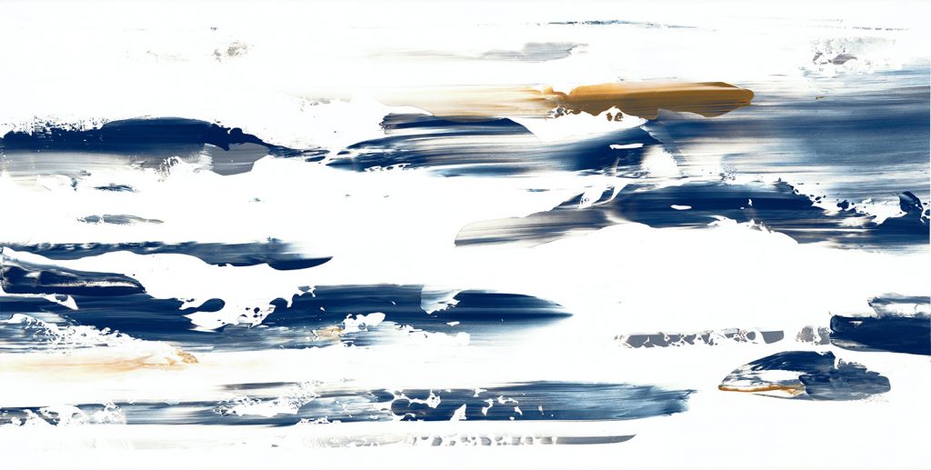
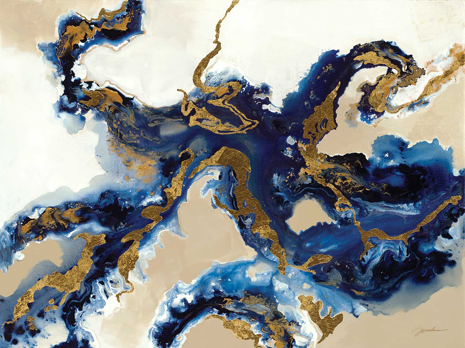
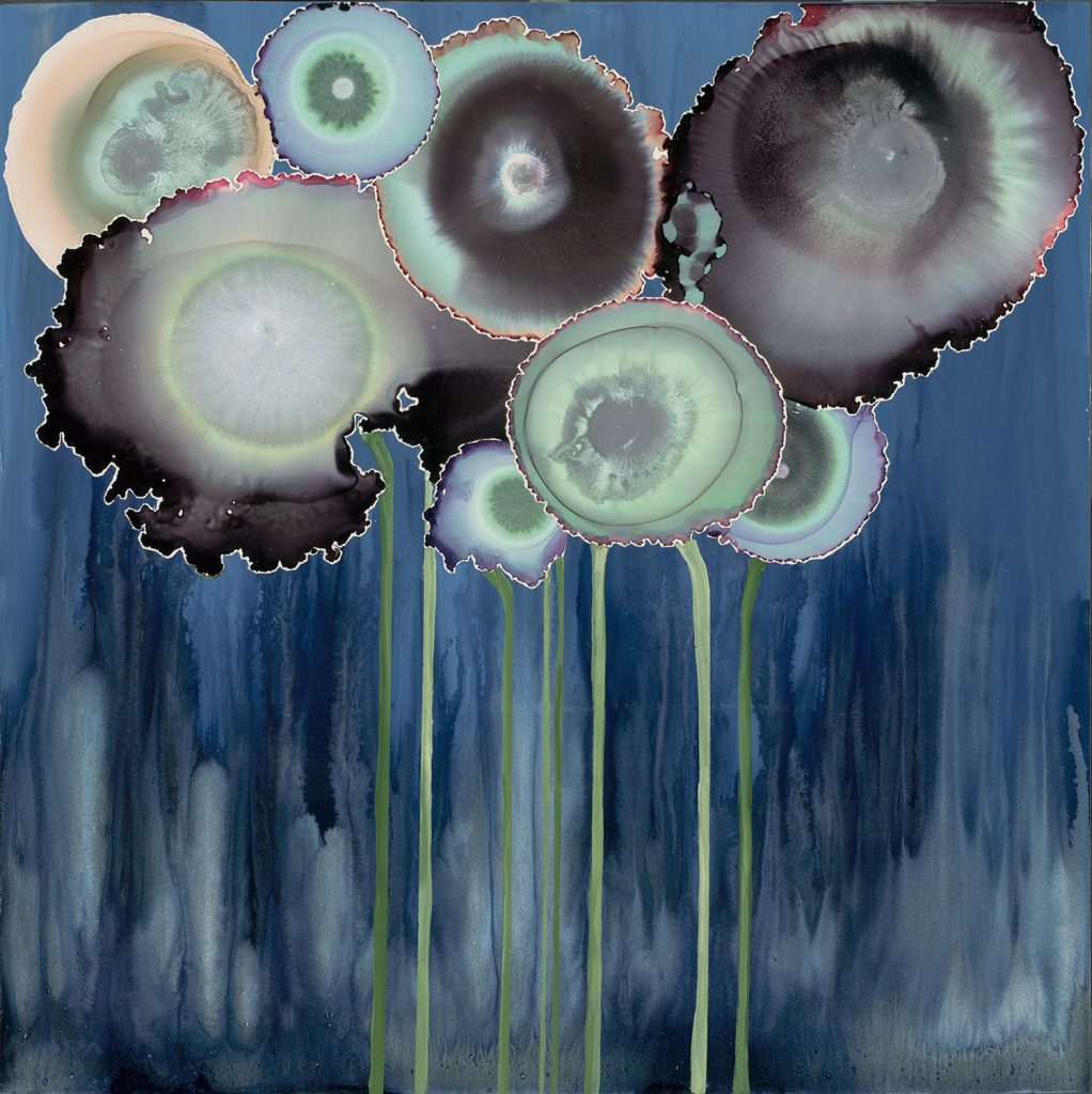
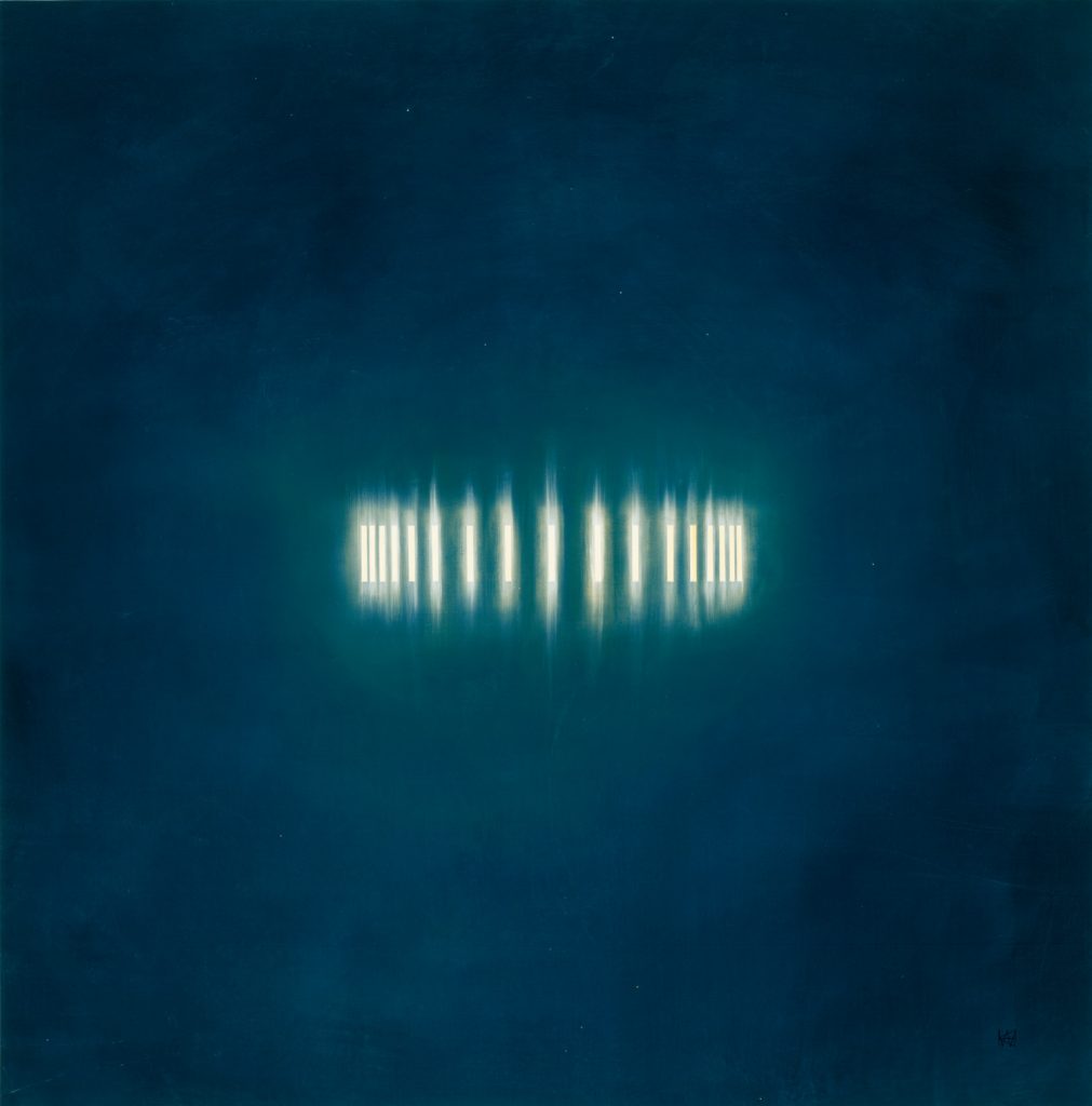
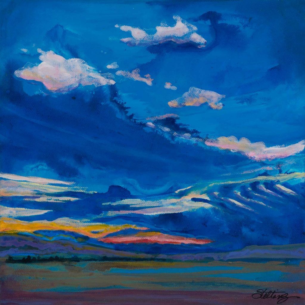
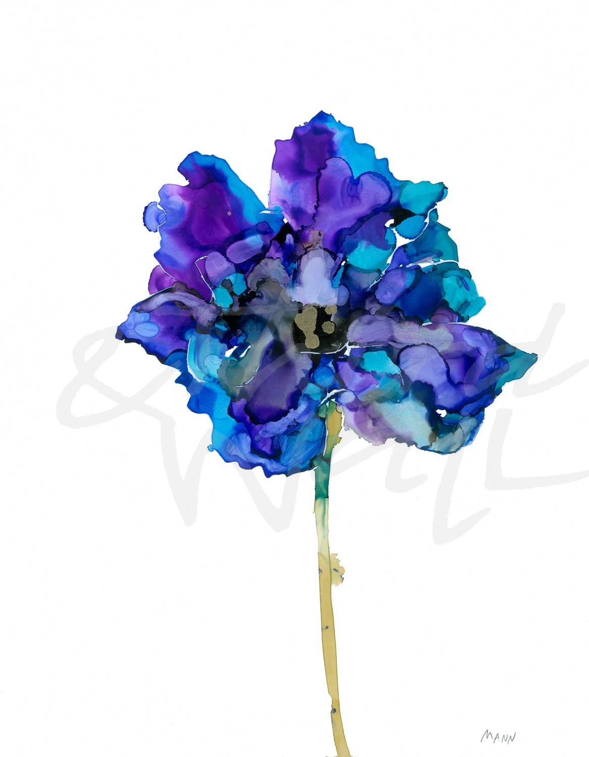
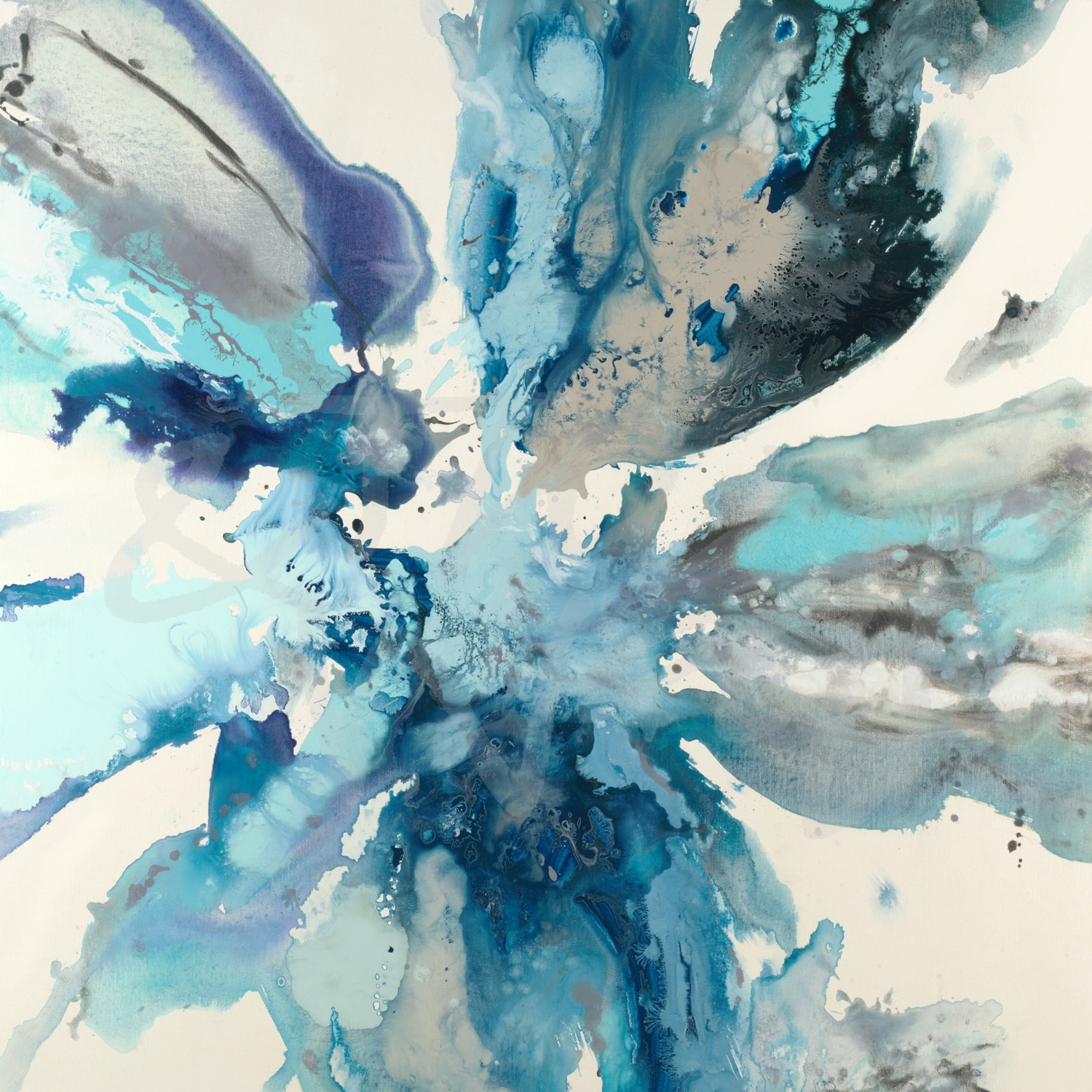
As a new year begins, we always look forward to the predictions of new décor and design trends. In forecasted color trends, Pantone announced their Color of the Year 2020: Classic Blue, and we are excited for this “timeless and enduring blue hue”! Blues are known to be calming and comforting, and the deep shade that Pantone has chosen for this new year reflects just that. Sherwin Williams also selected a moodier navy blue, Naval, as their color for 2020. Looks like having the blues isn’t such a bad thing after all!
“Panacea” by Corrie LaVelle
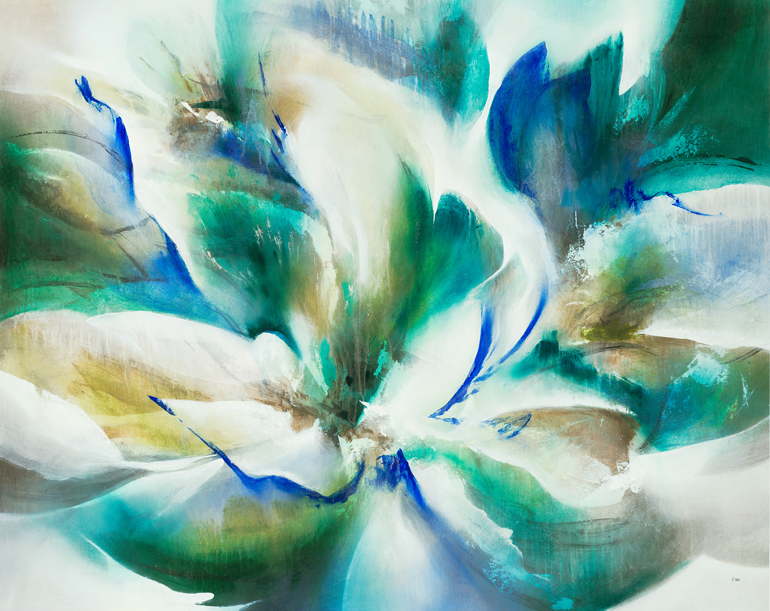
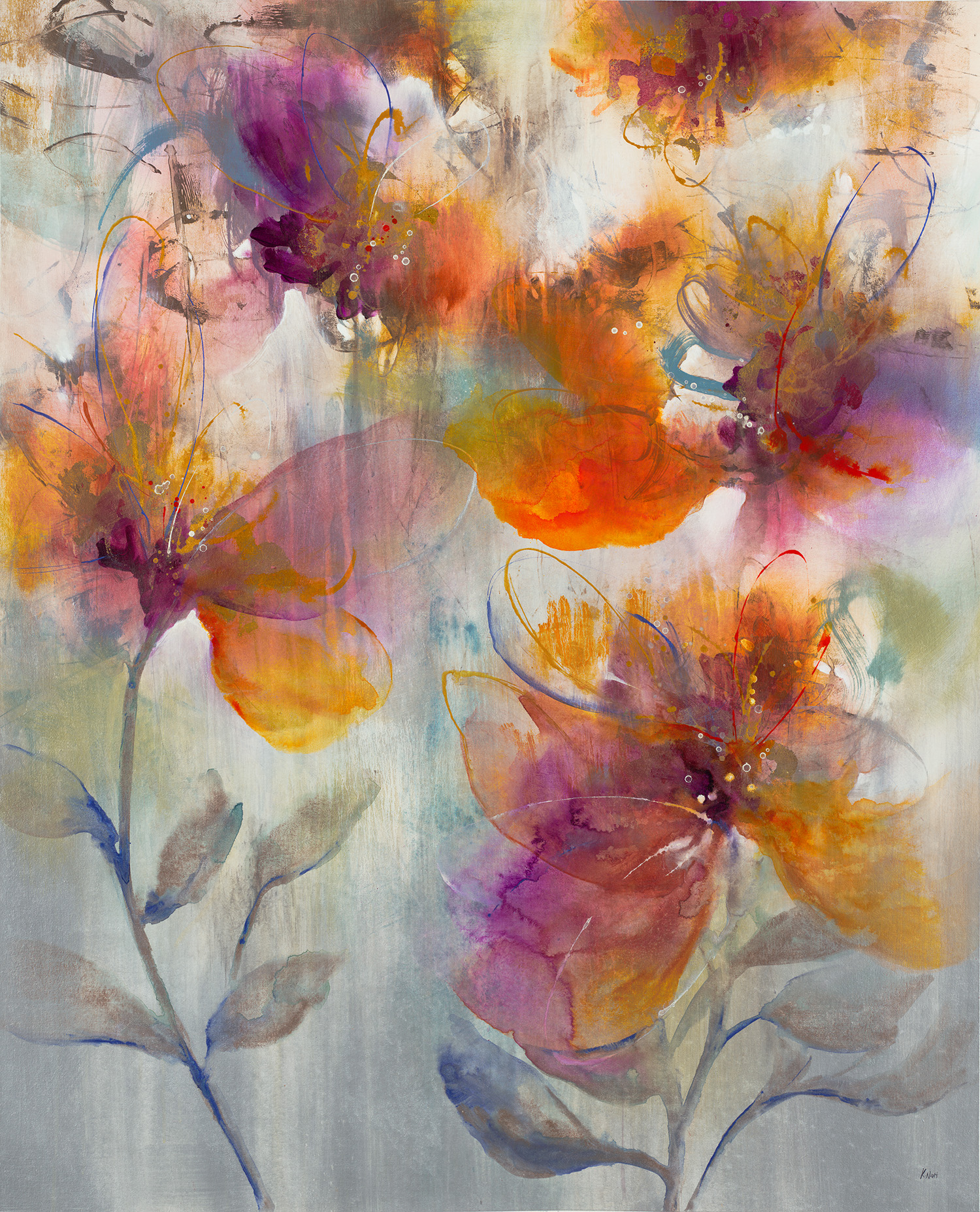
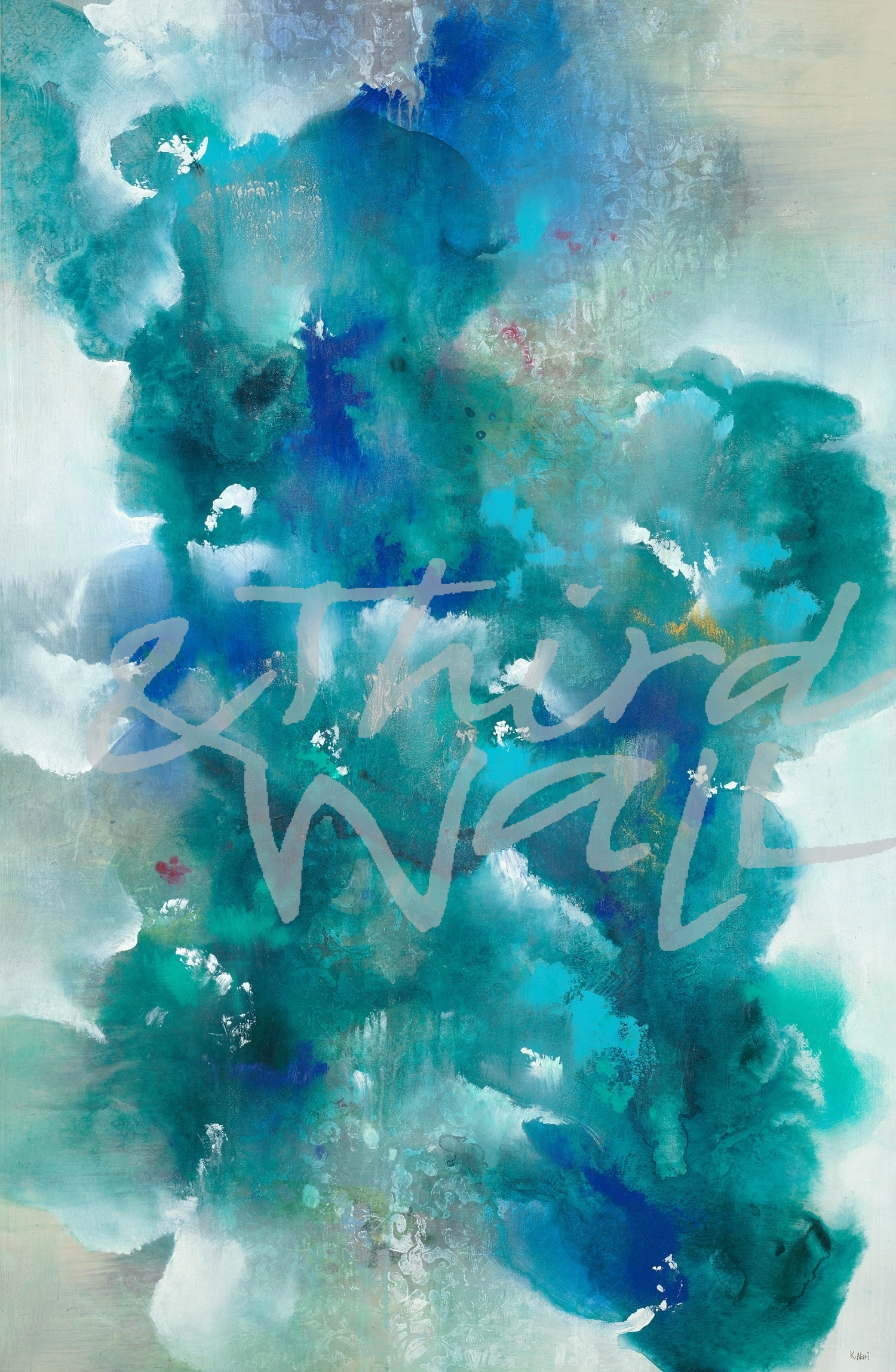
“Blue Velveteen” by K. Nari
“Blue Gazing” by Dina D’Argo
“The Perfect Place” by Kippi Leonard
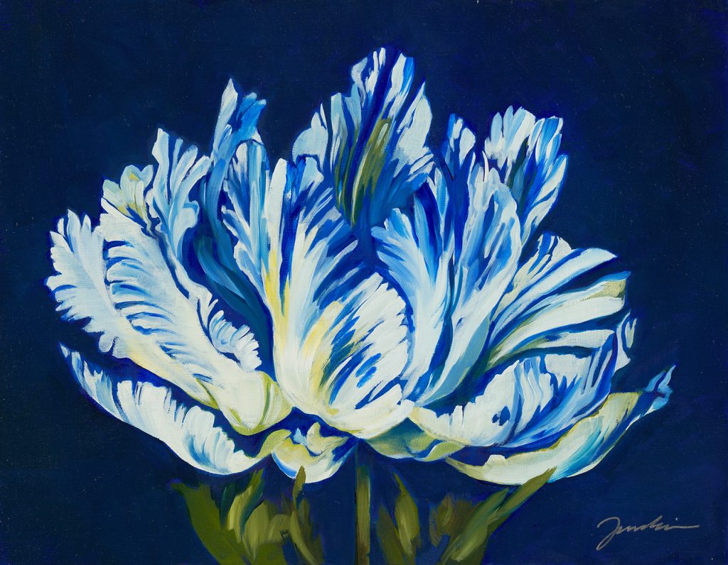
“Tulipania” by Liz Jardine
“All Aflutter” by Liz Jardine alt v 2
“Cobalt Velocity” by Jeff Iorillo
“Soul Searching” by K. Nari
“Metropolis” by Terri Burris alt v 1
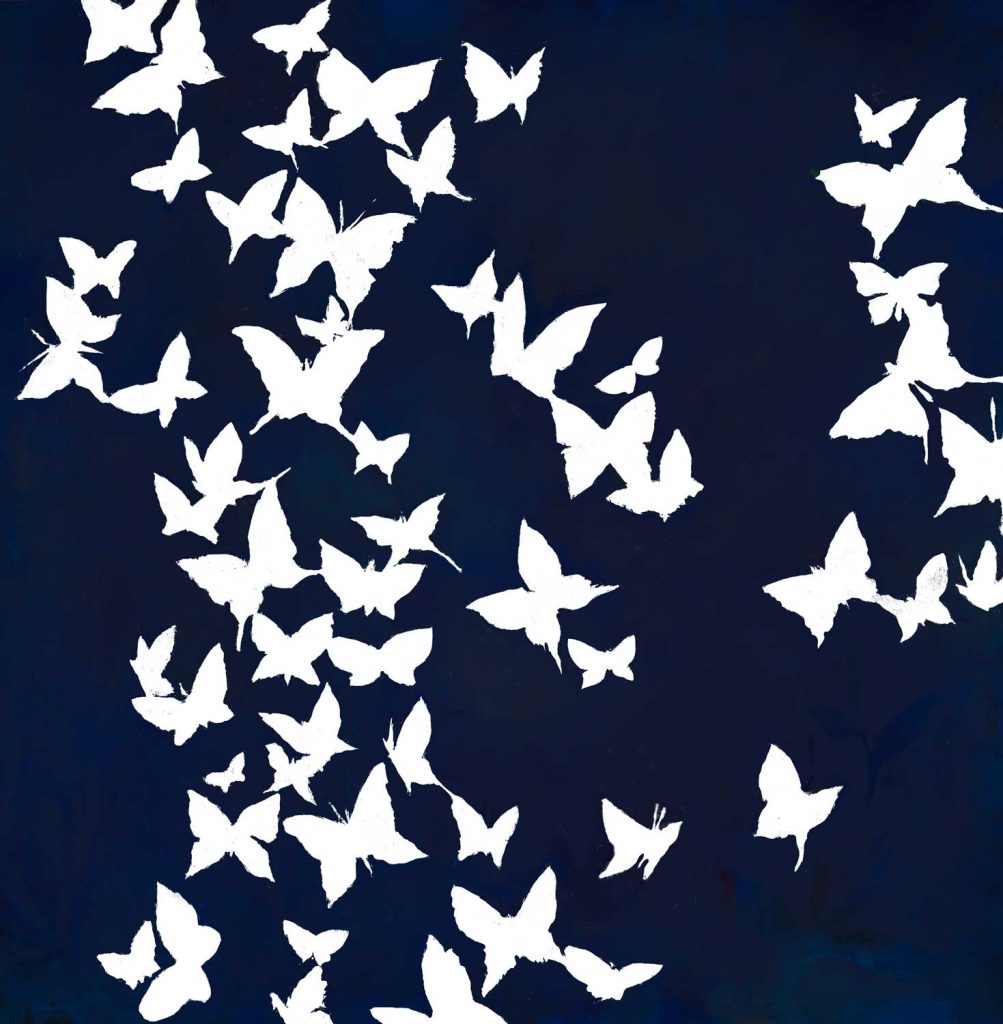
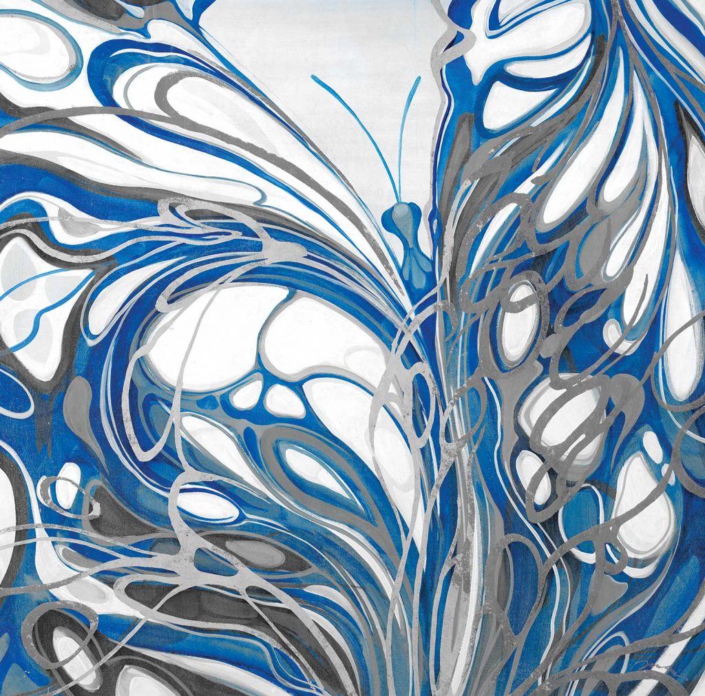
“Flight of the Butterfly” by Liz Jardine
photograph by Nancy Crowell
“Interpretation” by Jeff Iorillo
“On Rush II” by Jeff Iorillo
photograph by Melissa McClain
“View From The Air” by Liz Jardine
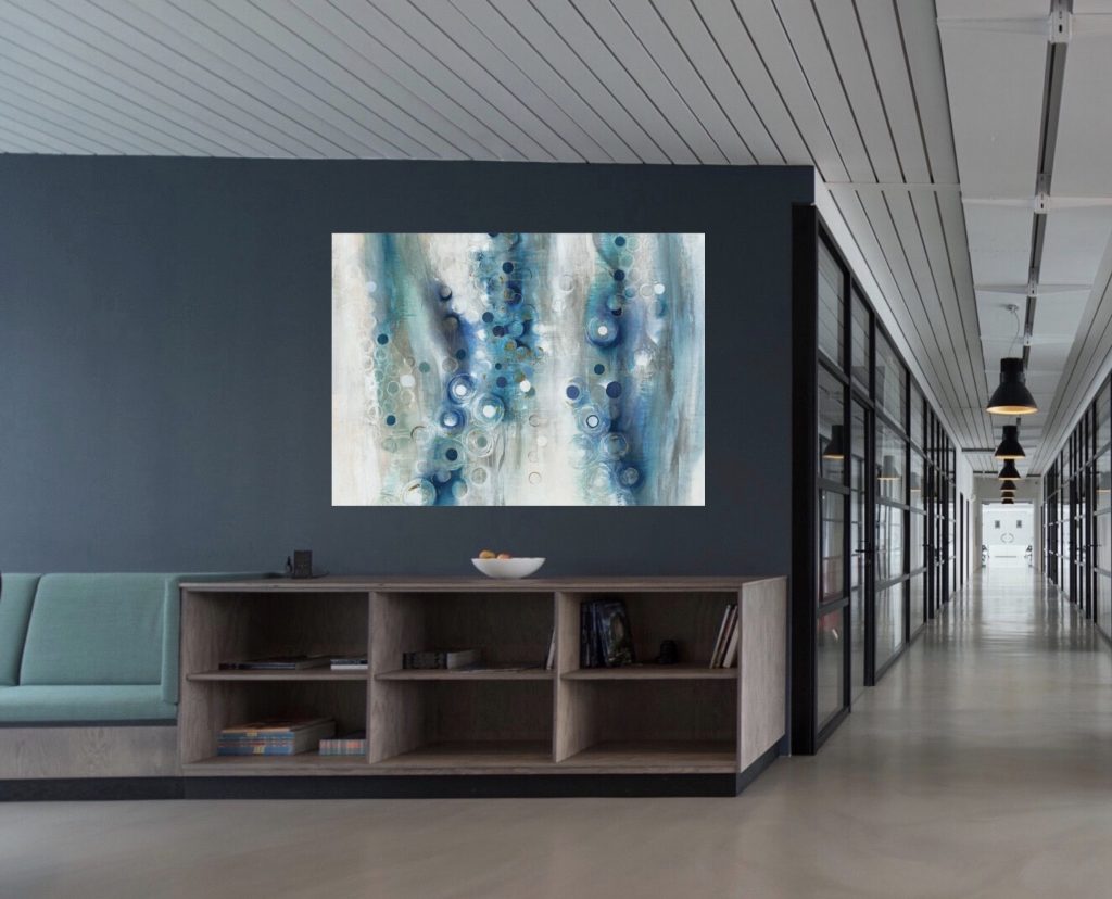
Changing out your artwork is an easy way to refresh your space and try out these new colors and interior trends. Because of their versatility, rich dark blues are taking on the role of a neutral this coming year, so don’t be afraid to decorate with them in bolder ways. These striking navy hues have relaxing and tranquil qualities, and they easily pair with any materials or colors you might already have in your space. From a luxe look to a cozy interior, these trending shades of blue can transform any design style!
“Plumage” by Dina D’Argo
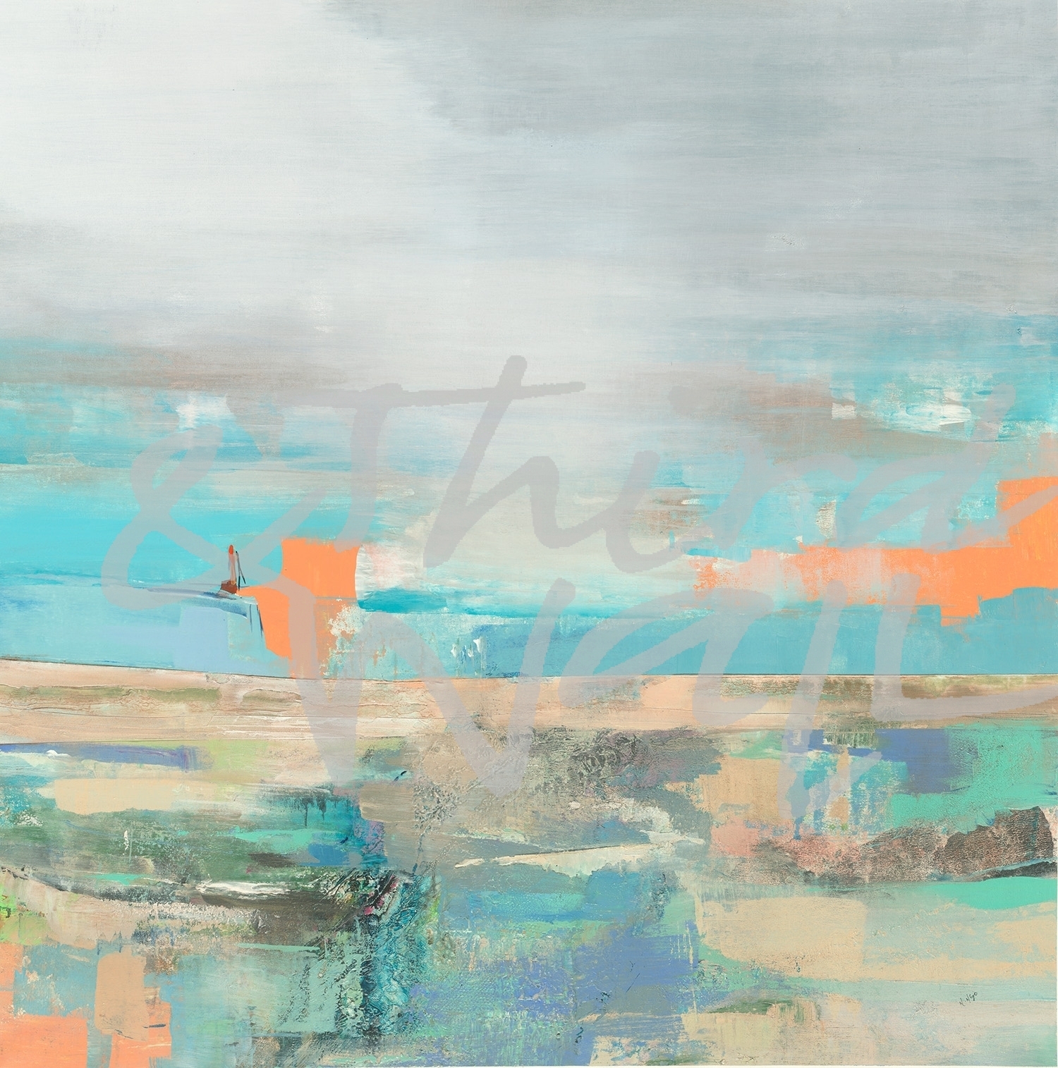
“Meditation” by Nancy Ngo
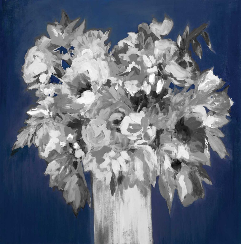
“Gray Bouquet #1” by Laura Van Horne
“Light Ring II” by KC Haxton
“Blue Skies” by Linda Stelling
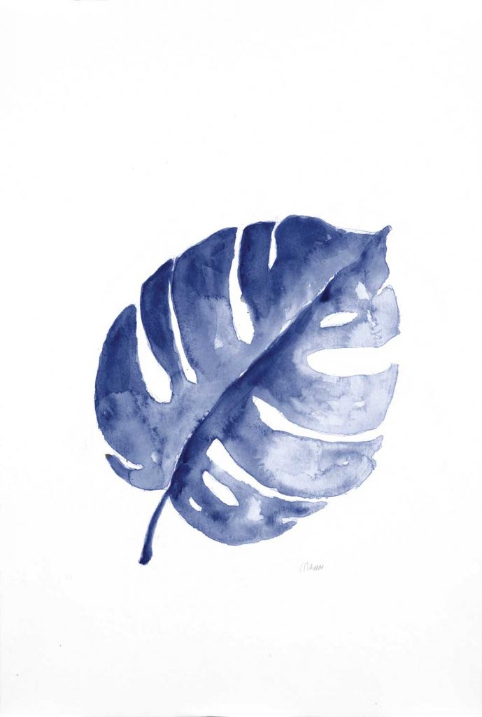
“B&W Palm I” by Patti Mann alt v 4
“Gold Rush” by Liz Jardine
“REdowa” by Jill Martin alt v 2
photograph by Aaron Matheson
“Sense of Time” by Peter Kuttner alt v 1
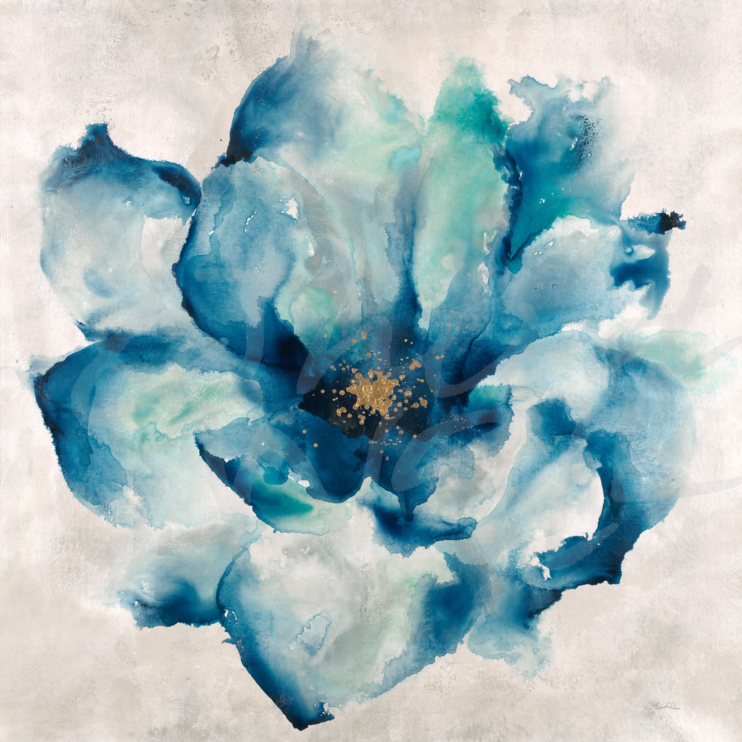
“Entwined” by Leah Rei
photograph by Melissa McClain
“Mountain of Blue” by Laura Van Horne
“Nexus I” by Leah Rei
“On Course II” by Dina D’Argo
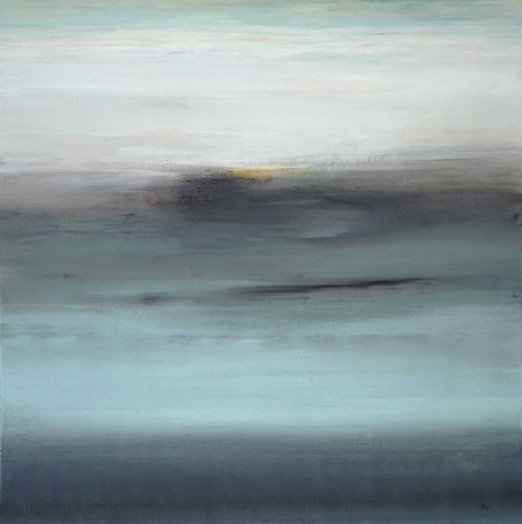
“Subtle Views V” by Lisa Ridgers
photograph by Nancy Crowell alt v 1
“Al Fresco Style” by Liz Jardine alt v 3
The images featured here are available in our Print-On-Demand collection. Some areas of our website are password-protected. If you are a member of the trade but don’t have full access to our website, www.thirdandwall.com, please contact us at customerservice@thirdandwall.com.
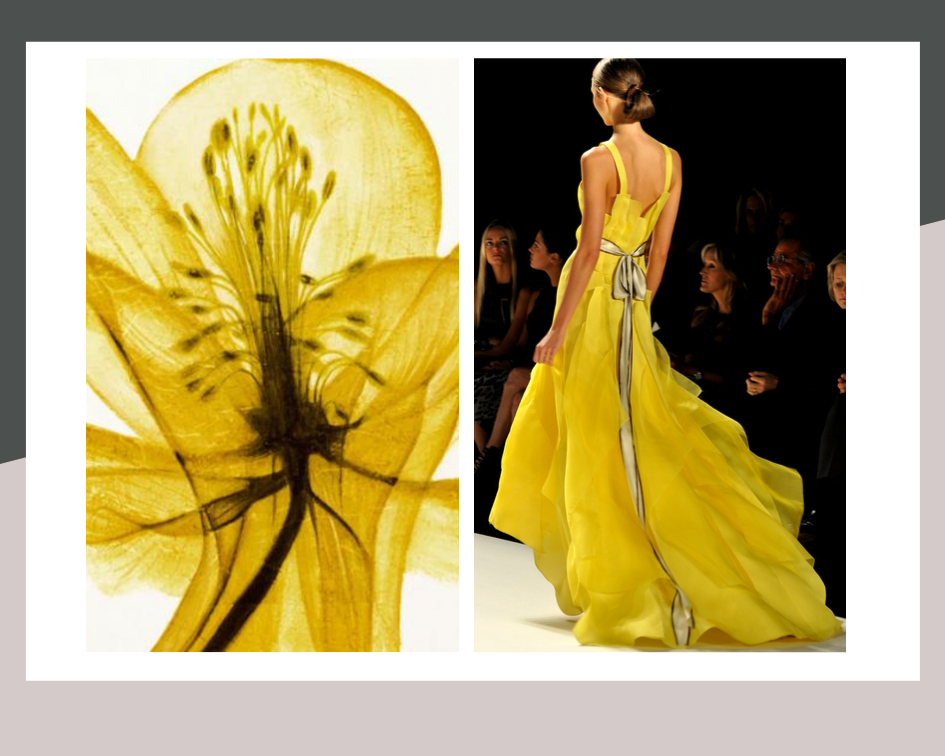
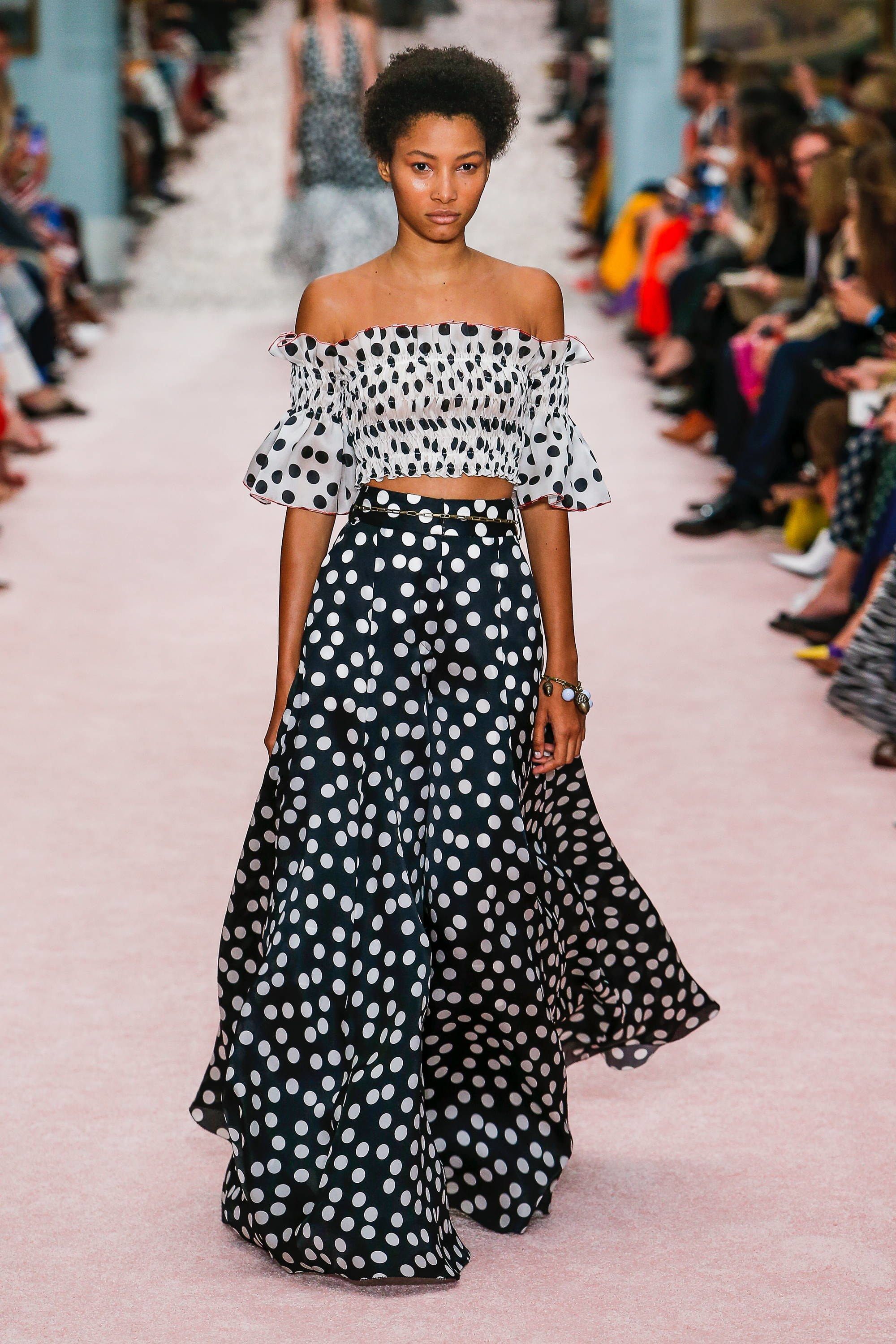
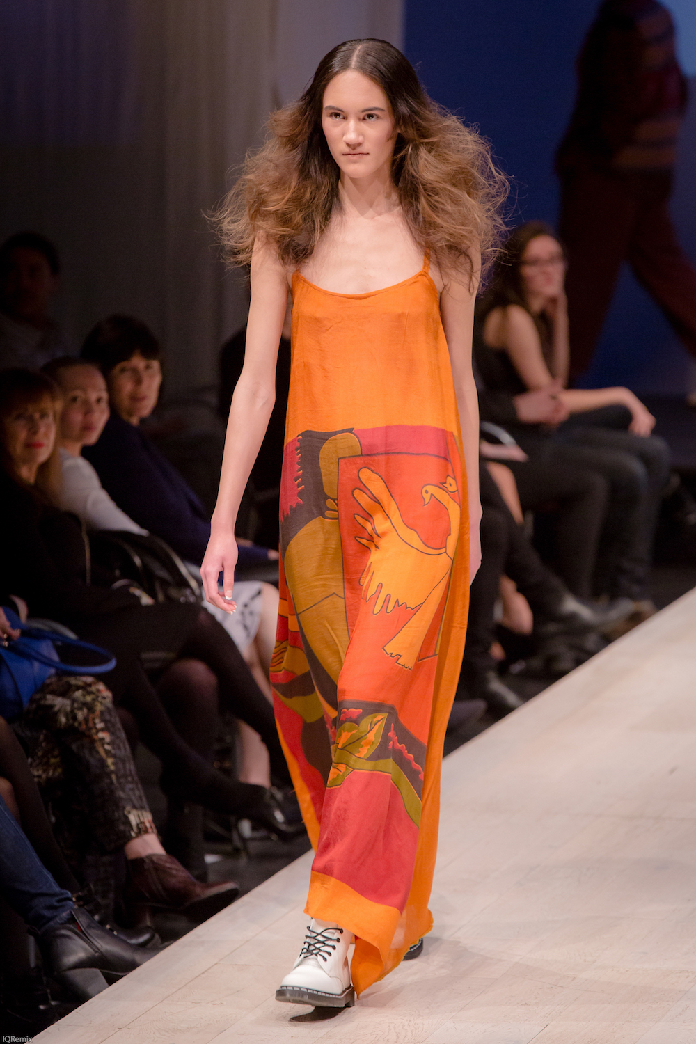
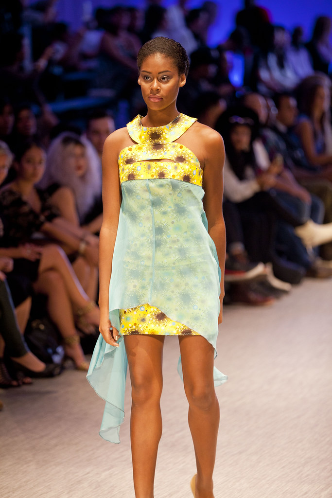
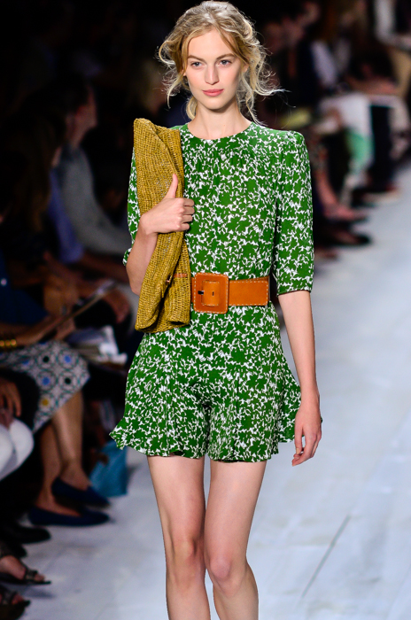
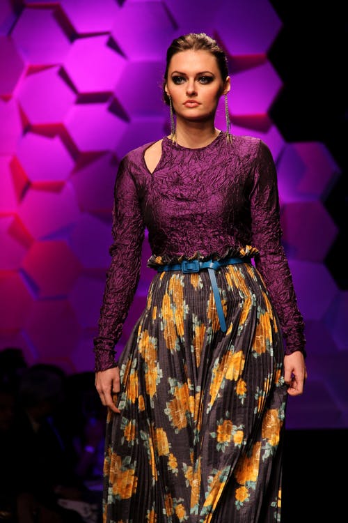
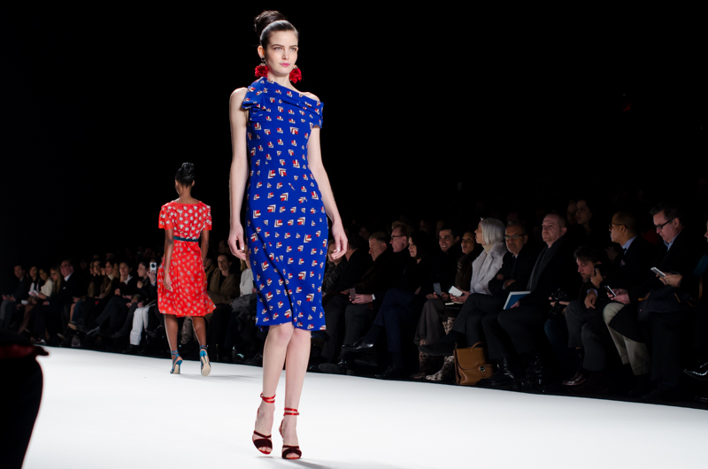
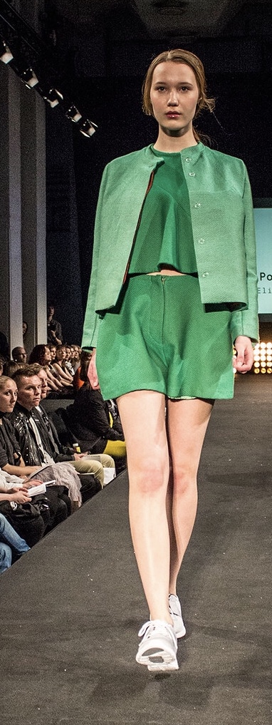
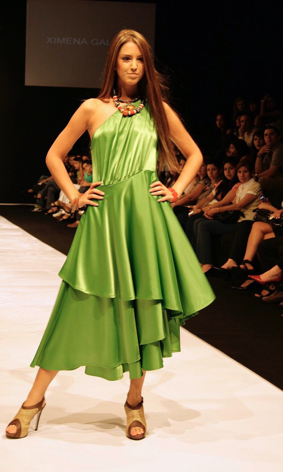
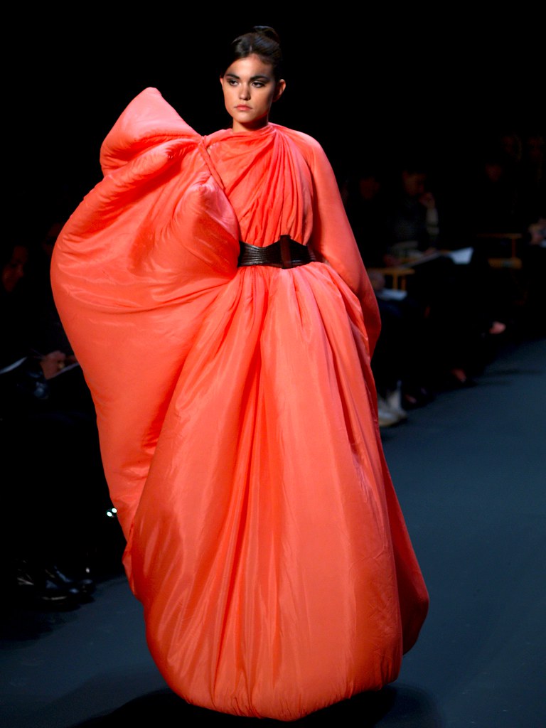
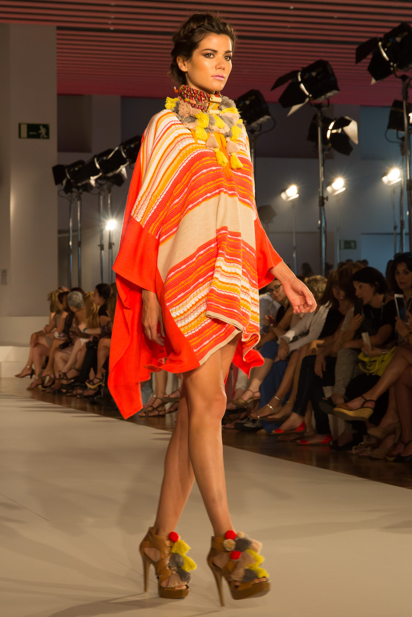
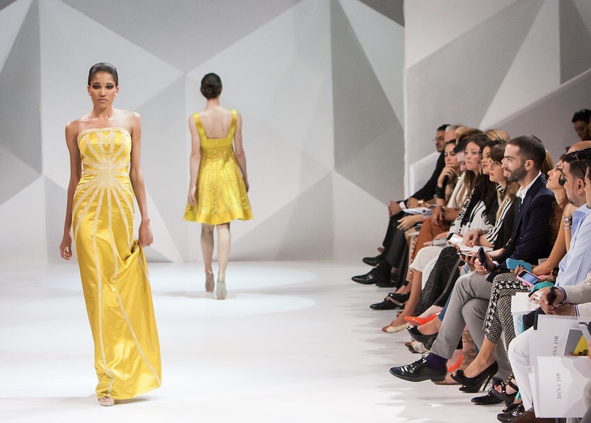
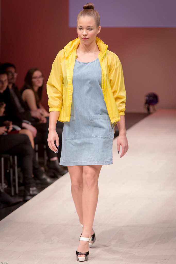
New York Fashion Week 2019 wrapped up in September and there were some runway trends for the upcoming year that caught our eye. It’s no surprise that the relationship between fashion and interiors is a close one, so these fashion trends can easily be applied to create unique spaces. We wanted to highlight a few of our favorite runway styles and how they can find a home in your wall decor!
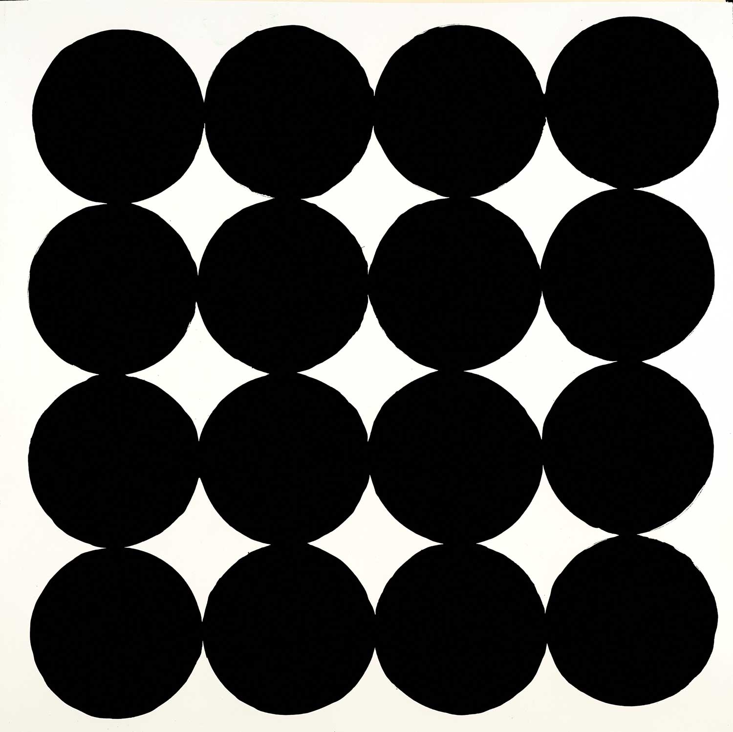
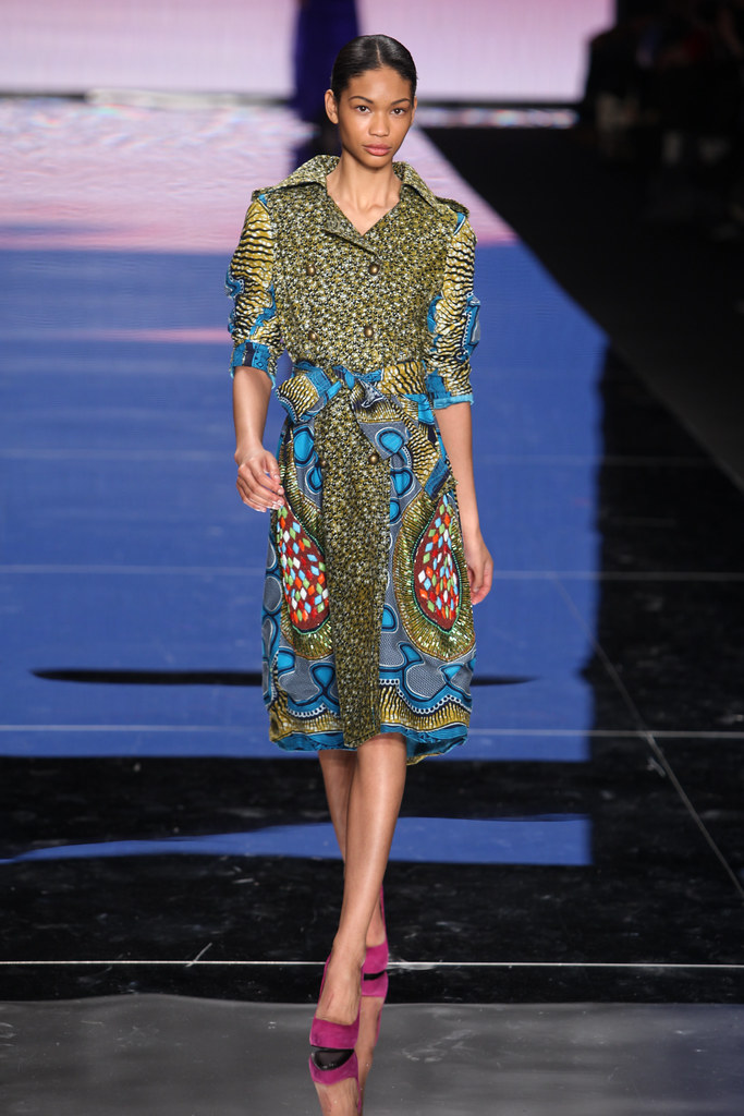
BOLD: Prints & Patterns
“Olives” by Laura Van Horne alt v 3
“Undersea Fantasia” by Liz Jardine
“Fresh Volley” by Jeff Iorillo
“Shades of Green” by Liz Jardine
“A Deep Rose” by Jill Martin
by Sarah Stockstill
“House Party” by Liz Jardine
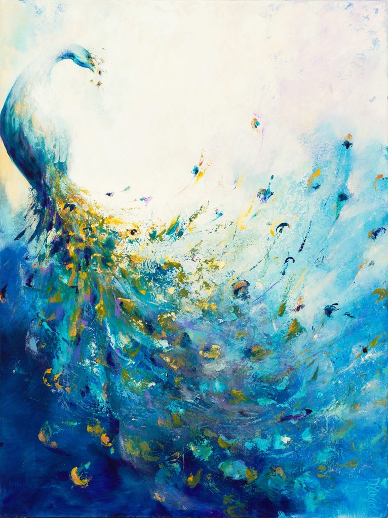
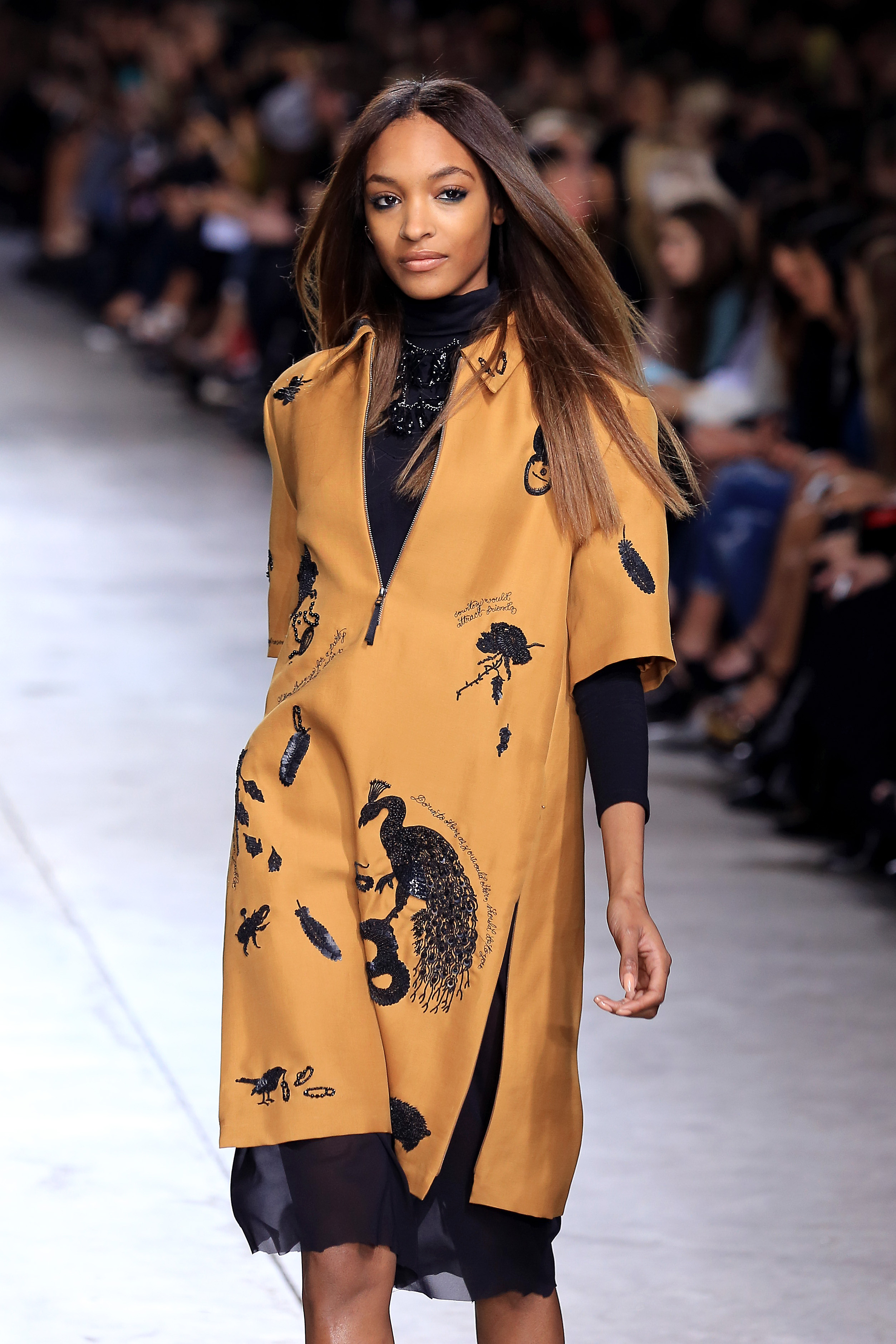
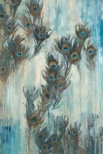
“Proud As A Peacock” by Liz Jardine
Bold patterns are trending on the runways and on our walls! From polka dots to rose prints to black & white graphic prints, we are drawing from this high-fashion inspiration and predicting bold patterns to be big in wall decor this coming year. Bold printed wallpaper and wallcovering have become very popular, and it looks to be an interior trend that will continue to grow in 2020.
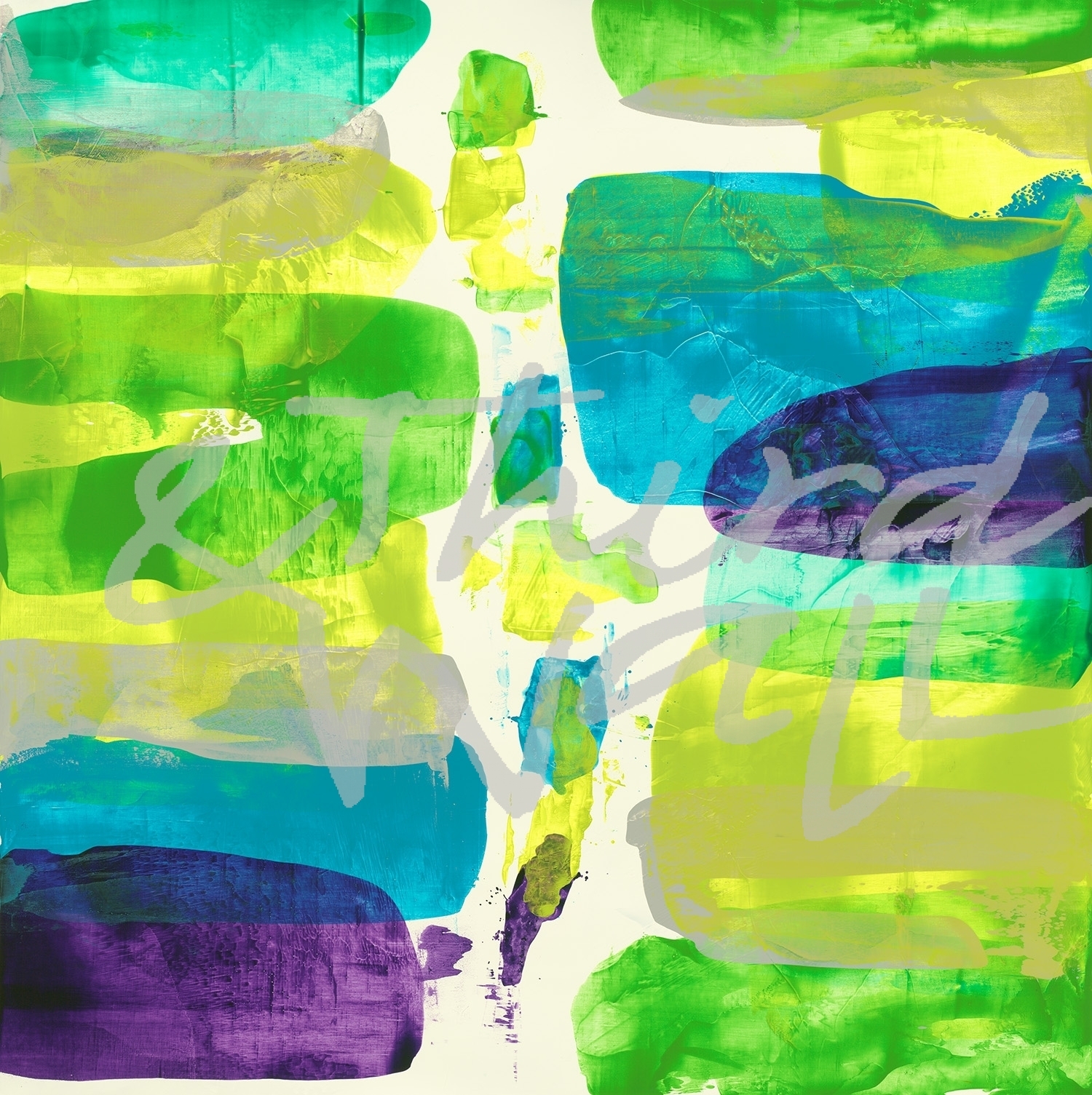
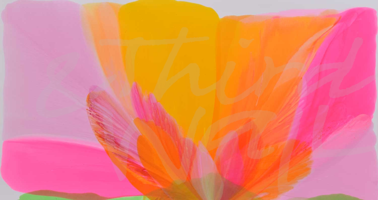
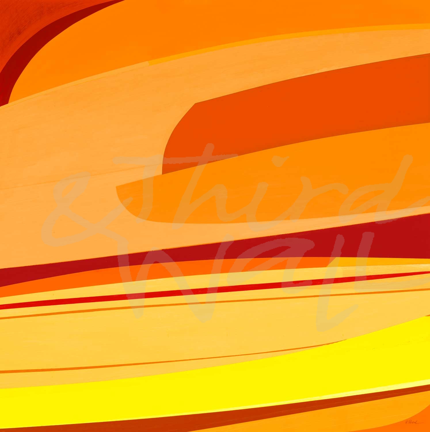
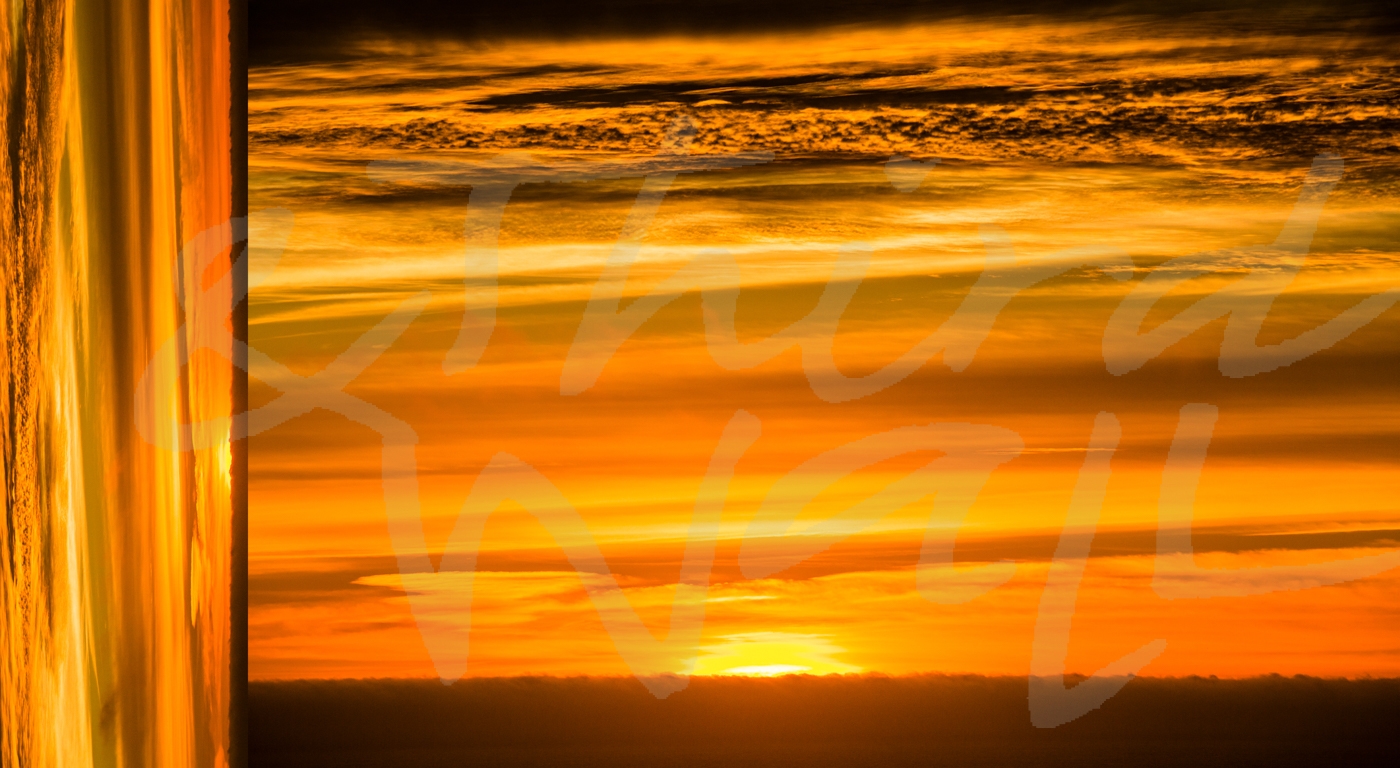
BRIGHT: Citrus-Inspired Colors
“Even Flow” by Randy Hibberd alt
“Cool Summer” by Jeff Iorillo
“The Sun and The Earth” by Linda Stelling
“Layered Sounds II” by Randy Hibberd
“Tangerine Sky” by KaCee Erle
“Cool Waves” by Liz Jardine
“The Drip #5” by Laura Van Horne
“High Note” by Liz Jardine
floral by Bradford Brenner
“Growth” by Laura Van Horne
Citrus-inspired colors are brightening up wardrobes and interiors! Refreshing colors such as lime green, tangy tangerine, and not-so-mellow yellow made a statement on the catwalks and are sure to make a splash in decor for a bright and colorful 2020. Decorating with these trendy highlighter hues can be as easy as hanging the perfect eye-catching artwork on your walls!
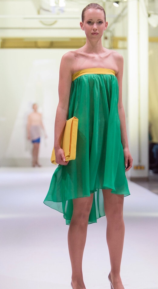
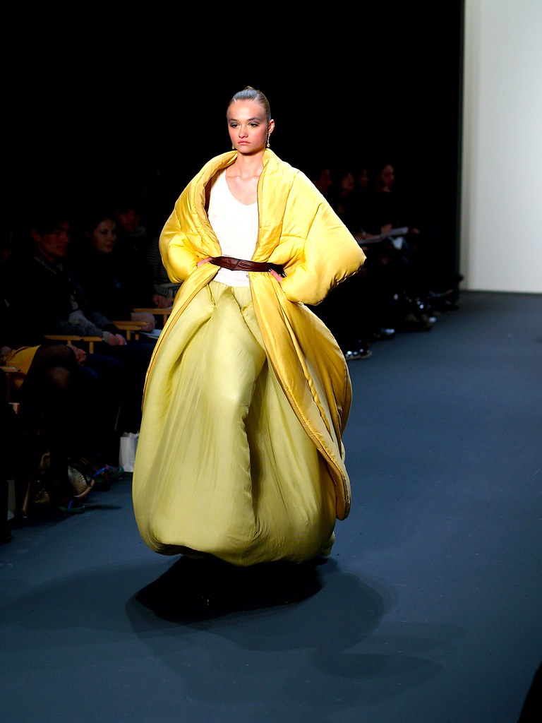
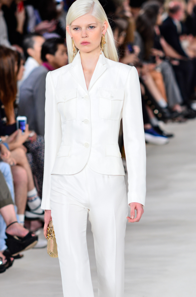
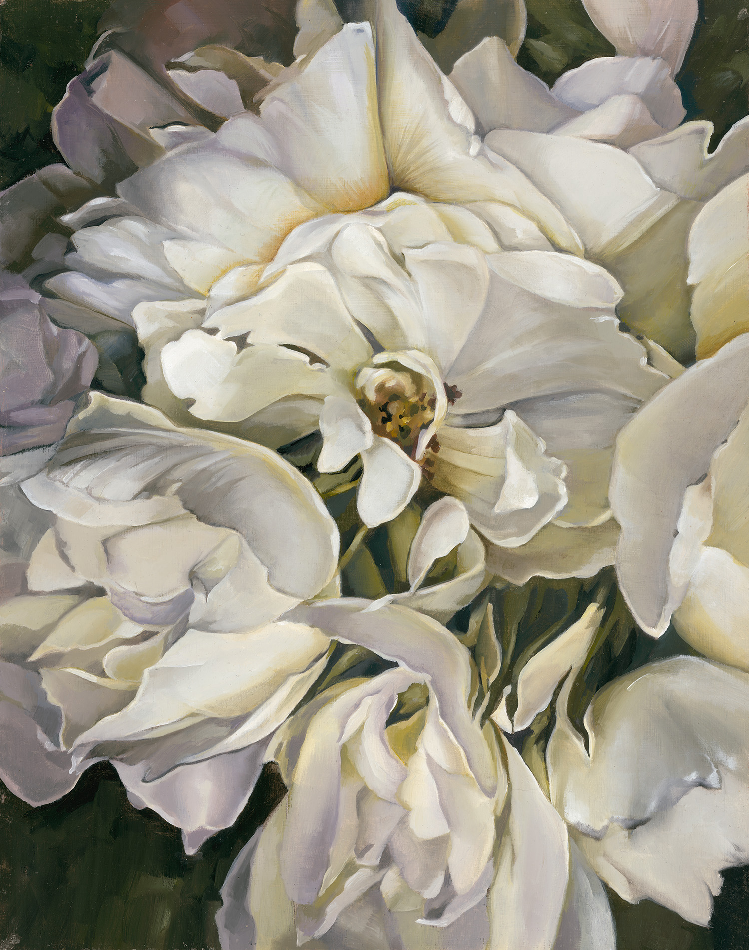
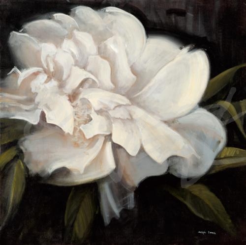
CLASSIC: All White Suit
“Stop On White” by Brooke Borcherding
“Still Life” by Julie Devine
photograph by Nancy Crowell
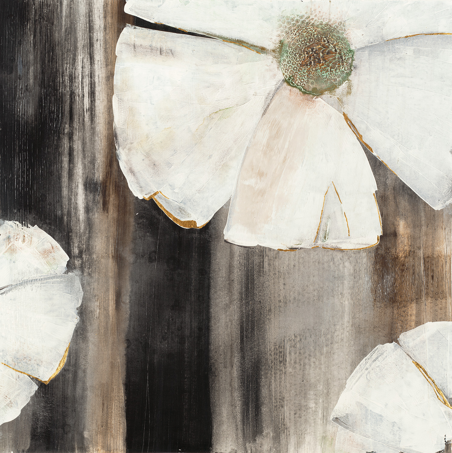
“Pearlescent Blooms” by K. Nari
The all-white suit continues to be a chic fashion staple and this past New York Fashion Week, designers were taking it to the next level with sultry cutouts and unique silhouettes. This clean, classic, and structured runway trend took a more relaxed, stylized vibe this year and it can easily transition to interior design and decor. Whether you want an all-white space or just some neutral decor, wall art in this pared-down color palette can be the stylized, unique accent piece you need!
The fashion and design industries are continually influencing each other and we love looking to the fashion world for inspiration!
The images featured above are available in our Print-On-Demand collection. Some areas of our website are password-protected. If you are a member of the trade but don’t have full access to our website, www.thirdandwall.com, please contact us at customerservice@thirdandwall.com.
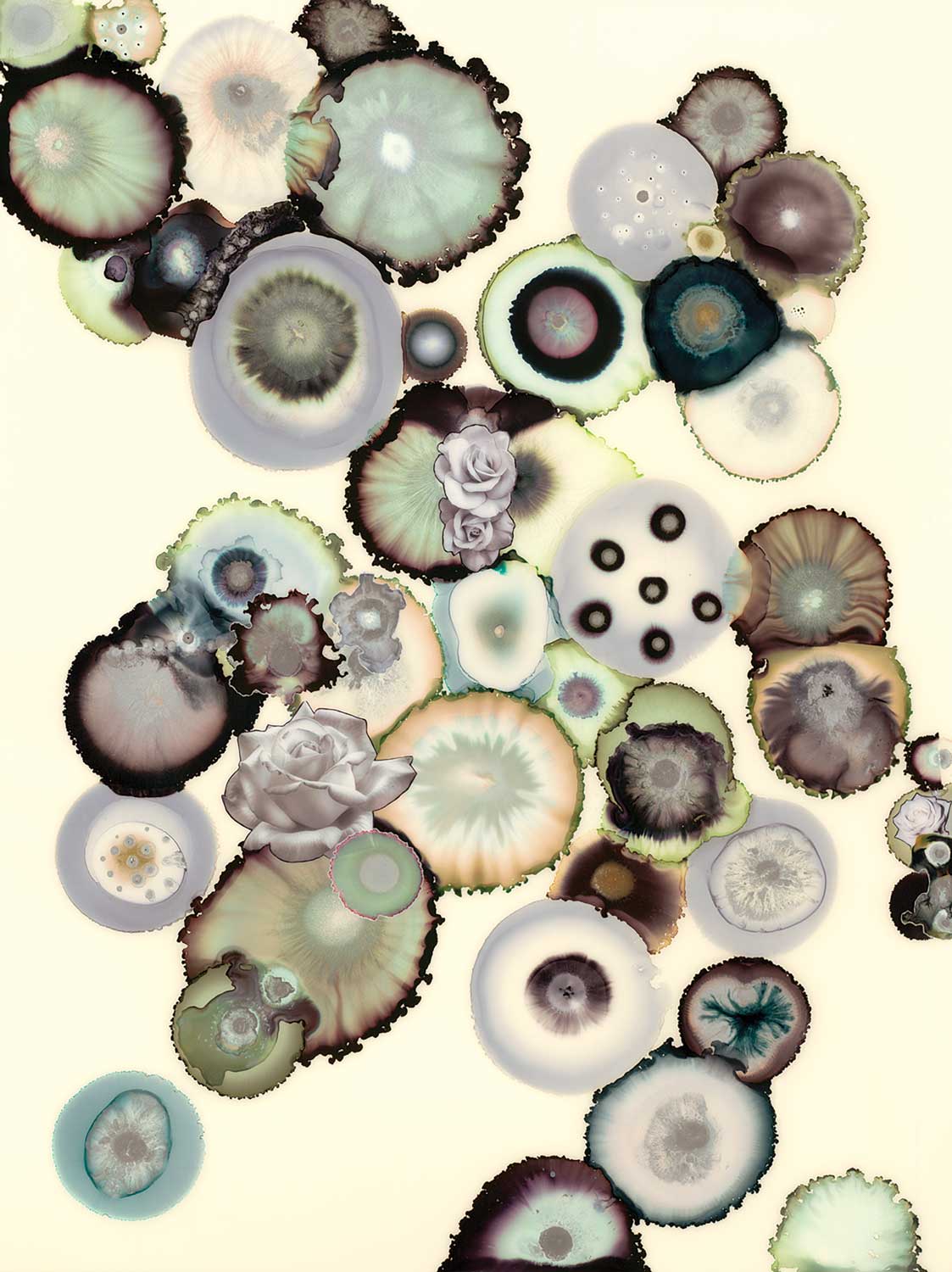
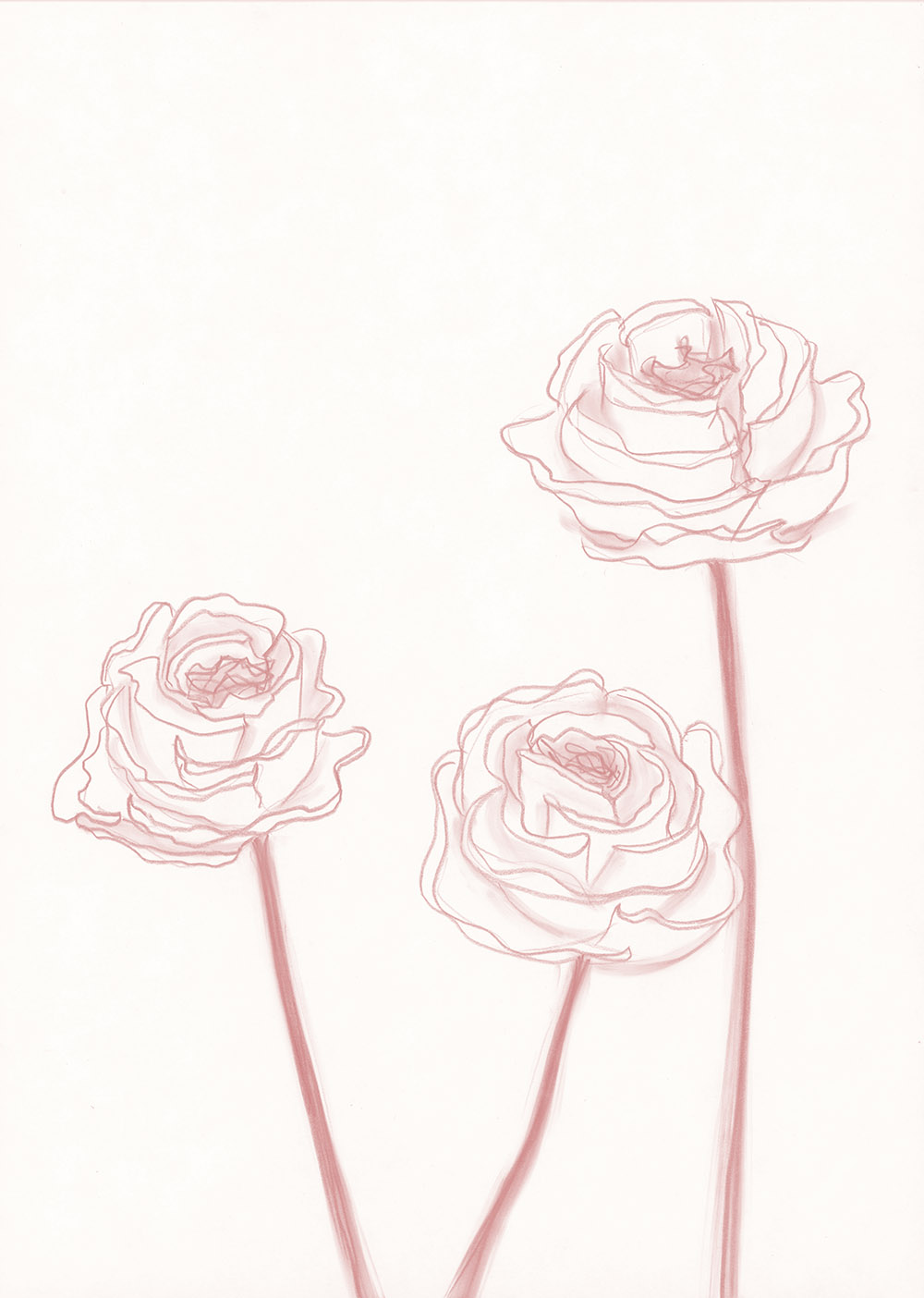
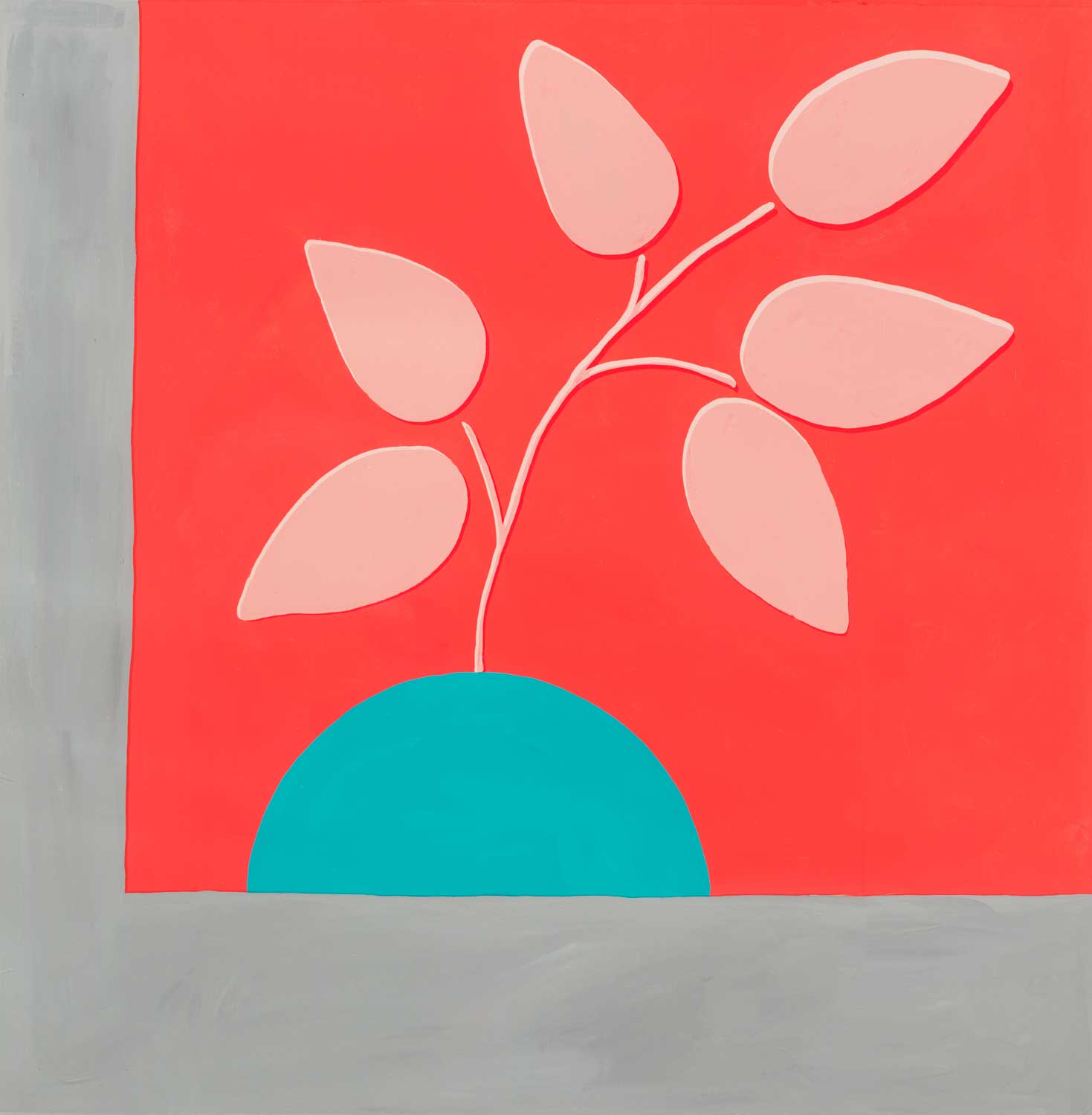
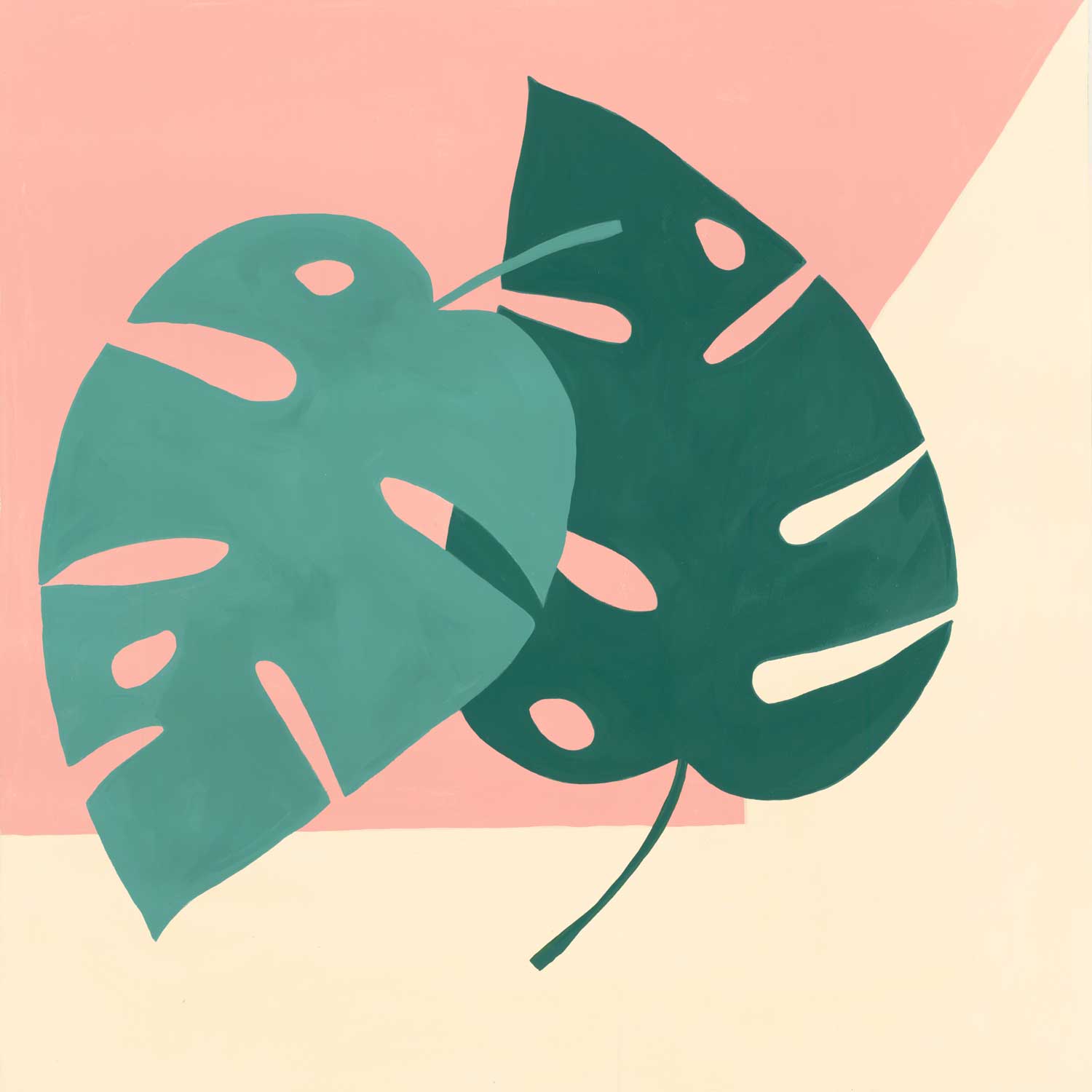
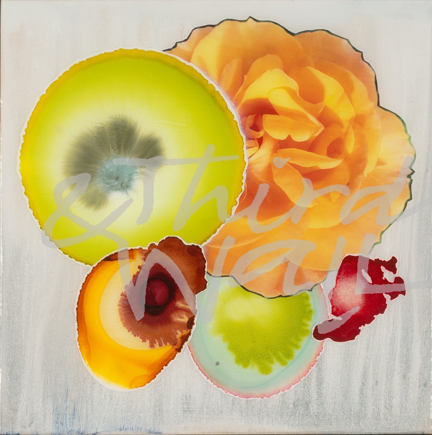
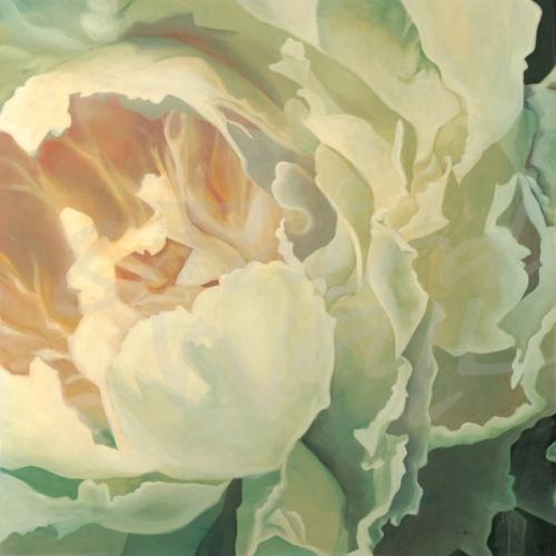
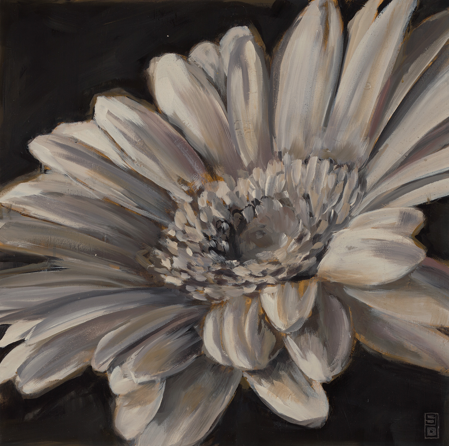
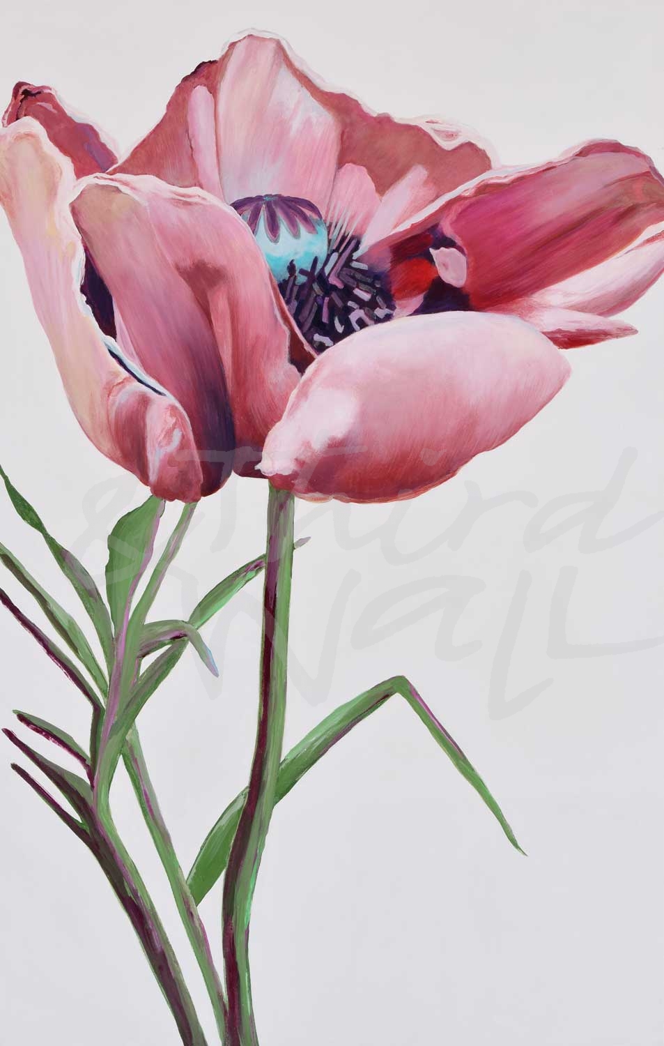
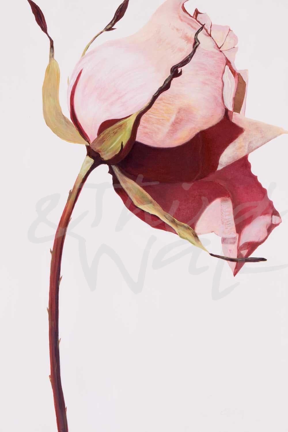
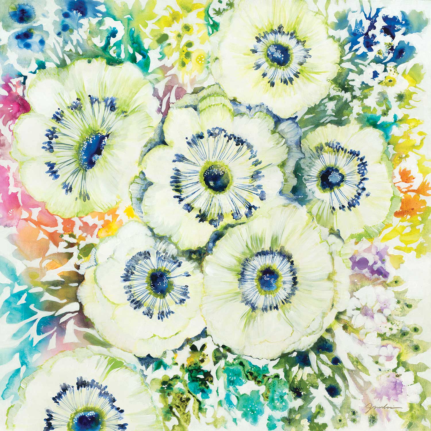
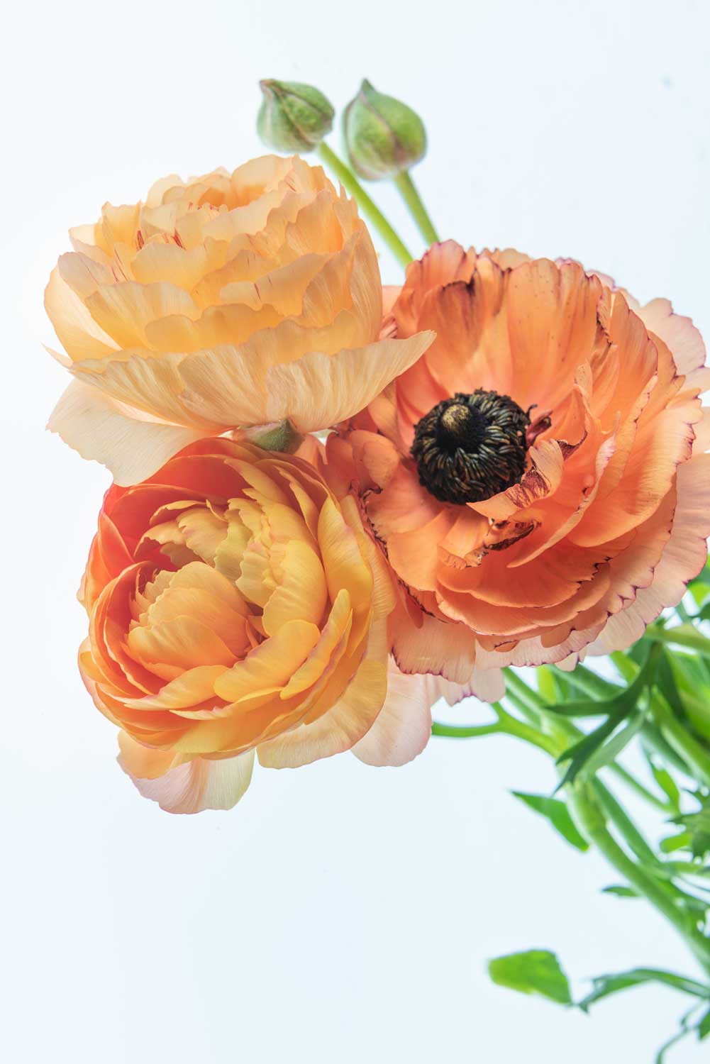
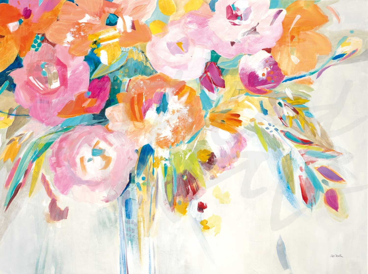
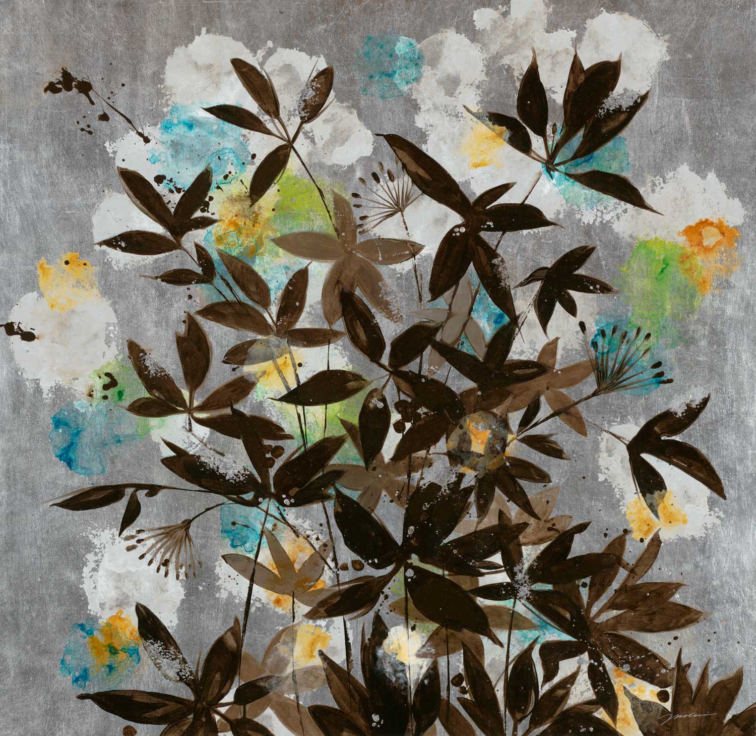
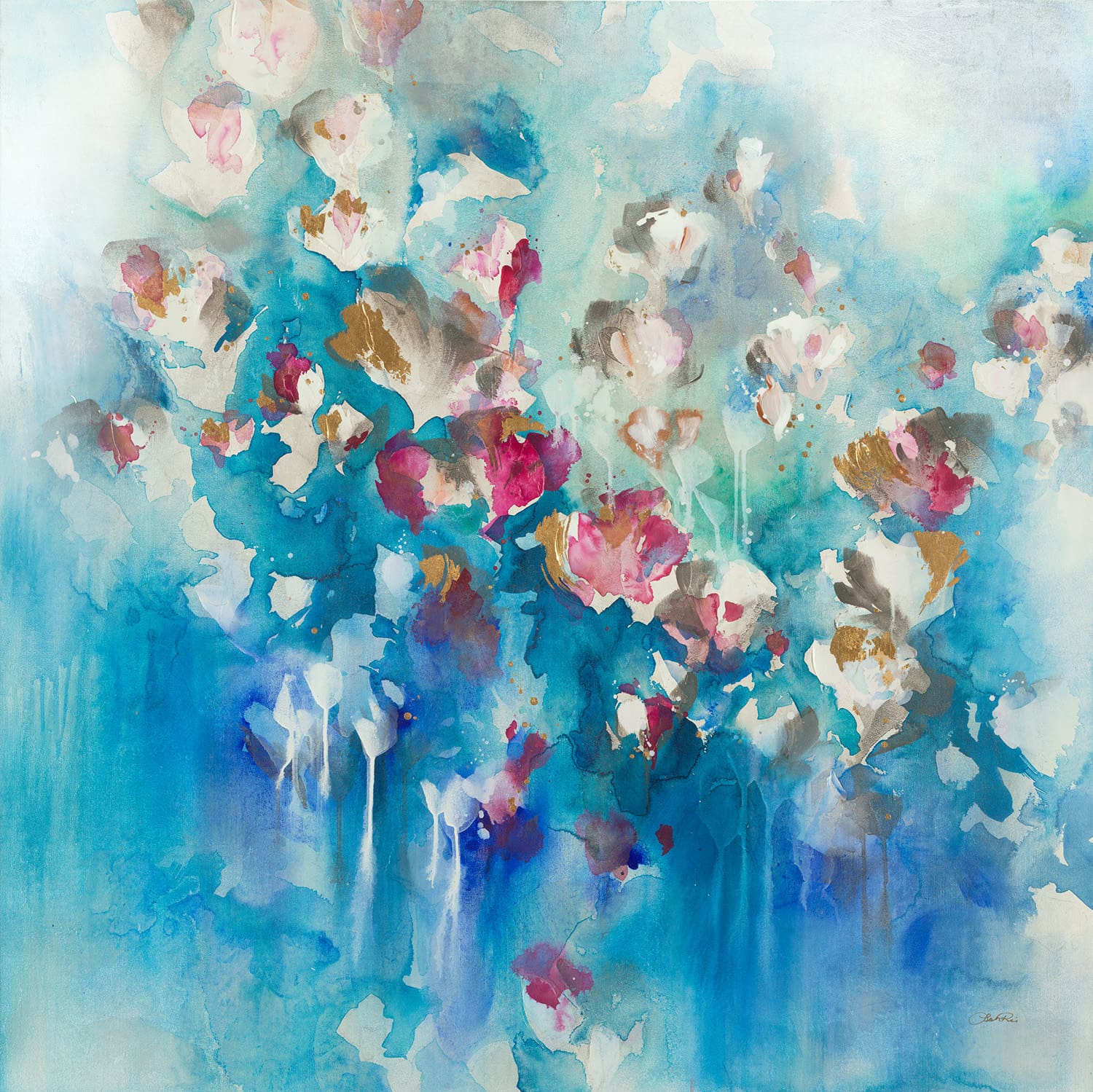
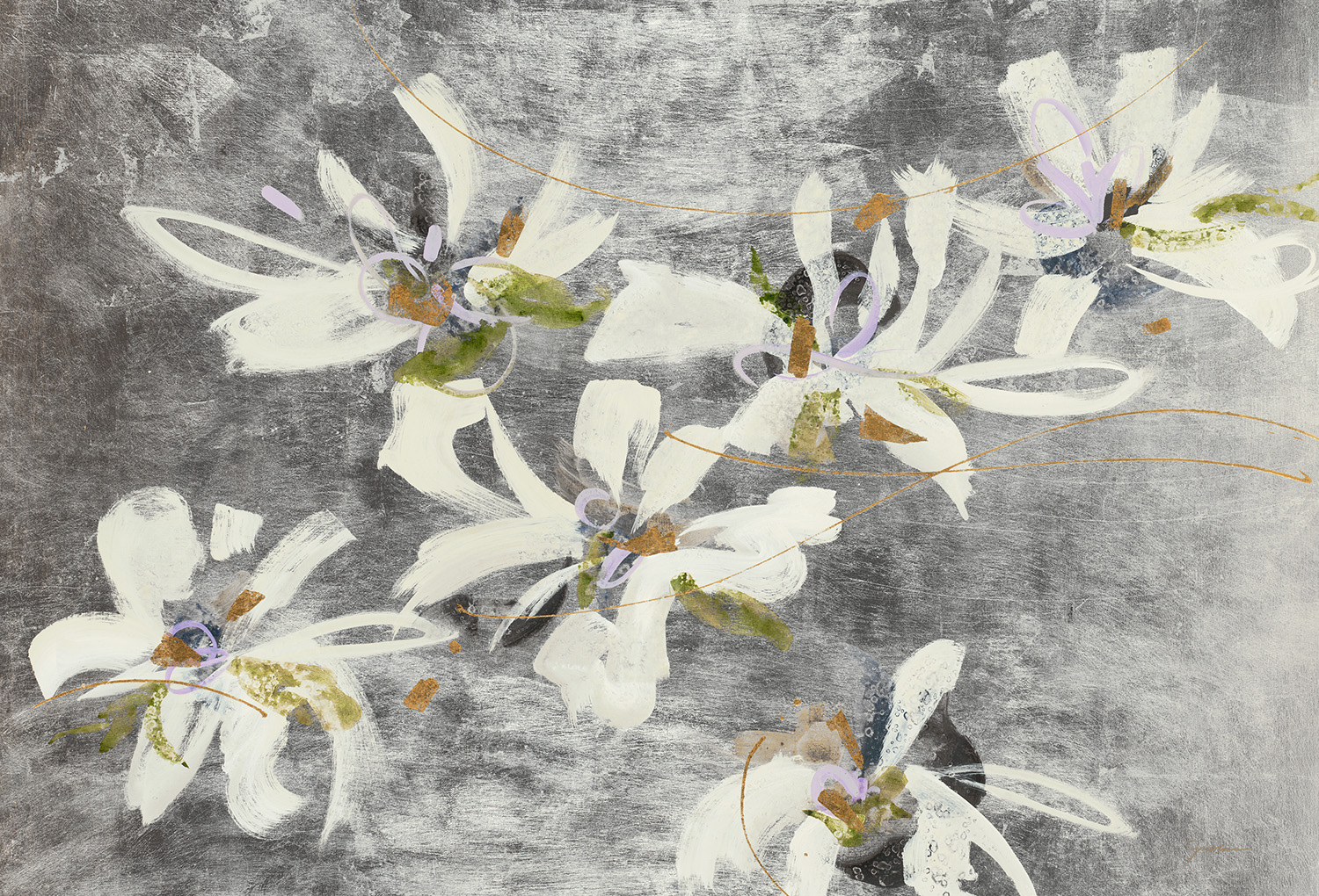
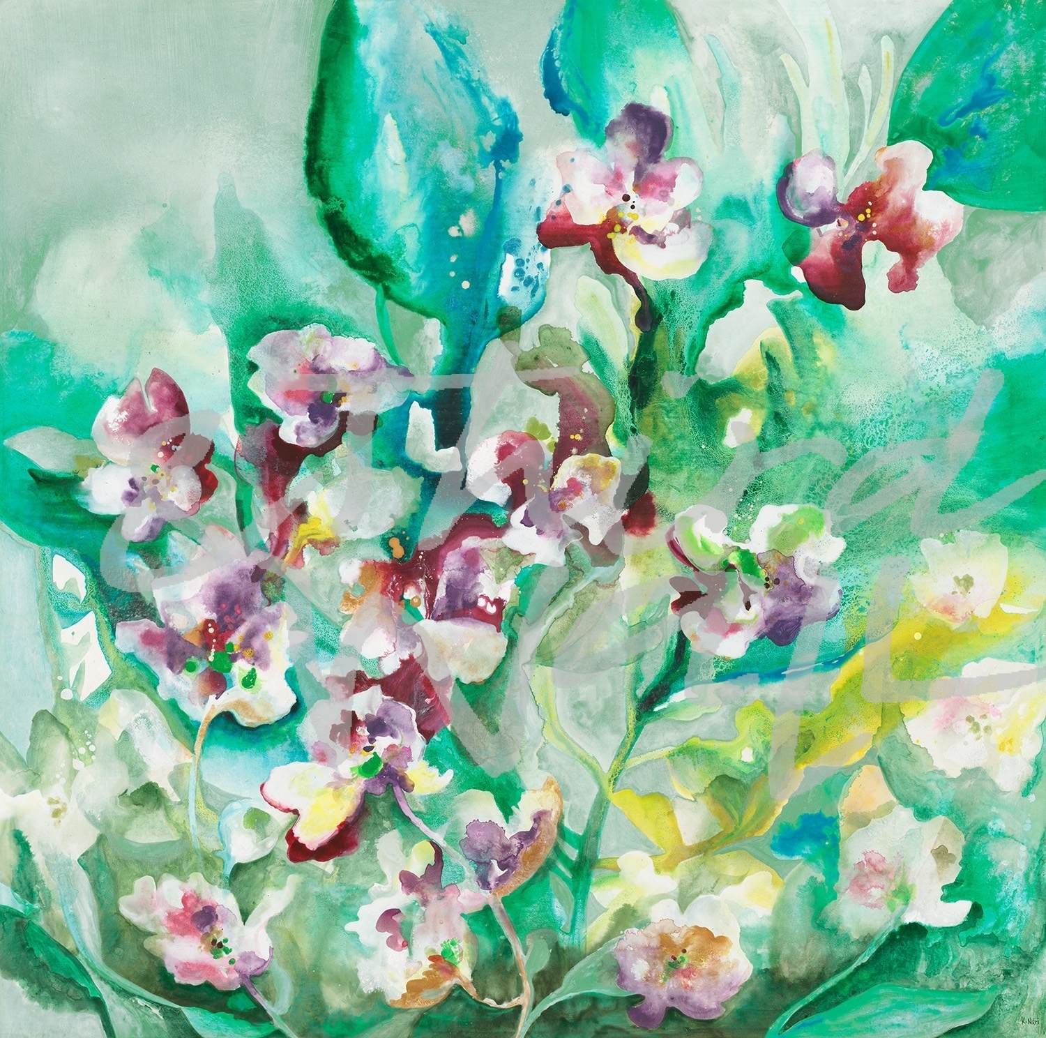
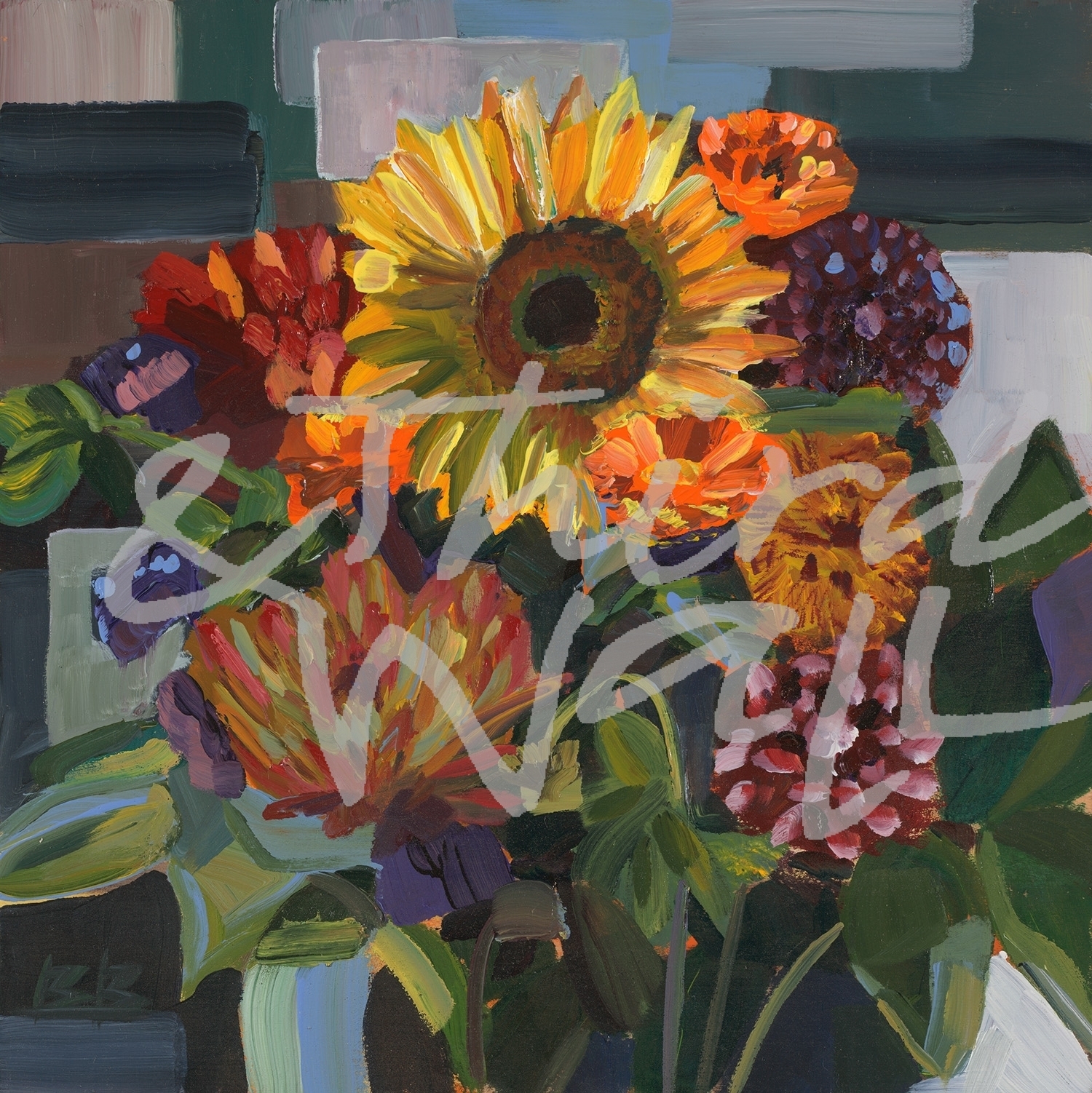
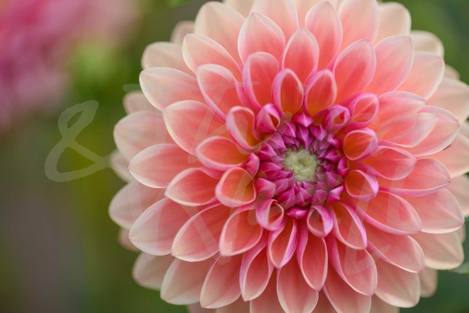
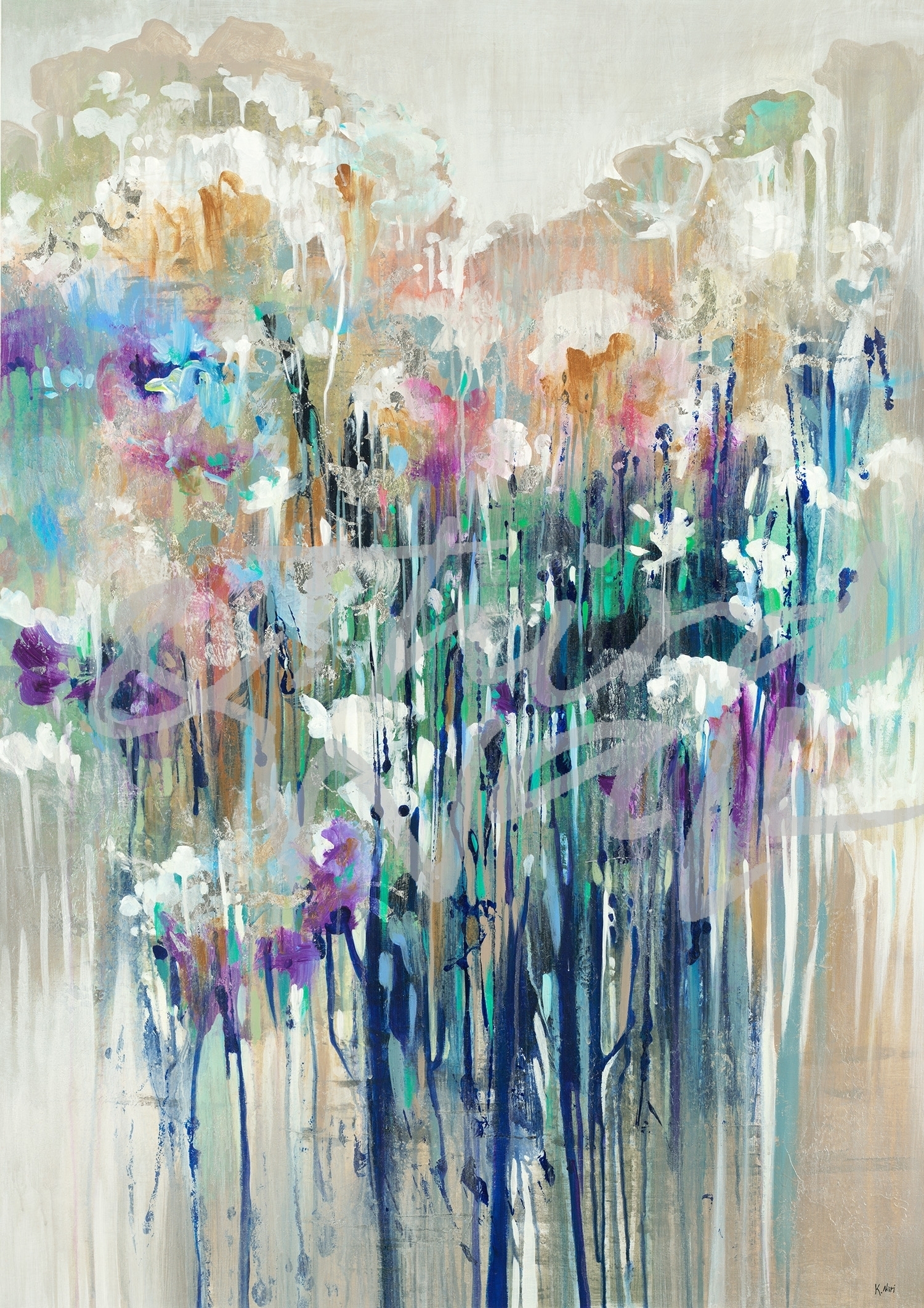
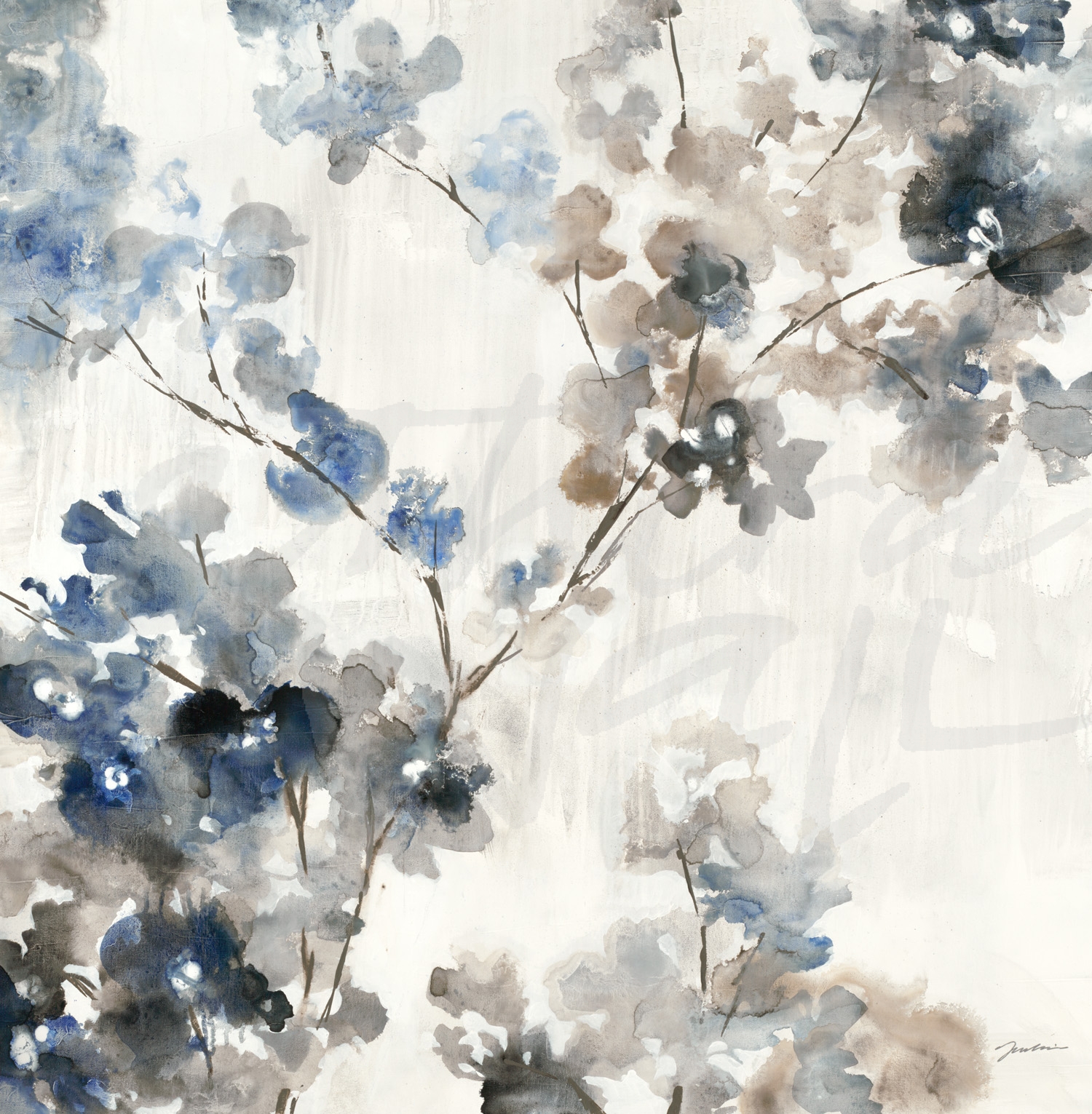
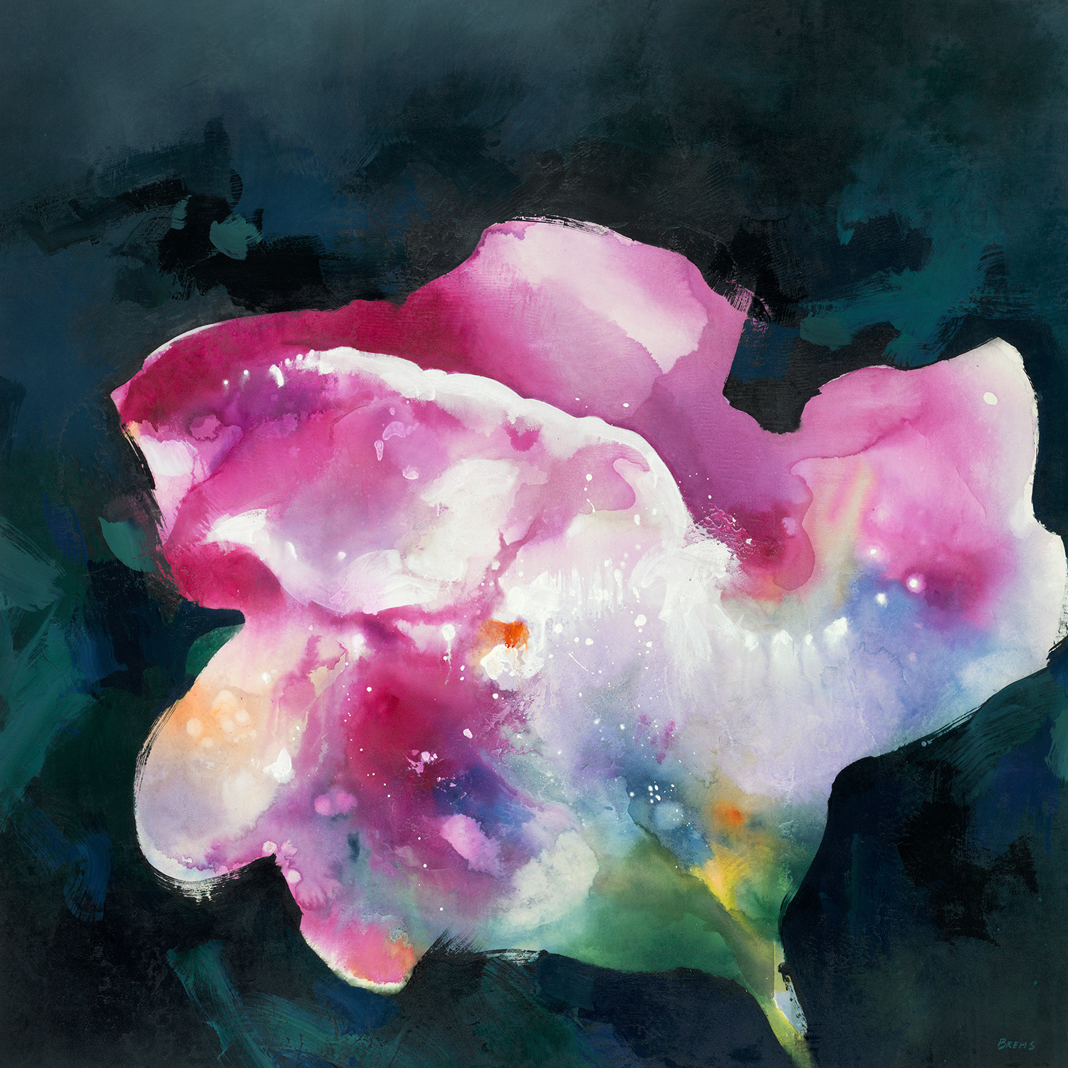
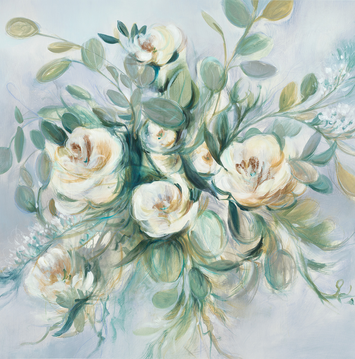
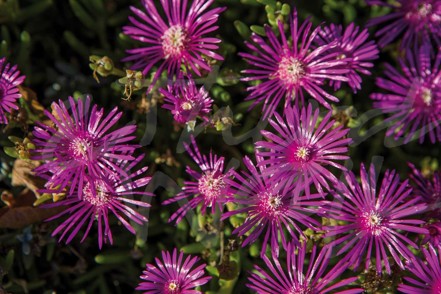
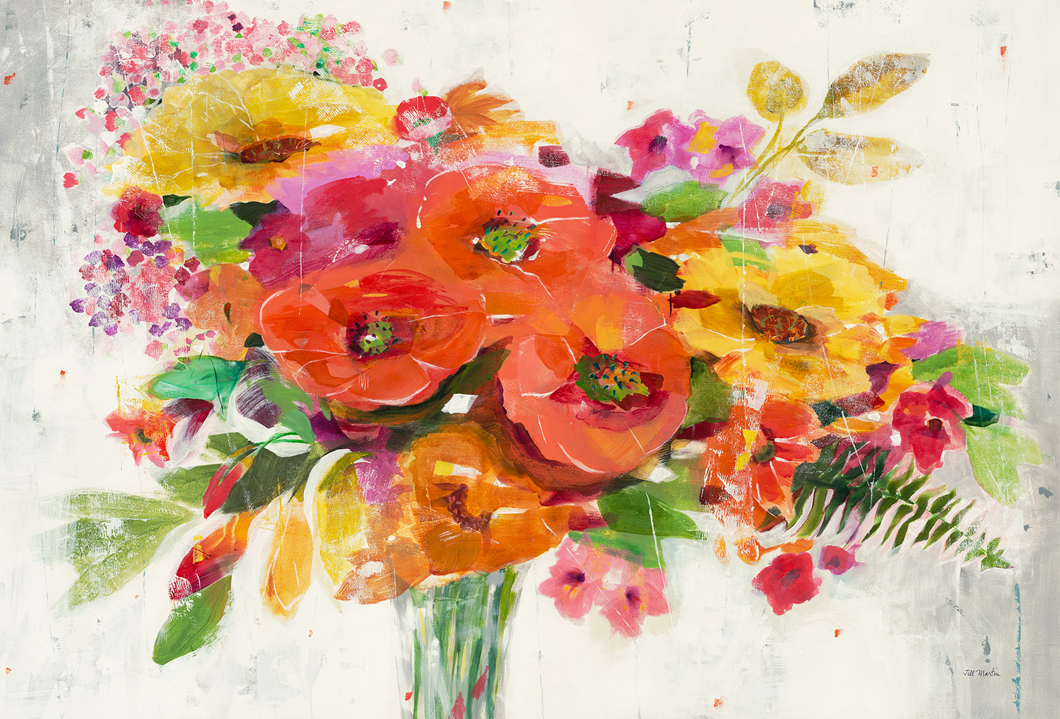
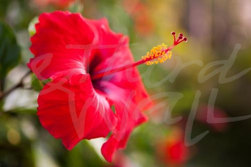
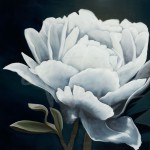
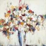
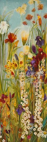
We are firm believers that floral decor is always in season! There are many different ways to add florals to your design, and one of our favorites is hanging big, bold floral prints on your wall. Floral and botanical artwork reflects the uniqueness of each flower, making it an easy way to bring color, joy, and the beauty of nature indoors to any design style. Since it is such a timeless décor trend, we wanted to share some floral imagery that will add some flower power to your space!
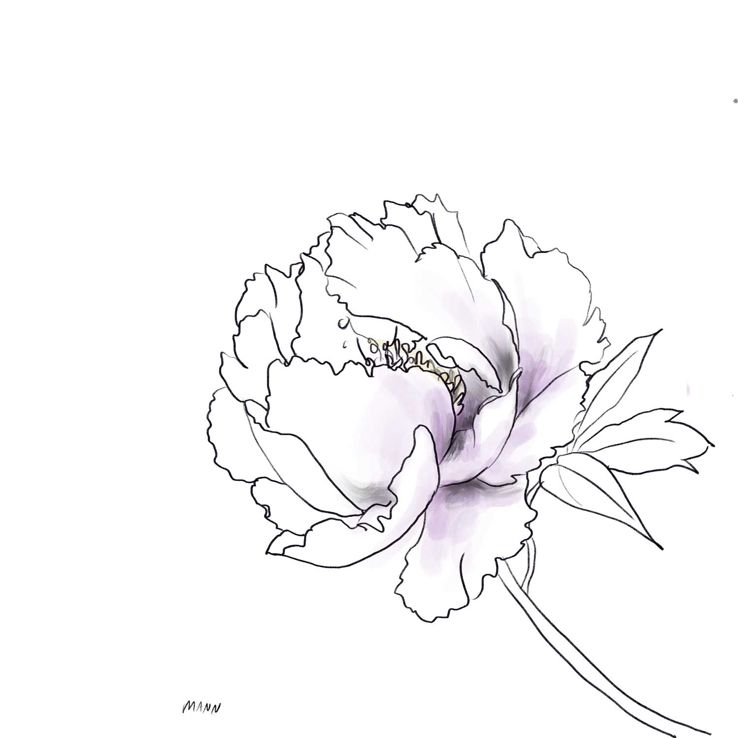
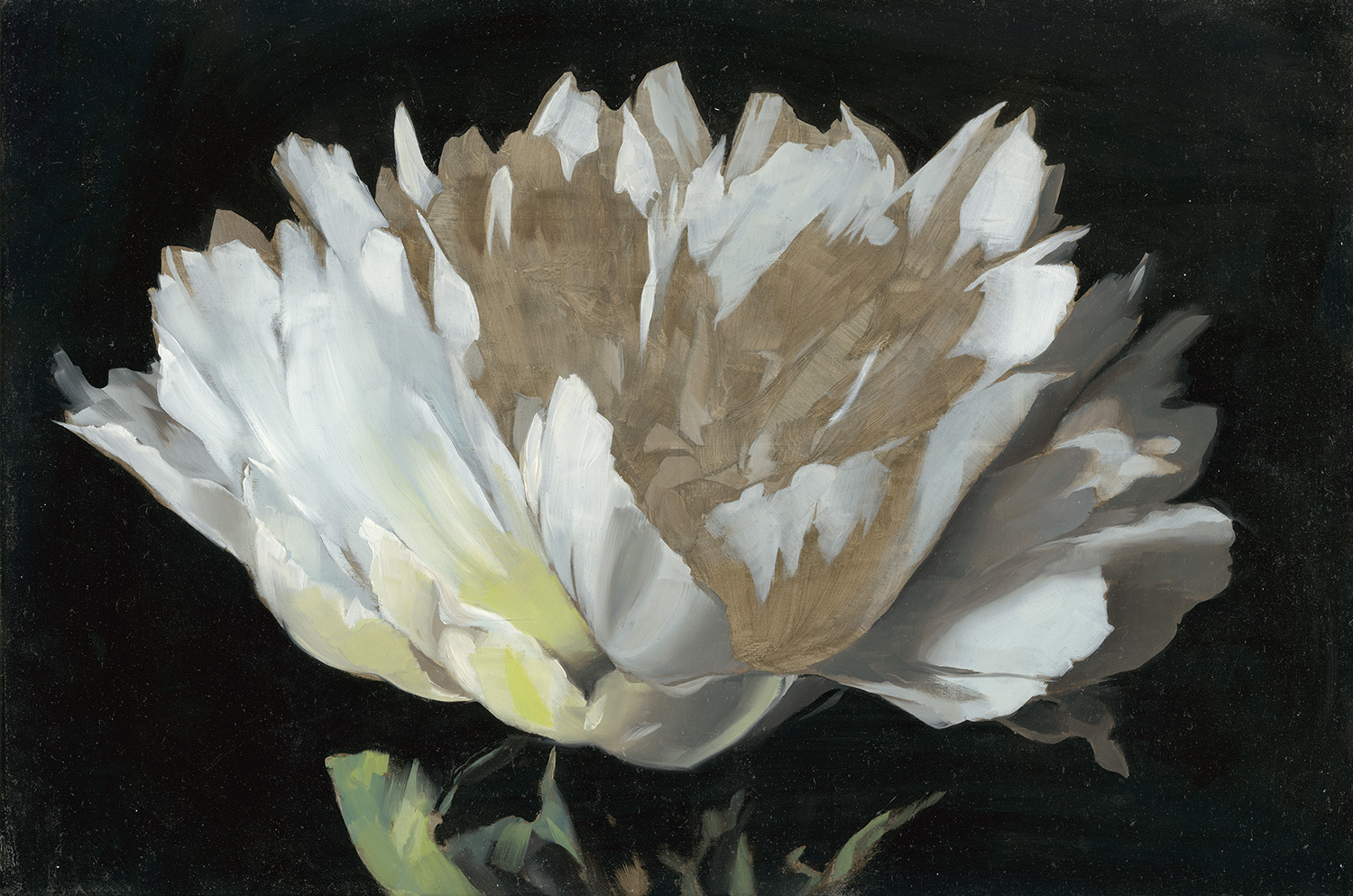
“Peony Study 4” by KC Haxton
“Botanic Sketchbook I” by Stacy D’Aguiar
“A Charmed Life” by Liz Jardine
“Paris Poppy” by Linda Stelling
“For The Roses” by Liz Jardine
“Love Is A Rose I” by Linda Stelling
“Flower I” by Joseph Cates
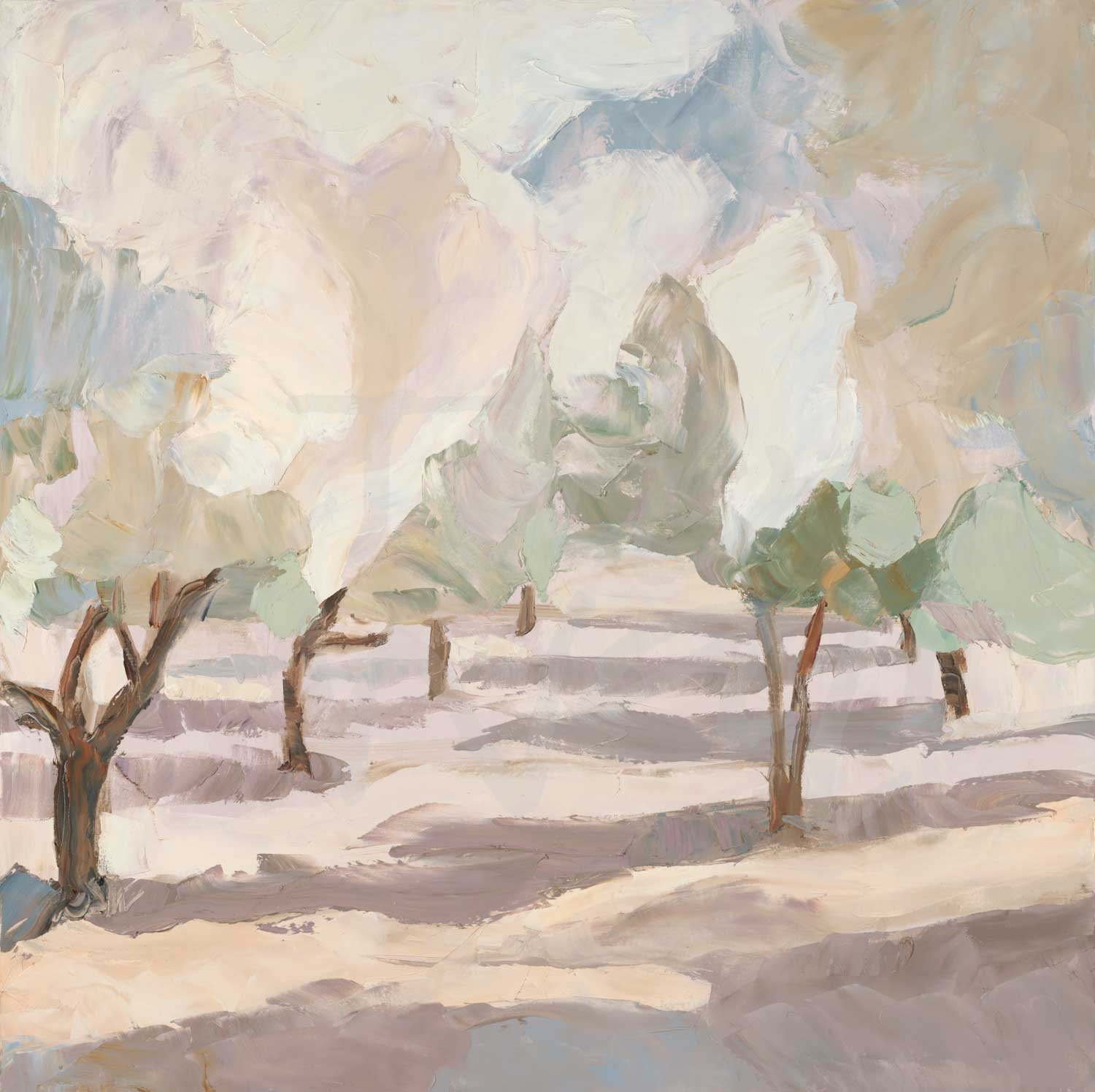
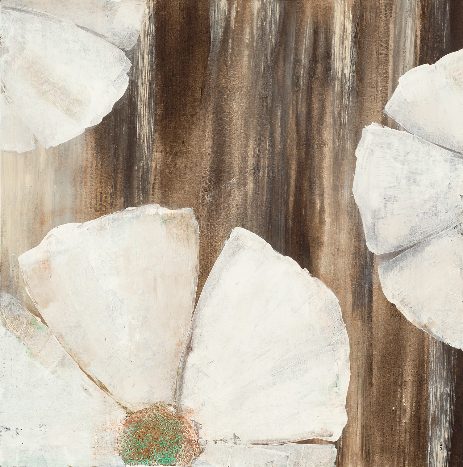
“Reaching For The Sun V” by Ruth Fromstein
“In Full Bloom” by Liz Jardine
From traditional to contemporary styles, big and bold florals can breathe life into your design!
“Vivid Flower III” by Patti Mann
photograph by Nancy Crowell
“Pearlescent Blooms” by K. Nari
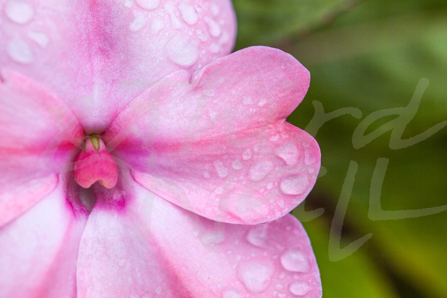
photograph by Melissa McClain
“Dance Lessons” by Jill Martin
photograph by Melissa McClain
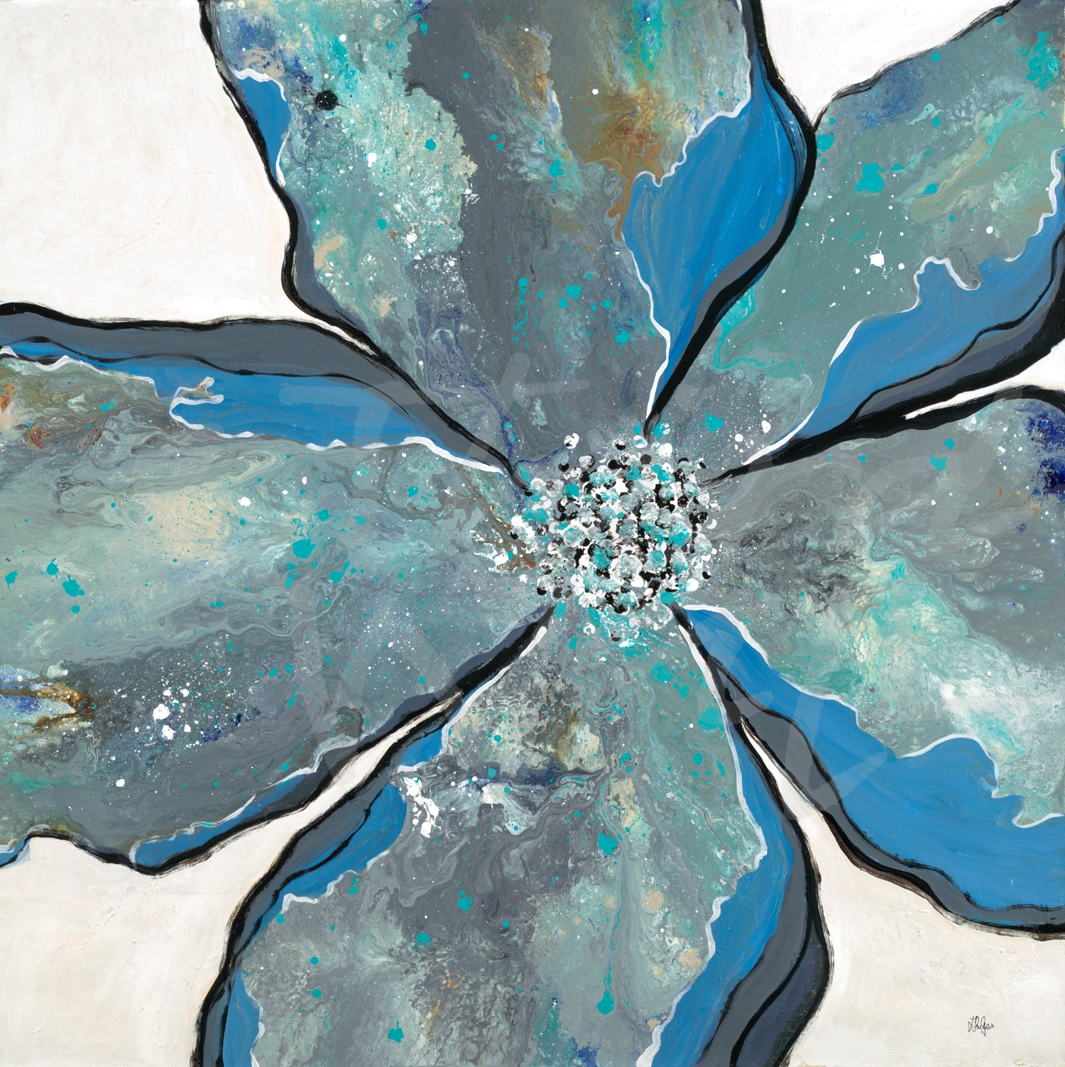
“In Bloom” by Lisa Ridgers
“Floral Blush” by Lisa Ridgers
“Blue Magnolia II” by Leah Rei
photograph by Nancy Crowell
photograph by Melissa McClain
“Midori I” by K. Nari
“Cruisin'” by Ruth Fromstein
“Night Blooms I” by Nancy Ngo
“Beautiful Day” by Liz Jardine
The images featured above are available in our Print-On-Demand collection. Some areas of our website are password-protected. If you are a member of the trade but don’t have full access to our website, www.thirdandwall.com, please contact us at customerservice@thirdandwall.com.
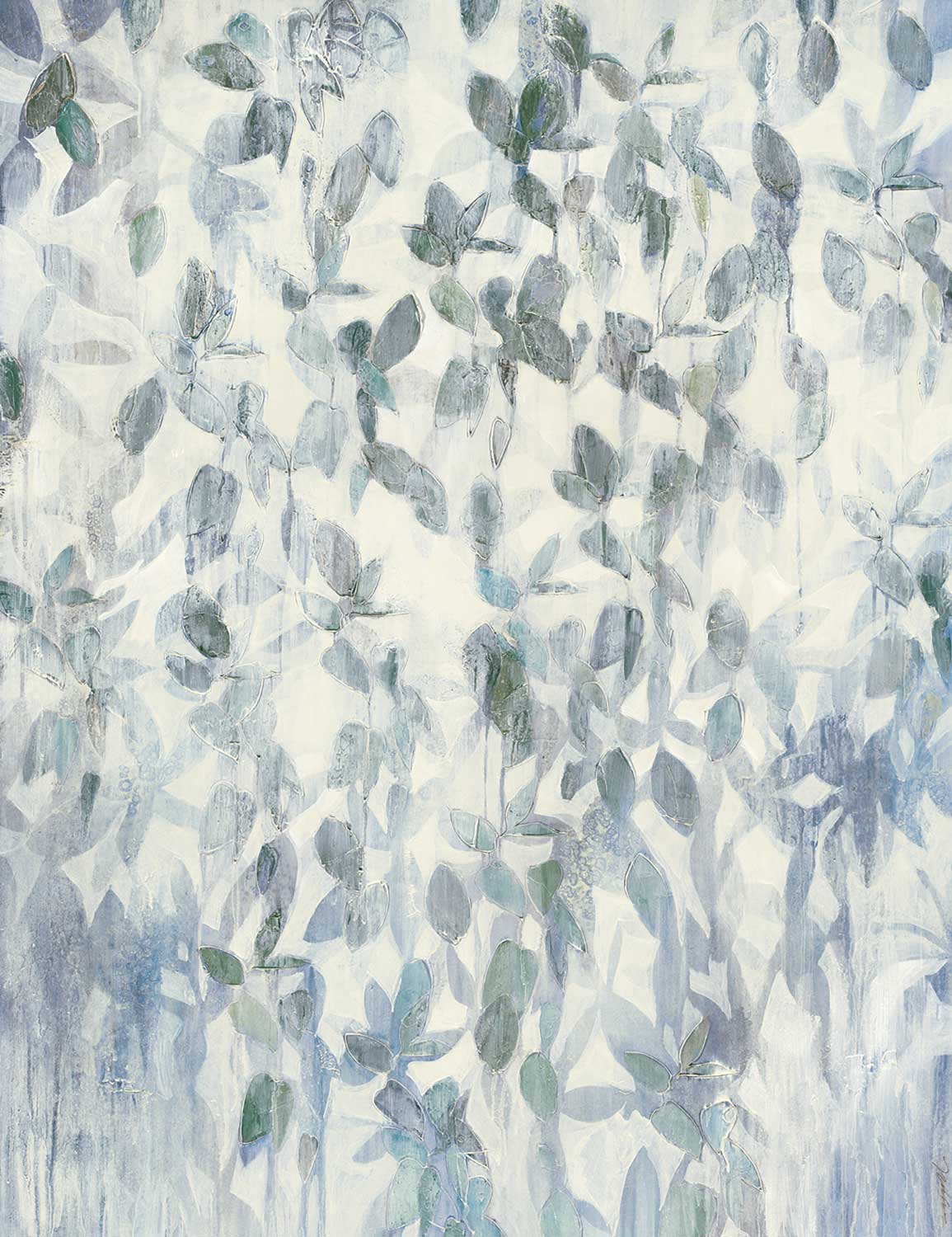
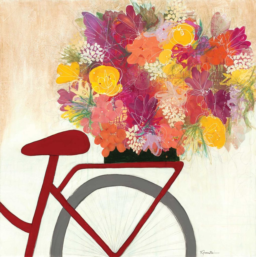
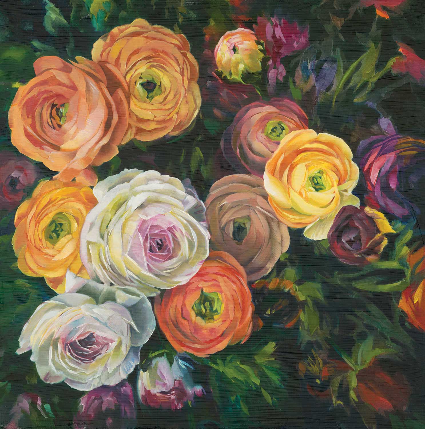
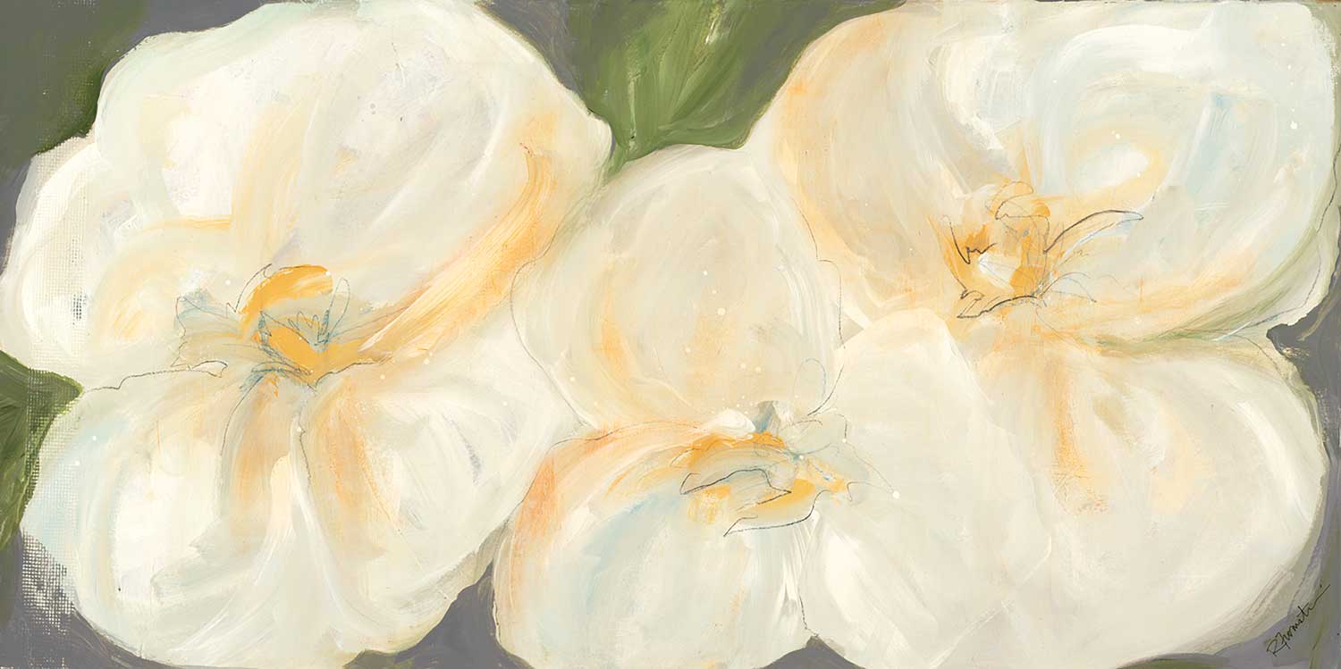
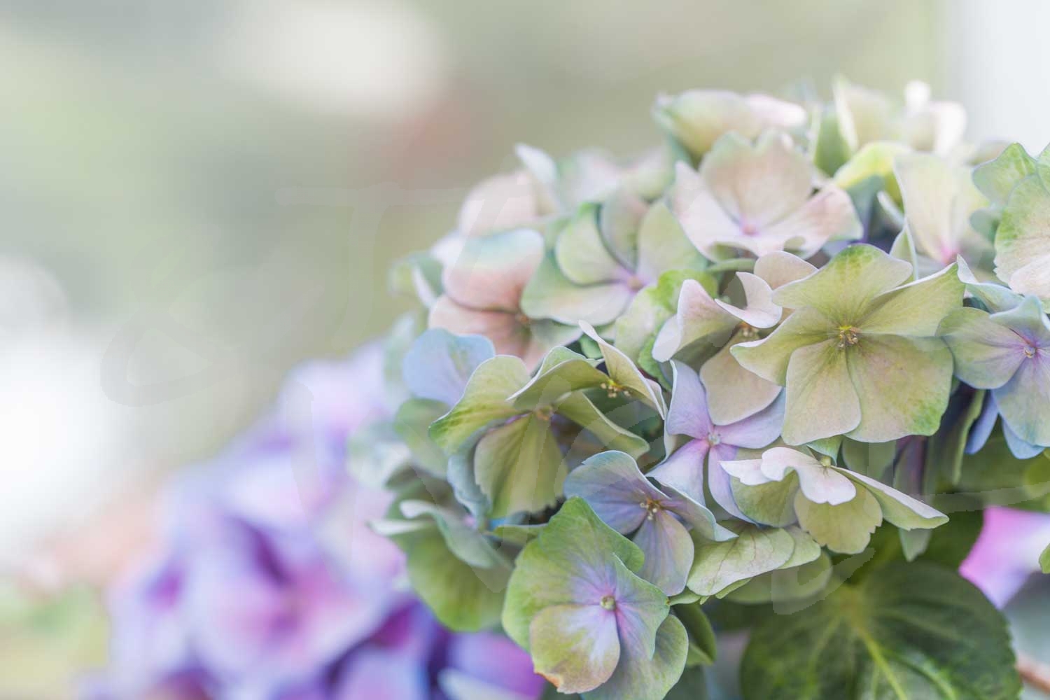
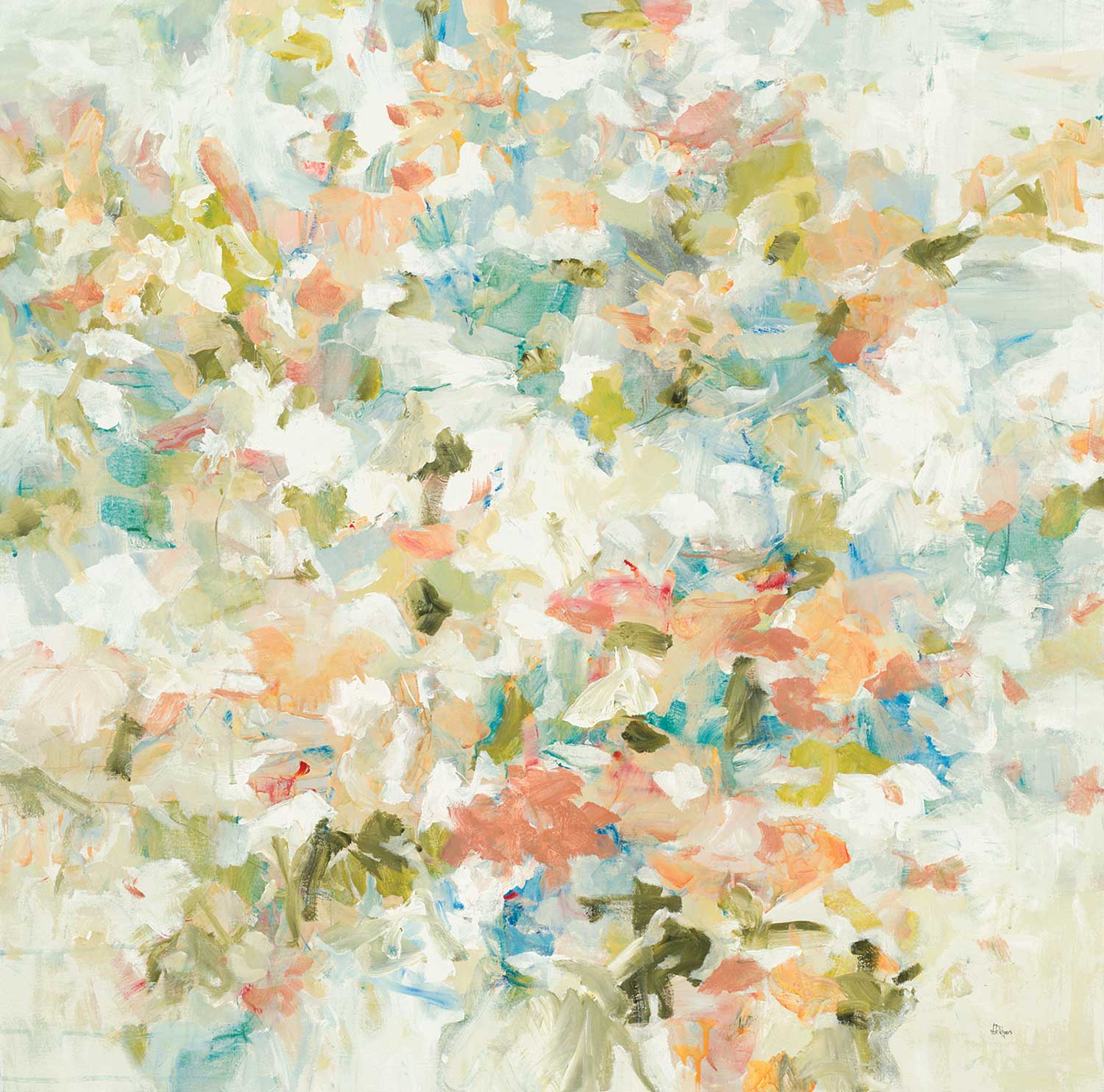
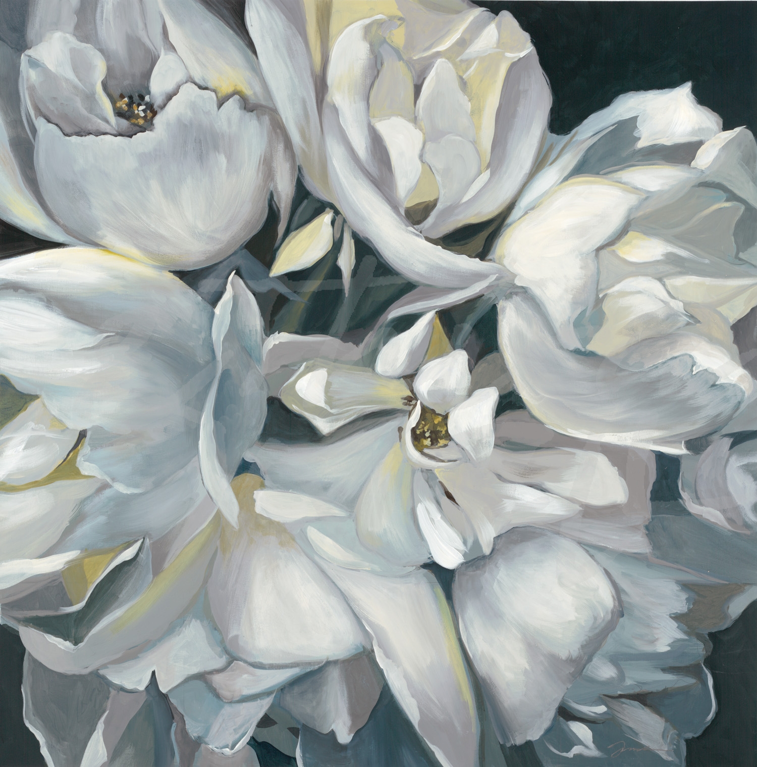
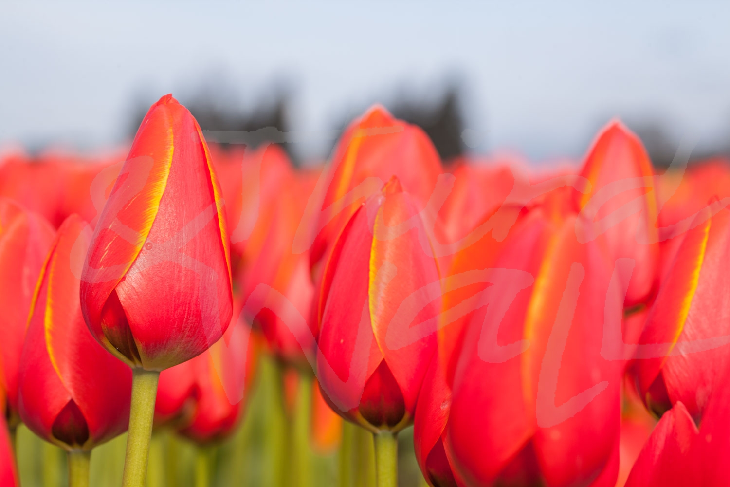
After a cold winter season, we are so ready to welcome the warmer days of spring (anyone else?) and are continually inspired by the statement florals making a big impact in interior design trends! Adding floral prints to your walls, couches, rugs, or anywhere else in your space is a perfect way to refresh your interiors, especially with spring on the horizon. Florals can bring some life and natural beauty into your design (without worrying about watering it!) and we are excited to share a few tips for incorporating some blooms in your space!
Find Your Style
Whether you prefer modern & contemporary or classic & traditional interiors, florals can work with any design style! Because floral prints can be as unique as flowers themselves—from delicate blooms to abstract petals—incorporating blossoming imagery doesn’t always mean your space will be too feminine or traditional. Modern florals can bring a bold energy to your design, and classic patterns can add the perfect vintage touch to a space. No matter your style, floral images can add a cheerful note and wake up a relaxed space.
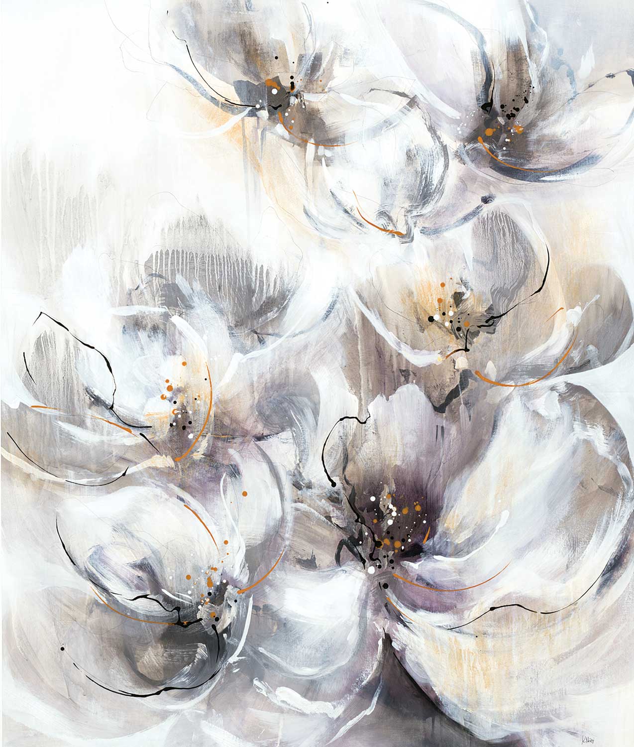
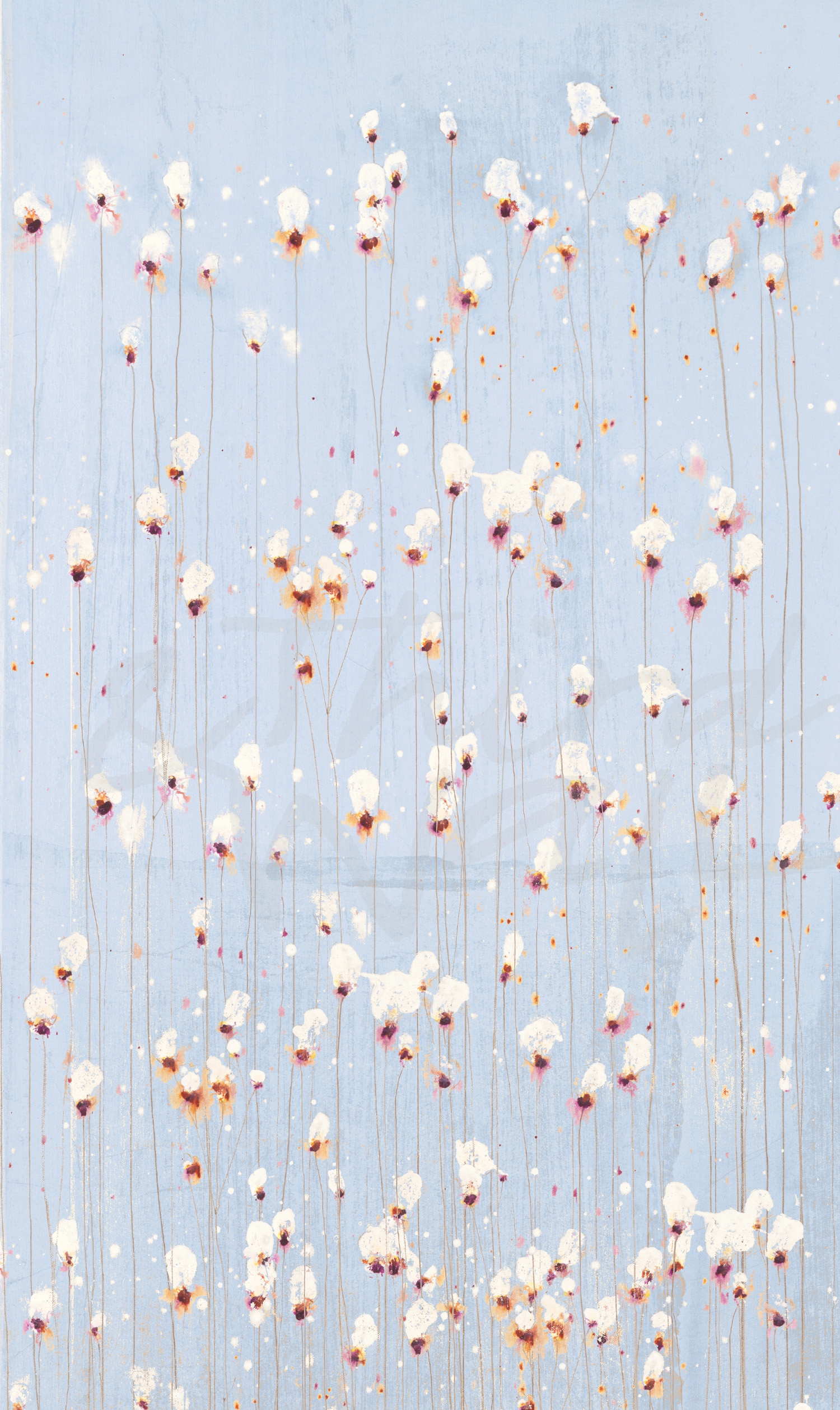
“Florets” by Leah Rei
“Coral Spirit” by K.Nari
“Love in a Mist” by Linda Stelling
“Blooms II” by Scott Brems
“The Drip #2” by Laura Van Horne
“Reading The Tea Leaves” by Liz Jardine
“Vanda Orchids” by K. Nari
“High Season” by Liz Jardine
“Daydreams” by Nancy Crowell
“Birthday Bouquet” by Brooke Borcherding
“Halcyon” by Sarah Stockstill
photograph by Nancy Crowell
Mix & Match
Floral imagery is a great way to add splashes of color to your space, in small or large doses. From pillows and rugs to small accessories, there are many ways to mix and match floral prints. If you have one floral focal point, such as a sofa or statement wall, try offsetting it with clean lines, modern elements, and a neutral color palette for a chic and eclectic space. And pairing prints and patterns can add even more playful notes to a design, but unifying color palette is key to making sure your vibrant space stays cohesive.
“After The Rain II” by Peter Kuttner
photograph by Melissa McClain
“Aqua Petals” by K.Nari
“Shine Through II” by Nancy Ngo
piece by Peter Kuttner, alt version 1
“Red Floral Dream II” by Randy Hibberd
“Blue Flower Explosion” by Randy Hibberd
“Glitter Field” by K. Nari
“Light As Air” by Liz Jardine
“Flower On Black” by Scott Brems
“Sage Lush” by K. Nari
photograph by Melissa McClain
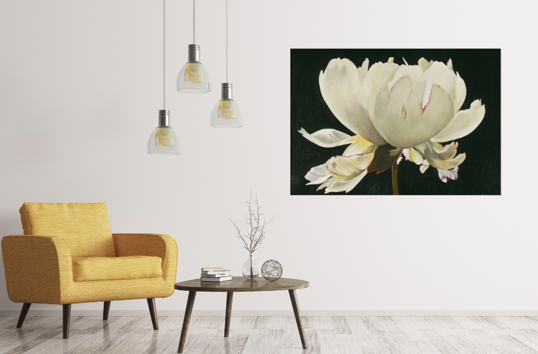
A Wall of Flowers
Framing some floral artwork is a great way to freshen up your space, especially if you want to ease into the floral decor. For those who want to go bold, a luscious wallcovering or wallpaper can create an elegant statement, whether you do a whole room or just cover one wall.
“Love Is A Rose I” by Linda Stelling
“Botanic Sketchbook IV” by Stacy D’Aguiar
“Muted Bouquet” by Lisa Ridgers
photograph by Aaron Matheson
“Vivid Flower IV” by Patti Mann
“Coin Purse Full of Petals” by Bradford Brenner
“White Peony” by Liz Jardine
“Look This Way” by Jill Martin
photograph by Aaron Matheson
However you choose to incorporate florals into your design, they are sure to bring the warmth and cheer of spring to any room!
The images featured above are available in our Print-On-Demand collection. Some areas of our website are password-protected. If you are a member of the trade but don’t have full access to our website, www.thirdandwall.com, please contact us at customerservice@thirdandwall.com.
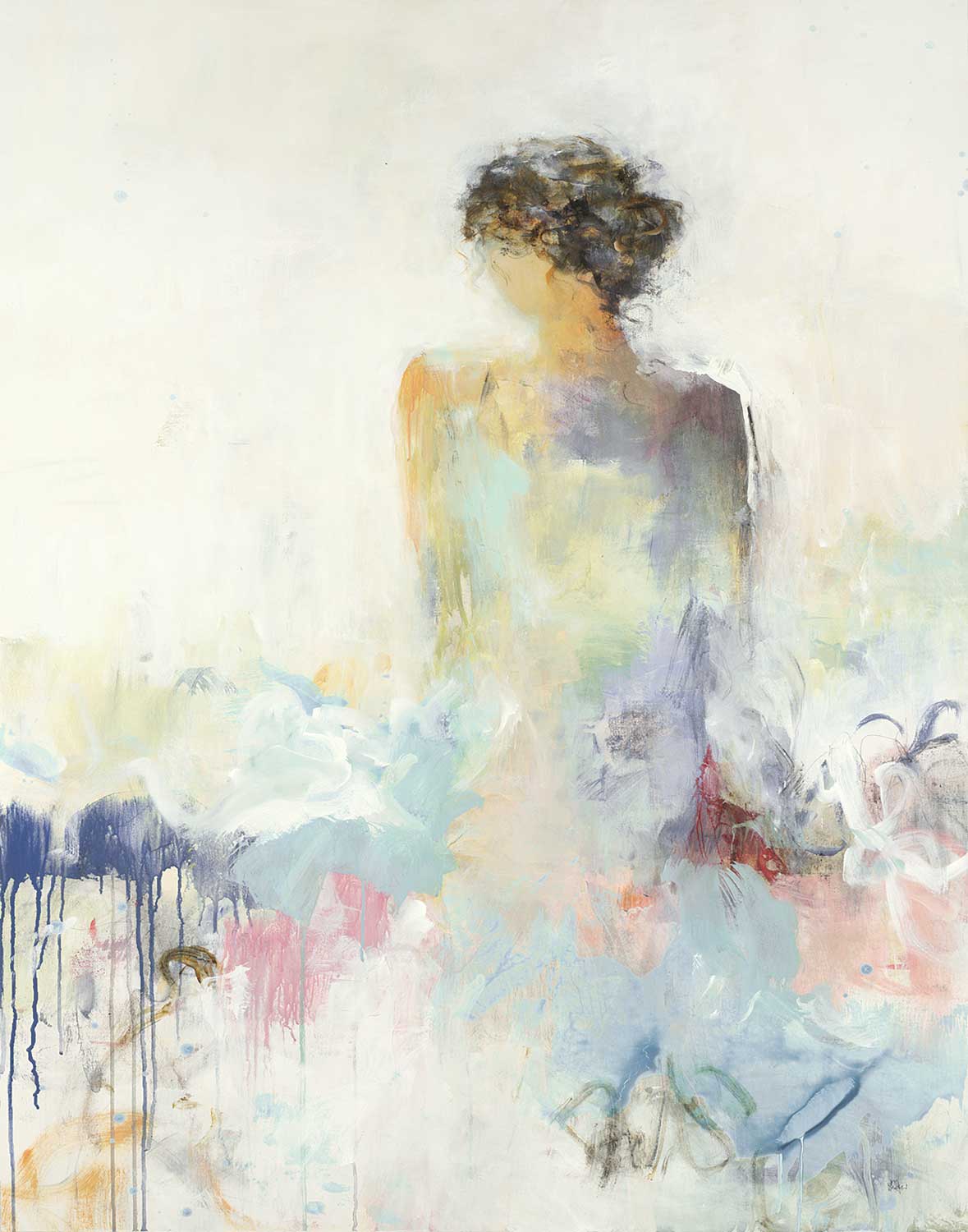
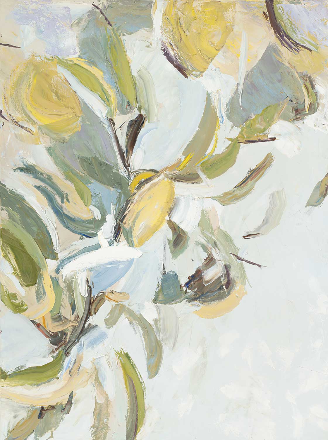
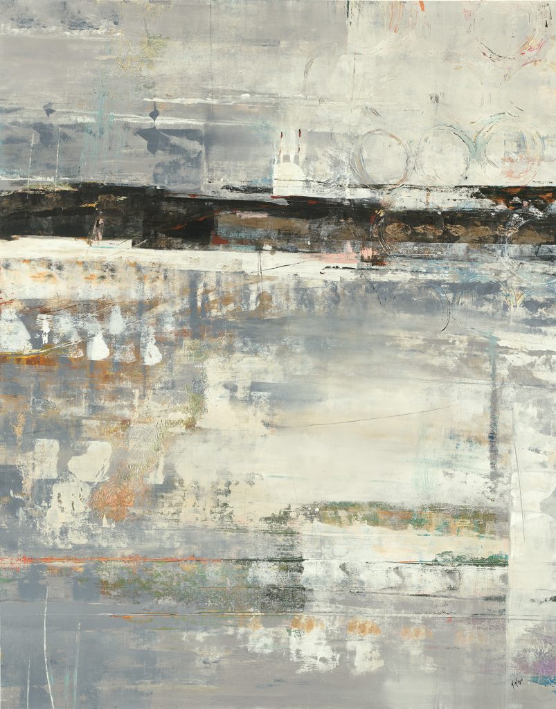
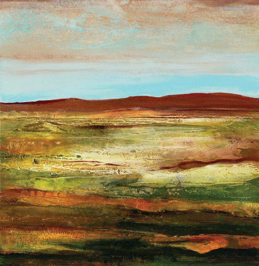
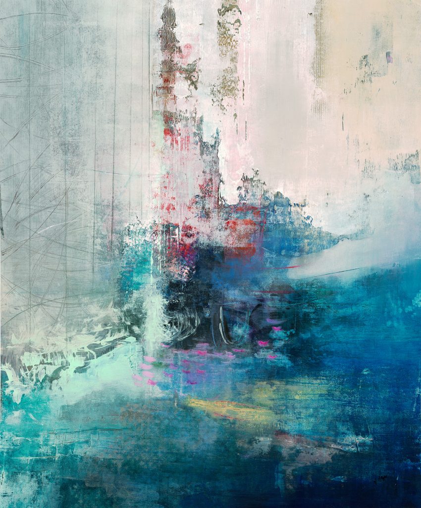
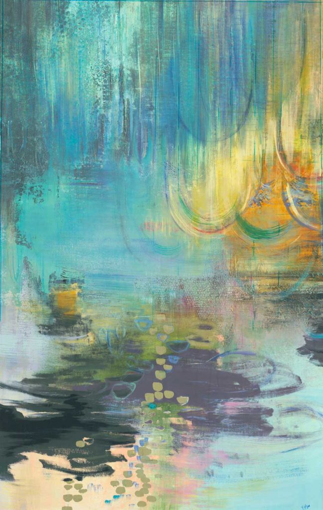
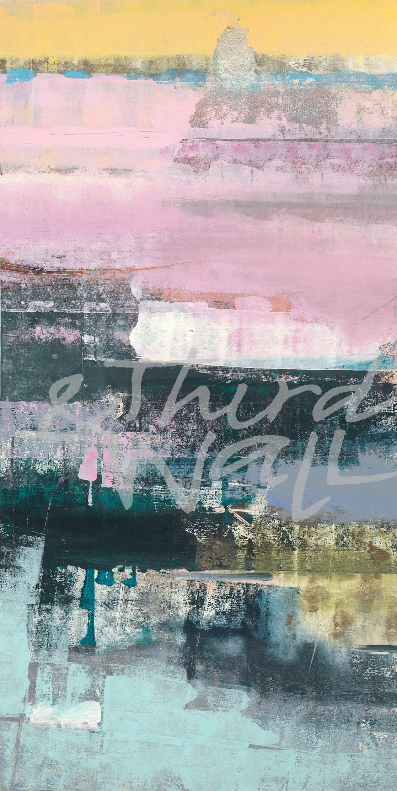
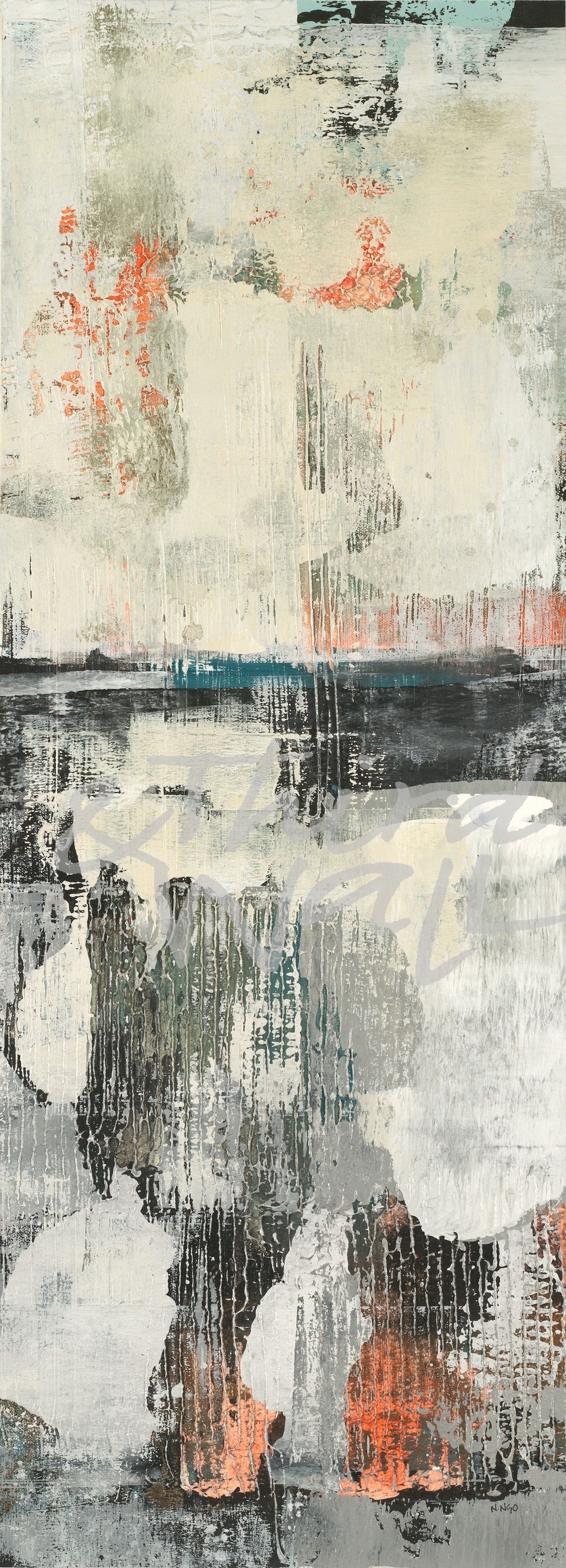
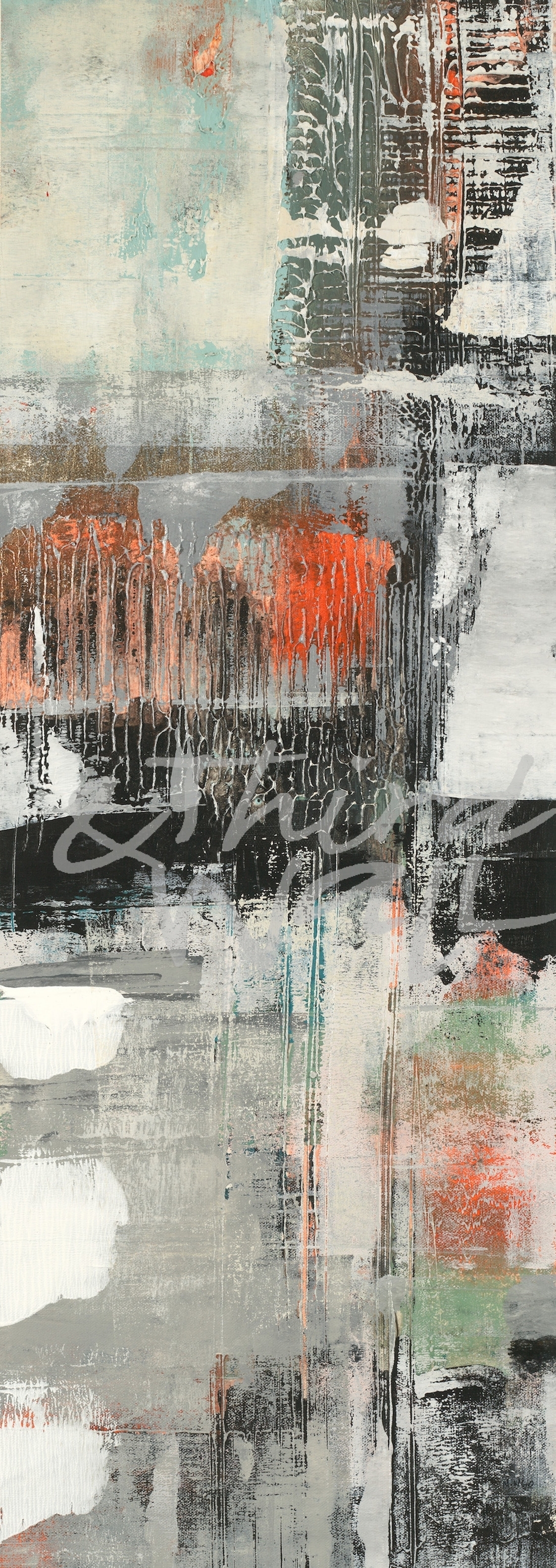
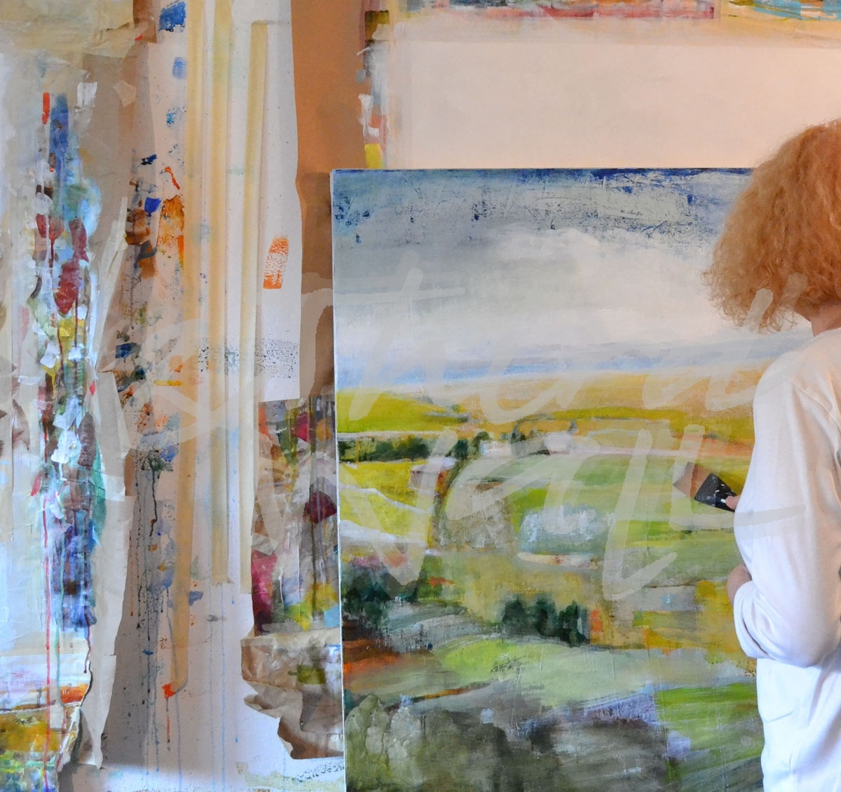
We would like to introduce you to our newest artist at Third and Wall, Nancy Ngo! Born in Chicago but transplanted to Arizona as a young child, Nancy grew up learning an appreciation for contrasting landscapes. She developed an eye for the difference in the way light reflects on different terrains in the country. Nancy returned to Chicago after high school and received her Bachelor of Fine Arts degree with an emphasis on Painting and Art History from The School of the Art Institute of Chicago. And once again, she moved back to Arizona where she currently resides with her culinary artist husband and their three daughters.
Nancy’s awareness of the play of light and shadow and its effect on color plays an important role in her work today. The dichotomy of the natural desert landscape of Arizona versus the urban downtown environment of Chicago led her to a certain “no rules” style of painting. Her paintings are highly textured and raw, sometimes with an unfinished quality in which the work holds a kind of potential energy and freedom. Nancy continues to explore new avenues in her work, even with new materials. She is fascinated by the discoveries made while creating each new piece of art, allowing her style to change often in order to keep her painterly freedom.
What do you first do when you get to the studio in the morning?
“Leap”
It depends on the day of the week… ship day, prep day, planning day or painting day. Obviously, my favorite days are when all the canvases are prepped, then I get started painting right away! If nothing is prepped, I like to take care of regular business stuff, checking emails and updating my planner and goals for the day or week, and then I can get to work.
How many paintings do you work on at a time?
Too many! If I have an order, I will work on a painting start to finish with no interruptions. More often though, I have so many ideas, sometimes I prep too many at once and have them sprawled out all over the studio.
Do you have a dream project that you would like to work on?
Anything extremely large scale. I love to work BIG.
featuring “Light Into Shadow II”
If you could paint with anyone, who would it be?
Oh my gosh, alive or dead? I’m inspired by artists of all genres… Kandinski, Egon Schiele, Michiko Itatani, Judith Godwin, Agnes Martin, David Hockney, Christine Tarkowski, Mike Kelley, Susanna Coffey, Bruce Nauman, Wolfgang Laib, James Turrell, Bill Viola… I could go on and on and on.
“Insight”
“Road Trip I”
“Longing I”
“Whispering Rainstorm”
“Clear The Air”
“Inference”
What’s your favorite way of generating ideas and inspiration?
If I am away from painting (on vacation) for a while, I usually come home and paint in a frenzy. I also like to look at magazines of all kinds.
How has your art evolved over time?
My work is ever changing. It’s often reflective of, or in response to, what’s going on in my life. I think it’s definitely become more complex. I’m trying to simplify it again.
“Lollipops”
“Dedicated To Spring”
“Night Blooms I”
What do you like most about your work?
“First Flight I”
The layers and heavy textures.
What is one word that best describes your style?
Dynamic
Is there an idea you would like to explore?
I’ve been wanting to explore figurative work, but it doesn’t come to me as easily as painting abstracts.
What is your favorite time of day to paint?
Any time I can get in the studio.
Do you ever get “stuck” on a piece? If so, what do you do?
Yes! If I think a painting becomes overworked, I paint over nearly the whole thing with white and leave only my favorite moments.
“Cloak I”
“Cloak II”
What is up next on your easel?
A few abstracts and a portrait… maybe.
“Low Tide I”
“Low Tide II”
The images featured here are available in our Print-On-Demand collection. Some areas of our website are password-protected. If you are a member of the trade but don’t have full access to our website, www.thirdandwall.com, please contact us at customerservice@thirdandwall.com.
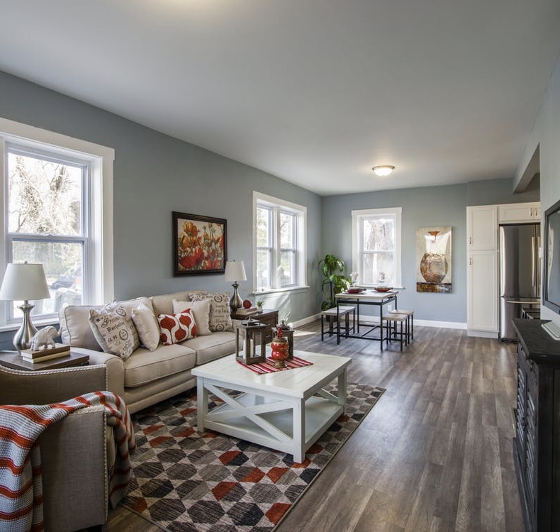
Twice a year in the Spring and Fall we invite friends, family and all art lovers to visit our South Lake Union gallery and take advantage of phenomenal 50-90% discounts on contemporary art, from original artworks to rich giclée prints on canvas and paper. You’ll find abstracts, landscapes, florals, figuratives, whimsical, vintage – we have beautiful, affordable art for every taste and every wall.
Our gallery is in South Lake Union, on 9th Ave. N and Harrison St. If you haven’t visited our gallery before, we’re surrounded with great places to dine and shop. Whole Foods is just a few blocks away, as is West Elm, Cactus, Serious Pie and many other hot spots. So come out and make an adventure of it!
Third & Wall offers exclusive contemporary and transitional imagery for wall decor and licensing, with a wide selection of Posters, Originals and Print-on-Demand/Licensing imagery. Some areas of our website are password-protected. If you are a member of the trade but don’t have full access to our website, www.thirdandwall.com, please contact us at customerservice@thirdandwall.com.
With his unique eye for composition and color, photographer Keith Morgan shares his view of our world in a way that evokes longing for places we haven’t visited, and awe for the exquisite beauty of nature.
What do you first do when you get to your desk in the morning?
Check emails, browse Facebook, check my calendar.
“9 Square 2”
How many images do you work on at a time?
In the field, I shoot multiple shots from many angles and perspectives. At my desk, once I’ve narrowed down the image I want to process I work on it from start to finish.
Do you have a dream project that you would like to work on?
Yes, Iceland @ summer solstice.
If you could shoot with anyone, who would it be?
Honestly, I prefer to be alone.
“KM2_5921”
Is there an idea you would like to explore?
I have a few self portrait ideas that I haven’t had time to try.
What is your favorite time of day to shoot?
Sunset, dusk.
Do you ever get “stuck” on a piece? If so, what do you do?
Yes. I walk away for a half hour or so.
“KM2_3141sep”
“My love of photography is something that has been a part of me for as long as I can remember. I learn best through trial and error and have been completely self-taught through books and the internet. I love travel and landscape photography and am on the road taking pictures as often as I can.” ~ Keith Morgan
Keith’s gorgeous images can be viewed in the Print-On-Demand section of our website. This area of our website is password-protected. If you are a member of the trade but don’t have full access to our website, www.thirdandwall.com, please contact us at customerservice@thirdandwall.com.
We’re getting ready to release our latest preview collection and thought we’d share a sneak-peek at our upcoming imagery.
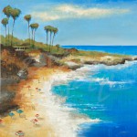
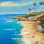
Lately, clients have been asking us for Beach House art. Since Fall has officially arrived here in Seattle – the rain, earlier sunsets and crisp air even when the sun is shining – we thought we’d warm things up with reminders of the great Summer we just enjoyed.
These contemporary beach scenes from Liz Jardine ought to do the trick!
Beach Day I by Liz Jardine
Beach Day 2 by Liz Jardine
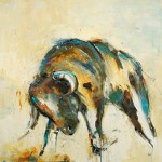
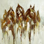
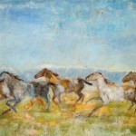
Lodge Art is another theme that we hear a lot about. Think lots of wood, warm cozy fires and deep rich colors, especially as Winter approaches. These captivating animals by Lisa Ridgers gallop into the Lodge theme beautifully!
URID-544
URID-557_ALT_BrownsGolds
Floral Art is always on-trend. Look at these timelessly gorgeous pieces by KC Haxton & Lisa Ridgers.
Jill Martin’s ethereal imagery is bright and soft, glowing with clean hues and a dreamy appeal that few can resist.
What do you first do when you get to the studio in the morning?
Check my email, read some news, then spend some time cleaning up my painting table which I always leave messy from the day before.
How many paintings do you work on at a time?
I’ll prep several canvases at once, but I tend to focus on just one or two paintings at a time.
Merriment II
Do you have a dream project that you would like to work on?
To paint 5 or 6 large paintings of different types of couples.
If you could paint with anyone, who would it be?
Very hard to choose. I could learn so much from Alex Kanevsky, Julie Heffernan, and Kent Williams.
Is there an idea you would like to explore?
How to paint the figure not in an impressionistic or gestural way but like a blurry photograph. – early Gerhard Richter’s work.
What is your favorite time of day to paint?
I’ll paint whenever, but the light in the studio is usually best midday and afternoon.
Do you ever get “stuck” on a piece? If so, what do you do?
Yes, I do get stuck sometimes and keep redoing areas over and over. At that point I have to not look at the painting for a few hours or a few days. Then when I go back to it I have a fresh perspective which hopefully makes it easier to see what needs to be done.