Tag Archives: green

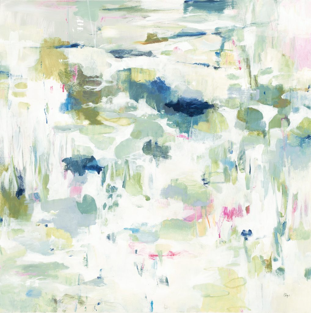
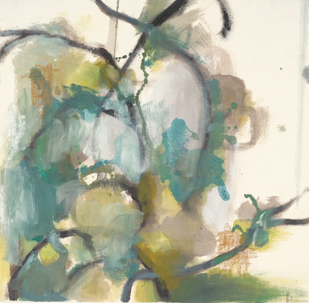
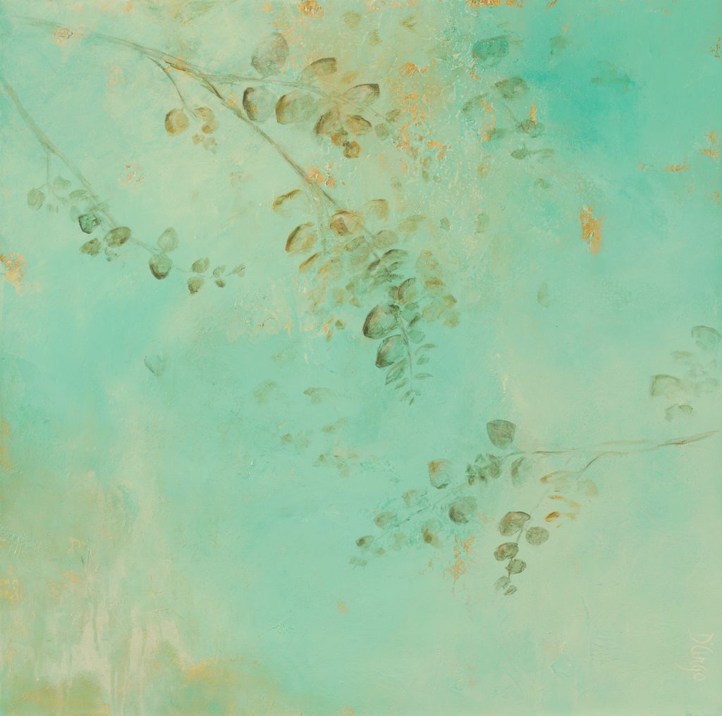
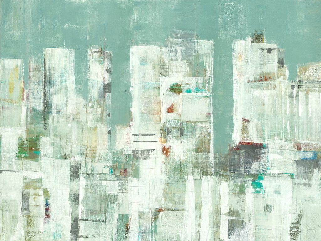
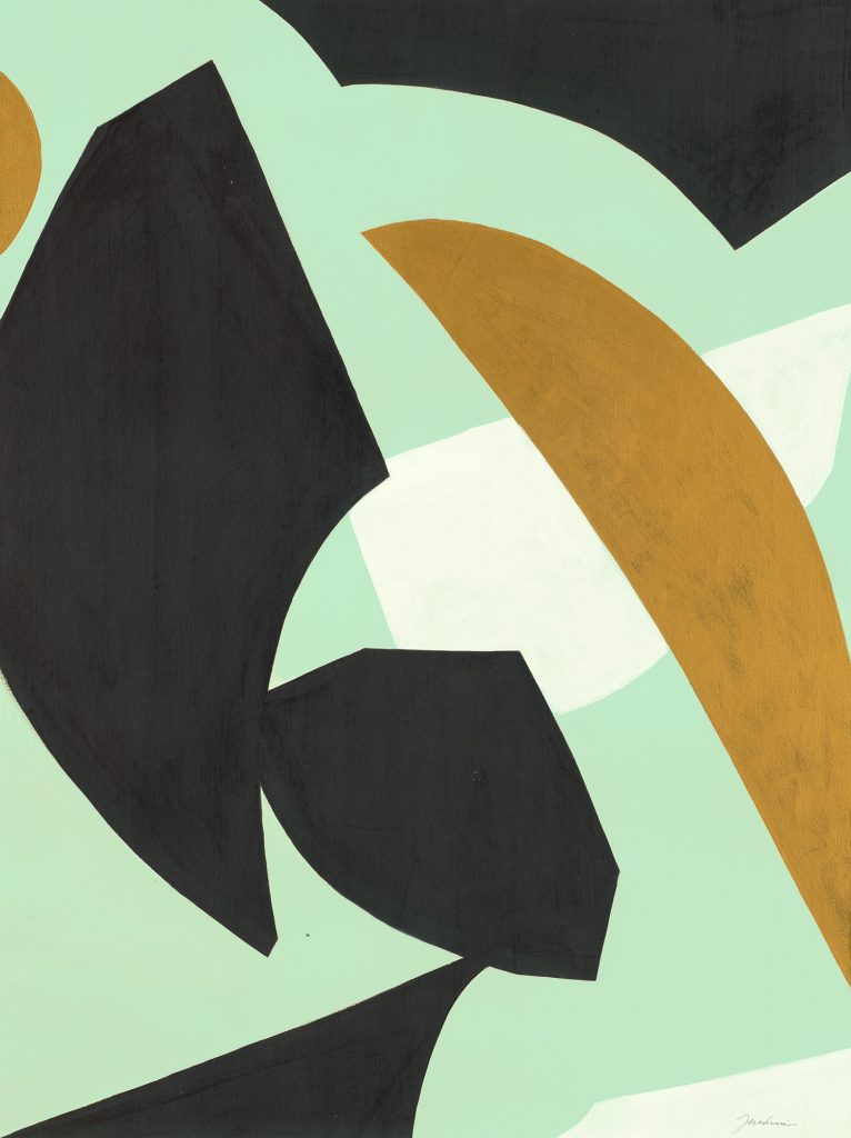
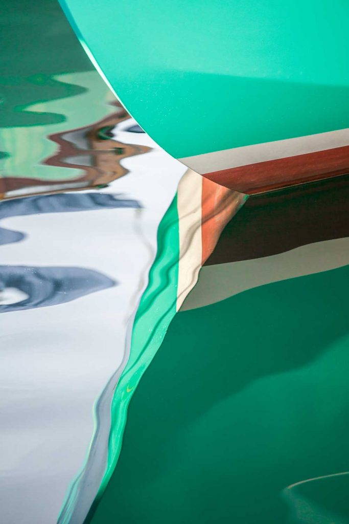
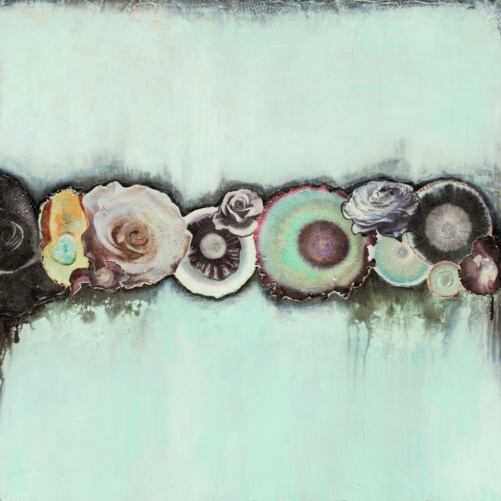
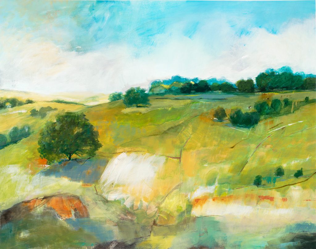
Color Trends: Going Green

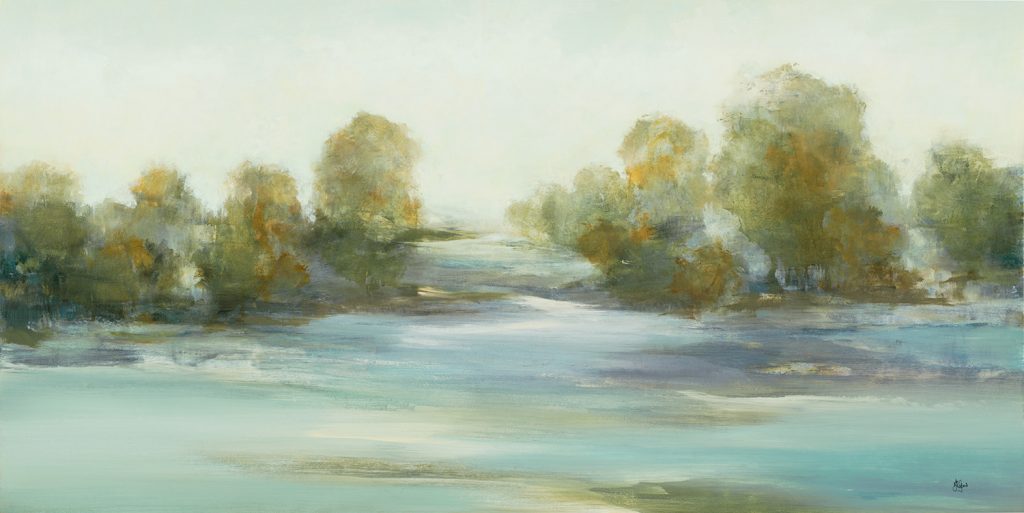
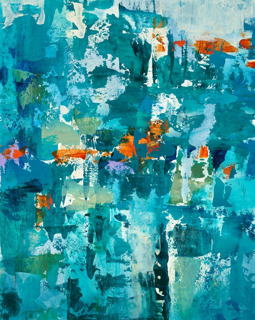
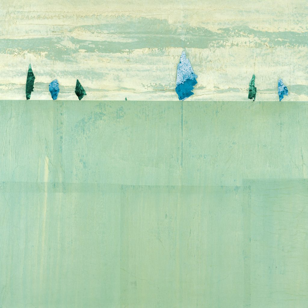
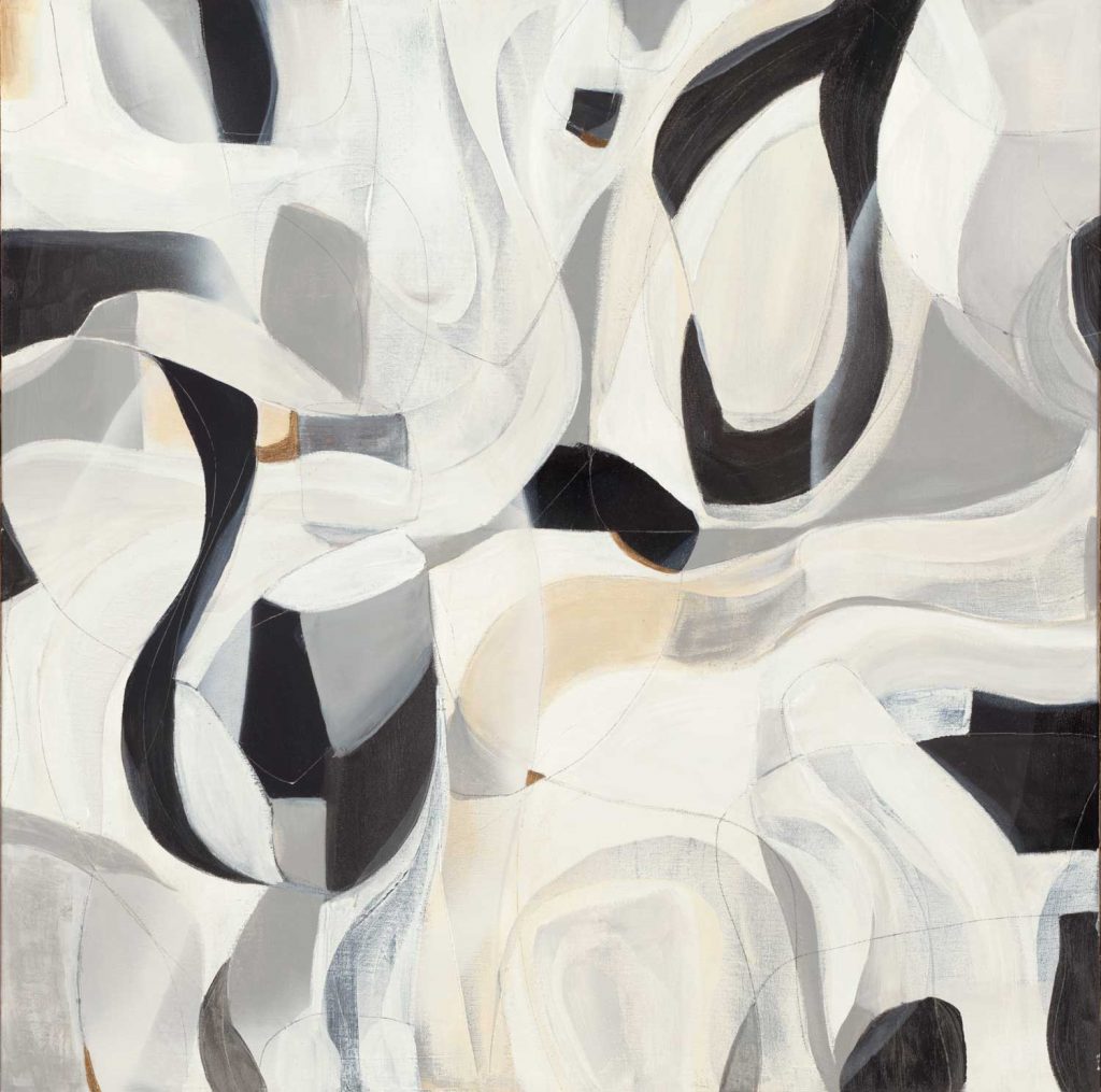
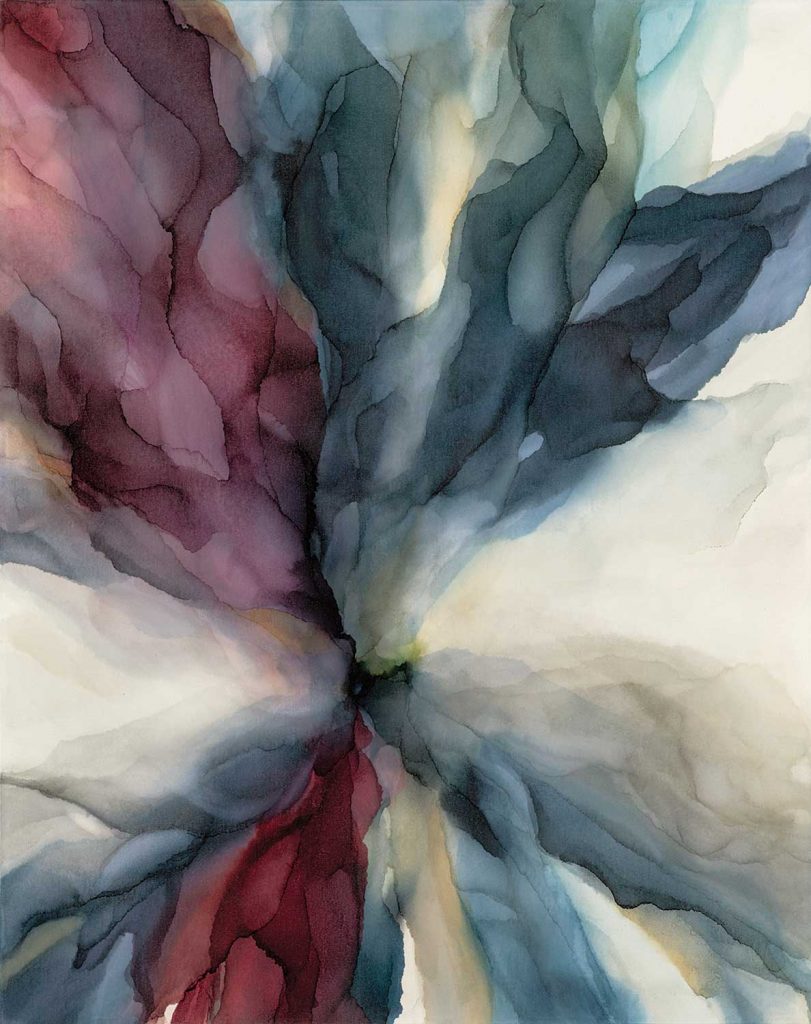
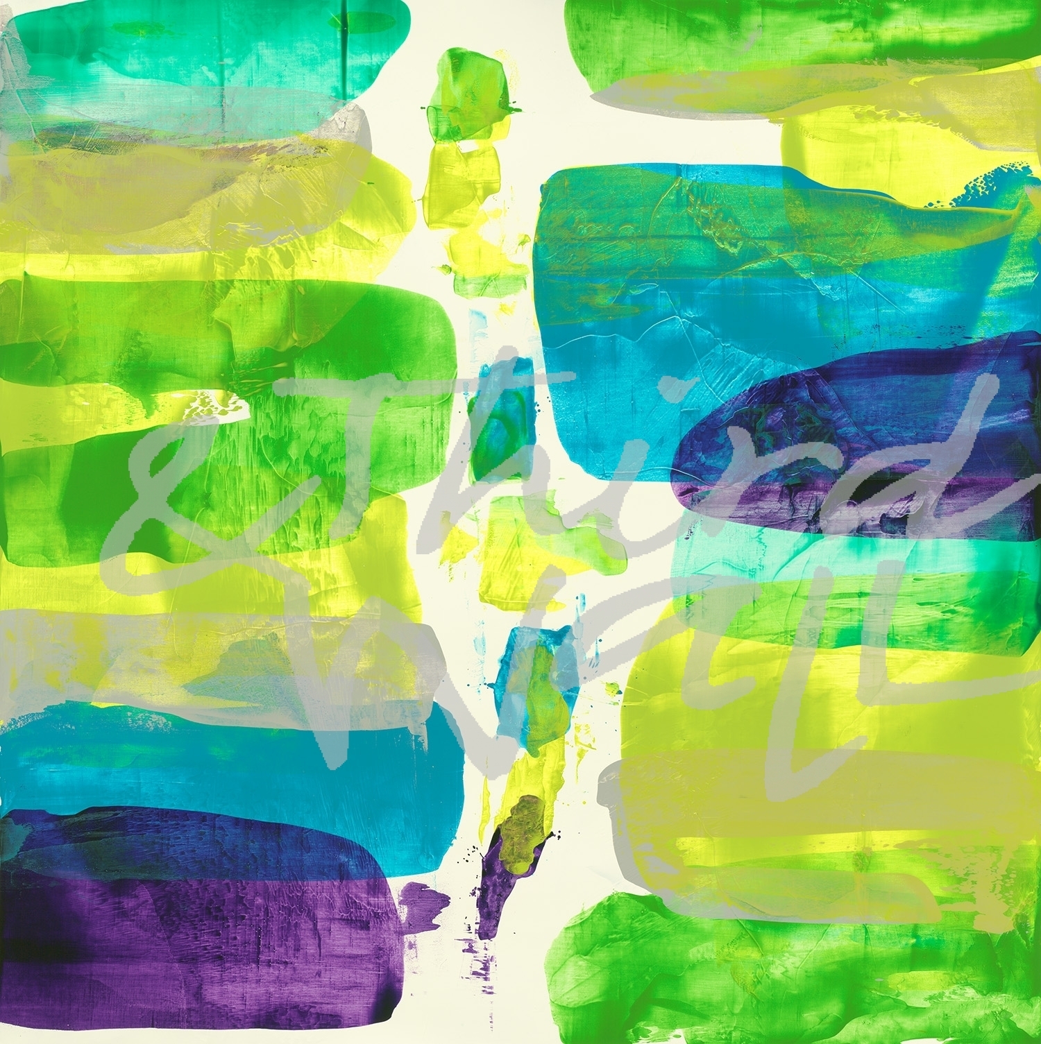
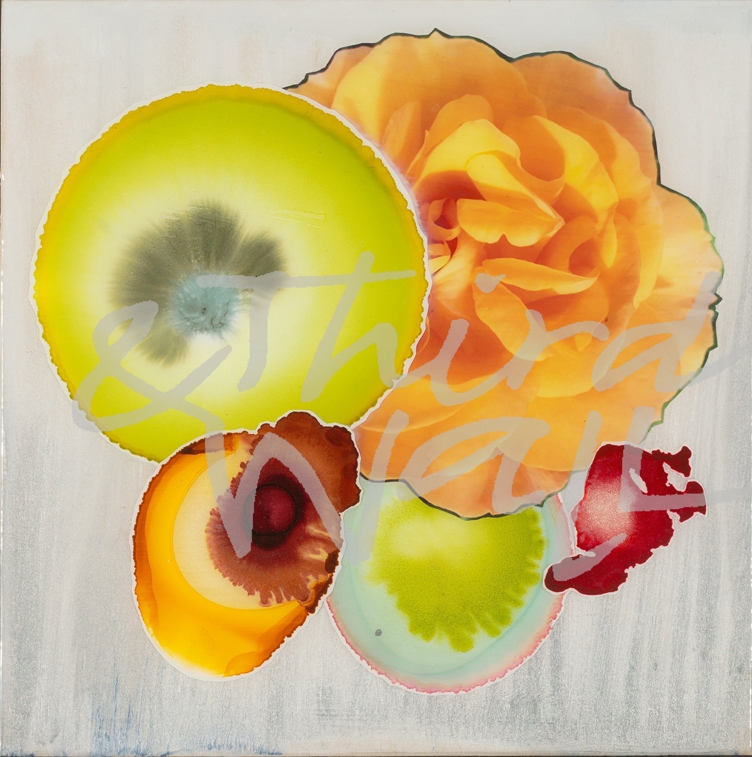
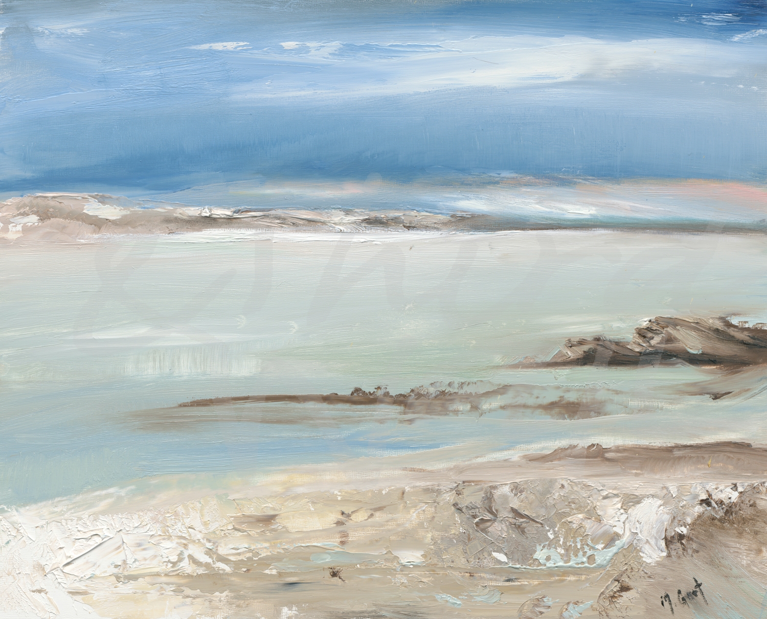
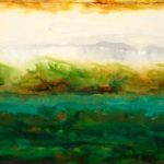
featuring “Easy Street” by BethAnn Lawson

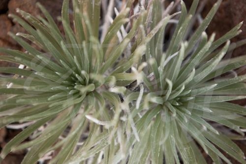
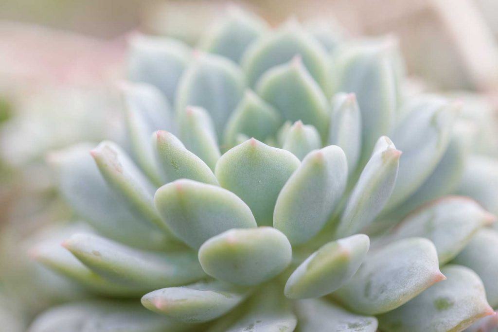
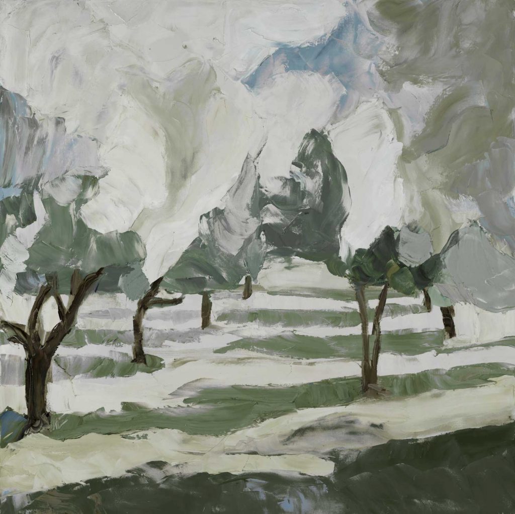
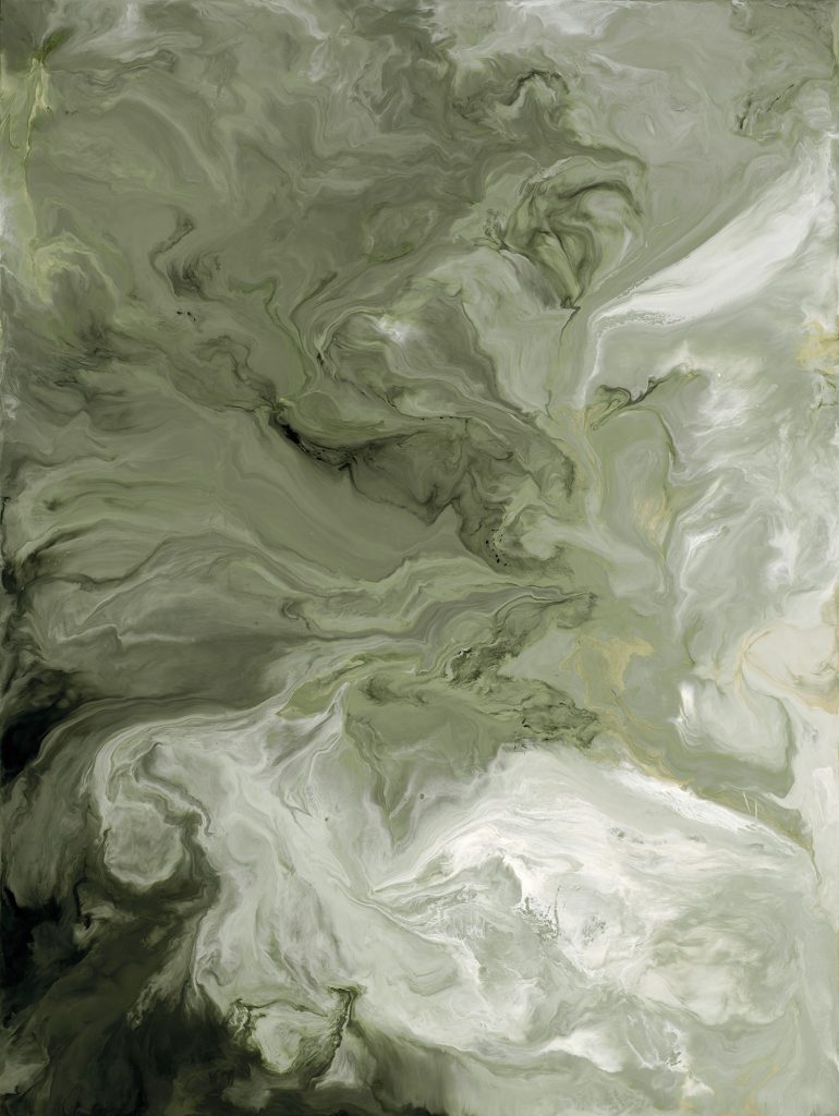
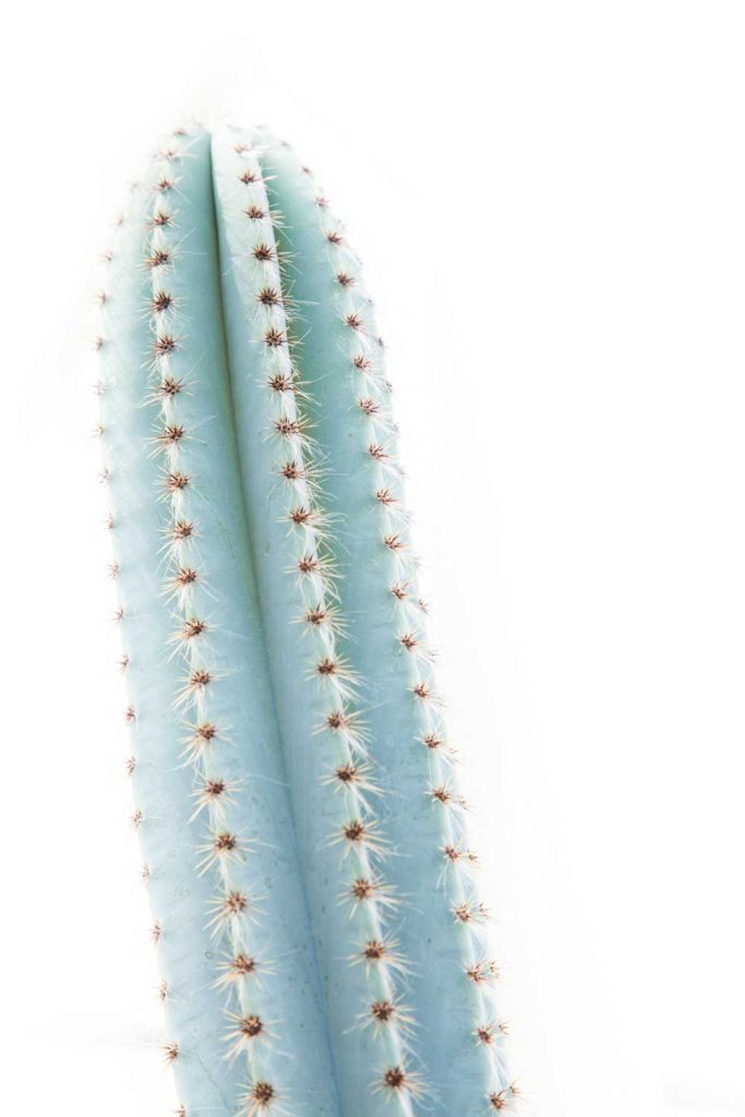
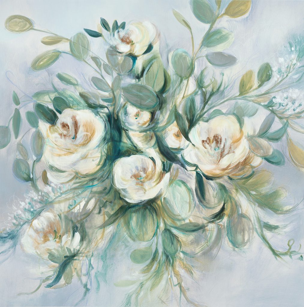
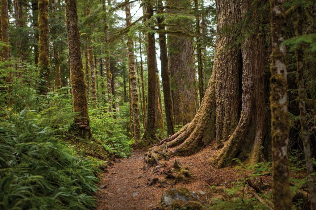
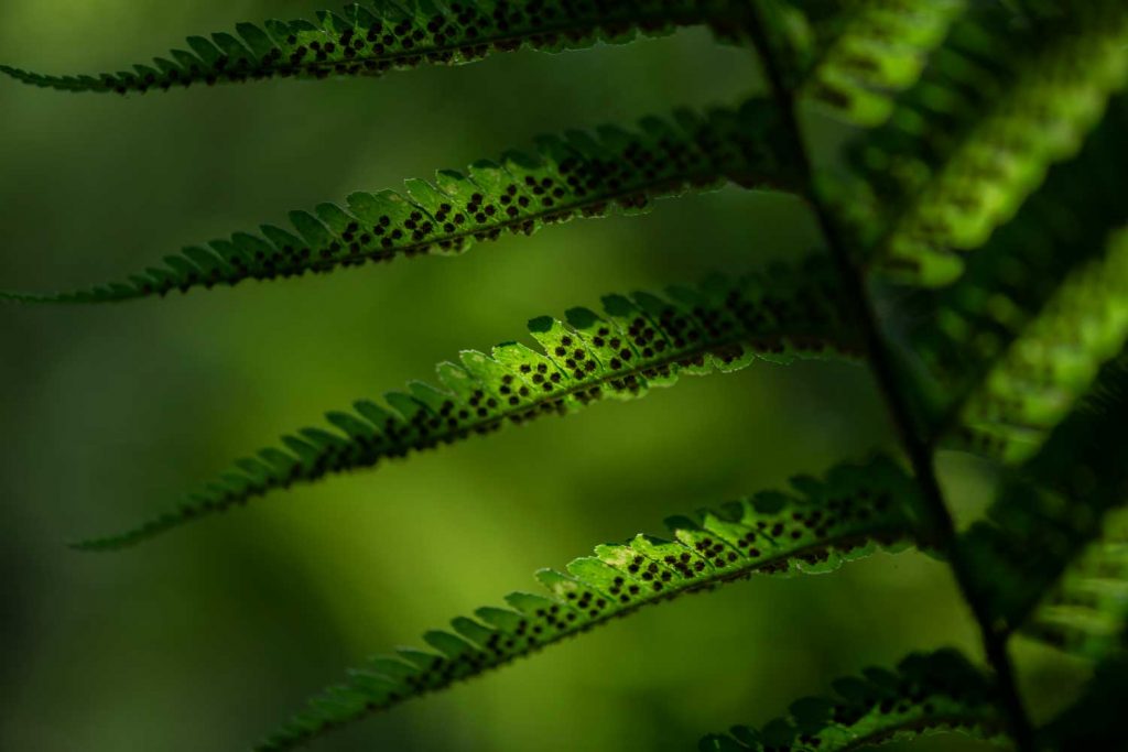
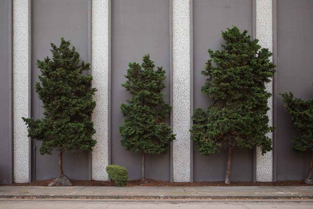
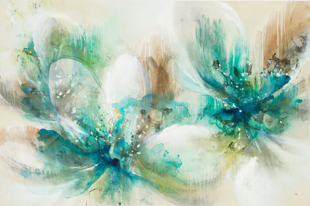
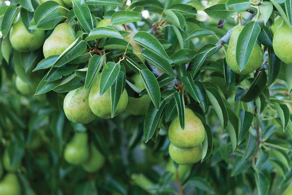
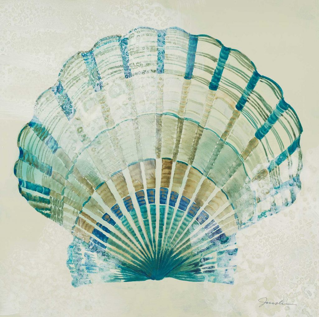
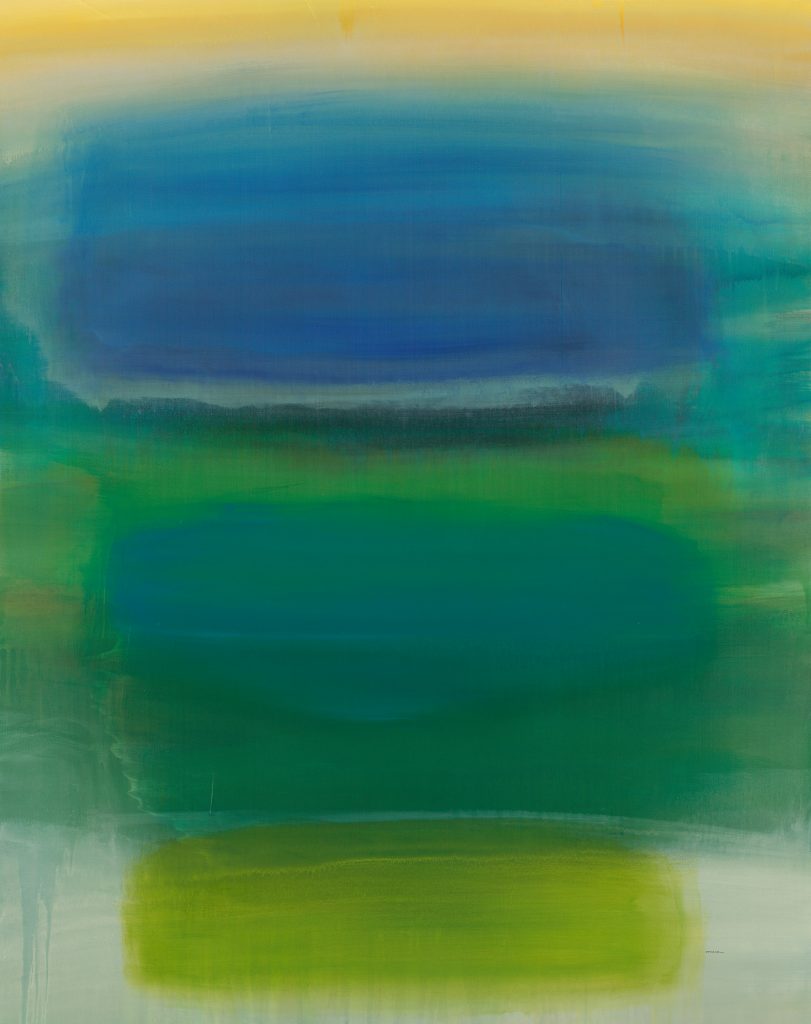
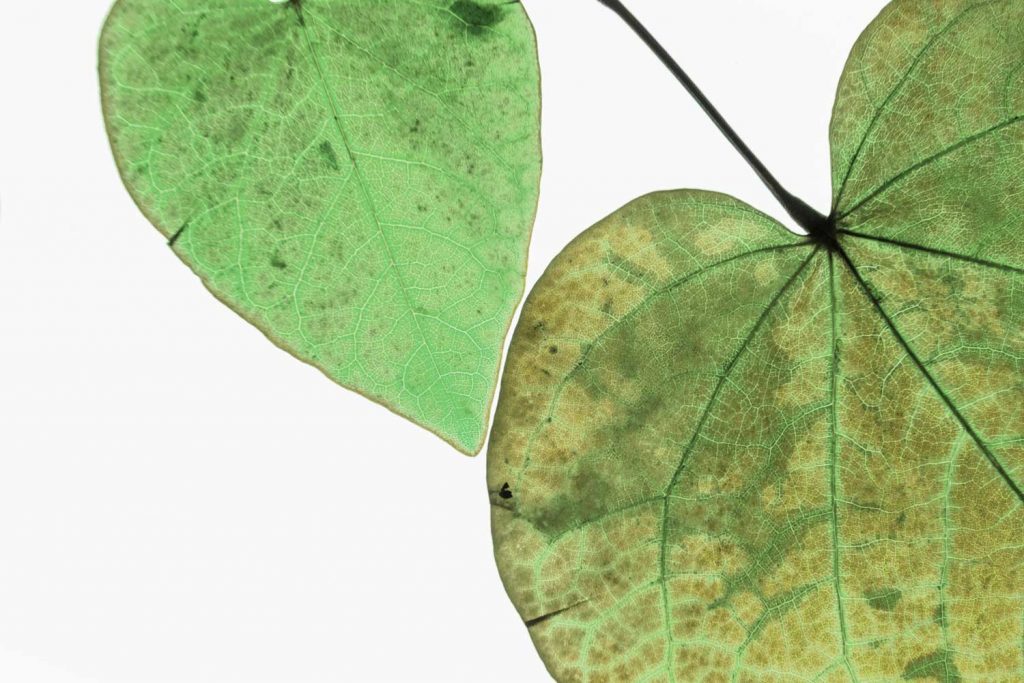
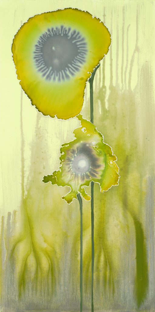
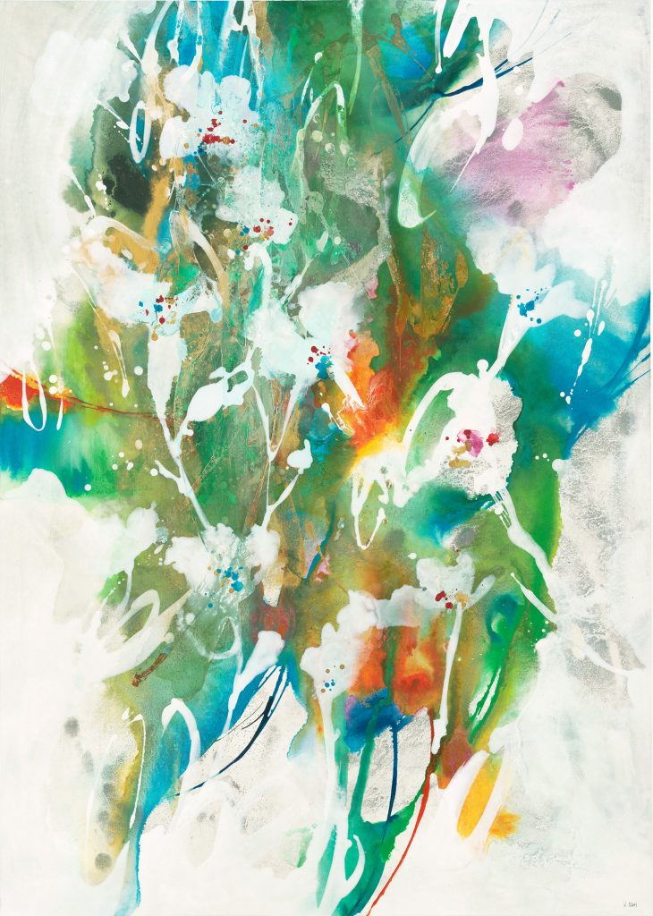
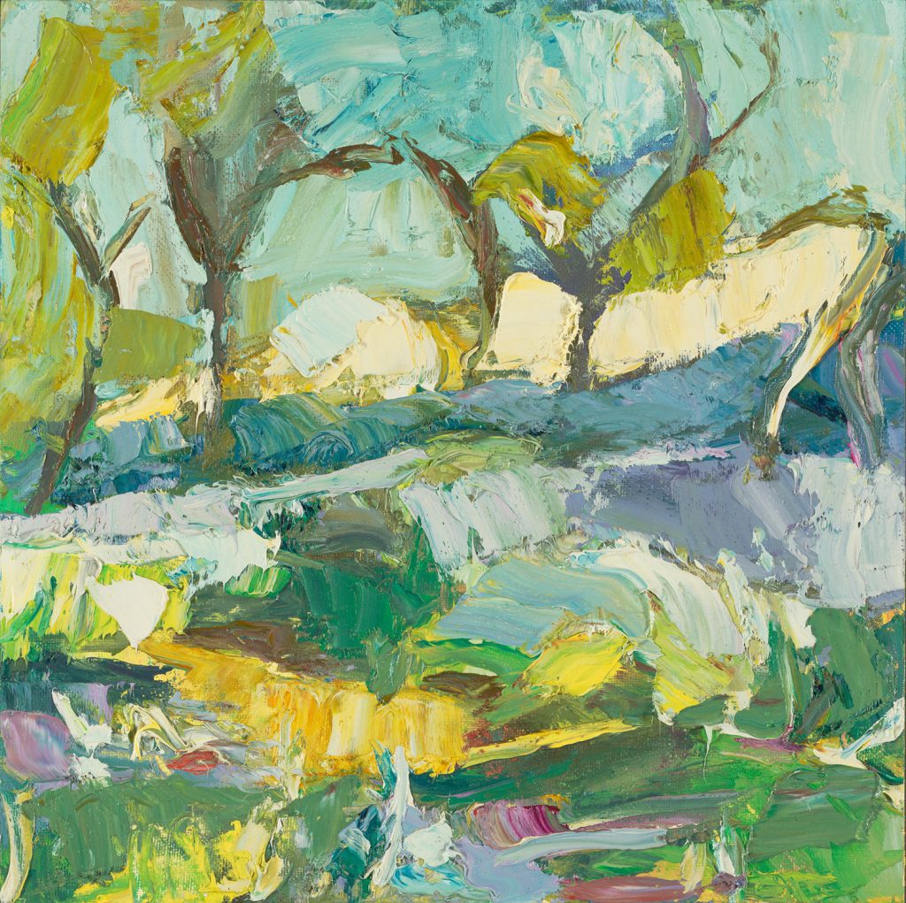
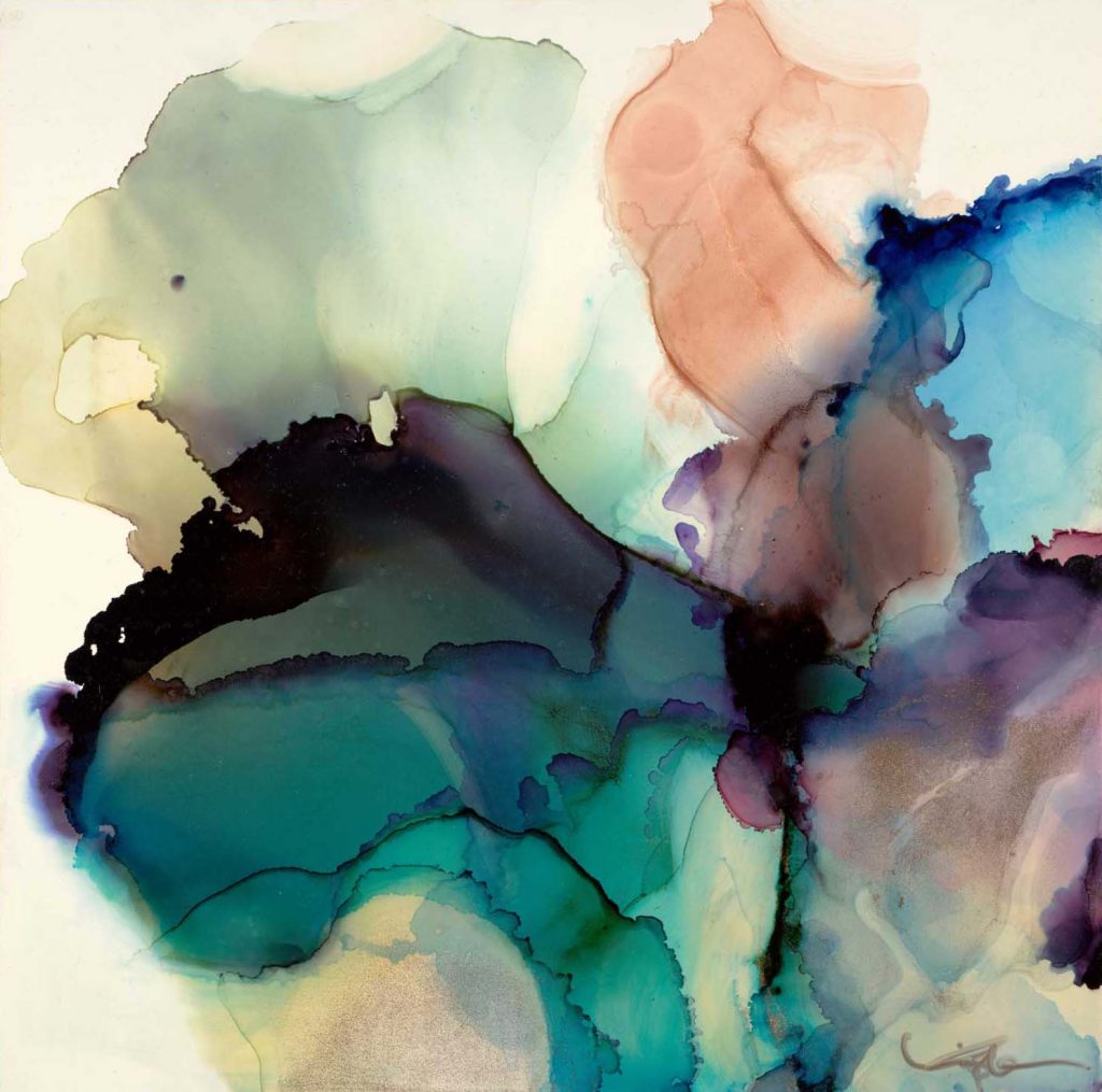
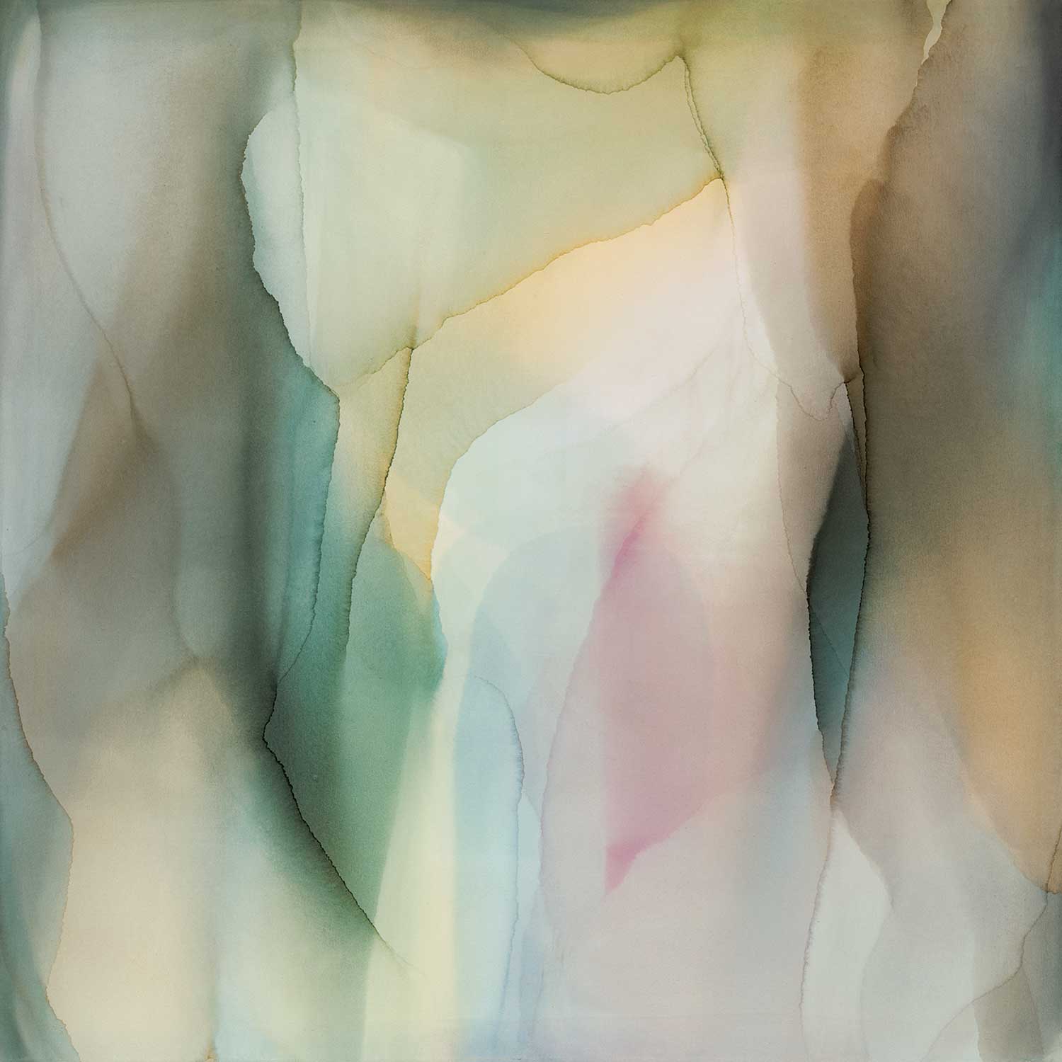
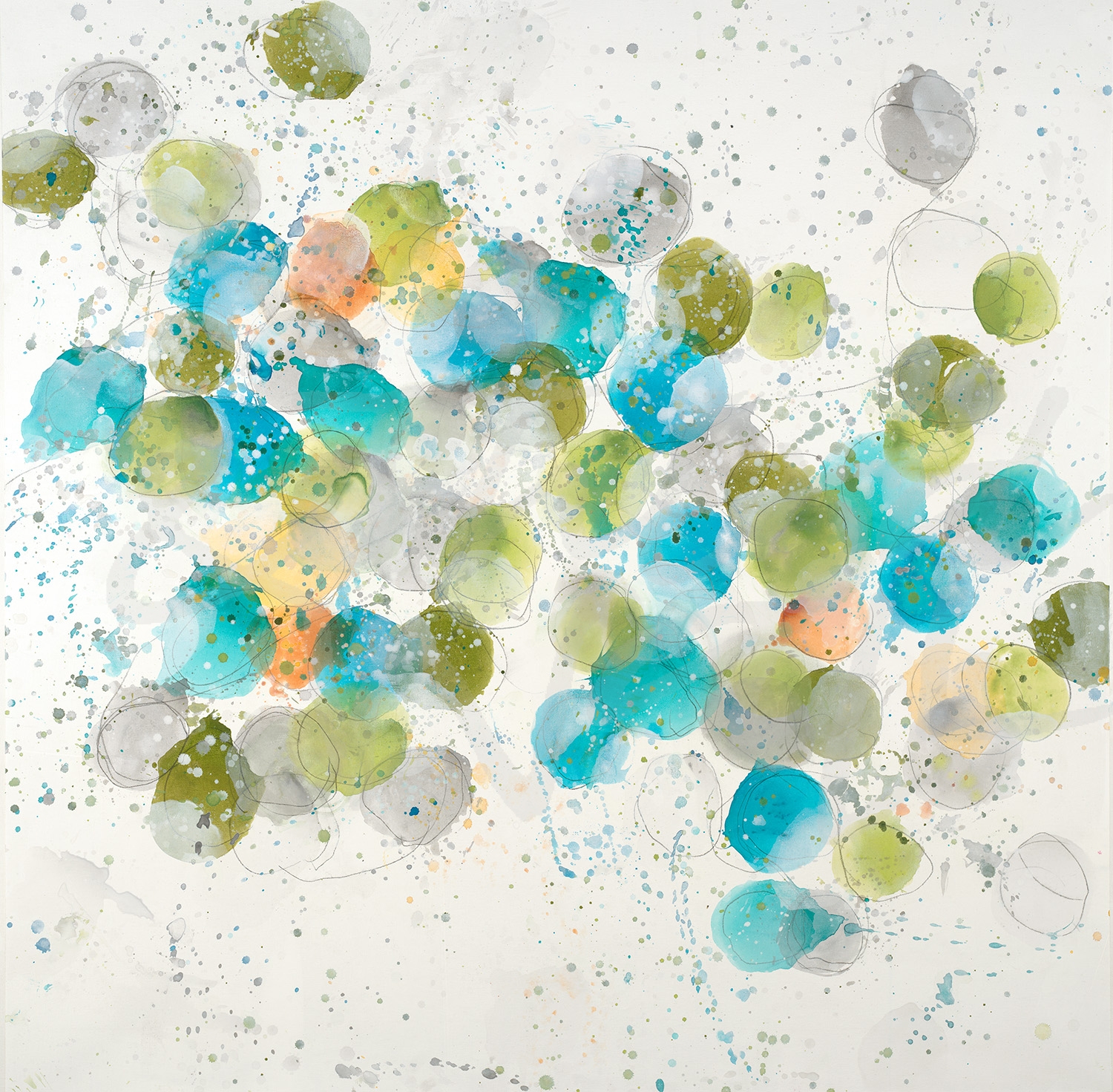
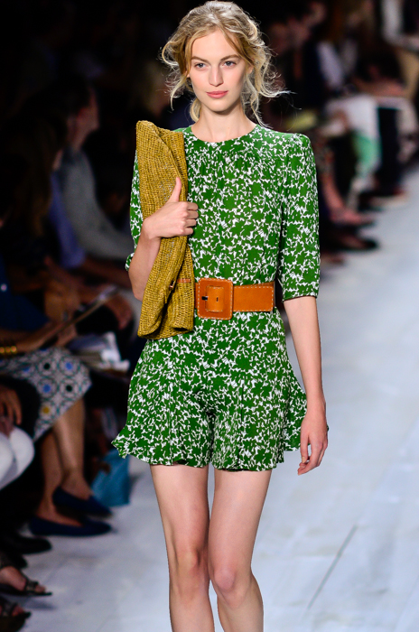
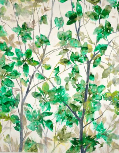
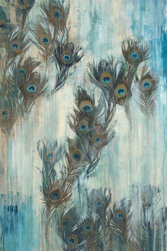
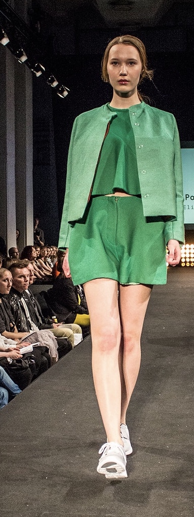
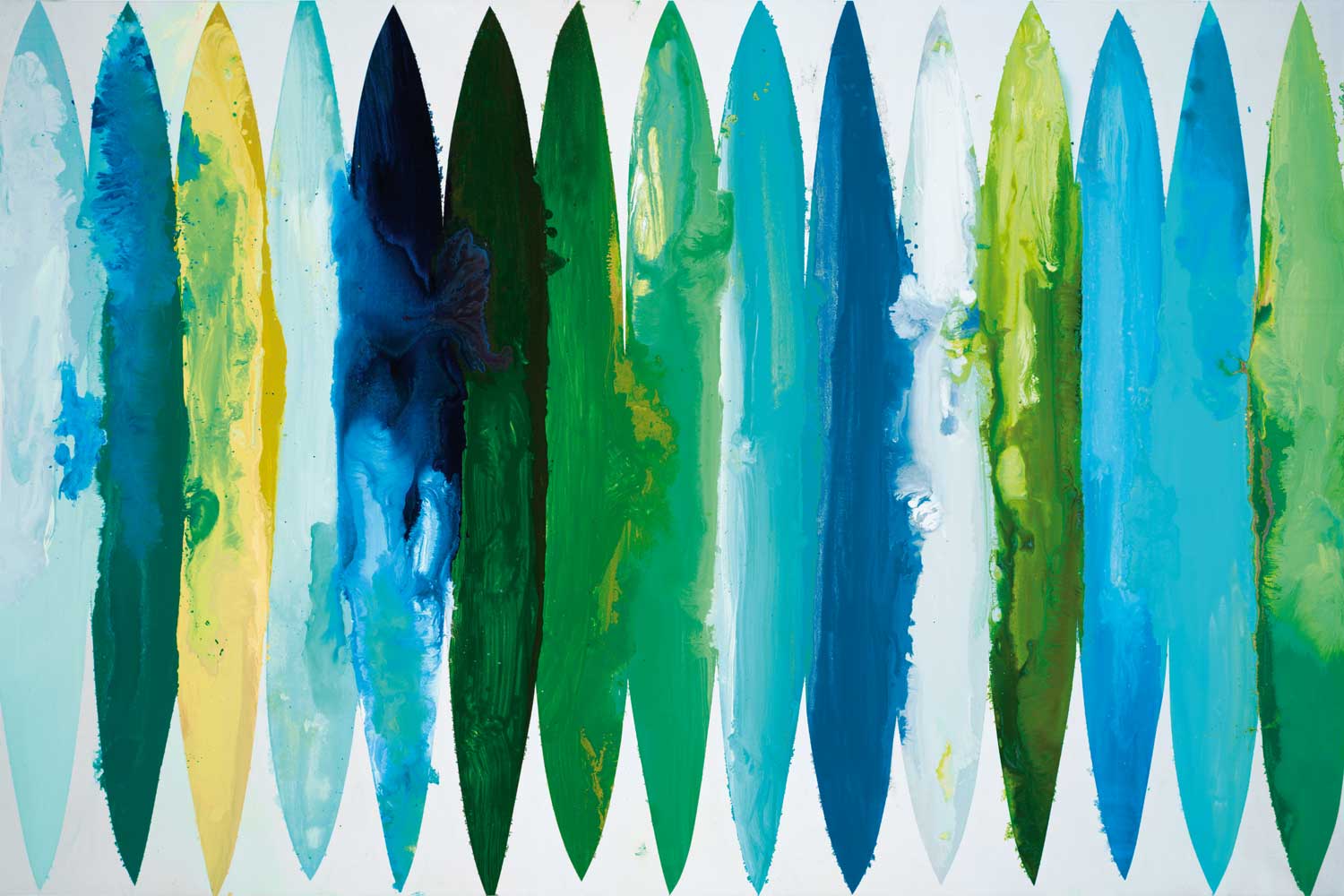
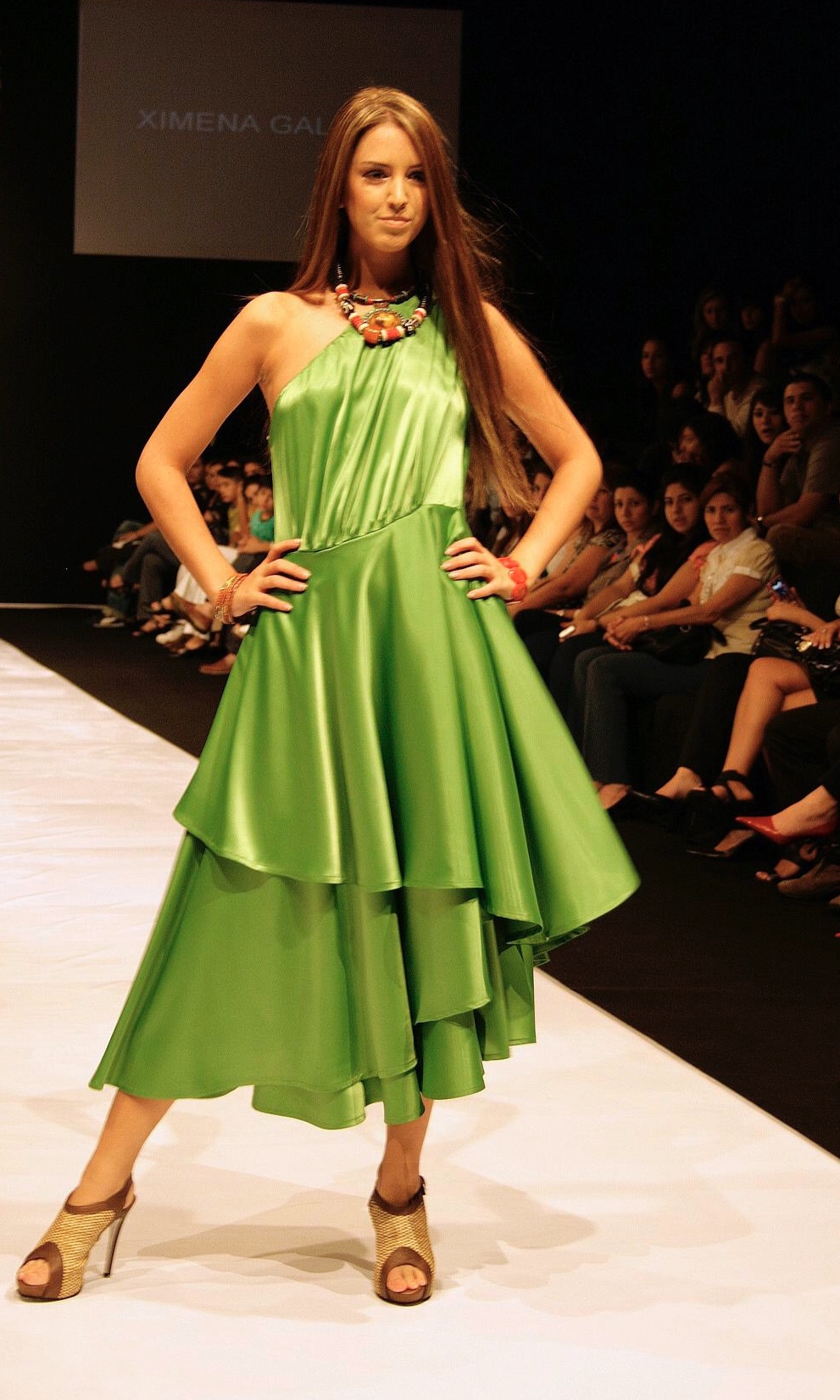
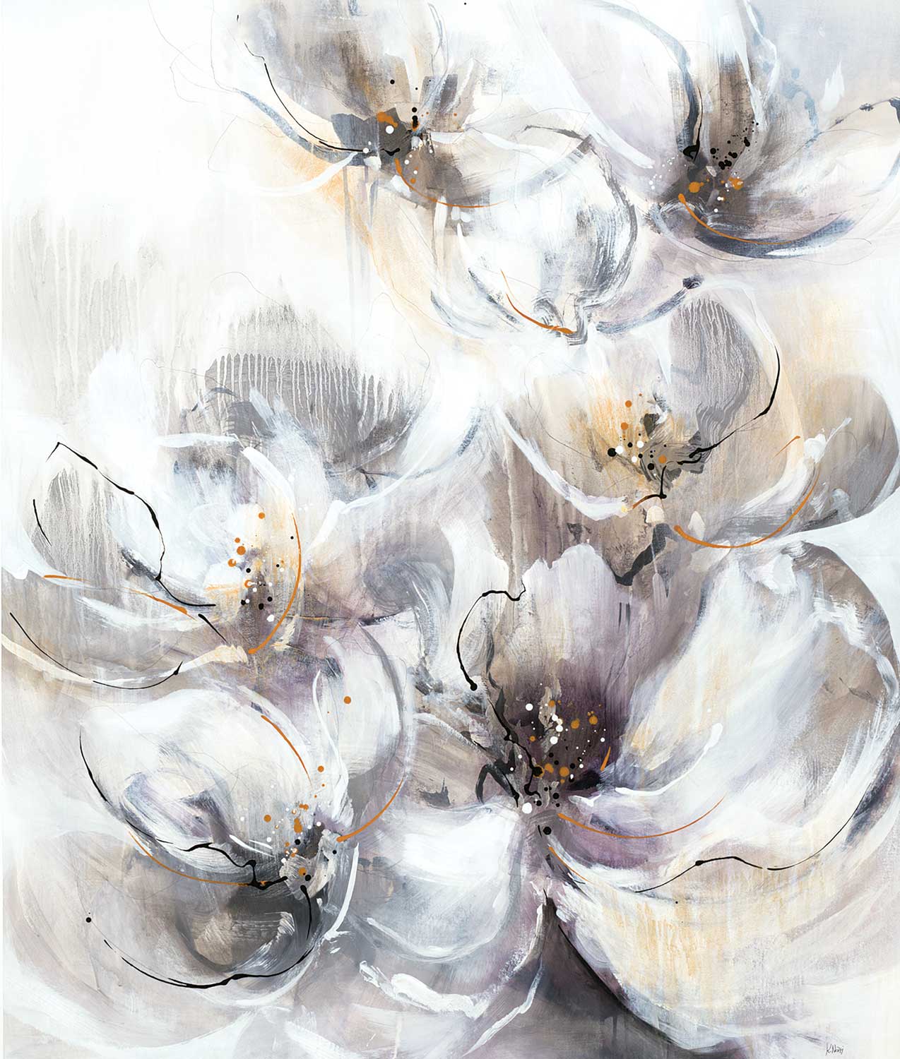
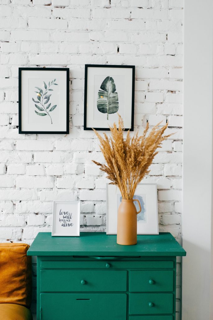
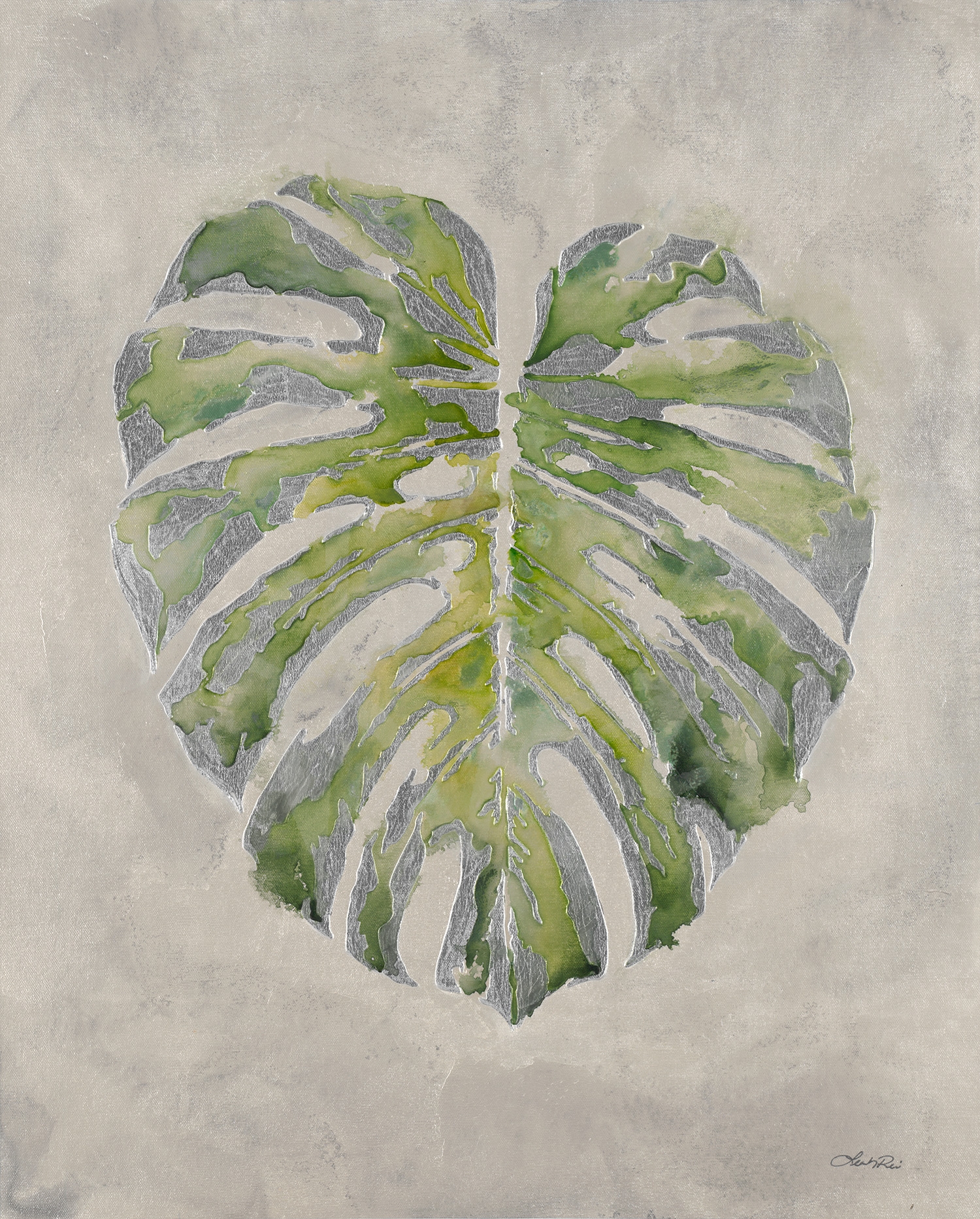
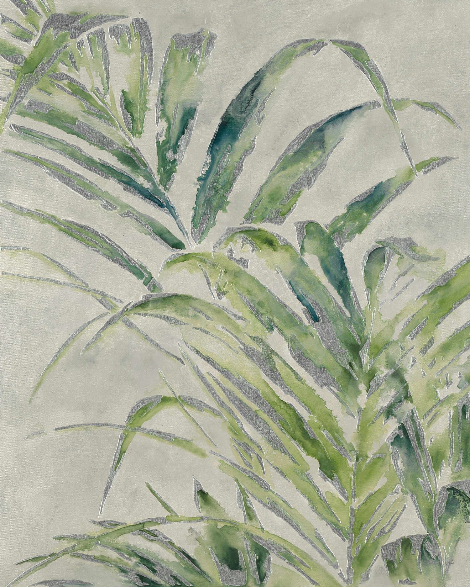
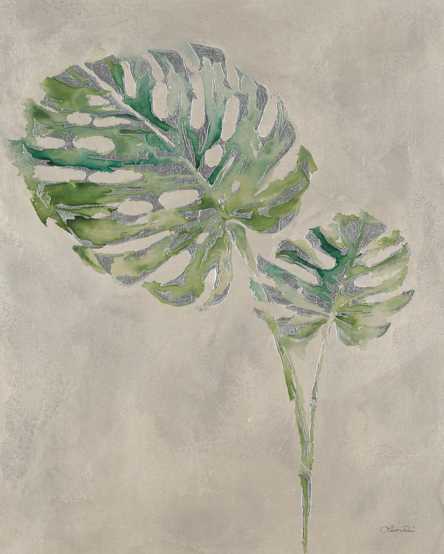
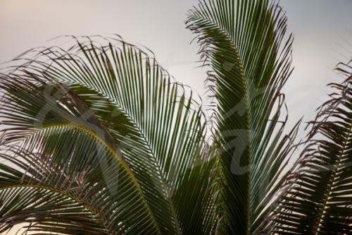
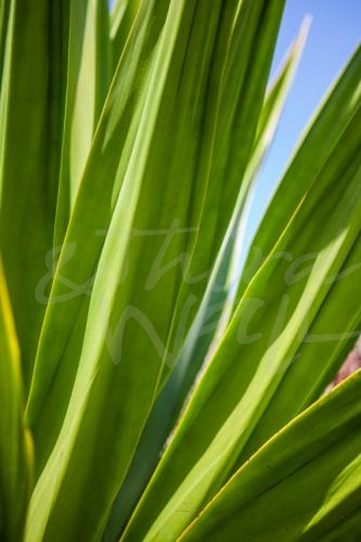
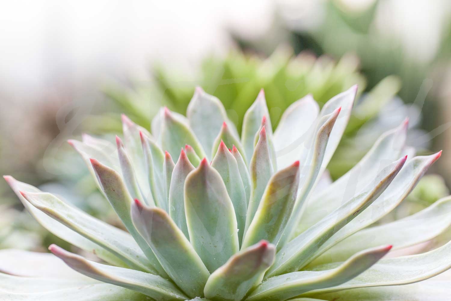
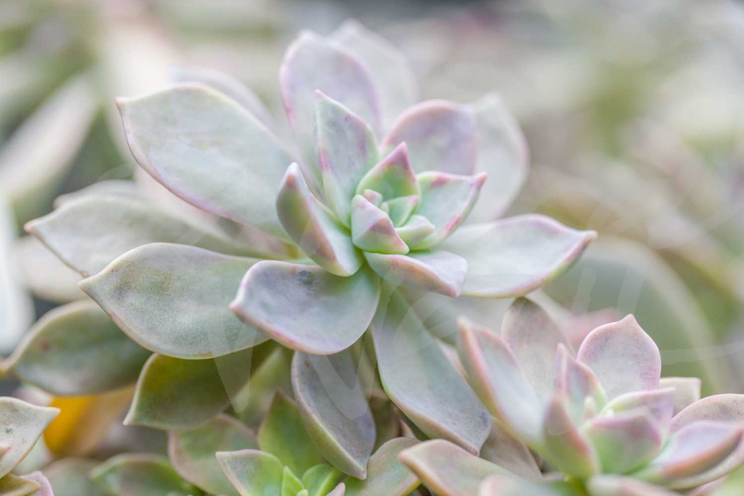
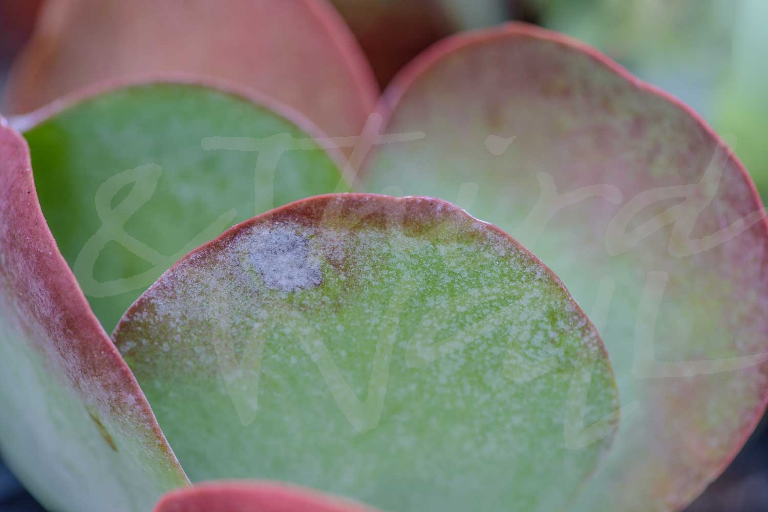
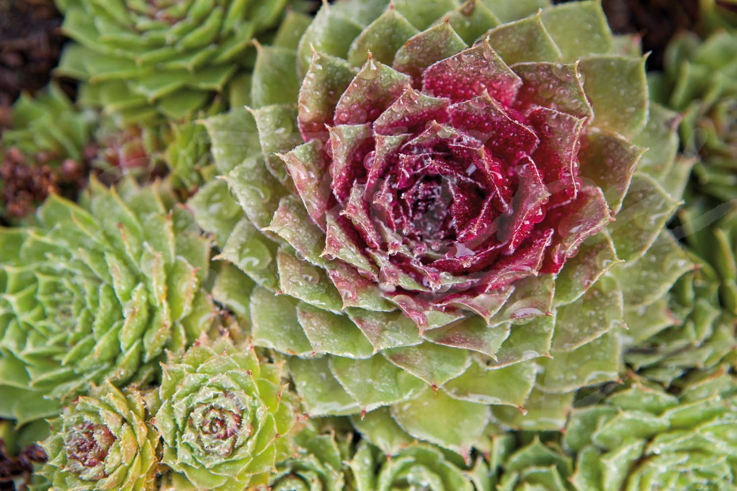
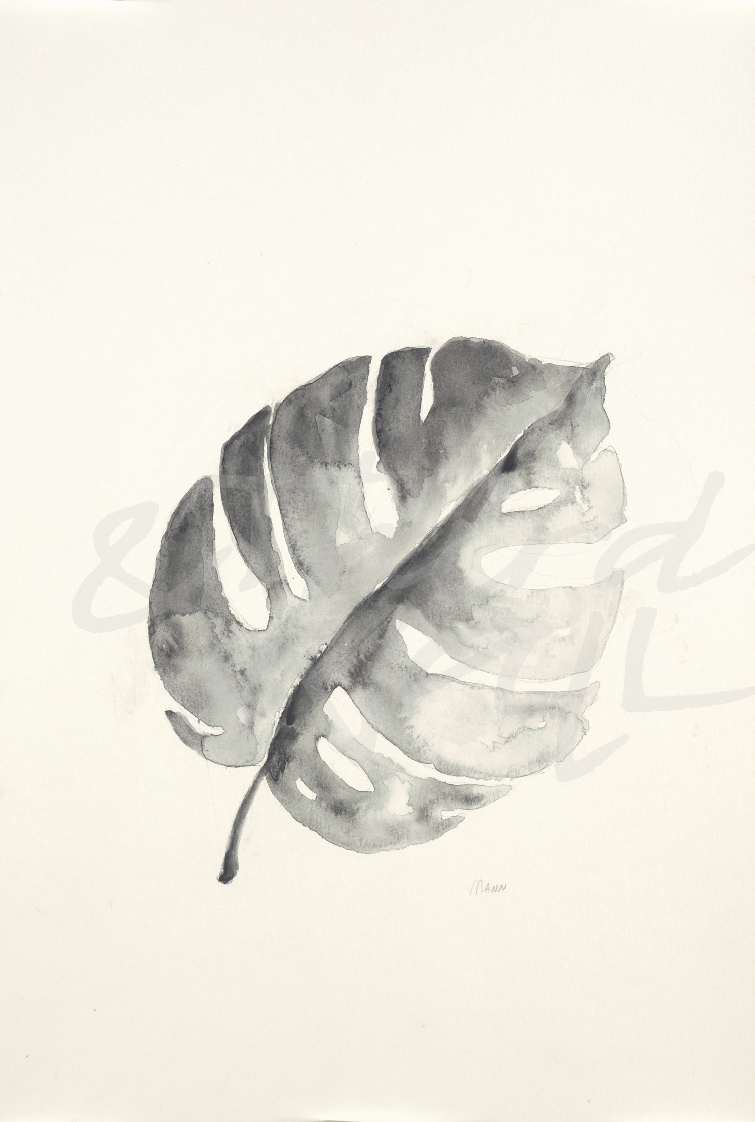
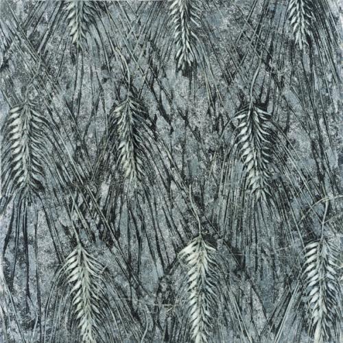
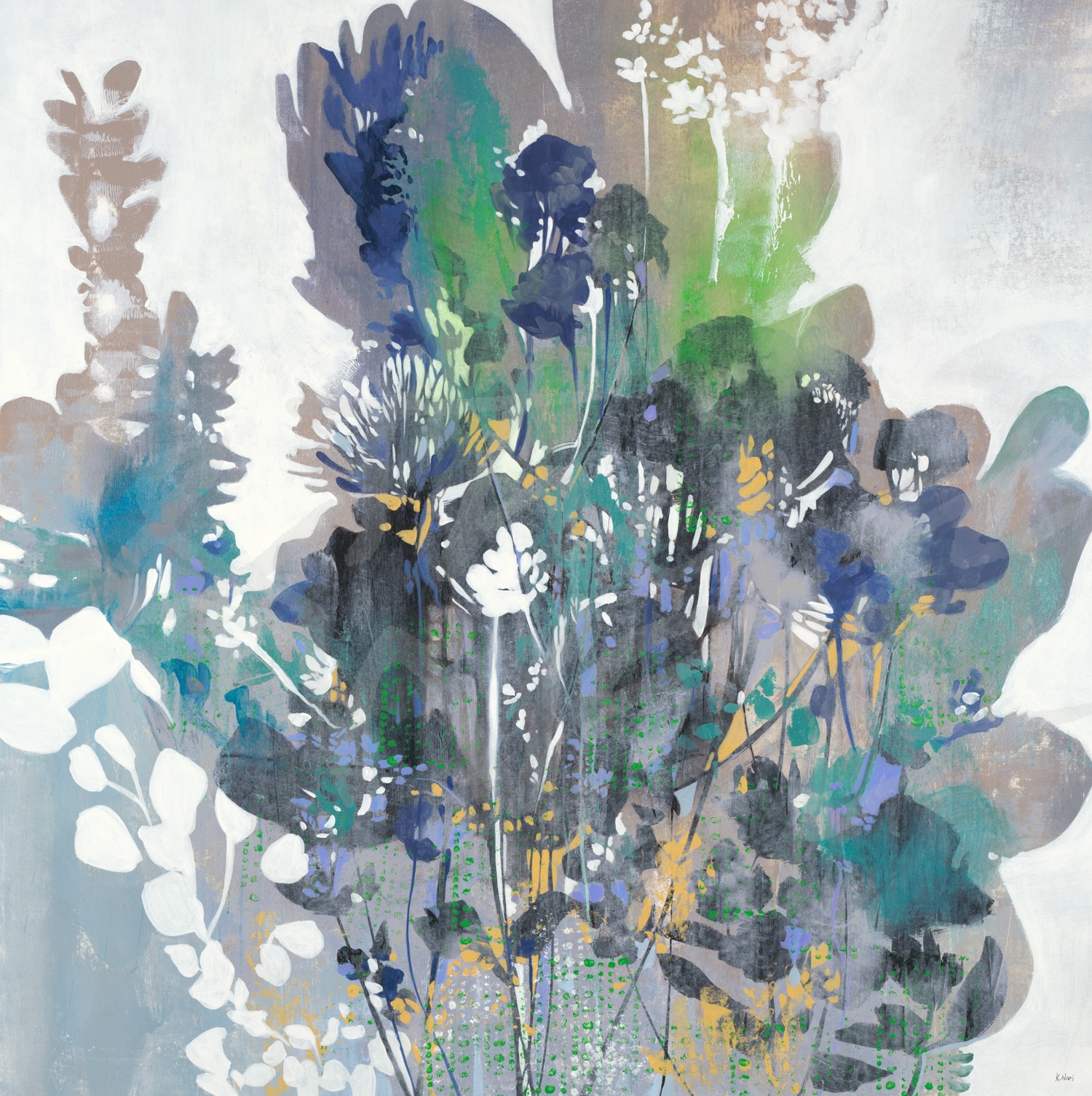
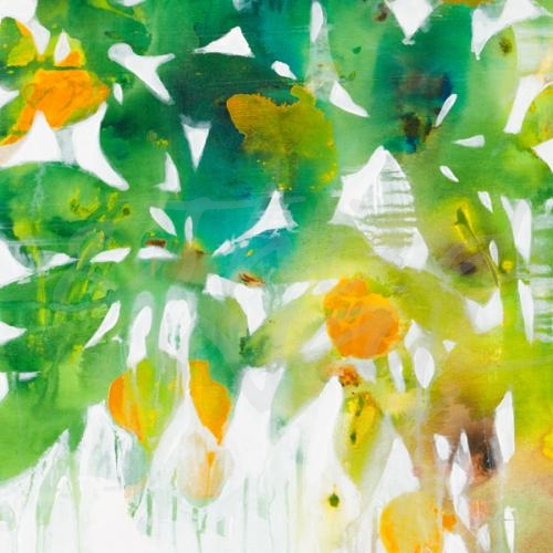
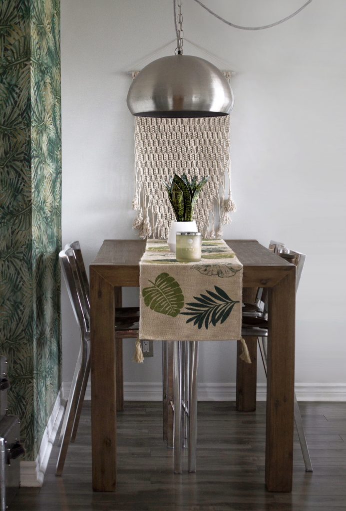
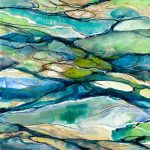
Are you looking for a way to freshen up your space? Incorporating shades of green can do just that and add a natural element to your interior.  Bringing the outdoors in has become a popular design trend, and adding some green is one of the easiest ways to infuse vitality into your room.  Cool green tones can be relaxing and nourishing, while warm tones can add personality and energy to a space, and they don’t always have to come in botanical form.  Having green hues in your furniture, accent pieces, and on your walls can be resting or energizing, and with such a wide range of green tones to use, it is easy to find the perfect one for your space.  Since there are endless possibilities, we are highlighting different ways to incorporate this versatile color trend into your decor and design to help you go green!

Greens as Neutrals

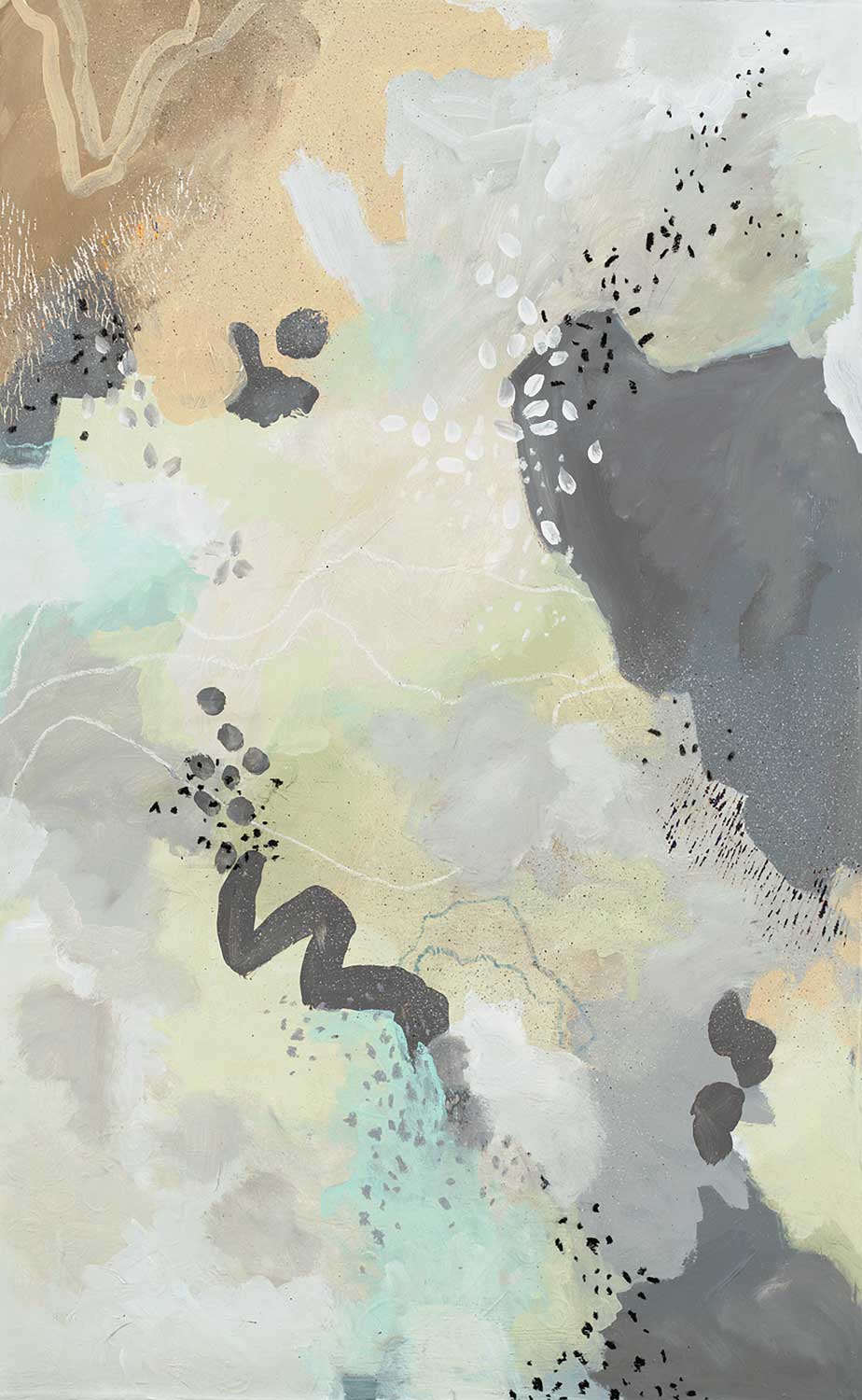
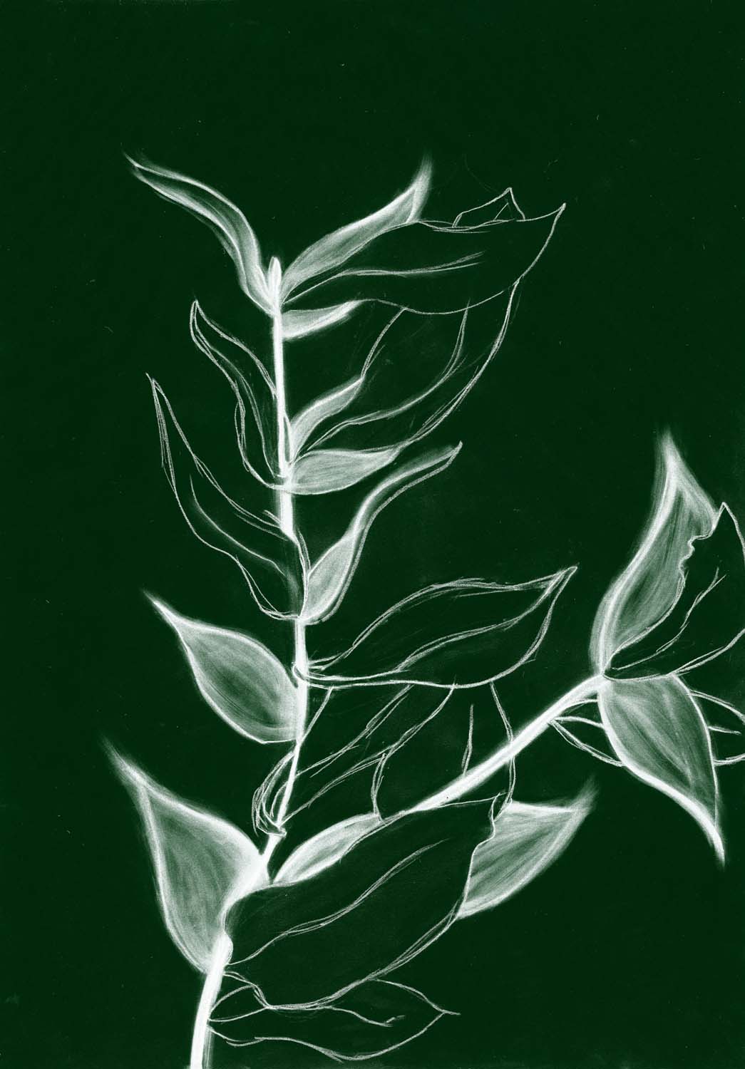
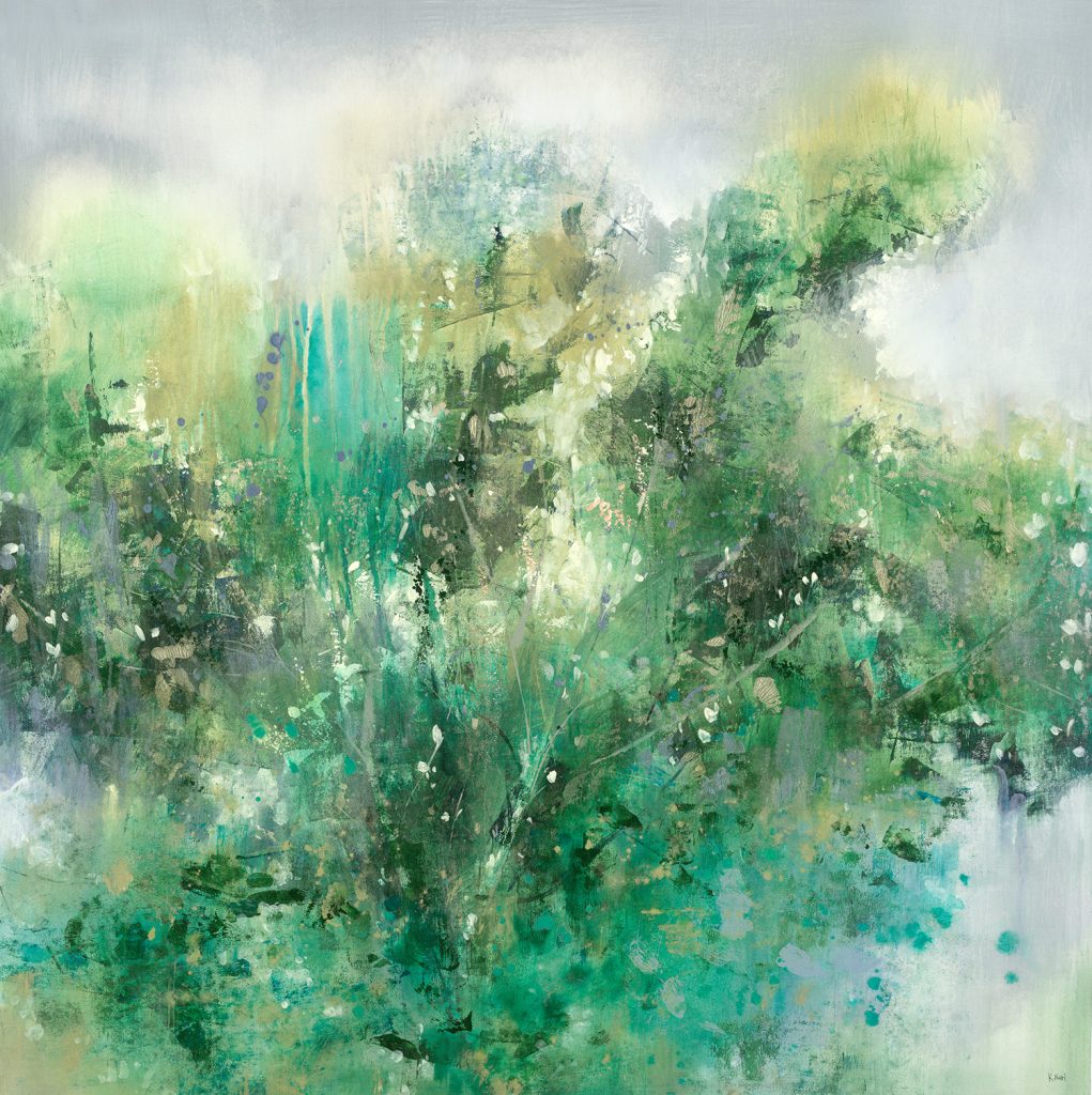
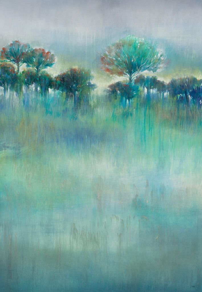
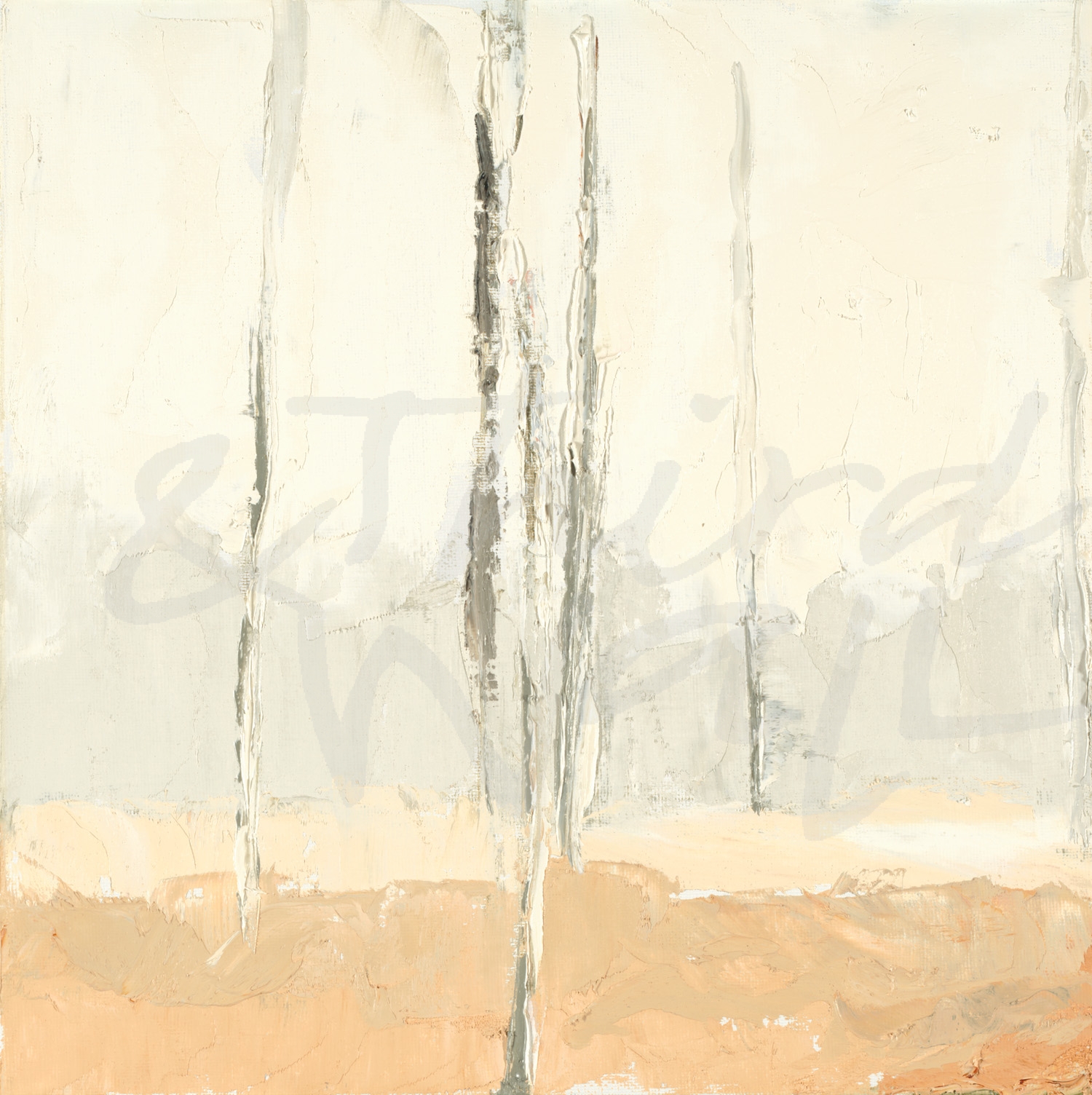
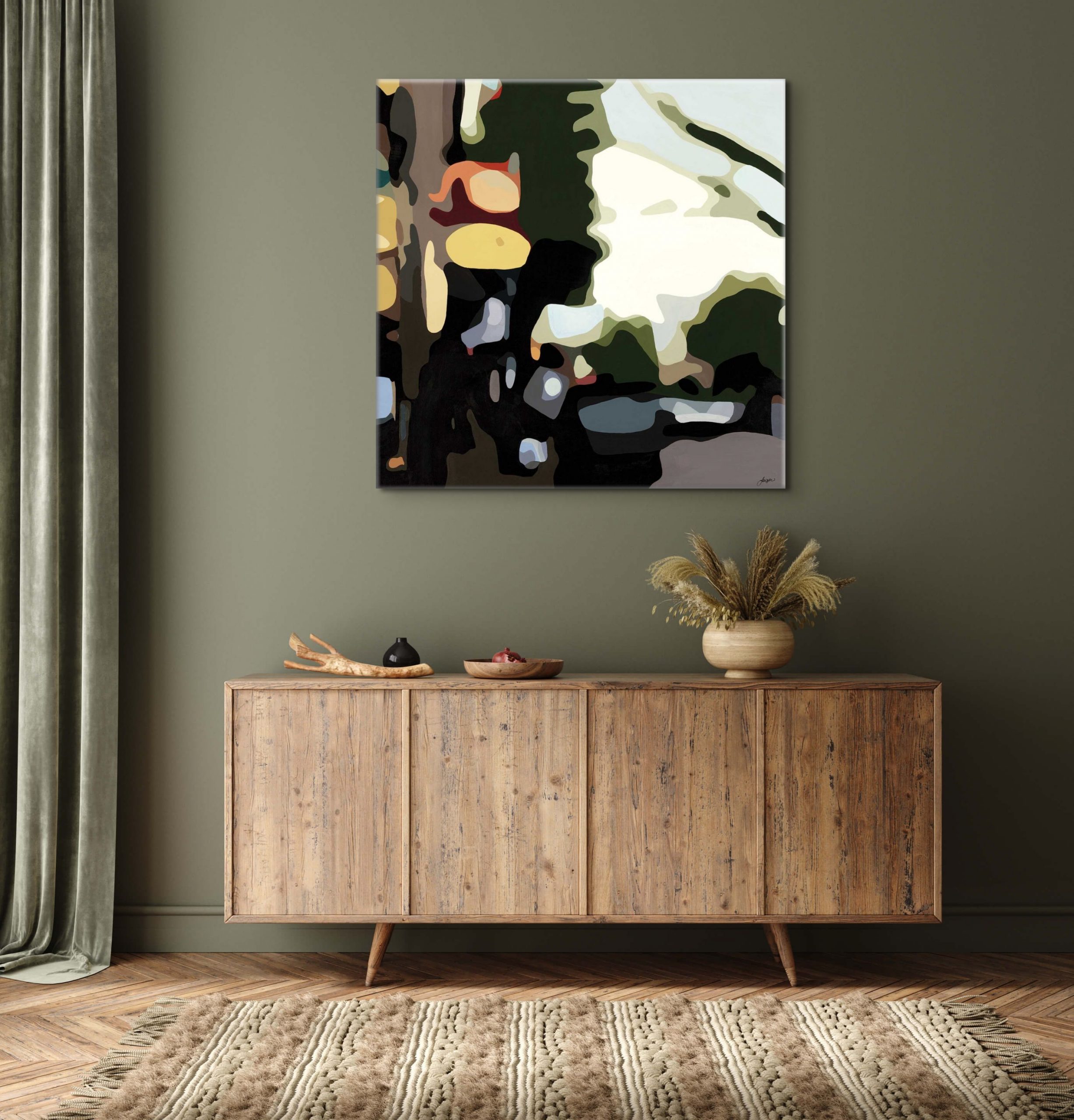
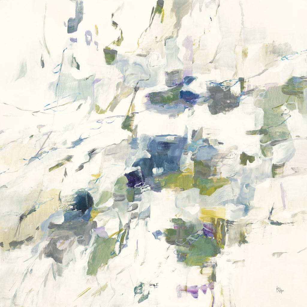
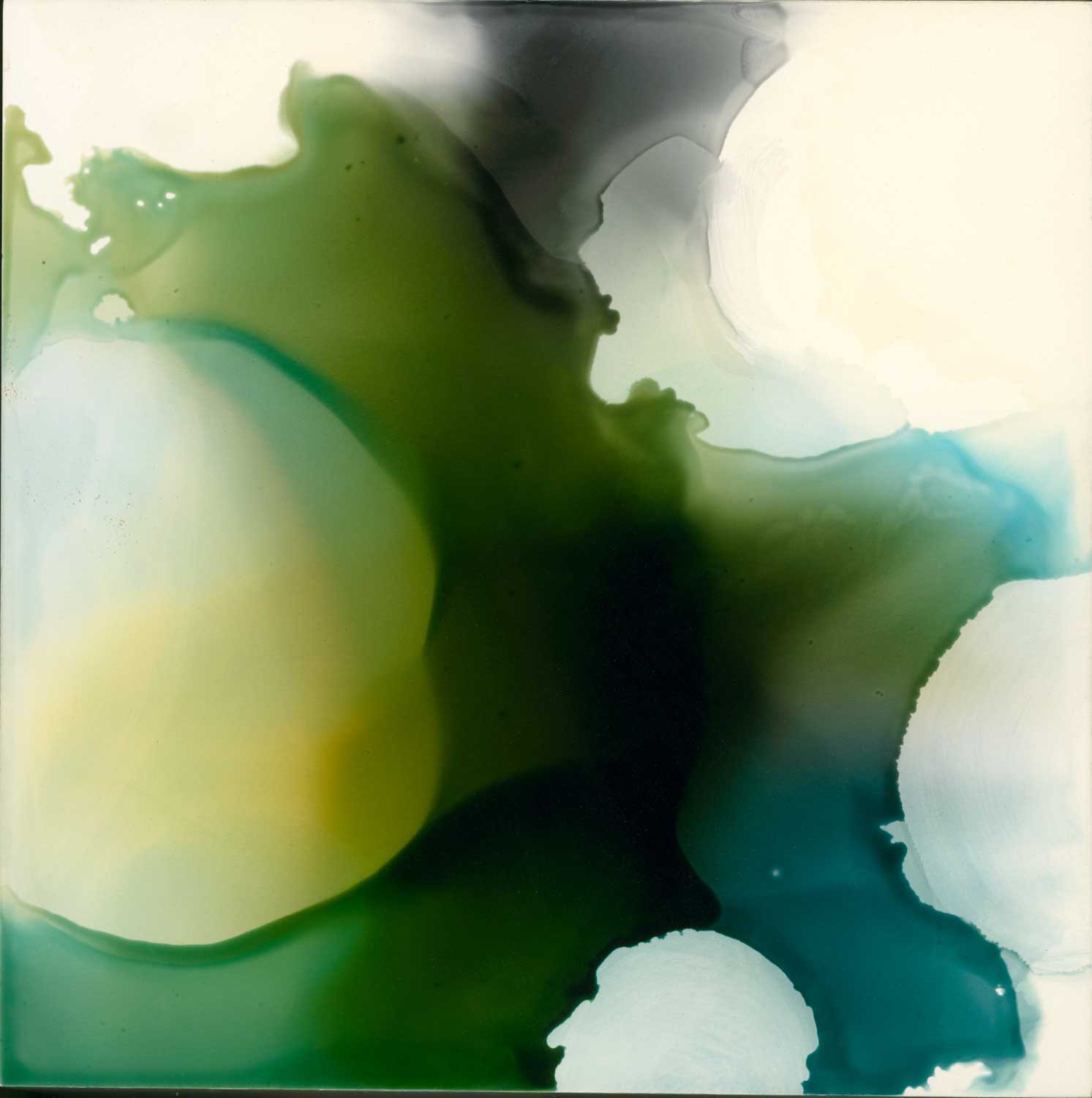
Cool, muted greens that take on more of a gray or brown tone, such as sage, are great for acting like neutrals in a space.  Paler greens that verge on the point of gray are a great way to keep a space light and serene, but they can pair easily with sharp, bright colors.  Khaki, mossy, and olivey greens can give a design an earthy feel, especially when paired with warm tones and natural textures. It’s easy to switch out your wall décor in these soothing, neutral green tones because of their versatility and ability to work with what you already have!
Rich & Saturated

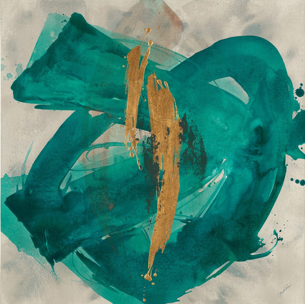
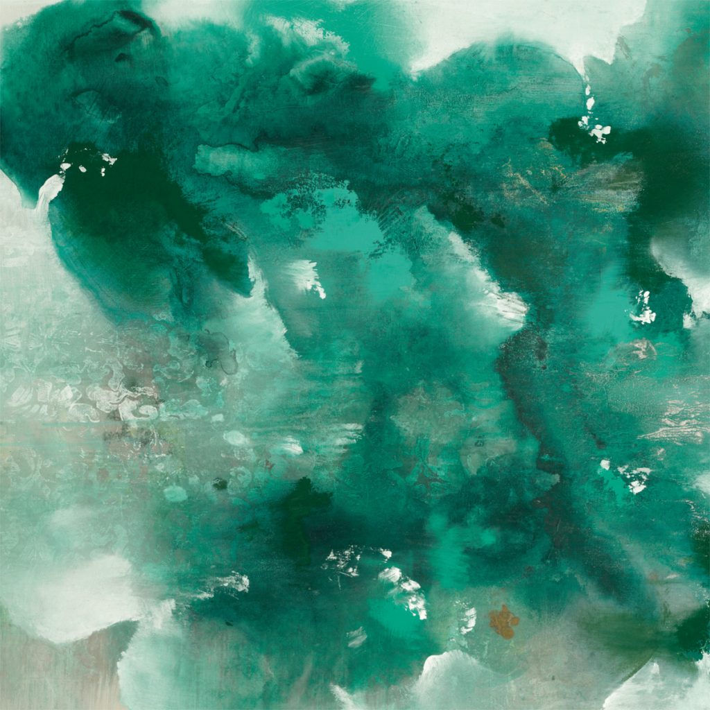
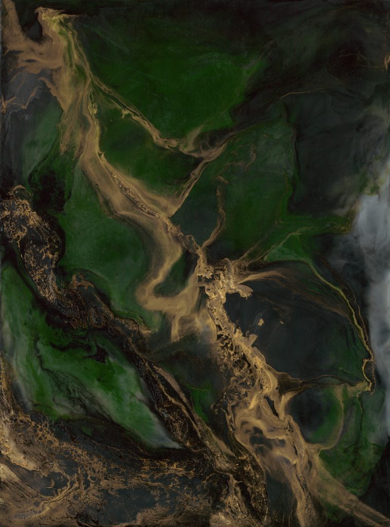
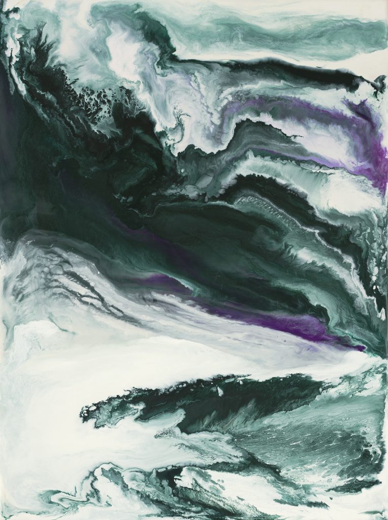
Bold, saturated green tones, such as jade and emerald green, add a rich and regal element to any interior. Whether paired with other dark accents to create a moody space or offset with neutrals and metallic accents, deep green tones can add personality and elegance. These dark, nature-inspired colors are great in furniture, accent pieces, or on your walls!
Light & Bright

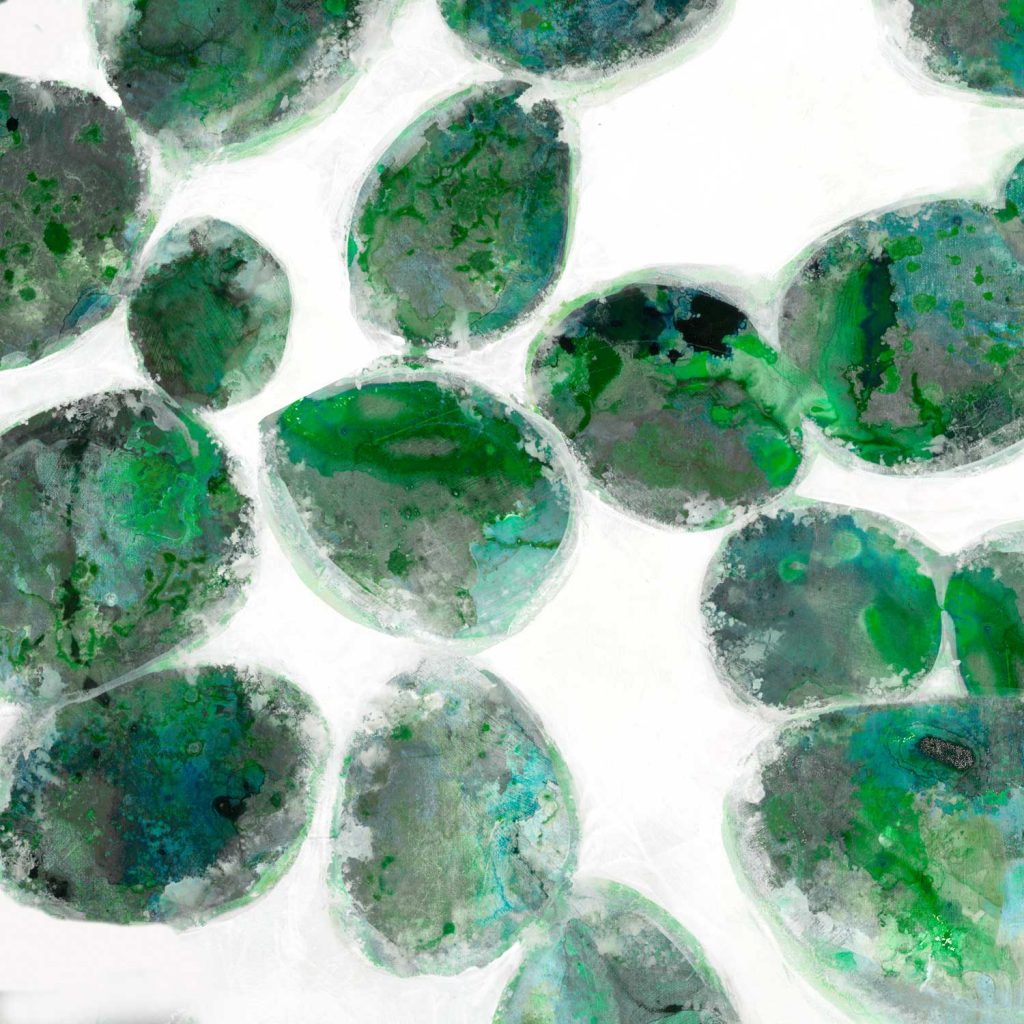
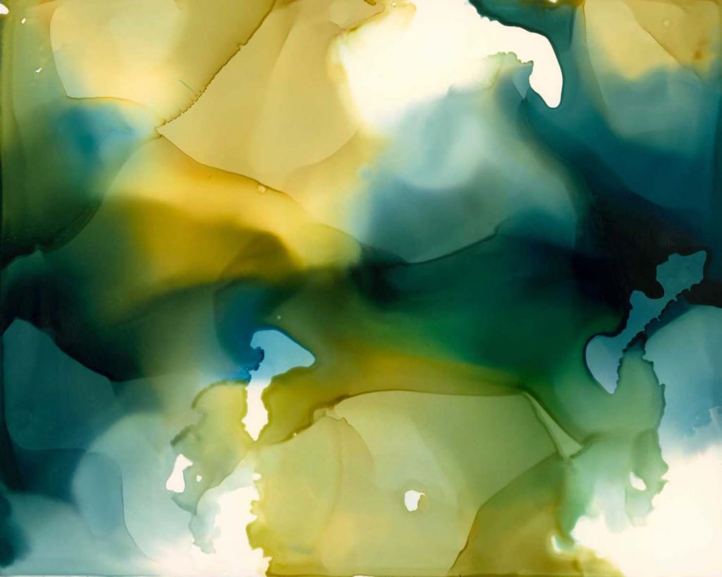
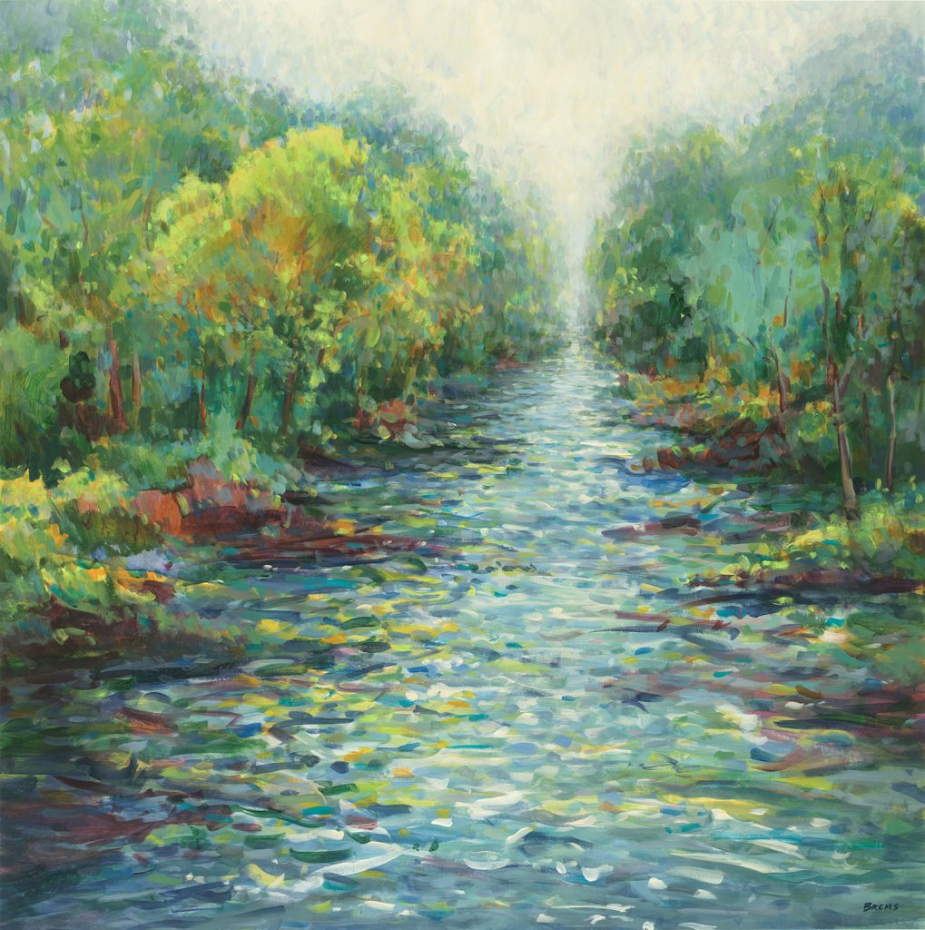
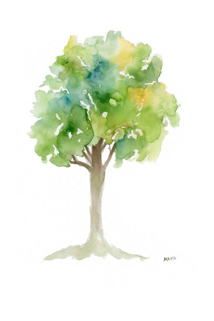
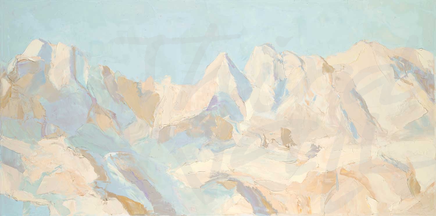
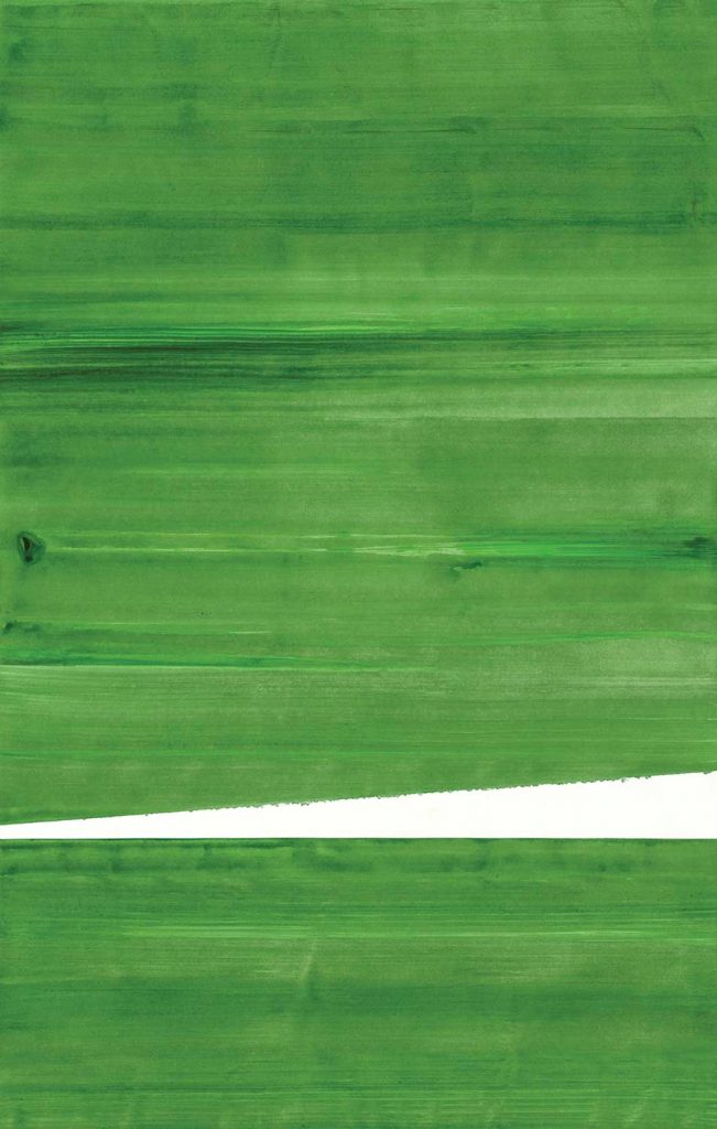
Light and bright green tones help to soothe and enliven rooms. Soft, pale greens colors with blue undertones, such as mint and sea-glass green, can brighten up a space in a calming way. Yellow-greens are fresh and inviting and more reminiscent of botanical hues. Using more lively and vibrant green colors, such as a shade of lime green, is great for social spaces because they can energize a room. If you go bold with bright green on your wall, balancing it out with neutral tones and light accents can keep it from feeling overwhelming. Decorating with light & bright greens in décor accessories and upholstery is a great way to add some calming and natural elements in smaller doses.
With a wide variety of shades and undertones, green hues can seamlessly complement other colors and unique textures, and find a home in any design style. From traditional styles to modern elements, green tones freshen up a space and bring the natural healing of the outdoors in. Whether it’s the focal point of a room or an accent color, pops of this nature-inspired color can create a chic and relaxing space!

The images featured here are available in our Print-On-Demand collection.  Some areas of our website are password-protected. If you are a member of the trade but don’t have full access to our website, www.thirdandwall.com, please contact us at customerservice@thirdandwall.com.

From The Studio of Kippi Leonard

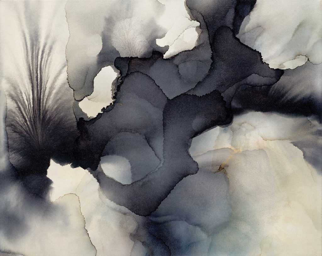
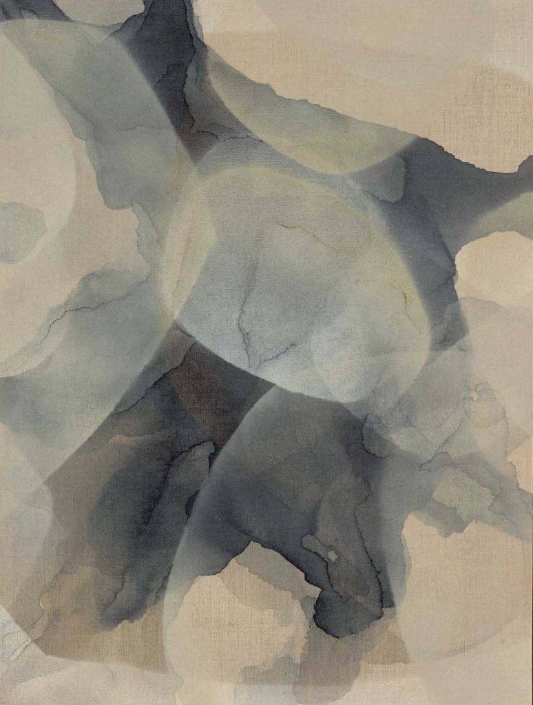
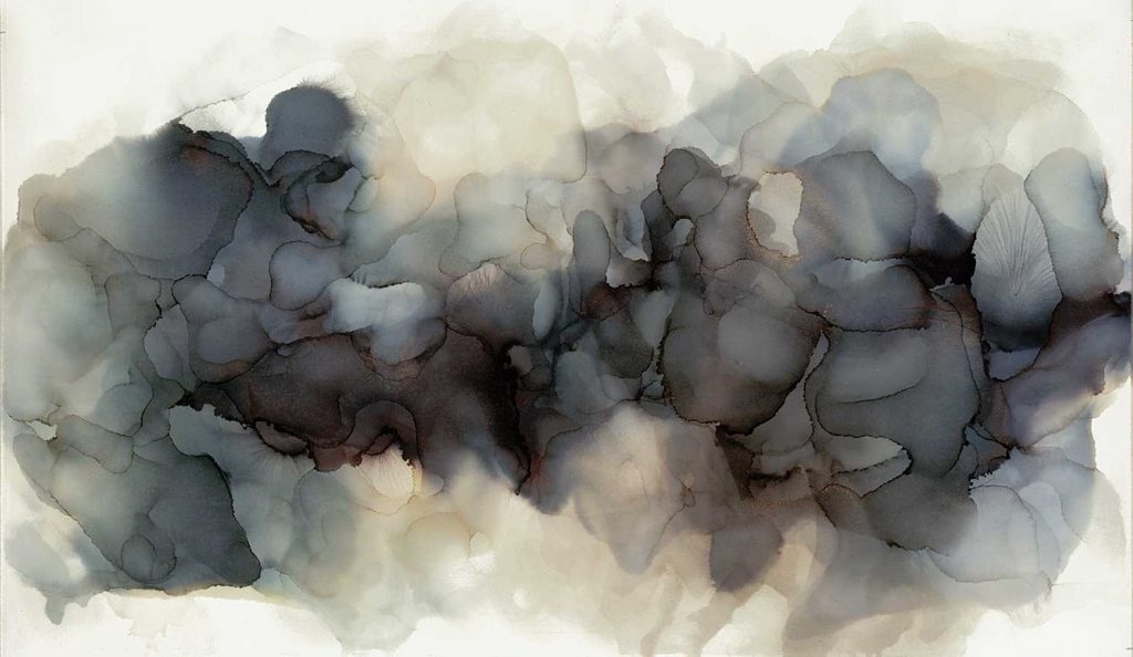
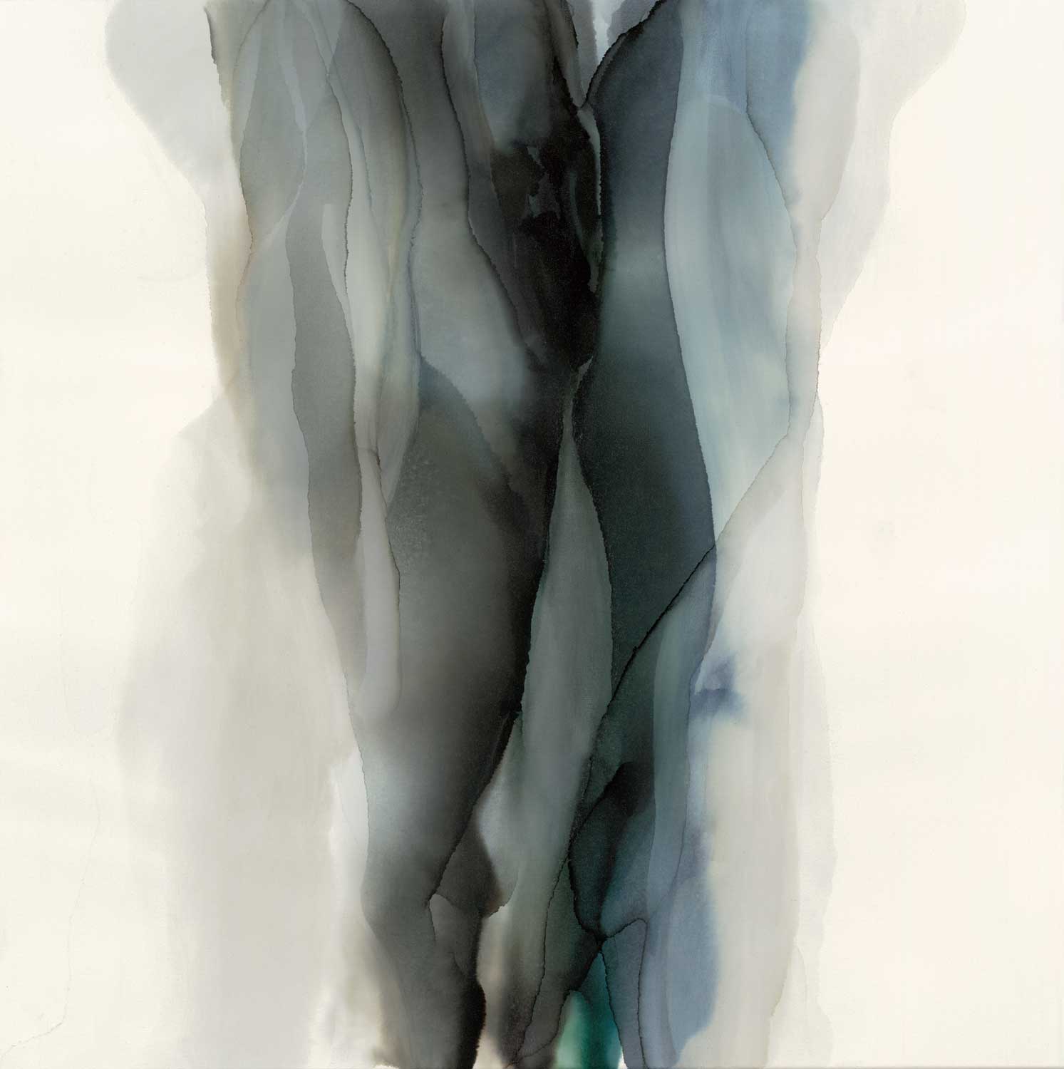
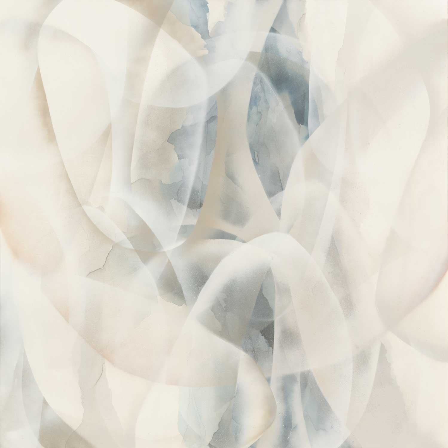
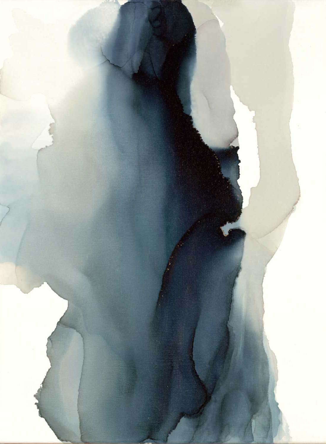
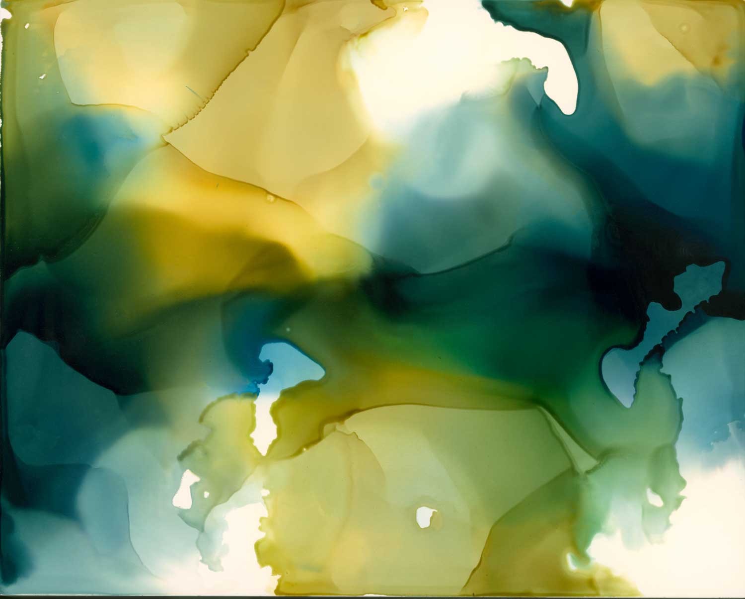
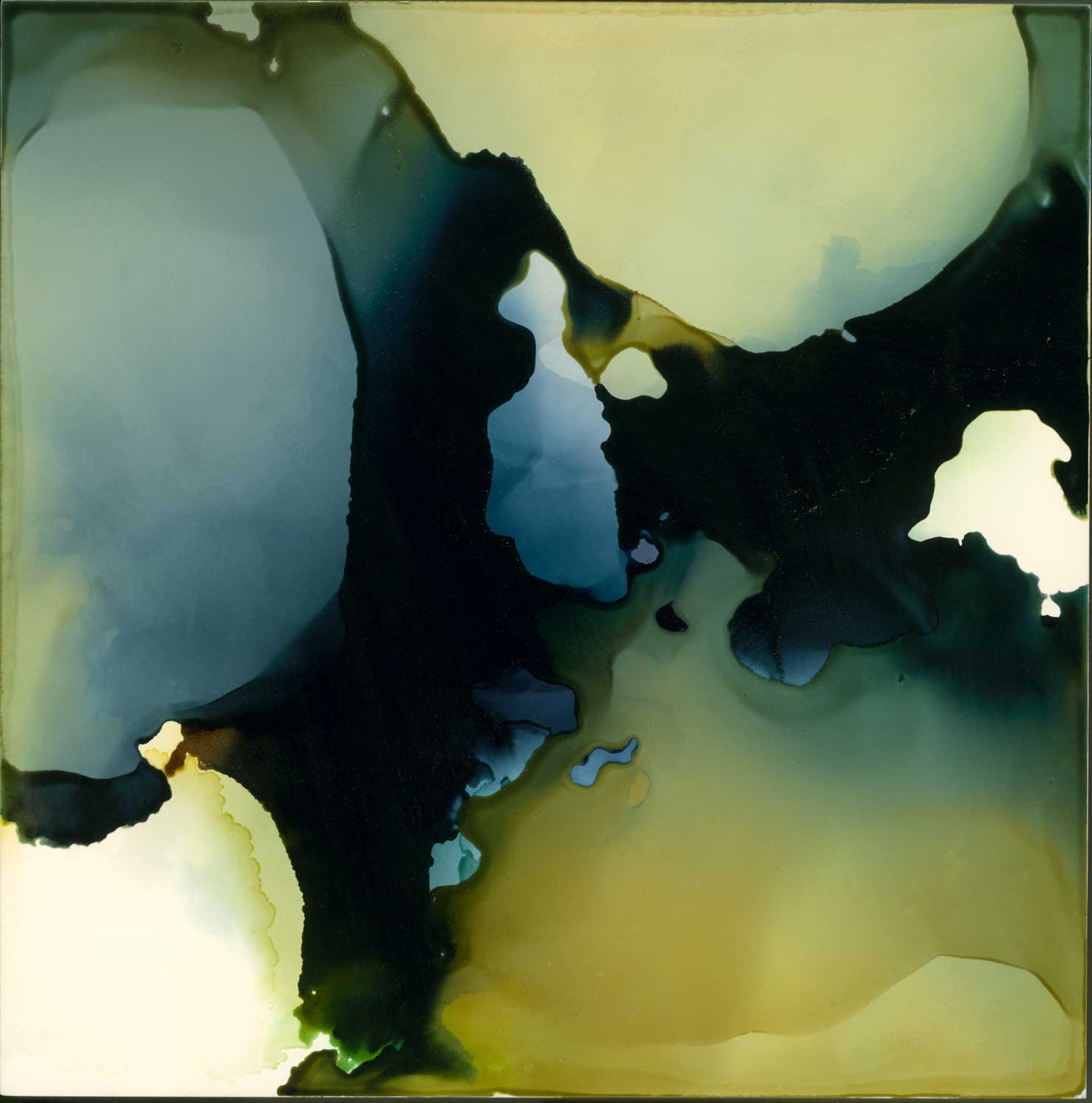
Meet our artist, Kippi LeonardKippi’s vibrant aqueous surfaces are the results of pouring inks that have been custom mixed onto canvas, panel, and linen.  The pouring process is her way of largely abandoning compositional control and remaining open to spontaneous occurrences with her work.  Through color, luminosity and light reflection, her work provokes calm and, simultaneously, deep introspection.  Inversely, her mixed media work is structural and largely black and white with expressive mark making and an occasional allusion of color.  Both methods of creating reflect her veracious essence.  After an extensive career in interior design, Kippi continues the exploration of materials through her experimental and abstract work in oil, encaustic, collage and watercolor.

A Pacific Northwest native, she now resides in Palm Desert, California a place that nurtures her comprehensive approach to creating art.

What do you first do when you get to the studio in the morning? 

The first thing I do when I arrive at my studio each day is to turn on music, something that will influence the tone, composition, and mood of my current series of paintings.

How many paintings do you work on at a time?

I typically work on 2-4 paintings at a time, with several in ink and a large acrylic mixed media.

Do you have a dream project that you would like to work on?

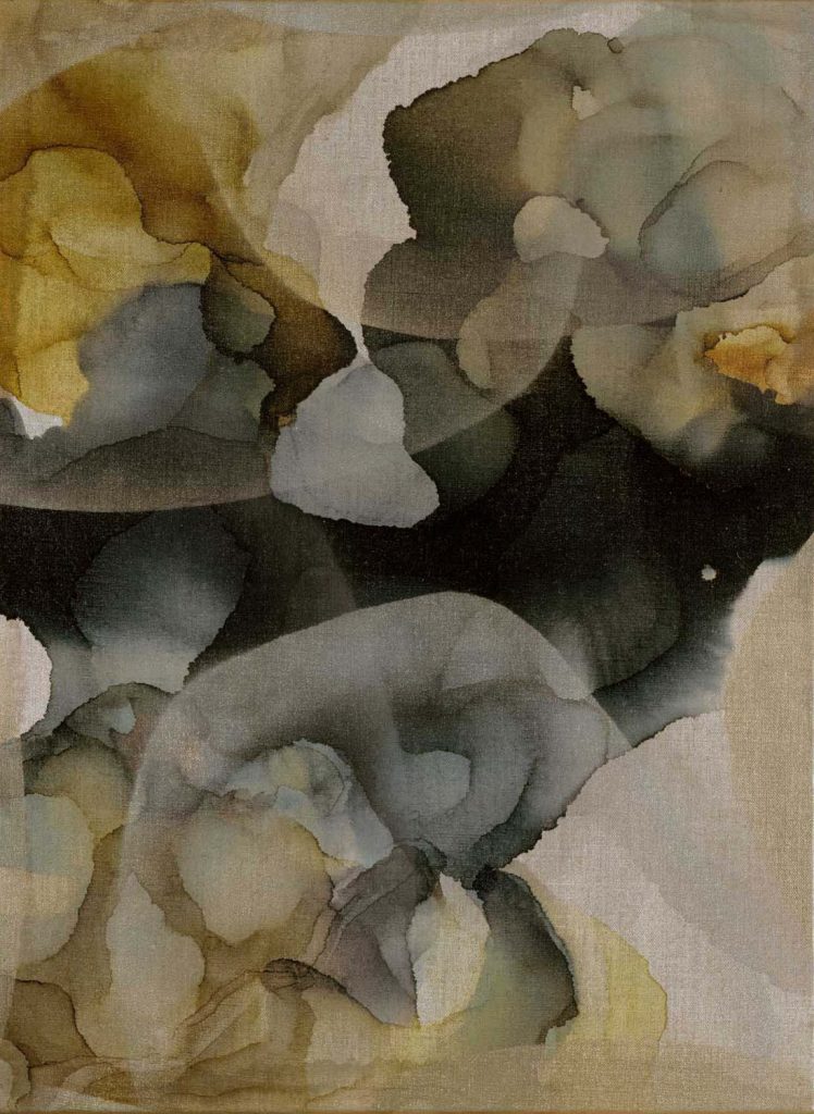
Solitude Storm

My current dream project has been opening my own studio/gallery/workshop space in Palm Desert where I live.  There is a street revitalization program currently in construction where my studio is located which is being built to provide the community with an art scene, community events, music festivals, dining, and gathering.  Its going to be amazing and I’d like to be involved in its vision and implementation.

If you could paint with anyone, who would it be?

I would have to go back in time.  I just read the book “Ninth Street Women” by author Mary Gabriel.  I could see myself painting for a day with Joan Mitchel or Grace Hartigan.  Mostly, I’d like to be a part of their unapologetic gusty innovation in the post-war modern art world.  Truly inspiring!

What’s your favorite way of generating ideas and inspiration?

When my creative tank is nearing empty, a good adventure clears my mind and, being an amateur photographer, I always return with photo inspiration.  Travel, hiking, visiting new out-of-the-way places of interest feeds my soul.  Museum, gallery, and art shows always excite my brain and fuel me to start new pieces.  Occasionally, a color I see somewhere in a crowd takes hold and a new idea begins to form.

How has your art evolved over time?

I experimented in so many mediums when I first started to learn about art and its creation.  I found my voice in my ink work and in my mixed media work, and I’ve realized I cannot do everything but I can challenge myself within a few favorites.  I am always trailblazing ways to use the inks.  For me, it’s always being willing to risk.  I love overcoming impossibility within my work.

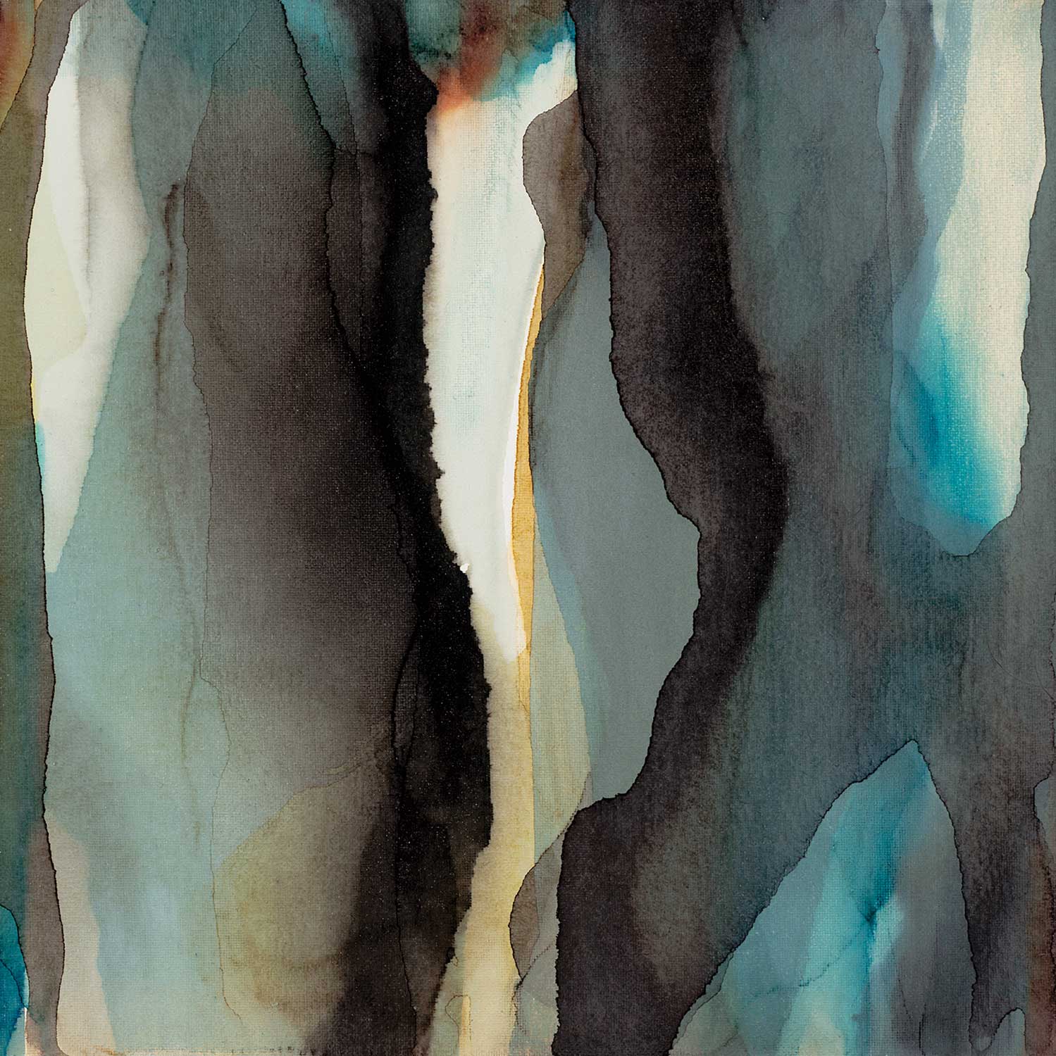
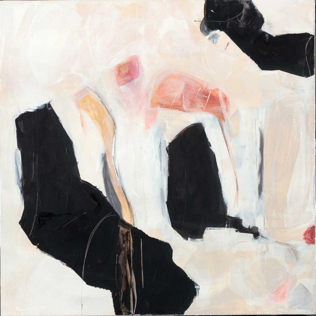
“Untitled”

What do you like most about your work?

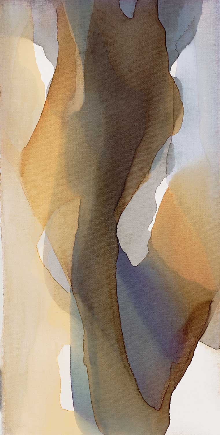
I like how it evokes emotion in the viewers.  I’m often being told stories of what a person sees within my work.  A mother holding a child, a sunrise in the mountains, a female silhouette; that it resonates in their heart and mind; that they don’t want to look away.  My story becomes part of their story when they bring my art into their home.  I want to connect with people and this is the way I do that.

What is one word that best describes your style?

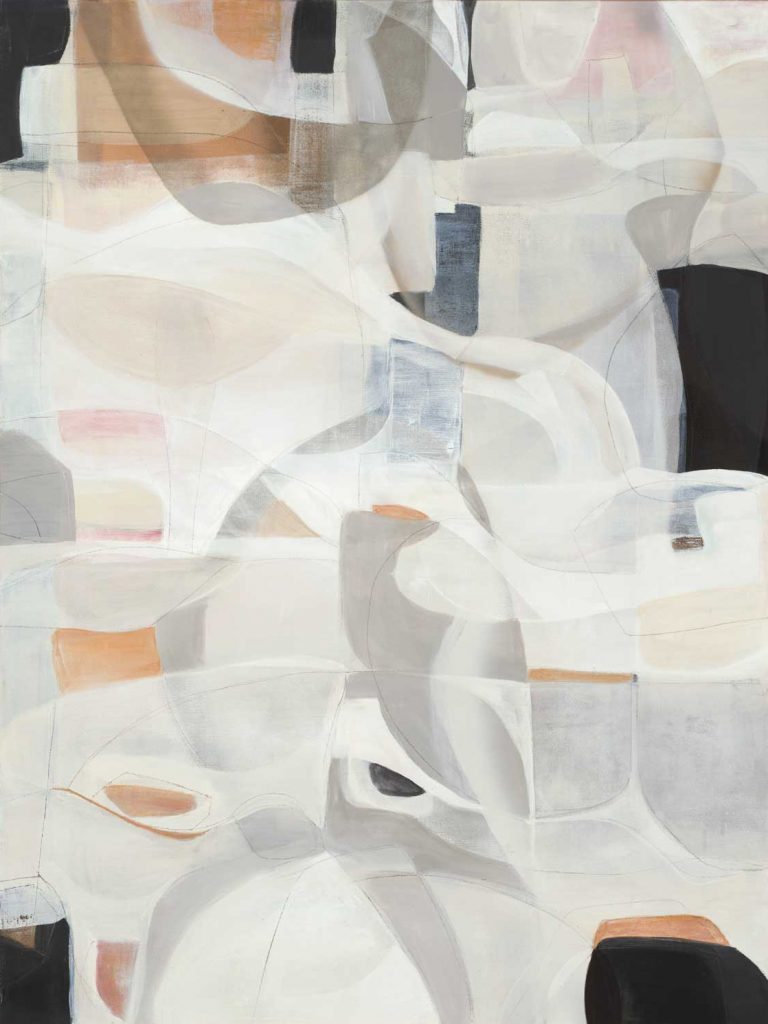
Modern-Neutral

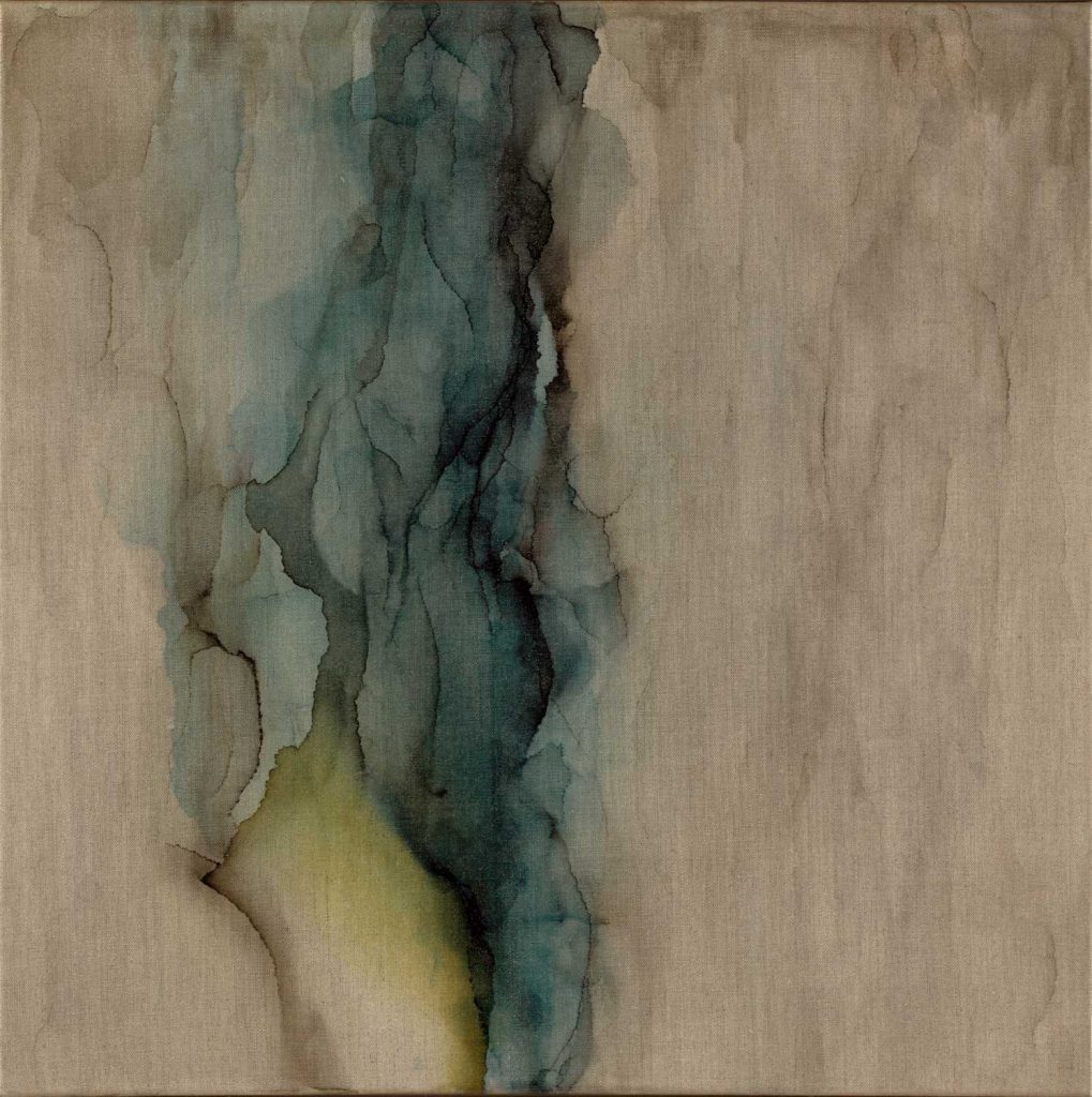
“Digging In”

Is there an idea you would like to explore?

I have lots of ideas to explore.  My current idea is blending contemporary elements with historical figures using my inks, collage, and acrylic in an abstract way.

What is your favorite time of day to paint?

It depends on what I’m painting.  I work with inks early in the morning when I’m energized, as they require complete attention with music that is upbeat and I can dance in place a bit while waiting for the inks to dry.  I work on my abstract mixed media pieces in the late afternoon and evenings, usually with soft jazz music playing.

Do you ever get “stuck” on a piece?  If so, what do you do?

I do get stuck and with those pieces I either push too far or they go in my “closet of unloved art” until a fresh idea hits me.  Then I begin again and they evolve into some of my most favorite pieces.  Occasionally, I have my husband look at a piece and give me his “feel”.  It re-inspires me to go in a new direction or validates I’m on the right track and I just needed to push through.

What is up next on your easel? 

Currently a 48 x 72″ ink piece for a commission is on the table and a new collage mixed media is on the easel waiting for the first brush stroke.

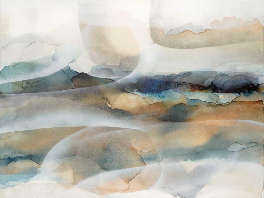
“Moody Desert”

The images featured here are available in our Print-On-Demand collection.  Some areas of our website are password-protected. If you are a member of the trade but don’t have full access to our website, www.thirdandwall.com, please contact us at customerservice@thirdandwall.com.
Trend Inspiration From New York Fashion Week

featuring “An Open Heart” by Liz Jardine alt v 1

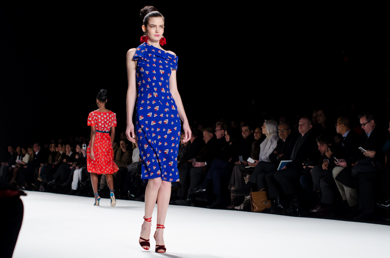
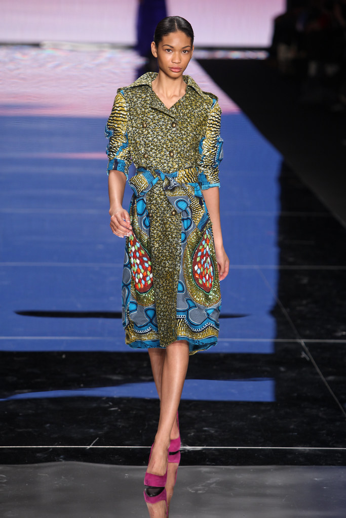
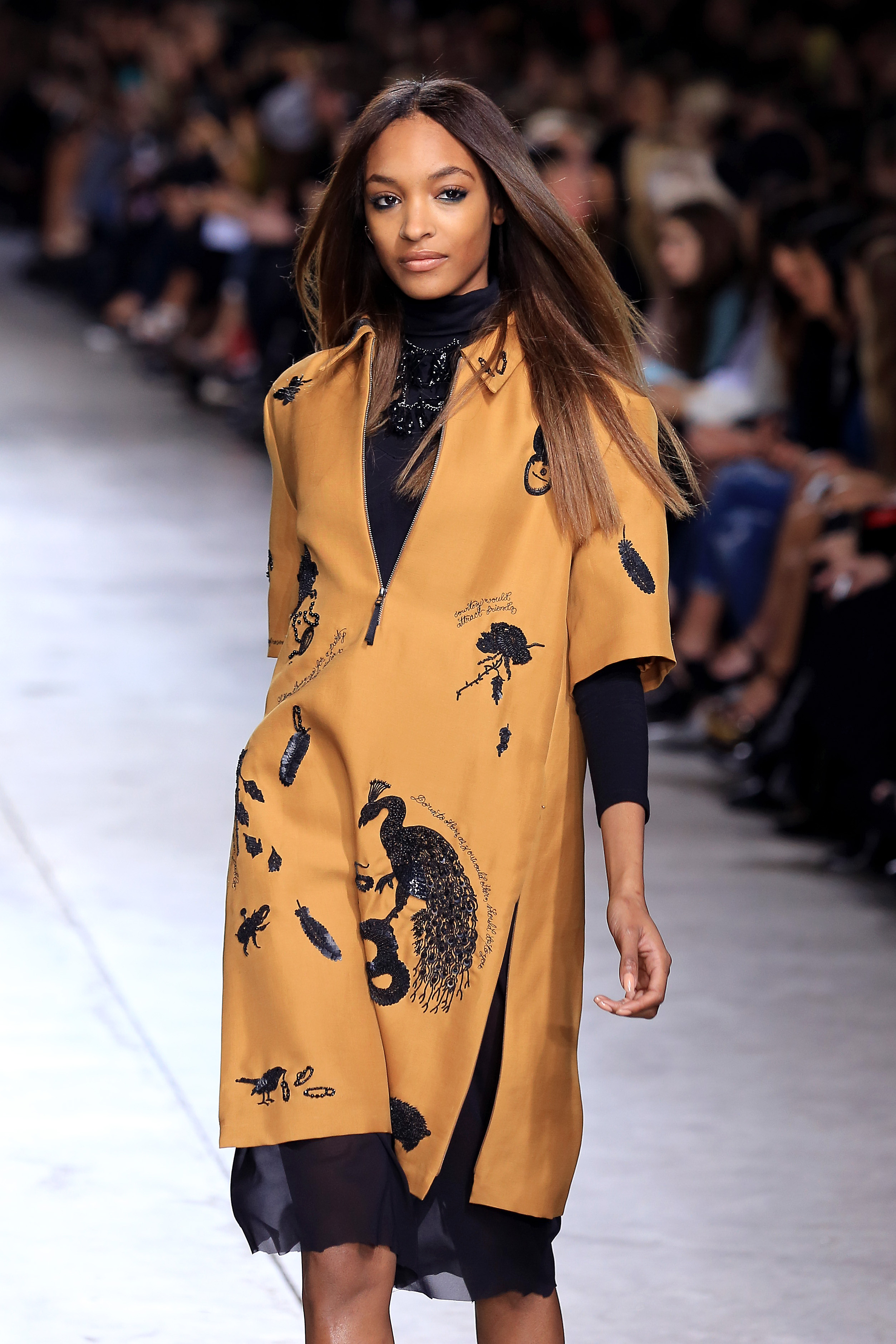
New York Fashion Week 2019 wrapped up in September and there were some runway trends for the upcoming year that caught our eye.  It’s no surprise that the relationship between fashion and interiors is a close one, so these fashion trends can easily be applied to create unique spaces.  We wanted to highlight a few of our favorite runway styles and how they can find a home in your wall decor!

BOLD: Prints & Patterns

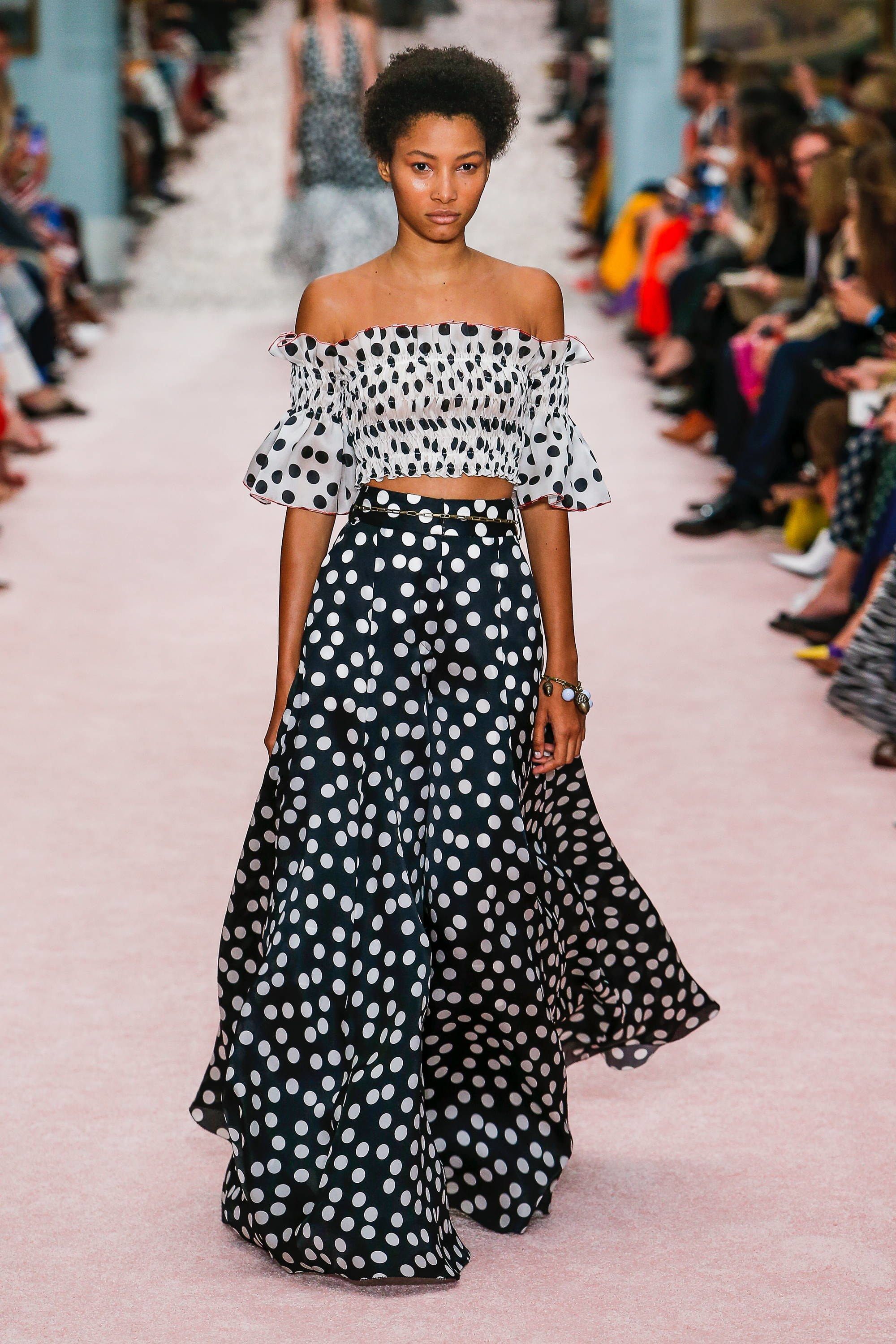
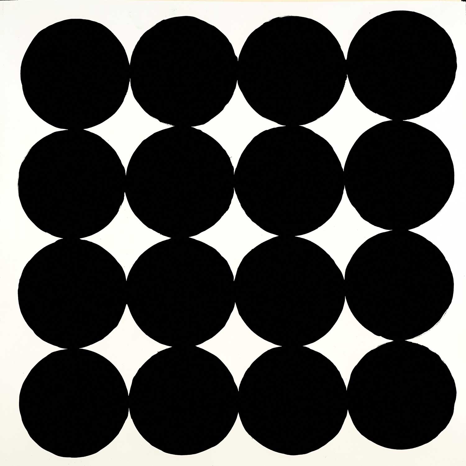
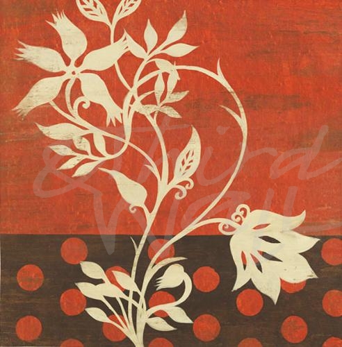
Bold patterns are trending on the runways and on our walls!  From polka dots to rose prints to black & white graphic prints, we are drawing from this high-fashion inspiration and predicting bold patterns to be big in wall decor this coming year.  Bold printed wallpaper and wallcovering have become very popular, and it looks to be an interior trend that will continue to grow in 2020.

BRIGHT: Citrus-Inspired Colors

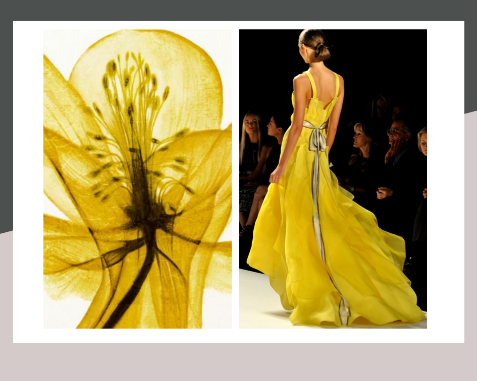
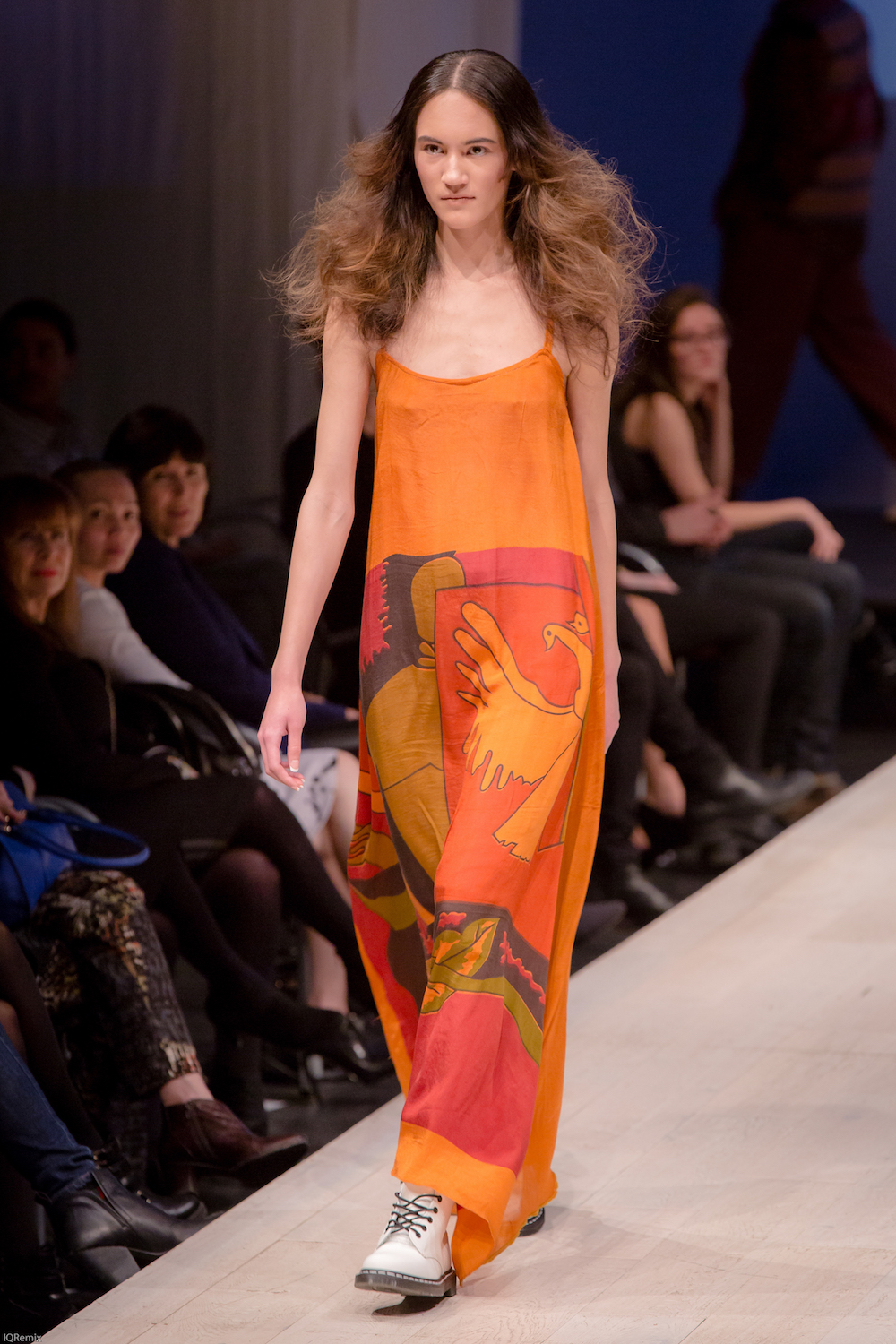
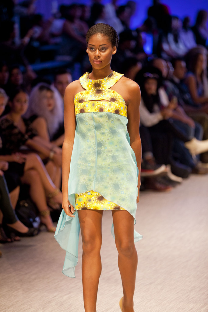
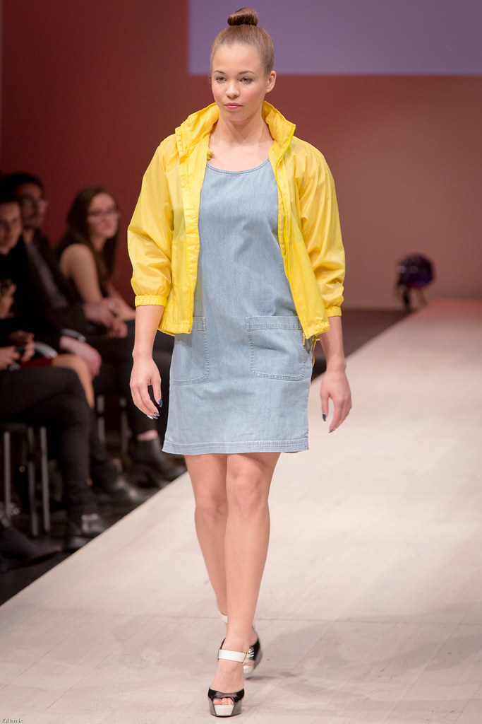
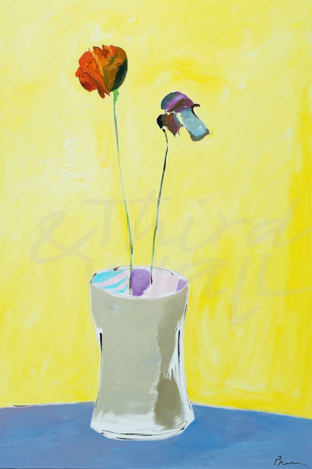
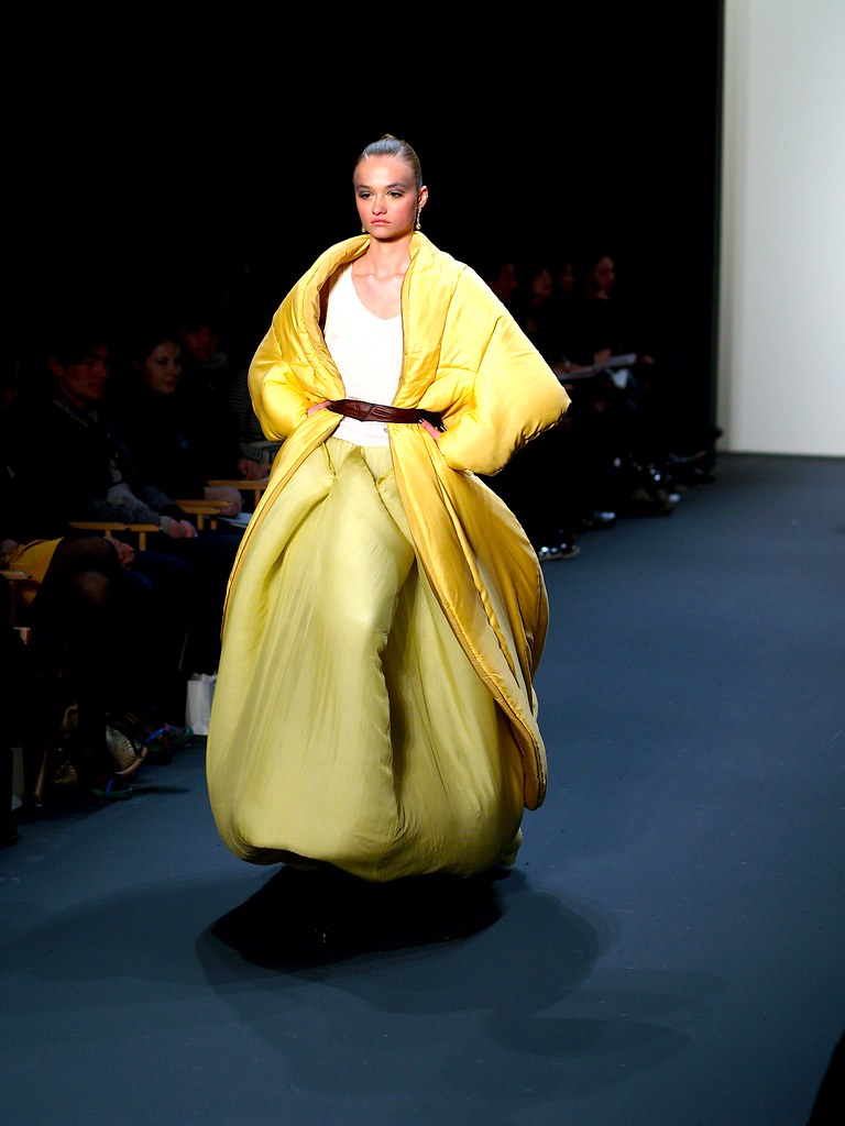
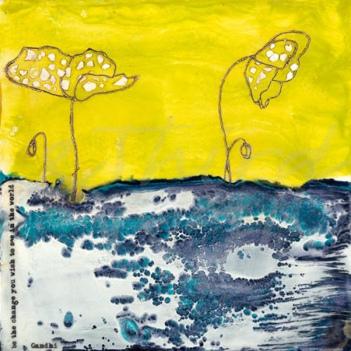
Citrus-inspired colors are brightening up wardrobes and interiors!  Refreshing colors such as lime green, tangy tangerine, and not-so-mellow yellow made a statement on the catwalks and are sure to make a splash in decor for a bright and colorful 2020.  Decorating with these trendy highlighter hues can be as easy as hanging the perfect eye-catching artwork on your walls!

CLASSIC: All White Suit

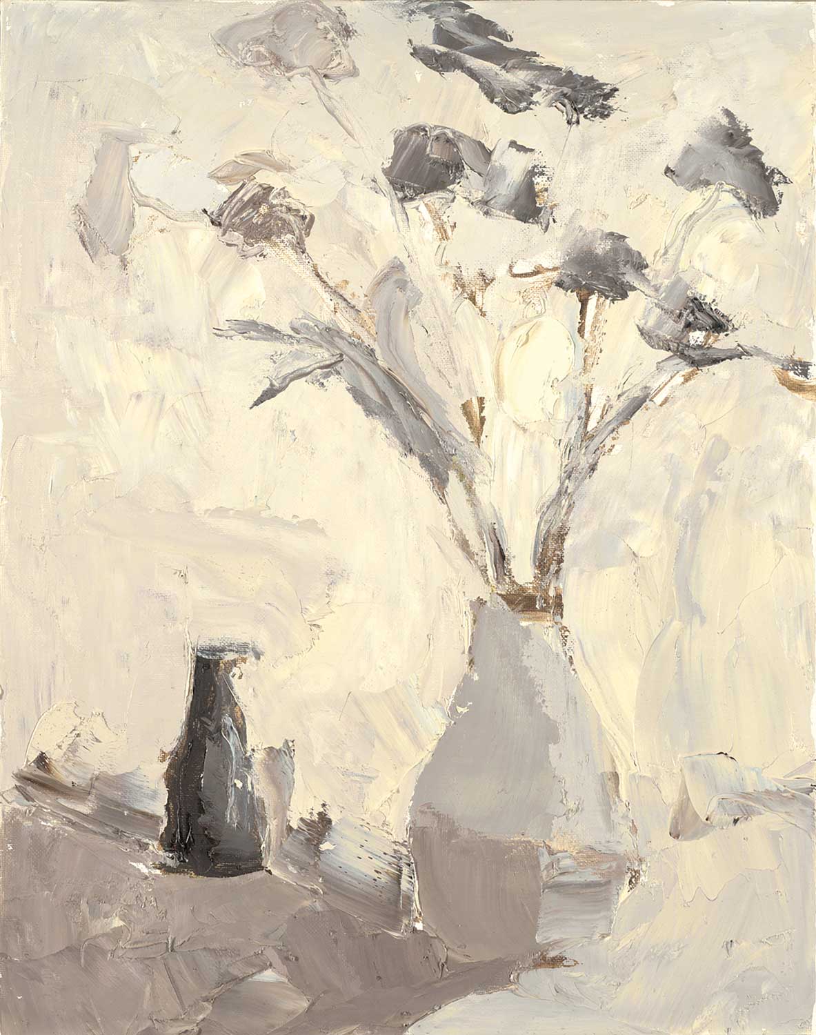
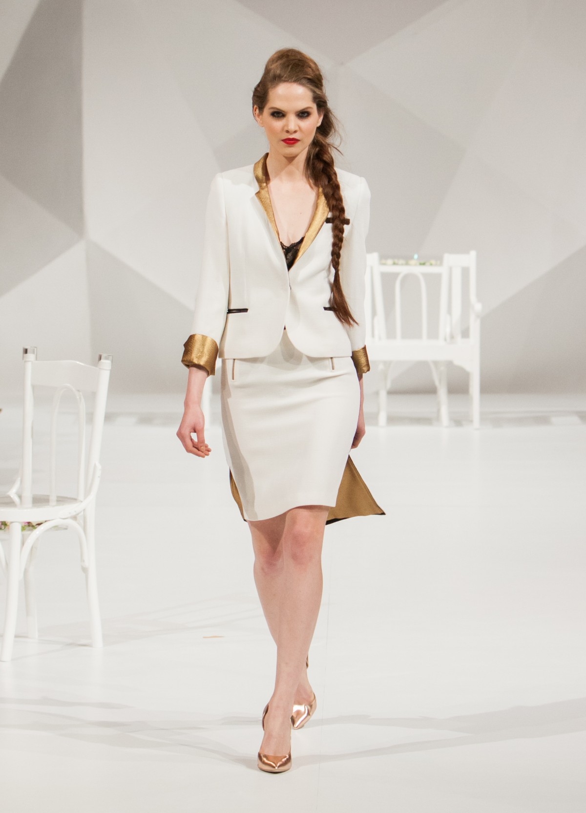
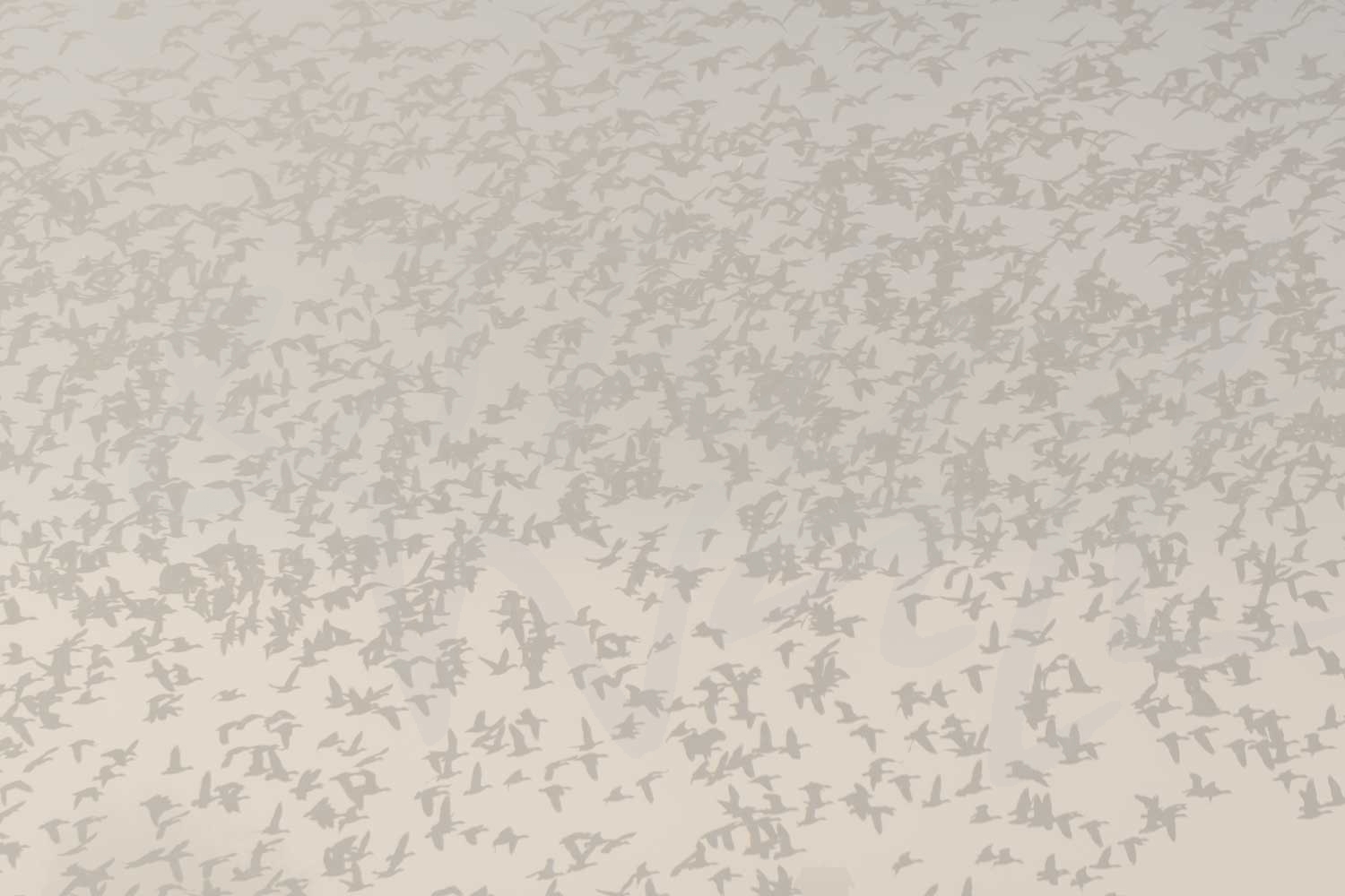
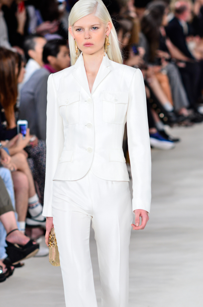
The all-white suit continues to be a chic fashion staple and this past New York Fashion Week, designers were taking it to the next level with sultry cutouts and unique silhouettes.   This clean, classic, and structured runway trend took a more relaxed, stylized vibe this year and it can easily transition to interior design and decor.  Whether you want an all-white space or just some neutral decor, wall art in this pared-down color palette can be the stylized, unique accent piece you need!

The fashion and design industries are continually influencing each other and we love looking to the fashion world for inspiration!

The images featured above are available in our Print-On-Demand collection.  Some areas of our website are password-protected. If you are a member of the trade but don’t have full access to our website, www.thirdandwall.com, please contact us at customerservice@thirdandwall.com.
Happy Holidays!

photograph by Aaron Matheson

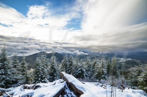
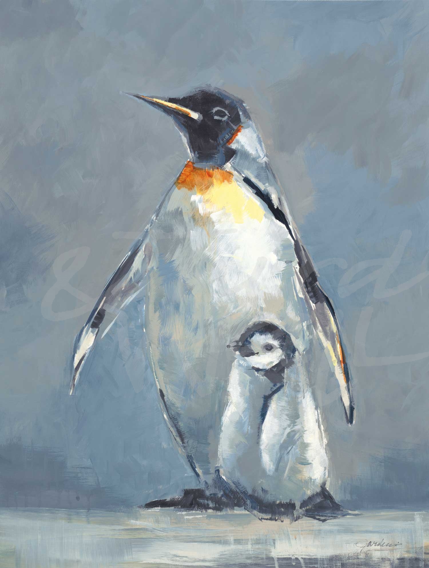
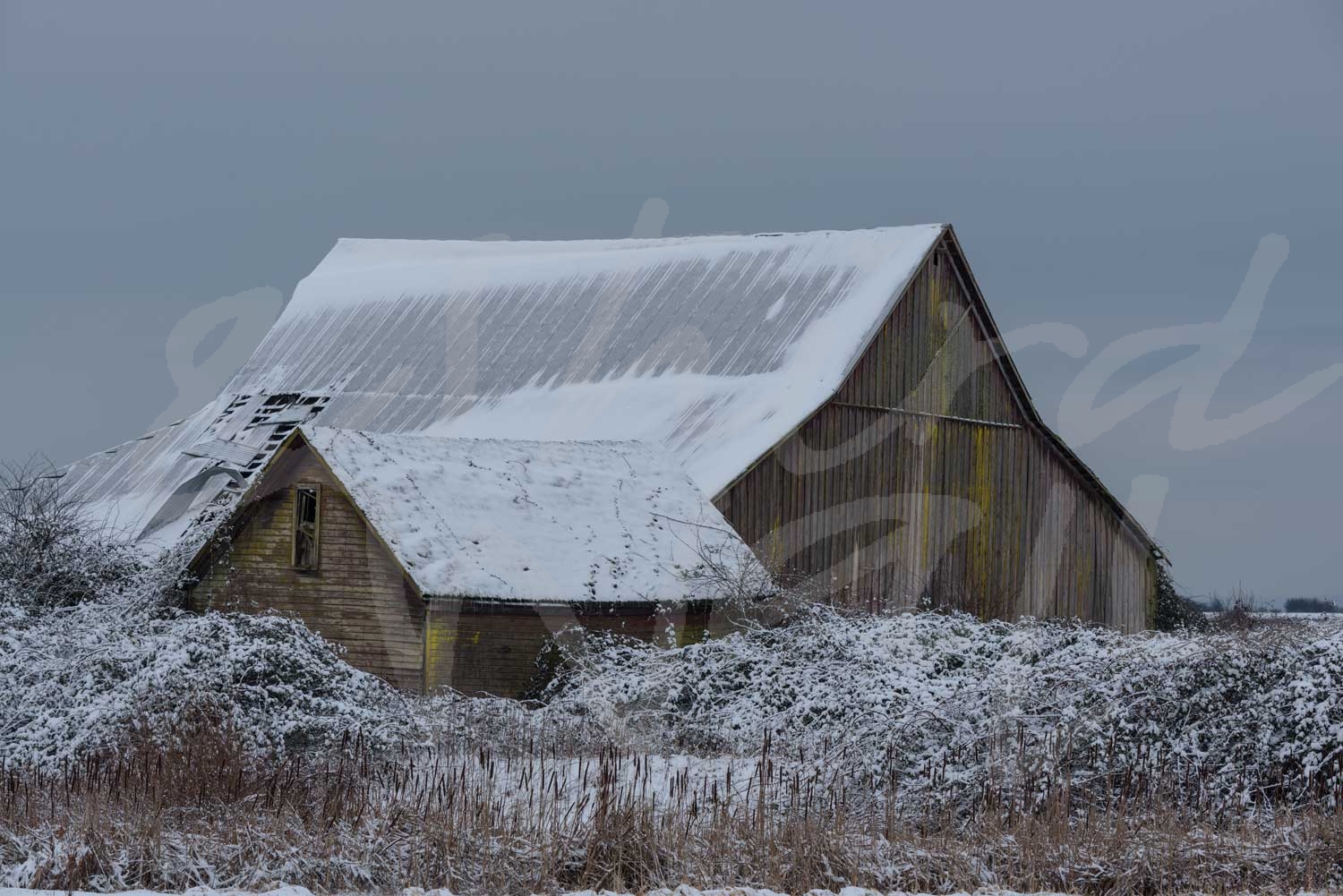
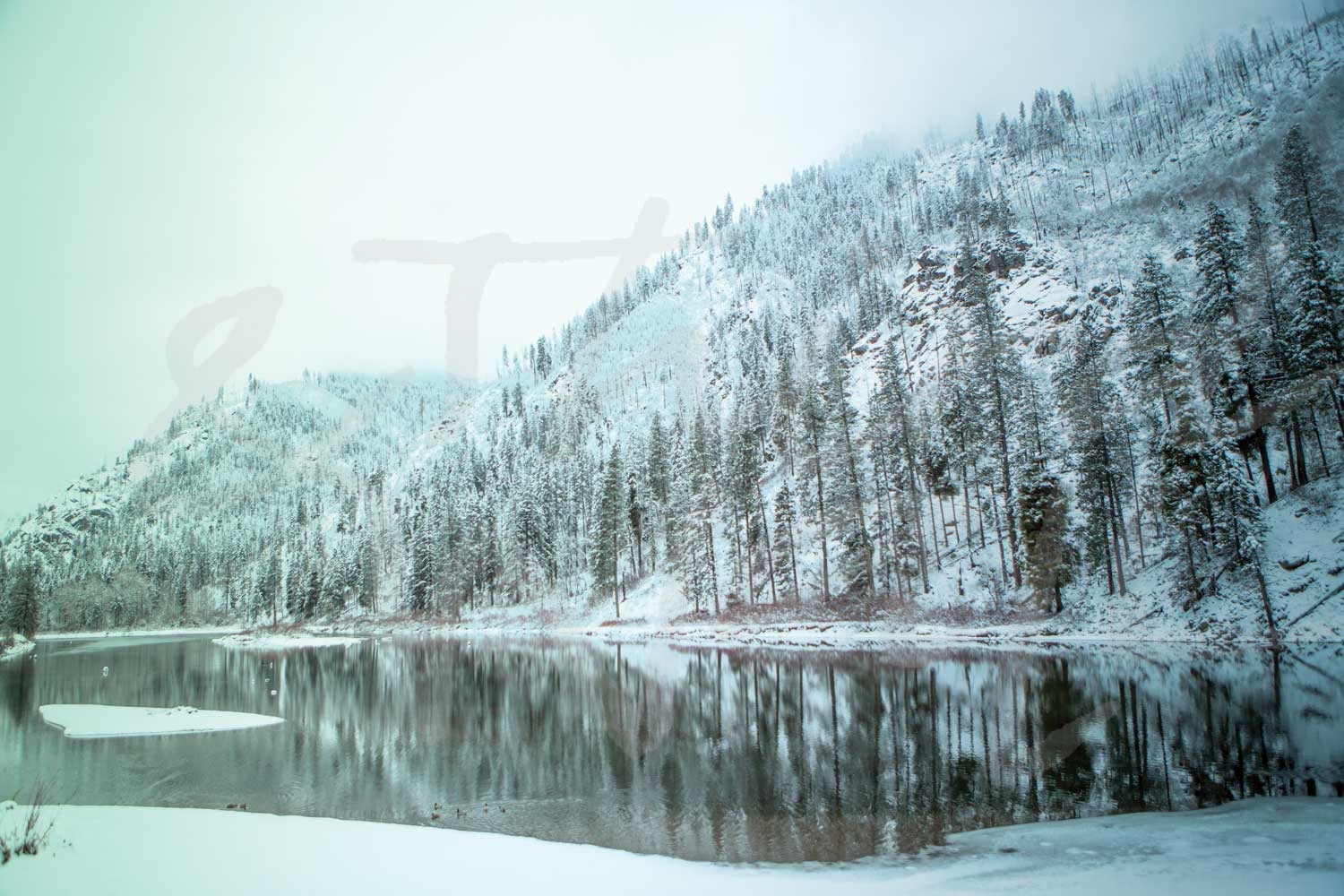
Now that it is officially the first day of winter and Christmas is just days away, we are in full holiday mode!  With cooler temperatures and shorter days, ’tis the season for winter whites & blues, evergreen accents, and warm fabrics.  We’ve rounded up some great wintry images for your walls that pair perfectly with pops of red, shimmery metallic accents, and soft textures for a cozy space!

And from all of us at Third & Wall, we wish you a very happy holiday!

The images featured above are available in our Print-On-Demand collection.  Some areas of our website are password-protected. If you are a member of the trade but don’t have full access to our website, www.thirdandwall.com, please contact us at customerservice@thirdandwall.com.
Desert Style: Cactus Craze

photograph by Melissa McClain

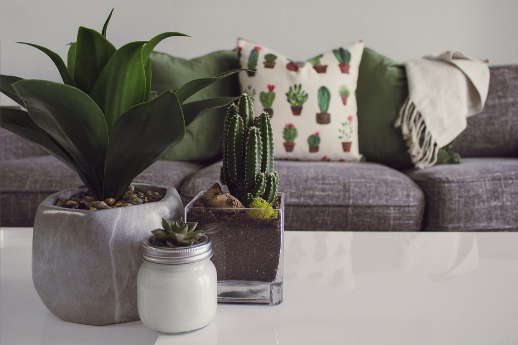
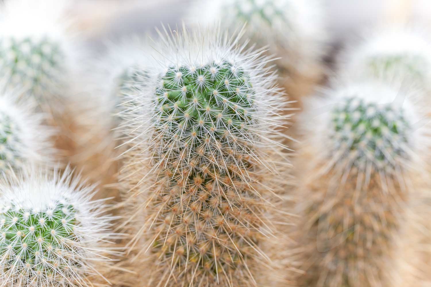
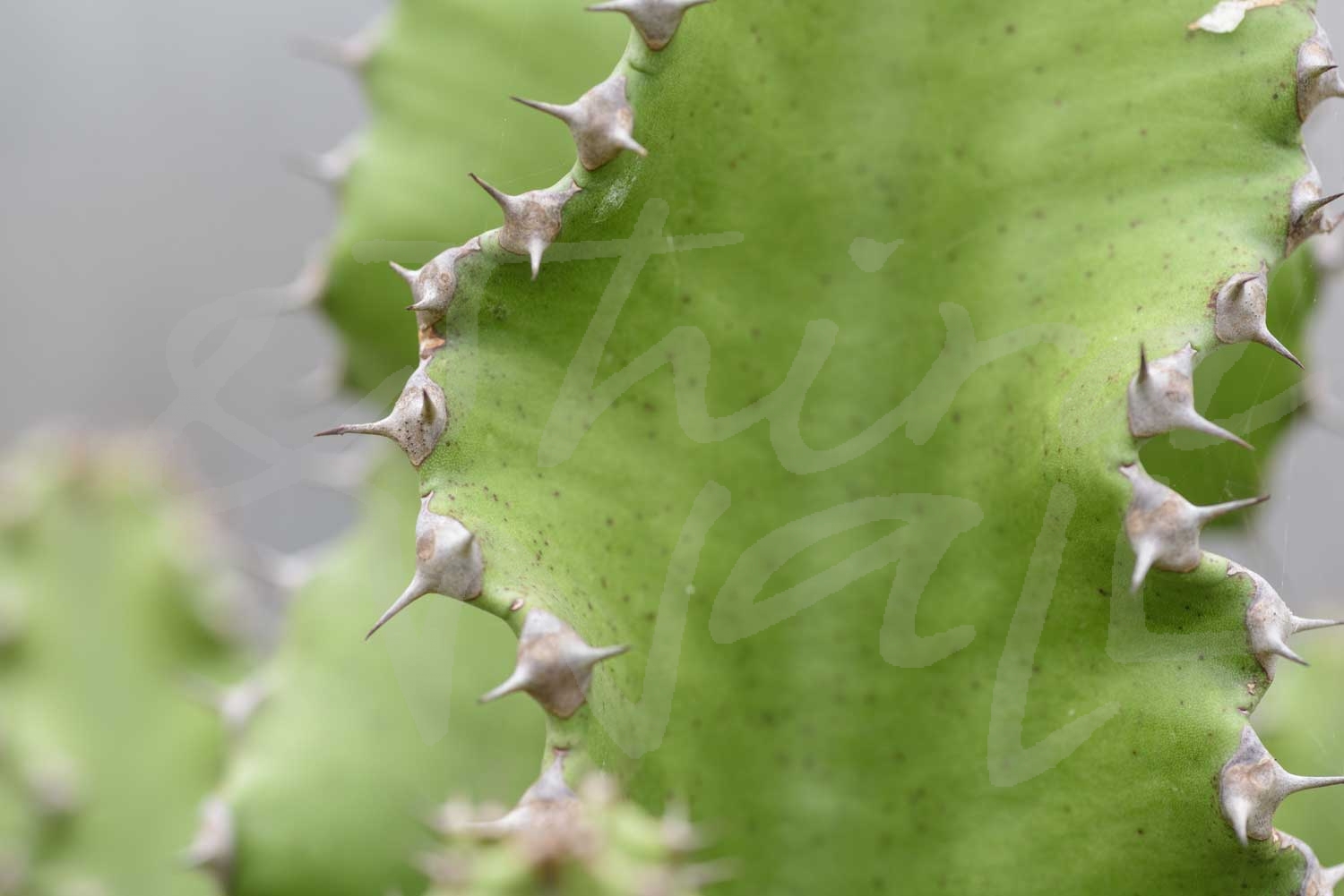
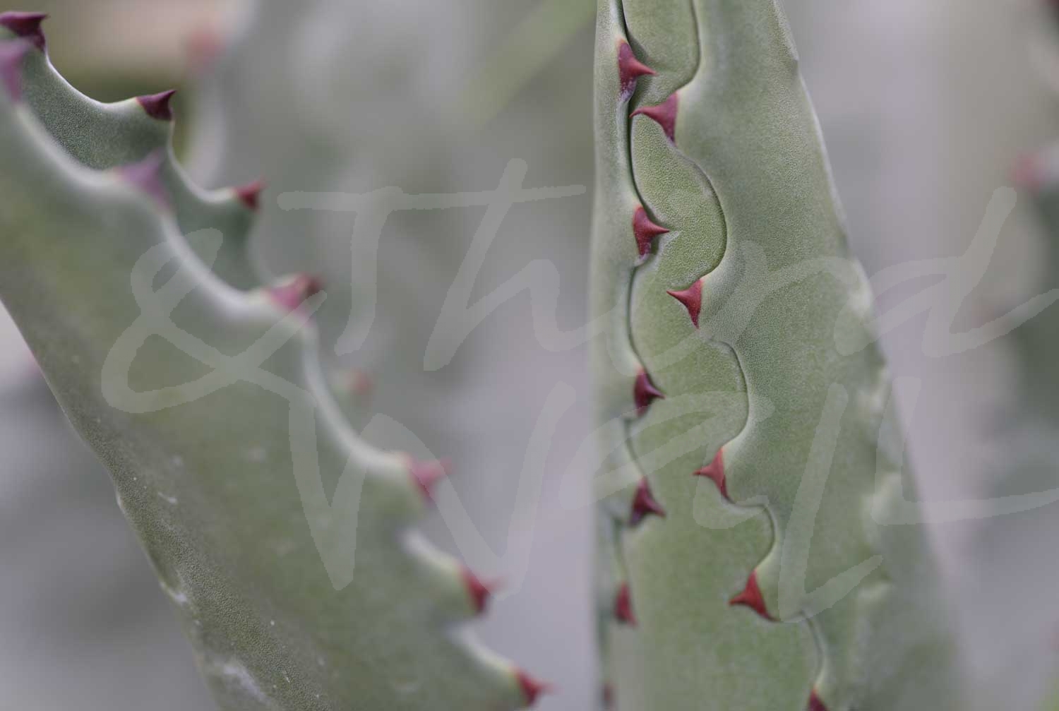
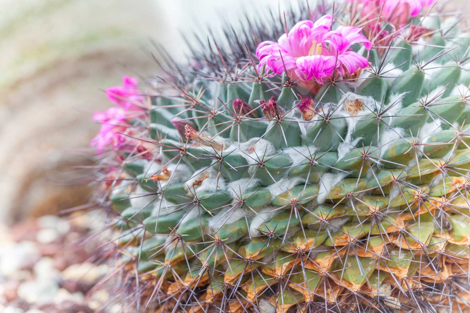
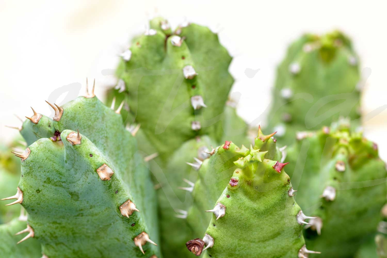
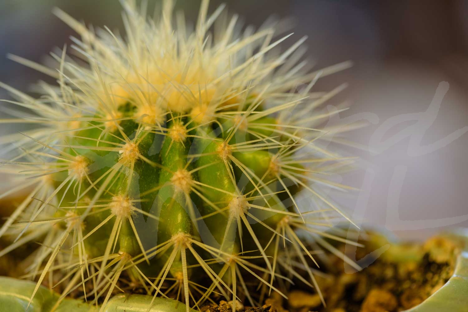
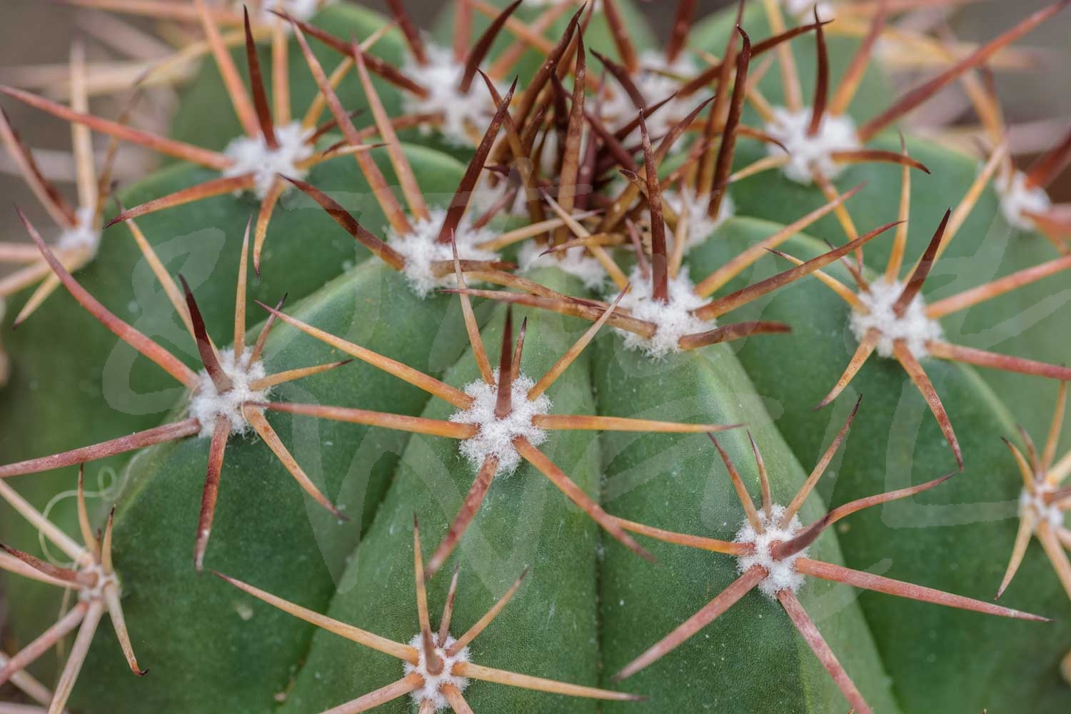
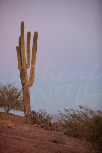
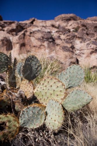
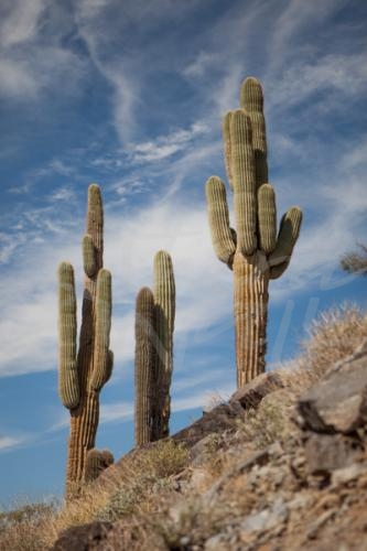
We are talking about one of summer’s biggest trends… the cactus craze!  From ceramic sculptures to printed pillows, from candles and mugs to pool floats and oven mitts, and of course the plant itself, it’s easy for the prickly shape to find a place in your home.

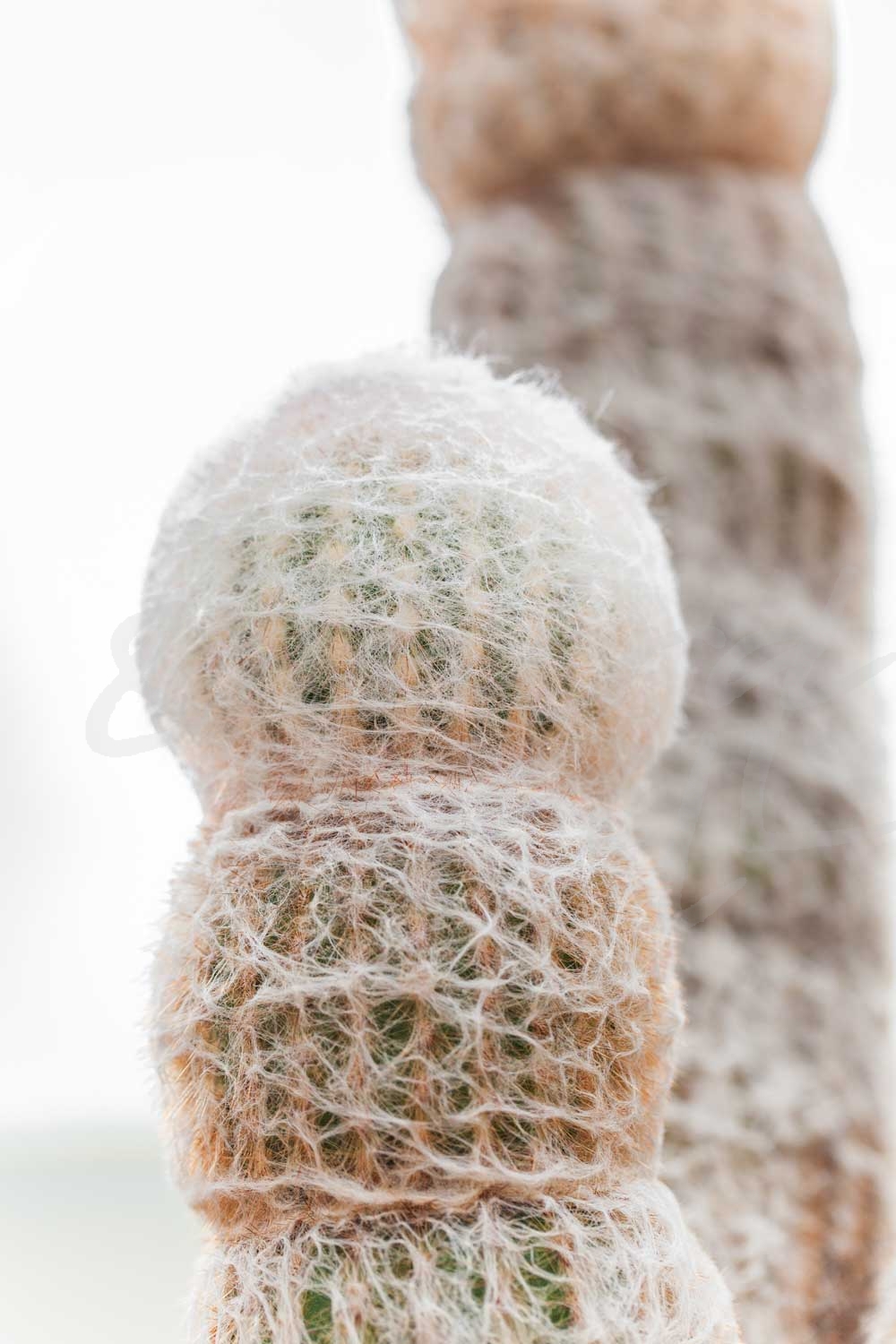
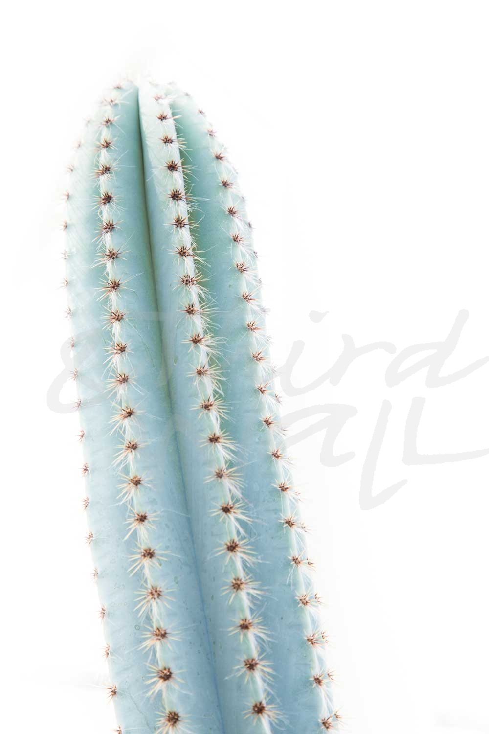
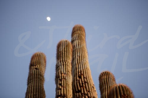
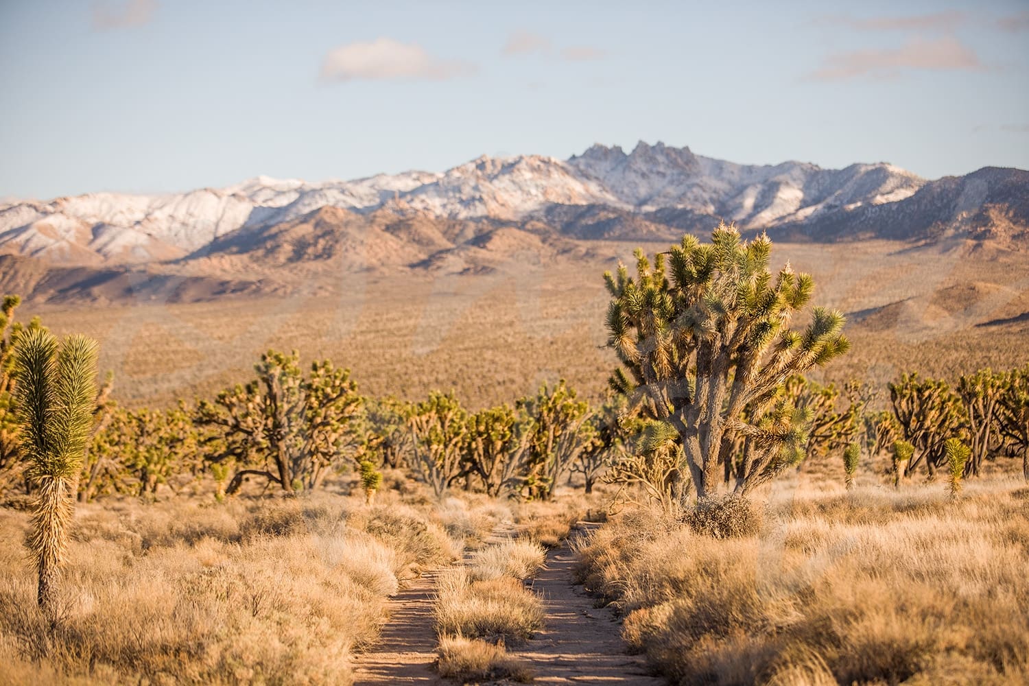
The variety in this design trend makes it simple to add some summer desert vibes to any space, no matter the design style, but one of the easiest ways is with a cactus image.  We have rounded up some perfect desert-inspired photographs to bring a modern sun-kissed style to your space. Wherever you are, these cactus images are sure to help bring the warm desert sun and some green to you and your walls!

While the cactus craze is not exactly new, photography featuring the desert plant can breathe new life into the trend with a modern and sophisticated touch.  Each photographer has a unique style and sees something different through their lens, capturing a new angle, color, or detail of the cacti’s natural beauty.

To complete a boho desert style, add a Southwestern rug and other textiles with some leather, wood accents, and spiky greenery to a neutral color palette.  Or if you just want to incorporate hints of the trend, cactus and desert imagery can be a cool way to bring the heat and still keep your space chic.

photograph by Aaron Matheson

All of these featured photographs are available in our Photography collection on our site.  Some areas of our website are password-protected. If you are a member of the trade but don’t have full access to our website, www.thirdandwall.com, please contact us at customerservice@thirdandwall.com.
A Hint of Green: Botanical Trend

Image by Alexandra Gorn

Today we are sharing a very popular, and watering-free, way to bring some more greenery into your space.  Adding natural and green elements to your design can have a soothing effect in your room, and PPG just announced their 2019 Paint Color of the Year: Night Watch- “a rich, luxurious, and classic shade of green allowing spaces to emulate the feeling of lush greenery and the healing power of nature”. With green on the rise, the botanical trend doesn’t look like it will be fading anytime soon, and we are not mad about it! Framing your plants is a great way to bring the beauty of the outdoors in and freshen up your space, no green thumb required.  So we’ve rounded up some perfect botanical images to add plant life to your walls and give your space a natural, chic look you’ll love!  

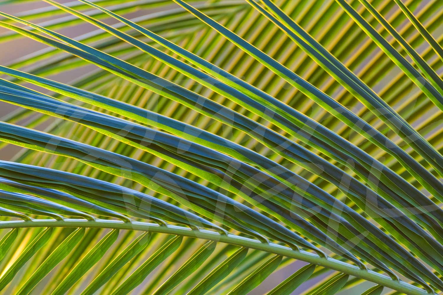
Botanical images are very versatile and can work in any space, no matter the interior design style.  Whether your room is tropical and beach inspired or classically styled, palm prints are a great way to give it a refreshed feel.

Framing photos of succulents and desert plant life can add the perfect boho chic vibes to your space.  And don’t be afraid to mix different types of botanicals in one space to create an eclectically sophisticated room!

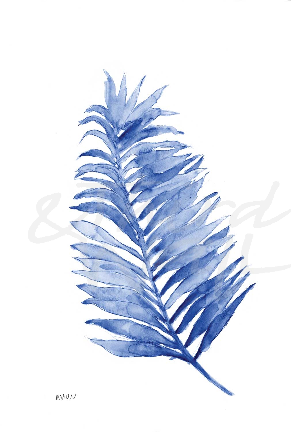
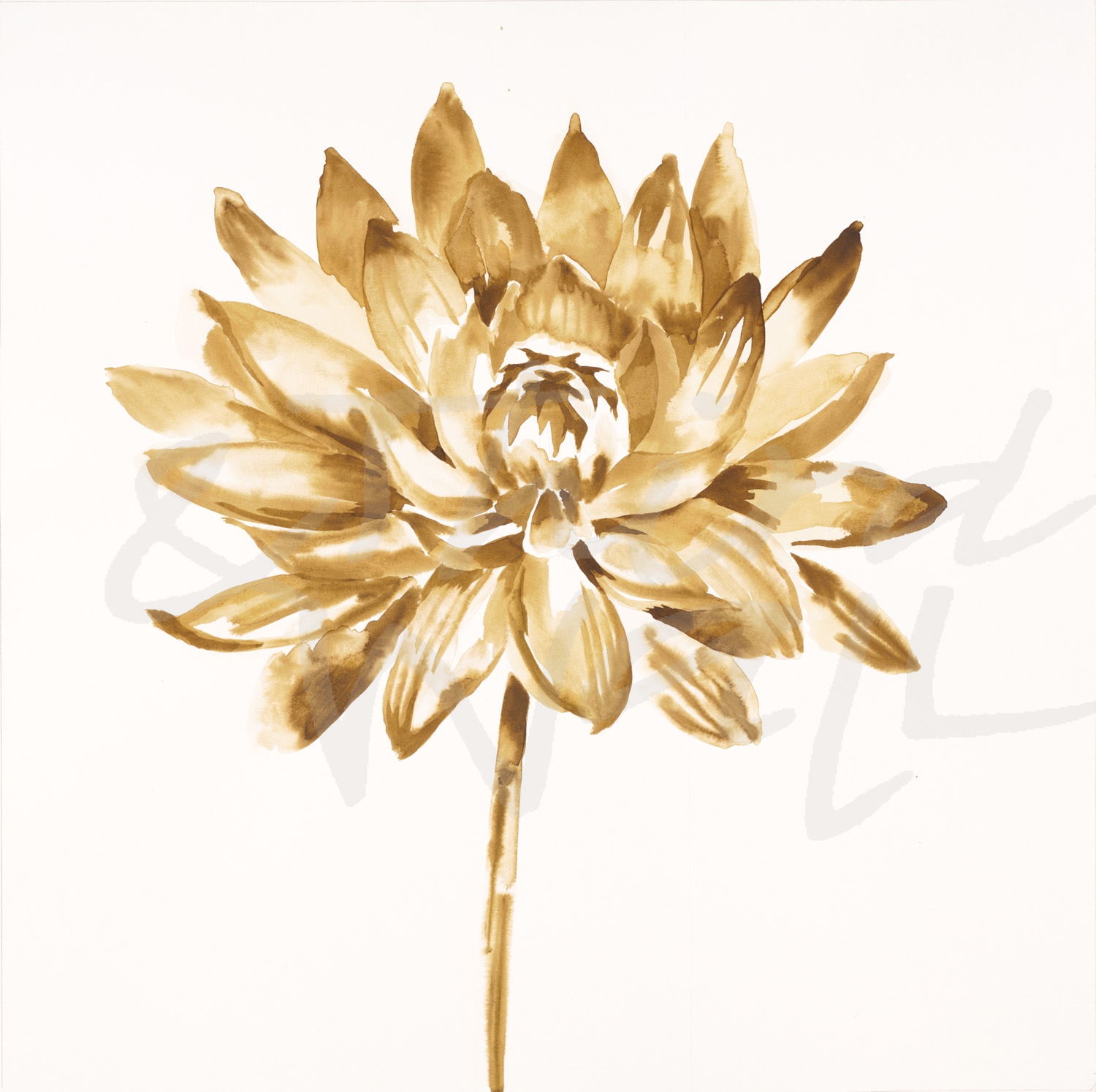
But incorporating the botanical trend into your space doesn’t always mean you have to go green.  At Third and Wall, we can customize images to match your space, and that includes color changes.  Whether you are looking for a monochromatic style, a little pop of color, or a metallic shimmer in your botanical prints, we can help you find it!

We love the botanical trend and think that these images are a great natural complement to your space.  If you are really inspired by this design trend, you can pair botanical artwork with potted plants, printed pillows and fabrics, wall coverings, or a mix of other botanical features.  Besides color customization, we can print on a variety of substrates and create wallcoverings to help make your space uniquely your own!

And check out our Pinterest board for even more botanical interior inspiration!  

All of the artwork featured in this post is available in our Print-On-Demand collection and Photography collection on our website.  Some areas of our website are password-protected. If you are a member of the trade but don’t have full access to our website, www.thirdandwall.com, please contact us at customerservice@thirdandwall.com.
What are your favorite ways to add greenery to your space?

Here’s to Green for St. Paddy’s Day
pantone-210-new-color-families-greensSt. Patrick’s Day is upon us. Everyone from schoolchildren to our coworkers will be wearing green on the 17th in order to avoid the dreaded pinch. If your wardrobe is short on green we can’t save you from a pinching incident, but we do have plenty of green for your walls to wear!
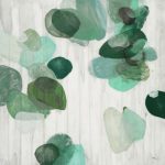
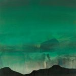
According to Pantone, the Mothership of color, “The human eye literally sees more green than any other color. The hue of foliage, grass, and growing plants; bountiful trees, lush meadows and clinging vines; the shade of forests and jungles; elves and leprechauns; the product of the Irish patriot and St. Patrick’s Day; with a multitude of greens so plentiful in the surrounding world, there are many moods the green family can convey.”

The color experts at Pantone go on to explain that green is a restful color, influencing our nervous system, slowing and deepening our breath, and relaxing our heart by slowing the production of stress hormones.

Whether in airy meadows, urban parks or macro-views of nature’s hidden areas, the use of green can promote a sense of balance, harmony and reassurance.

There, don’t you feel calmer already? Get some green!

Happy St. Patrick’s Day!

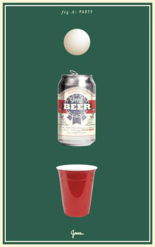
"Party" by KC Haxton

“Party” by KC Haxton

Third & Wall offers exclusive contemporary and transitional imagery for wall decor and licensing, with a wide selection of Posters, Originals and Print-on-Demand/Licensing imagery.  Some areas of our website are password-protected. If you are a member of the trade but don’t have full access to our website, www.thirdandwall.com, please contact us at customerservice@thirdandwall.com.