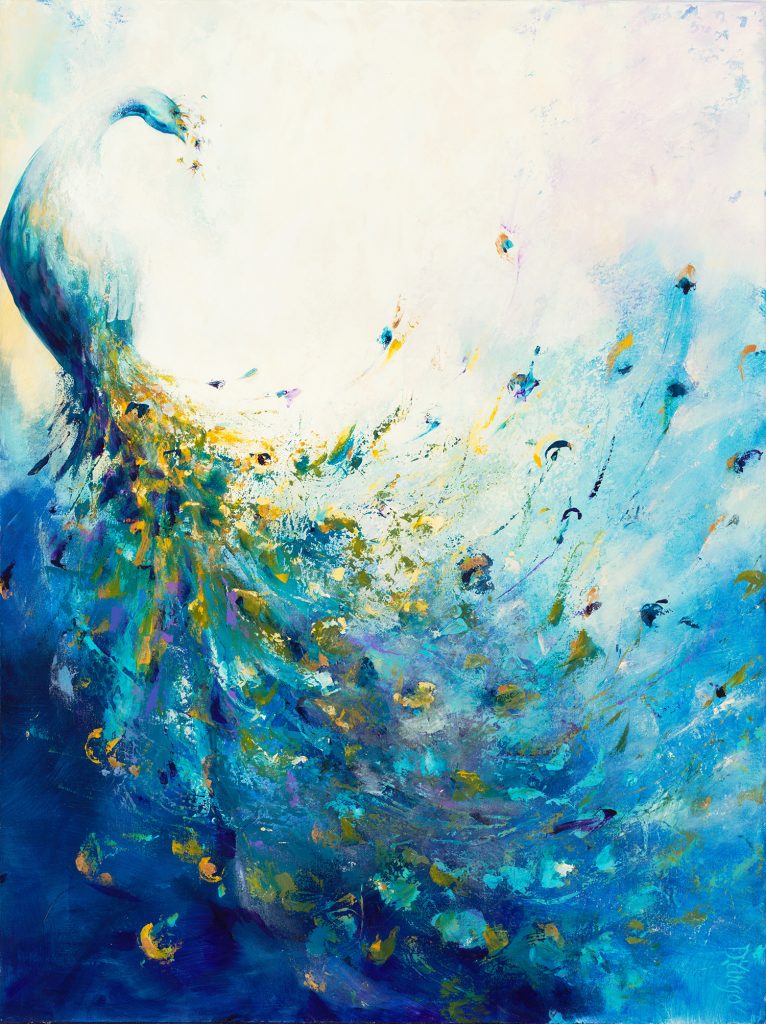
As a new year begins, we always look forward to the predictions of new décor and design trends. In forecasted color trends, Pantone announced their Color of the Year 2020: Classic Blue, and we are excited for this “timeless and enduring blue hue”! Blues are known to be calming and comforting, and the deep shade that Pantone has chosen for this new year reflects just that. Sherwin Williams also selected a moodier navy blue, Naval, as their color for 2020. Looks like having the blues isn’t such a bad thing after all!
“Panacea” by Corrie LaVelle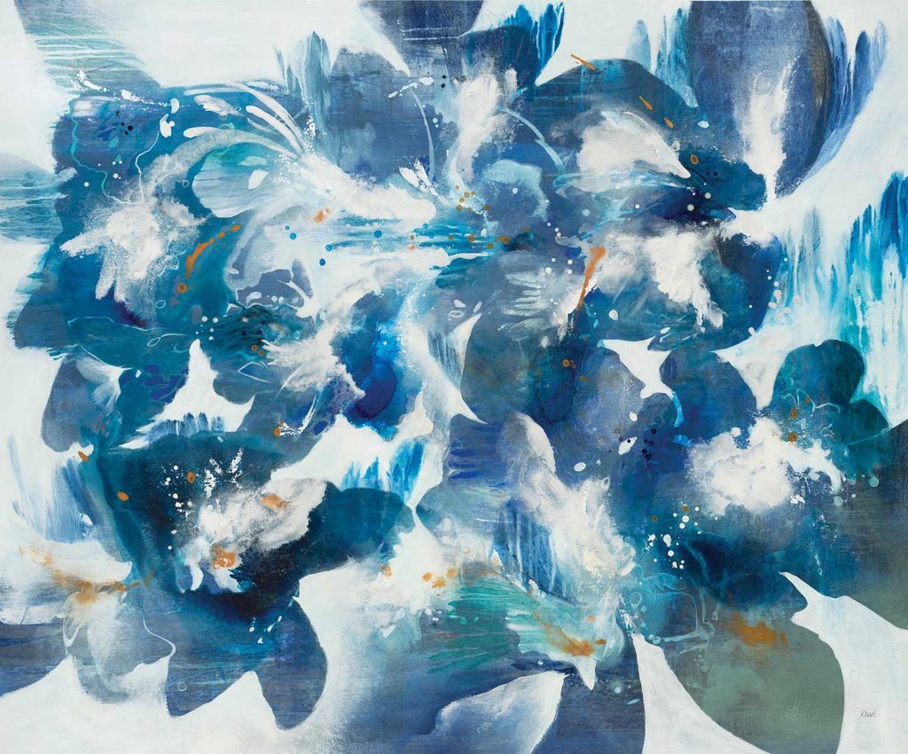
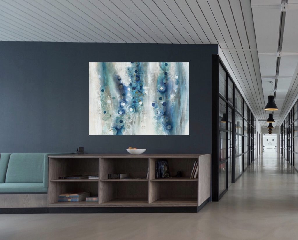
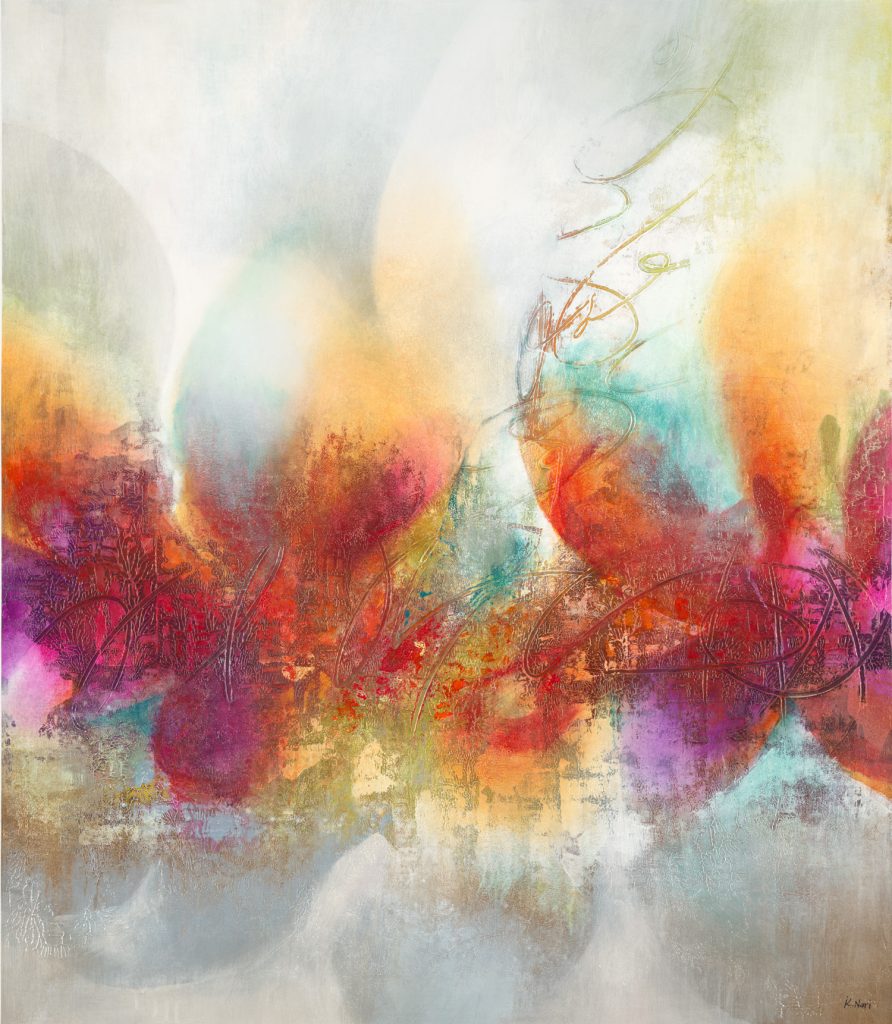
“Blue Velveteen” by K. Nari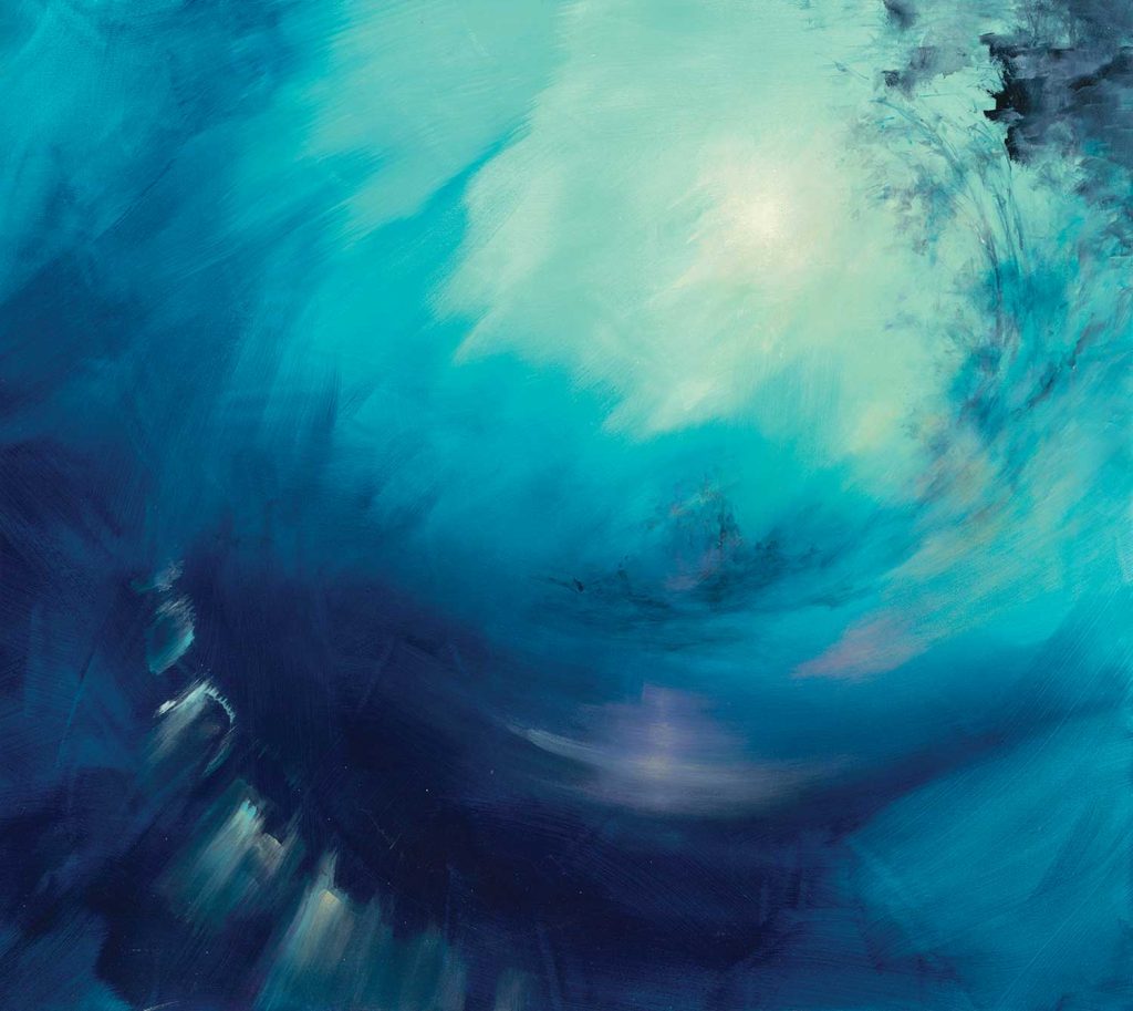
“Blue Gazing” by Dina D’Argo 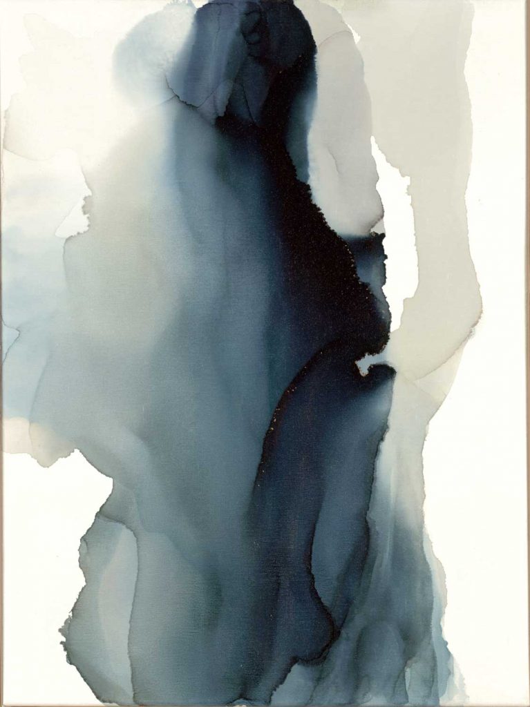
“The Perfect Place” by Kippi Leonard 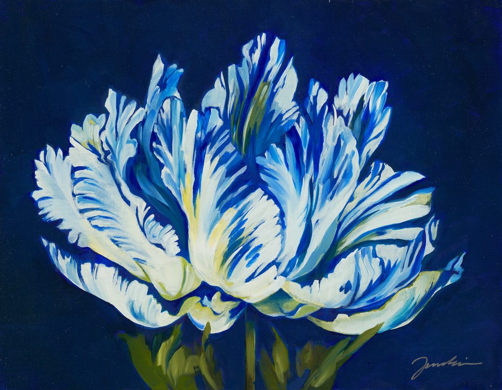
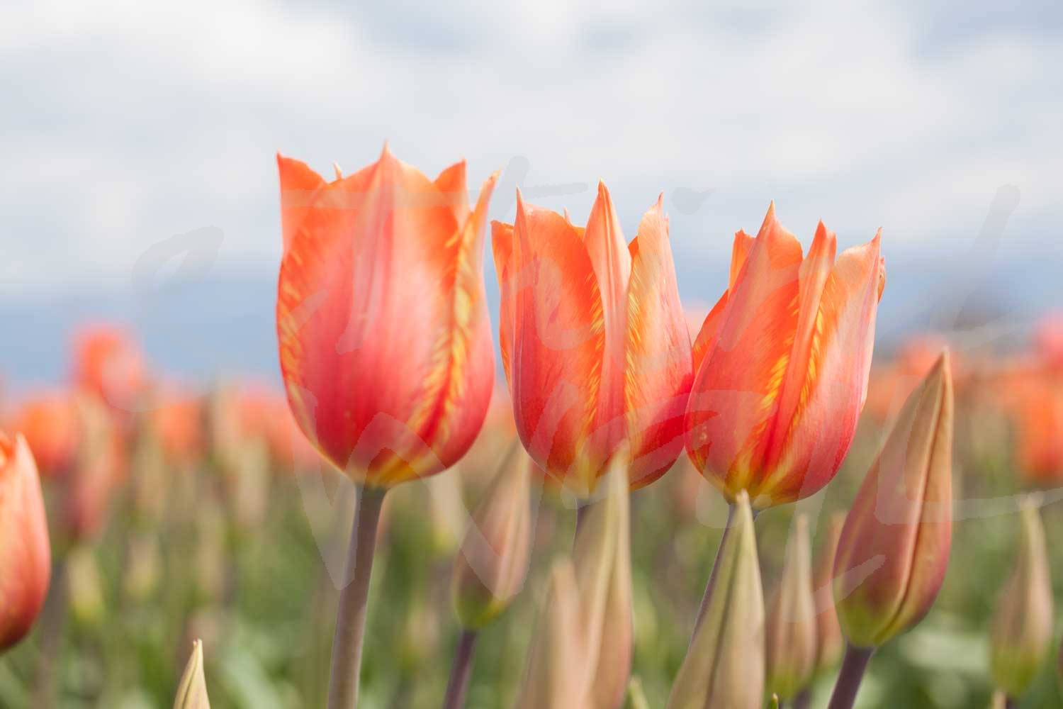
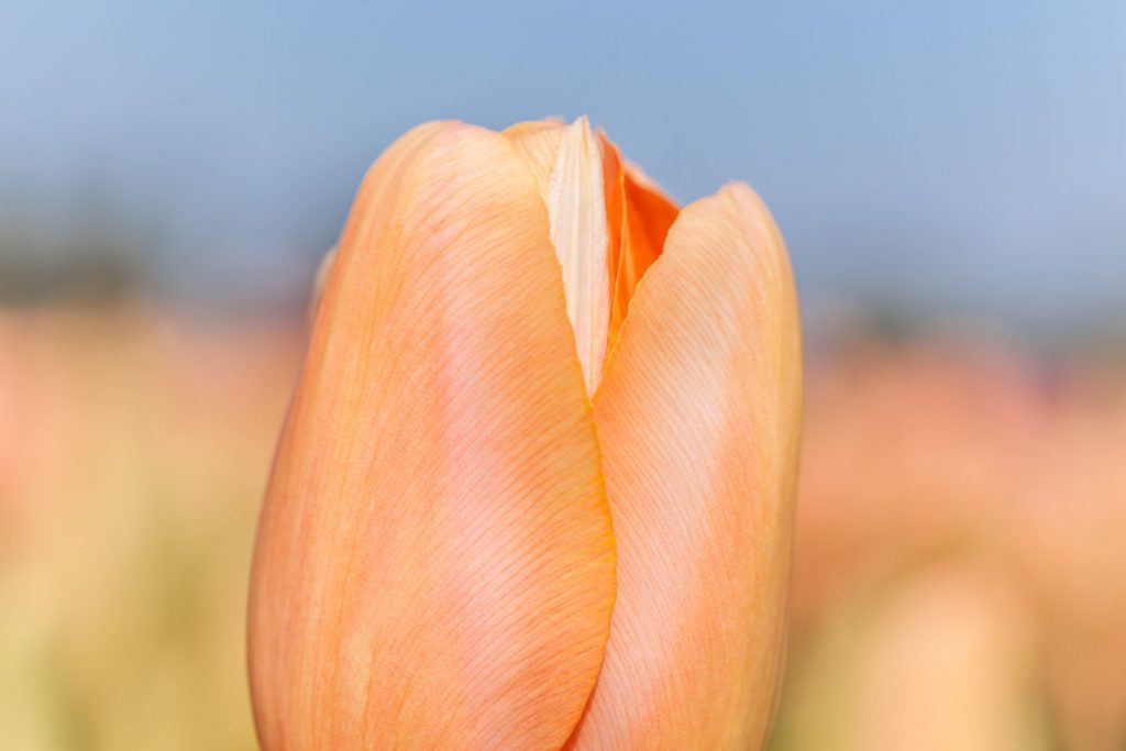
“Tulipania” by Liz Jardine 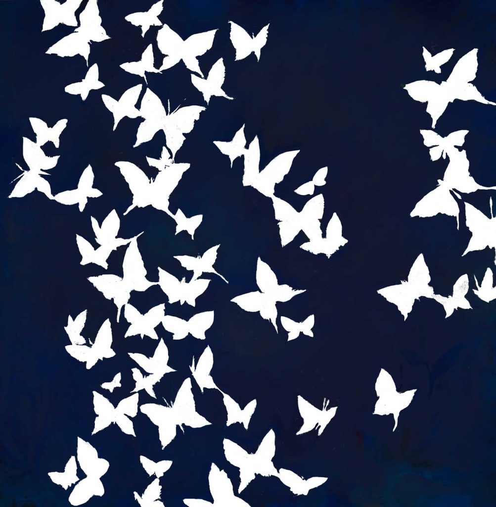
“All Aflutter” by Liz Jardine alt v 2 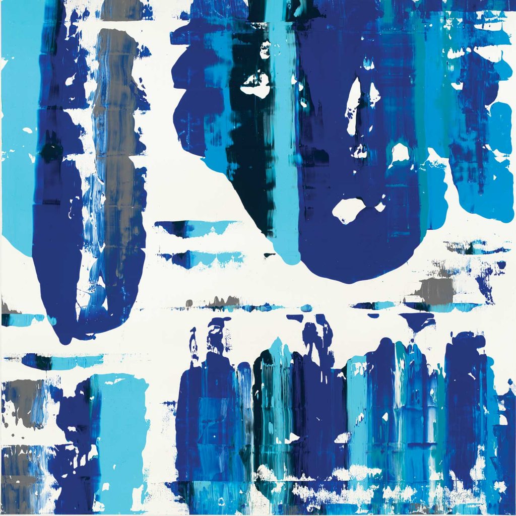
“Cobalt Velocity” by Jeff Iorillo 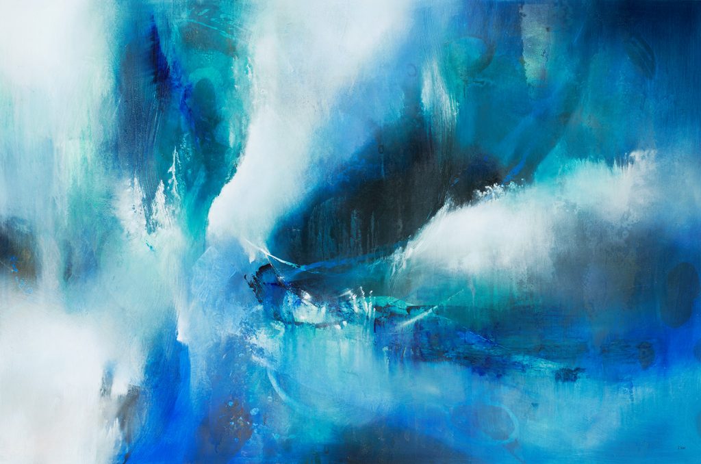
“Soul Searching” by K. Nari 
“Metropolis” by Terri Burris alt v 1 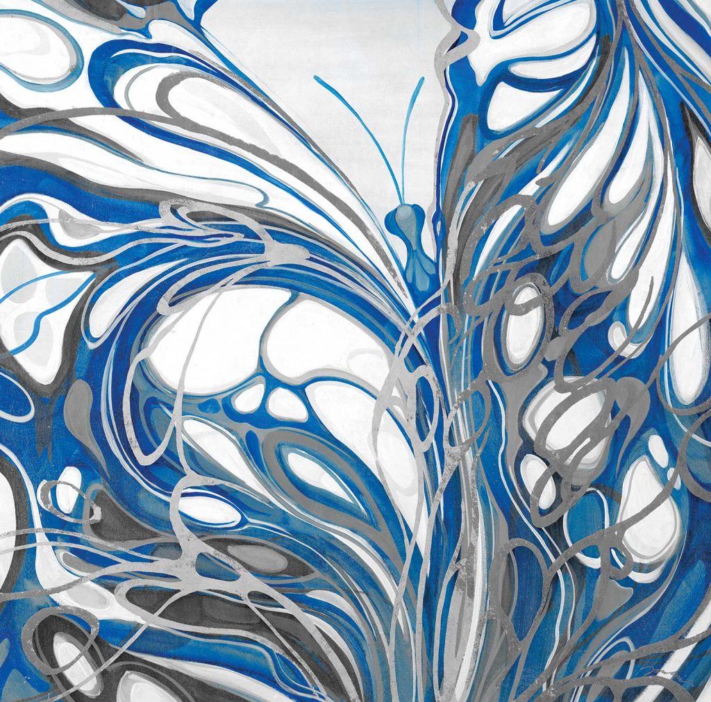
“Flight of the Butterfly” by Liz Jardine 
photograph by Nancy Crowell 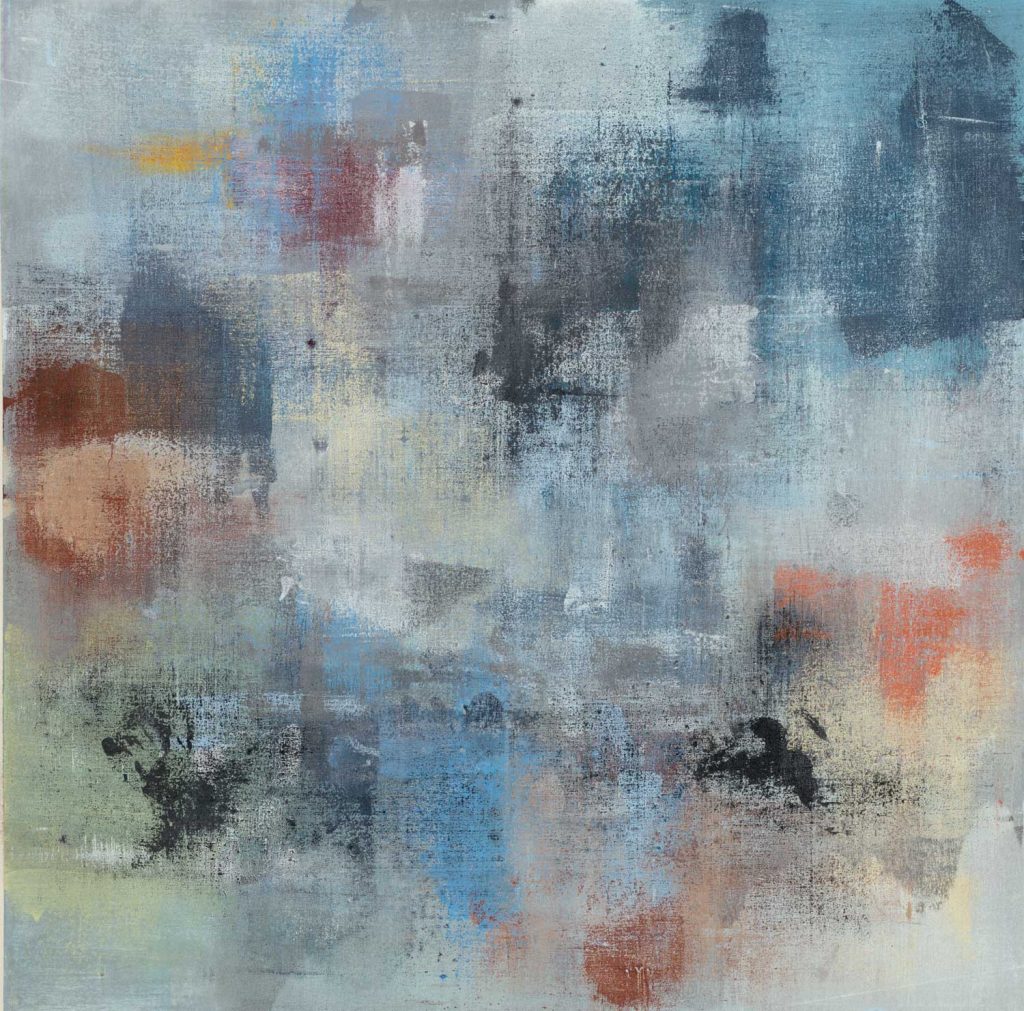
“Interpretation” by Jeff Iorillo 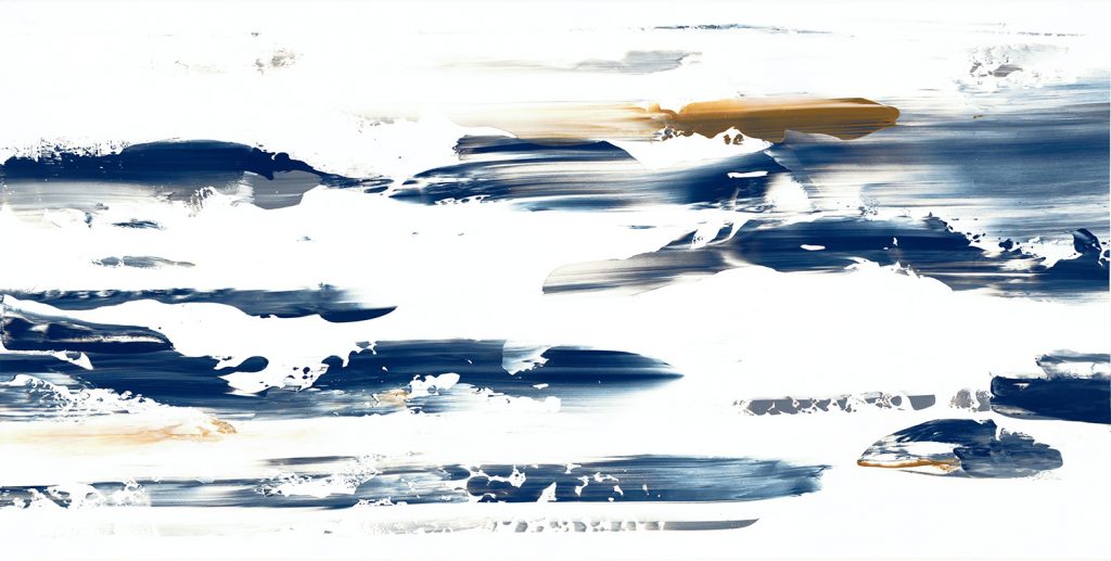
“On Rush II” by Jeff Iorillo 
photograph by Melissa McClain 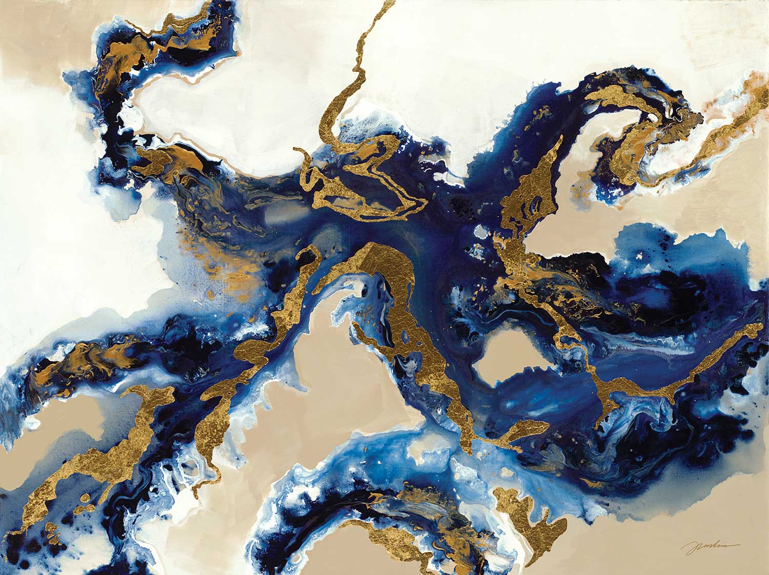
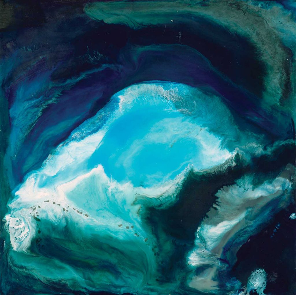
“View From The Air” by Liz Jardine
Changing out your artwork is an easy way to refresh your space and try out these new colors and interior trends. Because of their versatility, rich dark blues are taking on the role of a neutral this coming year, so don’t be afraid to decorate with them in bolder ways. These striking navy hues have relaxing and tranquil qualities, and they easily pair with any materials or colors you might already have in your space. From a luxe look to a cozy interior, these trending shades of blue can transform any design style!
“Plumage” by Dina D’Argo 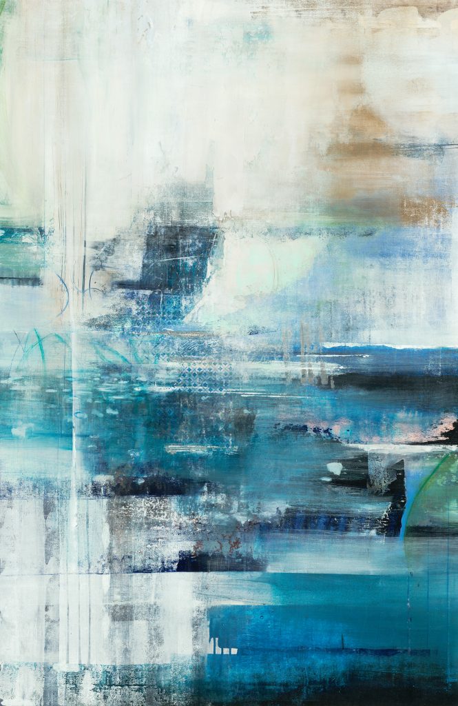
“Meditation” by Nancy Ngo 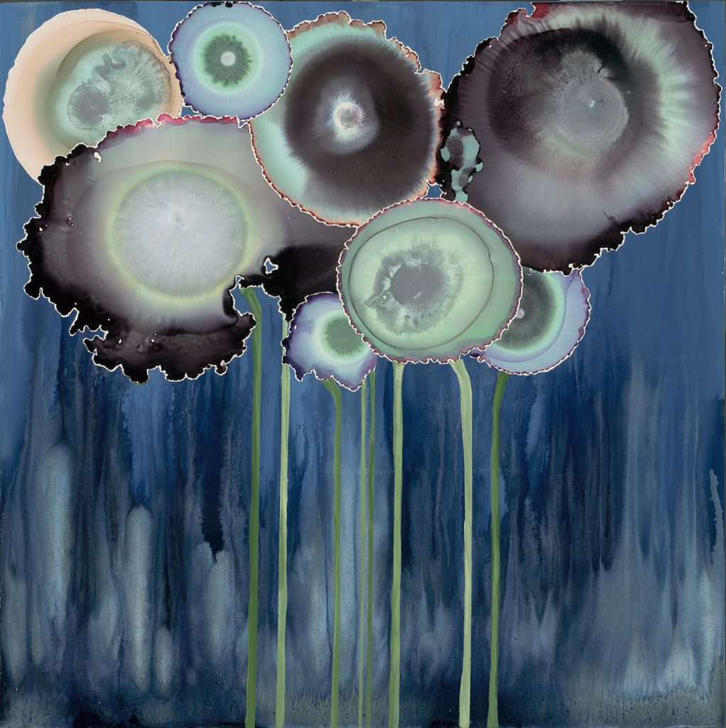
“Gray Bouquet #1” by Laura Van Horne 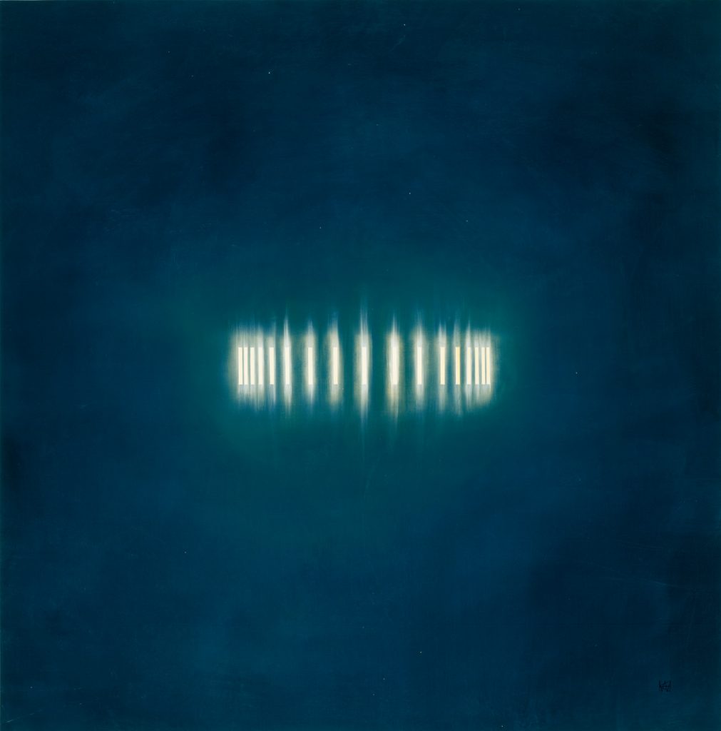
“Light Ring II” by KC Haxton 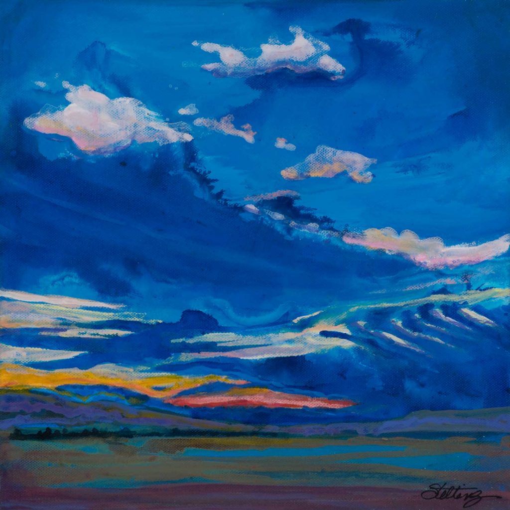
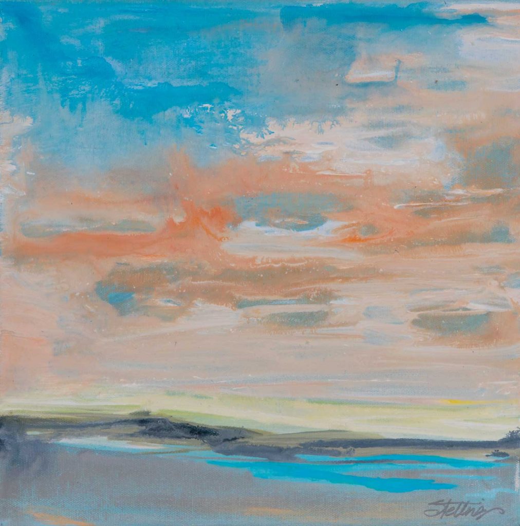
“Blue Skies” by Linda Stelling 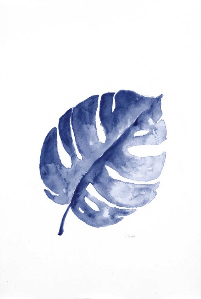
“B&W Palm I” by Patti Mann alt v 4 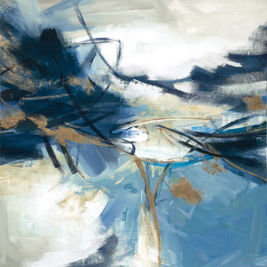
“Gold Rush” by Liz Jardine 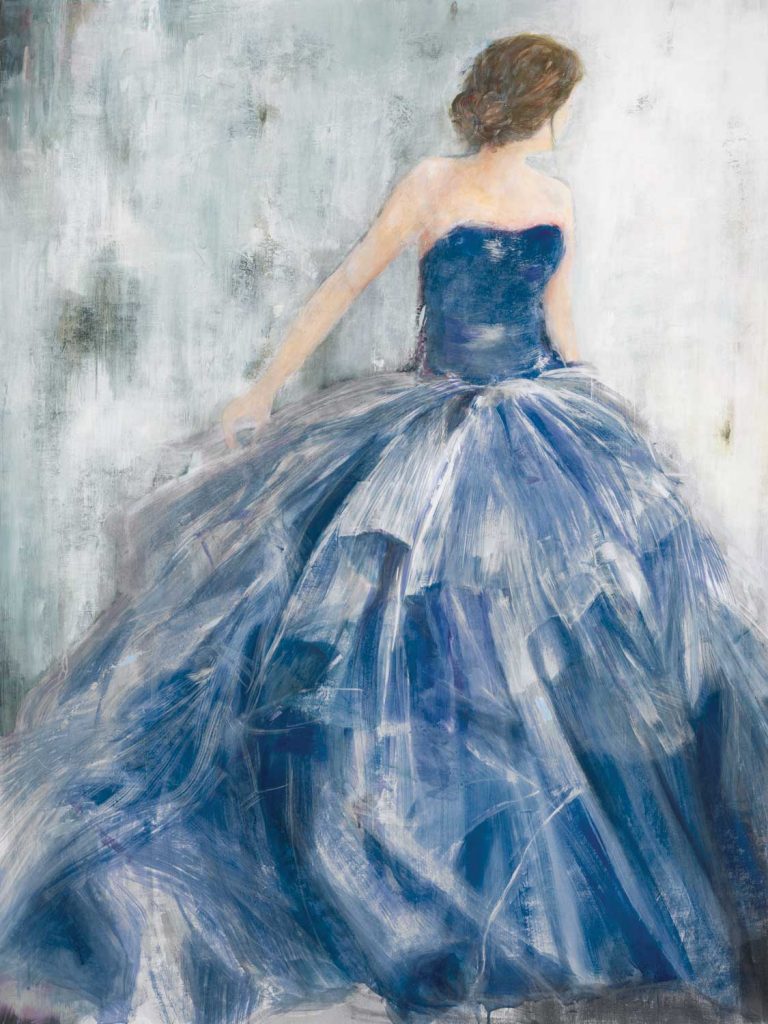
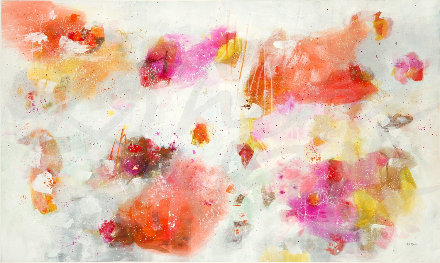
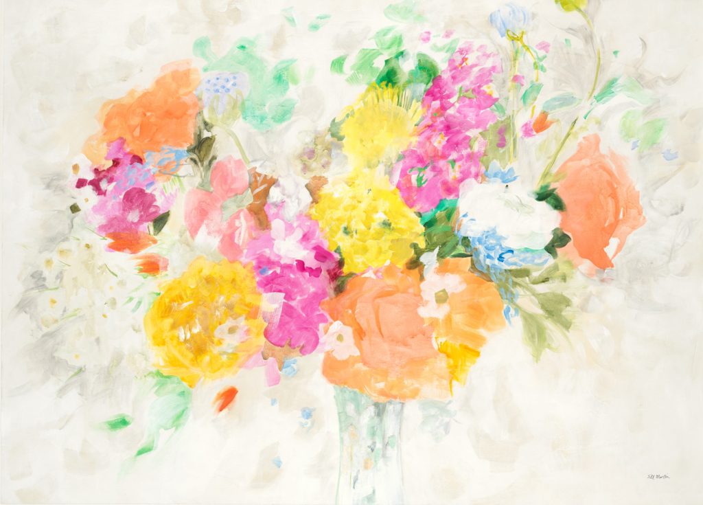
“REdowa” by Jill Martin alt v 2 
photograph by Aaron Matheson 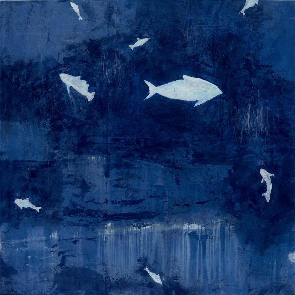
“Sense of Time” by Peter Kuttner alt v 1 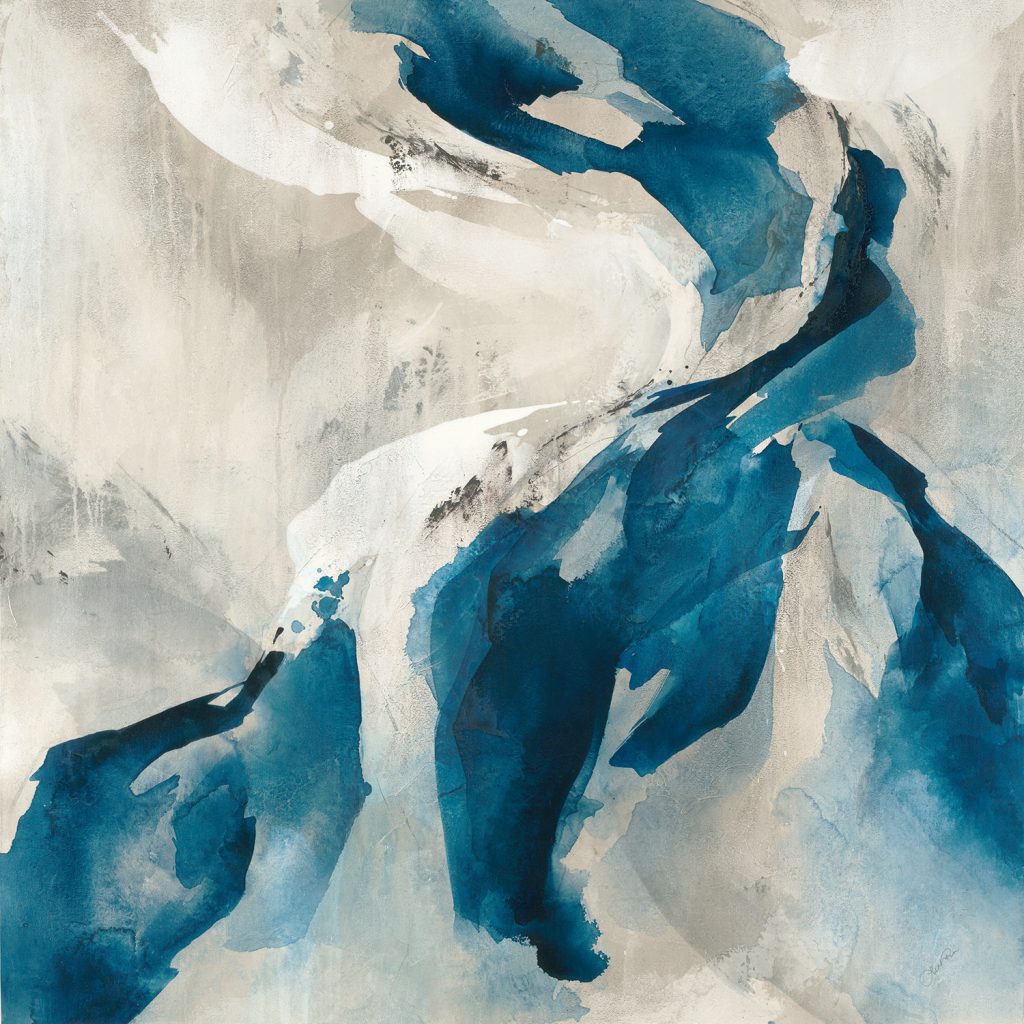
“Entwined” by Leah Rei 
photograph by Melissa McClain 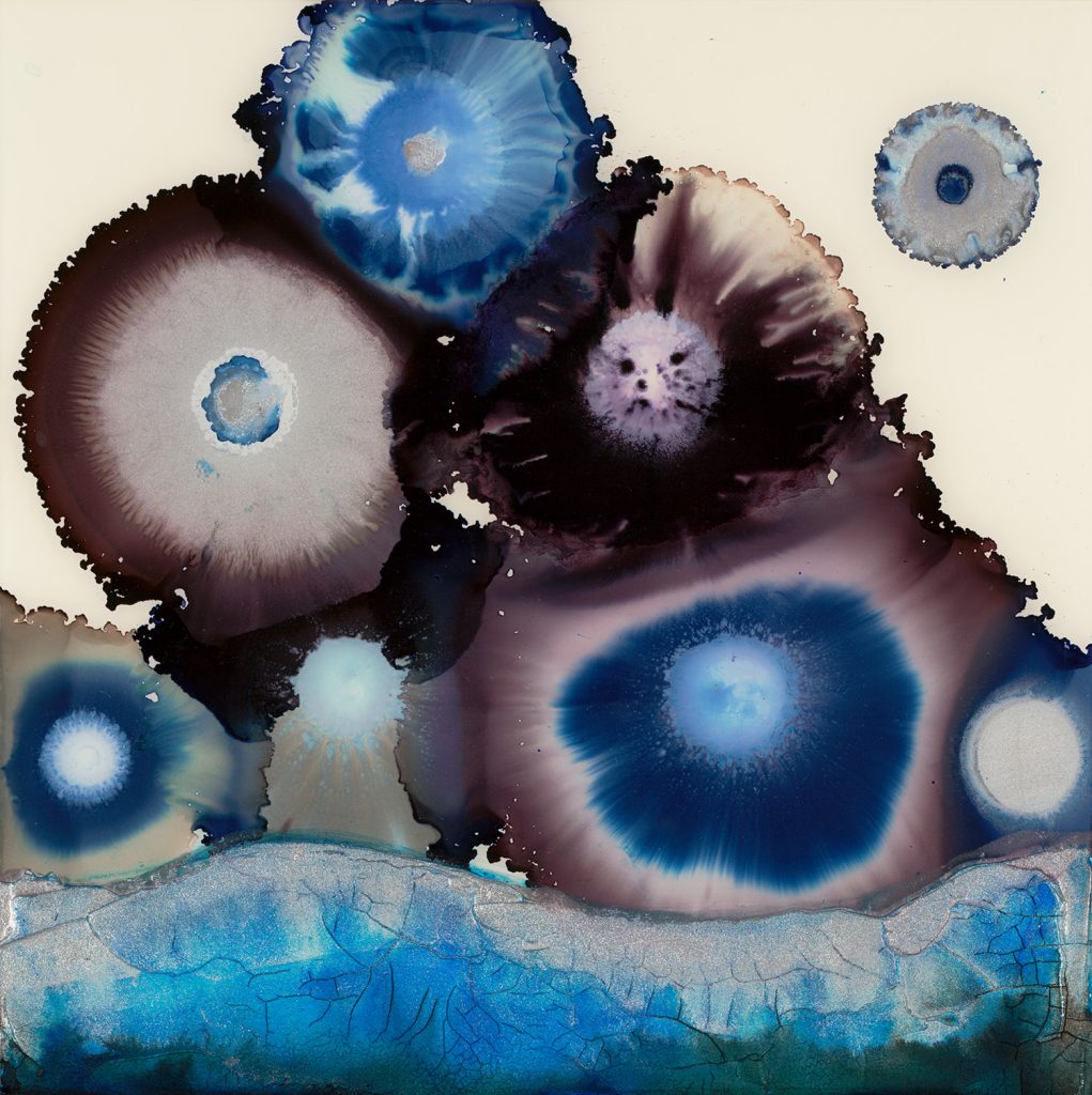
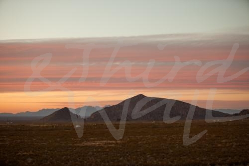
“Mountain of Blue” by Laura Van Horne 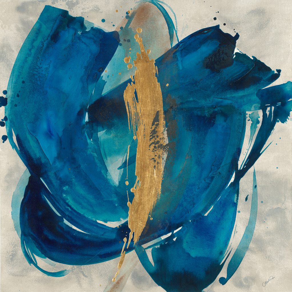
“Nexus I” by Leah Rei 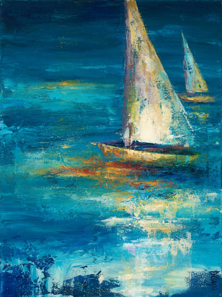
“On Course II” by Dina D’Argo 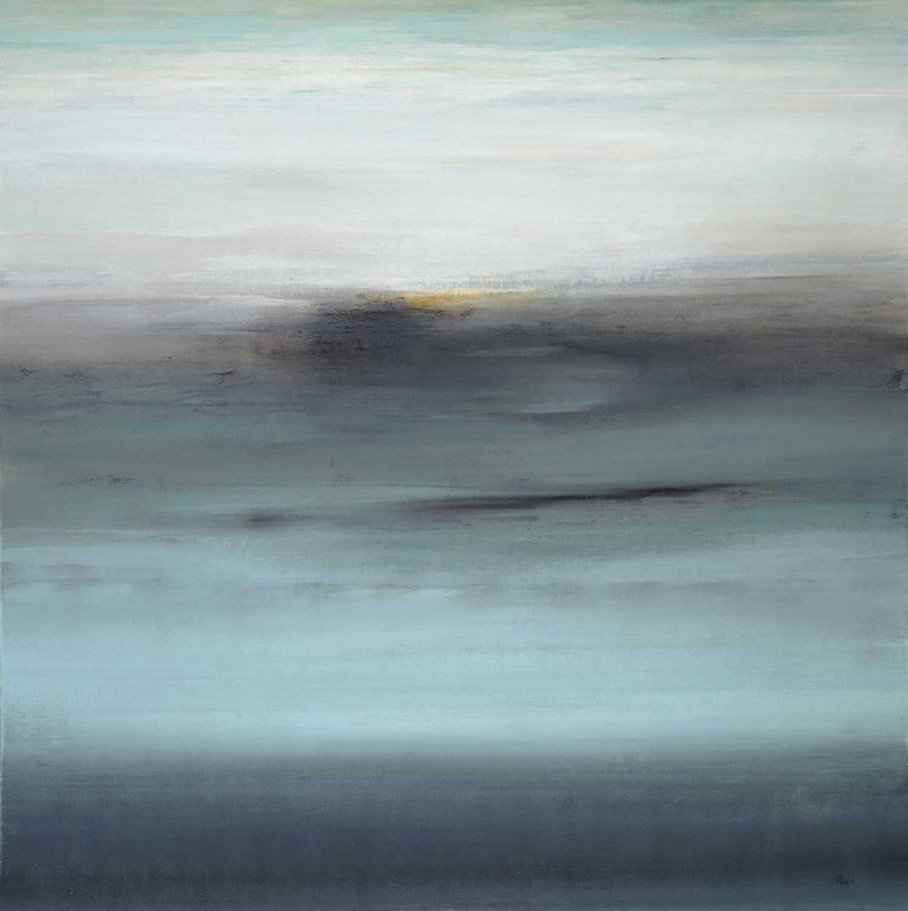
“Subtle Views V” by Lisa Ridgers 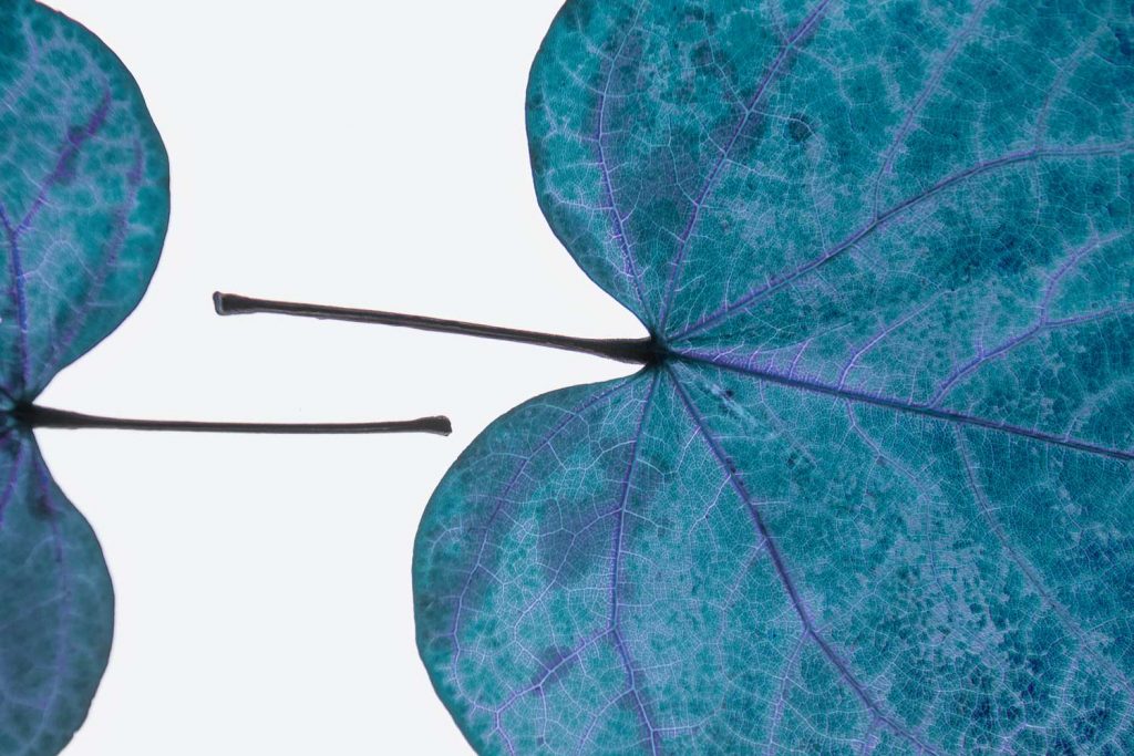
photograph by Nancy Crowell alt v 1 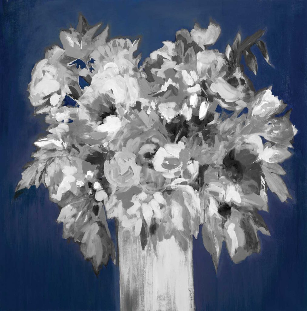
“Al Fresco Style” by Liz Jardine alt v 3
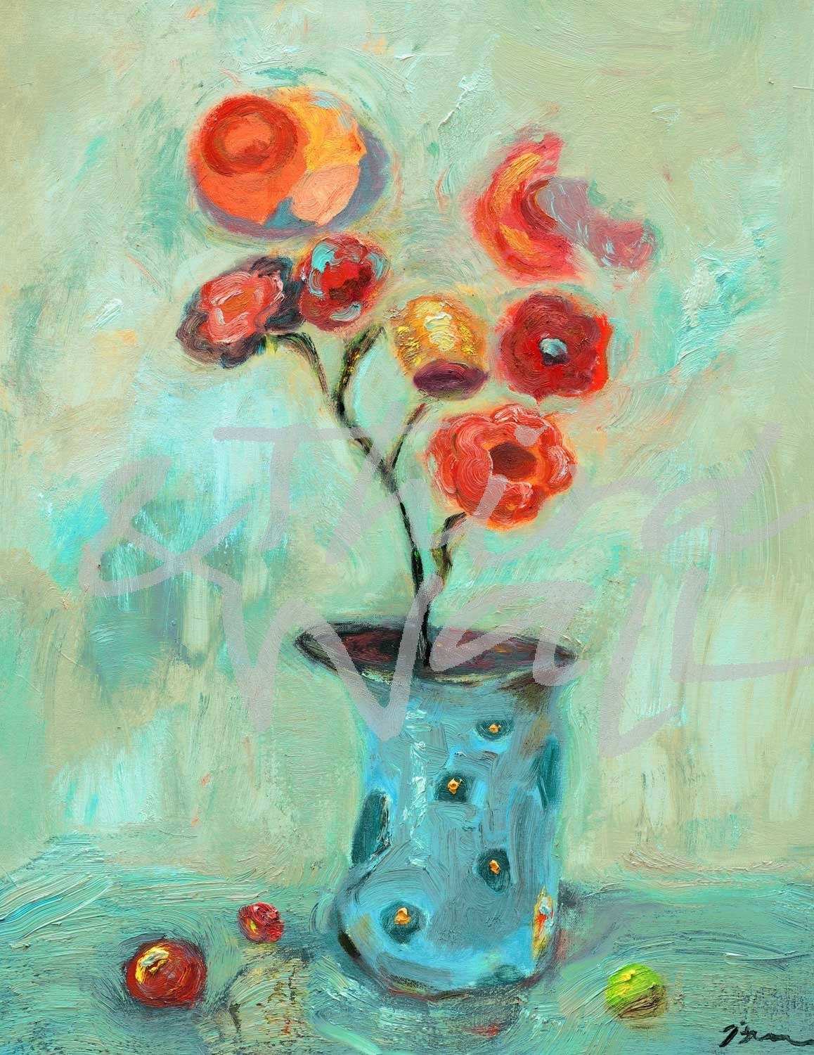
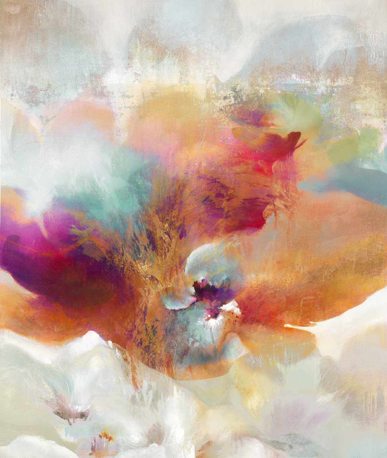
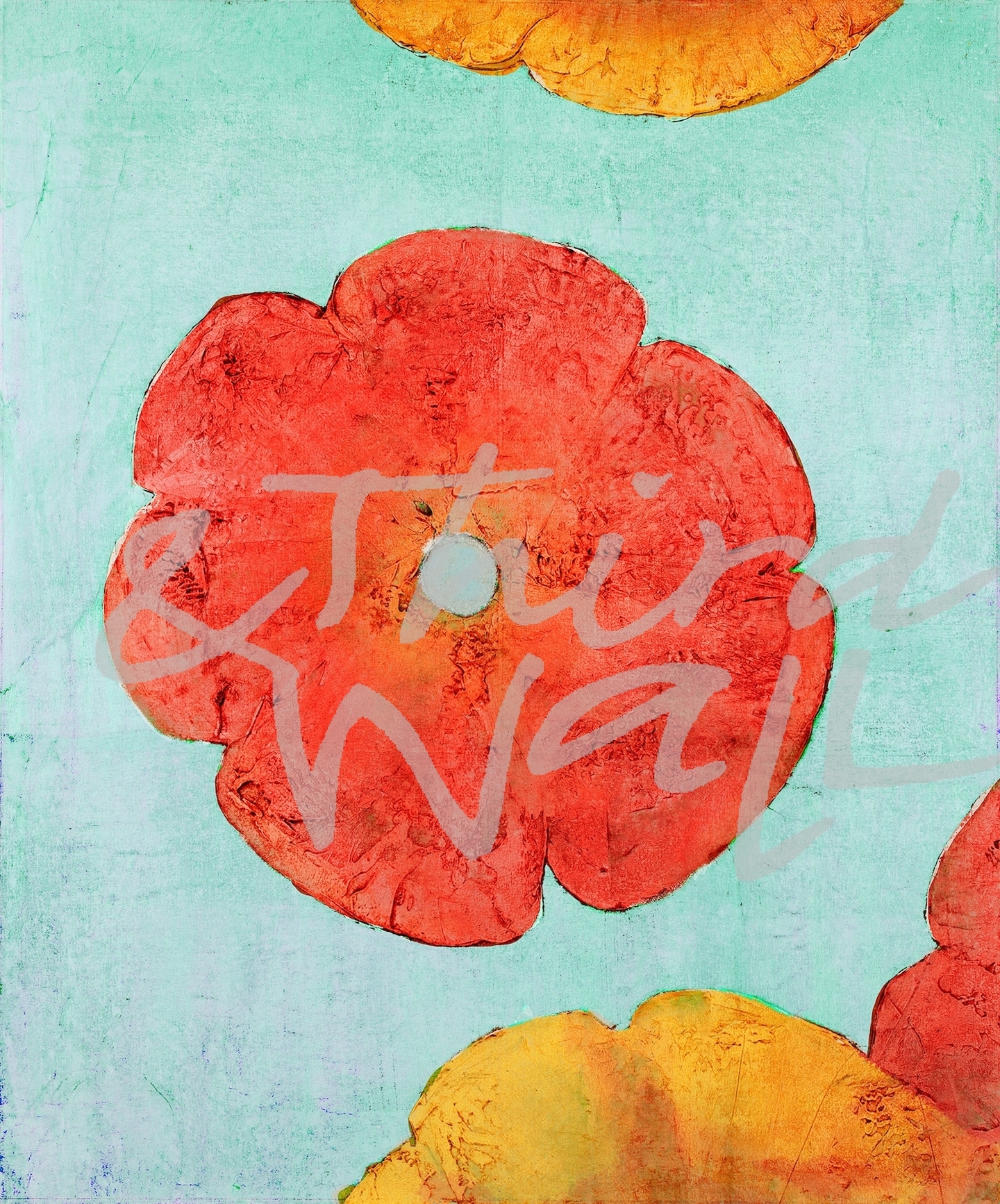
The images featured here are available in our Print-On-Demand collection. Some areas of our website are password-protected. If you are a member of the trade but don’t have full access to our website, www.thirdandwall.com, please contact us at customerservice@thirdandwall.com.

 St. Patrick’s Day is upon us. Everyone from schoolchildren to our coworkers will be wearing green on the 17th in order to avoid the dreaded pinch. If your wardrobe is short on green we can’t save you from a pinching incident, but we do have plenty of green for your walls to wear!