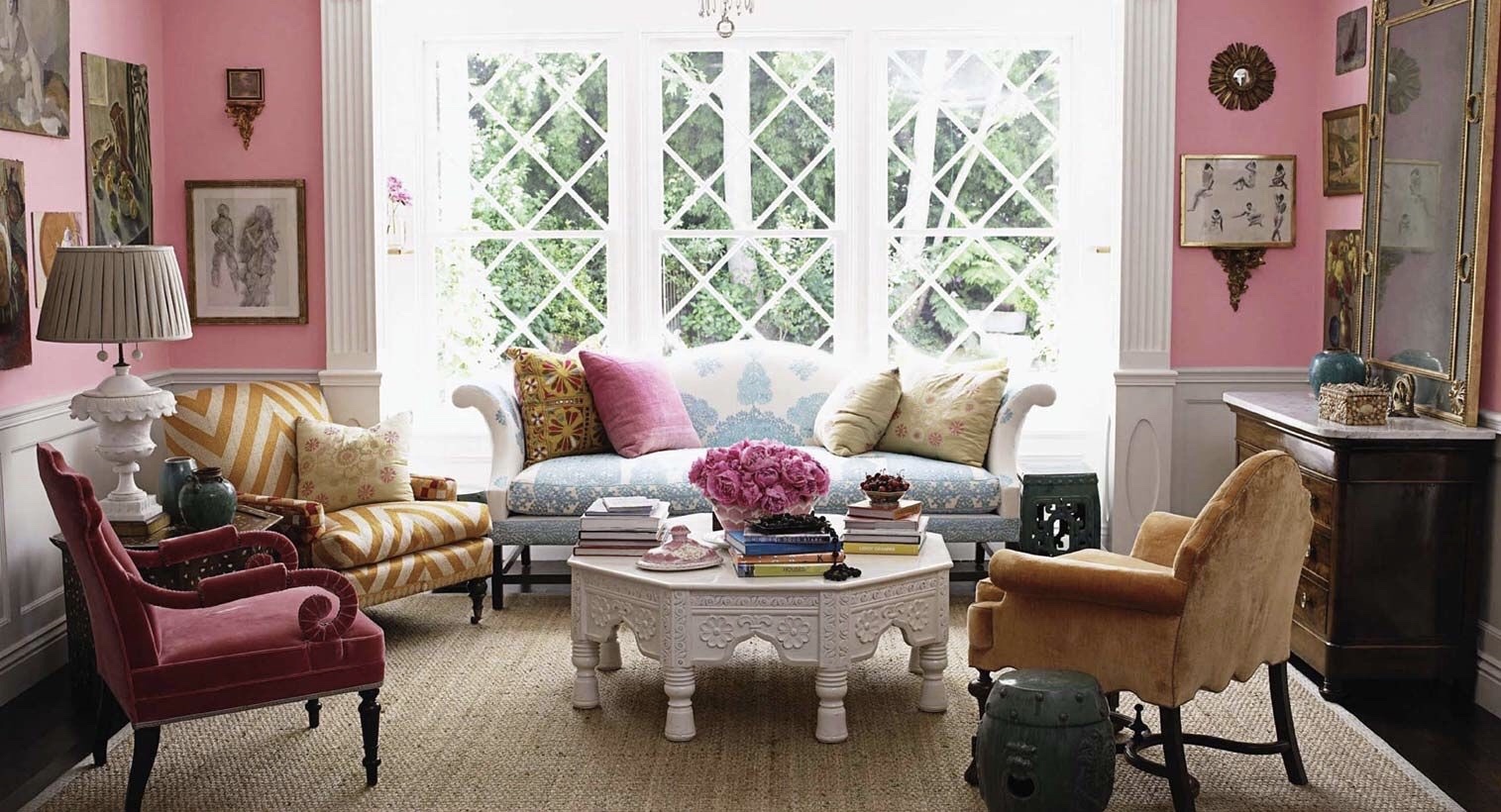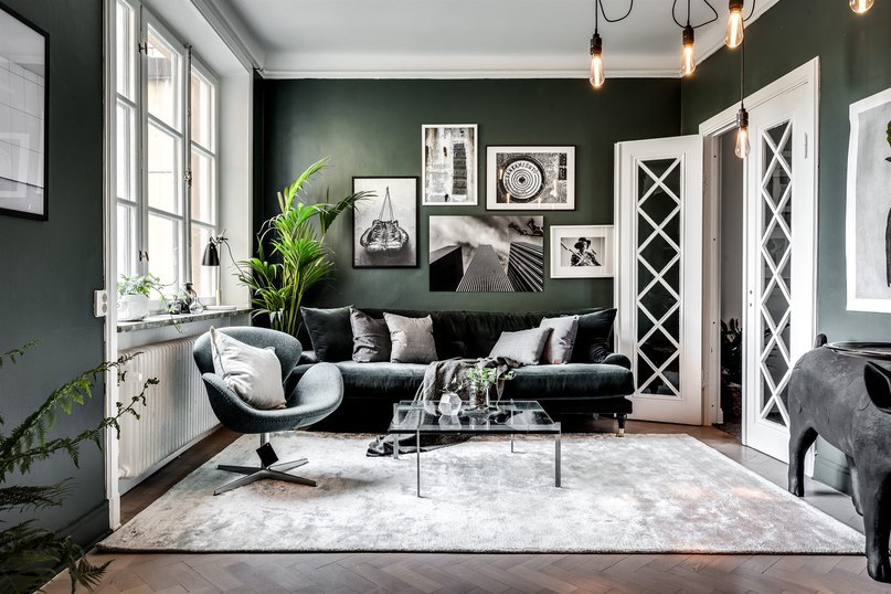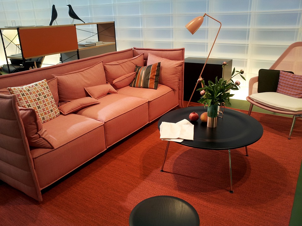
Are you looking for a way to freshen up your space? Incorporating shades of green can do just that and add a natural element to your interior. Bringing the outdoors in has become a popular design trend, and adding some green is one of the easiest ways to infuse vitality into your room. Cool green tones can be relaxing and nourishing, while warm tones can add personality and energy to a space, and they don’t always have to come in botanical form. Having green hues in your furniture, accent pieces, and on your walls can be resting or energizing, and with such a wide range of green tones to use, it is easy to find the perfect one for your space. Since there are endless possibilities, we are highlighting different ways to incorporate this versatile color trend into your decor and design to help you go green!
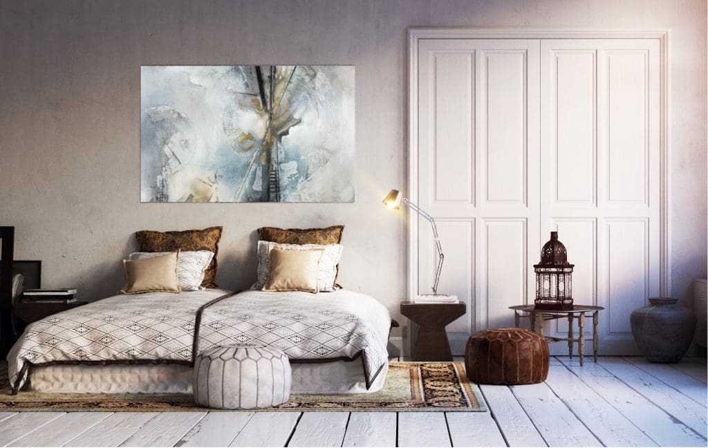
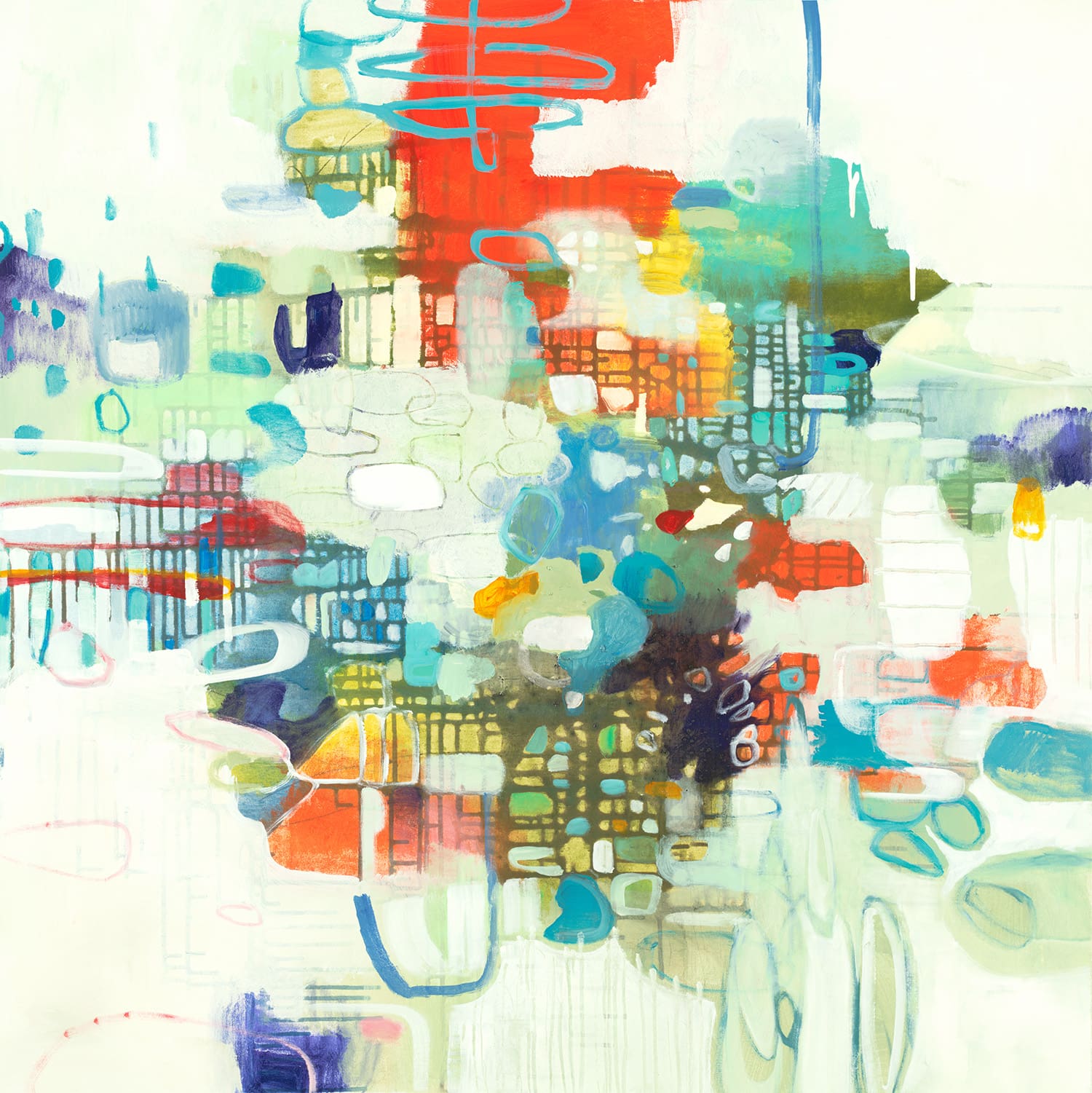
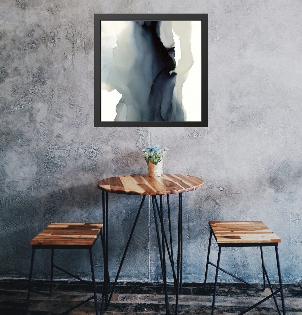
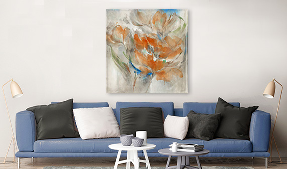
Greens as Neutrals
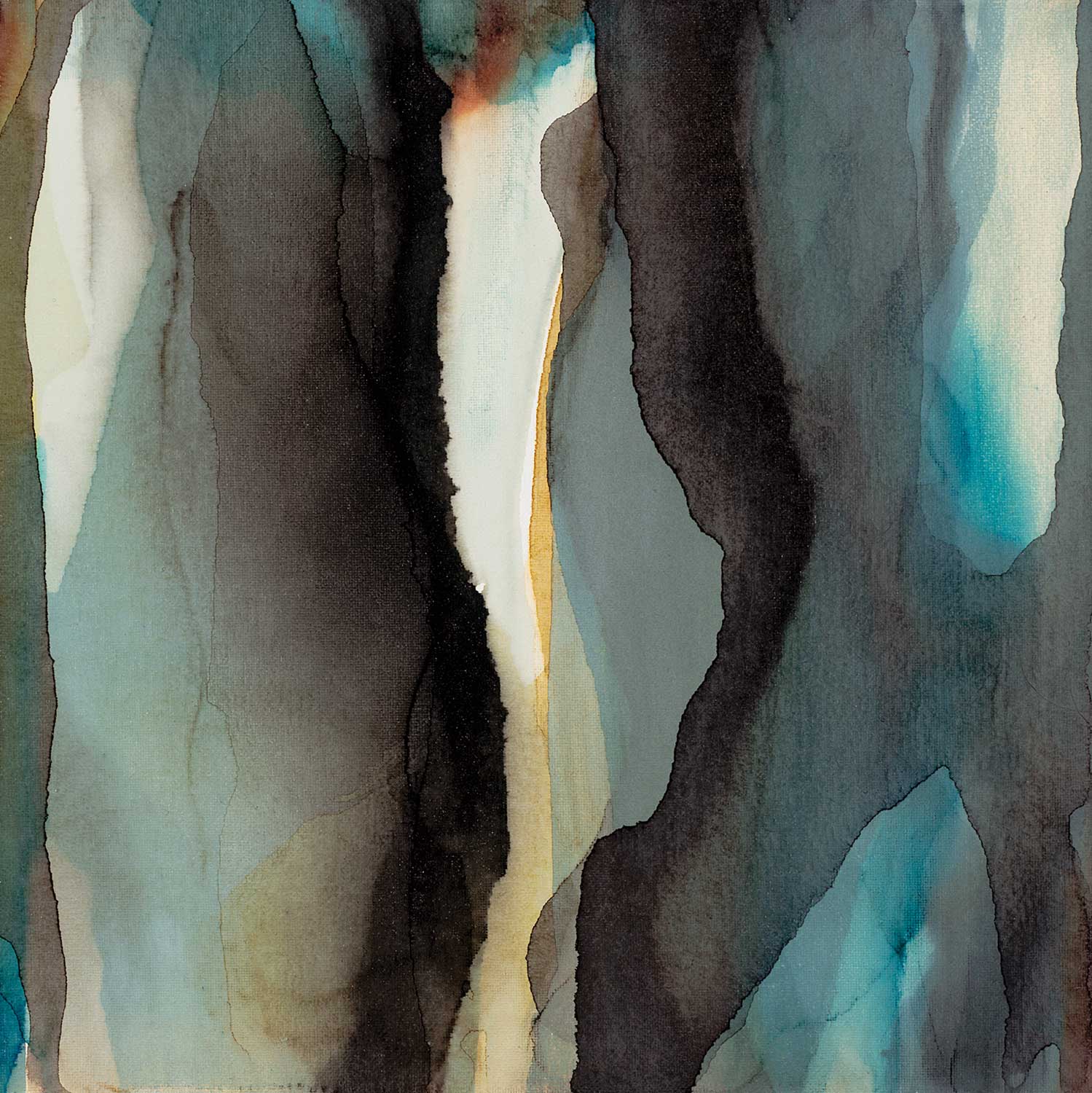
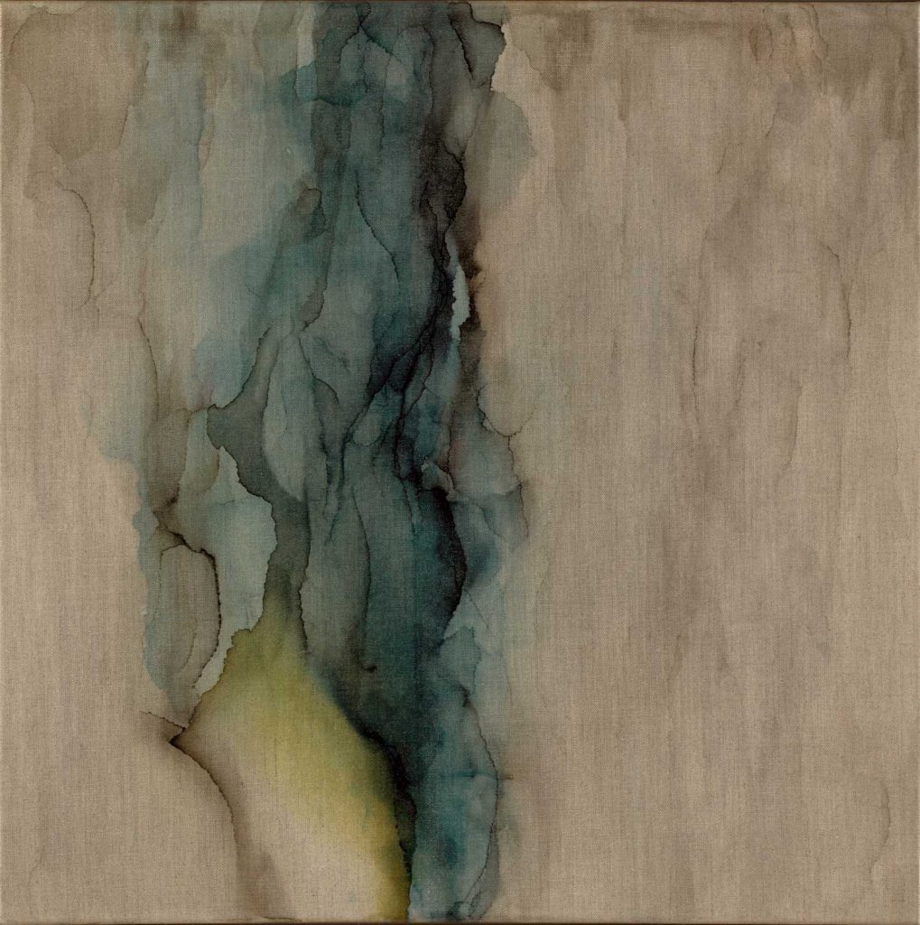
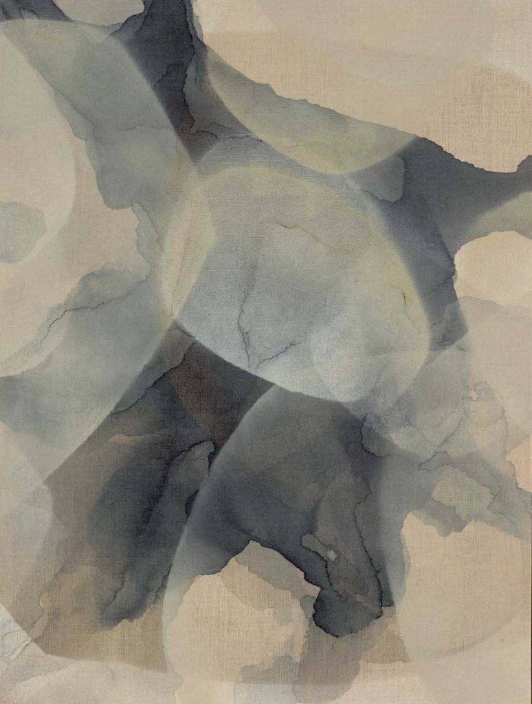
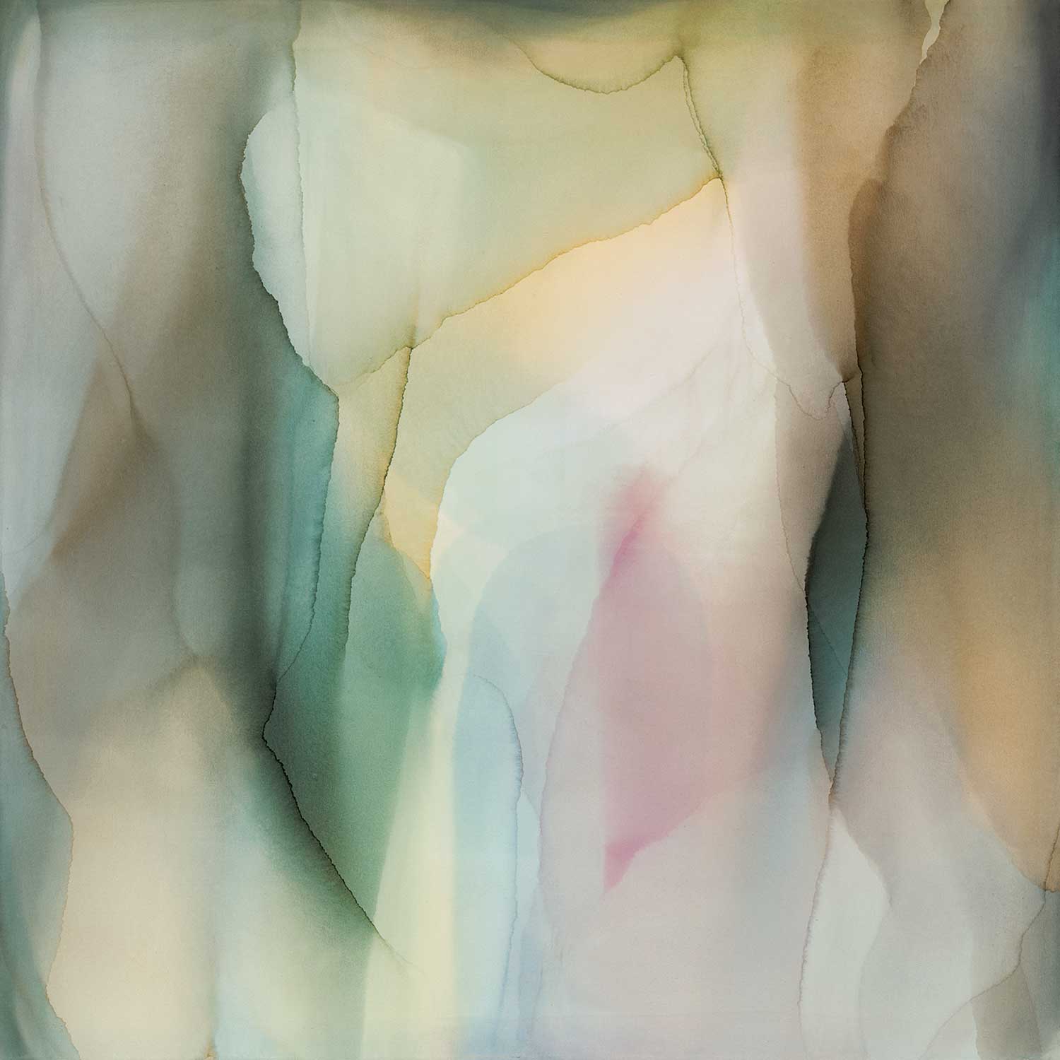
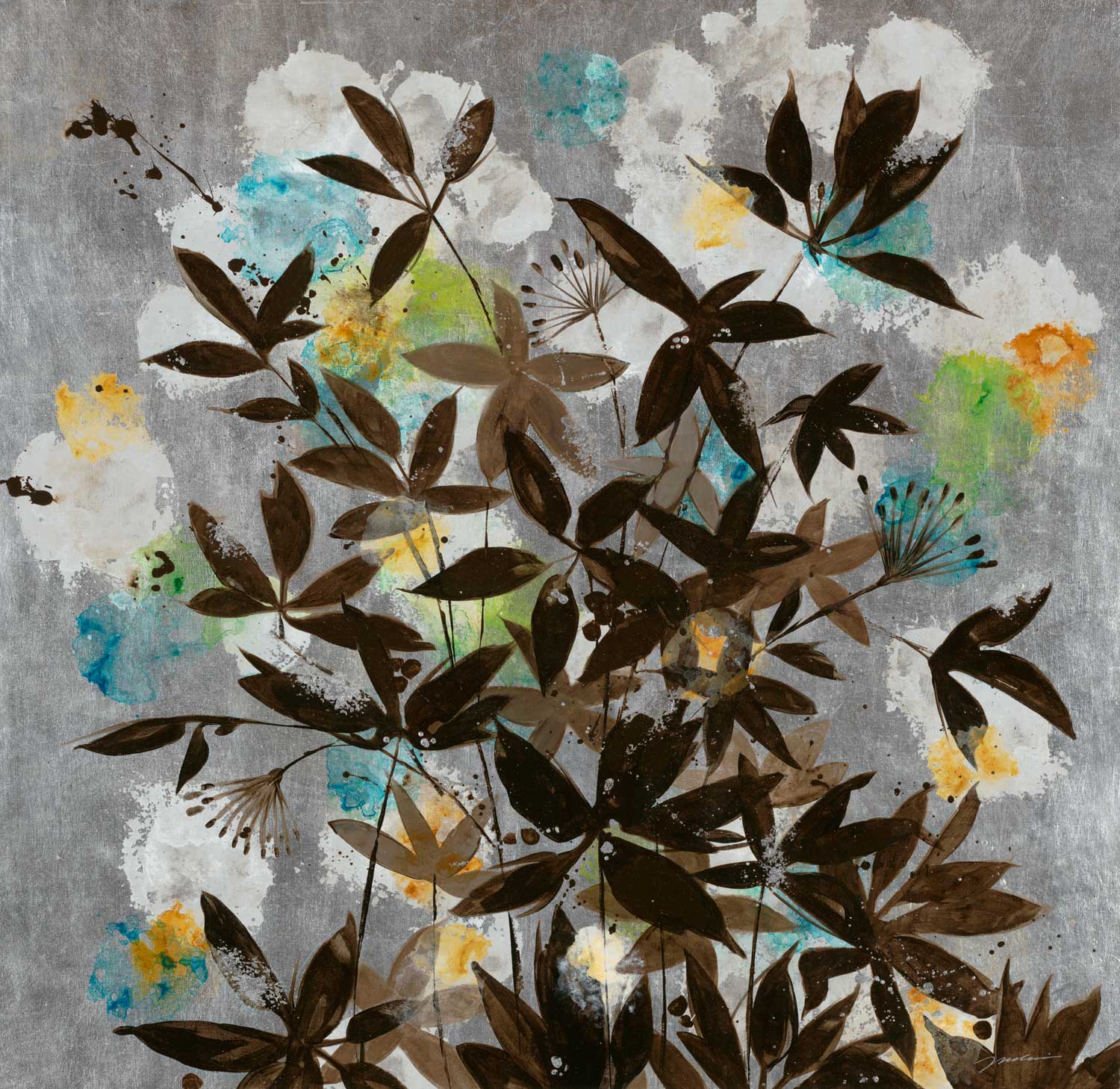
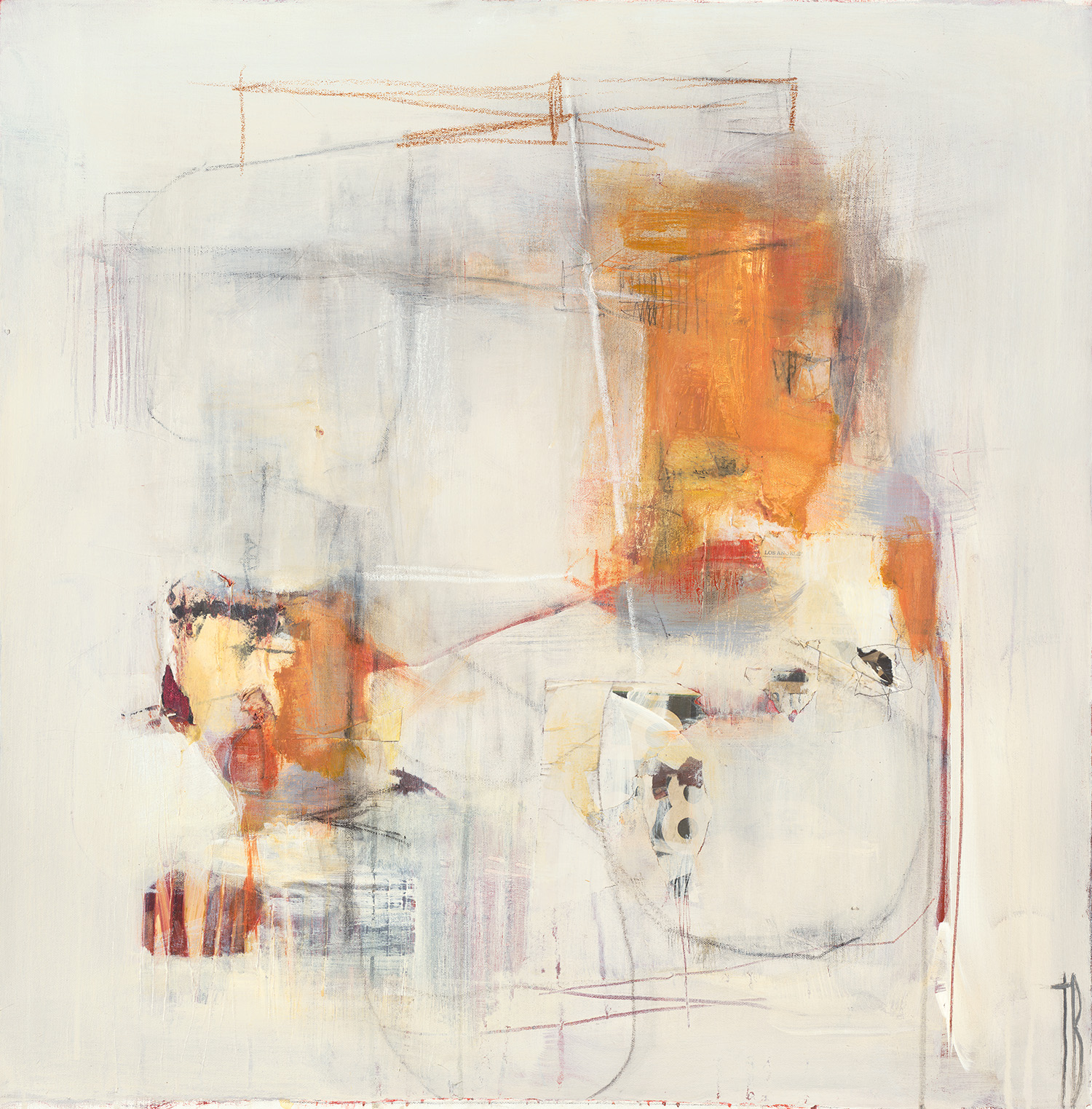
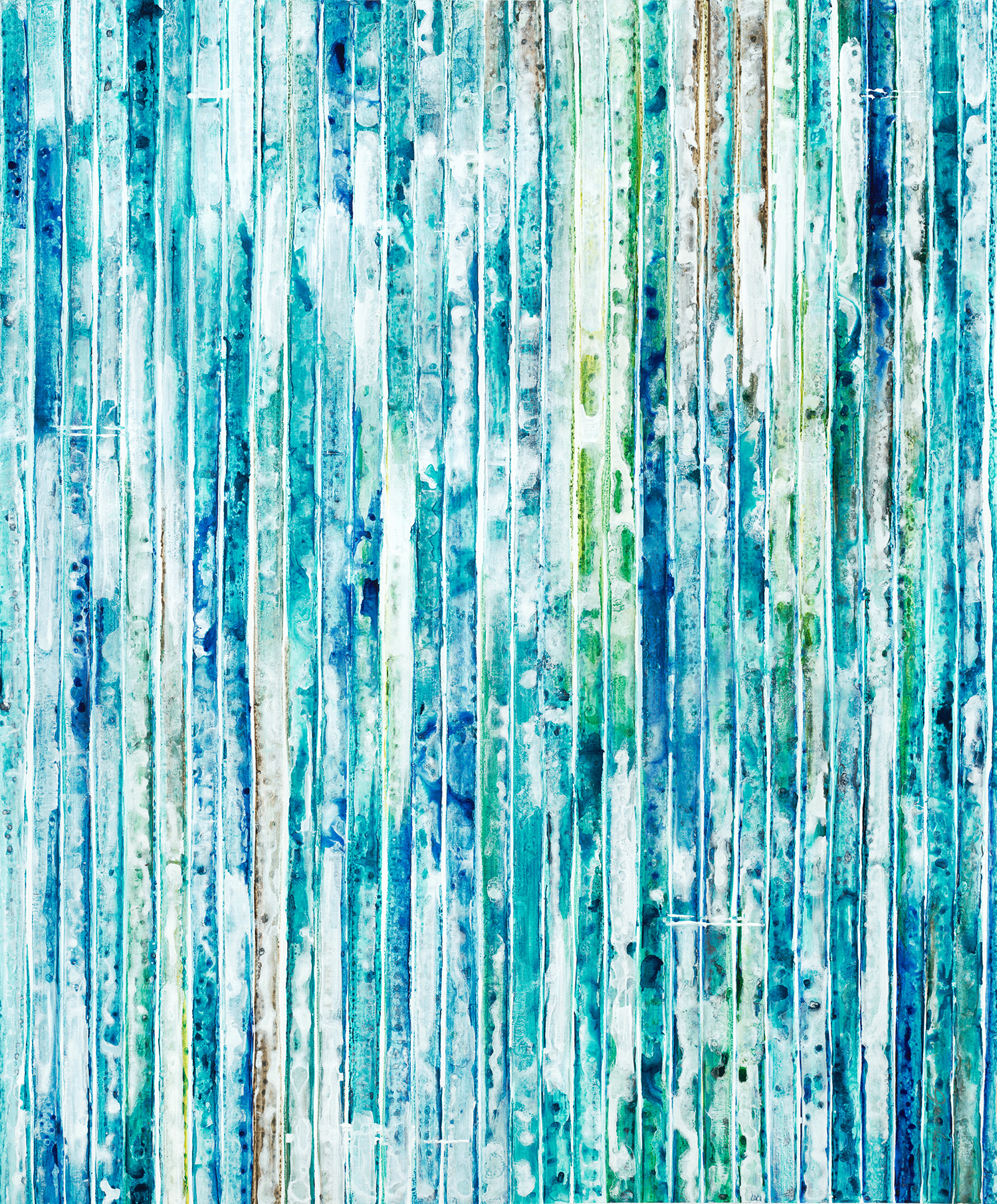
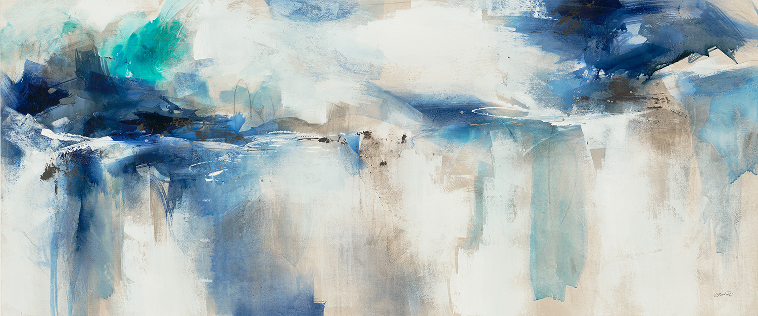
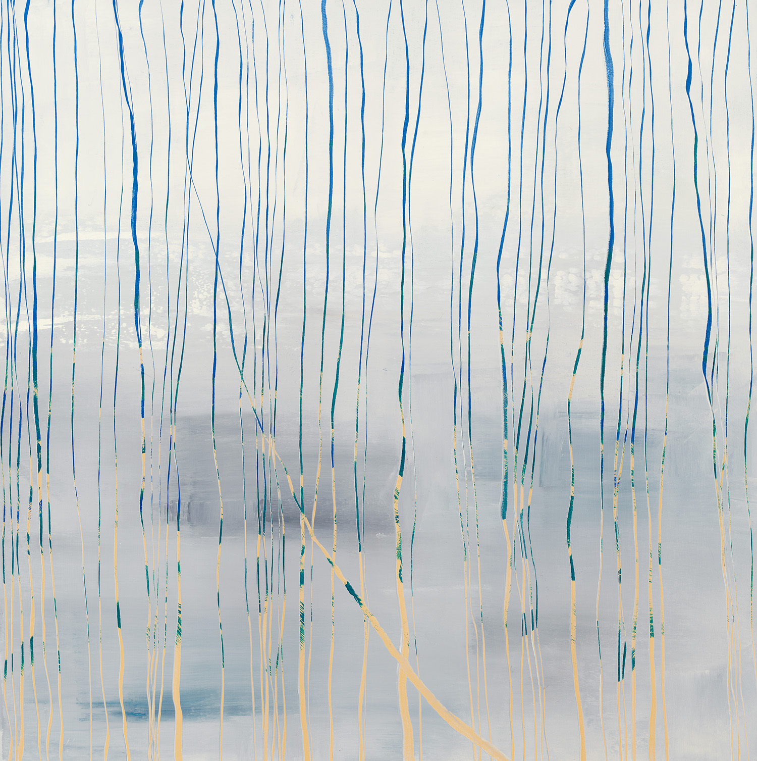
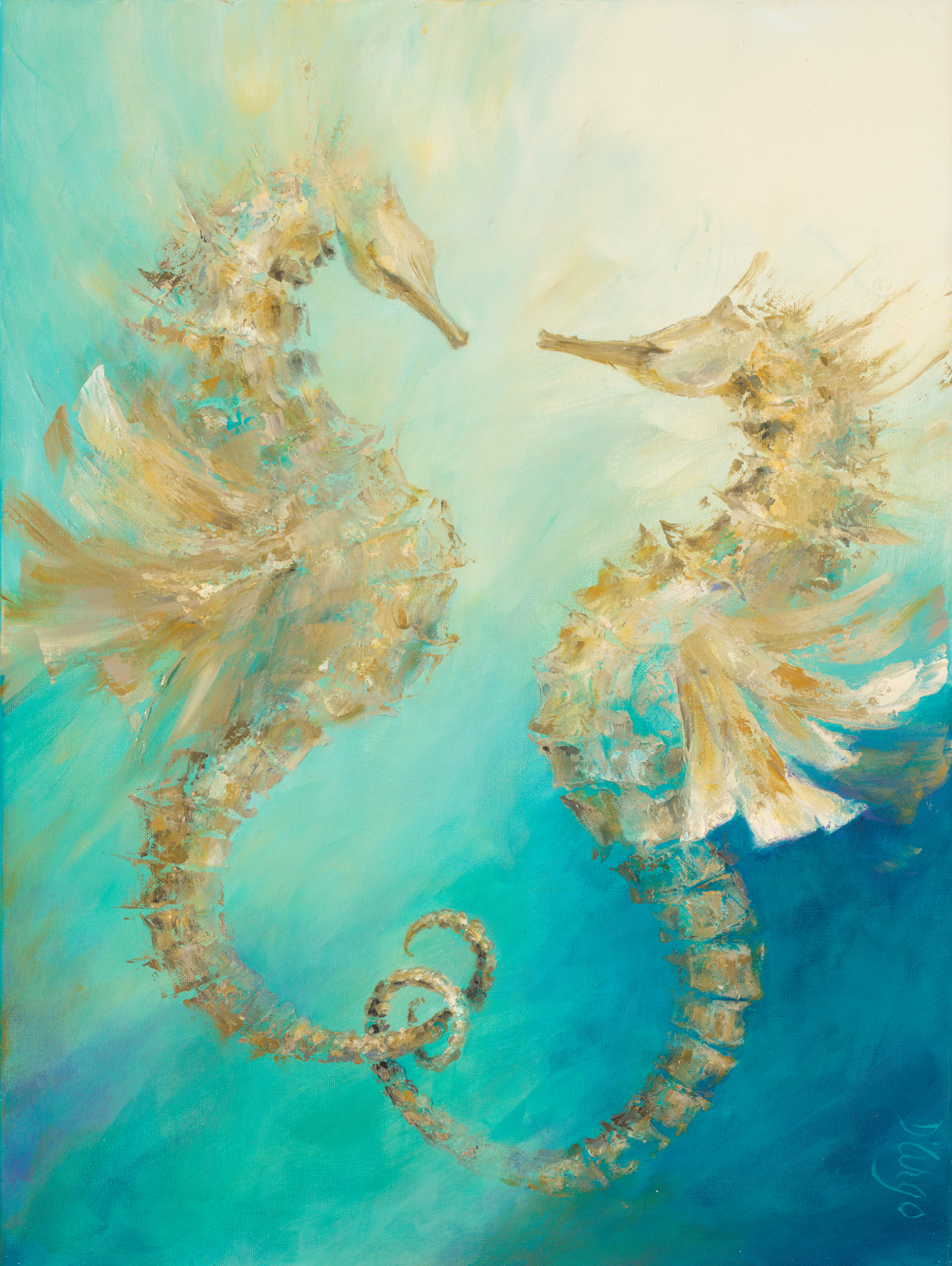
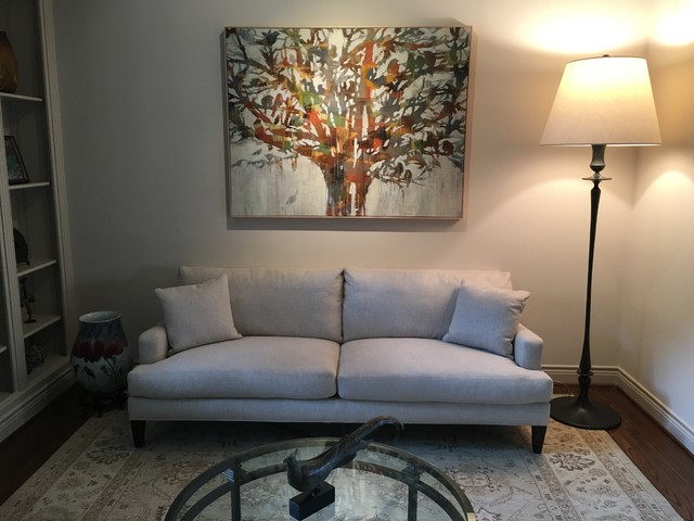
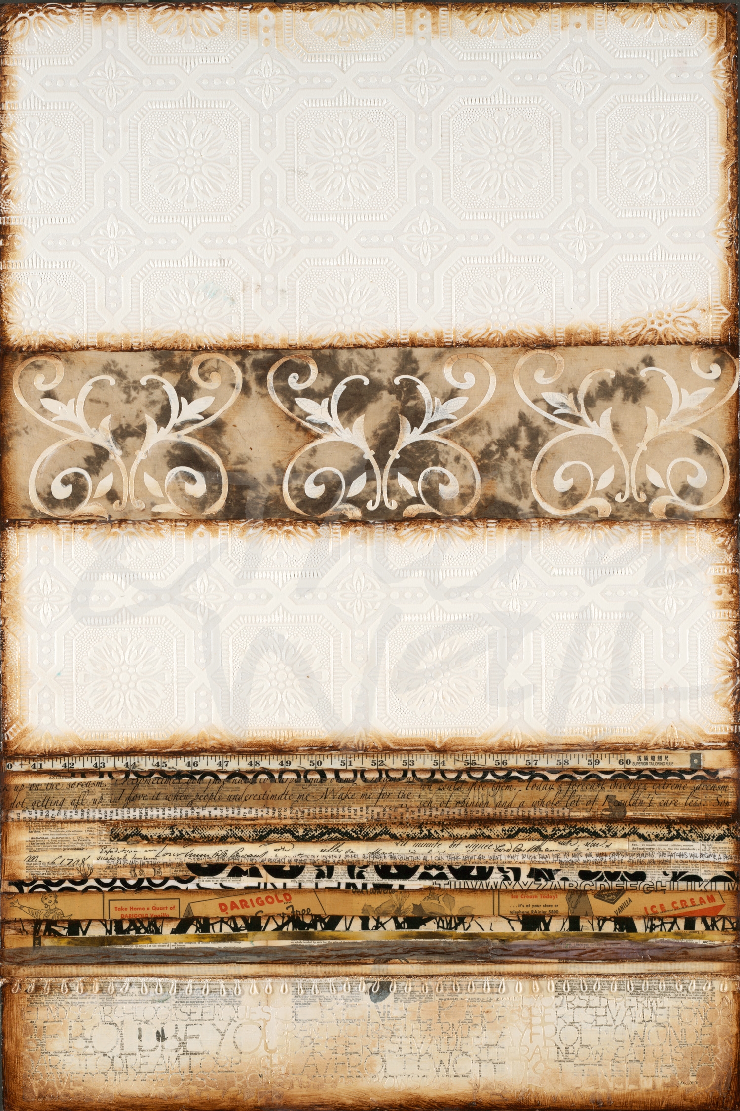
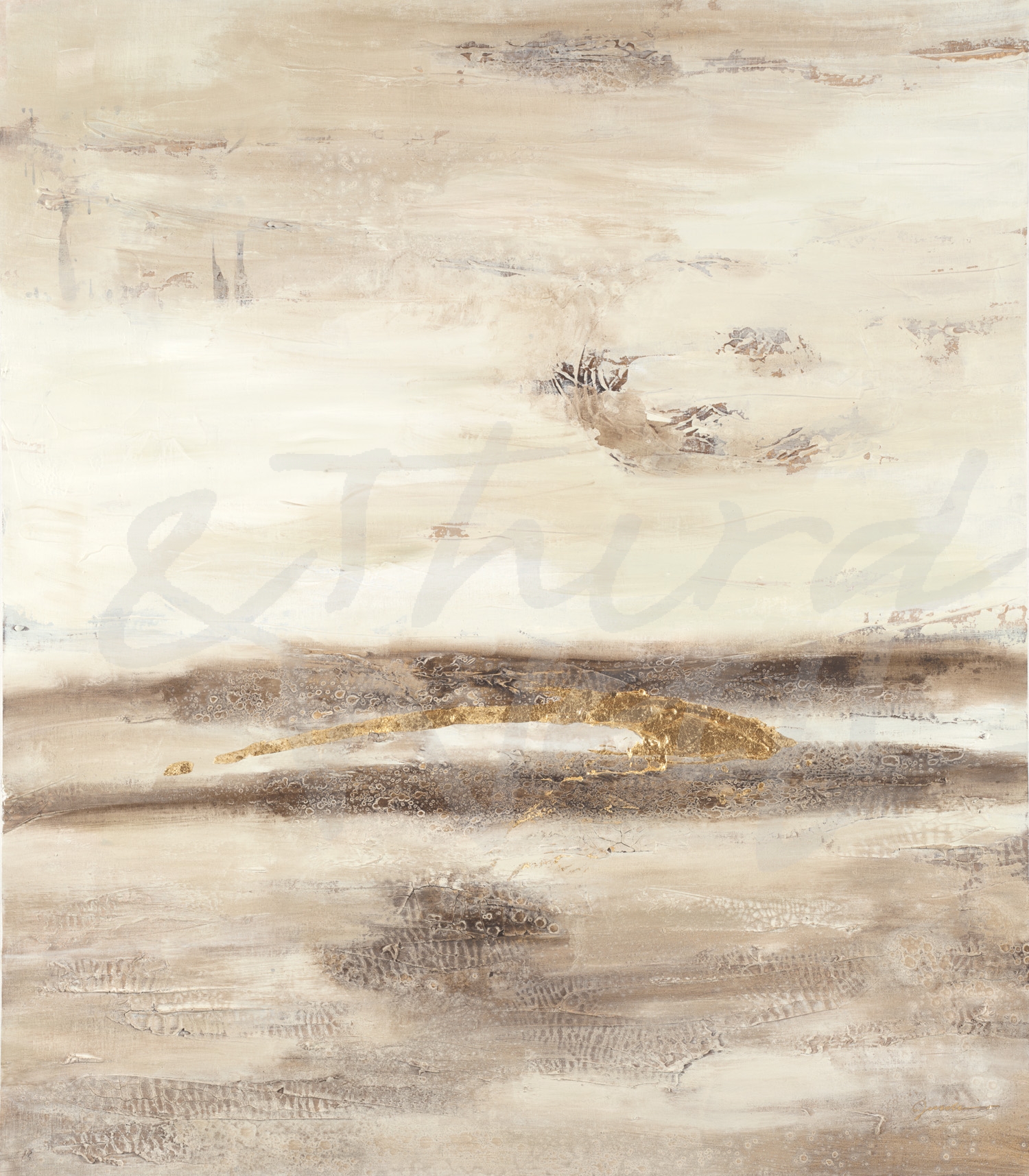
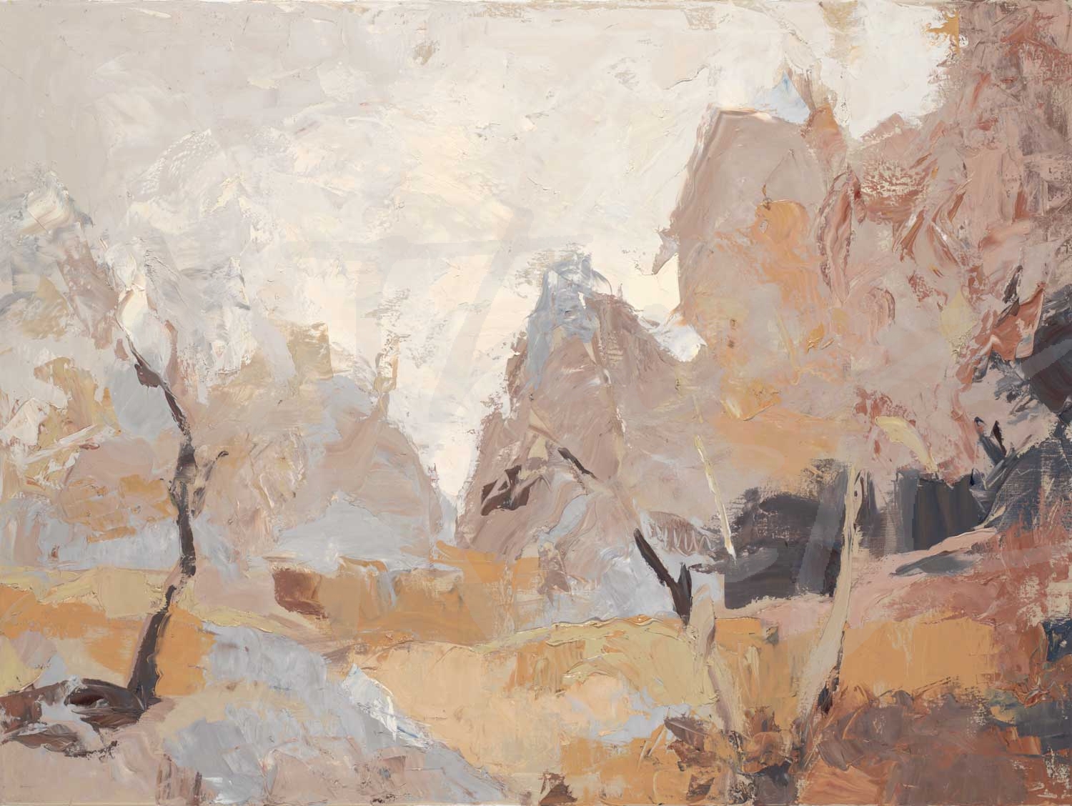
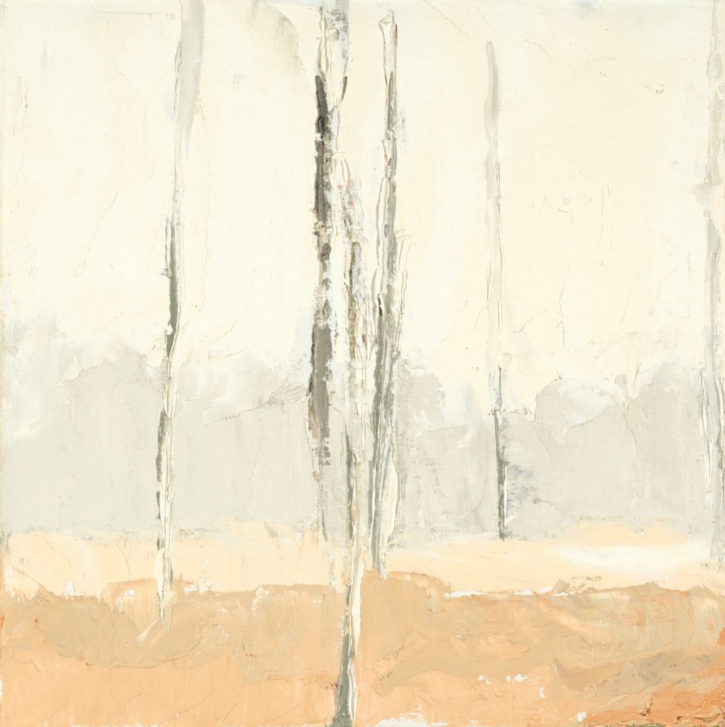
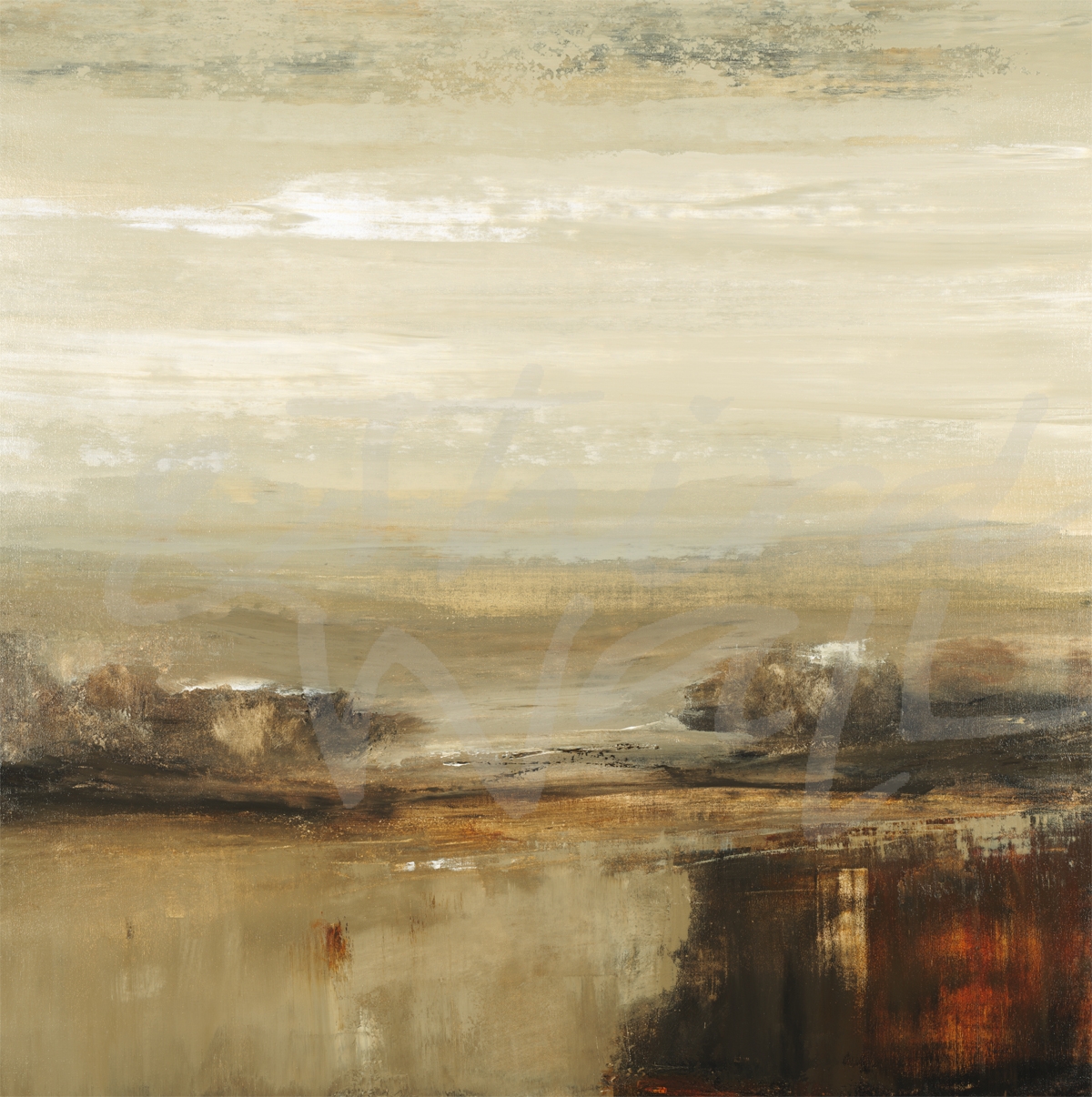
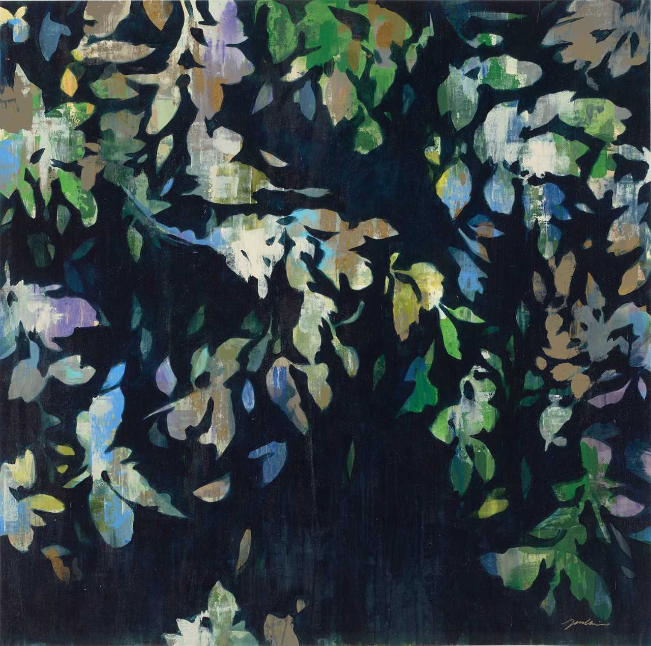
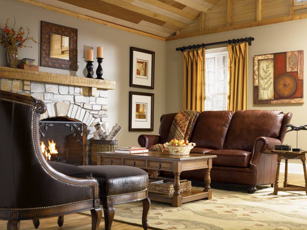
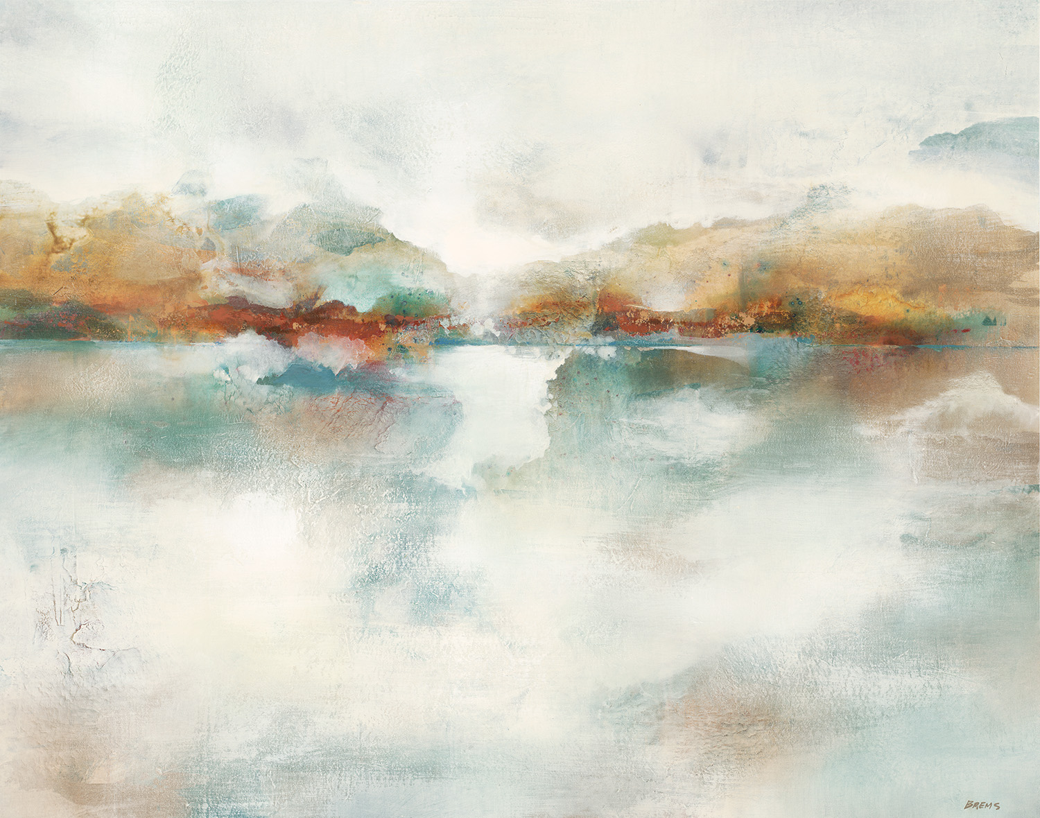
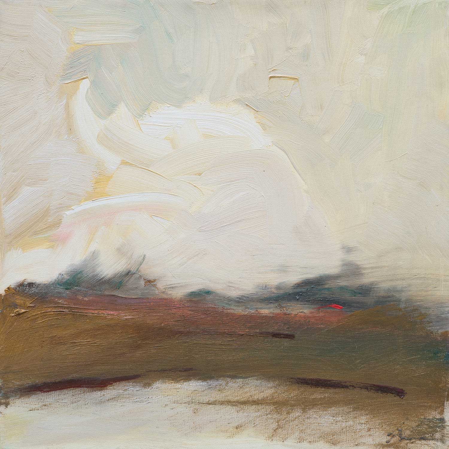
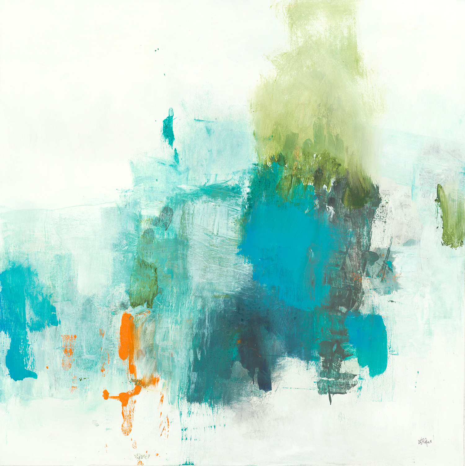
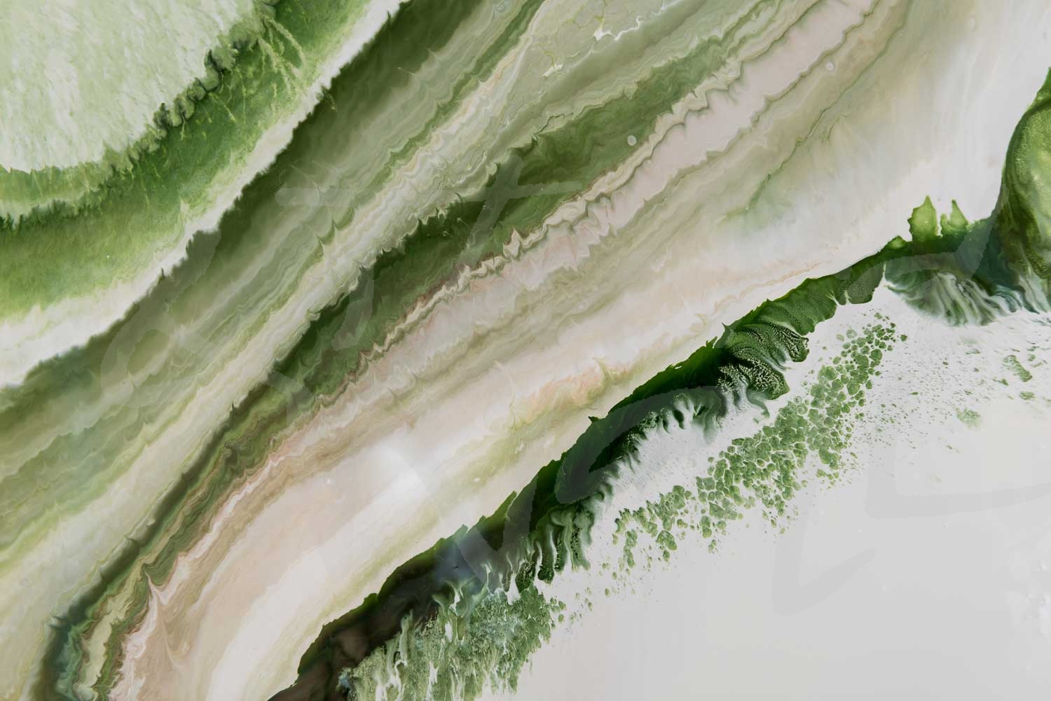
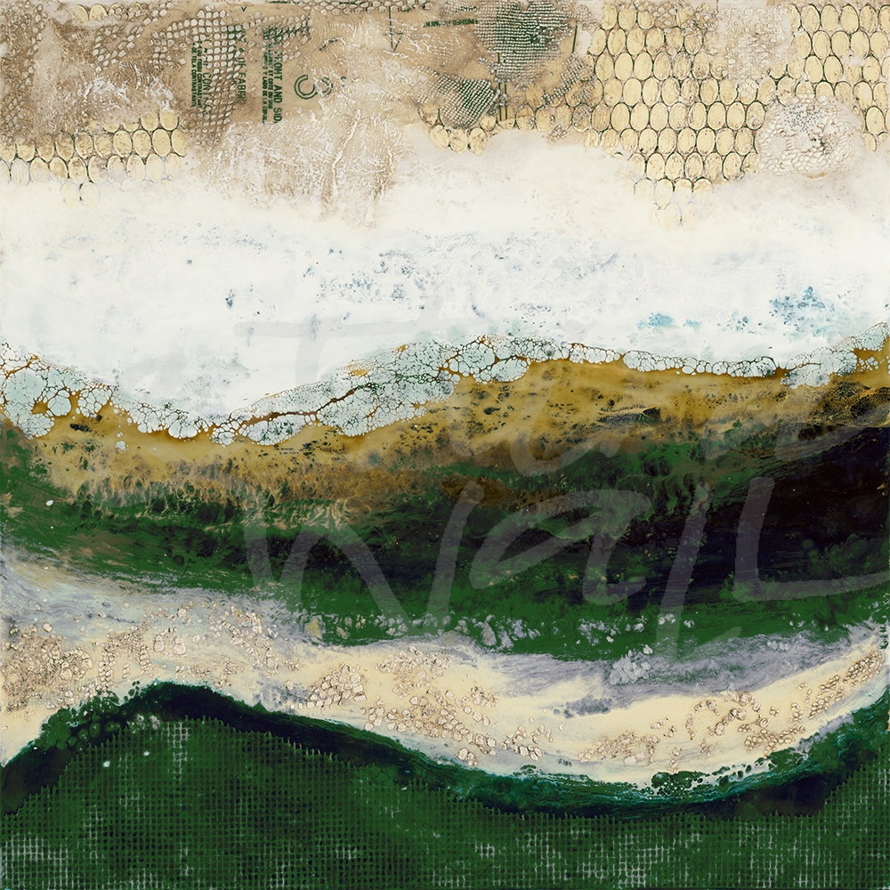
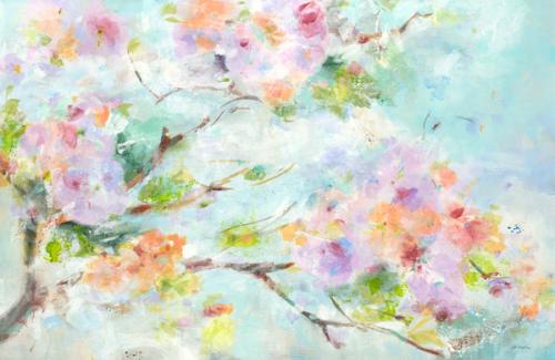
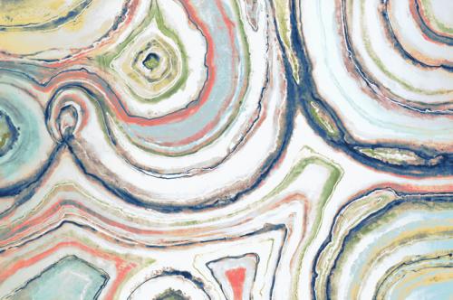
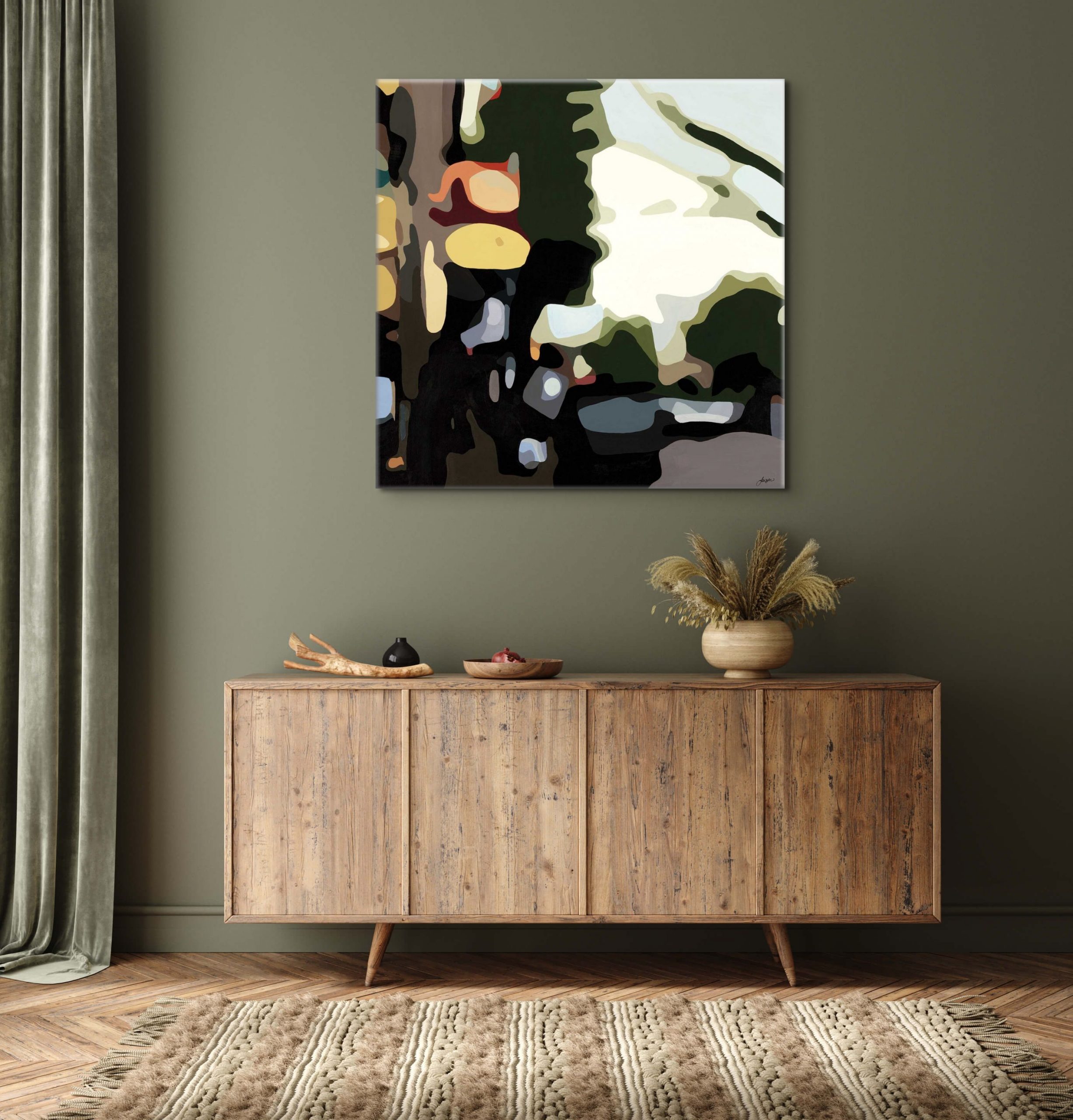
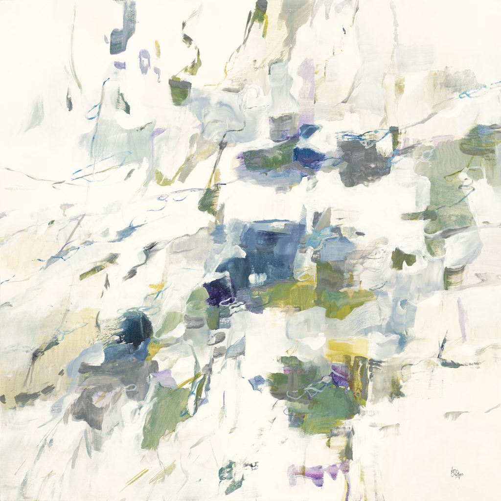
Cool, muted greens that take on more of a gray or brown tone, such as sage, are great for acting like neutrals in a space. Paler greens that verge on the point of gray are a great way to keep a space light and serene, but they can pair easily with sharp, bright colors. Khaki, mossy, and olivey greens can give a design an earthy feel, especially when paired with warm tones and natural textures. It’s easy to switch out your wall décor in these soothing, neutral green tones because of their versatility and ability to work with what you already have!
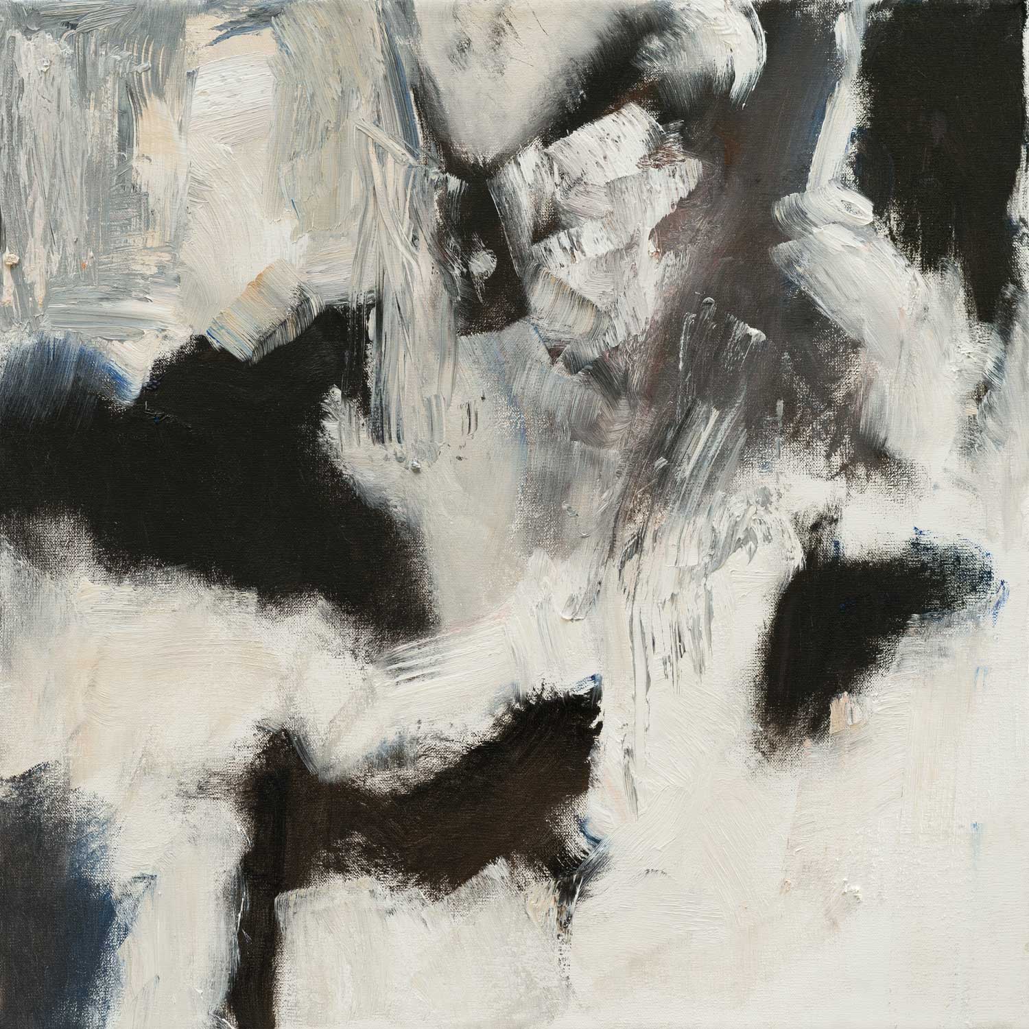
“Fall Away” by Lisa Ridgers
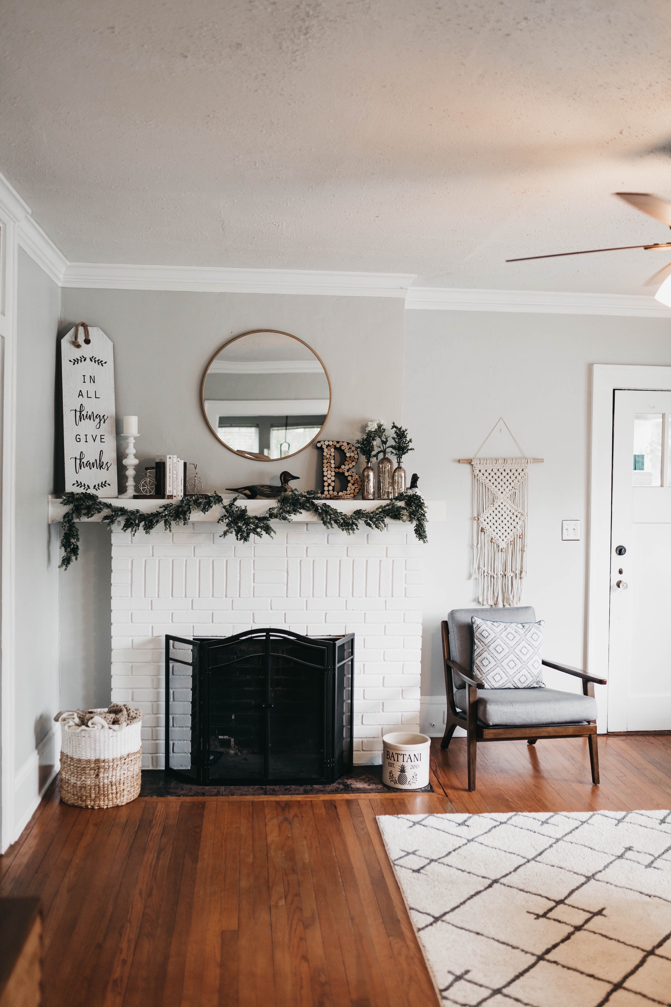
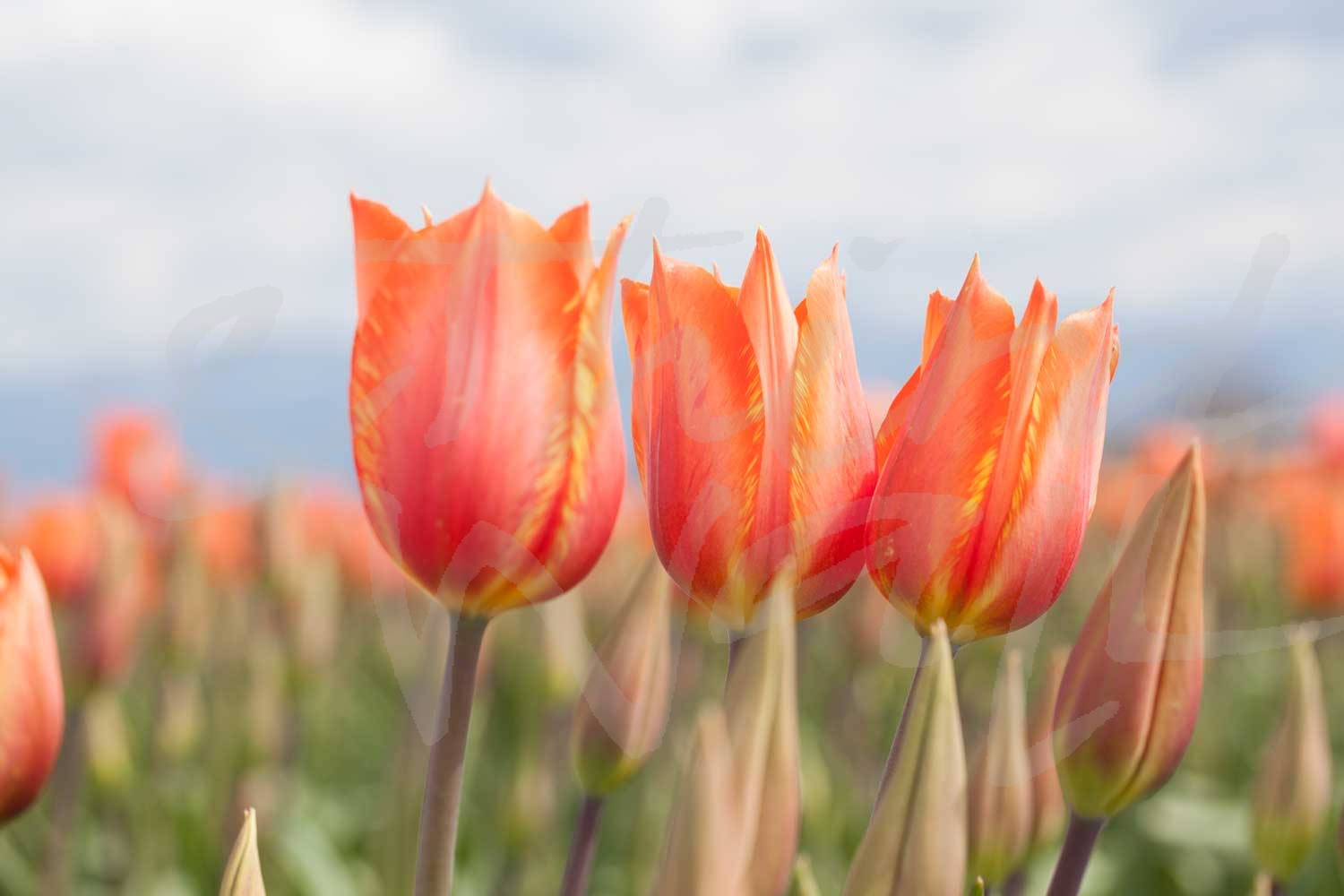
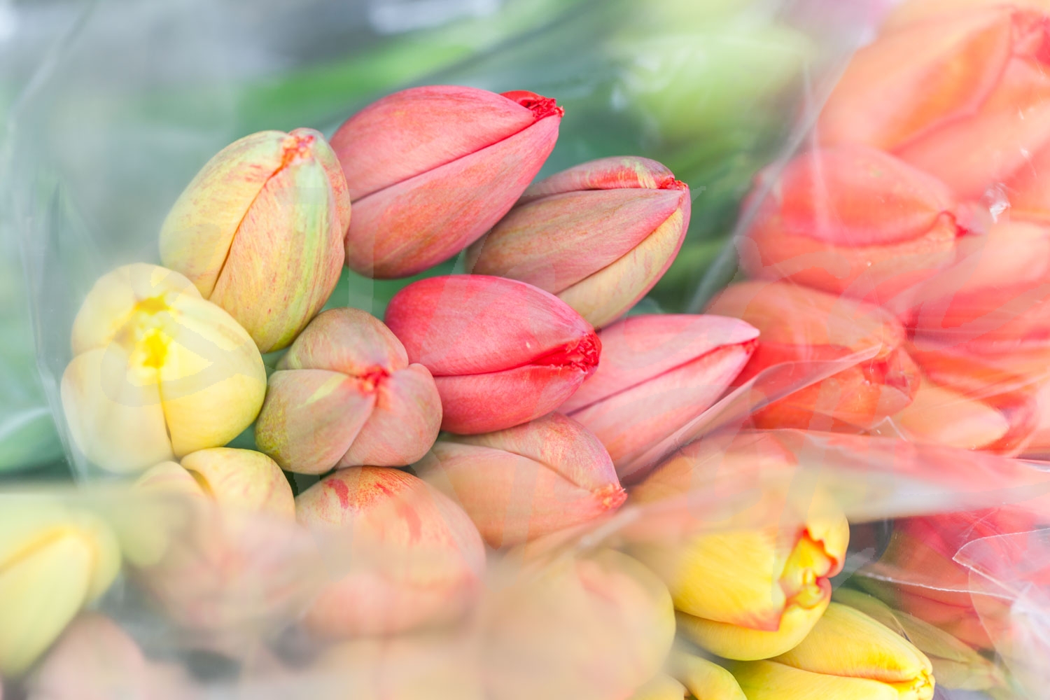
photograph by Aaron Matheson 
“Soothing Scenery III” by Lisa Ridgers 
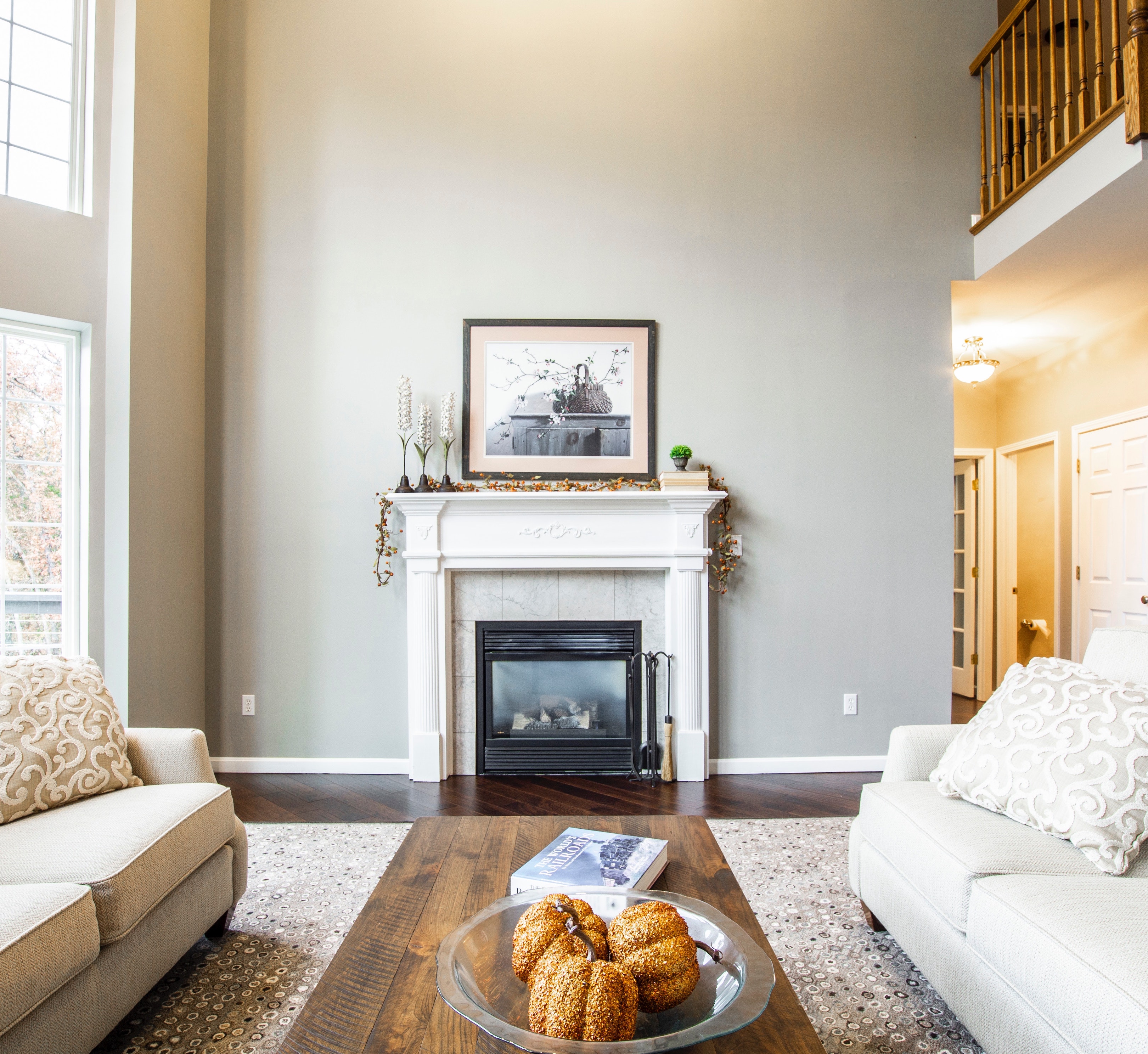
photograph by Melissa McClain 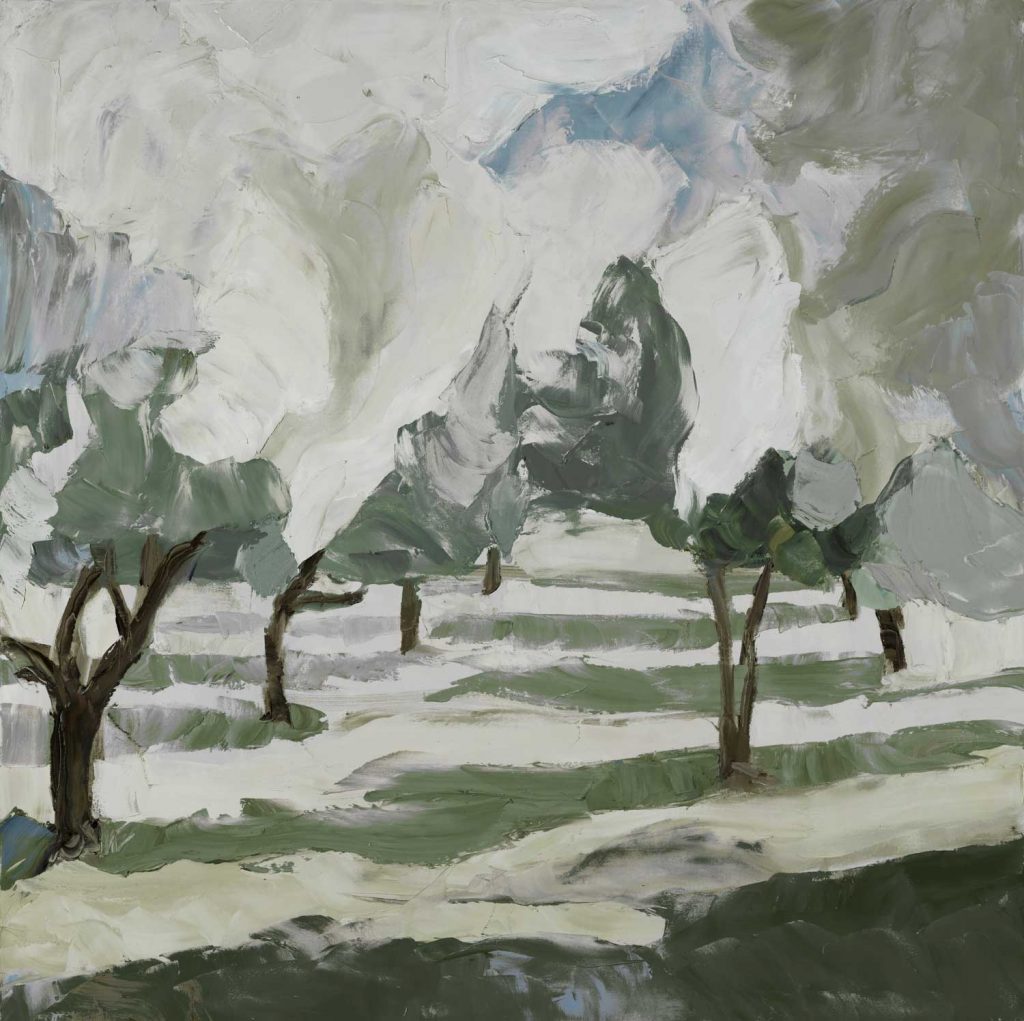
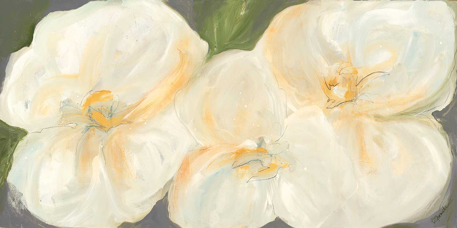
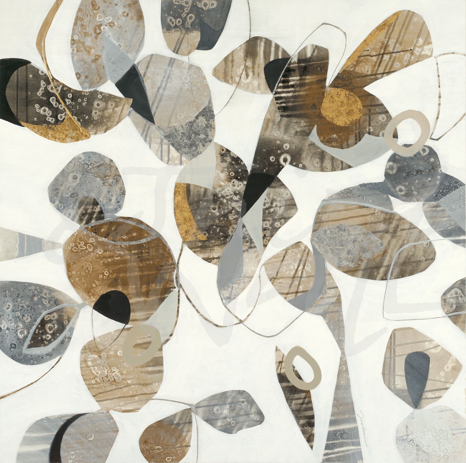
“Spring Orchard” by Julie Devine alt v 2 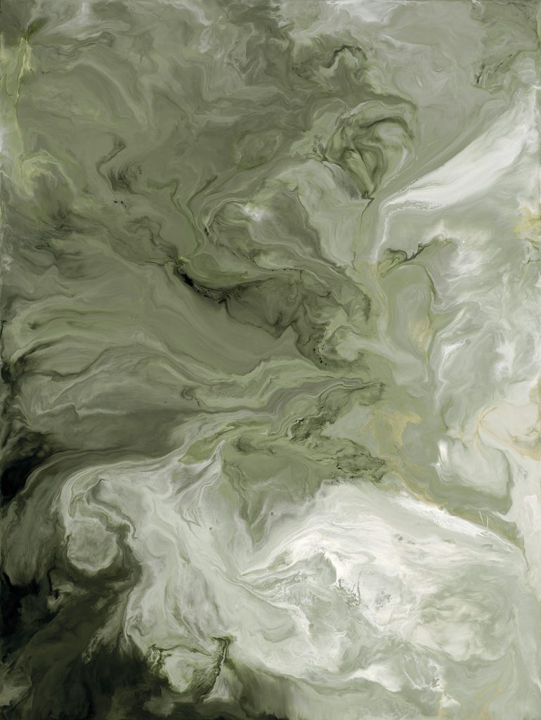
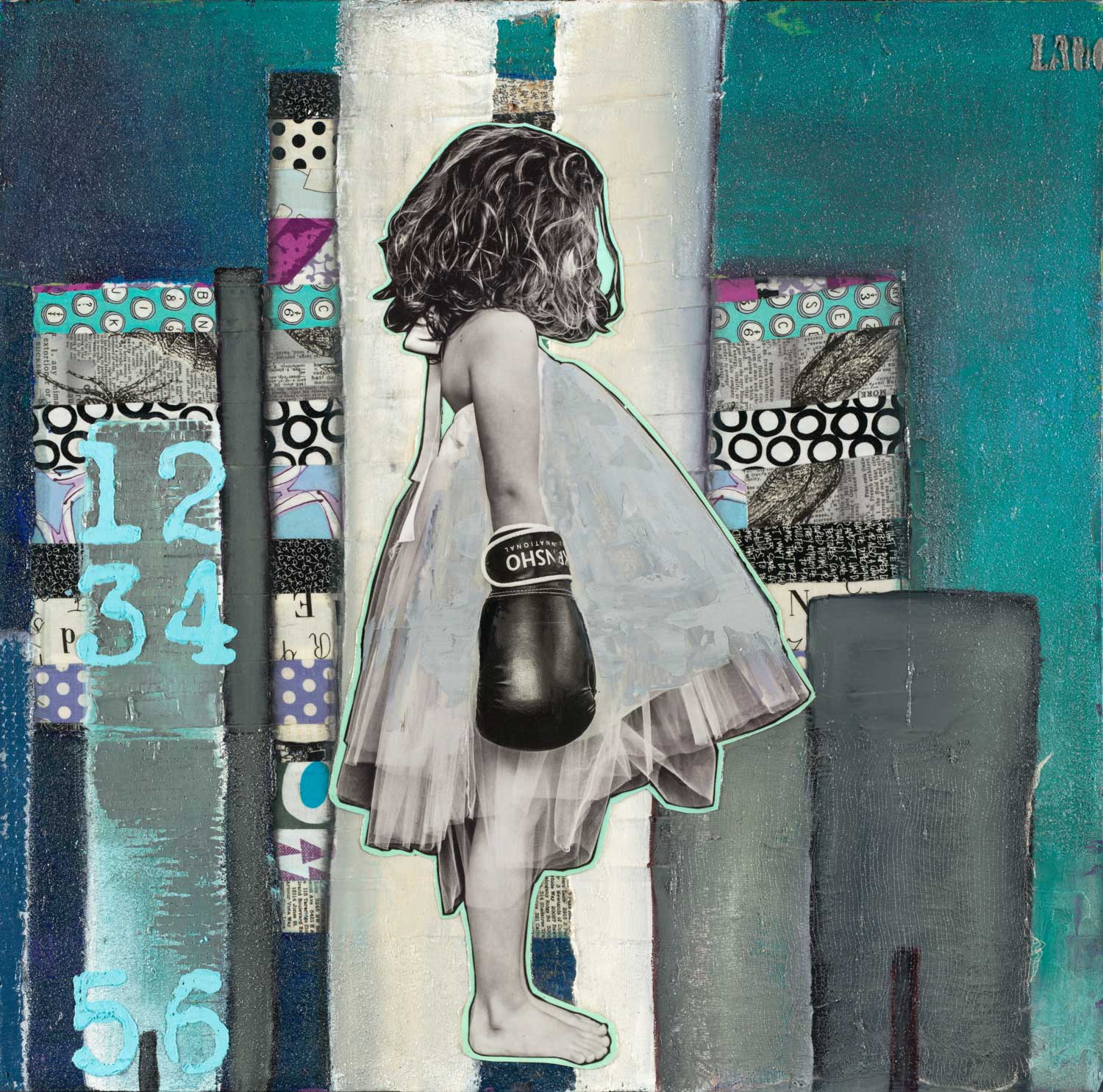
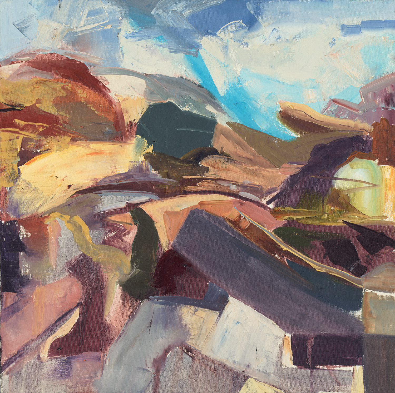
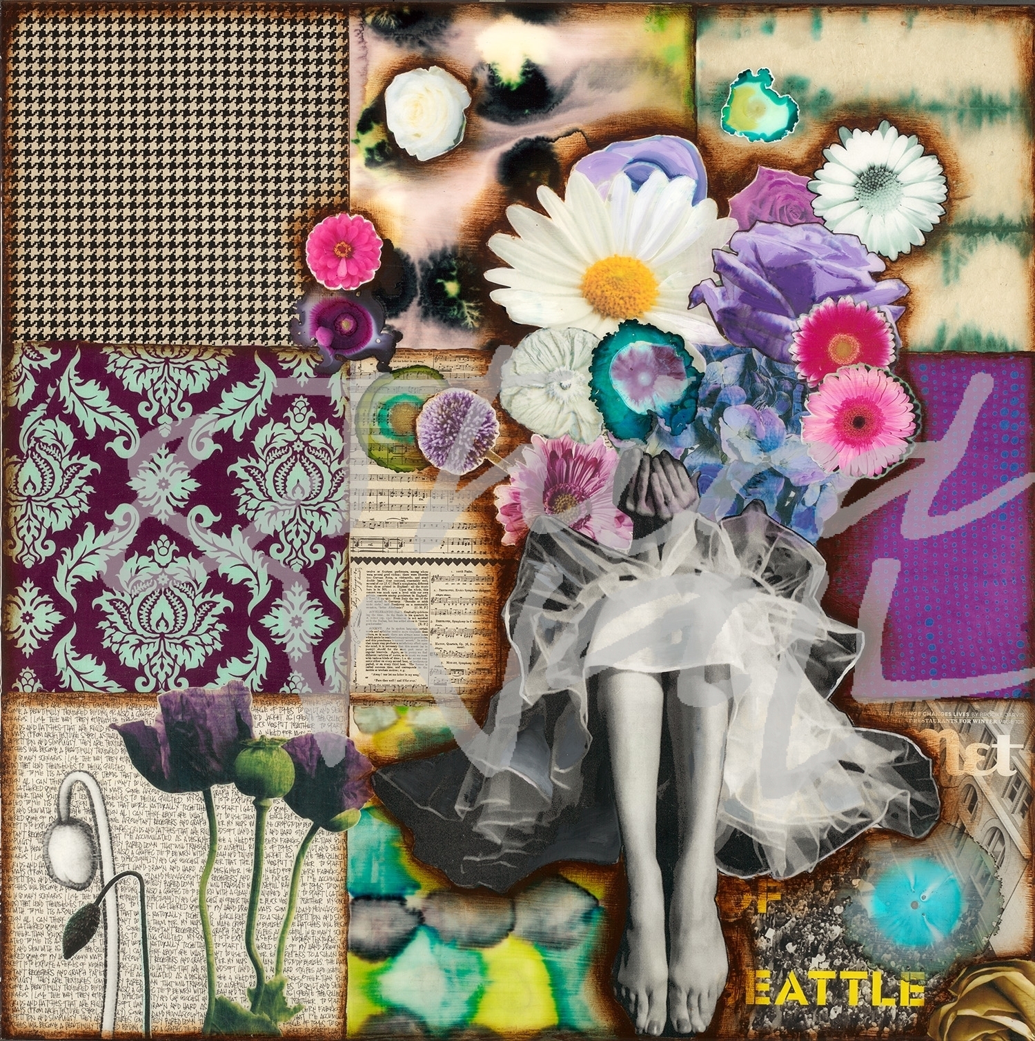
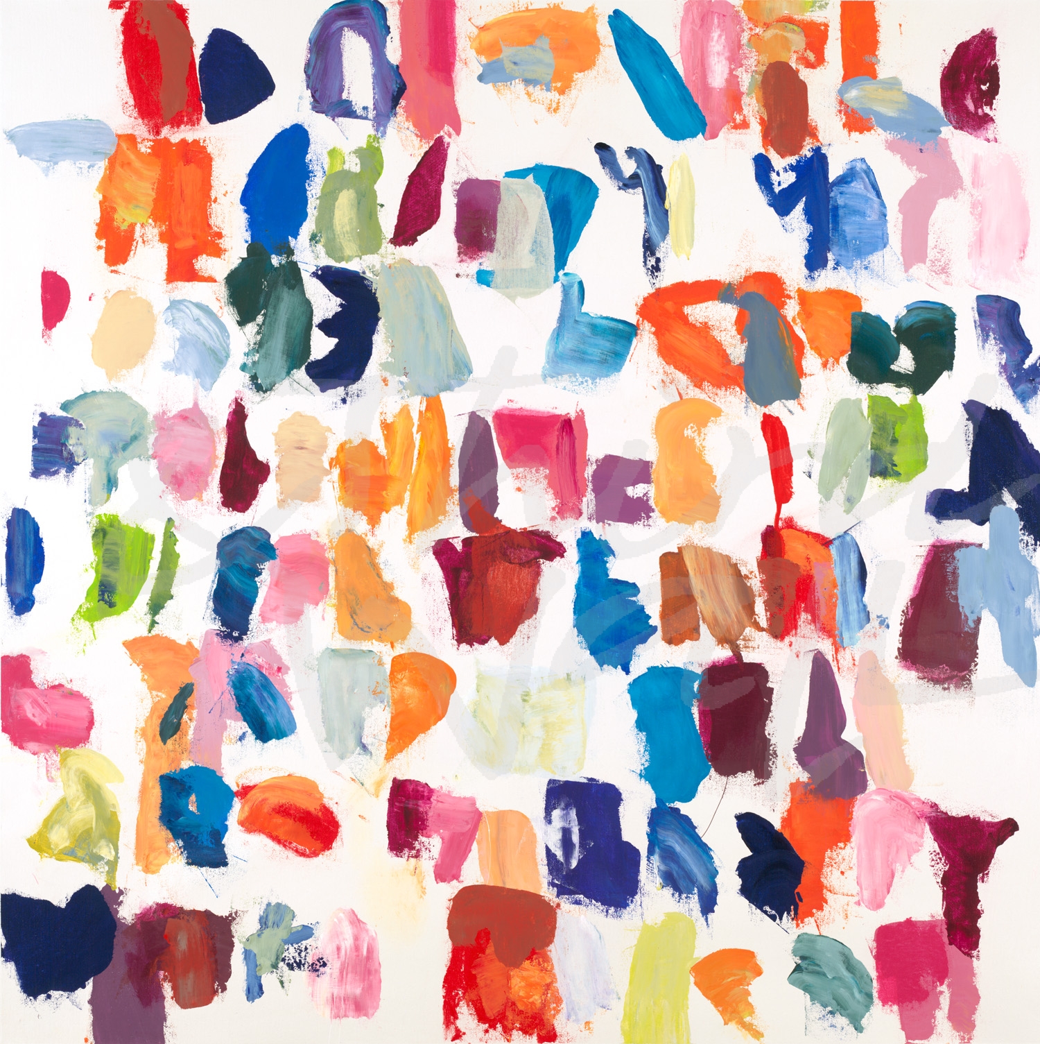
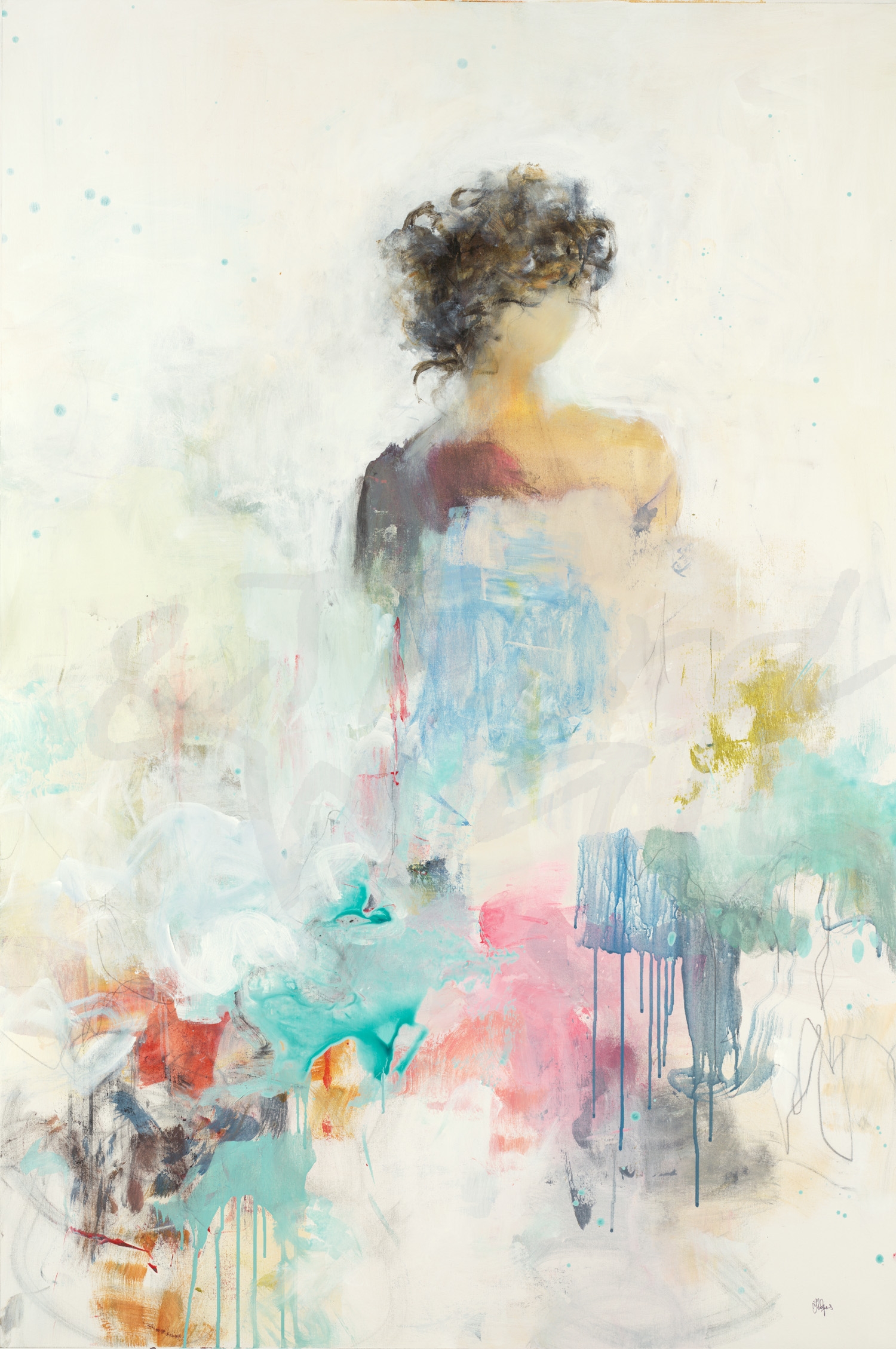
“The Anniversary” by Corrie LaVelle alt v 12 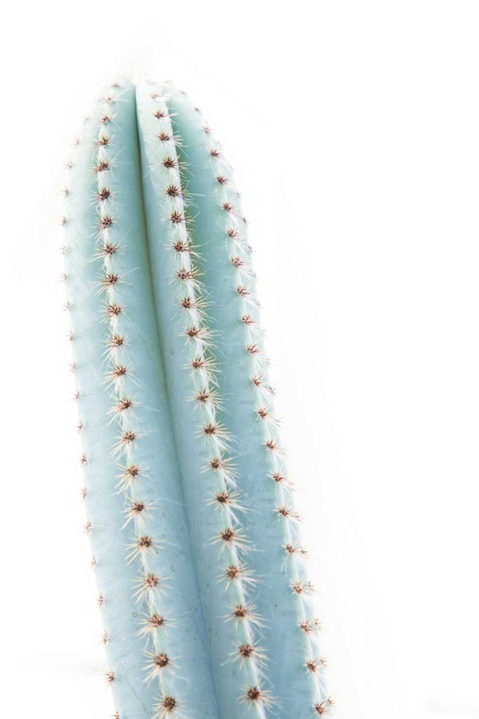
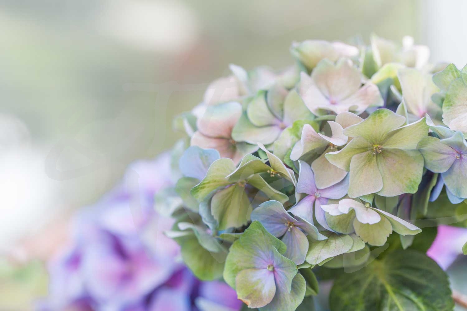
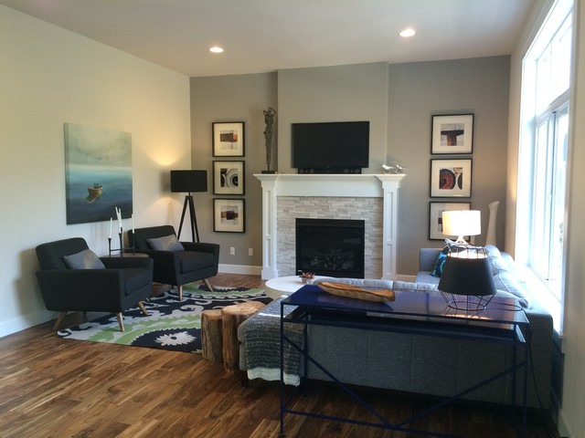
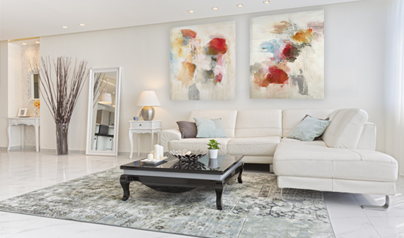
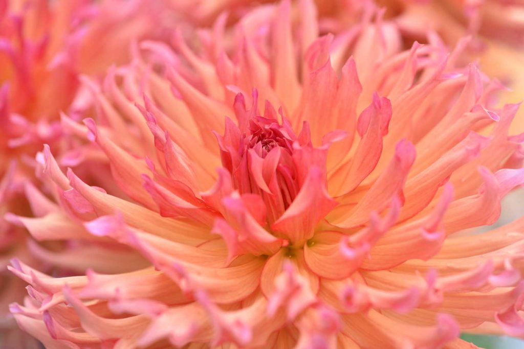
photograph by Melissa McClain 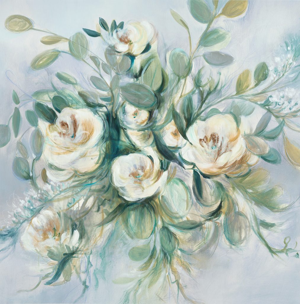
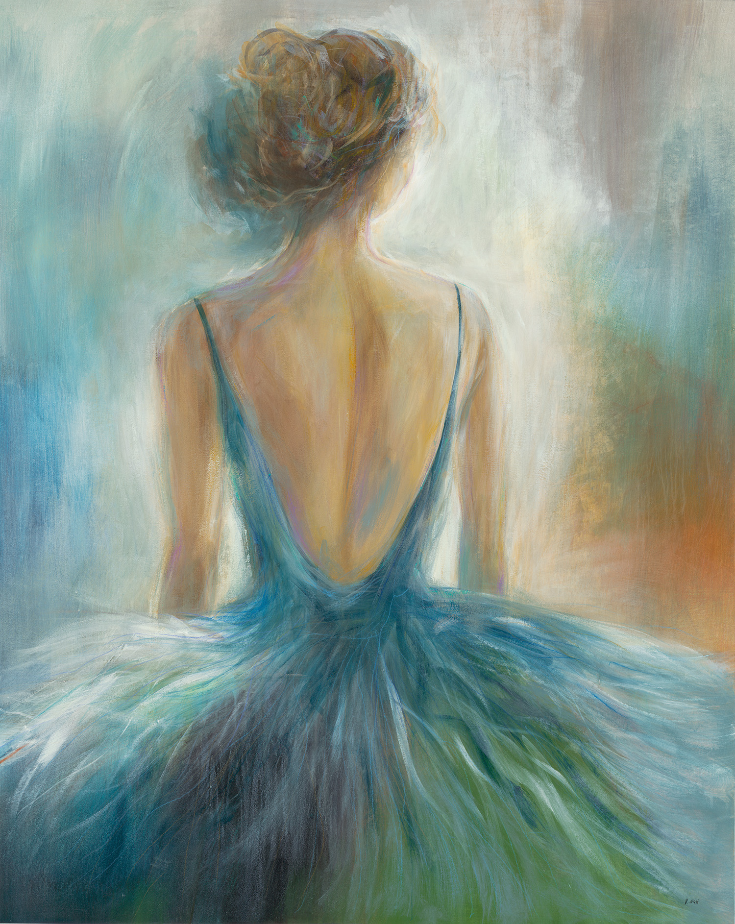
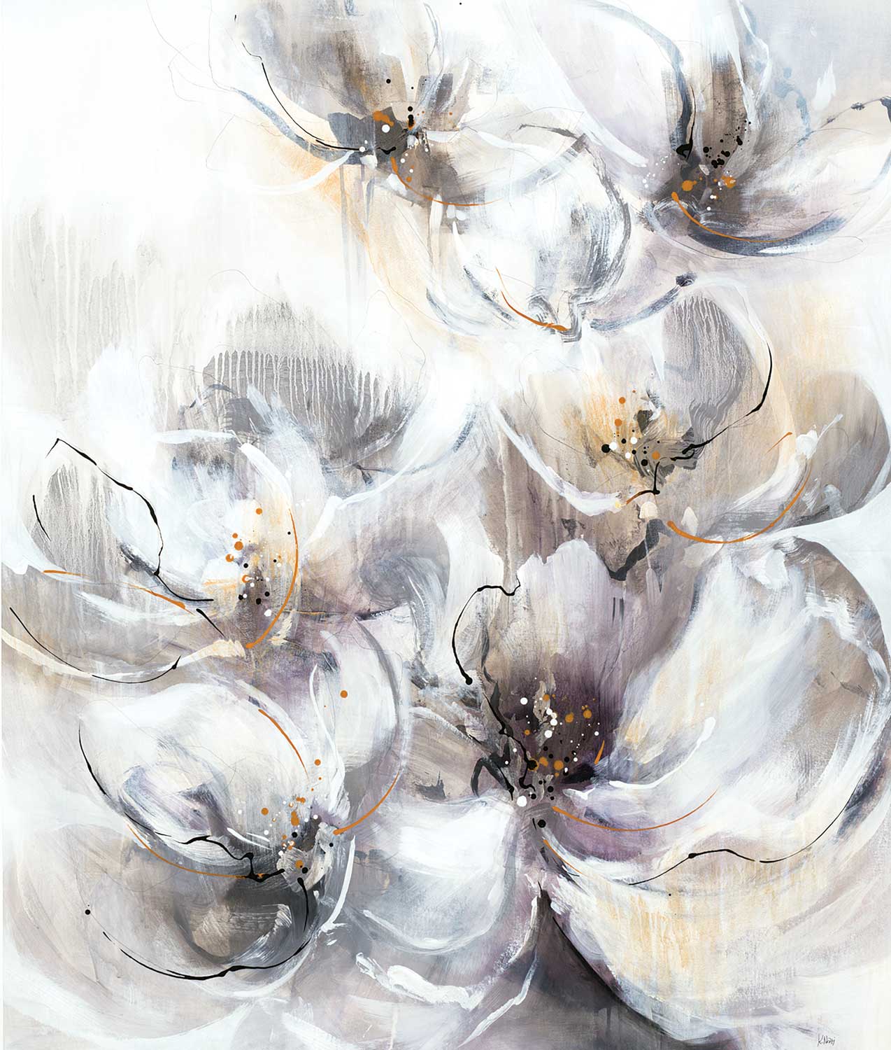
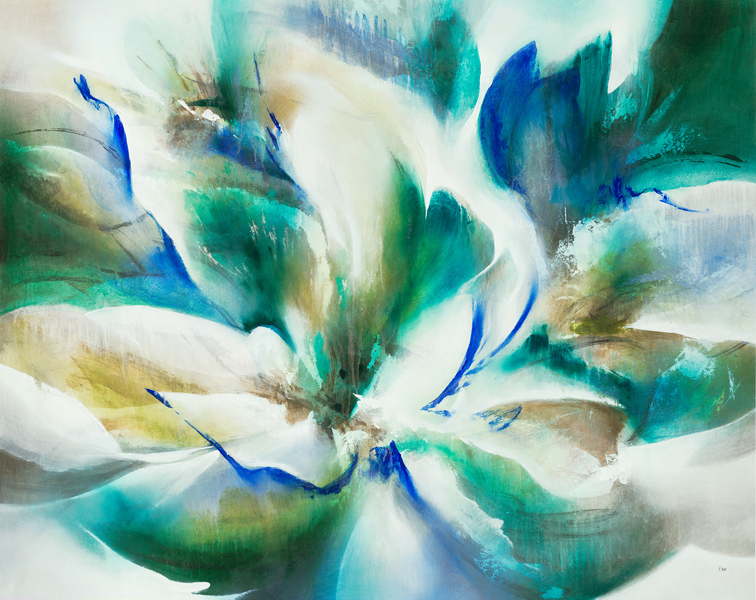
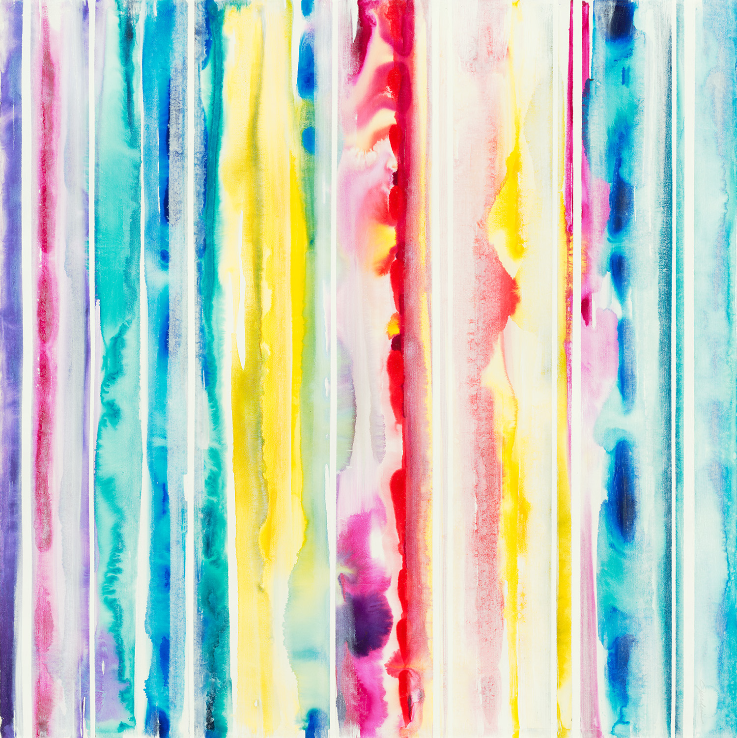
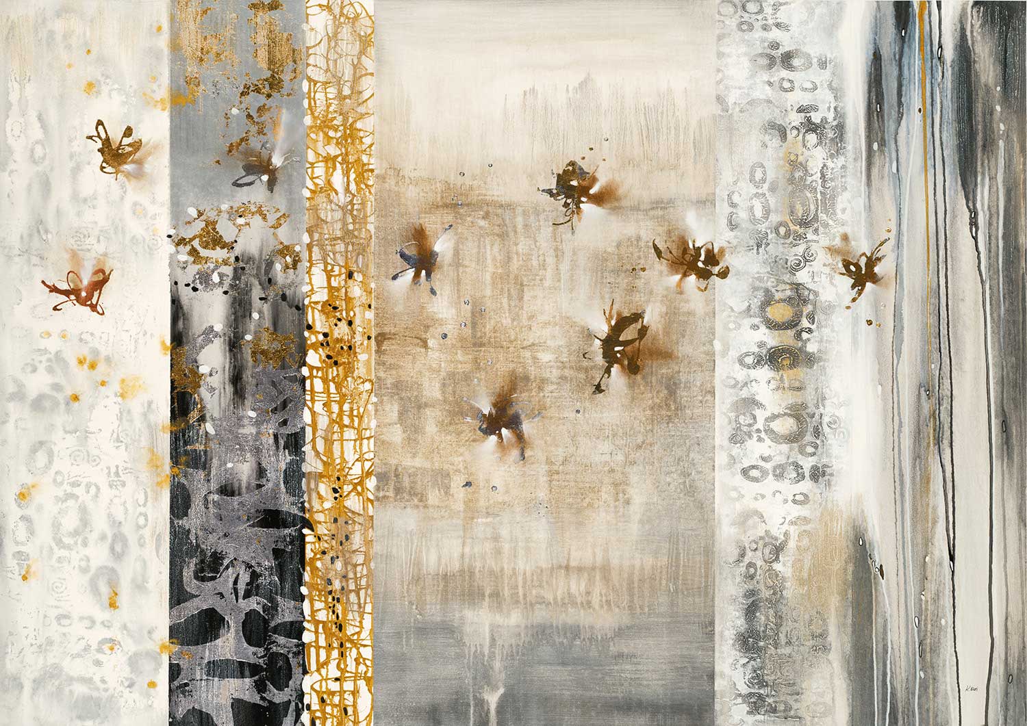
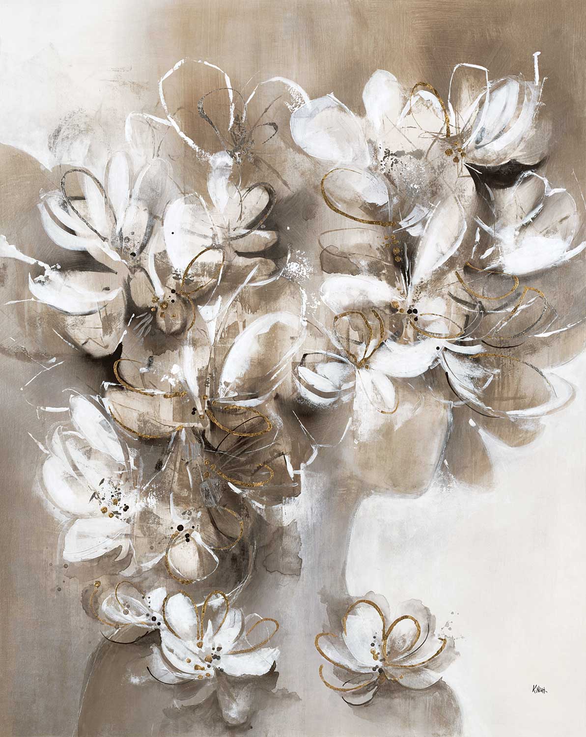
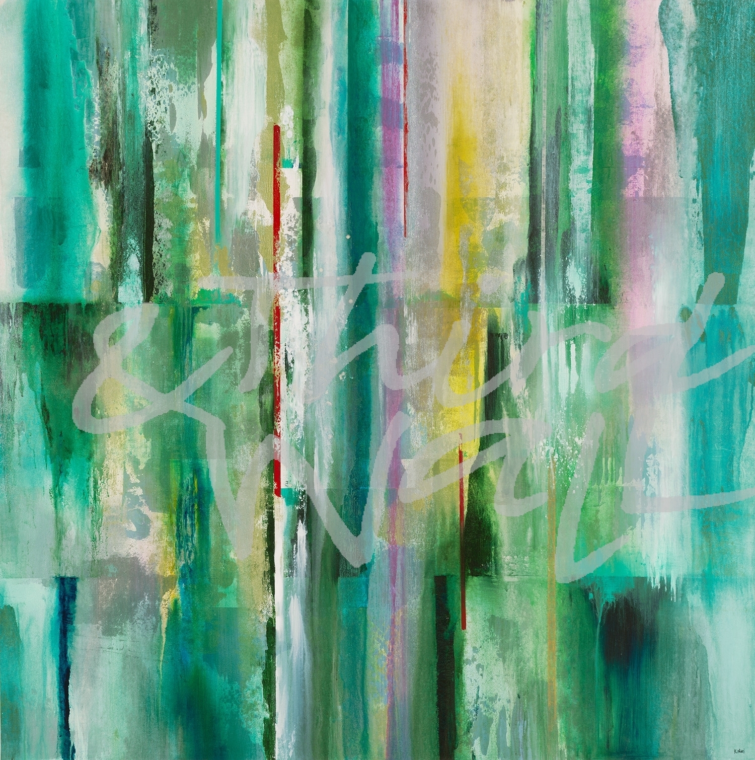
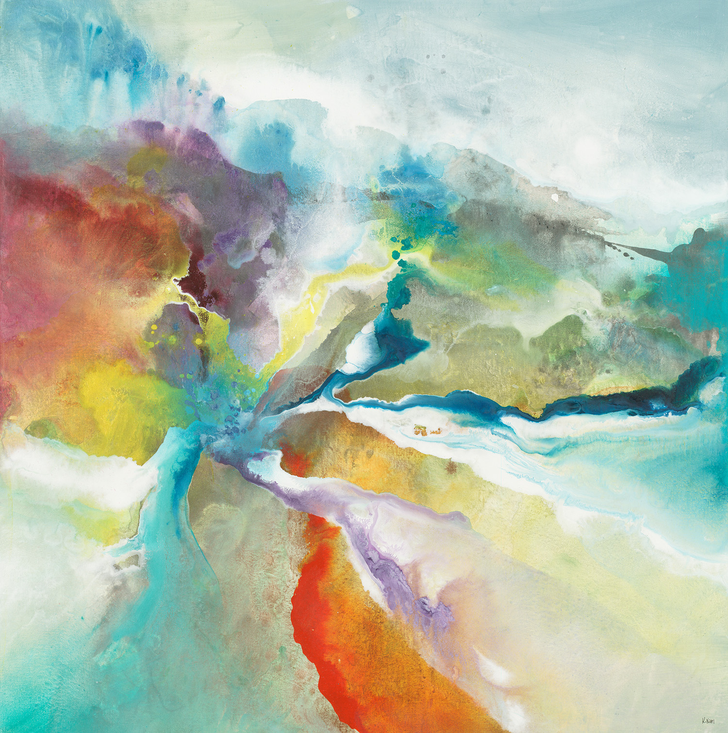
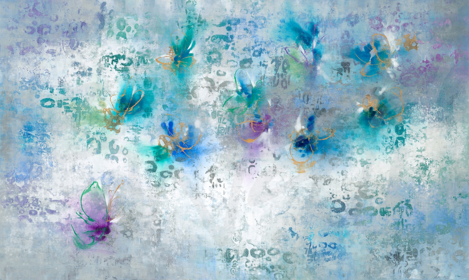
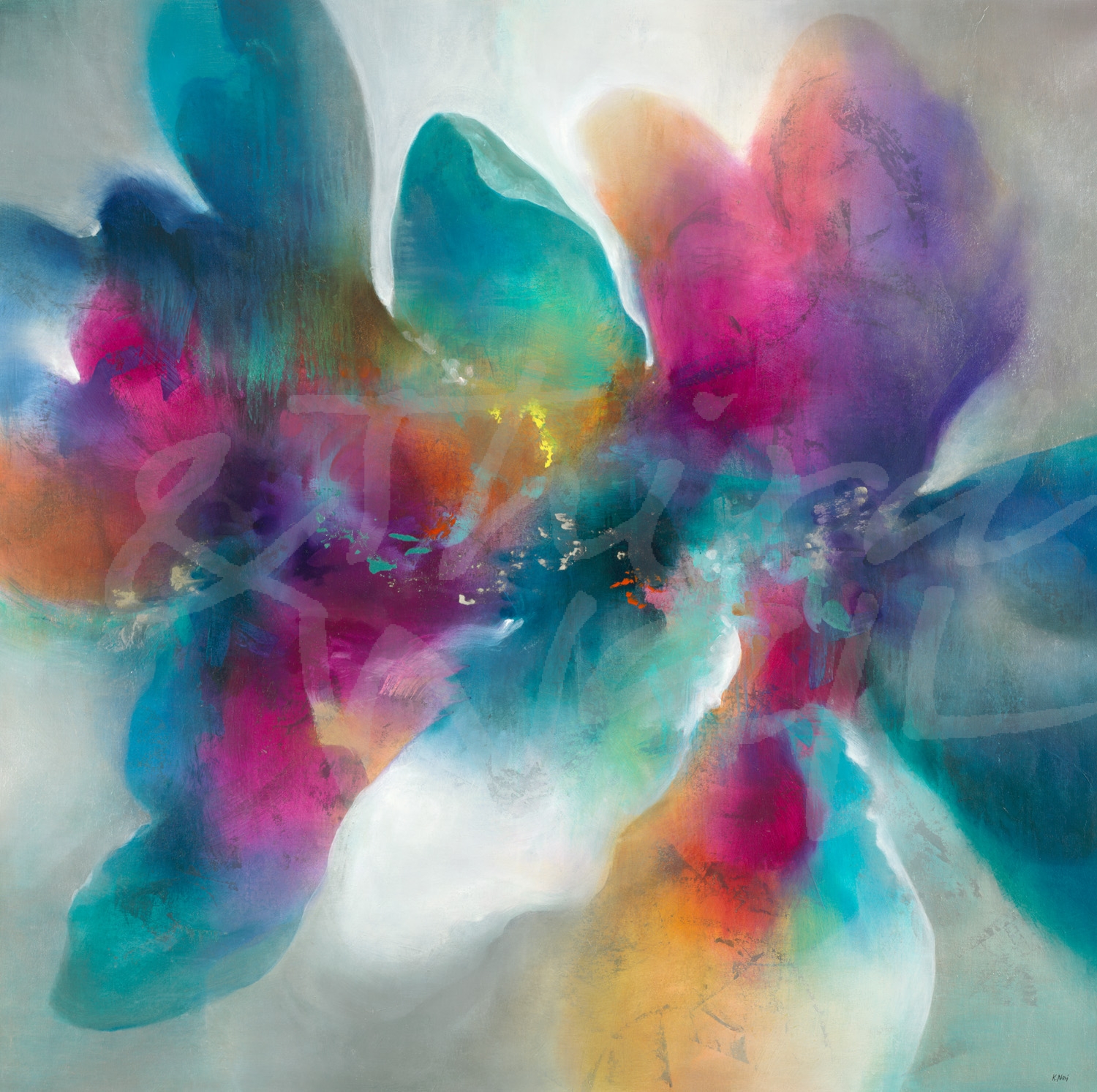
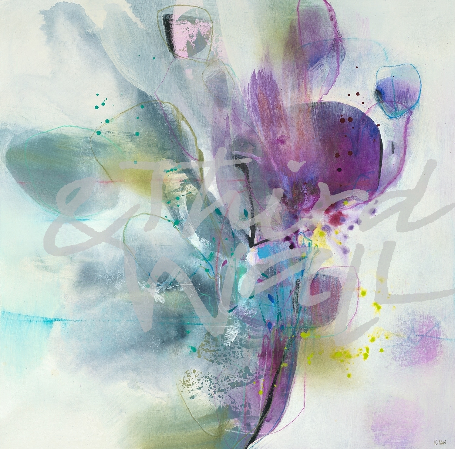
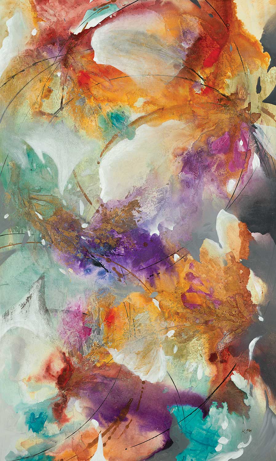
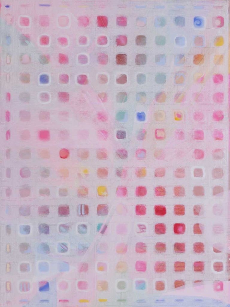
“Sage Lush” by K. Nari 
photograph by Aaron Matheson 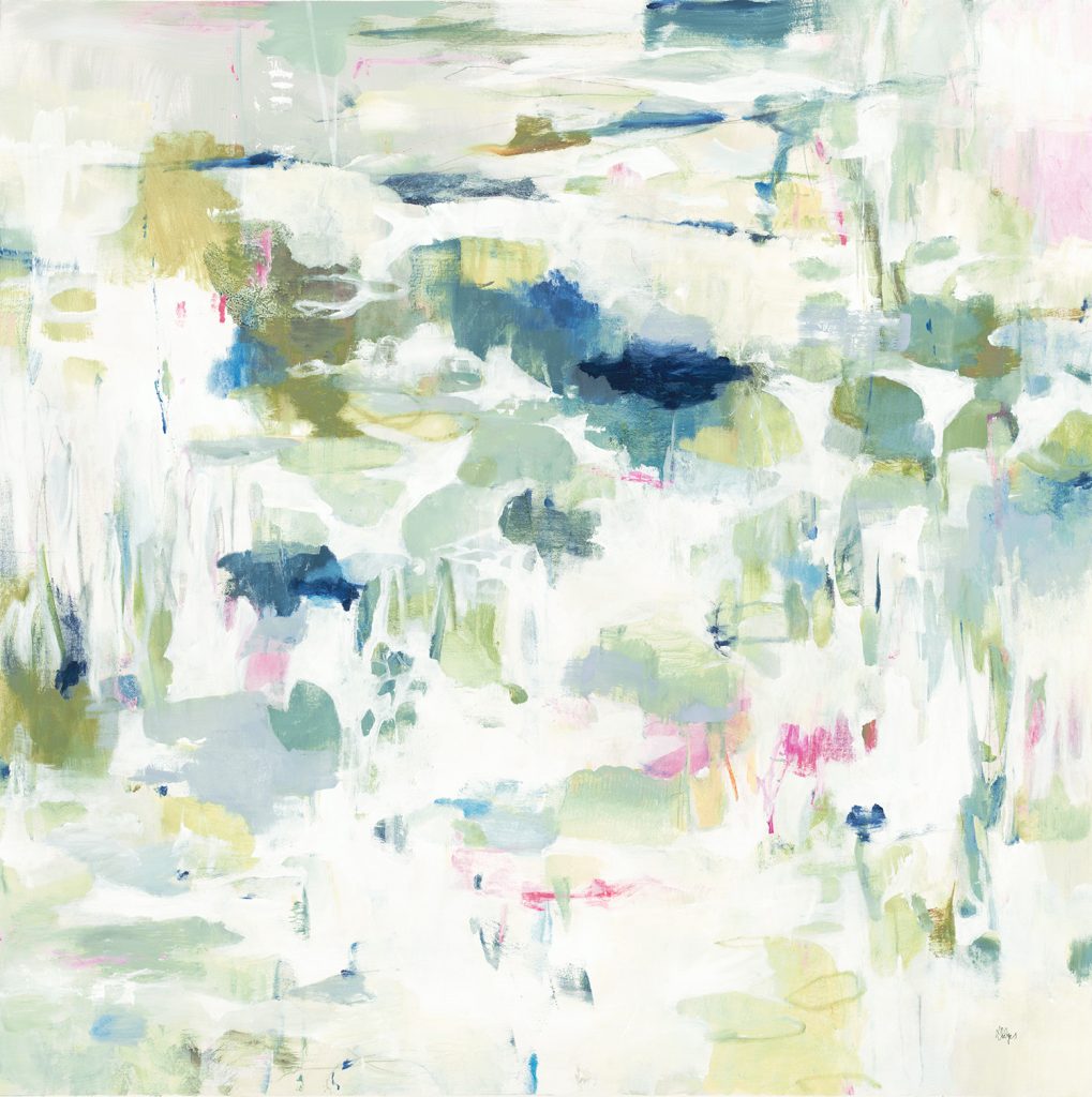
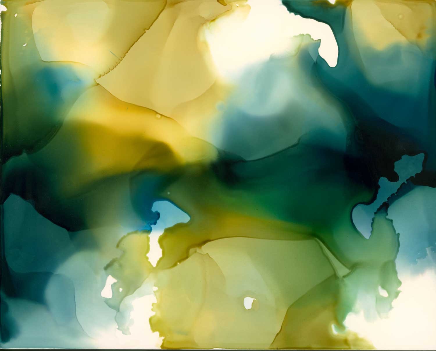
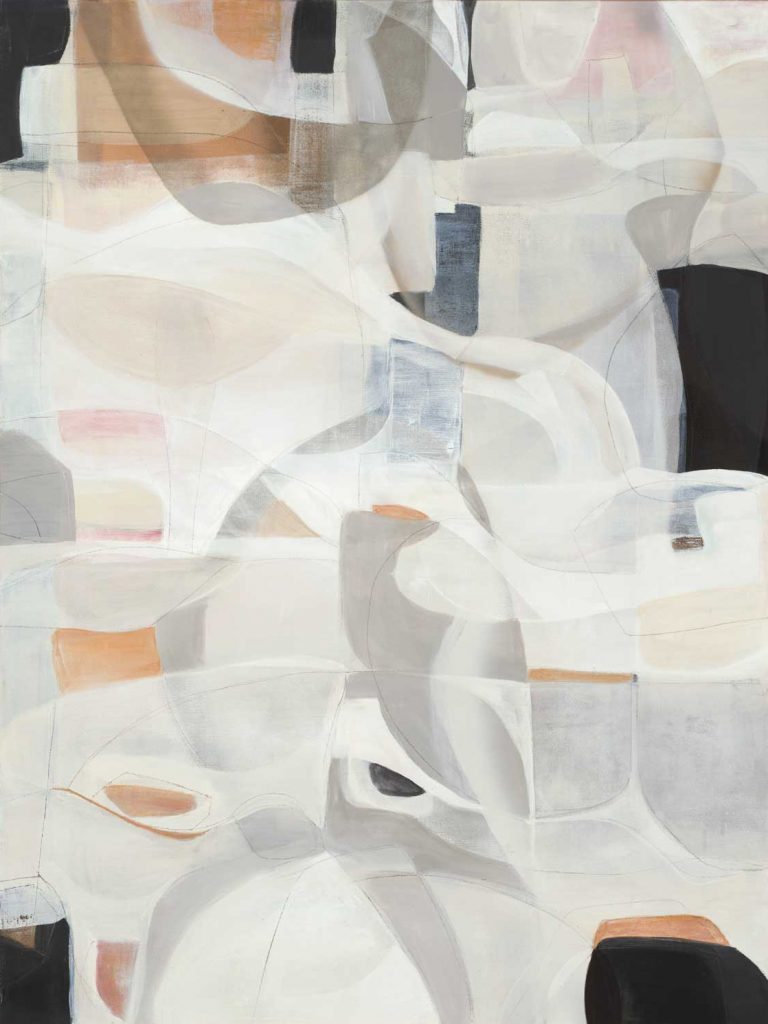
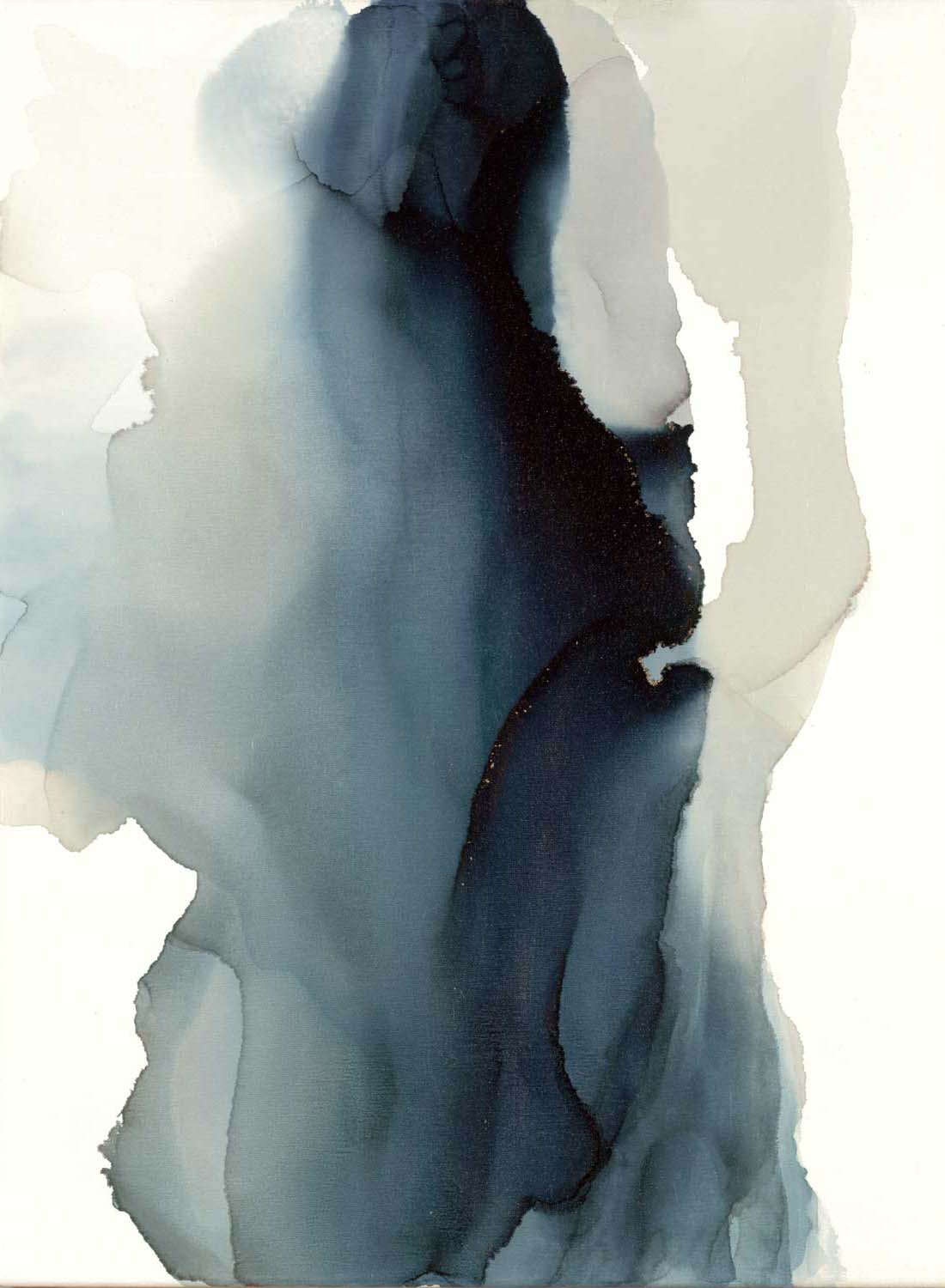
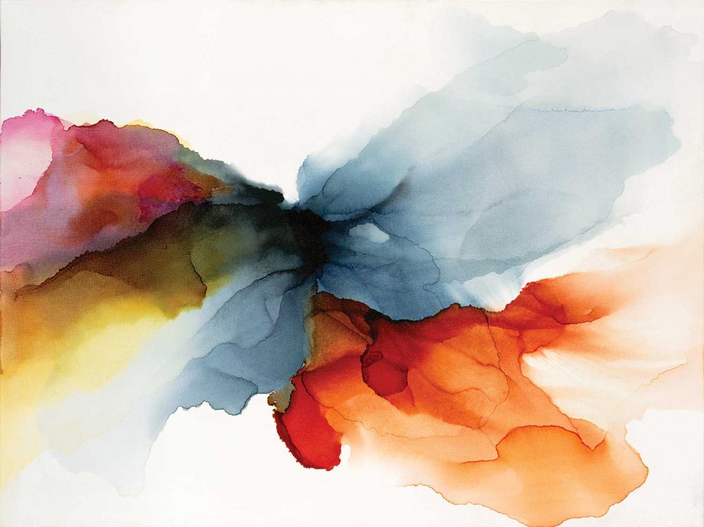
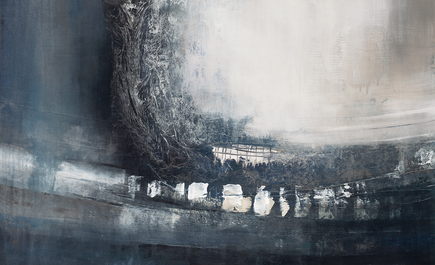
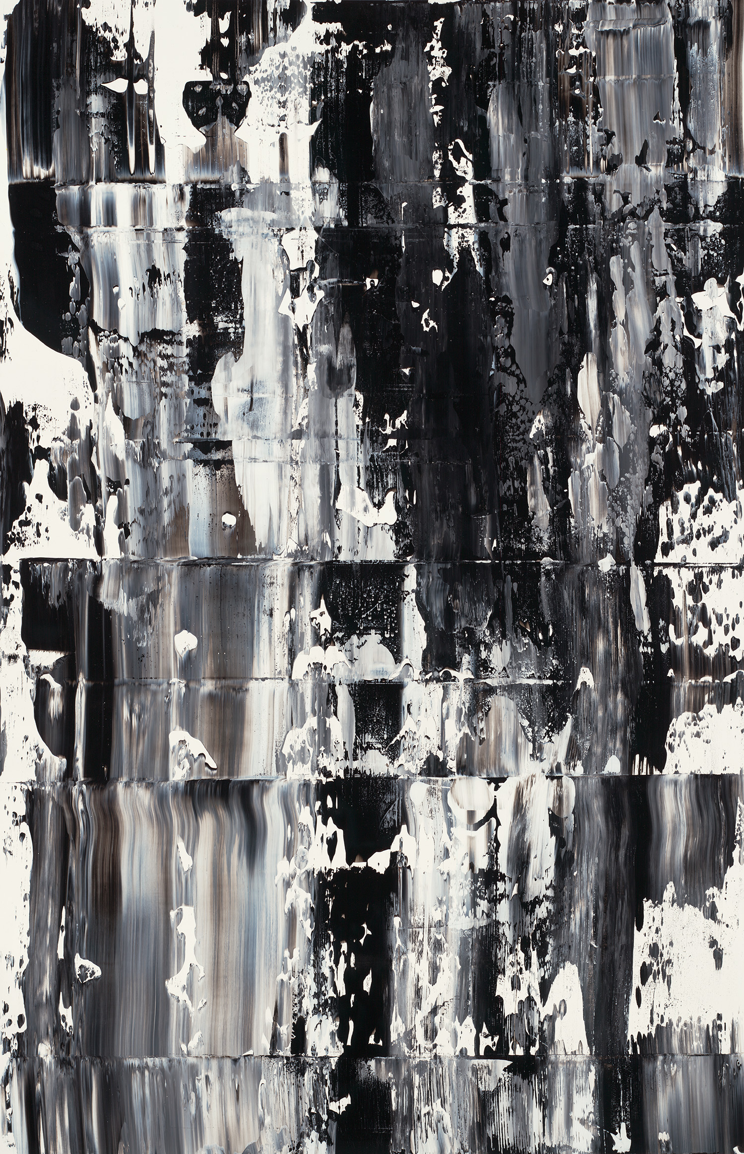
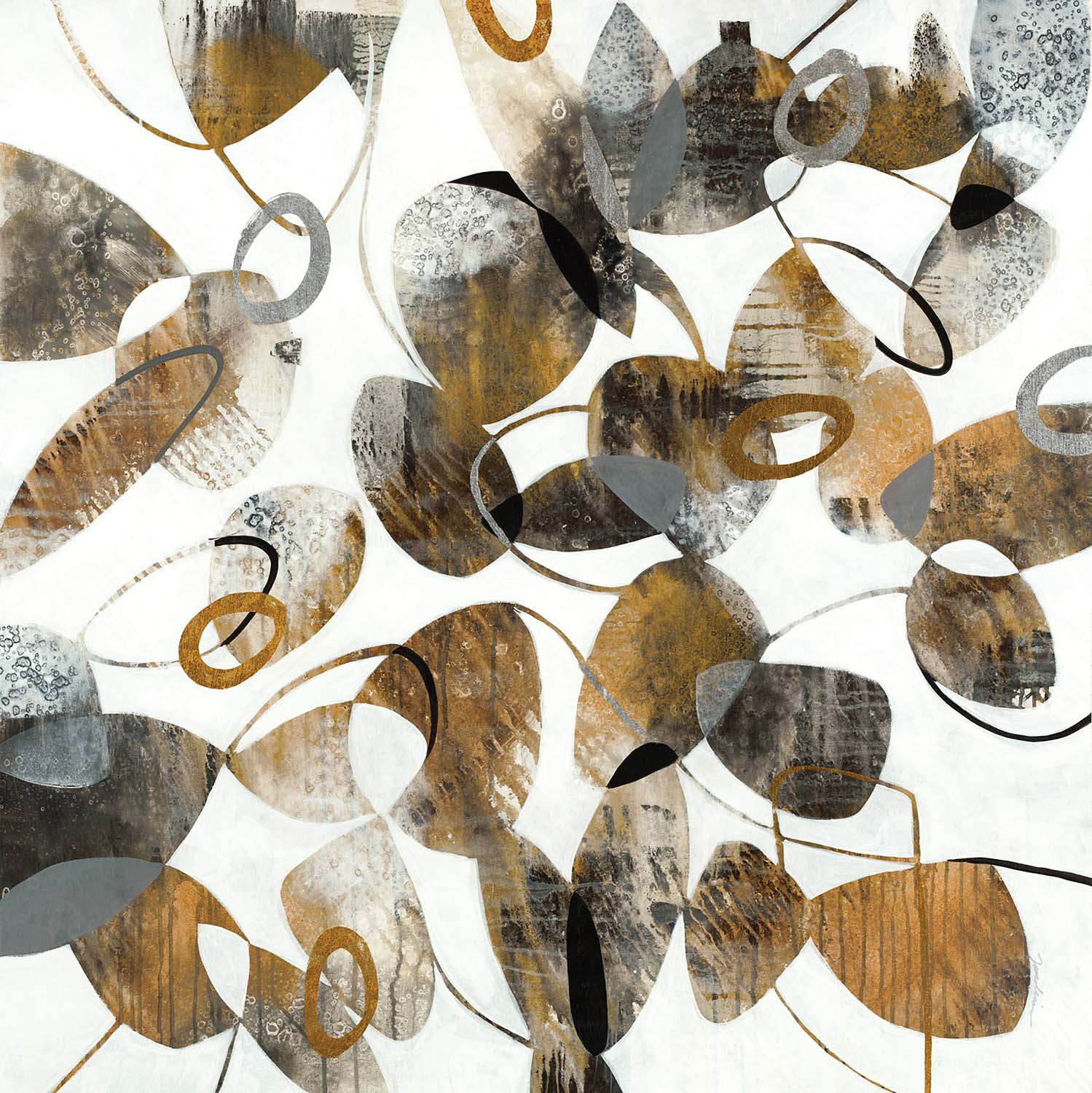
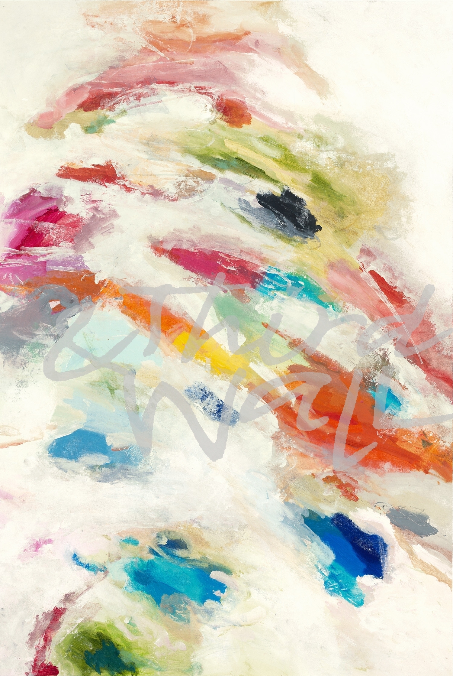
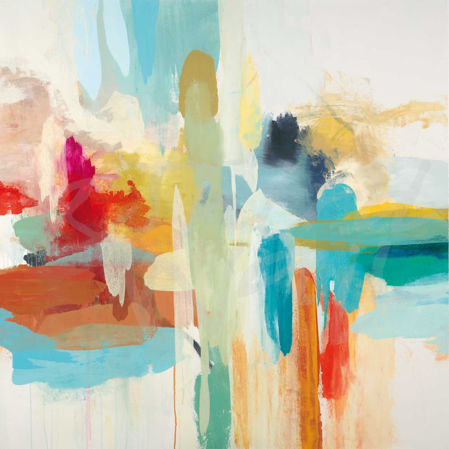
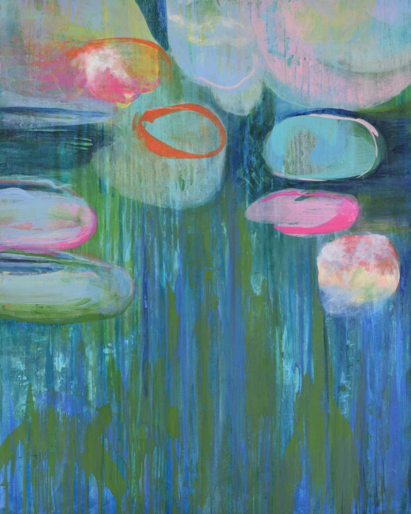
“Abstract Reflections” by Lisa Ridgers 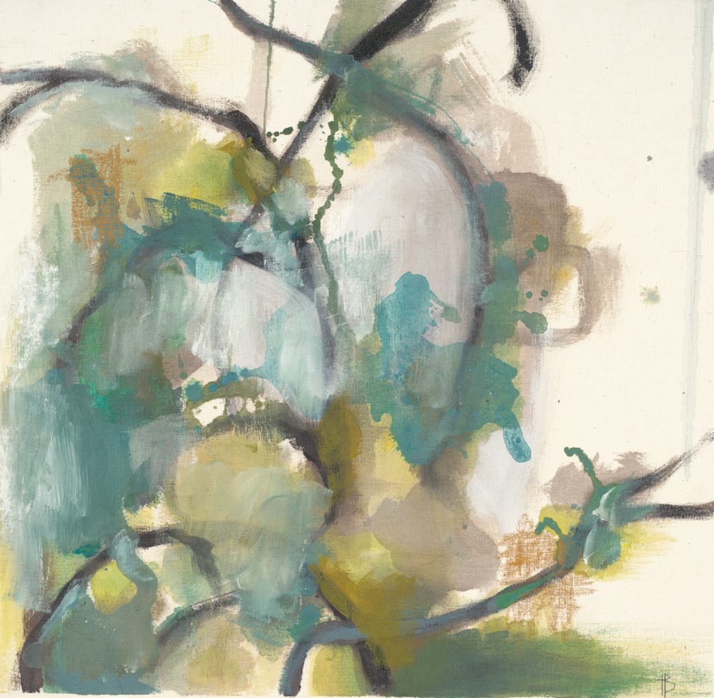
“Tropical Vines” by Terri Burris 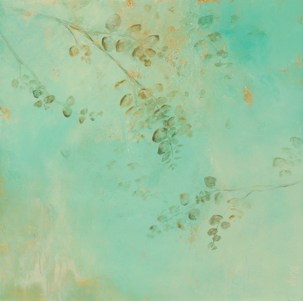
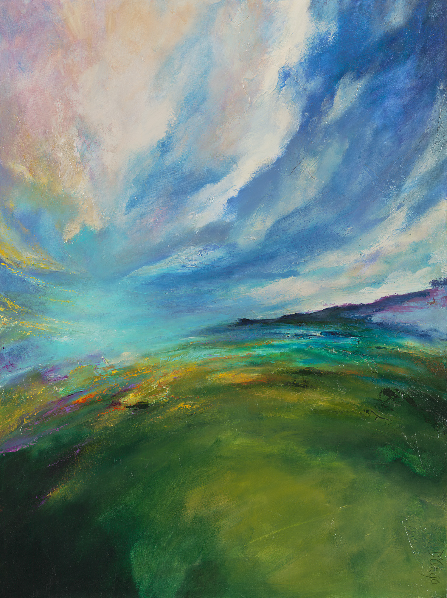
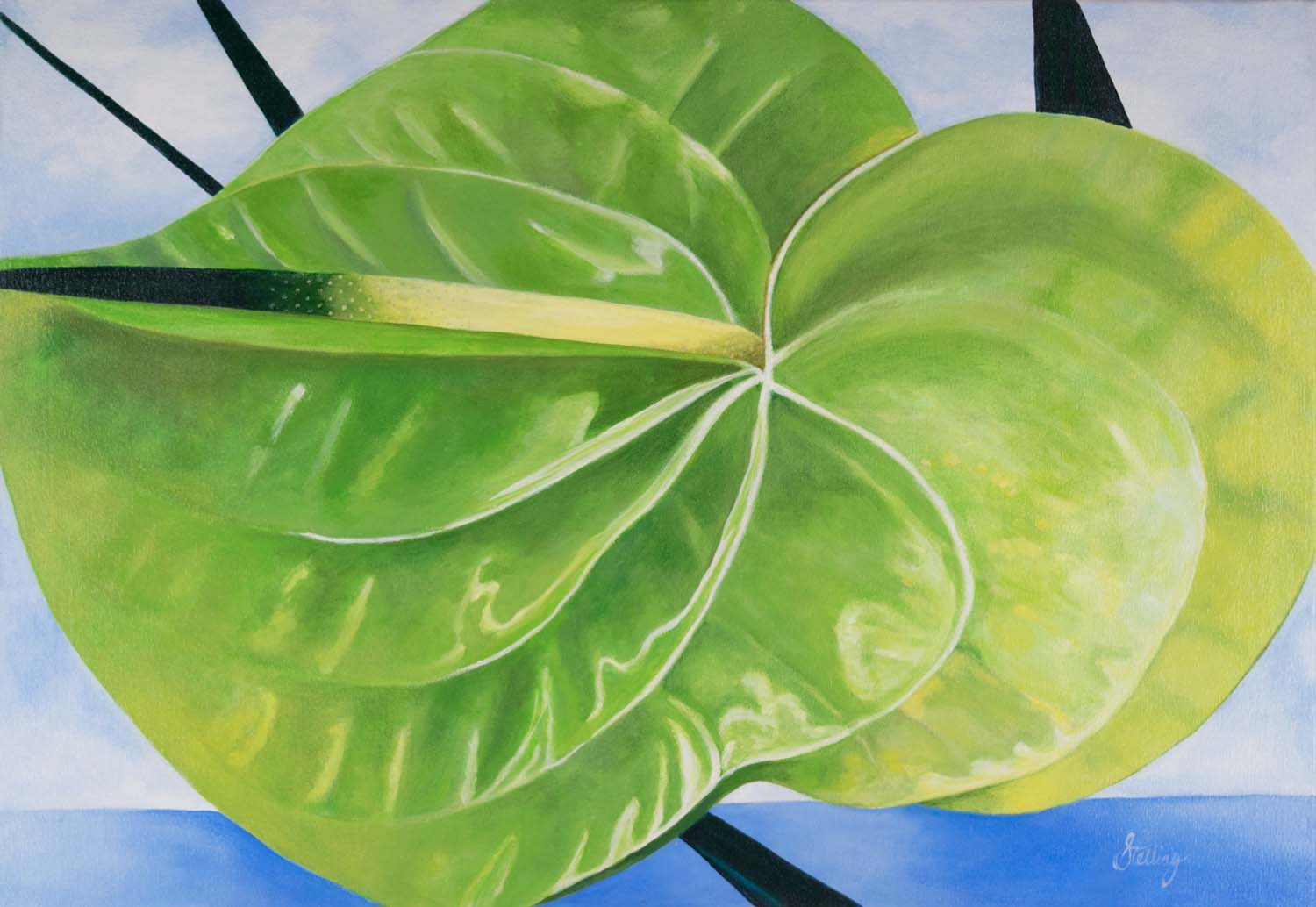
“Soft Eucalyptus II” by Dina D’Argo 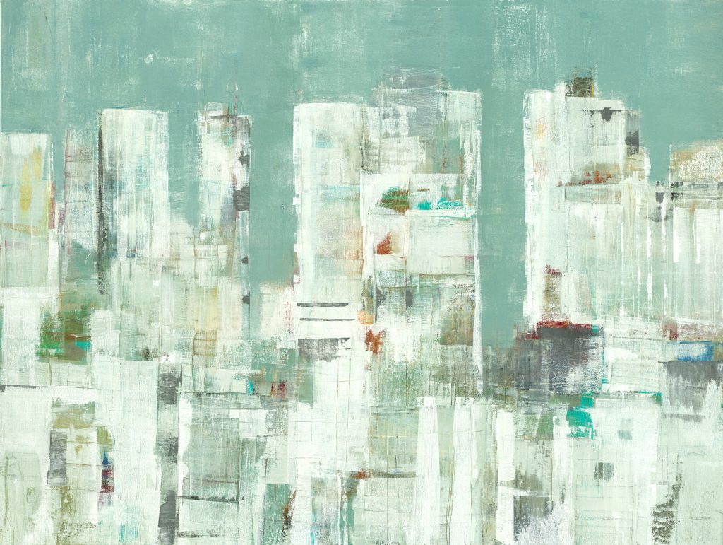
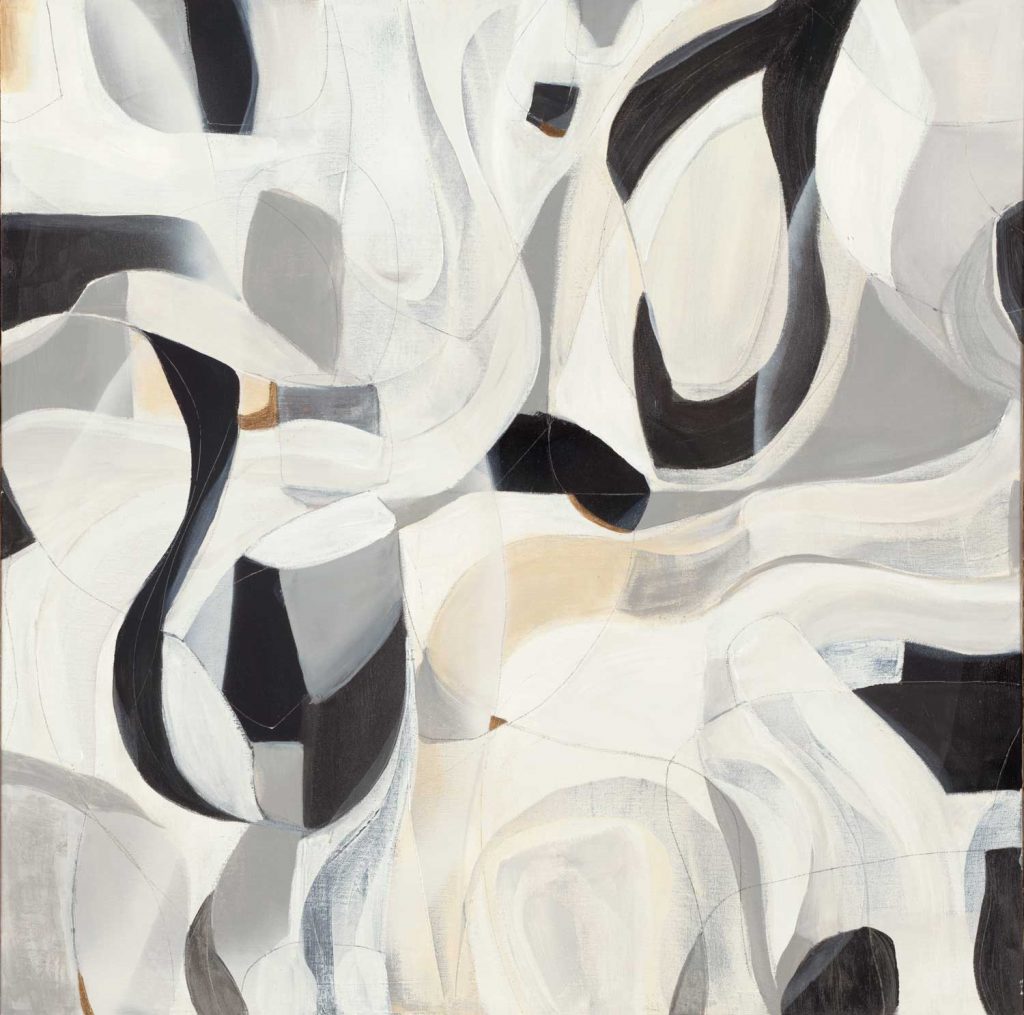
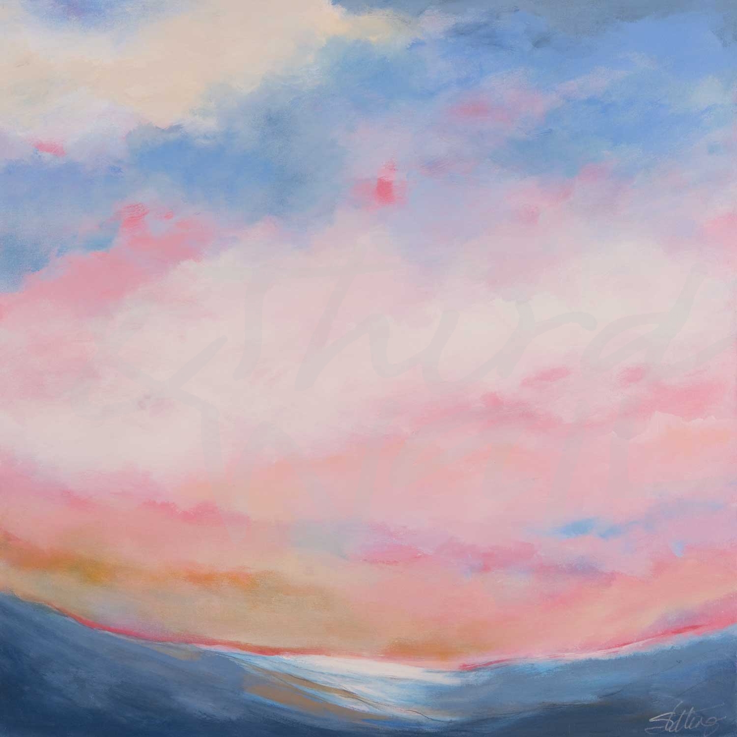
“Skyline II” by Lisa Ridgers 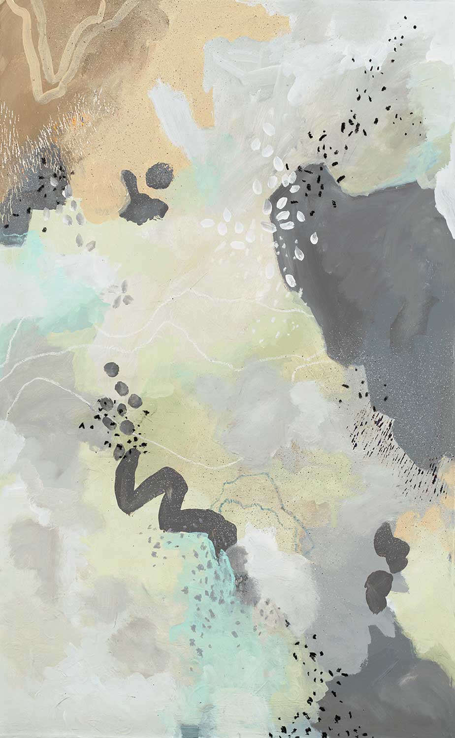
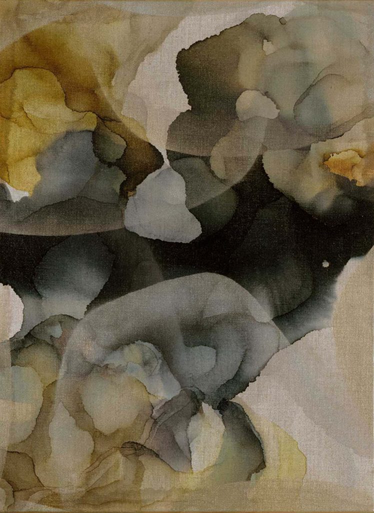
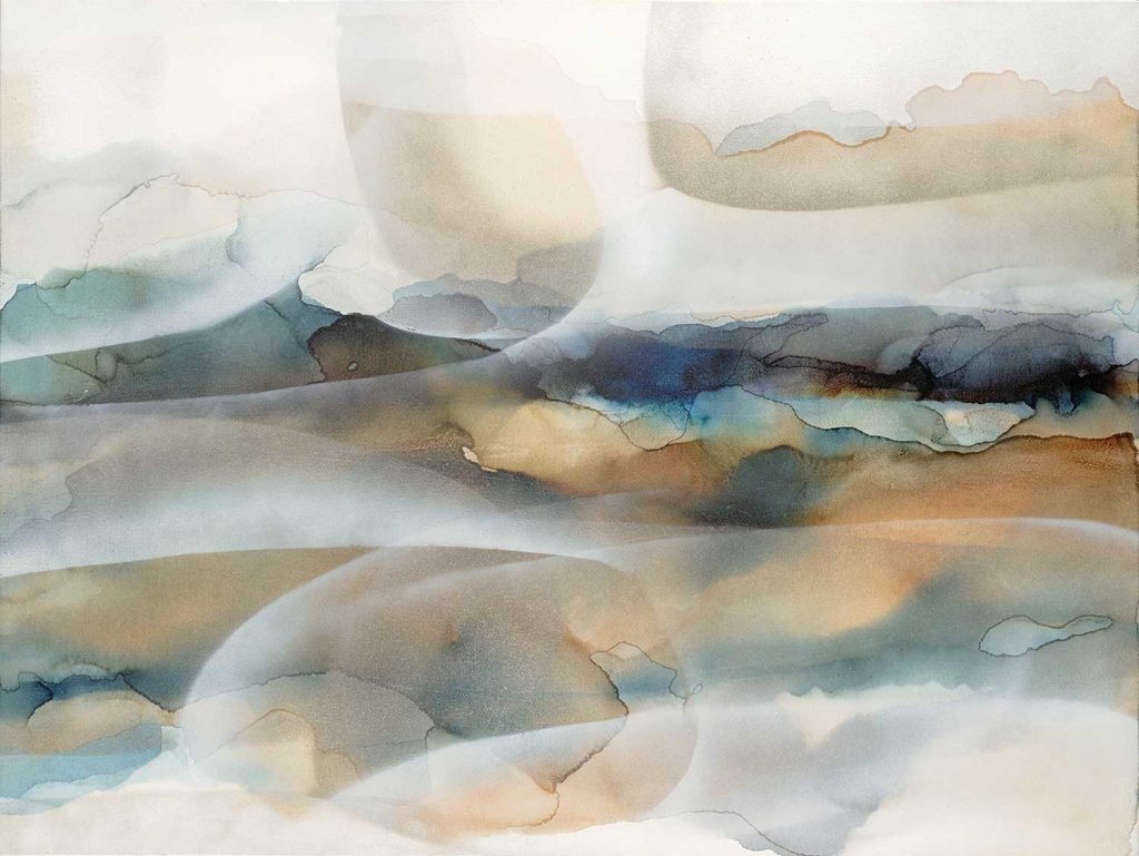
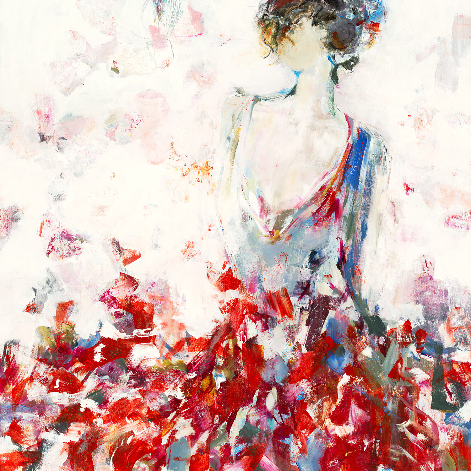
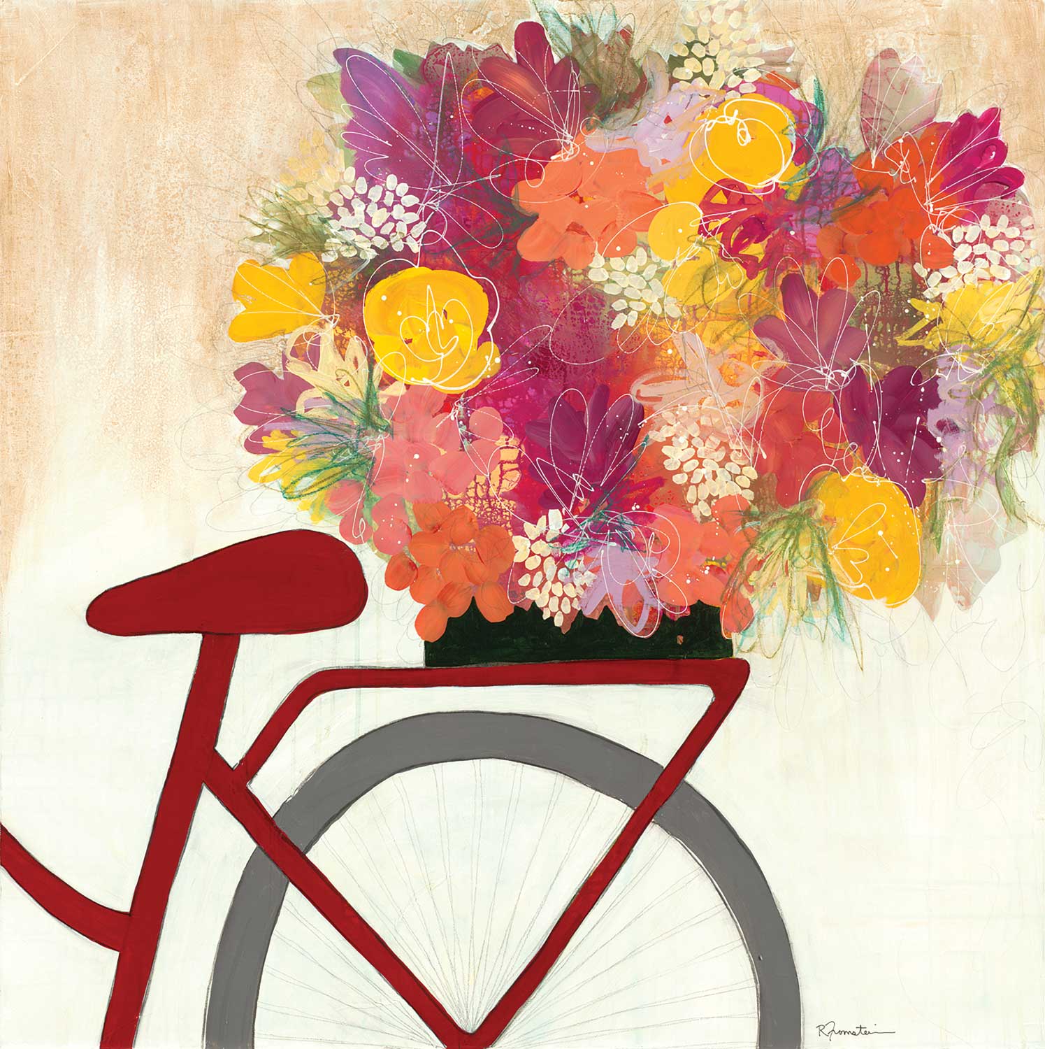
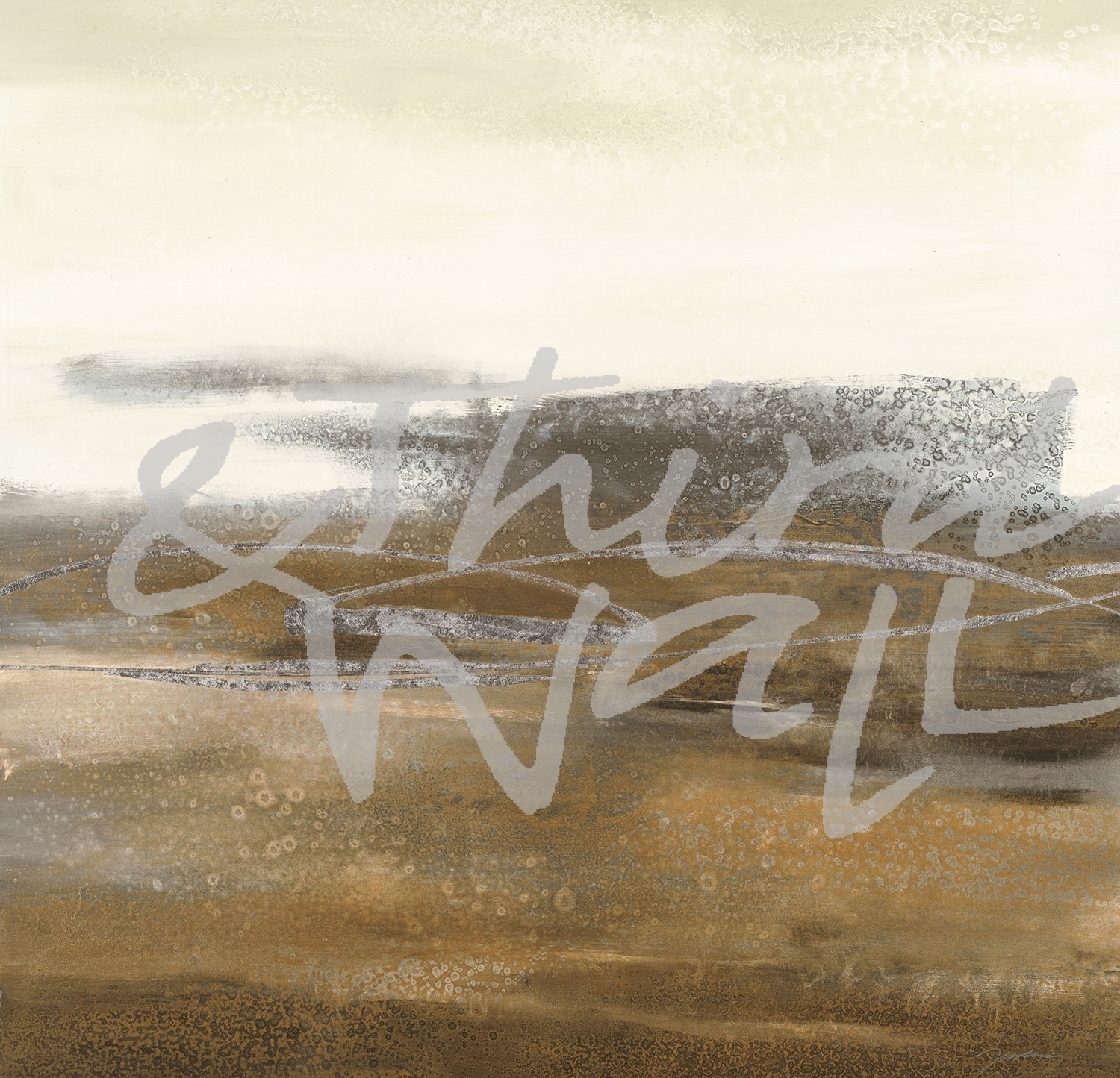
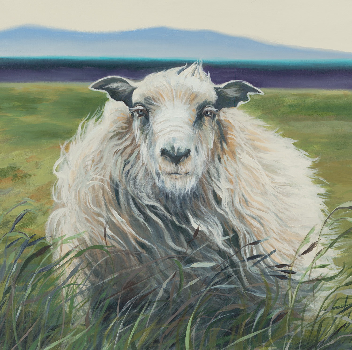
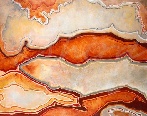
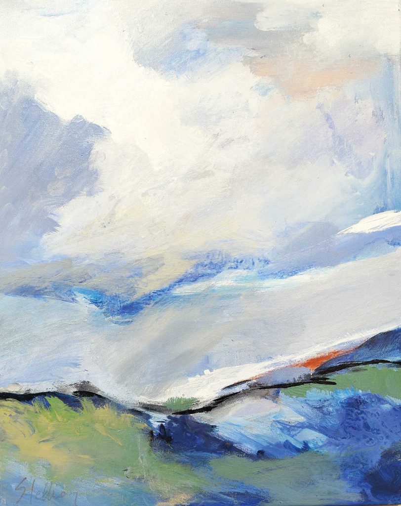
“Forecasting Change” by Ruth Fromstein
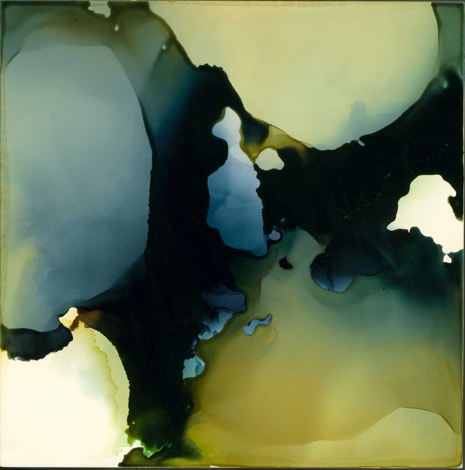
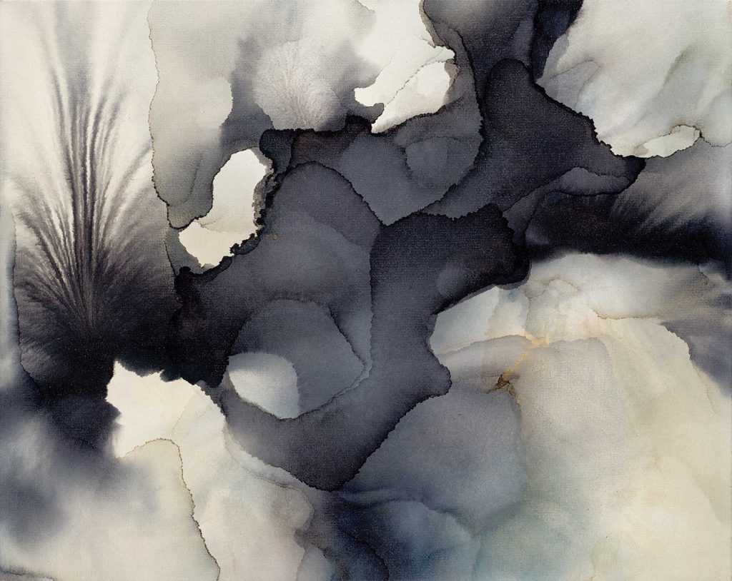
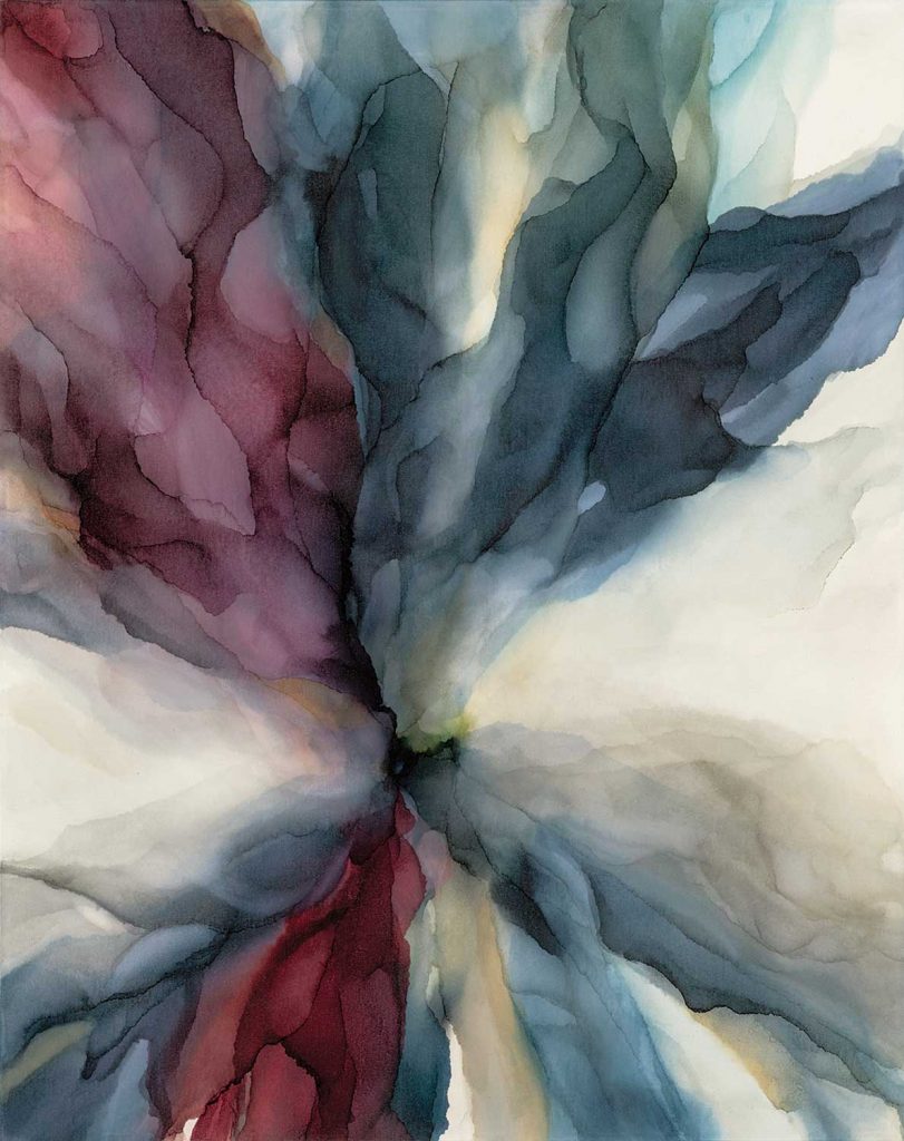
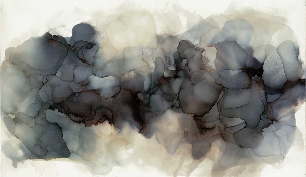
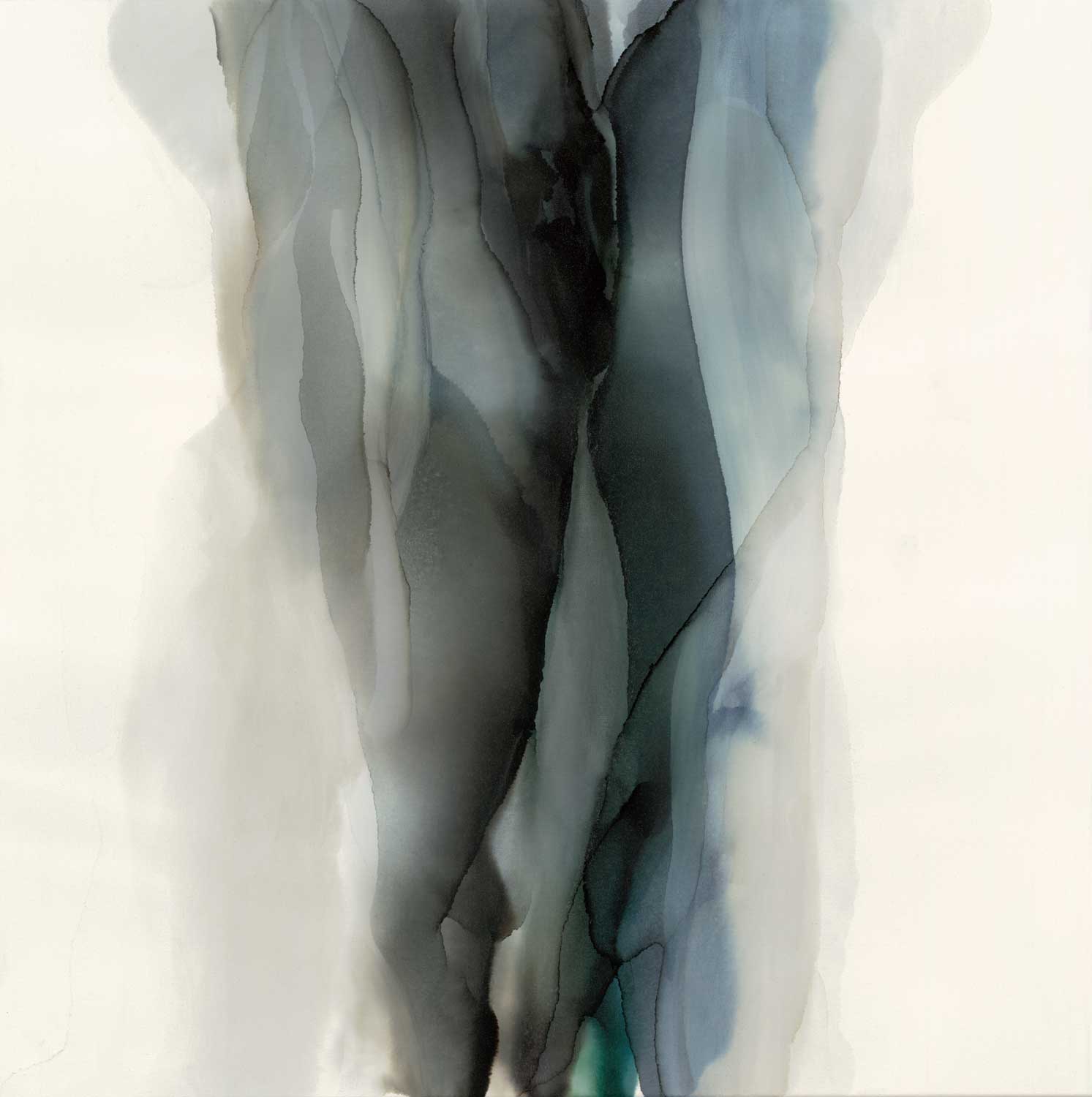
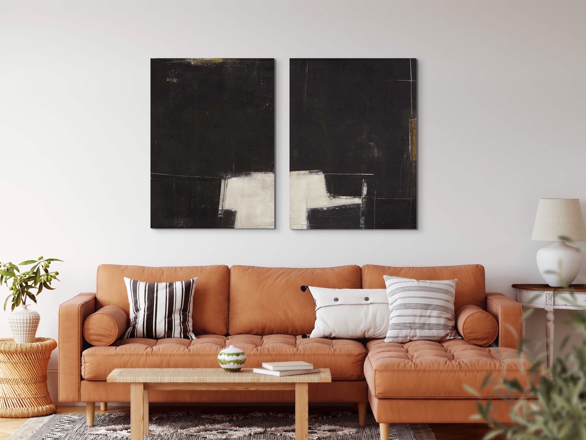
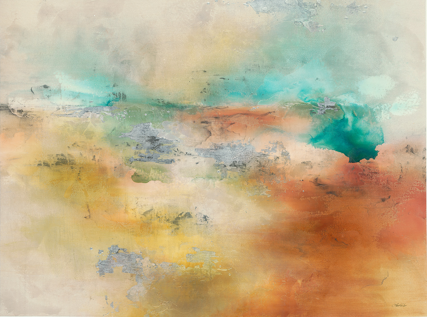
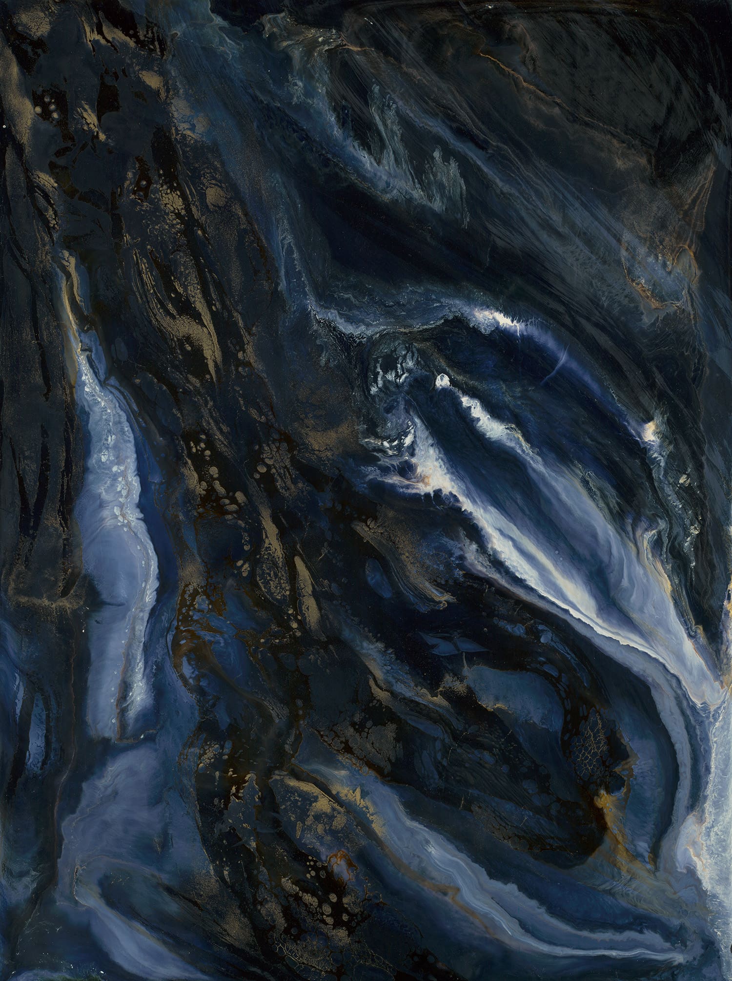
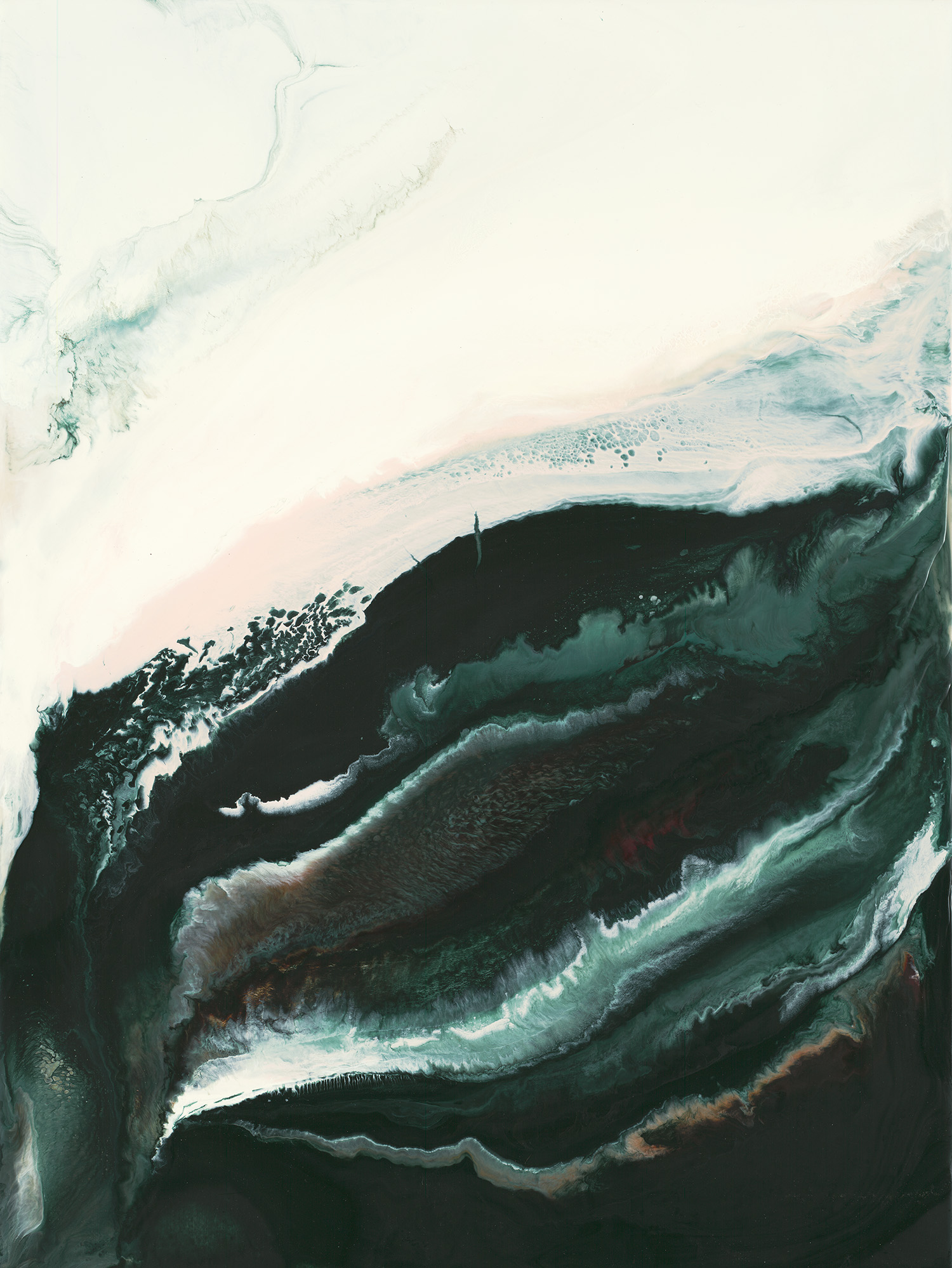
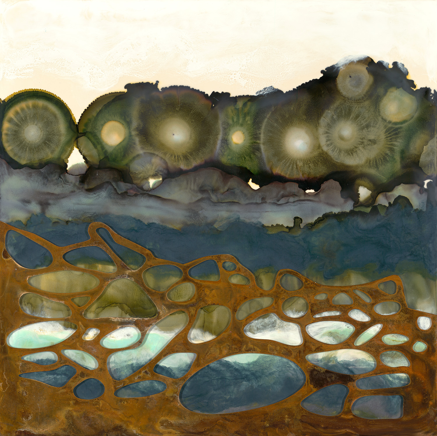
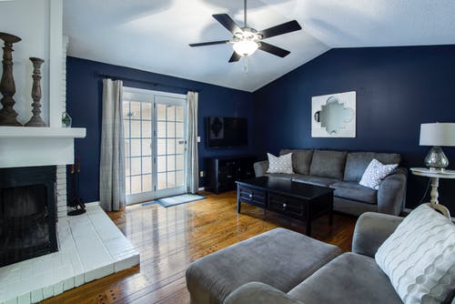
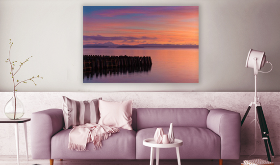
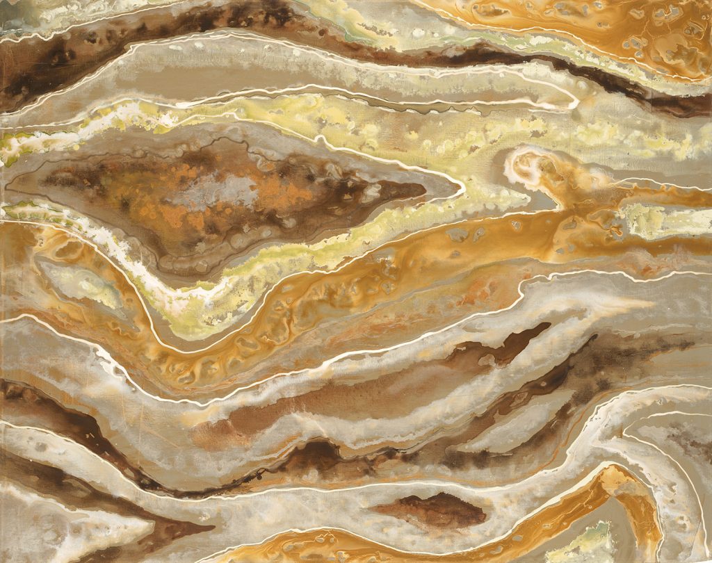
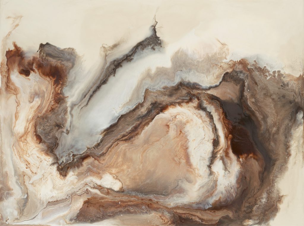
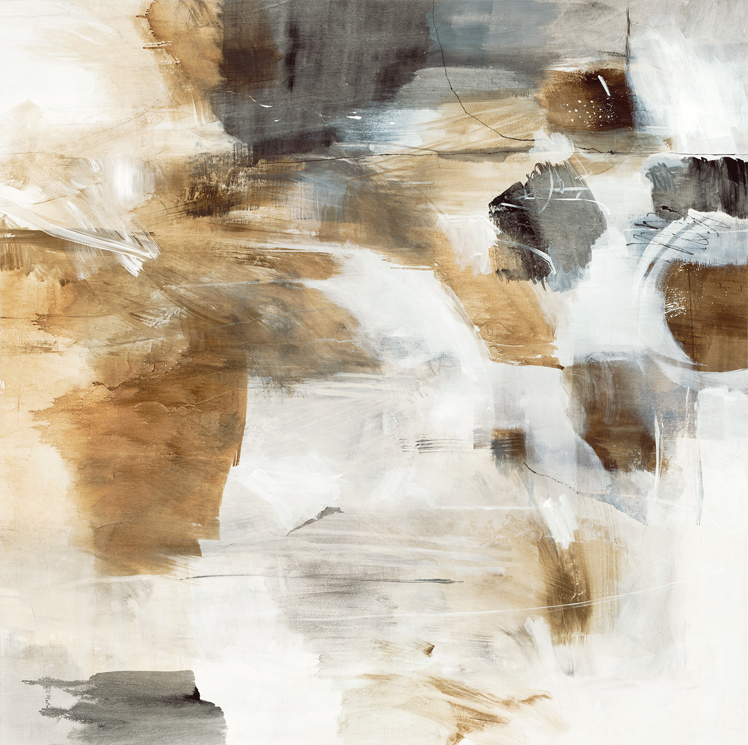
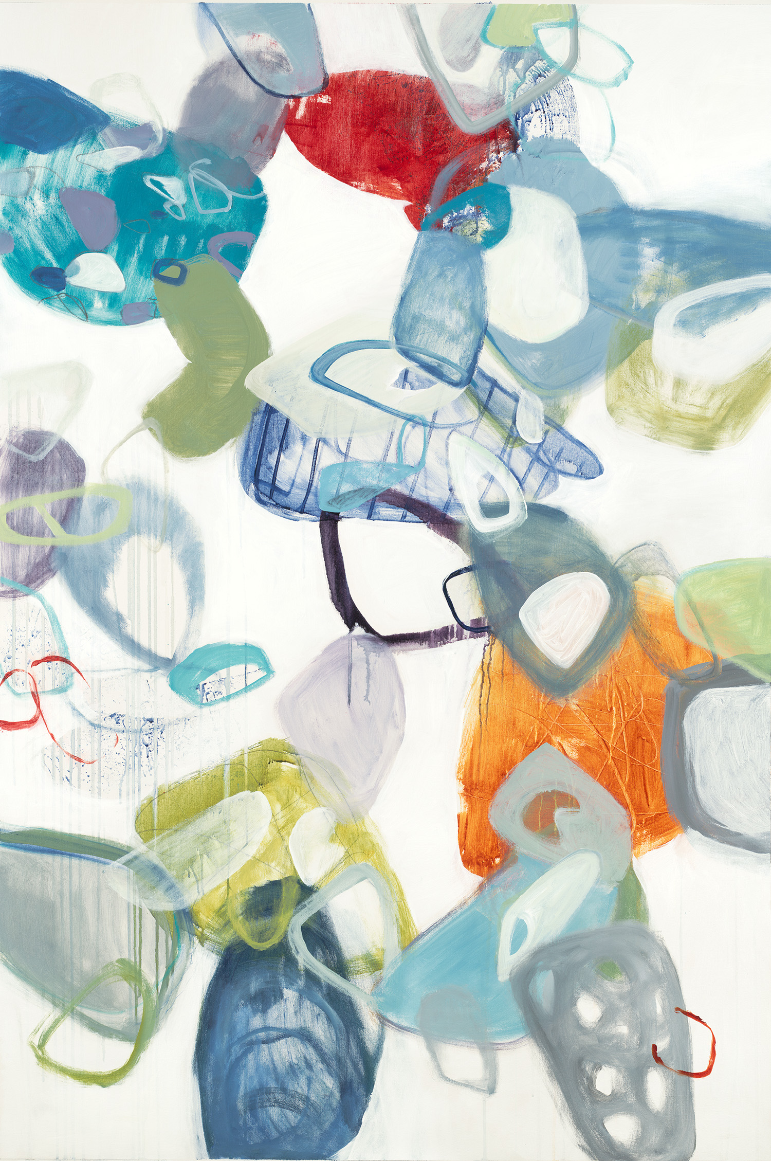
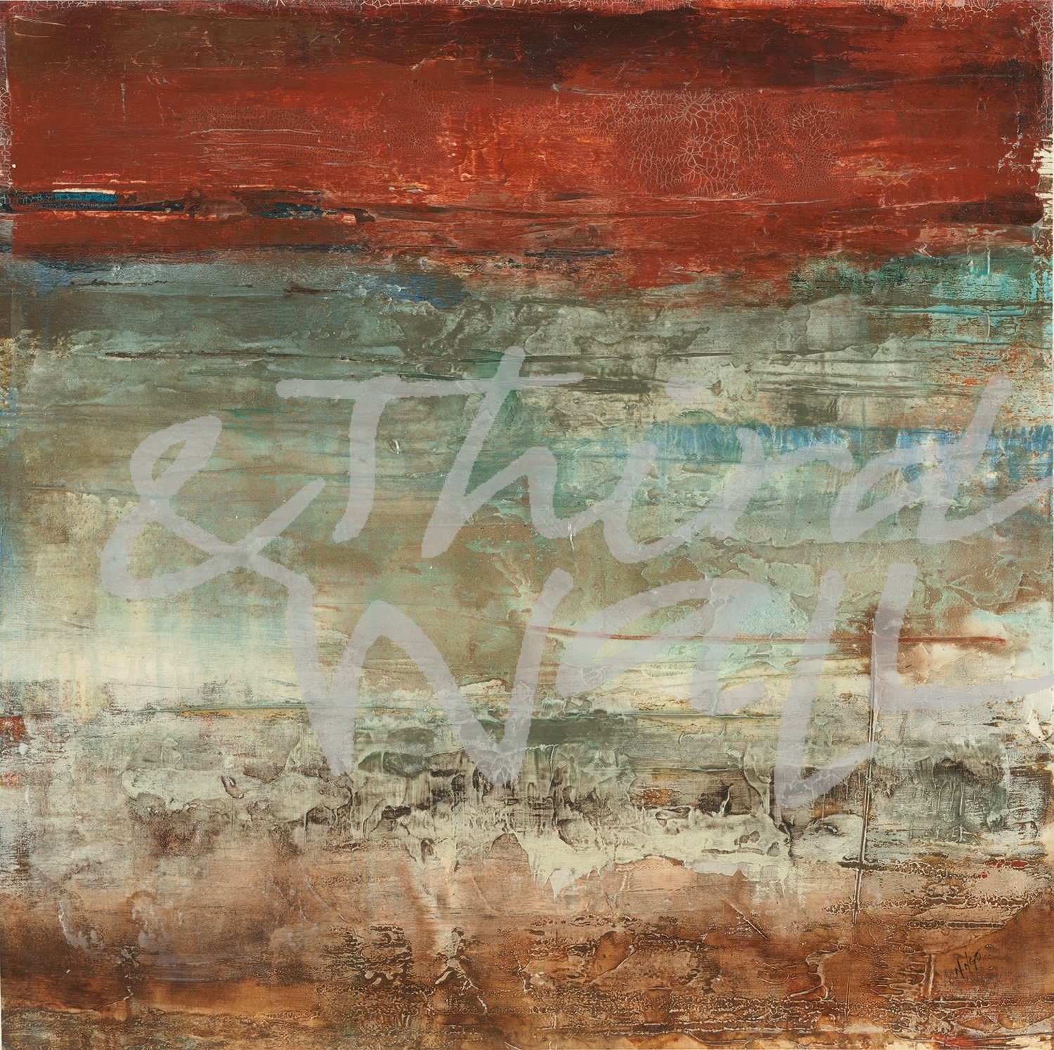
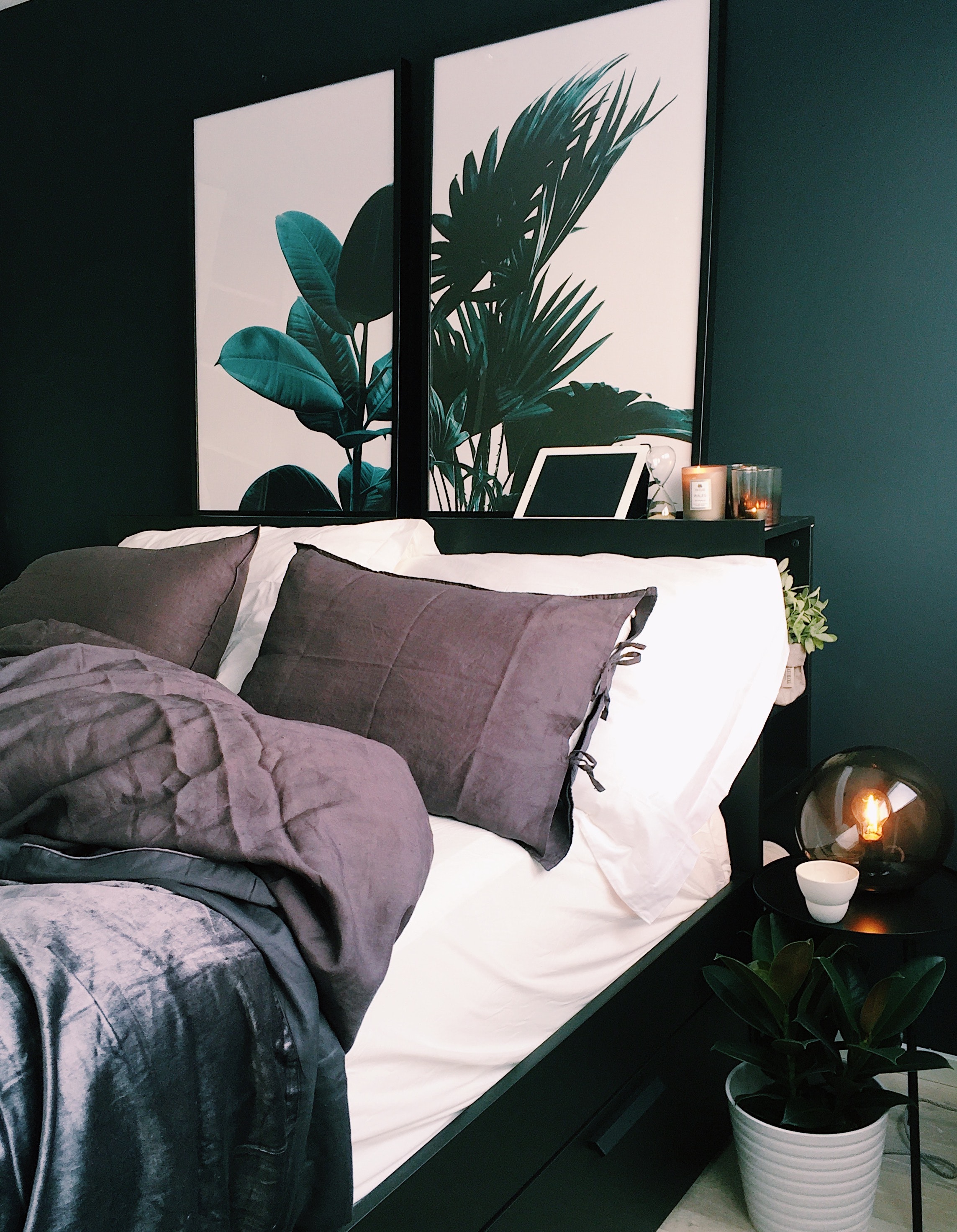
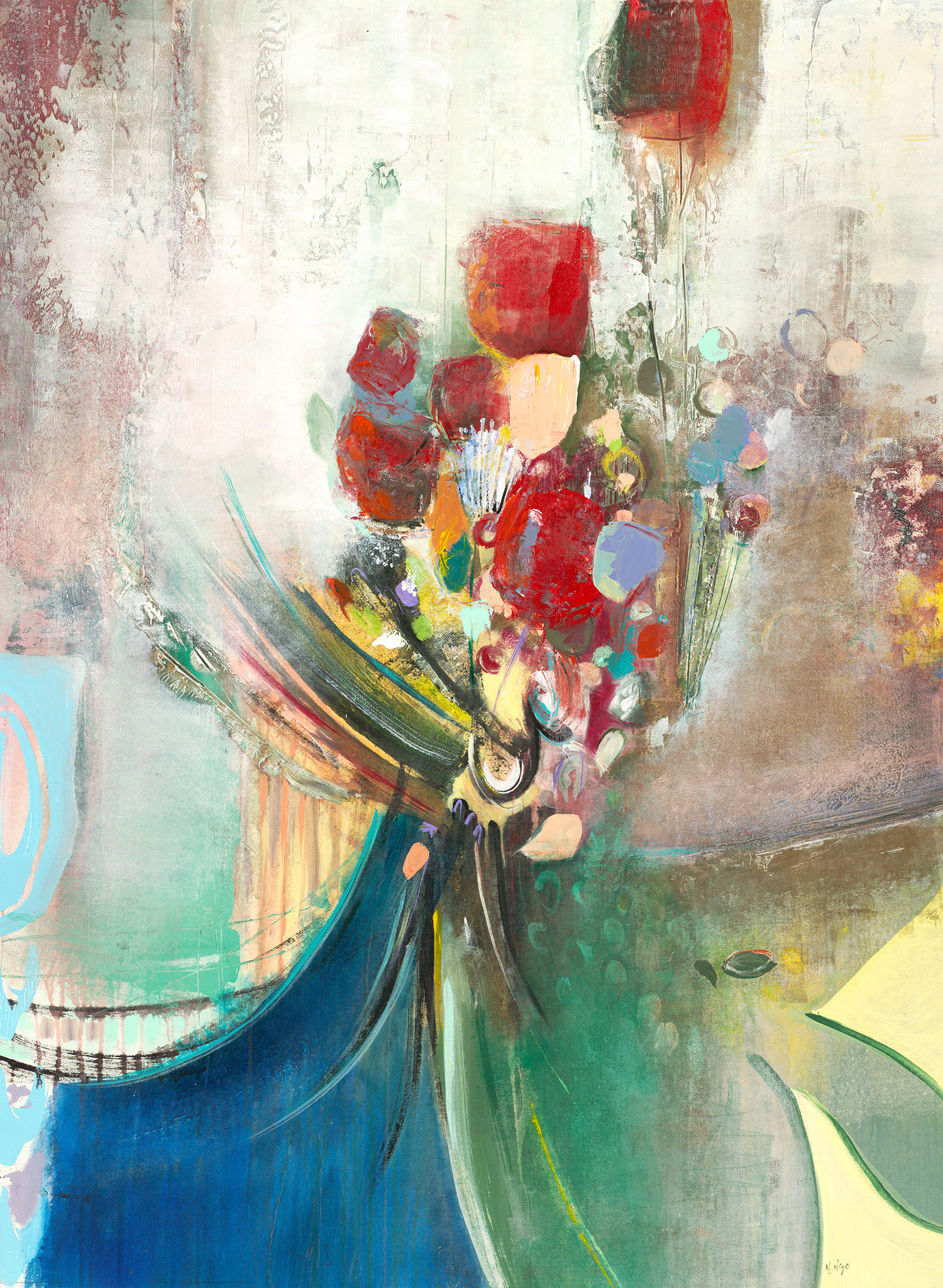
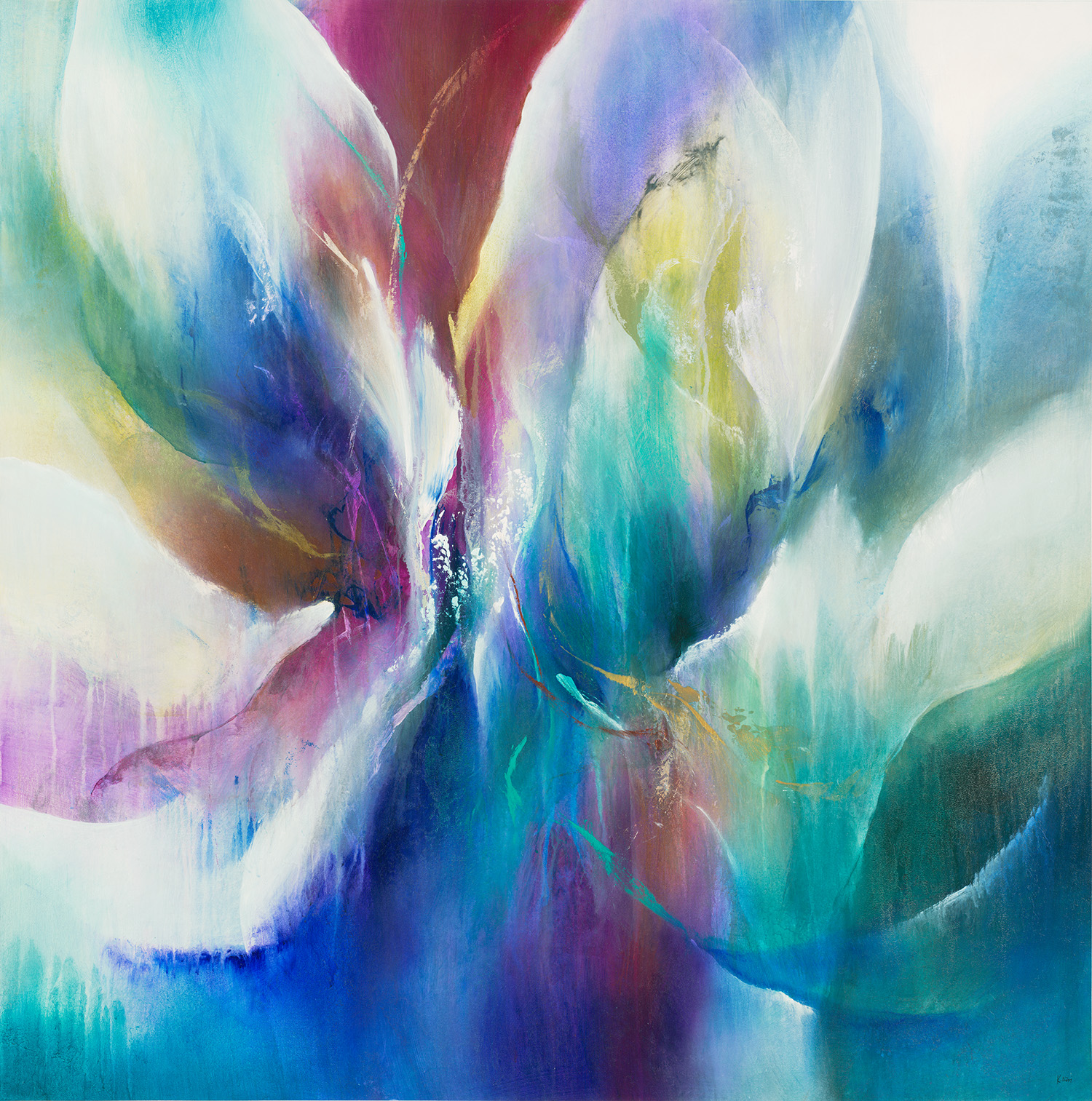
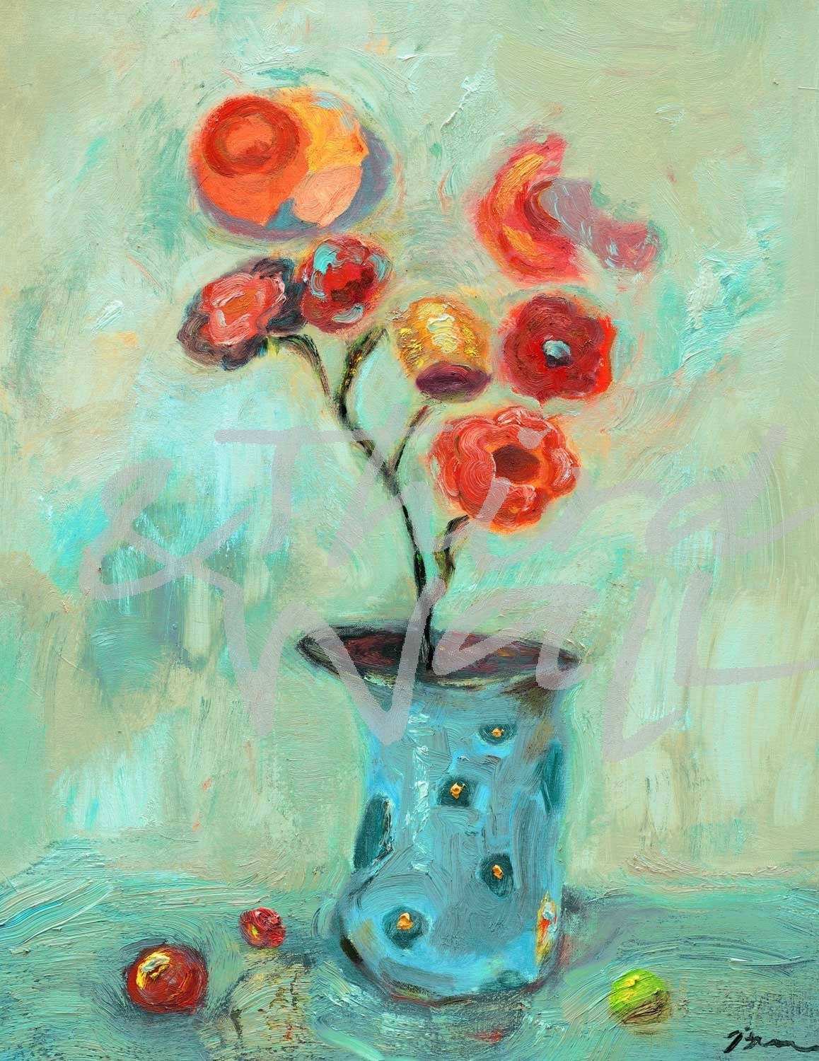
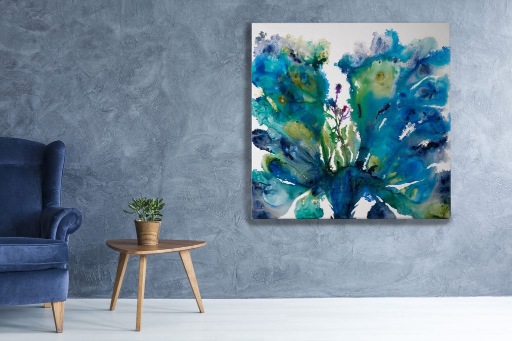
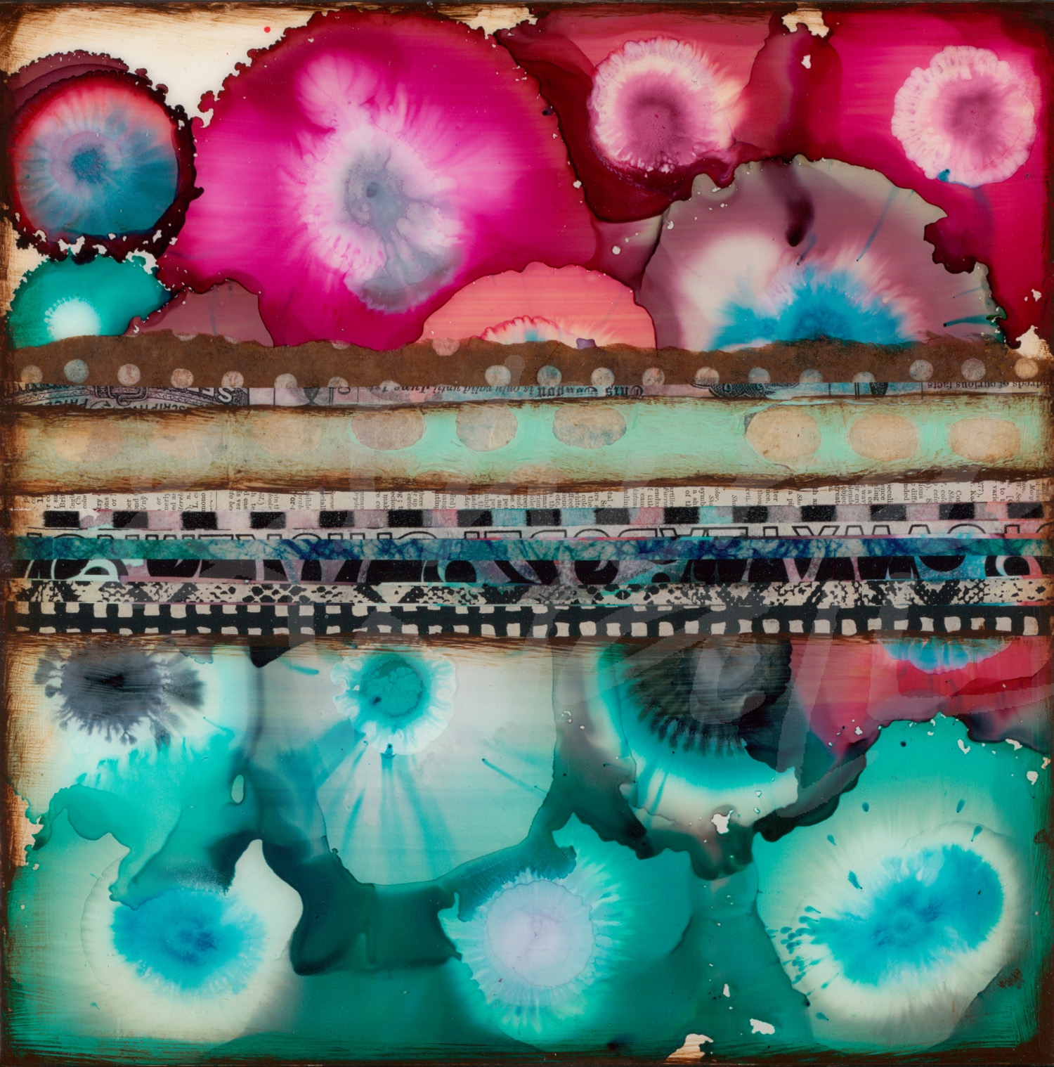
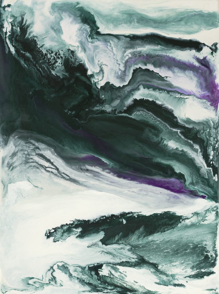
Rich & Saturated
Bold, saturated green tones, such as jade and emerald green, add a rich and regal element to any interior. Whether paired with other dark accents to create a moody space or offset with neutrals and metallic accents, deep green tones can add personality and elegance. These dark, nature-inspired colors are great in furniture, accent pieces, or on your walls!
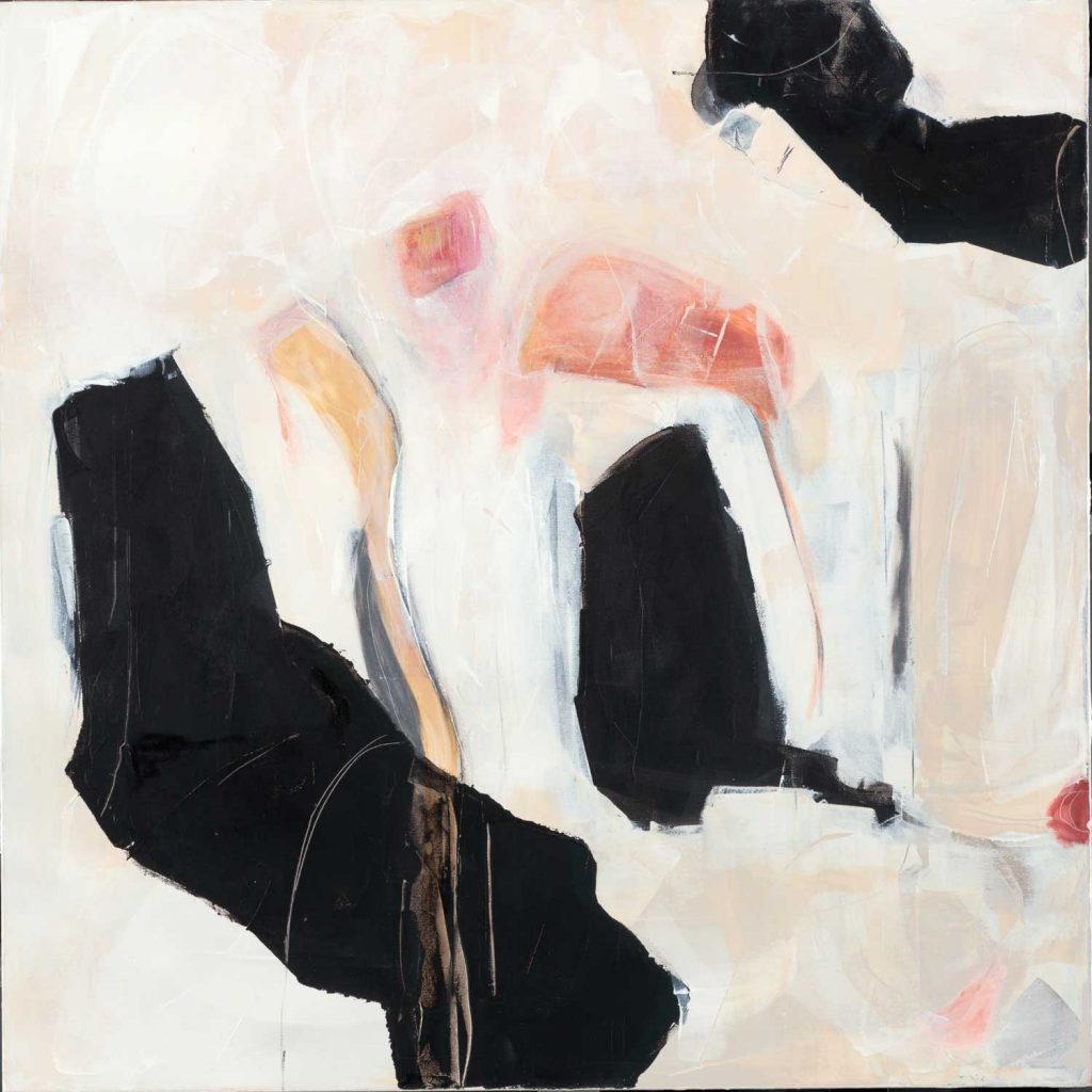
“Being” by Corrie LaVelle 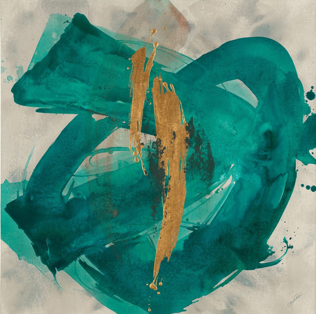
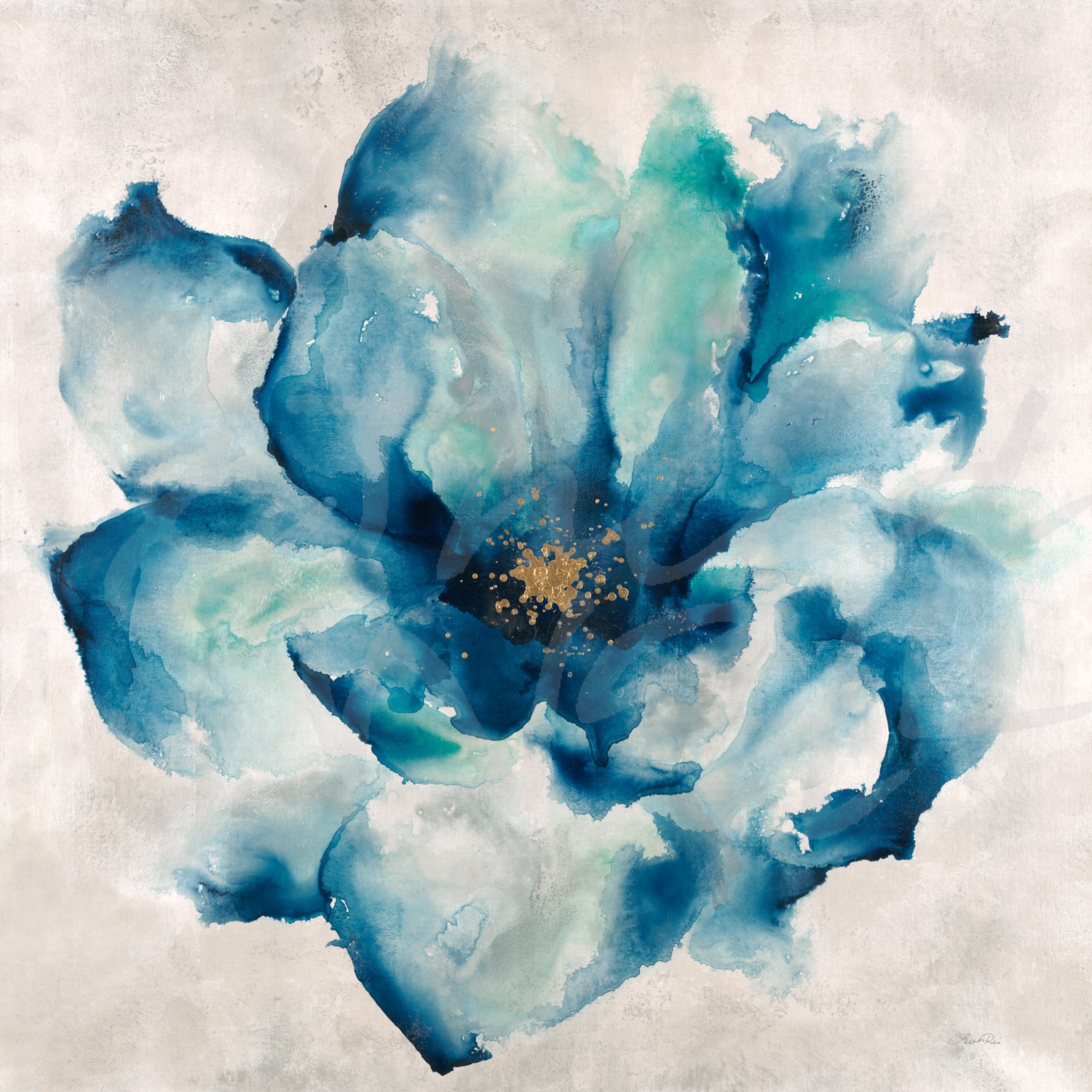
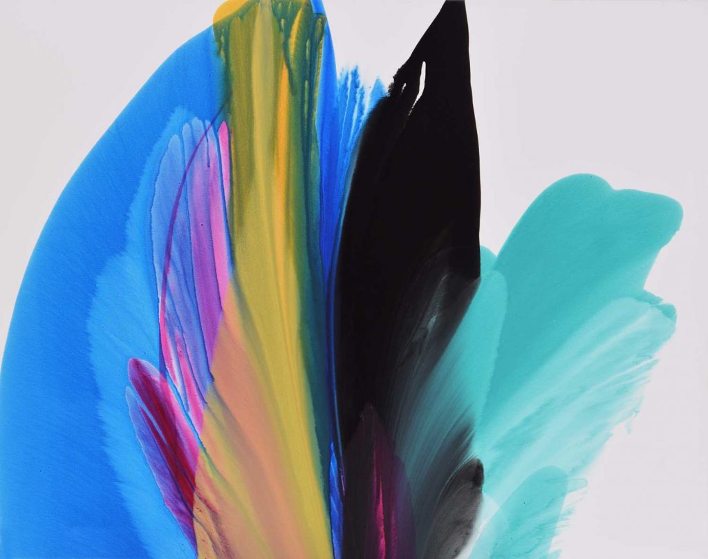
“Nexus III” by Leah Rei 
photograph by Aaorn Matheson 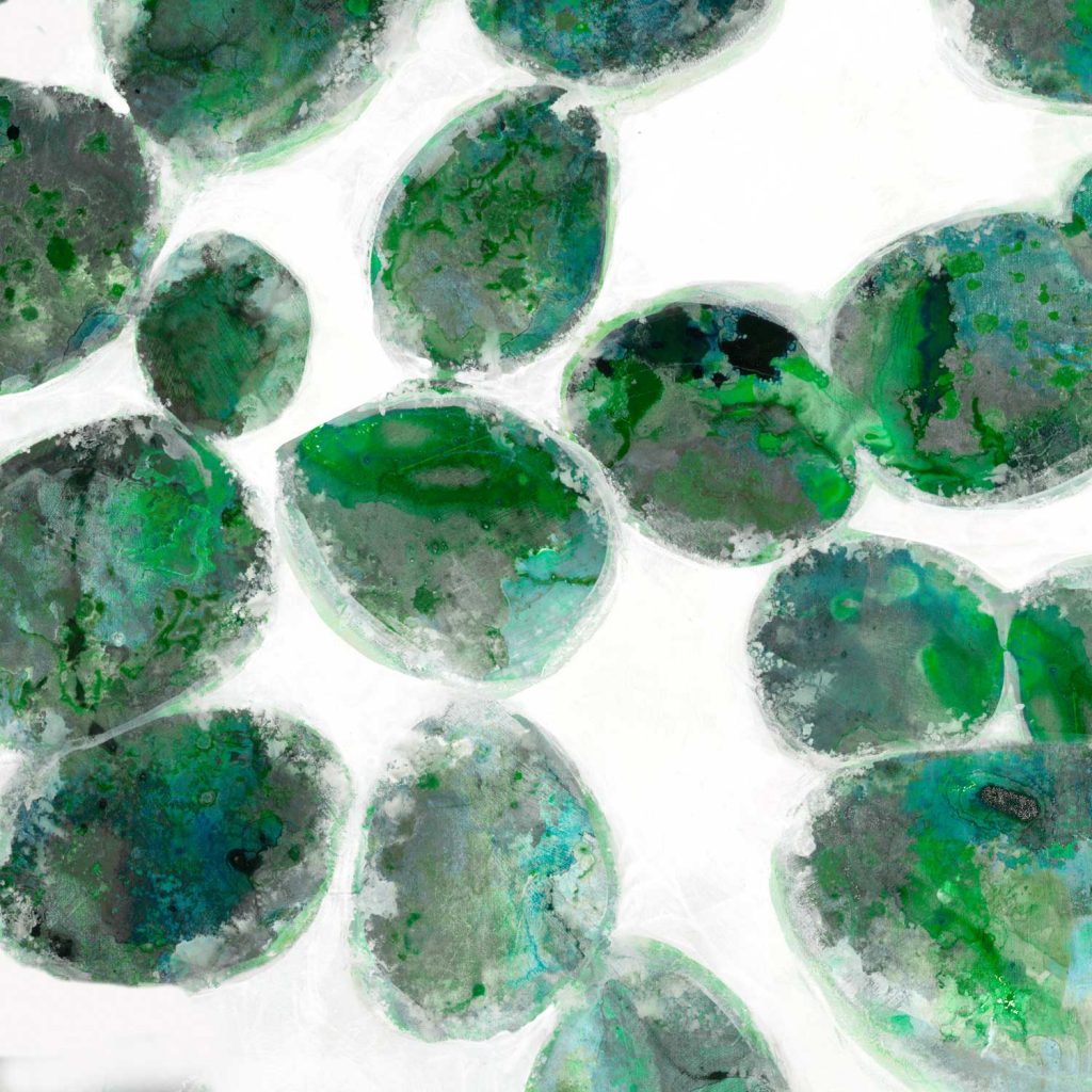
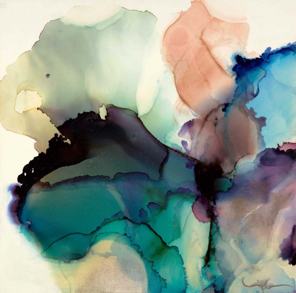
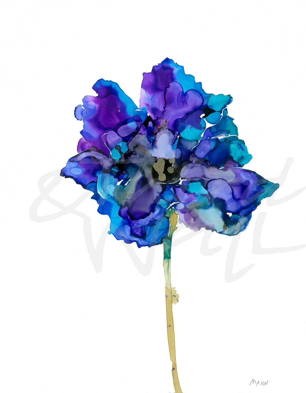
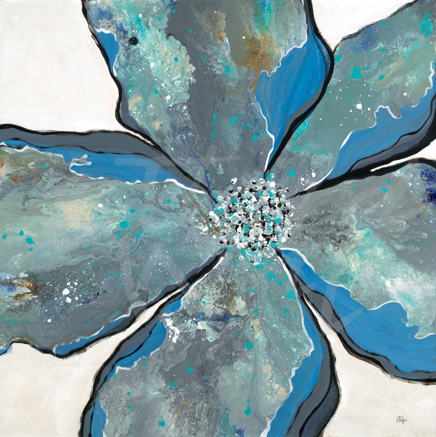
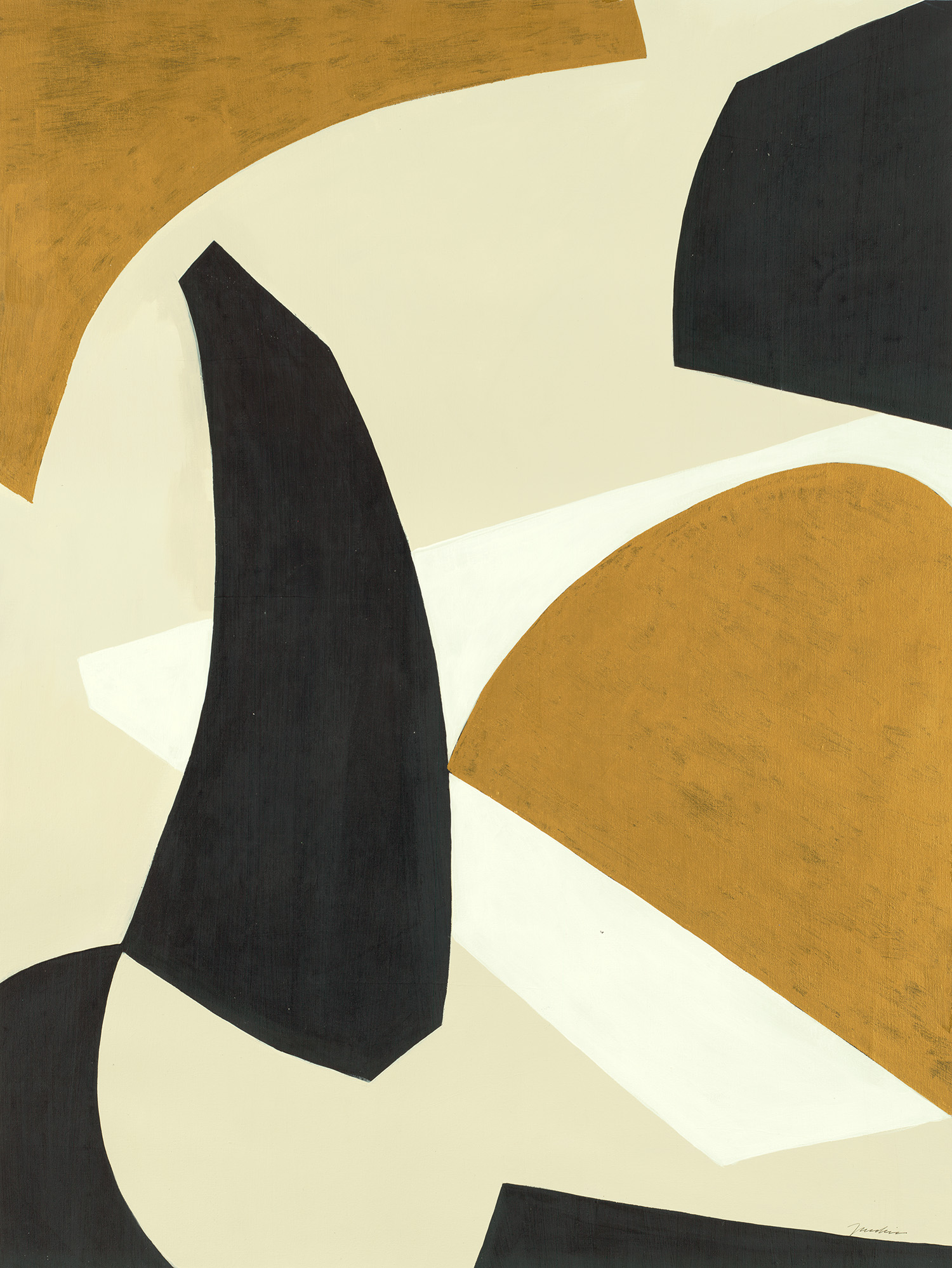
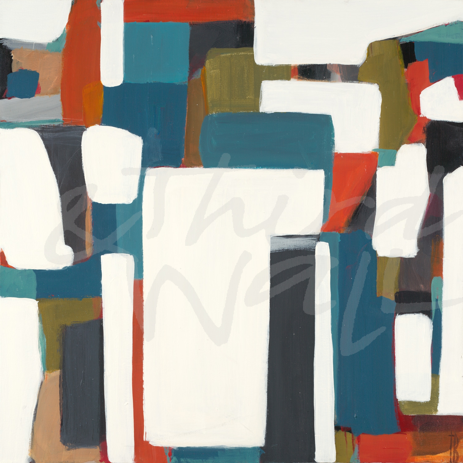
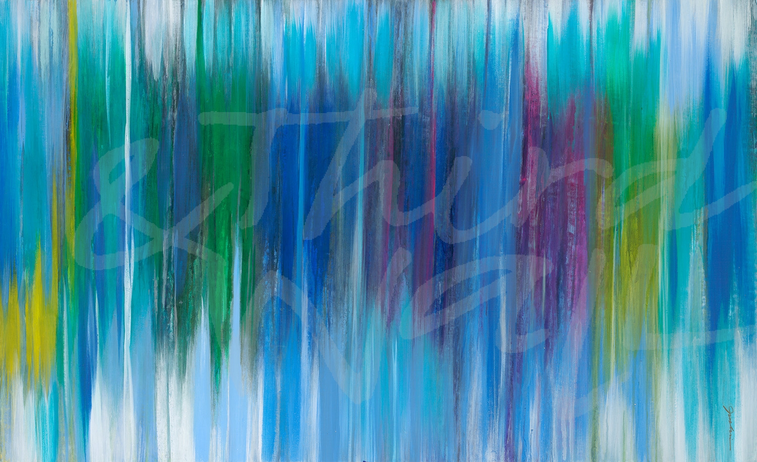
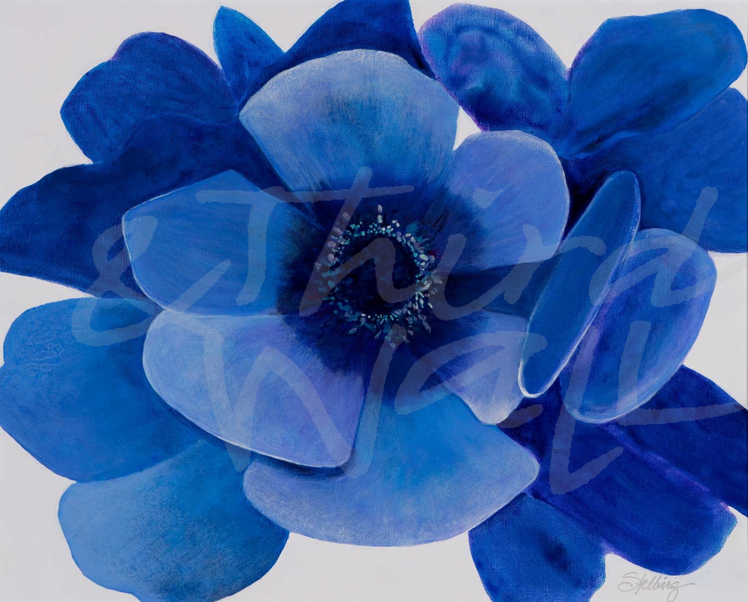
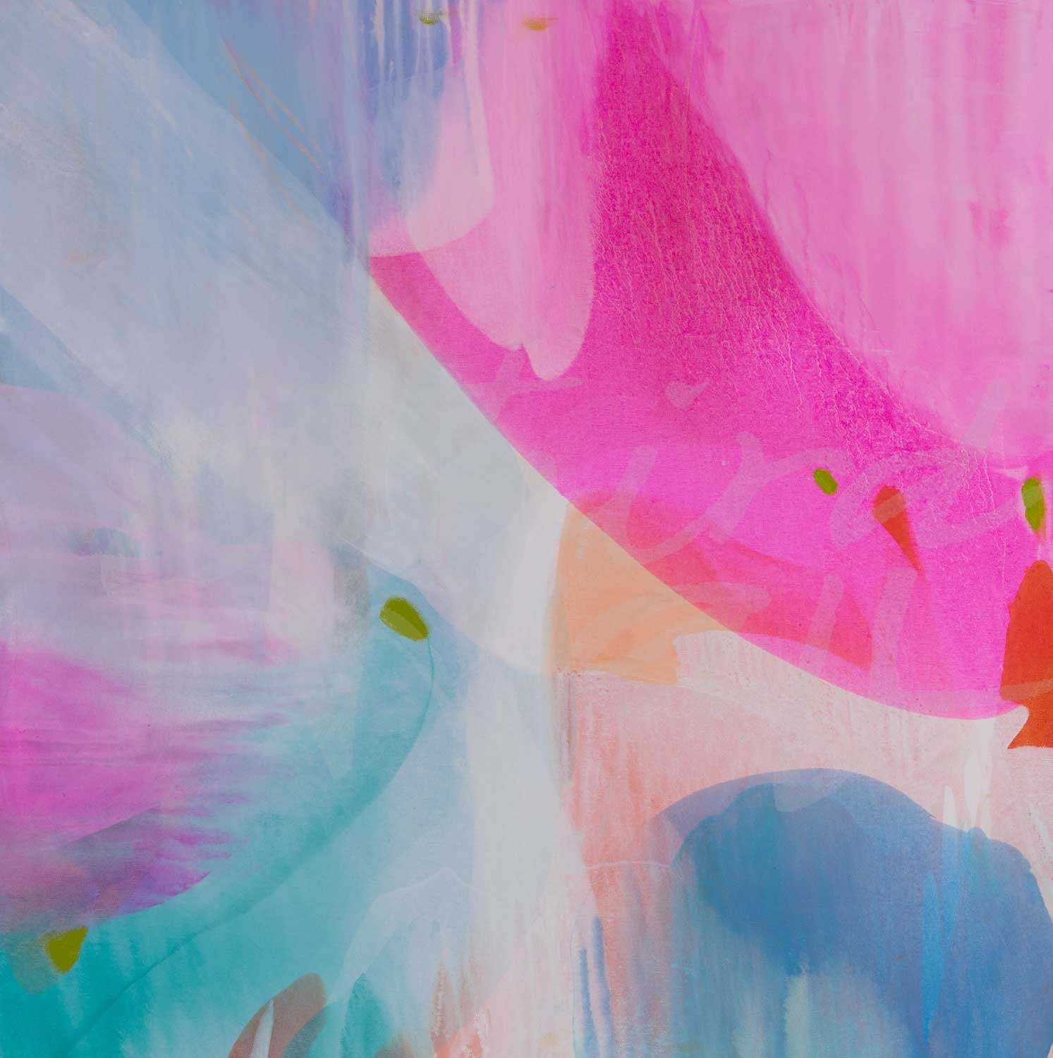
“In A Blue Mood” by Liz Jardine alt v 3 
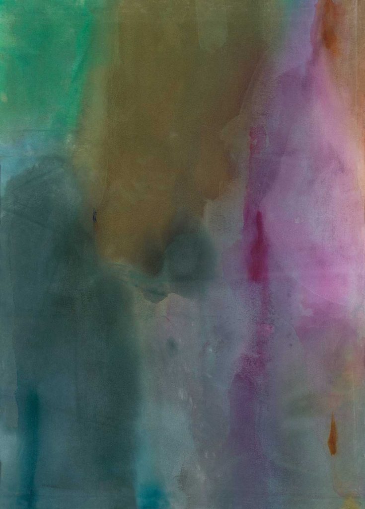
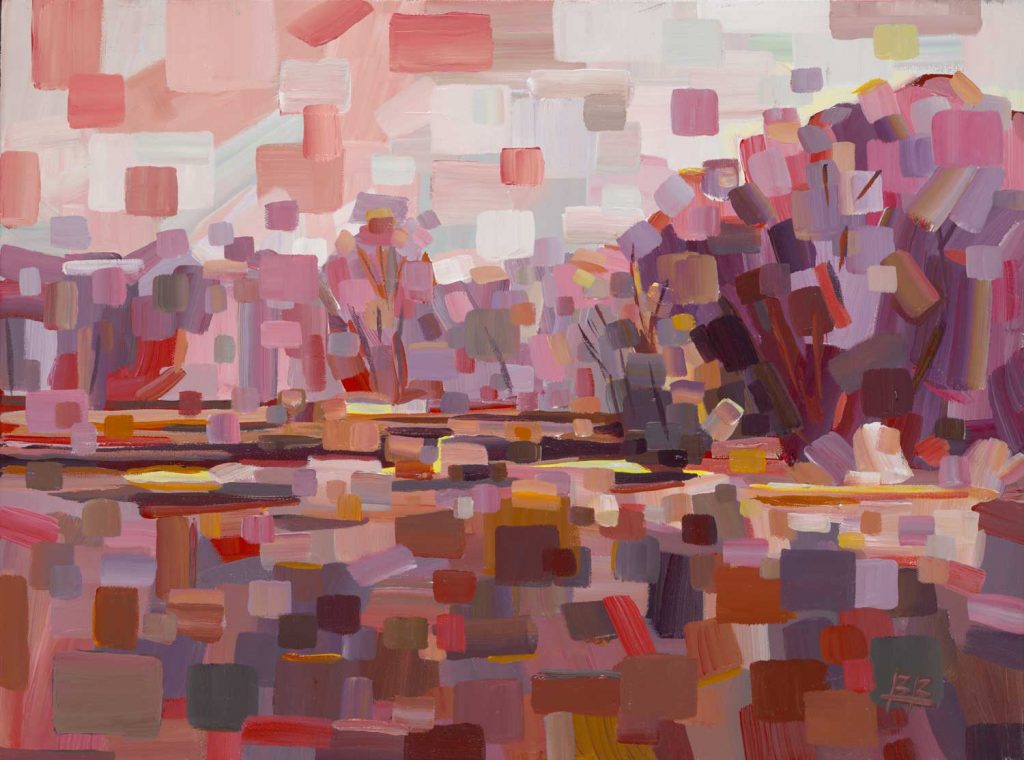
“Reticent I” by Scott Brems 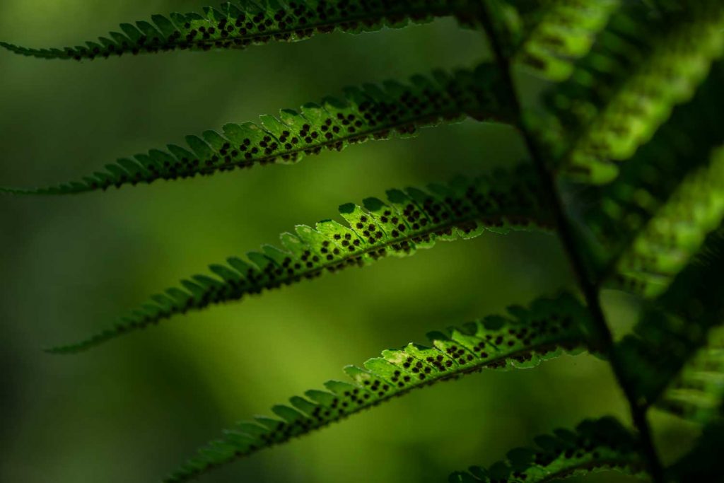
photograph by Nancy Crowell 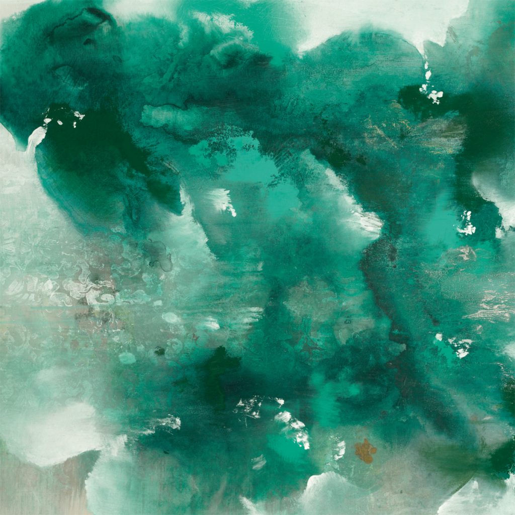
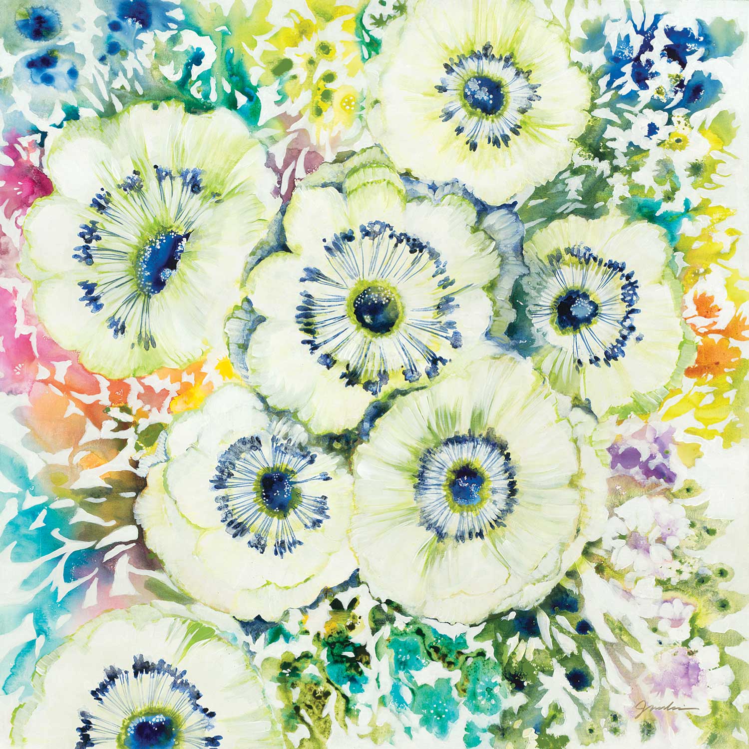
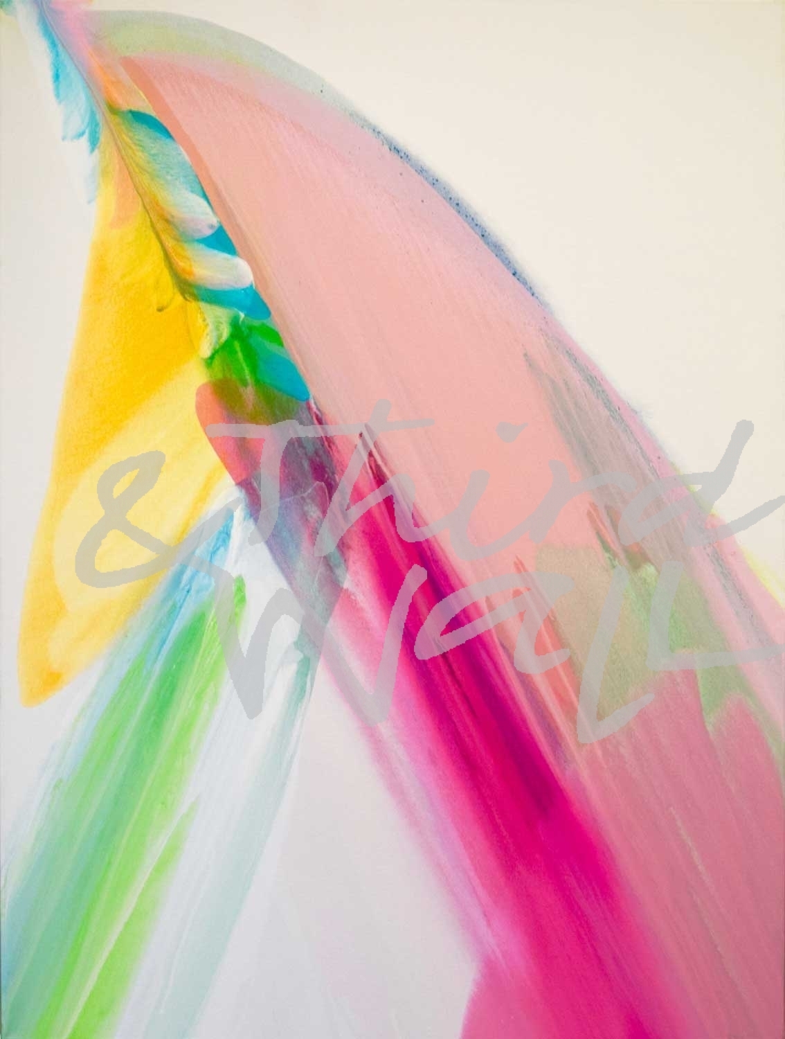
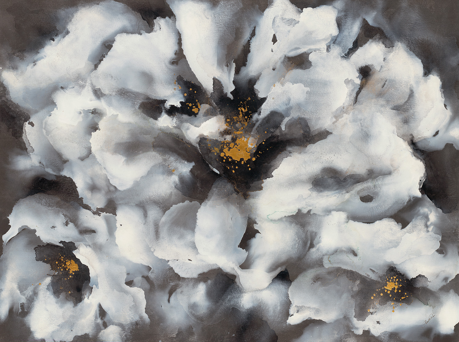
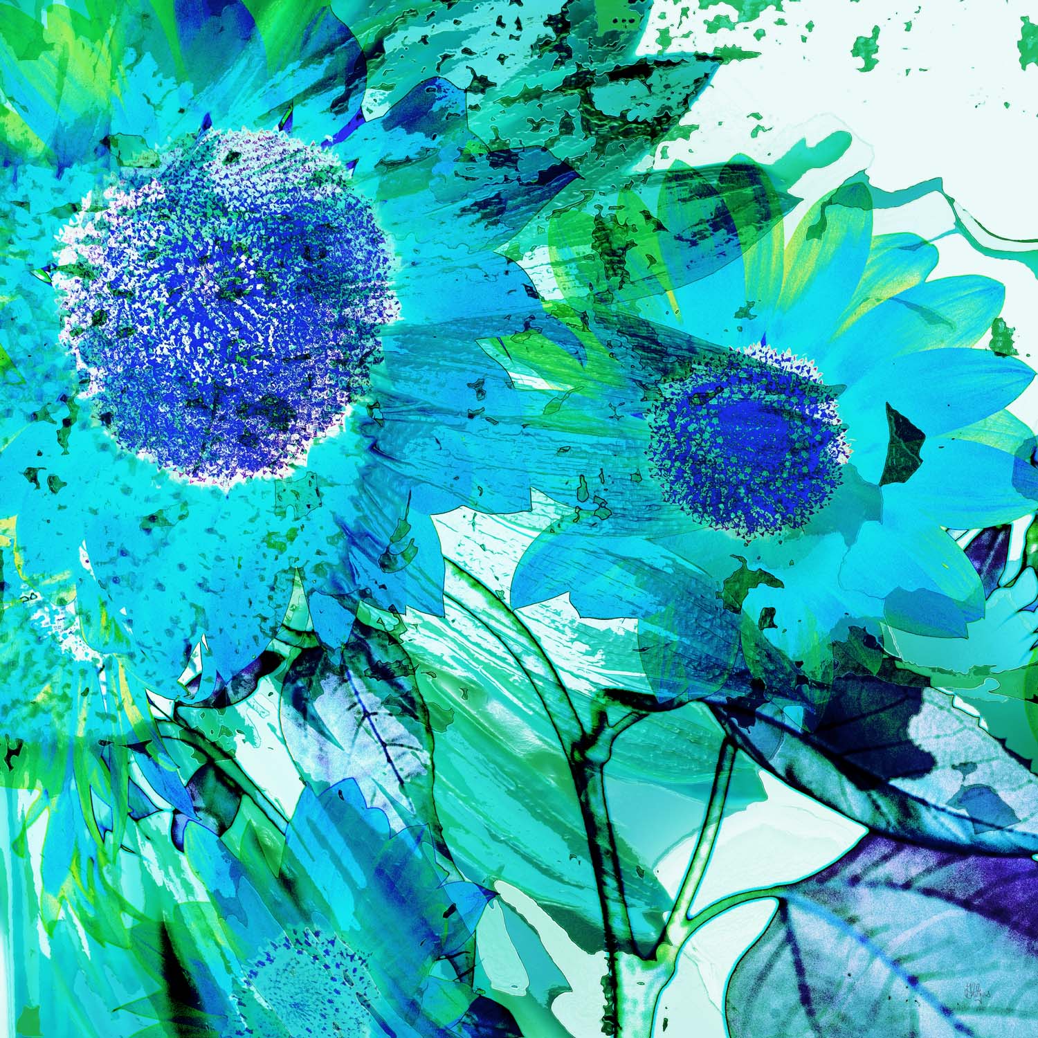
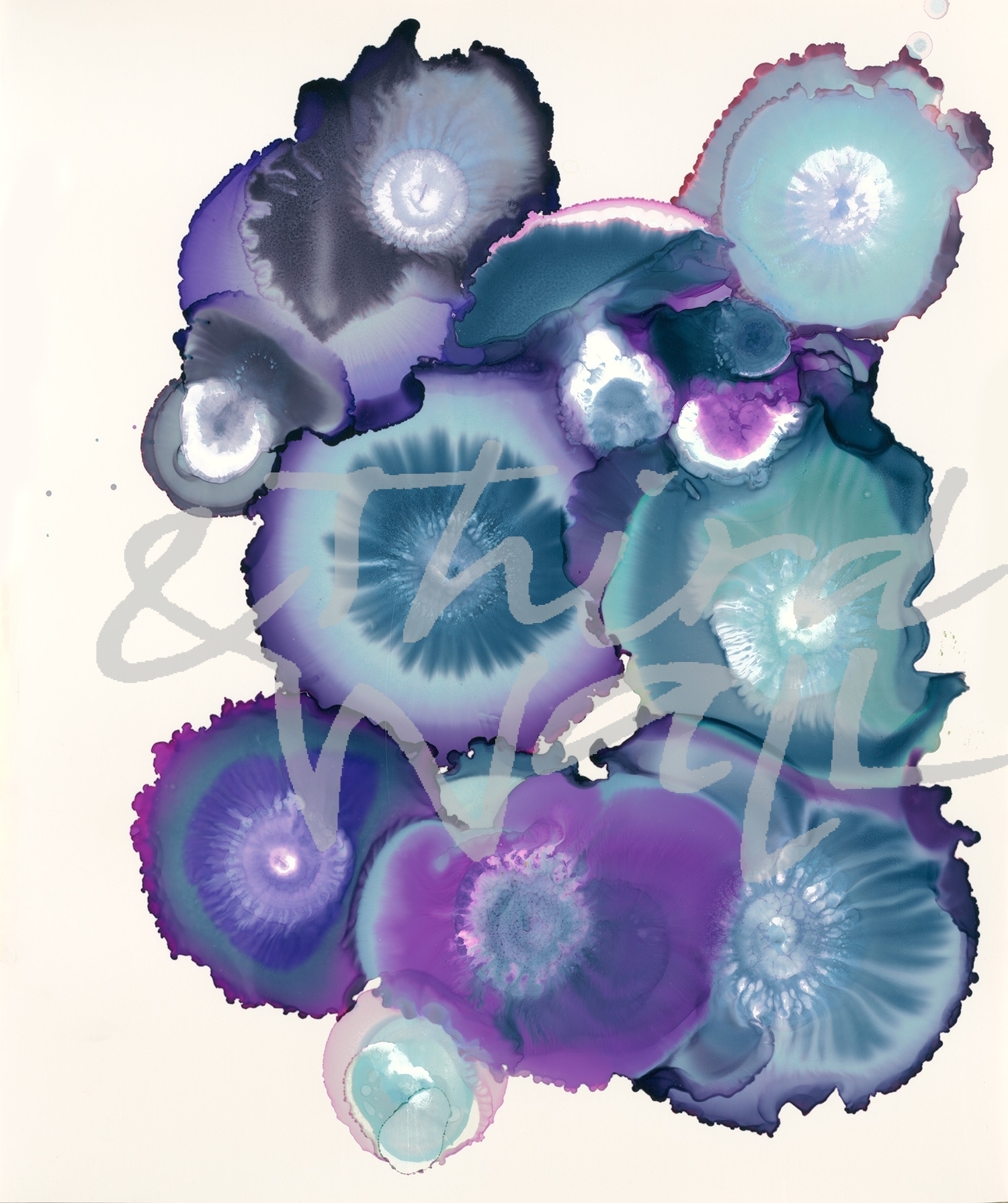
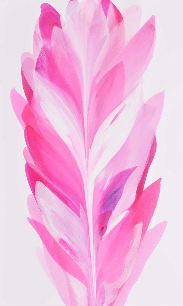
“Aqua Petals” by K. Nari 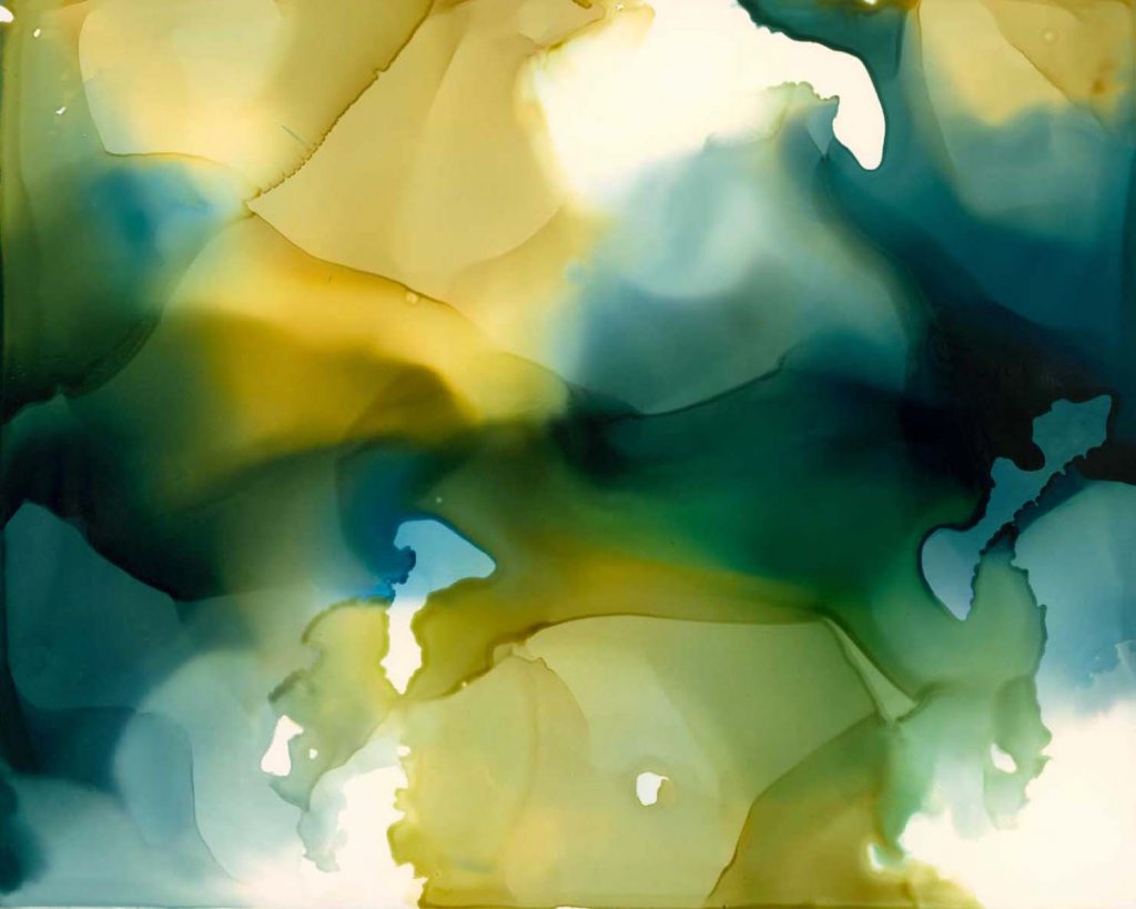
“Down Streams” by Kippi Leonard 
photograph by Aaron Matheson 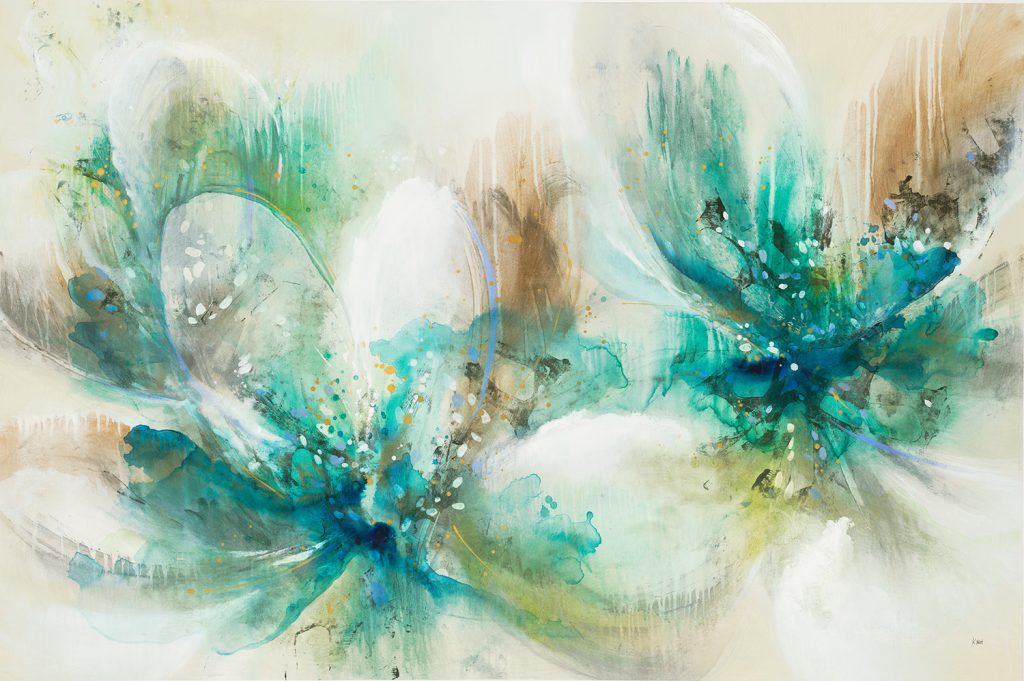
“Spring Fling” by K. Nari 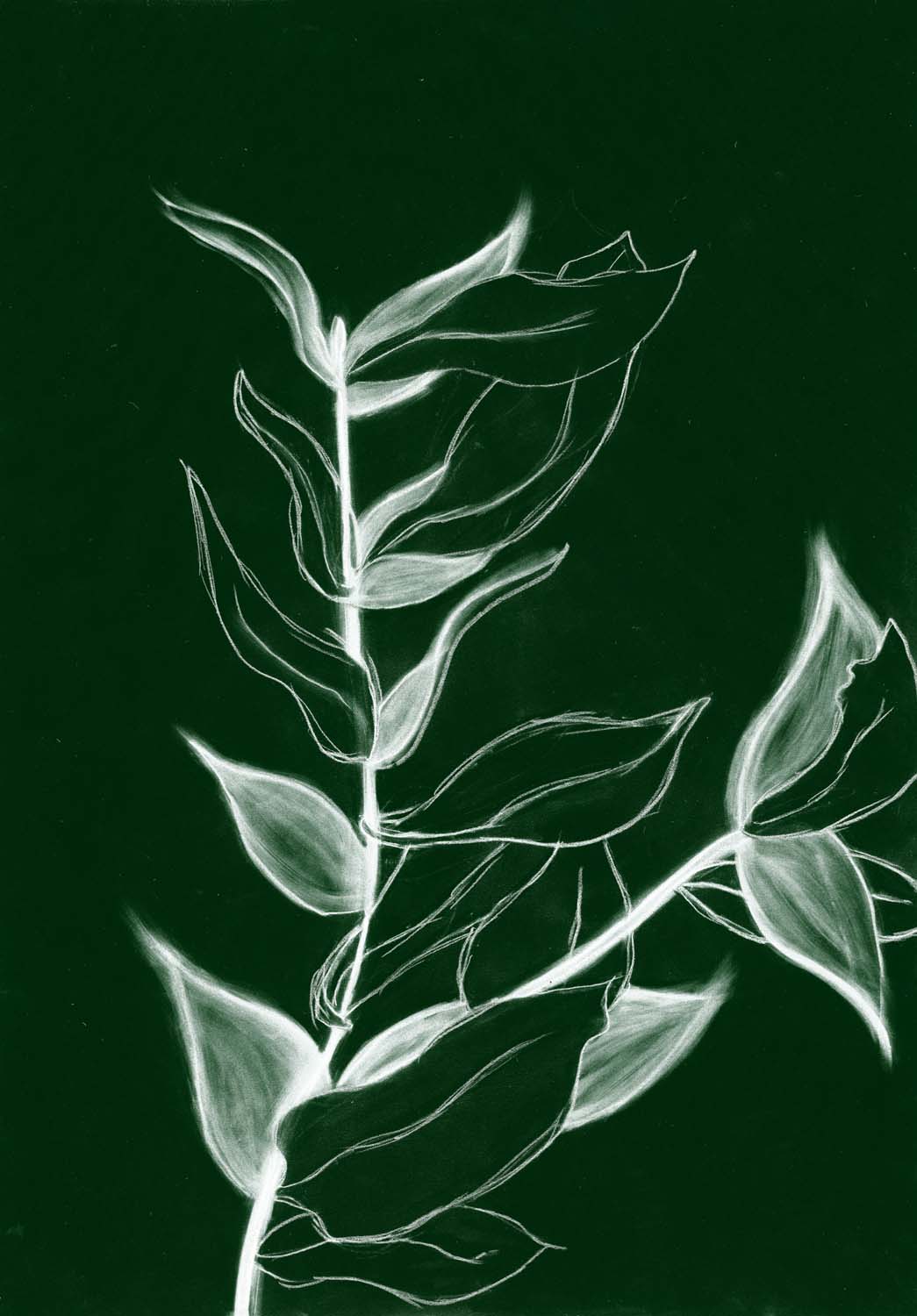
“Charcoal Foliage I” by Kayleigh Wold alt v 3 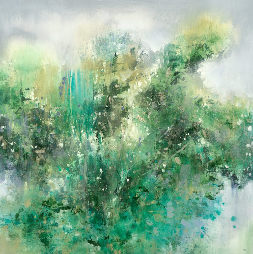
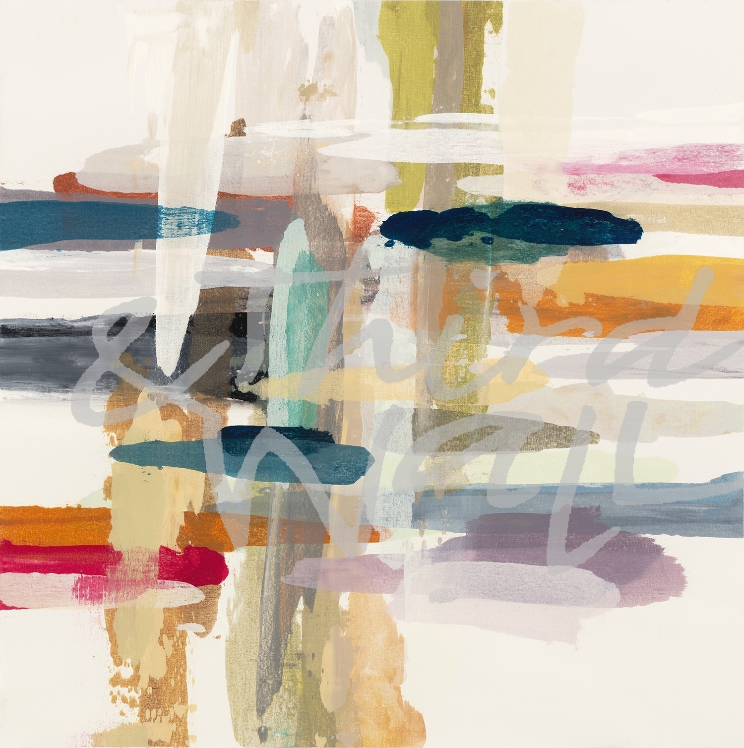
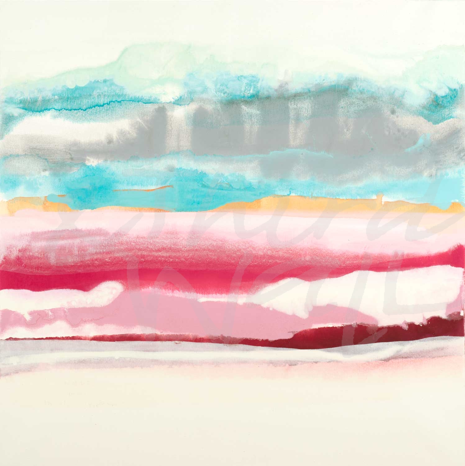
“Silver Sky” by K. Nari 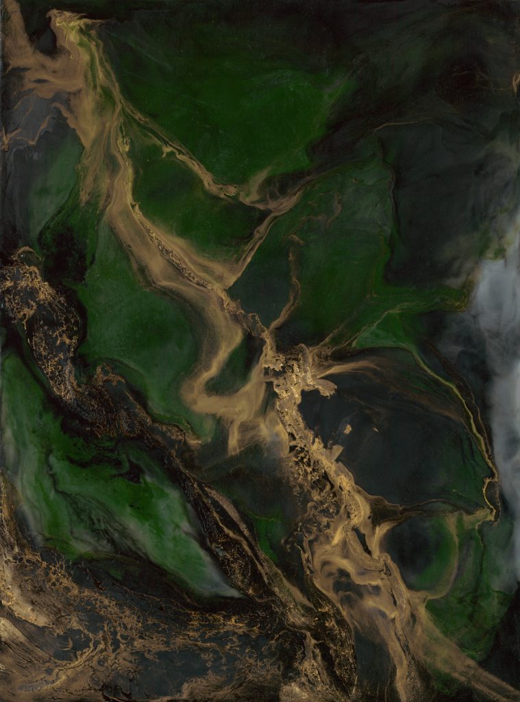
“Untitled” by Corrie LaVelle 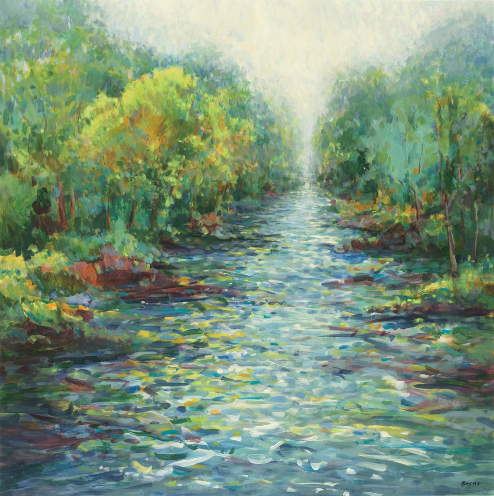
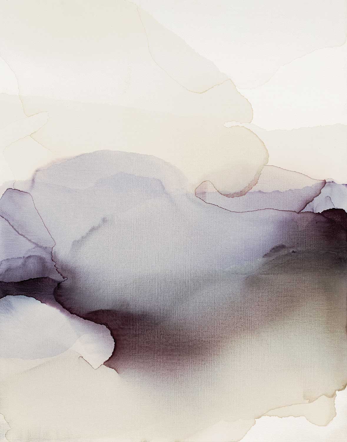
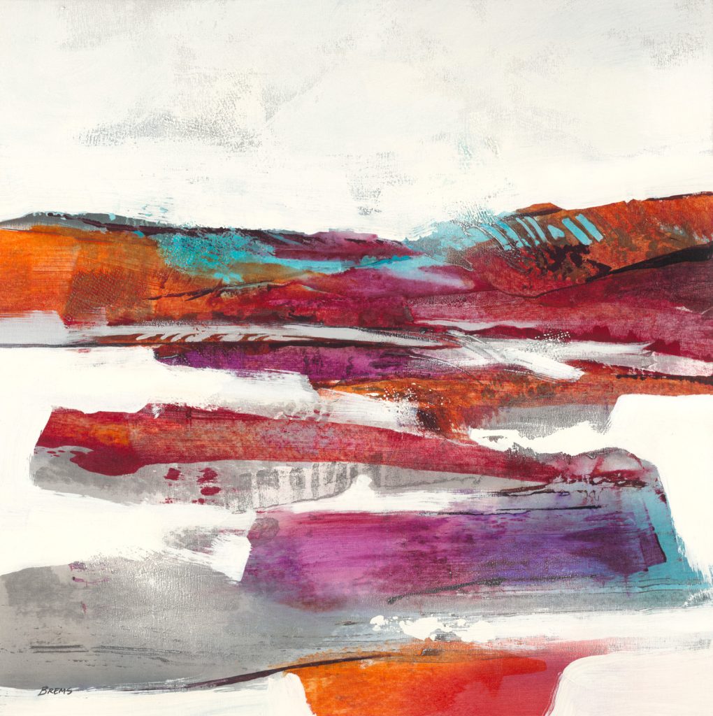
“River Mist” by Scott Brems 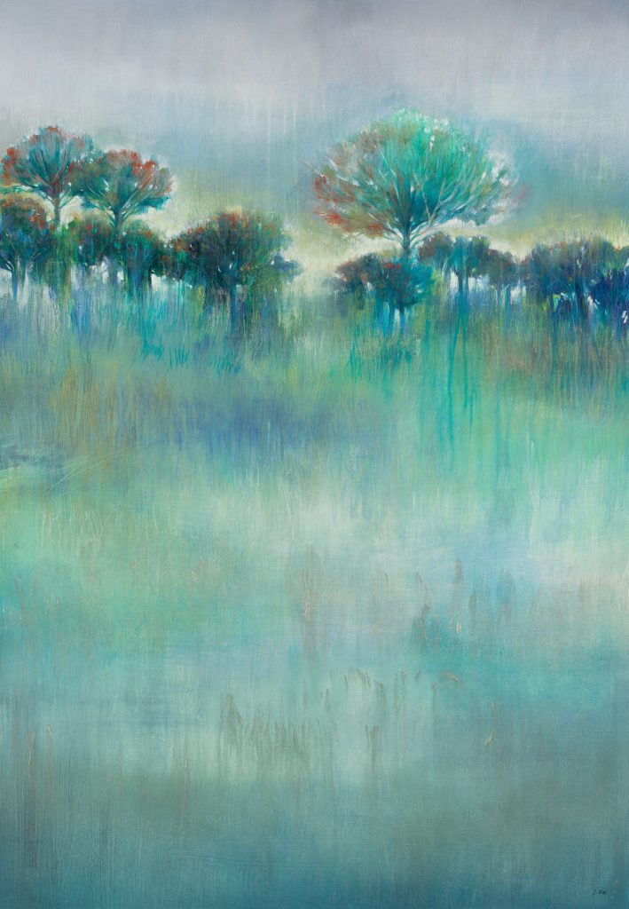
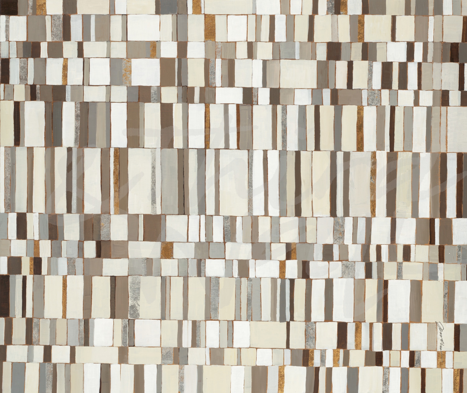
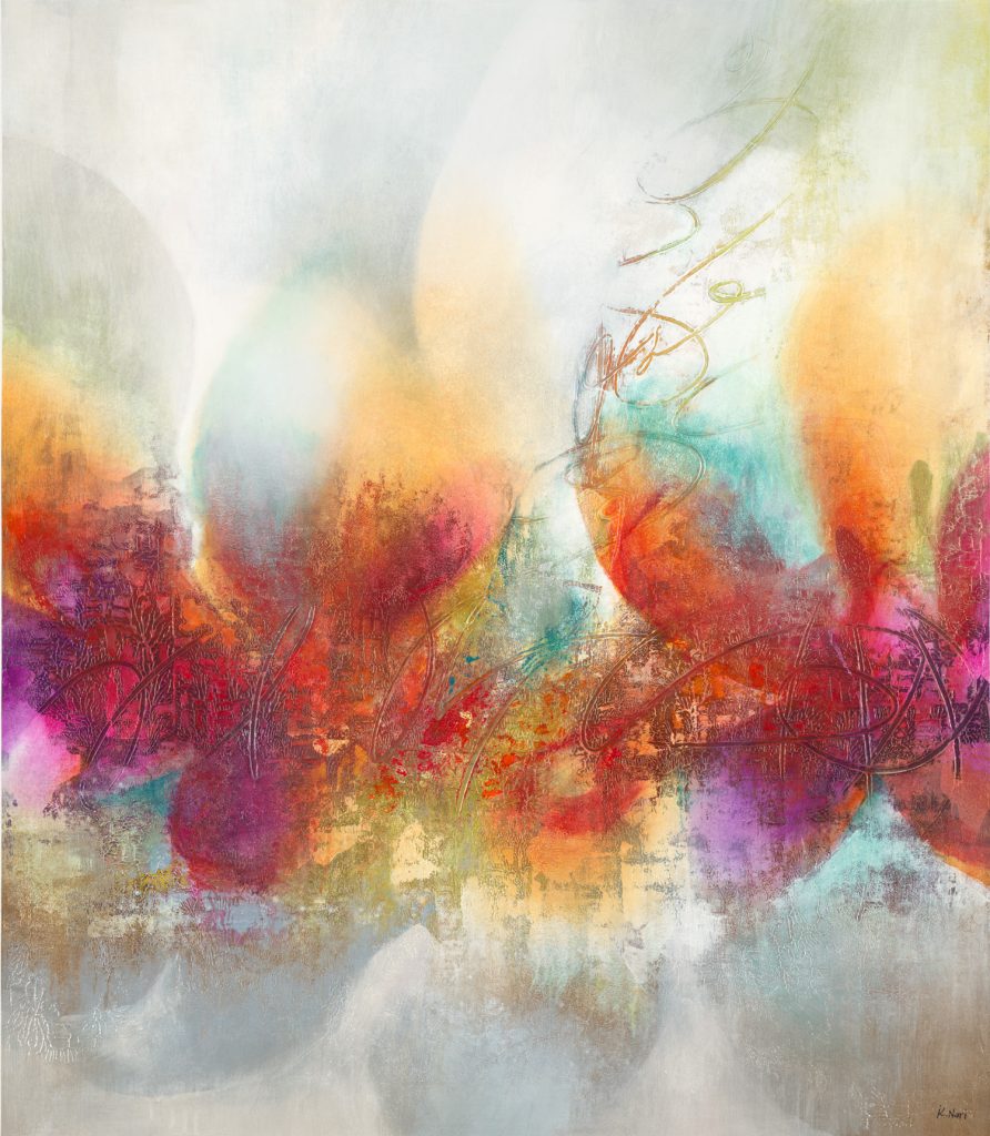
“Wintergreen” by K. Nari
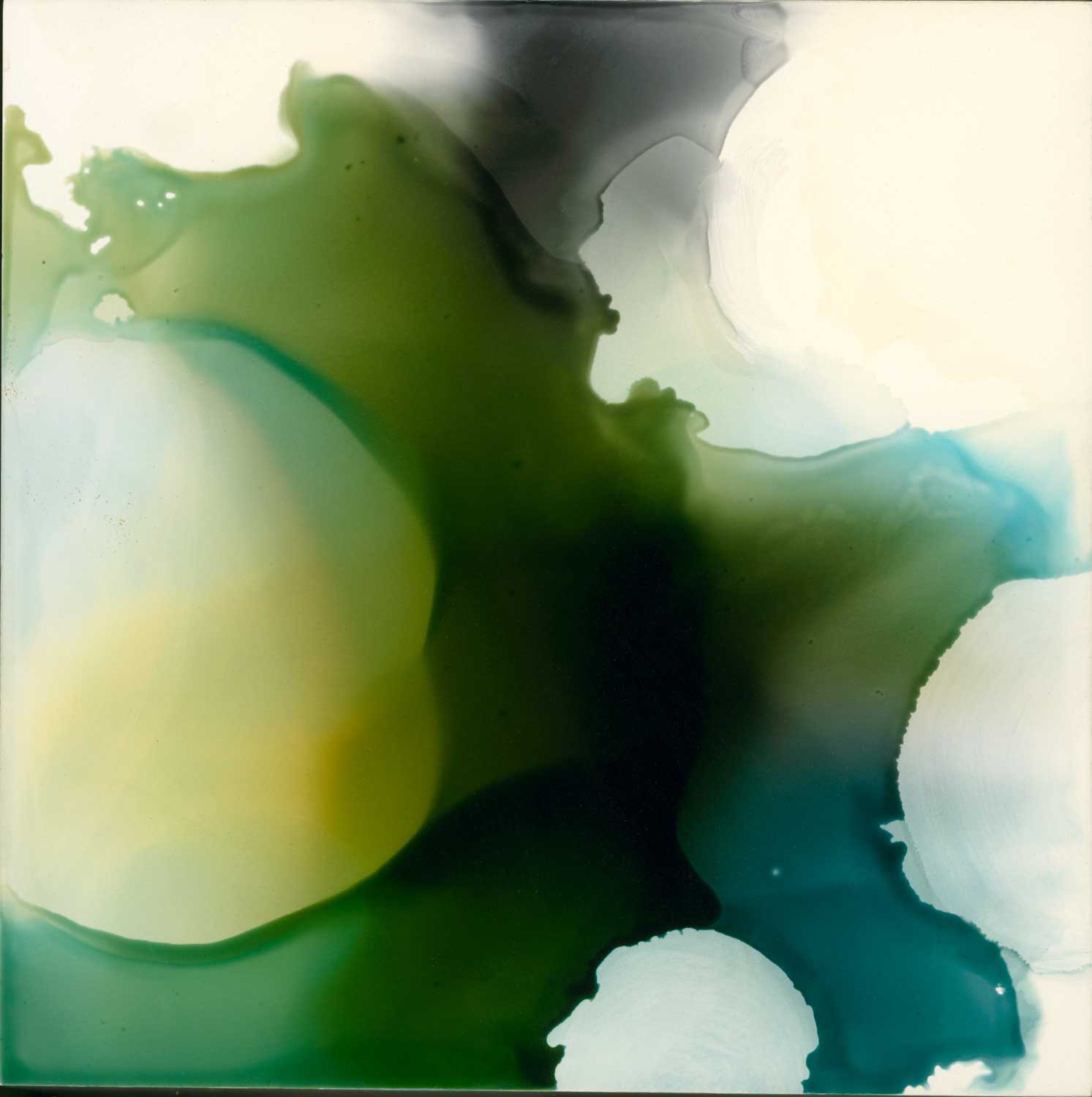
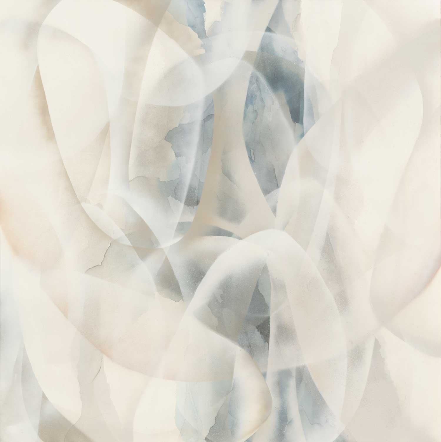
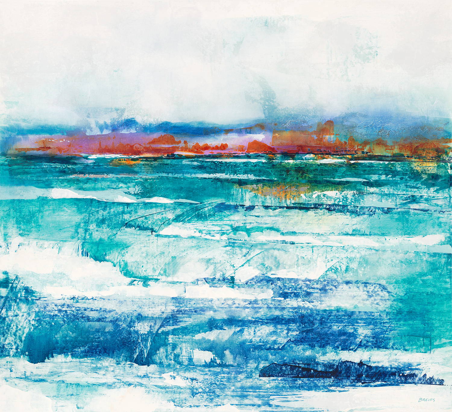
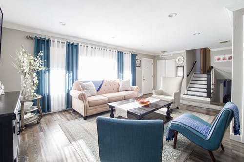
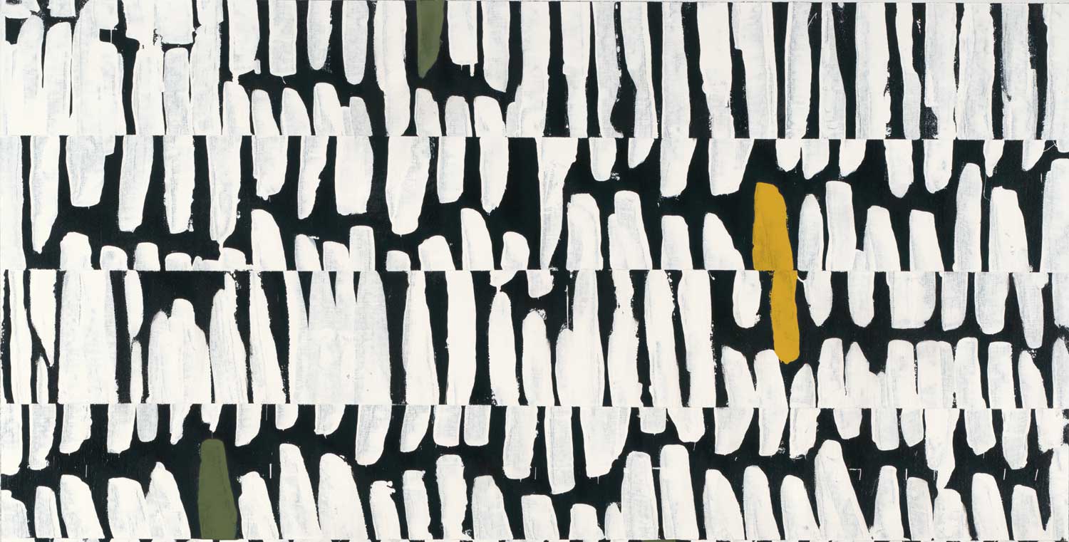
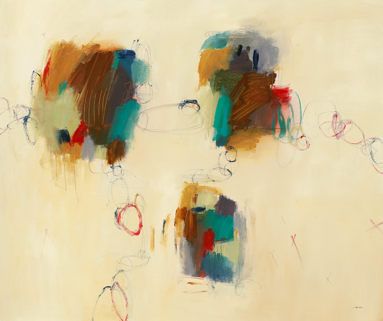
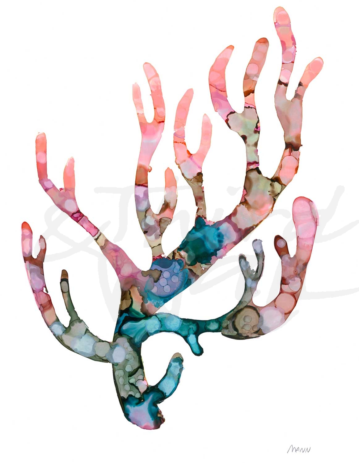
Light & Bright
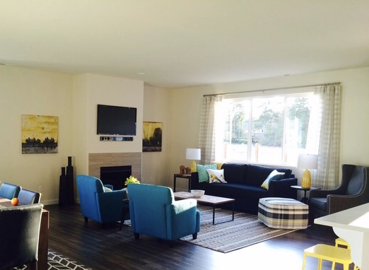
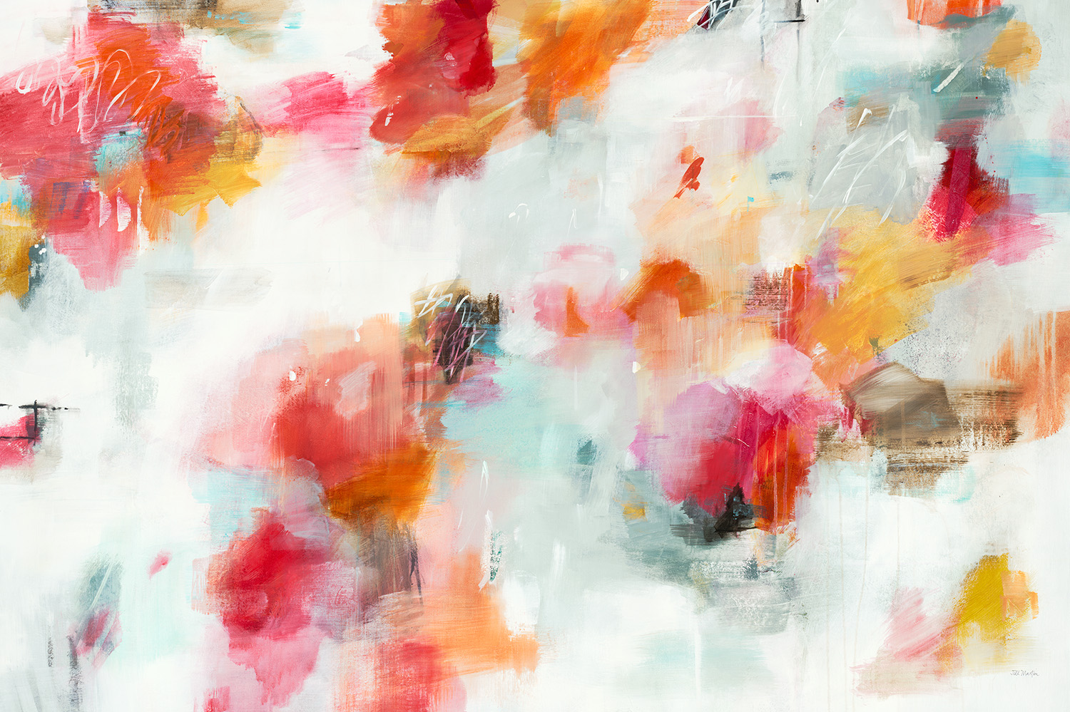
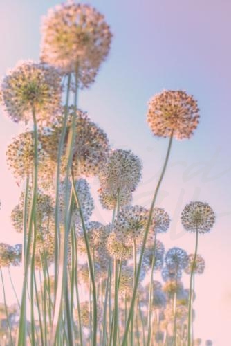
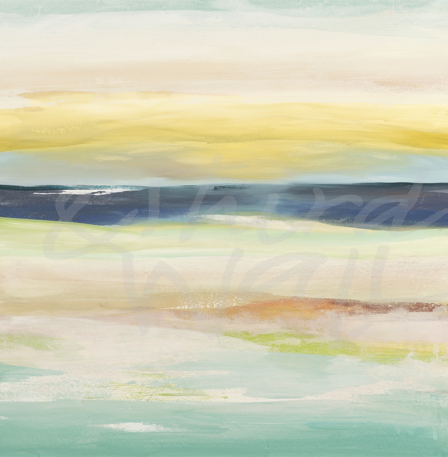
Light and bright green tones help to soothe and enliven rooms. Soft, pale greens colors with blue undertones, such as mint and sea-glass green, can brighten up a space in a calming way. Yellow-greens are fresh and inviting and more reminiscent of botanical hues. Using more lively and vibrant green colors, such as a shade of lime green, is great for social spaces because they can energize a room. If you go bold with bright green on your wall, balancing it out with neutral tones and light accents can keep it from feeling overwhelming. Decorating with light & bright greens in décor accessories and upholstery is a great way to add some calming and natural elements in smaller doses.
“Around The World IV” by Jeff Iorillo 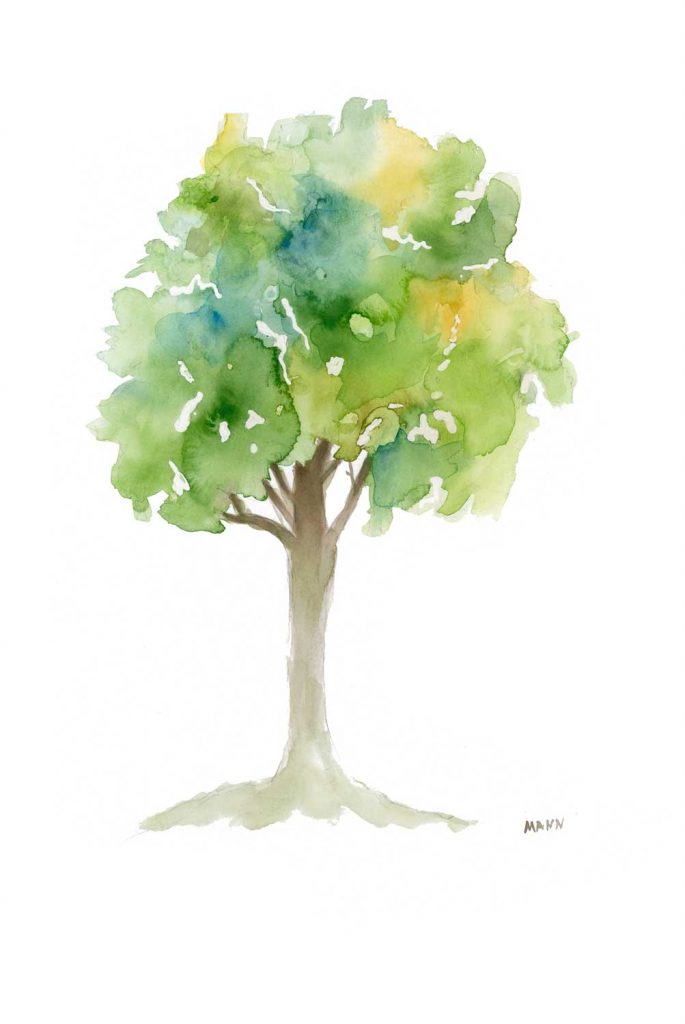
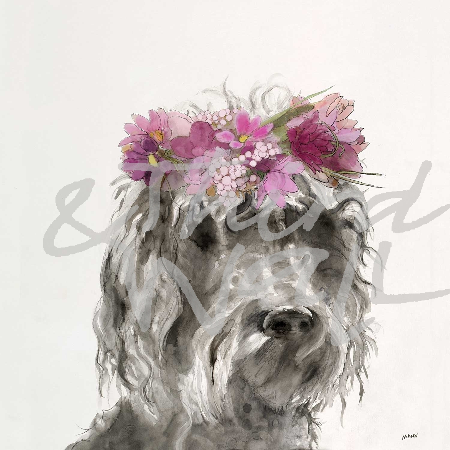
“L’Arbre III” by Patti Mann 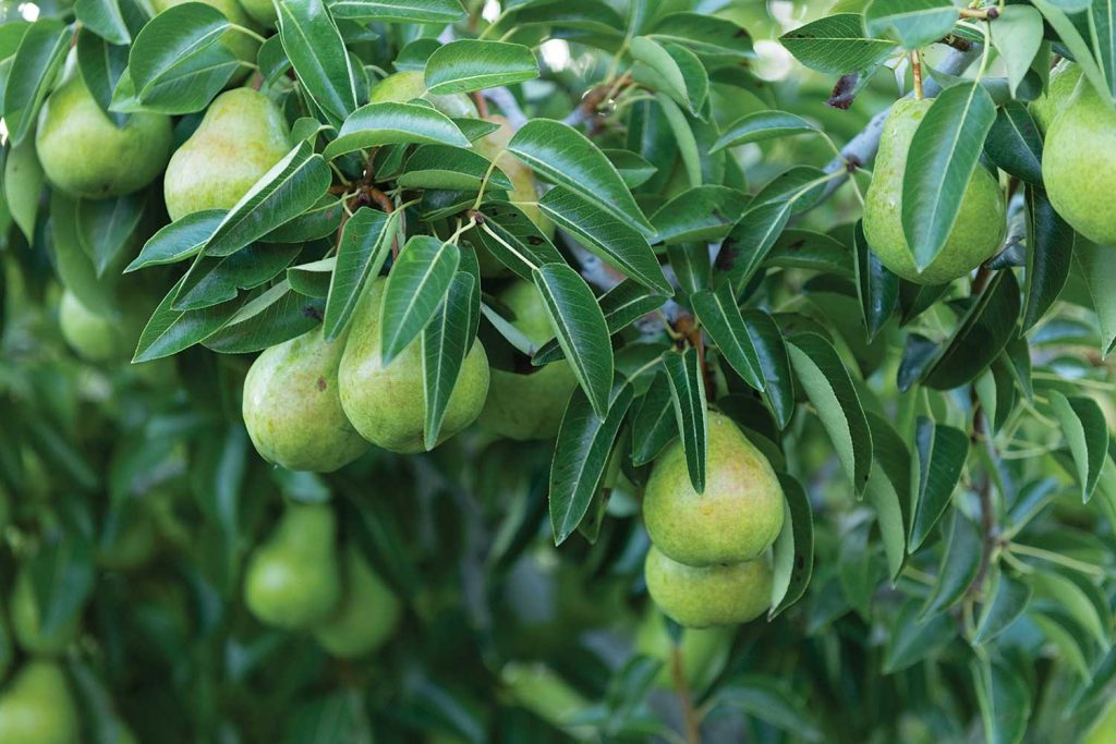
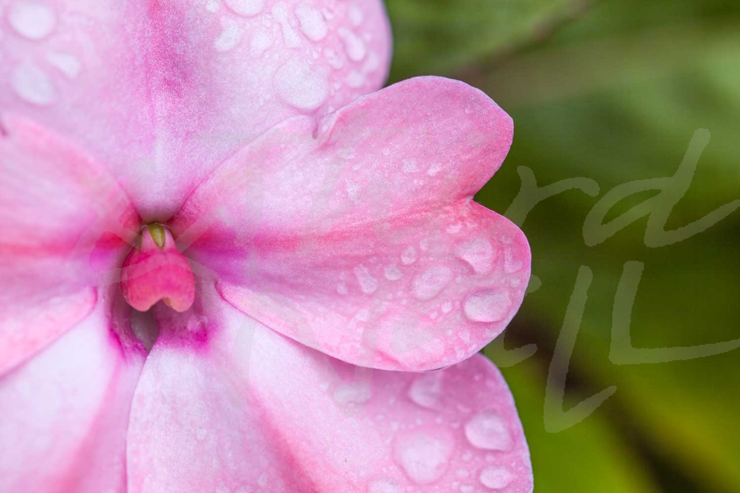
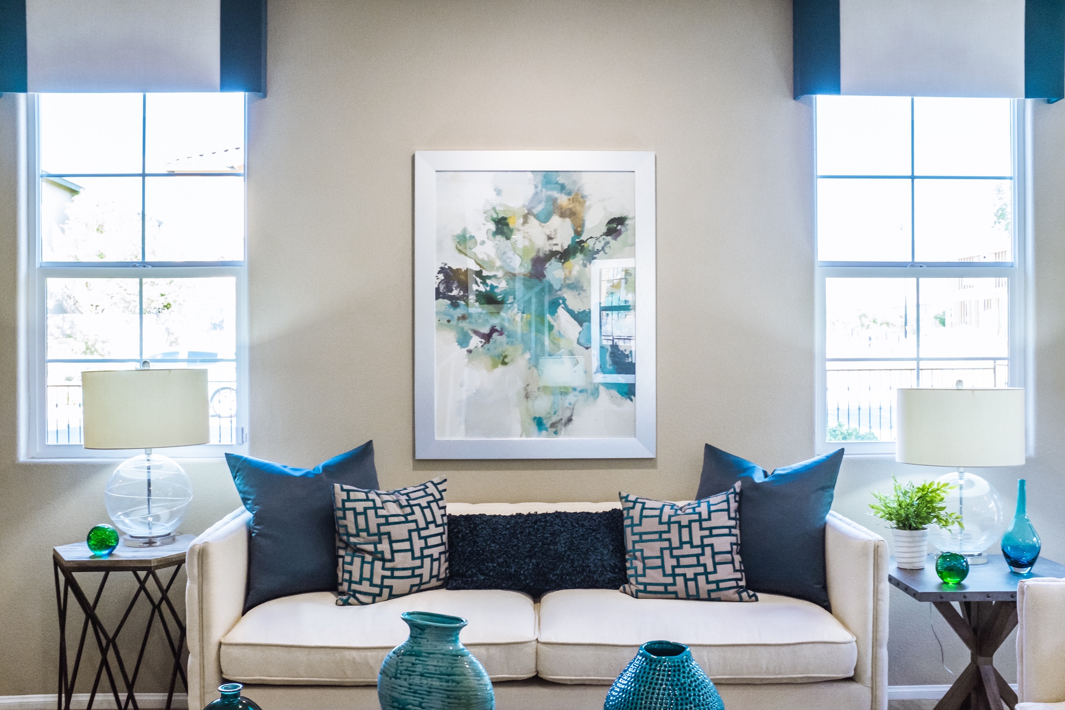
photograph by Nancy Crowell 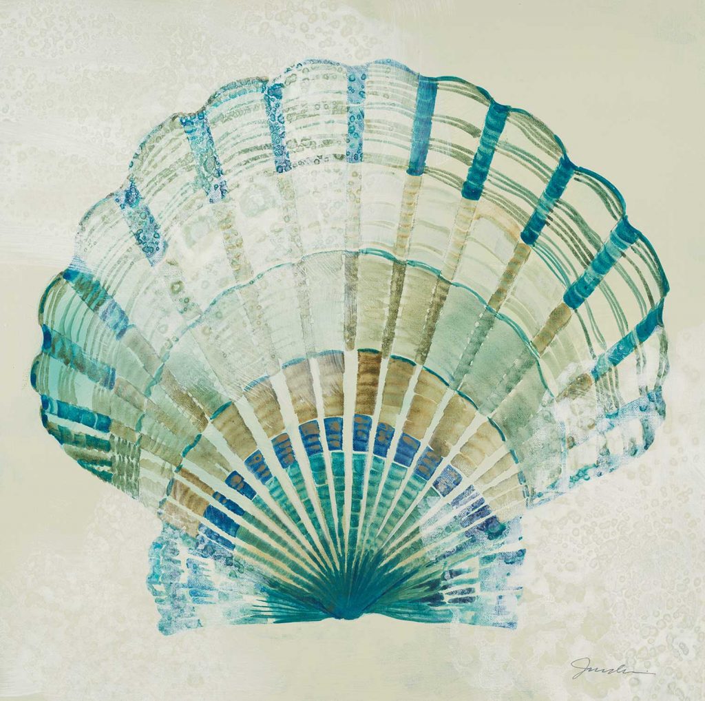
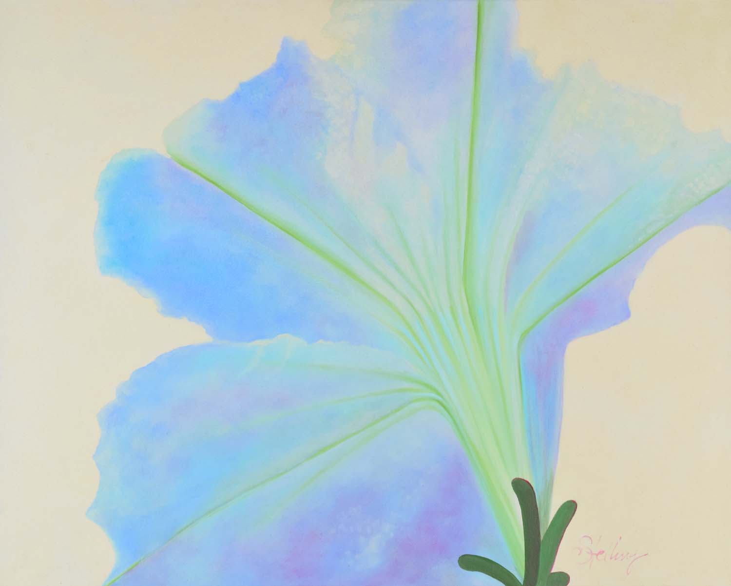
“Sea Foam II” by Liz Jardine 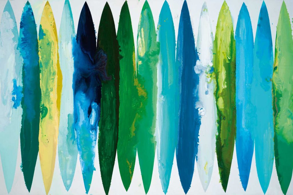
“Even Flow” by Randy Hibberd alt v 2 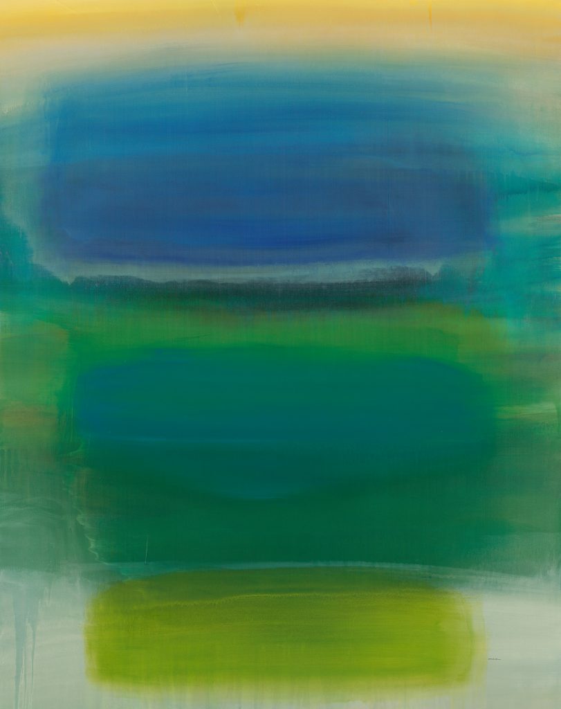
“Found I” by Sarah Stockstill 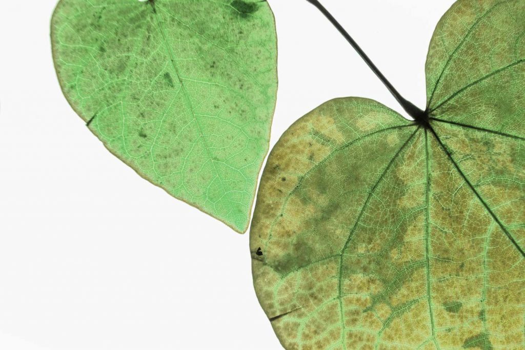
photograph by Nancy Crowell alt v 1 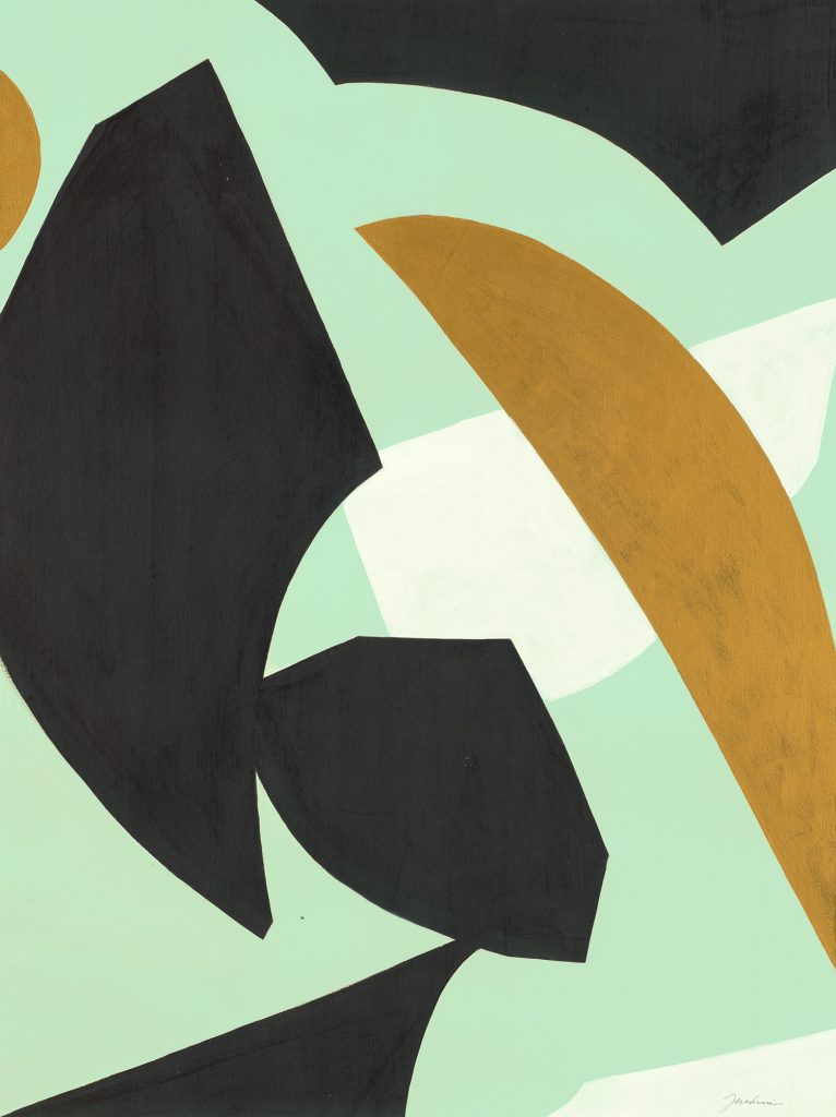
“Edge of the World II” by Liz Jardine alt v 1 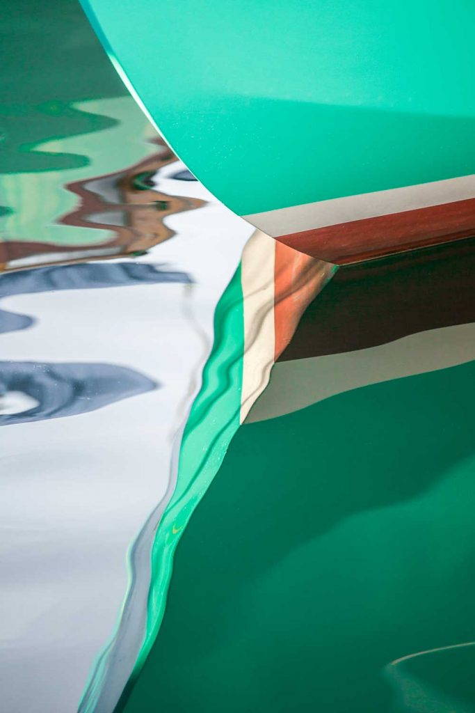
photograph by Melissa McClain 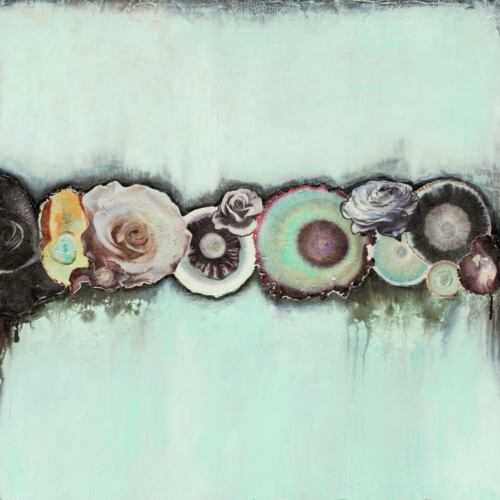
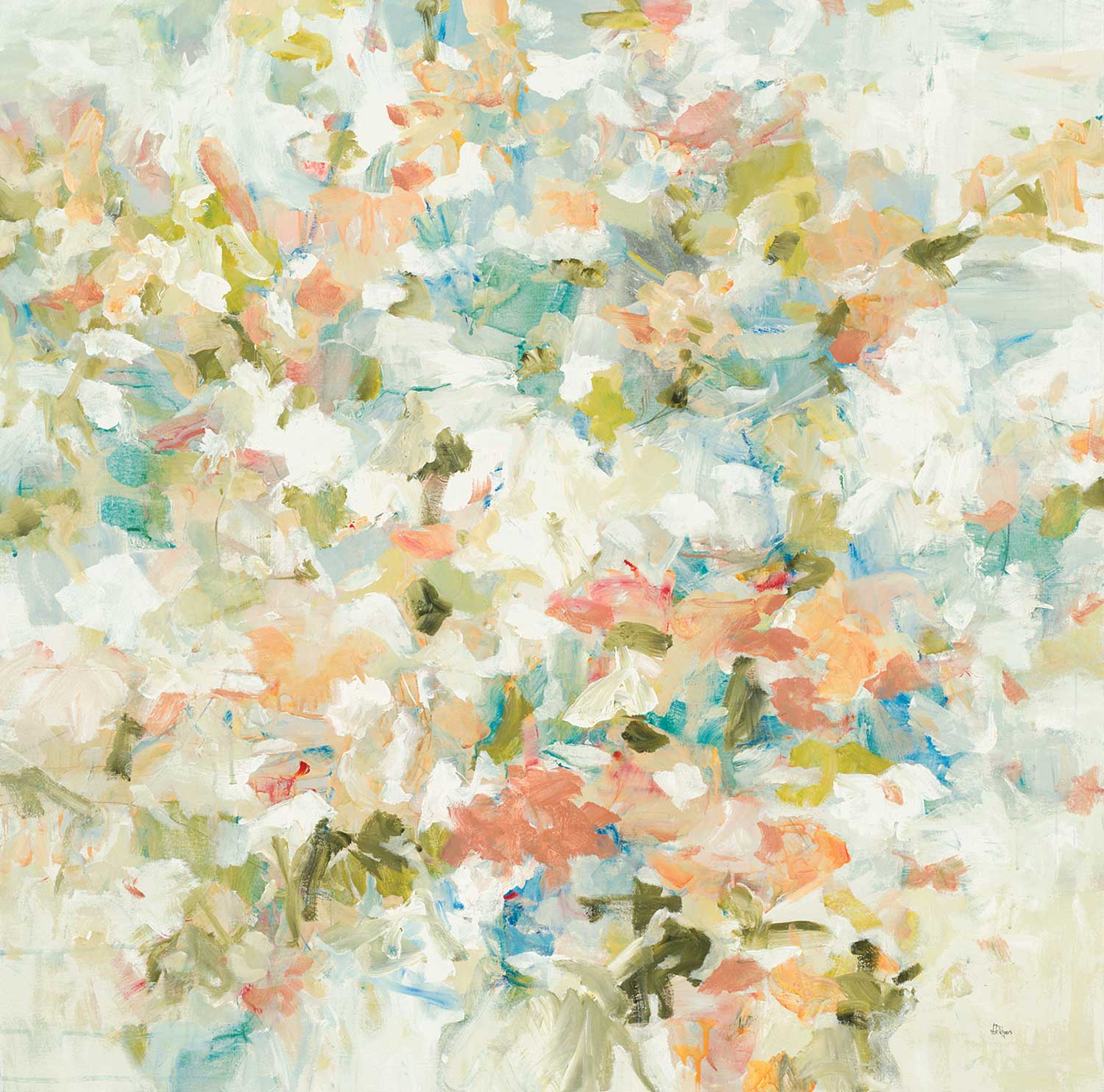
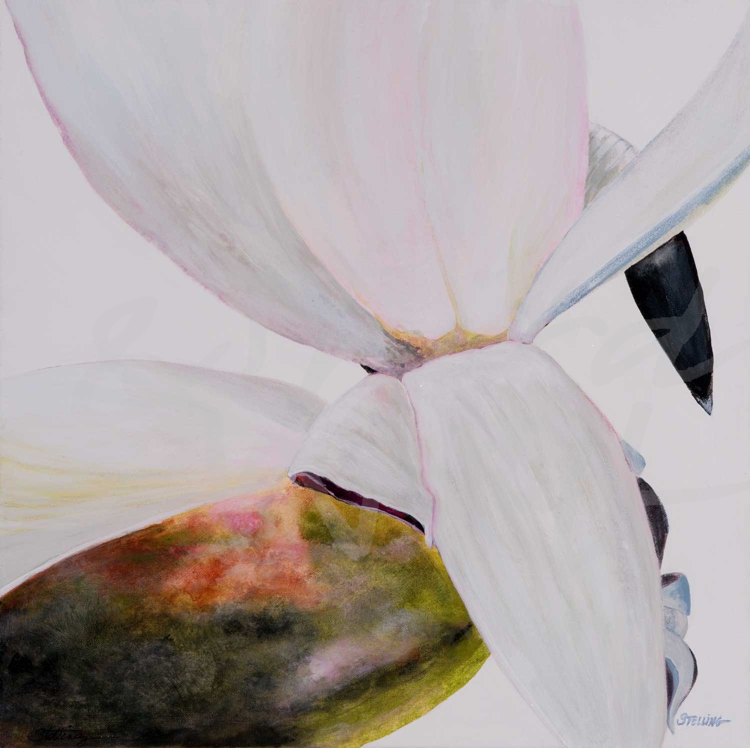
“Flower Road II” by Laura Van Horne 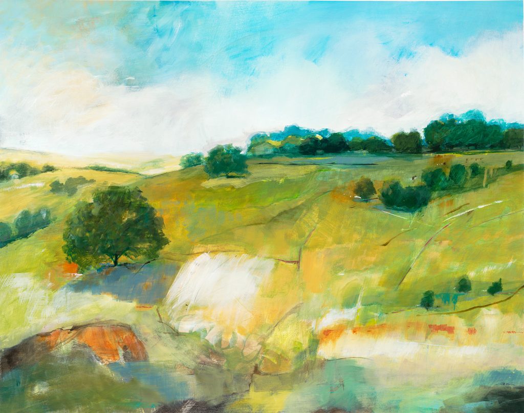
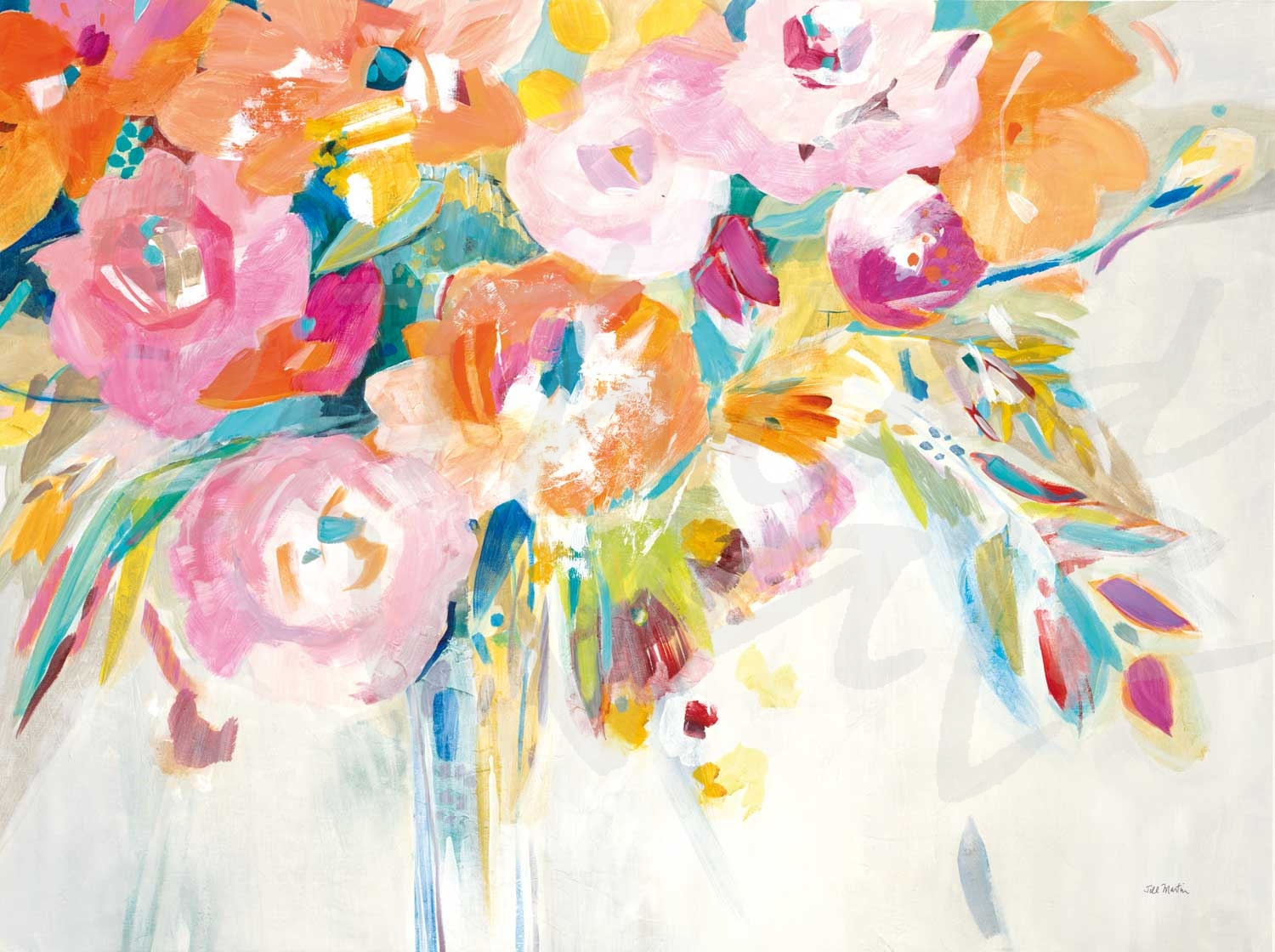
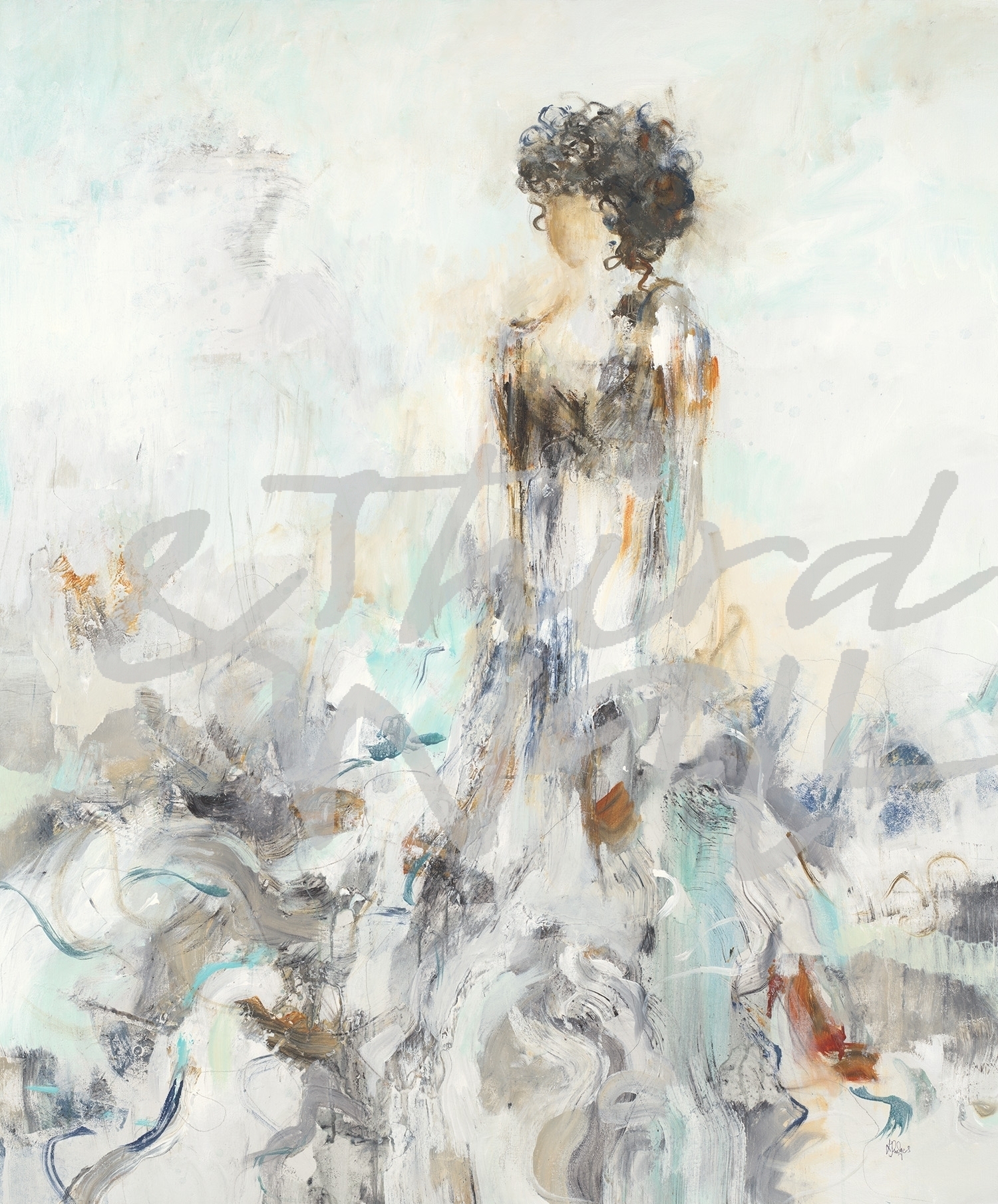
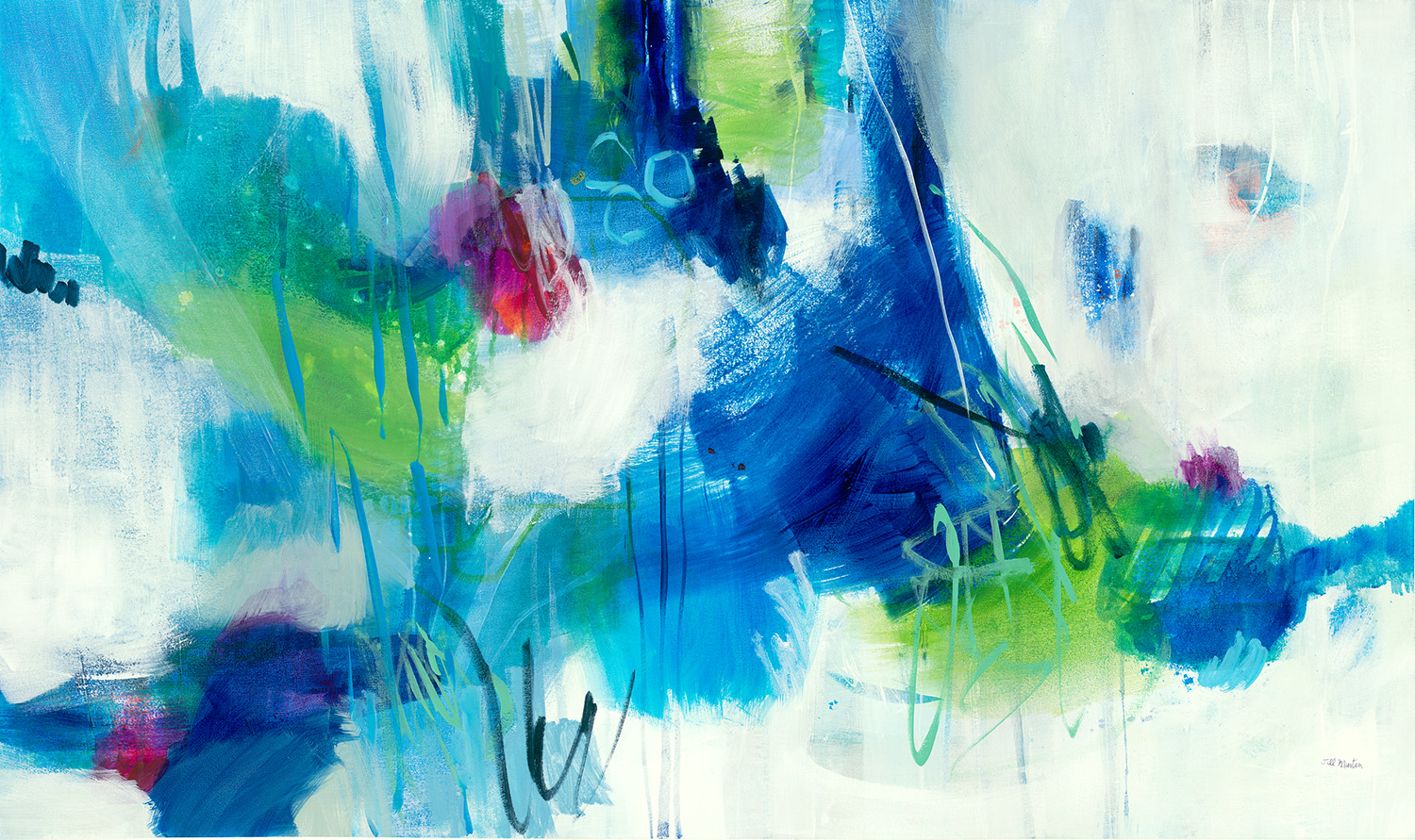
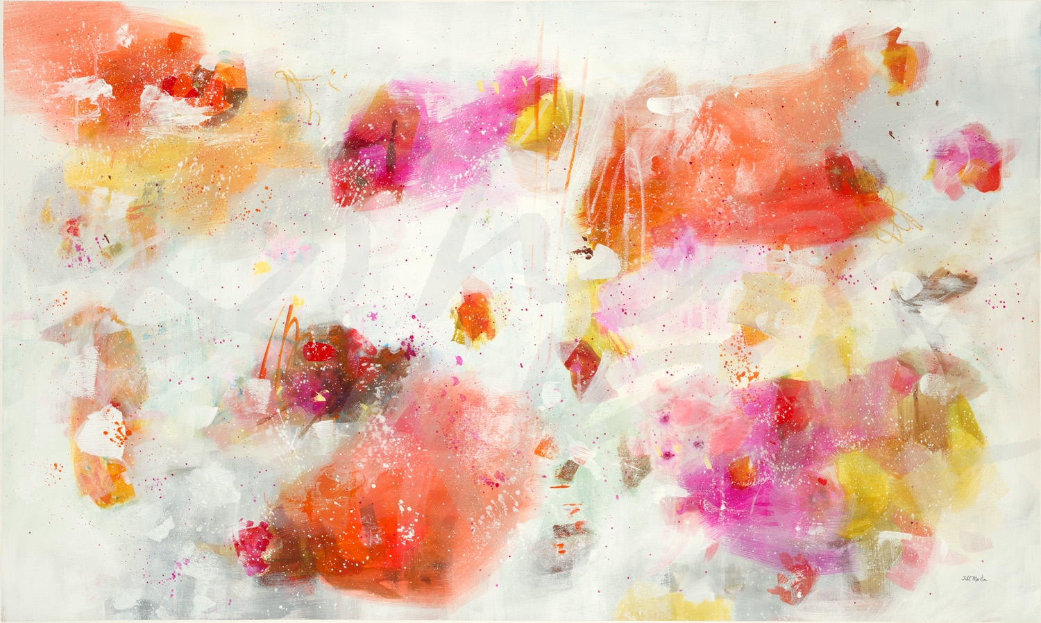
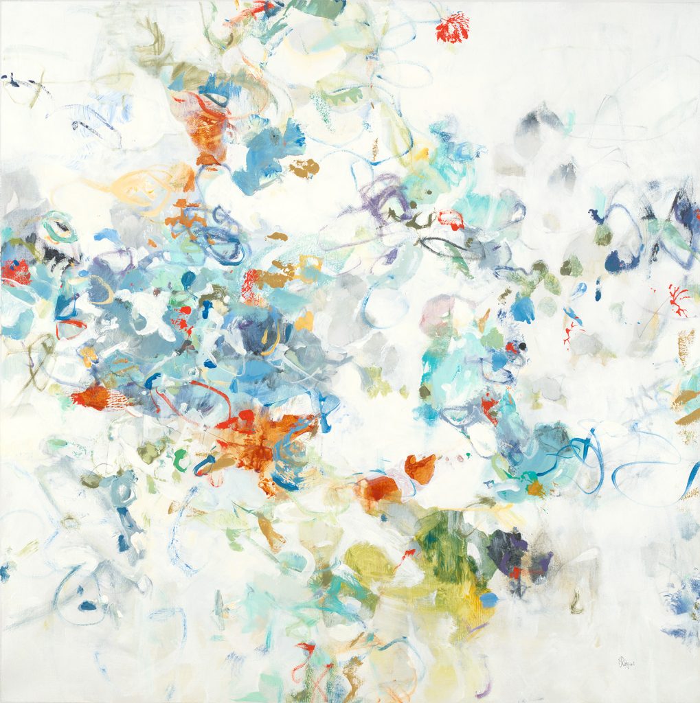
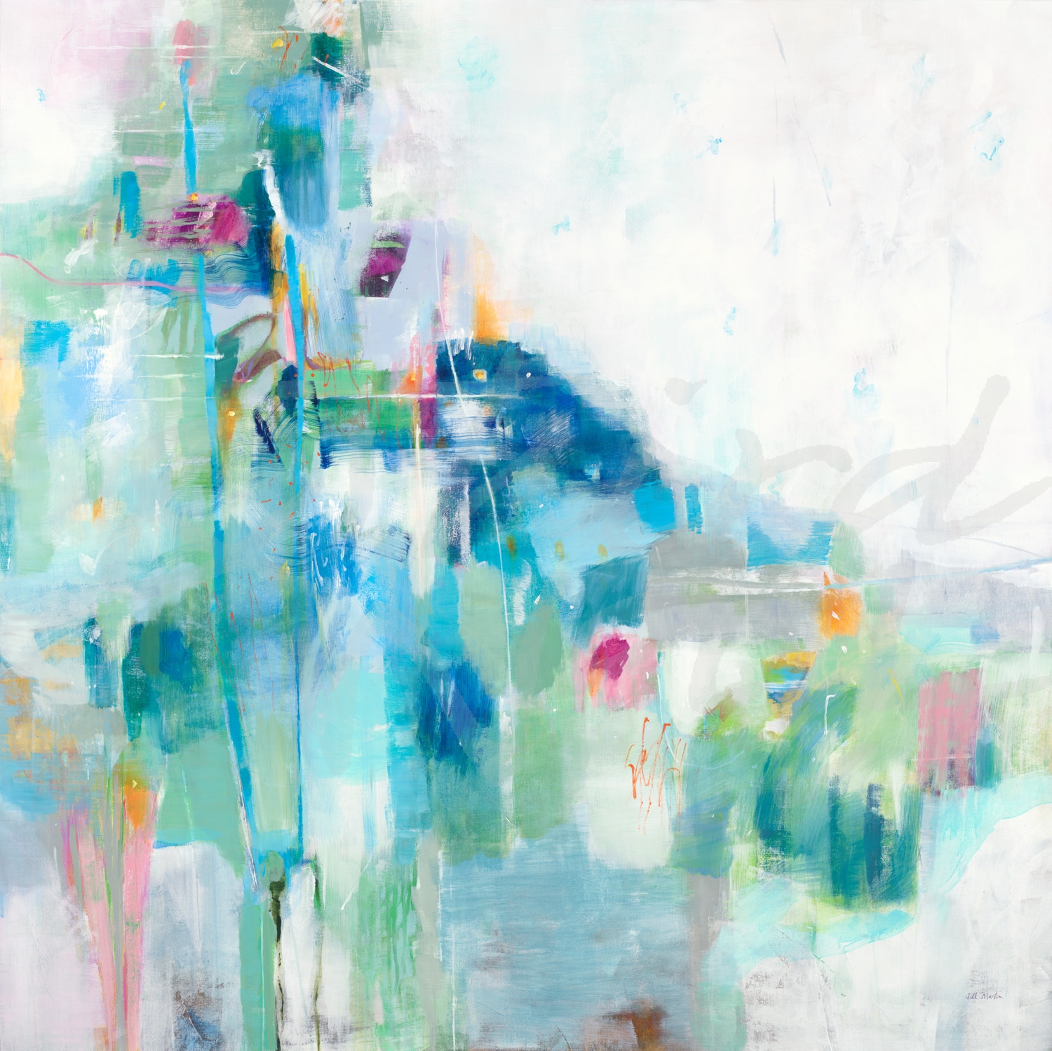
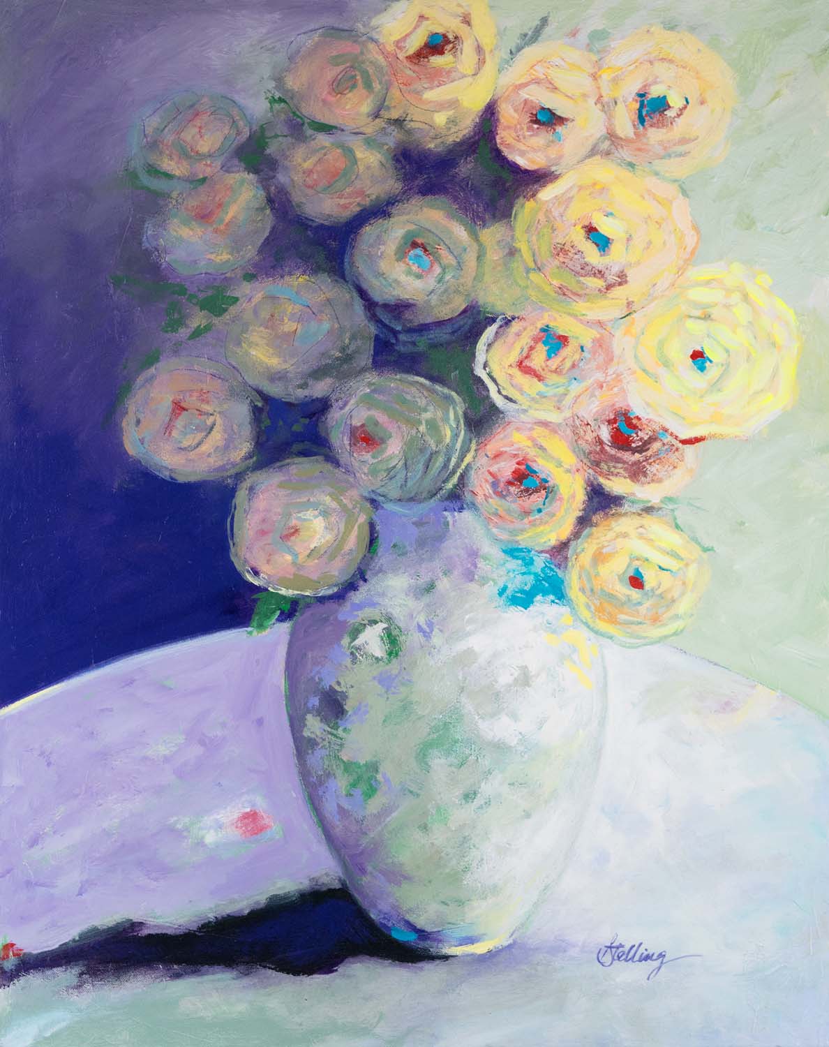
“Time To Reflect” by Jill Martin 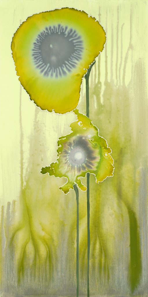
“Lime Pods” by Laura Van Horne 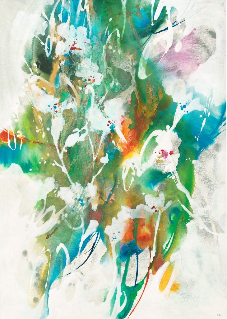
“Evanescing Scent” by K. Nari 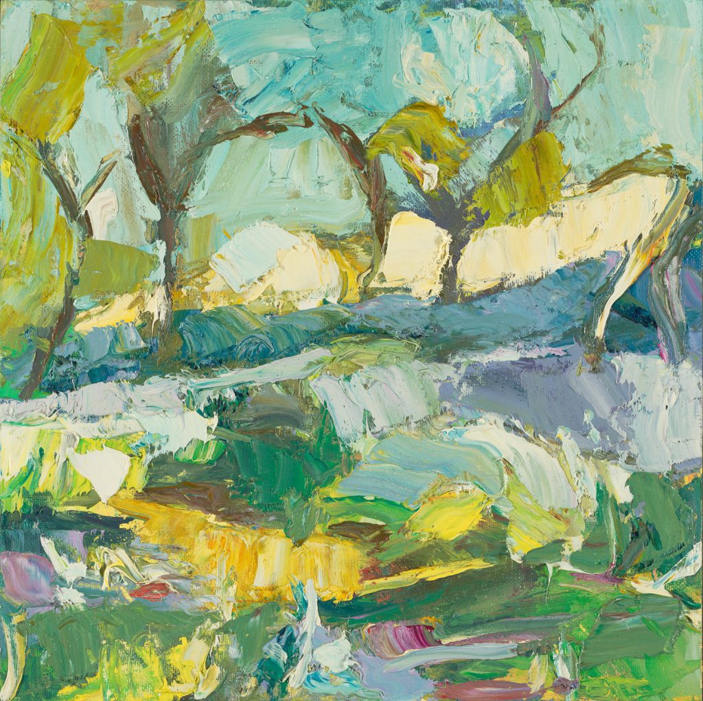
“My Brother Wants Blueberries” by Julie Devine 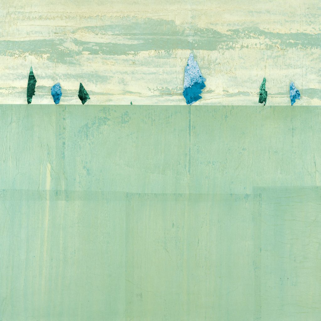
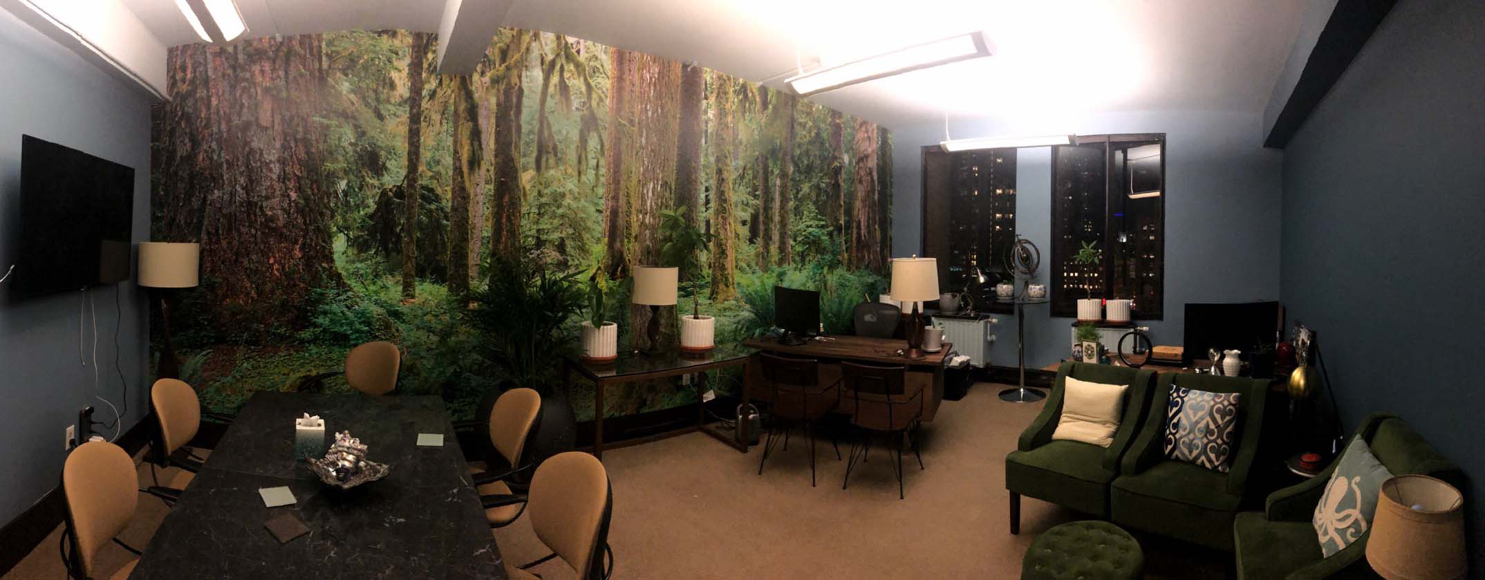
image by Peter Kuttner
With a wide variety of shades and undertones, green hues can seamlessly complement other colors and unique textures, and find a home in any design style. From traditional styles to modern elements, green tones freshen up a space and bring the natural healing of the outdoors in. Whether it’s the focal point of a room or an accent color, pops of this nature-inspired color can create a chic and relaxing space!
The images featured here are available in our Print-On-Demand collection. Some areas of our website are password-protected. If you are a member of the trade but don’t have full access to our website, www.thirdandwall.com, please contact us at customerservice@thirdandwall.com.