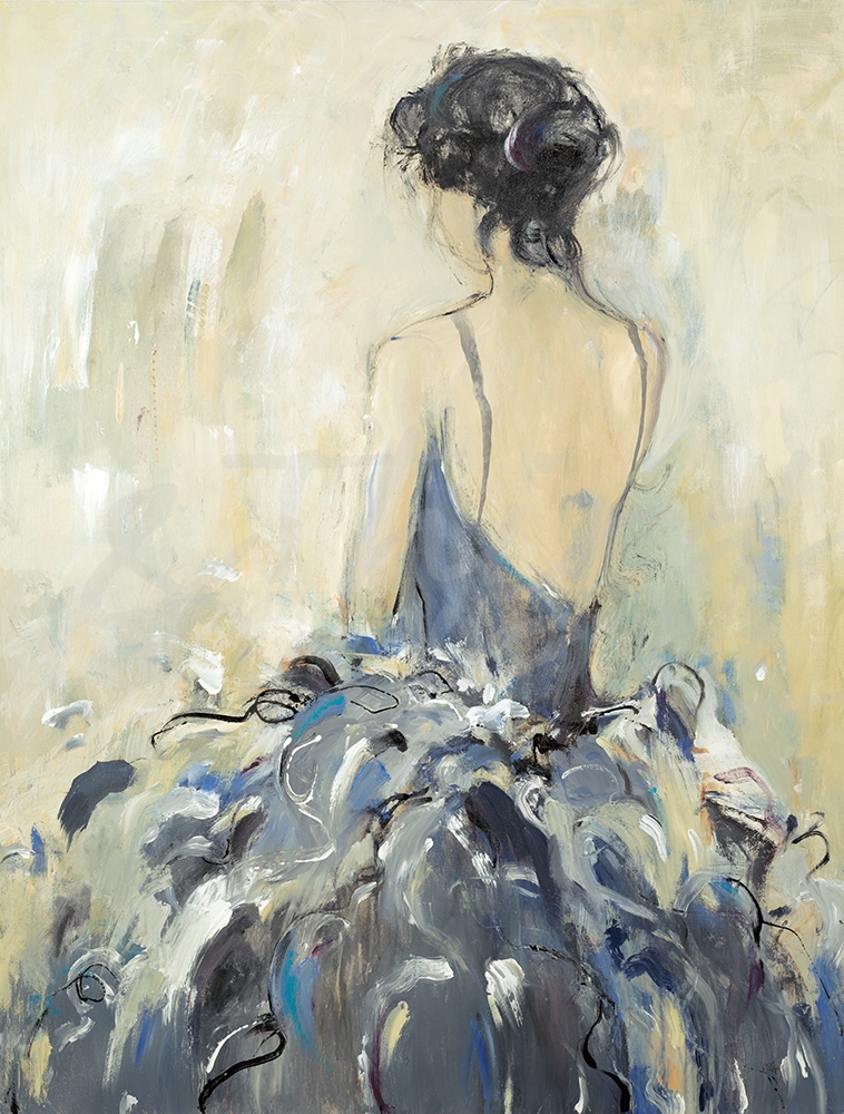
We were excited to participate and be featured in Redfin’s blog post “15 Tips to Revamp Your Room From Dull to Dazzling”! Here’s a little sneak peek of the article and our tip for transforming your bedroom using artwork. And check out more tips in the full article on Redfin’s blog!
Your bedroom is one of the most important rooms in your house and the one you spend most of your time in. Even though few guests will step foot inside, it’s important to give your space a refresh to fit your style and become your personal getaway. So even if you live in Portland, New York, or anywhere in between, you’ll be able to escape the chaos of everyday life. This doesn’t require a complete remodel. In fact, incorporating things like well-placed art, bold wallpaper, and your favorite materials and colors will do just the trick. Looking for some inspiration? We’ve gathered tips from experts on how to create the room of your dreams.
Incorporate artwork into your bedroom
Refreshing your bedroom can be as easy as switching out the artwork in your space. Add new color, texture, and style to your room by hanging a unique, large-scale art piece or pair different pieces together to curate your own gallery-styled wall. For an even bolder transformation, cover one or all of your walls in a favorite print with wallcovering. –Third & Wall
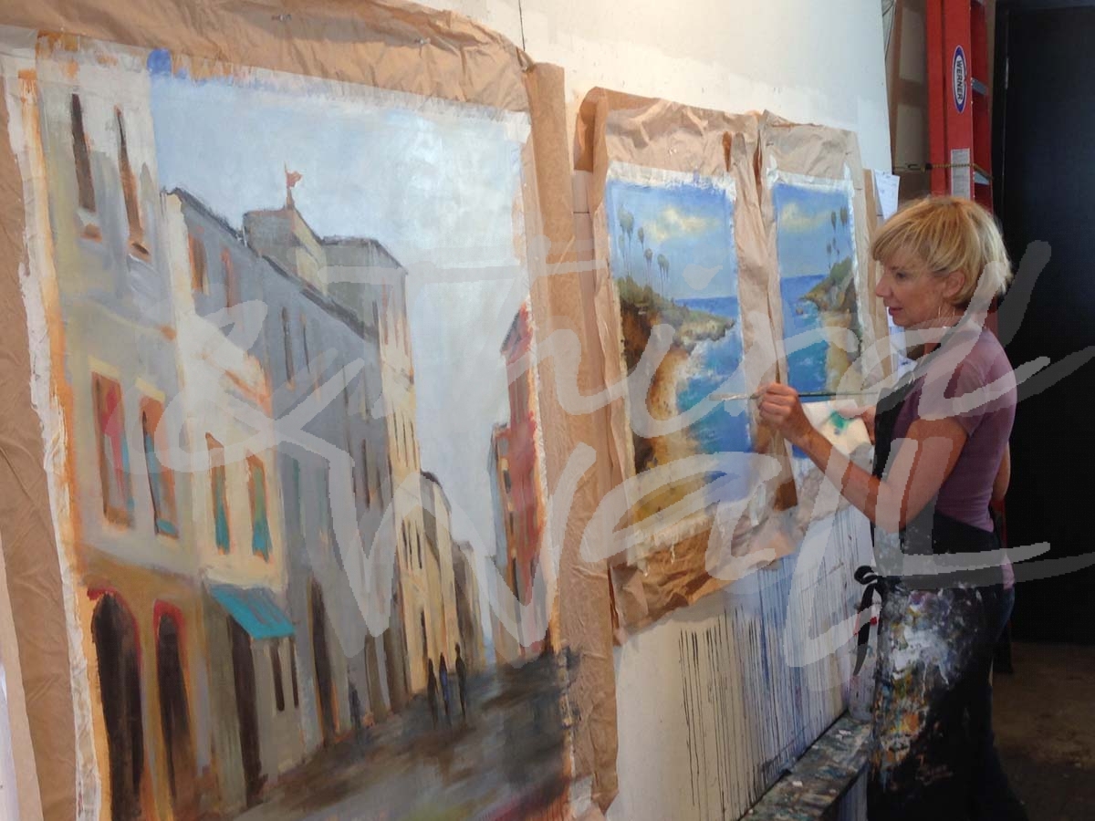
Meet our new artist, Stacey Pollard! Her paintings usually involve landscape, either as a study of shapes and compositions or of structures in the landscape. Since moving to Seattle, Stacey has been drawn to the varied architecture and light of the Pacific Northwest. Her paintings start with photographs as reference, and she quickly edits the composition, adding layers and materials. Building up the textures and glazes is an exciting process for her every time! Stacey likes to walk the line between an accurate depiction of what she saw and a more emotional reading of the scene.
What do you do when you get to the studio in the morning?
I stop on the way and get my coffee–have to have it in my hand even if I don’t drink it. Then I turn up the heat and get my playlist going.
“Evening Reflection”
How many paintings do you work on at a time?
I usually have two or three going at once, all at different stages.
Do you have a dream project that you would like to work on?
Not really–I’m having fun with what I’m doing now.
If you could paint with anyone, who would it be?
I would have to go back in time to hang out in Richard Diebenkorn’s studio–I’ve always admired his work.
What’s your favorite way of generating ideas and inspiration?
I take photos when I’m out and about–whatever scene catches my eye. Then I take them back to the studio to find the shapes and compositions–different ideas appeal to me at different times. Once I get a painting started, I put the photo away and just refer to the painting itself–that’s when the really exciting stuff happens.
“Walk In The Park”
“Labyrinth”
“Mosaic”
“Hideaway”
“Past Life”
“Green Circle”
How has your art evolved over time?
I started out as a painter and printmaker–I think my paintings are similar to the collagraph plates I used to make. I still like to layer on the textures and colors. The subject matter has changed a bit, but they still start with something representational, and then I abstract them.
“Intrepid”
What do you like most about your work?
I like that they are interesting to look at up close and interesting to see from far away. The texture is fun to create, and the layers of glazes and brushwork also seem to hold up.
What is one word that best describes your style?
Abstract landscape–not one word but that is the best I can do!
“Port Townsend”
“Dusk”
“Eaves”
Is there an idea you would like to explore?
I’m always looking for the next great composition–one that really resonates when I see it. Those are the unforgettable images or scenes I know I have to paint.
What is your favorite time of day to paint?
“Egress”
I like to paint in the afternoon.
Do you ever get “stuck” on a piece? If so, what do you do?
Of course! When I can see it starting to happen, I have to set it aside and let it simmer for a while. Sometimes I just have to give up and start over, but then again some of my best pieces were saved at the last minute!
What is up next on your easel?
I’m working on three pieces at the moment–I’ve been experimenting with underpainting and some different textures. It’s hard to take my time on these–I’ve got so many ideas I want to try!
“Summer’s Day”
“Quiet Reflection”
“Blue House”
“Reflection I”
“Coming Storm”
“Monterey”
The images featured here are available in our Print-On-Demand collection. Some areas of our website are password-protected. If you are a member of the trade but don’t have full access to our website, www.thirdandwall.com, please contact us at customerservice@thirdandwall.com.
The beginning of a new month can be the perfect time to refresh your interiors and find new trends to try. And as we kick off this new decade, we can’t help but want to go big! Wallcovering and wallpaper will continue to be a growing design trend this year and one that we love! From soft, subtle scenes to bold and expressive patterns, wallcovering can add style and personality to any room. It’s a great way to bring color and texture into your space in unique and unexpected ways. This popular trend works great in residential and commercial design, so we wanted to share a few ways to include different wallcovering prints and textures in your space.
featuring “Sound & Color” by Kippi Leonard
One of our favorite things about wallcovering is that there are various ways to decorate your walls with it. You can cover all of your walls, use it to make a statement accent wall, or (particularly if you have an oddly shaped wall) you can easily wallpaper half or parts of a wall. And for drama and detail in an unexpected place, you can try covering your ceiling!
Murals
Why not blow up that landscape to full wall size? Murals and serene scenes are great for accent walls and infusing your space with natural inspiration. A global-inspired scene can add some wanderlust while silhouette prints can add a twist on a classic look. Visually rich wallcovering that resembles different materials, such as marble, wood, or terrazzo, will add a luxe and modern style to your space. And wallcovering can be an easy way to introduce metallics into your wall décor to make a memorable moment in your room. Mural wallcovering can turn your design into one-of-a-kind!
Patterns
Patterns are a common wallcovering trend, but there are many different ways to infuse it with your own style. Geometric patterns are popular in design, especially with Art Deco design having a resurgence, and the symmetrical nature allows for bold, playful colors. Simple tonal stripes and small-scale prints, such as dots, can help make a room feel larger. Large solid and color-blocked prints in wallcovering can create a timeless design, especially in a dramatic black and white color scheme or crisp, classic blue hues. For a light and minimal space, try oversized prints in botanical, fruit, and bird imagery!
Florals & Painterly Prints
A floral print might initially come to mind when you think of wallpaper or wallcovering. Florals are a traditional décor staple that is getting an updated look, helping to create modern spaces with bold colors and large-scale, abstracted patterns. Painterly florals and imagery can be unique and easy on the eye, while lively abstracts are energizing and great for an eclectic look.
featuring “River’s Run” by Jeff Iorillo
At Third & Wall, we not only have many different images to choose from for your wallcovering, but also several different styles and textures to add extra detail to your walls. Textured wallcovering is great for a monochrome look, as it adds dimension and character while keeping it simple. A suede wallcovering has a similar texture to, you guessed it, suede fabric. This light texture works well to reduce glare from direct light, while adding warmth to the print. With a flat, smooth, and low-gloss finish, we recommend a matte wallcovering for crisp, sharp-edged prints such as photography or detailed designs. A canvas wallcovering will give your wall an elegant and painterly effect, as it mimics the texture of a painter’s canvas. Lastly, Terralon wallcovering is a PVC-free alternative wallcovering material made from 31% post-consumer recycled materials, with various LEED credits. It is smooth and breathable for a sleek finish!
wallcovering samples
However you decide to decorate with this trend, we want to help you find the best image and wallcovering option! Some areas of our website are password-protected. If you are a member of the trade but don’t have full access to our website, www.thirdandwall.com, please contact us at customerservice@thirdandwall.com.
As a new year begins, we always look forward to the predictions of new décor and design trends. In forecasted color trends, Pantone announced their Color of the Year 2020: Classic Blue, and we are excited for this “timeless and enduring blue hue”! Blues are known to be calming and comforting, and the deep shade that Pantone has chosen for this new year reflects just that. Sherwin Williams also selected a moodier navy blue, Naval, as their color for 2020. Looks like having the blues isn’t such a bad thing after all!
“Panacea” by Corrie LaVelle
“Blue Velveteen” by K. Nari
“Blue Gazing” by Dina D’Argo
“The Perfect Place” by Kippi Leonard
“Tulipania” by Liz Jardine
“All Aflutter” by Liz Jardine alt v 2
“Cobalt Velocity” by Jeff Iorillo
“Soul Searching” by K. Nari
“Metropolis” by Terri Burris alt v 1
“Flight of the Butterfly” by Liz Jardine
photograph by Nancy Crowell
“Interpretation” by Jeff Iorillo
“On Rush II” by Jeff Iorillo
photograph by Melissa McClain
“View From The Air” by Liz Jardine
Changing out your artwork is an easy way to refresh your space and try out these new colors and interior trends. Because of their versatility, rich dark blues are taking on the role of a neutral this coming year, so don’t be afraid to decorate with them in bolder ways. These striking navy hues have relaxing and tranquil qualities, and they easily pair with any materials or colors you might already have in your space. From a luxe look to a cozy interior, these trending shades of blue can transform any design style!
“Plumage” by Dina D’Argo
“Meditation” by Nancy Ngo
“Gray Bouquet #1” by Laura Van Horne
“Light Ring II” by KC Haxton
“Blue Skies” by Linda Stelling
“B&W Palm I” by Patti Mann alt v 4
“Gold Rush” by Liz Jardine
“REdowa” by Jill Martin alt v 2
photograph by Aaron Matheson
“Sense of Time” by Peter Kuttner alt v 1
“Entwined” by Leah Rei
photograph by Melissa McClain
“Mountain of Blue” by Laura Van Horne
“Nexus I” by Leah Rei
“On Course II” by Dina D’Argo
“Subtle Views V” by Lisa Ridgers
photograph by Nancy Crowell alt v 1
“Al Fresco Style” by Liz Jardine alt v 3
The images featured here are available in our Print-On-Demand collection. Some areas of our website are password-protected. If you are a member of the trade but don’t have full access to our website, www.thirdandwall.com, please contact us at customerservice@thirdandwall.com.
Are you looking for a way to freshen up your space? Incorporating shades of green can do just that and add a natural element to your interior. Bringing the outdoors in has become a popular design trend, and adding some green is one of the easiest ways to infuse vitality into your room. Cool green tones can be relaxing and nourishing, while warm tones can add personality and energy to a space, and they don’t always have to come in botanical form. Having green hues in your furniture, accent pieces, and on your walls can be resting or energizing, and with such a wide range of green tones to use, it is easy to find the perfect one for your space. Since there are endless possibilities, we are highlighting different ways to incorporate this versatile color trend into your decor and design to help you go green!
Greens as Neutrals
Cool, muted greens that take on more of a gray or brown tone, such as sage, are great for acting like neutrals in a space. Paler greens that verge on the point of gray are a great way to keep a space light and serene, but they can pair easily with sharp, bright colors. Khaki, mossy, and olivey greens can give a design an earthy feel, especially when paired with warm tones and natural textures. It’s easy to switch out your wall décor in these soothing, neutral green tones because of their versatility and ability to work with what you already have!
“Fall Away” by Lisa Ridgers
photograph by Aaron Matheson
“Soothing Scenery III” by Lisa Ridgers
photograph by Melissa McClain
“Spring Orchard” by Julie Devine alt v 2
“The Anniversary” by Corrie LaVelle alt v 12
photograph by Melissa McClain
“Sage Lush” by K. Nari
photograph by Aaron Matheson
“Abstract Reflections” by Lisa Ridgers
“Tropical Vines” by Terri Burris
“Soft Eucalyptus II” by Dina D’Argo
“Skyline II” by Lisa Ridgers
“Forecasting Change” by Ruth Fromstein
Rich & Saturated
Bold, saturated green tones, such as jade and emerald green, add a rich and regal element to any interior. Whether paired with other dark accents to create a moody space or offset with neutrals and metallic accents, deep green tones can add personality and elegance. These dark, nature-inspired colors are great in furniture, accent pieces, or on your walls!
“Being” by Corrie LaVelle
“Nexus III” by Leah Rei
photograph by Aaorn Matheson
“In A Blue Mood” by Liz Jardine alt v 3
“Reticent I” by Scott Brems
photograph by Nancy Crowell
“Aqua Petals” by K. Nari
“Down Streams” by Kippi Leonard
photograph by Aaron Matheson
“Spring Fling” by K. Nari
“Charcoal Foliage I” by Kayleigh Wold alt v 3
“Silver Sky” by K. Nari
“Untitled” by Corrie LaVelle
“River Mist” by Scott Brems
“Wintergreen” by K. Nari
Light & Bright
Light and bright green tones help to soothe and enliven rooms. Soft, pale greens colors with blue undertones, such as mint and sea-glass green, can brighten up a space in a calming way. Yellow-greens are fresh and inviting and more reminiscent of botanical hues. Using more lively and vibrant green colors, such as a shade of lime green, is great for social spaces because they can energize a room. If you go bold with bright green on your wall, balancing it out with neutral tones and light accents can keep it from feeling overwhelming. Decorating with light & bright greens in décor accessories and upholstery is a great way to add some calming and natural elements in smaller doses.
“Around The World IV” by Jeff Iorillo
“L’Arbre III” by Patti Mann
photograph by Nancy Crowell
“Sea Foam II” by Liz Jardine
“Even Flow” by Randy Hibberd alt v 2
“Found I” by Sarah Stockstill
photograph by Nancy Crowell alt v 1
“Edge of the World II” by Liz Jardine alt v 1
photograph by Melissa McClain
“Flower Road II” by Laura Van Horne
“Time To Reflect” by Jill Martin
“Lime Pods” by Laura Van Horne
“Evanescing Scent” by K. Nari
“My Brother Wants Blueberries” by Julie Devine
image by Peter Kuttner
With a wide variety of shades and undertones, green hues can seamlessly complement other colors and unique textures, and find a home in any design style. From traditional styles to modern elements, green tones freshen up a space and bring the natural healing of the outdoors in. Whether it’s the focal point of a room or an accent color, pops of this nature-inspired color can create a chic and relaxing space!
The images featured here are available in our Print-On-Demand collection. Some areas of our website are password-protected. If you are a member of the trade but don’t have full access to our website, www.thirdandwall.com, please contact us at customerservice@thirdandwall.com.
New York Fashion Week 2019 wrapped up in September and there were some runway trends for the upcoming year that caught our eye. It’s no surprise that the relationship between fashion and interiors is a close one, so these fashion trends can easily be applied to create unique spaces. We wanted to highlight a few of our favorite runway styles and how they can find a home in your wall decor!
BOLD: Prints & Patterns
“Olives” by Laura Van Horne alt v 3
“Undersea Fantasia” by Liz Jardine
“Fresh Volley” by Jeff Iorillo
“Shades of Green” by Liz Jardine
“A Deep Rose” by Jill Martin
by Sarah Stockstill
“House Party” by Liz Jardine
“Proud As A Peacock” by Liz Jardine
Bold patterns are trending on the runways and on our walls! From polka dots to rose prints to black & white graphic prints, we are drawing from this high-fashion inspiration and predicting bold patterns to be big in wall decor this coming year. Bold printed wallpaper and wallcovering have become very popular, and it looks to be an interior trend that will continue to grow in 2020.
BRIGHT: Citrus-Inspired Colors
“Even Flow” by Randy Hibberd alt
“Cool Summer” by Jeff Iorillo
“The Sun and The Earth” by Linda Stelling
“Layered Sounds II” by Randy Hibberd
“Tangerine Sky” by KaCee Erle
“Cool Waves” by Liz Jardine
“The Drip #5” by Laura Van Horne
“High Note” by Liz Jardine
floral by Bradford Brenner
“Growth” by Laura Van Horne
Citrus-inspired colors are brightening up wardrobes and interiors! Refreshing colors such as lime green, tangy tangerine, and not-so-mellow yellow made a statement on the catwalks and are sure to make a splash in decor for a bright and colorful 2020. Decorating with these trendy highlighter hues can be as easy as hanging the perfect eye-catching artwork on your walls!
CLASSIC: All White Suit
“Stop On White” by Brooke Borcherding
“Still Life” by Julie Devine
photograph by Nancy Crowell
“Pearlescent Blooms” by K. Nari
The all-white suit continues to be a chic fashion staple and this past New York Fashion Week, designers were taking it to the next level with sultry cutouts and unique silhouettes. This clean, classic, and structured runway trend took a more relaxed, stylized vibe this year and it can easily transition to interior design and decor. Whether you want an all-white space or just some neutral decor, wall art in this pared-down color palette can be the stylized, unique accent piece you need!
The fashion and design industries are continually influencing each other and we love looking to the fashion world for inspiration!
The images featured above are available in our Print-On-Demand collection. Some areas of our website are password-protected. If you are a member of the trade but don’t have full access to our website, www.thirdandwall.com, please contact us at customerservice@thirdandwall.com.
Are you looking to make an impact with your wall art? One popular décor trend that can do just that is contemporary figurative art. In a variety of artistic styles, figurative artwork can add whimsical flair or a modern touch to any interior. While it doesn’t always mean artwork of people, figurative art often takes human form. With its representational approach, figurative imagery can be simple line sketches or bold abstracted figures. We love how contemporary figurative art decor can add fresh takes on classic subjects that feel familiar!
“Femme II” by Patti Mann
“Little Boxer” by Laura Van Horne
“Red Dress” by Lisa Ridgers
“Surfers” by Randy Hibberd
“Trapped In Plain Sight” by Sarah Stevenson
“Bike Ride on the Boardwalk (Male)” by Terri Burris
“Night Out” by Julianne Marcoux
“Lady In Blue” by K. Nari
“Over In The Light” by KC Haxton
“Ms. Thing In Spades” by BethAnn Lawson
“Redowa” by Jill Martin alt v 2
“Mr. Right” by BethAnn Lawson
Figurative art can elevate a space and a female figure can add a feminine touch. One room that is a perfect spot for artwork of figures, and even nude art, is the bathroom. This classic art theme, whether realistic or impressionistic, can complement any design style!
“Into The Blue” by Kelsey Hochstatter
“Ole” by Lisa Ridgers
“Butterfly Girl” by Laura Van Horne
“Grace” by Sarah Stockstill
“True” by Kelsey Hochstatter
“The Dance” by Liz Jardine
“Negative II” by Liz Jardine
“Focus I” by Patti Mann
“Girl With Surfboard” by Sarah Stevenson
The images featured above are available in our Print-On-Demand collection. Some areas of our website are password-protected. If you are a member of the trade but don’t have full access to our website, www.thirdandwall.com, please contact us at customerservice@thirdandwall.com.
Adding animal prints and imagery to spaces continues to be a popular decor trend, and one that we love! This trend can fit any design style and can be as bold as you want. Neutrally-toned western-inspired imagery can complete a modern farmhouse or boho design; a bright watercolor sea creature is a sweet addition to any wall, and; wild life artwork can be paired perfectly with fierce animal prints and saturated tones. Celebrate your own pet by hanging similar artwork of them on your walls or just add imagery of your favorite animal!
Horses and Farm Animals
It’s no surprise that horse imagery is one of the most popular animal decor trends. Whether your space is sleek and modern, rustic and Southwest-inspired, or a cozy farmhouse feel, images of horses, longhorns, deer and farm animals can add the finishing touches to your design. You are sure to find animal artwork that suits your style and color palette!
“Vanguard” by Dina D’Argo
“Blue Meadow” by Stacy D’Aguiar
“Colt” by Patti Mann
“Bridled Beauty” photograph by KaCee Erle
“Run Free” photograph by KaCee Erle
photograph by Nancy Crowell
“Long Horn” by Scott Brems
“Longhorn” by Dina D’Argo
photograph by Aaron Matheson
“Young Buck” by Liz Jardine
“Homespun (Lamb)” by Liz Jardine
“Deer” by Liz Jardine
“Down on the Farm II” by Patti Mann
“Pink Pig” by Patti Mann
“Save the Drama for your Llama” by Patti Mann
Under The Sea
Artwork of ocean life can bring a coastal decor element to your room. With imagery in different styles, sea creatures can add some relaxing or playful vibes to your design. Mix them with a nautical-inspired space, a modern style, or a calm neutral space for a splash of the sea!
“Silver Jelly” by Laura Van Horne
“Fun Fish” by Dina D’Argo
“Lobster” by Patti Mann
by Patti Mann
“Riding The EAC” by Patti Mann
“Goldfish III” by Patti Mann
“Happy Narwhal” by Patti Mann
“Octo Legs” by Laura Van Horne
“Humpback Whale” by Patti Mann
“Seahorses In Love” by Dina D’Argo
“A Moment In Time” by Ruth Fromstein
“Manta Ray” by Laura Van Horne
“Sea Foam II” by Liz Jardine
“School” by Liz Jardine
“Golden Starfish” by Liz Jardine
Wild Life
Take a walk on the wild side! Wild life imagery can add a modern, global-inspired touch to your walls. Mix it with a zebra print rug, deep jewel tones, or a mostly-neutral room for instant glam or a subtle cool flair.
“Amboseli Elephants” by Jorge Llovet
“Striped Pajamas” by Liz Jardine
“Alligator” by Patti Mann
“Savannah III” by Patti Mann
“Crossing The African Plains” by Jorge Llovet
“Bear Totem” by Scott Brems
“Savannah IV” by Patti Mann
“Safari Animals- Elephant” by Liz Jardine
“African Heat” by Jorge Llovet
“Zebra” by Patti Mann alt v 5
“Fox” by Liz Jardine
“On The Move” by Scott Brems
“Savannah I” by Patti Mann
“Zebra Abstraction” by Jorge Llovet
Pet Friendly & Feathered Friends
The animal decor trend would not be complete without including artwork of dogs, cats, and birds. The decor of furry and feathered friends can be a sweet addition to any space. Whether you are inspired by your own pet or not, hanging some cute animal imagery can brighten your wall!
photograph by Marika Moffitt
photograph by Nancy Crowell
photograph by Marika Moffitt
“Walk Time II” by Patti Mann
photograph by Nancy Crowell
photograph by Nancy Crowell
photograph by Melissa McClain
photograph by Marika Moffitt
“Family Tree” by Liz Jardine
“Plumage” by Dina D’Argo
photograph by Marika Moffitt
“Blue Heron II” by Patti Mann
“Love birds” by Liz Jardine
“Poise II” by Patti Mann
“Blue Owl” by Patti Mann
“Quest for Flowers IV” by Stacy D’Aguiar
photograph by Aaron Matheson
“Pug” by Julianne Marcoux
The images featured above are available in our Print-On-Demand collection. Some areas of our website are password-protected. If you are a member of the trade but don’t have full access to our website, www.thirdandwall.com, please contact us at customerservice@thirdandwall.com.
So you’ve found the perfect image for your wall and determined it will be printed on canvas, but you just wish it had a little more texture or metallic shine like an original painting. Well, you’re in luck! At Third and Wall, we have the ability to add hand embellishment to your giclée canvas print. We offer several different embellishment options, which does mean that you will have one more decision to make. But, not to worry, we are breaking down the different types of embellishment to help! From gel brushstrokes for added texture to metallic leafing for extra shimmer (or both!), we want to help make your art work for you and your unique style!
Brushstroke Embellishment
hand embellishing with gel
“Flourish” by Randy Hibberd with gel embellishment
With a clear gel medium, we are able to hand-apply brushstrokes that follow the image of your print. This embellishment option will give your printed piece texture that can mimic an original piece without compromising the image. From fluid lines to geometric shapes and from thick gel to thin, the gel embellishment can highlight the movement of any piece.
Pigment Embellishment
“Charger” by John Burrows with pigment embellishment
pigment and gel embellishment
“Early Light” by Leah Rei with metallic pigment
We can also hand-paint canvas prints with pigment, including metallic and pearlescent colors, to add extra color and texture! Combined with the gel embellishment, added pigment can help the colors of your image truly pop. We use different paintbrushes and palette knives to apply the right color pigment and match the artistic style of the image, making the giclée come to life. We can use gold, silver, or bronze metallic and pearlescent paint, which adds a light shimmer to highlight the metallic shine that an original might have. The hand-painted texture and added color is a perfect way to elevate your giclée and really make it pop!
Metallic Leafing
“City Nights, Gold” by Liz Jardine with metallic leafing
“Equilibrium” by Leah Rei with gold leafing
“Bloom I” by Scott Brems with gold leafing
For a bold metallic pop on your canvas print, we can hand-apply silver, copper, or gold metallic leafing. The leafing can also be combined with the traditional gel embellishment to add that painterly texture with the burst of shimmer. No matter how much of the image you decide to add the metallic leaf to, it is sure to pack a golden or silvery punch!
No matter what you decide, having a canvas giclée embellished is a great way to customize an art print and create a truly unique art piece that is perfect for your wall!
featuring “Toward Shore I” and “Toward Shore II” by Lisa Ridgers
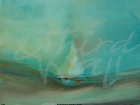
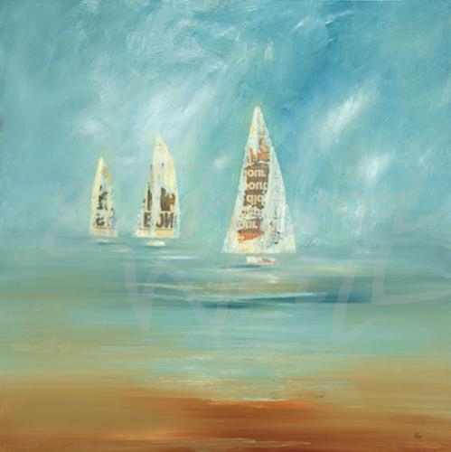
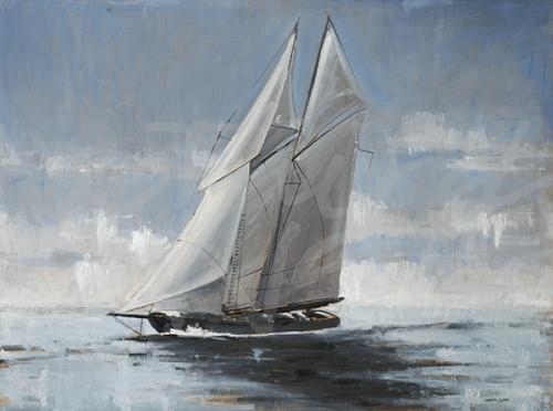
As we get ready for the long sunny days of summer, it can be a great time to refresh your space with new colors and furnishings. One popular design trend that can help keep you cool and relaxed during the warm months is the modern coastal theme. Light & neutral hues, shore-inspired imagery, and natural textures & materials can add sophisticated beachy vibes for a serene styled space. Incorporating the coastal theme doesn’t mean you have to completely transform your room. Adding some contemporary beachside inspiration to your space can be as easy as decorating with some neutral and blue accent colors or switching out your wall art. Abstracted seascapes, contemporary boat imagery, and coastal photography are great pieces that will add a modern seaside touch to your walls!
“Soothing Scenery IV” by Lisa Ridgers
photograph by Aaron Matheson
“Across A Line” by Brooke Borcherding
“Scape 355” by KC Haxton
“After The Storm” by Dina D’Argo
“Sail Away III” by Lisa Ridgers
“Tipping Point” by Leah Rei
photograph by Aaron Matheson
“Lost In Waves” by K. Nari
“Under The Sun” by Liz Jardine
photograph by Melissa McClain
“Fisherman’s Friend” by Liz Jardine
The contemporary coastal trend is perfect for creating a calming atmosphere, no matter how close you are to the shore. And for more coastal inspiration, check out this previous blog post!
photograph by Melissa McClain
“Ocean Tides VII” by Kelsey Hochstatter
“Ocean Front” by Bradford Brenner
“Sail Time III” by Lisa Ridgers
photograph by Aaron Matheson
“Bay Mist” by Pablo Rojero
“Take The Plunge” by Liz Jardine
photograph by Aaron Matheson
“From the Shore” by Jill Martin
photograph by Melissa McClain
The images featured above are available in our Print-On-Demand collection. Some areas of our website are password-protected. If you are a member of the trade but don’t have full access to our website, www.thirdandwall.com, please contact us at customerservice@thirdandwall.com.
We are firm believers that floral decor is always in season! There are many different ways to add florals to your design, and one of our favorites is hanging big, bold floral prints on your wall. Floral and botanical artwork reflects the uniqueness of each flower, making it an easy way to bring color, joy, and the beauty of nature indoors to any design style. Since it is such a timeless décor trend, we wanted to share some floral imagery that will add some flower power to your space!
“Peony Study 4” by KC Haxton
“Botanic Sketchbook I” by Stacy D’Aguiar
“A Charmed Life” by Liz Jardine
“Paris Poppy” by Linda Stelling
“For The Roses” by Liz Jardine
“Love Is A Rose I” by Linda Stelling
“Flower I” by Joseph Cates
“Reaching For The Sun V” by Ruth Fromstein
“In Full Bloom” by Liz Jardine
From traditional to contemporary styles, big and bold florals can breathe life into your design!
“Vivid Flower III” by Patti Mann
photograph by Nancy Crowell
“Pearlescent Blooms” by K. Nari
photograph by Melissa McClain
“Dance Lessons” by Jill Martin
photograph by Melissa McClain
“In Bloom” by Lisa Ridgers
“Floral Blush” by Lisa Ridgers
“Blue Magnolia II” by Leah Rei
photograph by Nancy Crowell
photograph by Melissa McClain
“Midori I” by K. Nari
“Cruisin'” by Ruth Fromstein
“Night Blooms I” by Nancy Ngo
“Beautiful Day” by Liz Jardine
The images featured above are available in our Print-On-Demand collection. Some areas of our website are password-protected. If you are a member of the trade but don’t have full access to our website, www.thirdandwall.com, please contact us at customerservice@thirdandwall.com.
Blue is a classic color trend that is always in style, and one that we love! With so many shades to choose from, it can be easy to incorporate some blue hues in any design style. Light and pale shades are perfect for a neutral space or coastal design, and deeper blue hues can add some dramatic flair to your space. A cool blue will encourage rest and activate your zen, which makes it great to use in a bedroom or any space you want to relax.
Light & Neutral
Using pale blue tones, especially in a neutral room, can create calming, coastal vibes. Soft and lighter tones can ignite comfort and are perfect for a space where you want to unwind and unplug. Painting your wall(s) a pale blue will help keep your space light and fresh, while still infusing it with some color and personality. Adding blue décor pieces can bring cool, serene elements to a neutral room. Blue shades can pair easily with cool gray spaces or warm accents, it’s just a matter of finding the right shade of blue to work in your room!
Deep Hues & Bold Prints
Because blue is such a classic color, it is perfect for a statement print or pattern. Try a chic geometric pattern on your walls, some floral prints on your upholstery, or stripes on a rug. Adding darker blue hues to your space can create a striking statement, and it doesn’t have to require any paint. A bold sapphire couch or a large-scale navy art piece can create a dramatic focal point in your room. And with the timeless color combination of blue and white, using a deep blue can provide the perfect stylized contrast in your space. Don’t be afraid to go big and bold with your blue!
featuring “Territory” by Julie Devine
The Best Rooms for Blue
Being such a soothing color, shades of blue are often used in living rooms, bedrooms, or spaces you want to create a zen atmosphere. Cooler blue shades, such as ice blue and cobalt, will help encourage rest, which is why bedrooms are one of the most popular spaces to design with blue in your color palette. Blues with warmer red undertones, like denim blue or slate blue, create a cozy, inviting space and are great for more social spaces such as living rooms or kitchens.
“Shape IV” by KC Haxton alt v 4
“Endless Voyage” by Jeff Iorillo
“Flicker IV” by K. Nari
“Celeste Motion I” by Jill Martin
“Blue Meadow” by Stacy D’Aguiar
“Meditation” by Nancy Ngo
“Number Hill” by Laura Van Horne
“Visionaire” by Liz Jardine
“Indigo Impression” by Leah Rei
“Outlier” by John Burrows
“Seahorses In Love” by Dina D’Argo
“Shadow Play” by Scott Brems
Blue’s versatility makes it an easy one to incorporate in your color palette, in any design style or room. Whether you cover your walls in a blue hue or decorate with blue accent pieces, this color trend will always look fresh and timeless. And with summer on the way, a cool blue can be the perfect addition to any room!
The images featured above are available in our Print-On-Demand collection. Some areas of our website are password-protected. If you are a member of the trade but don’t have full access to our website, www.thirdandwall.com, please contact us at customerservice@thirdandwall.com.
Choosing the right image for your wall is just the first step in making the perfect art print work for your space. Here at Third & Wall, we have more than 15,000 contemporary artworks to choose from–and we are continually adding more–for your custom Print-On-Demand project! Once you find your image, determining the print size you need for your wall and the substrate you want it printed on are the next steps. Each substrate offers a unique look and style, whether it’s a paper piece to frame, a canvas piece to stretch, or an alternative substrate like wood, metal, or acrylic. We wanted to share the differences of each to help you find the best material for your artwork!
featuring “Golden Bliss” by K. Nari
Paper
Picturing a framed glass image on your wall? Then a paper print is for you! With a few different options to choose from, you can find the best type of paper for your image. Semi-matte paper is coated and reflects colors and details vividly without being too glossy. Enhanced Matte paper is a lighter uncoated paper ideal for images that do not require gloss, but prints saturated images with excellent highlight and shadow detail. And Fine Art Paper is uncoated, toothy and heavy for a luxurious fine art look (similar to high-quality watercolor paper), helping the matte finish show detail beautifully.
embellished canvas print of “White Peony” by Liz Jardine with metallic paint
Canvas
A canvas giclée print is great for large-scale images and most closely resembles an original art piece on a painter’s canvas. Canvas pieces can be stretched and framed to elevate your giclée print, and hand embellishment with gel, pigment, pearlescent color, or metallic leafing can be added for extra texture, shimmer and shine.
framed “High Style III” and “High Style IV” by Liz Jardine on wallcovering image by Corrie LaVelle
Wallcovering
With bold walls making a comeback, adding wallcovering to your space is a great way to make a statement! Depending on the image you are using to cover your wall(s) and the feeling you want to create, we can help you find the best type of wallcovering for your interiors. Matte wallcovering is ideal for crisp prints such as photography or detailed designs, while canvas wallcovering adds more texture to your walls, like a painter’s canvas. Suede wallcovering brings elegance & warmth with a similar texture to suede fabric and reduces glare, whereas Terralon wallcovering has a very smooth surface and is made from 31% post-consumer recycled materials!
“Proximity” by Jill Martin on acrylic
Alternative Substrates
Want to create a truly unique look with your imagery? Try an alternative substrate such as wood, metal, or acrylic! Images can be printed on honey-colored birch or apple Europly wood for a rustic finish, and you can choose between a solid image or to have the woodgrain show through. For a modern, sleek, and elegant feel, try printing on metal—this process is called DiBond and is formed by two thin metal sheets sandwiching a sheet of black sintra–with a brushed aluminum surface. While printing your image on clear acrylic can give your art print depth and add a polished touch to your walls!
Although all of these options can seem overwhelming, we want to help make choosing the best substrate for your art easy! Have you thought of another cool substrate for your art print? We will try and source it and create it for you!
For more details about all of the different substrate options we offer, check out our Products page.
A stylish and functional entryway can create the perfect warm-welcome the minute you step through the door! Whether it is the lobby of a communal building or the foyer of your home, the design of this space can set the tone for the rest of the interior. Even if it isn’t large–or technically it’s own room–your entryway can still make a dramatic impact. No matter how much space you have, we wanted to share some tips for finding the best pieces for making a show-stopping first impression!
featuring “Expedite” by Corrie LaVelle
Make A Statement
Your entryway can be one of the best places to make a big statement, which is why we love the idea of a bold wallcovering–on just one wall or all of them–to define this space. If you aren’t quite ready to cover your whole wall, finding large art pieces to fill your blank wall is another great way to add drama to your entryway and make a small space feel larger. If you have a rug in your foyer, finding wall decor to complement it will help keep the space cohesive without feeling too busy.
Keep It Functional
A main priority when designing and decorating your entryway is its functionality and space. Utilizing your square footage is important, whether airy and spacious or just a hallway, and you want to be sure that it serves the purpose(s) you need. Make sure to account for any seating or a console table you might need in this area, and try hanging some art above a bench or displaying pieces in a vignette to bring pops of color and interest to the space.
Keep It Cohesive
As the first impression of your space, you want your foyer to set the right tone for the rest of your interior. Keeping it with the color scheme and thematic design of the other rooms can help keep them unified as a whole. To find the best style for your entryway, think about the mood you want to create once you walk in. From light and neutral to eclectic and bold, there so many ways to create your perfect warm welcome!
A beautiful and organized entryway can make your space even more inviting, so finding the right decor is key to creating your perfect grand entrance!
After a cold winter season, we are so ready to welcome the warmer days of spring (anyone else?) and are continually inspired by the statement florals making a big impact in interior design trends! Adding floral prints to your walls, couches, rugs, or anywhere else in your space is a perfect way to refresh your interiors, especially with spring on the horizon. Florals can bring some life and natural beauty into your design (without worrying about watering it!) and we are excited to share a few tips for incorporating some blooms in your space!
Find Your Style
Whether you prefer modern & contemporary or classic & traditional interiors, florals can work with any design style! Because floral prints can be as unique as flowers themselves—from delicate blooms to abstract petals—incorporating blossoming imagery doesn’t always mean your space will be too feminine or traditional. Modern florals can bring a bold energy to your design, and classic patterns can add the perfect vintage touch to a space. No matter your style, floral images can add a cheerful note and wake up a relaxed space.
“Florets” by Leah Rei
“Coral Spirit” by K.Nari
“Love in a Mist” by Linda Stelling
“Blooms II” by Scott Brems
“The Drip #2” by Laura Van Horne
“Reading The Tea Leaves” by Liz Jardine
“Vanda Orchids” by K. Nari
“High Season” by Liz Jardine
“Daydreams” by Nancy Crowell
“Birthday Bouquet” by Brooke Borcherding
“Halcyon” by Sarah Stockstill
photograph by Nancy Crowell
Mix & Match
Floral imagery is a great way to add splashes of color to your space, in small or large doses. From pillows and rugs to small accessories, there are many ways to mix and match floral prints. If you have one floral focal point, such as a sofa or statement wall, try offsetting it with clean lines, modern elements, and a neutral color palette for a chic and eclectic space. And pairing prints and patterns can add even more playful notes to a design, but unifying color palette is key to making sure your vibrant space stays cohesive.
“After The Rain II” by Peter Kuttner
photograph by Melissa McClain
“Aqua Petals” by K.Nari
“Shine Through II” by Nancy Ngo
piece by Peter Kuttner, alt version 1
“Red Floral Dream II” by Randy Hibberd
“Blue Flower Explosion” by Randy Hibberd
“Glitter Field” by K. Nari
“Light As Air” by Liz Jardine
“Flower On Black” by Scott Brems
“Sage Lush” by K. Nari
photograph by Melissa McClain
A Wall of Flowers
Framing some floral artwork is a great way to freshen up your space, especially if you want to ease into the floral decor. For those who want to go bold, a luscious wallcovering or wallpaper can create an elegant statement, whether you do a whole room or just cover one wall.
“Love Is A Rose I” by Linda Stelling
“Botanic Sketchbook IV” by Stacy D’Aguiar
“Muted Bouquet” by Lisa Ridgers
photograph by Aaron Matheson
“Vivid Flower IV” by Patti Mann
“Coin Purse Full of Petals” by Bradford Brenner
“White Peony” by Liz Jardine
“Look This Way” by Jill Martin
photograph by Aaron Matheson
However you choose to incorporate florals into your design, they are sure to bring the warmth and cheer of spring to any room!
The images featured above are available in our Print-On-Demand collection. Some areas of our website are password-protected. If you are a member of the trade but don’t have full access to our website, www.thirdandwall.com, please contact us at customerservice@thirdandwall.com.
Designing a stylish and functional living room can create the perfect gathering space! Whether you are entertaining guests or relaxing with family, finding the right décor can help set the tone for your room. We are excited to share some tips on finding the best pieces for creating an inviting living room.
Furniture is arguably the most important piece of a living room, so finding wall décor that complements your couches and comfy chairs is important. Hanging wall art in the same color scheme as your furniture will keep your space cohesive, whether it’s bright hues or warm neutrals. If your furniture has contemporary curves, try hanging a piece with rounded details to help soften the space. Boldly patterned wall art will pair well with printed pillows, rugs, and detailed fabrics in your living space.
A mantel can be the focal point of a living room so adding eye-catching decor will really help make it the center of the room. You can hang and center wall art above your mantel to draw the eye upward and fill more vertical space. You can also add art to your mantle, no hammer necessary, by propping it against the wall and layering it with other décor pieces to add more character. Depending on your wall space, you can also hang art on either side of the fireplace to help frame it.
featuring “Boundless I and Boundless II” by Brent Foreman
If you are looking to fill some large wall space, adding multiple pieces can help break up an empty wall. Adding a diptych or gallery wall are great options for adding multiple images to one wall, or don’t be afraid to go bold by hanging one large piece to really make a statement!
No matter your style, finding the right art and décor will bring your design together. Add personal touches and find pieces that reflect you to make your living room a cozy and welcoming space!
Some of the images featured in the interiors above are available in our Print-On-Demand collection. Some areas of our website are password-protected. If you are a member of the trade but don’t have full access to our website, www.thirdandwall.com, please contact us at customerservice@thirdandwall.com.
There’s a reason warm neutral colors are as popular as ever! The soft and subtle tones can brighten up any space, keeping it classic and elegant. Although decorating with neutrals can seem daunting, since an all-neutral space can sometimes sound stark and boring, it can be more visually rewarding than you’d think. Using a variety of light and dark neutrals with warm undertones will create depth in your space, and incorporating lots of texture will make your space anything but boring!
“Lady Flora by K. Nari”
“White Out” by Laura Van Horne
“Leather Bound” by Liz Jardine
photograph by Aaron Matheson
“Instrumental” by Corrie LaVelle
“Autumn Clearing” by Julie Devine
“Classic Cool” by Liz Jardine
“Bud” by Ruth Fromstein
“In The Clear” by Liz Jardine
The simplicity of the tones makes them easy to pair with other colors, textures, and materials. Layering your neutral space with different textures and materials like wood, leather, and metallic accents will add dimension and warmth to your design. If you have neutral toned walls, try incorporating different bespoke textures to make your space even more inviting and eye-catching. And you can even create the illusion of texture with the right imagery in warm earth tones and embellished or metallic wall art!
“Two Poppies” by Laura Van Horne alt 1
photograph by Melissa McClain
“Winter Forest 2” by Julie Devine
photograph by Nancy Crowell
“Geode in Mixed Metallic Palette” by Liz Jardine
“Perpateticien” by Corrie LaVelle
With a pared-down palette, patterns and shapes can help create more interest in a soothing space. Decorating with neutral colors doesn’t mean you have to play it safe! Boldly patterned wallcoverings are great for making a statement, even with a minimalistic color foundation. Patterns and shapes on rugs, pillows, and wall art will keep your space engaging, while the neutral hues keep it light. For a cohesive and harmonized space, make sure all of your colors have the same neutral undertone, either with warm neutrals or cool neutrals. Whether you are decorating an all-neutral space or adding light earth-tone elements, we love the comfort and freshness these warm colors bring to any style!
“Ancient Story” by Jill Martin
“Lost in Space” by Liz Jardine
“Determination” by Dina D’Argo
“Sense of Time” by Peter Kuttner
“Edge of the World I” by Liz Jardine
“Modern Luxe” by Liz Jardine
“Whisk I” by Nancy Ngo
“Natural Surroundings” by Lisa Ridgers
“Gold Geode” by Laura Van Horne
The images featured above are available in our Print-On-Demand collection. Some areas of our website are password-protected. If you are a member of the trade but don’t have full access to our website, www.thirdandwall.com, please contact us at customerservice@thirdandwall.com.
Have you been wanting to try a new interior design style or change out your décor? The start of a new year can be the perfect time to refresh your space and redecorate. As 2019 begins, new design trends are forecasted and interiors are transformed with fresh colors, textures, and accent pieces. The prediction is that this new year will bring bold walls, bright hues, and lots of personal touches! For some revamping and redesign inspiration, here are some interior design trends that look like they will make a big splash in 2019.
Black and White
While always a timeless color combination, black and white furnishings are at the top of trending decor items you’ll want to incorporate into your design. The contrasting tones will keep your space balanced yet bold, especially when incorporating dramatic black elements. For more inspiration on decorating in black and white, check out this post!
“Hang Loose” by Jill Martin
“All The King’s Horses” by Bradford Brenner
“Beyond Shadows I” by Nancy Ngo
“Peonia” by Leah Rei
“Shadow Velocity” by Jeff Iorillo
photograph by Nancy Crowell
photograph by Melissa McClain
photograph by Aaron Matheson
Patterns & Prints
A recent wallcovering install
Large-scale prints and patterns will be making a big impact this year, especially in wallpapers and wallcoverings. Ornate walls in geometric patterns and floral prints are a great way to get a wow effect in your room. And check out this post for more ways to decorate with prints and patterns!
“Cut Out” by Terri Burris
“Catching The Light” by Liz Jardine
“Party Time I” by Lisa Ridgers
“Night & Day” by Randy Hibberd alt v 1
“Thrive” by John Burrows
“Running Latitudes” by Jeff Iorillo
“Dream Portal 16” by Linda Stelling
“Teal Cascade” by K. Nari
Warm Neutrals
Light and neutral spaces are still going to be popular, with warm earth tones such as sand, ochre, and terracotta keeping spaces fresh and cozy. Cool grays are being replaced with warmer hues in wall colors, furniture, wall art, and more!
“California Coast” by Brooke Borcherding
“Jewels I” by Liz Jardine
“Rising Veil” by Scott Brems
“Granite Reef I” by Nancy Ngo
“Trio” by L. Baines
“Silver Camellia II” by K. Nari
“Clouds of Fish” by Bradford Brenner
“Scape 100” by KC Haxton
“My Secret Spot” by John Burrows
“Warm Waves” by Leah Rei
“Warm Welcome” by Liz Jardine
“Lost In Space II” by Liz Jardine
Figurative Imagery
In this new year, home furnishings and decor pieces will be straying away from the abstract and taking concrete and recognizable forms. Imagery of animals and figurative art are expected to become more popular to add as focal points or accents pieces, and can easily be incorporated in any design style.
“Wild Hare II” by Liz Jardine alt v 1
“Song on the Wind” by Liz Jardine
“Quest for Flowers IV” by Stacy D’Aguiar
“Facade” by Laura Van Horne
“Walk Time II” by Patti Mann alt v 2
“Homespun (Lamb)” by Liz Jardine
“Romantic Reflection II” by Lisa Ridgers
photograph by Aaron Matheson
“Redowa” by Jill Martin
“Surfers” by Randy Hibberd
“Time” by Kelsey Hochstatter
photograph by Melissa McClain
Bright and Bold Hues
This year, color is in! We are welcoming 2019 with bright, bold, and saturated tones. Spaces with vibrant color, lots of texture, and maximalist design styles are expected to dominate interior trends and bring new energy. Don’t be afraid of deep-hued walls, jewel-toned furniture, and colorful decor, and check out this post for more jewel-tone inspiration!
“Selene” by K. Nari
“Earth Magic II” by Dina D’Argo
“Warm Flow” by Jeff Iorillo
“In And Out II” by Lisa Ridgers
“Looking The Other Way” by Jill Martin
“Celebration II” by Nancy Ngo
“Spirit Finder I” by Alridge
piece by Corrie LaVelle
“Burst of Rain” by Jill Martin
“All About the Vase” by Bradford Brenner
“Vibrant Breeze” by Leah Rei
“Ember Bloom” by K. Nari
Although trends rise and fade, the key to adopting new styles and ideas is to personalize your space, and don’t be afraid to make a statement! And however you decide to shake up your design, we hope you have a wonderful and successful year!
The images featured above are available in our Print-On-Demand collection. Some areas of our website are password-protected. If you are a member of the trade but don’t have full access to our website, www.thirdandwall.com, please contact us at customerservice@thirdandwall.com.
Last week Pantone announced their highly anticipated Color of the Year, and their pick for 2019 is Living Coral. In their description and explanation of the “vibrant, yet mellow” color, they acknowledge that this pick comes as a response to the influence of technology and social media in our daily lives. They explain, “Sociable and spirited, the engaging nature of PANTONE 16-1546 Living Coral welcomes and encourages lighthearted activity. Symbolizing our innate need for optimism and joyful pursuits, PANTONE 16-1546 Living Coral embodies our desire for playful expression.” This vibrant color also recalls the “energizing aspects of color found in nature” and life under the sea.
piece by Bradford Brenner
photograph by Nancy Crowell
“Sea Coral II” by Patti Mann
“If I Were There The Hills Would Turn Red” by Linda Stelling
“Warm Summer” by Jeff Iorillo
“Mystery Flow” by K. Nari alt v 2
piece by Peter Kuttner alt 3
“Spirited” by Jill Martin
photograph by Melissa McClain
“Map Series I” by Terri Burris
“Moon Rise” by Randy Hibberd
photograph by Aaron Matheson
There are lots of ways to include Living Coral in your space, whether you lead with this cheerful color or use it in accent pieces. If you are not ready make a big coral splash on a large scale, like painting your wall(s) or front door, try using this warm and playful color in your upholstery,tableware, and other home accessories. Balance out this happy coral color with neutrals and white for a light and fresh space, or complement it with deep blues and greens for a vibrant room. And finding the perfect wall art and decor can help tie in Living Coral with the rest of your design, keeping your room bright and cohesive!
photograph by Nancy Crowell
“Blush Sky” by Linda Stelling
“Coral Agate” by Liz Jardine
“Traverse I” by Scott Brems
“Pretty In Pink” by Brooke Borcherding alt v 1
“Amaryllis” by K. Nari
photograph by Melissa McClain
“Party Time IV” by Lisa Ridgers
“Shadows IV” by Lisa Ridgers alt v 1
photograph by Aaron Matheson
“Sprightly” by Jill Martin
How would you decorate with Living Coral?
And check out or Pinterest Board for more Living Coral Inspiration!
The images featured above are available in our Print-On-Demand collection. Some areas of our website are password-protected. If you are a member of the trade but don’t have full access to our website, www.thirdandwall.com, please contact us at customerservice@thirdandwall.com.
Even after 150 years, we continue to be inspired by Claude Monet, Camille Pissaro, Renoir, and other founding Impressionist artists! When the Impressionist movement emerged in late 19th-century France, some artists began breaking away from fine finish and detail of the traditional paintings of the time, and instead, capturing momentary glimpses of an everyday scene with thick paint and quick brushstrokes. This major shift moved artists outside of the studio to depict their impressions of the world around them, focusing on the effects of different light and colors on landscapes, buildings, and common subject matters.
“Jalais Hill, Pontoise” by Camille Pissarro 1867
19th-century Impressionist artist Camille Pissarro said of Impressionism, “Work at the same time on sky, water, branches, ground, keeping everything going on an equal basis… Don’t be afraid of putting on color… Paint generously and unhesitatingly, for it is best not to lose the first impression.”
This movement has had a profound impact on the art world since it began in the late 1800s and is often regarded as a catalyst of modern art. Its style and technique continues to influence many artists, including some of our artists at Third & Wall. Julie Devine’s work “communicates a spirited appreciation for the outdoors and for the tradition of painting, in particular the impressionist, post-impressionist, and abstract expressionist styles.”
“Blue Majestic” by Julie Devine
“White Bark” by Julie Devine
“My Brother Wants Blueberries” by Julie Devine
“Majesty” by Julie Devine
Today’s artists are interpreting and showcasing Impressionism in new ways, painting in the thick, bold strokes and capturing the moment, light, and color around them as they see it. Third and wall artist Brooke Borcherding “took her easel outdoors for the first time in 2009, observing and learning from both nature and her plein air painting peers.” This direction was fueled by her need “to express what is real and everyday, and embrace the often overlooked beauty that is right in front of us.”
“Belmont Street” by Brooke Borcherding
“Skagit Creek” by Brooke Borcherding
“Ode” by Brooke Borcherding
“Needle From The Hill” by Brooke Borcherding
The Impressionist movement represented a groundbreaking shift in art history, allowing artists the freedom to explore new ideas, technology, and painting techniques. Born in Barcelona, Third and Wall artist Adolf Llovera visited many Barcelona art galleries that formed his earliest art influences, leaving him particularly enamored of the works of the French Impressionist painters. Llovera said,
“To me, observation is inspiration. Details of everyday life, everything that surrounds us provides a motive for inspiration.”
“Cafe Paris II” by Adolf Llovera
piece by Adolf Llovera
“San Francisco Streetcar III” by Adolf Llovera
piece by Adolf Llovera
The subjectivity of artwork shaped by Impressionism evokes a visceral reaction from the viewer and depicts the beauty of everyday moments. As each artist in the late 1800s began to hone their own style with more artistic freedom, the Impressionist movement itself dissipated but paved the way for future art movements. It continues to inspire artists today and their own contemporary interpretations of Impressionism.
The images featured above are available in our Print-On-Demand collection. Some areas of our website are password-protected. If you are a member of the trade but don’t have full access to our website, www.thirdandwall.com, please contact us at customerservice@thirdandwall.com.
With the holidays right around the corner, tis the season for lots of celebrating and entertaining guests. No matter how big the guest list, hosting takes a lot of work and can require a long to-do list. While there is a lot to remember, one way to elevate your hosting game is with your décor. As the dining room takes center stage during the holiday season, wall art and décor can help set the perfect ambiance for socializing and indulging in a delicious feast. We wanted to share some tips and tricks for finding the perfect pieces for your dining space, any time of year!
Multiple Images
Install of two Liz Jardine pieces
If you have a large wall to cover, adding multiple images is a great way to utilize the space. Diptychs and triptychs make it easy to hang multiple images and keep the wall cohesive, or you can break up one image in multiple pieces. Gallery walls are also a great option for showcasing artwork, family photos, and decor items all on one wall. Large pieces of art can help expand a small space, especially one without windows, so don’t be afraid to go big!
Make A Statement
Go bold in your dining space and make an impact! Adding a wallcovering of a print or pattern to your wall(s) is a great way to make a statement. Create depth in your space with contrasting colors and textures, and mixing in wood or metal accents can add natural elements to your space. When deciding your dining room colors and design, think about how it can complement your entertaining style. Rich and warm reds can activate your space (and appetites) while incorporating gold or silver can add drama and elegance.
Work With What You’ve Got
Each dining space is unique, so work with what you’ve got! Find wall decor that fits within your windows and enhances any architectural details. If you have shelves or a mantle, you can use them to display art and decor without any hanging. You can also use your tableware and the details of the room to help guide your art selection. If you change your décor to get into the holiday spirit, switching out your artwork can be a great way to help make the room feel festively cohesive. For Thanksgiving, adding autumnal themed paintings and photographs can get you and your guests ready for a turkey feast. As winter approaches and you break out your Christmas decorations, try switching out your wall art for winter-themed images to match the season!
“Leaf Cascade” by Liz Jardine Alt V I
photograph by Nancy Crowell
“Crisp Autumn Leaves” by Liz Jardine
“Tree of Sunset” by K. Nari
“Autumn Blossoms” by Terri Burris
photograph by Aaron Matheson
The images featured above are available in our Print-On-Demand collection. Some areas of our website are password-protected. If you are a member of the trade but don’t have full access to our website, www.thirdandwall.com, please contact us at customerservice@thirdandwall.com.
Black and white is a timeless color combination that will keep your space feeling both classic and modern. The contrasting tones can add sophistication and drama to any room, not matter your design style. From bold stripes to matte black walls, there are a lot of great ways to decorate with this chic color trend. Whether you go for a complete monochromatic look or just want to add some black and white accessories, hanging black and white artwork on your walls will help complete your stylish look!
“Mass Velocity” by Jeff Iorillo
“Metanoia I” by Corrie LaVelle
“Black Hill” by Laura Van Horne
“Whispers” by Jill Martin
“High Drama” by Liz Jardine
“Winter White” by Julie Devine
“Charcoal Lily” by Kayleigh Wold
“Scribbles II” by KC Haxton
“Arrangement II” by Michael Lawrence
“Graphix I” by Lisa Ridgers
“Grey Horizons” by Jeff Iorillo
“In Motion III” by Lisa Ridgers
If your room is light or white, adding black accents can create a stunning contrast that will never go out of style. Painting a wall black, even if it may seem scary, can help your room feel more cozy and intimate, with crisp white accents and warm woods creating a perfect balance.
If you want to start with smaller doses, incorporating the striking color combo in your trim, patterned upholstery, or artwork can elevate a space and emphasize different aspects of the design. And hanging black and white photography on your walls is always a classic way to bring these timeless tones in to your space.
photograph by Nancy Crowell
photograph by Nancy Crowell
photograph by Nancy Crowell
photograph by Aaron Matheson
photograph by Aaron Matheson
photograph by Melissa McClain
photograph by Nancy Crowell
photograph by Marika Moffitt
photograph by Melissa McClain
photograph by Marika Moffitt
photograph by Marika Moffitt
photograph by Marika Moffitt
Guaranteed to create a sophisticated and classic aesthetic, this color combination has proven time and time again that it is here to stay. And did you know that we are able to customize and recolor our imagery to fit your design needs? If you see an image you’d love in black and white, we can help!
“Longing I” by Patti Mann
“City Life IV” by Lisa Ridgers
“Smoke Signals” by Liz Jardine
“Longing I” Alt V 5
“City Life” Alt V 2
“Smoke Signals” Alt V 4
The images featured here are available in our Print-On-Demand collection. Some areas of our website are password-protected. If you are a member of the trade but don’t have full access to our website, www.thirdandwall.com, please contact us at customerservice@thirdandwall.com.
We would like to introduce you to our newest artist at Third and Wall, Nancy Ngo! Born in Chicago but transplanted to Arizona as a young child, Nancy grew up learning an appreciation for contrasting landscapes. She developed an eye for the difference in the way light reflects on different terrains in the country. Nancy returned to Chicago after high school and received her Bachelor of Fine Arts degree with an emphasis on Painting and Art History from The School of the Art Institute of Chicago. And once again, she moved back to Arizona where she currently resides with her culinary artist husband and their three daughters.
Nancy’s awareness of the play of light and shadow and its effect on color plays an important role in her work today. The dichotomy of the natural desert landscape of Arizona versus the urban downtown environment of Chicago led her to a certain “no rules” style of painting. Her paintings are highly textured and raw, sometimes with an unfinished quality in which the work holds a kind of potential energy and freedom. Nancy continues to explore new avenues in her work, even with new materials. She is fascinated by the discoveries made while creating each new piece of art, allowing her style to change often in order to keep her painterly freedom.
What do you first do when you get to the studio in the morning?
“Leap”
It depends on the day of the week… ship day, prep day, planning day or painting day. Obviously, my favorite days are when all the canvases are prepped, then I get started painting right away! If nothing is prepped, I like to take care of regular business stuff, checking emails and updating my planner and goals for the day or week, and then I can get to work.
How many paintings do you work on at a time?
Too many! If I have an order, I will work on a painting start to finish with no interruptions. More often though, I have so many ideas, sometimes I prep too many at once and have them sprawled out all over the studio.
Do you have a dream project that you would like to work on?
Anything extremely large scale. I love to work BIG.
featuring “Light Into Shadow II”
If you could paint with anyone, who would it be?
Oh my gosh, alive or dead? I’m inspired by artists of all genres… Kandinski, Egon Schiele, Michiko Itatani, Judith Godwin, Agnes Martin, David Hockney, Christine Tarkowski, Mike Kelley, Susanna Coffey, Bruce Nauman, Wolfgang Laib, James Turrell, Bill Viola… I could go on and on and on.
“Insight”
“Road Trip I”
“Longing I”
“Whispering Rainstorm”
“Clear The Air”
“Inference”
What’s your favorite way of generating ideas and inspiration?
If I am away from painting (on vacation) for a while, I usually come home and paint in a frenzy. I also like to look at magazines of all kinds.
How has your art evolved over time?
My work is ever changing. It’s often reflective of, or in response to, what’s going on in my life. I think it’s definitely become more complex. I’m trying to simplify it again.
“Lollipops”
“Dedicated To Spring”
“Night Blooms I”
What do you like most about your work?
“First Flight I”
The layers and heavy textures.
What is one word that best describes your style?
Dynamic
Is there an idea you would like to explore?
I’ve been wanting to explore figurative work, but it doesn’t come to me as easily as painting abstracts.
What is your favorite time of day to paint?
Any time I can get in the studio.
Do you ever get “stuck” on a piece? If so, what do you do?
Yes! If I think a painting becomes overworked, I paint over nearly the whole thing with white and leave only my favorite moments.
“Cloak I”
“Cloak II”
What is up next on your easel?
A few abstracts and a portrait… maybe.
“Low Tide I”
“Low Tide II”
The images featured here are available in our Print-On-Demand collection. Some areas of our website are password-protected. If you are a member of the trade but don’t have full access to our website, www.thirdandwall.com, please contact us at customerservice@thirdandwall.com.
With so much of the world to see, traveling the globe sounds ideal! And even if we can’t explore every international city or remote spot around the world, we love how art and photography can capture a faraway place and instantly transport you there. Images of cityscapes can bring a piece of your favorite city to your walls, and adding global-inspired artwork to your space is perfect to inspire wanderlust. We have gathered some great images that will take you on a trip around the world!
“Go, Do, Be” by Kelsey Hochstatter
Cityscapes can bring the exciting energy of city living to your space. And with cityscapes in many different styles, from abstract cities to detailed skyscrapers and outlined skylines, it is easy to find the perfect one to fit your design style!
“April Showers” by BethAnn Lawson
“Boat City” by Randy Hibberd
“Skyline II” with Joseph Cates
“Space Needle” by Brooke Borcherding
“City Sketches” by Liz Jardine
“City View” by Terri Burris
“London Calling” by Liz Jardine
“Misty City II” by Michele Gort
“Paris By Night” by Liz Jardine
“Urban Beat” by Lisa Ridgers
“Waterfront Skyline” by Jill Martin
“City From Away” by KC Haxton
Global-inspired art is a great way to bring scenes from around the world to your walls, no plane ticket required. You will instantly feel transported to a Parisian cafe, a Tuscan village, a lotus garden, or wherever your art takes you!
“Venice II” by Casey McKee
“Tuscan Village IX” by Liz Jardine
“Parisian Stroll” by Joseph Cates
“Tuscan Villa” by Joseph Cates
“Map of the World” by Liz Jardine
“Grasses, Buddha Looking Down” by Jennifer Broussard
“Lotus Garden” by Casey McKee
“Mei Shan IV” by Robert Charon
And photography can share the beauty of the world in one captured moment. So whether you want to be reminded of a special place you have traveled to or be inspired to trot around the globe, cityscapes and global art decor can take you there!
photograph by Keith Morgan
photograph by Aaron Matheson
photograph by Aaron Matheson
photograph by Aaron Matheson
photograph by Nancy Crowell
photograph by Nancy Crowell
photograph by Melissa McClain
photograph by Nancy Crowell
photograph by Nancy Crowell
photograph by Nancy Crowell
photograph by Nancy Crowell
photograph by Aaron Matheson
The images featured here are available in our Print-On-Demand collection and some are available as originals. Some areas of our website are password-protected. If you are a member of the trade but don’t have full access to our website, www.thirdandwall.com, please contact us at customerservice@thirdandwall.com.
Meet our artist John Burrows! After becoming infatuated with the arts at an early age and studying at the Los Angeles Art Center College of Design, John worked at two architectural firms and started his own commercial interior design company in 1975. He enjoyed design so much it became his business while art became his passion. After 35 years, John closed his design office to pursue his art career full time and has never looked back.
John initially used acrylic paints but later switched to oil paints and, once again, he never looked back. He loves vibrant oils and the fact that the paint stays wet while being worked. He loves impasto painting with large brushes that enhance his impressionistic works. To be even more expressive, he started applying paint with large drywall knives, which he calls “blades.” This allowed his paintings to became even bolder with movement and texture. His paintings range from abstract expression to pure abstracts. He never gets tired of experimenting with new materials and techniques while also constantly engaging with and learning from other artists.
What do you first do when you get to the studio in the morning?
My studio is in my home so it is always there, calling me. Quite often I go to Starbucks for a latte before I start painting.
“Guardian Angel”
“Poolside 2”
“Ocean Fence” by John Burrows
“On the Beach”
“My Secret Spot” by John Burrows
How many paintings do you work on at a time?
I work on only one painting at a time.
“Fall at Soba Commone”
Do you have a dream project that you would like to work on?
I love working large. A small painting for me is 30 x 30. Most of my paintings are over 1200 square inches. I’ve had a few commissions in the past that have required a very large canvas. One was over 7,000 square inches. I love going large.
If you could paint with anyone, who would it be?
Gerhard Ricter or Edgar Degas
What’s your favorite way of generating ideas and inspiration?
Observing nature and touring galleries, appreciating other artists.
“Invincible”
“Emergence”
“Every Which Way” by John Burrows
“Coming Home”
“Tribal”
“When Harry Met Sally”
How has your art evolved over time?
My original focus was on architecture, then on ethnic figures and I was using large brushes. Now I focus on abstract impressionism using large blades in order to avoid detail.
What do you like most about your work?
“Boom Times II”
“Boom Times I”
The whimsy, the expressionism and the lack of detail.
What is one word that best describes your style?
Energetic
Is there an idea you would like to explore?
More minimalism
What is your favorite time of day to paint?
I usually start in the morning after a run to Starbucks.
Do you ever get “stuck” on a piece? If so, what do you do?
Sometimes the idea I had in my head turns to mud in reality. I’ll spend all day trying to save it but once it goes south, it’s a waste of time. I will scrap off all the paint and use that canvas another day.
What is up next on your easel?
I have several ideas in my head but I usually wait for the whimsy to take over.
“Dock Tight”
“OK Finish Line”
“Lady of the Lake”
“Aerial”
“Chutes Up” by John Burrows
“Stealth”
“The Big Reveal”
“Bow Spray” by John Burrows
“Jewel of the Sea”
The images featured here are available in our Print-On-Demand collection. Some areas of our website are password-protected. If you are a member of the trade but don’t have full access to our website, www.thirdandwall.com, please contact us at customerservice@thirdandwall.com.
featured piece is “Peacock Blossom” by Liz Jardine
Lately we’ve grown inspired by a rich and vibrant color trend that is shaking up the neutral color palettes: jewel tones. Using these deep colors in your space will give you the feeling of cozy luxury, especially when pairing them with velvety texture, bold pattern, and metallic accents. Each jewel tone can bring a different energy into your design, so we thought we’d share some of our favorite gem-inspired colors and ways to add them to your space.
Sapphire
Adding a sapphire hue can bring a soothing touch of glam to a space. Blue is great in rooms for rest and relaxation, such as a bedroom, and adding elements of sapphire is a bold way to activate your Zen. Paint your wall(s) this blue-gem color or add sapphire furniture and decor for a striking transformation.
“Farfalla Dream” by K. Nari
“Nexus I” by Leah Rei
“Destination” by K. Nari
“Waterworld” by Liz Jardine
“Sunflowers In Blue” by Lisa Ridgers
“Soundwaves” by Liz Jardine
“Blue Skies” by Linda Stelling
“Blue Flo” by Randy Hibberd
“Out To Sea” by Liz Jardine
Magenta
For a fresh burst of energy in your room, try magenta or a sweet, pink jewel-tone. Balance out the bright and vibrant hue of magenta by pairing it with other jewel tones, such as soft amethyst, cooling aquamarine, or rich ruby red.
“Ocean” by Randy Hibberd Alt v 1
“Pink Poppies” by Laura Van Horne
“Magenta Path” by Laura Van Horne
“Candywrapper III” by Liz Jardine
“Azalea Spectrum” by K. Nari
“Pink Over Blue” by Laura Van Horne
Amethyst
Decorating with shades of amethyst will bring drama and elegance to your space. Mixing a deep, saturated jewel-tone with softer colors can help lighten up a space, and using a decadent purple in a room with a lot of sunlight can keep it from feeling too dark.
“Airflow” by Jeff Iorillo
photograph by Nancy Crowell
“Clematis” by K. Nari
piece by Peter Kuttner Alt v 2
photograph by Melissa McClain
photograph by Nancy Crowell
“Jeweled Horizon” by K. Nari
“Purple Bloom” by Laura Van Horne
“Forget Me Not” by K. Nari
Emerald
Green brings a sense of healing to a space, and decorating with emerald tones can evoke calming and nature-inspired luxury. Even better, this dazzling green hue will pair perfectly with shimmery gold accents or deep blue colors.
piece by Corrie LaVelle
“Forage” by Sarah Stockstill
“Marfa II” by Sarah Stockstill
“Dream” by Laura Van Horne alt v 1
Ruby
For a striking and warm color, go for a ruby red. Adding this rich jewel tone will instantly energize your space, and because red is such an activating color, using it in dining area or living room will make your space feel social and inviting.
piece by Corrie LaVelle
“Red Water” by Laura Van Horne
photograph by Aaron Matheson
“Under Current” by Leah Rei Alt v 1
photograph by Nancy Crowell
“Gathering Blooms” by Leah Rei
Whether you choose one vivid gem color to set the mood of your room or mix them to transform your space into a beautiful jewel box, finding the perfect jewel-toned art piece will add a touch of elegance to your walls!
The images featured here are available in our Print-On-Demand collection. Some areas of our website are password-protected. If you are a member of the trade but don’t have full access to our website, www.thirdandwall.com, please contact us at customerservice@thirdandwall.com.
With the new autumn season approaching, we decided to embrace some change and rehang the original art pieces in our art gallery. There’s something about transitioning to fall that invites fresh and new beginnings, and changing up your interior spaces is a great way to embrace this season. So as design styles and home decor change with the leaves, deciding exactly how you want to rearrange or redecorate can be tricky. Sometimes reorganizing wall decor you already have, finding new ways to display items in your home, or switching out different pieces can instantly refresh your room and get you ready for crisp weather & cozy days inside.
A gallery wall–although it can sound daunting–is a great way to display your wall decor pieces, fill a blank wall, and personalize your space. If you already have a gallery-styled wall, switching out pieces, adding new ones, or reorganizing them can help re-energize your space. So whether you are attempting your first gallery wall or rehanging what you already have, we wanted to share some helpful tips and tricks that we learned when switching up our own art gallery walls recently.
Style
The first thing to decide on is how the style of your gallery wall; what “theme” or aesthetic are you going for? Classic and traditional? Or a more eclectic vibe? Since there are so many ways to create a gallery wall, pinpointing your style that will help when picking out the specific pieces to use and organizing them. For our art gallery, we decided to rehang each wall by color palette and used pieces in similar tones. Color is a key component of making any gallery wall cohesive. Whether the pieces are all black and white, all in the same color scheme, or an intentional mix of colors, it’s important think about how the colors in your pieces will look together on your wall and in your space.
Finding the pieces
Once you have an overall idea of the style you want for your gallery wall, it’s time to pick your pieces. An easy way to start is to choose some main pieces–they tend to be the larger ones–that you want to be the focal points of your wall, and then you can build around them. No matter if you are rehanging pieces you already have or finding new pieces, this can help give you a specific direction and a better idea of how to organize the space you have available. Once you have the main pieces, you can find others to go with them and start creating a collection of possible images and works for your gallery. At this point in our gallery, we started gathering the pieces that worked with the color palette of our wall and pairing them up based on aesthetic–not worrying about sizes quite yet. This is the fun part, so use your unique eye and style to find the perfect pieces to fit your vision!
Lay It Out
After you have the pieces that you want to include in your gallery wall, begin planning out how you want to organize them. Figure out how much wall space you want/have to work, measure out the sizes of the pieces (it can be helpful to start with the larger ones) and start mapping our how you want to place them. Consider which sized pieces work best together, spacing out like-images so similar items aren’t clumped together, and the amount of space you want to leave between each piece. Make it as clean & gridded or as intentionally disordered as you would like, but laying it out and having a game plan will really help before grabbing the nails and hammer. For our art gallery, we kept a consistent bottom line for our art pieces and worked up, making sure pieces were centered with the ones below and evenly spaced. Don’t be afraid to try different things and experiment with various lay outs before finding what works best for your space!
One big tip about creating a gallery wall–no matter how you go about curating and hanging it–is to stay flexible and don’t be afraid to adapt if things aren’t going exactly how you envisioned. Whether you are creating a new gallery wall and on the hunt for the perfect pieces or reimagining your space with pieces you already have, enjoy getting creative with it! The hard work, creativity, and personal touches will be really rewarding once you stand back and admire your work!
Bold patterns and deep hues are taking over the minimalist interior trend in favor of more eclectic spaces. While an ultra-clean and sleek space is always classic, we love how adding prints and pattern to a room can bring a whole new energy and show your personality. Incorporating pattern is easier than you might think, and we are sharing some tips and tricks for playing with them in your space!
1. Geometric patterns
Geometric shapes are an easy and chic way to add a contemporary element to your space. They are great for big scale patterns in your room, such as a big feature on a wall, or you can always start with small doses of print to ease into it. Geometric shapes are popular on throw pillows or rugs, as planters and light fixtures, or in artwork and wall decor. As a big home decor trend, it’s easy to find the perfect way add geometrics in your design.
piece by Parker Jones
“Crystal in Blue” by KC Haxton
“Pattern Blue” by Randy Hibberd
2. Mixing Patterns & Prints
Don’t be afraid to mix prints or patterns in your space! Although there are no hard-and-fast rules, some things to consider when incorporating multiple patterns are: the types of patterns, the size & scale of each, and the proximity to each other. Finding patterns that complement each other is key, so think about pairing one bold, busier pattern with other simpler patterns. And to help keep the space balanced, integrate patterns in different sizes throughout the room, like a large printed wallcovering paired with medium and small patterned fabrics and home decor pieces. If you use a few similar patterns, try varying the scale of each print to create a fluid and eclectic harmony. Even though mixing patterns can seem daunting, spacing them out in a room with solid colors and neutrals will help keep the space cohesively mismatched. But one of the best things about mixing pattern and prints is that you can make it entirely your own!
“Every Which Way” by John Burrows
“Industrial Chic” by Liz Jardine
“LoFi I” by Michael Lawrence
“Beach II” by Brooke Borcherding
“Splashed II” by Peter Kuttner
“Petal Pushers” by Liz Jardine
piece by Parker Jones
3. Wallcoverings
Want to make a big impact with your pattern and print? Adding a patterned wallcovering to your room will make a striking statement, and accenting it with other pieces in solid colors or subtler patterns will keep the room from feeling overwhelming. Whether you cover all of your walls or just one, stripes, classic floral prints or modern geometric patterns are sure to transform any space. And did you know that here at Third and Wall, we are able to customize a wallcovering to fit your needs? So go big, because you are already home!
4. Curved Patterns & Circles
When deciding what patterns to use, sometimes going for circular shapes can help soften the room. The shapes and pattern will still liven it up, especially with some bright color, but the curves bring a different dimension and depth. And even better, circular patterns and prints play well with others, so go ahead and mix things up!
“Latticework” by Liz Jardine Alt V2
“Fresh Volley” by Jeff Iorillo
“Retro Fit” by Lisa Ridgers
“Pyramid Power” by Liz Jardine
“Pattern Play” by Liz Jardine
“Closer Than 6 Ft I” by Ruth Fromstein
5. Color & Pattern
One of the biggest tips for incorporating pattern into your space is to stay mindful of the color palette, whether keeping it unified or intentionally mismatched. Being strategic about the color family of your patterns will help make sure your room blends and stays cohesive. Patterns work well in neutral tones or with bold & bright colors, so don’t be afraid to show your personality & style in your space and have fun playing with pattern!
“Adapt I” by Randy Hibberd
photograph by Melissa McClain
“Dream Portals” by Linda Stelling
“Shades of Green” Alt 1 by Liz Jardine
“Night & Day” by Randy Hibberd
“Cut Out” by Terri Burris
How do you use pattern when decorating your spaces?
The images featured here are available in our Print-On-Demand collection. Some areas of our website are password-protected. If you are a member of the trade but don’t have full access to our website, www.thirdandwall.com, please contact us at customerservice@thirdandwall.com.
You have probably seen encaustic artwork, but how much do you know about the painting medium?
“Redscape” by Laura Van Horne
The use of hot wax and damar resin (crystalized tree sap) gives encaustic painting its vibrant layers. Artists use a wide variety of techniques to create a range of styles in this medium, and on substrates such as wood. The hot wax is brushed on the substrate and can be layered for a more opaque effect, combined with pigment for color or collage materials, or scraped for different finishing textures. The endless creative possibilities of the encaustic process can be especially fulfilling for the artist, and the works of art they produce can really resonate with the viewer. Our artists Laura Van Horne and Corrie LaVelle create gorgeous encaustic paintings, and we wanted to share their experiences with painting in this medium.
“Chatoyer” by Corrie LaVelle
In a personal statement, Laura Van Horne shares what draws her to encaustic work, “I find encaustic wax paintings very satisfying to work on as they are multi-sensory. The smell of the wax, the texture, the sound of the hotplate cracking as it heats up or cools down, the vibrancy of colors, and the sheen of the cooled wax entice me”. These encaustic paintings by Laura Van Horne (below) exemplify the vibrancy and texture in her encaustic painting that we love! With so many different colors and styles, you can easily find encaustic artwork that will make a gorgeous statement on your wall.
“Blue Poppies” by Laura Van Horne
“Dream” by Laura Van Horne
“Circle over Circles” by Laura Van Horne
“Overwater” by Laura Van Horne
“Purple Hill” by Laura Van Horne
“Blue Path” by Laura Van Horne
We love how beautifully Corrie LaVelle describes her personal experience as an artist and why creating encaustic art is so meaningful to her, “Encaustic art is necessary to my life. It is where I spell out my personal journey into every piece. To have the ability to share that experience, and allow the viewer to choose their interpretation of and apply it to their own personal path is a joy”. Corrie LaVelle’s beautiful encaustic work (below) has a distinct style and makes a stunning statement with its fluidity and layers of colors!
“Possibilities” by Corrie LaVelle
“Plaisir” by Corrie LaVelle
“Magnetism” by Corrie LaVelle
“Ephemere” by Corrie LaVelle
“Last Night’s Dream” by Corrie LaVelle
“Untitled Blue” by Corrie LaVelle
The encaustic pieces featured in this post–and lots more!–are available in our Print-On-Demand collection and Poster collection. We also have some original encaustic paintings available on our website, with the unique texture and depth that an original encaustic piece offers.
As we get into the dog days of summer (hello August!), relaxing in a beautiful beach house sounds just about perfect. The serenity and simplicity of the neutral color palette, clean lines, and oceanside vibes are enough to lull you into a summer trance. Coastal interiors are perfect for curing any of your summer blues, no matter the season. And whether you live by the shore or thousands of miles away, we are sharing some of the best images to help you create that same soothing seaside energy in your own space!
photograph by Aaron Matheson
photograph by Aaron Matheson
photograph by Melissa McClain
There are lots of ways to make the coastal design trend your own, and it doesn’t have to mean a kitschy style with seaside trinkets galore. It can transform your room into a simplistically elegant oasis with a natural color palette, different textures, and modern accents.
“Hope” by Dina D’Argo
For a calming, coastal-chic space, start with a neutral base for a color palette, with muted and pastel tones like tans, off-whites, and soft grays & blues. Taking a minimalist approach with furniture & decor and mixing some traditional pieces with modern accents can give you the perfect balance of a relaxing, sleek space. And incorporating imagery of sand, sea, and sky is an easy way to elevate your space to make it contemporary and inviting. We love how a beautiful shore painting transports you to the peaceful waves!
“Voyage” by Scott Brems
“Oceans of Energy” by Randy Hibberd
“Seascape” by John Burrows
“Teal Tides” by Pablo Rojero
But a coastal style doesn’t always have to mean complete tranquility. Fun and beachy vibes can be perfect for a kid’s room, bathroom, or any space you want to bring some more energy to. By adding brighter and bigger pops of coastal-inspired color, such as aqua, coral, or deeper blues, to a mostly-neutral space, you can liven up a room while keeping the coastal inspiration. Hanging imagery of cute sea creatures, shells, and beach life will bring the fun of the beach to your space without tracking in any of the sand!
“Ocean Bliss” by Jennifer Broussard
“Ocean Fence” by John Burrows
“Sea Turtle” by Patti Mann
photograph by Aaron Matheson
“Ocean Treasures III” by Patti Mann
“Sea Coral I” by Patti Mann
photograph by Melissa McClain
No matter how you choose to incorporate some coastal vibes into your design, we hope this artwork helps bring you a little closer to the shore!
All of these images and photographs (and lots more!) are available in our Print-On-Demand and photography collection, and some are available as originals. Some areas of our website are password-protected. If you are a member of the trade but don’t have full access to our website, www.thirdandwall.com, please contact us at customerservice@thirdandwall.com.
We are talking about one of summer’s biggest trends… the cactus craze! From ceramic sculptures to printed pillows, from candles and mugs to pool floats and oven mitts, and of course the plant itself, it’s easy for the prickly shape to find a place in your home.
The variety in this design trend makes it simple to add some summer desert vibes to any space, no matter the design style, but one of the easiest ways is with a cactus image. We have rounded up some perfect desert-inspired photographs to bring a modern sun-kissed style to your space. Wherever you are, these cactus images are sure to help bring the warm desert sun and some green to you and your walls!
photograph by Melissa McClain
photograph by Nancy Crowell
photograph by Nancy Crowell
photograph by Melissa McClain
photograph by Nancy Crowell
photograph by Nancy Crowell
While the cactus craze is not exactly new, photography featuring the desert plant can breathe new life into the trend with a modern and sophisticated touch. Each photographer has a unique style and sees something different through their lens, capturing a new angle, color, or detail of the cacti’s natural beauty.
photograph by Aaron Matheson
photograph by Aaron Matheson
photograph by Nancy Crowell
photograph by Aaron Matheson
photograph by Aaron Matheson
photograph by Aaron Matheson
To complete a boho desert style, add a Southwestern rug and other textiles with some leather, wood accents, and spiky greenery to a neutral color palette. Or if you just want to incorporate hints of the trend, cactus and desert imagery can be a cool way to bring the heat and still keep your space chic.
photograph by Aaron Matheson
All of these featured photographs are available in our Photography collection on our site. Some areas of our website are password-protected. If you are a member of the trade but don’t have full access to our website, www.thirdandwall.com, please contact us at customerservice@thirdandwall.com.
Your bedroom is your sacred space. It is a place where you relax, unwind, and get some much-needed rest. It is your personal oasis, and its design should reflect all of those things to ensure that you get the stylish sanctuary of your dreams. An integral aspect of that design is the artwork you incorporate in your space, so today we are sharing some things to consider when searching for the best piece(s) for above your bed. Don’t worry, we’ve got you and your bedroom walls covered!
Style:
The style of your art pieces should, of course, reflect the interior design style of your space. Abstract art is perfect for bringing modern and chic vibes, while landscapes introduce serene and calming feelings into your bedroom. And photography is a great way to add personal touches to your wall or transport you to a destination, near or far, while you relax. Once you have pinpointed your dream design, finding the perfect art piece will help you execute it.
Artwork featured is “A New Tune” by Liz Jardine
Size:
Sometimes bigger is better! A large composition makes for a great statement above your bed, and can easily energize or calm your space. The size of your piece will depend, of course, on your wall space, but always make sure that the image is high enough above your bed so you don’t bump it!
Photograph featured is by Aaron Matheson (Alt v1)
Number:
You can also use the open wall space to add a triptych or a collection of different images. This can help break up a large, bare wall, while keeping the space cohesive. Curate a gallery wall around your bed to incorporate personal photos with your art, or just hang a couple pieces. The sky is the limit (well the ceiling is, but you know what we mean)!
Triptych of “Continuation” by Lisa Ridgers
Color:
Whatever the color palette of your room, the color in your art pieces can help set the mood of your bedroom and tie in small accent pieces. Blues and greens can have a cool and calming effect, neutrals and browns can provide a feeling of naturalness and comfort, and grays and black can give your space a sophisticated and elegant feel. Whether bright and vibrant or serenely simplified, color can define your oasis so go bold or stay neutral but, most importantly, make sure it reflects you!
Sarah Stevenson, and her art, comes to us from Sydney, Australia. With an educational background in media arts and film as well as visual arts, Sarah’s thought provoking work is largely in the form of digital art. She also enjoys working with acrylic paints, and has begun incorporating 3D elements to her paintings. She has a vast range of styles but particularly enjoys contemporary abstract styles with an edgy feel.
What do you first do when you get to the studio in the morning?
I turn on my music, lay out various images that currently inspire me, and set up my canvas whether it be digital or physical.
How many paintings do you work on at a time?
It varies, sometimes just the one, occasionally it’ll be as many as six, but usually it’s around two or three at a time.
Do you have a dream project that you would like to work on?
Nature’s Horizon
There’s not specifically a dream project that I have in mind at the moment but I do strive to make work that’s able to produce a strong emotional response from the viewer. I find making powerful pieces the most rewarding and my dream artwork would be one that encompasses that.
If you could paint with anyone, who would it be?
Aleksei Vinogradov.
What’s your favorite way of generating ideas and inspiration?
I find scrolling through the web is a really effective way to inspire me and get my imagination going. Whether it be the colours in a photograph someone has posted, or an emotion I feel when I see a video clip, I find it to be a great way for generating various ideas.
How has your art evolved over time?
Over time the style of my art has changed quite a lot. I’ll be inspired by different styles over time and so the style I chose to do ten years ago has vastly changed to what I’m inspired by at the moment. My work has become a lot more edgy with more grunge elements over the years. We’ll see what it’s like in another ten years!
“Trapped In Plain Sight” by Sarah Stevenson
Industrial Whirlwind
Ethnic Dance
What do you like most about your work?
Girl With Surfboard
The variety of style I bring to my work and that I’m not limited to just one look.
What is one word that best describes your style?
Eclectic.
Is there an idea you would like to explore?
I would like to explore the idea of psychological freedom.
What is your favorite time of day to paint?
In the afternoon.
Do you ever get “stuck” on a piece? If so, what do you do?
I do get stuck on pieces sometime. I find taking some time away from it to clear my head is something really necessary and then often when I come back to it I can see it a little more objectively and clearly. Asking for feedback from trusted individuals when I’m stuck is also something I find useful; as well as sometimes looking at something I feel inspired by can also be very helpful.
Sing Dance Create Differently
Live Love Play Differently
Imagine Differently
What is up next on your easel?
Figurative Abstract
I’m inspired to work on a digital abstract piece next with greys and splashes of pastel, possibly incorporating elements of an adult face just subtly.
Sarah’s work can be found can be found in our Print-On-Demand collection on our site. Some areas of our website are password-protected. If you are a member of the trade but don’t have full access to our website, www.thirdandwall.com, please contact us at customerservice@thirdandwall.com.
Add a little shimmer to your space! We are sure you’ve seen gold hardware, embellished fabrics, copper mugs, and silver light fixtures (just to name a few) taking over home décor trends. And with metallic accents having a big moment in design, we have the perfect images to embellish your walls and want to share 5 tips to help you incorporate some metallic into your space!
1. Opposites attract: metallics & earth tones
Adding just the right touch of metallic accents with warm earth tones is the perfect, polished pair. Hanging an art piece with natural tones and a pop of sparkle can make the perfect statement and elevate a neutral space without over-doing it.
2. Metals do mix
“Shining Example” by Liz Jardine
No matter what you may have heard, don’t be afraid to mix your metals. One trick to mixing metals in one space is to hang an art piece that incorporates the different metallic tones you are using. You can also highlight one metal and have smaller accent pieces of a different metal, like gold with smaller silver accents, to keep your space cohesive.
3. No room is off limits
Metallic hues can make any room feel a little extra luxurious, no matter the function. While living rooms and dining rooms are popular spaces for incorporating the metallic trend, your office space, bathroom, or really any space, can use a touch of glamour too!
“Indigo Oyster Shells” by Liz Jardine
4. Pops of Color & Shimmer
Just because you add metallics to your room doesn’t mean you can’t add some color. Even in a neutral space, having a colorful art piece with a metallic shimmer can be exactly what you need to enhance your space. Or if your space already has a bit of color, finding the right art piece can complement it and also add some shine.
5. Go Bold
Go for it, and make a statement with your embellishment! Metallics are sure to catch people’s eye, so don’t be afraid to go bold with pattern, deep hues, and shimmer in your wall decor.
Some of these pieces are available as originals with all the beautiful texture and metallic shimmer you’ll love, but all of the pieces featured here are available in our Print-On-Demand collection on our website. We are also able to do hand embellishment on canvas prints so that your image will get that unique and customized metallic texture!
Today marks the official start of summer, and we could not be more excited for it! With long, warm, and sunny days ahead spent relaxing by the shore, off on an adventure, or unwinding inside with the windows open (or AC blasting), we can’t wait for all that summer brings. And we want to help put some of that summer sunshine on your walls with the perfect beachy, tropical, and summer-inspired images!
We love images that transport us to a warm, tropical destination, and palm trees, sandy beaches, and sweet fruit will do just that!
And this summer imagery has us a picturing those fun, sunny days lounging by a pool or wiggling our toes in the sand!
Summer, we are oh-so glad that you are here!
How do you love to spend your summer?
All of these images are available in our Print-On-Demand collection and Photography collection on our website. Some areas of our website are password-protected. If you are a member of the trade but don’t have full access to our website, www.thirdandwall.com, please contact us at customerservice@thirdandwall.com.
Today we are sharing a very popular, and watering-free, way to bring some more greenery into your space. Adding natural and green elements to your design can have a soothing effect in your room, and PPG just announced their 2019 Paint Color of the Year: Night Watch- “a rich, luxurious, and classic shade of green allowing spaces to emulate the feeling of lush greenery and the healing power of nature”. With green on the rise, the botanical trend doesn’t look like it will be fading anytime soon, and we are not mad about it! Framing your plants is a great way to bring the beauty of the outdoors in and freshen up your space, no green thumb required.So we’ve rounded up some perfect botanical images to add plant life to your walls and give your space a natural, chic look you’ll love!
Botanical images are very versatile and can work in any space, no matter the interior design style. Whether your room is tropical and beach inspired or classically styled, palm prints are a great way to give it a refreshed feel.
Framing photos of succulents and desert plant life can add the perfect boho chic vibes to your space. And don’t be afraid to mix different types of botanicals in one space to create an eclectically sophisticated room!
But incorporating the botanical trend into your space doesn’t always mean you have to go green. At Third and Wall, we can customize images to match your space, and that includes color changes. Whether you are looking for a monochromatic style, a little pop of color, or a metallic shimmer in your botanical prints, we can help you find it!
We love the botanical trend and think that these images are a great natural complement to your space. If you are really inspired by this design trend, you can pair botanical artwork with potted plants, printed pillows and fabrics, wall coverings, or a mix of other botanical features. Besides color customization, we can print on a variety of substrates and create wallcoverings to help make your space uniquely your own!
And check out our Pinterest board for even more botanical interior inspiration!
All of the artwork featured in this post is available in our Print-On-Demand collection and Photography collection on our website. Some areas of our website are password-protected. If you are a member of the trade but don’t have full access to our website, www.thirdandwall.com, please contact us at customerservice@thirdandwall.com.
What are your favorite ways to add greenery to your space?
Let us introduce you to one of our newer artists, Dina D’Argo! Originally from San Diego, Dina now lives near Nashville and enjoys life with her horses and dogs when she is not in the studio. With bold brush strokes, lush colors, and textural elements, Dina D’Argo captures the grace and beauty of her subjects. An animal lover and horsewoman, her focus is on celebrating the bond between ourselves and nature. Dina works mainly in acrylic on canvas, with a refined yet dramatic blend of abstract and representational styles.
What do you first do when you get to the studio in the morning?
My studio is on the rural property where I live. I like to have my animals around me when I work, so I let the dogs in, get their beds situated near the windows where they like them, and I bring my 2 horses in from the pasture so I can easily see them grazing and relaxing in the yard.
How many paintings do you work on at a time?
Coastline II
I use many layers of color and also a number or texture products. I usually have one piece that I am really concentrating on, but possibly 2 or three more either in “prep” or “finishing touches” stages.
Do you have a dream project that you would like to work on?
Yes; My husband (who is a writer) and I are planning to collaborate at some point to create a book of equine stories and artwork inspired by mythology from different cultures.
If you could paint with anyone, who would it be?
I prefer to paint alone, but I would love to walk in the desert finding old bones and sticks with Georgia O’Keefe.
What’s your favorite way of generating ideas and inspiration?
Connecting with nature; just looking at the sky or the relationships of color, shape, and light found on our beautiful planet.
How has your art evolved over time?
Winter Birds and Branches
Over time, my work continues to become less defined and more intuitive. Simplification has become appealing to me, and I am compelled to “pare down” the subjects in my images yet still retain a sense of complexity in the overall composition.
What do you like most about your work?
To me, my paintings are simple on the surface, but have a strong sense of emotion to them.
I think I paint “feelings” more than images, and I love that people can connect in a powerful way and feel inspired or understood by one of my pieces.
Radiance
Leaving
Coastal Viewpoint II
What is one word that best describes your style?
Organic
Integrity
Is there an idea you would like to explore?
I would like to explore simplifying the landscape down to just the bare minimum of color and line, while still capturing the essence of the subject and the emotional connection to it.
What is your favorite time of day to paint?
Afternoon into evening is my favorite time to paint, as I have a beautiful view of the sunset out over the horse pastures. But any unfettered studio time is precious.
Do you ever get “stuck” on a piece? If so, what do you do?
This is a big challenge for me! I have found that rather than trying to force myself when “stuck”, the resolution will often come if I just relax and let it happen spontaneously. I am working on being more forgiving and flexible with myself, and allowing myself to put a piece aside if it isn’t flowing easily. But I haven’t gotten there yet 😉
Last Day of Summer
What is up next on your easel?
Two very different things are “in the works”: One is the second in a series of loose landscapes focusing on a brilliant sun, as in my “Last Day Of Summer” piece. The other is a figurative piece I was asked to create for our community on the Tennessee/Kentucky border to celebrate the solar eclipse.
All of these images by Dina, and more, are available in our Print-On-Demand Collection. Some areas of our website are password-protected. If you are a member of the trade but don’t have full access to our website, www.thirdandwall.com, please contact us at customerservice@thirdandwall.com.
We have been so busy at Third and Wall that we haven’t had a chance to update our blog in a while.But we are back and excited to introduce one of our artists to you!
Meet Julie Denise! Although originally from California, Julie has lived in the Pacific Northwest since 1991. Julie paints from the landscape, combining gestural brushwork and knifework into a distinctive, semi-abstract style. With a detailed eye for composition and light, she captures the spirit of the landscape she paints.
What do you first do when you get to the studio in the morning?
I open the window, turn on the fan, and make some tea. Then I select my music. Billie Holiday is a favorite, especially on rainy days in Seattle. Or a collection of women jazz vocalists.
How many paintings do you work on at a time?
I like to focus on a single work at a time, but there are times when I’ll have two or three paintings going.
“Spring Orchard”
“Fall Light”
“Sitka”
“Fall Clearing Variation 2”
“Breach”
“Snow Cone”
Do you have a dream project that you would like to work on?
I’d like to paint something enormous that is luminous and inspiring. An abstract landscape that is life size—one you feel you could walk into. And I’d like it to live in a public space where many people could experience it.
featuring “Territory” by Julie Devine
If you could paint with anyone, who would it be?
Oh, that is a good question! There are so many artists I’d love to paint with. If I had to choose a living painter, my first thought is Eric Aho. He paints these amazingly gestural, bold landscapes that bridge traditional and contemporary art. If I could paint with an artist who has passed, I might choose to paint in plein air with Van Gogh. I adore his tree landscapes and his aim to paint the life energy of his subjects. Louisa McElwain would be another contender. She painted Southwest canyon vistas on giant canvases in plein air with a speed and confidence that is astounding.
“Heron”
“Blue Majestic”
“Lemon Pears”
“Passage”
“Intermission II”
“Retreat”
What’s your favorite way of generating ideas and inspiration?
“Honey Canopy”
Recently I’ve been paying a lot of attention to composition. When I see something in nature that interests me, I photograph it, then work with the photograph online or in sketches. I also like to look at master works and determine why they work so well. I read this excellent book a couple of years ago – Composition of Outdoor Painting by Edgar Payne. He demonstrates several successful strategies for arranging objects in a landscape. I think about these a lot as I’m planning a painting. If the composition isn’t strong, why bother creating the work!
How has your art evolved over time?
I trained at Gage Academy of Art and started with an academic approach to painting. I paid close attention to achieving a likeness of my subject, creating a sense of depth, light, and temperature. I painted carefully and focused on observation and color mixing. Gaining these skills takes time. Once I felt I had these under my belt, I experimented on my own. I travelled to Southern California and New Mexico and saw work inspired by Russian impressionism. The paint was bold and thick, the style was expressive, and yet the work remained true to the effects of light. I also spent time with Abstract Expressionist works. Joan Mitchell, Arshile Gorky, Lee Krasner, and Perle Fine are some of my favorite artists in this style. What I admired most about the art I saw was the confidence and bold use of paint. Over time, I have found my expressive style.
“Fresh Shore”
What do you like most about your work?
I like the shapes in my work. I also like the confidence and the gestural quality of the paint handling. I like the subtle shifts in color temperature that create vibrancy.
What is one word that best describes your style?
I think of them as “spirited.” I hear “luminous” come up a lot from collectors and people who follow my work.
“Bounty”
“White Bounty”
Someone once described my work as “spiritually kind.” I love that description!
Is there an idea you would like to explore?
Yes, right now I’m exploring large rocky landscape formations. I’d like to explore these on a very large scale.
What is your favorite time of day to paint?
Anytime is a good time.
“My Lady II”
“Rites Of Spring”
“Constitutional”
“My Brother Wants Blueberries”
“Winter Range”
“Mendenhall”
Do you ever get “stuck” on a piece? If so, what do you do?
Yes. It happens less often now that I spend a lot of time working out a composition before I begin to paint. But when I get stuck, I take a look at the work in a mirror. Sometimes seeing it backward will reveal problems in its composition. The mirrored image helps me see the image with fresh eyes. I’ve also been known to take it to my kids for their insight. They are very candid, and my older son has a good sense of design. He’ll say things like “this part looks good, but it’s messed up here.”
What is up next on your easel?
A wolf portrait that’s being commissioned, and a semi-abstract, horizontal mountain landscape in a high color key.
“Sketch For Blue Wolf”
“Blue Wolf”
Julie’s paintings live in international private collections and have been exhibited in the Pacific Northwest. Seattle’s Group Health Hospital has acquired several pieces of her work for their permanent collection.
All of these pieces featured and more works by Julie Devine are available in our Print-On-Demand collection, and some of her originals are also available on our website. Some areas of our website are password-protected. If you are a member of the trade but don’t have full access to our website, www.thirdandwall.com, please contact us at customerservice@thirdandwall.com.
As December draws to a close, we’d like to remember all the imagery, artists and projects that made 2015 such a fun and dynamic year. We look forward to 2016 and are excited to bring you even more images, new artists and the opportunities to provide your clients with the very best artwork in the industry.
All of us here at Third and Wall Art Group wish you a happy, healthy New Year!
Here’s a glimpse of some of the new images coming your way in 2016:
Moving towards simplicity and a clean, classic look, several major paint brands have declared off-white to be the hot interior color for 2016.
“Champagne Blossom” by Liz Jardine
“Tempest” by Liz Jardine
“Geometry 101 IV” by Liz Jardine
There are hundreds of shades of white, and each shade morphs into something new with the shifting rays of natural and interior light. White is never just white as long as light is hitting it!
Whether warm or cool, or a combination of both, white invites serenity and reflection, and creates a fresh, uncomplicated space in which to accent textiles, furniture pieces or objets d’art.
If you’re thinking about creating a white-on-white interior, do a little homework – get some paint swatches and compare them in a variety of lighting situations and at different times of day.
“Study in Black & White” by LIz Jardine
“Subtlety I” by Carmen Gimenez
:Whitewashed I” by Hilario Gutierrez
“Dandelions” by Liz Jardine
Third & Wall offers exclusive contemporary and transitional imagery for wall decor and licensing, with a wide selection of Posters, Originals and Print-on-Demand/Licensing imagery. Some areas of our website are password-protected. If you are a member of the trade but don’t have full access to our website, www.thirdandwall.com, please contact us at customerservice@thirdandwall.com.
We are thrilled to introduce you to the newest artists at Third & Wall – Stacy D’Aguiar, Michele Gort and Michael Lawrence. All of their imagery is available to you on a variety of media for your home or business design projects through our Print-On-Demand program.
Stacy D’Aguiar paints a wide range of subject matter on canvas, metal and wood, from transitional landscapes to surrealism to abstract images. She enjoys collaborating with clients to create beautiful custom art for a range of corporate, hospitality and residential interiors.
“I’m honored to have my work in spaces where it brings joy, inspiration and healing to others.” ~ Stacy D’Aguiar
“The Grass is Greener” by Stacy D’Aguiar
Stacy D’Aguiar
“Neptune’s Province” by Stacy D’Aguiar
Michele Gort hails from Holland, Michigan. Her prior career as an interior designer infuses an extra level of insight, style and taste into the art she creates for a range of interiors.
“I paint not only to decorate environments, but to inspire people.” ~ Michele Gort
“Come Sail Away” by Michele Gort
“Space In Between” by Michele Gort
Michele Gort
“Kaleidoscope Blue 2” by Michele Gort
Michael Lawrence earned a BFA in Studio Arts with Painting Emphasis at the University of Colorado. Since then he has exhibited work in many important exhibition spaces worldwide, and continues to explore the breadth of contemporary art practice through abstract painting.
“A feeling of completeness and thoughtfulness in my work is very important to me.” ~ Michael Lawrence
“Eloquent Flow III” by Michael Lawrence
Michael Lawrence
“Eloquent Flow II” by Michael Lawrence
“Color Confections 2” by Michael Lawrence
If you are a member of the trade and would like information on becoming a Third & Wall member and accessing our online collections, please contact us or call us at 1-206-443-8425 or toll-free at 1-877-326-3925. Our fax number is 1-206-441-4299.
If you are not a member of the trade, please email us to find a retailer near you, or visit our showroom at 312 Ninth Avenue N., Seattle, WA 98109. Our showroom is open to the public.
We just finished working on a great project for a hotel lobby in California, and wanted to share some of the pictures from our client who was delighted with the finished product. We love when that happens!
These are photographs taken by our newest photographer Kyle and enhanced by our production team. You can check out more of Kyle’s work on our website.
Jill Martin’s ethereal imagery is bright and soft, glowing with clean hues and a dreamy appeal that few can resist.
What do you first do when you get to the studio in the morning?
Check my email, read some news, then spend some time cleaning up my painting table which I always leave messy from the day before.
How many paintings do you work on at a time?
I’ll prep several canvases at once, but I tend to focus on just one or two paintings at a time.
Merriment II
Do you have a dream project that you would like to work on?
To paint 5 or 6 large paintings of different types of couples.
If you could paint with anyone, who would it be?
Very hard to choose. I could learn so much from Alex Kanevsky, Julie Heffernan, and Kent Williams.
Is there an idea you would like to explore?
How to paint the figure not in an impressionistic or gestural way but like a blurry photograph. – early Gerhard Richter’s work.
What is your favorite time of day to paint?
I’ll paint whenever, but the light in the studio is usually best midday and afternoon.
Do you ever get “stuck” on a piece? If so, what do you do?
Yes, I do get stuck sometimes and keep redoing areas over and over. At that point I have to not look at the painting for a few hours or a few days. Then when I go back to it I have a fresh perspective which hopefully makes it easier to see what needs to be done.
At Third & Wall Art Group we work with some of the most exceptional artists in the industry. They are market-savvy, prolific, and total pros at creating upscale contemporary artworks that reflect color and decor trends.
However, those trends tend to morph and shift as they cycle throughout the industry. The result is that sometimes a customer may love an image for their project, but its colors may not reflect the unique needs of their design project. As a member of the Production Department at 3&W, I and my fellow digital color specialists spend a lot of time immersed in Photoshop, digitally changing colors and customizing art to meet precise specifications.
Our customers are like snowflakes – each one is unique, with diverse ways of communicating their digital alteration needs. One customer may simply provide a general vision, like “I’d like the greens to be more sage green, not so Kermit the Frog green”; others may send us a JPEG they want us to match; some will specify Pantone numbers or commercial paint swatches; and others will send fabric swatches and ask us to change elements of the image to precisely match their décor schemes.
Sometimes a project requires a suite of three images, but only two images exist – so rather than wait several weeks for the busy artist to paint a third image, like pulling a rabbit out of a hat we digitally create a third image out of thin air (ta da!).
Other client requests have included altering nude figures to be more modest (I’ll leave that to your imagination); making figures less “frumpy”; removing road signs or telephone wires from landscape photographs; removing birds from tree branches; restoring damaged vintage photography; moving elements of paintings around to create different compositions; changing the height of horizon lines – the list goes on. And just when we think we’ve done it all, our customers are always coming up with intriguing new customizations to challenge our skills and Photoshop know-how!
In most cases, there’s almost nothing our fabulous Production Department can’t match or alter. However, there are a couple of things to remember when requesting image customization:
1) Customization Isn’t Free: Digital image customization is a highly-skilled and specialized service, so there is a nominal fee for digital work. For more information check with your 3&W Account Manager.
2) Avoid Extreme Light to Dark/Dark to Light Changes: It is very difficult to digitally change a very light or white image area to very dark or black; and vice versa.
3) Be Conscious of Original Size When Enlarging: Enlarging a small image (or a small piece of crop from an image) can result in fuzziness, unintentional gigantic brushstrokes or canvas texture, and even the dreaded pixelation – so be sure to check the original size of your image before asking for an enlargement. If the original is 12×12” and you want it to be 60×60”, odds are it’s not going to have the clarity you want, no matter how carefully it is enlarged. And always request a test strip if you are requesting a big enlargement.
4) All Monitors Show Color Differently: Remember that every computer monitor shows color differently – so if you are requesting us to match colors in a JPEG you sent us, we will match what OUR monitors show us, which is not necessarily what your monitors are showing you. If color is extremely important, please specify a pantone or commercial paint chip color, or send us a physical color reference.
And now…bring on the challenges! Let’s customize!
– Patti Mann, Digital Color Artist, Third & Wall Production Team
My love for Sarah Stockstill’s work began very shortly after I started to work for Third and Wall Art Group. I was still in training and had the opportunity to visit her in her studio as she was just starting a new piece. I had seen her work before in print form, which I really liked, but it wasn’t until I sat there in complete awe of her and her talent that I really did just fall in love.
She greeted me with a hug and a huge smile that just lit up the room. There is something so sweet and genuine about her, I felt at ease immediately. I had years of experience on the retail end dealing with published pieces, but I was a complete newbie when it came to the original art market. This was my first exposure to how an artist takes a blank canvas and starts to create.
“Lyric in Gesture”
“Sonata II”
With fluid motions and various tools she combined colors in a way that to me seemed completely effortless. She layered and pulled paint over the canvas, then stepped back, tilted her head to both sides and continued. I was watching the colors she was using and thought “Mmmmm, that’s an interesting combination” – and just like that, the colors blended together, light variations of colors and the HUGE once-blank canvas evolved into a stunning abstract original.
“Aquitaine II”
I couldn’t help but smile during the entire process that I was fortunate enough to witness first hand. I am not an artist by any means but I have been in the industry long enough to know when there is an artist who is truly remarkable and unique. To me, that is Sarah Stockstill.
My very own Sarah Stockstill original!
Recently I fell in love with one of her pieces, an abstract figure, and am happy to say thanks to the gracious gesture of one of our other amazing artists, Liz Jardine, it is hanging in my living room and I get to smile now every day because of the piece, and Sarah’s incredible talent.
I just spent a few days backpacking in the North Cascade Mountains in Washington state. And for me, my favorite part is always the incredible vistas. Maybe it’s because I’m a visual person; I just can’t get enough of the breathtaking landscape surrounding us. Photographer Keith Morgan is a local Seattleite who also enjoys being in the outdoors, so I always get very excited to see his latest photography.
These are some of my favorites.
KM2_6056
KM3_0398_9lm
KM2_5225
KM2_0041tm
KM2_4455
No wonder so many of our clients use Keith’s imagery for their healthcare projects. There is something so soothing and healing in viewing nature.
~ by Aimee Clarke, Creative Director
Keith’s gorgeous images can be viewed in the Print-On-Demand section of our website. This area of our website is password-protected. If you do not have a log-in to our website, contact us to find out if you qualify! [contact-form subject='[Third %26amp; Wall news | inspiration’][contact-field label=’Name’ type=’name’ required=’1’/][contact-field label=’Email’ type=’email’ required=’1’/][contact-field label=’Website’ type=’url’/][contact-field label=’Comment’ type=’textarea’ required=’1’/][/contact-form]
We see the paintings and we know the artist’s name, but we don’t know anything else about the person who created the art, how she works, or how she is inspired. We recently caught up with Lisa Ridgers in her studio to find out from the top-selling artist herself – how does she create all those gorgeous paintings?
What do you first do when you get to the studio in the morning?
Usually I crank some tunes and jiggle around a little bit to get warmed up, inspired and loosen my muscles
How many paintings do you work on at a time?
It varies but normally two or three.
Do you have a dream project that you would like to work on?
Yes, I would LOOOOVE to work on a piece for P!NK. Sounds a bit weird, I know, but I really admire her talent and her authenticity, the lady rocks!
If you could paint with anyone, who would it be?
Well, if I had powers of resurrection, definitely JMW Turner. One more just to be greedy……I would also love to paint with Sarah Stockstill, her work has always inspired me.
Is there an idea you would like to explore?
Yes, I currently am intrigued by all the digital work that artists are now doing and would like to learn some new skills, incorporating something along those lines into my work.
What is your favorite time of day to paint?
Morning……my brain fritzes out in the afternoons.
Do you ever get “stuck” on a piece? If so, what do you do?
Yes, I sometimes used to fight pieces to the death but now I take a different approach. I turn them around and they face the wall until I am ready to work on that piece again…some sit for weeks at a time.
What is up next on your easel?
I am playing around with a new “urban” look but have to work out some kinks yet…should be a fun day 🙂
I’m so excited about these new images from Liz Jardine. Don’t they just scream summer!? I love the silhouetted rides against the woodgrain-inspired background. Dreaming of fun-filled days running from ride to ride, stopping for ice cream, elephant ears, and corn dogs along the way.
We introduce new imagery all the time, and of course our team of artists provide us with a steady stream of exceptional artwork, but what is the inspiration behind each new painting? How is it developed? One of my favorite things to do is to open the shipping tubes containing new artwork that we receive from our artists. I find it exciting to unroll and reveal the new images, smell the paints, touch the canvas. I truly enjoy this.
Recently I had the opportunity to visit a couple of our artists in their studios, and to witness the creation of our artwork before it is rolled up and shipped out to us. I spent a wonderful afternoon visiting Liz Jardine in her studio and learning about her rich creative process.
Her studio was filled with paints, brushes, paper, and canvases. There were a number of different paintings in various stages of development. There were magazines, color swatches, ideas and inspirations pinned to a bulletin board, and so much more.
So where does our artwork come from? If you were to visit Liz and her studio, you would see her artwork comes from the inspiration that she finds all around her. During my visit, Liz was involved in the painting of a seascape, a city scene, a floral and an abstract. It was inspiring and so much more fun to be in on the creation than just opening the tubes of new artwork.
It is hard to believe that Third & Wall was founded 9 years ago by a small handful of dedicated art lovers. Most of the core group that envisioned the original concept for the company are still here and working hard at our initial dream. While some aspects of our company continue to change and evolve, our core values remain the same.
We rely strongly on our founding philosophy and values. We believe that friendly and ethical relationships with our artists, customers and employees will result in positive personal and business experiences for all of us, everyday; and that this positive outlook will influence not only the art world but our own lives, our families and our work and home communities.
Over the years we have built some wonderful relationships with artists, clients, vendors and one another. These connections are the heart of our business. Our goal is to have happy and inspired artists, customers and employees. We hope to share a little of that inspiration and creativity here.
Recently, we released our new Summer Preview Poster Collection. Selecting imagery for these releases is always challenging, because our artists send us so many fabulous image options! We usually start pulling new imagery by reviewing recent submissions from each artist. From there we narrow the choices down by subject, with the goal of creating a dynamic mix of abstracts, landscapes, figurative, etc. We aim for a nice balance from each artist that encompasses diverse color palettes while staying sensitive to current and upcoming trends. Lately we’ve had a lot of requests for Coastal imagery, so we’re really excited about our latest collection of serene sailboats.
OSTO-416, “Sparks In The Tide” by Sarah Stockstill
ORID-490, “Sailor’s Day II”, by Lisa Ridgers
OCAT-116, “Full Sail” by Joseph Cates
Romance is another popular image category. It is always interesting to see the various artists’ perspectives, from Kelsey Hochstatter’s lovely collages…
Selecting Abstracts for the collection can often be the toughest part. Many of our artists specialize in creating transitional pieces, so narrowing down the selection is challenging.
OMAR-171, “Persimmon Jump”, by Jill Martin
OMAR-170, “Atmosphere II”, by Jill Martin
Now for the the fun of waiting to see which images inspire our clients!
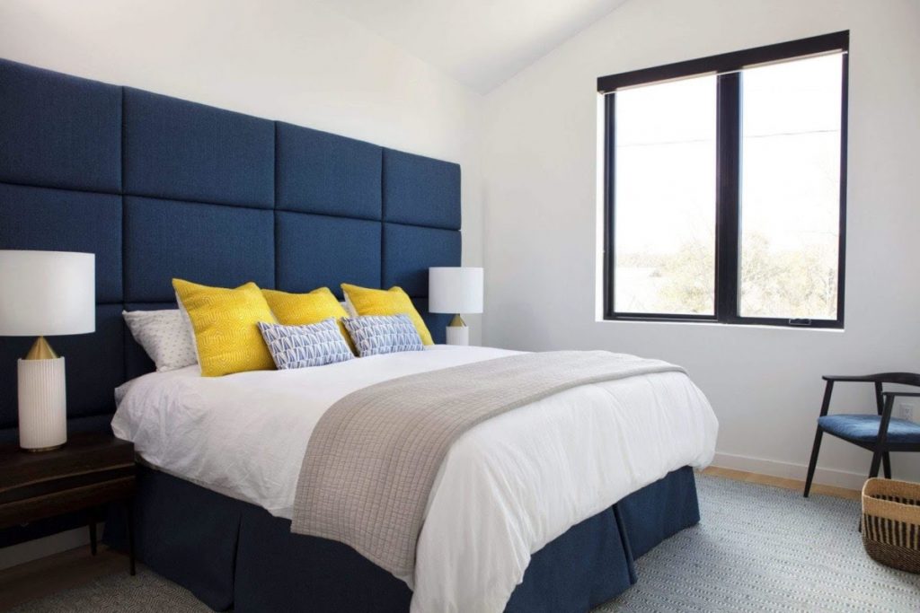

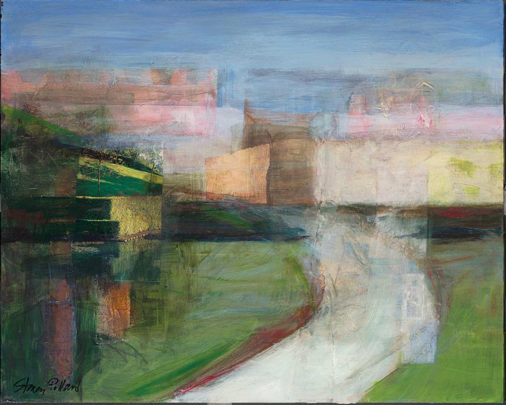
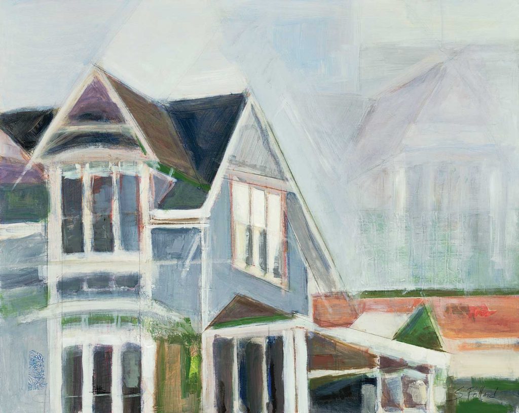
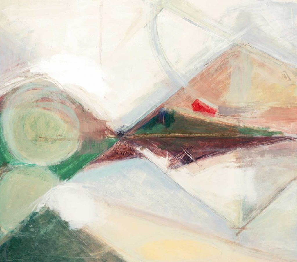
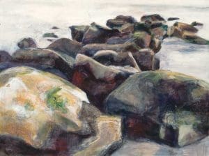
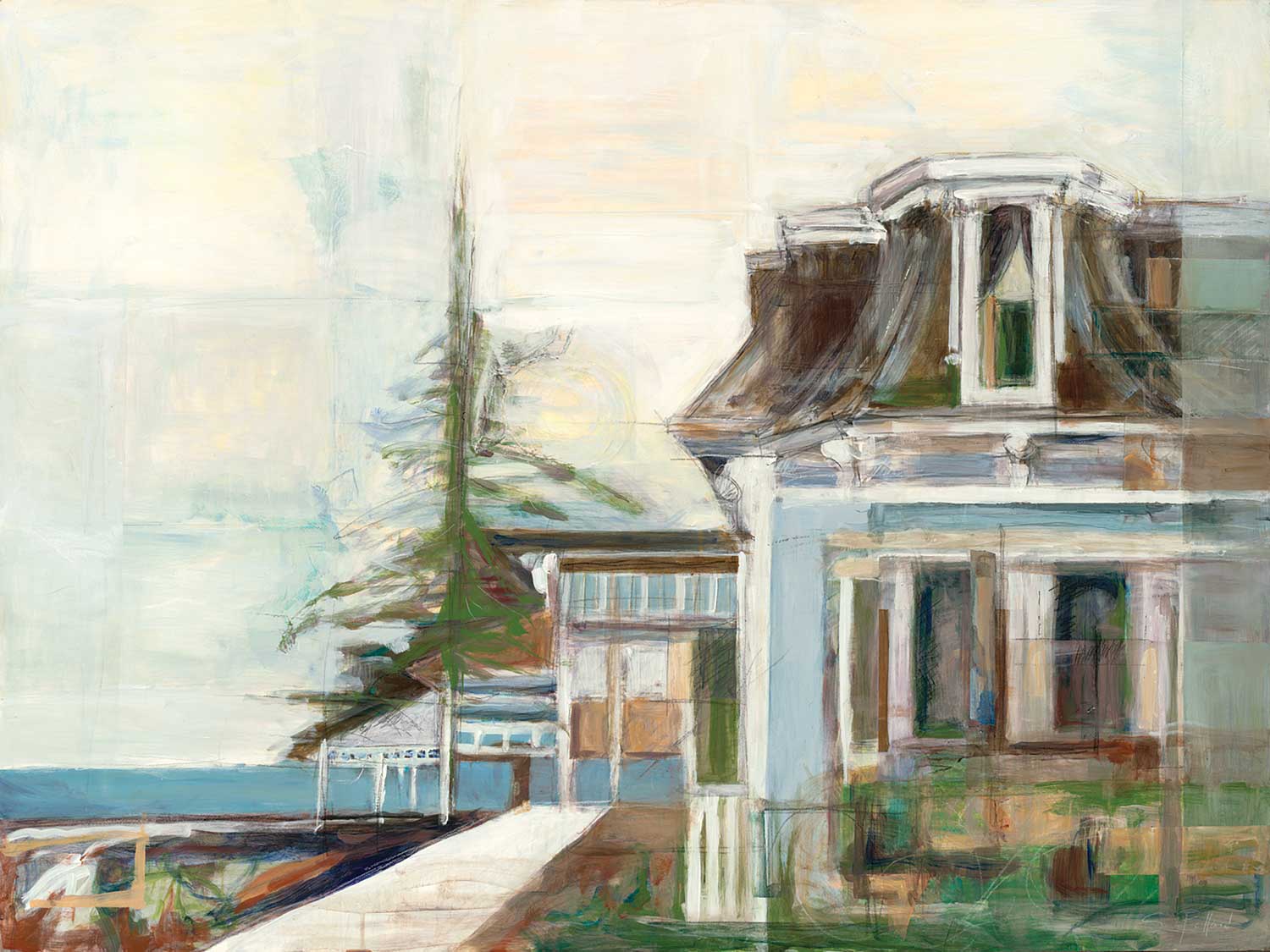
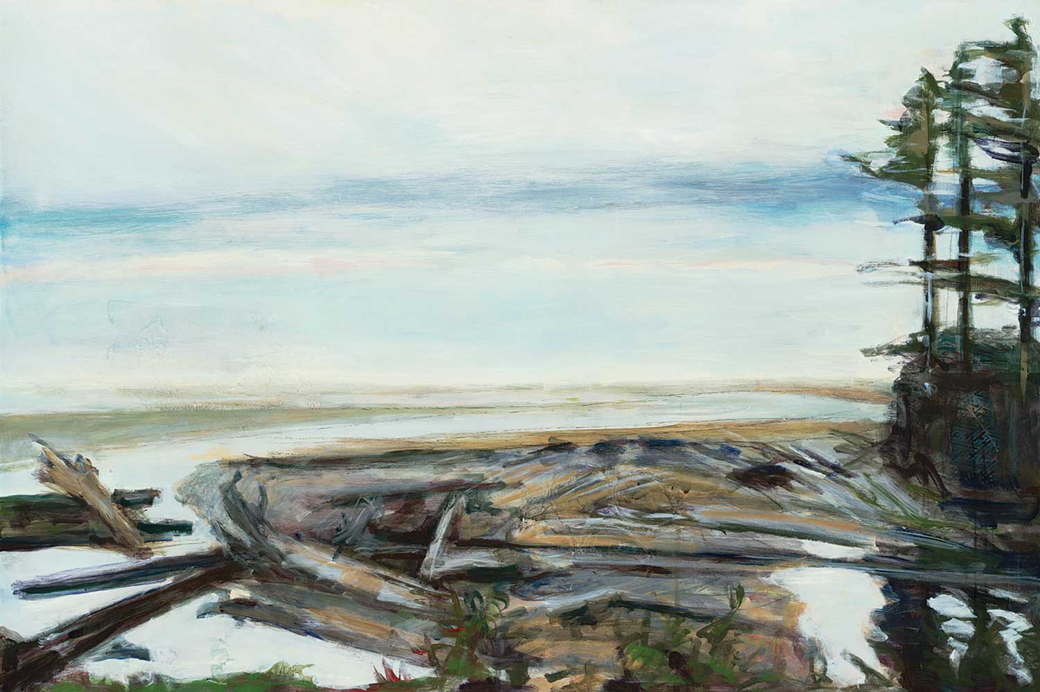
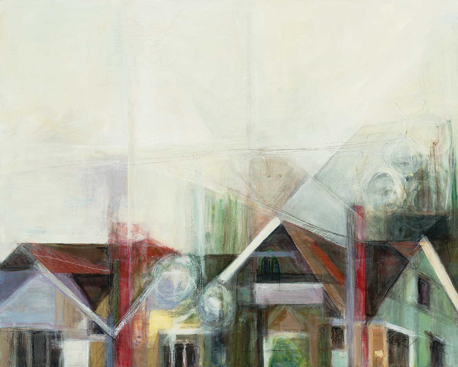
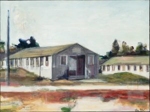
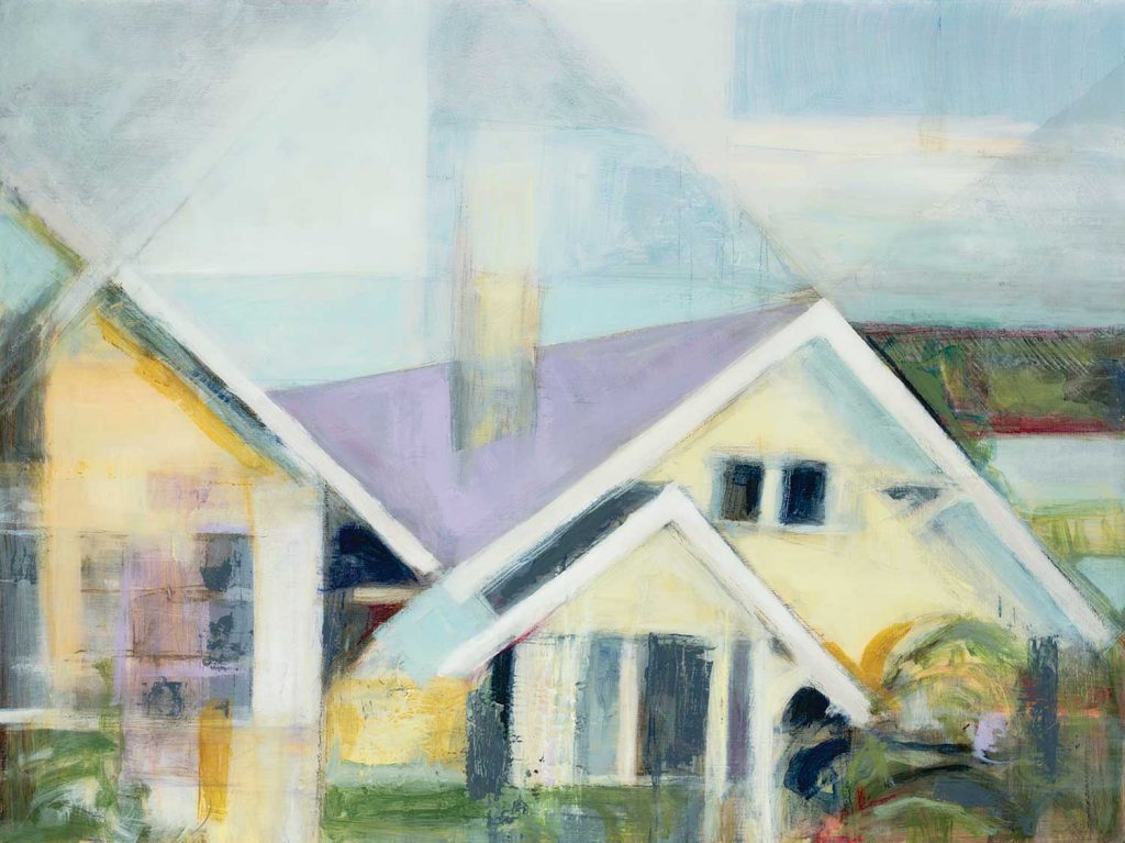
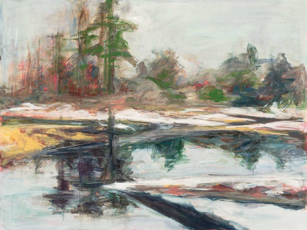
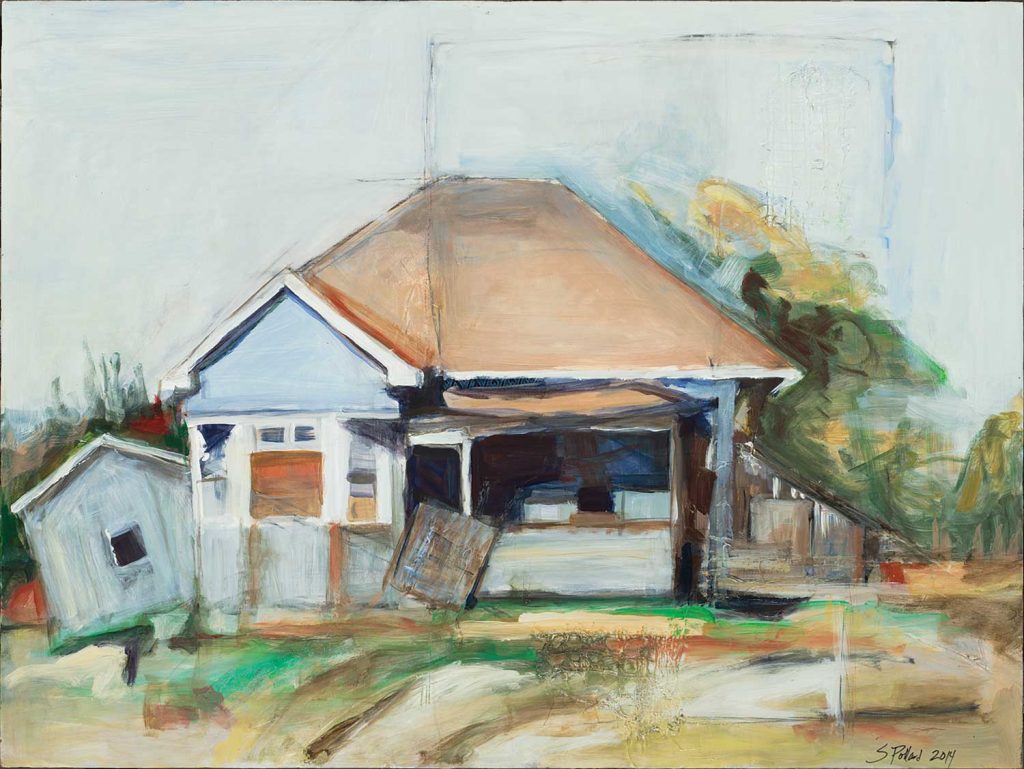
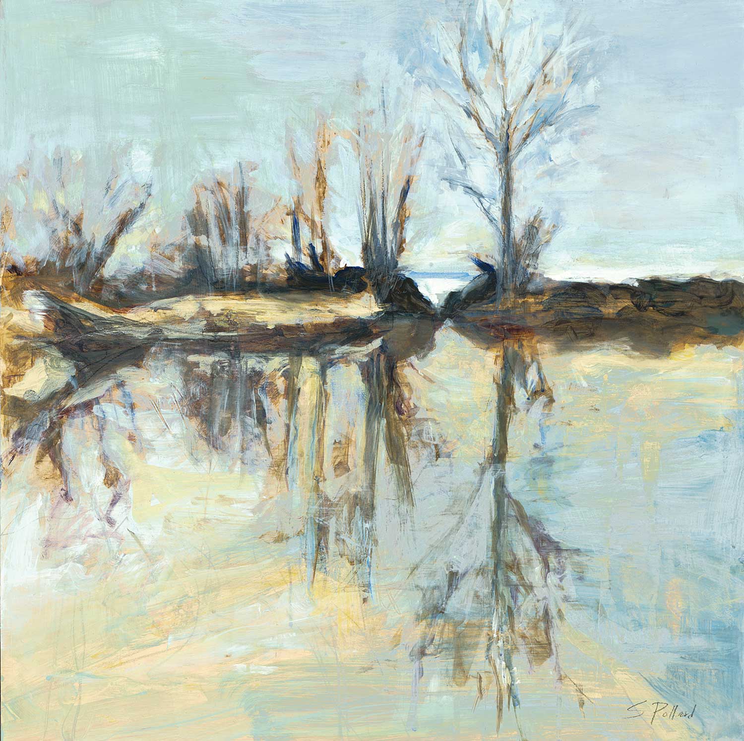
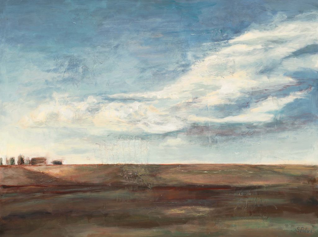
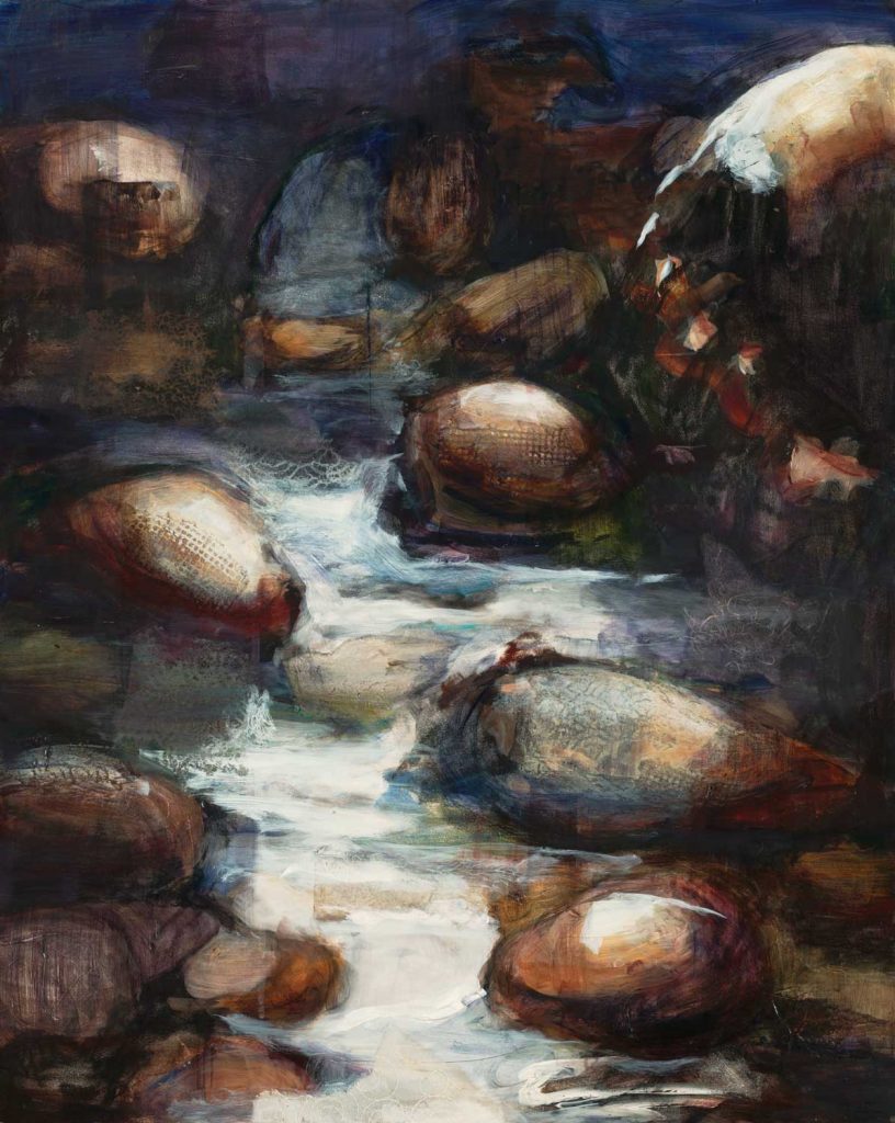
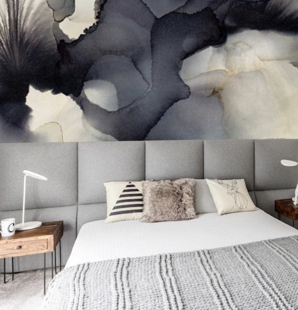
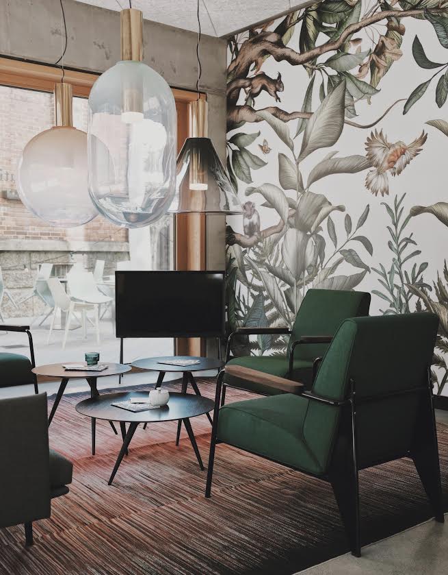
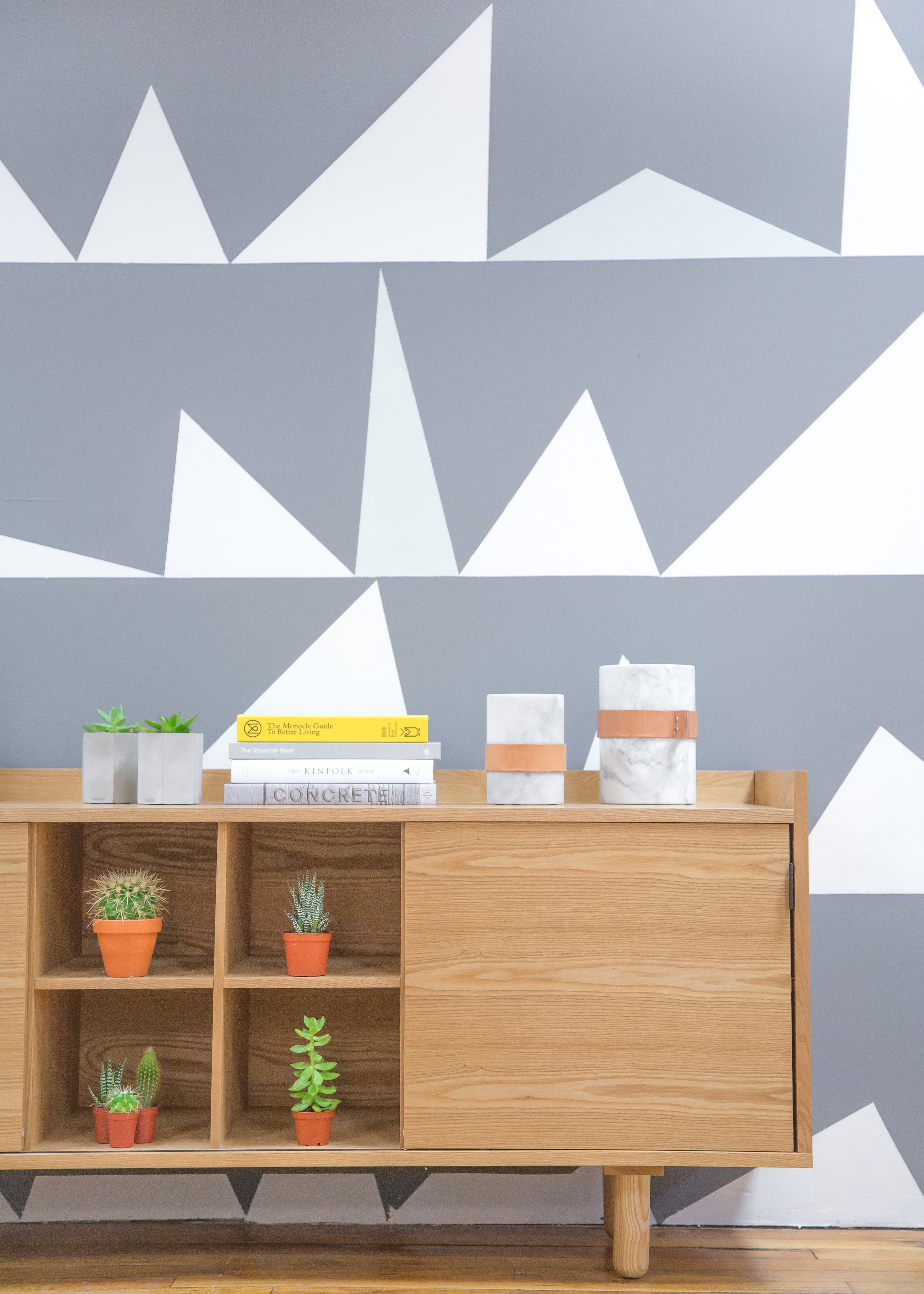
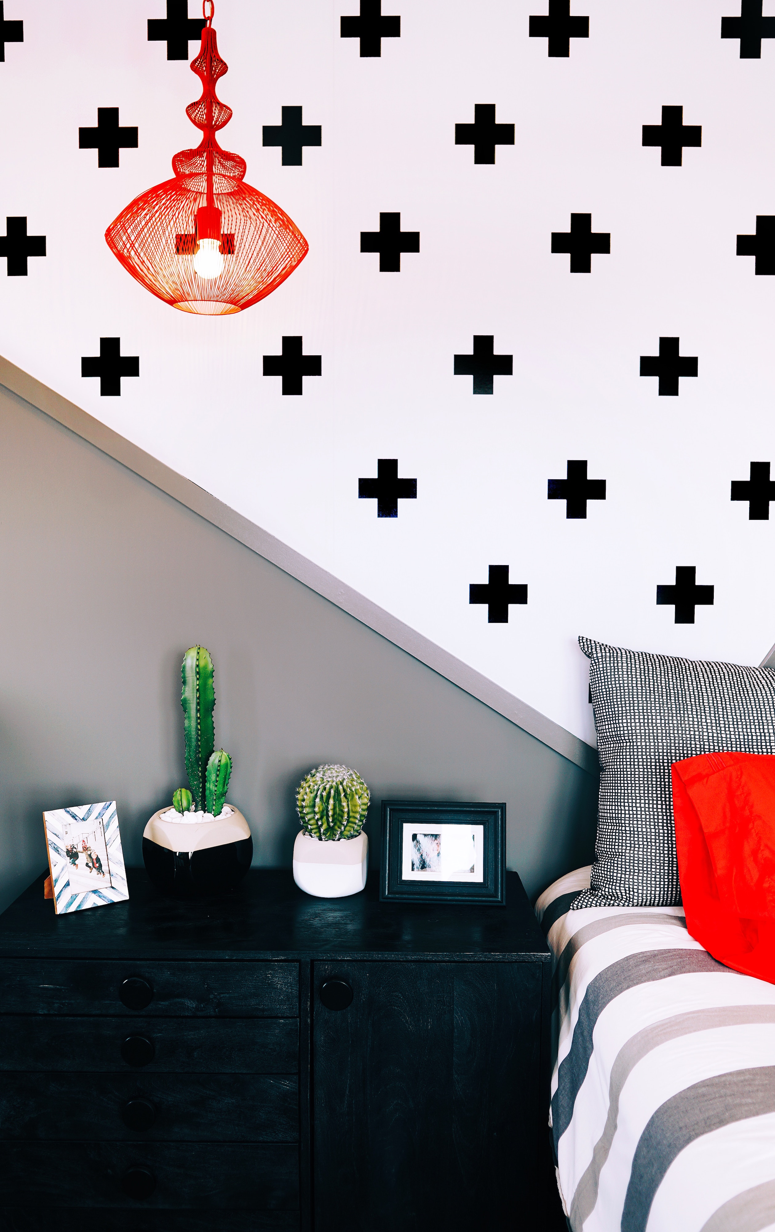
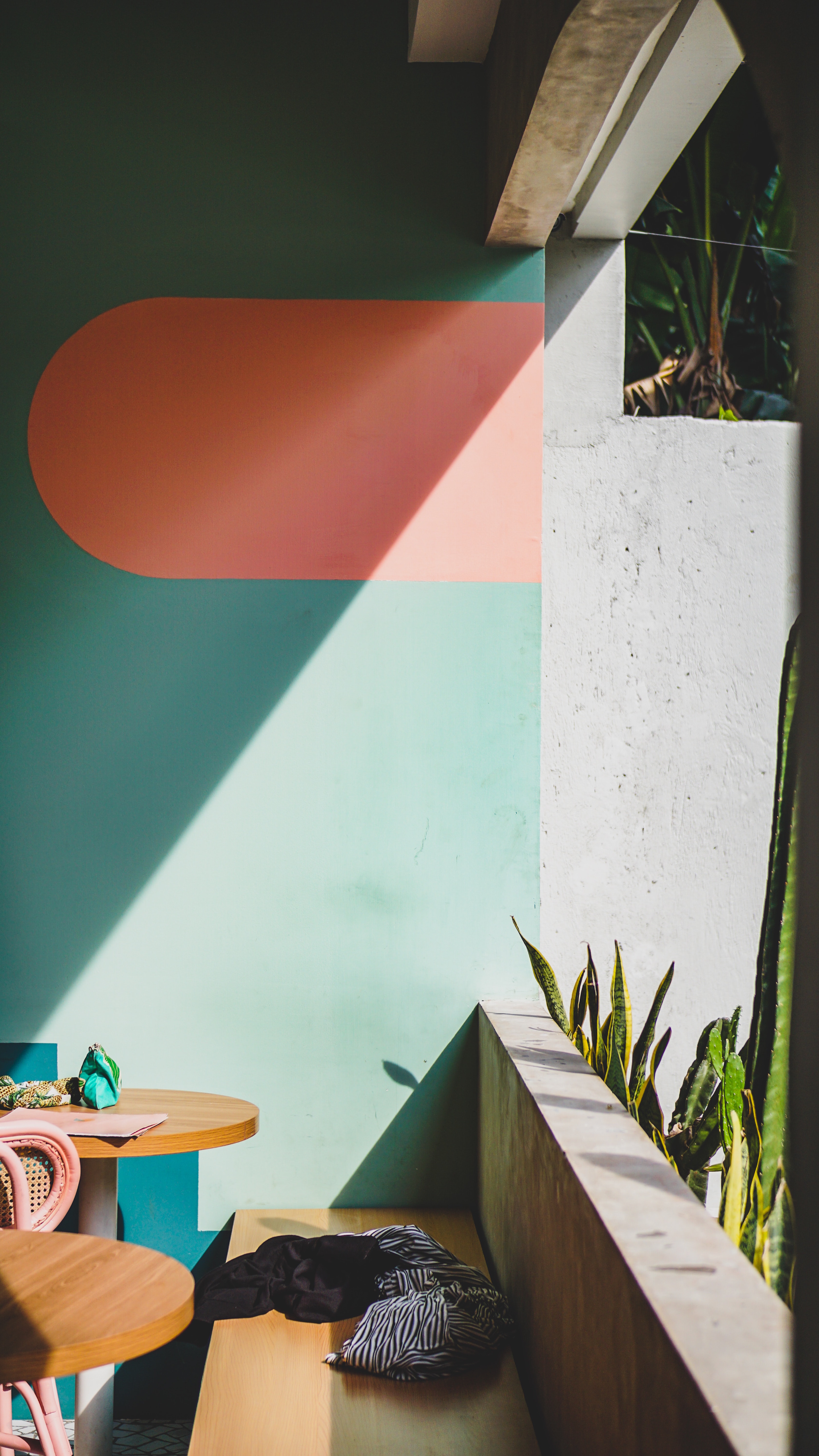
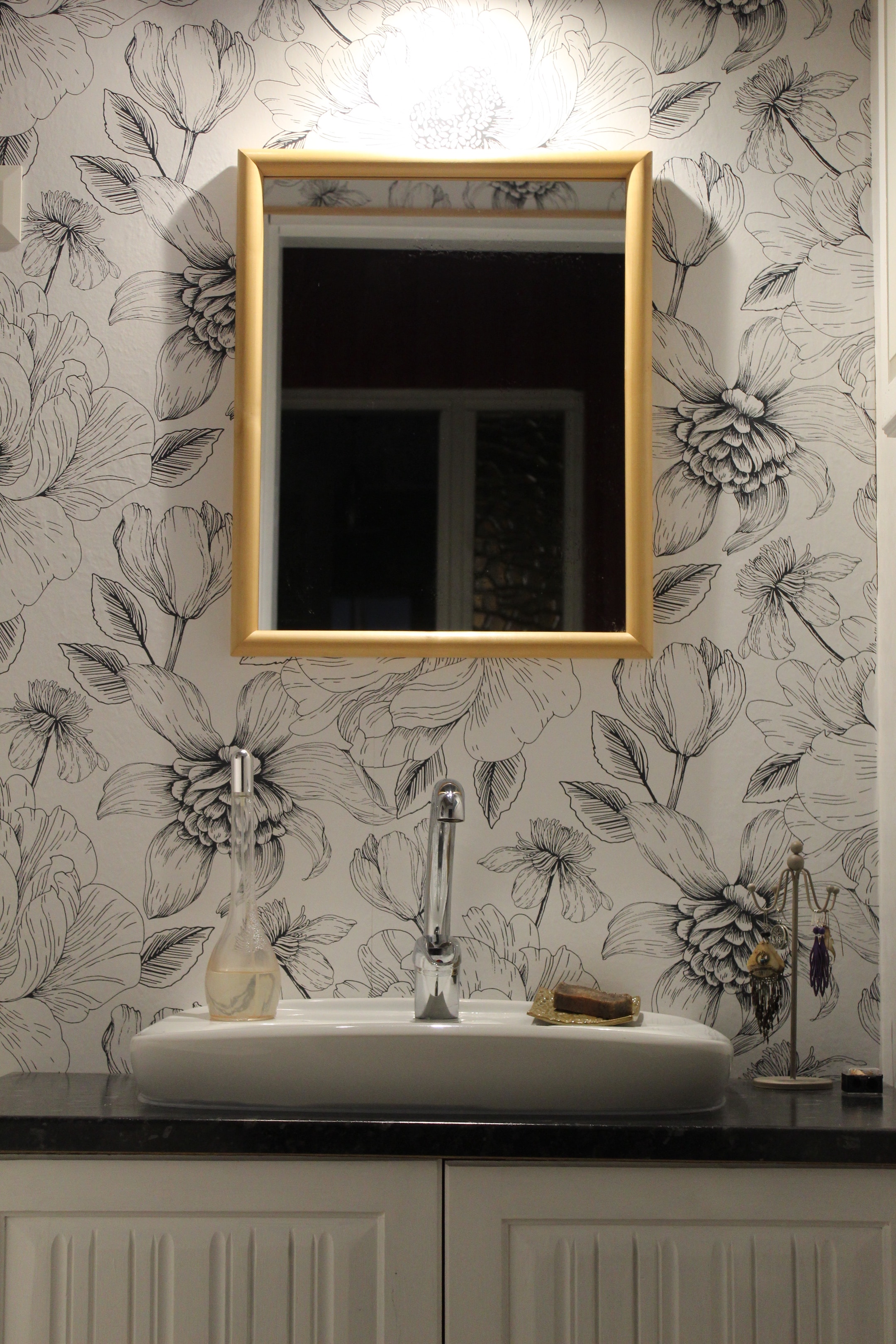


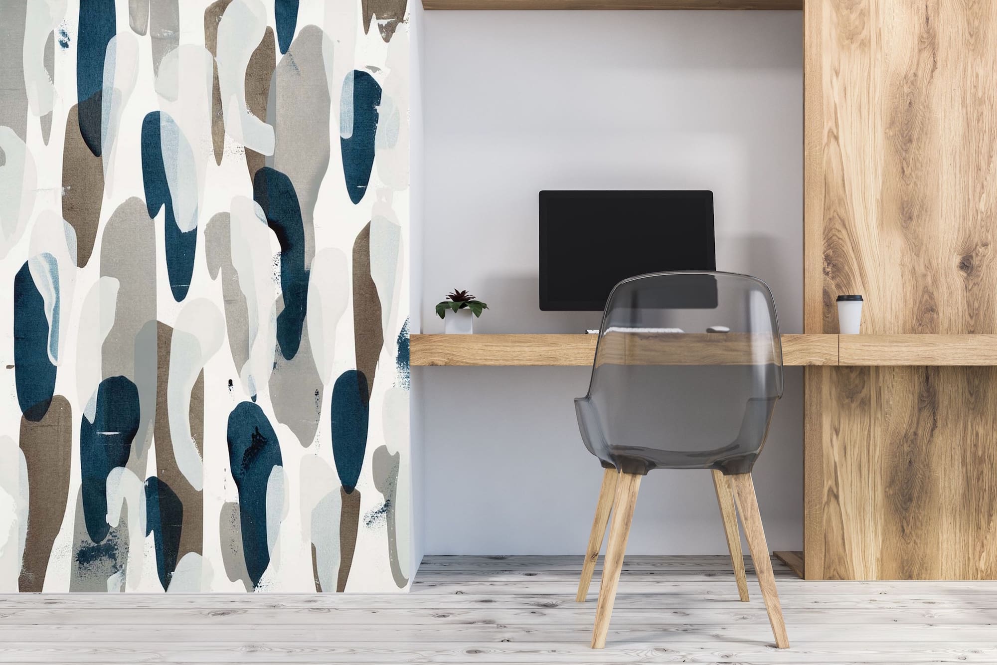
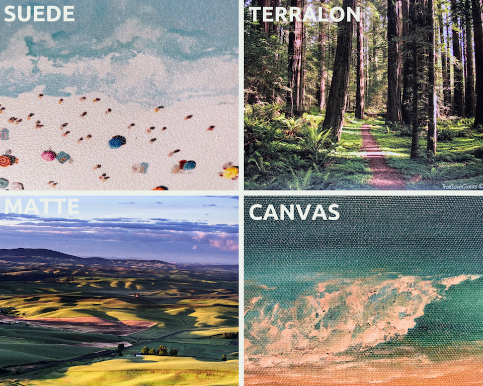
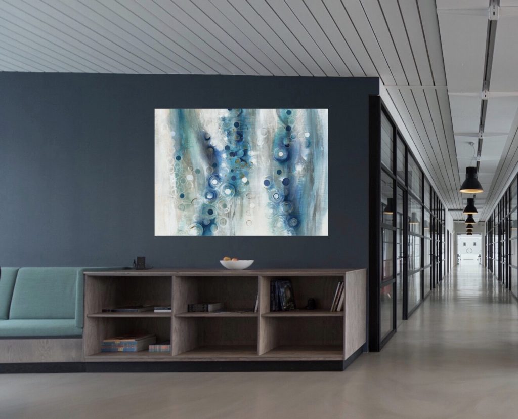
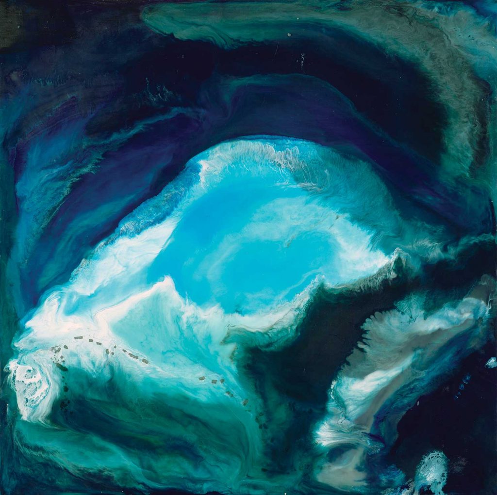
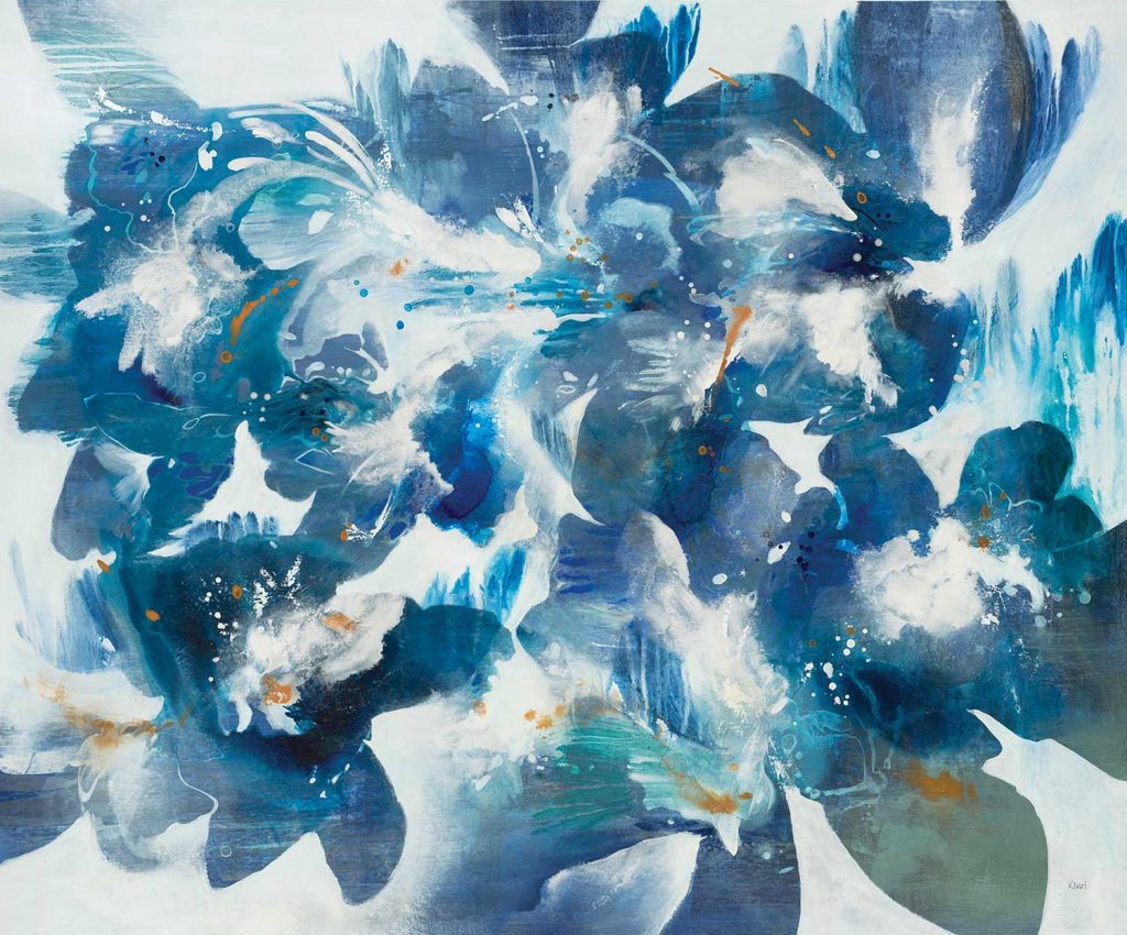
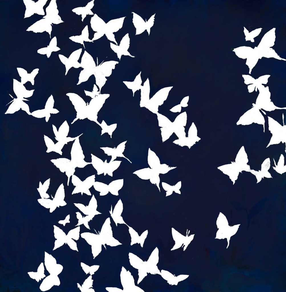
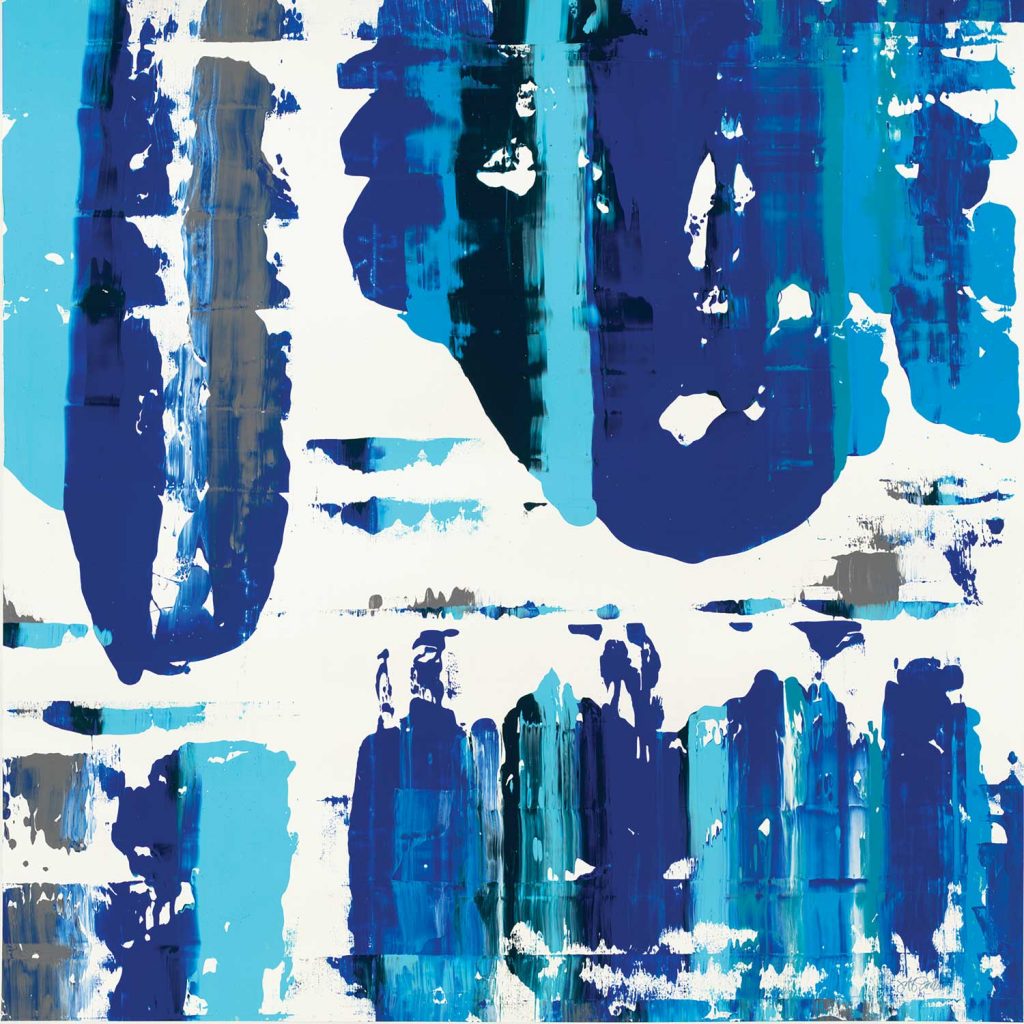
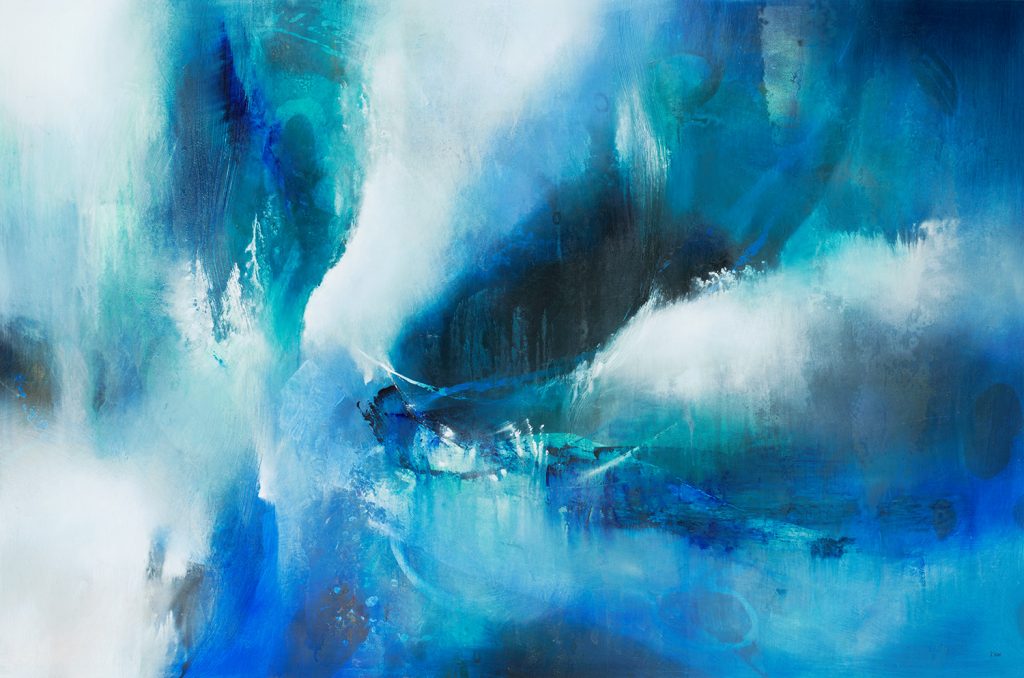
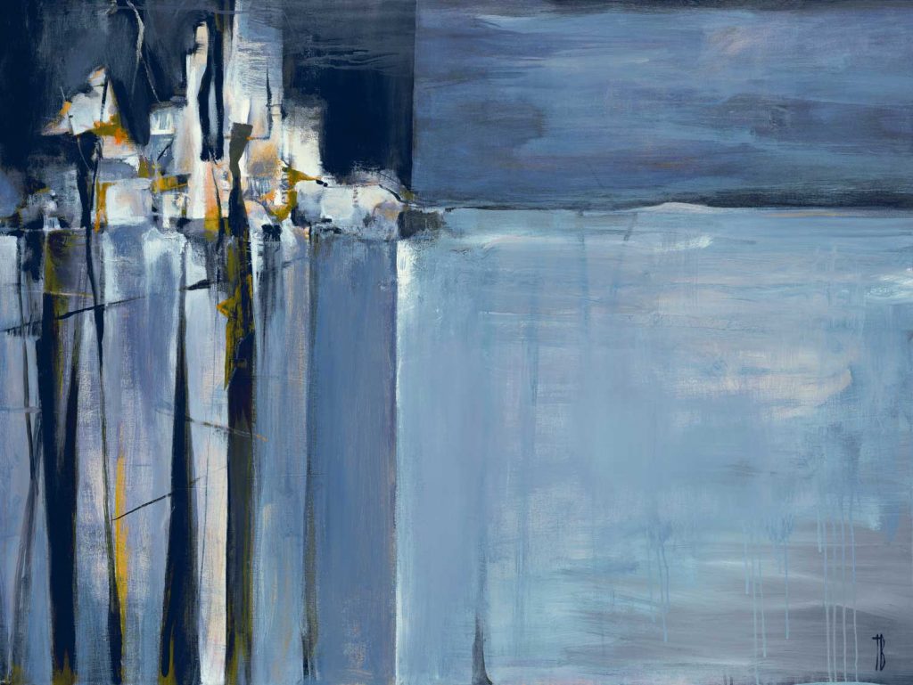
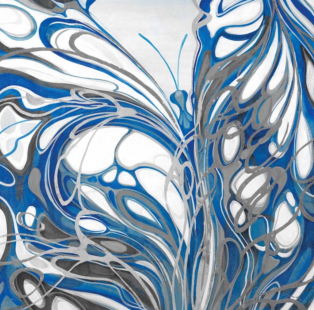


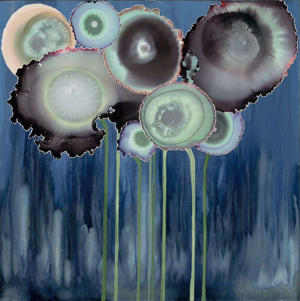
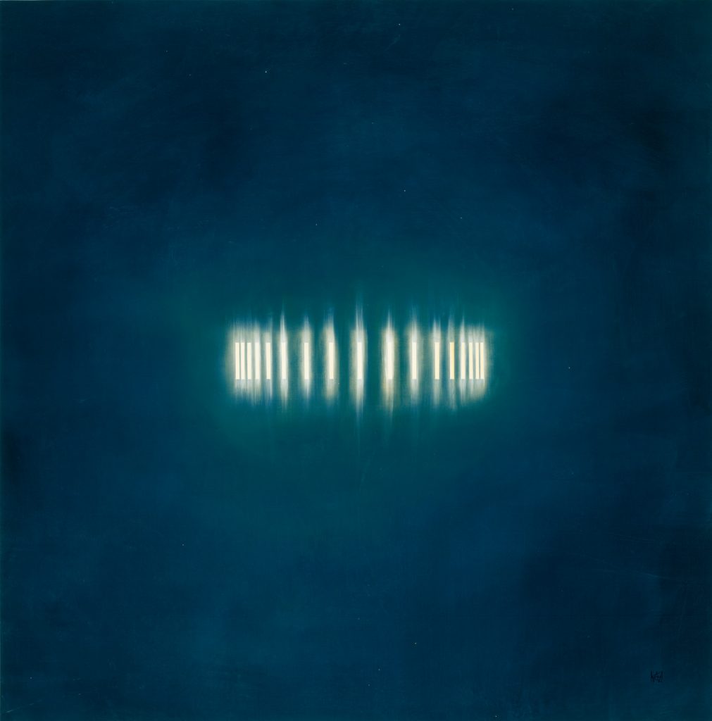
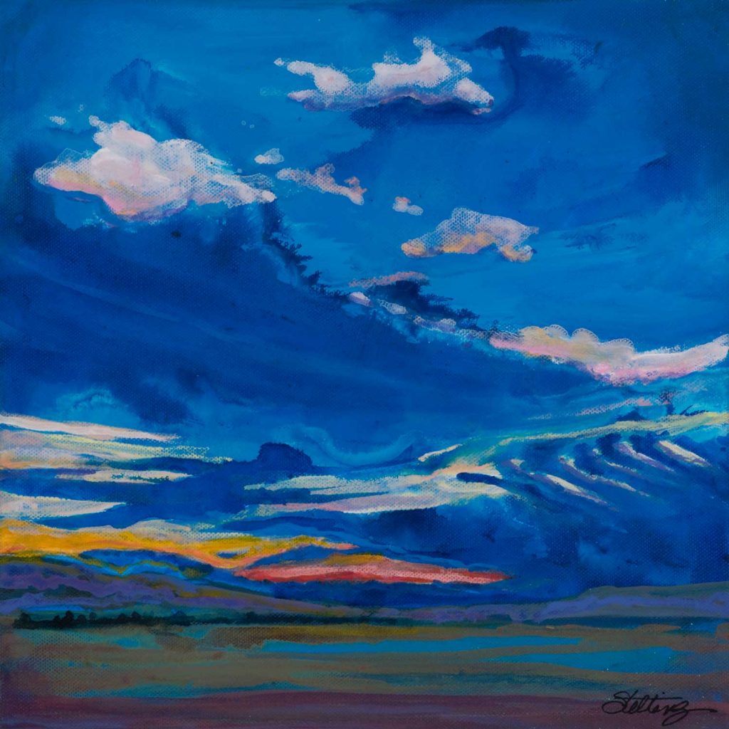
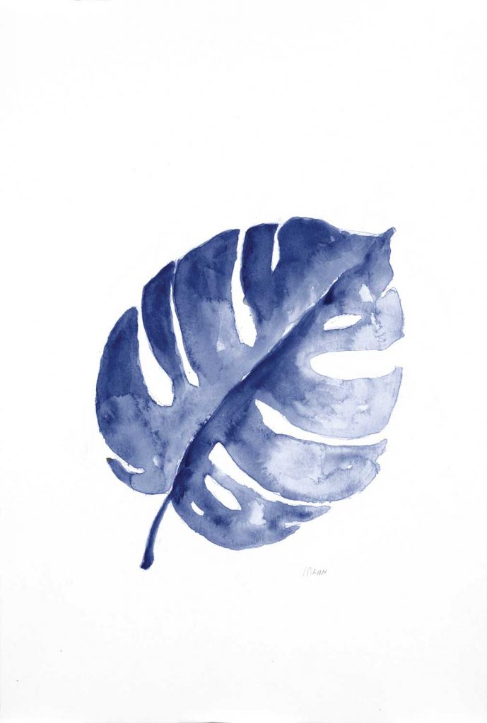
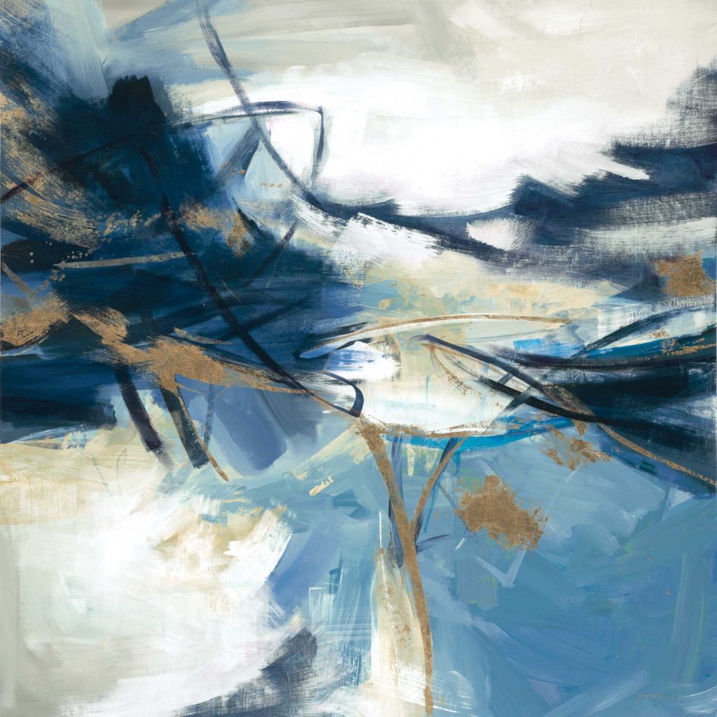
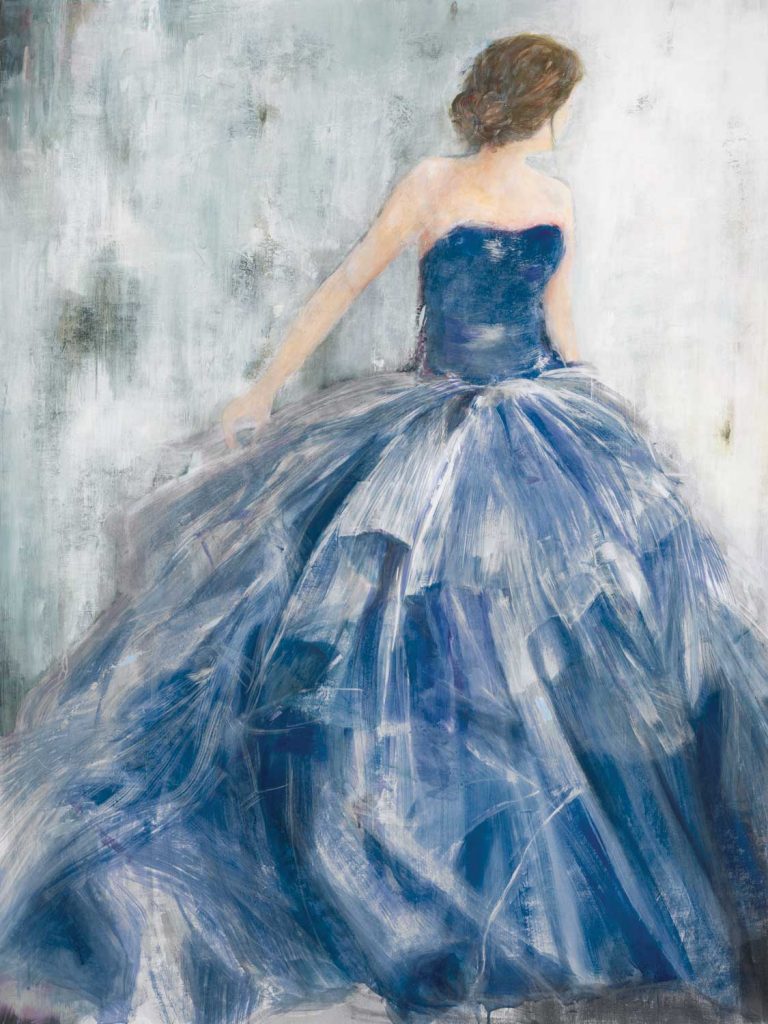
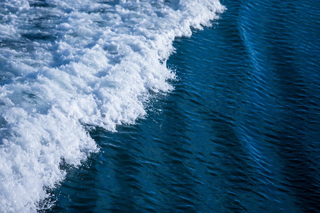
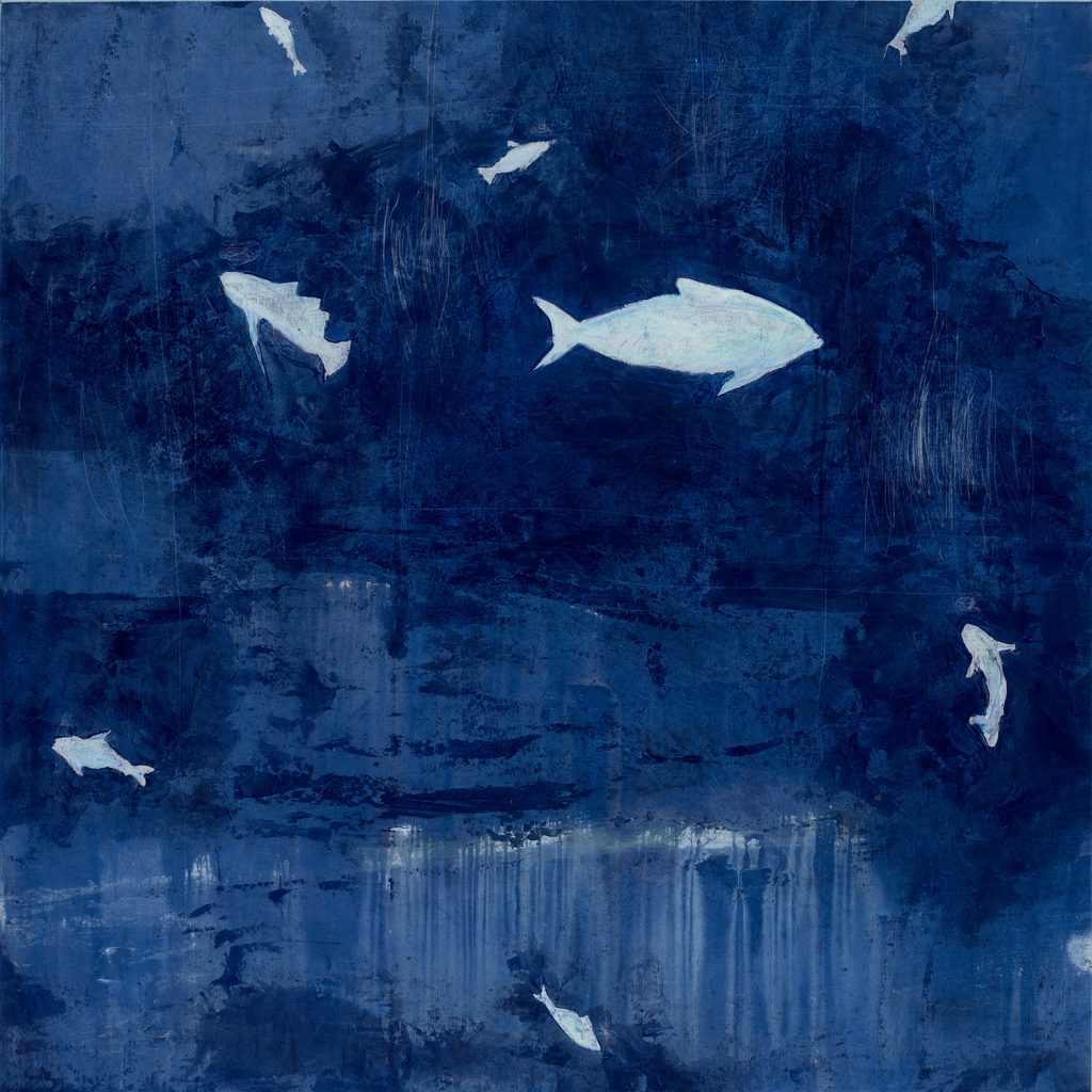
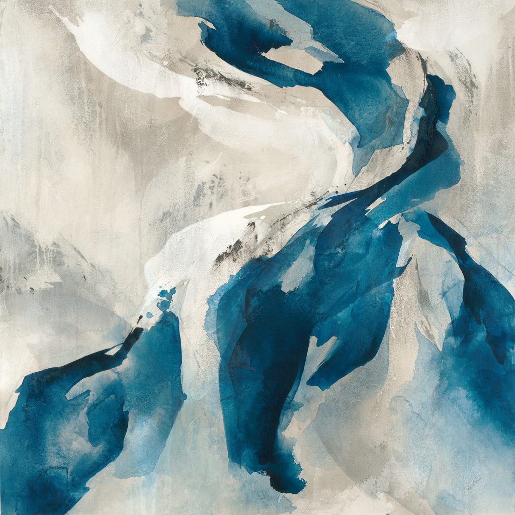
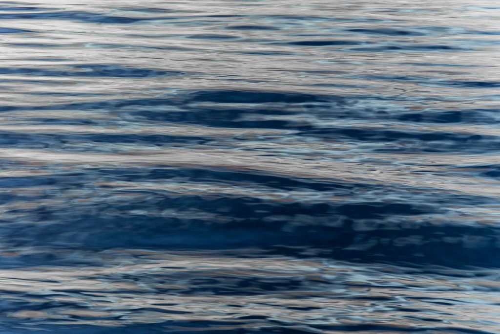
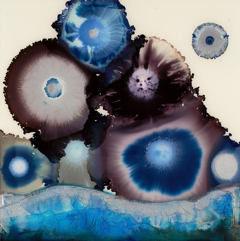
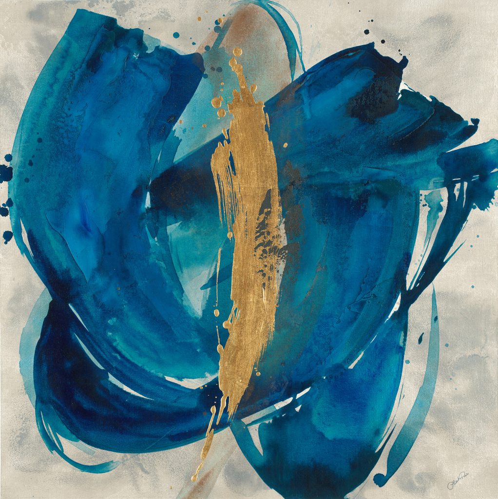
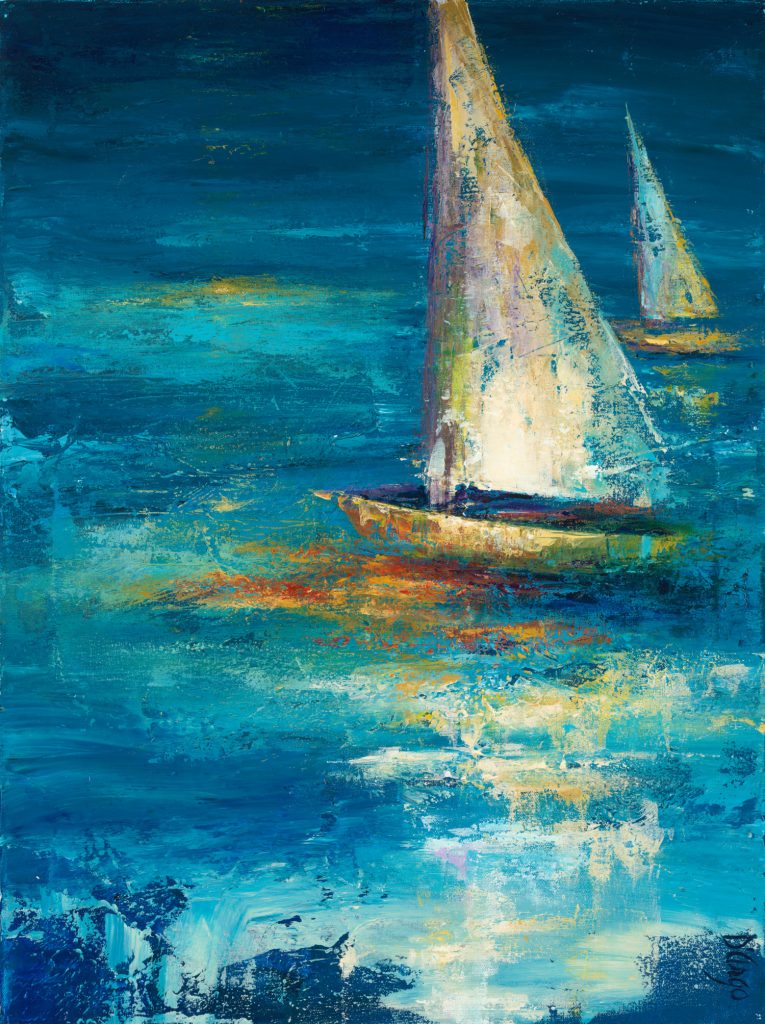
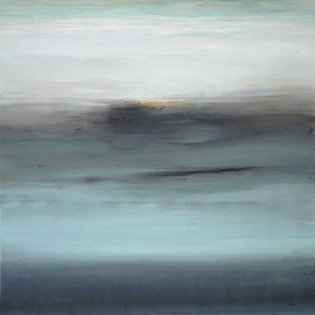
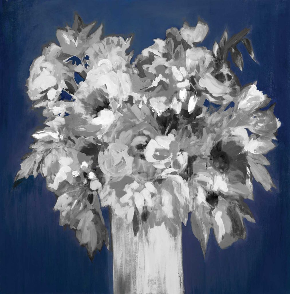
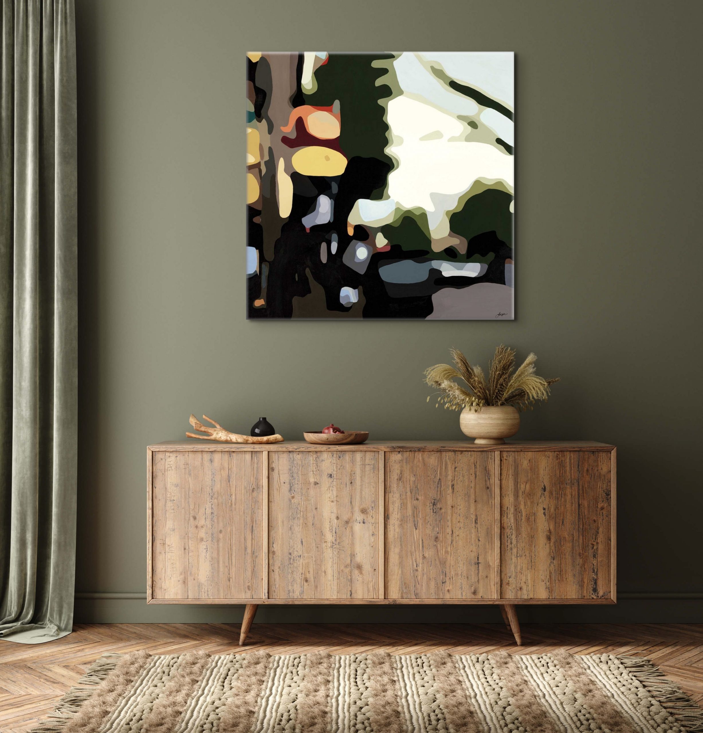
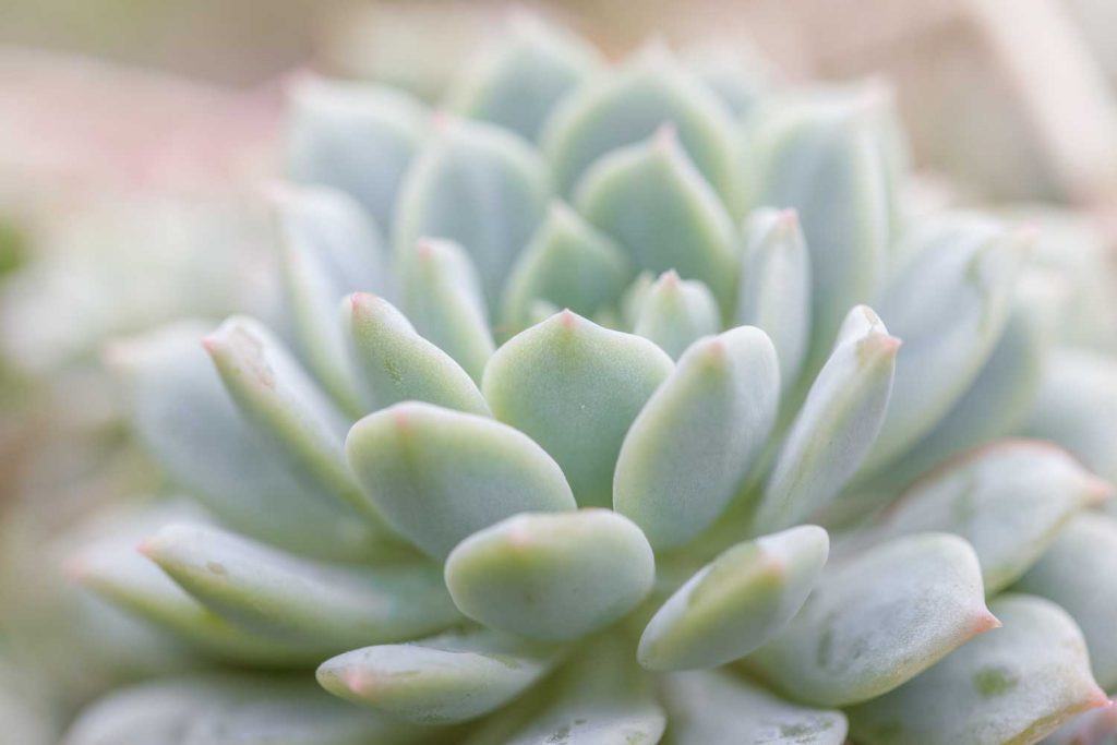
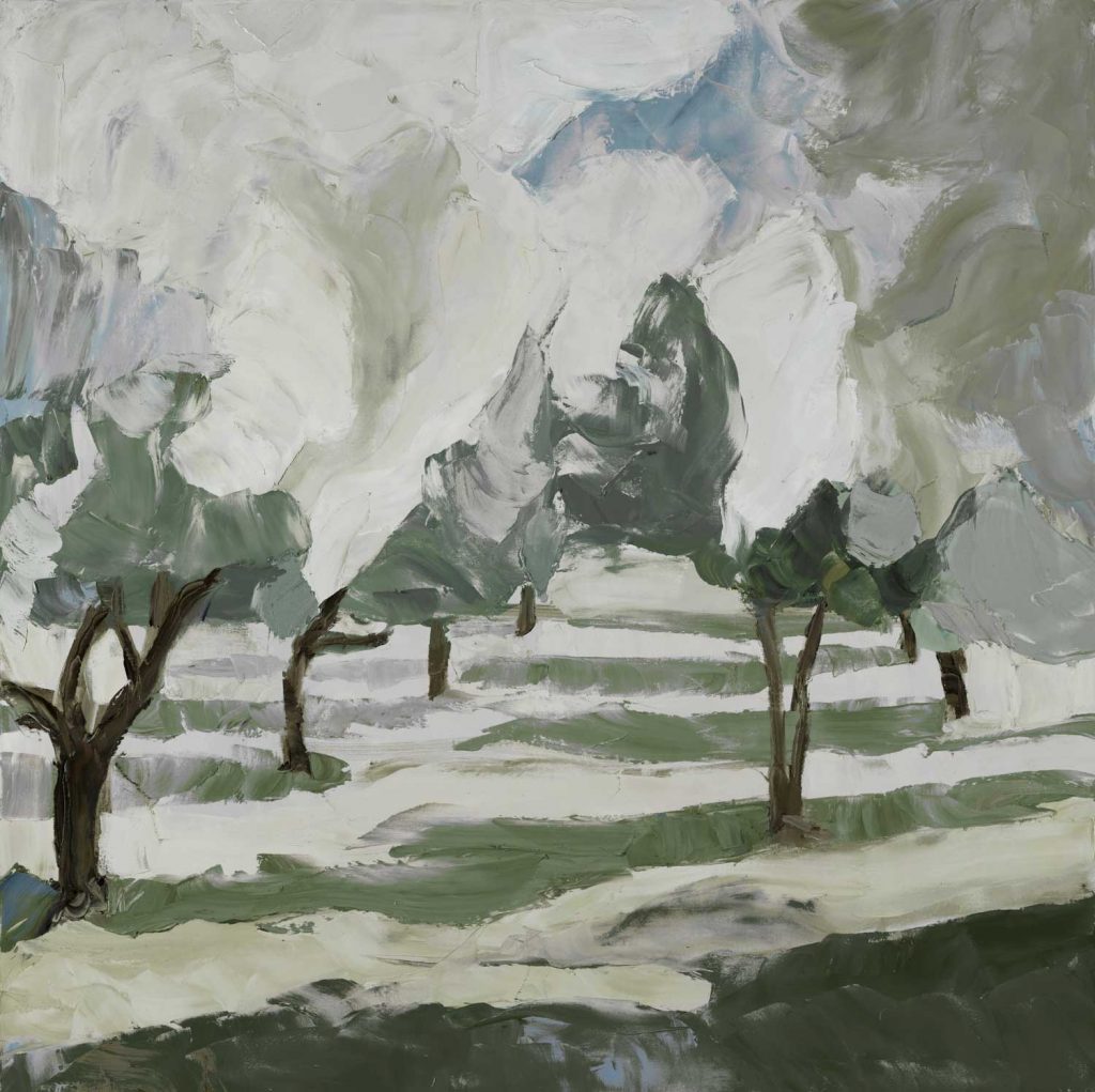
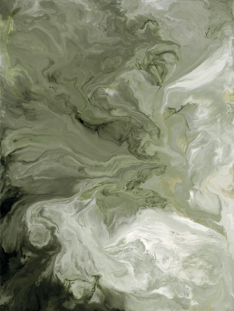


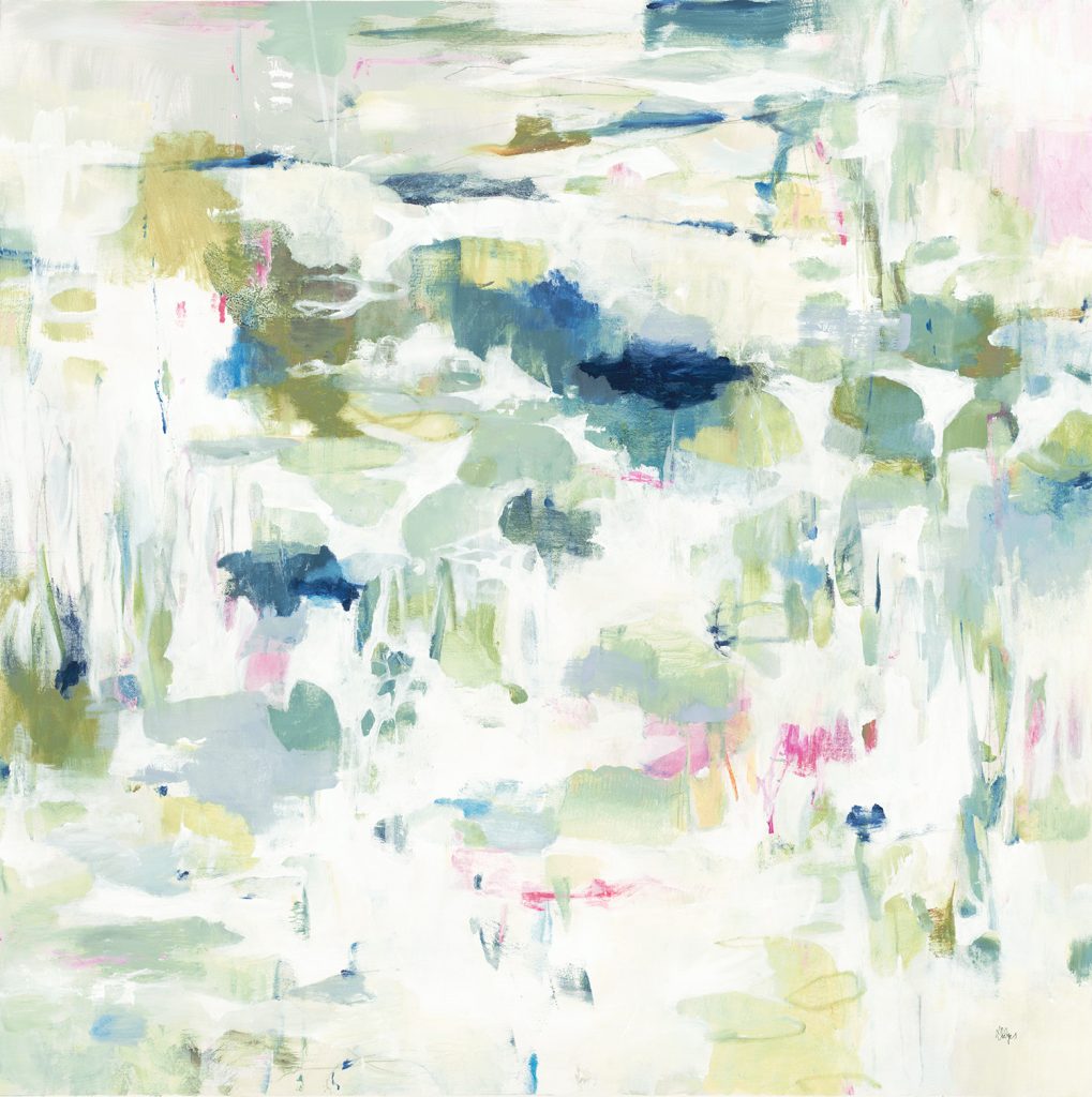
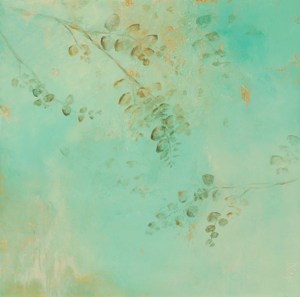
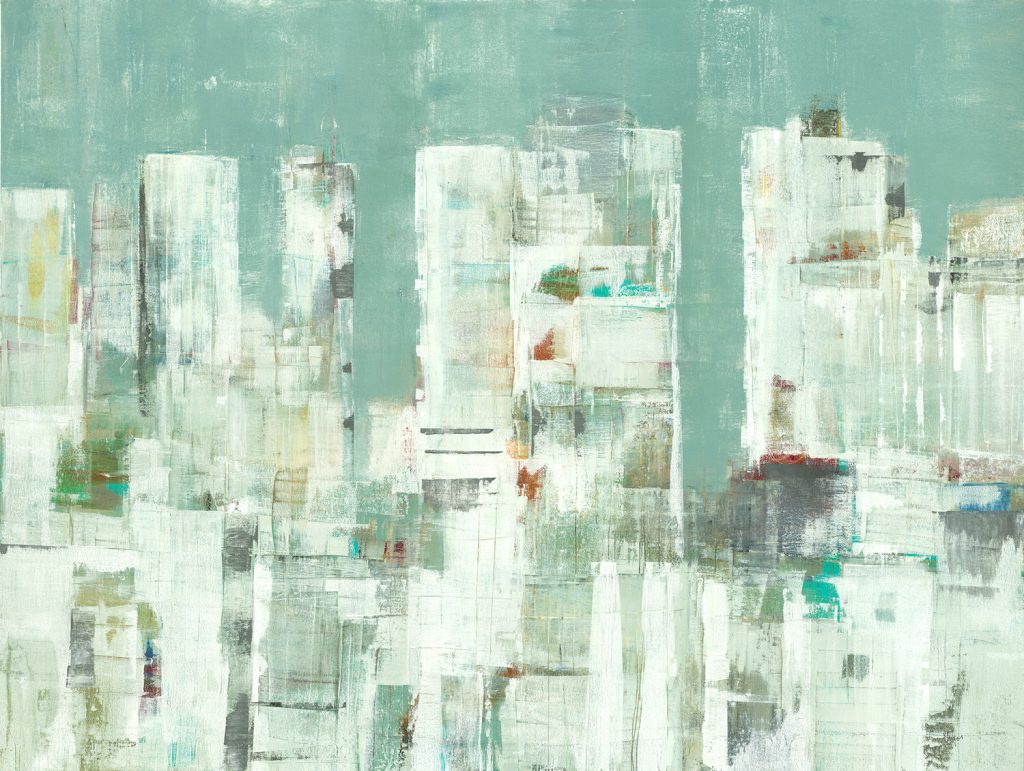
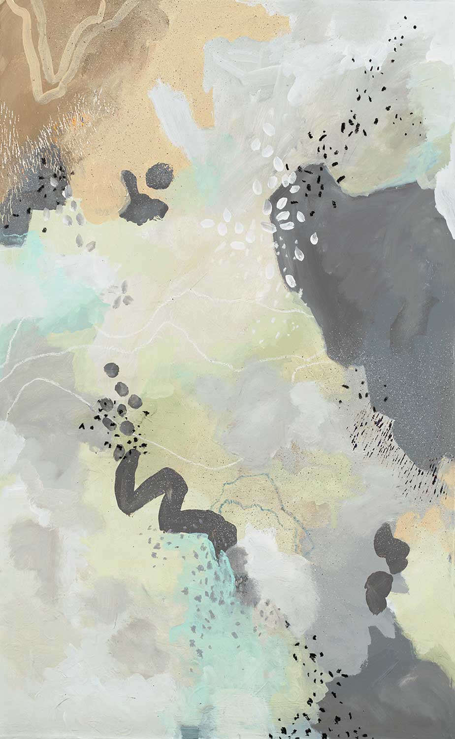
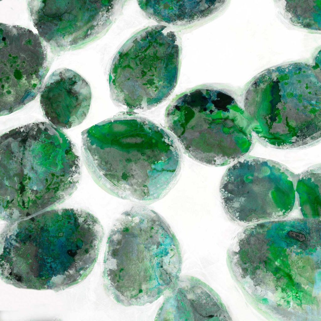

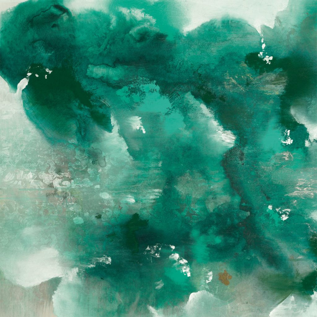
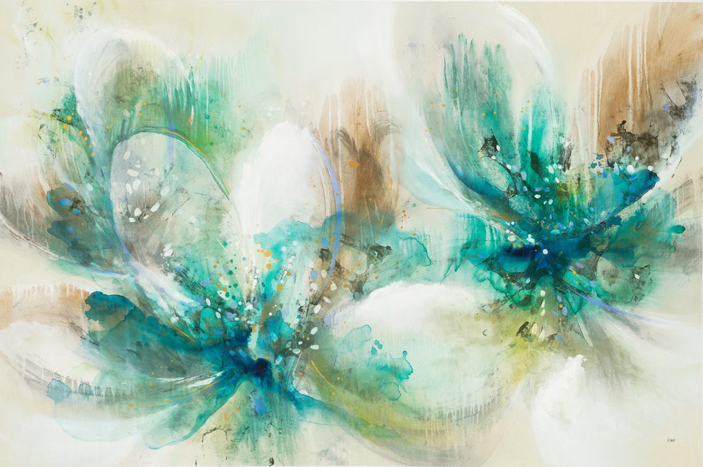
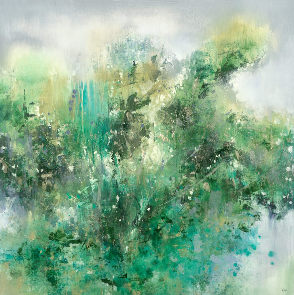
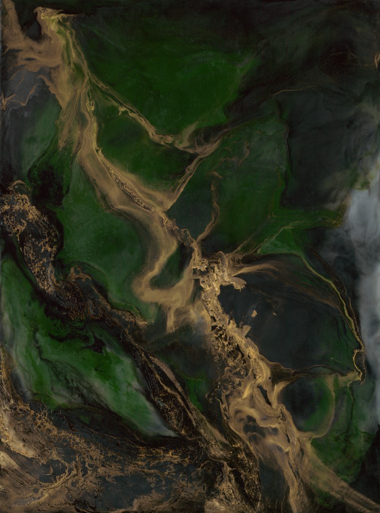
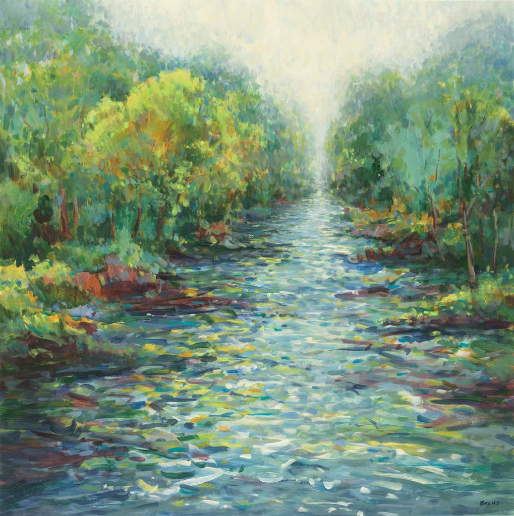
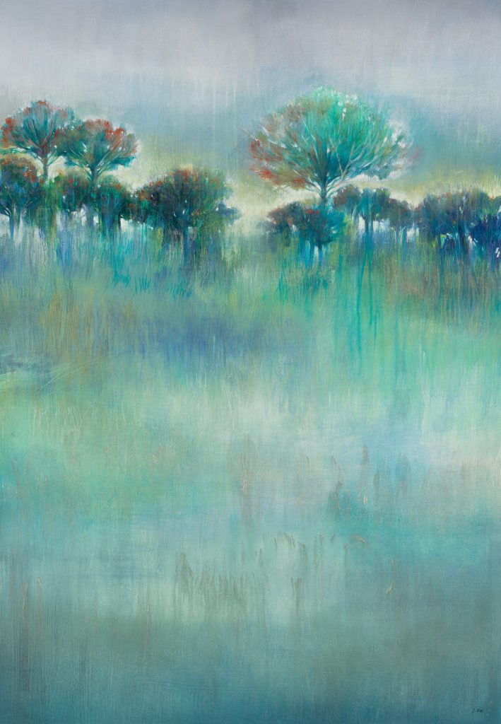
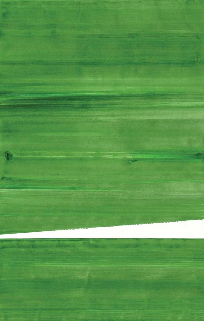
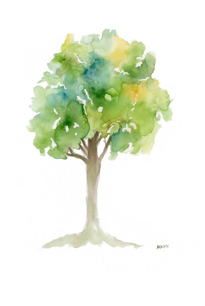


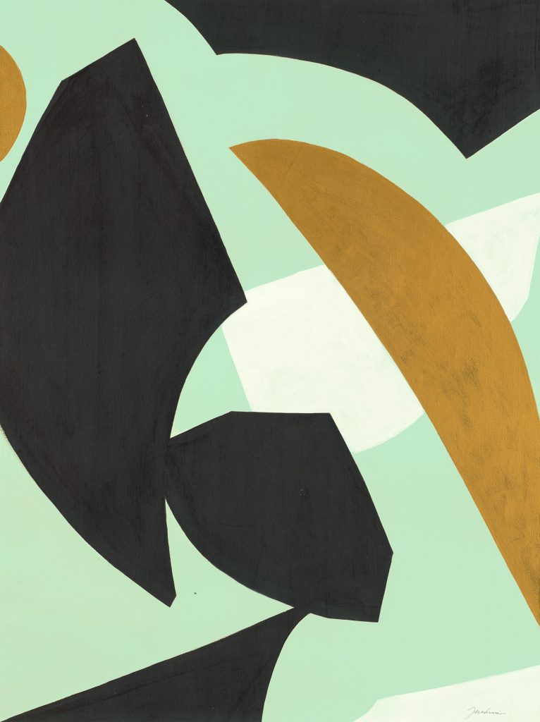
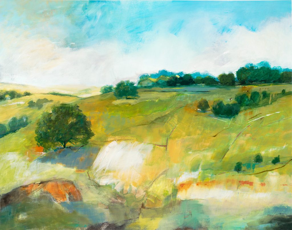
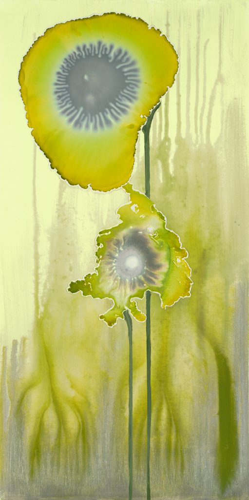
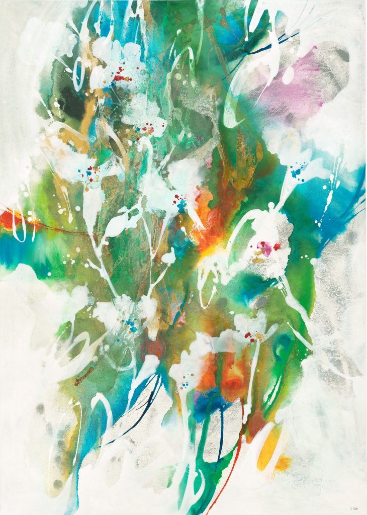

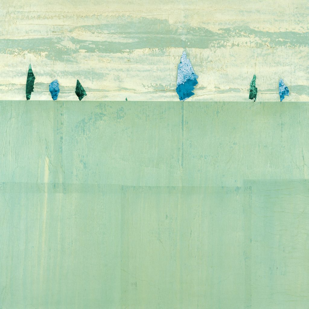
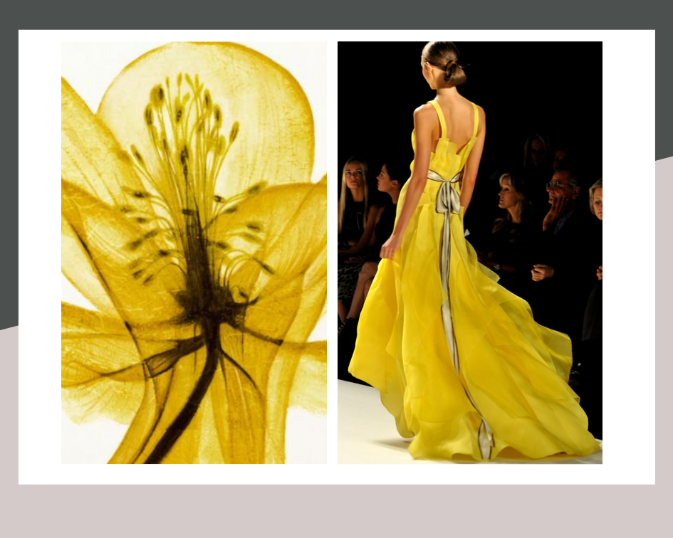
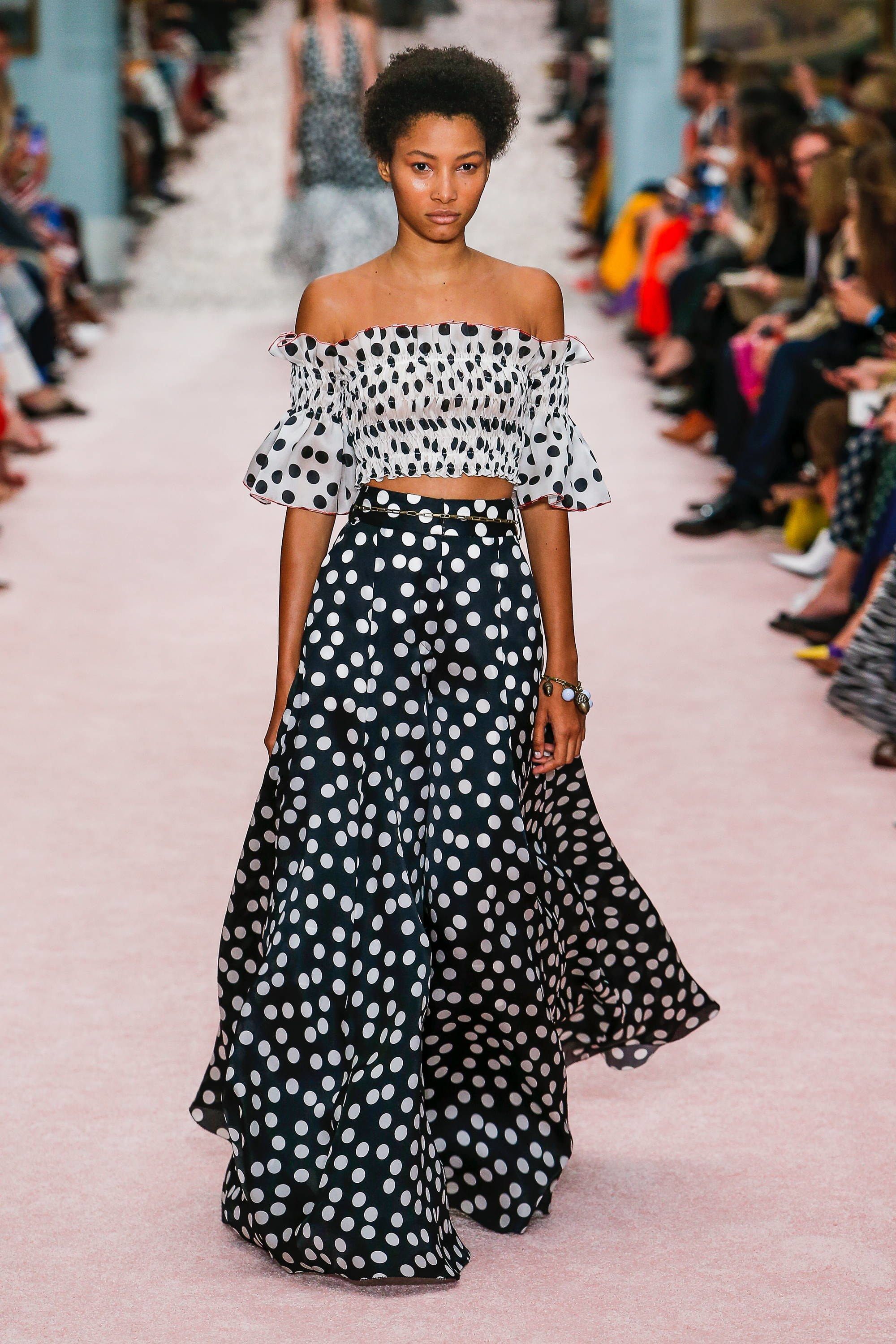
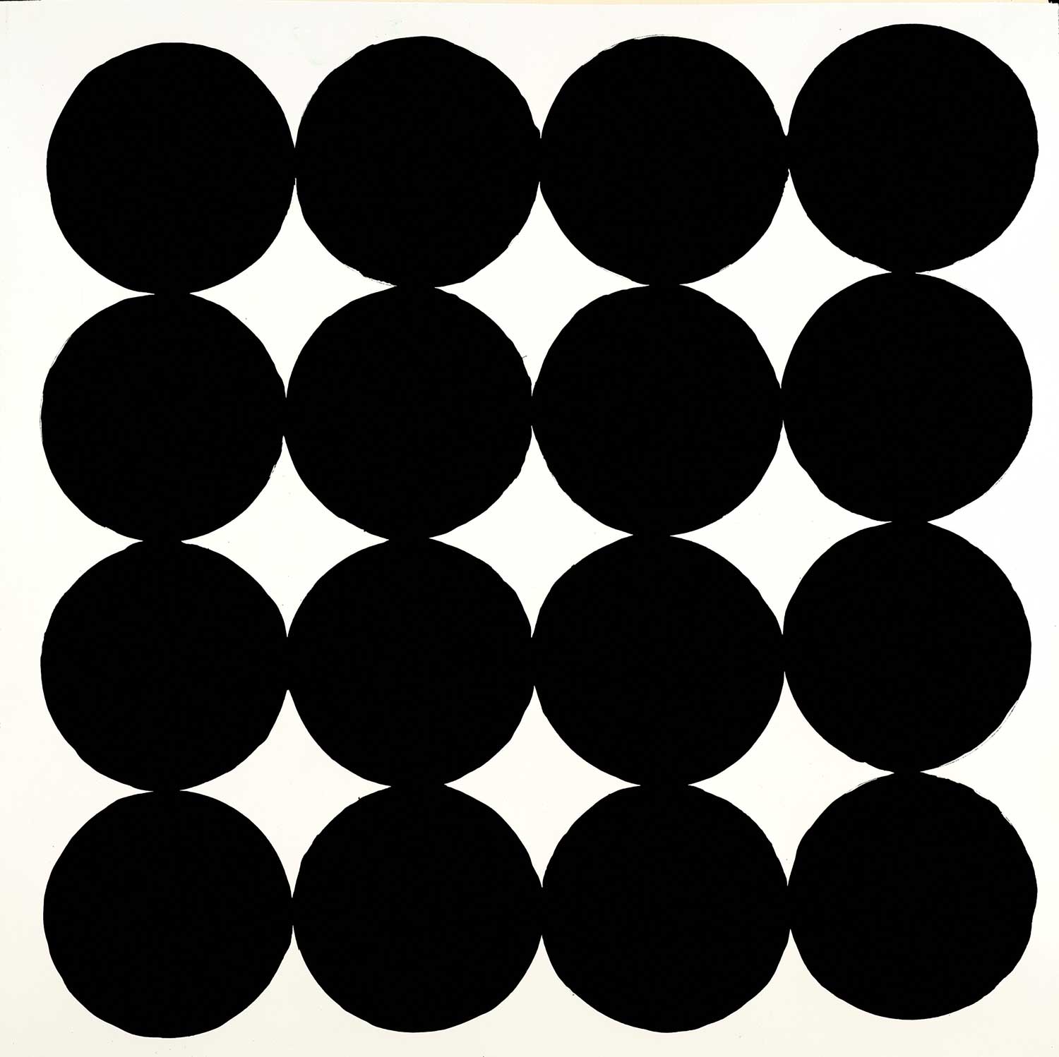
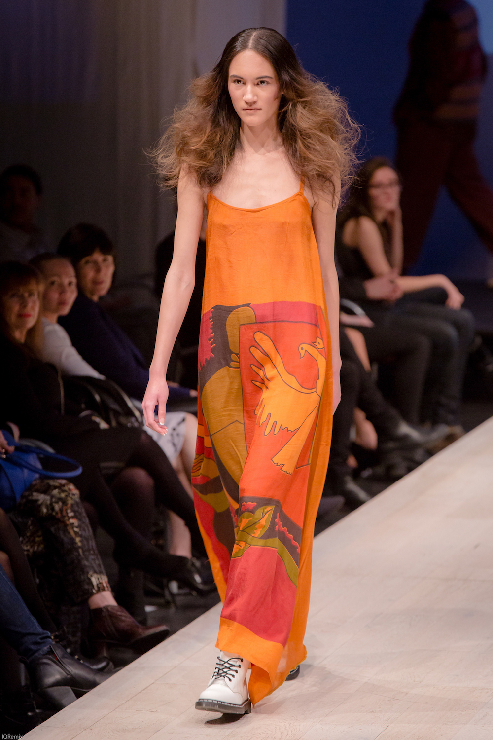
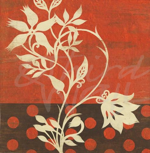
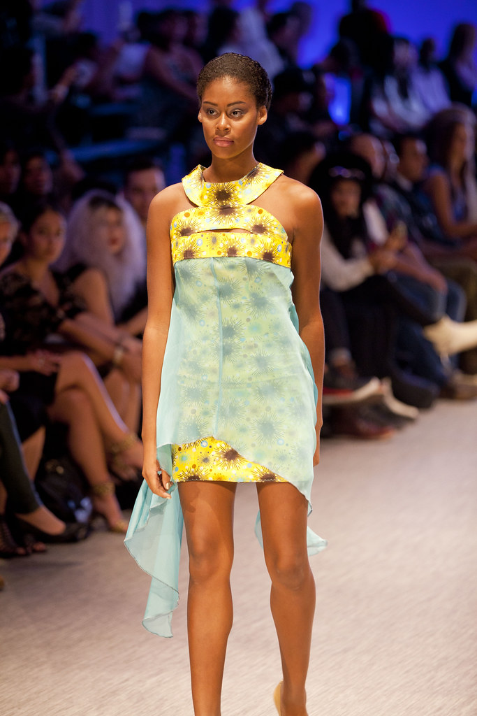
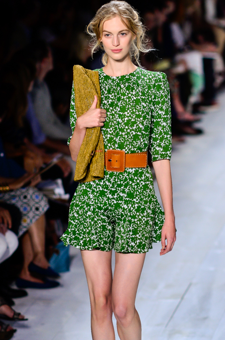
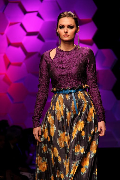
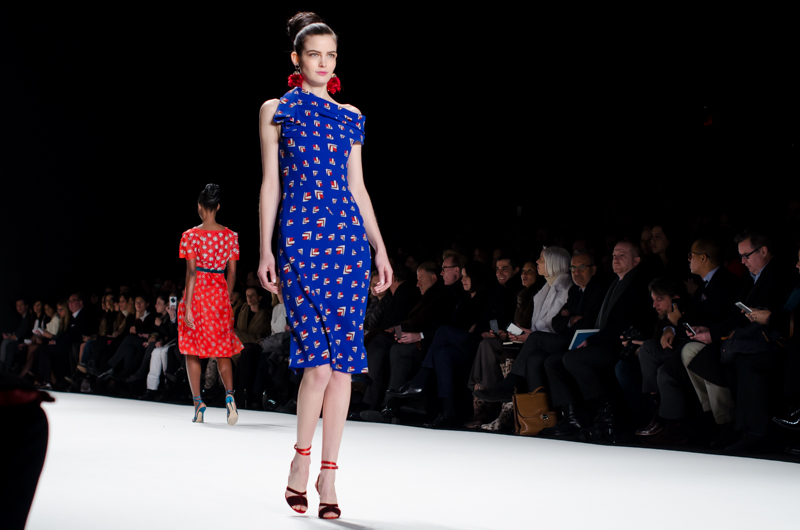
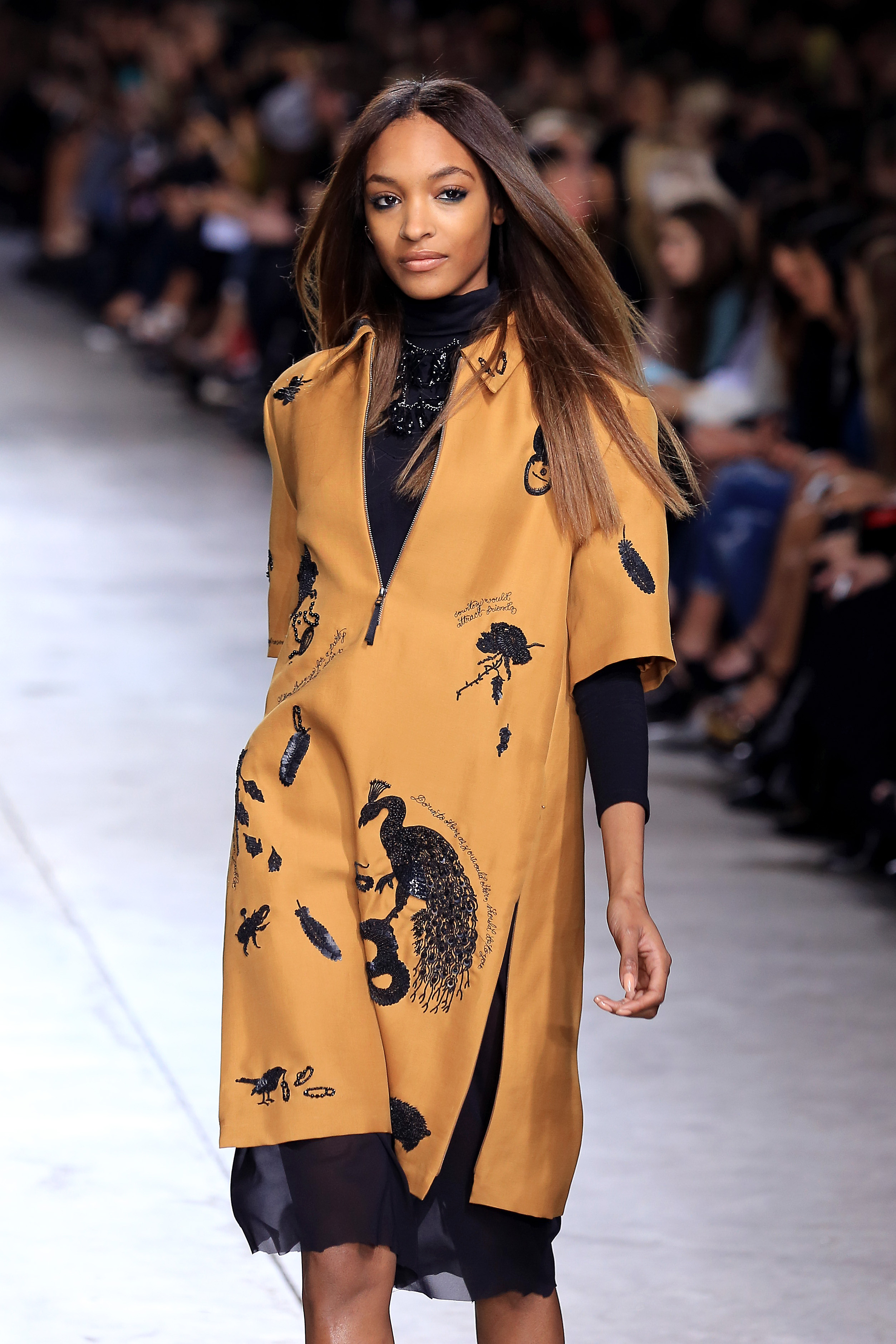
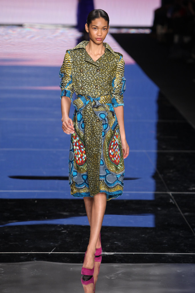
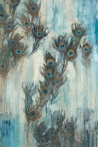
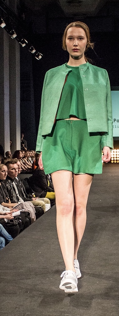
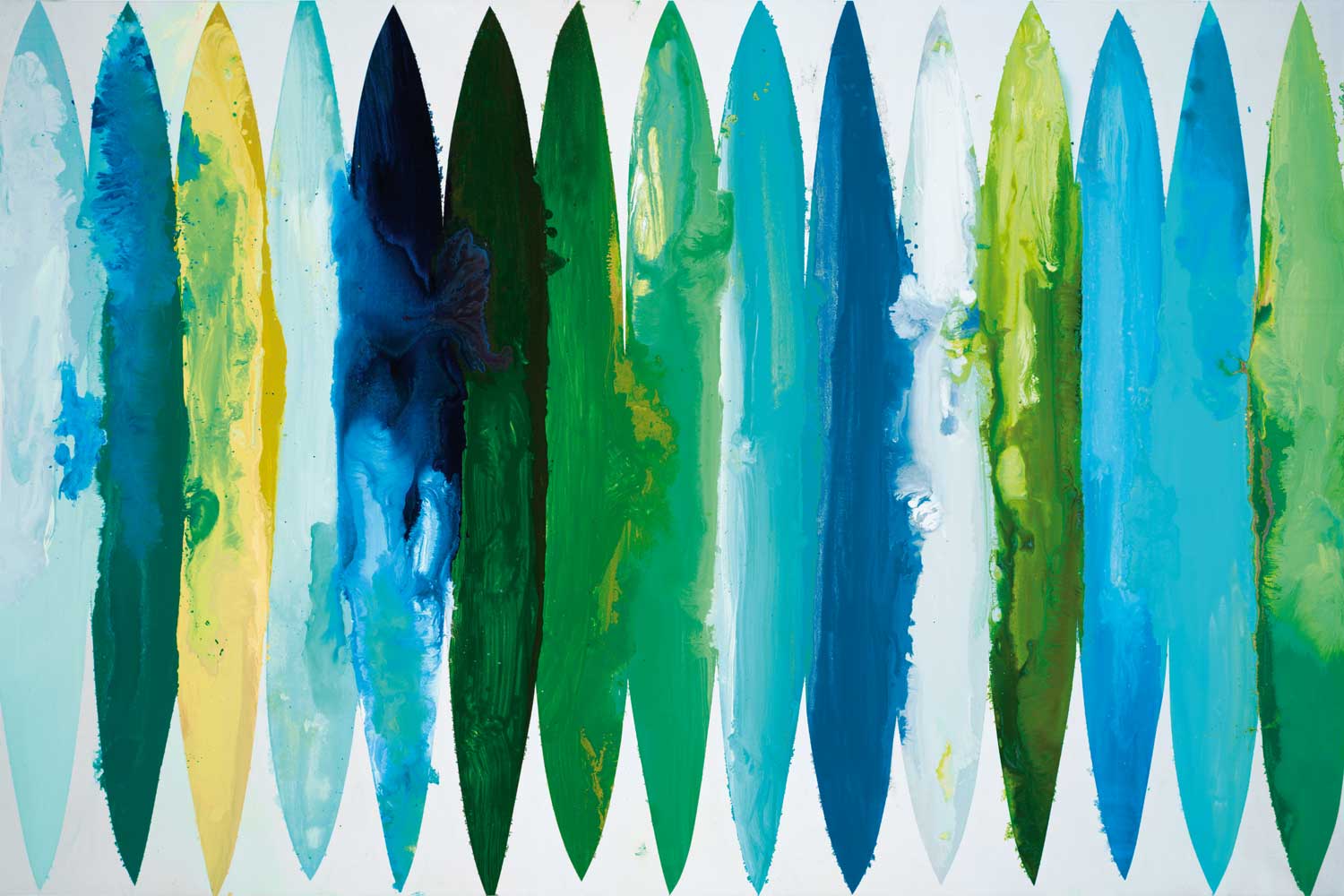
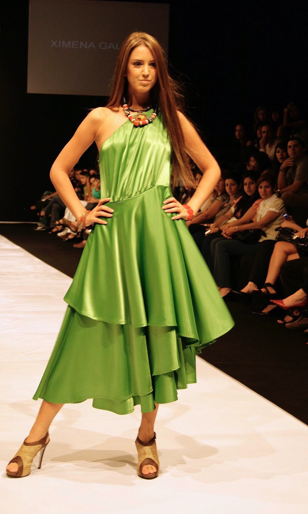
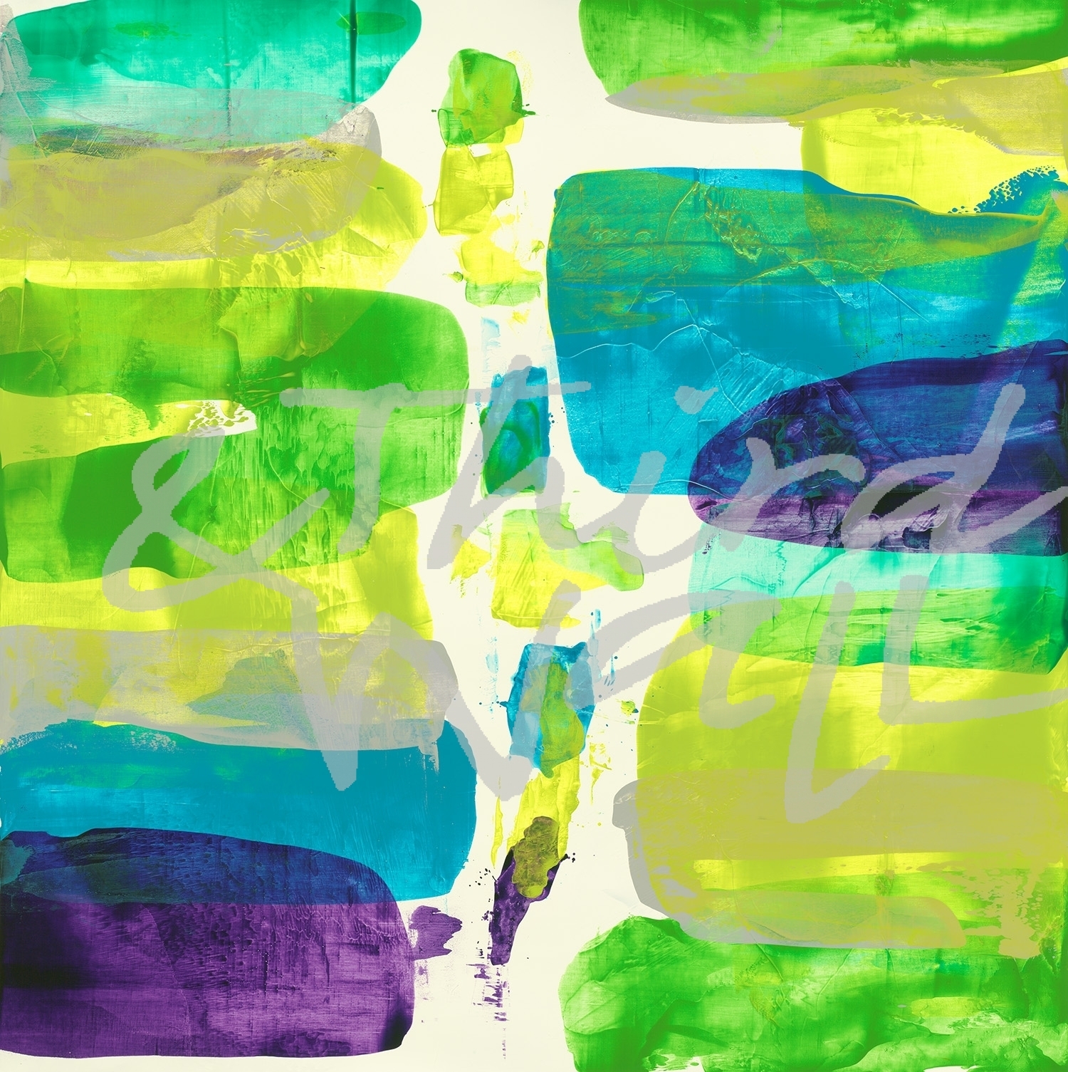
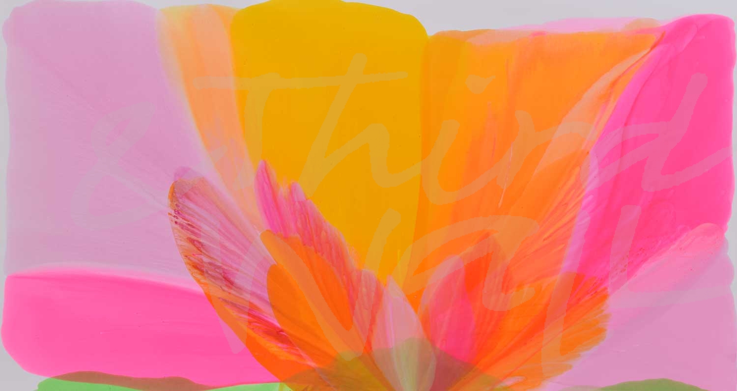
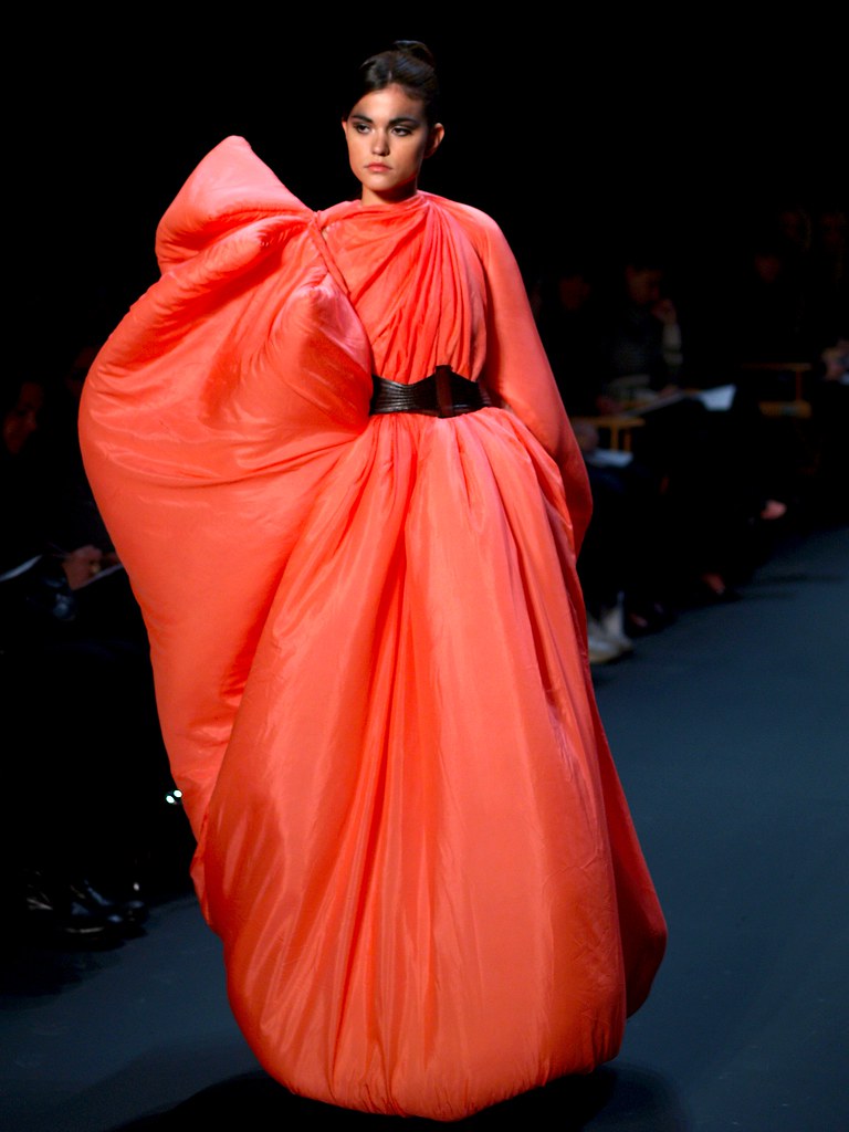
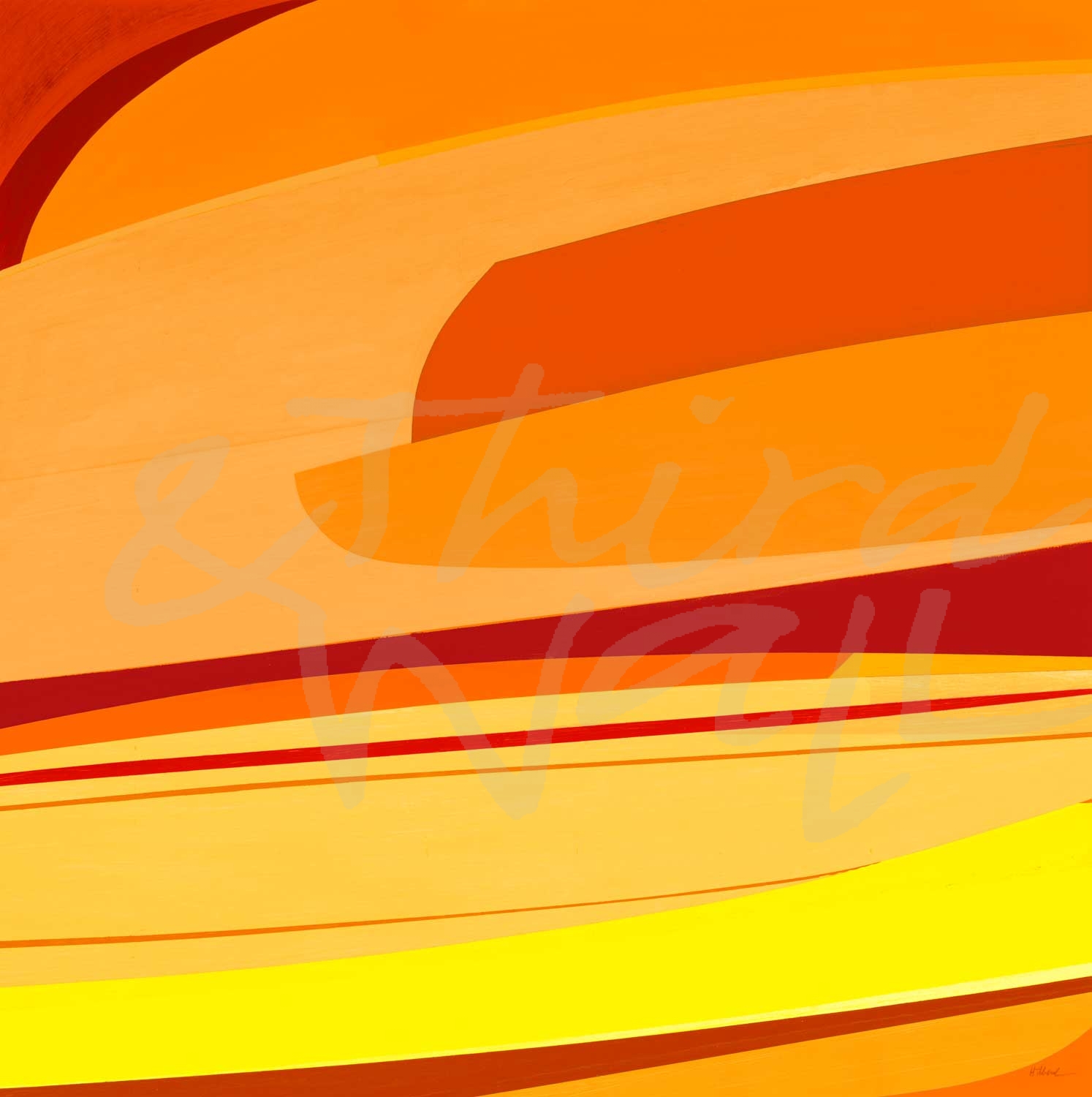
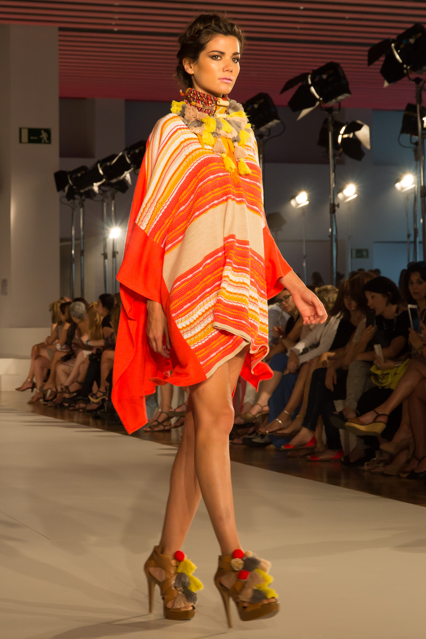
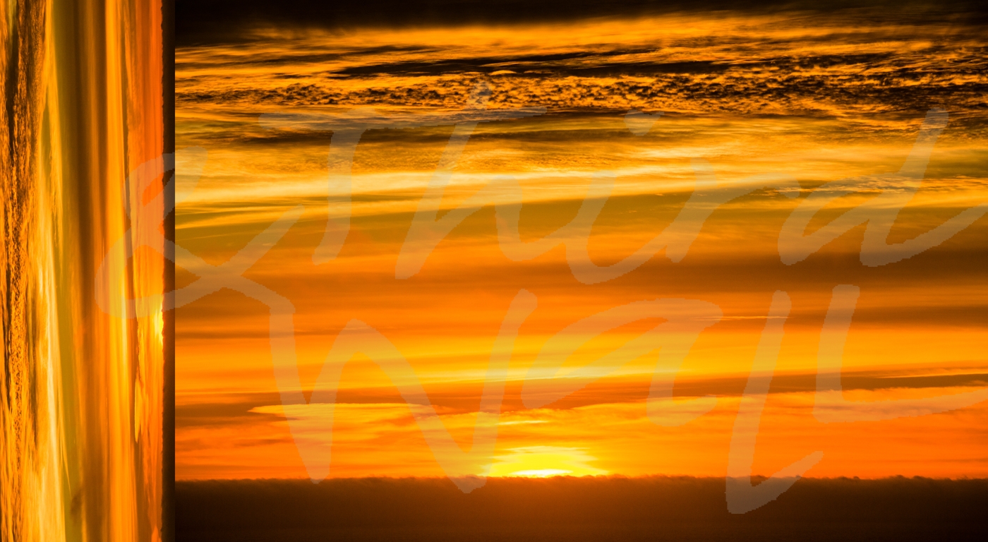
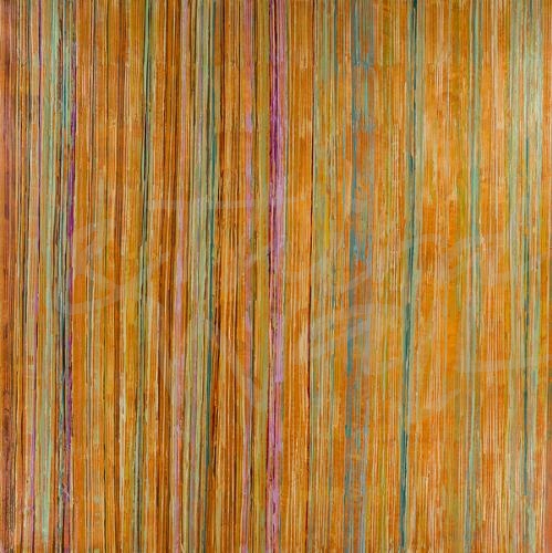
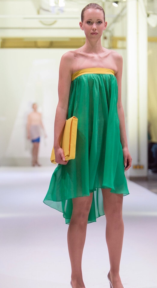
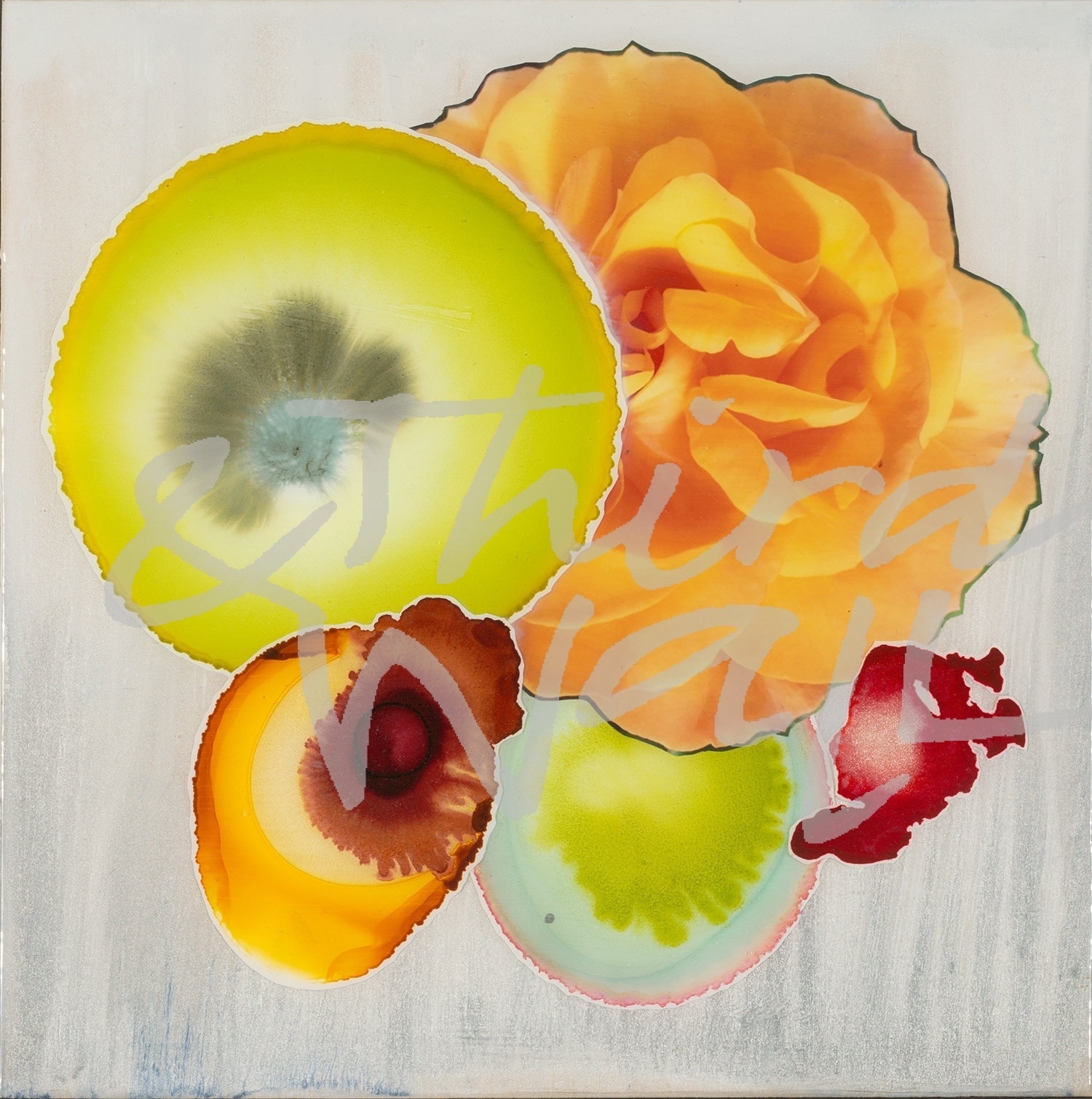
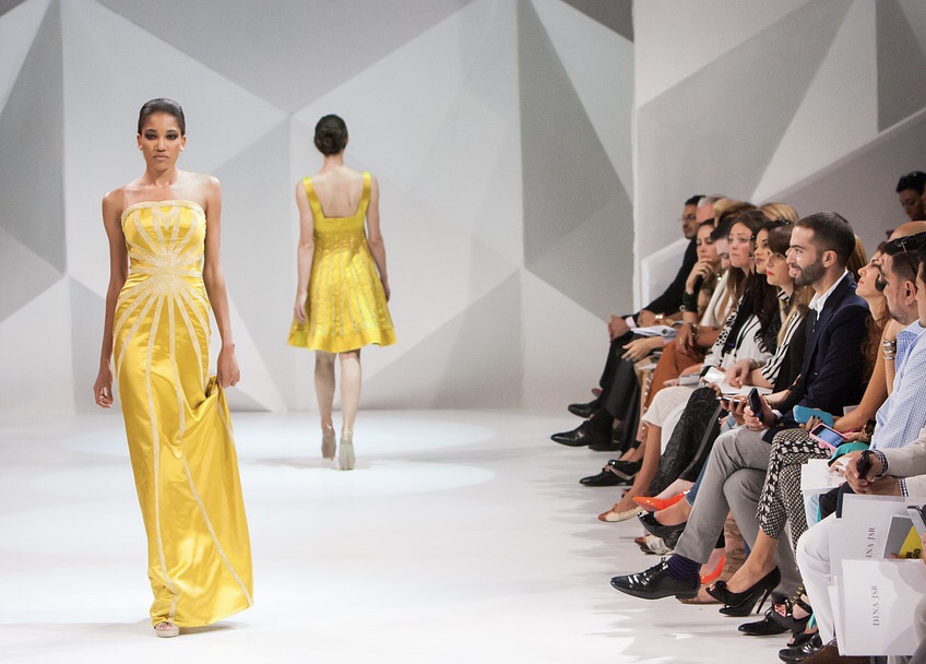
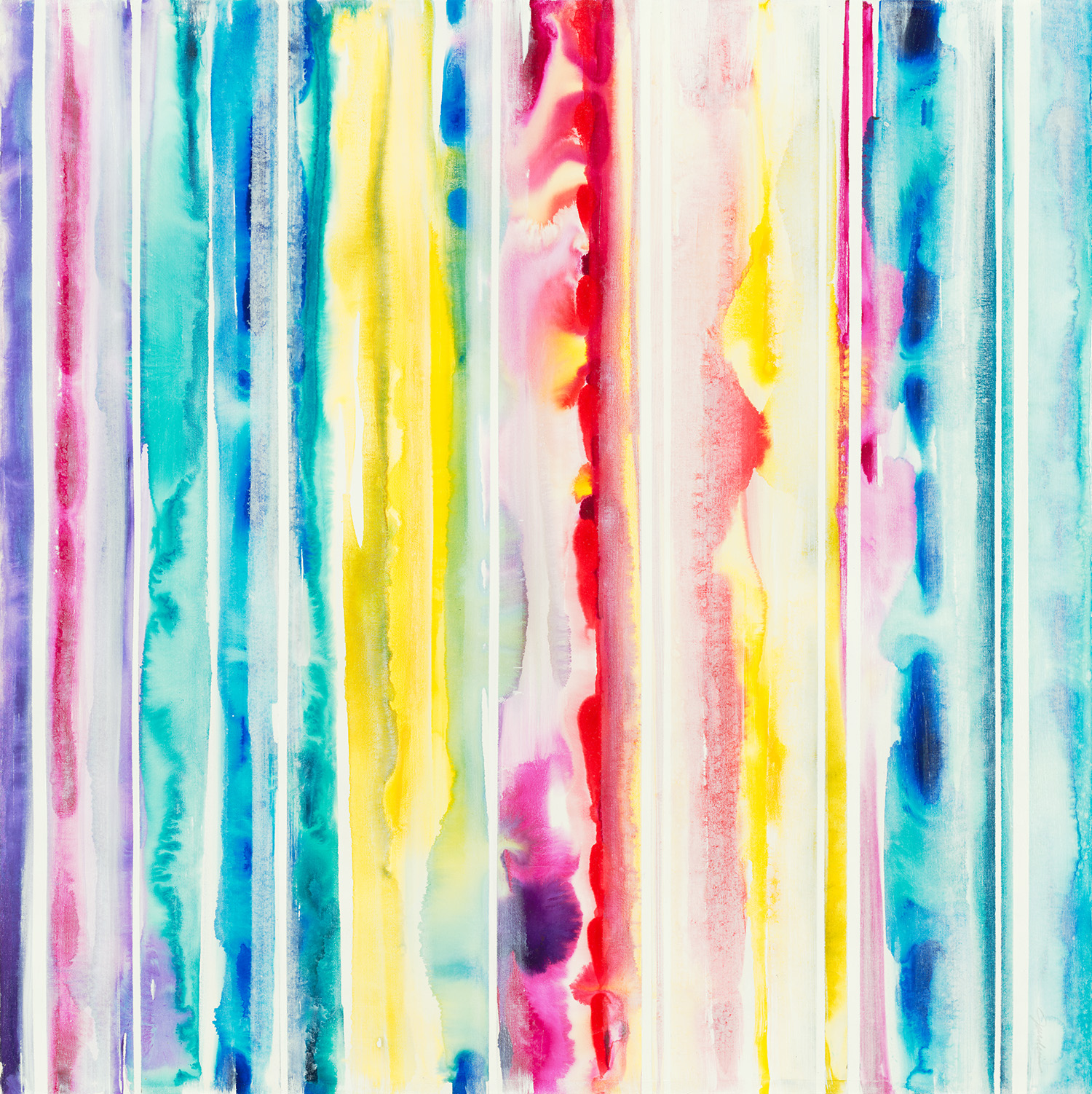
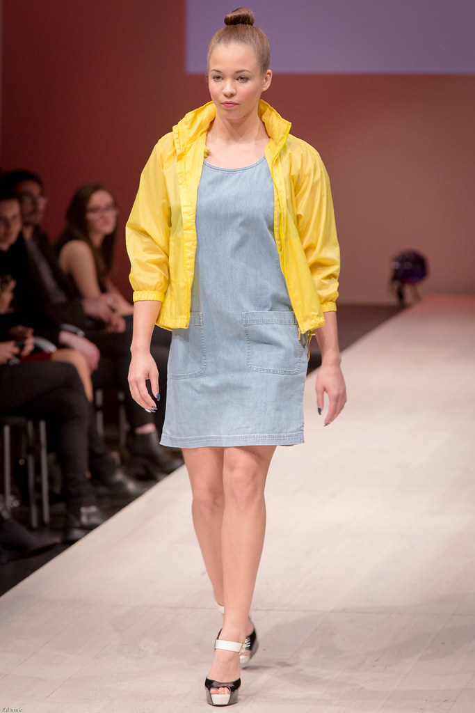
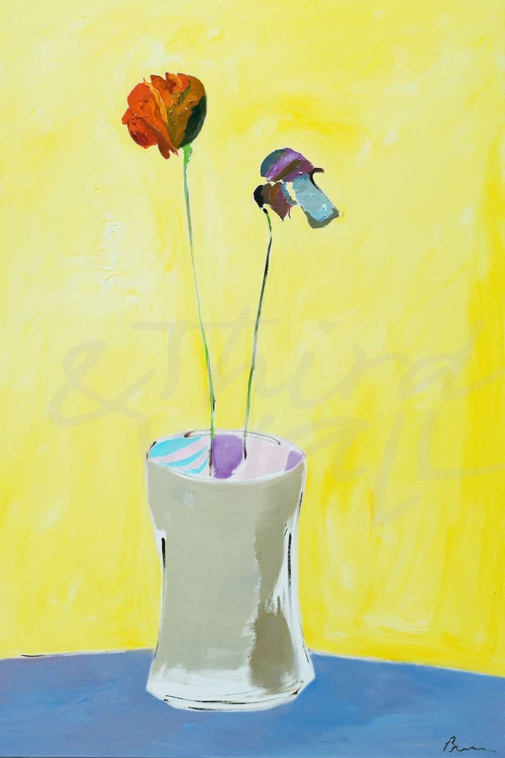
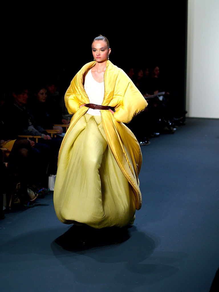
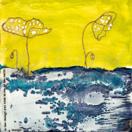
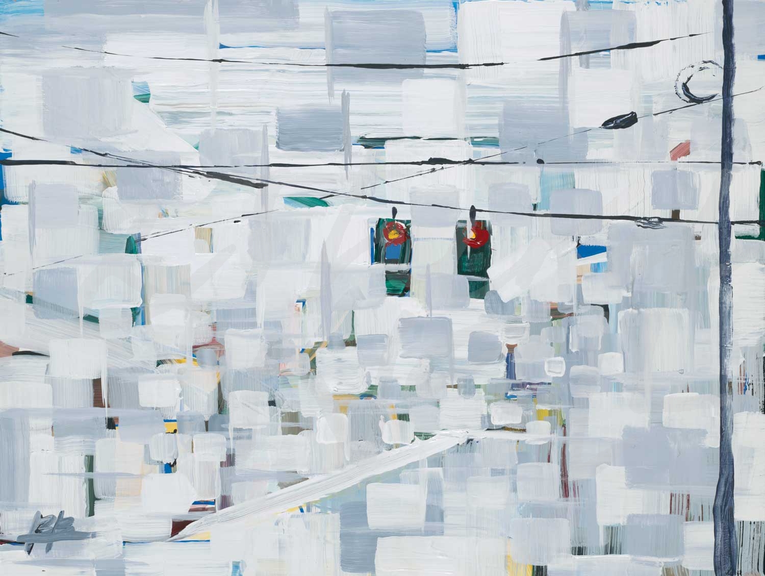
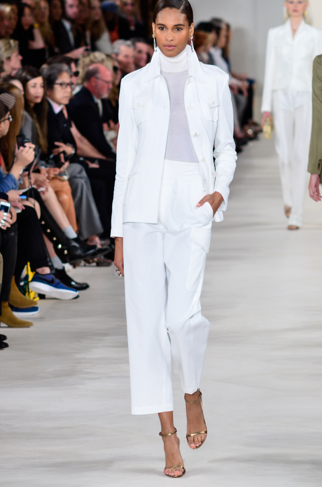
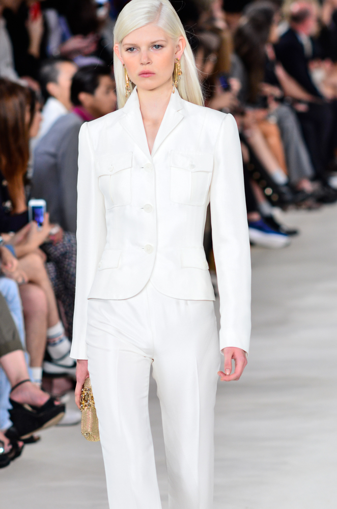
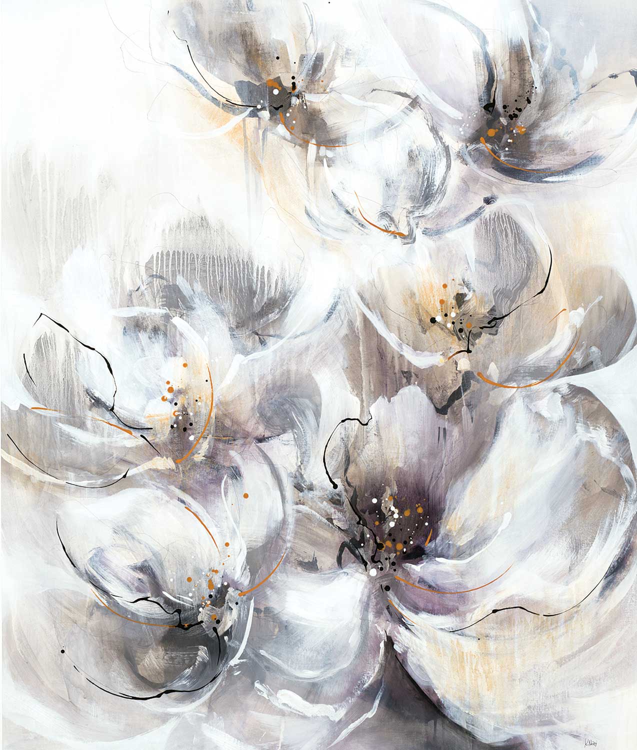
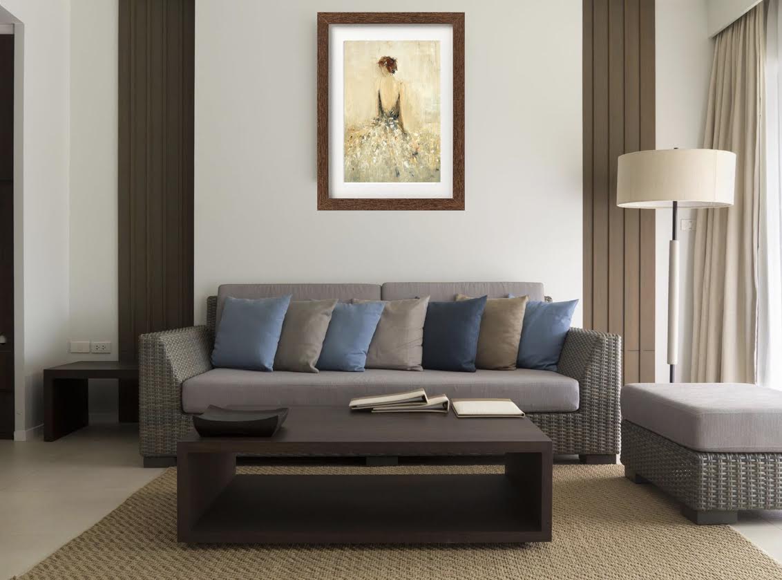
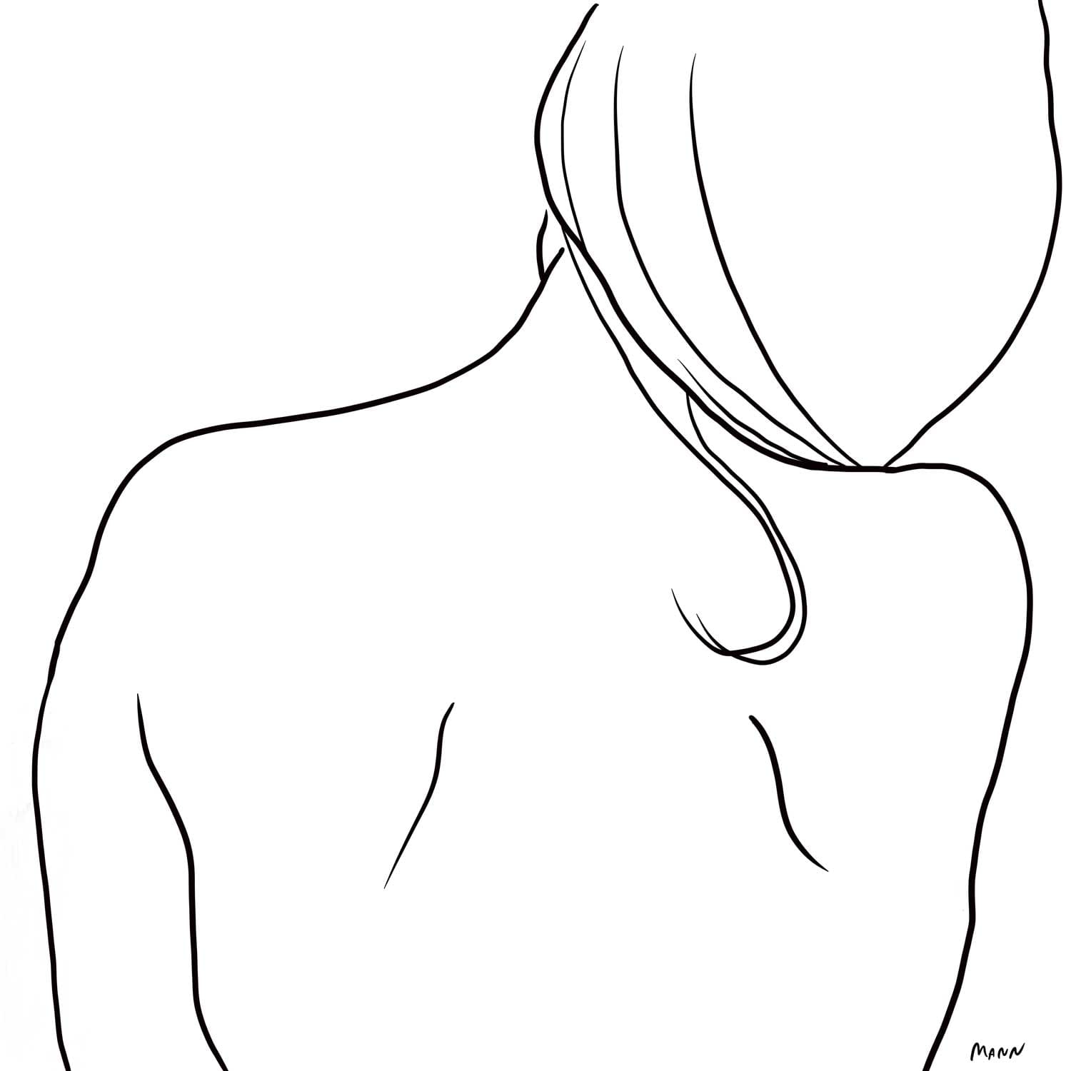
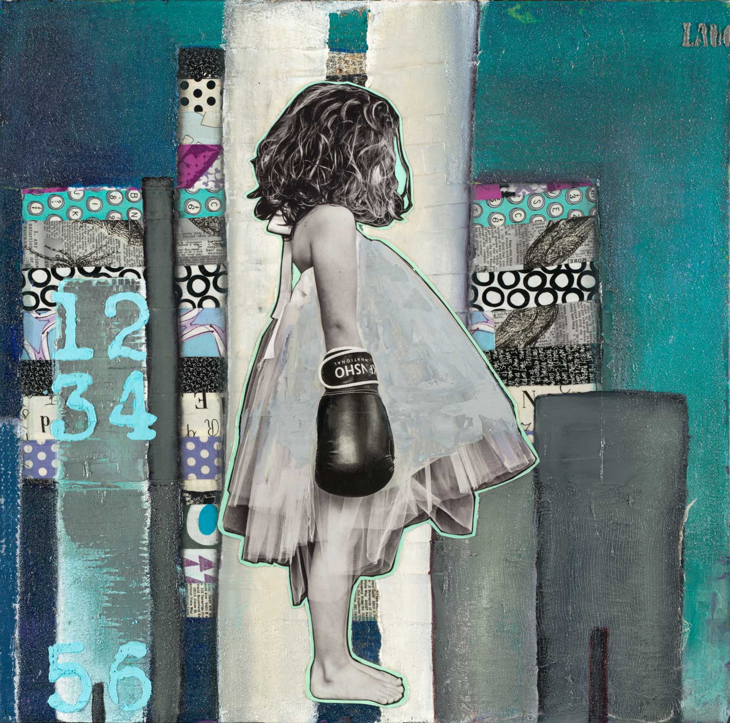
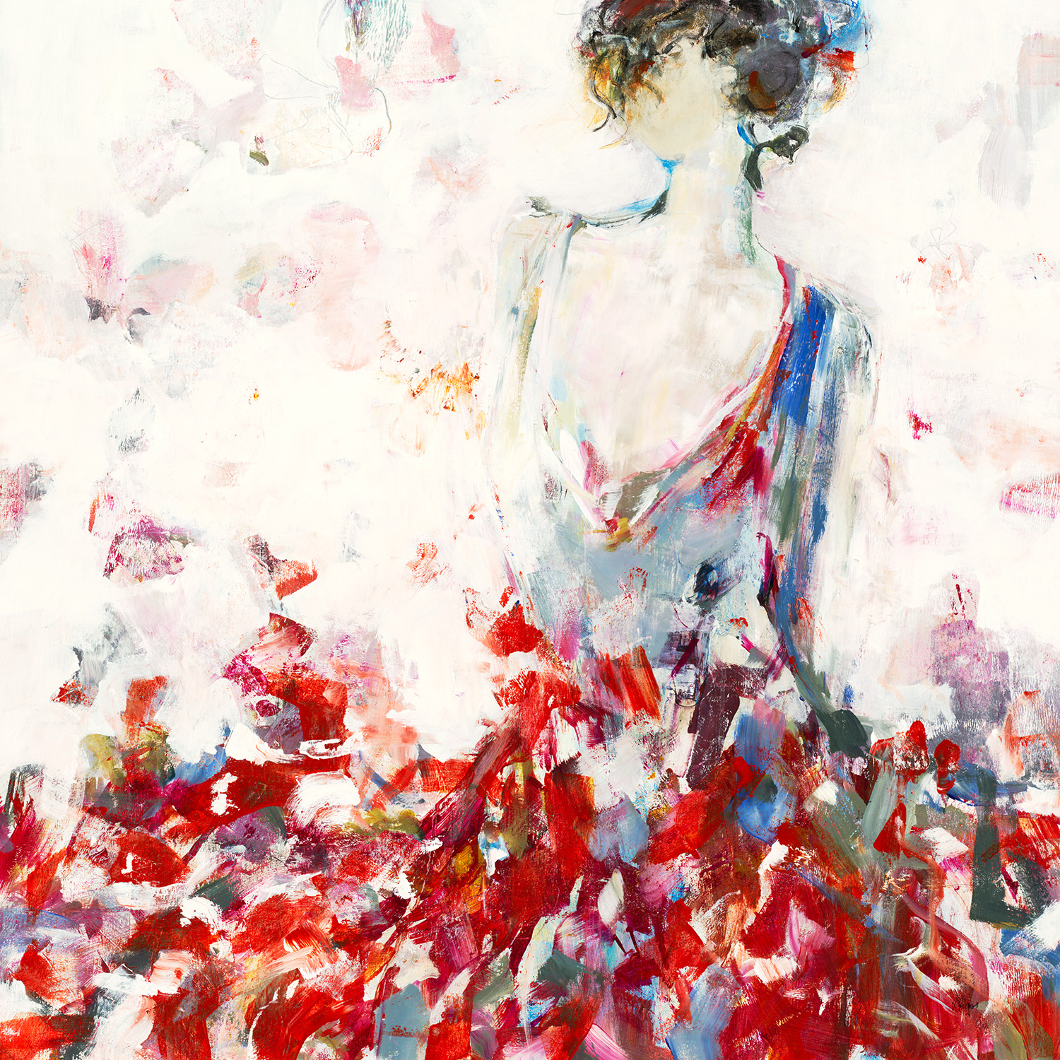
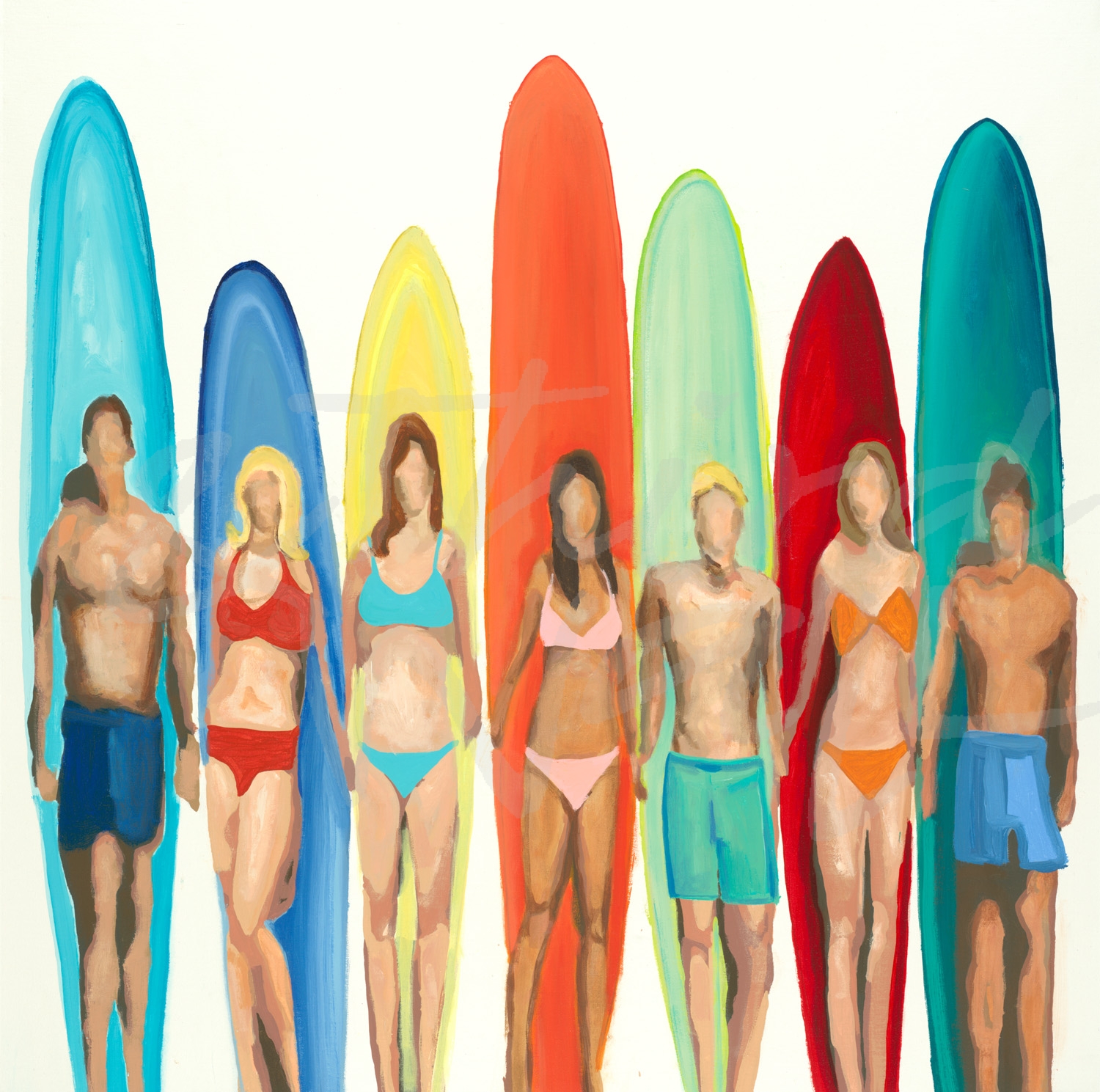
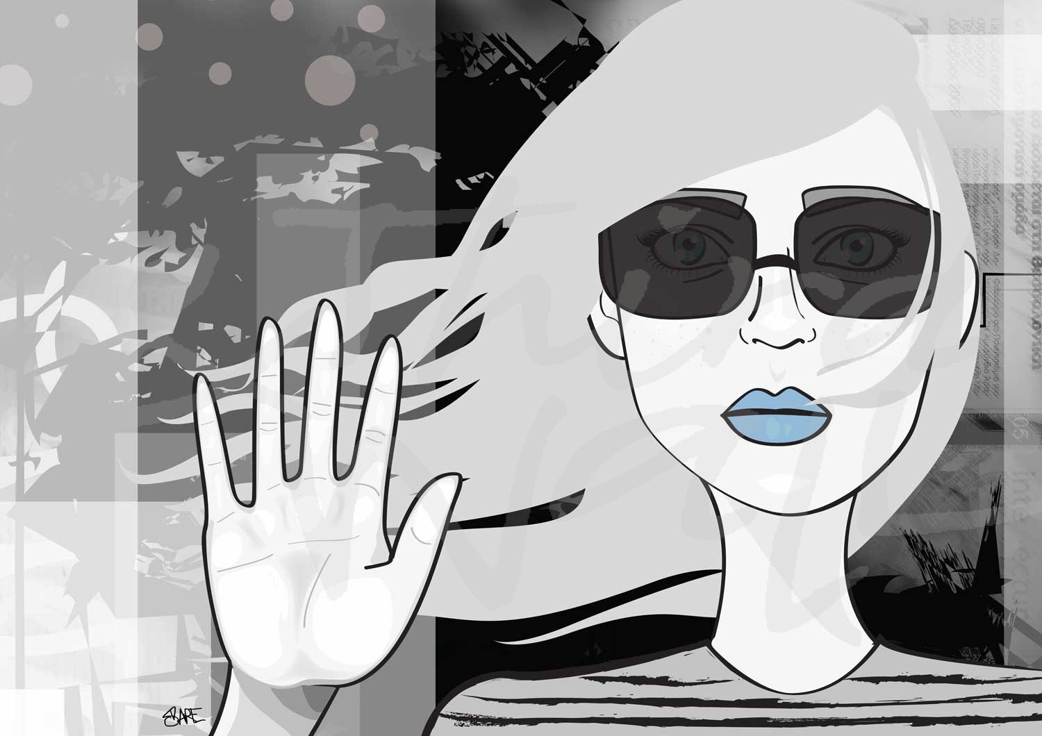
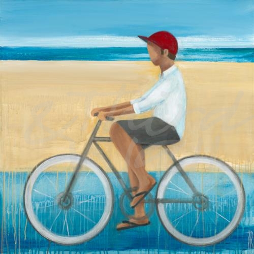
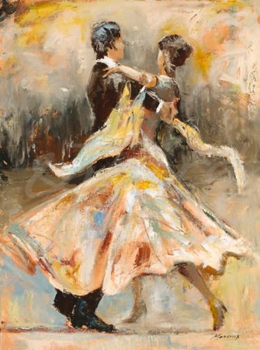
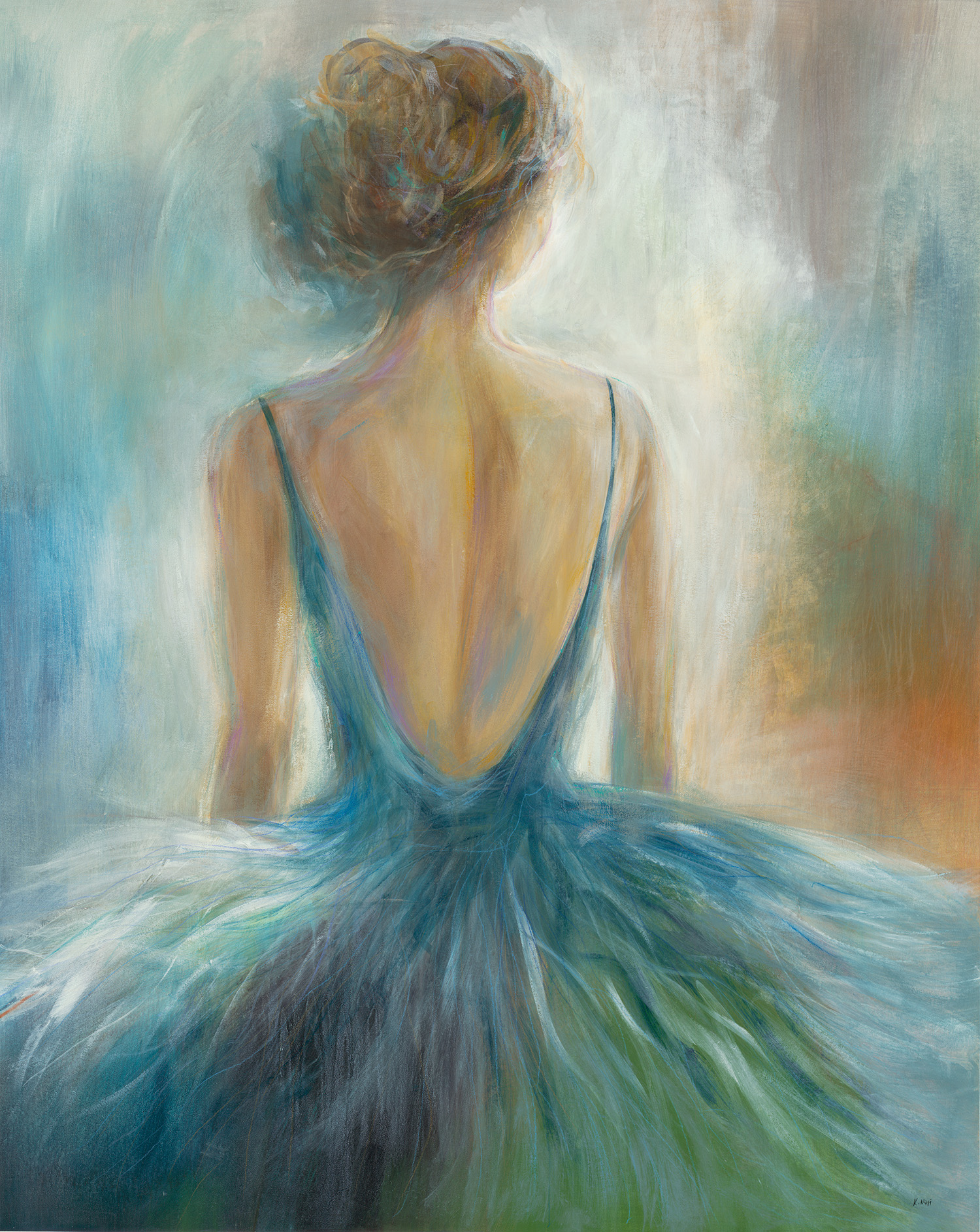
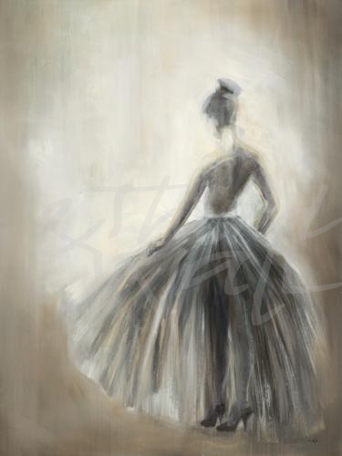
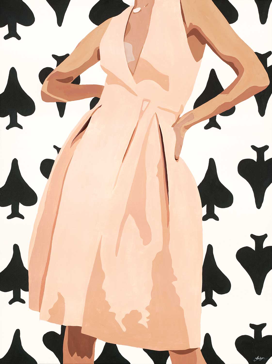
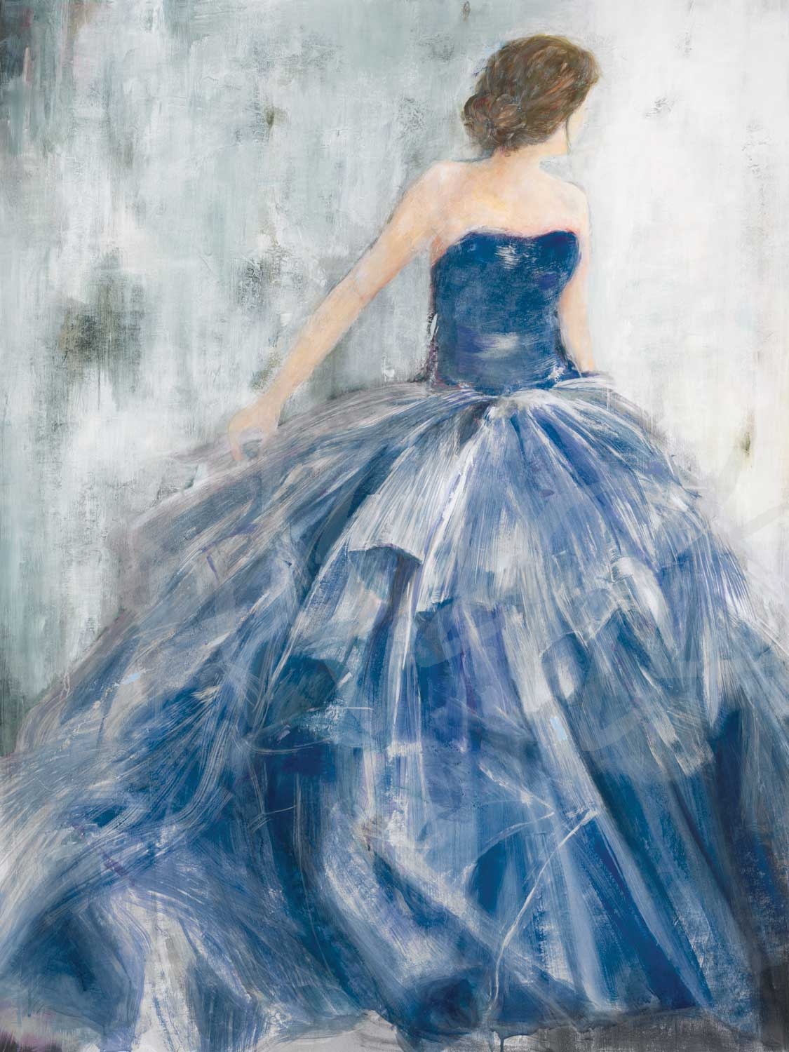
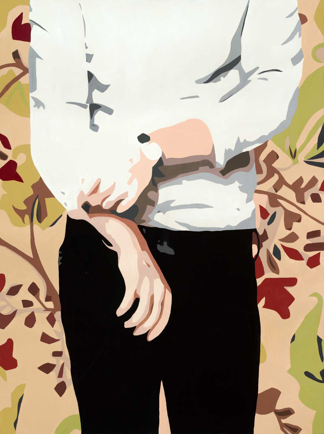
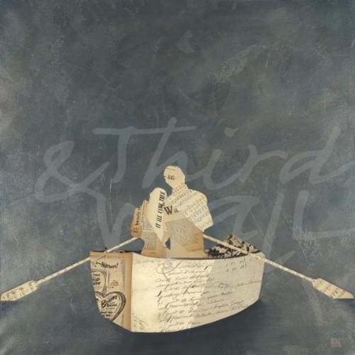
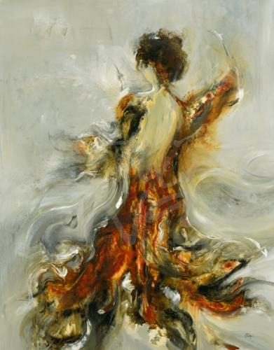
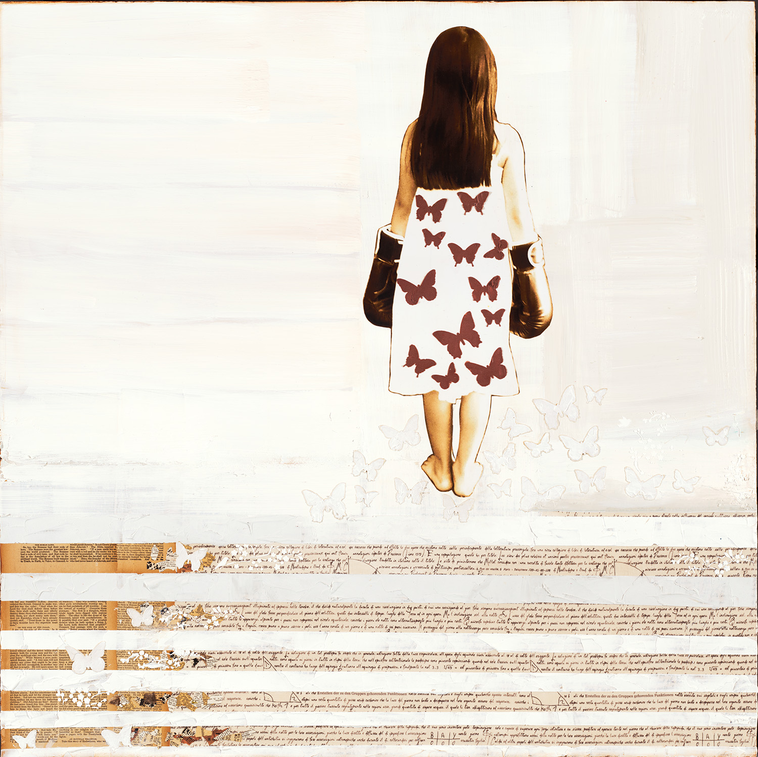
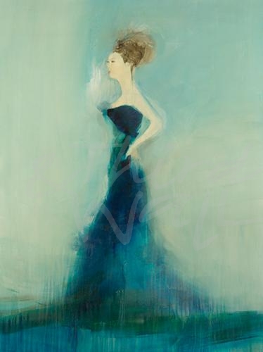
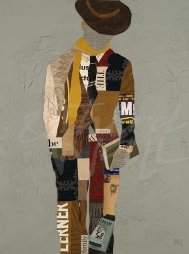
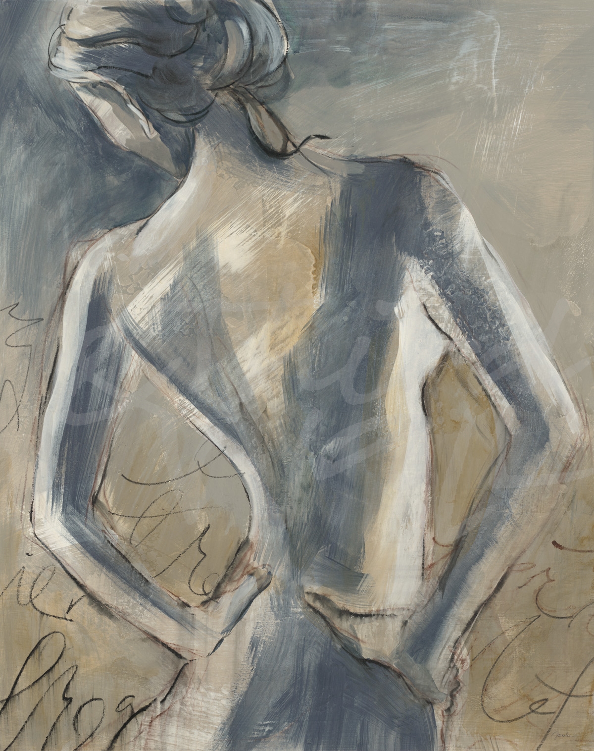
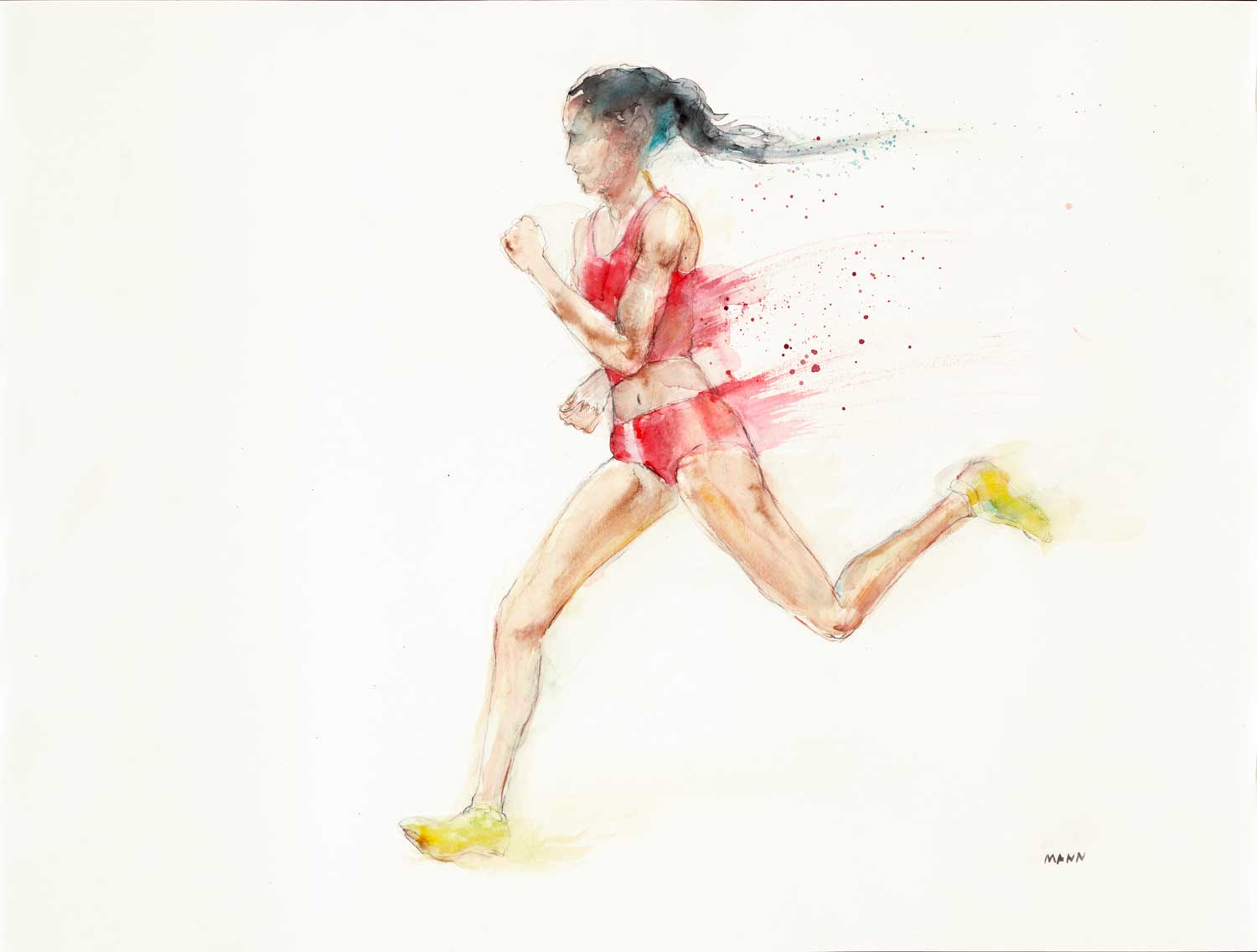
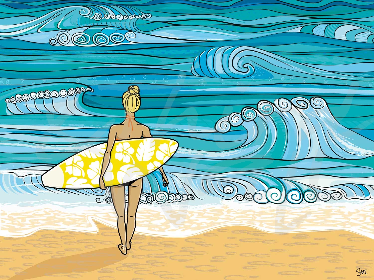
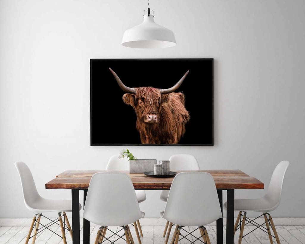
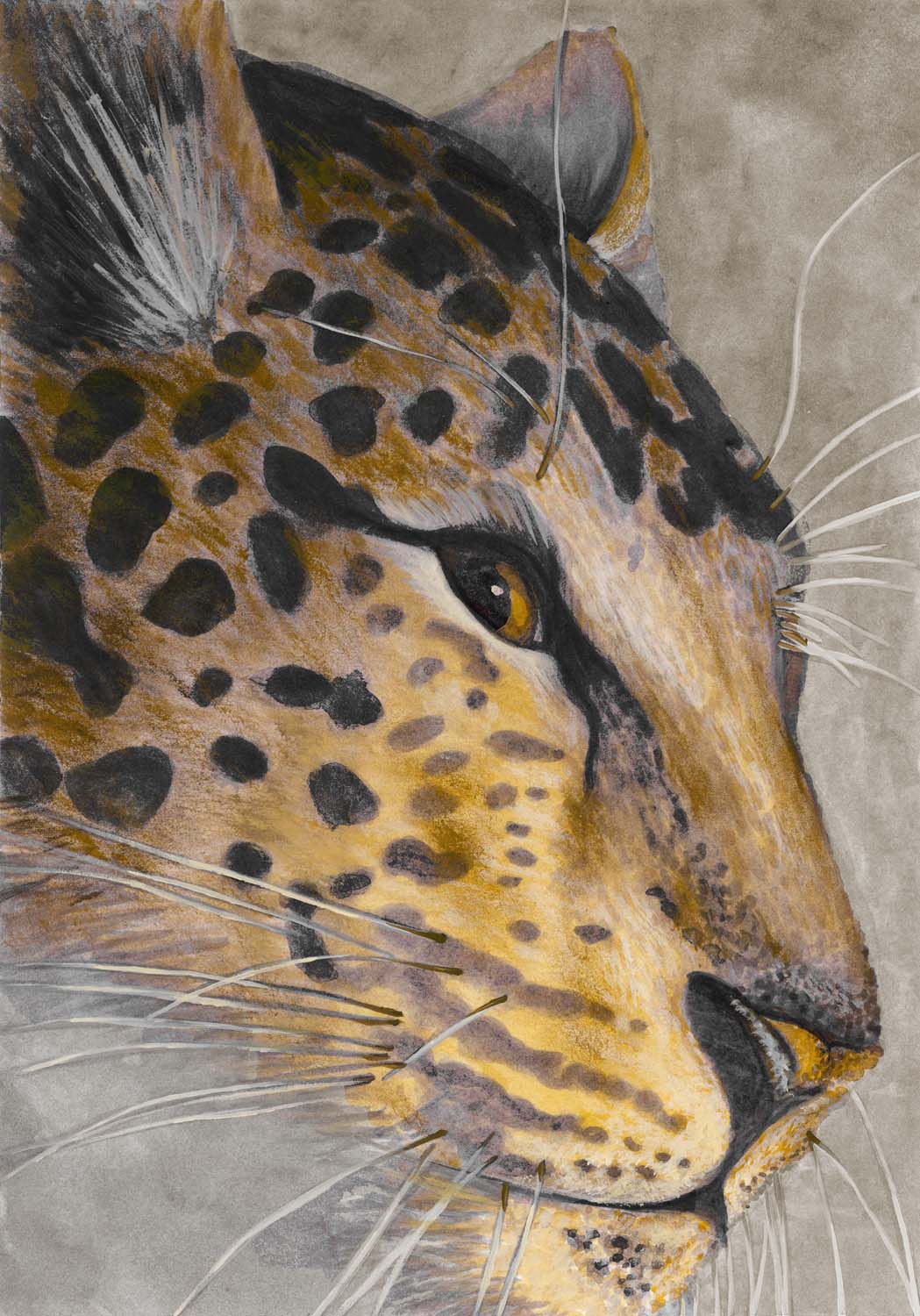
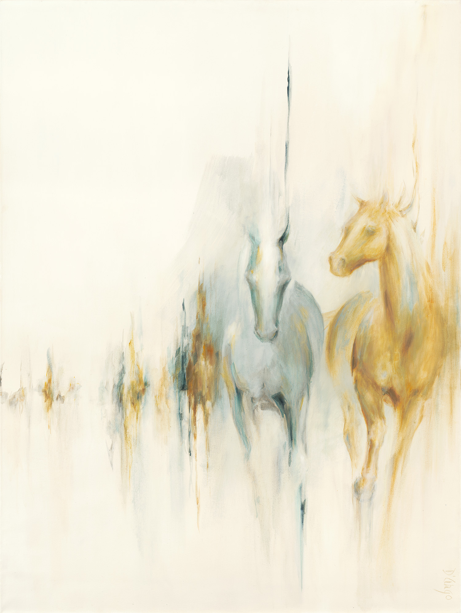
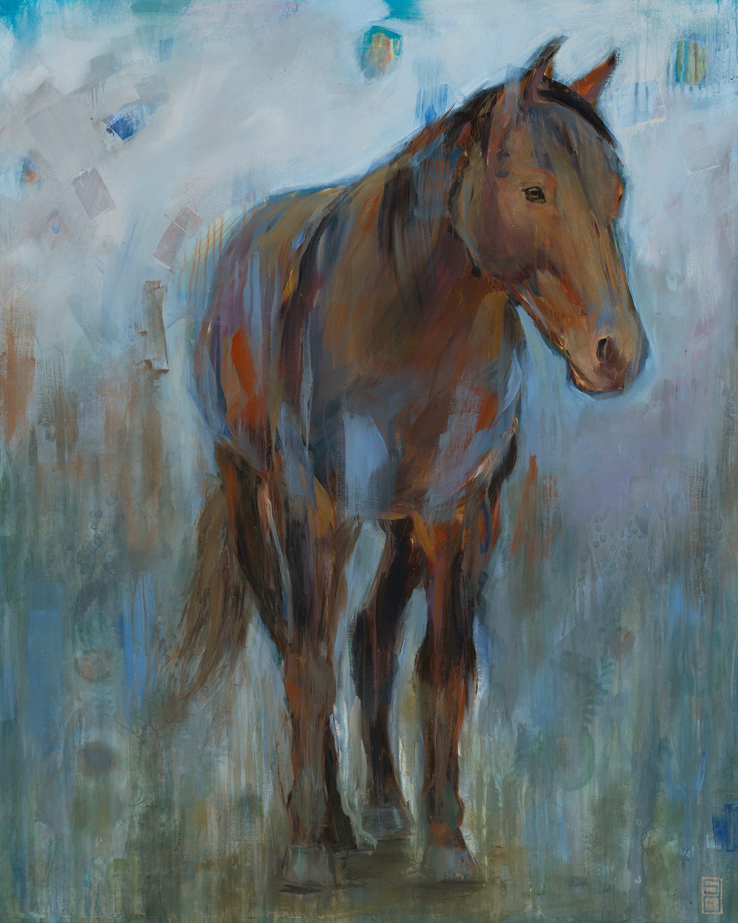
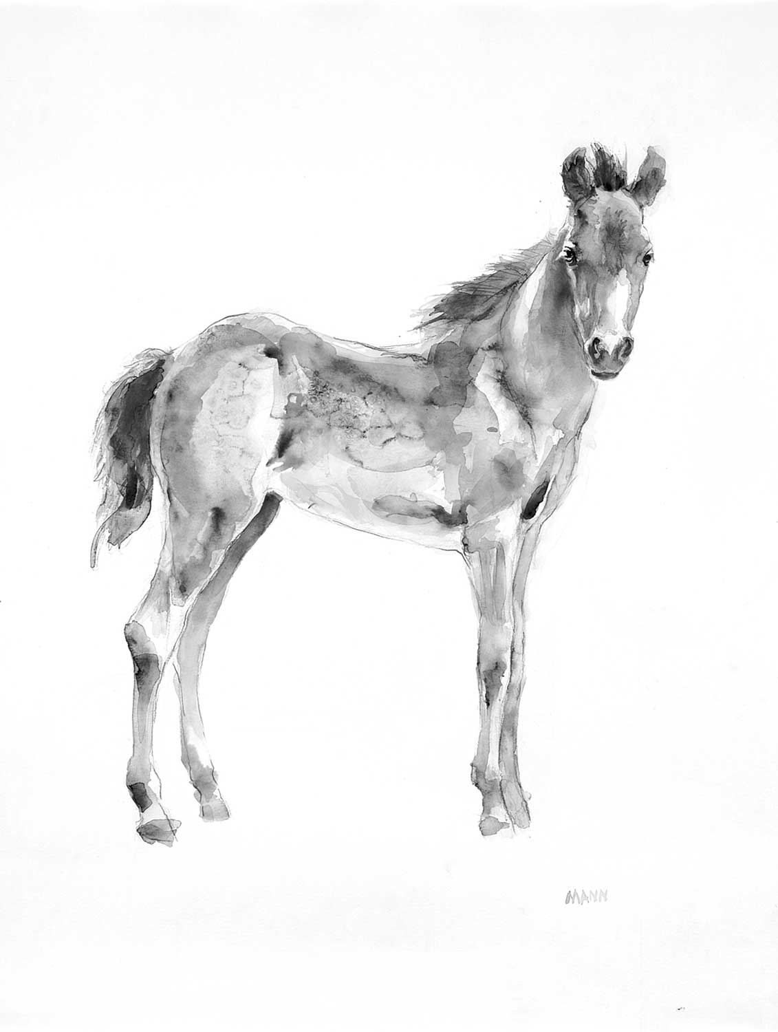
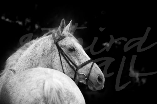
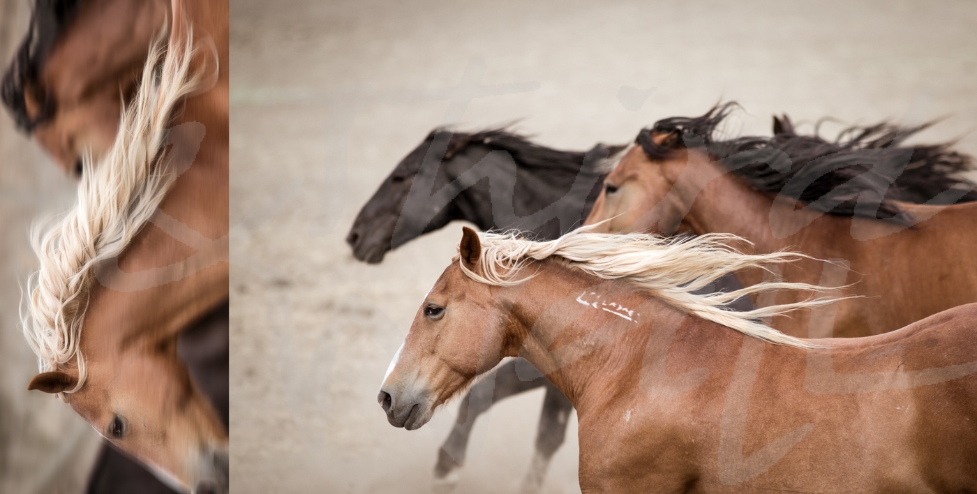
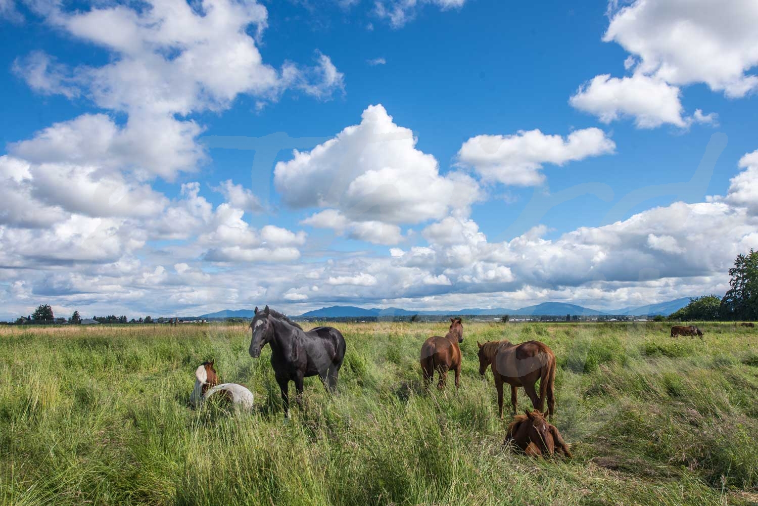
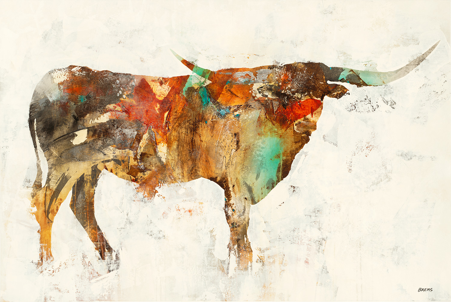
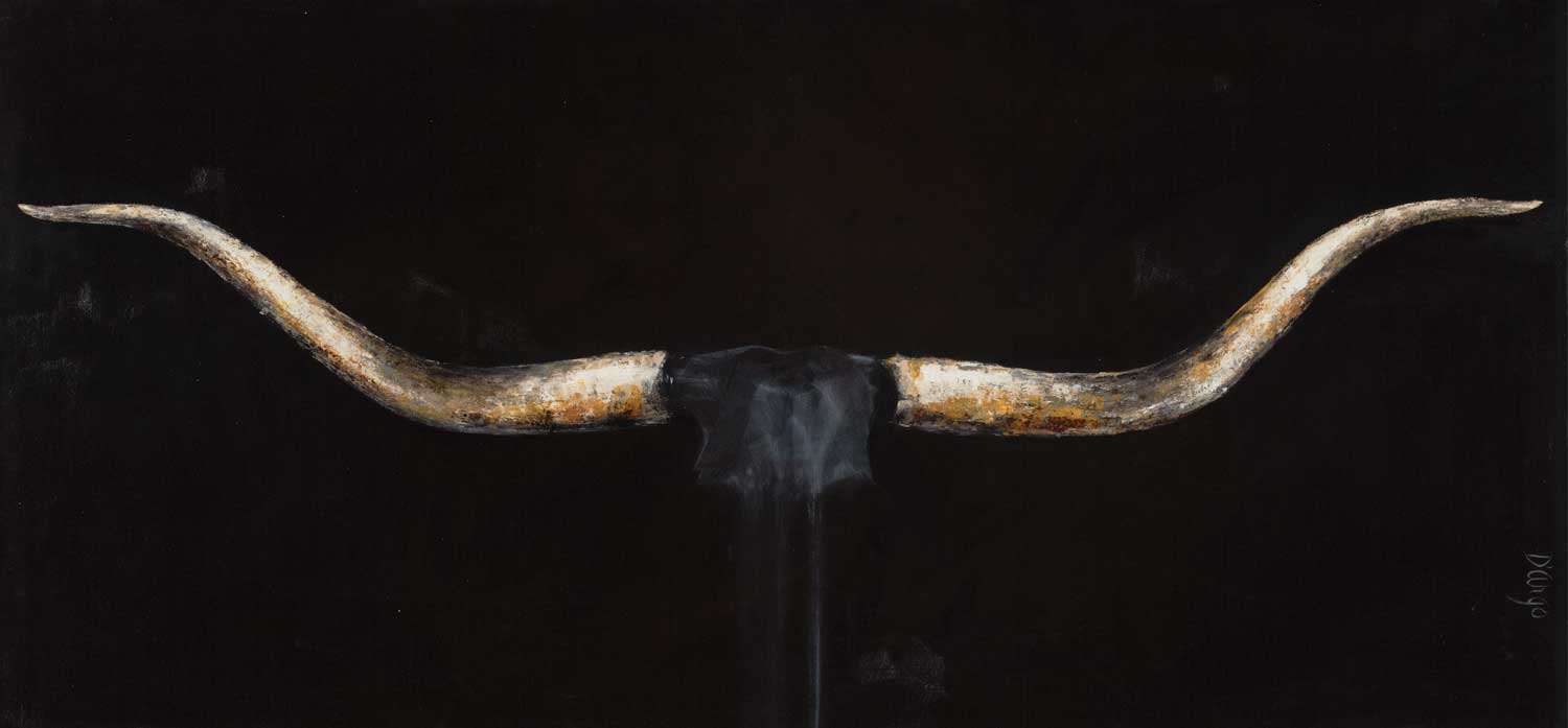
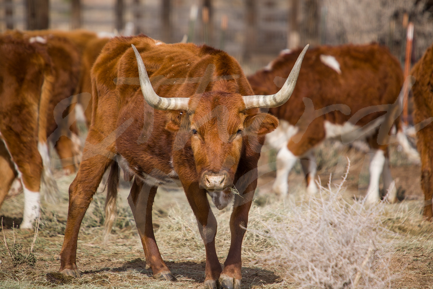
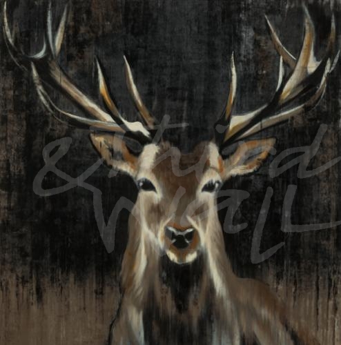
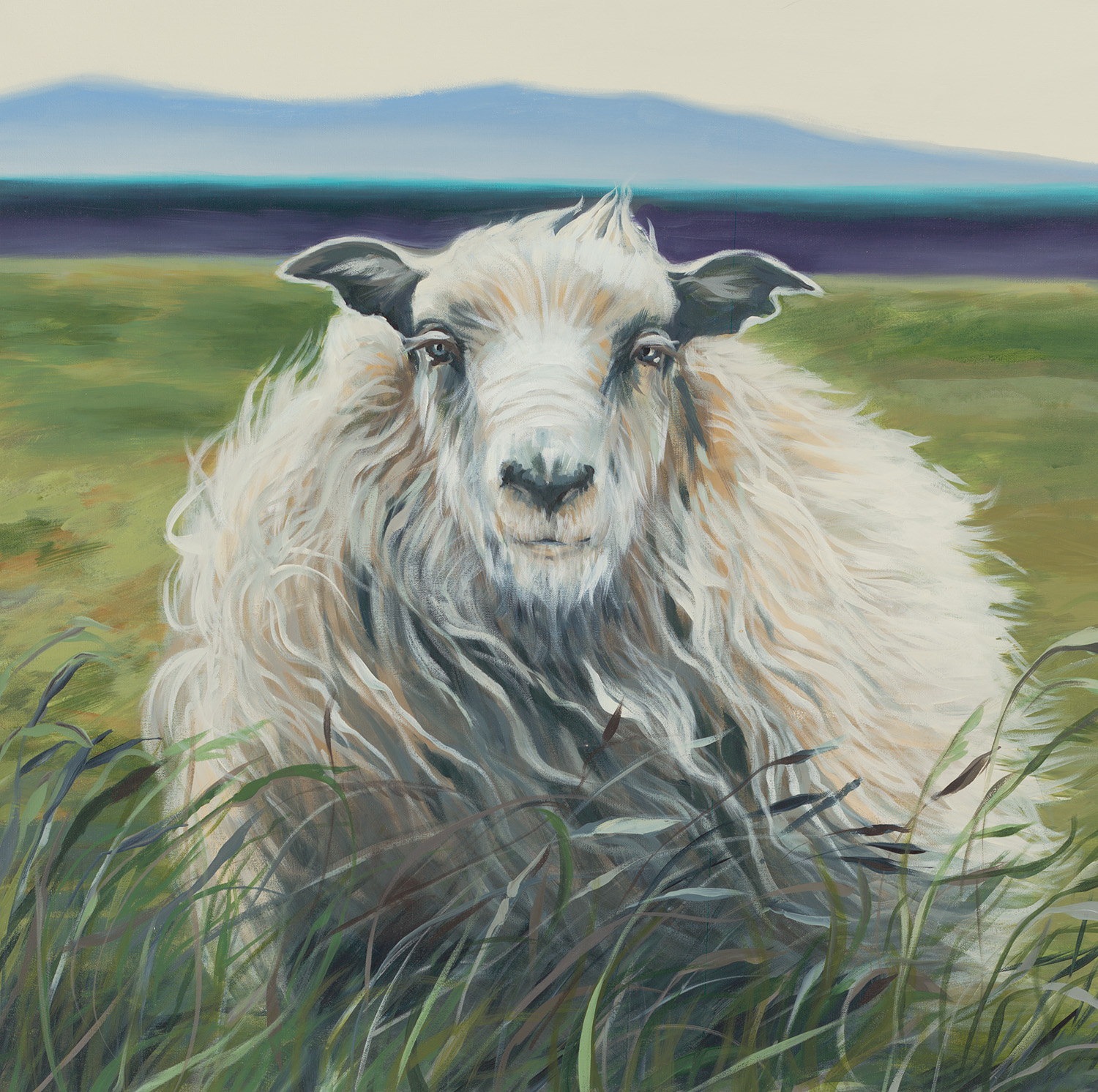
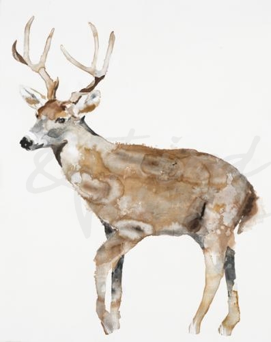
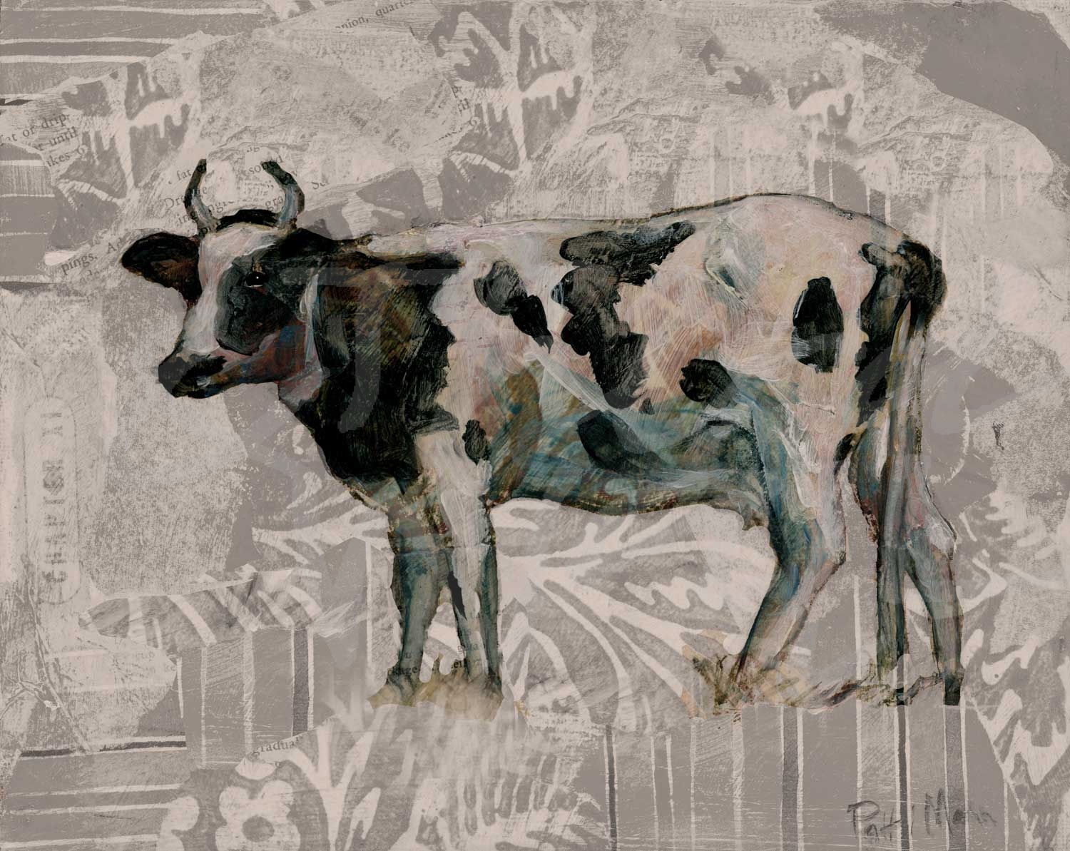
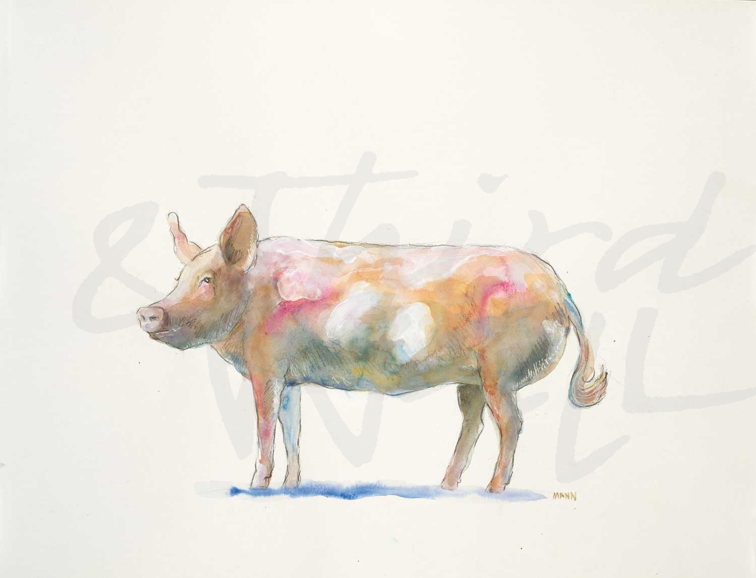
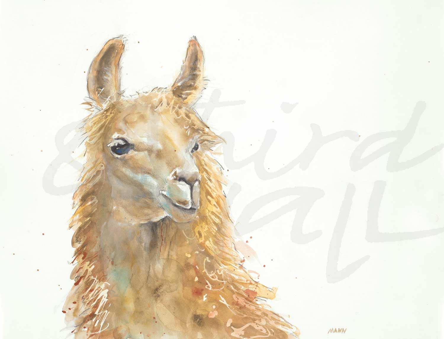
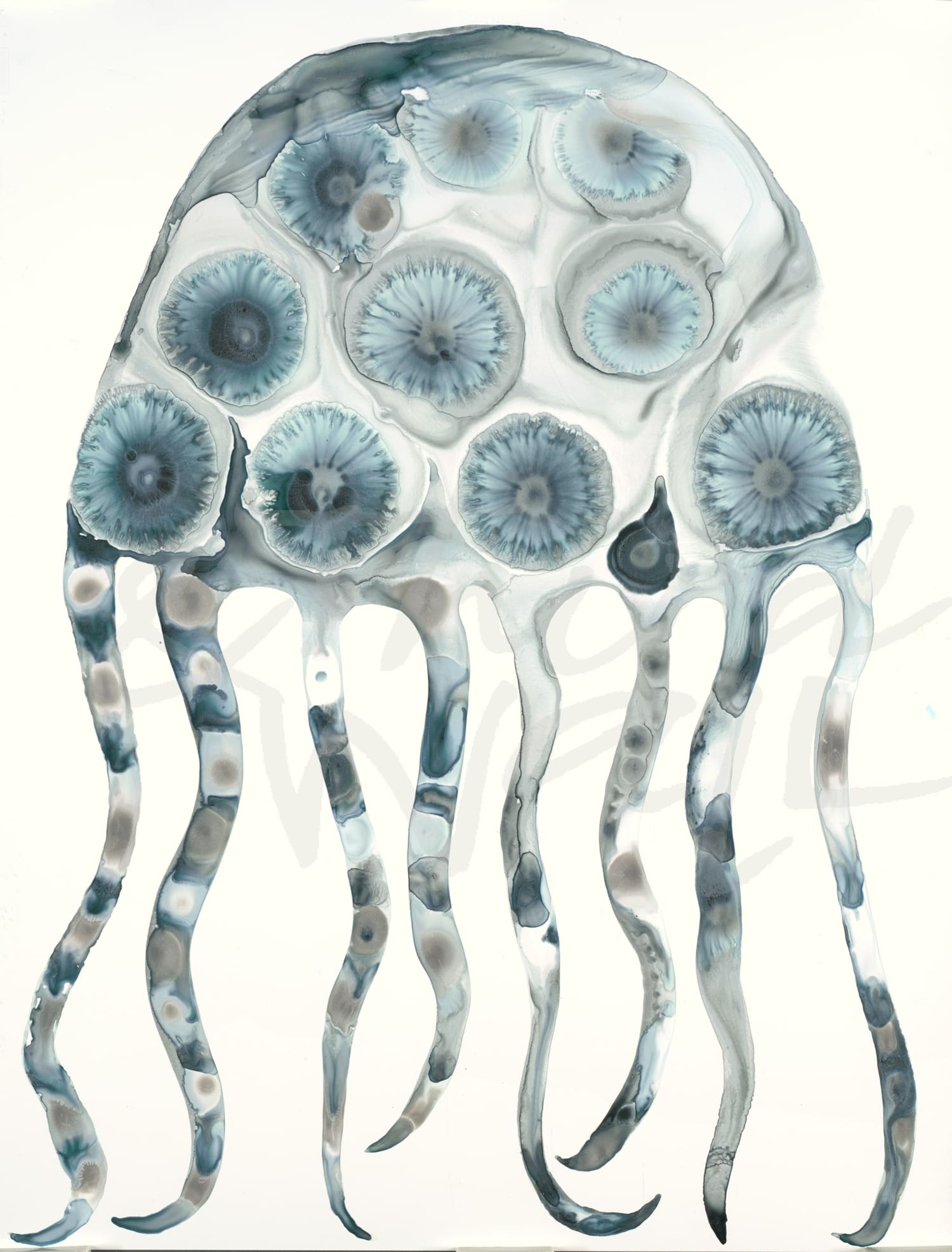
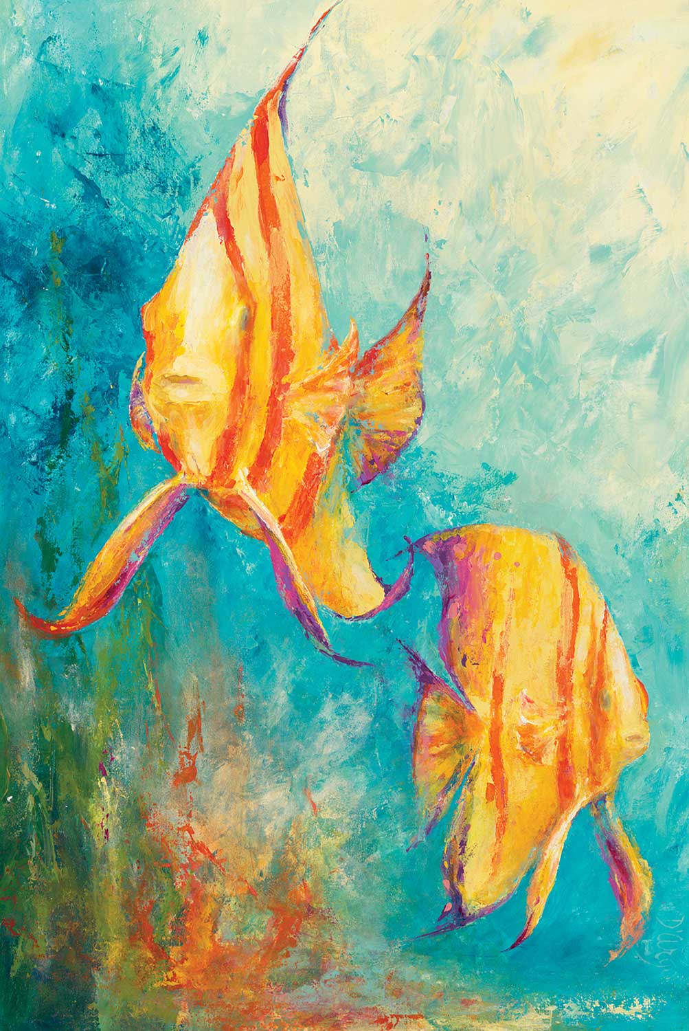
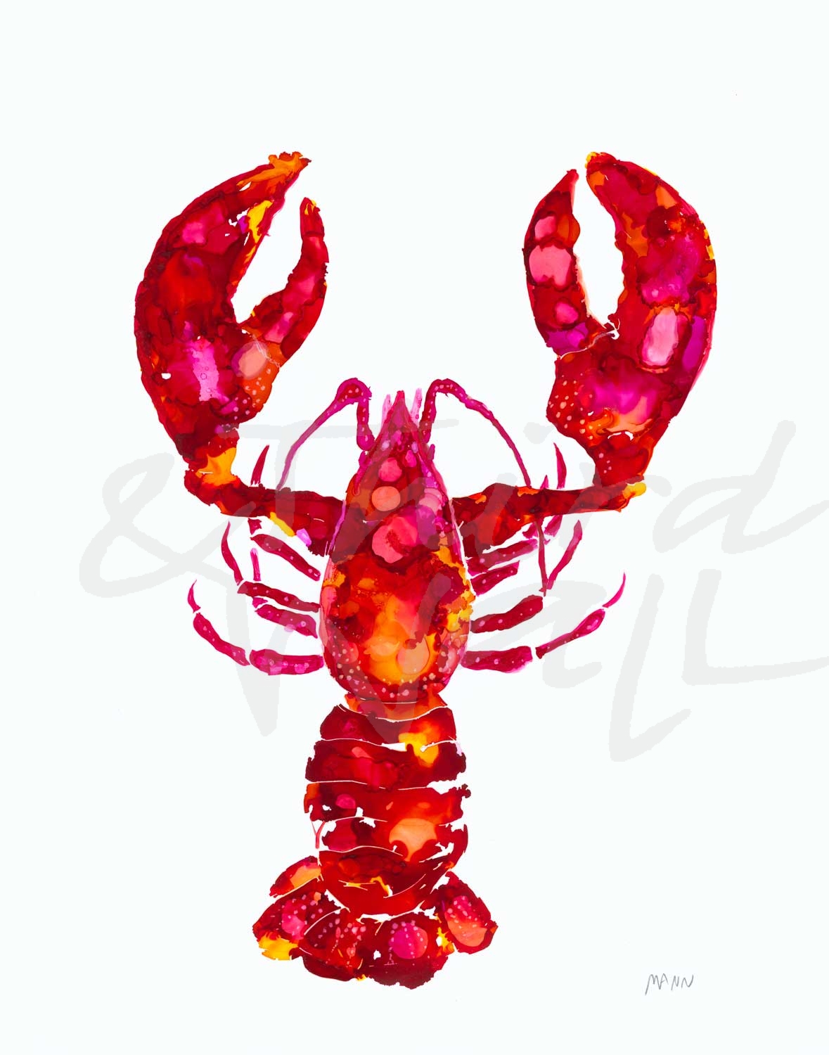
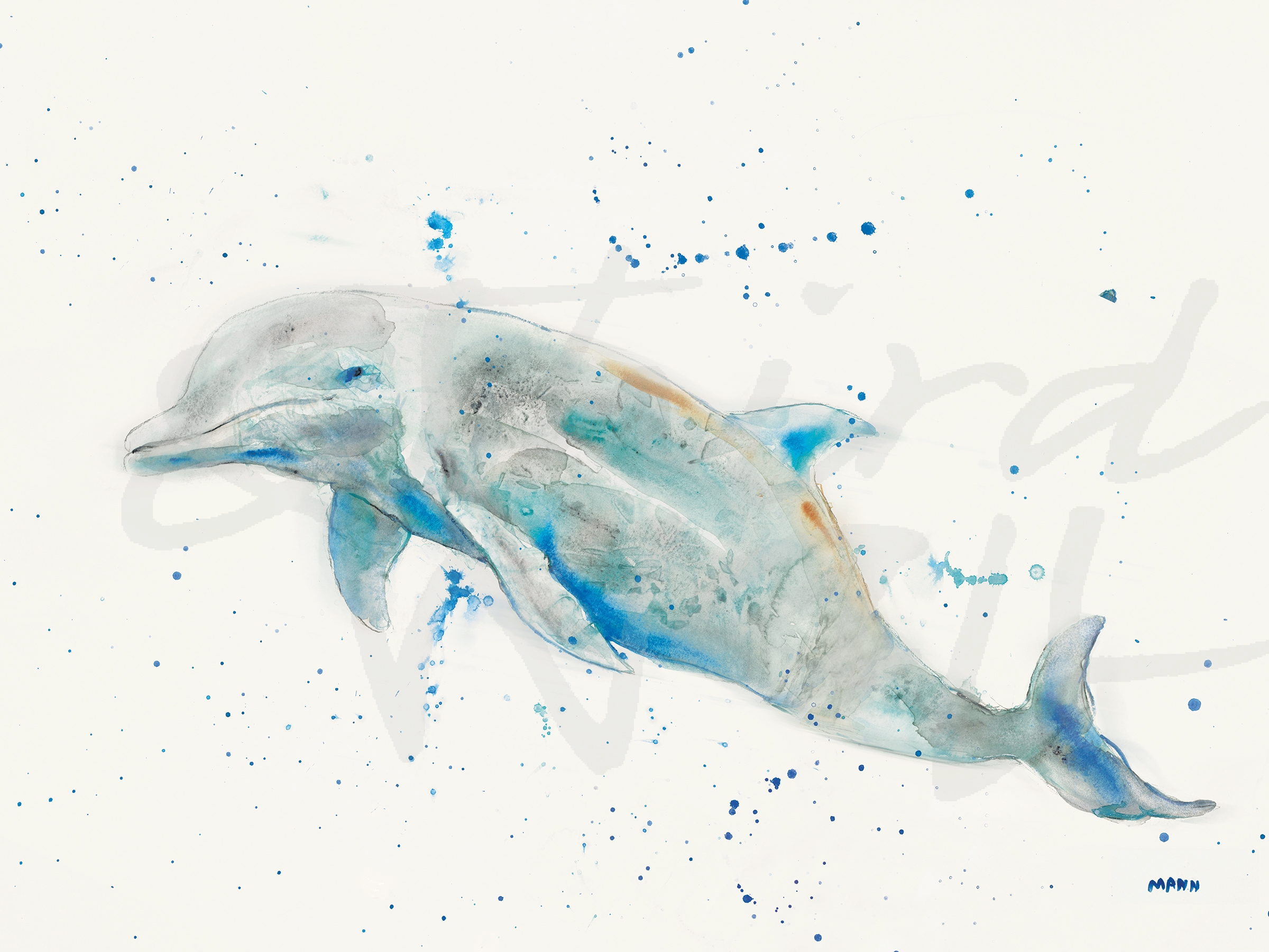
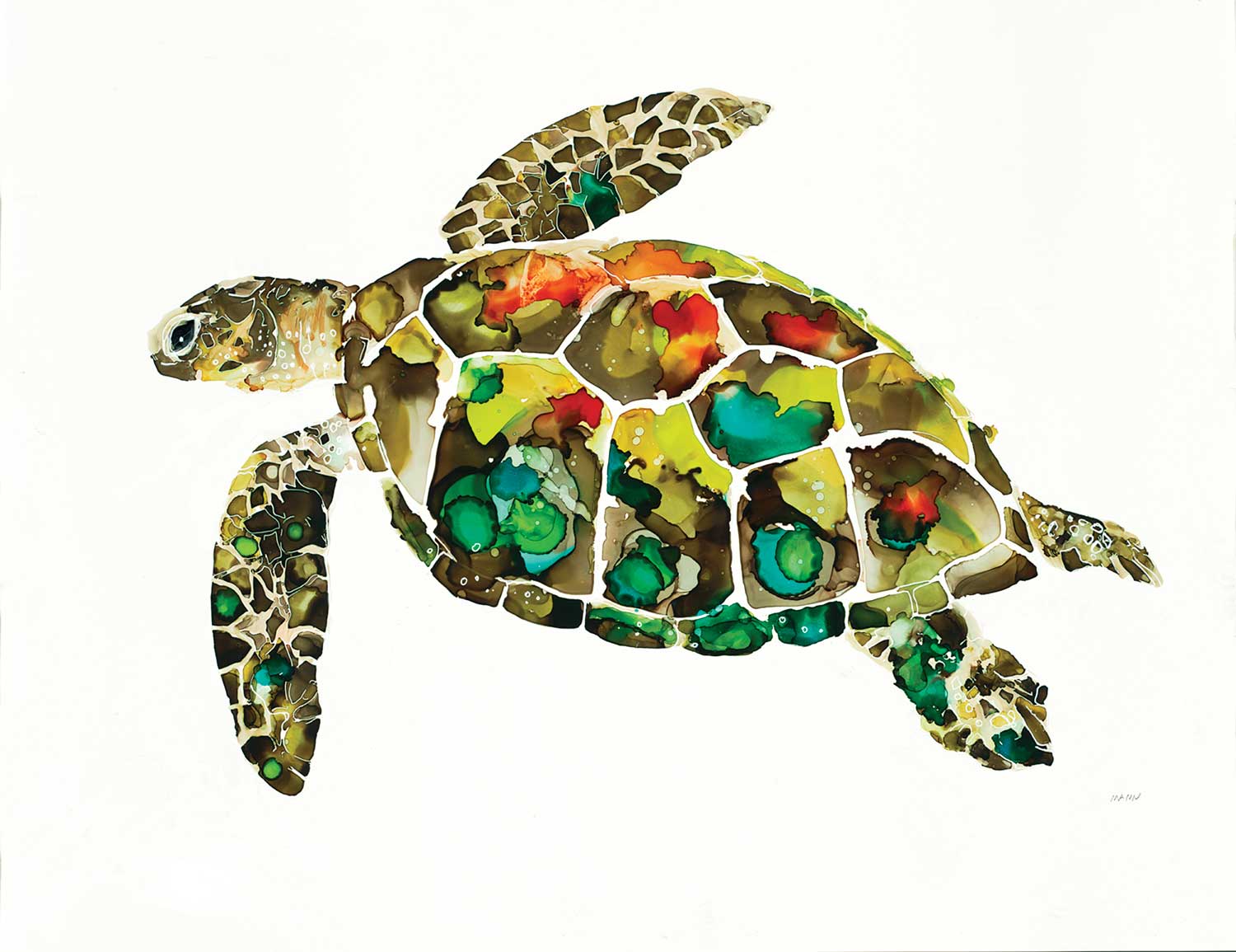
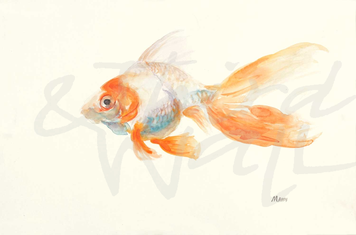
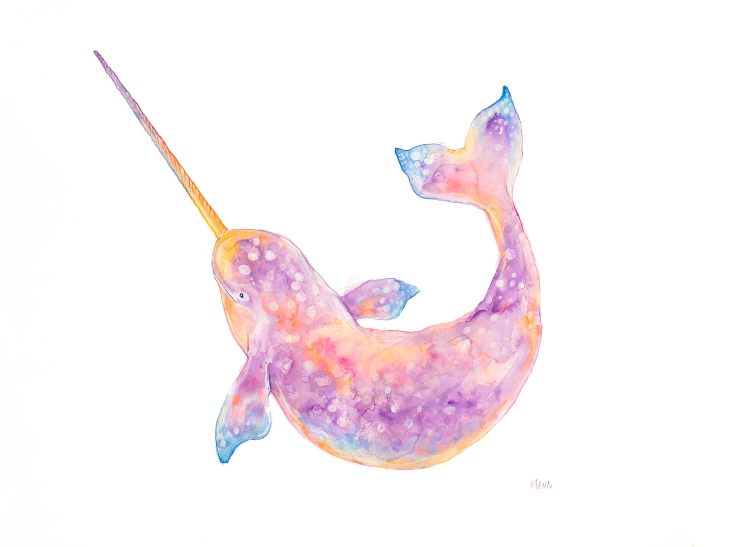
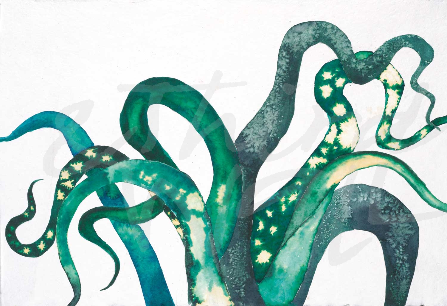
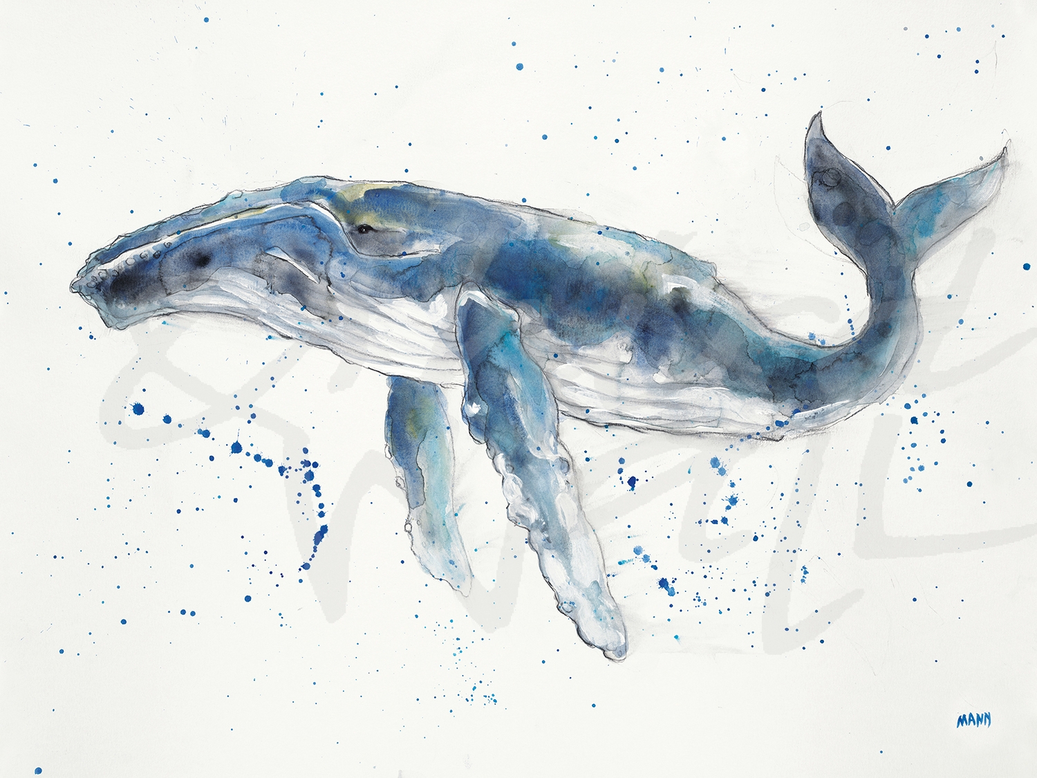
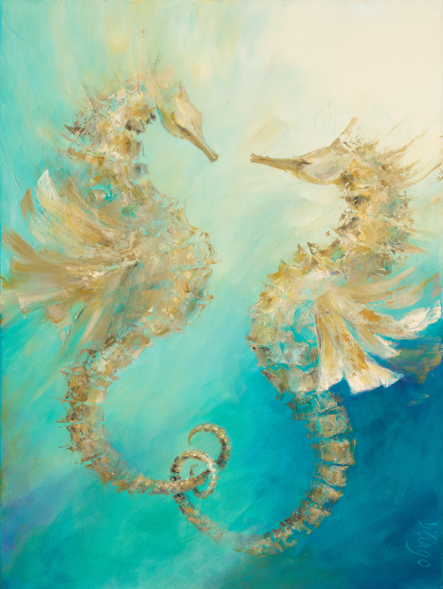
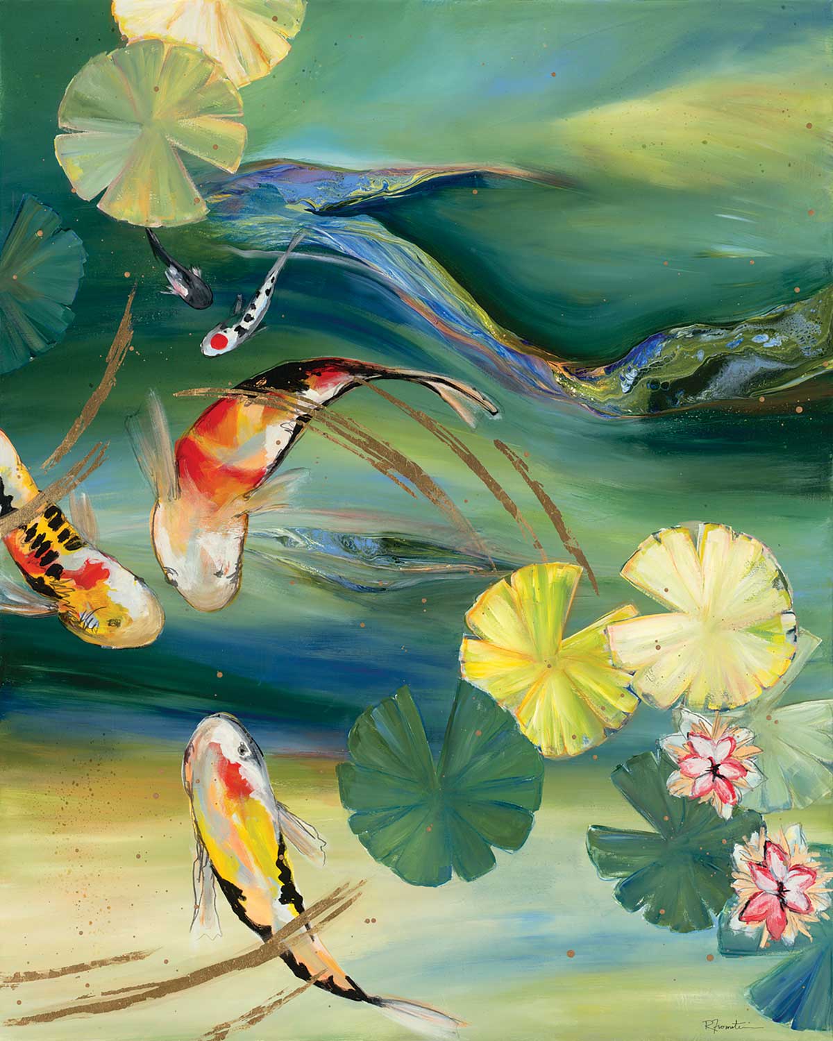
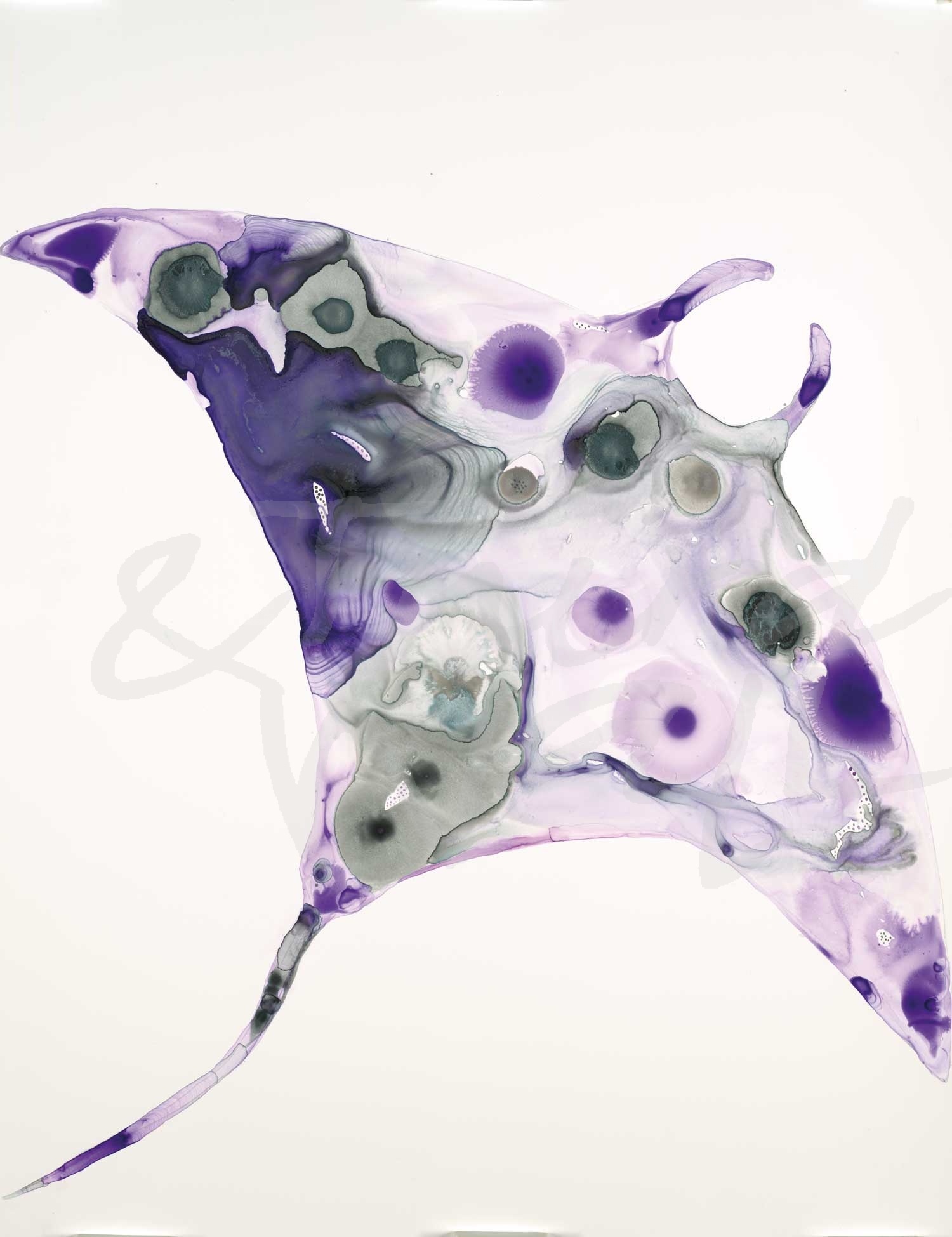
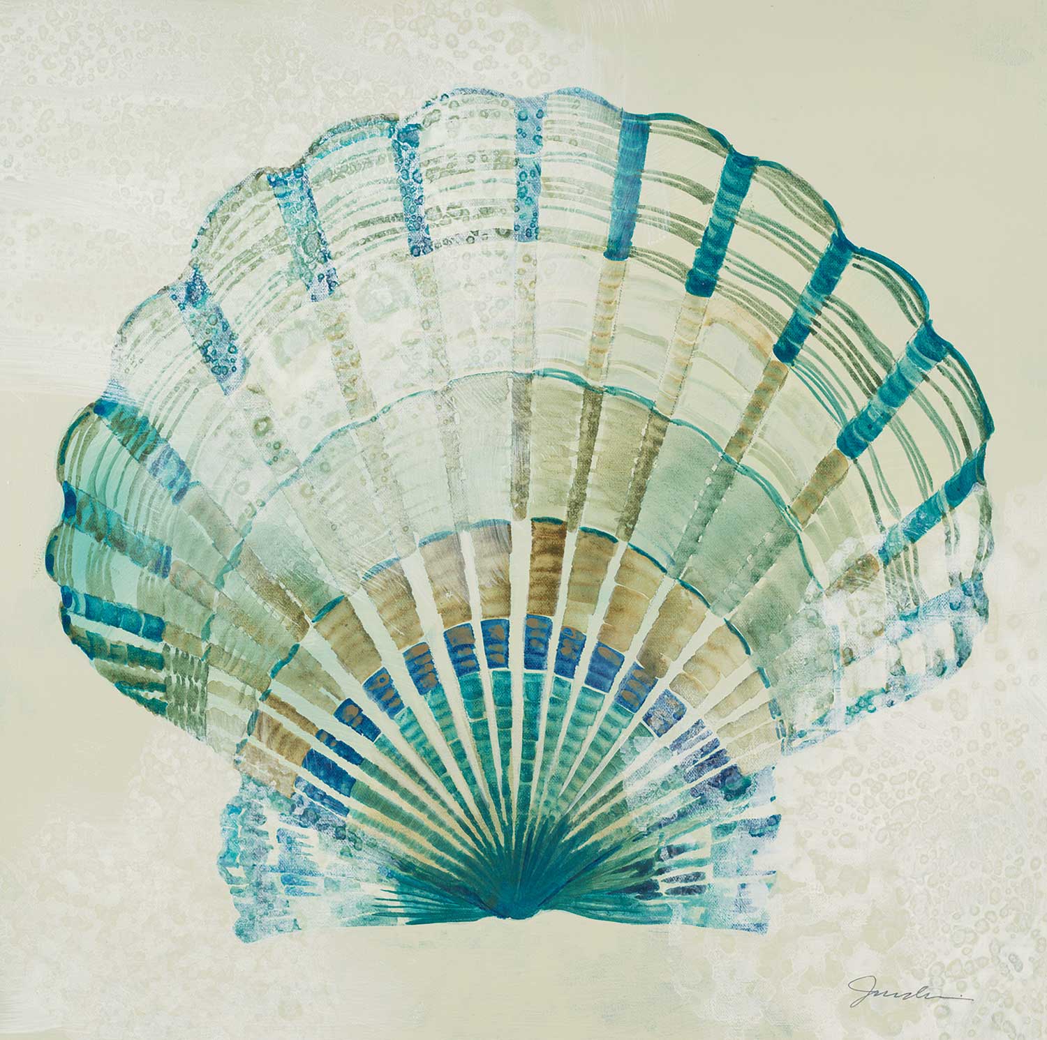
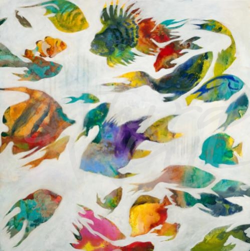
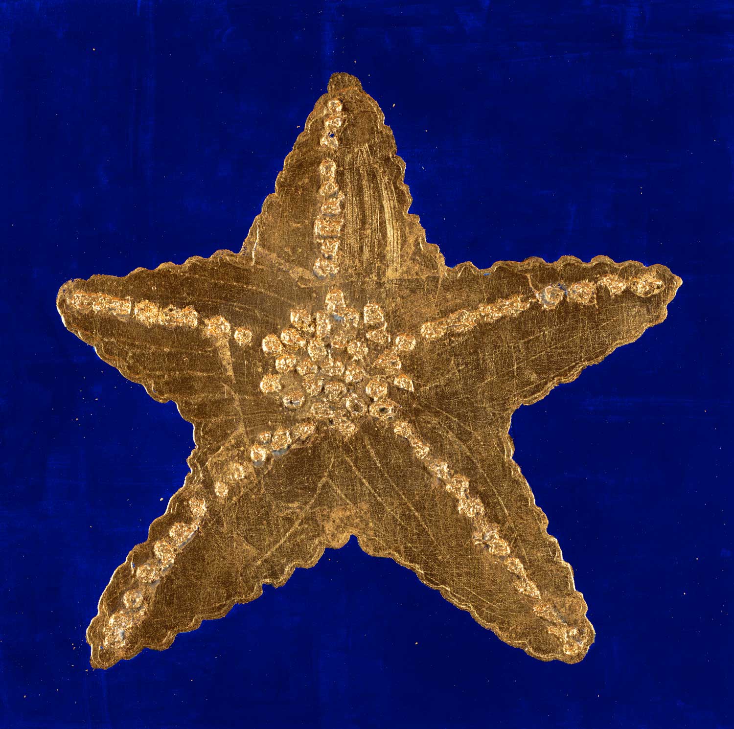
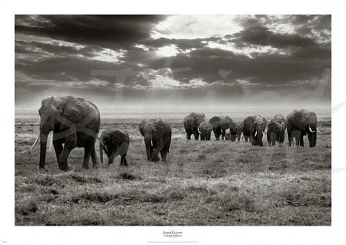
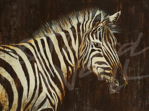
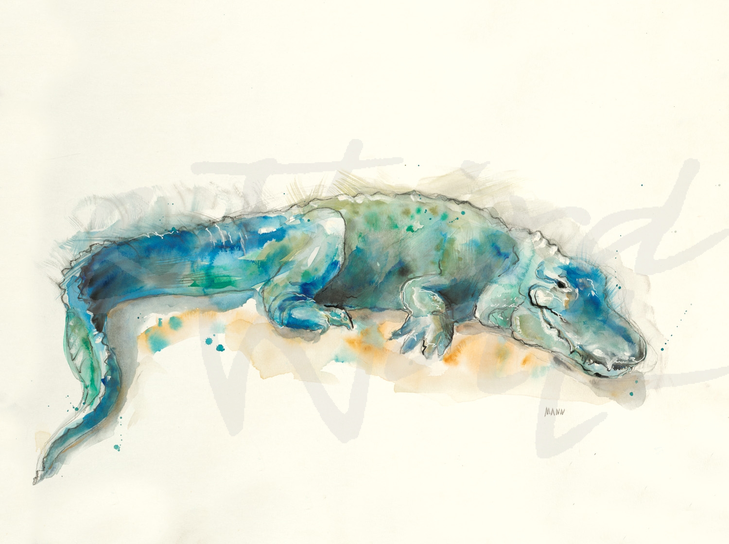
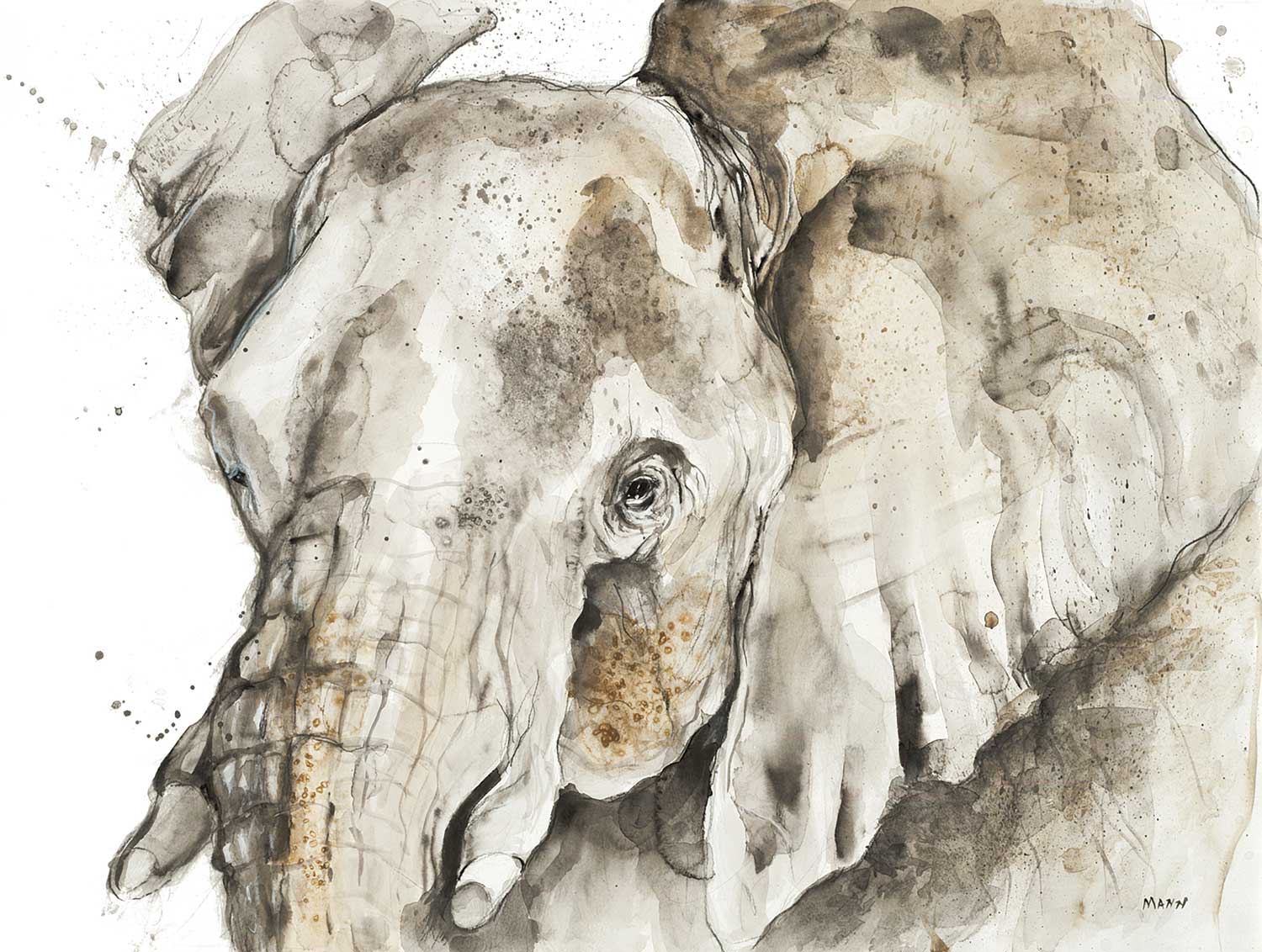
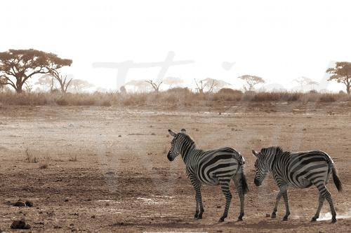
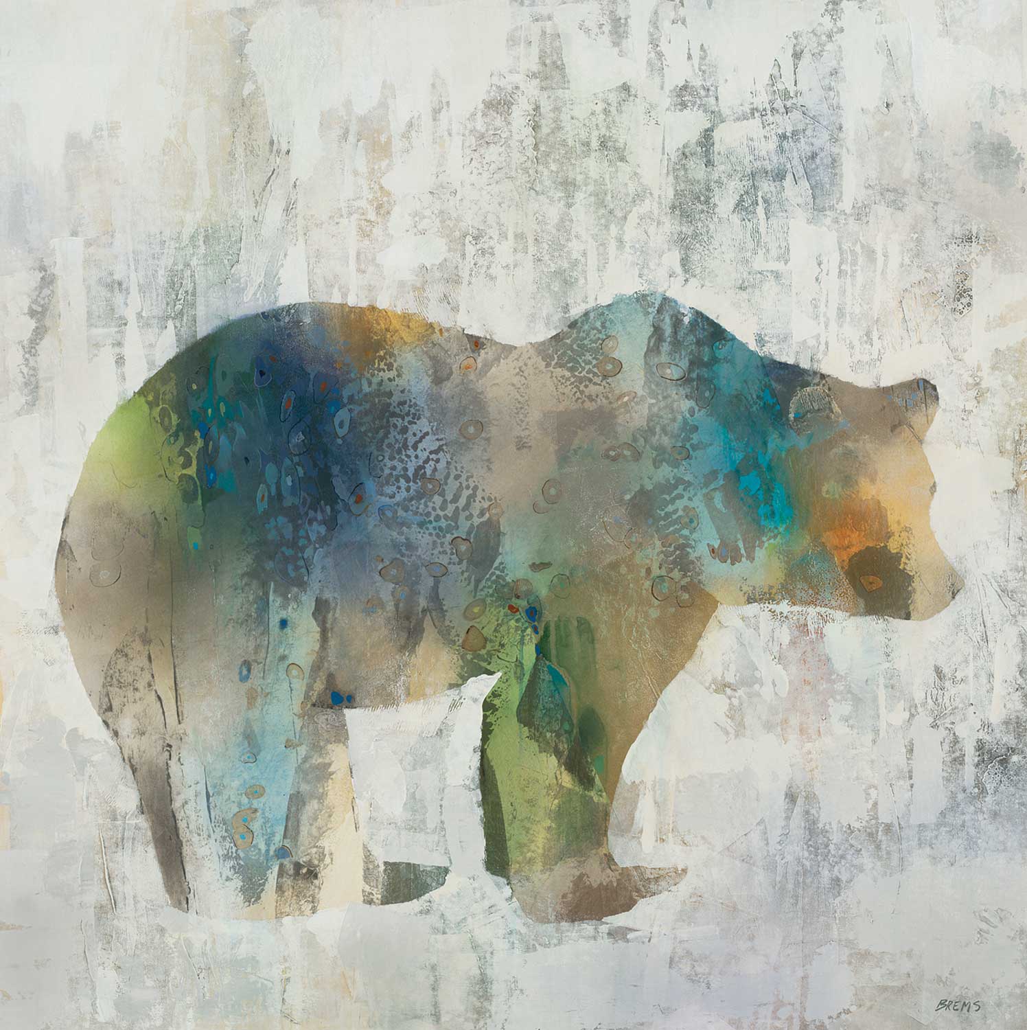
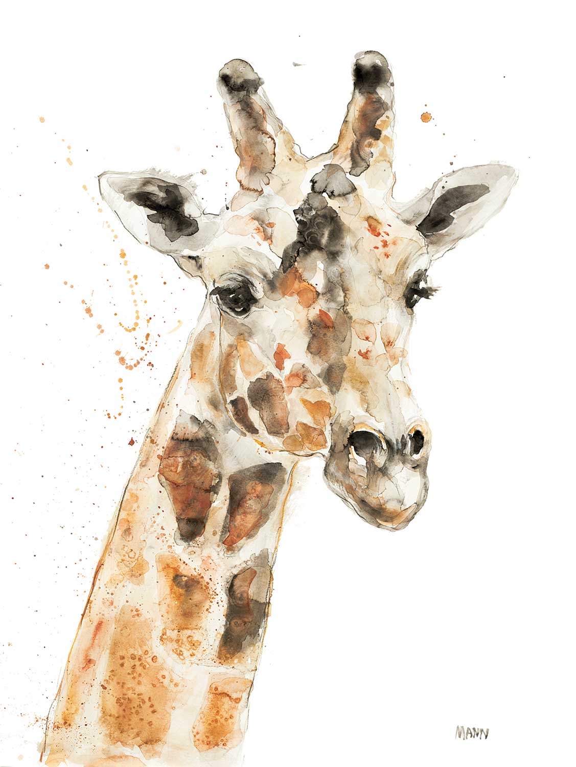
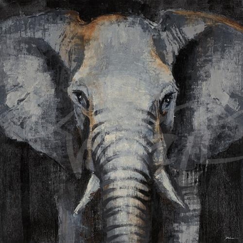
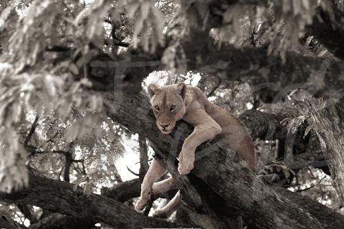
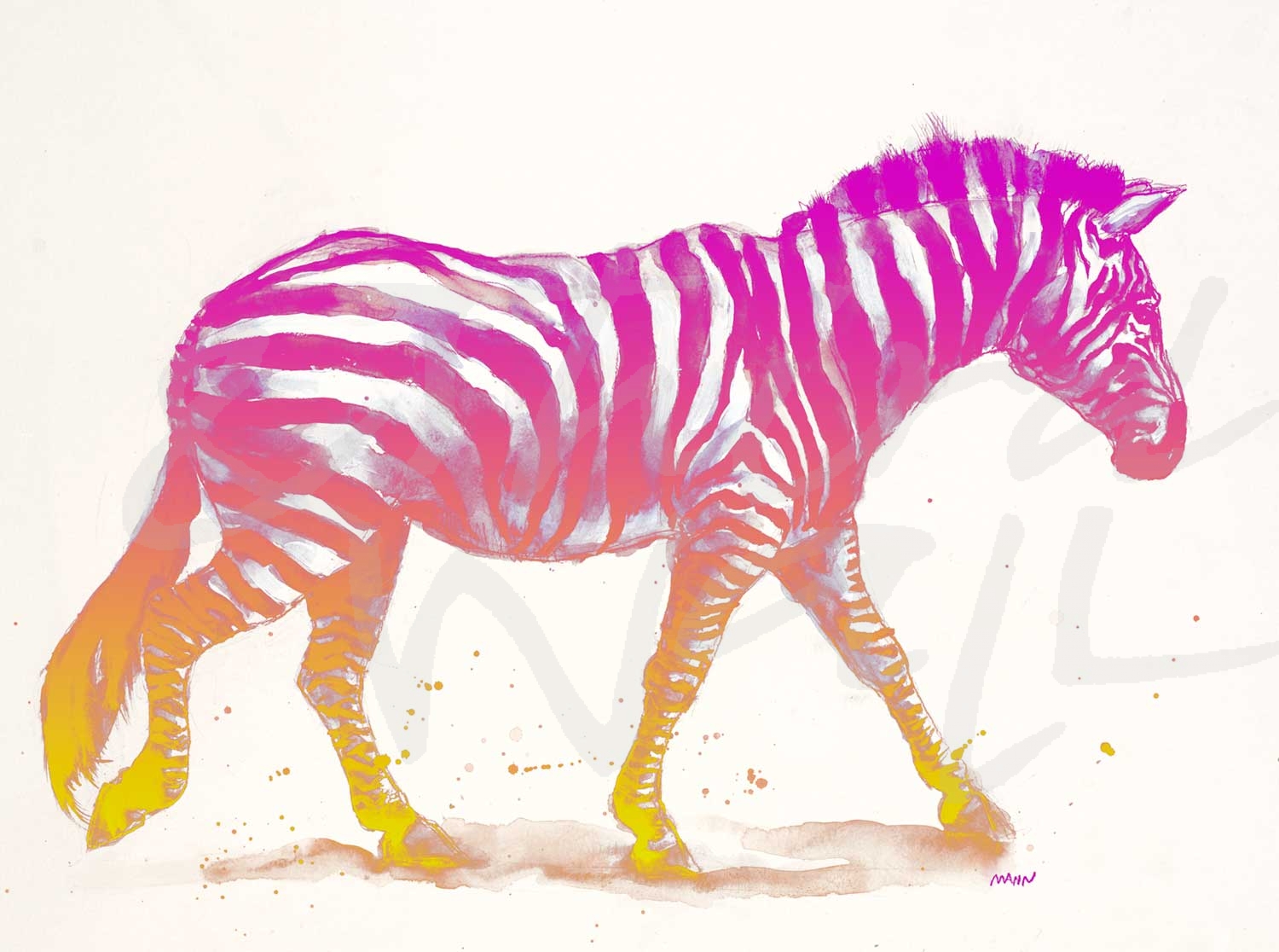
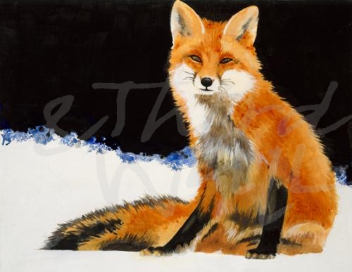
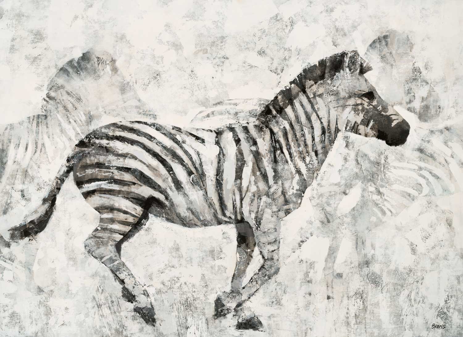
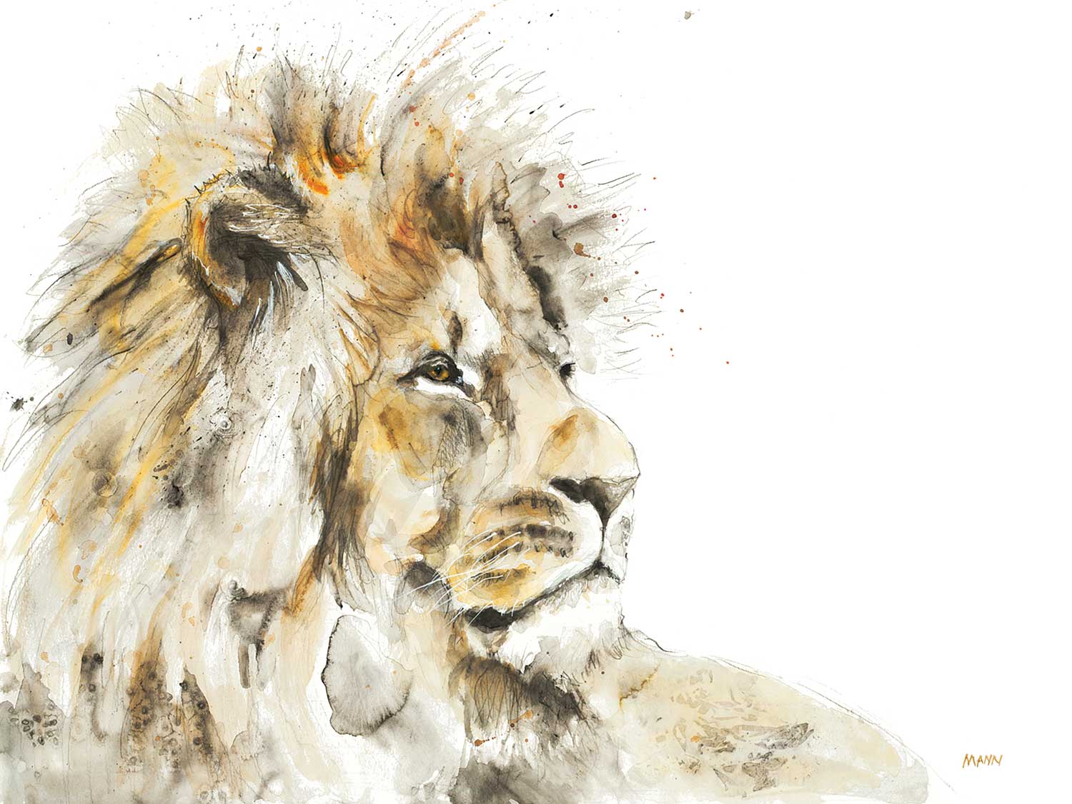
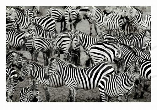
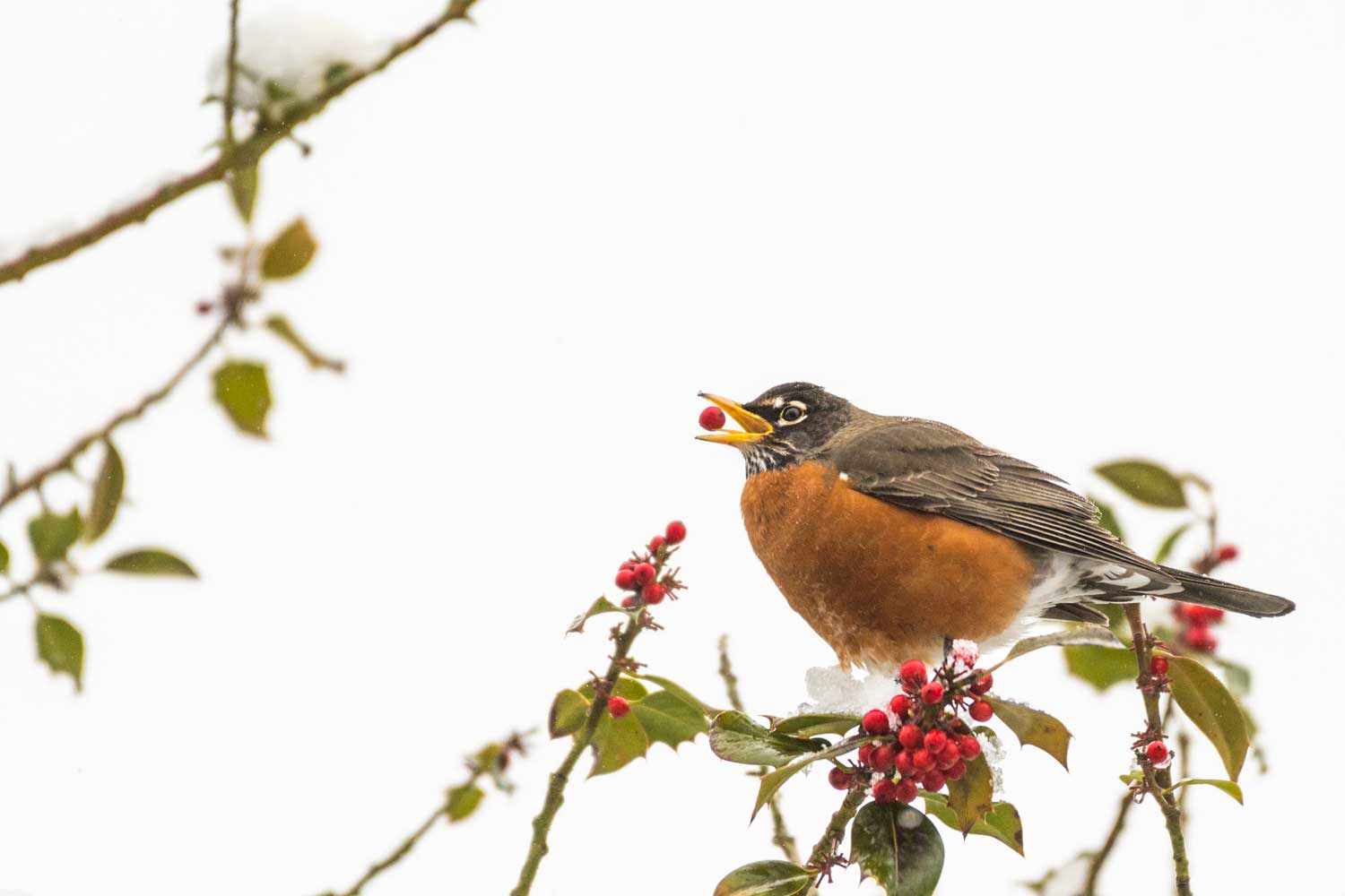

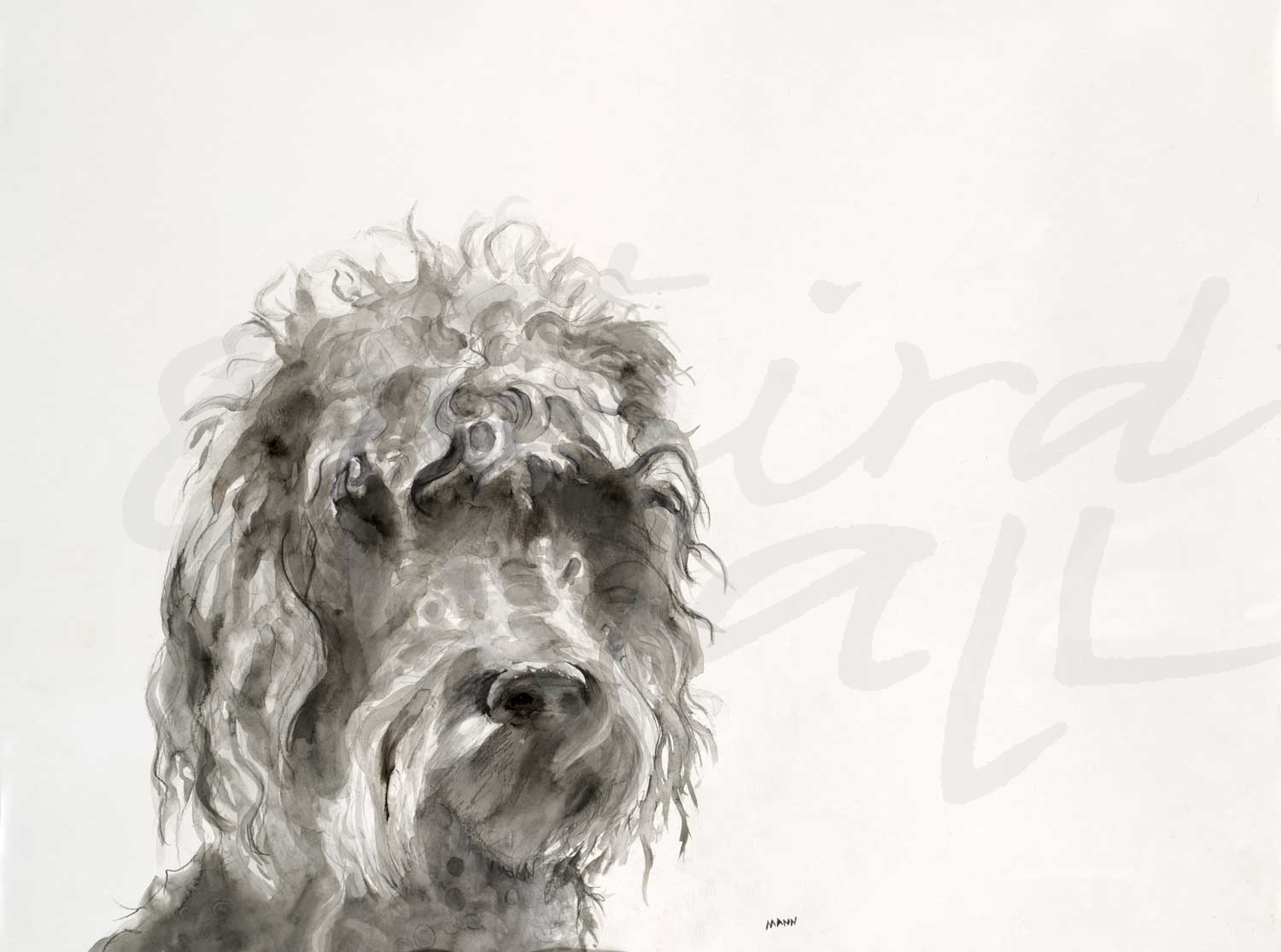
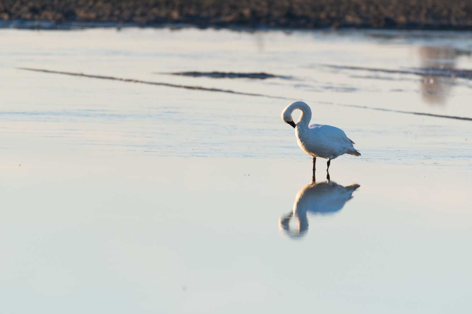
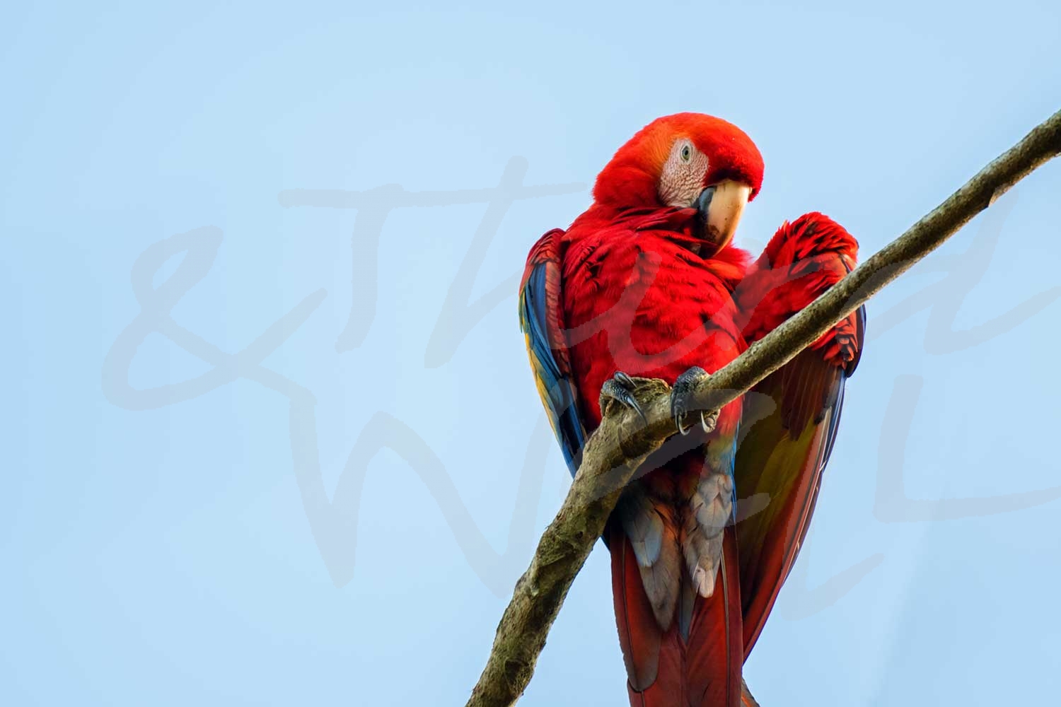
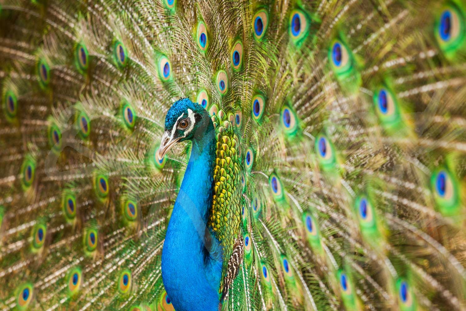

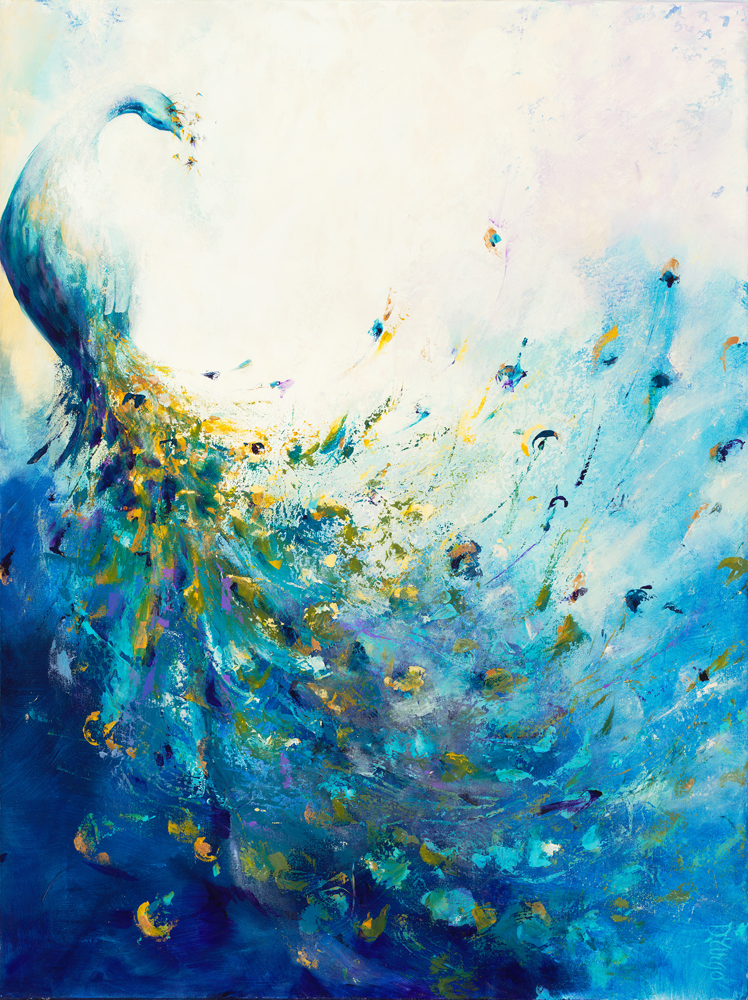
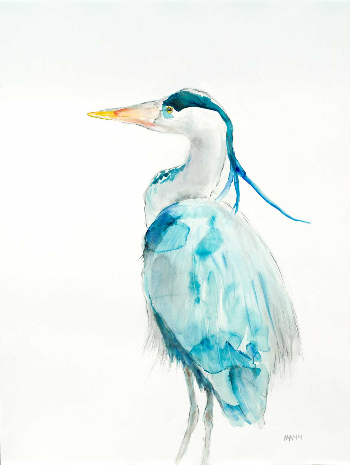
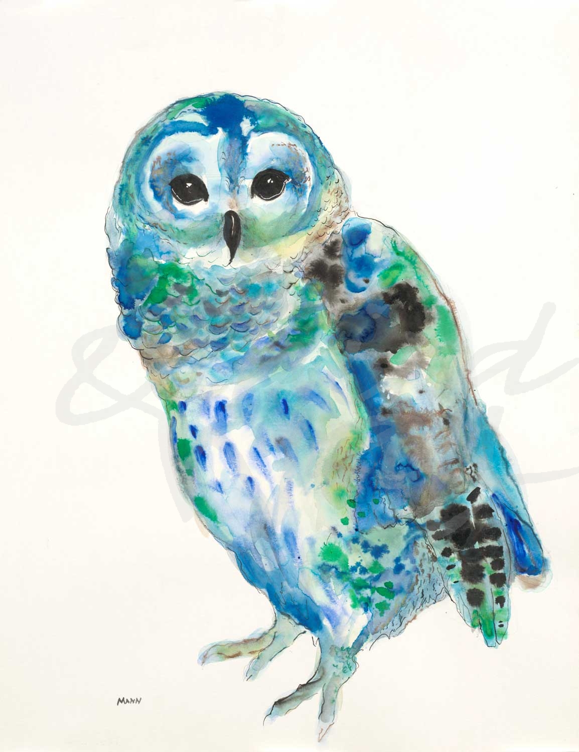
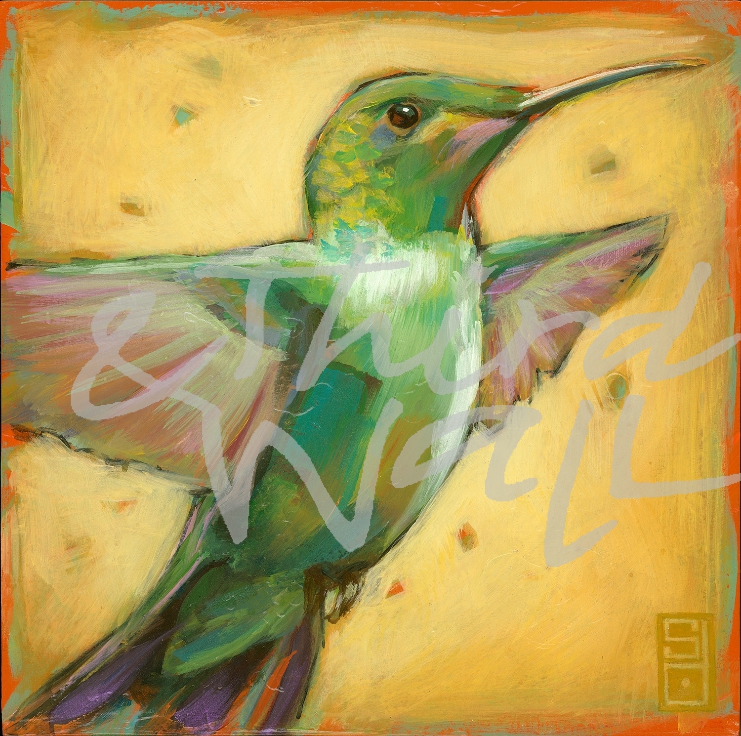
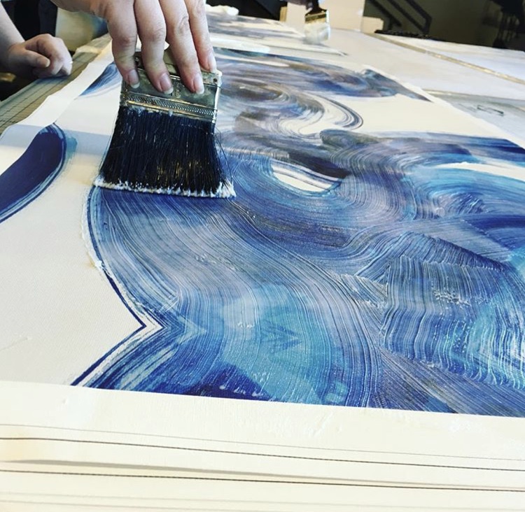
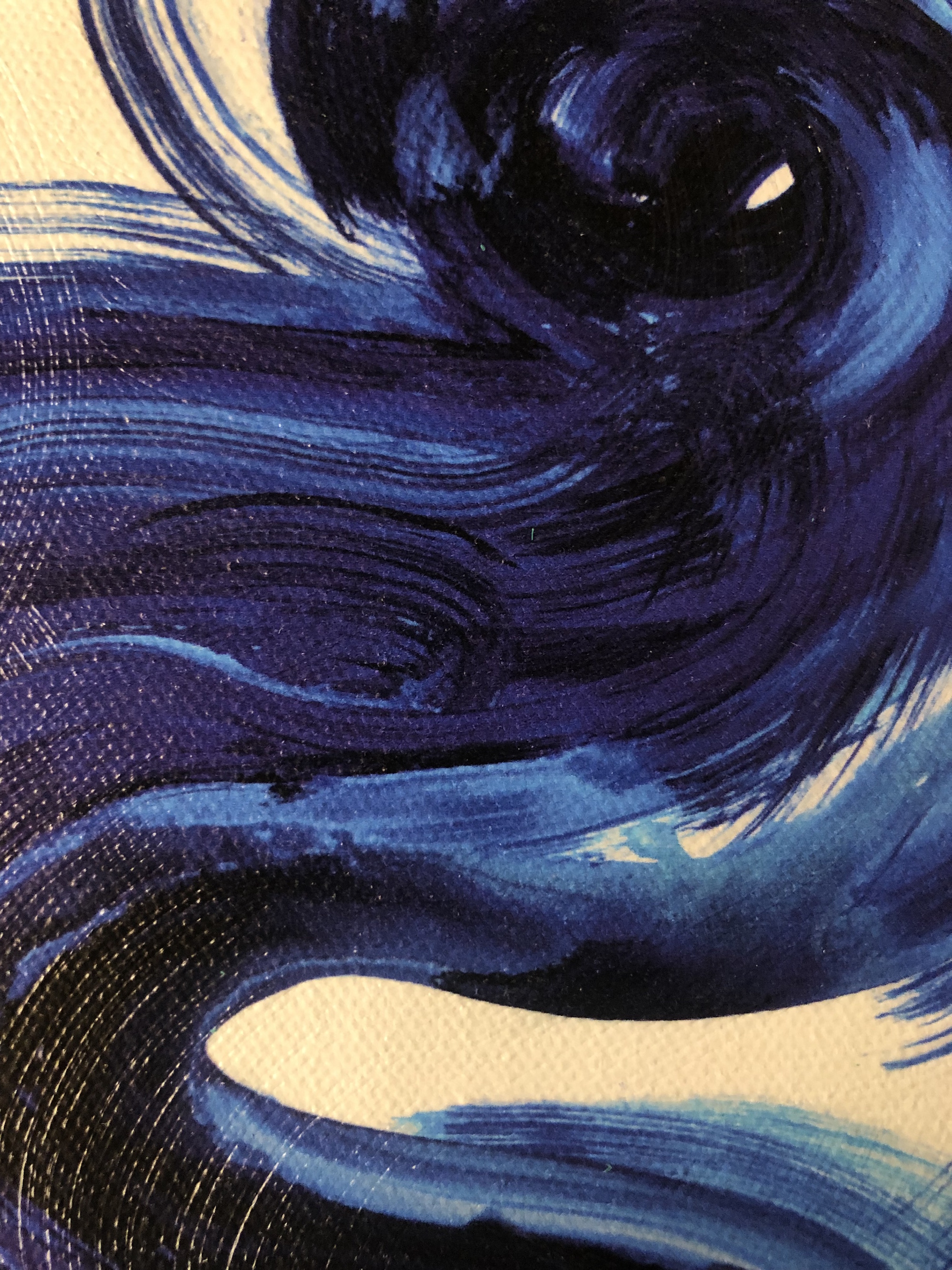
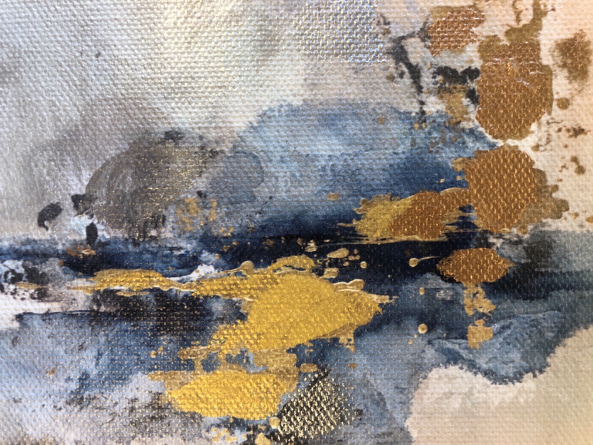
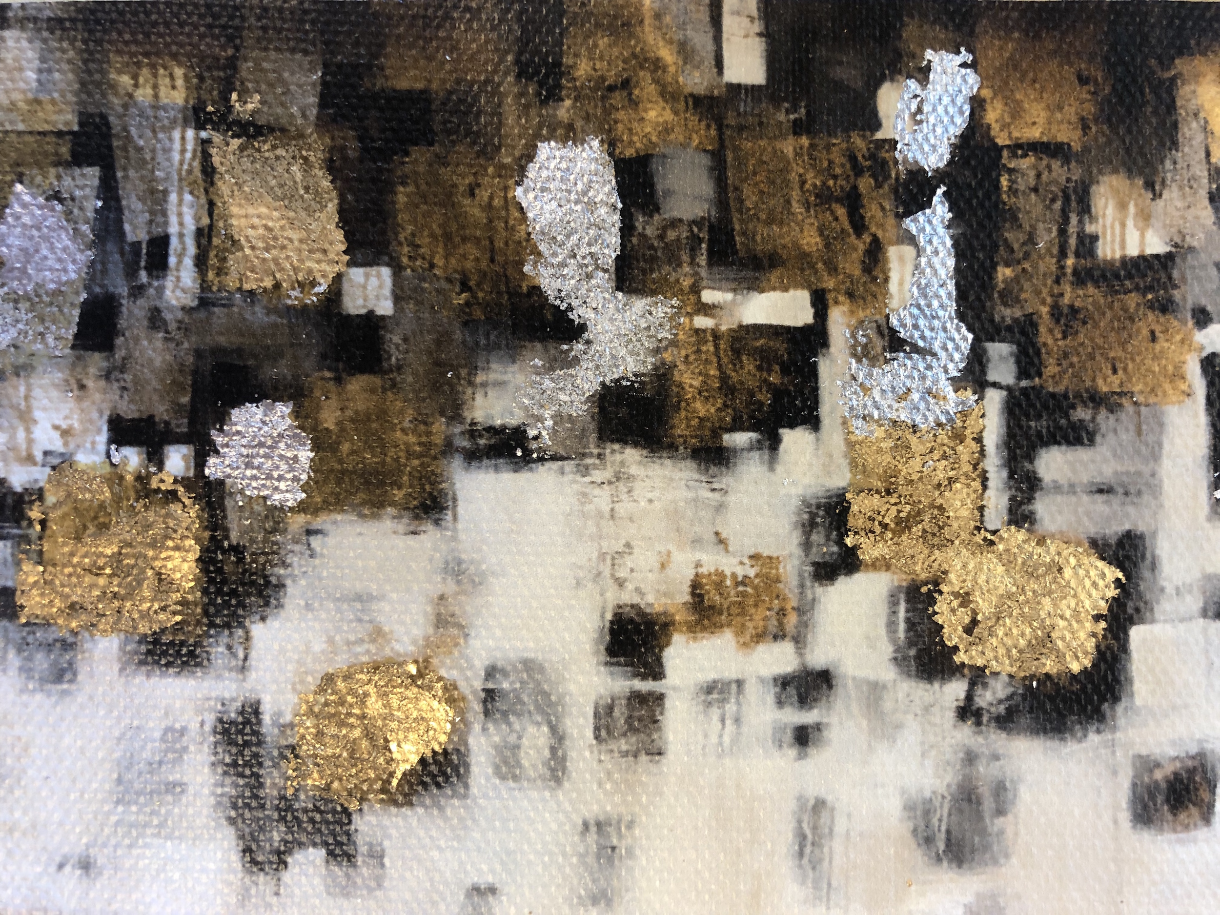
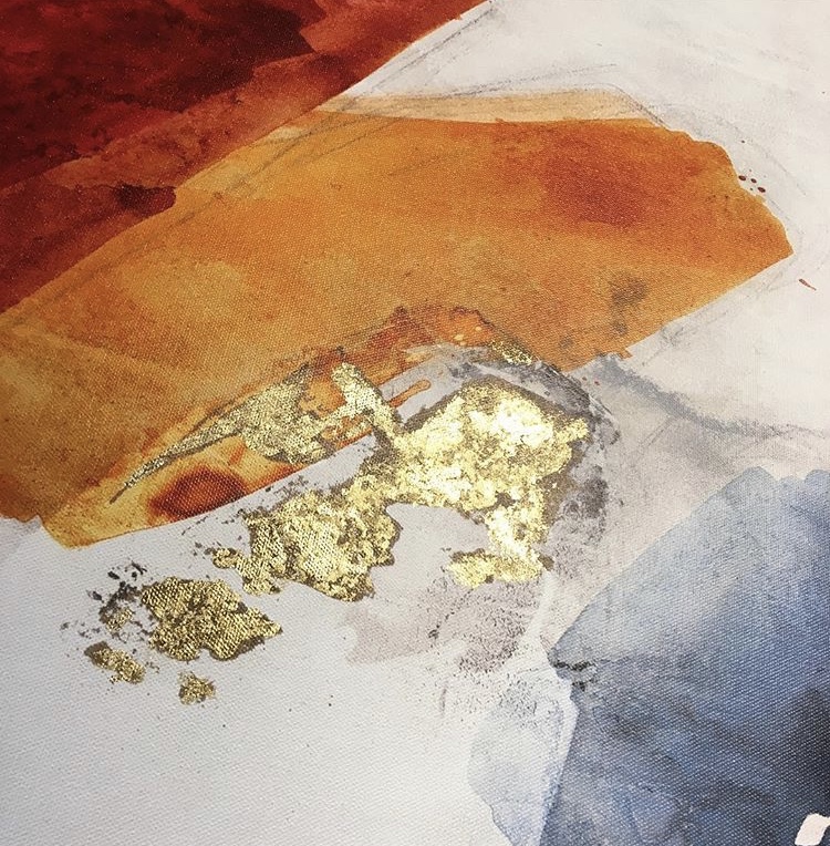
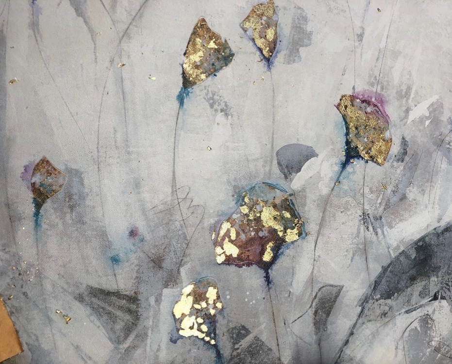
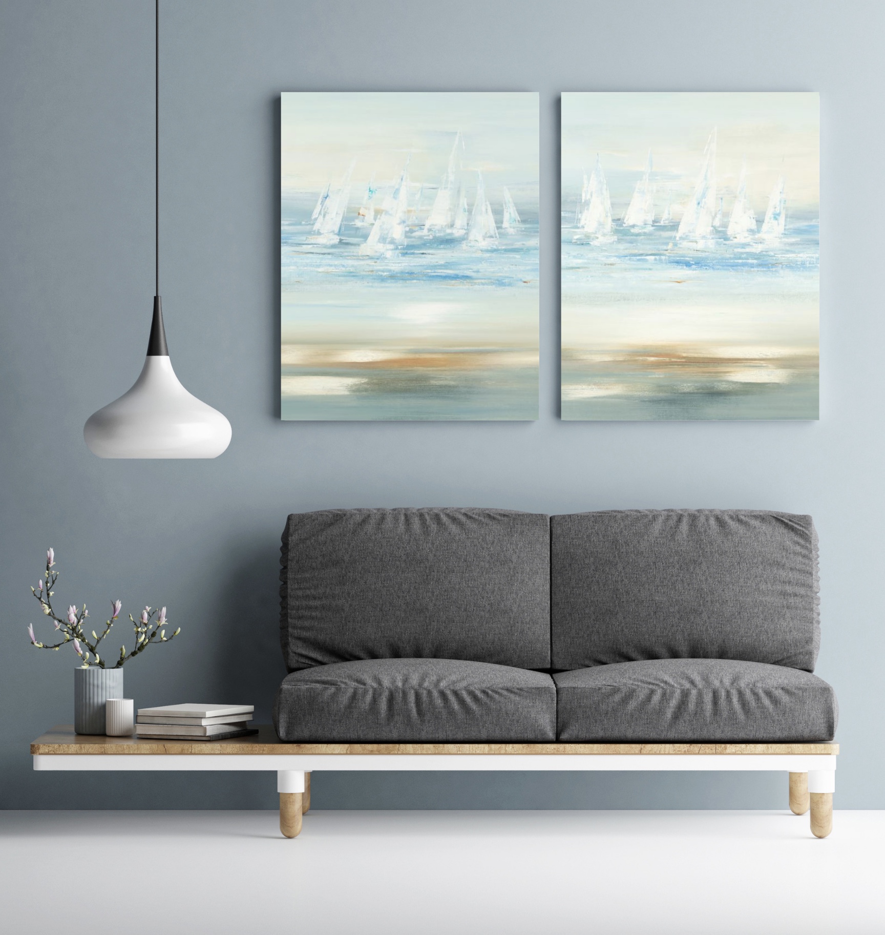
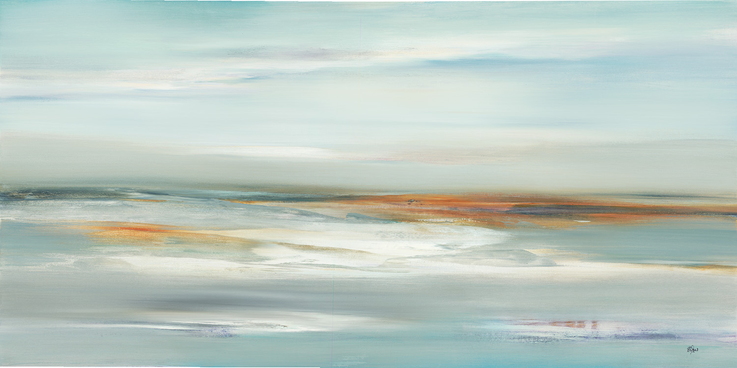
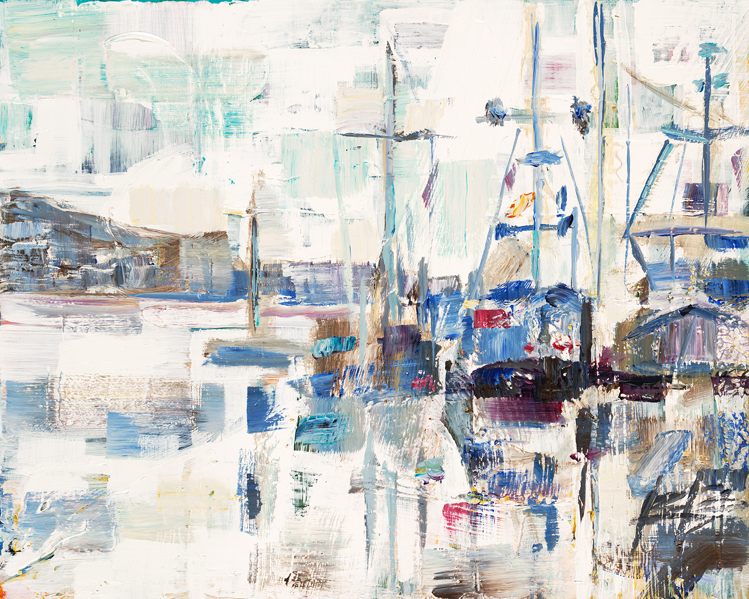
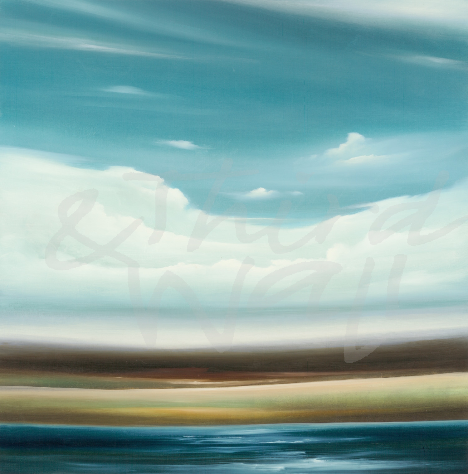
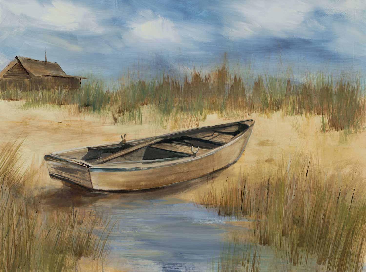
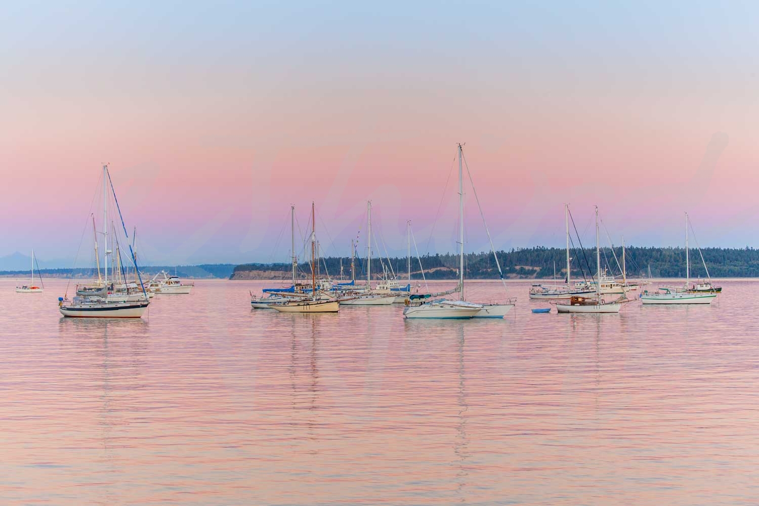
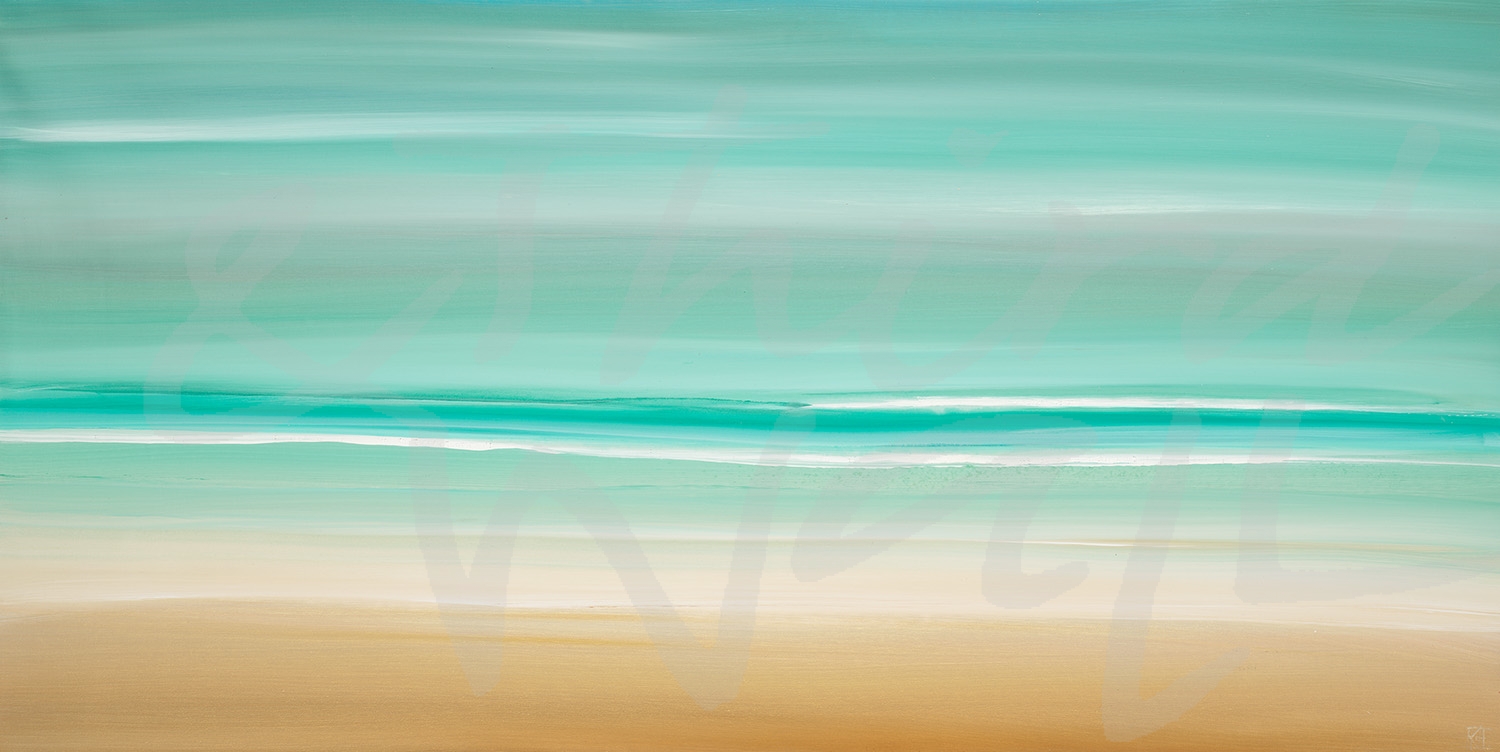
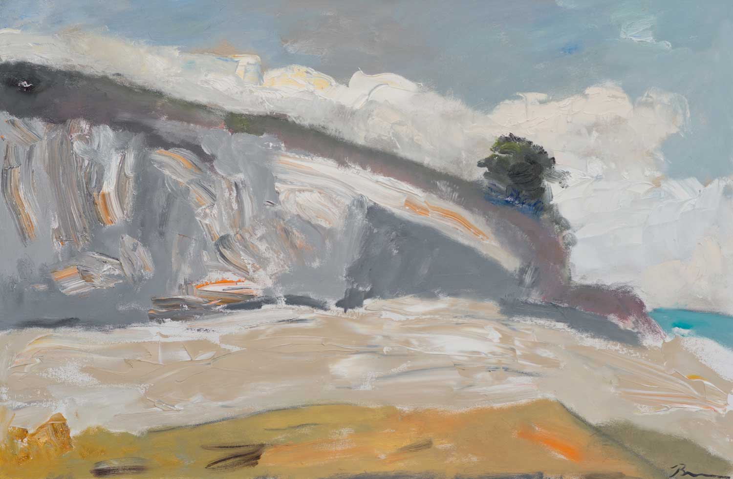
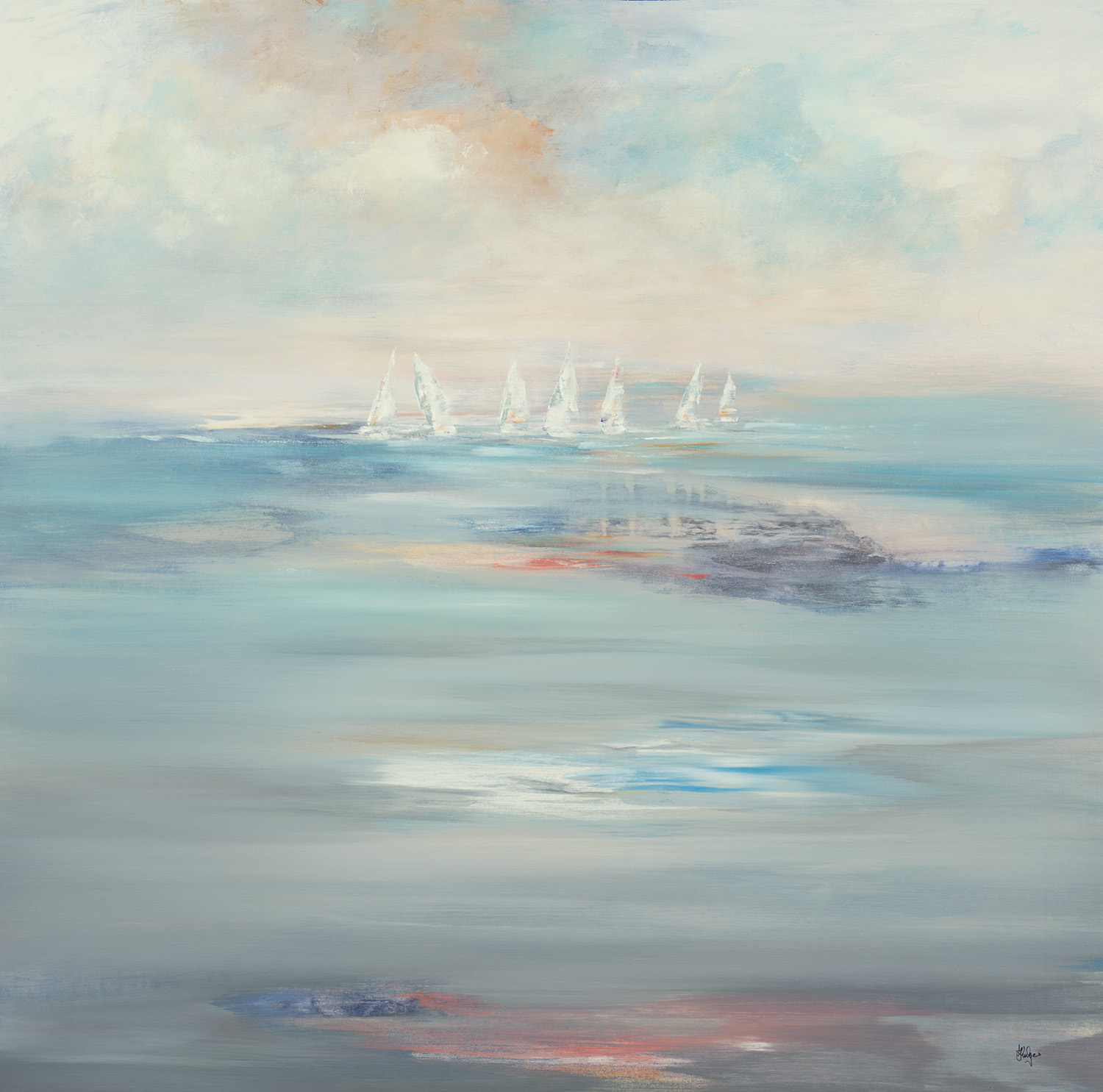
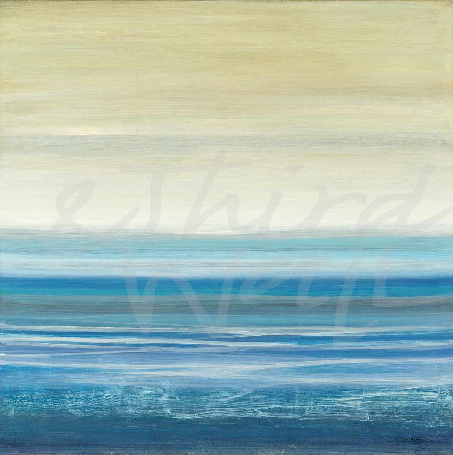
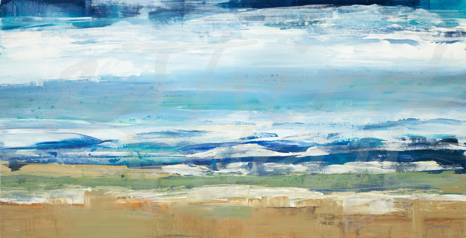
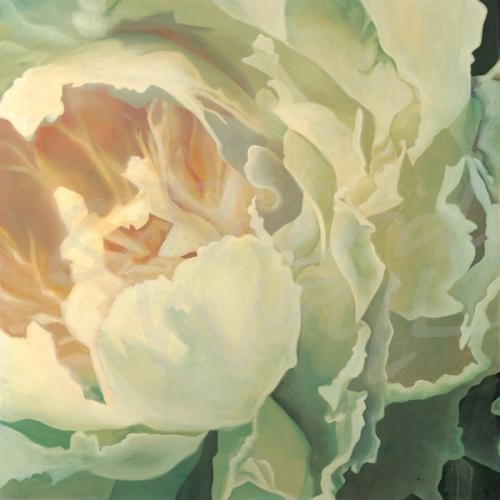
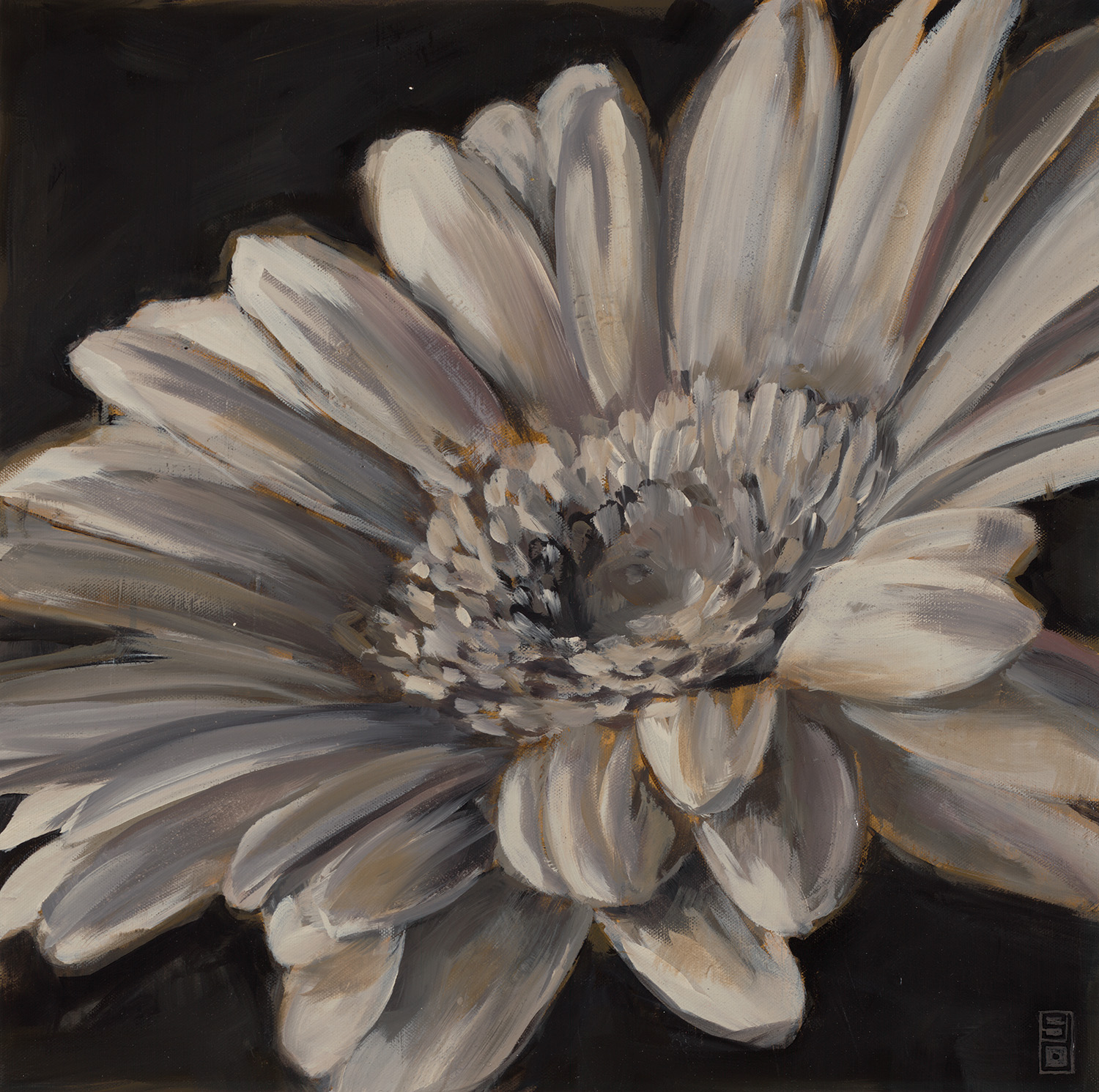
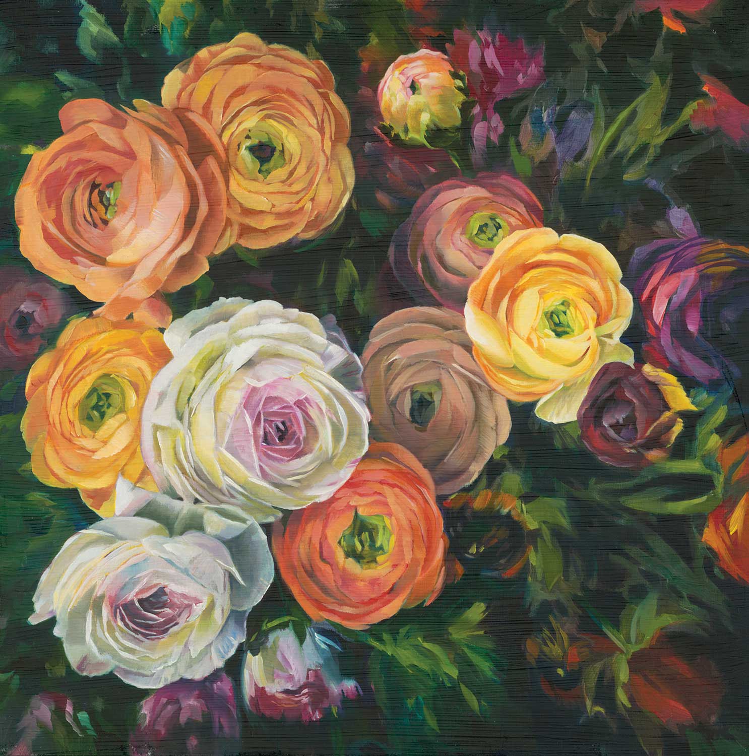
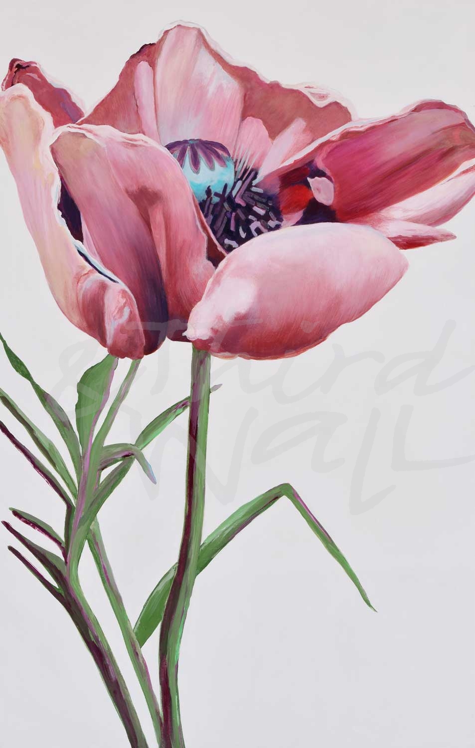
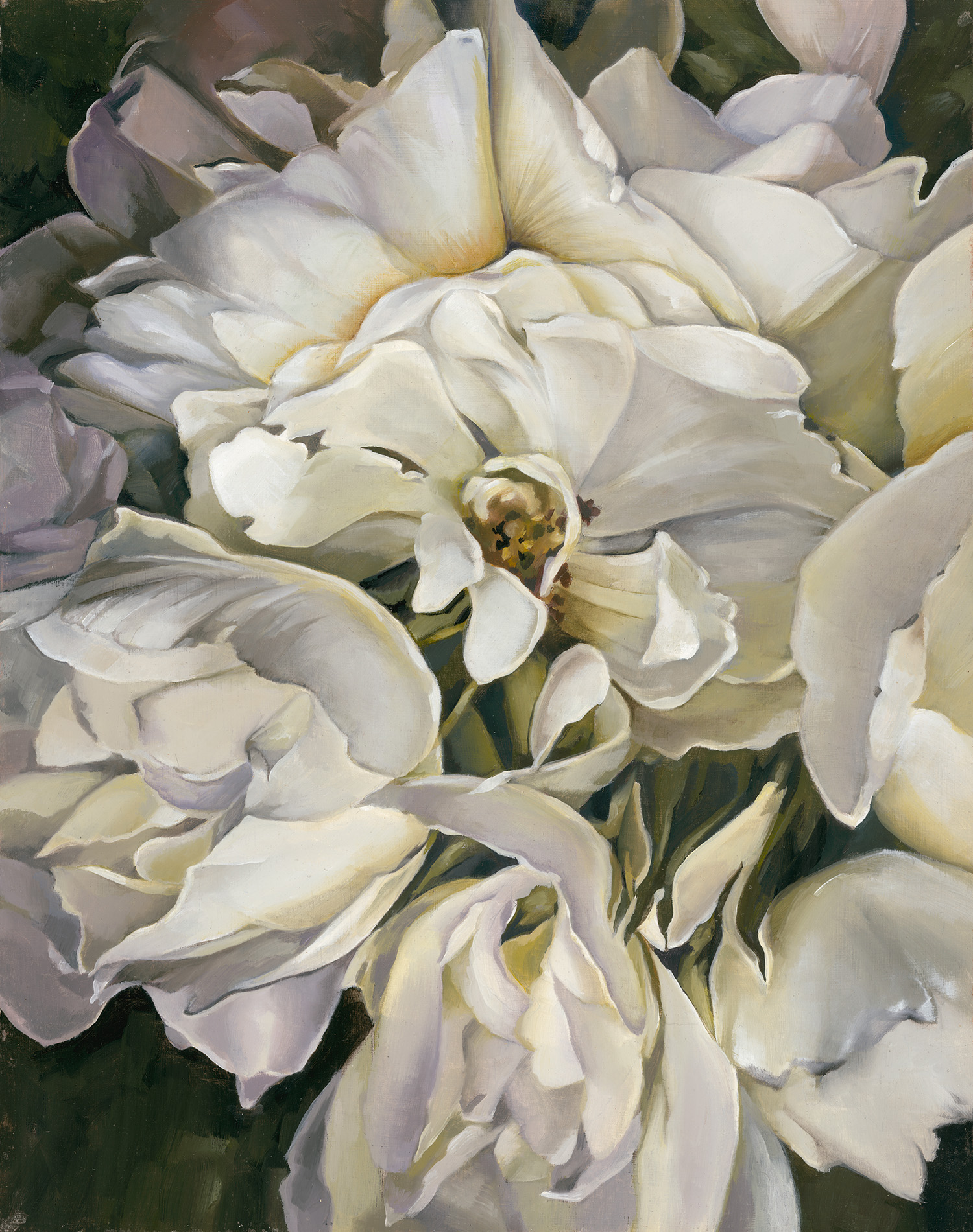
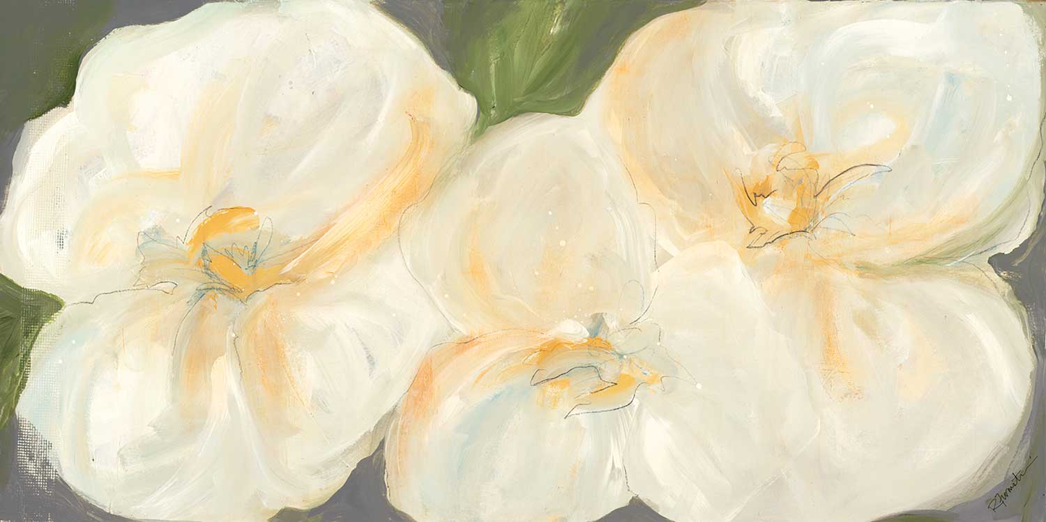
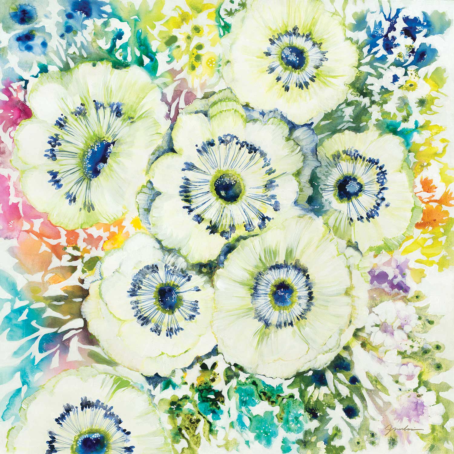
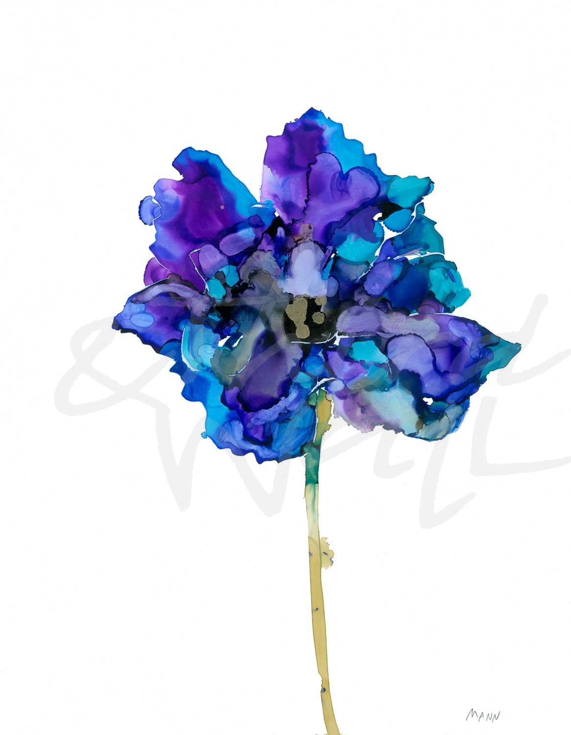
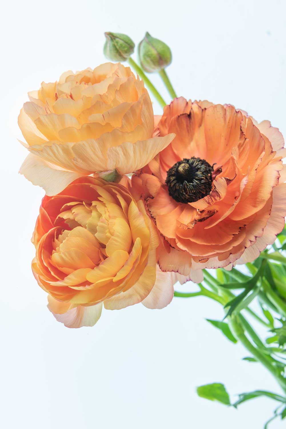
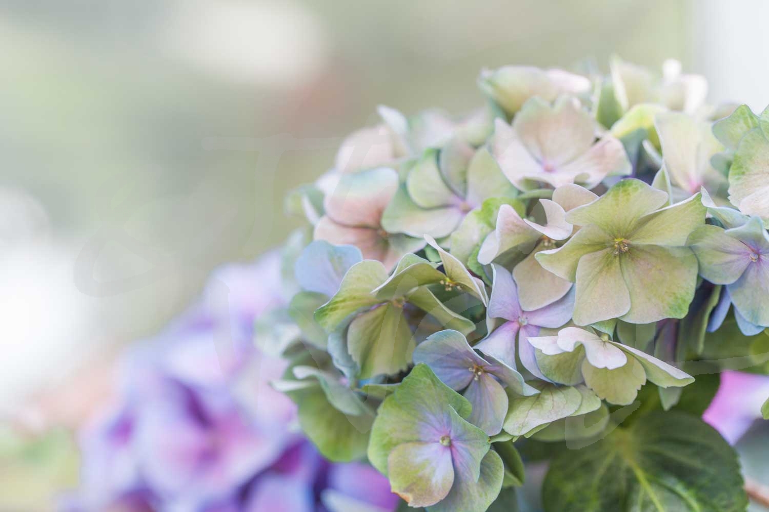
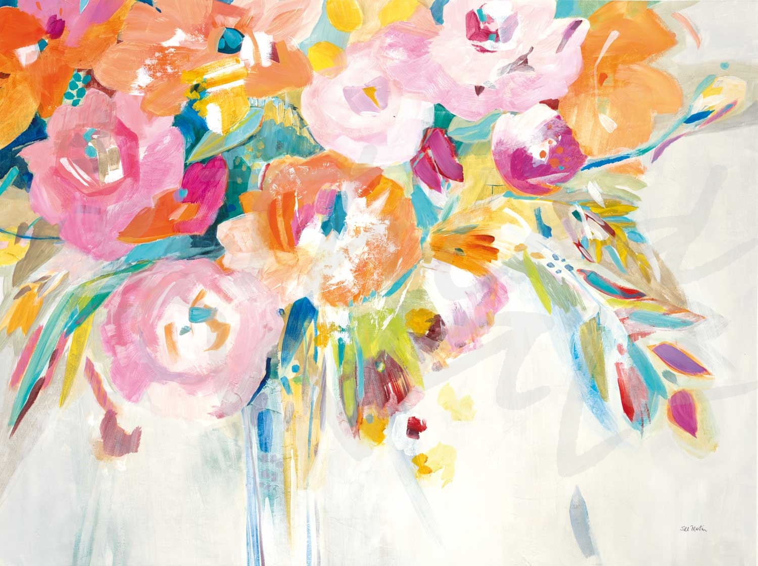
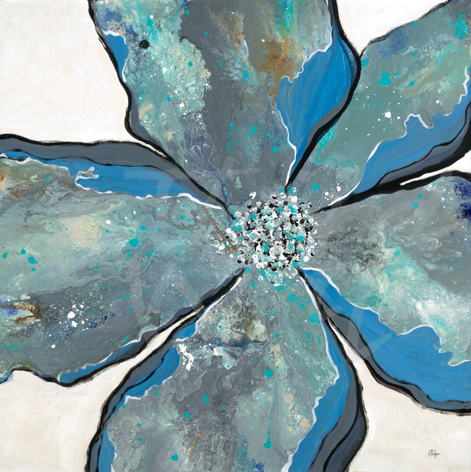
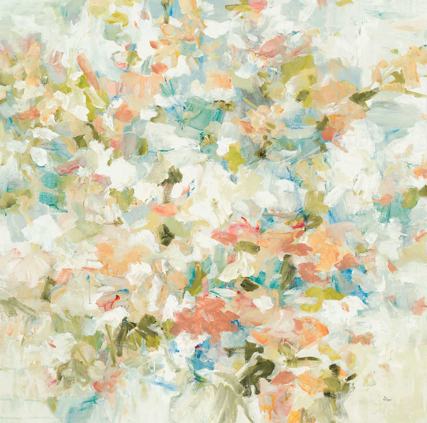
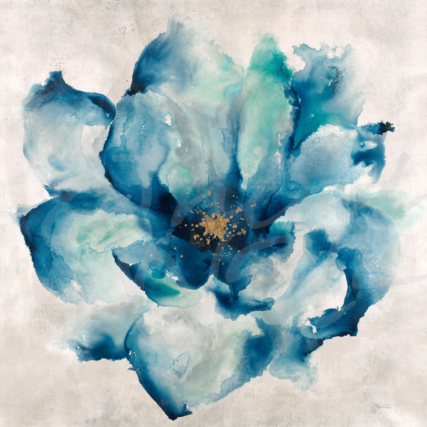
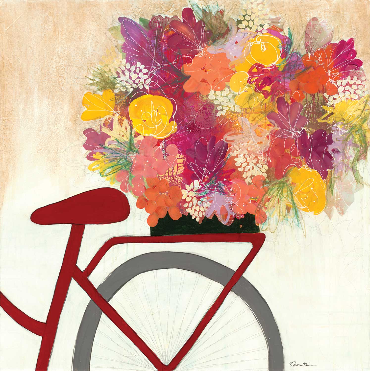
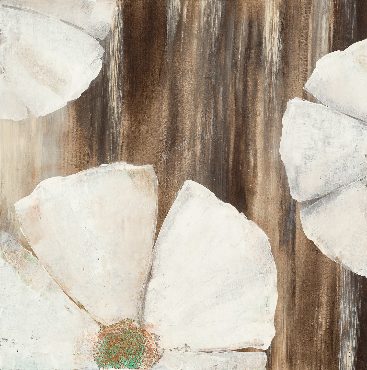
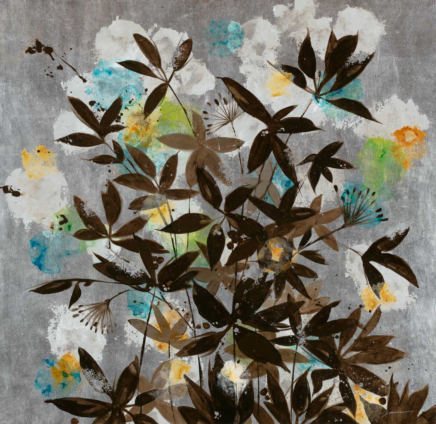
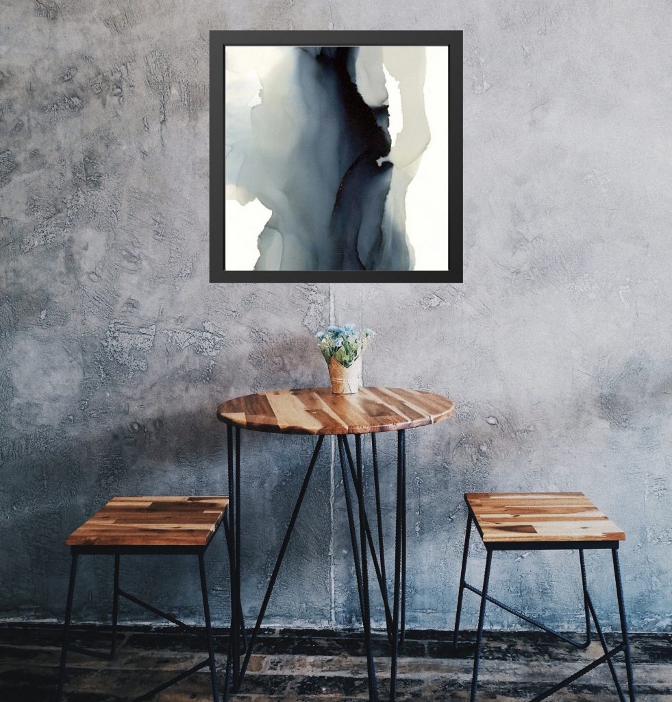
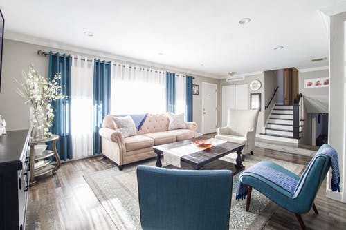
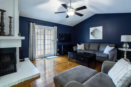
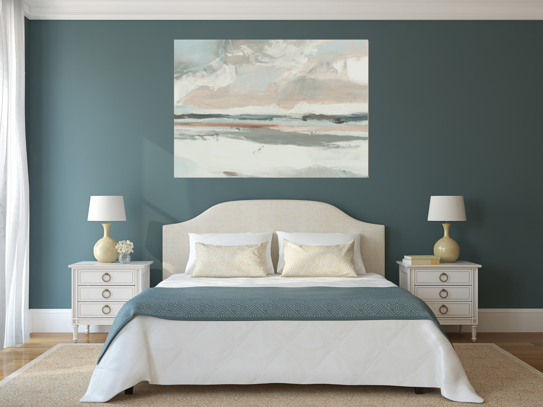
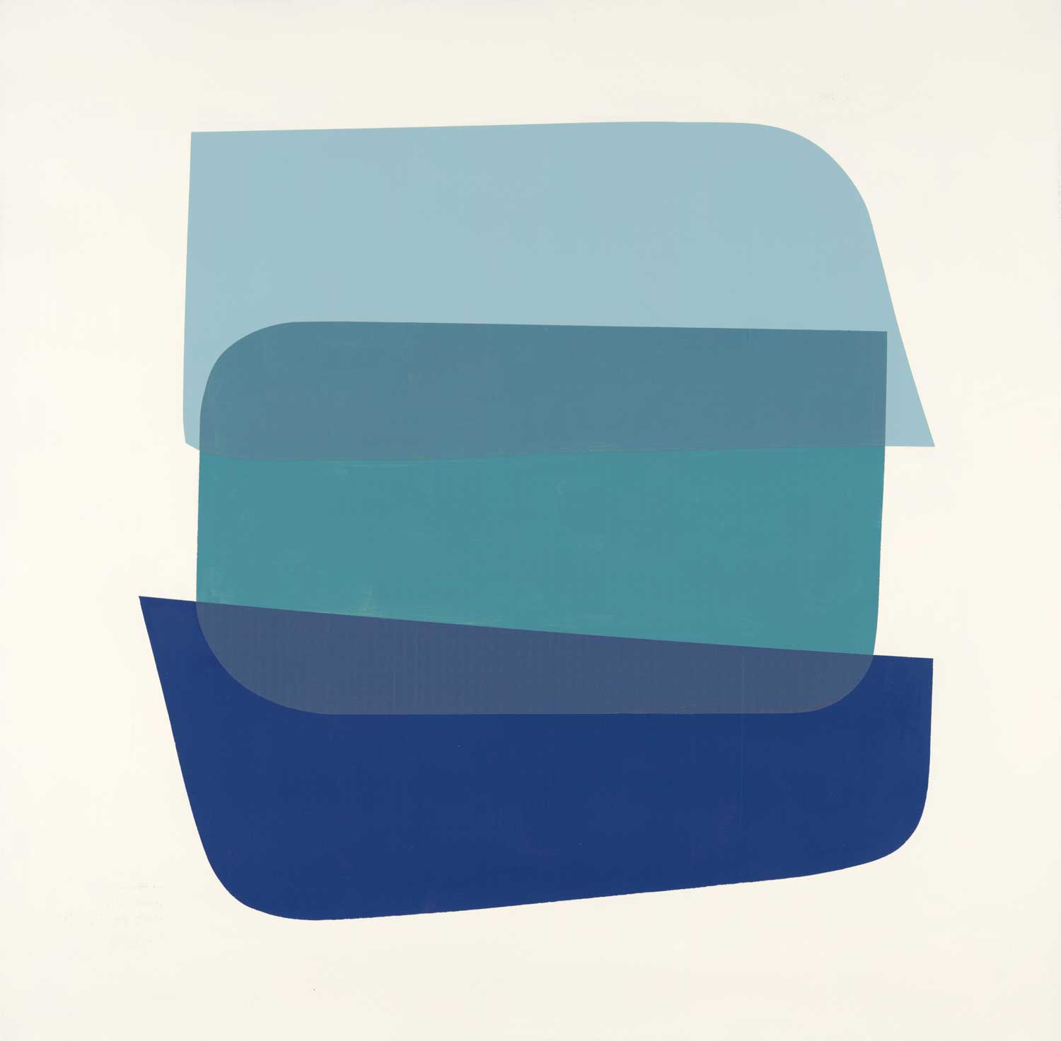
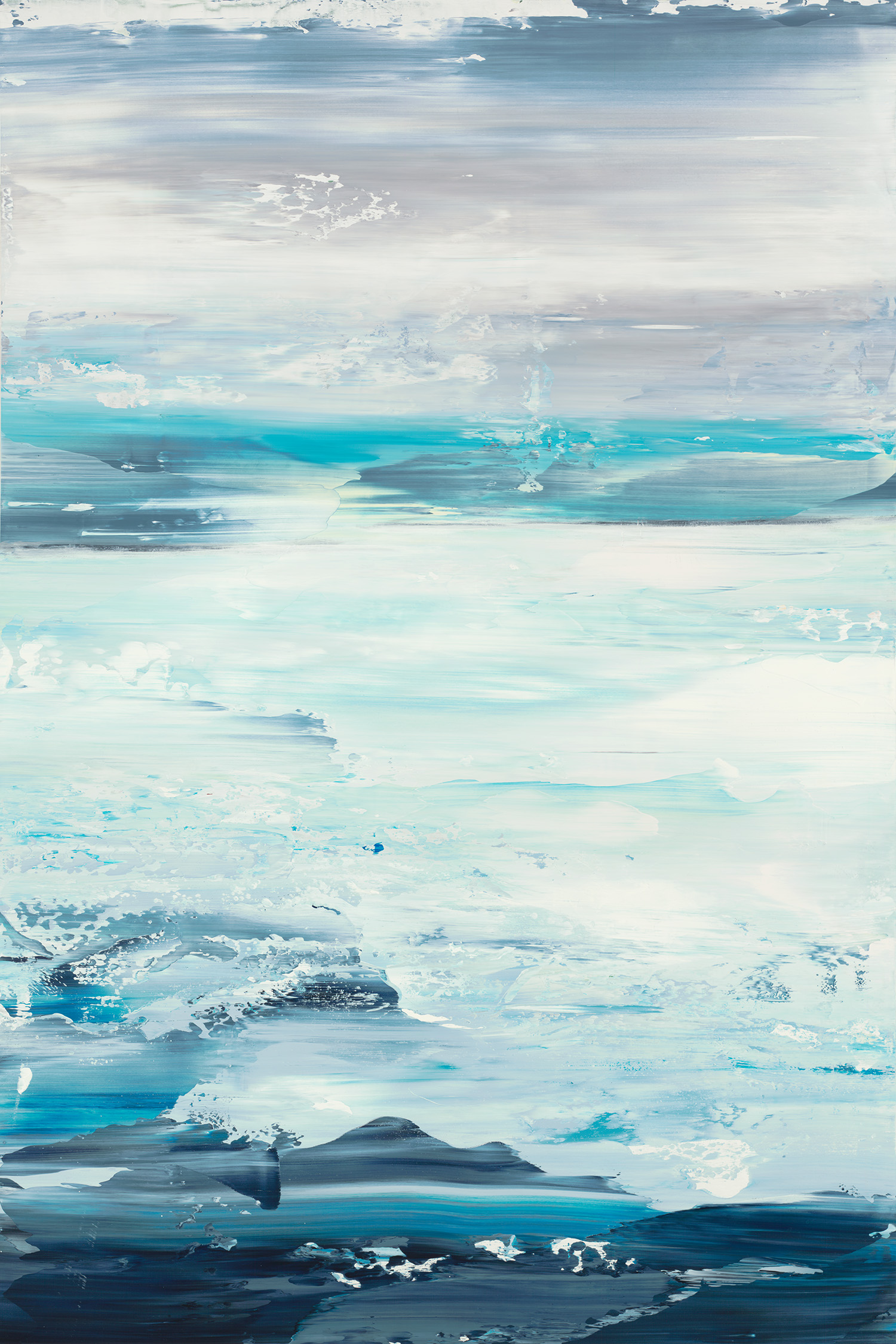
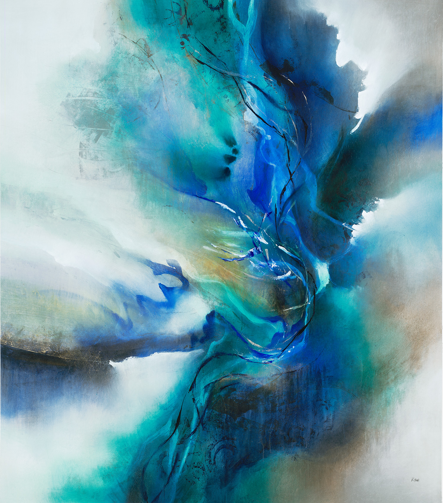
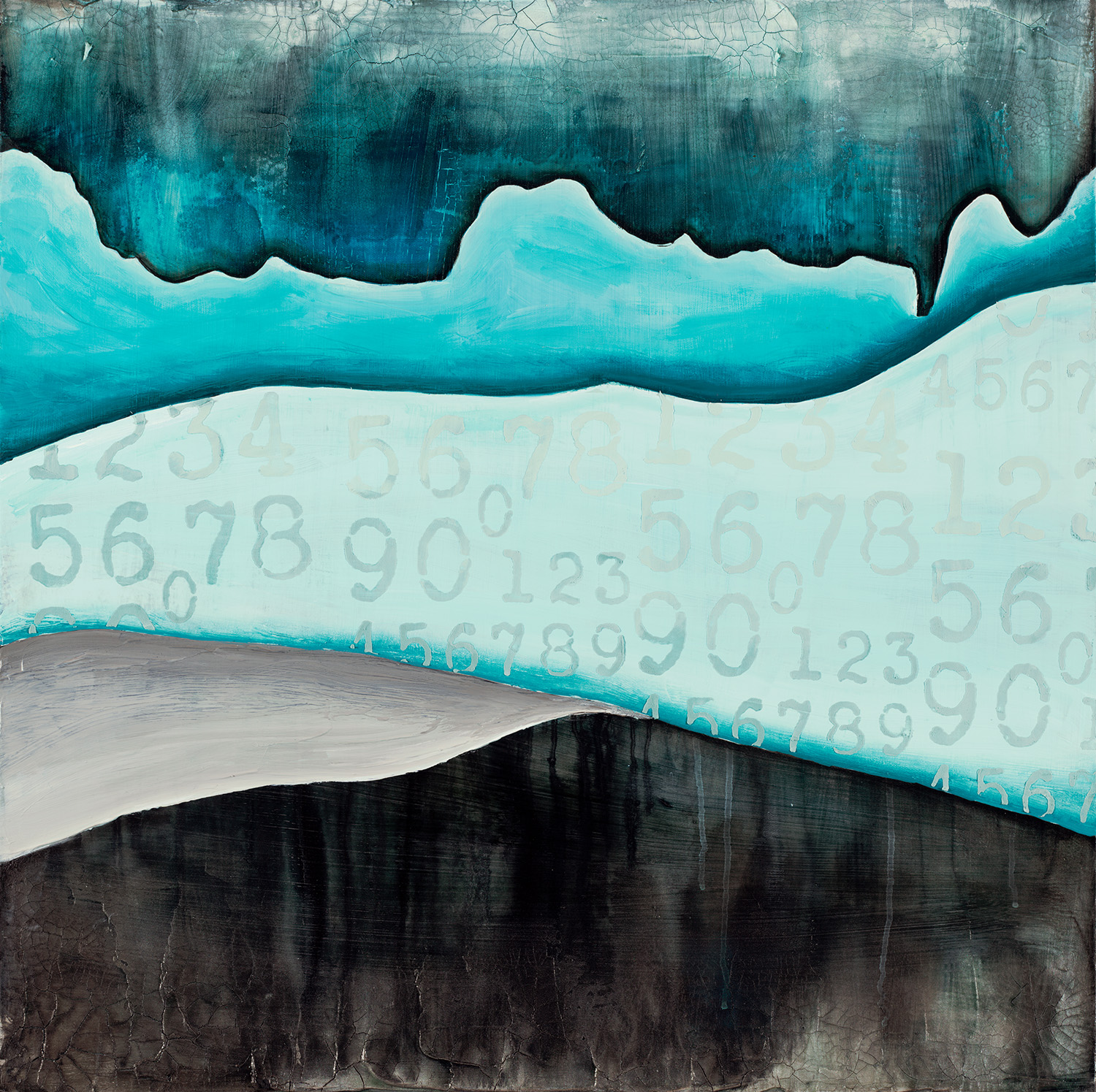
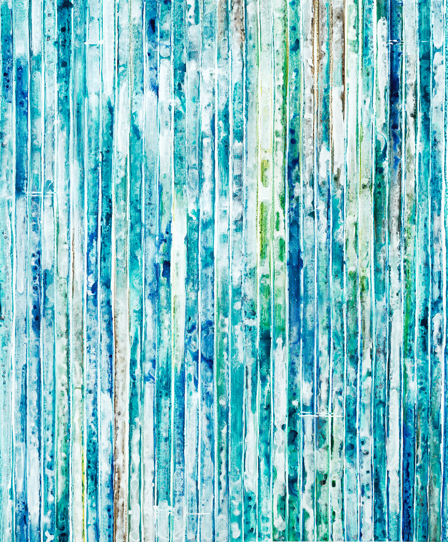
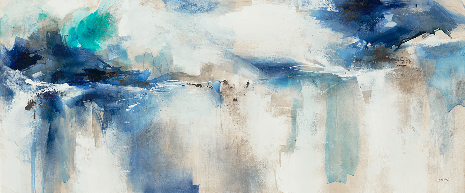
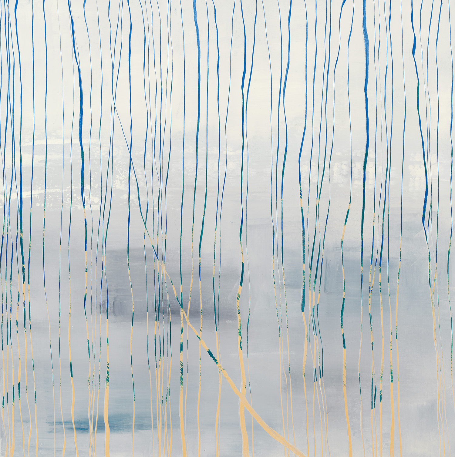
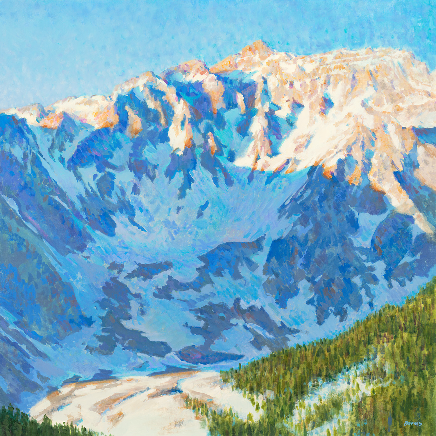
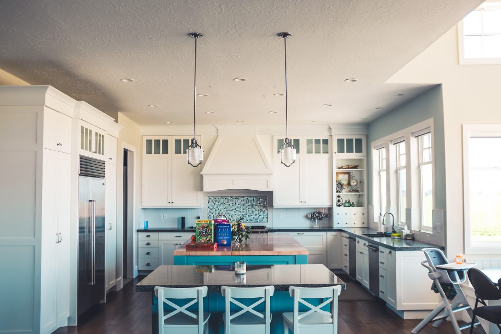
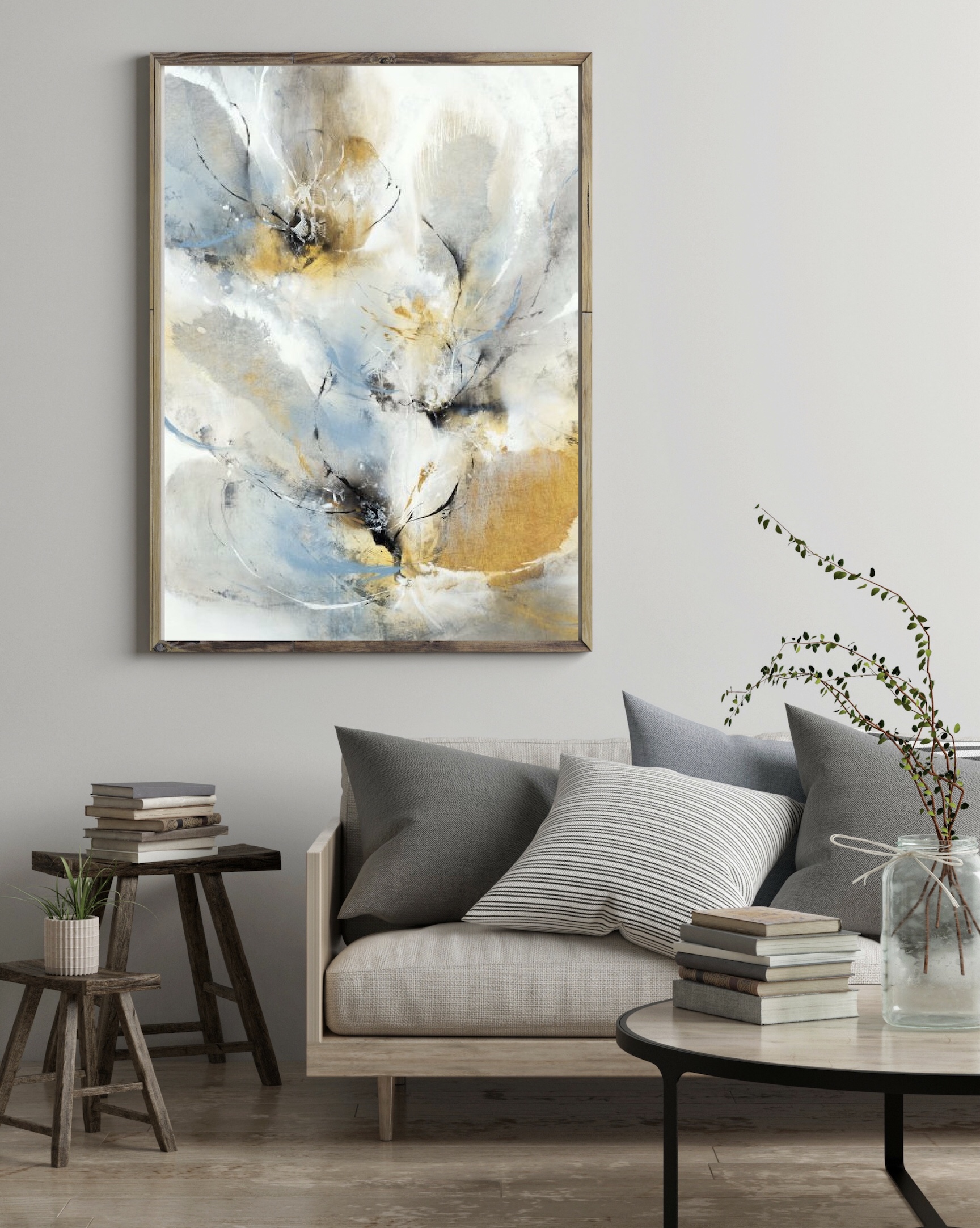
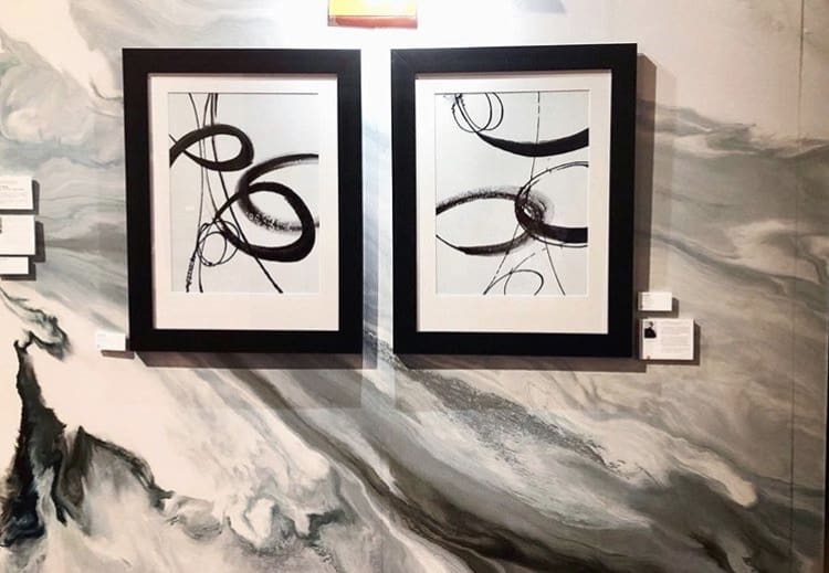
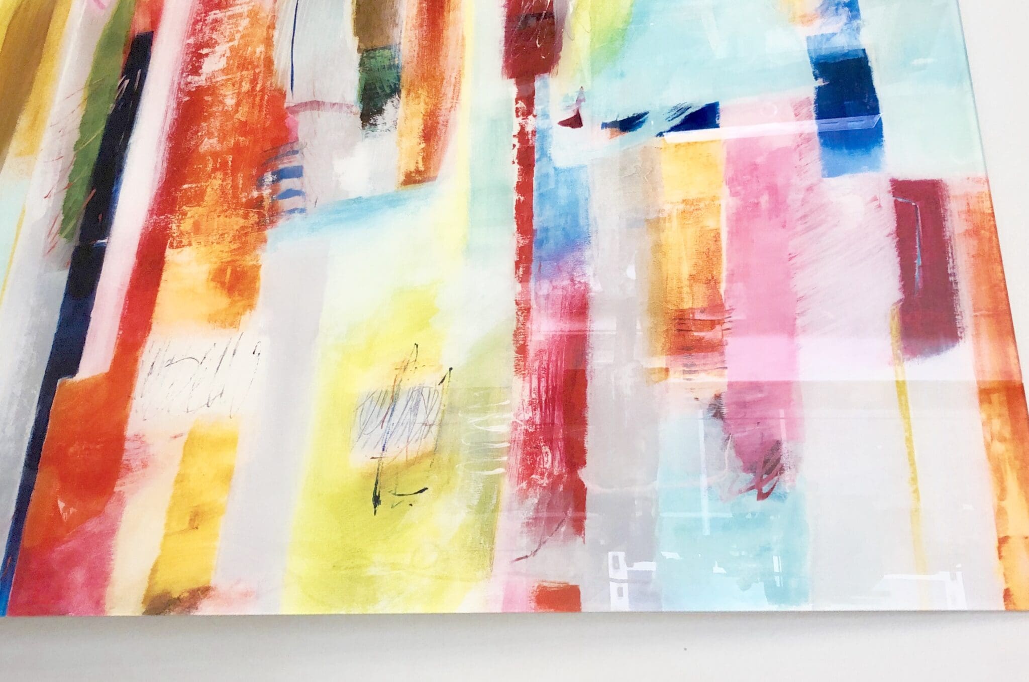
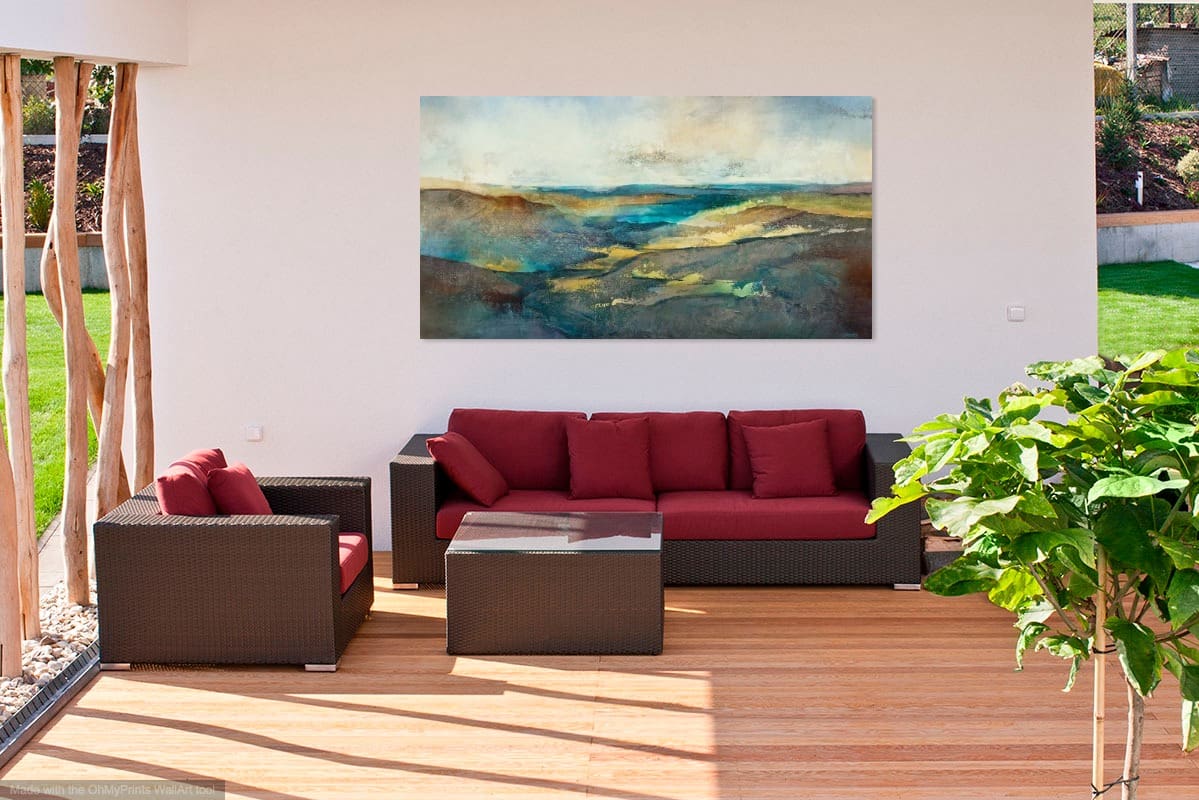
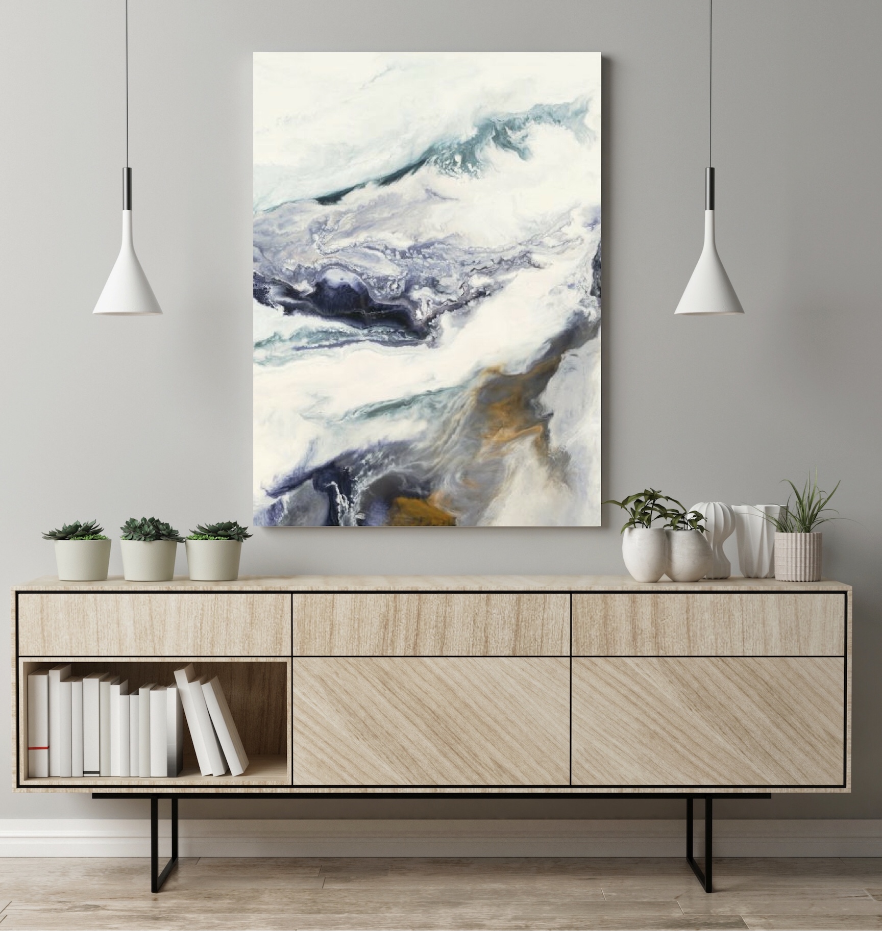
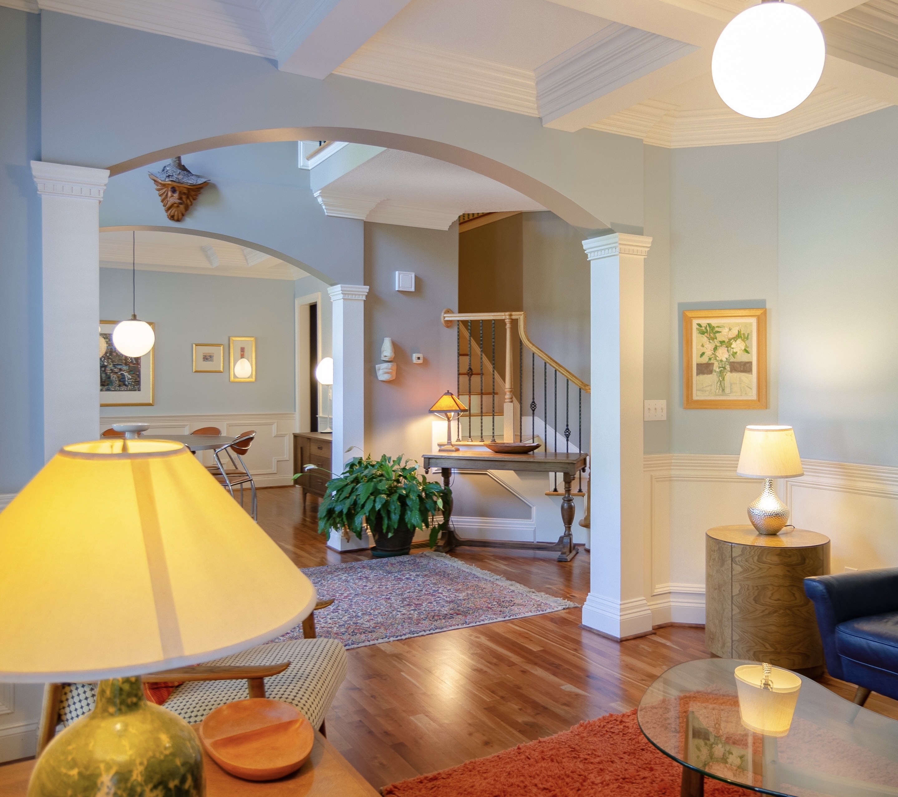
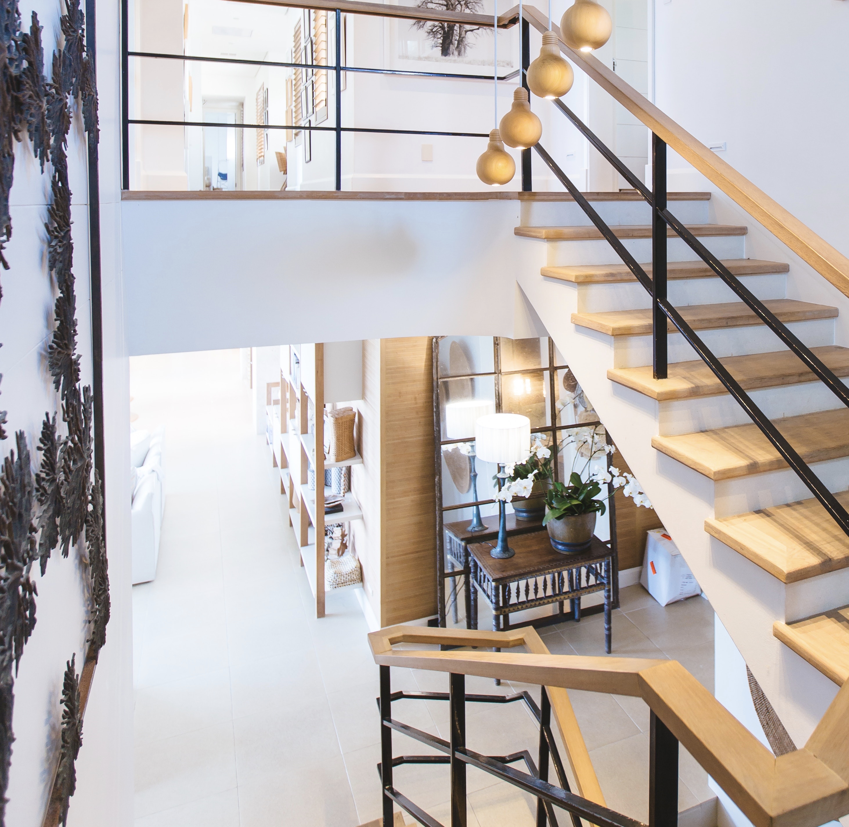
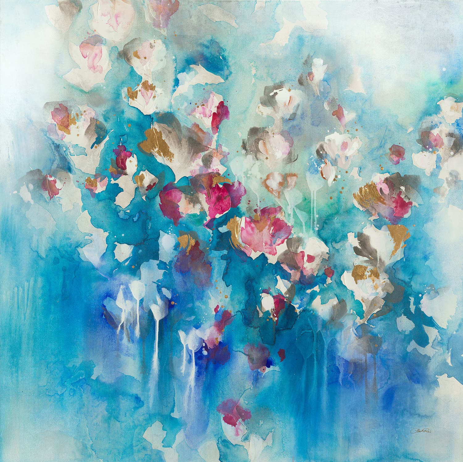
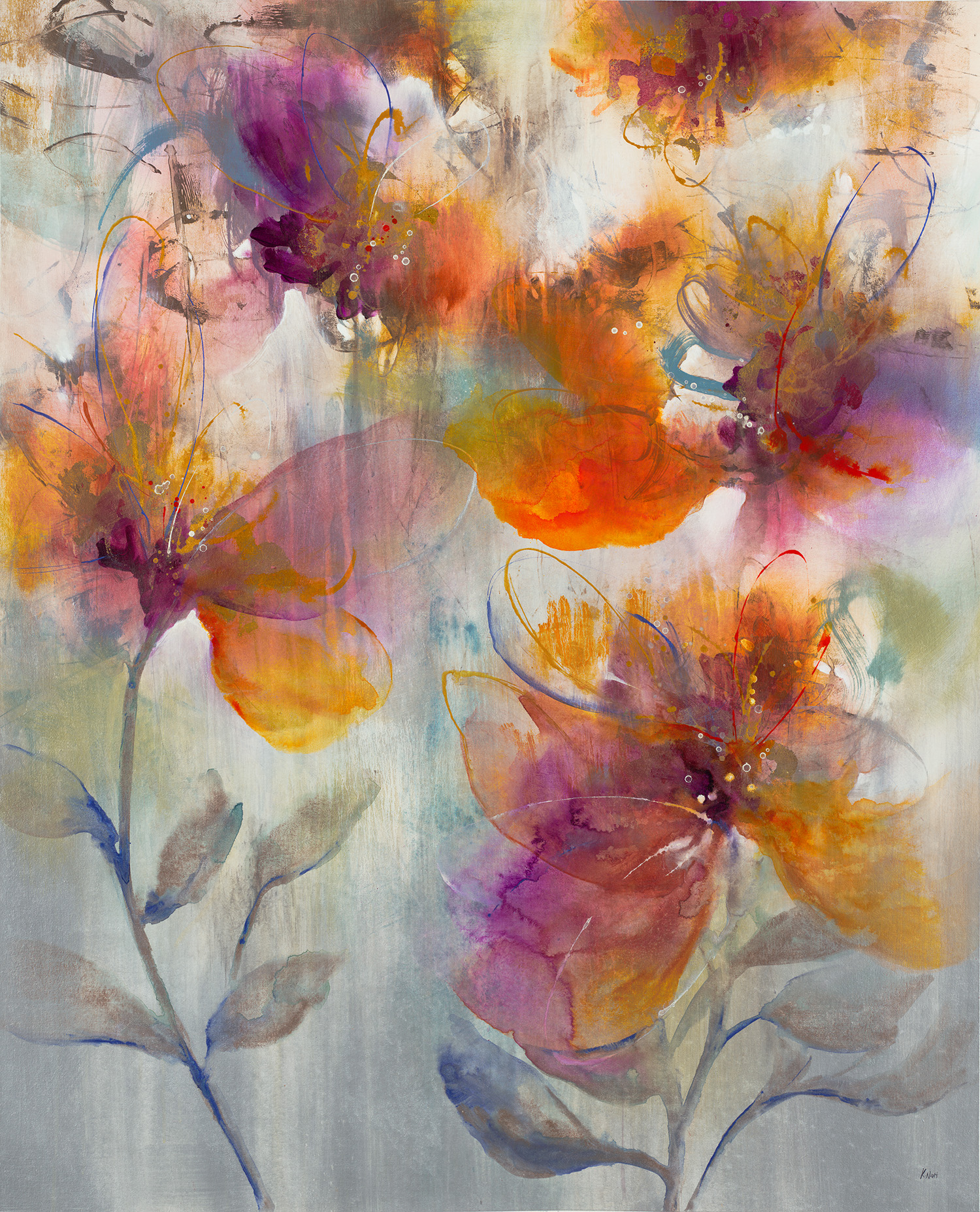
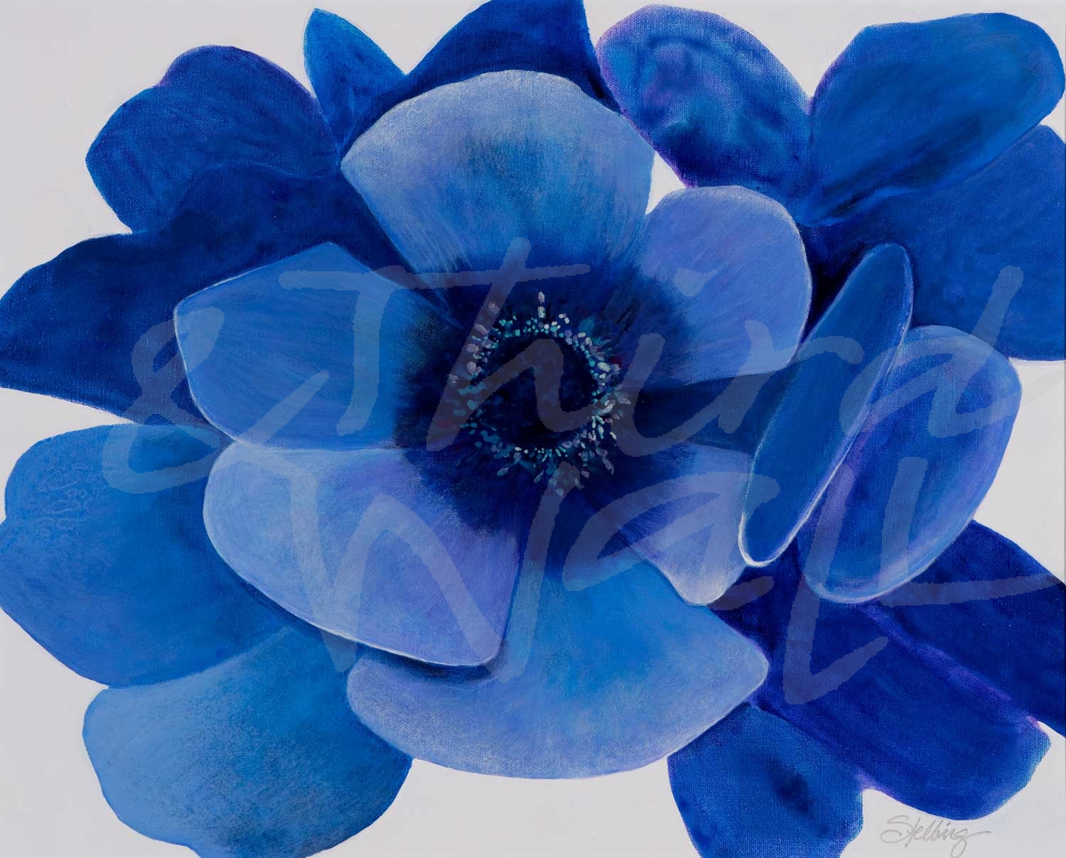
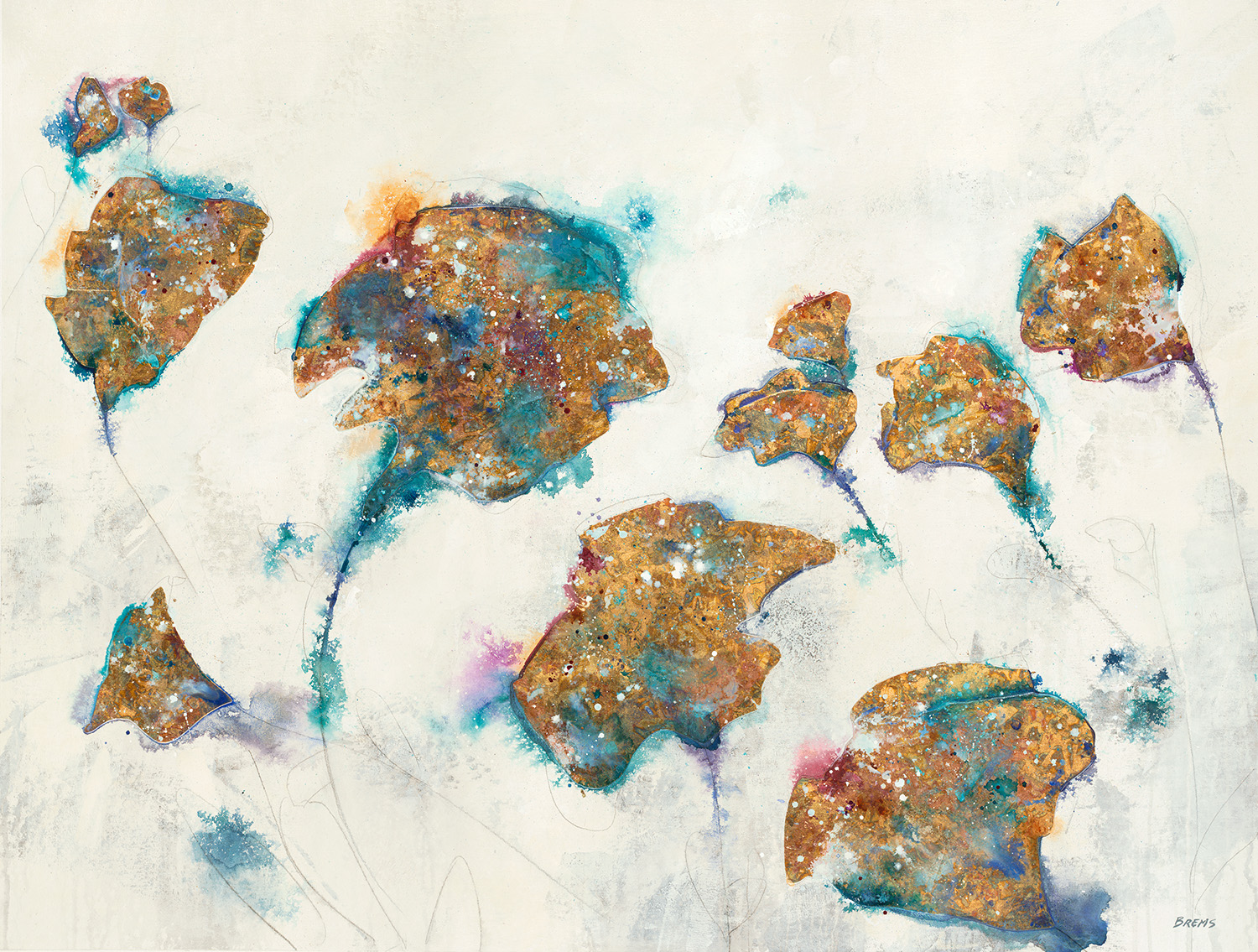
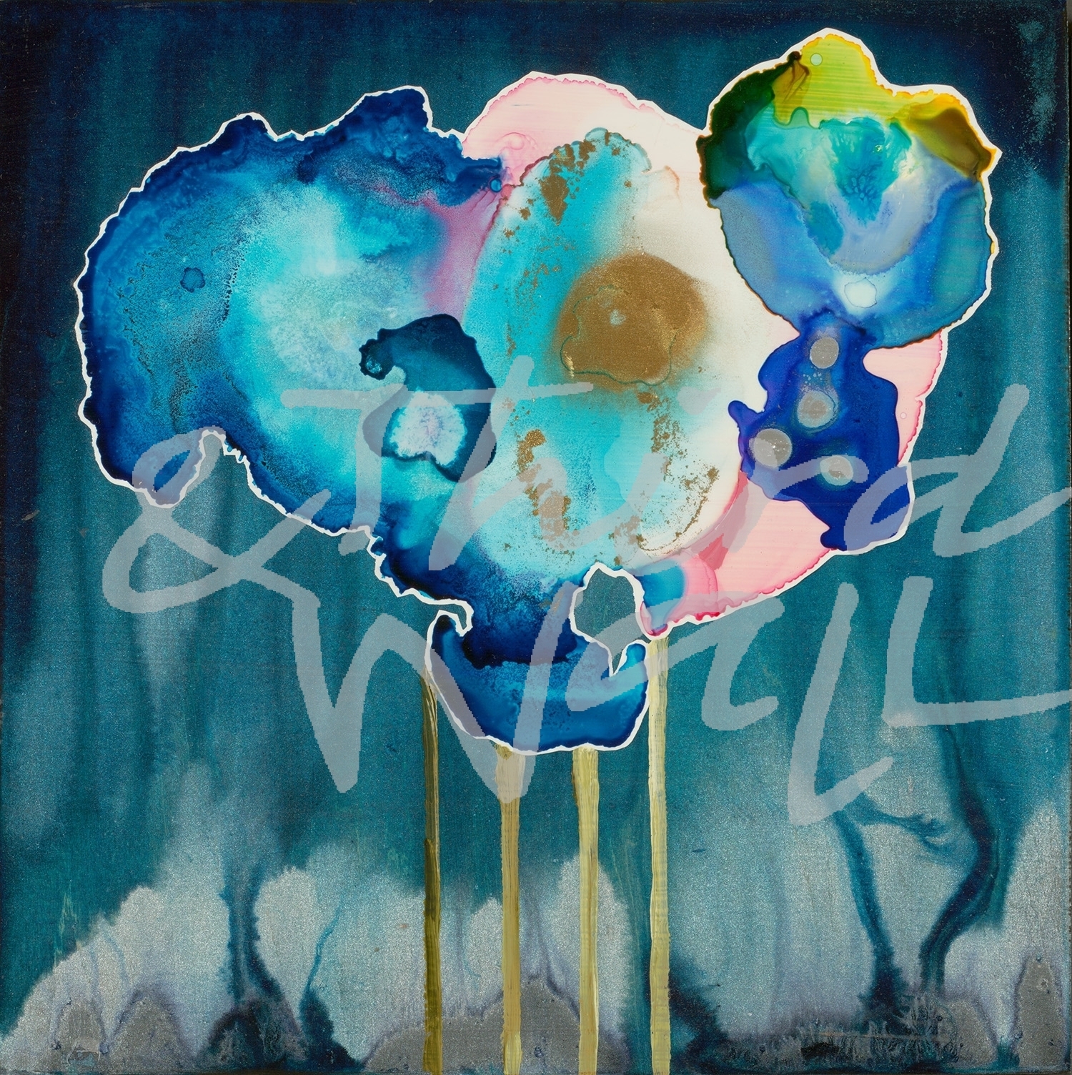
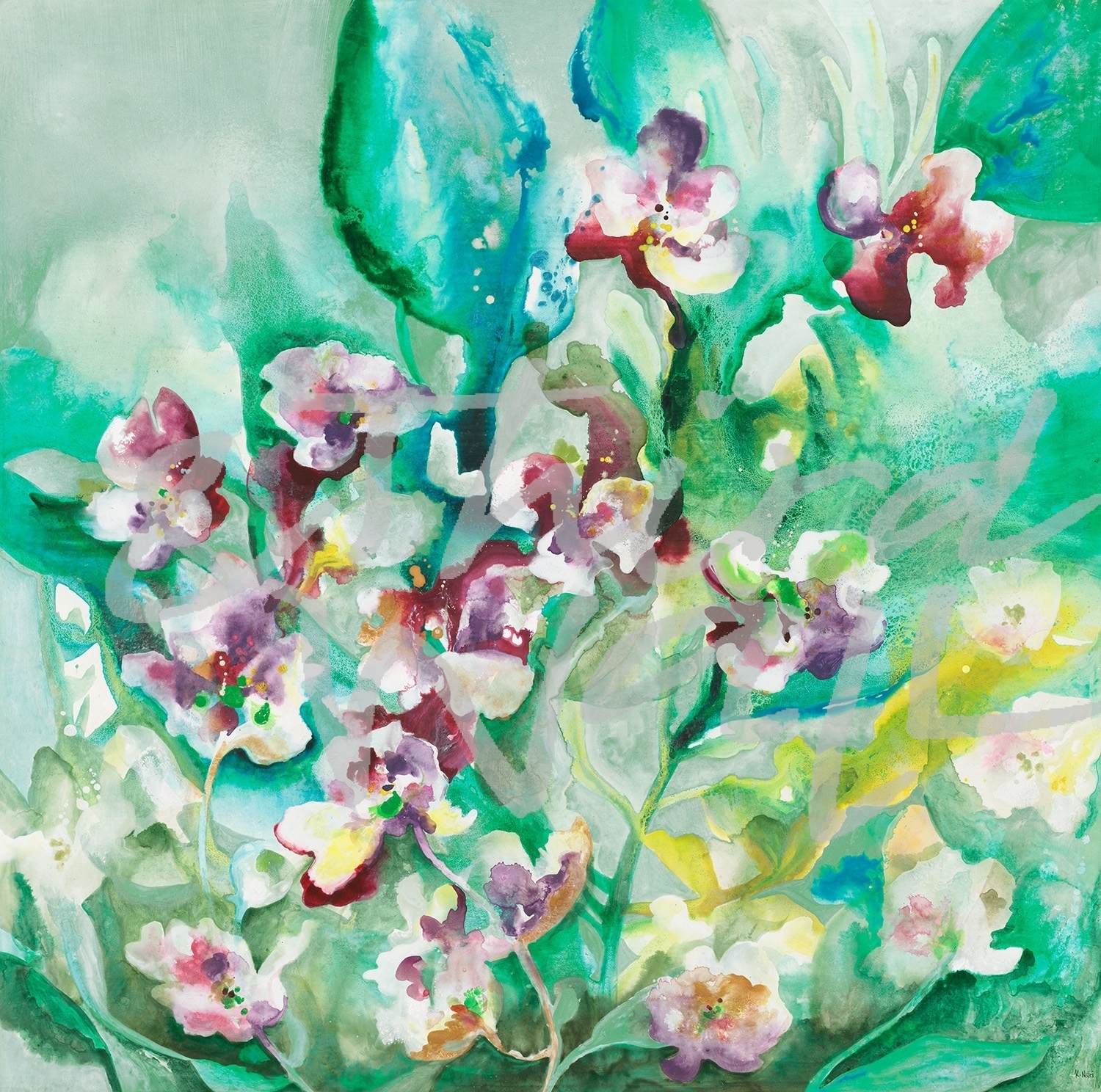
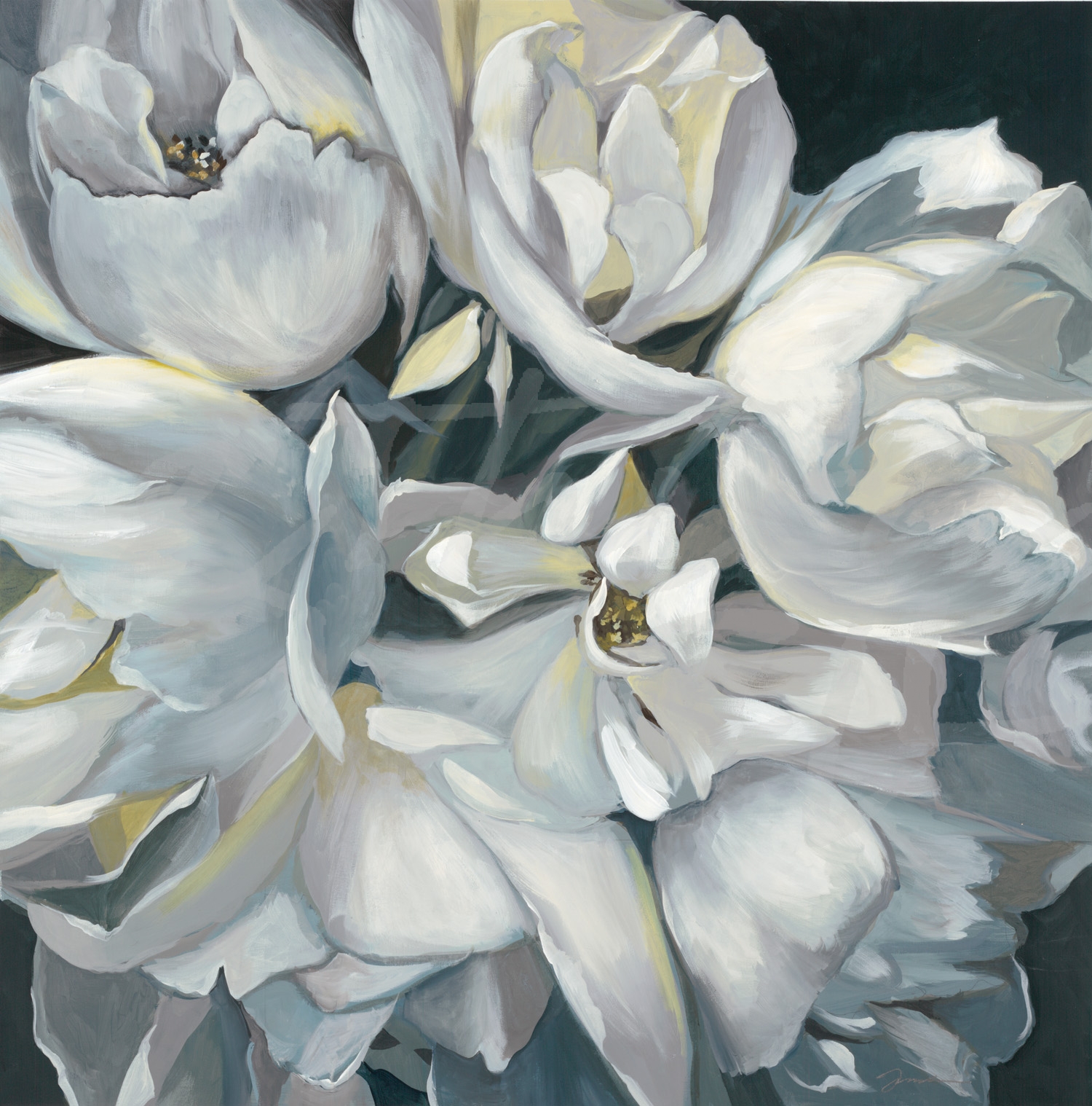

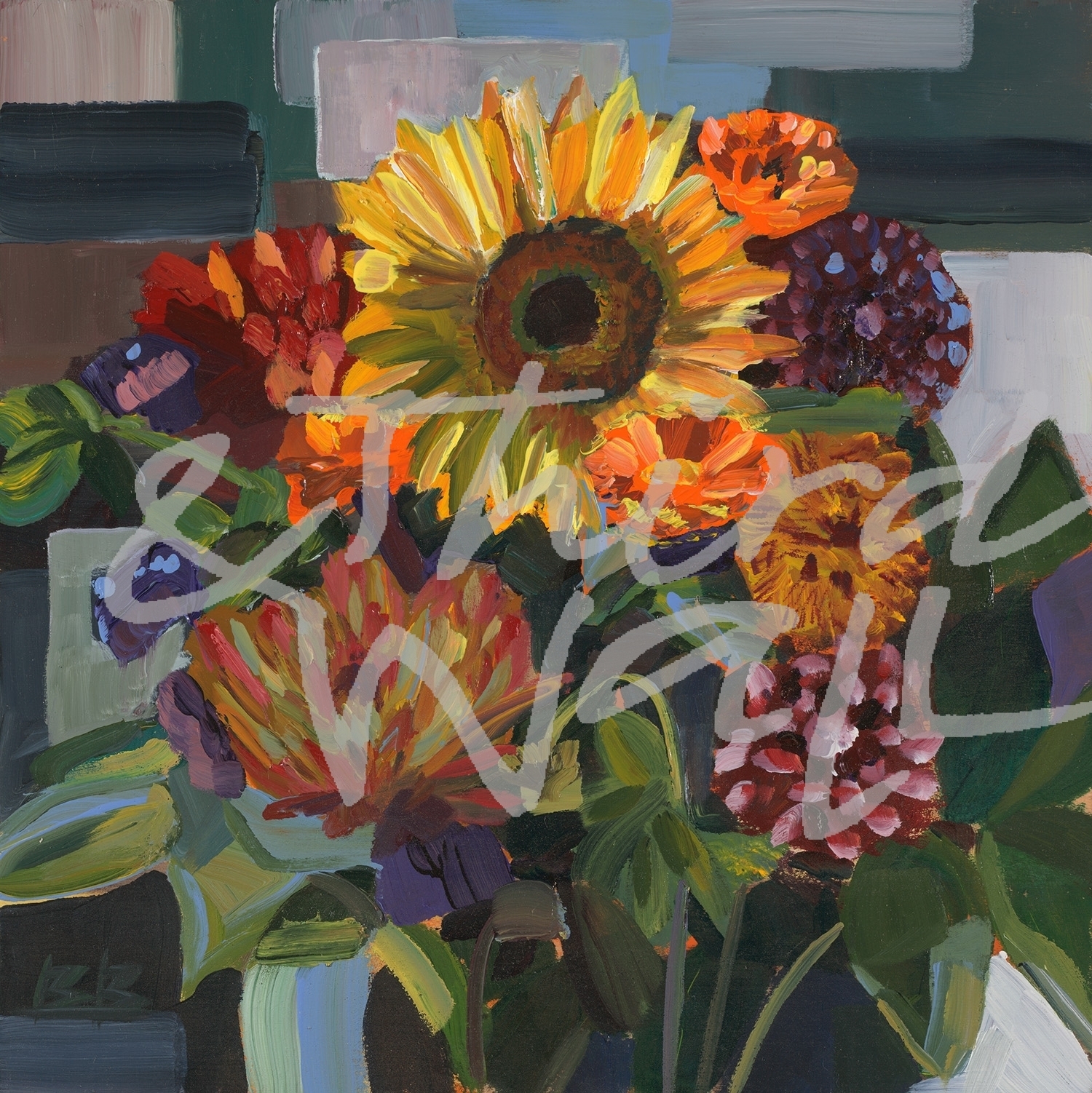
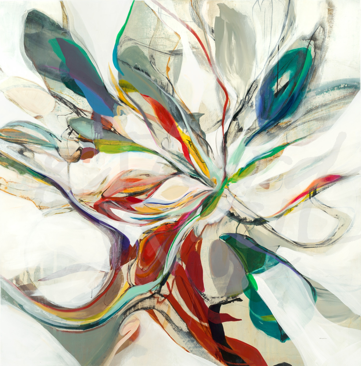
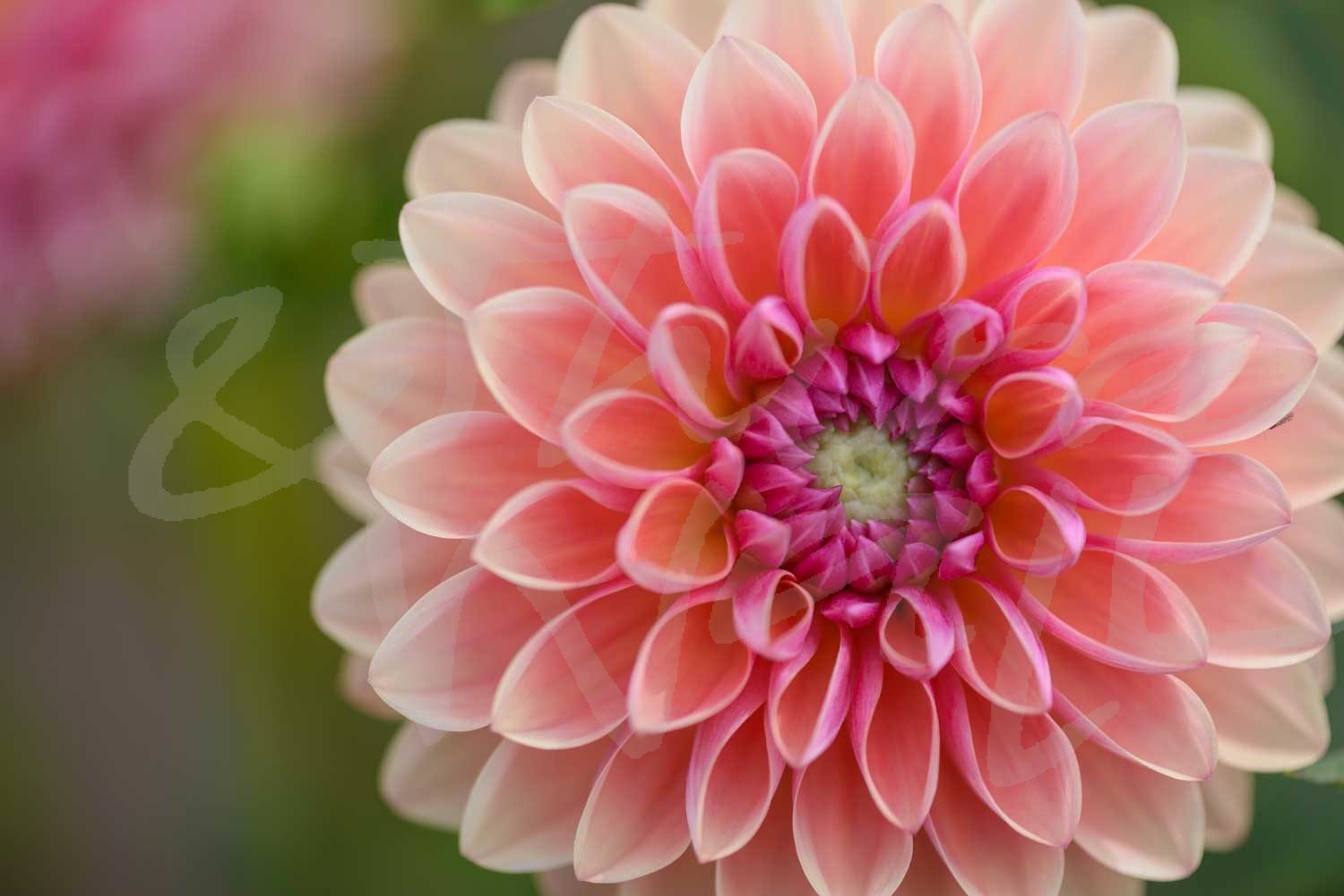
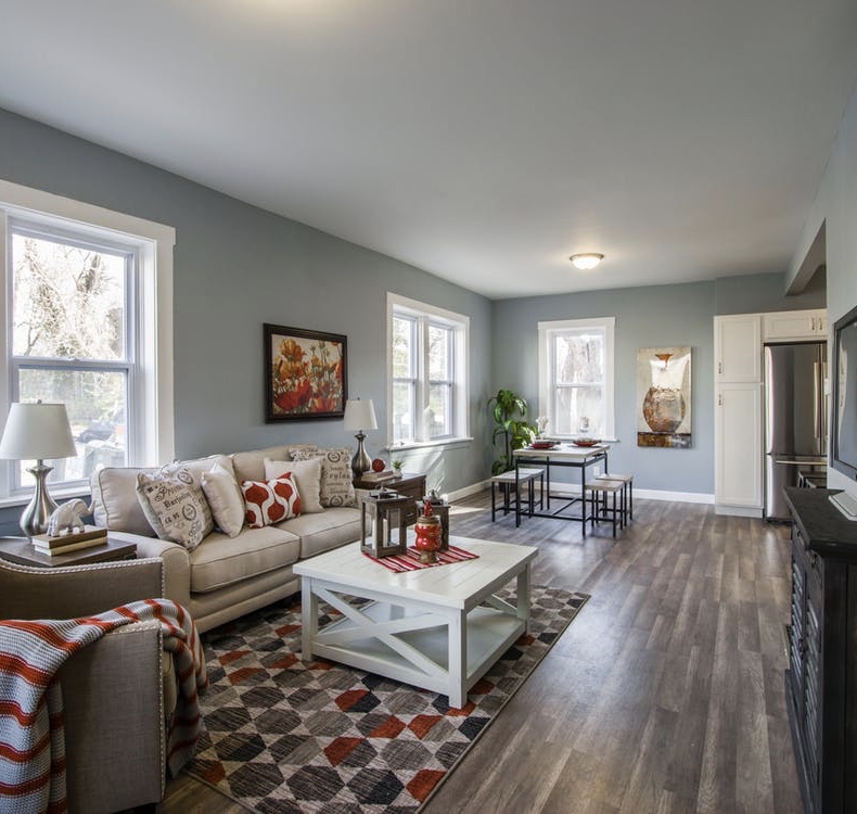
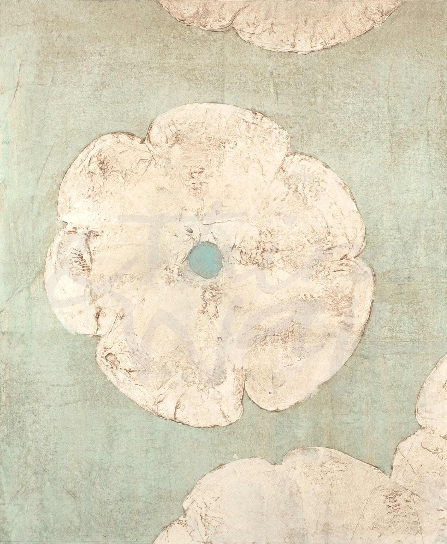
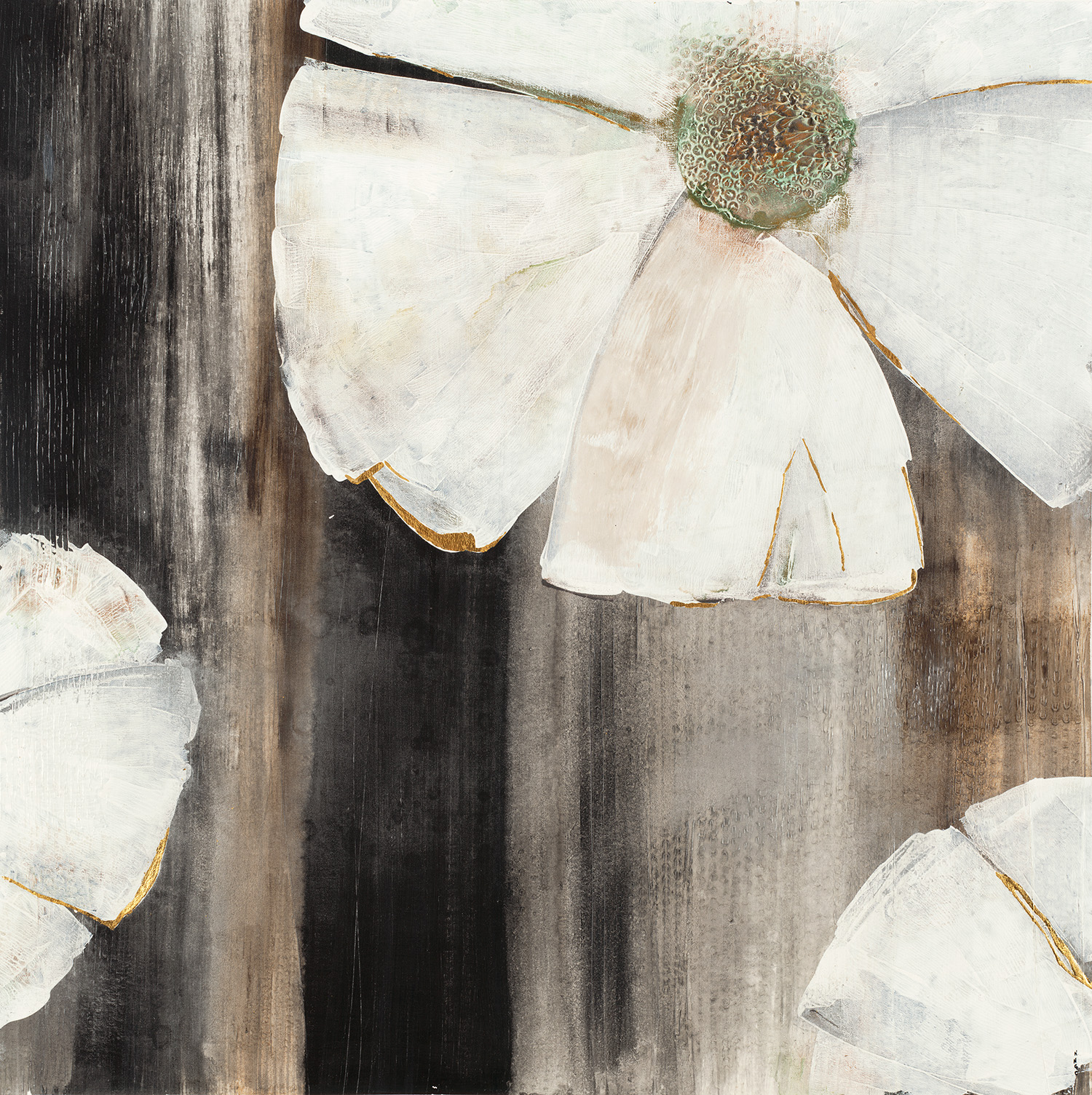
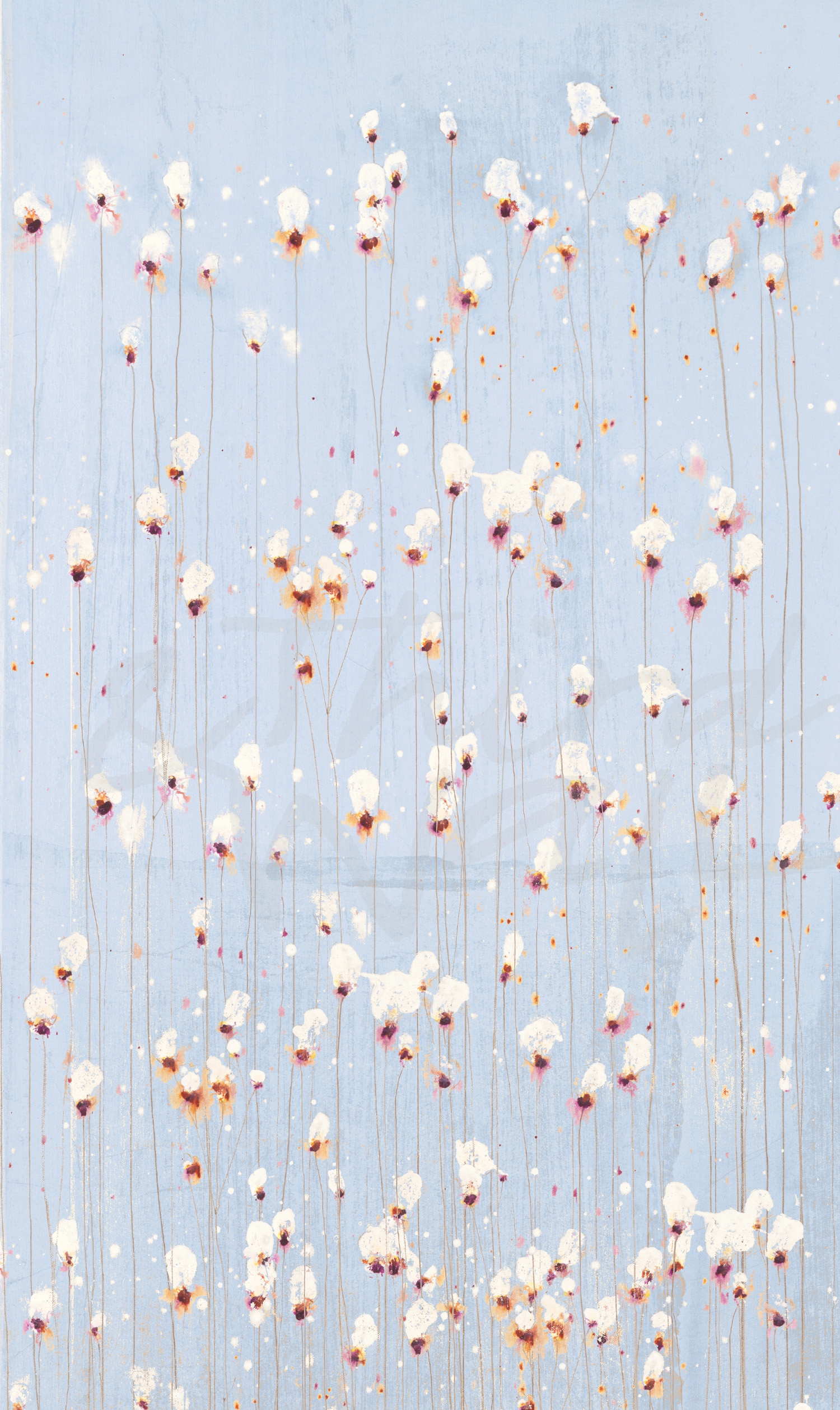
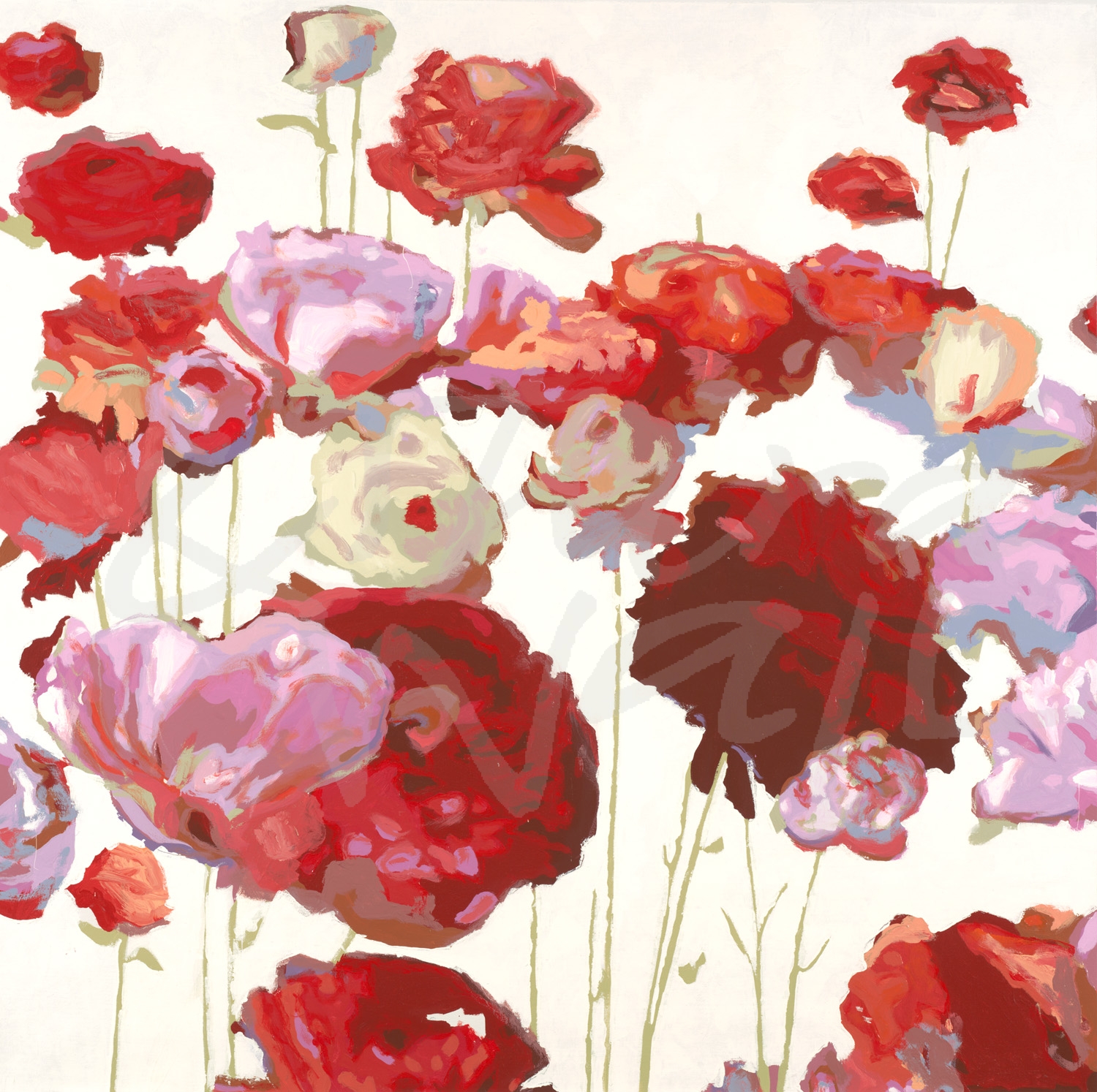
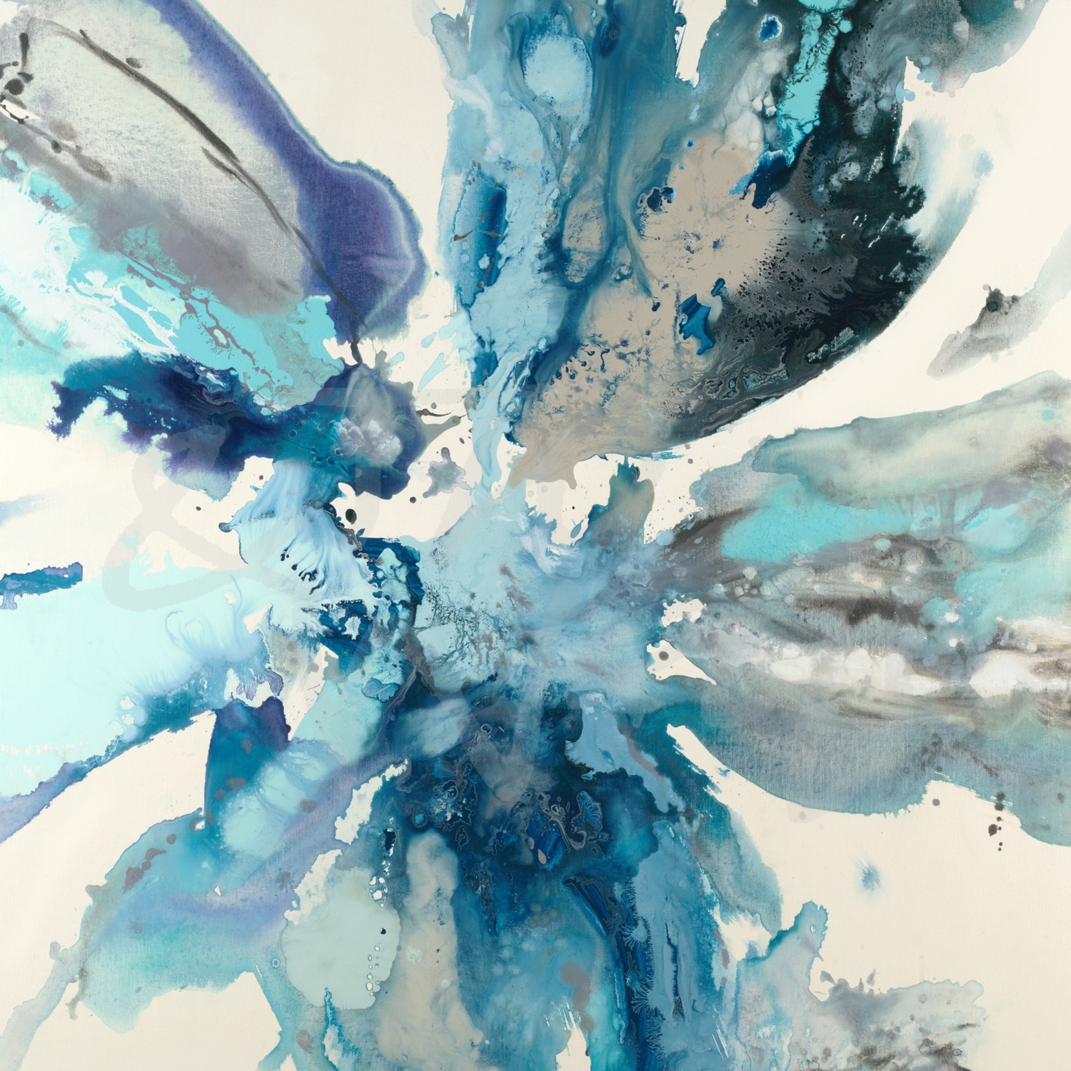
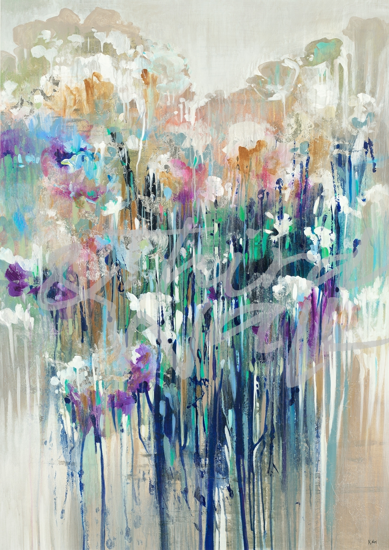
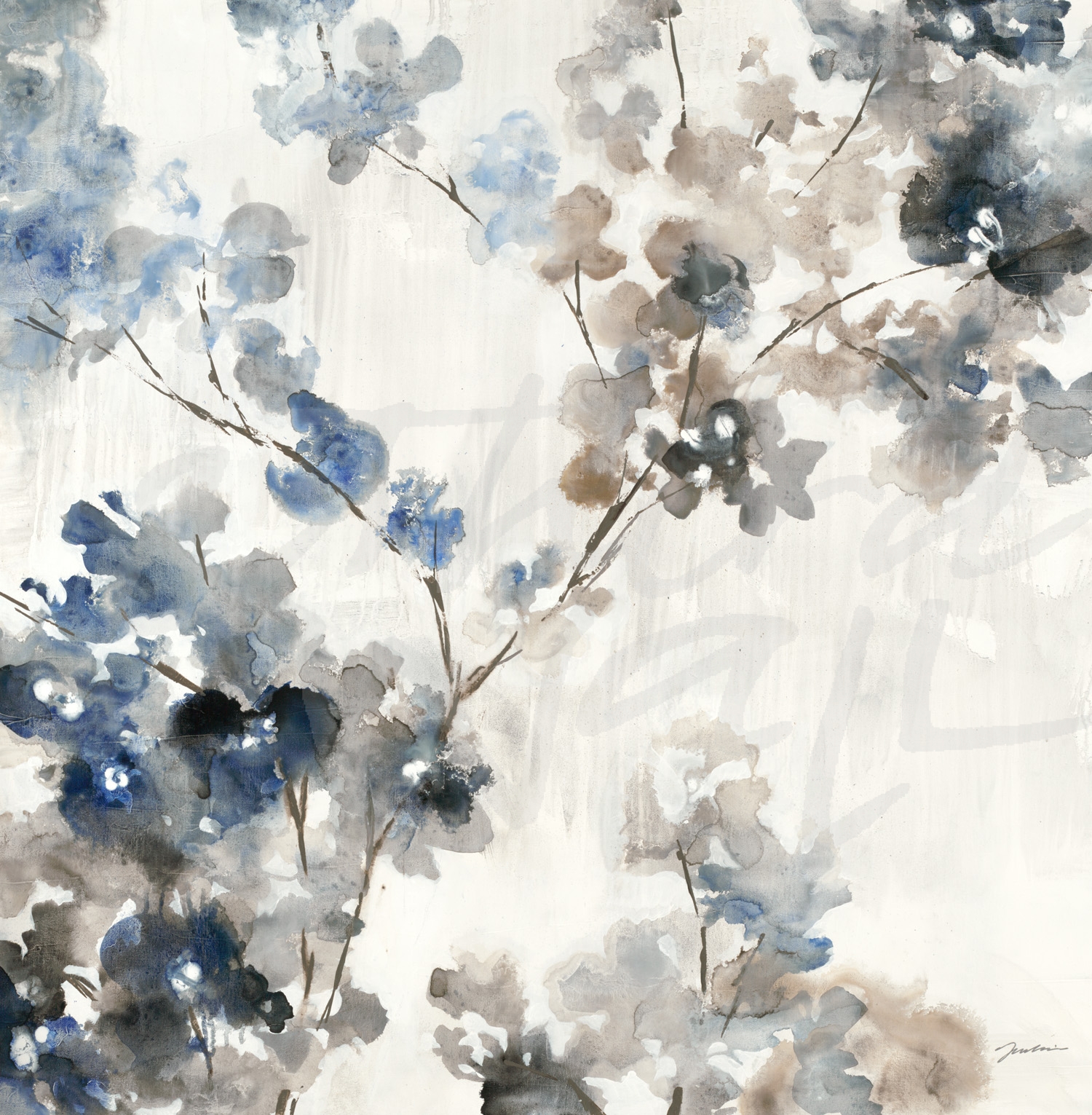
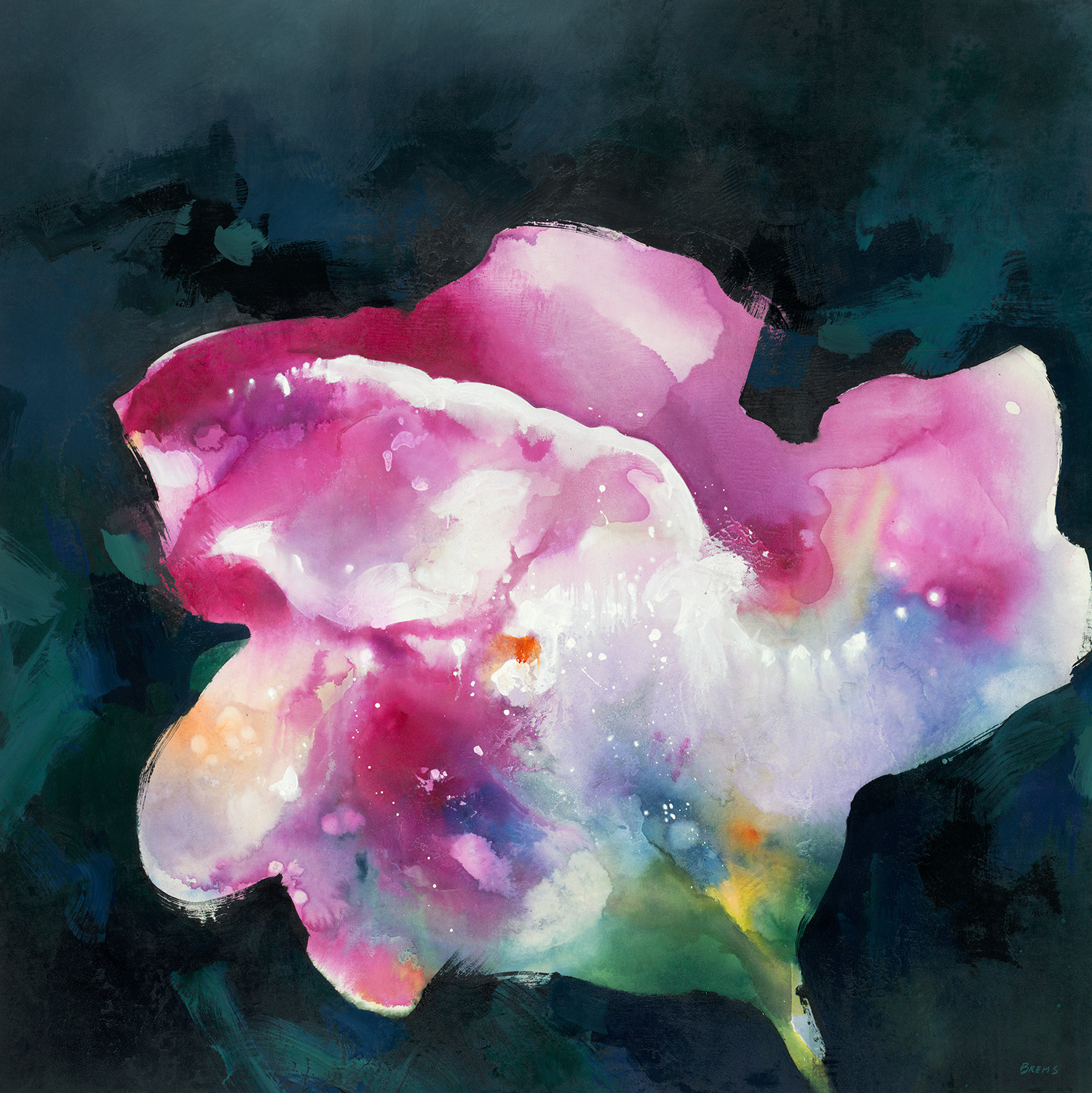
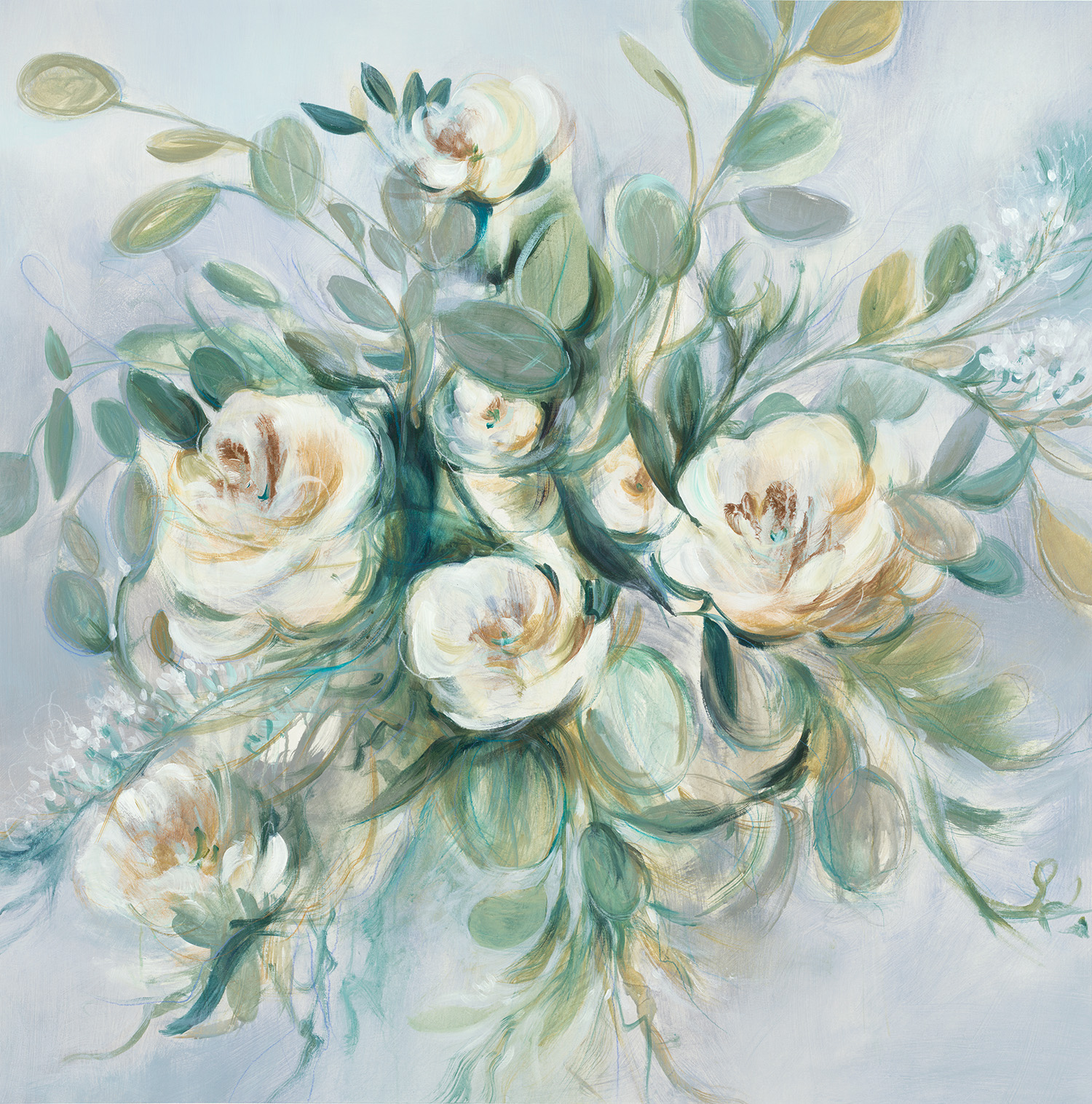
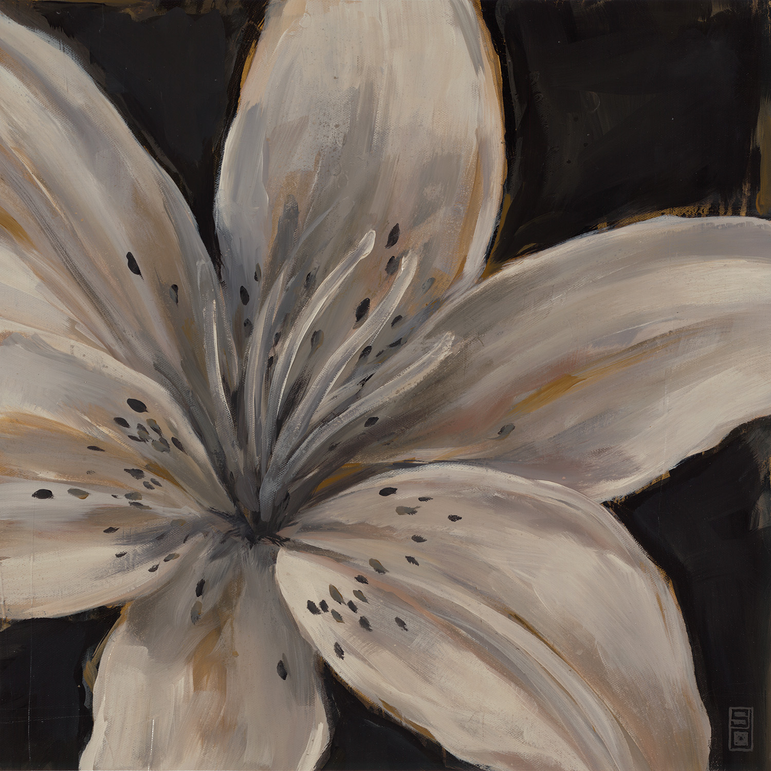
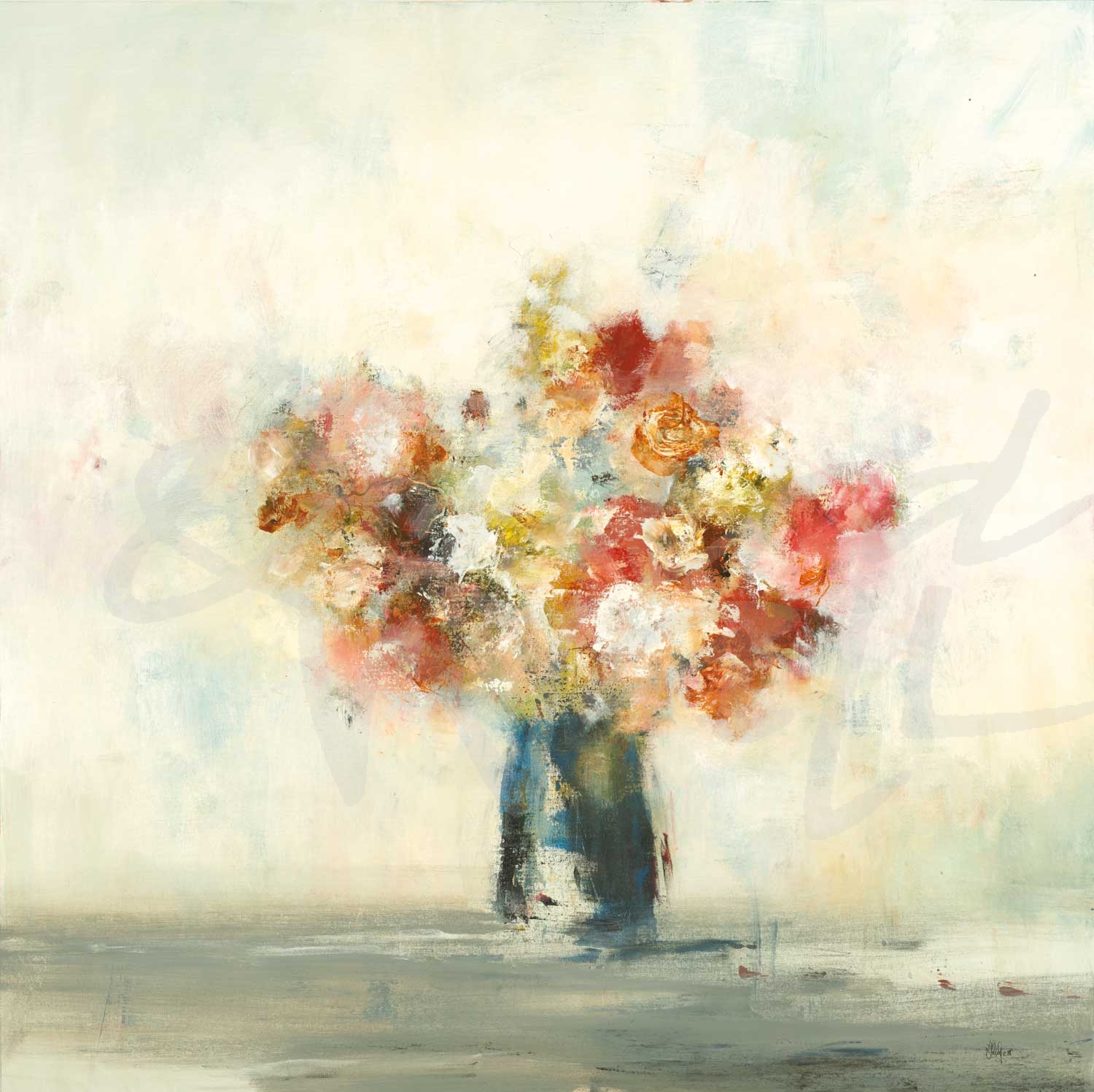
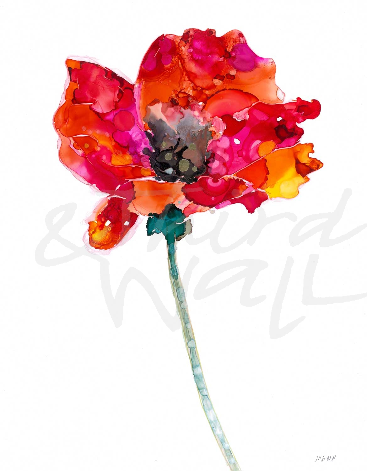
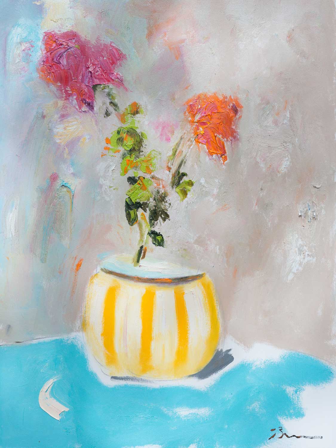
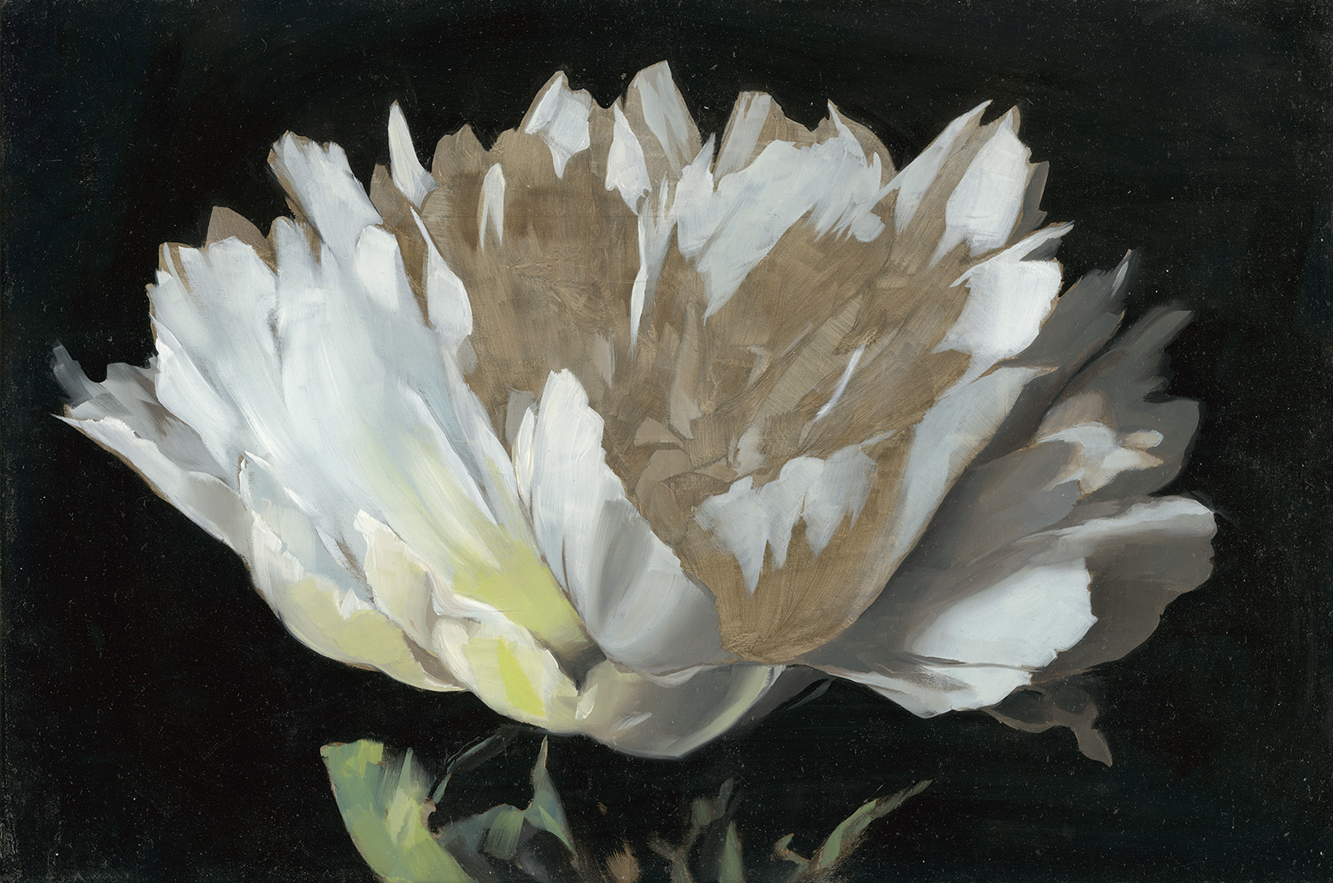
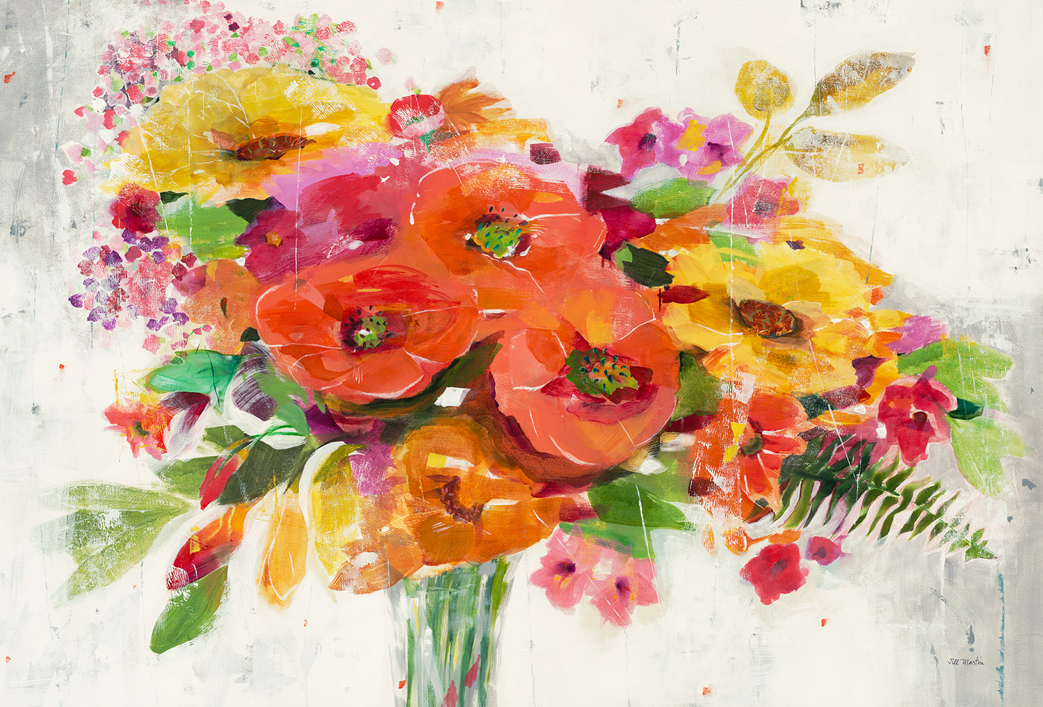
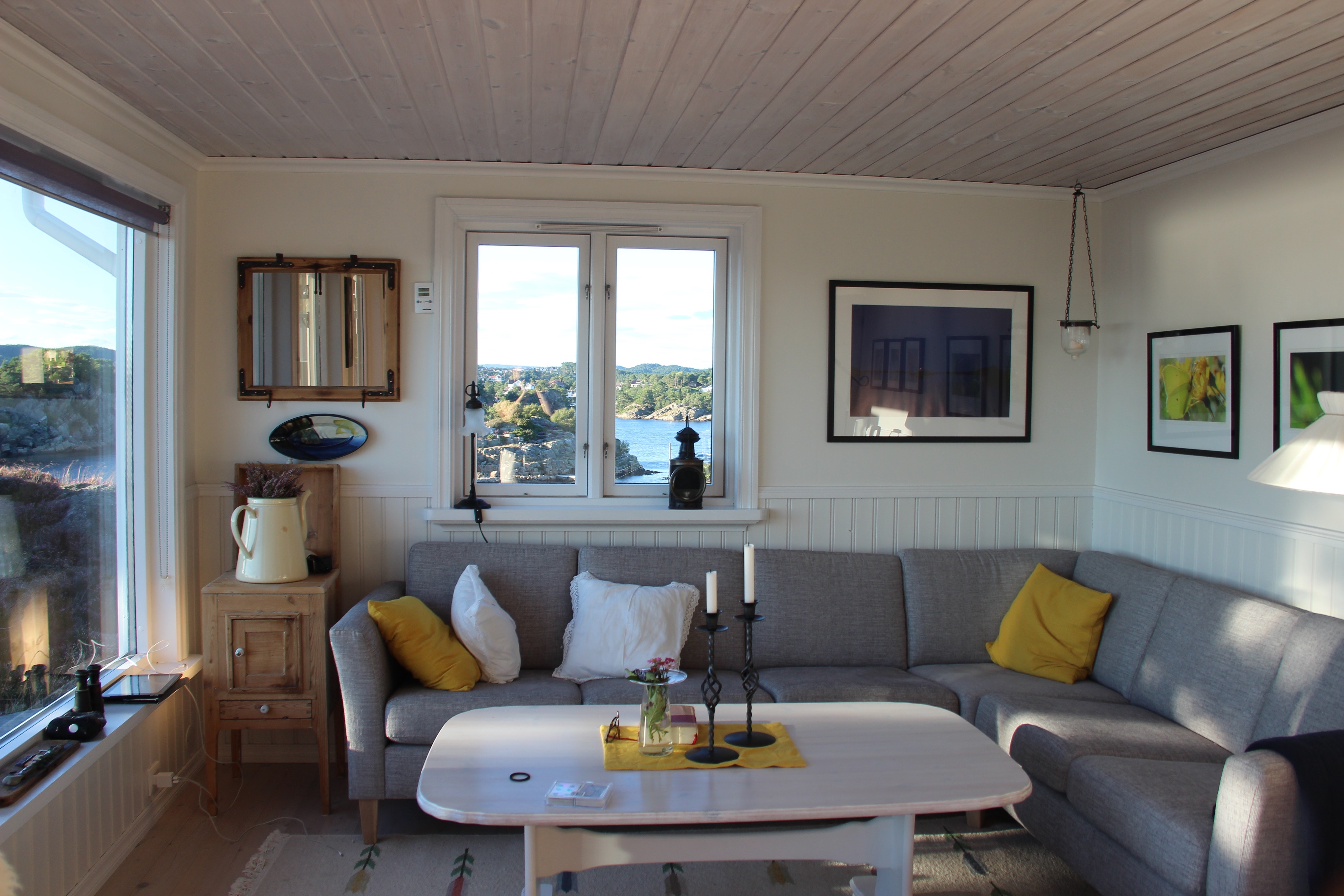
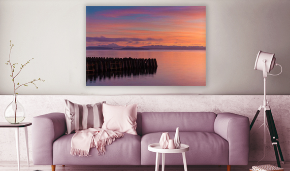
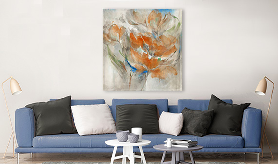
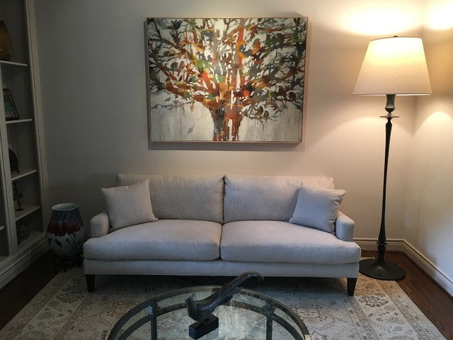
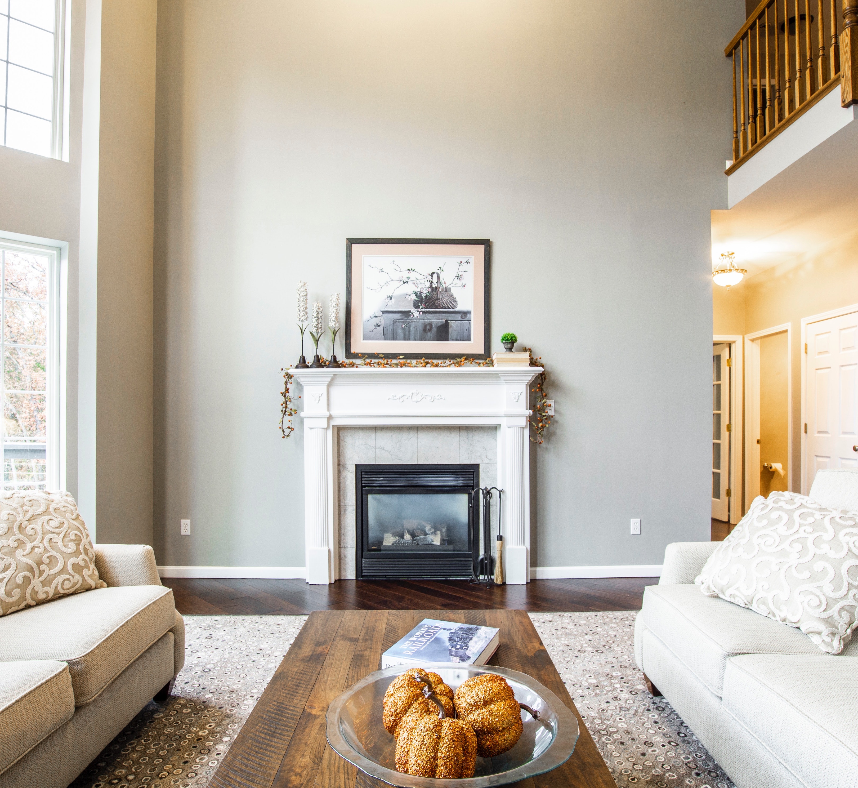
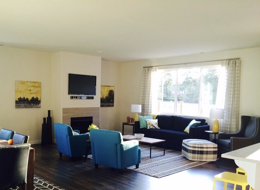
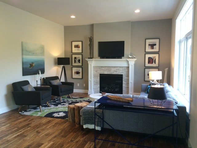
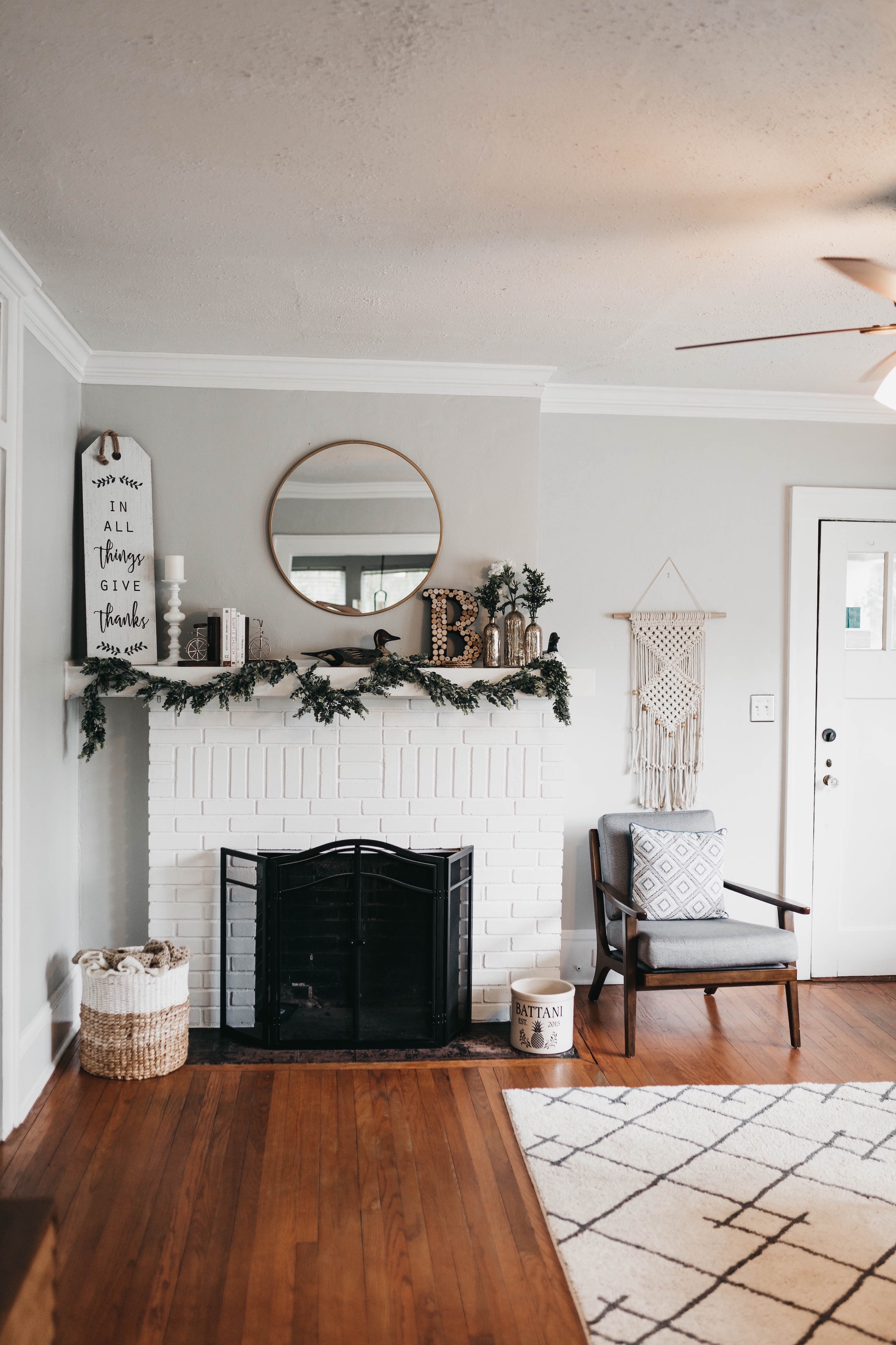
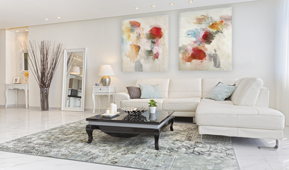
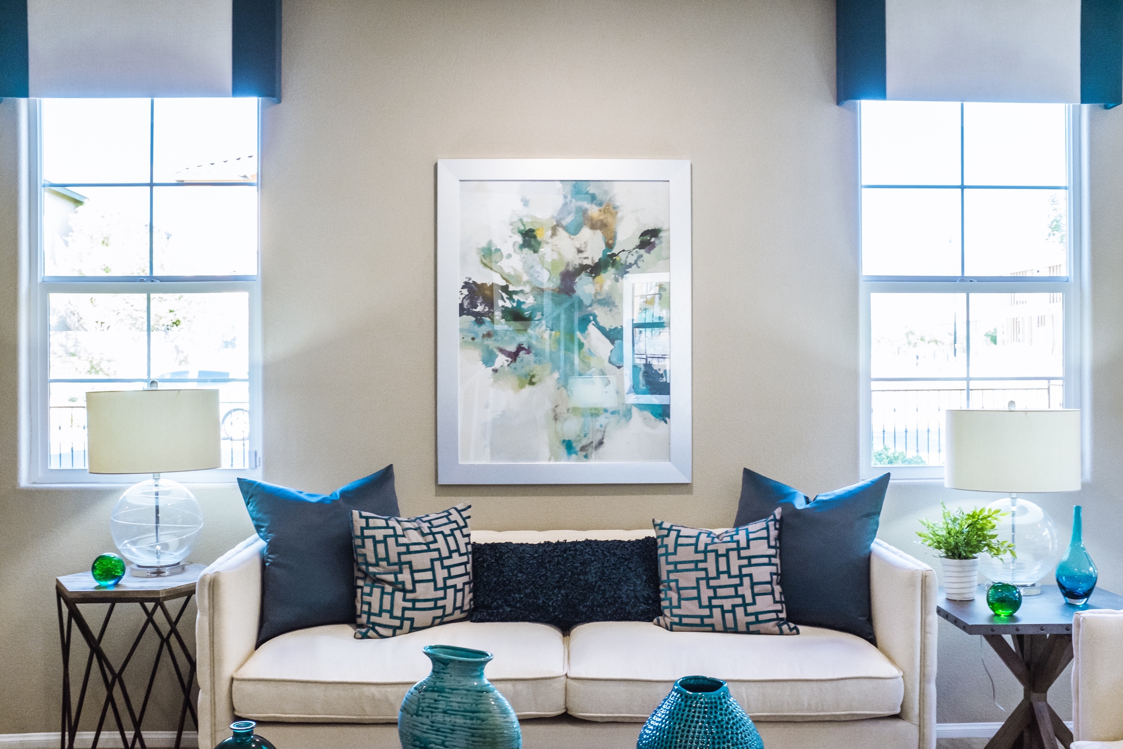

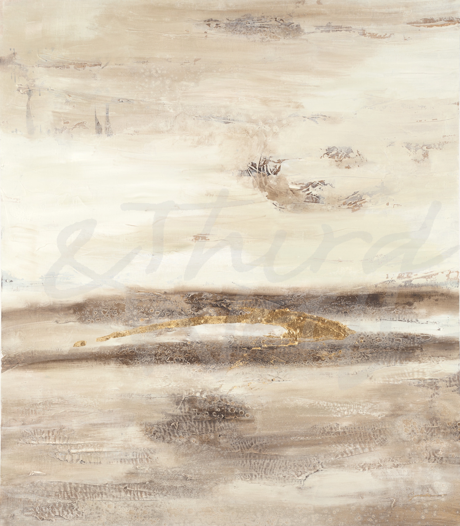
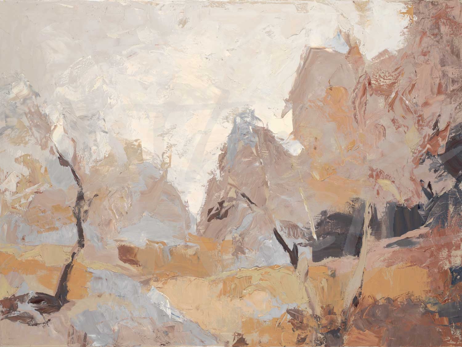
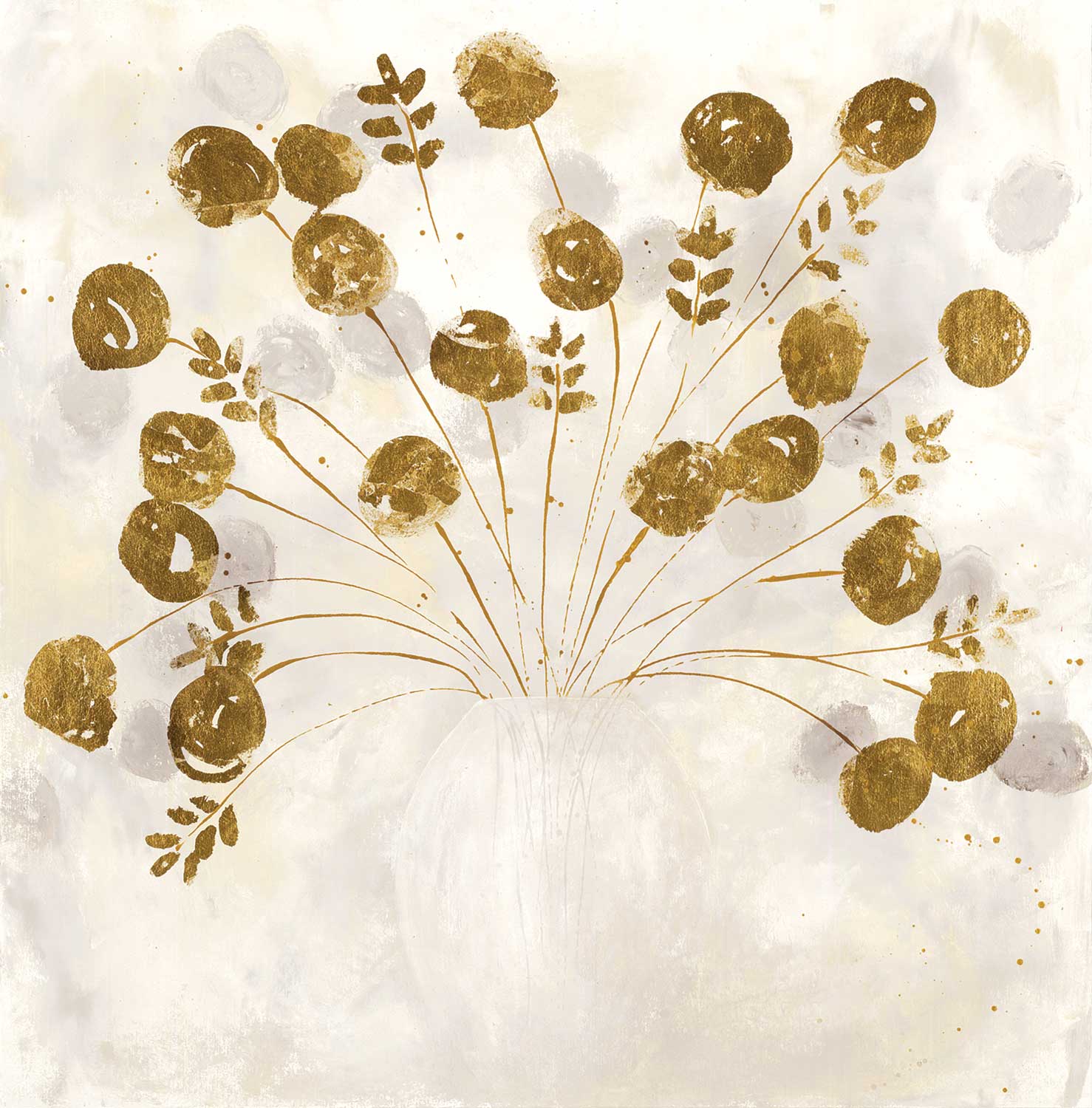
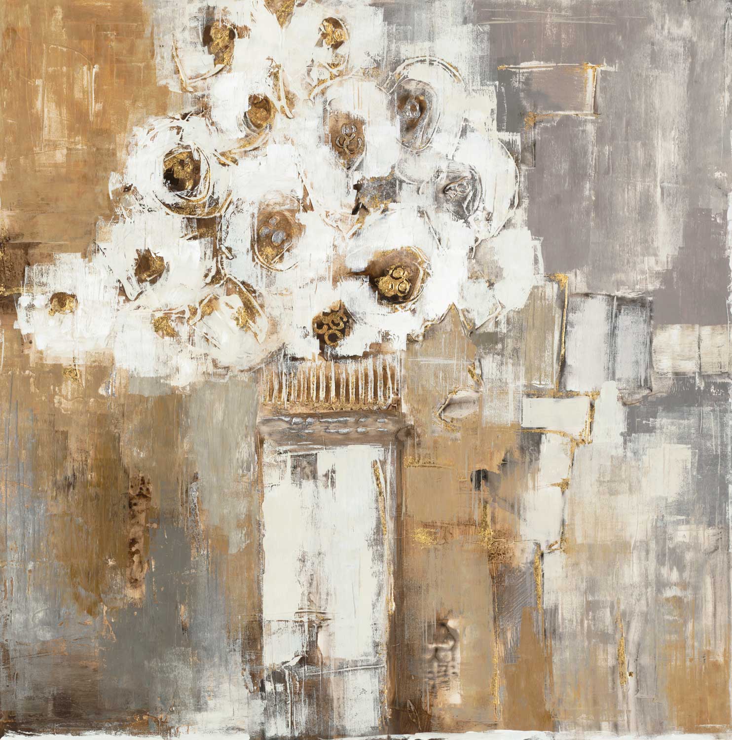
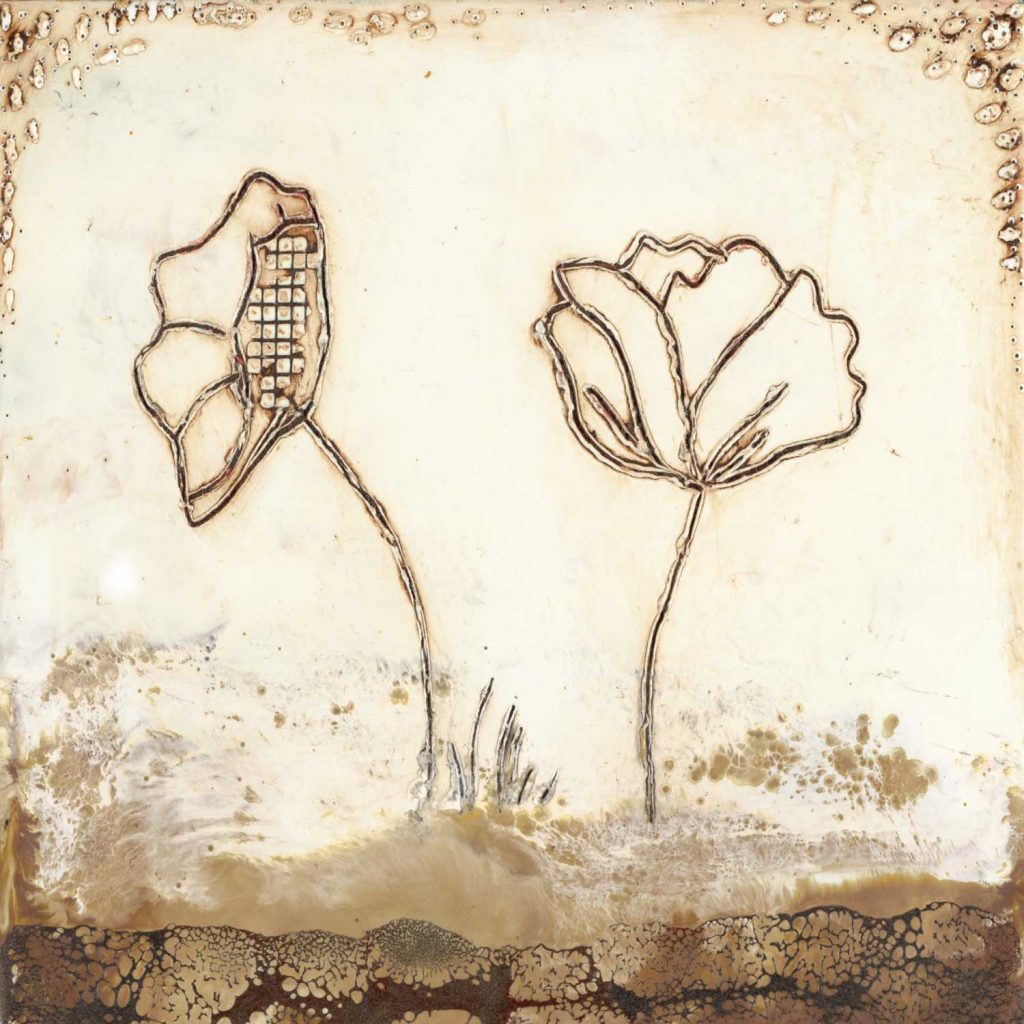
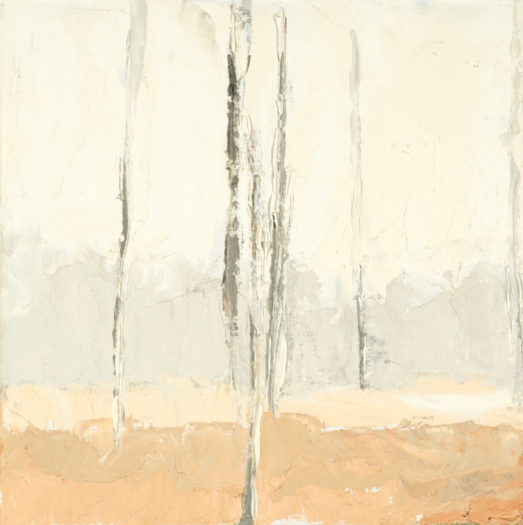
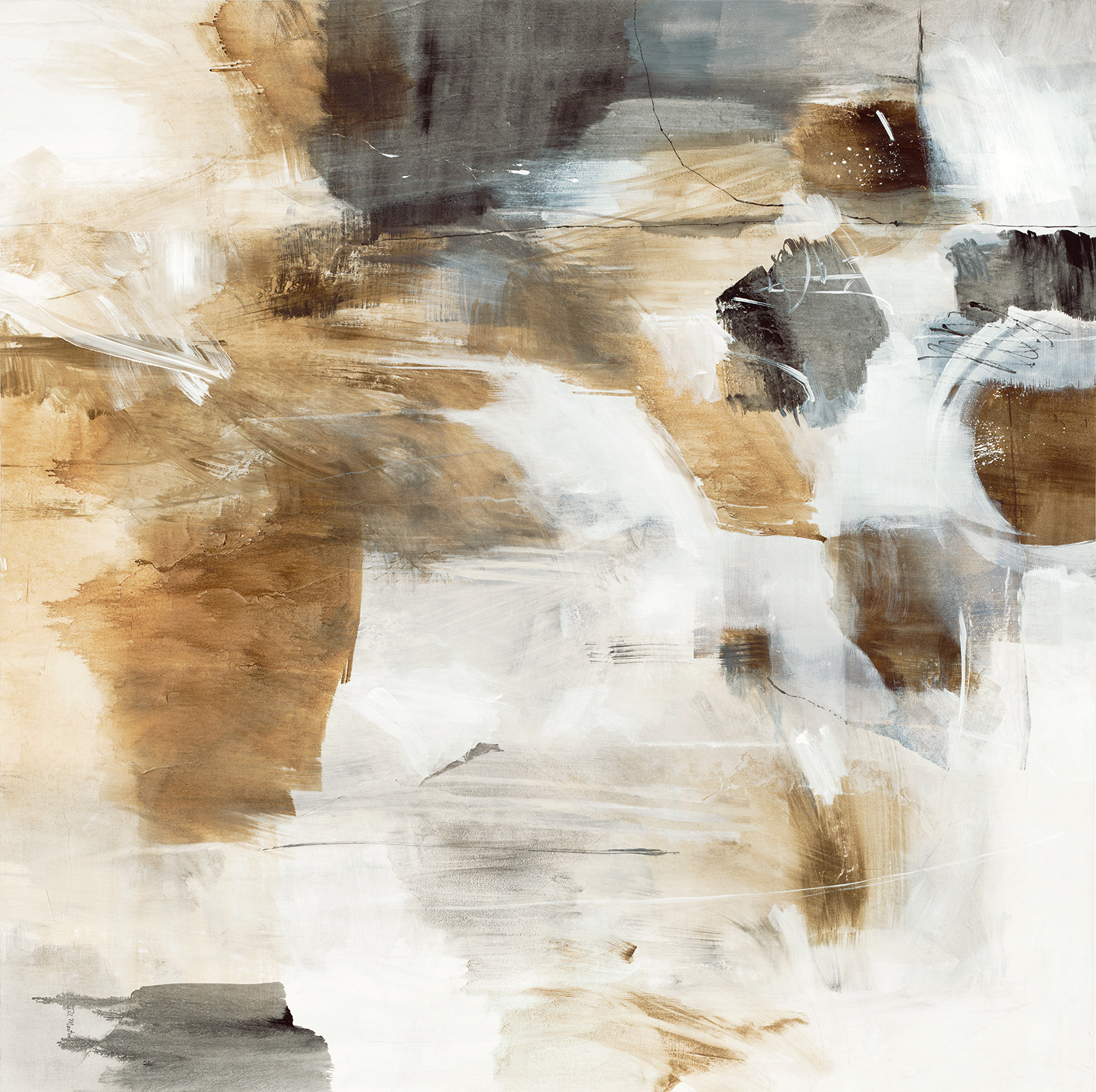
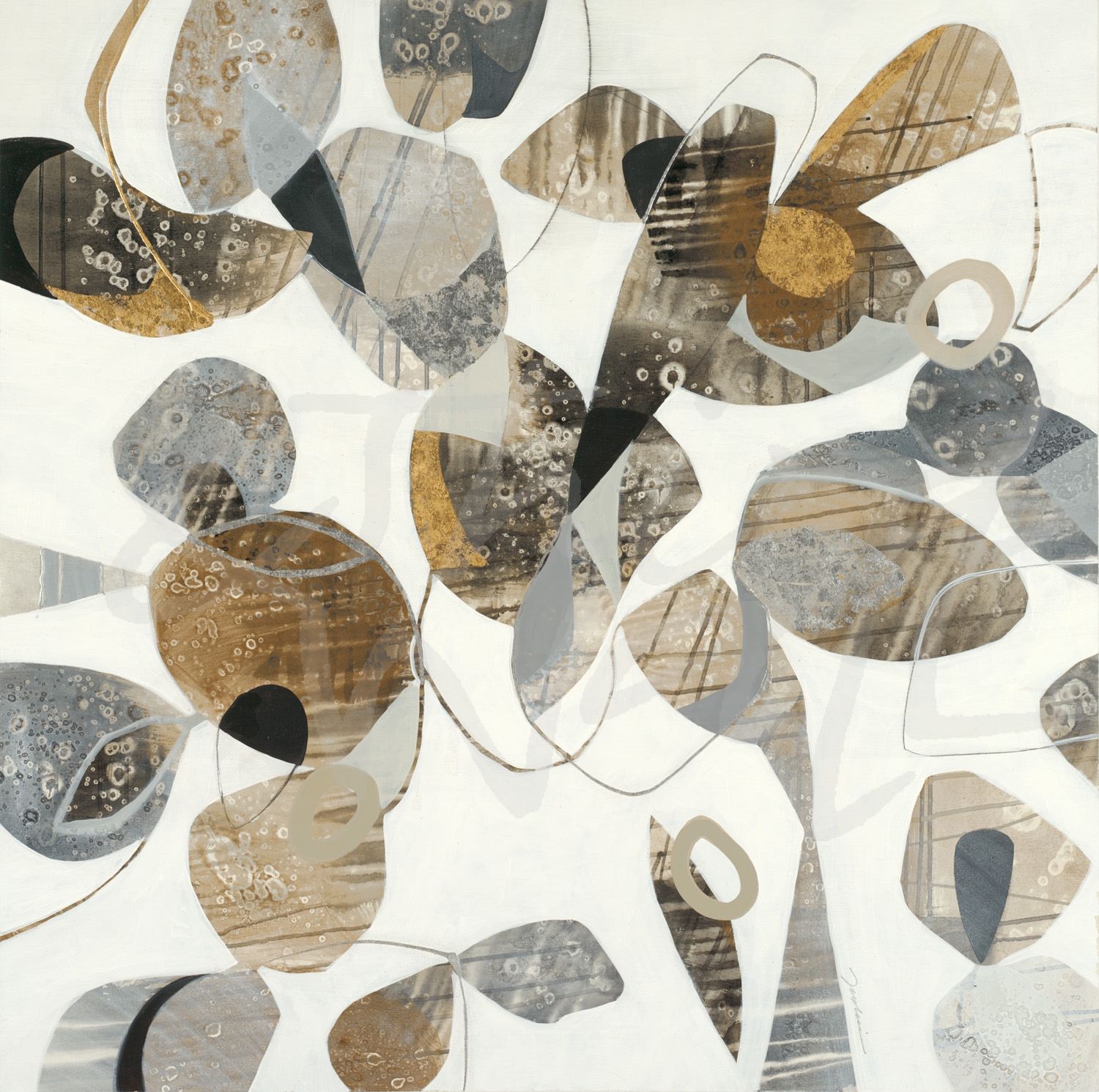
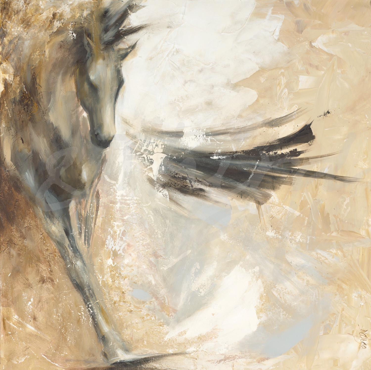
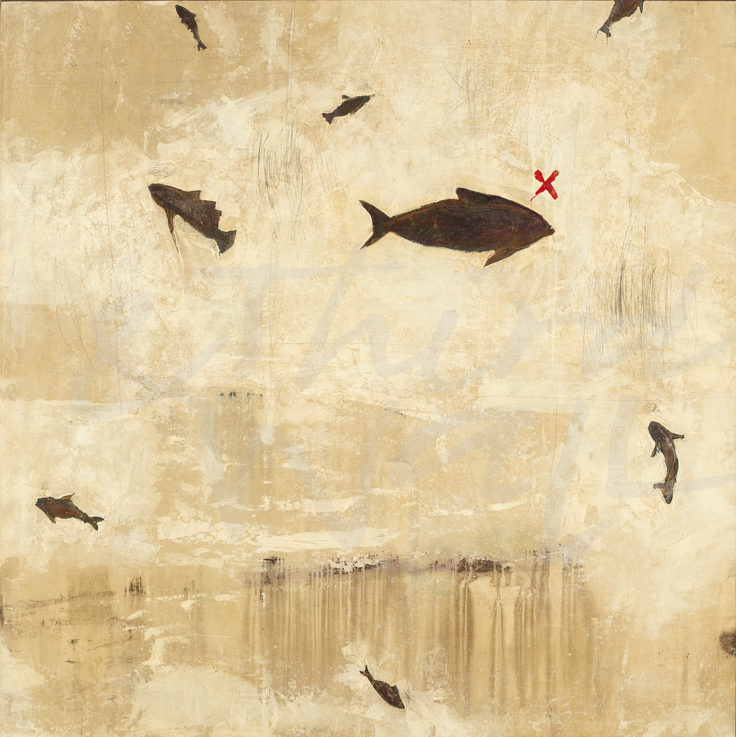
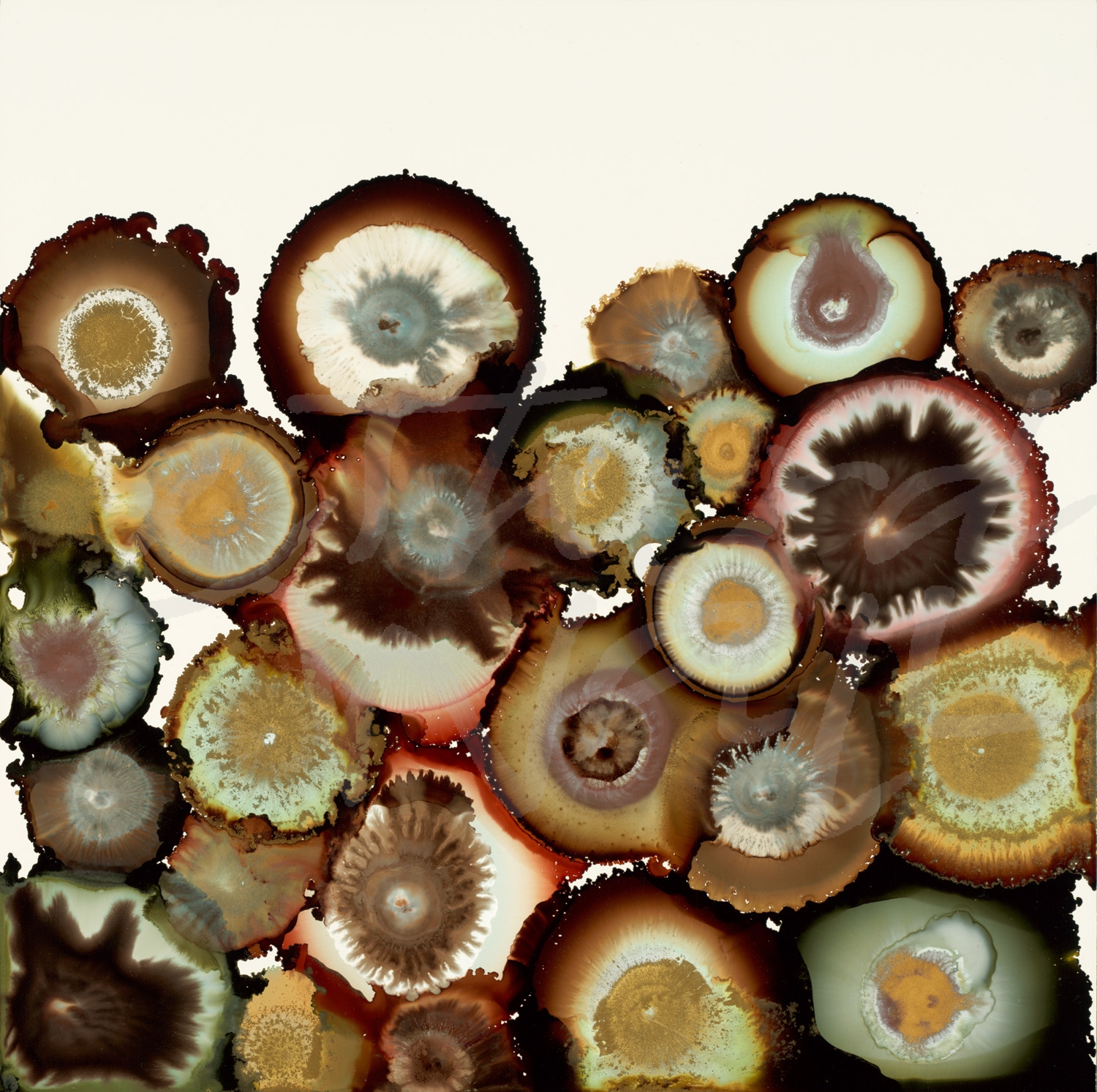
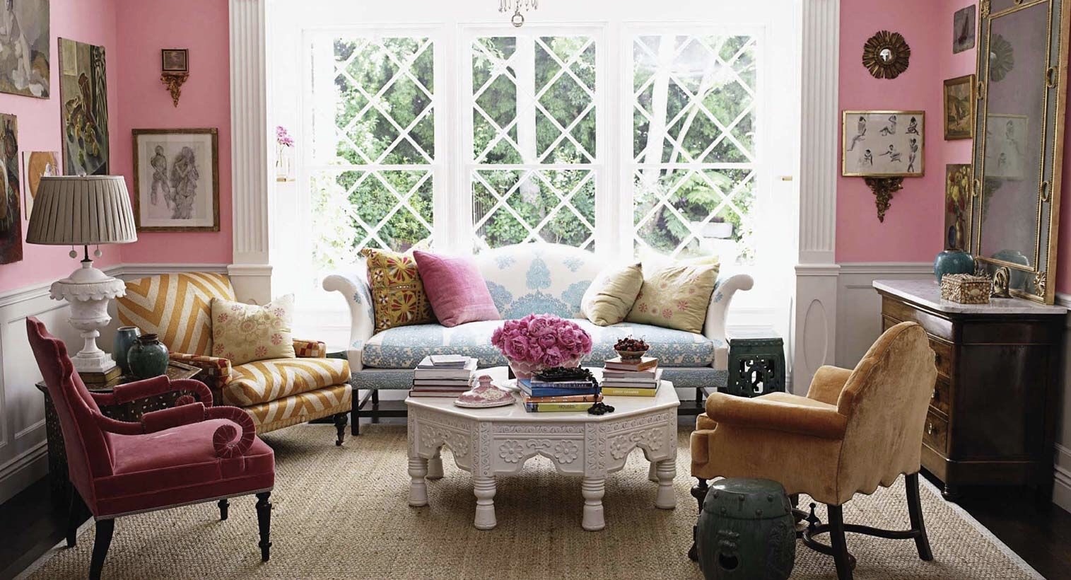
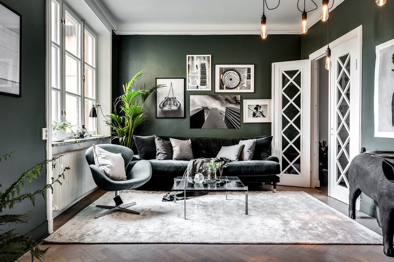
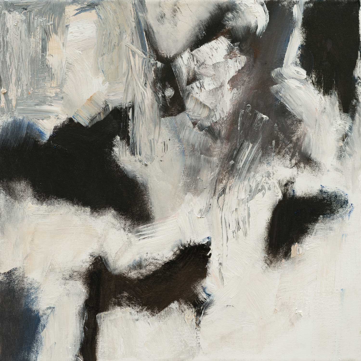
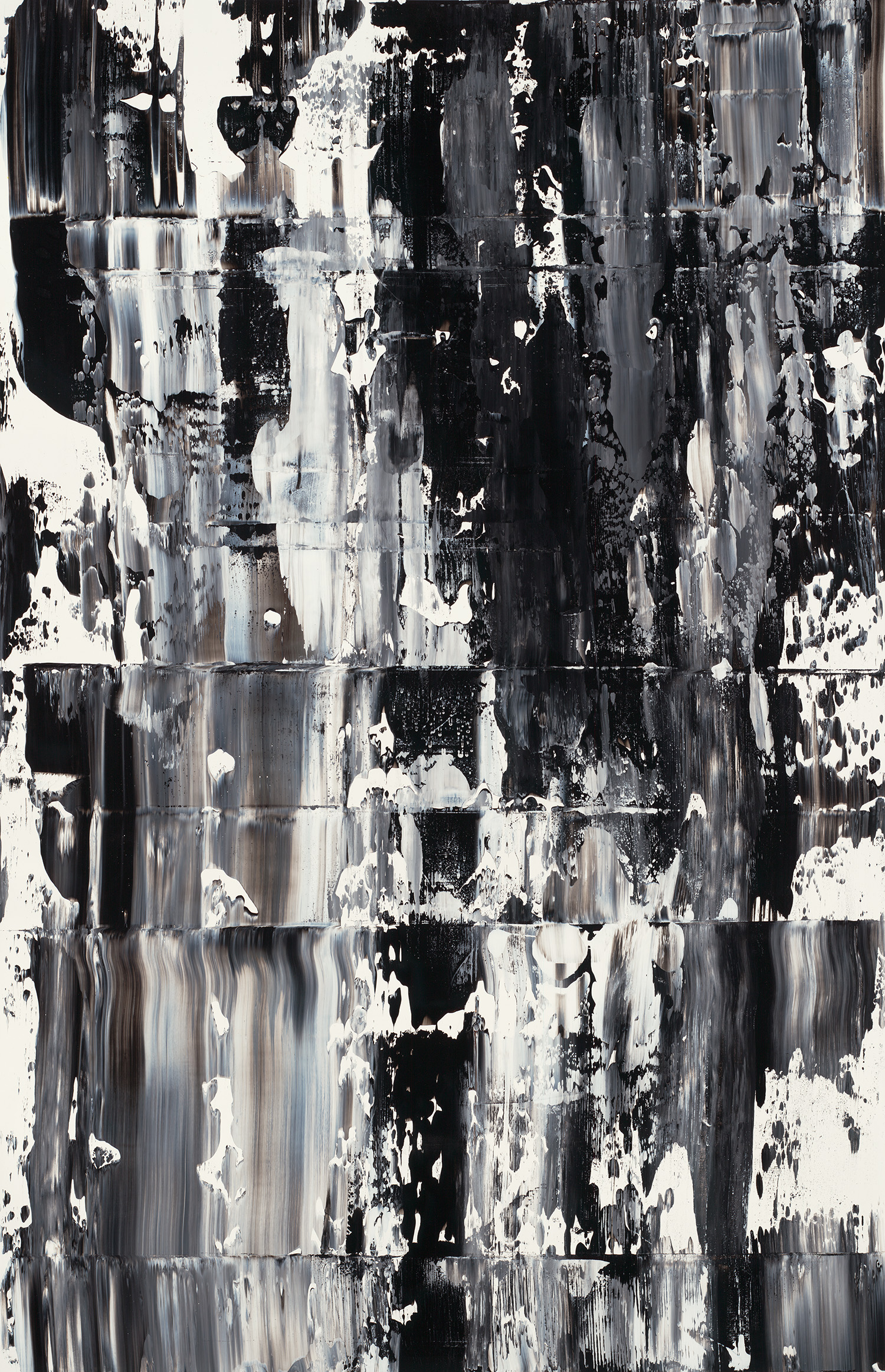
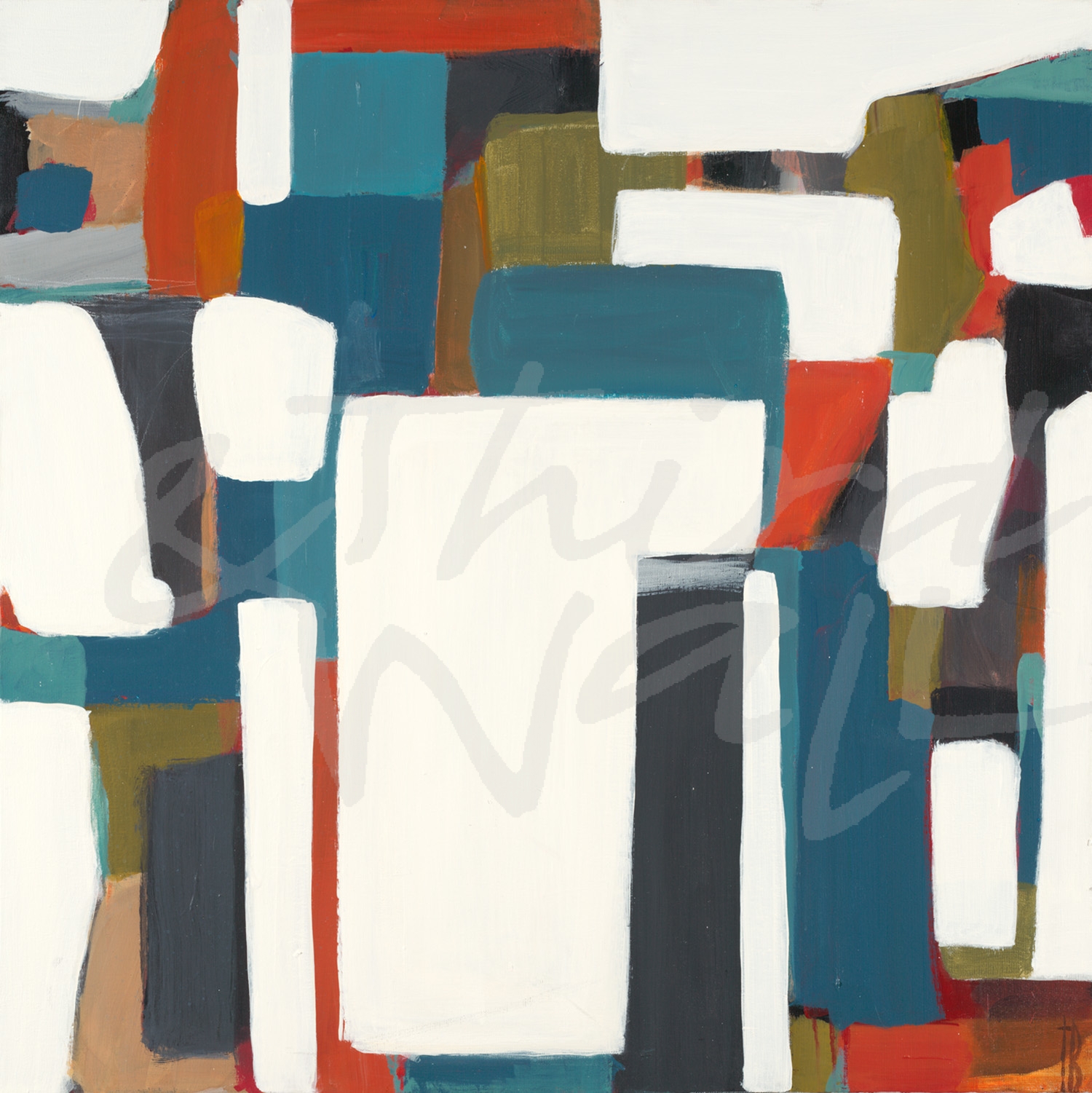
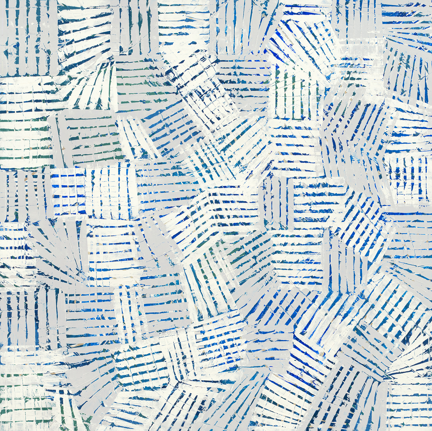
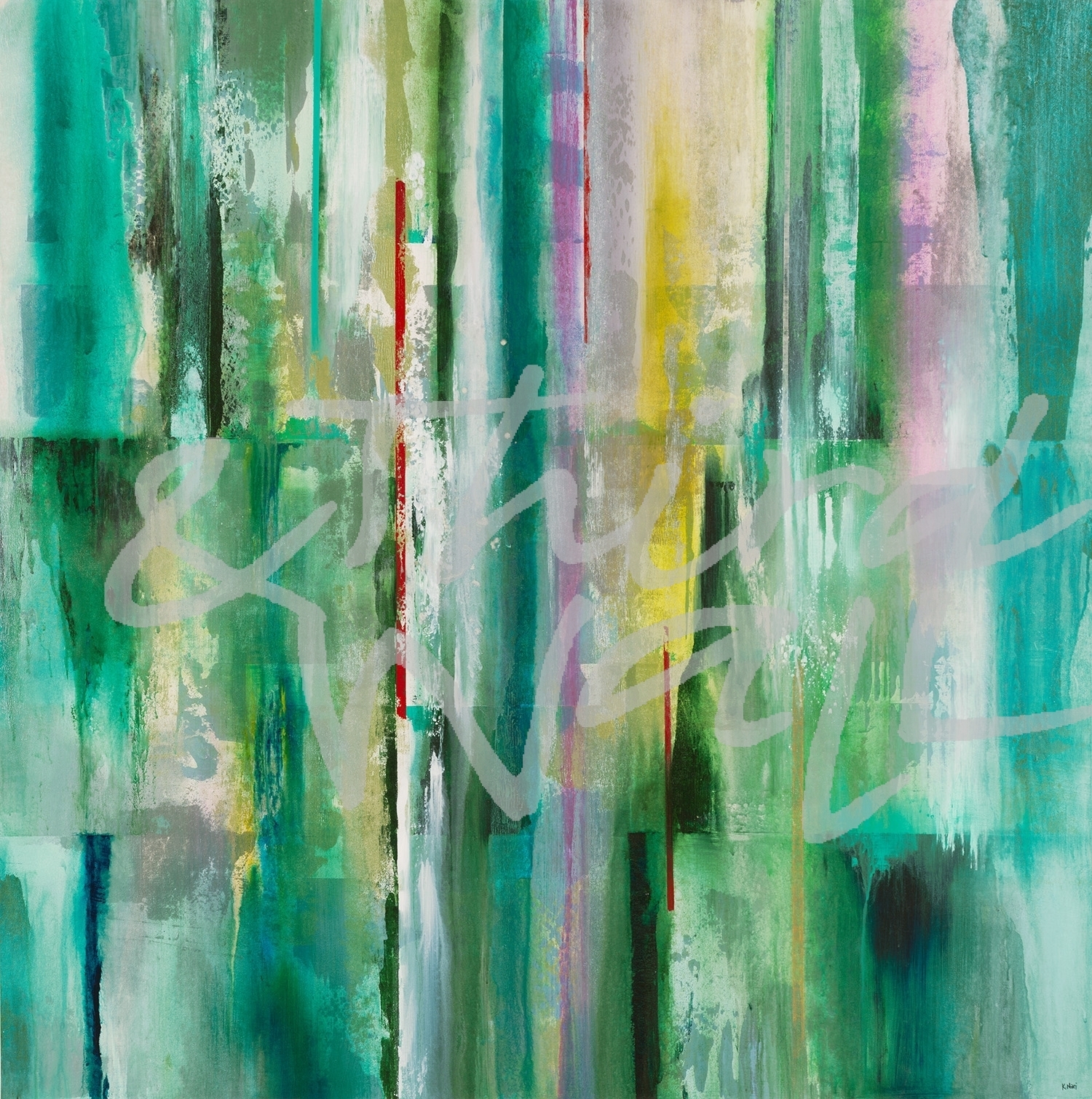
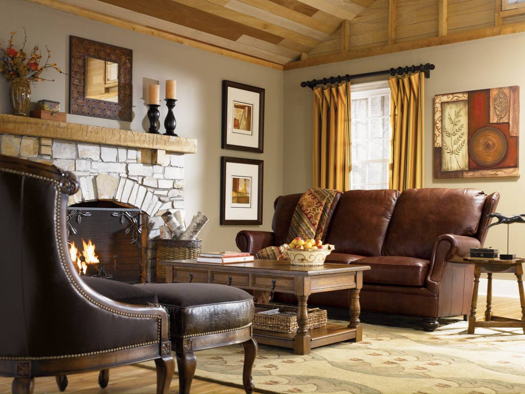
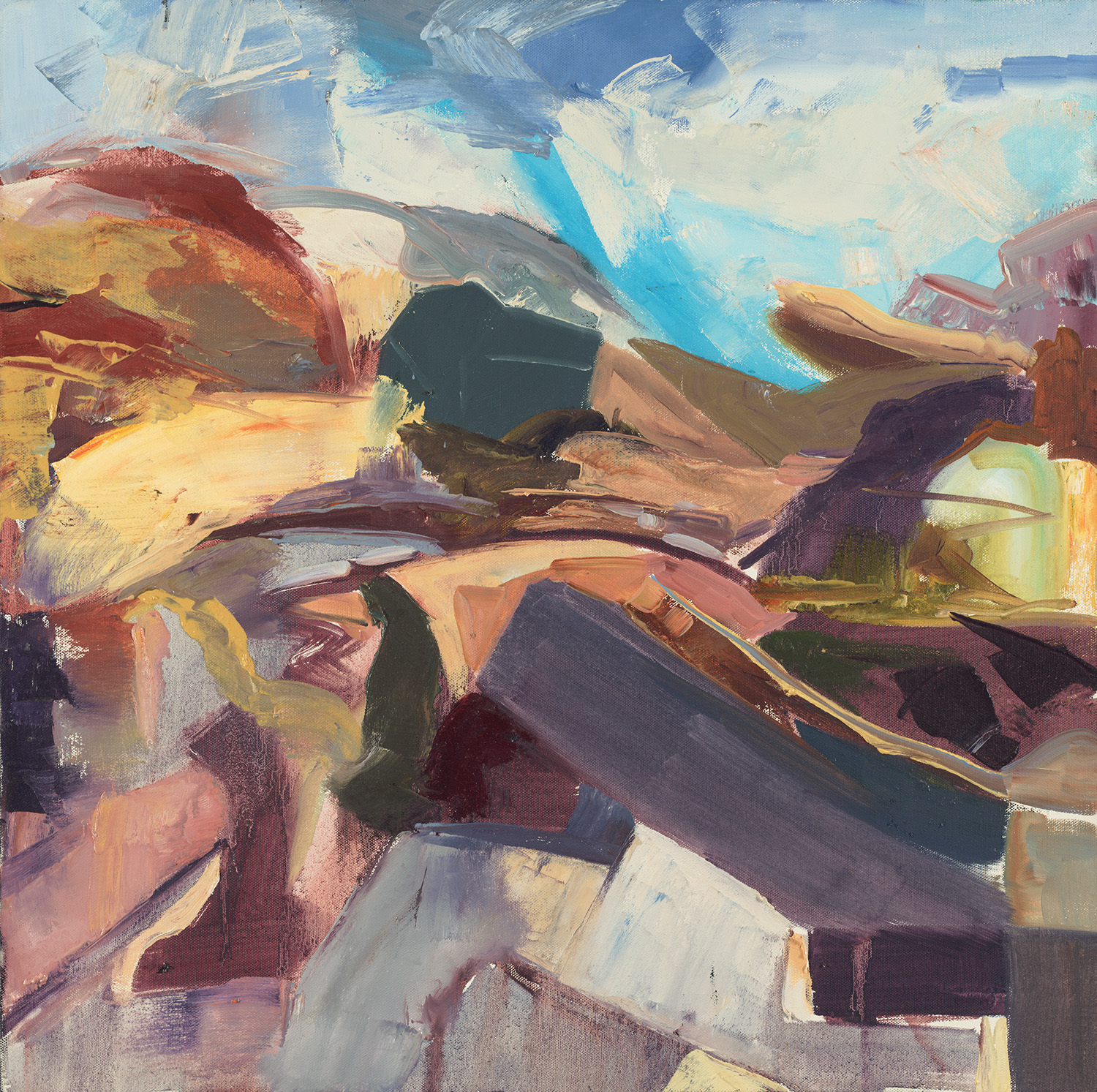
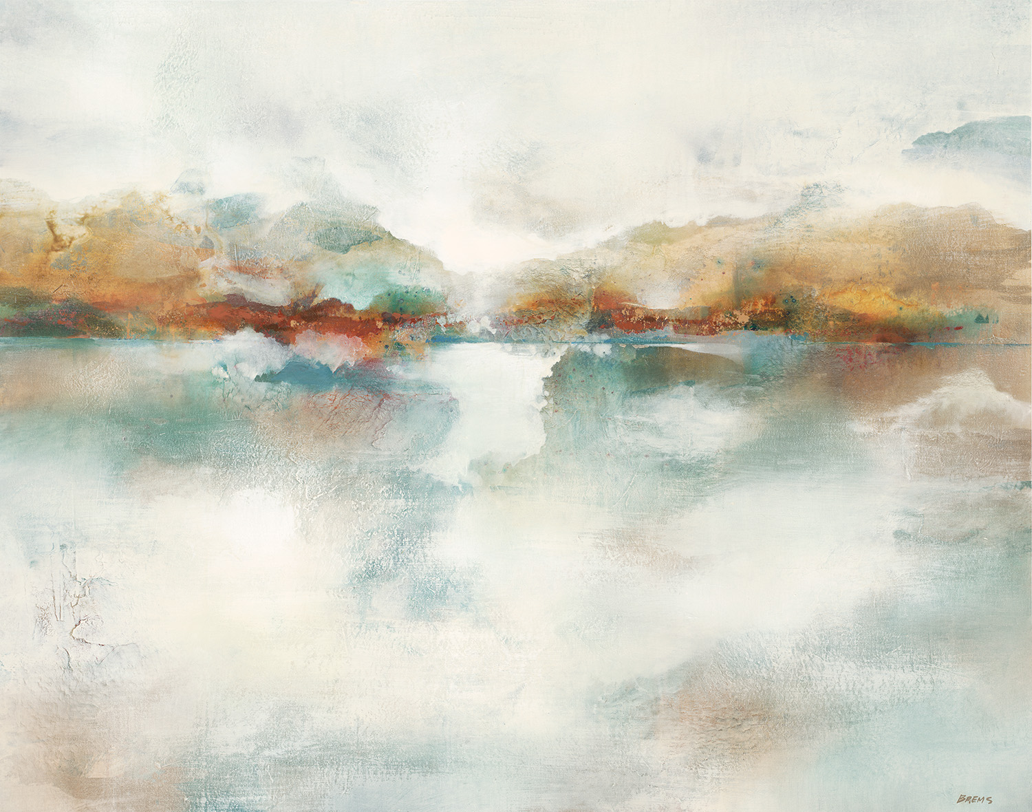
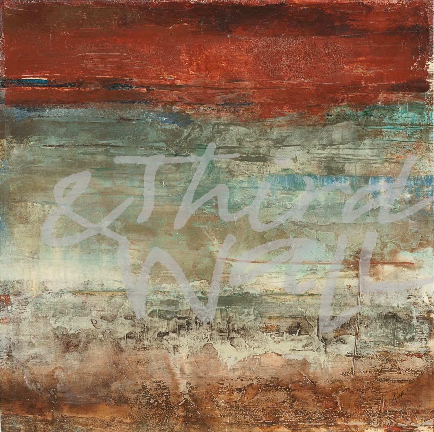
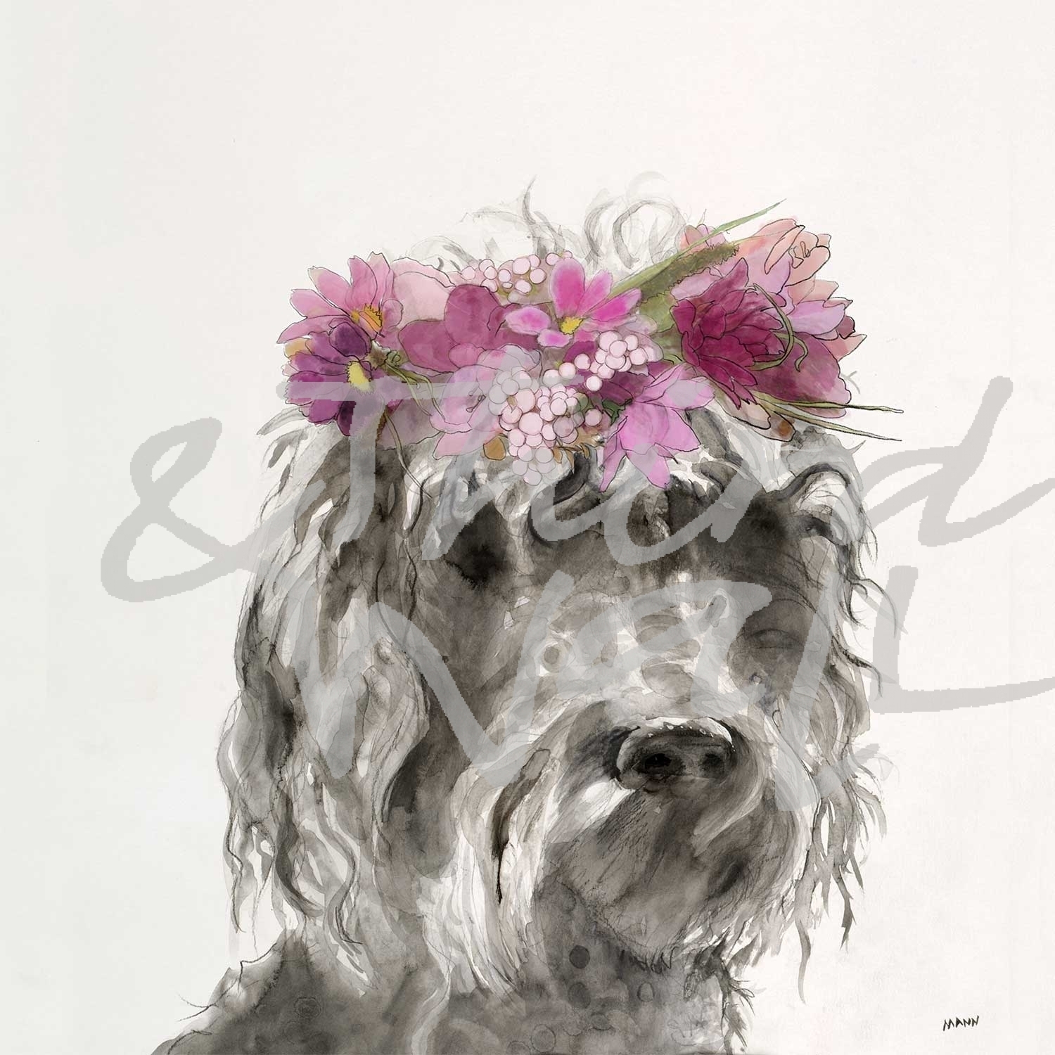
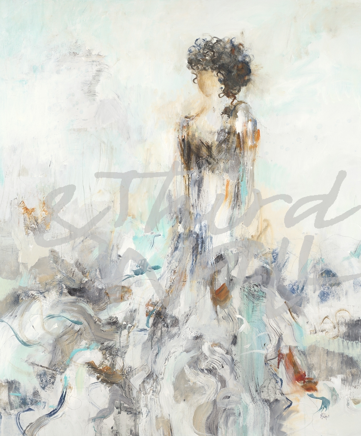
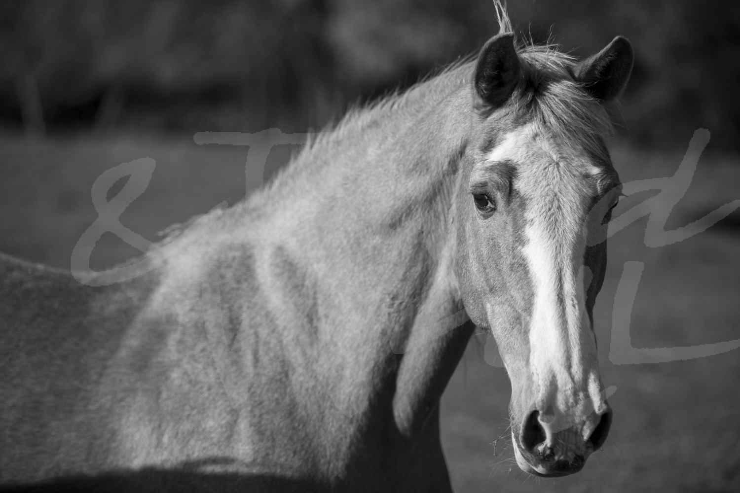
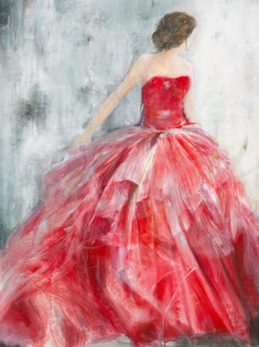
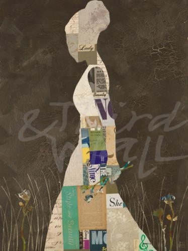
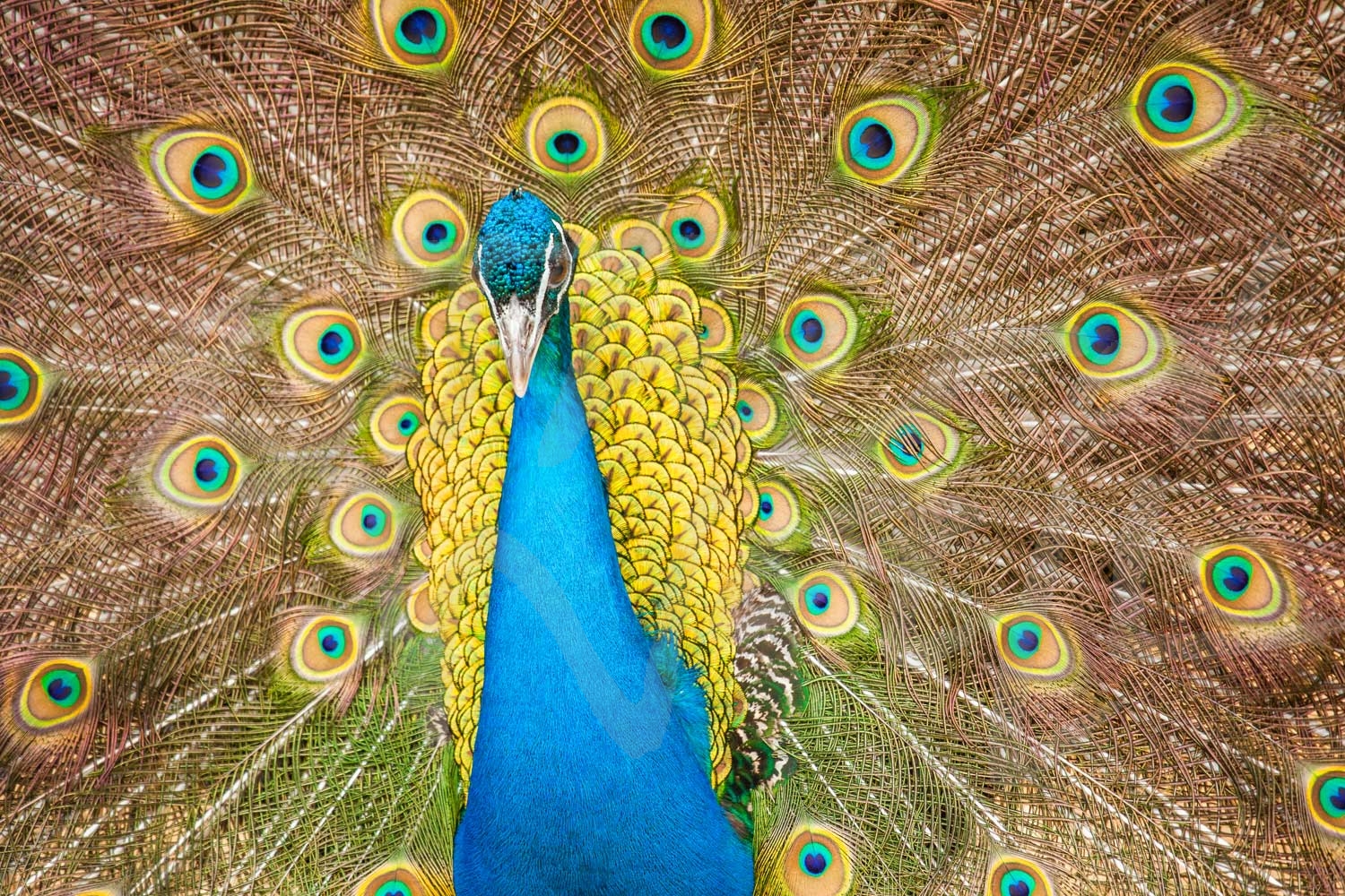
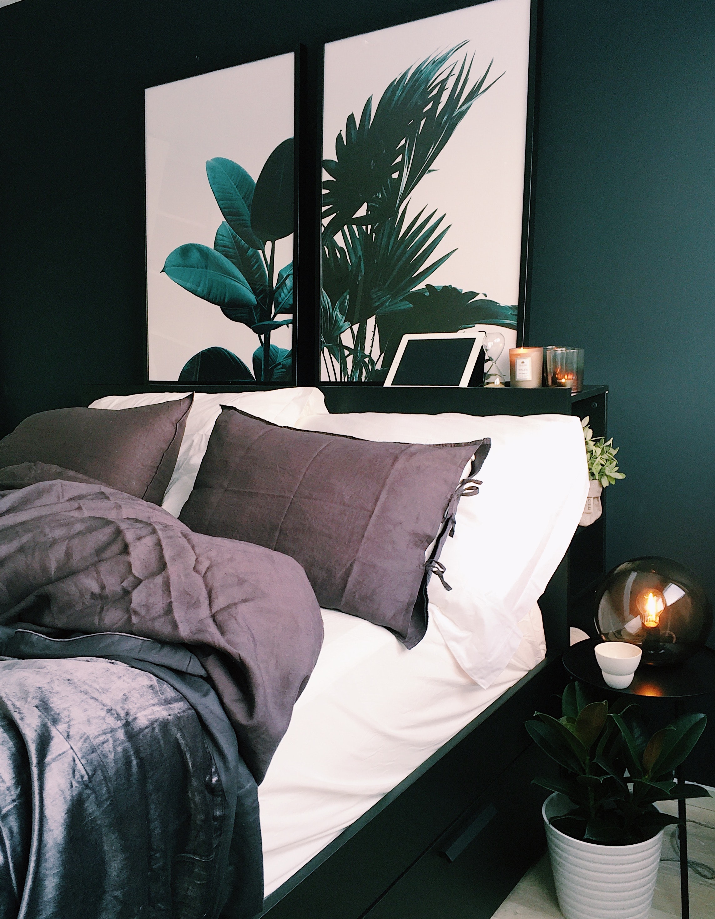
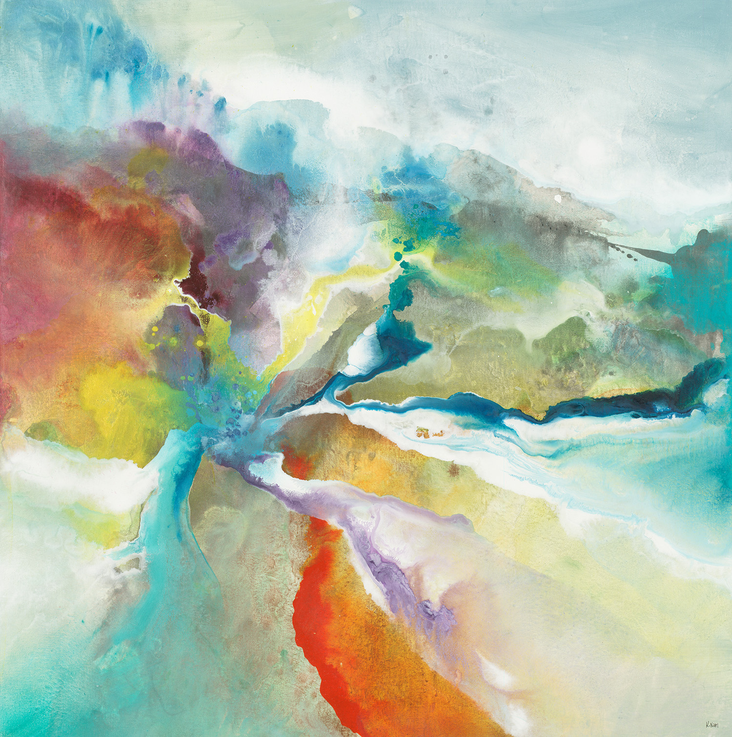
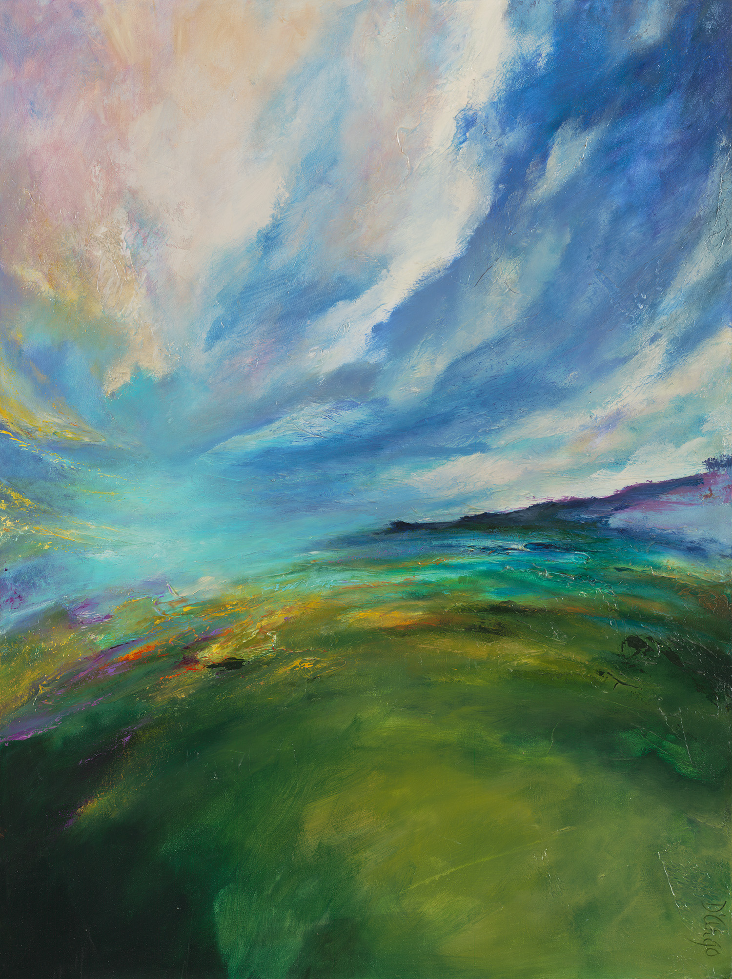
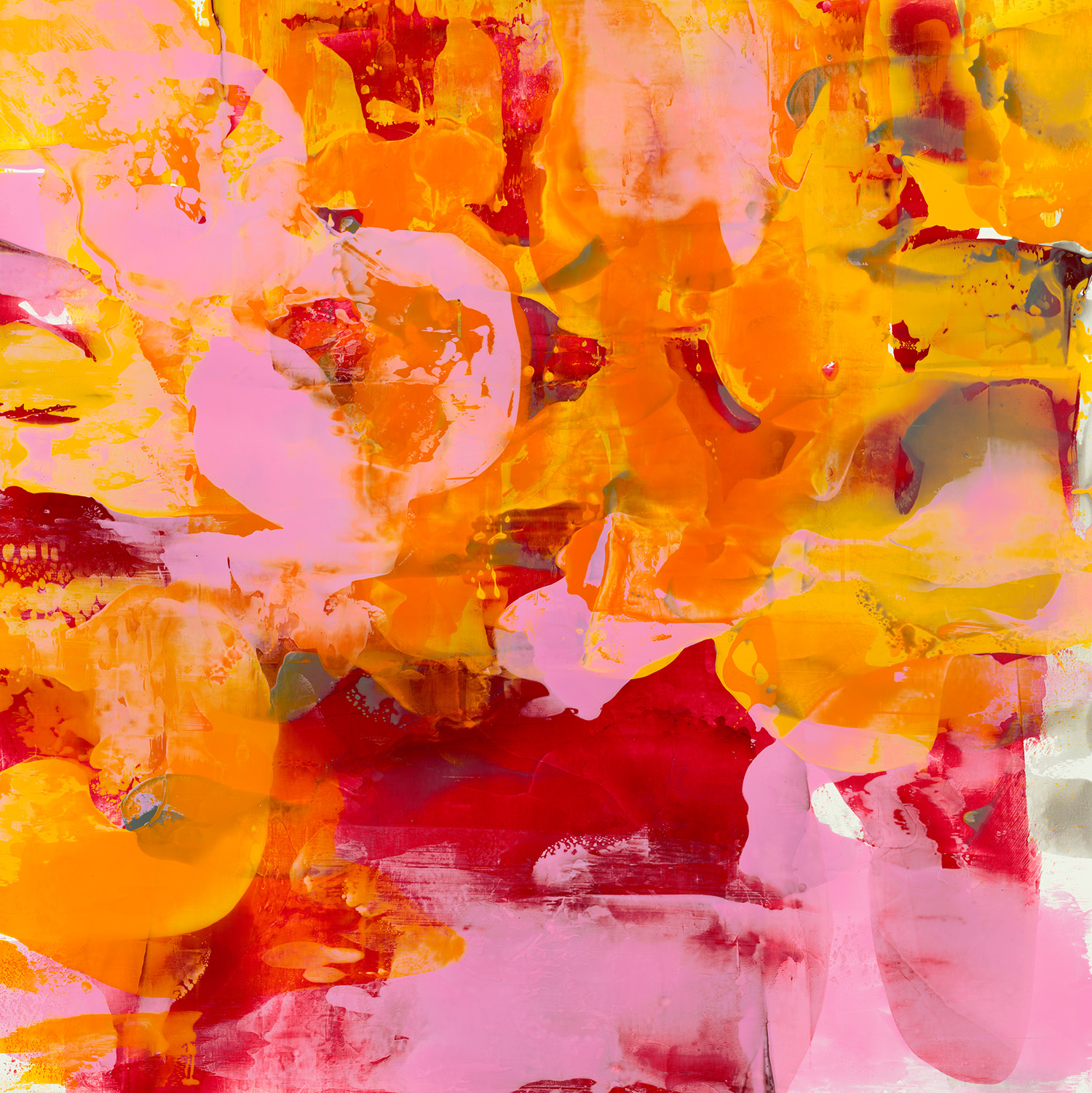
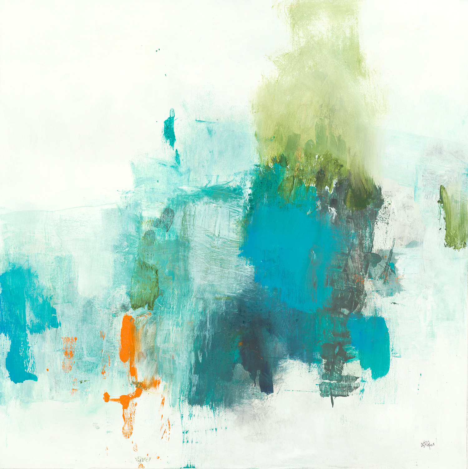
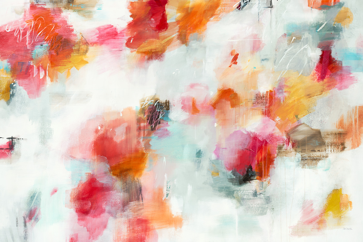
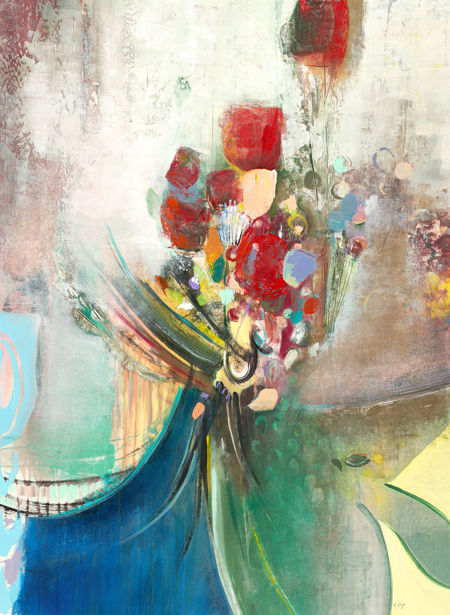
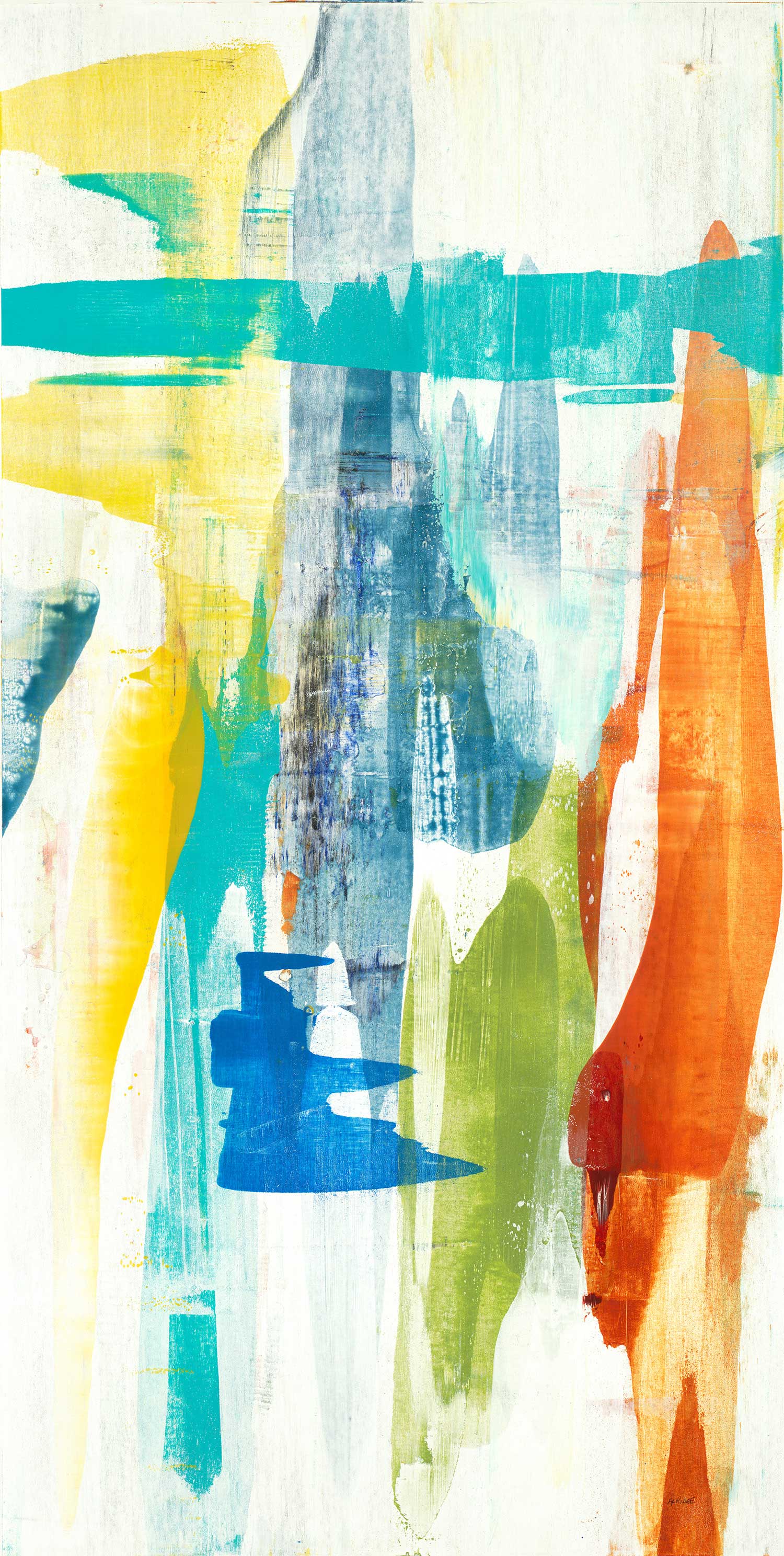
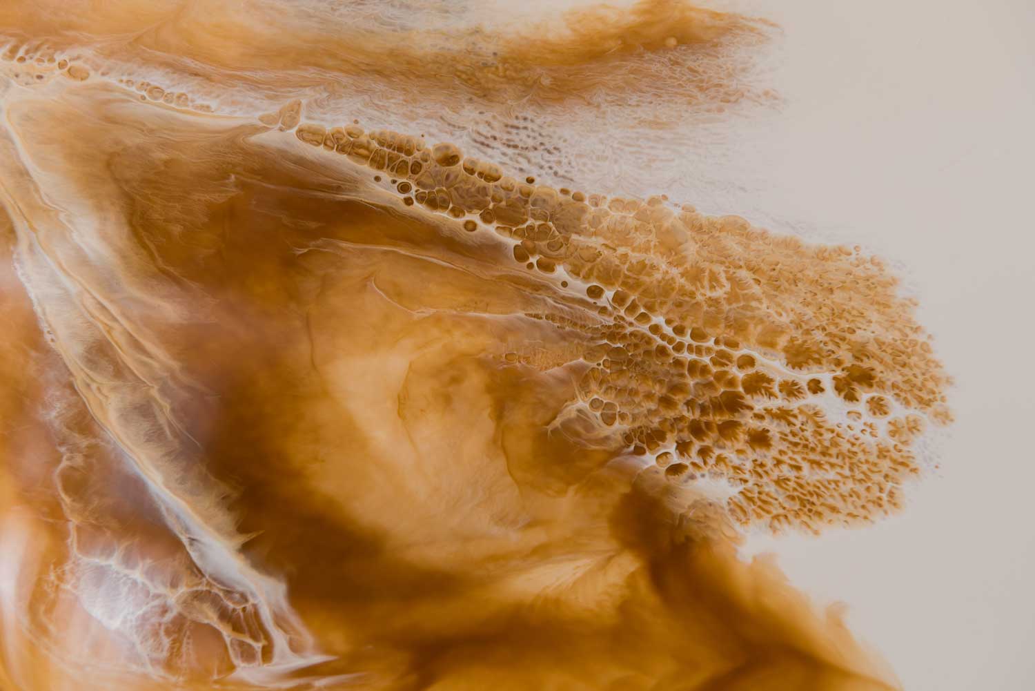
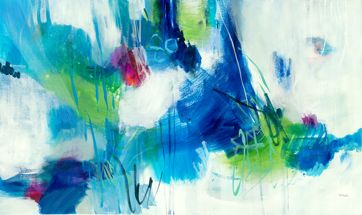
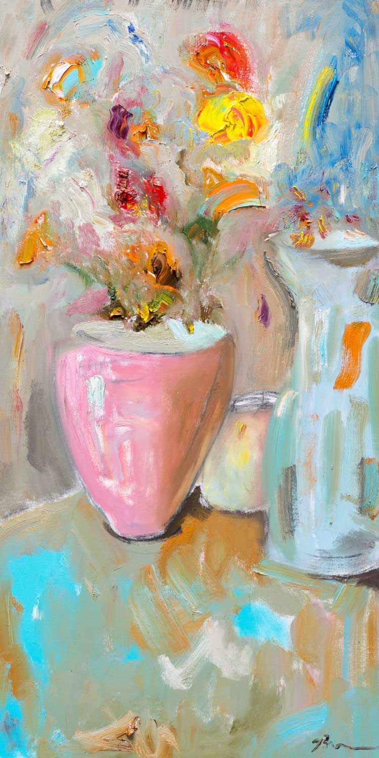
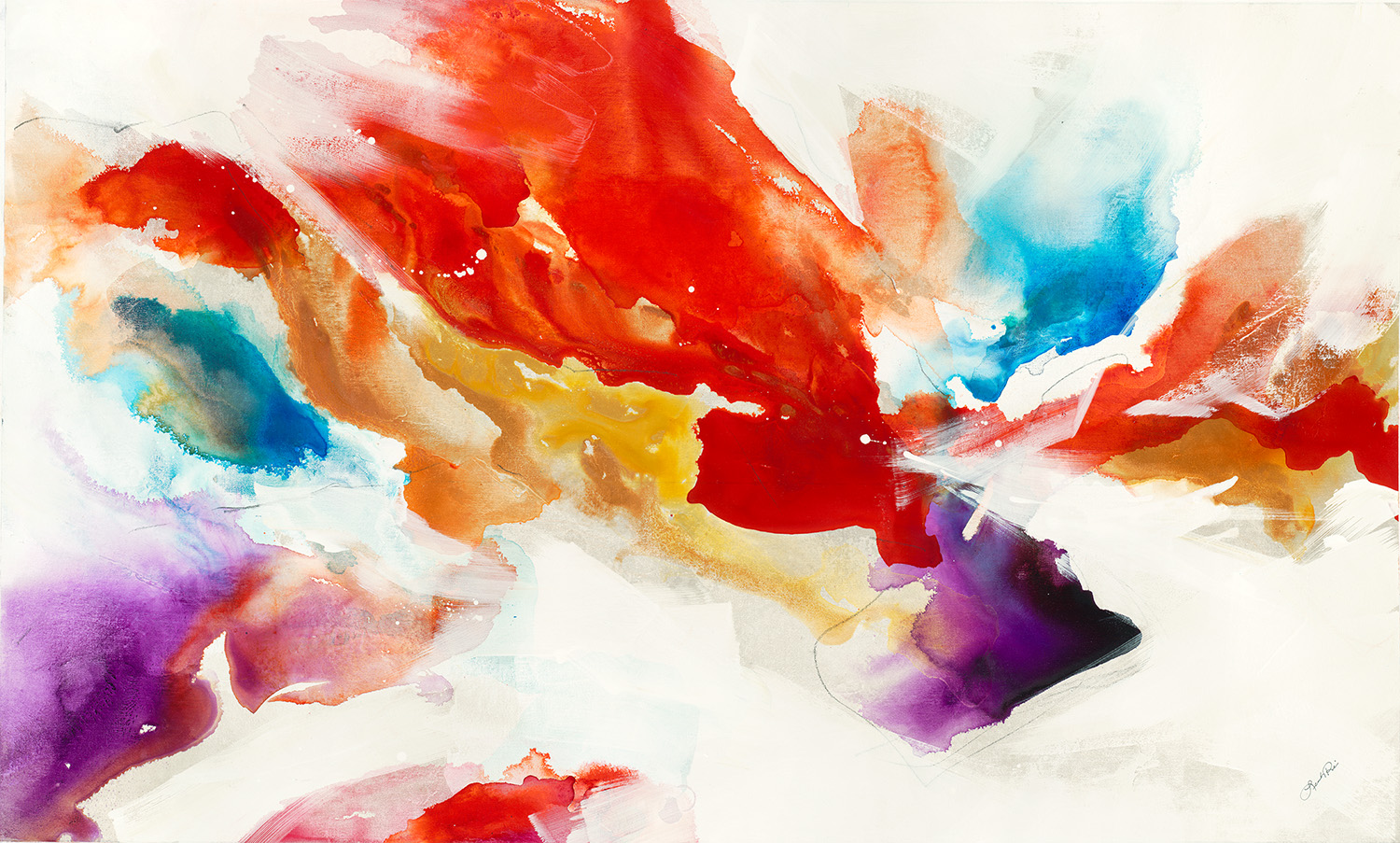
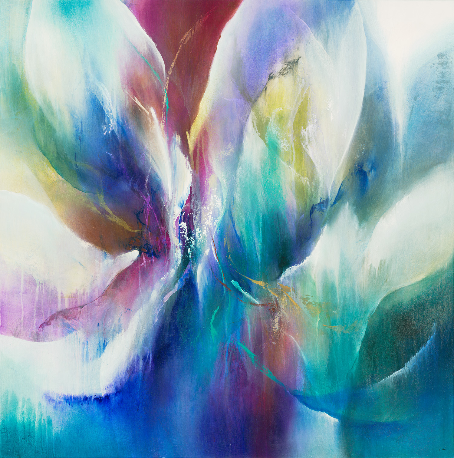
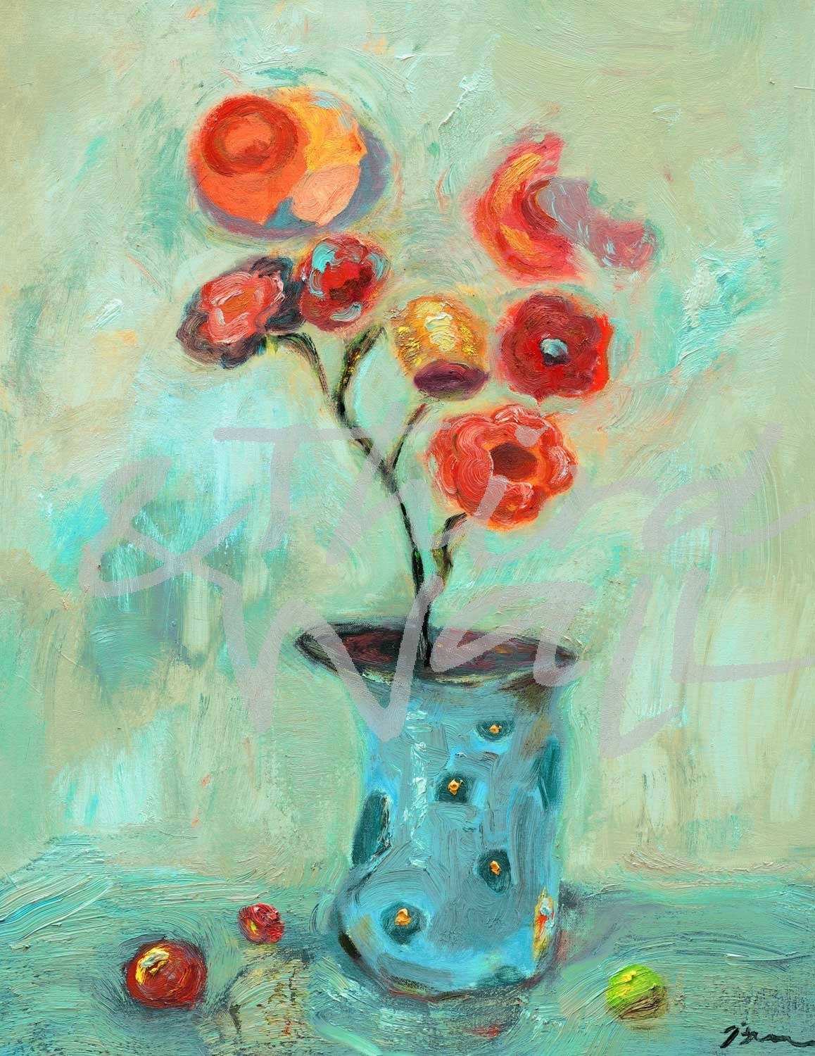

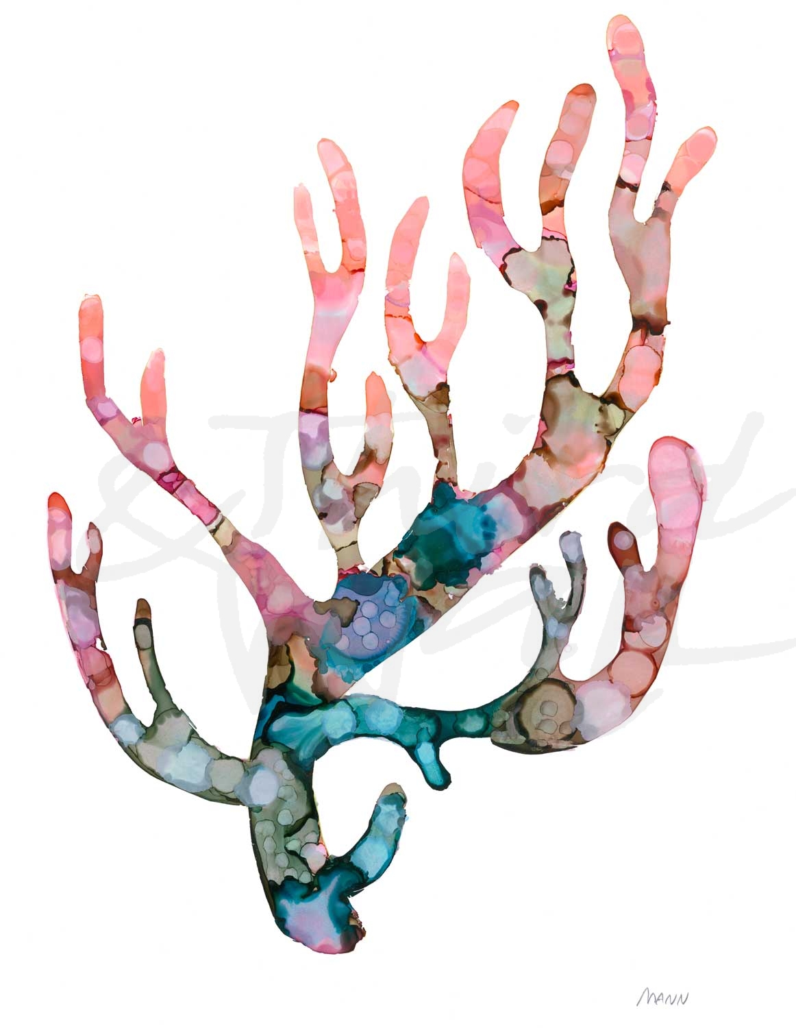
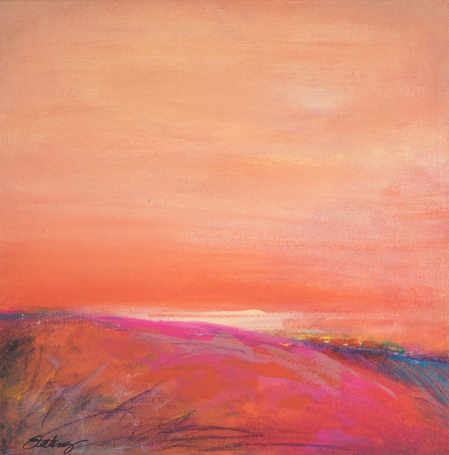
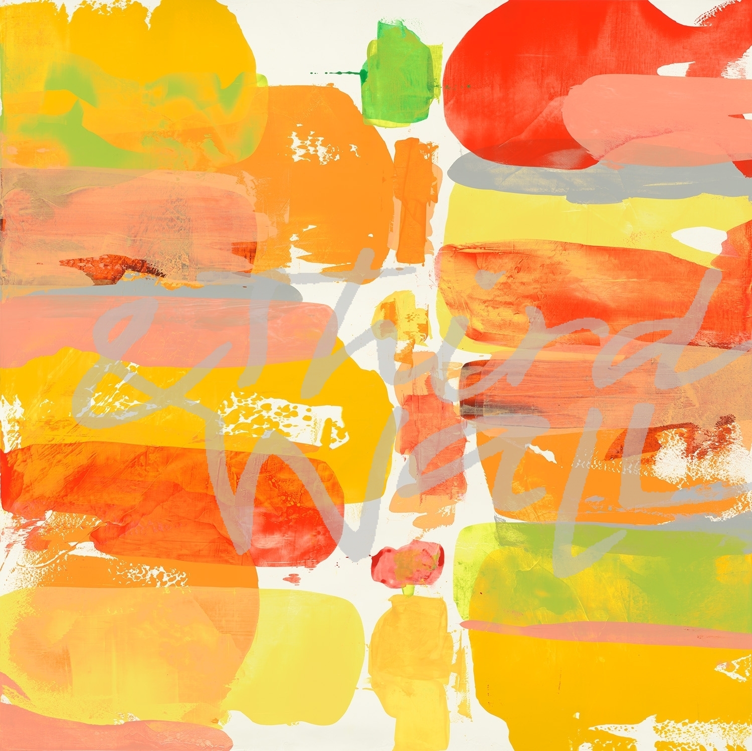
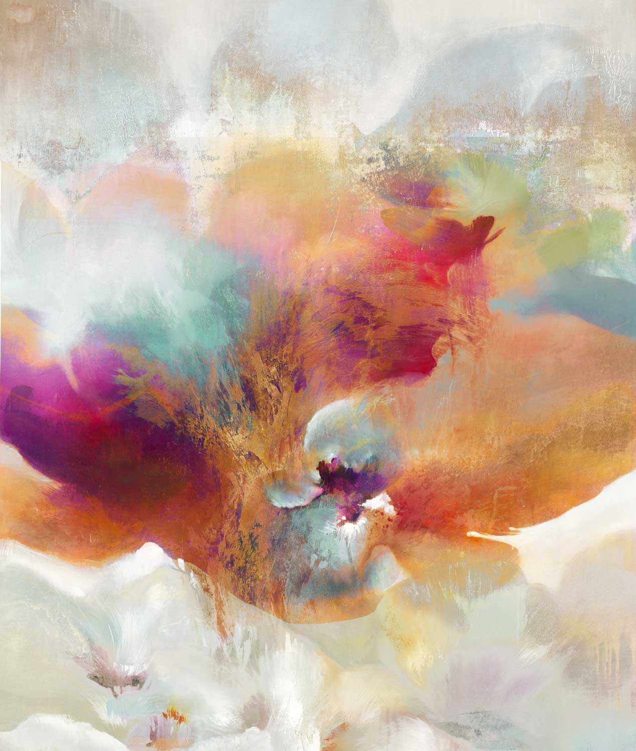
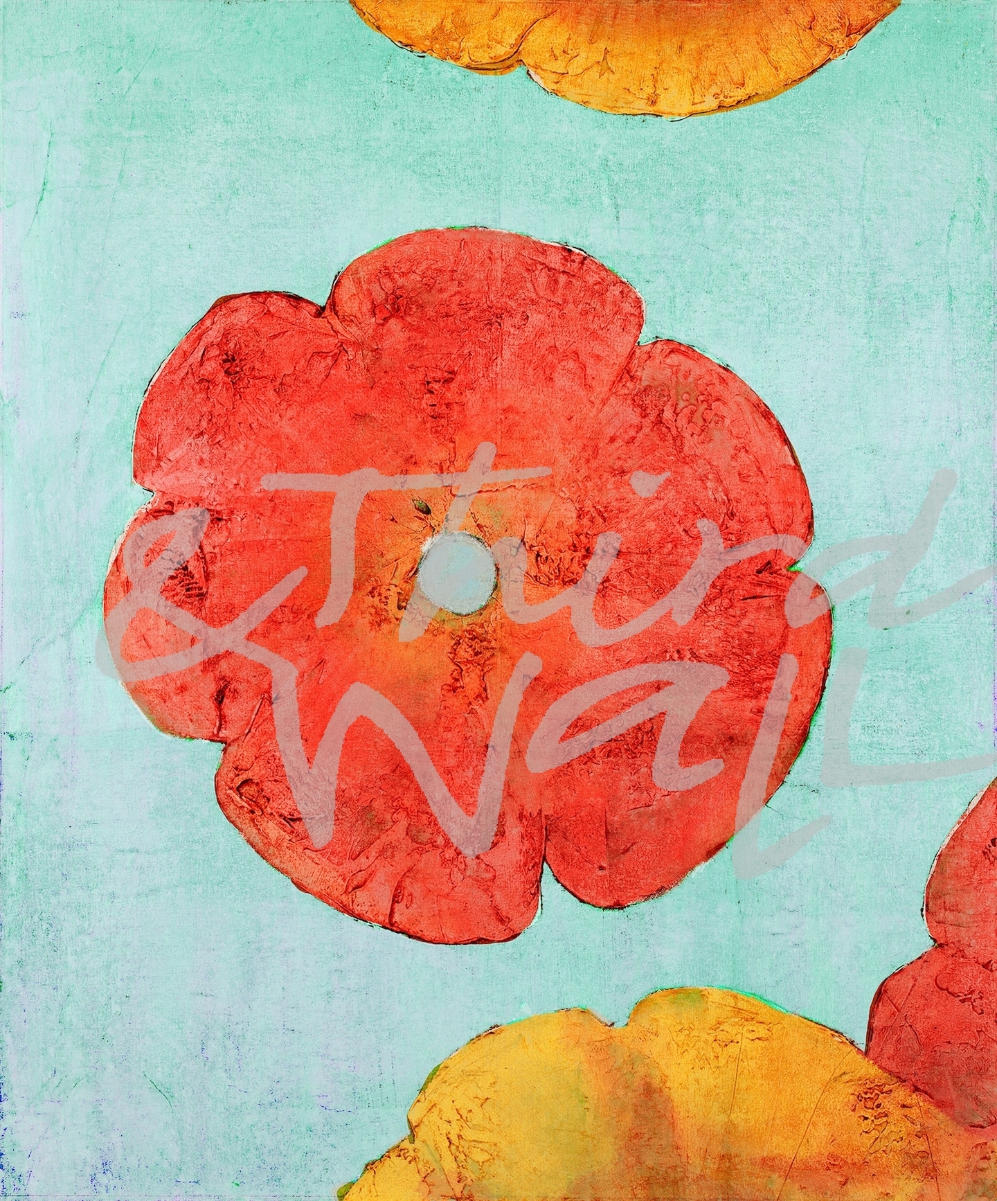
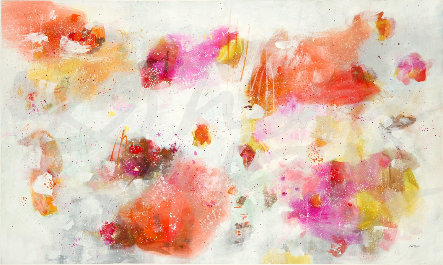
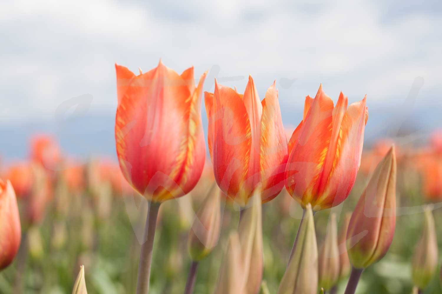
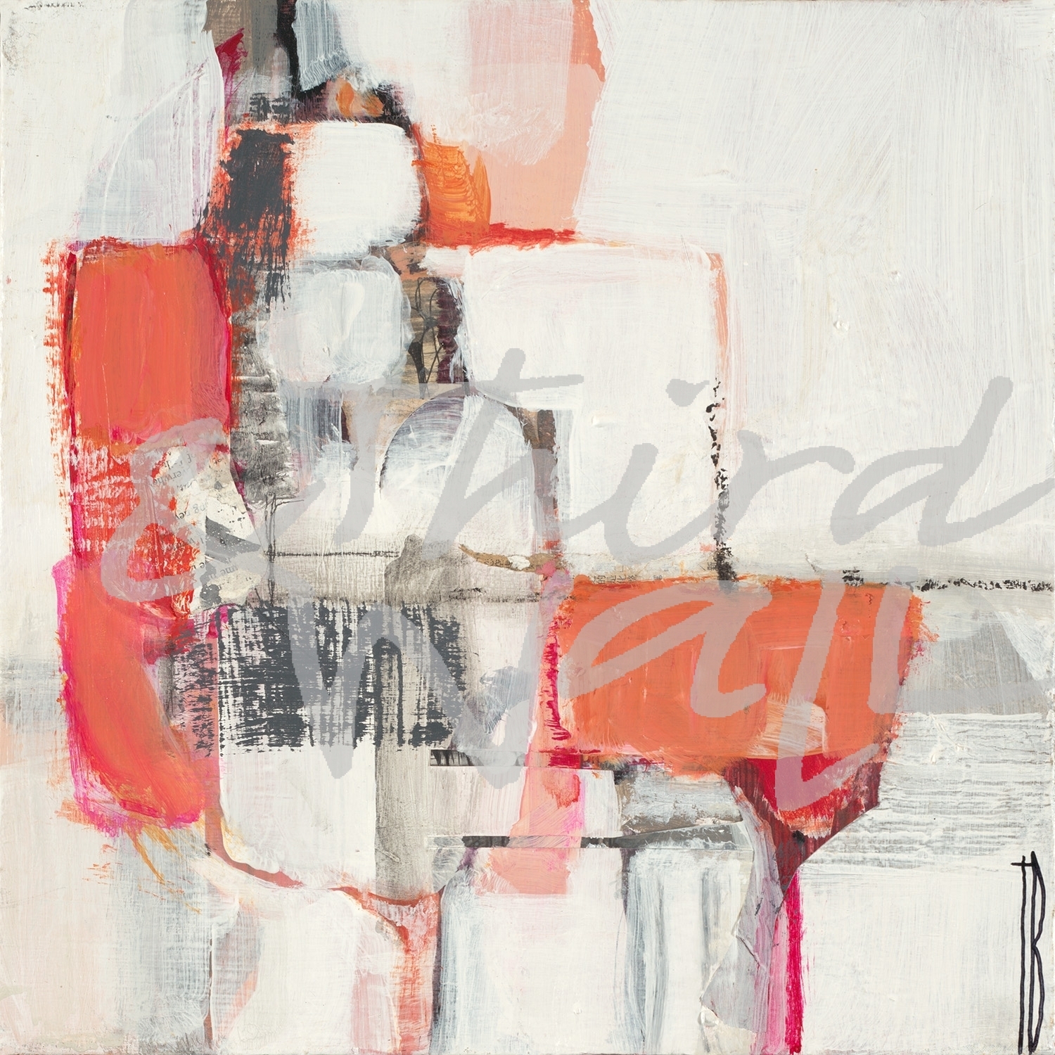
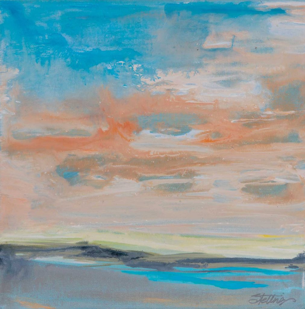
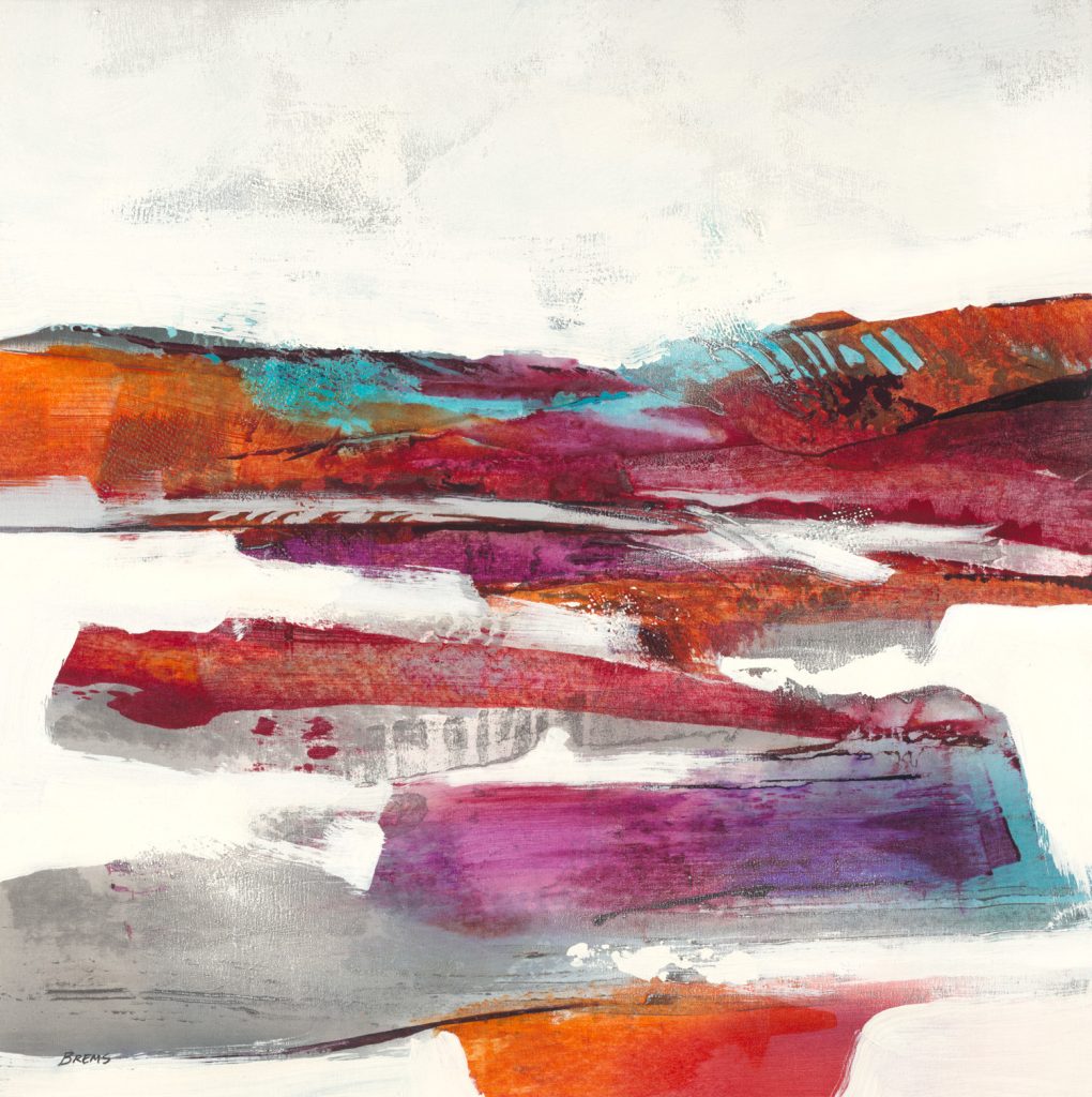
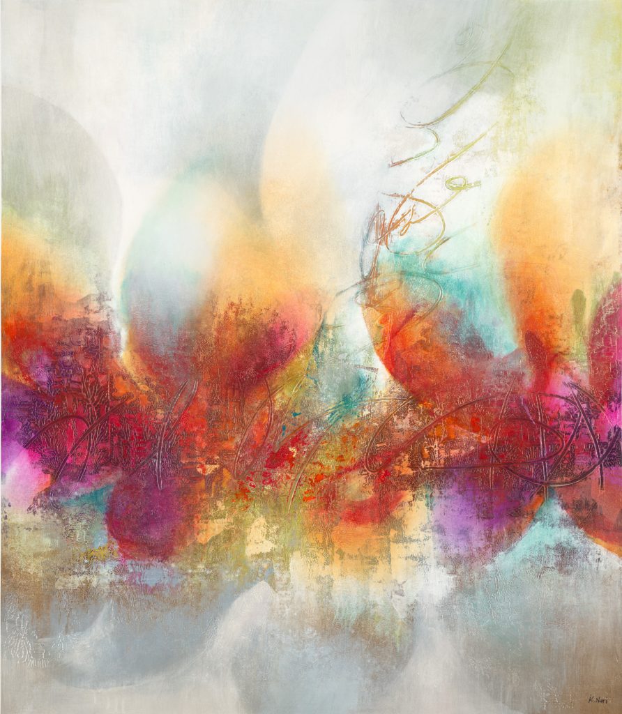
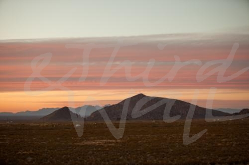
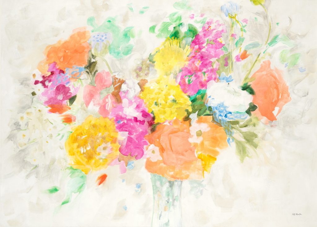
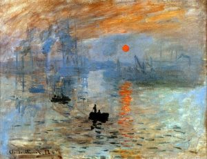
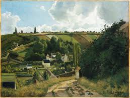
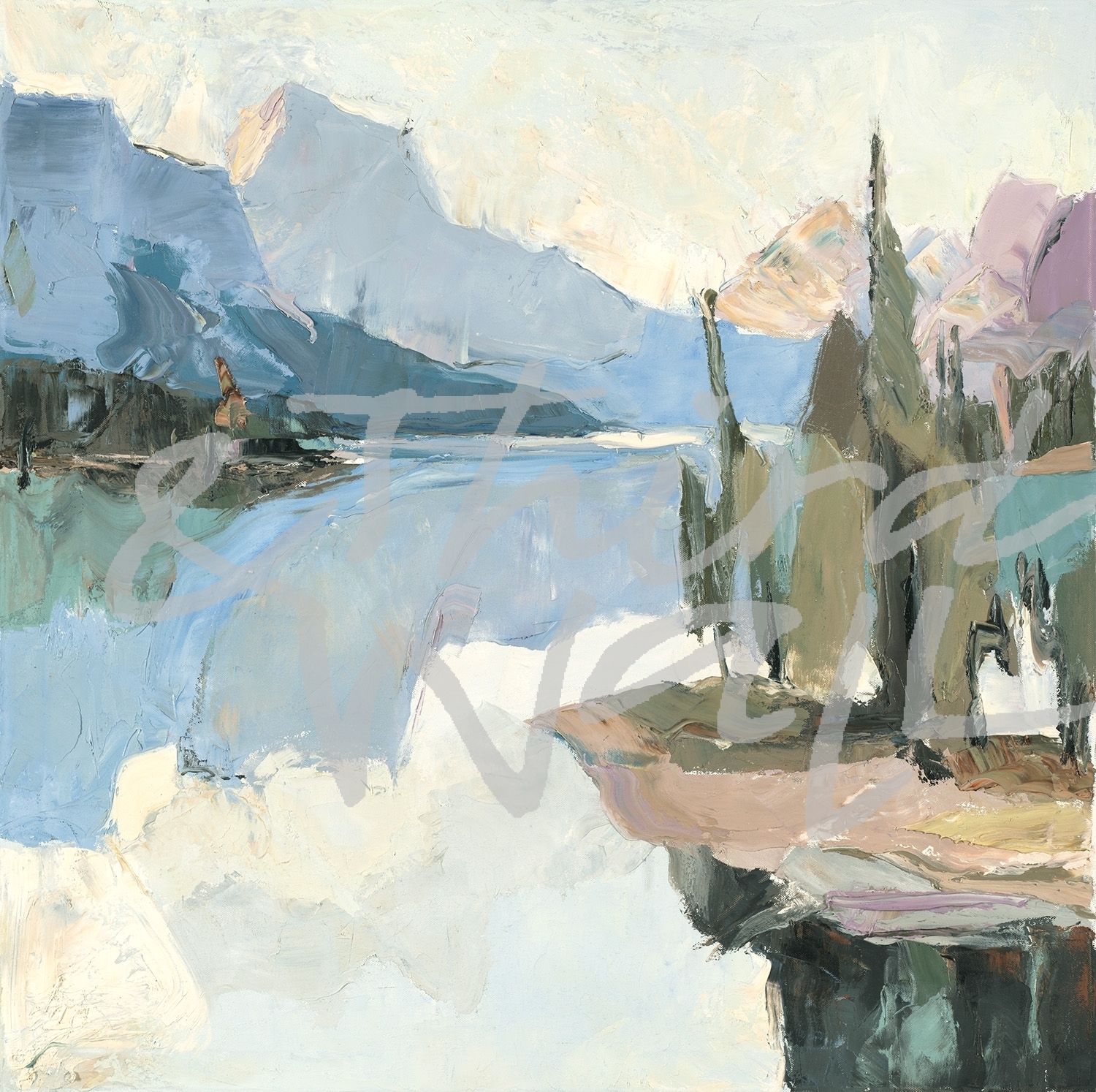
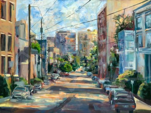
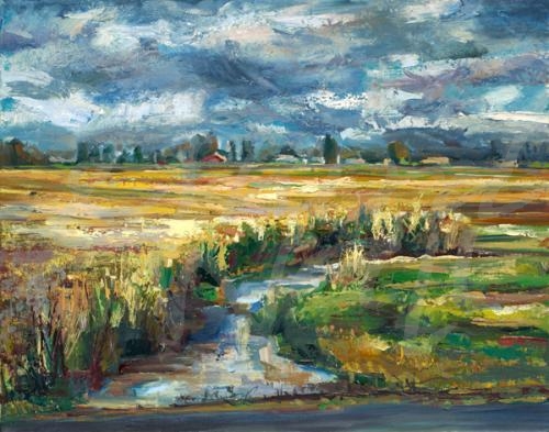
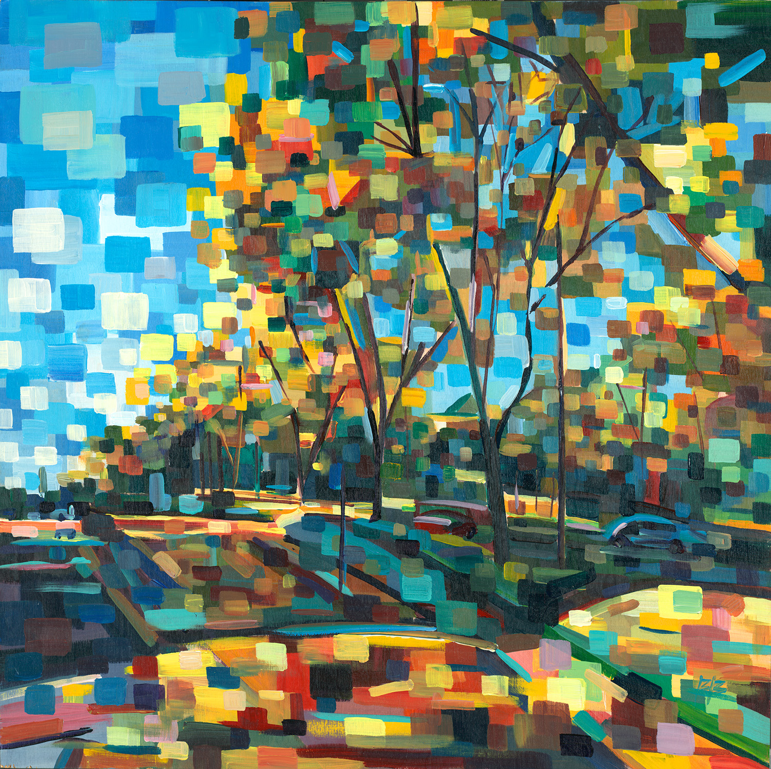
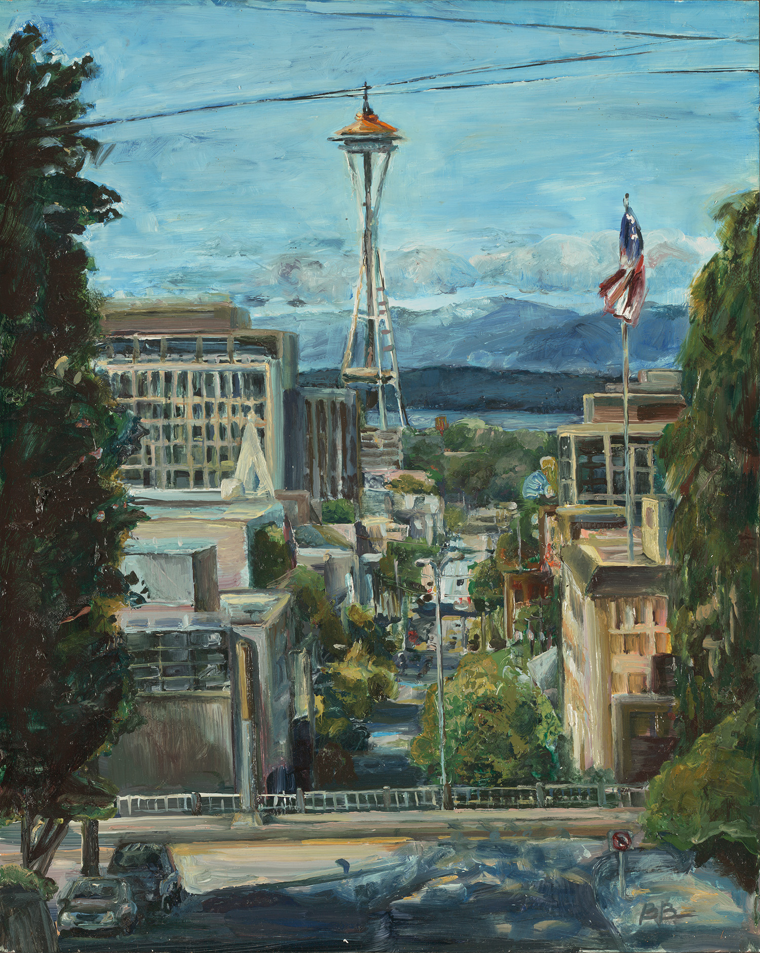
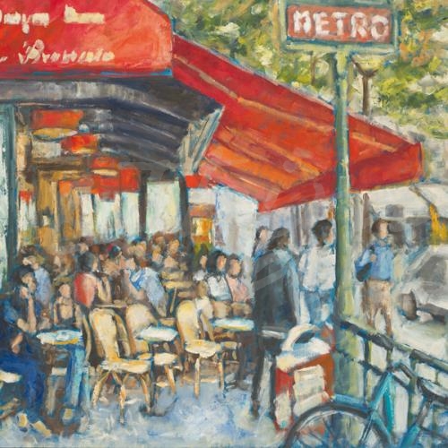
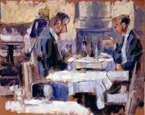
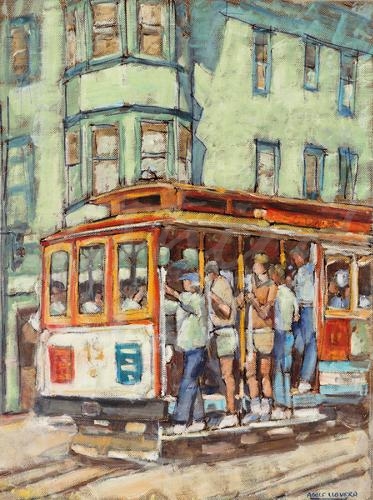
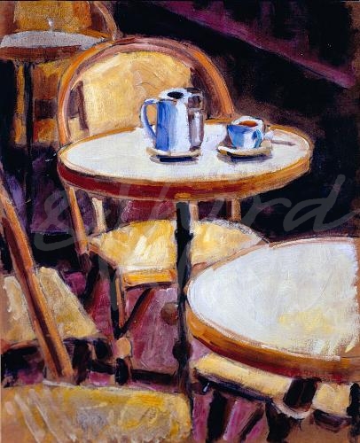
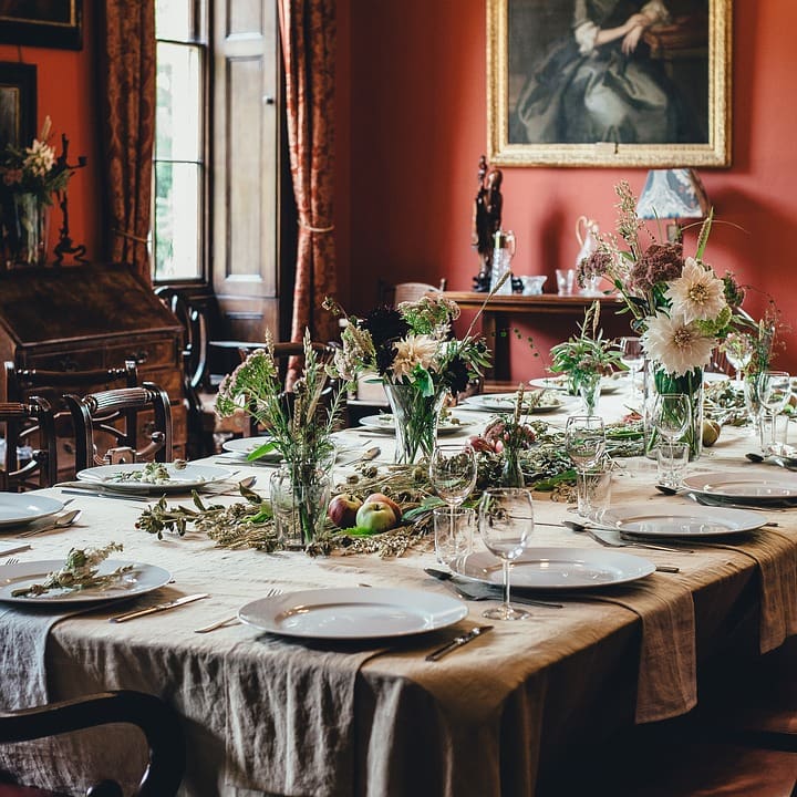
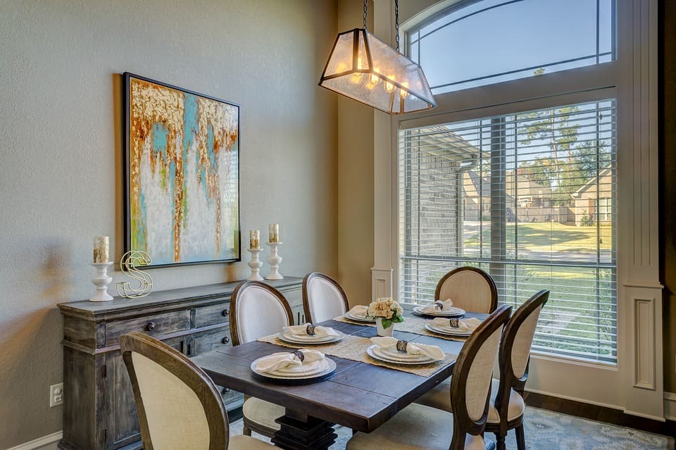
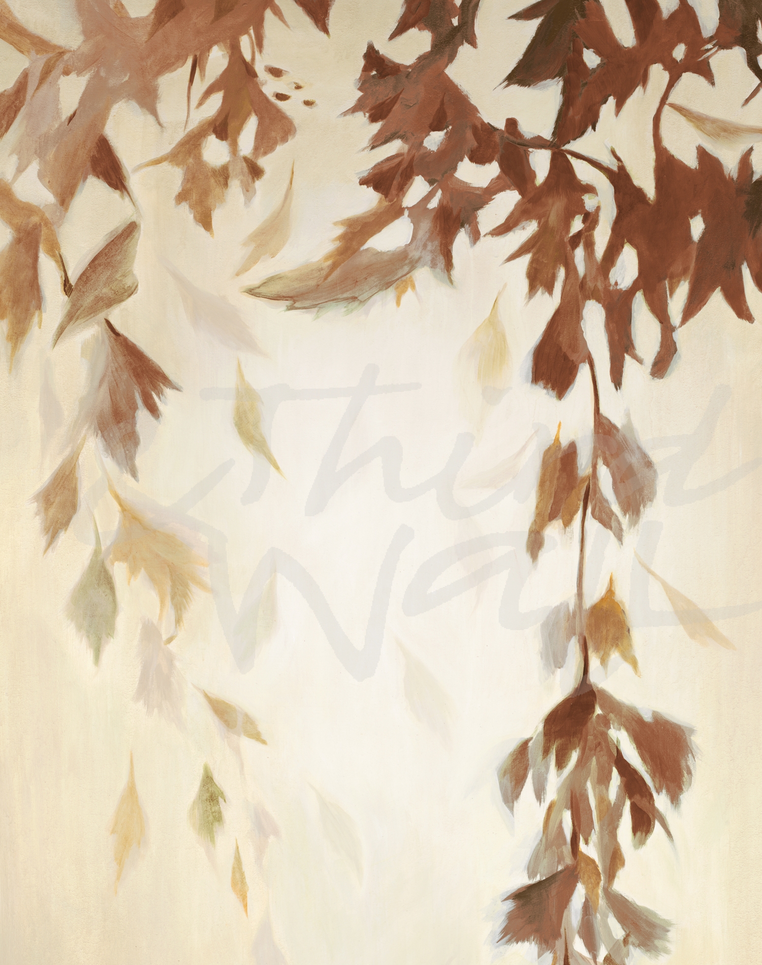
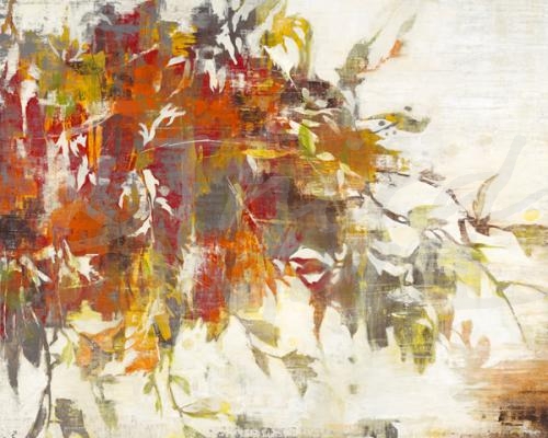
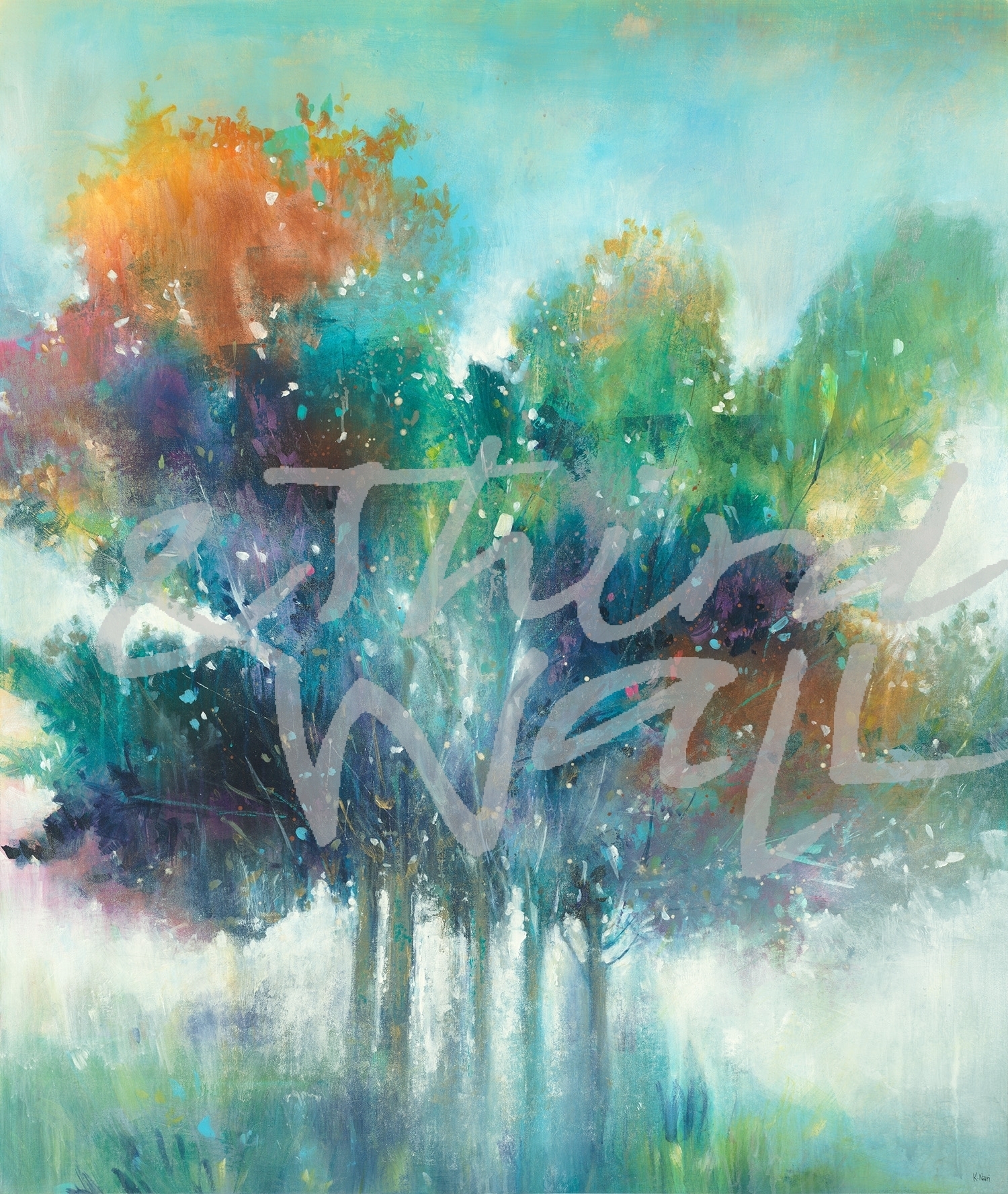
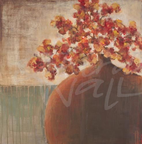
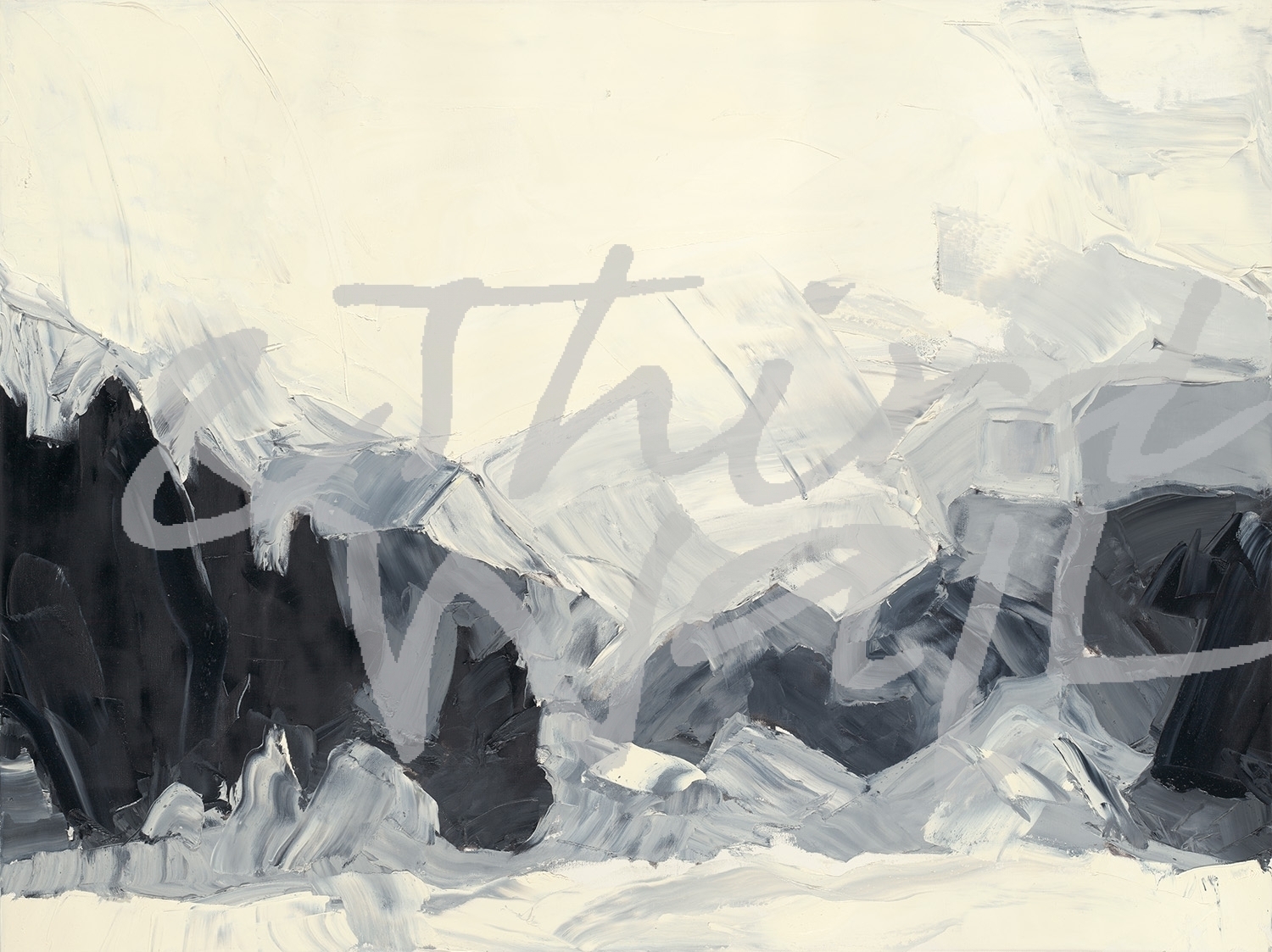
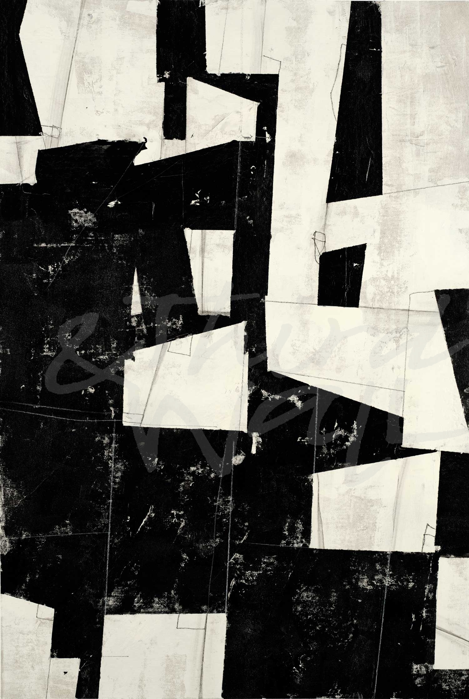
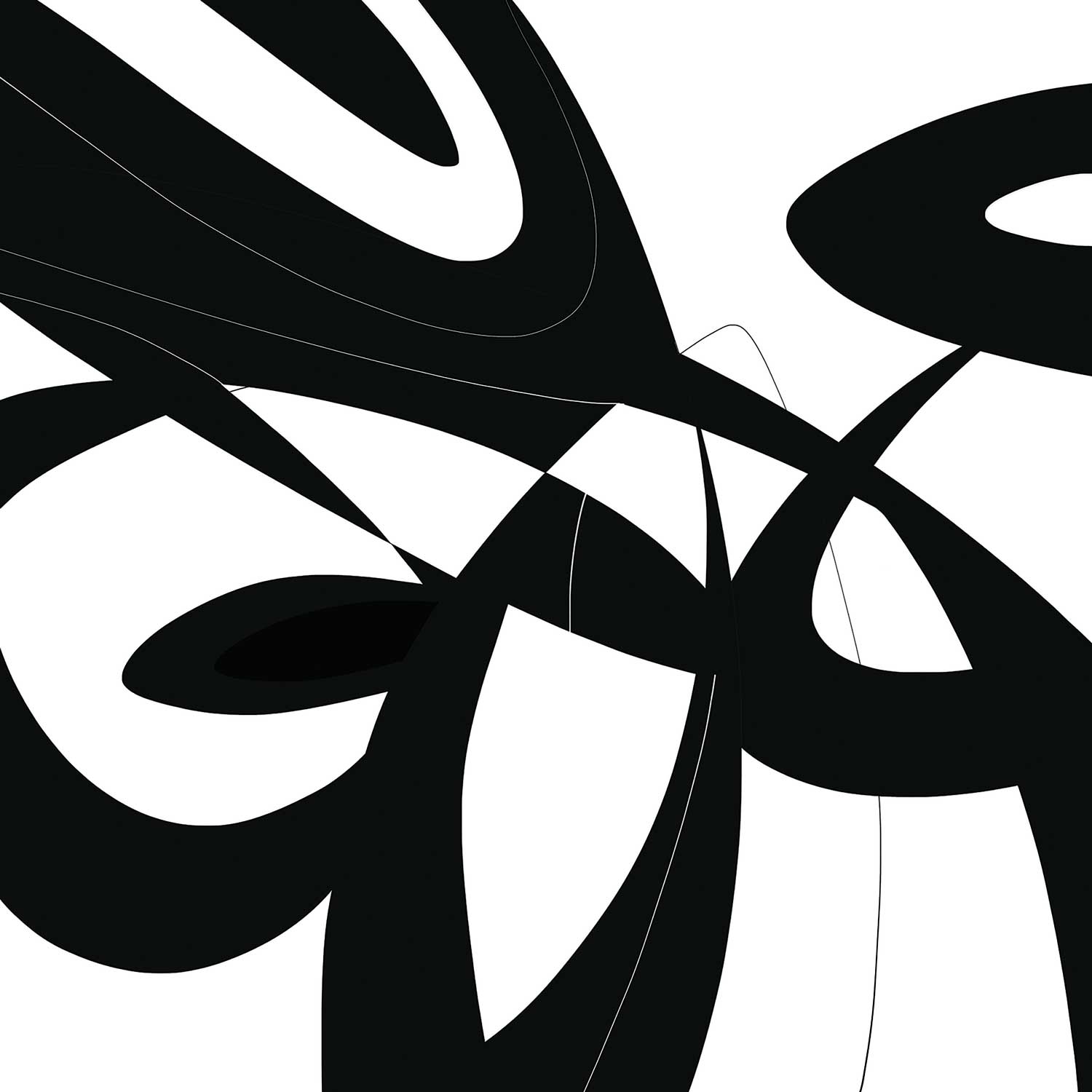
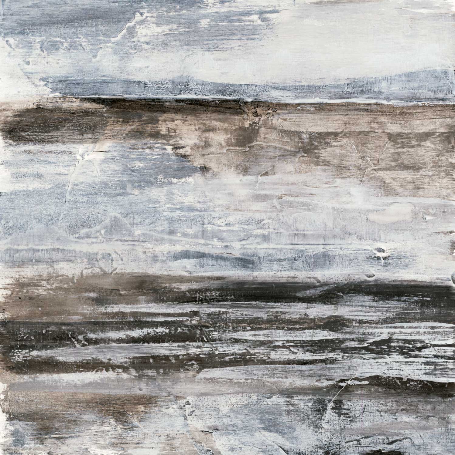

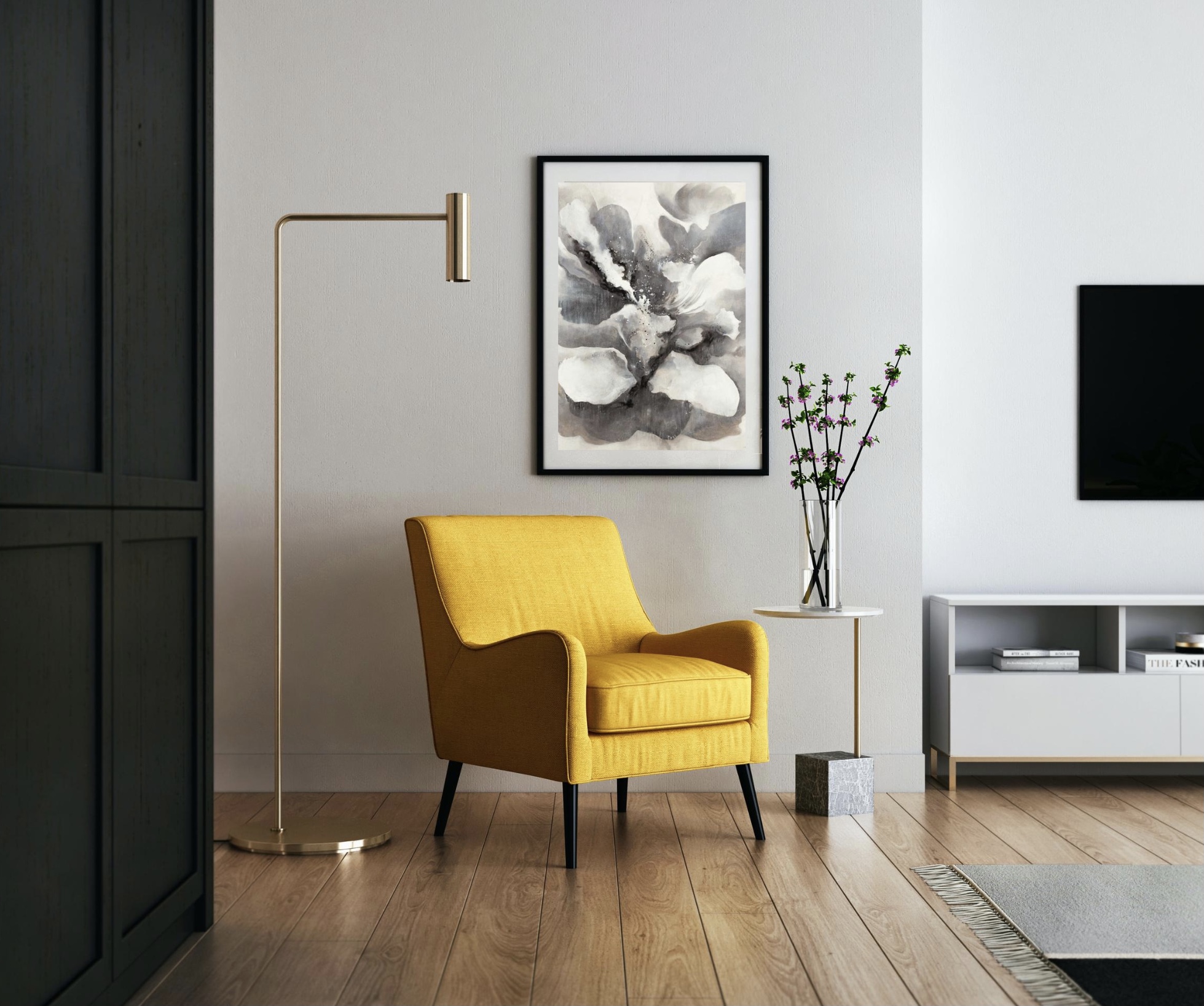
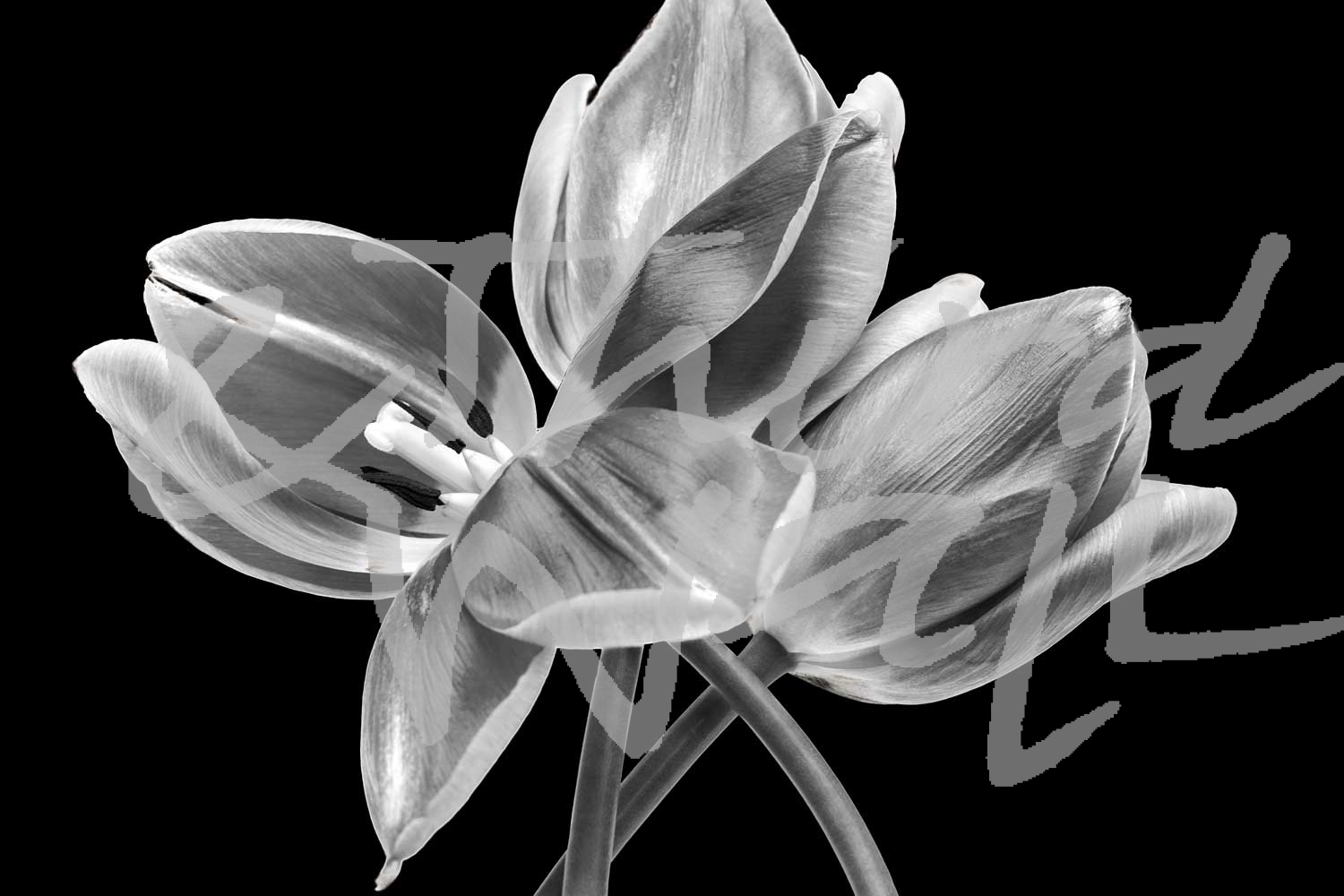
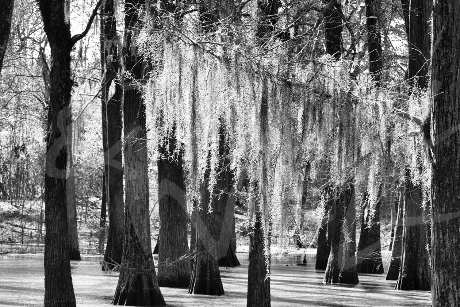
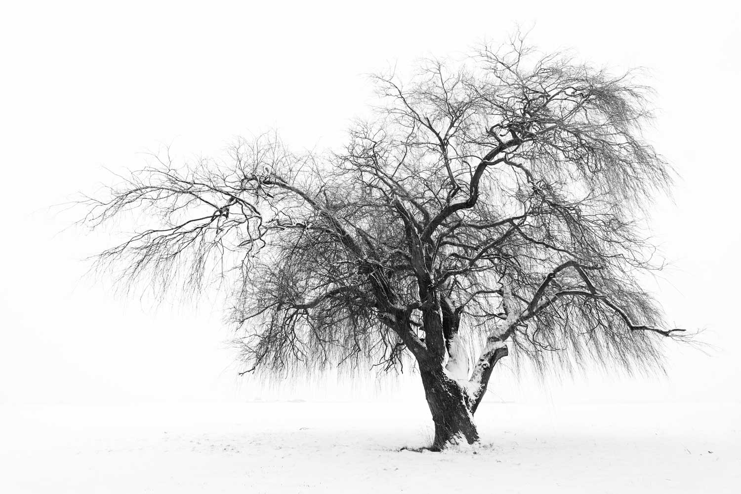
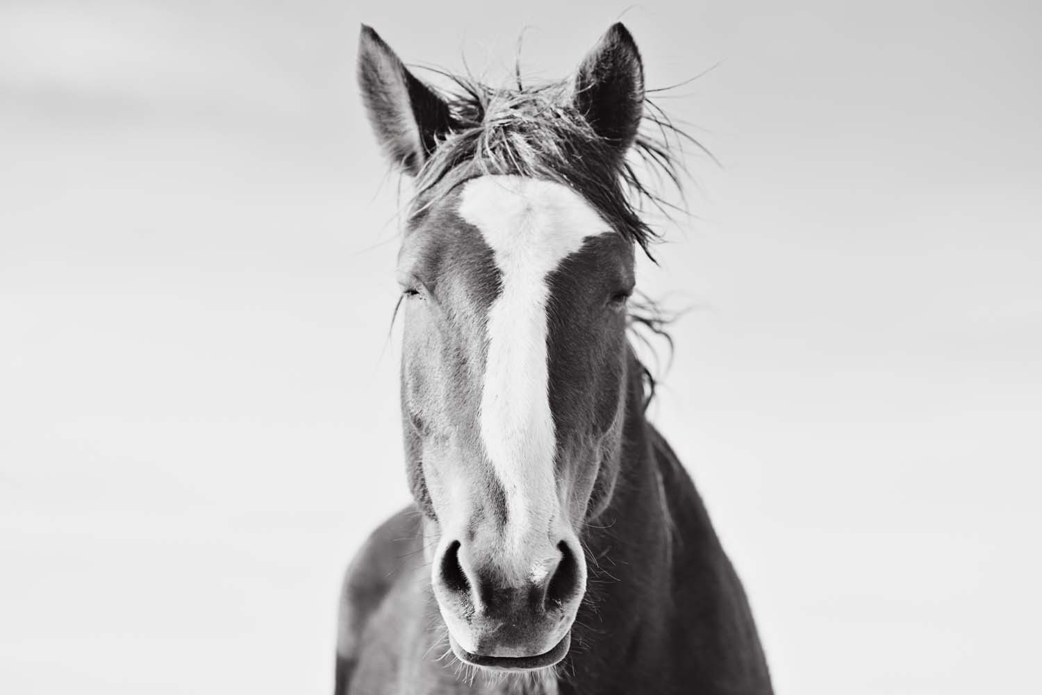
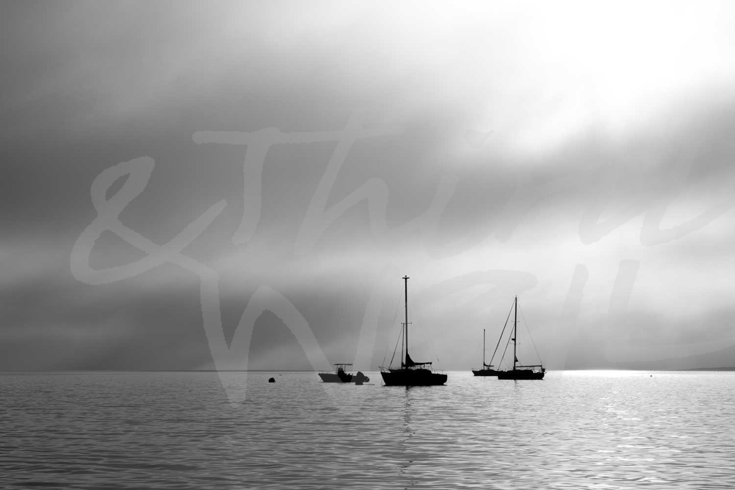
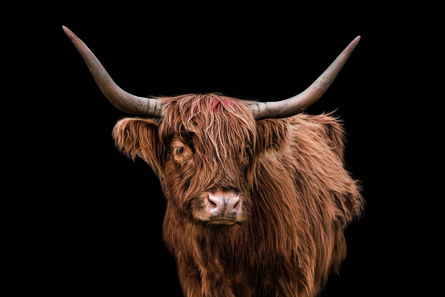
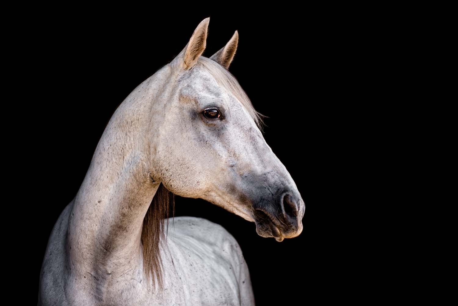
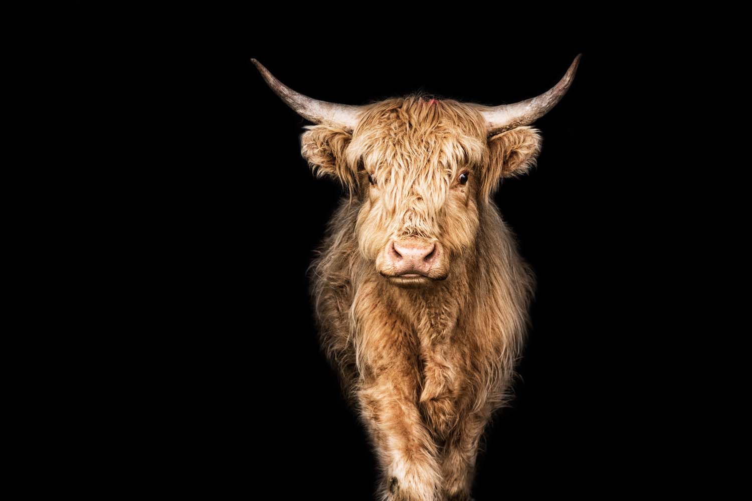
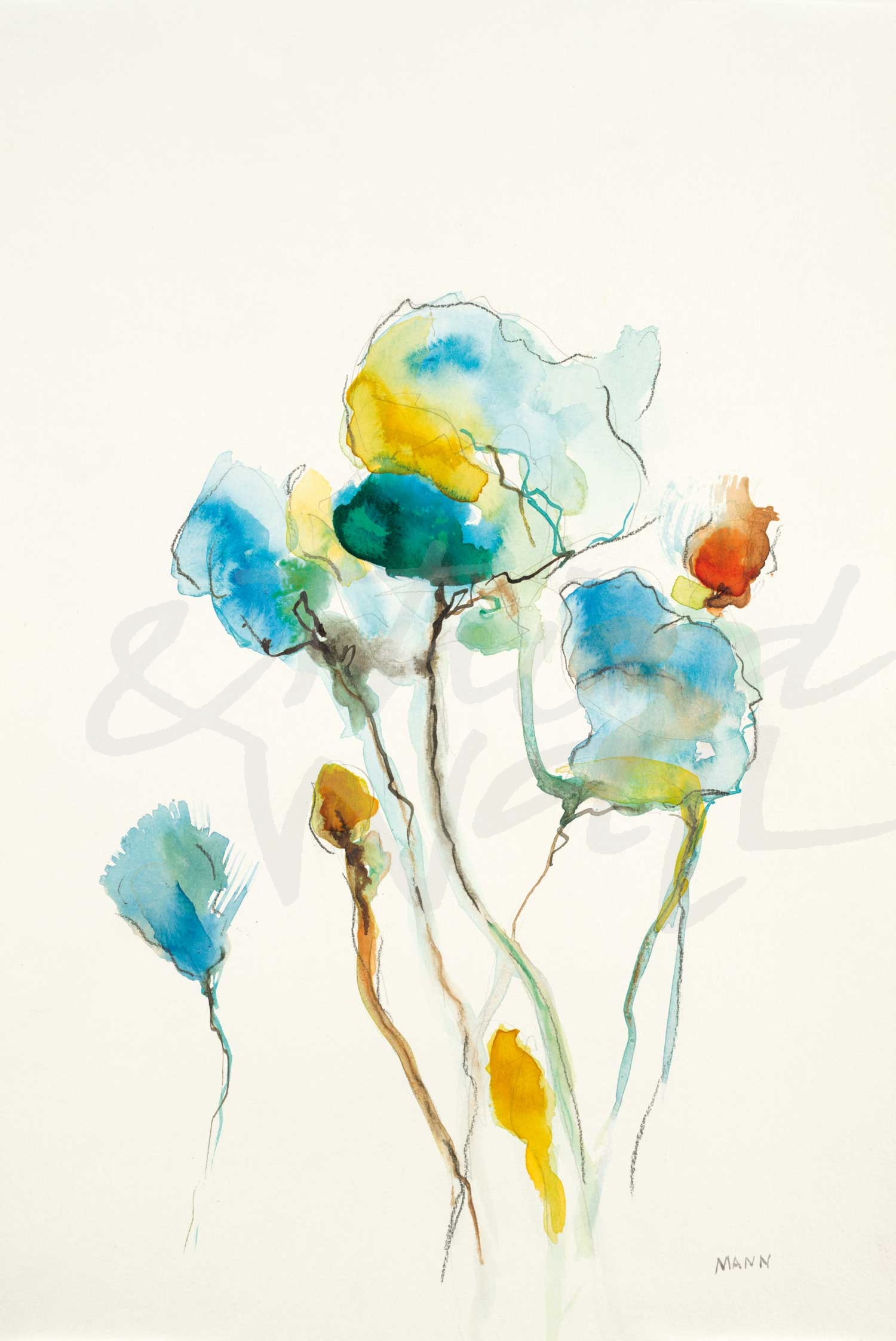
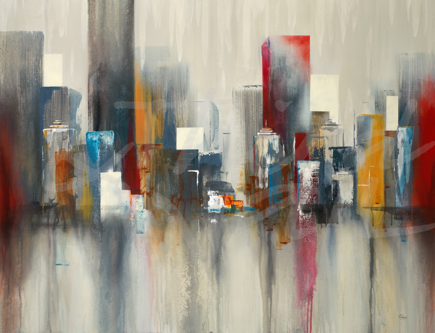
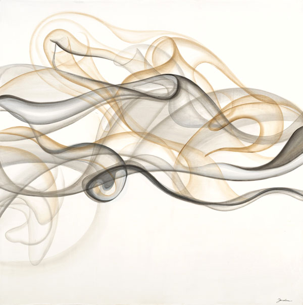
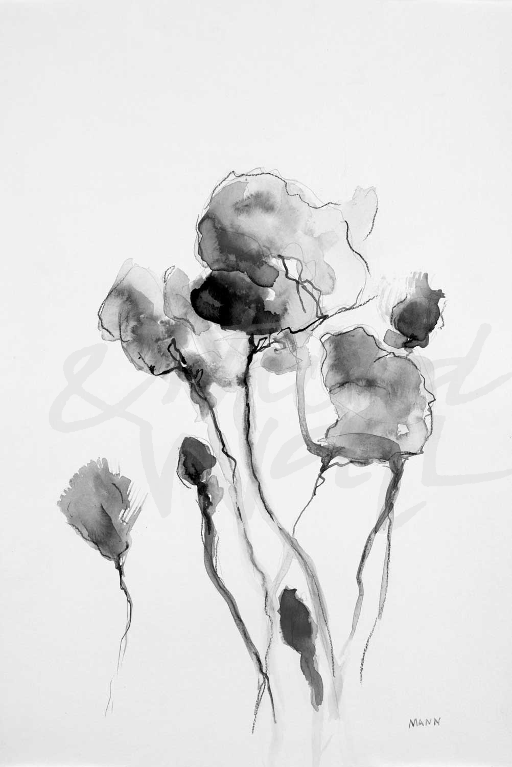
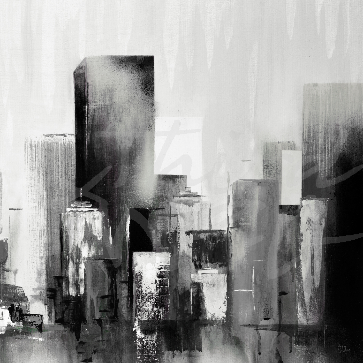
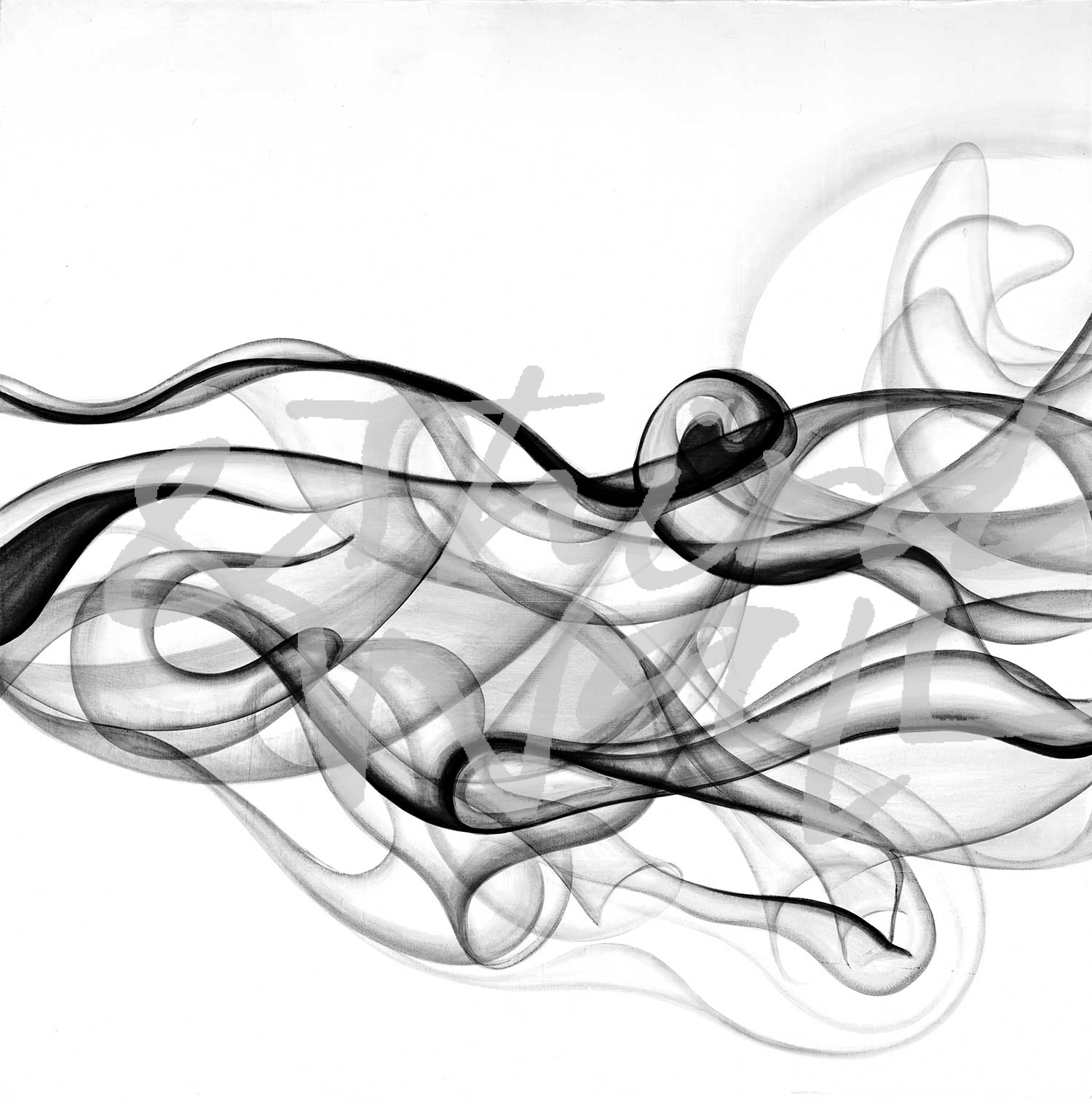

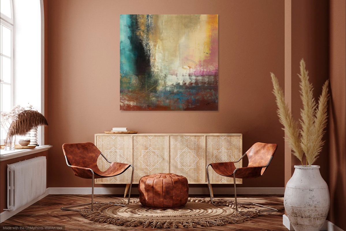
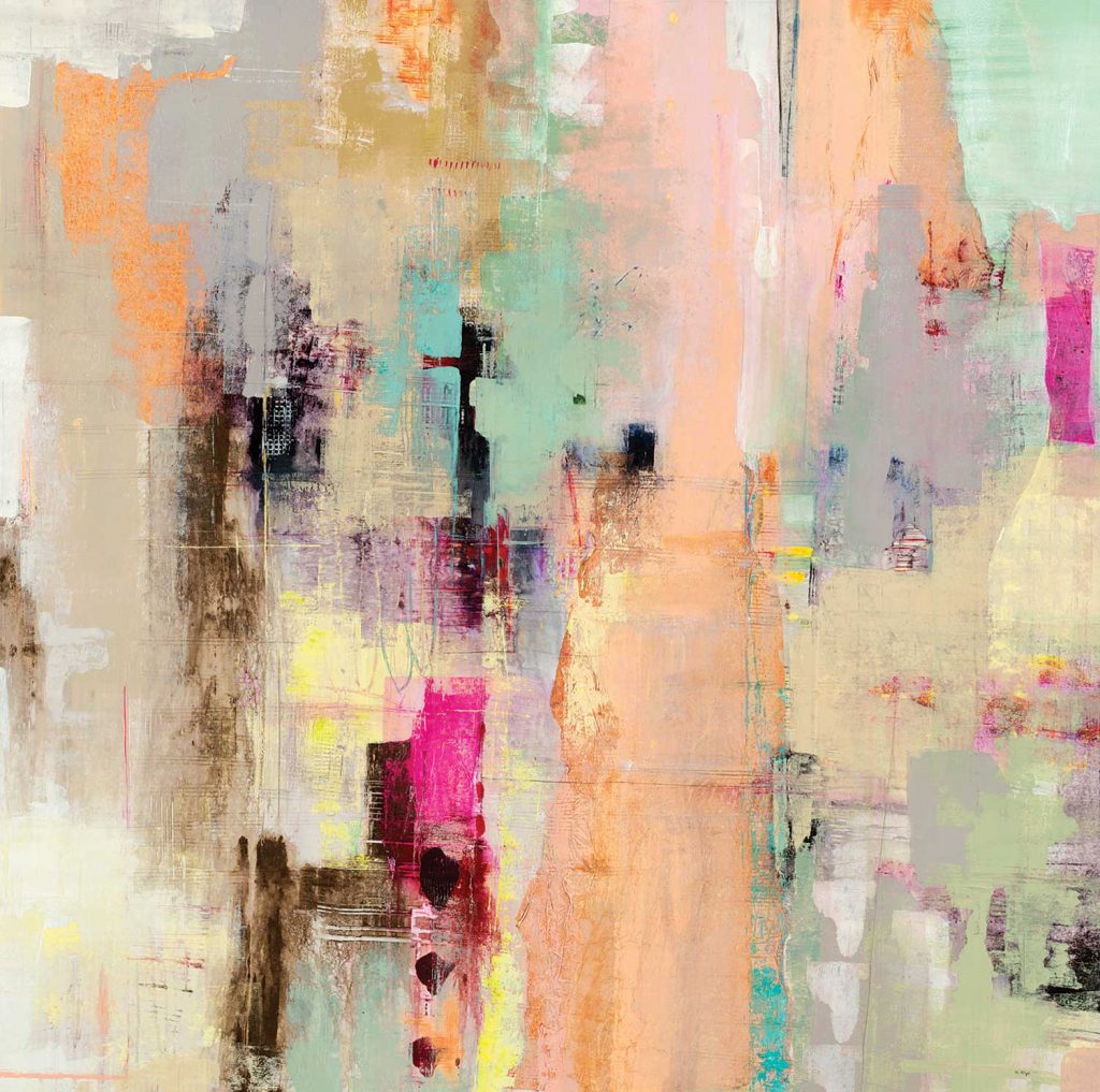
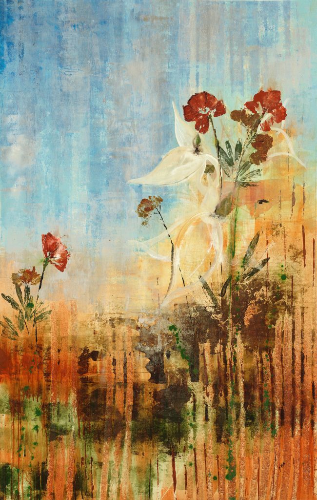

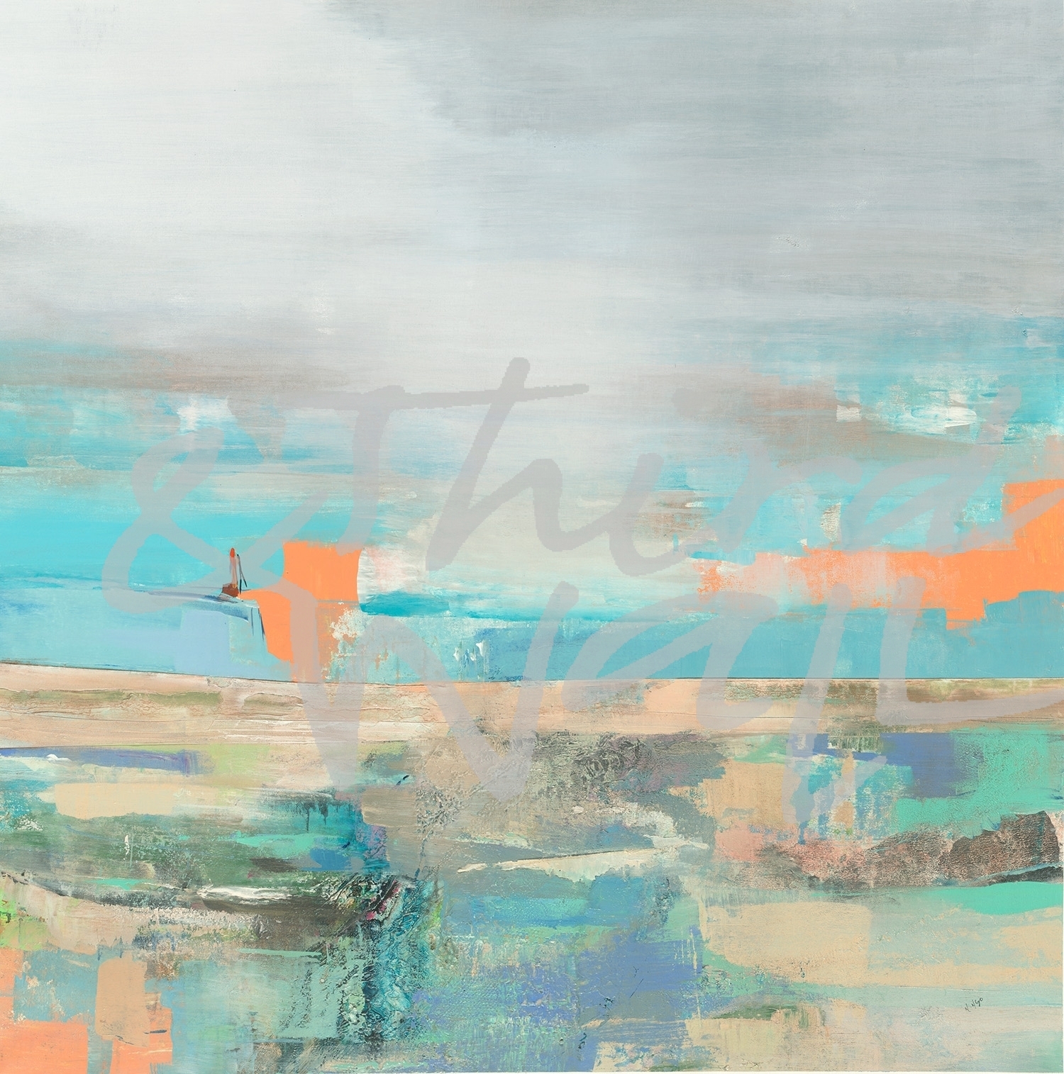
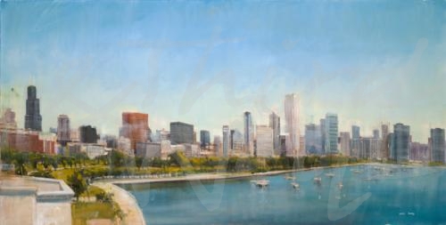

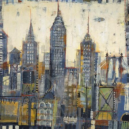
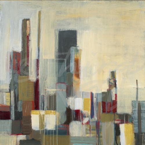
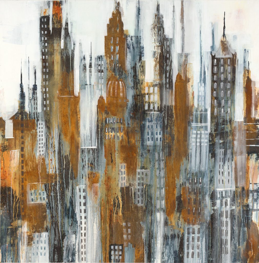
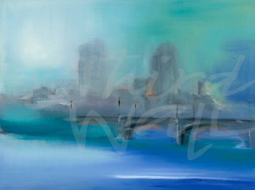
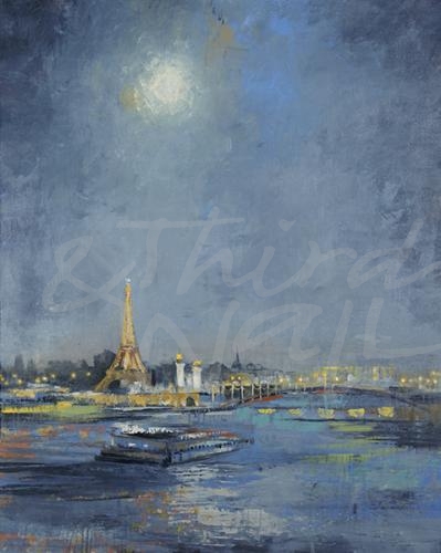
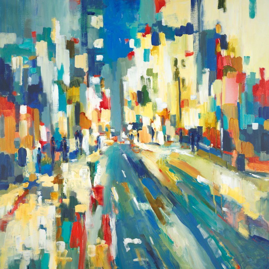


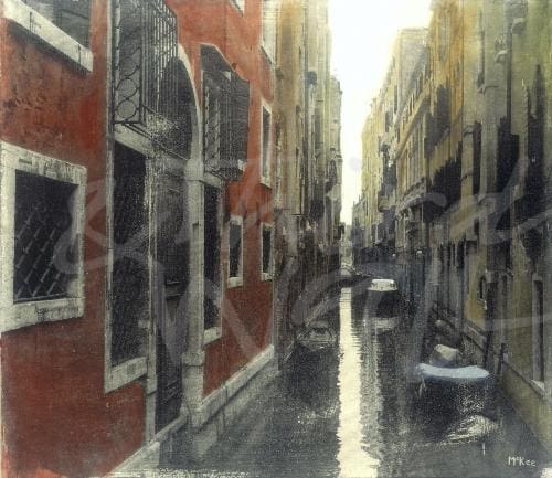

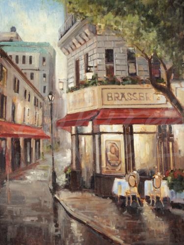
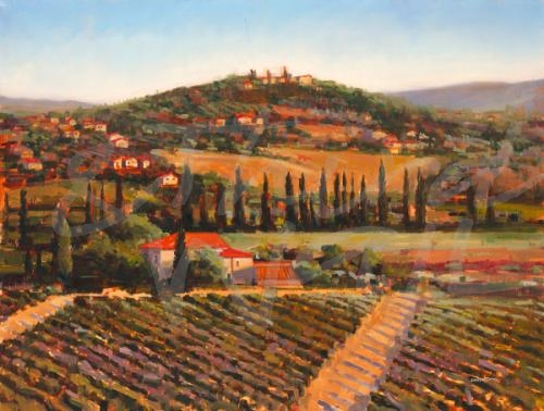
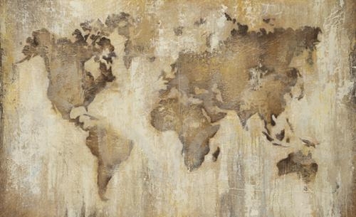
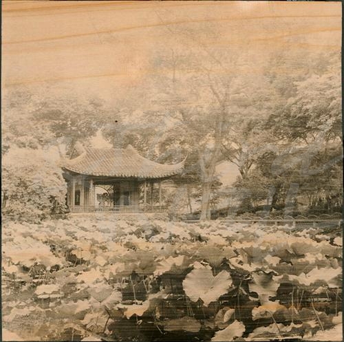
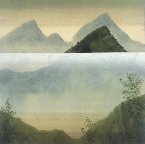
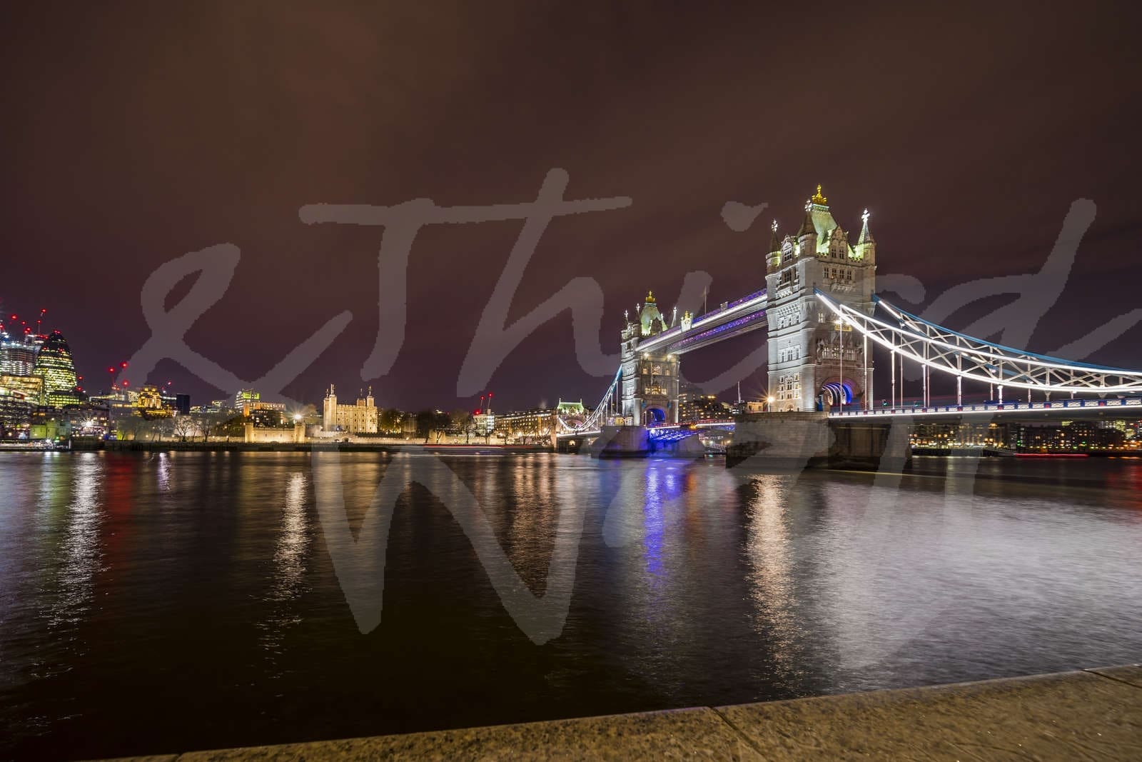
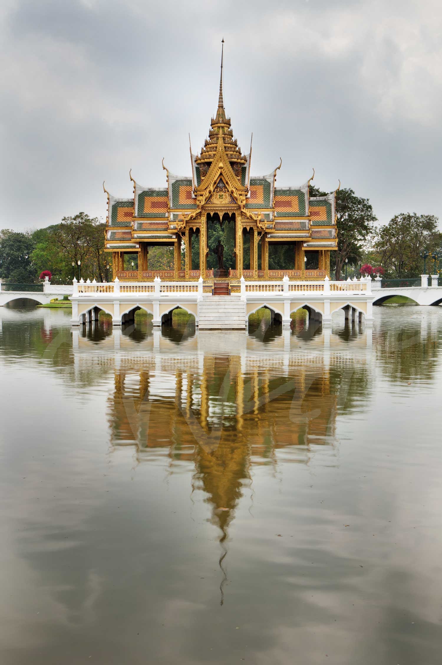
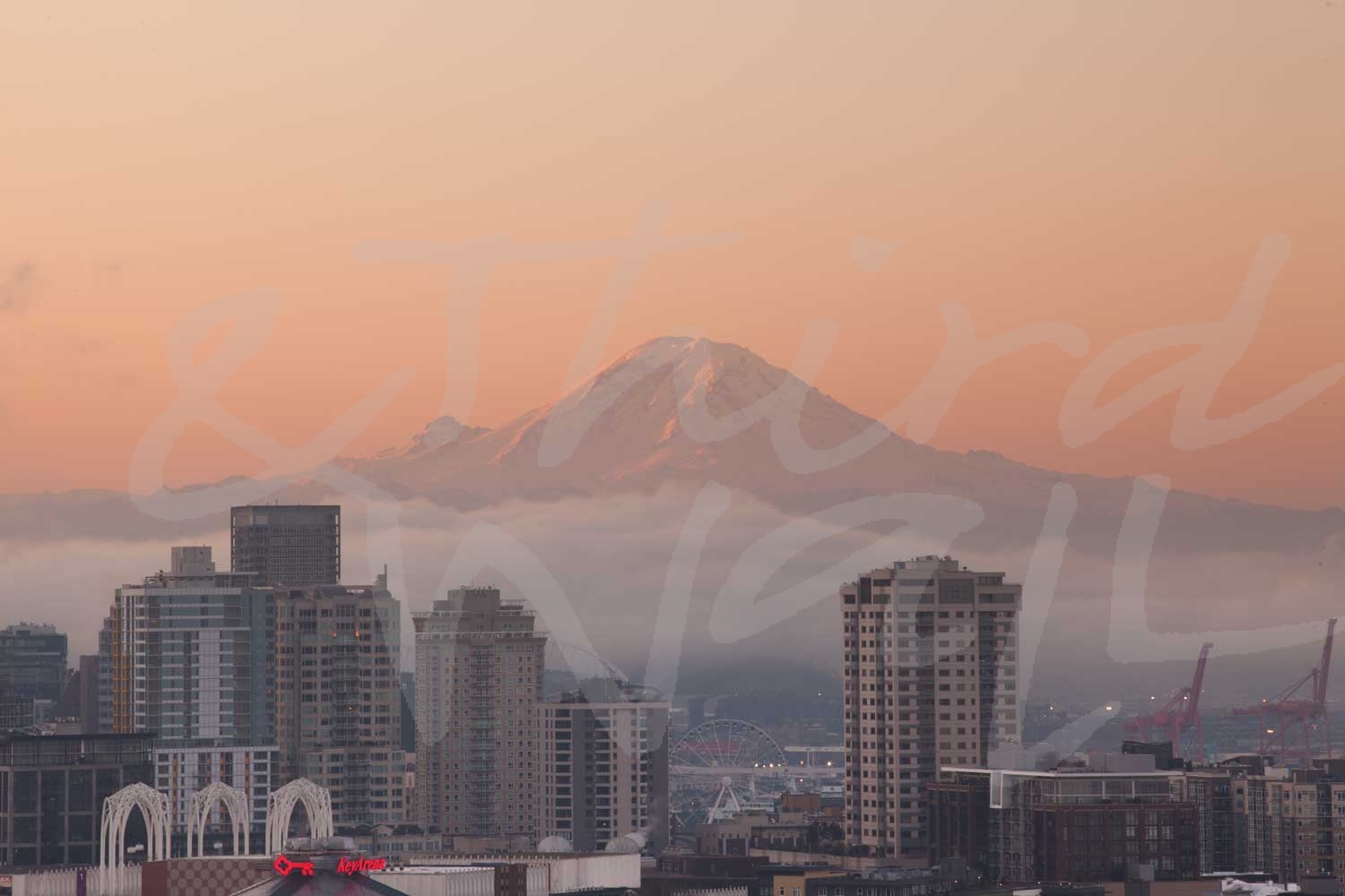
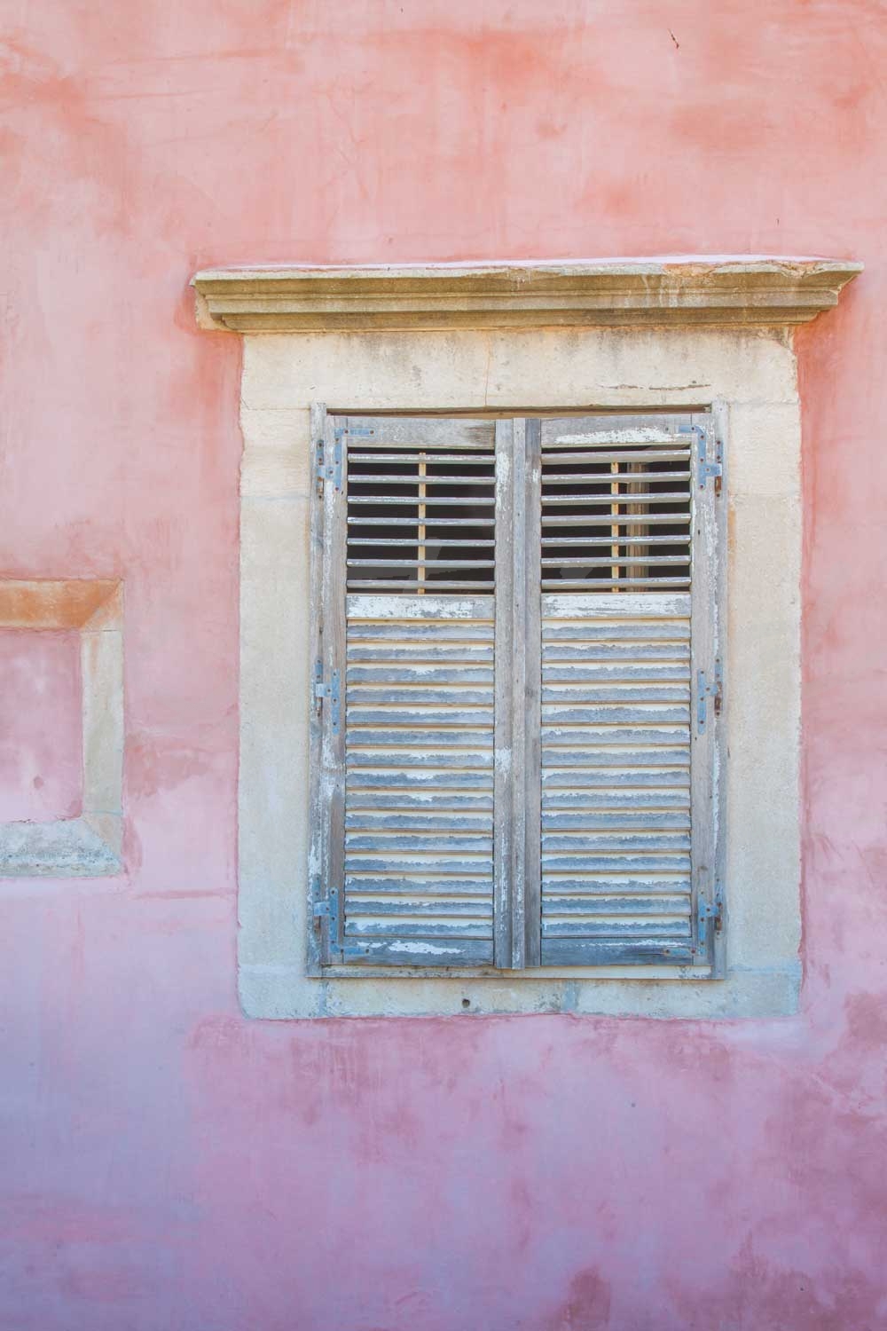
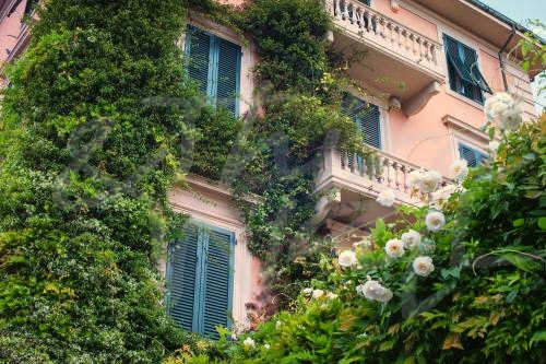

 studying at the Los Angeles Art Center College of Design, John worked at two architectural firms and started his own commercial interior design company in 1975. He enjoyed design so much it became his business while art became his passion. After 35 years, John closed his design office to pursue his art career full time and has never looked back.
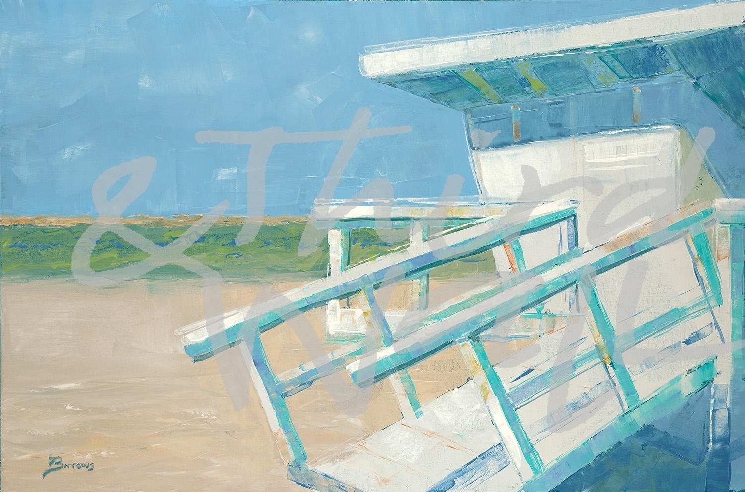
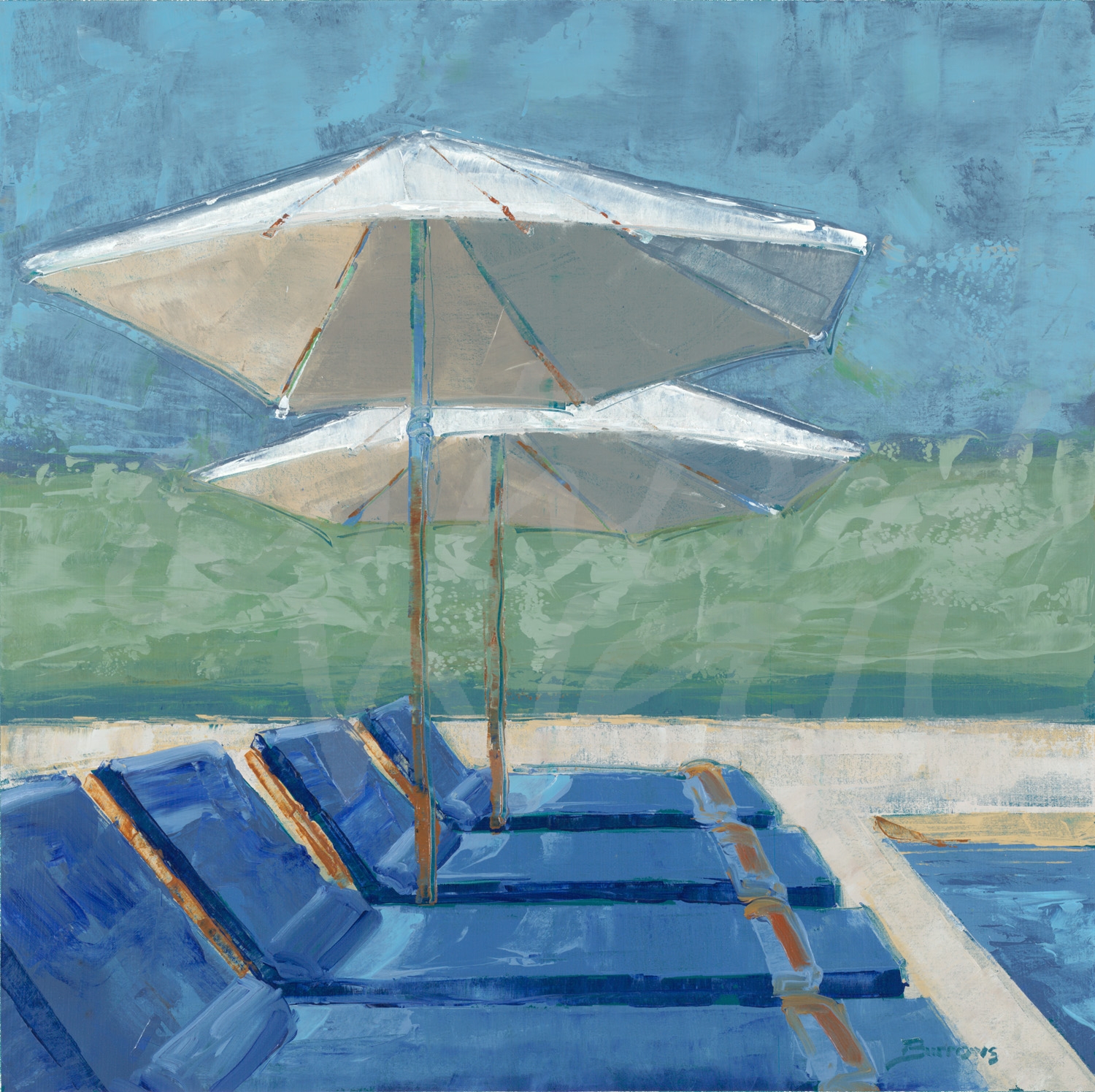
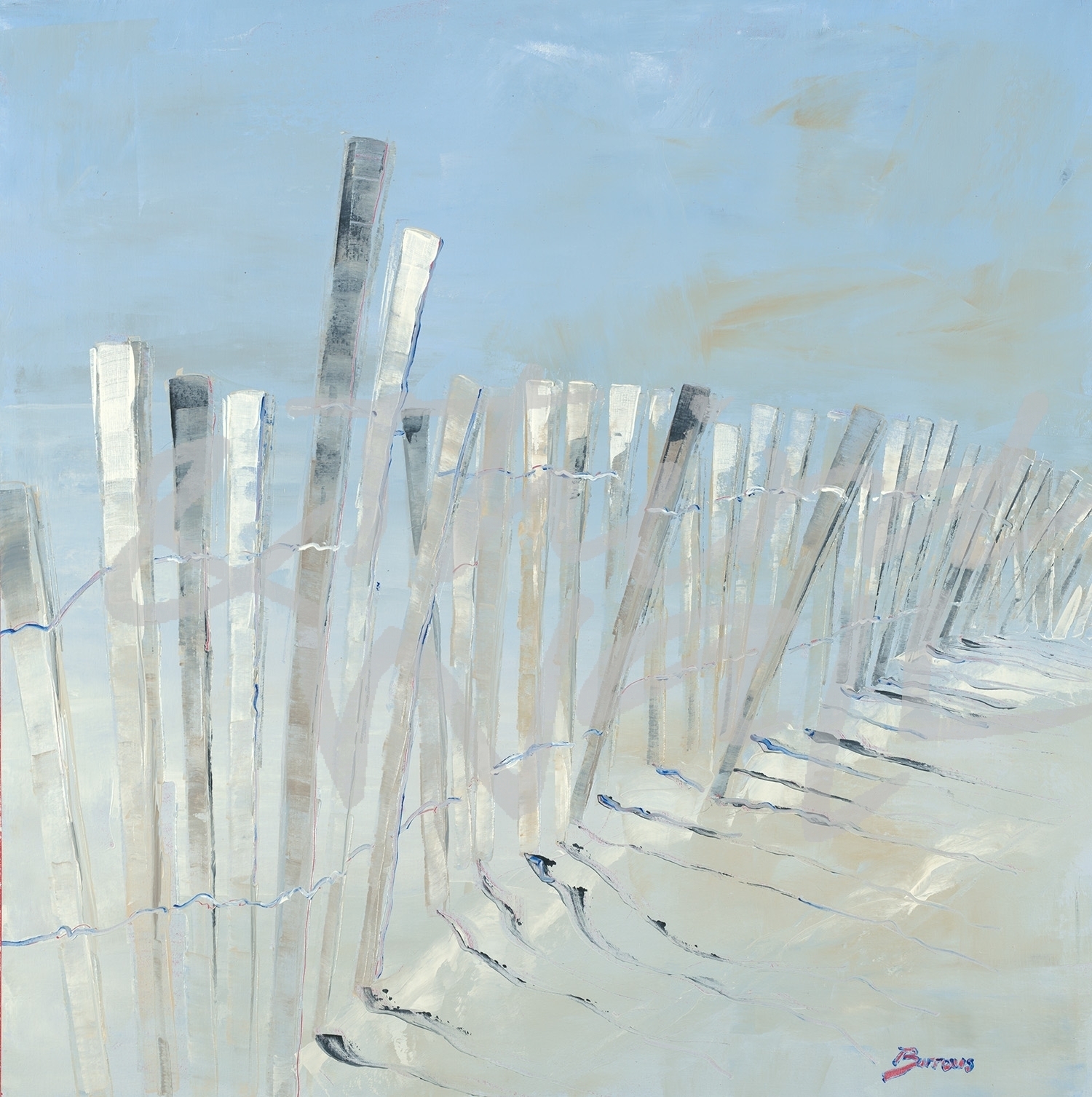
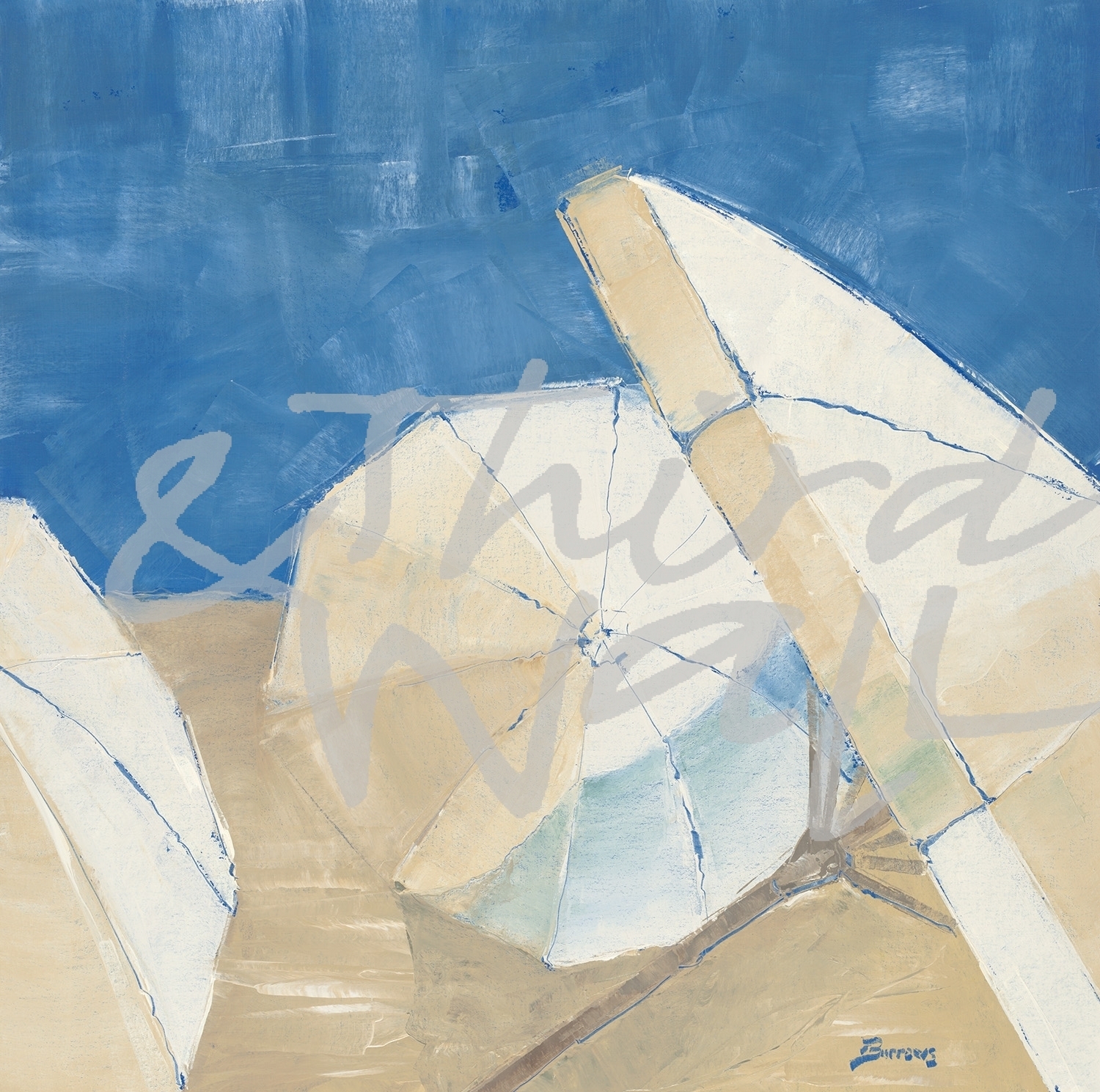
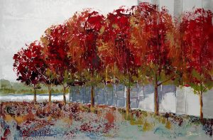
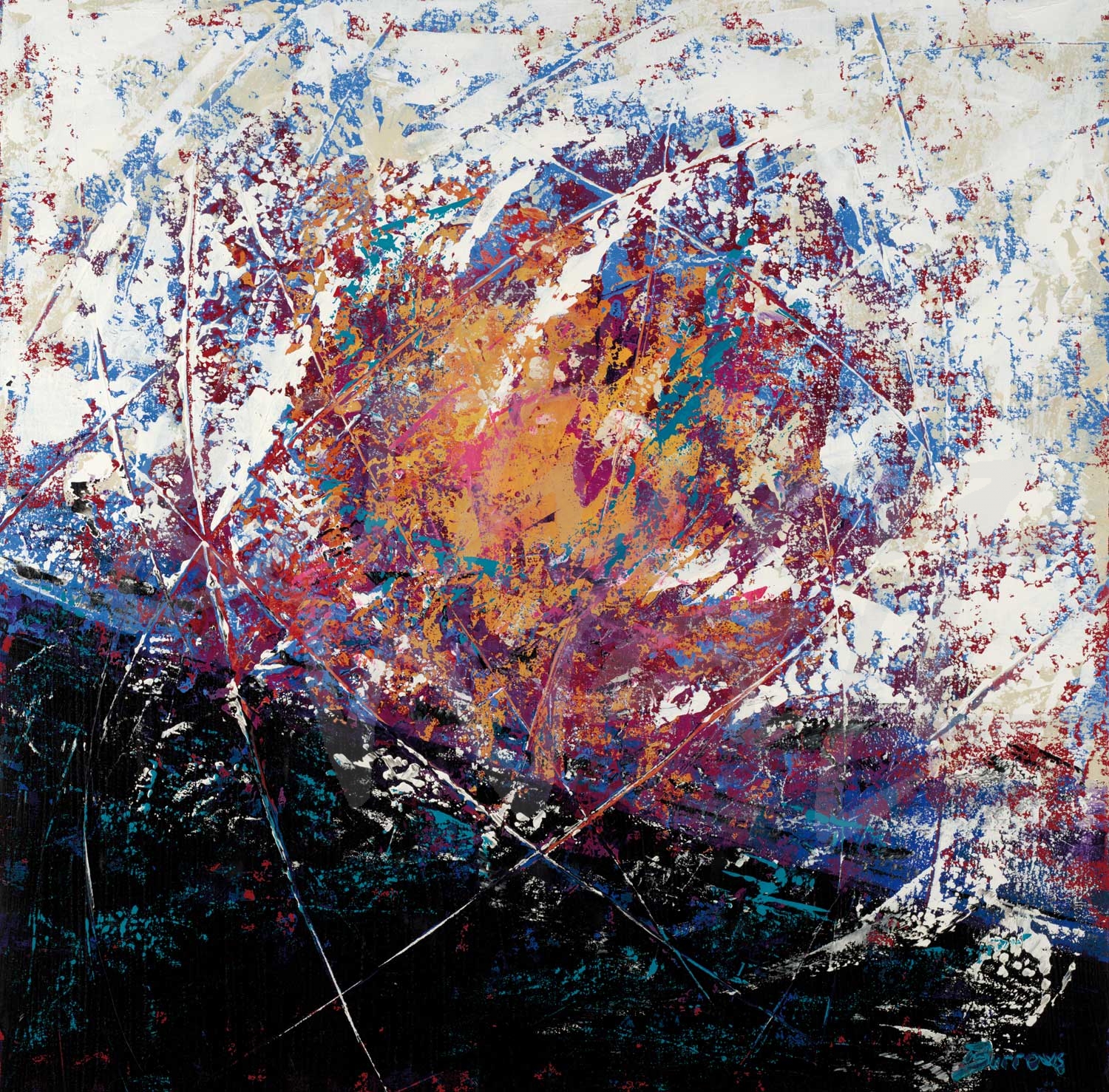
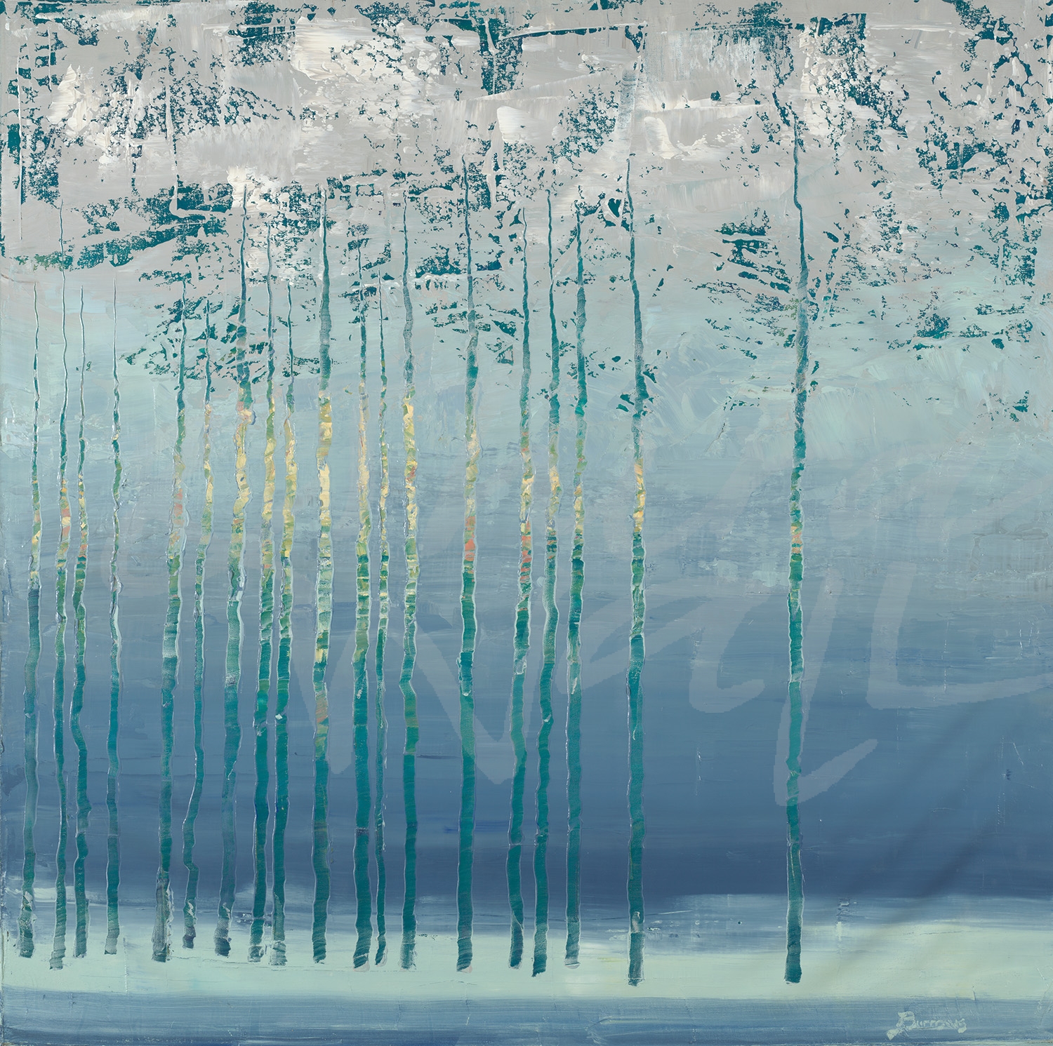
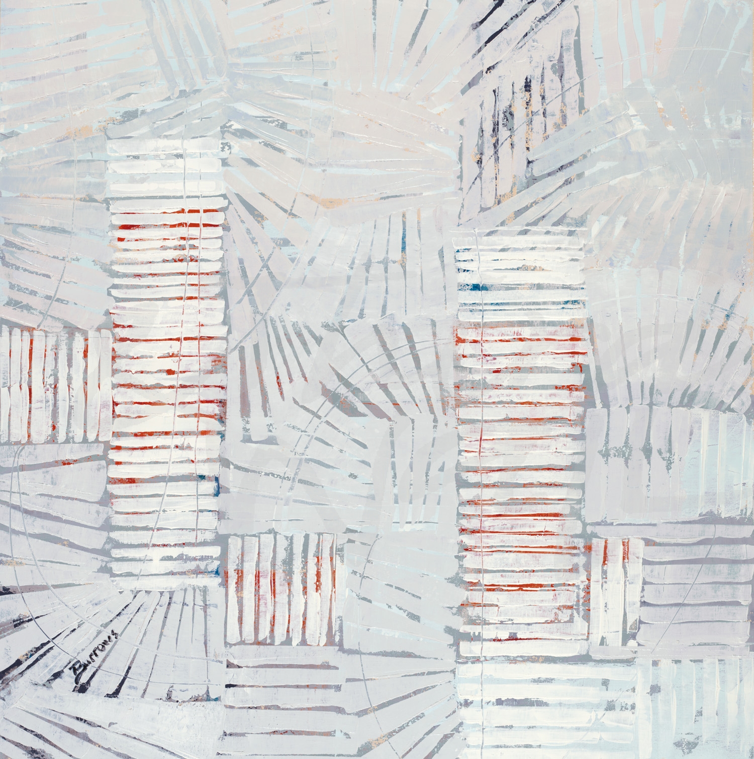
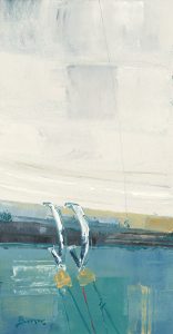
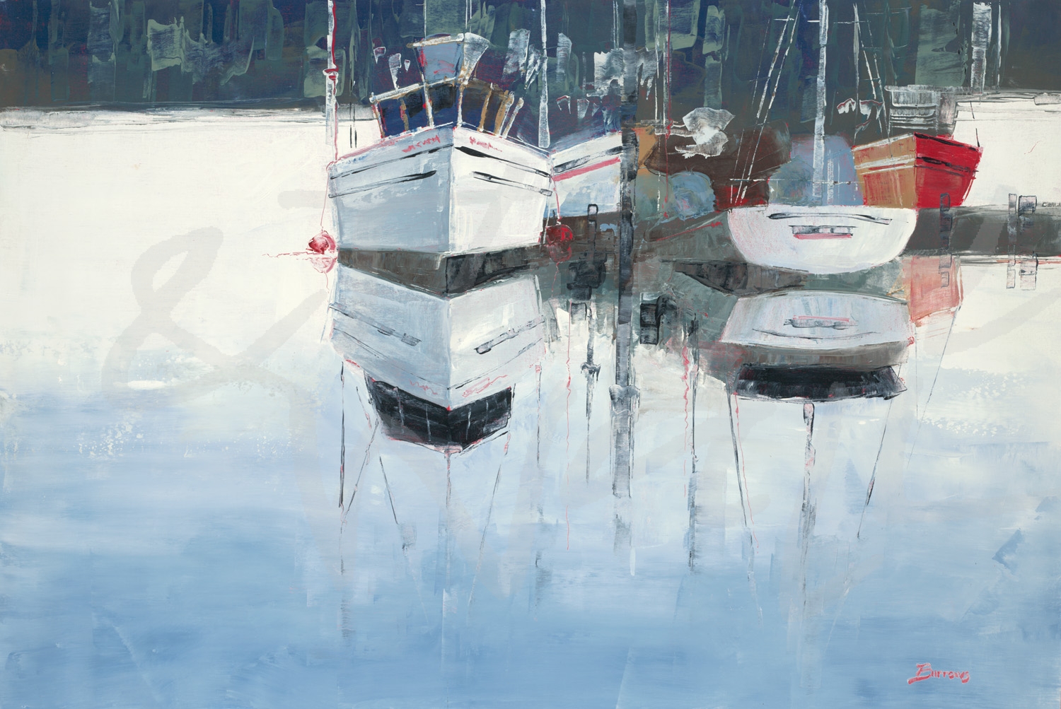
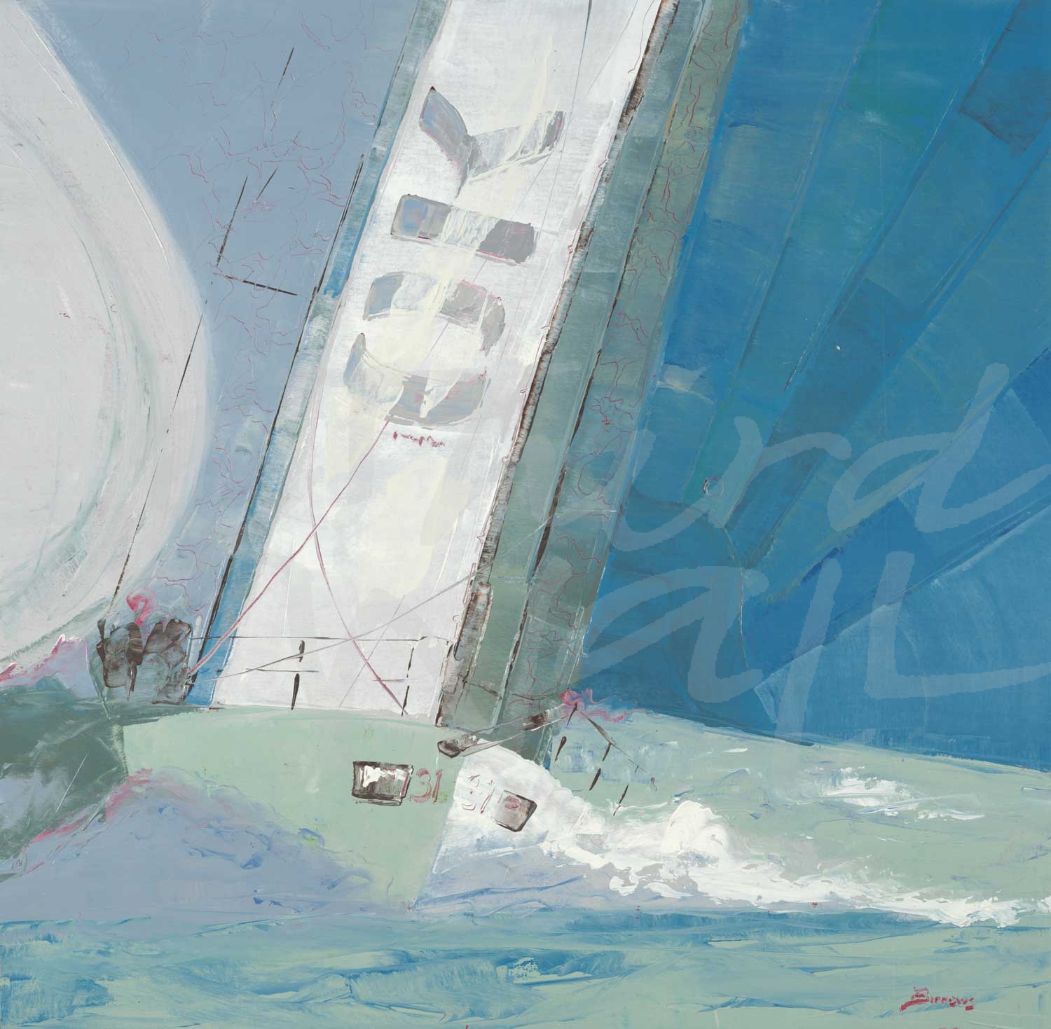
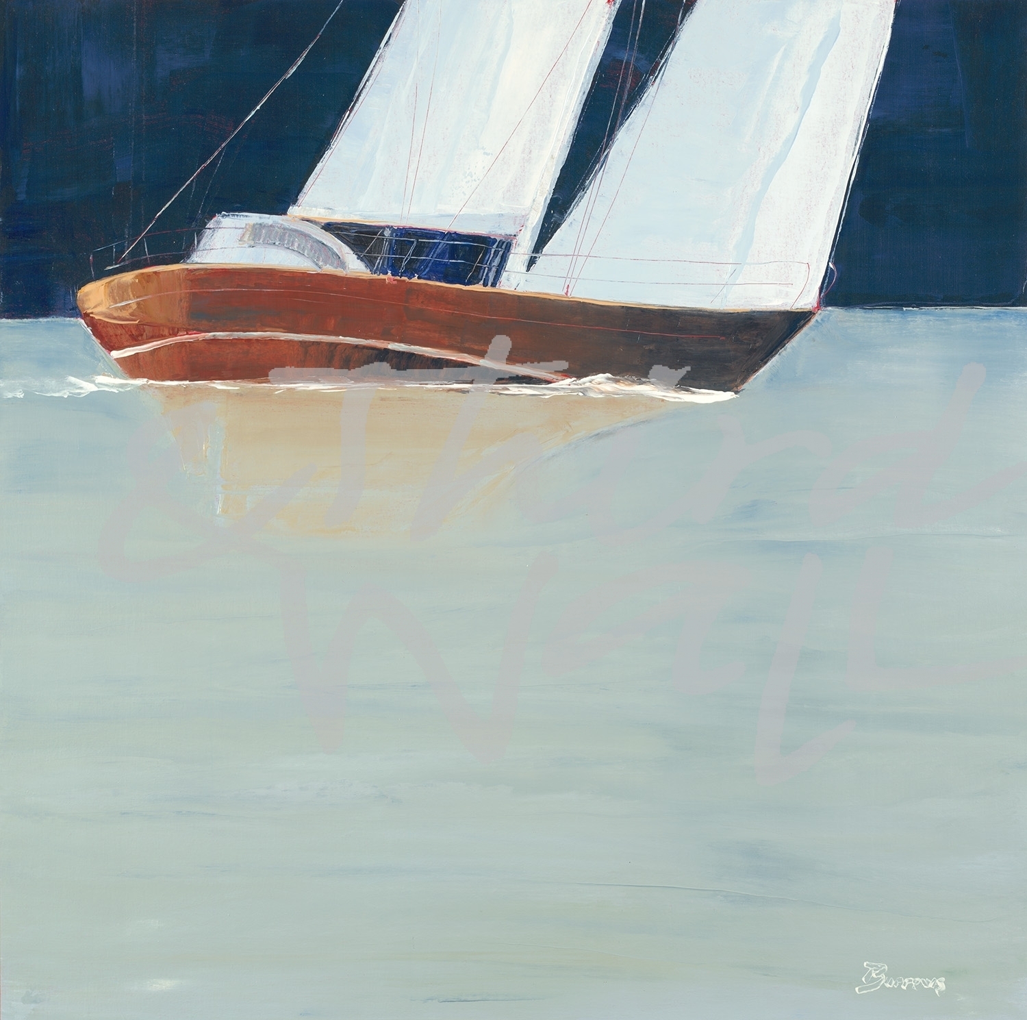
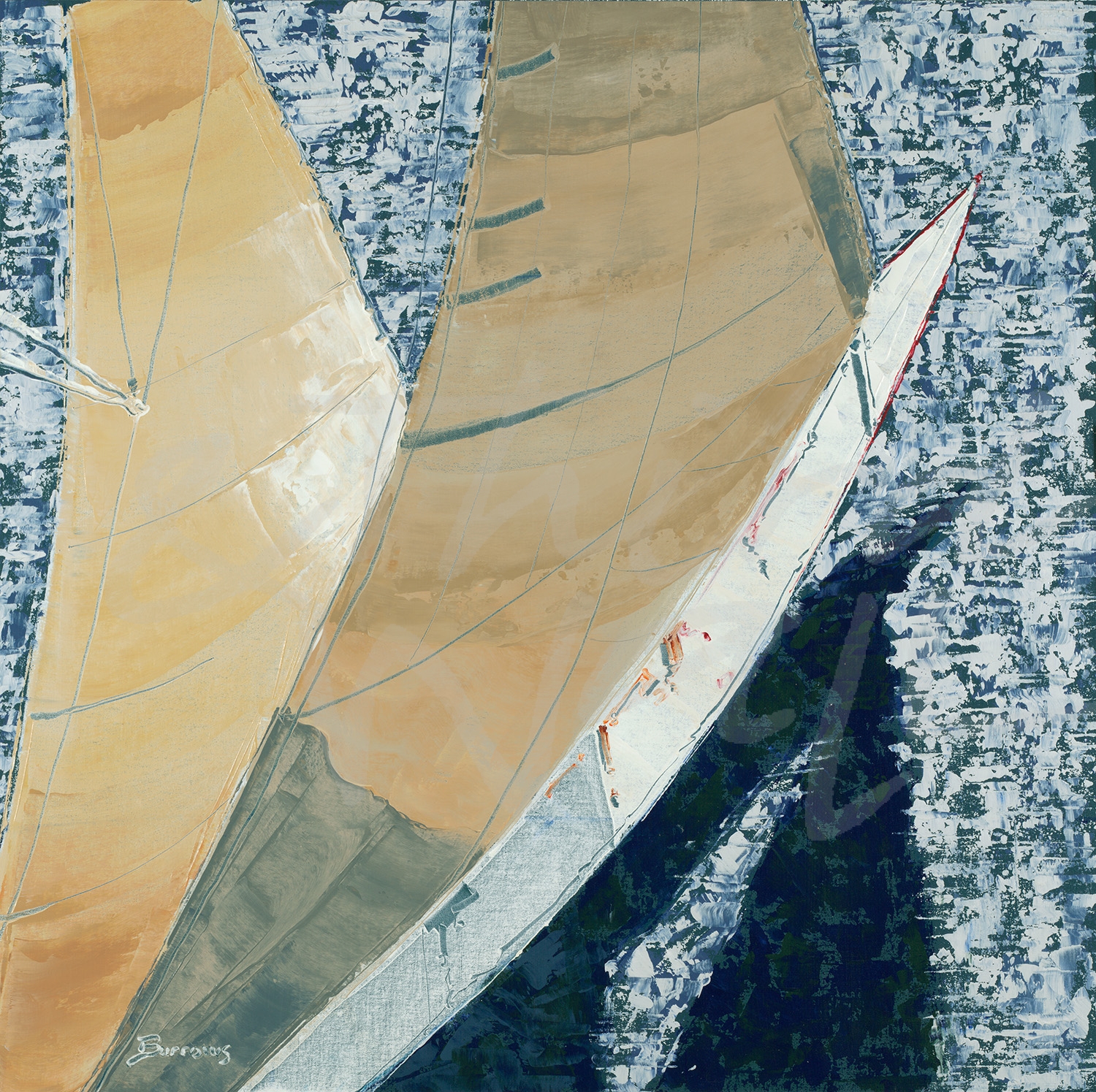
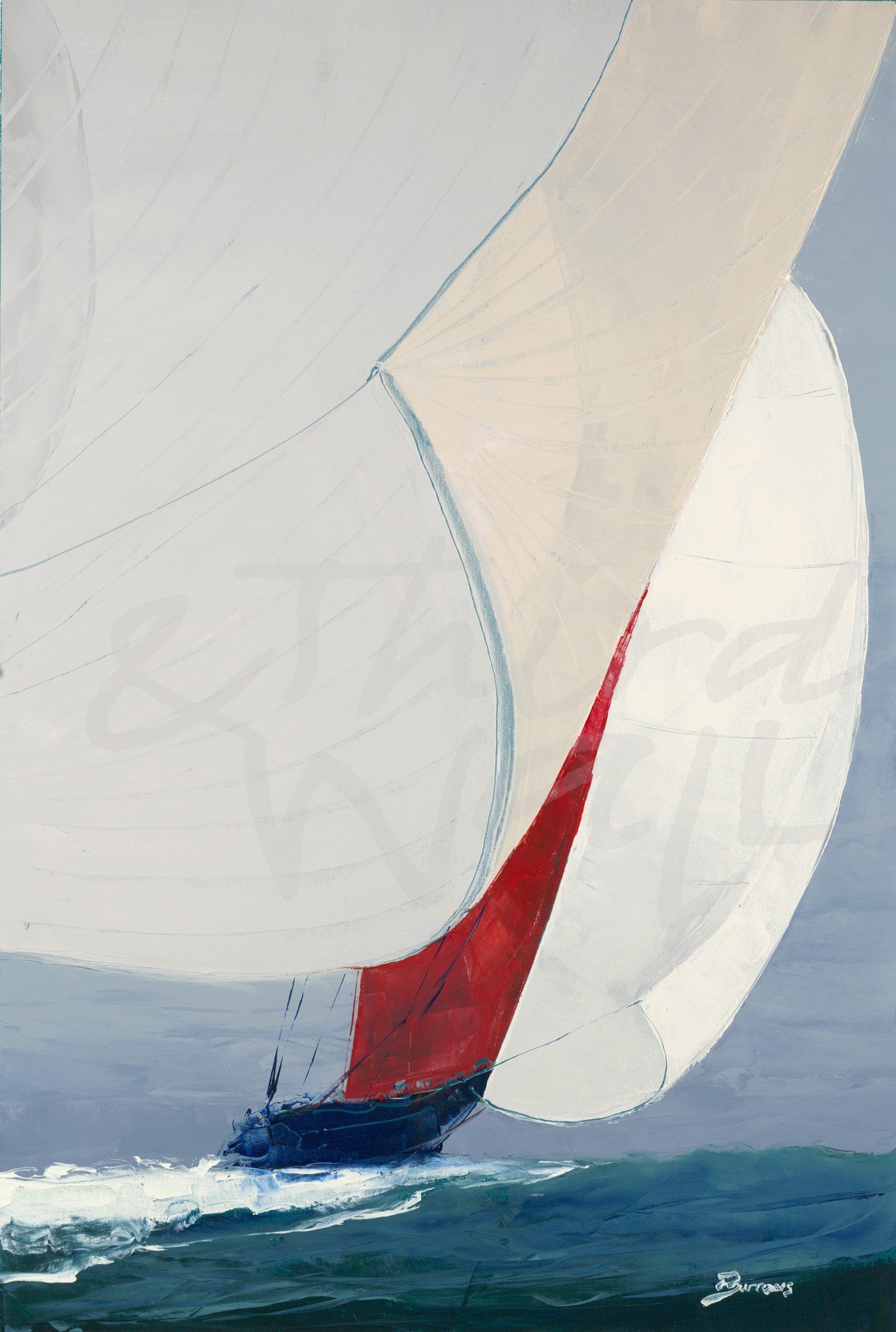
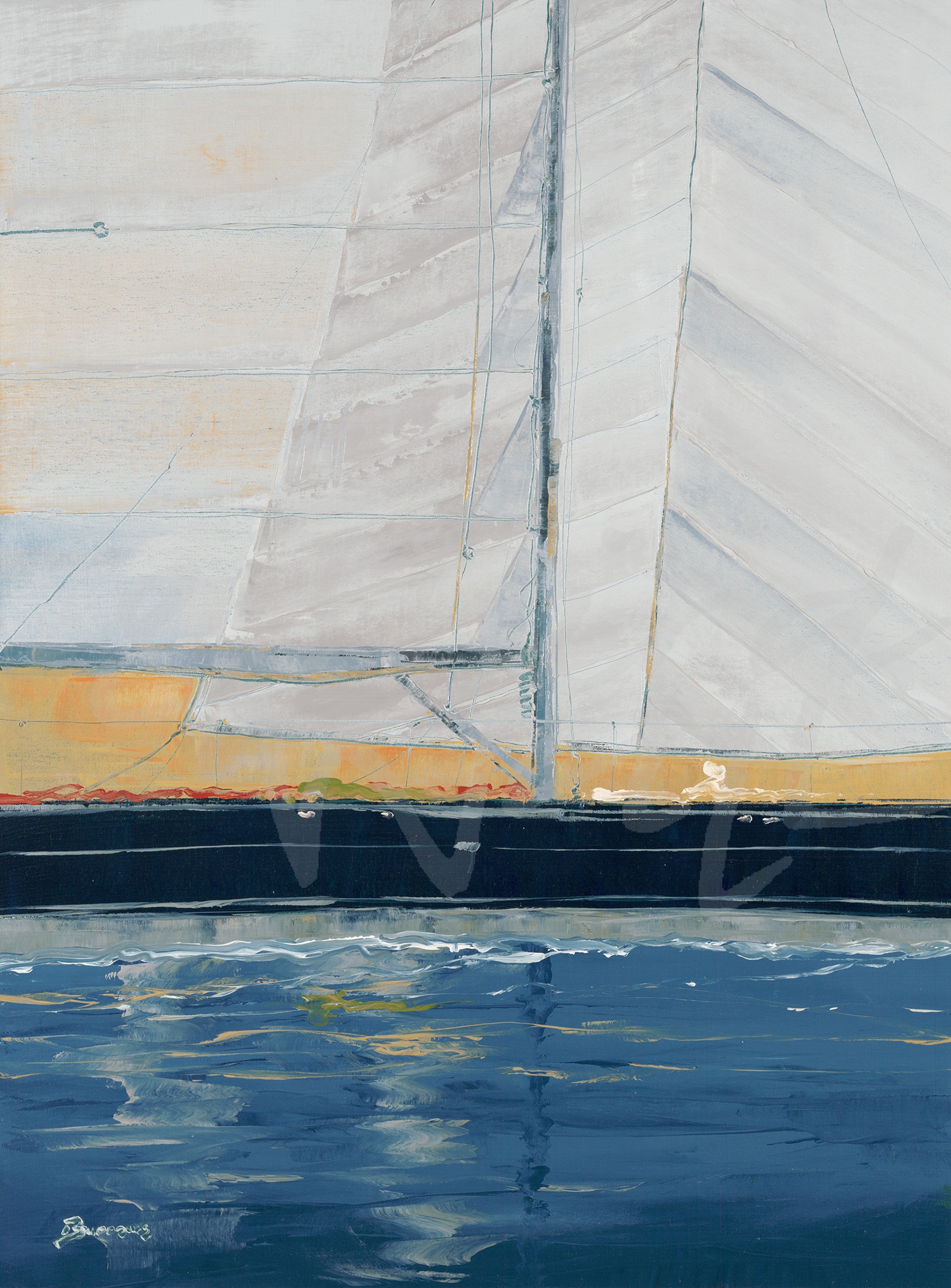
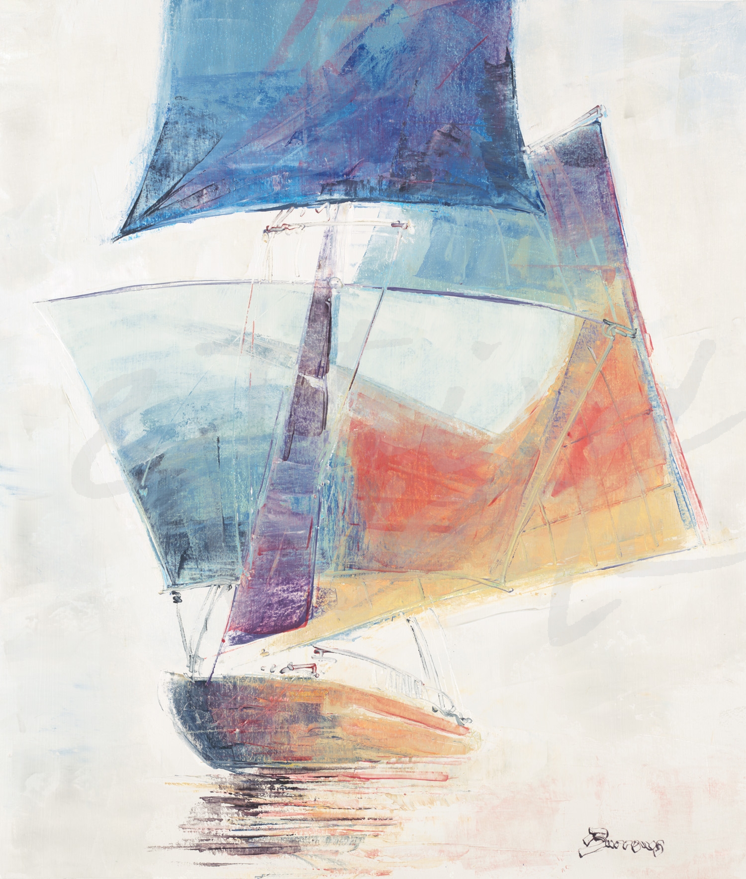
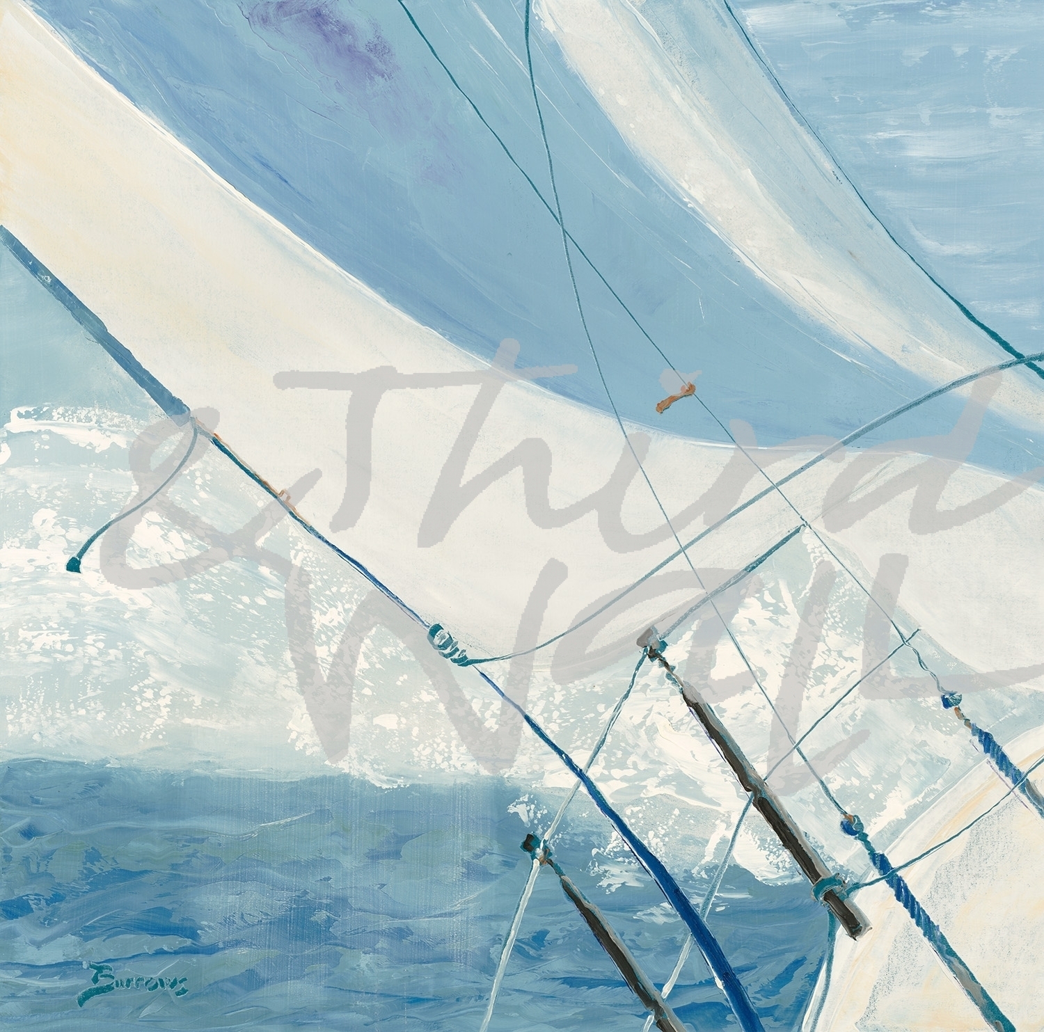
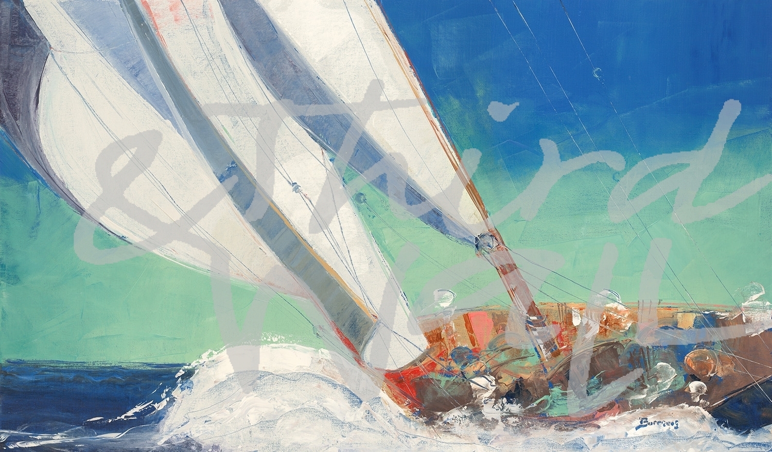
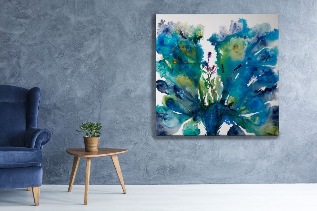
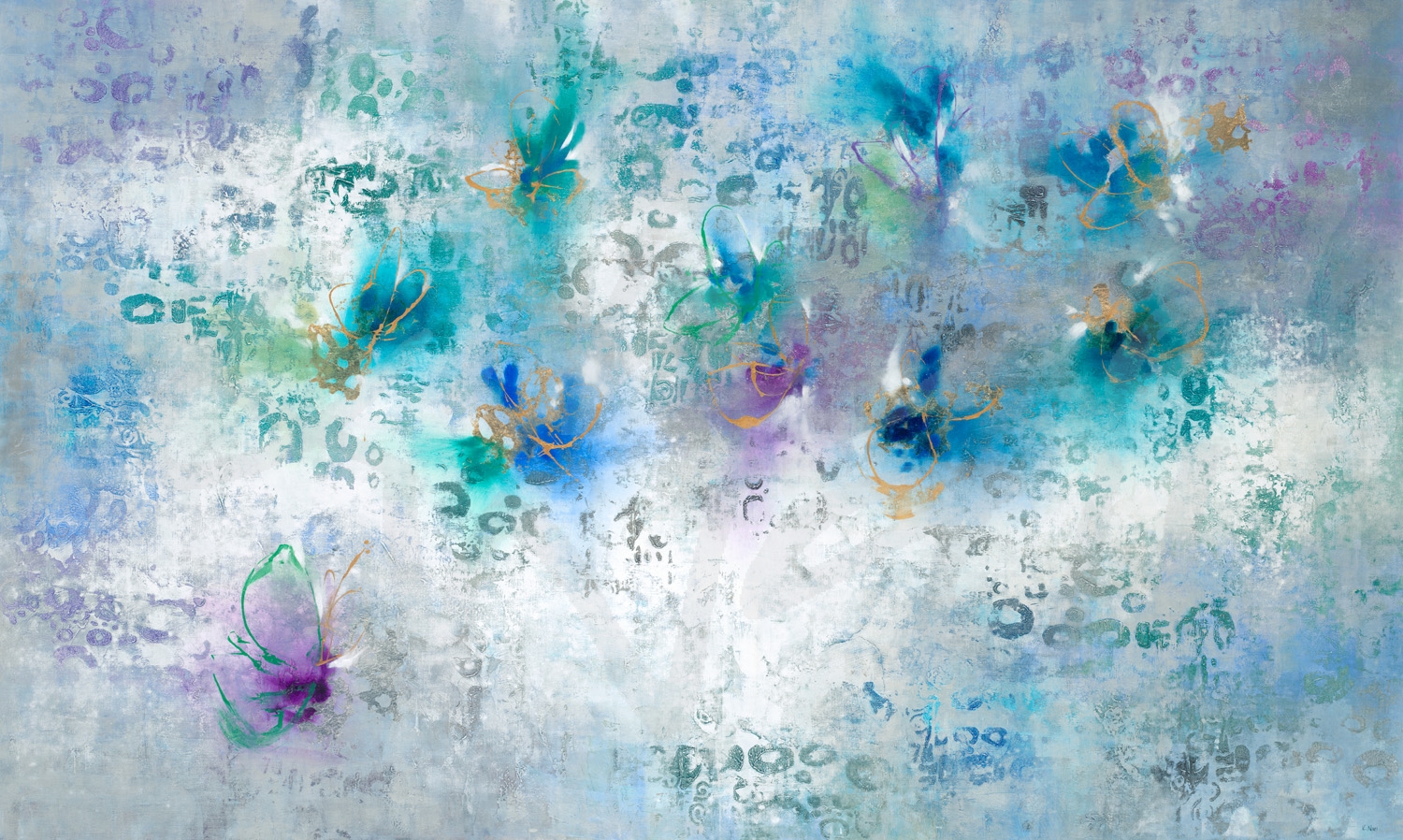
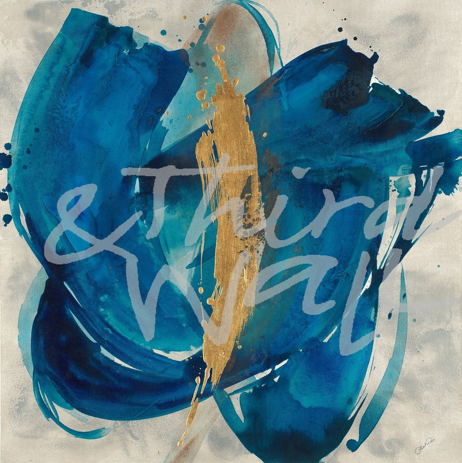
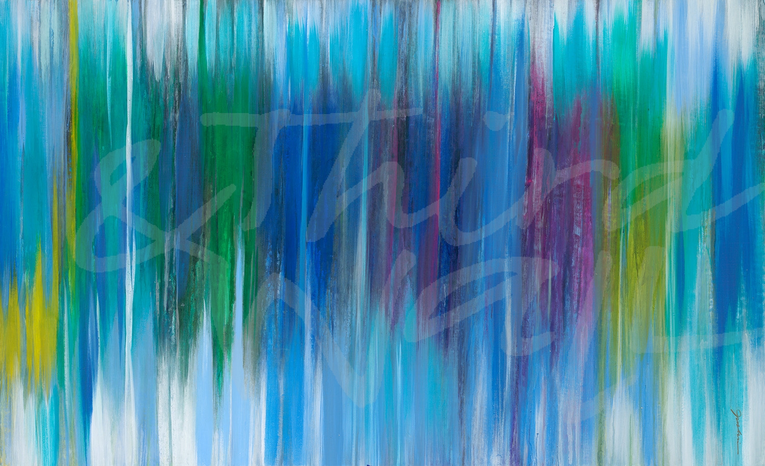
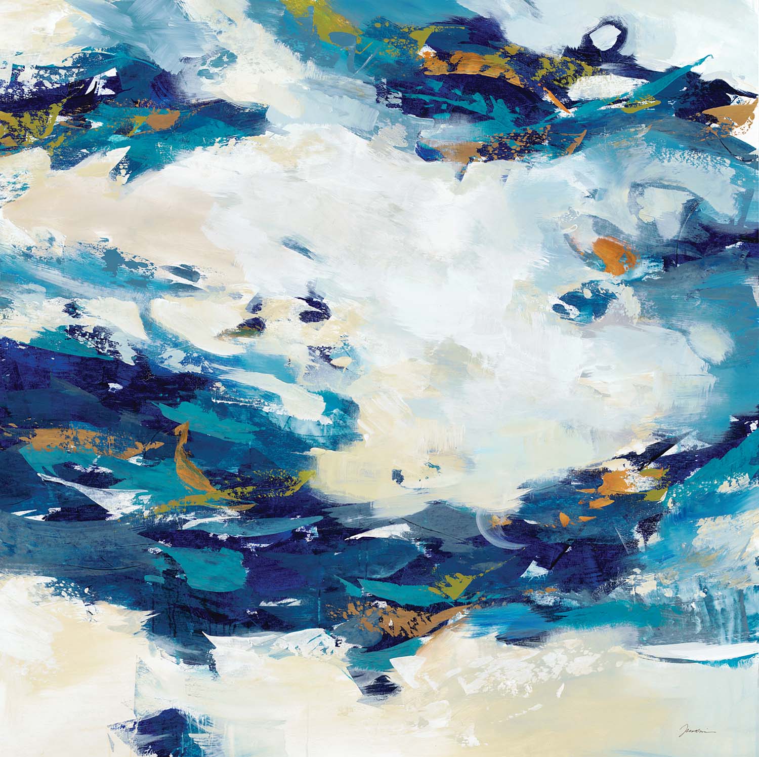
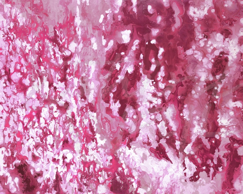
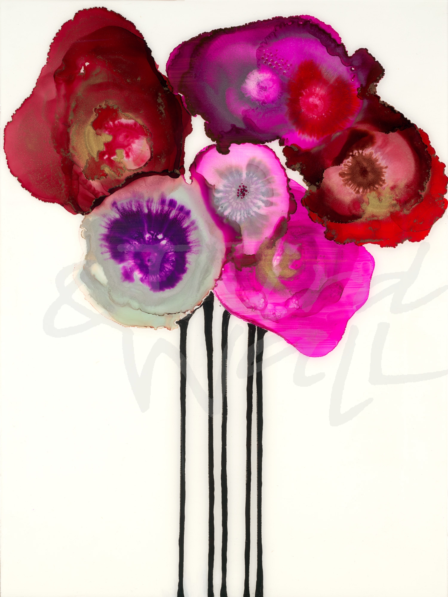
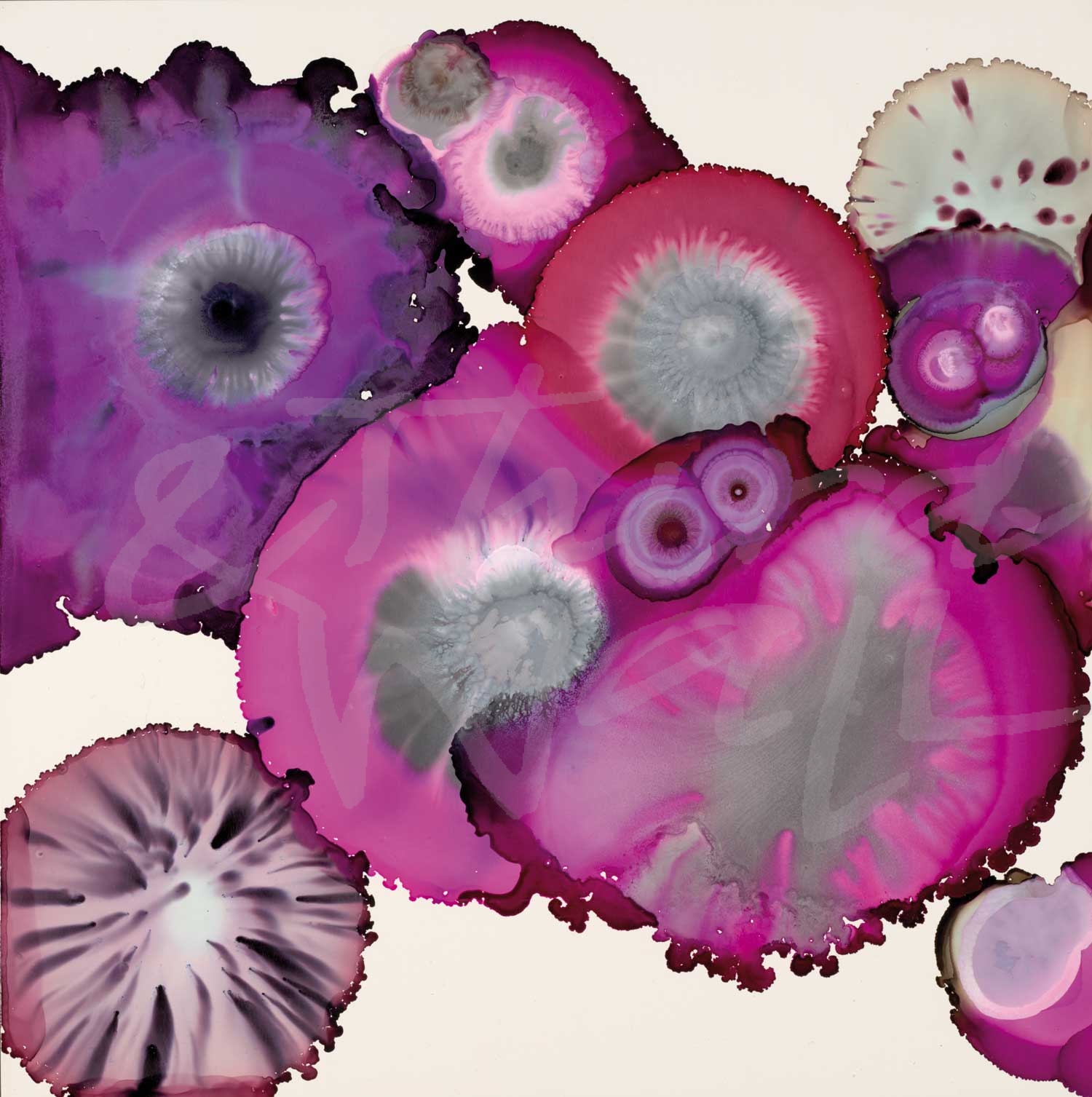
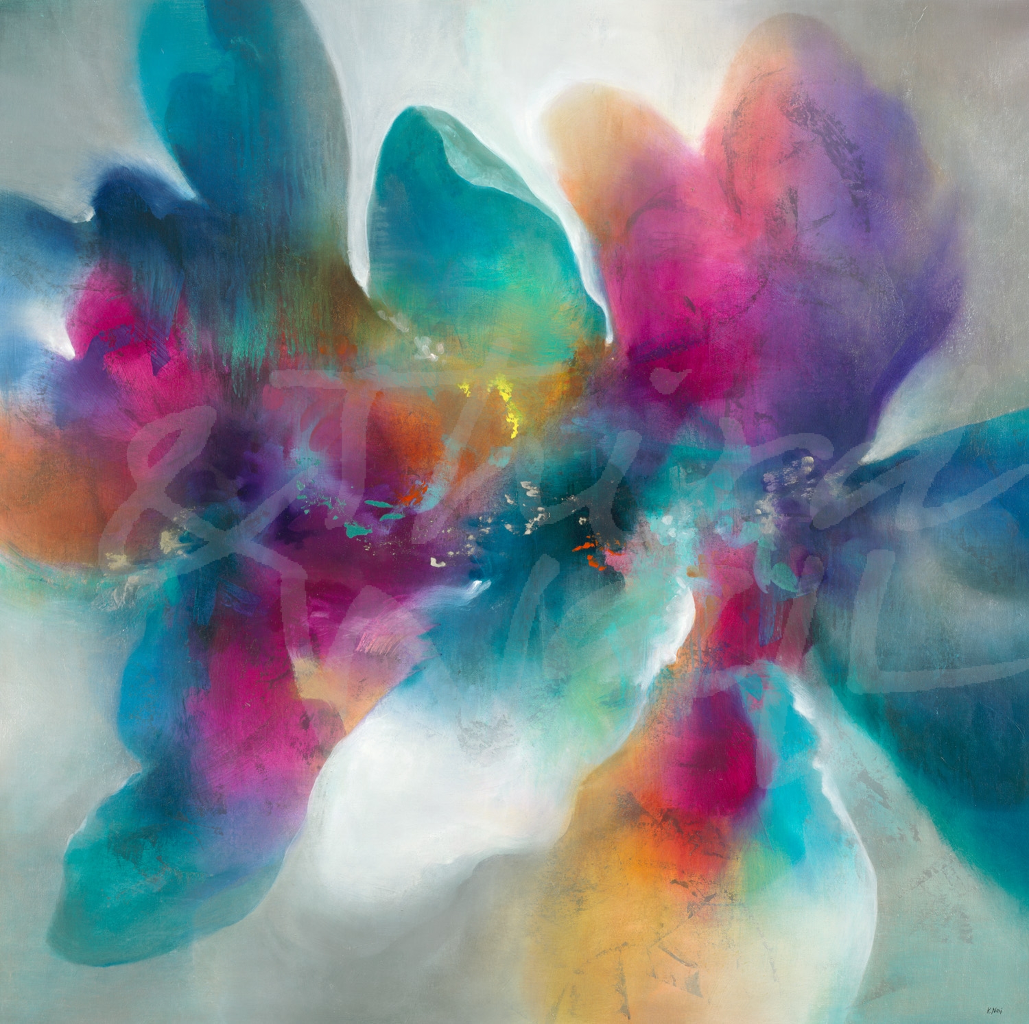
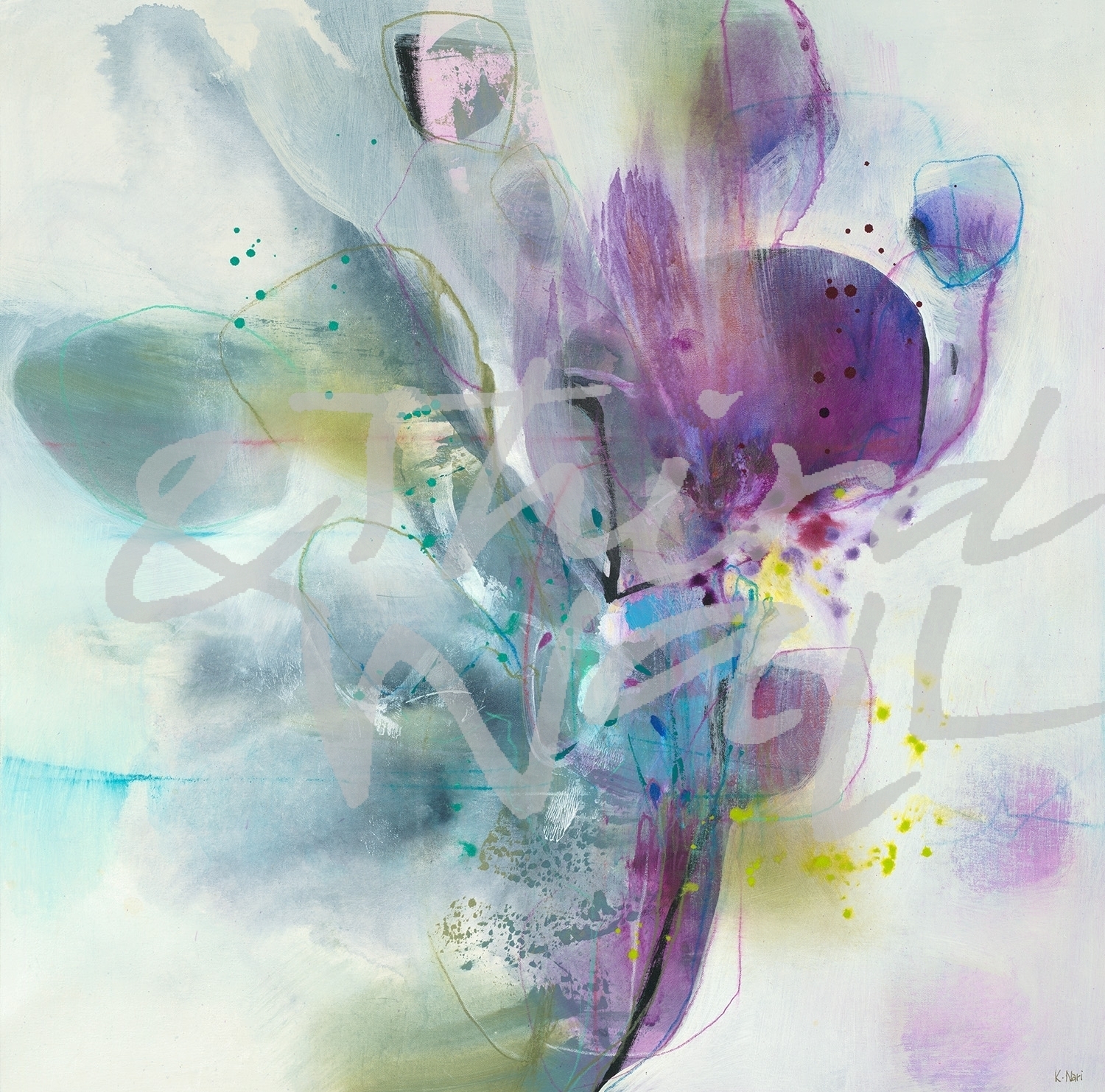
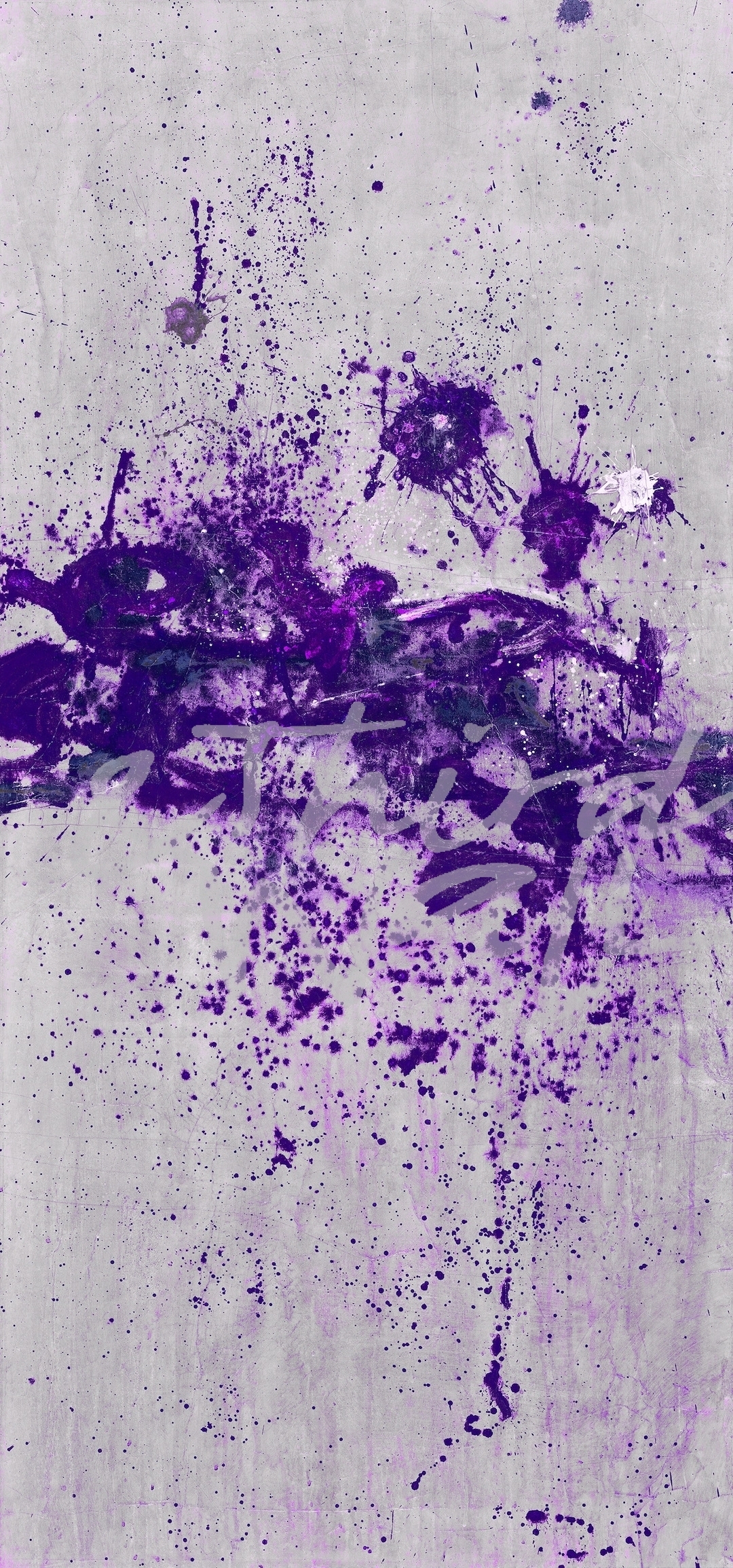
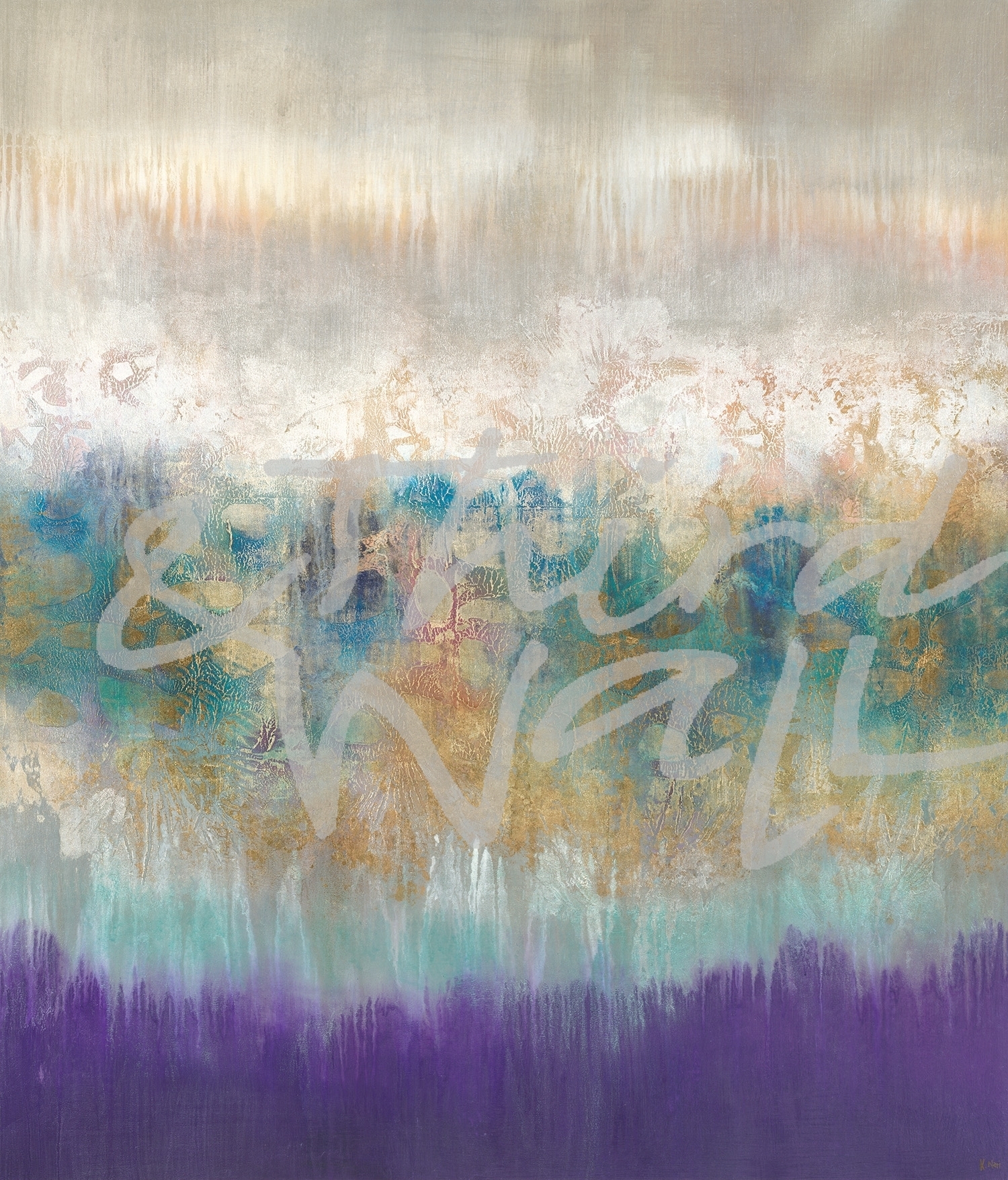
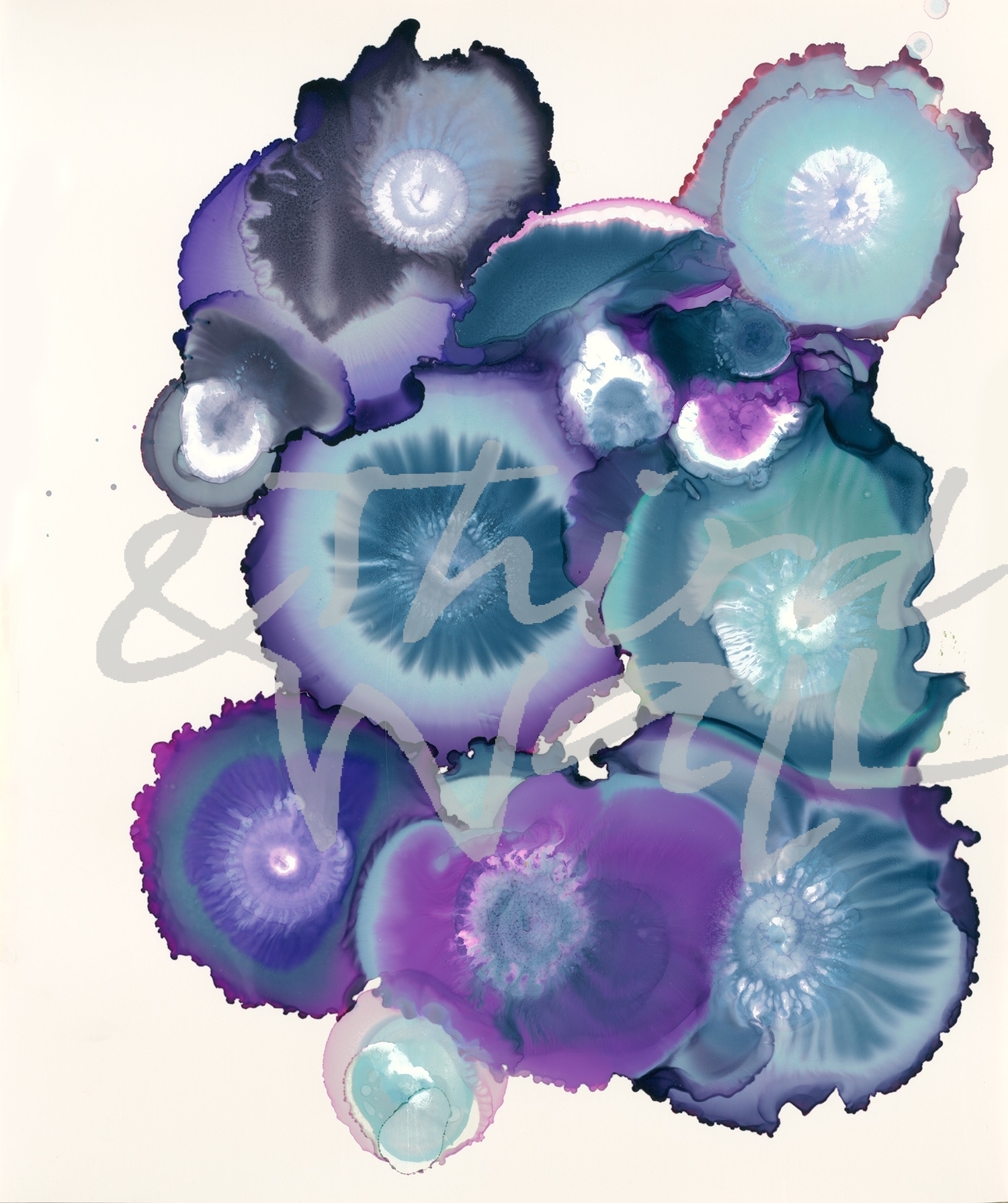
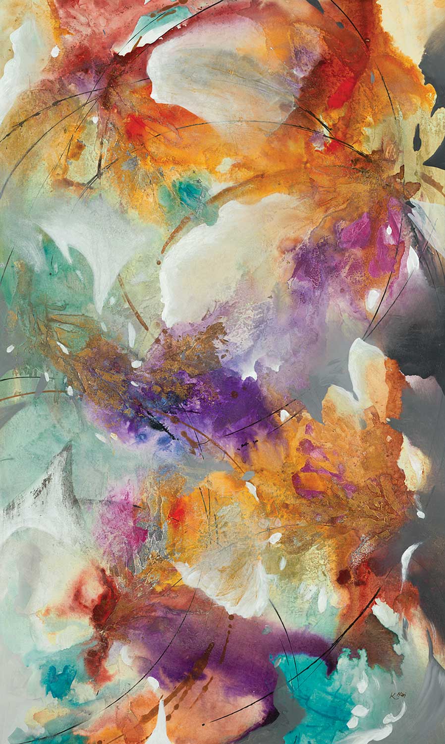
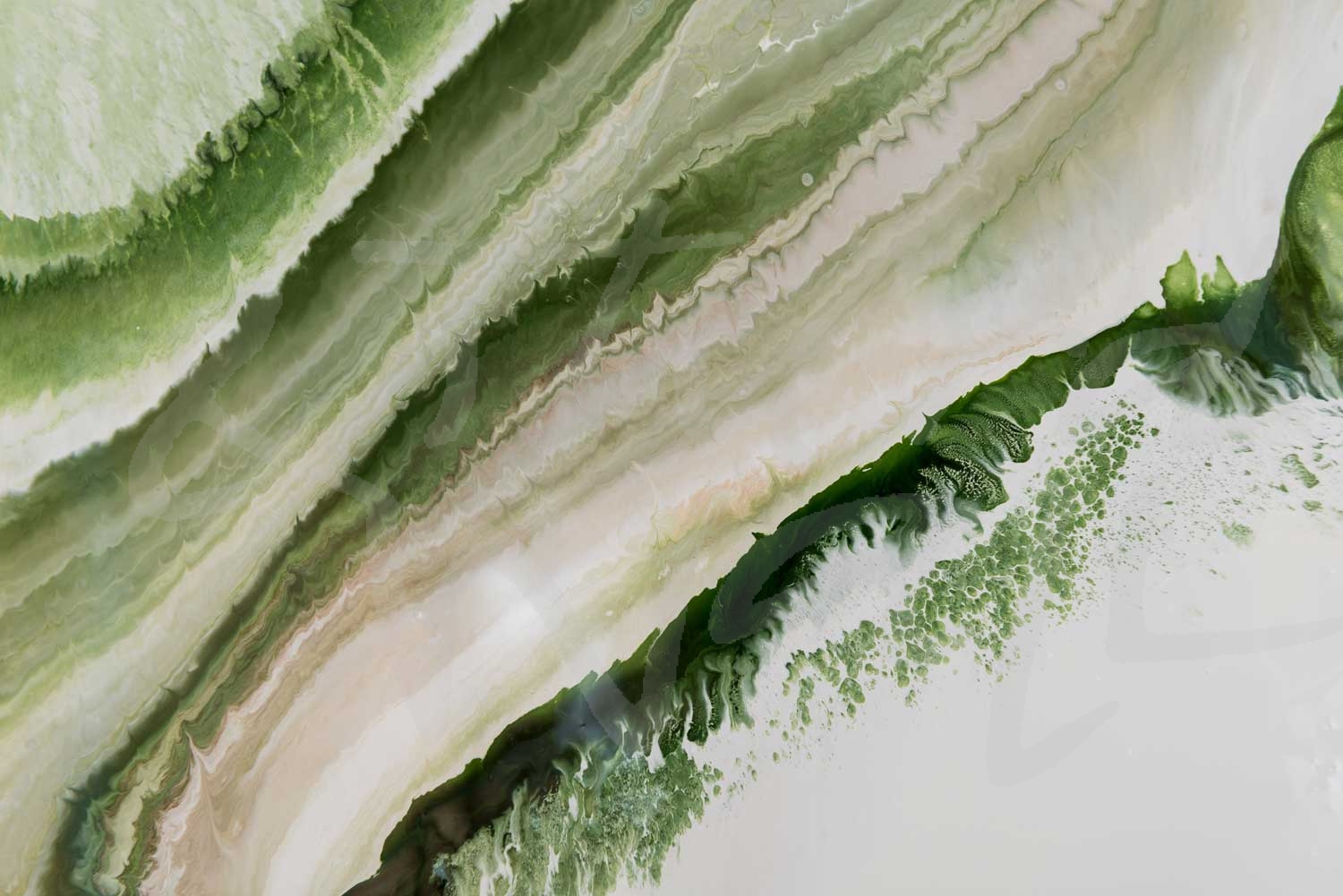
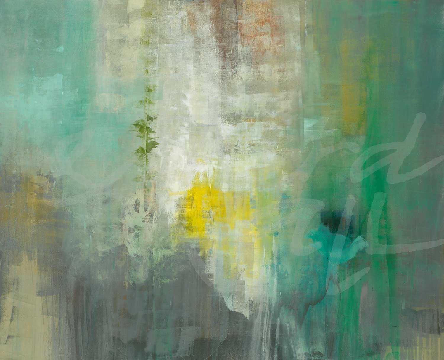
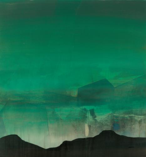
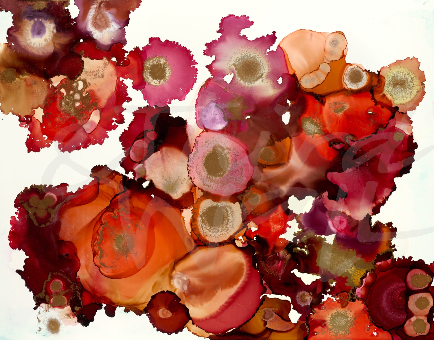
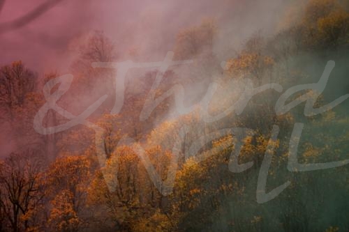
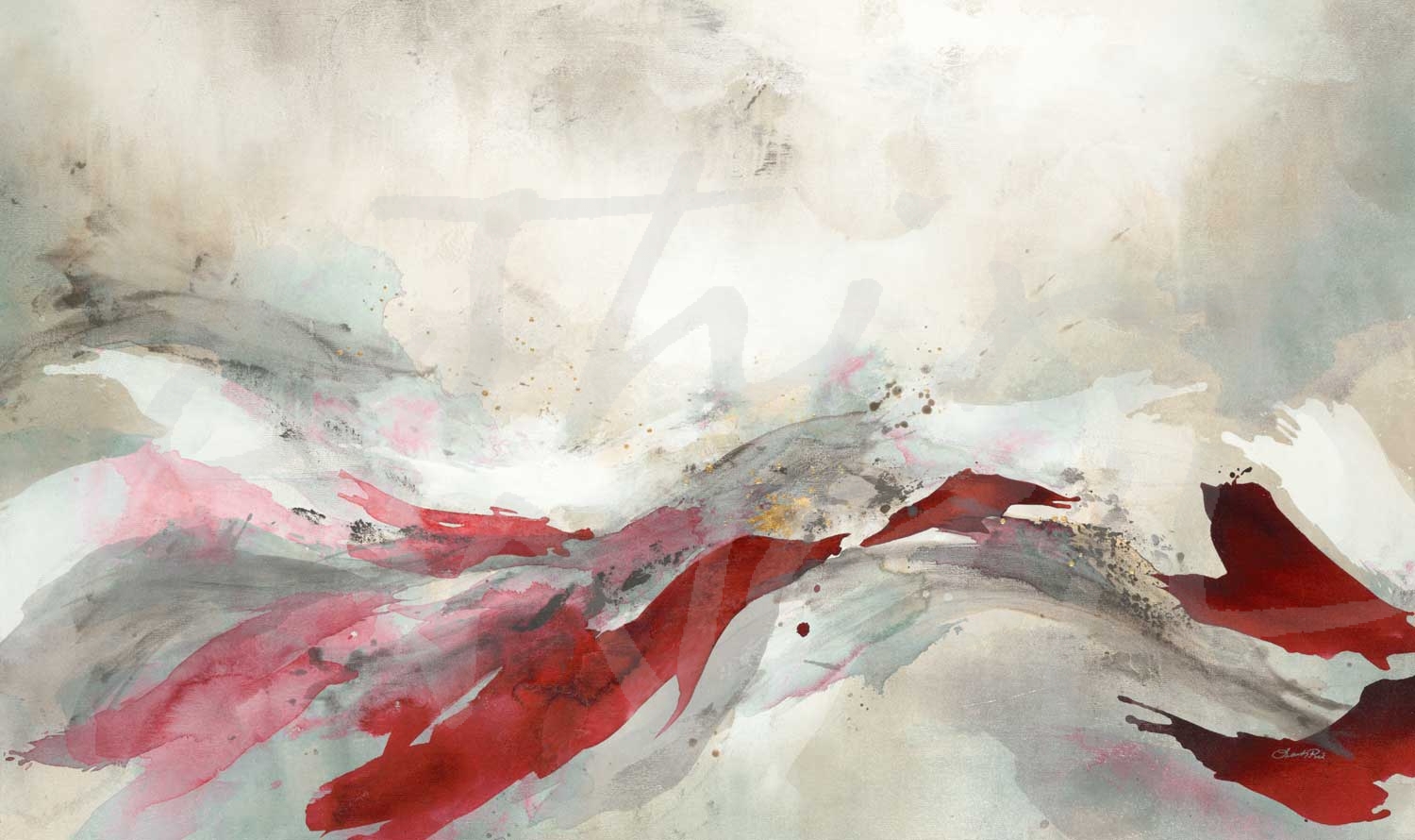
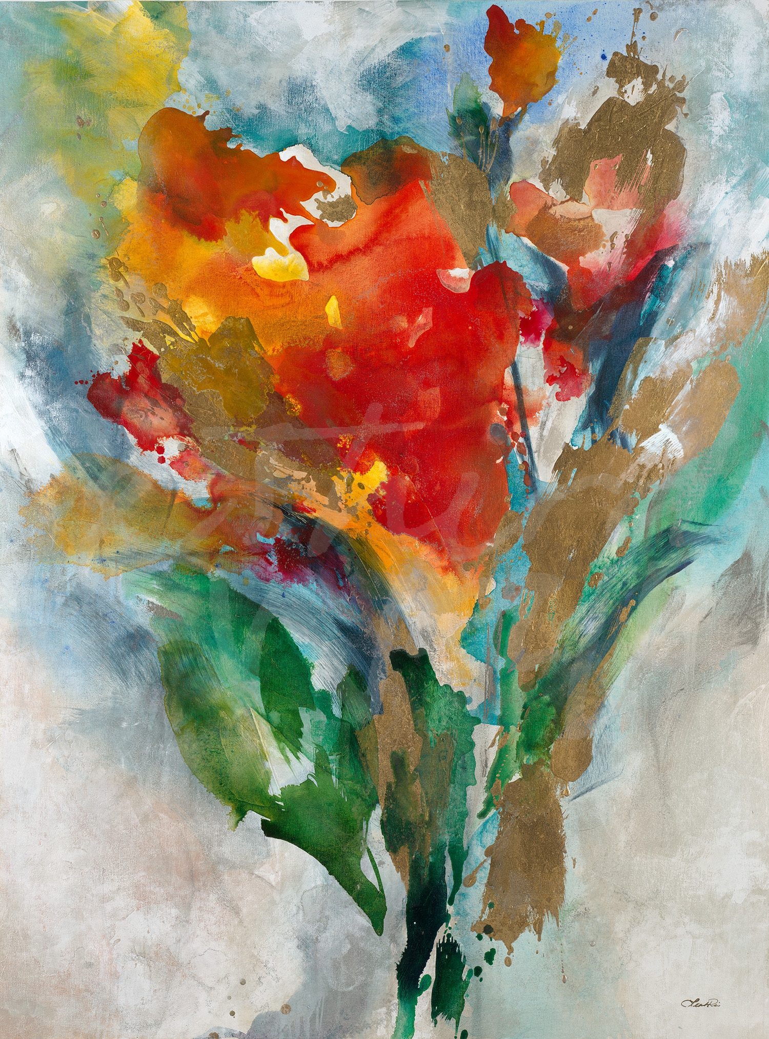
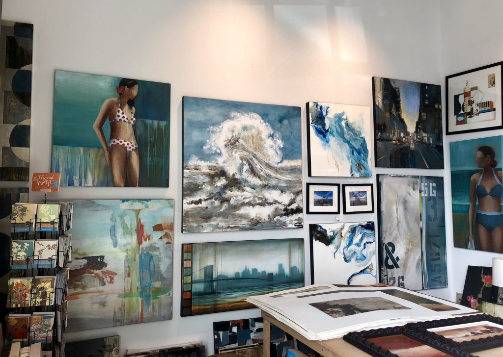
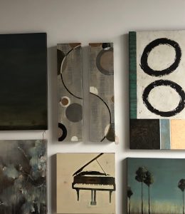
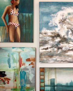
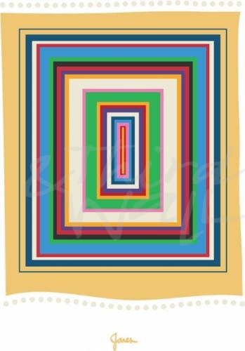
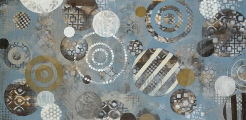
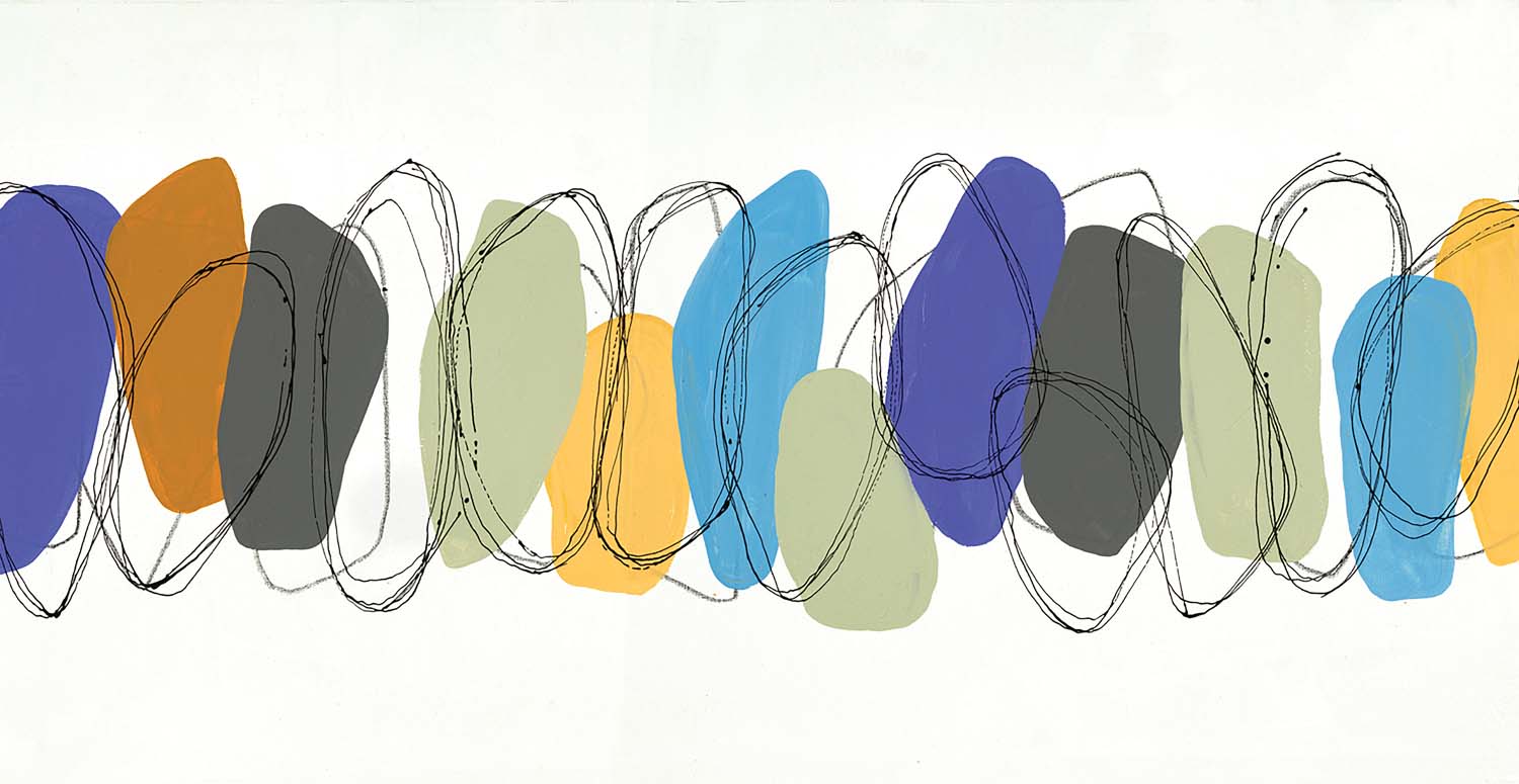
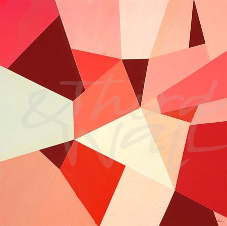
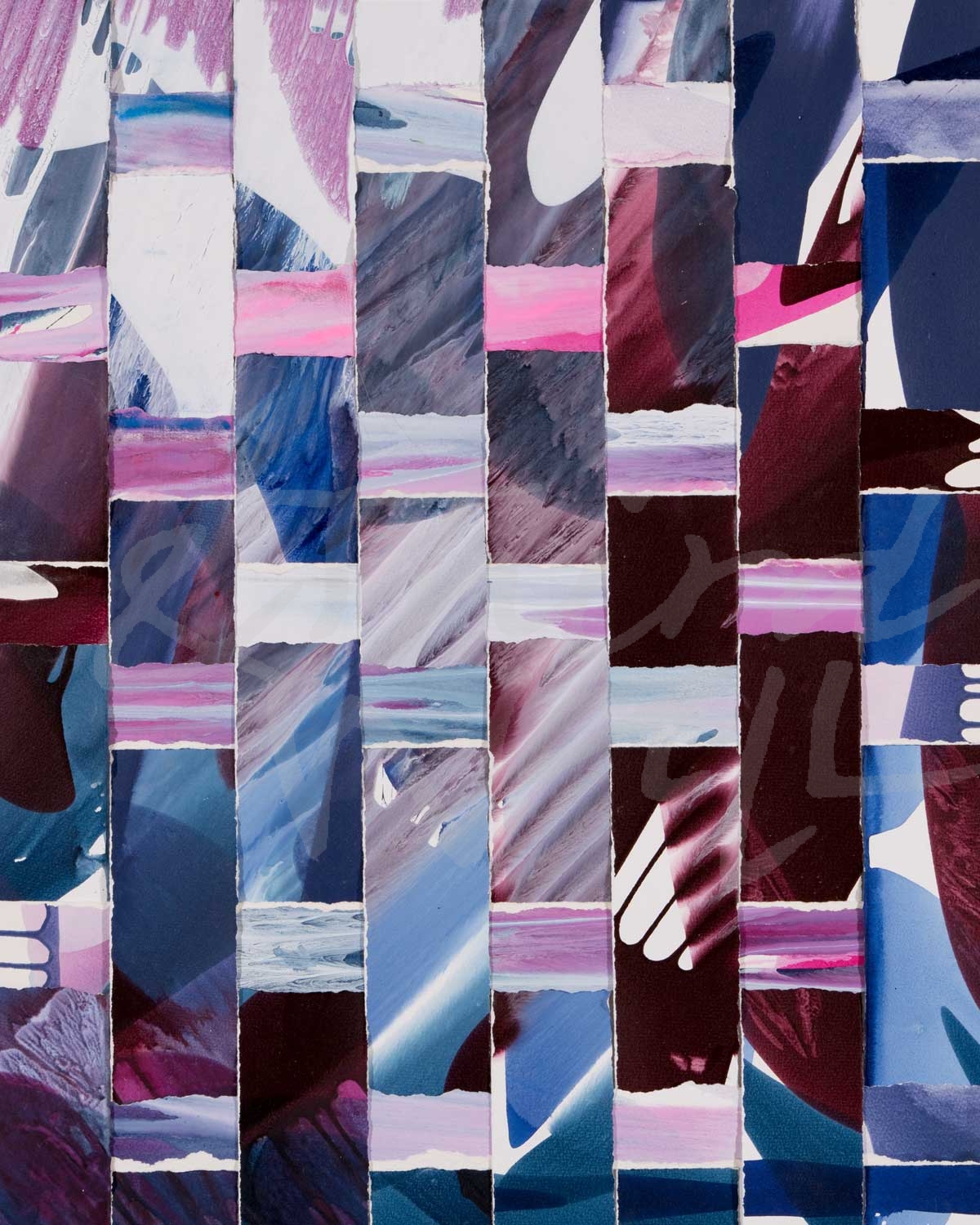
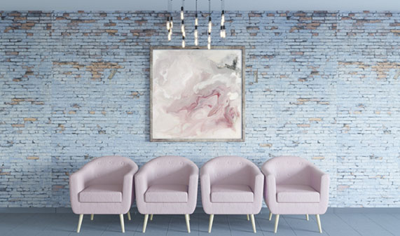
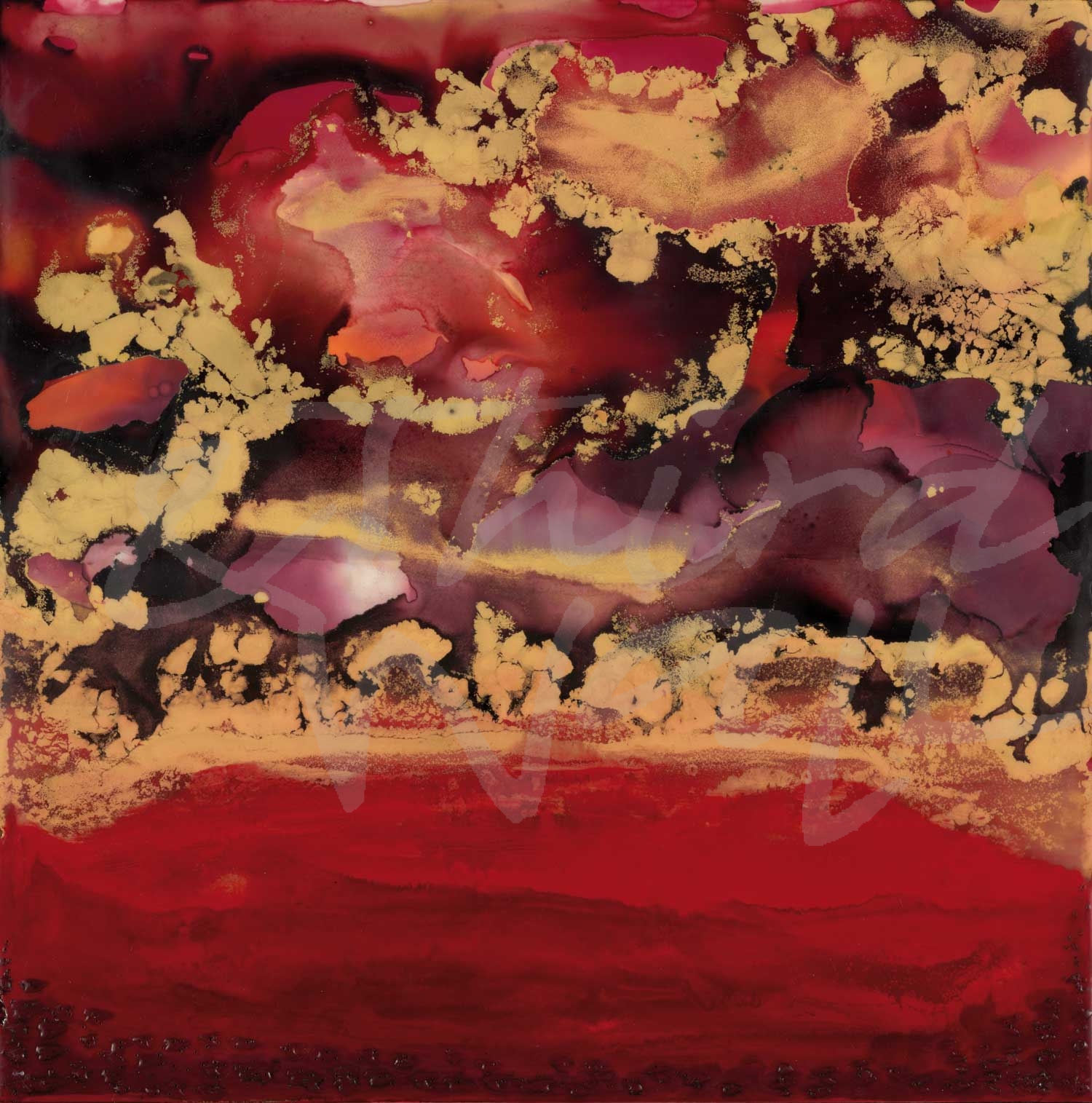
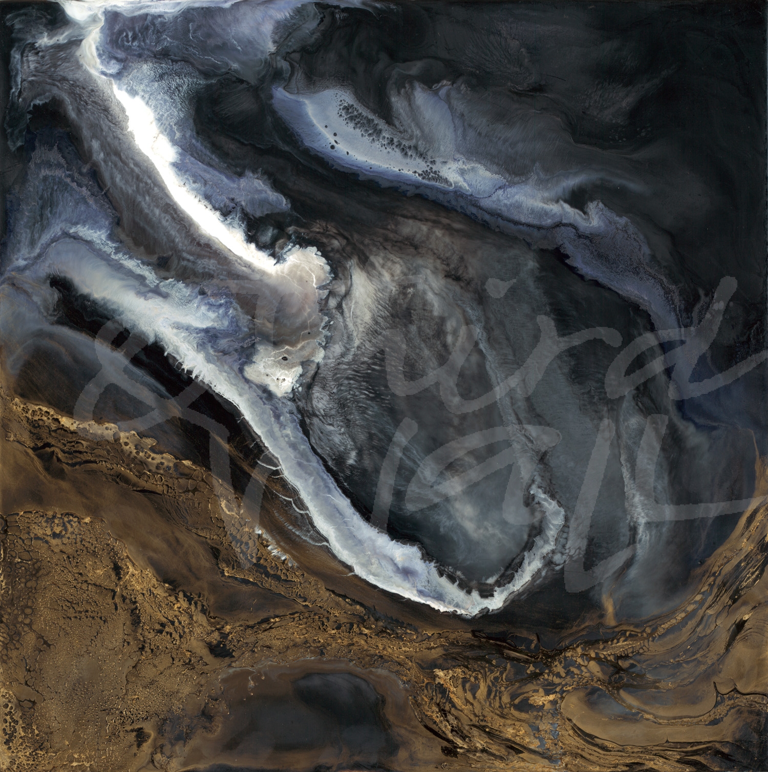
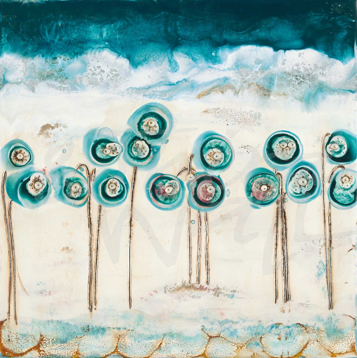
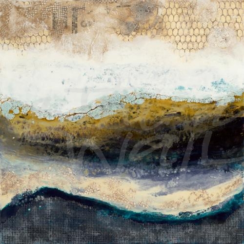
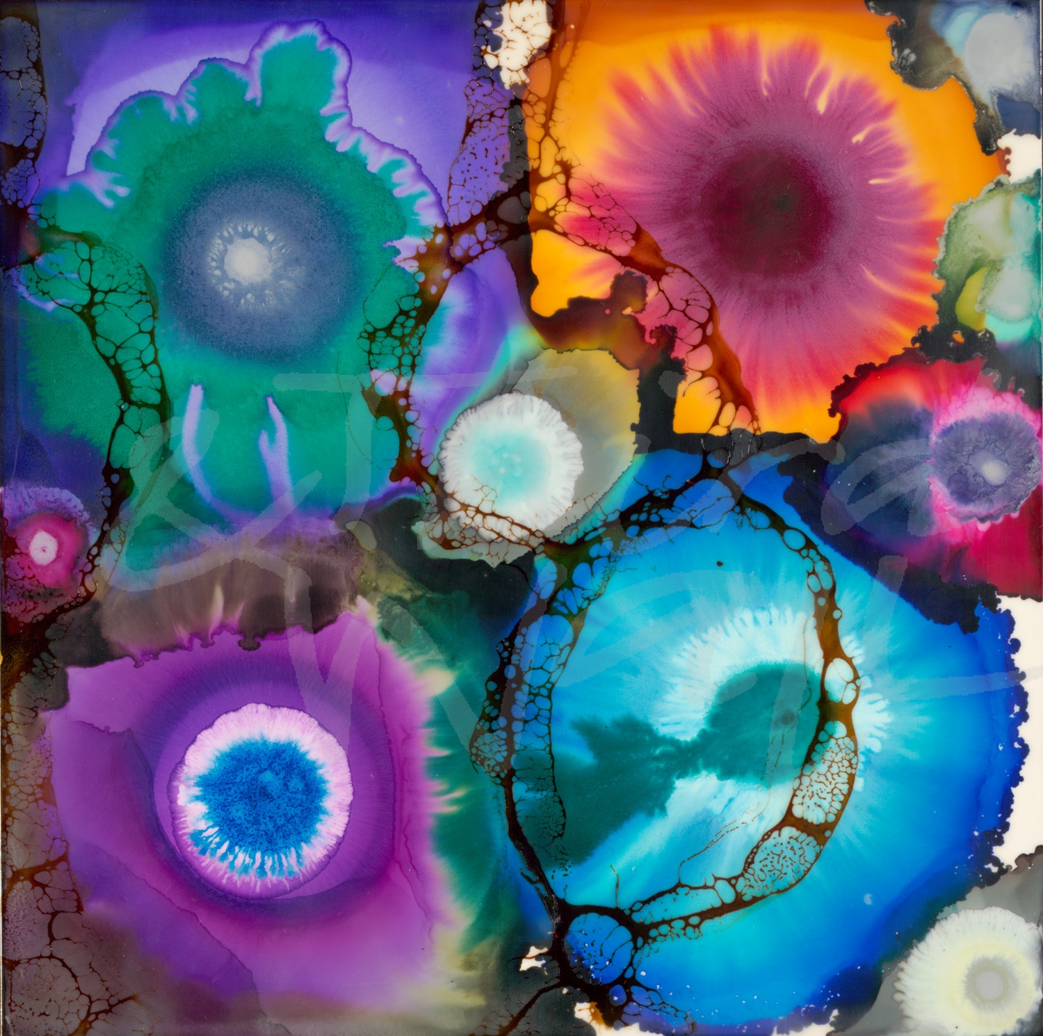
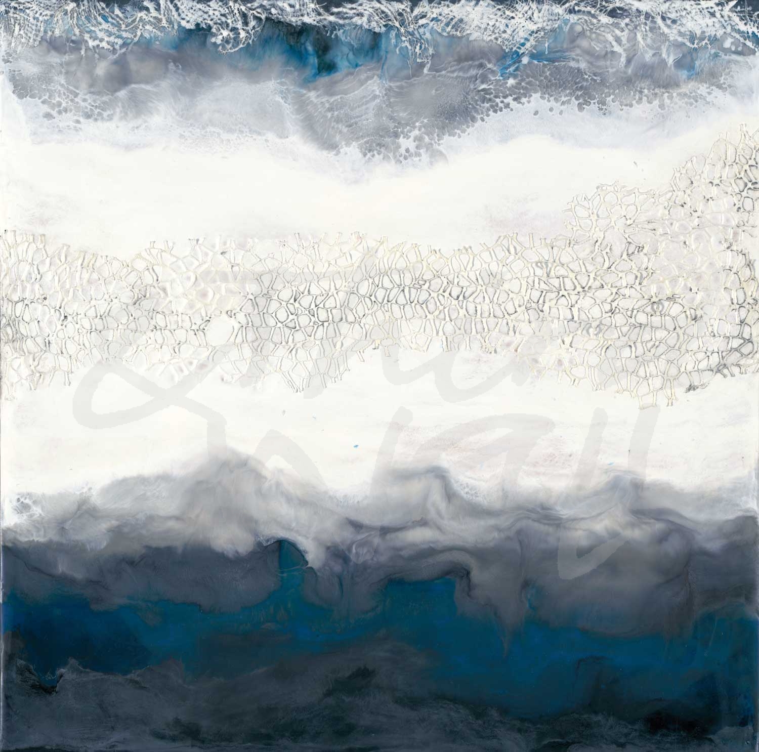
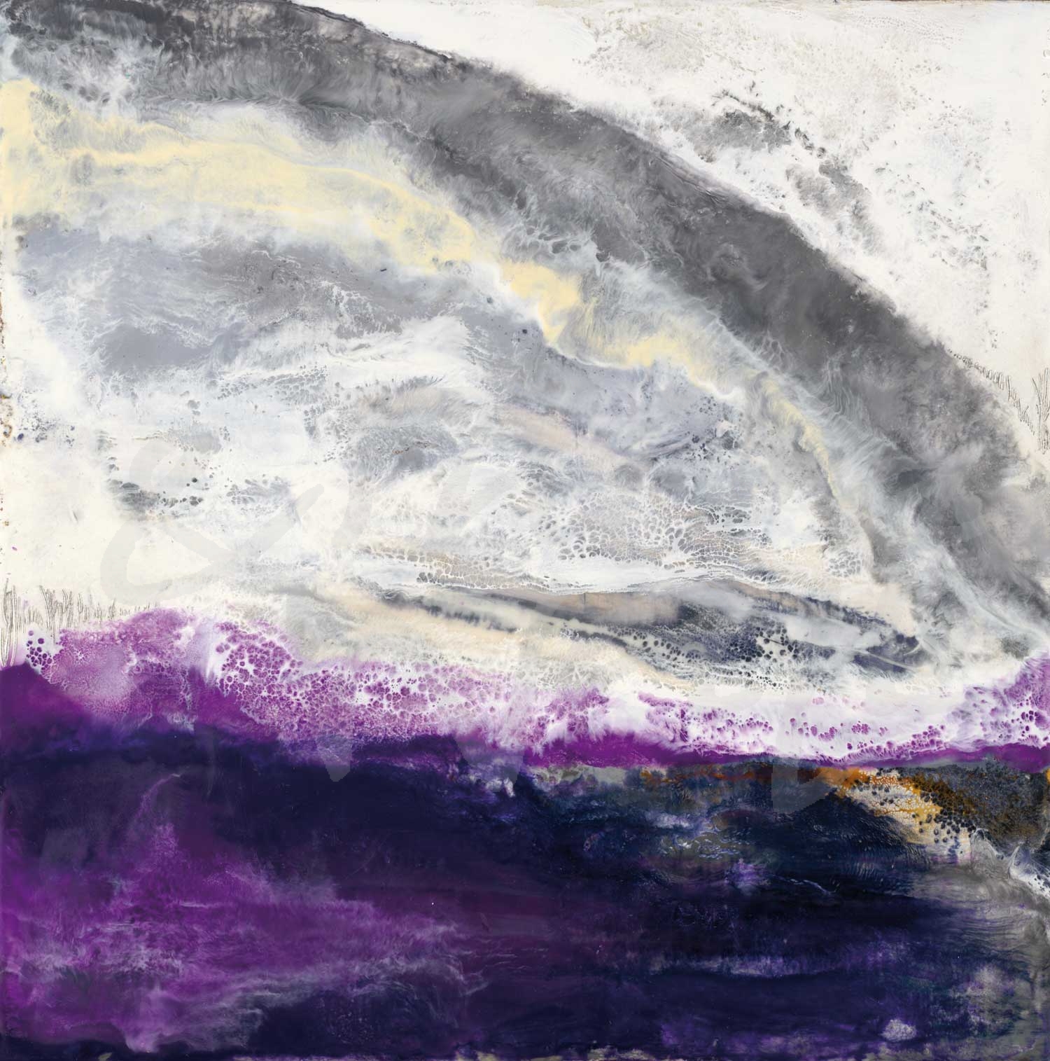
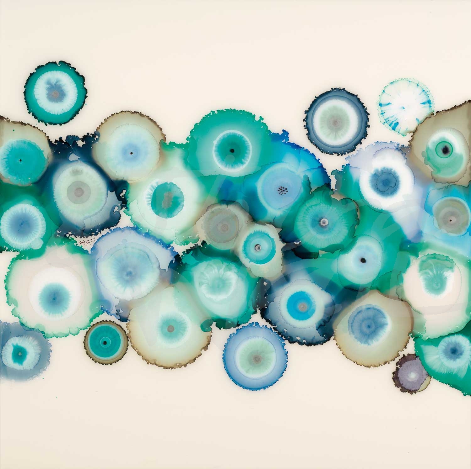
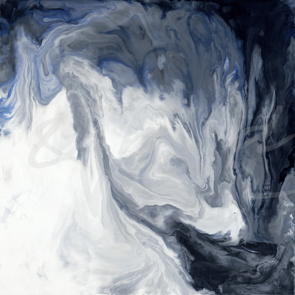
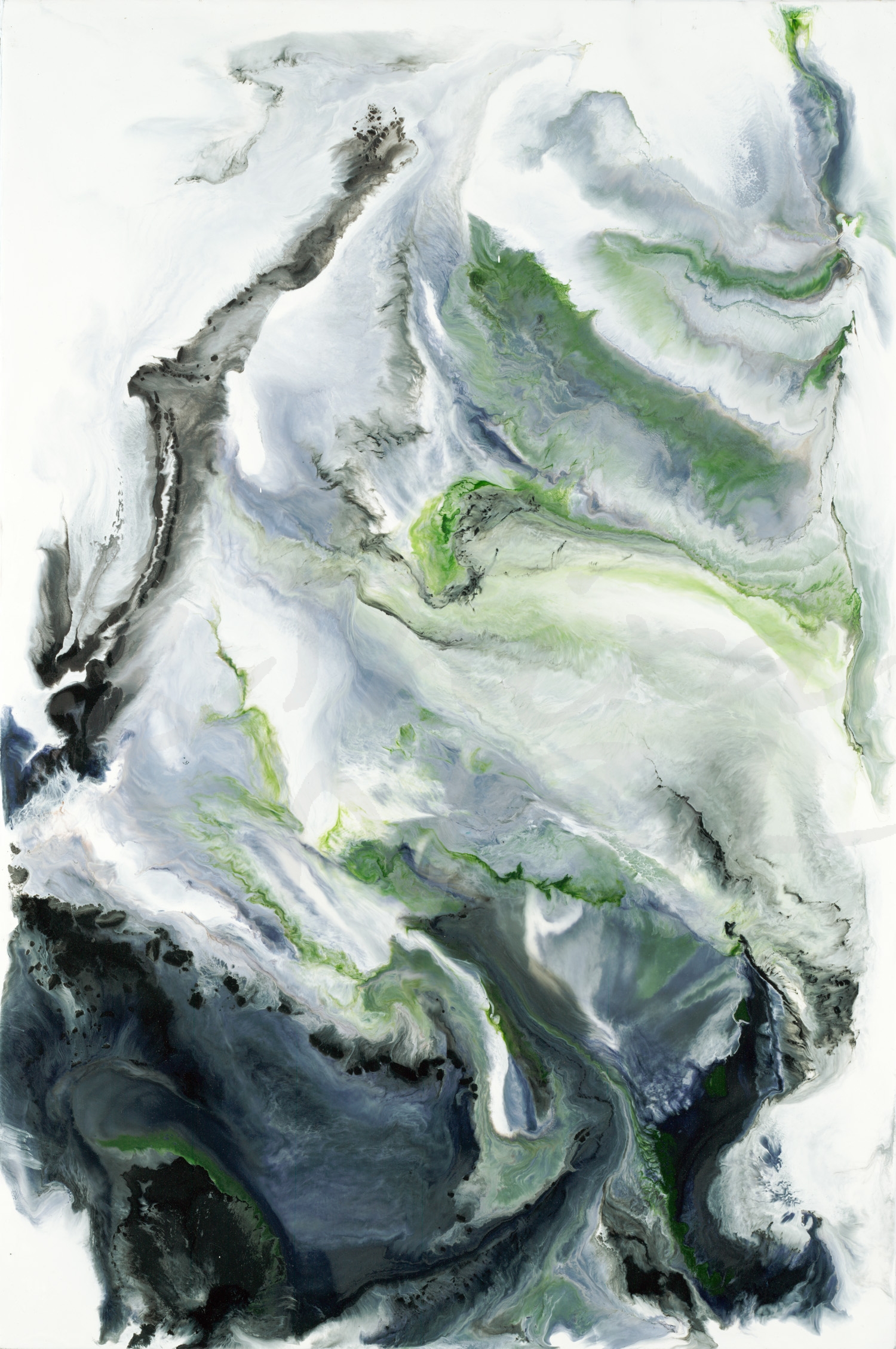
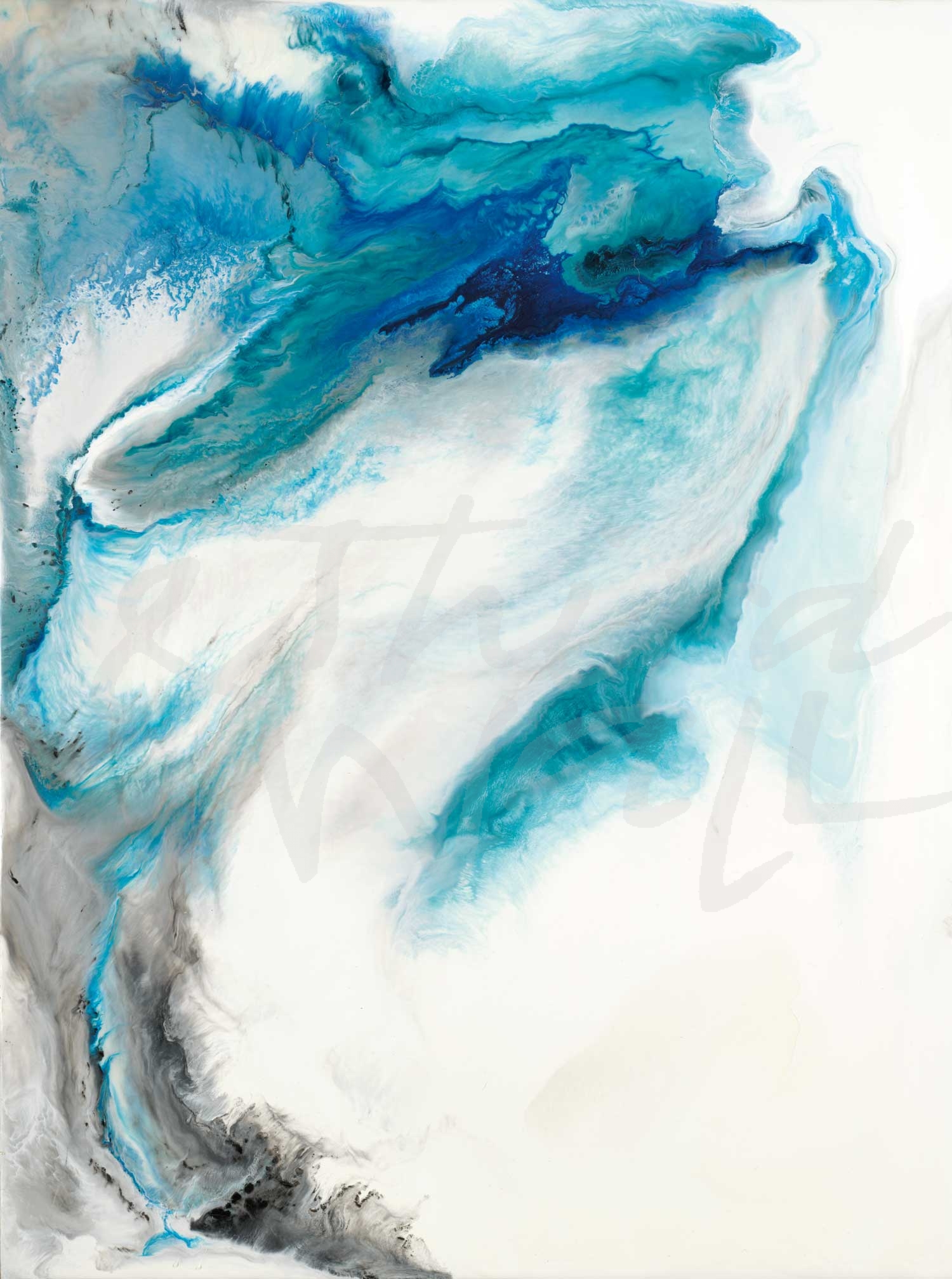
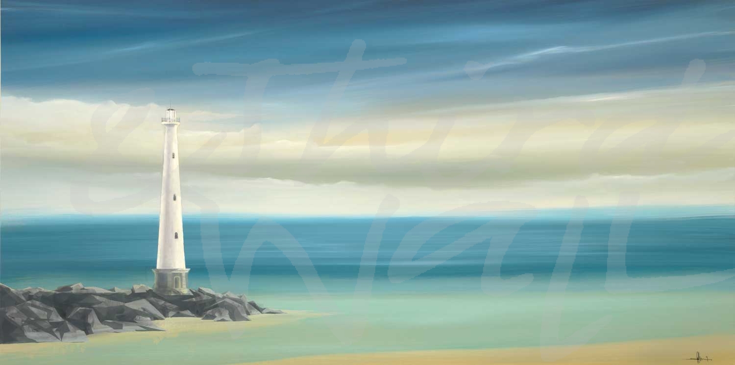
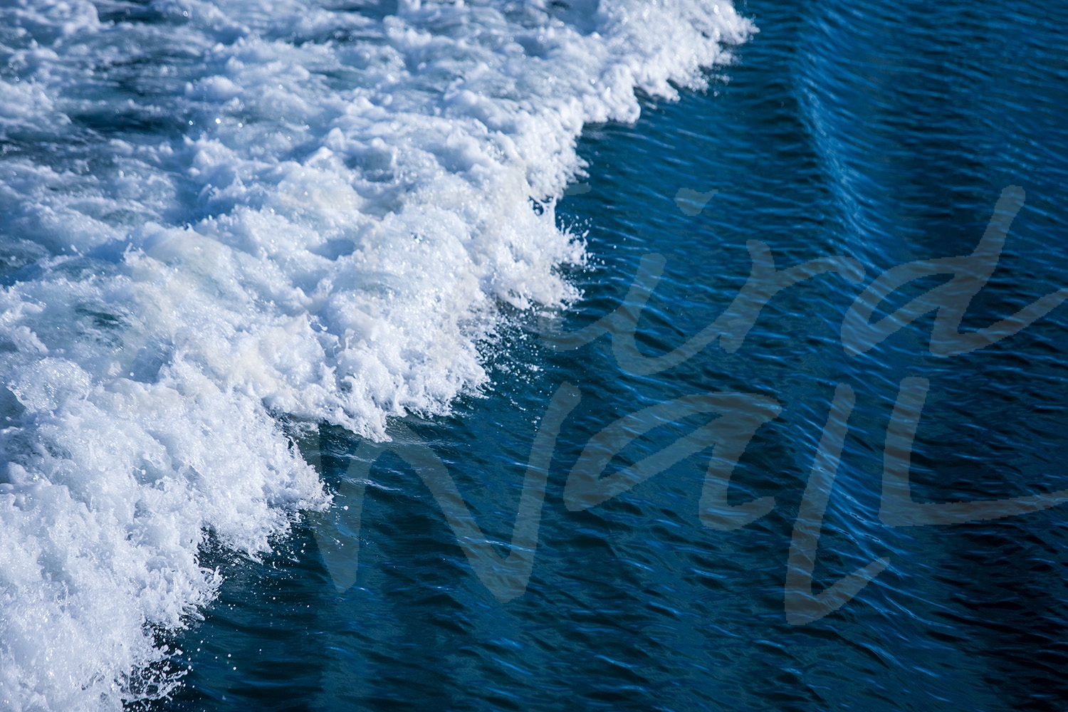
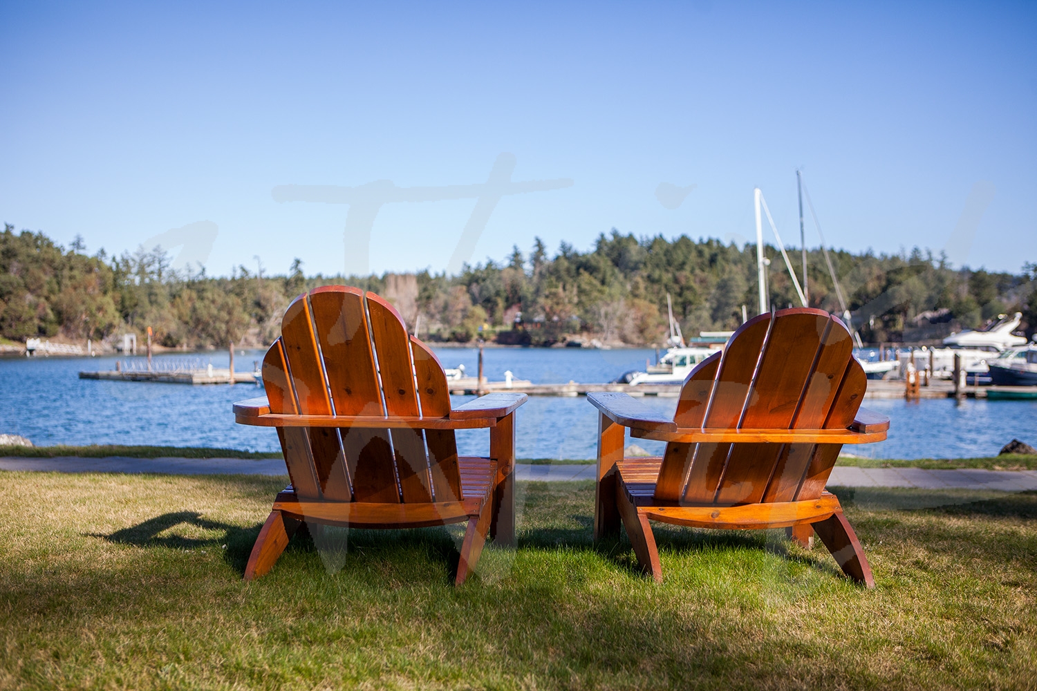
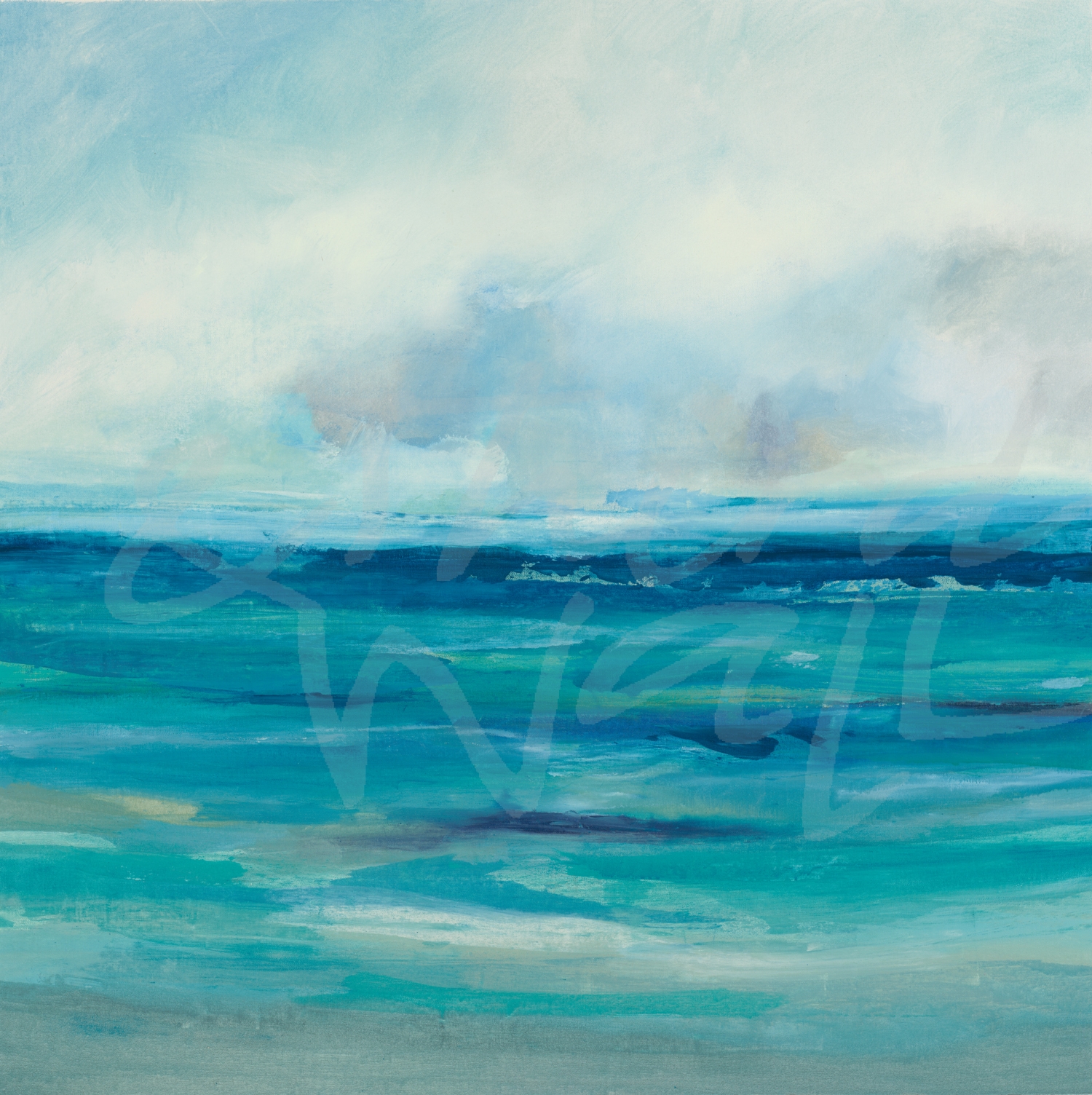
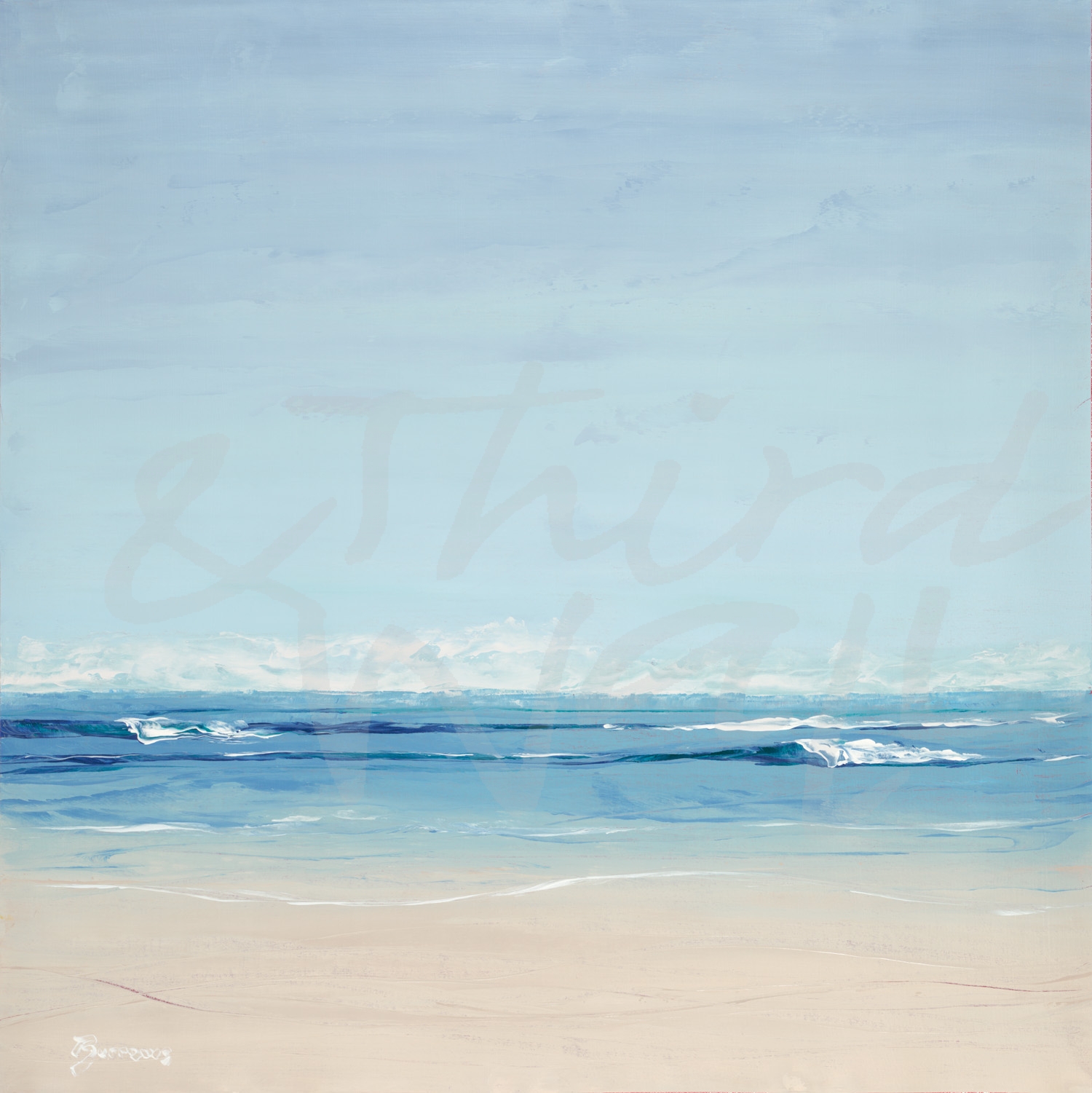
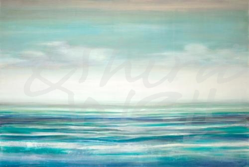
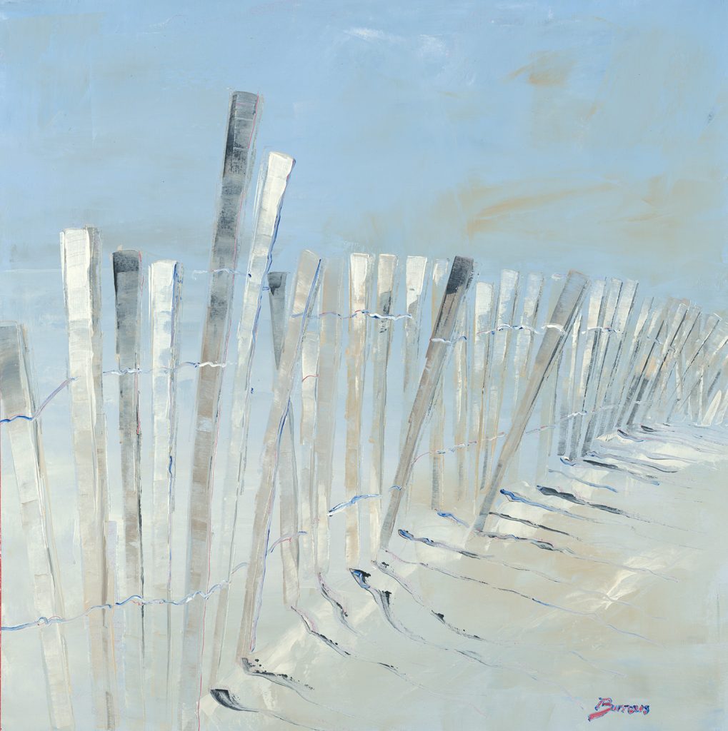
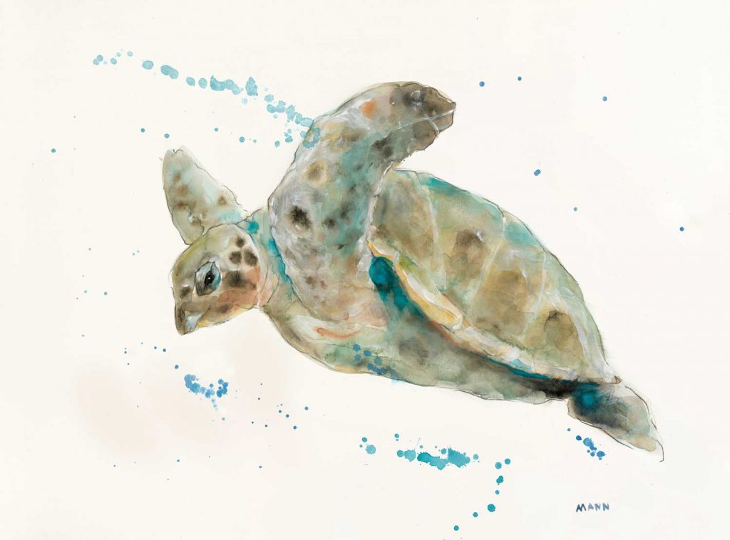
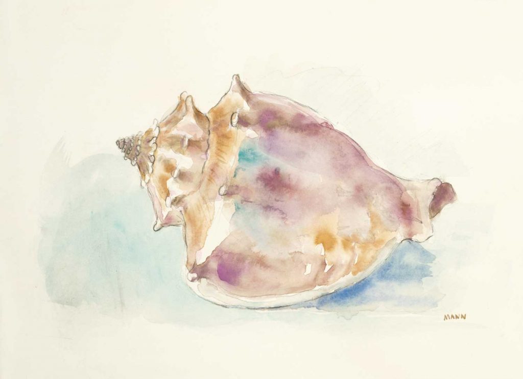
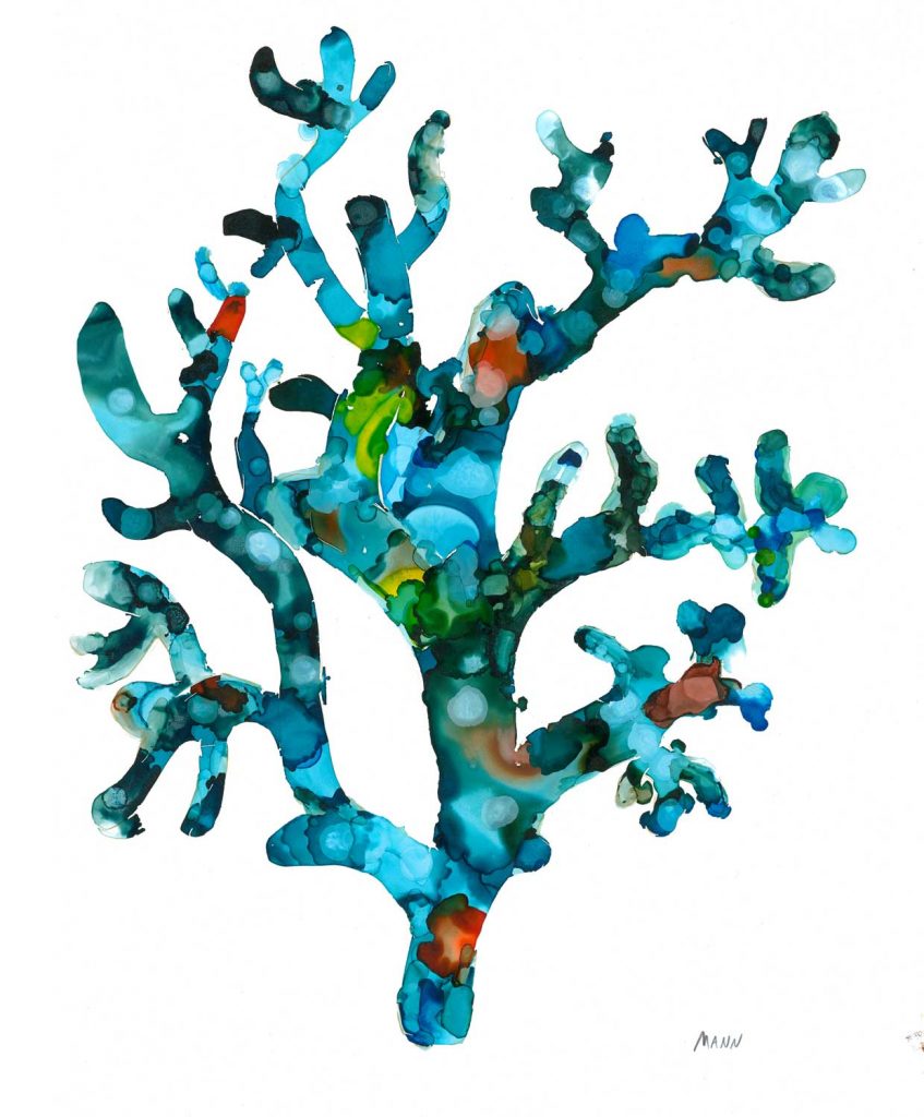
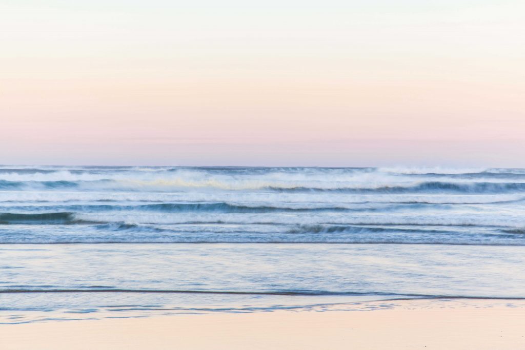
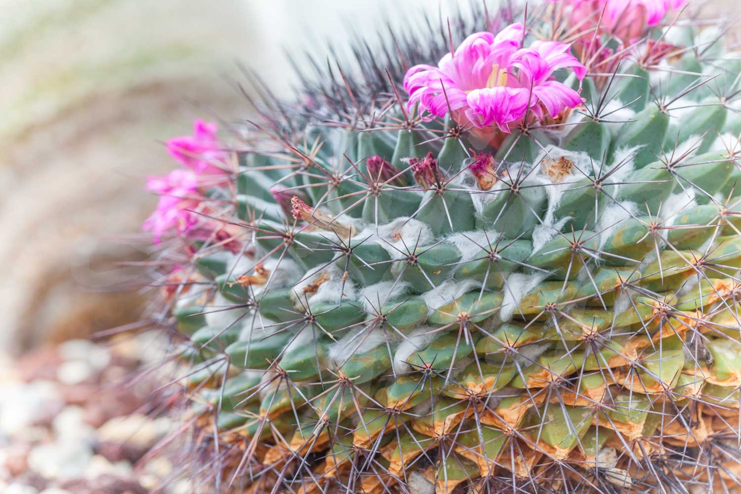
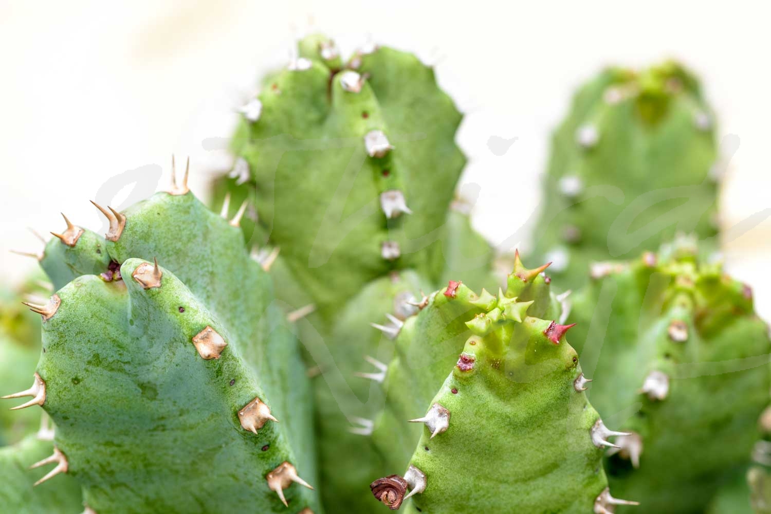
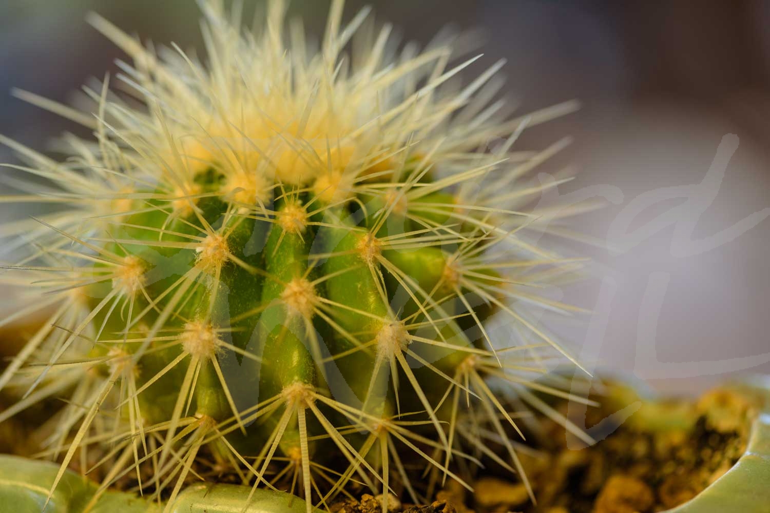

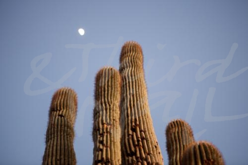
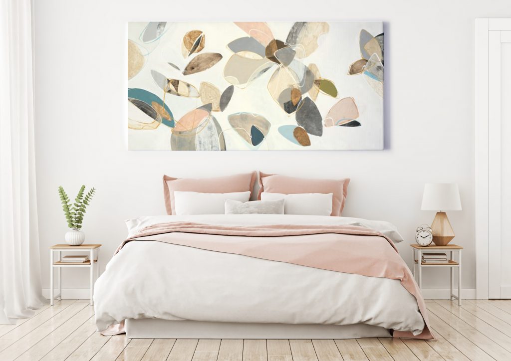
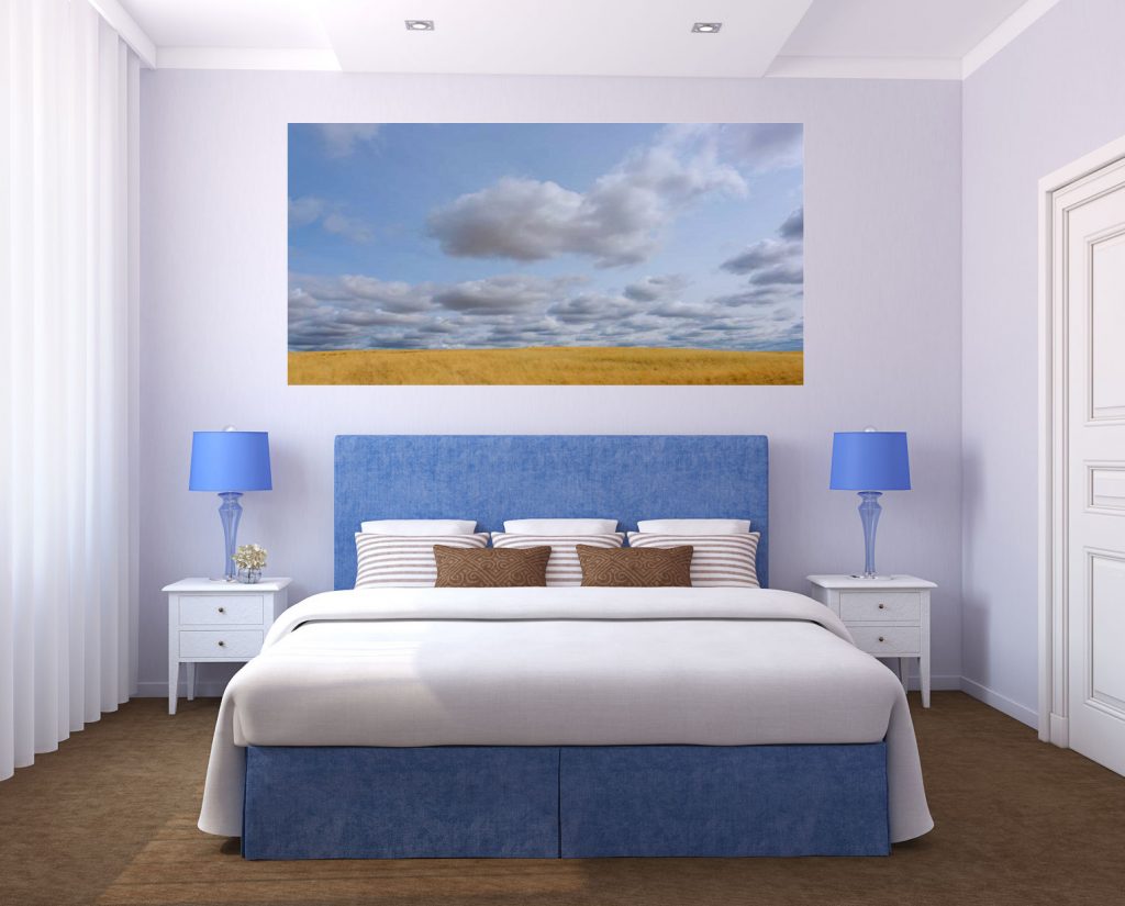
 digital art. She also enjoys working with acrylic paints, and has begun incorporating 3D elements to her paintings. She has a vast range of styles but particularly enjoys contemporary abstract styles with an edgy feel.


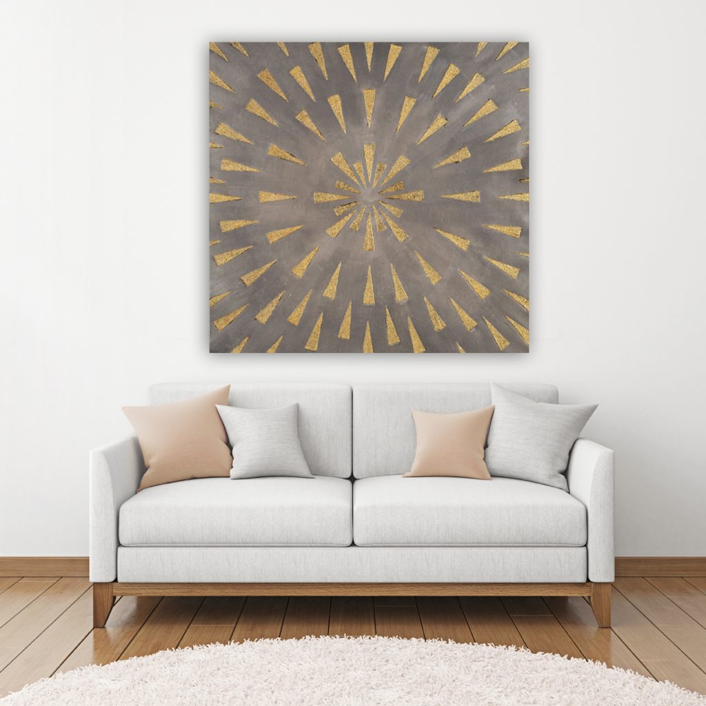
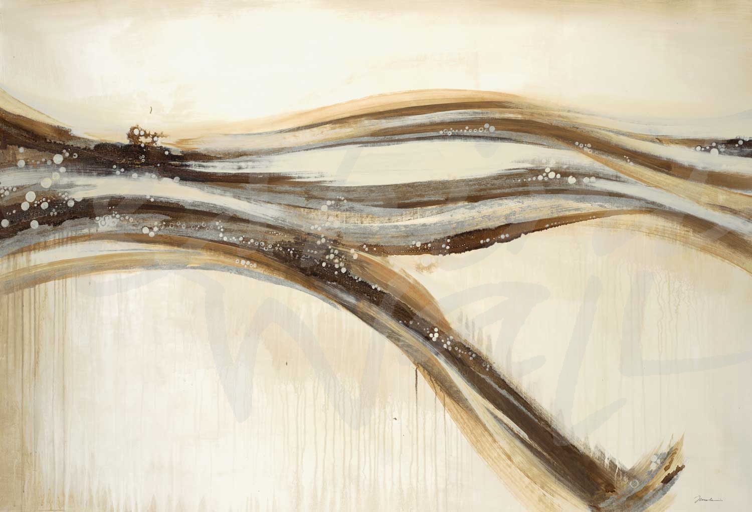
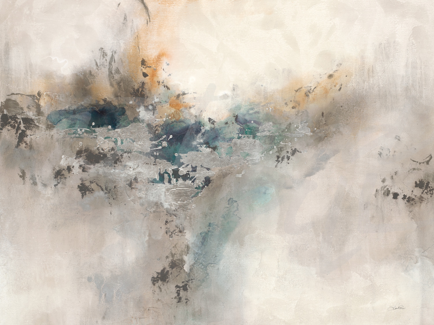
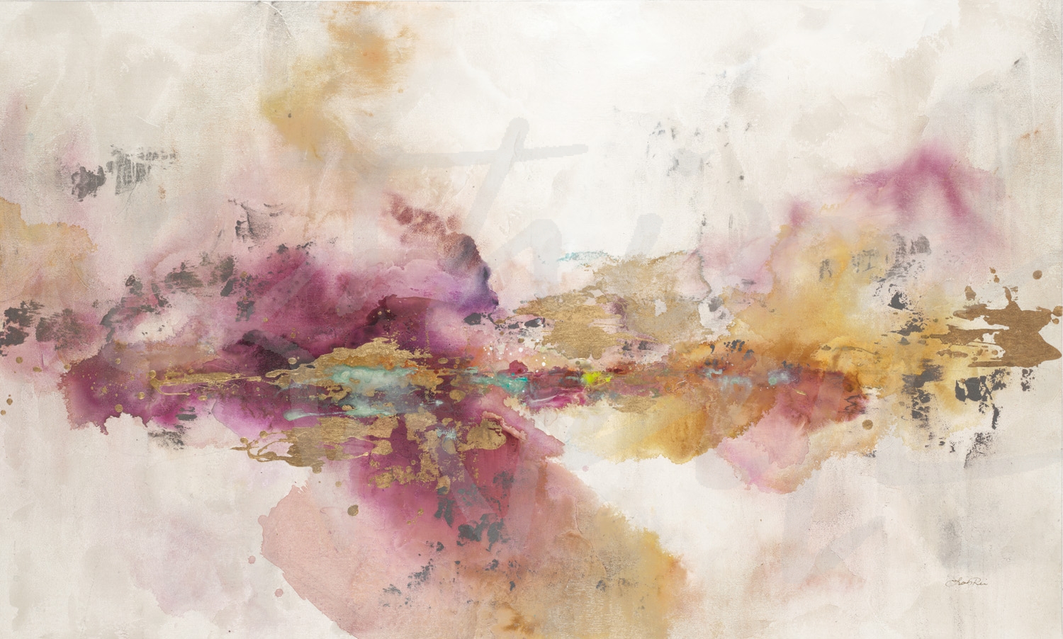
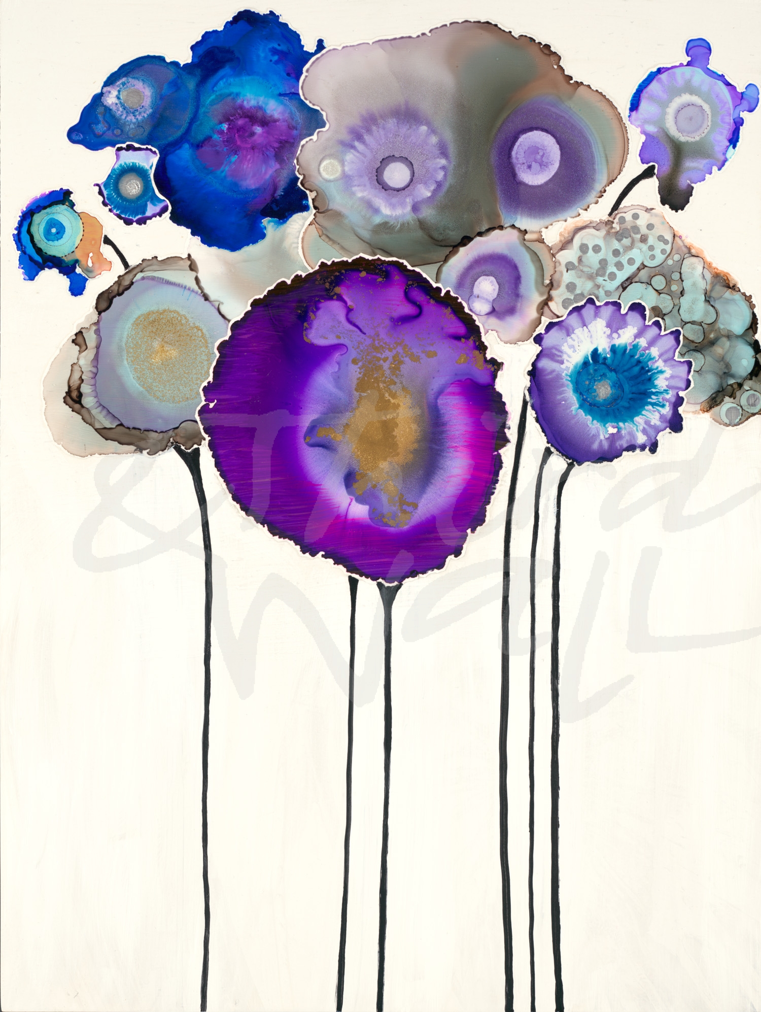
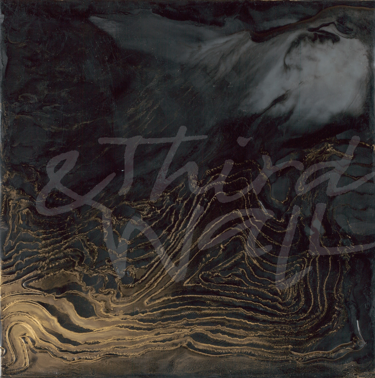
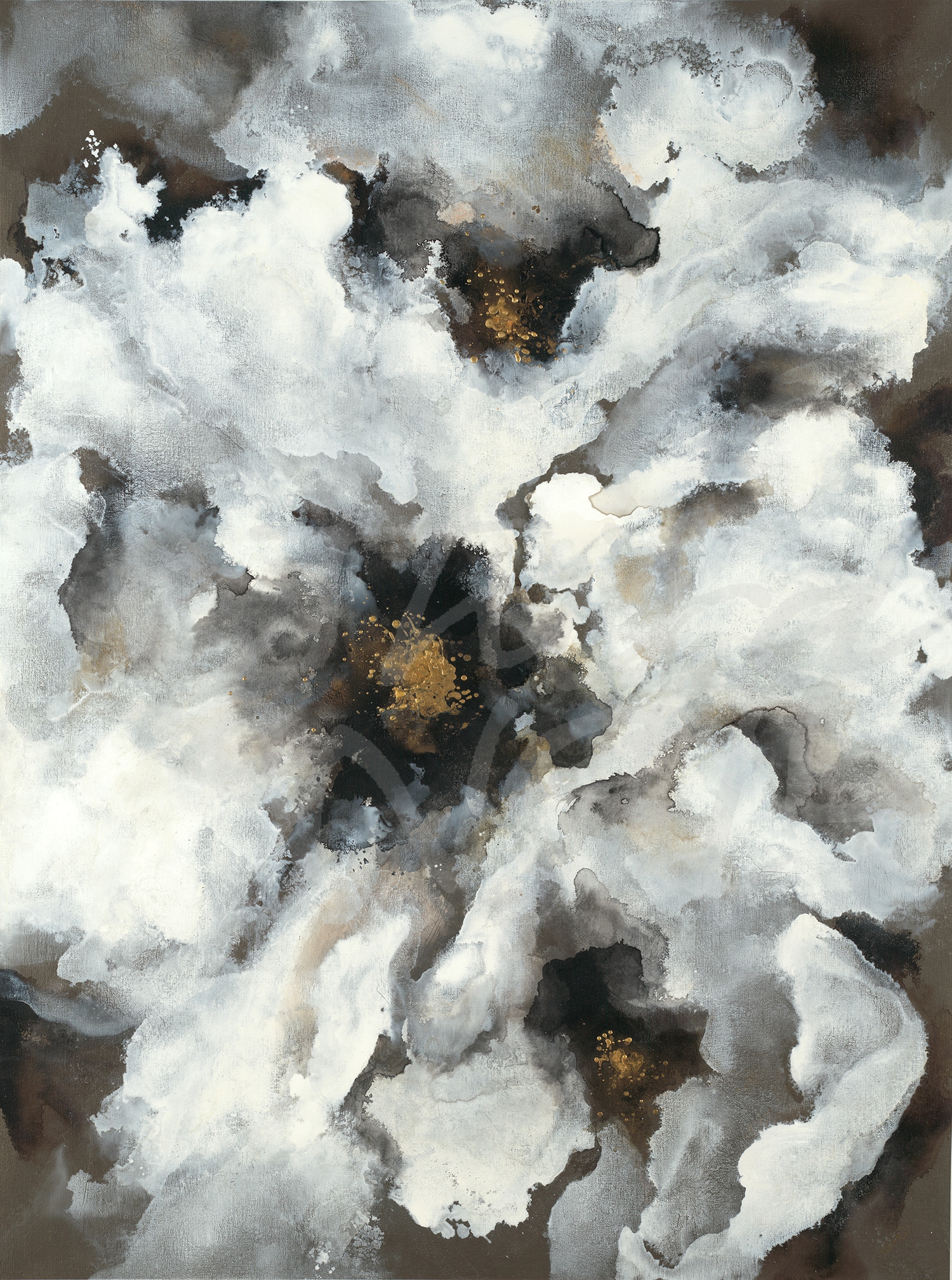
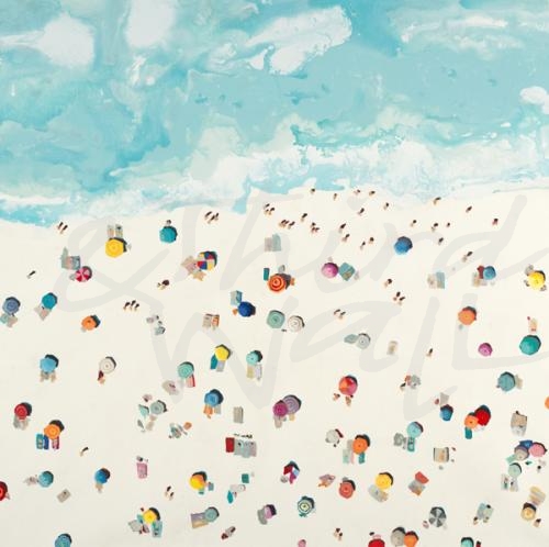

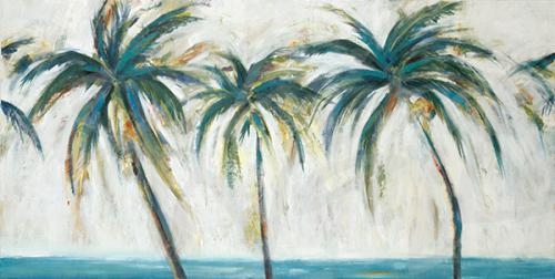
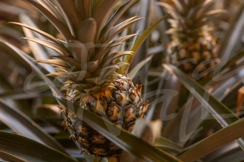
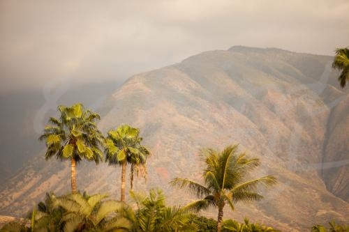
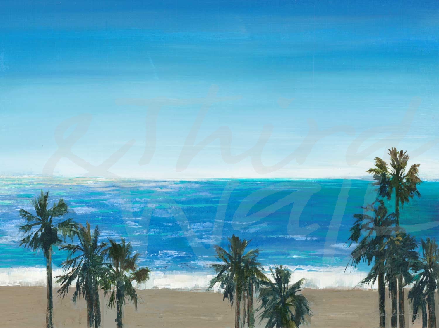
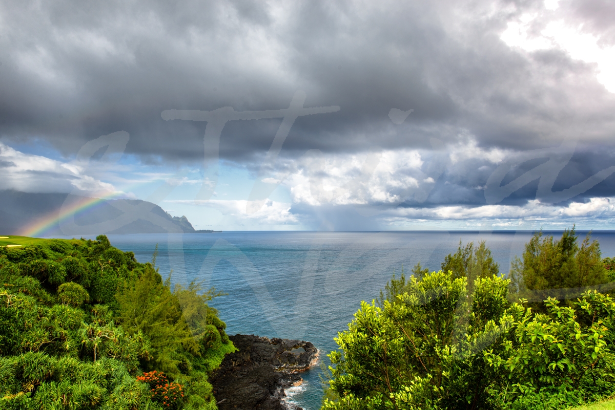
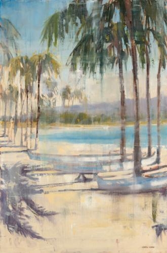
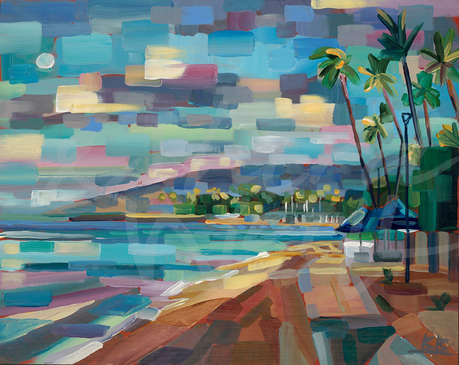
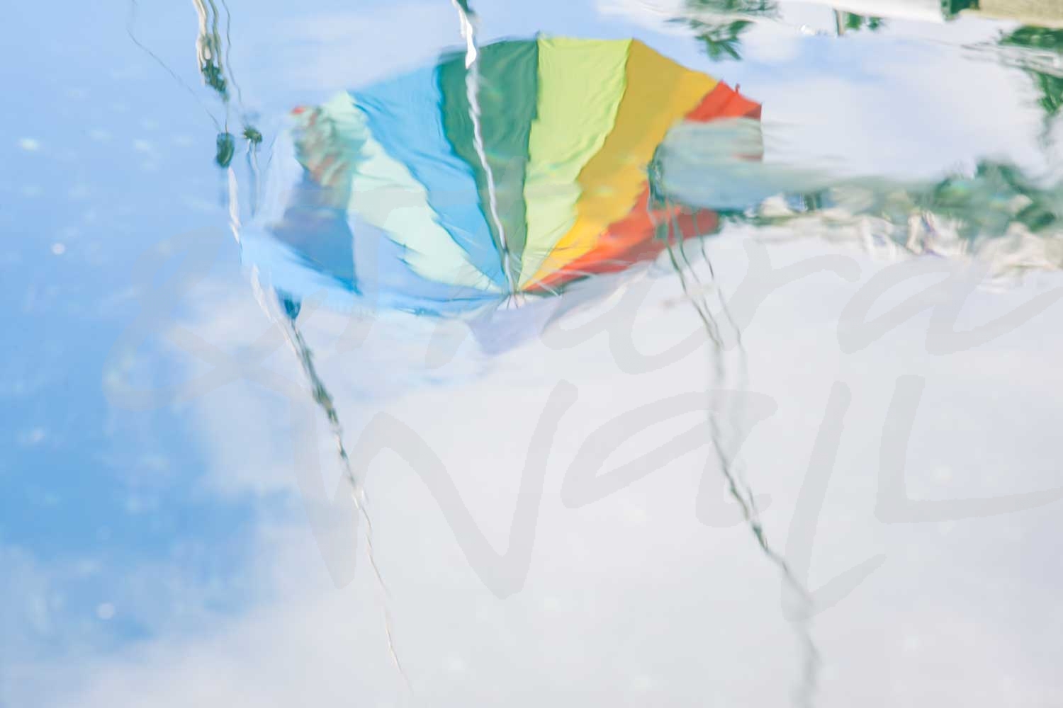
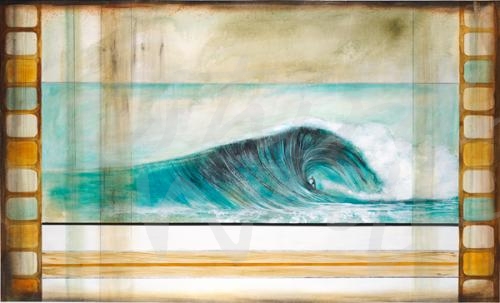

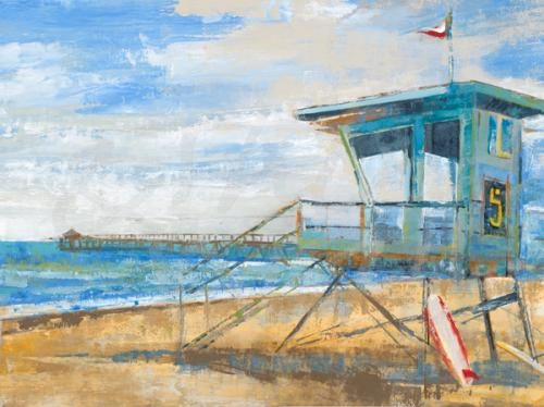
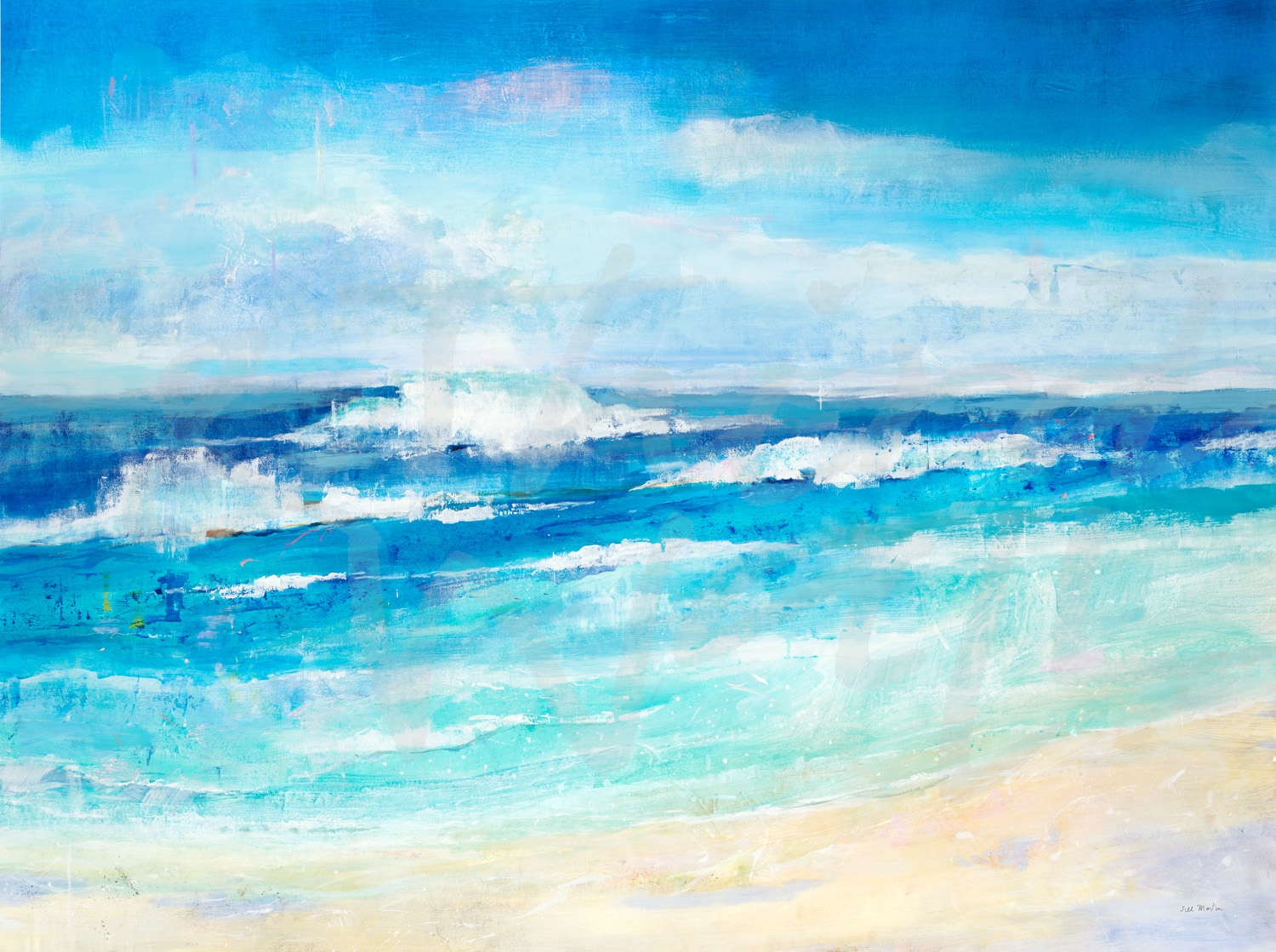
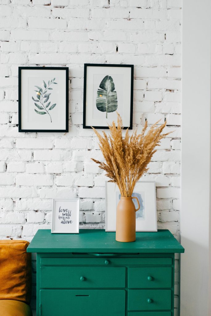
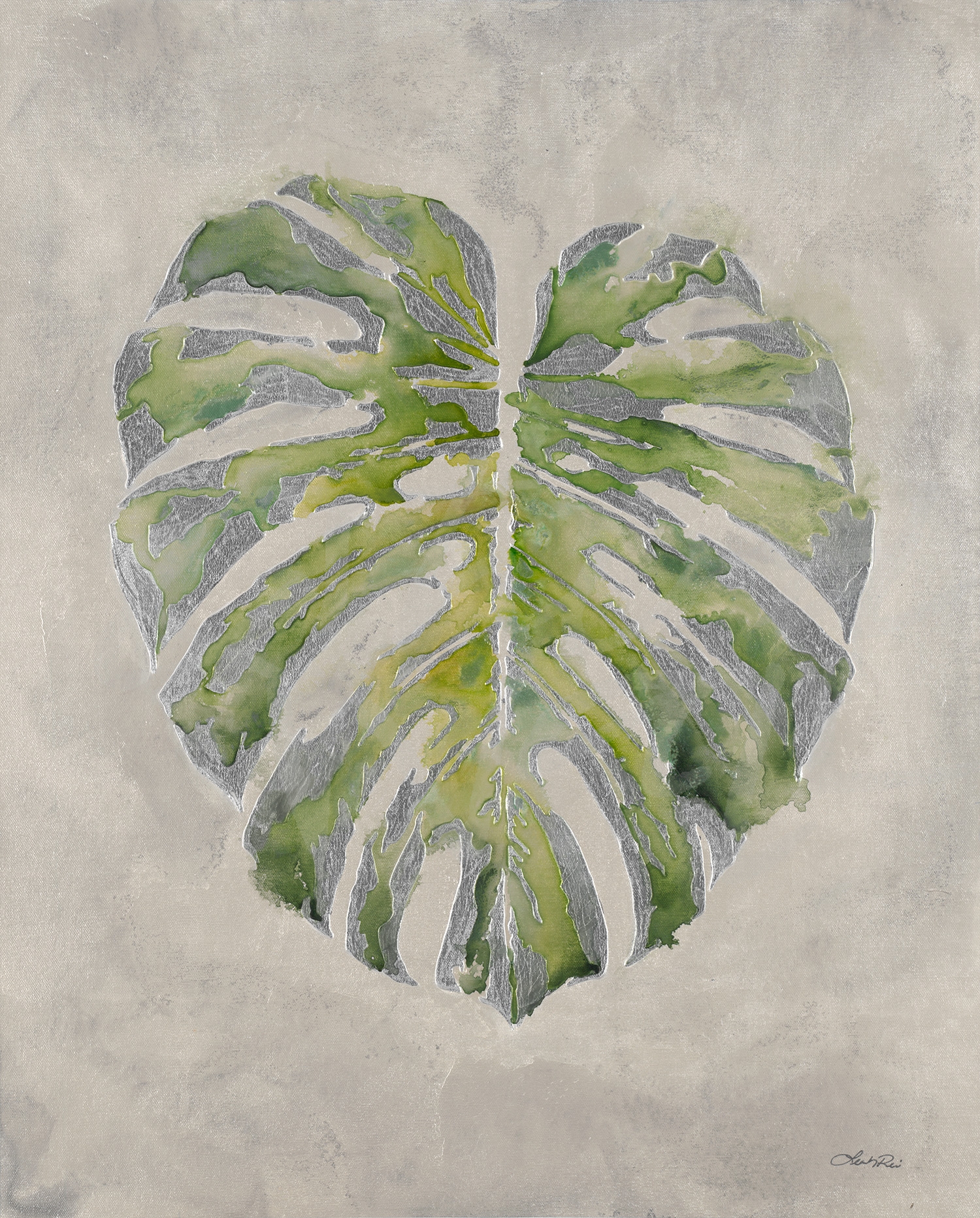
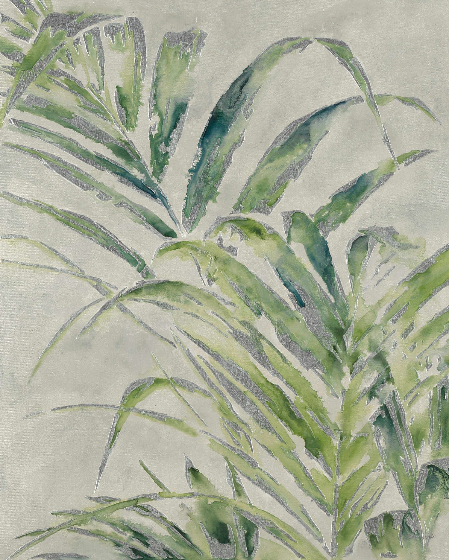
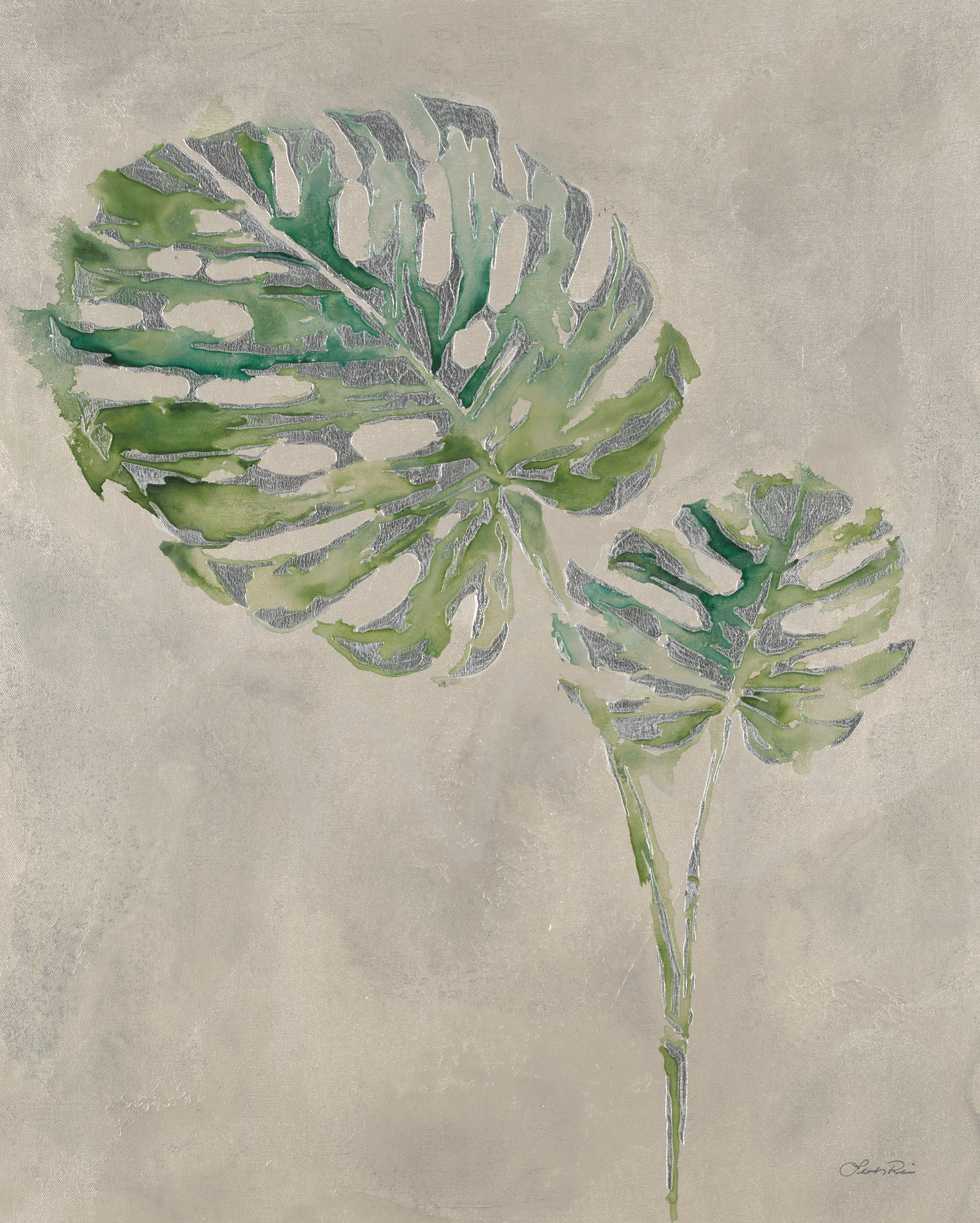
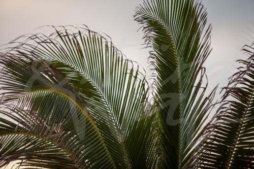

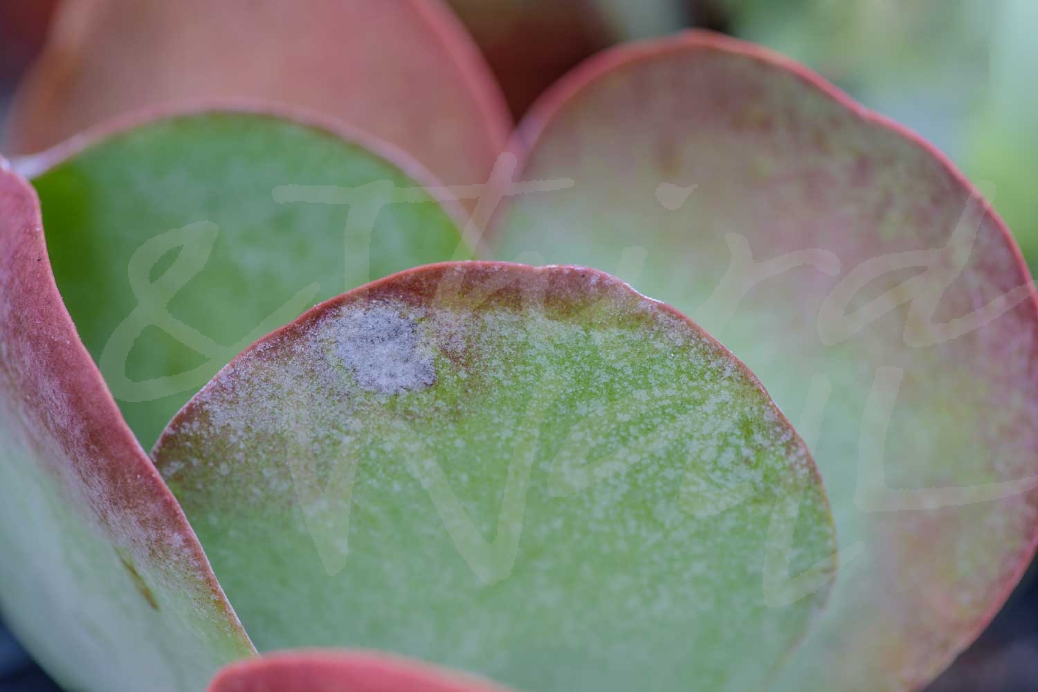
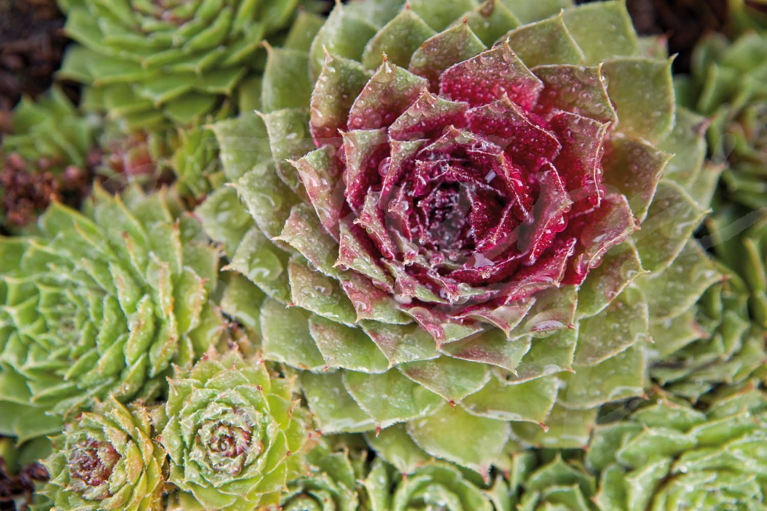
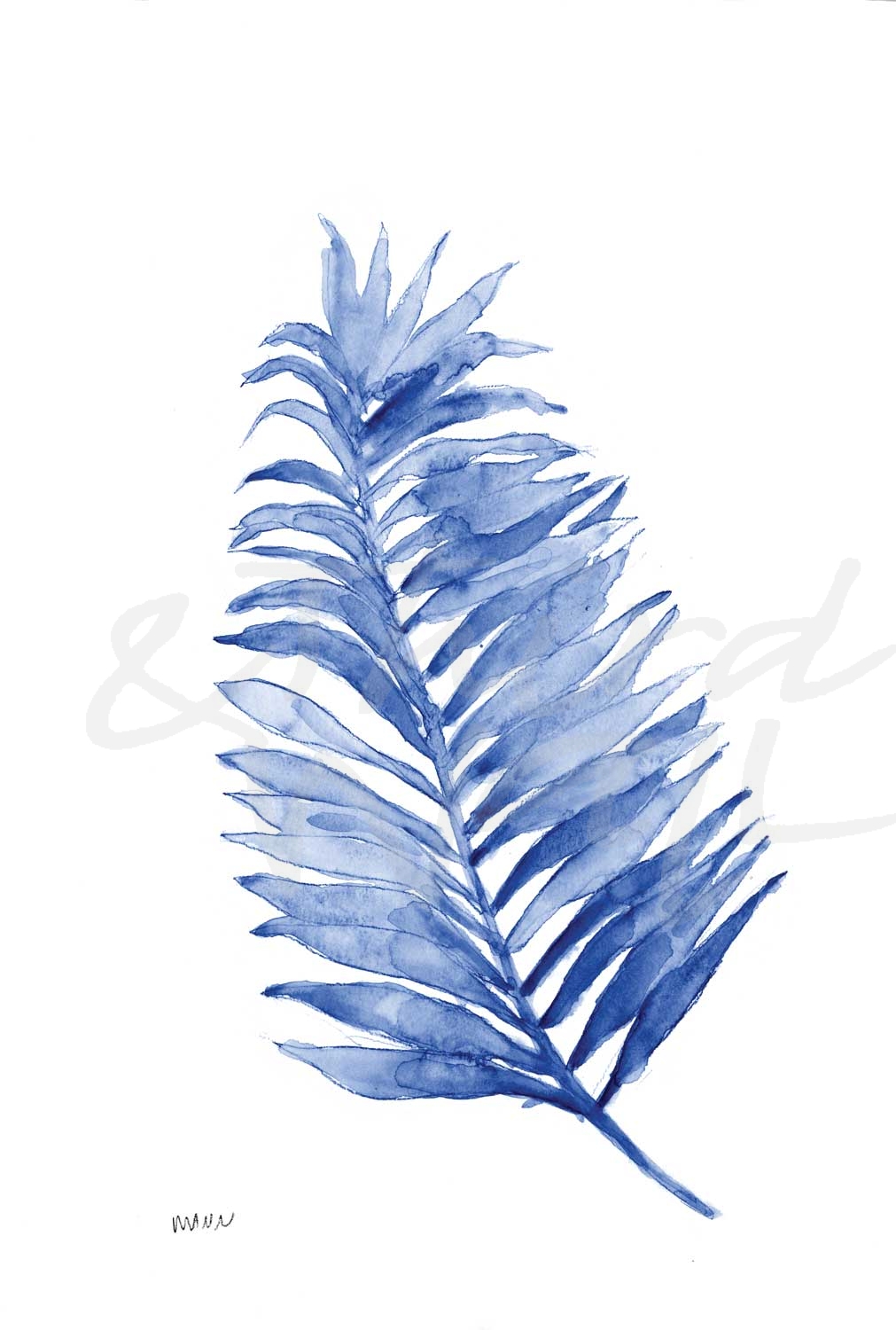
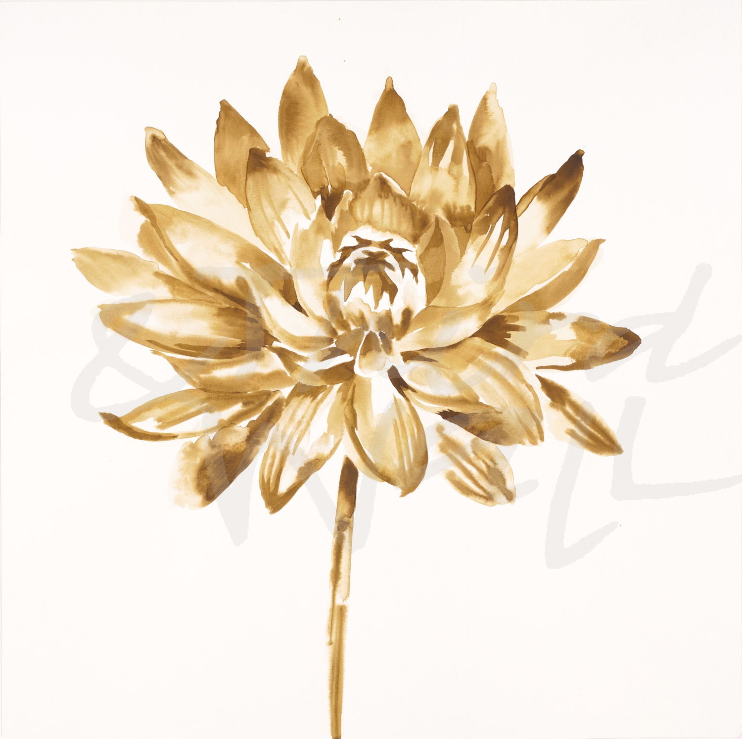
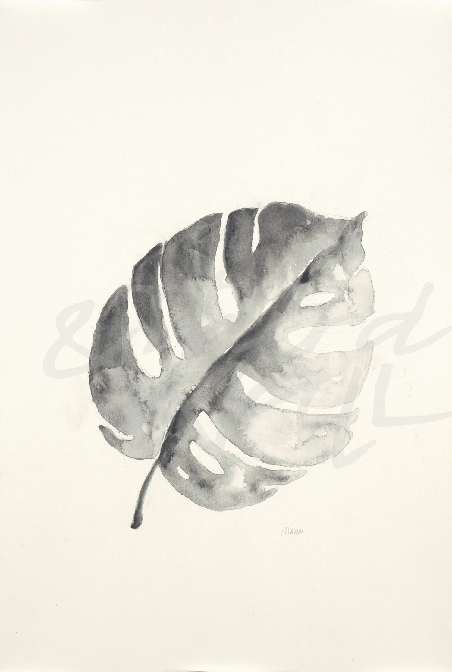
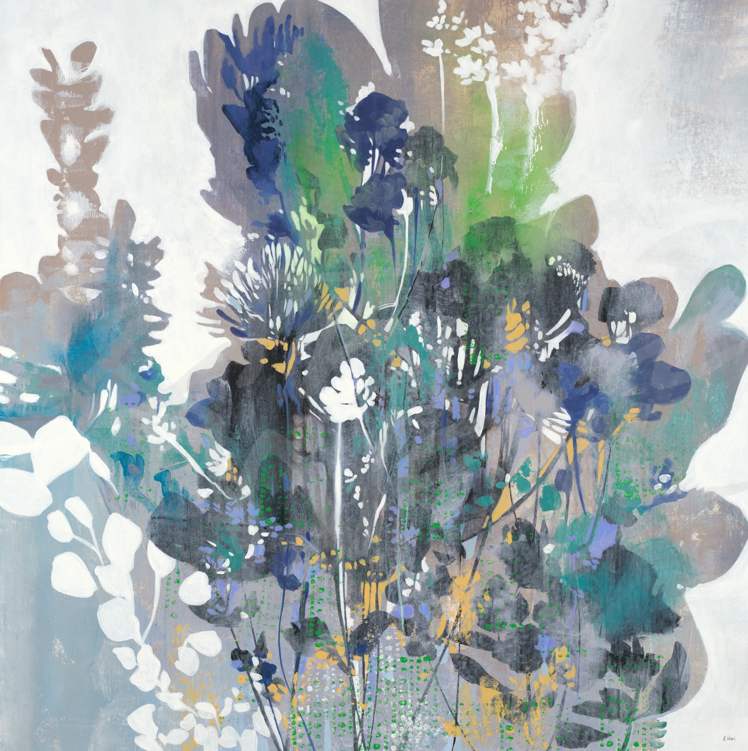
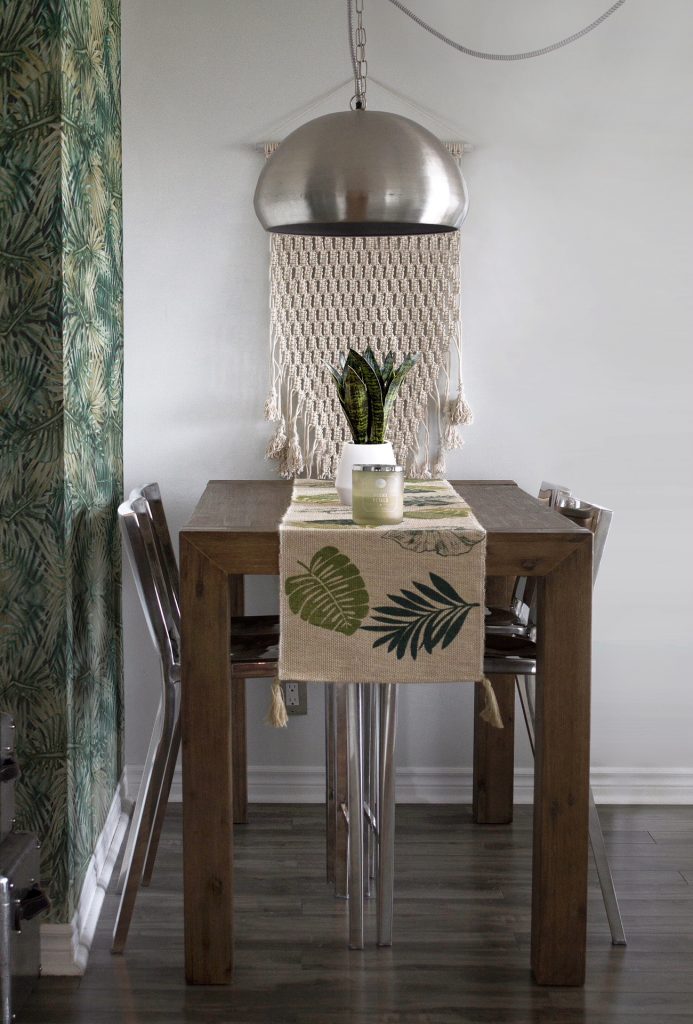

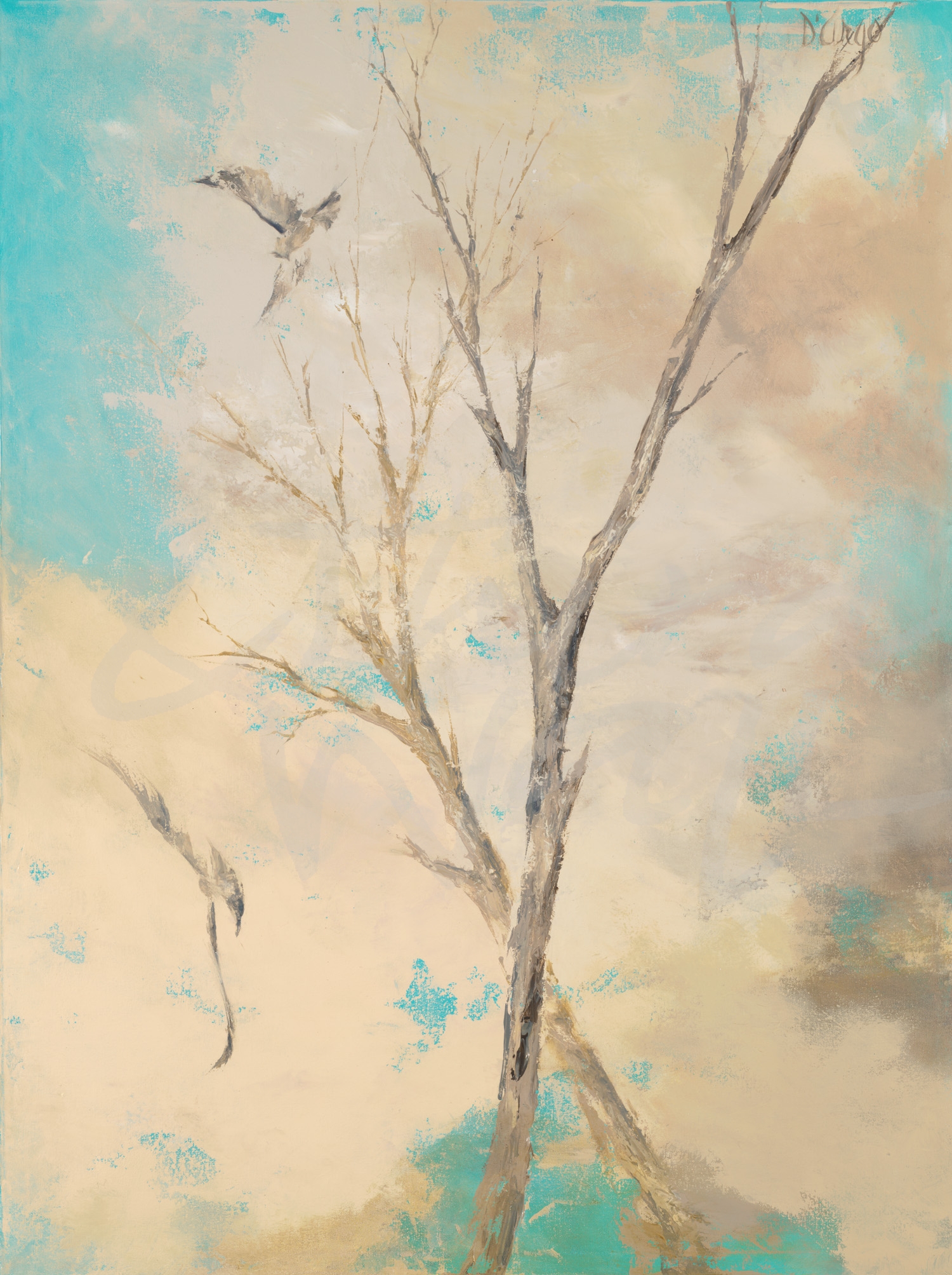
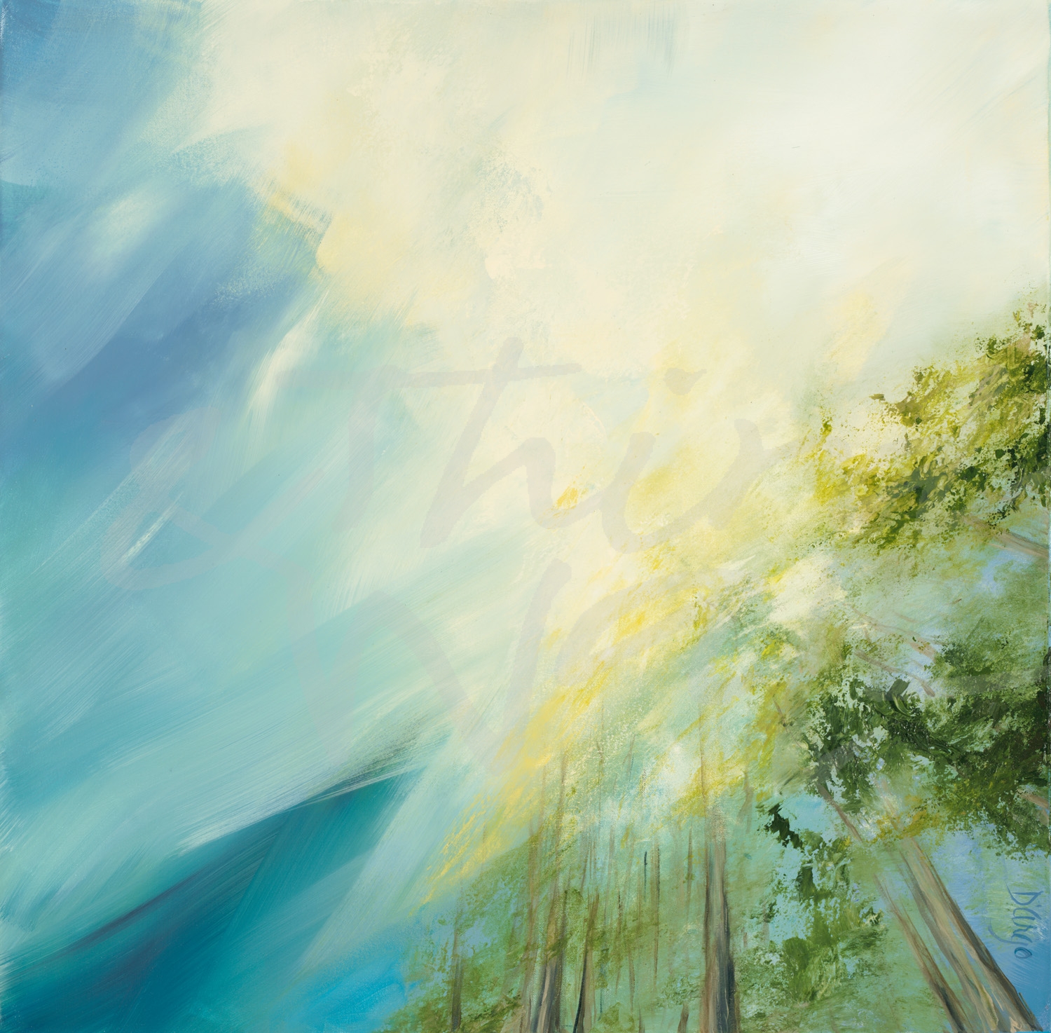
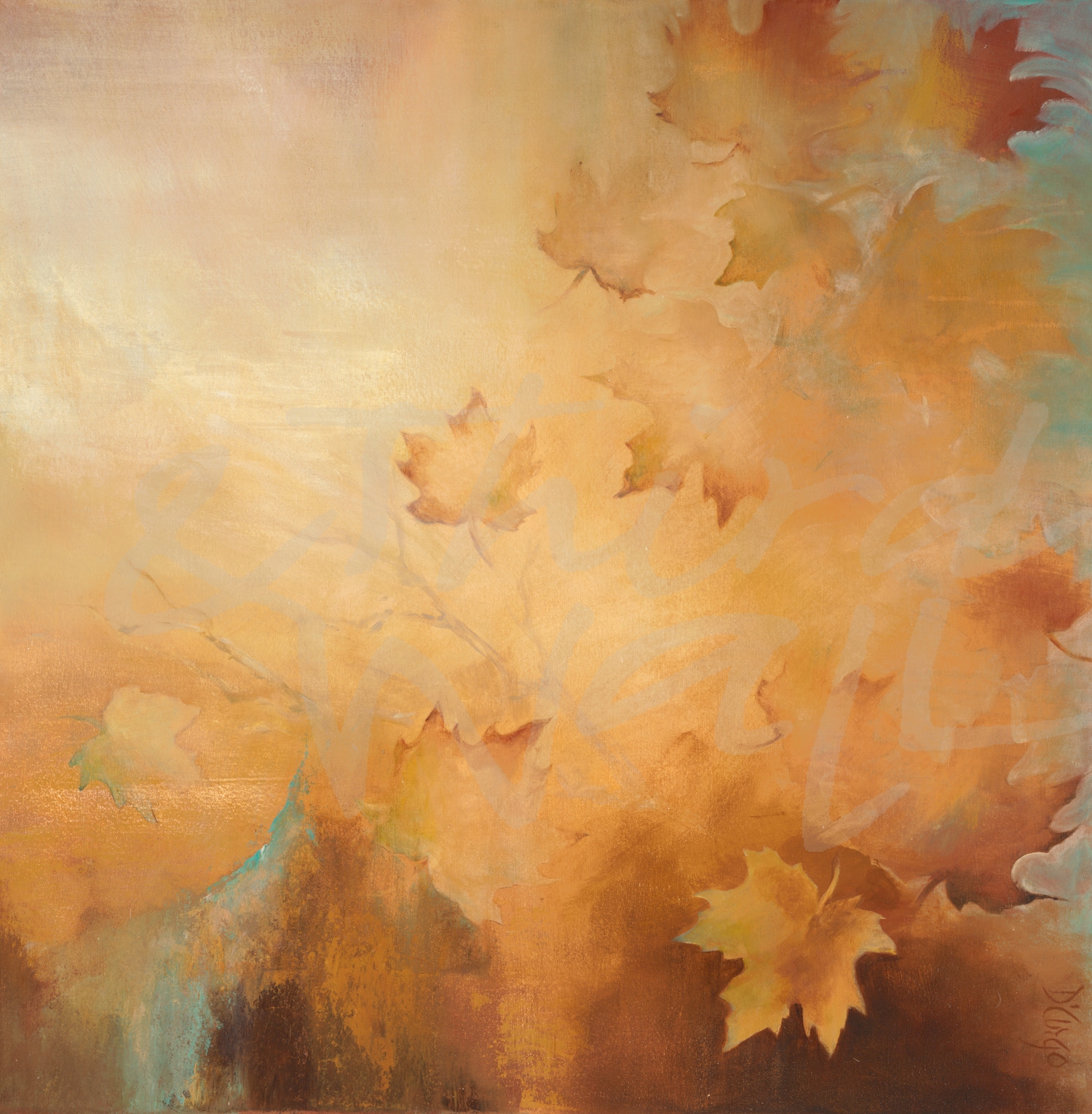
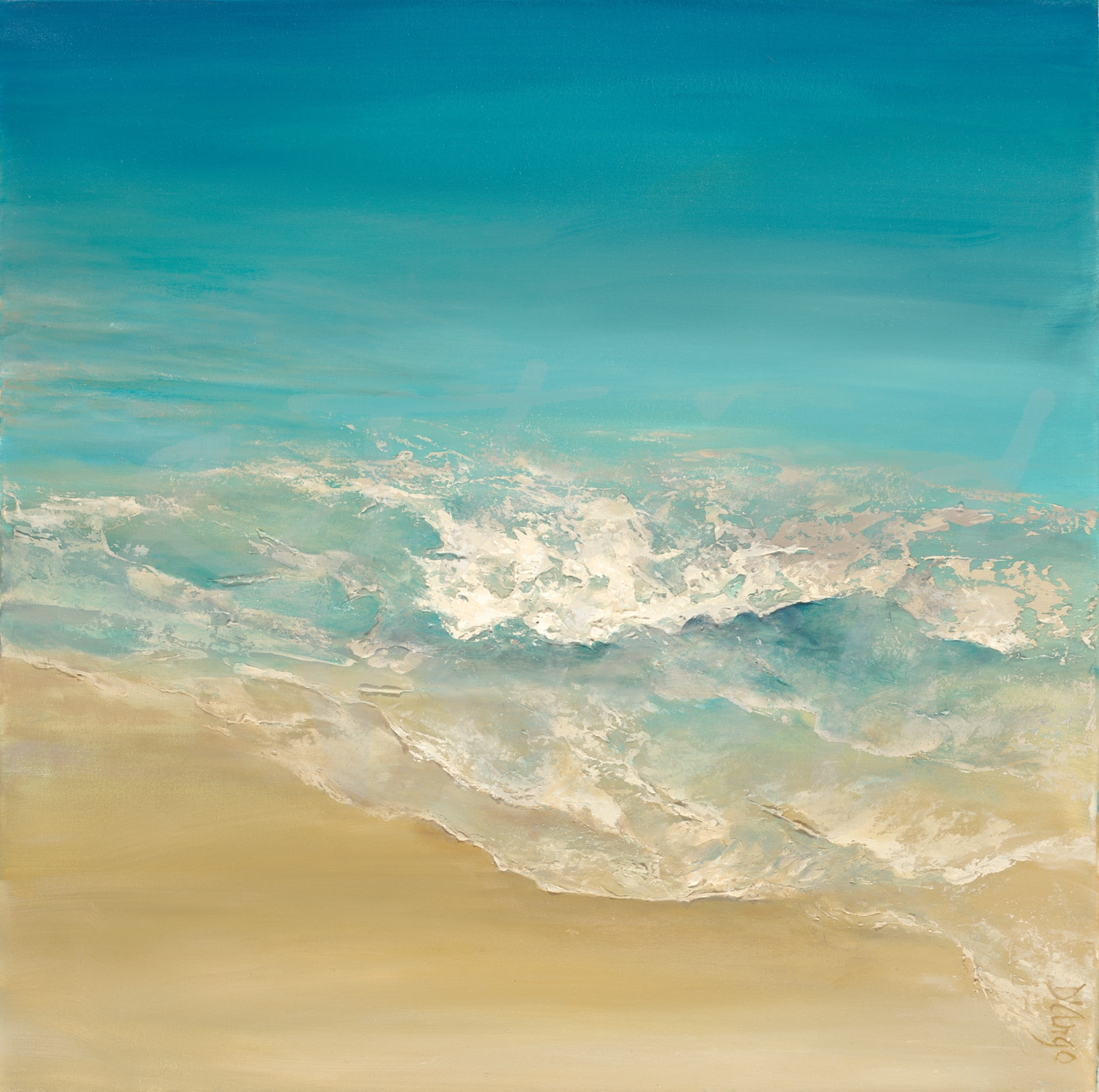
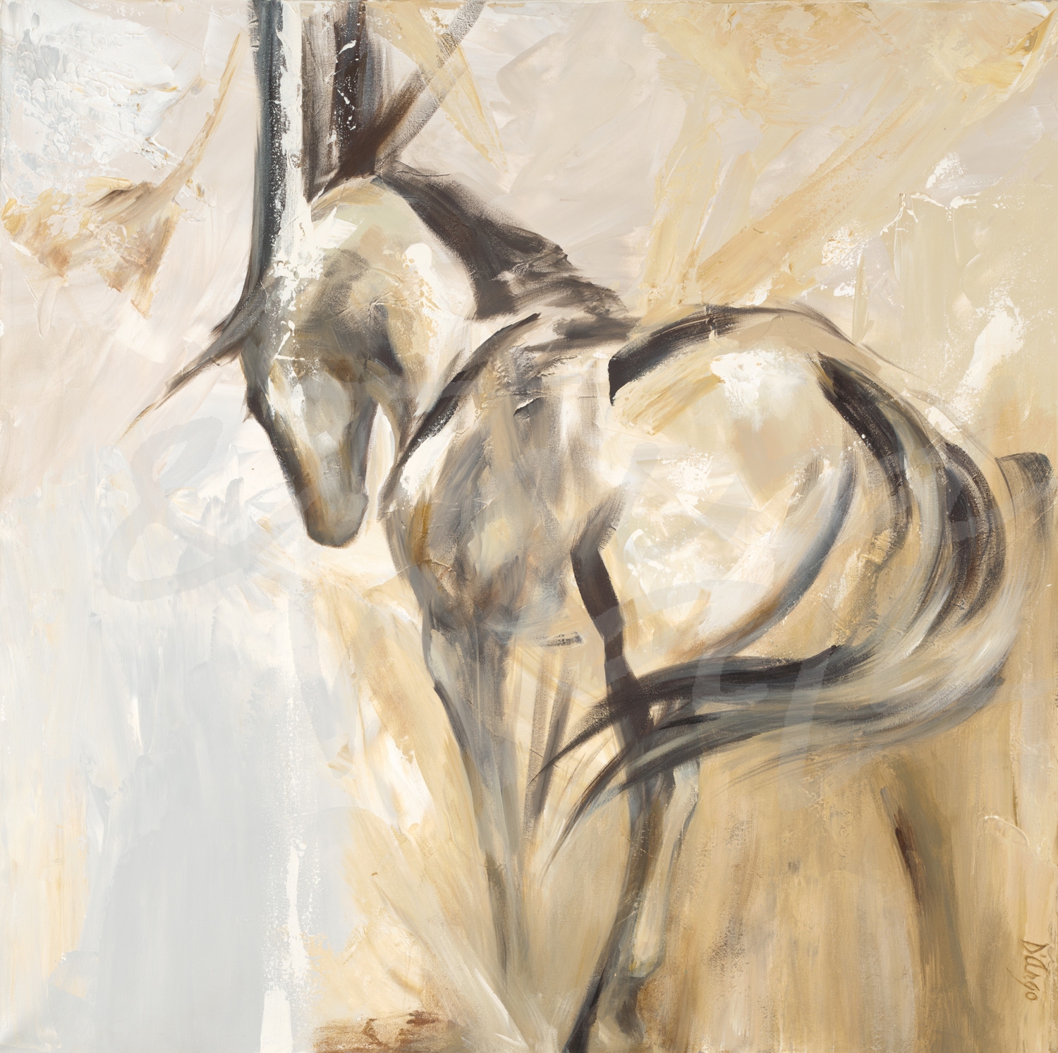
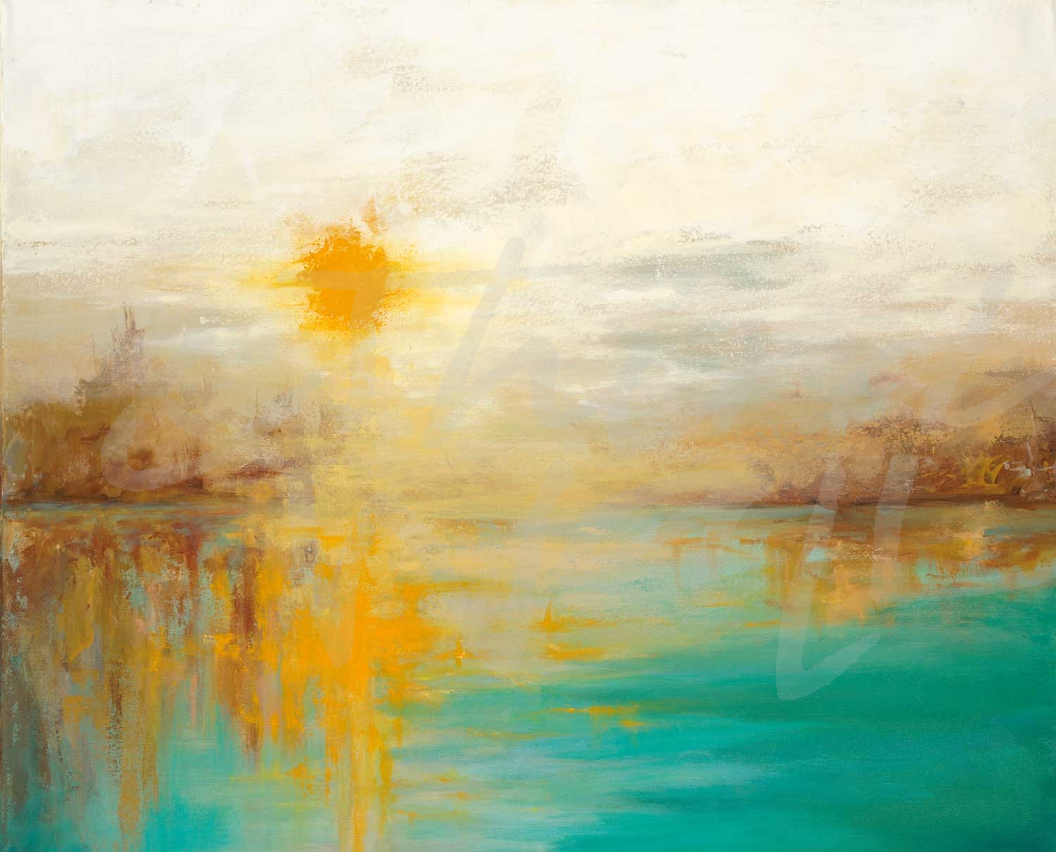

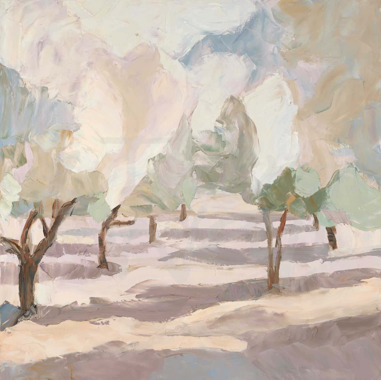
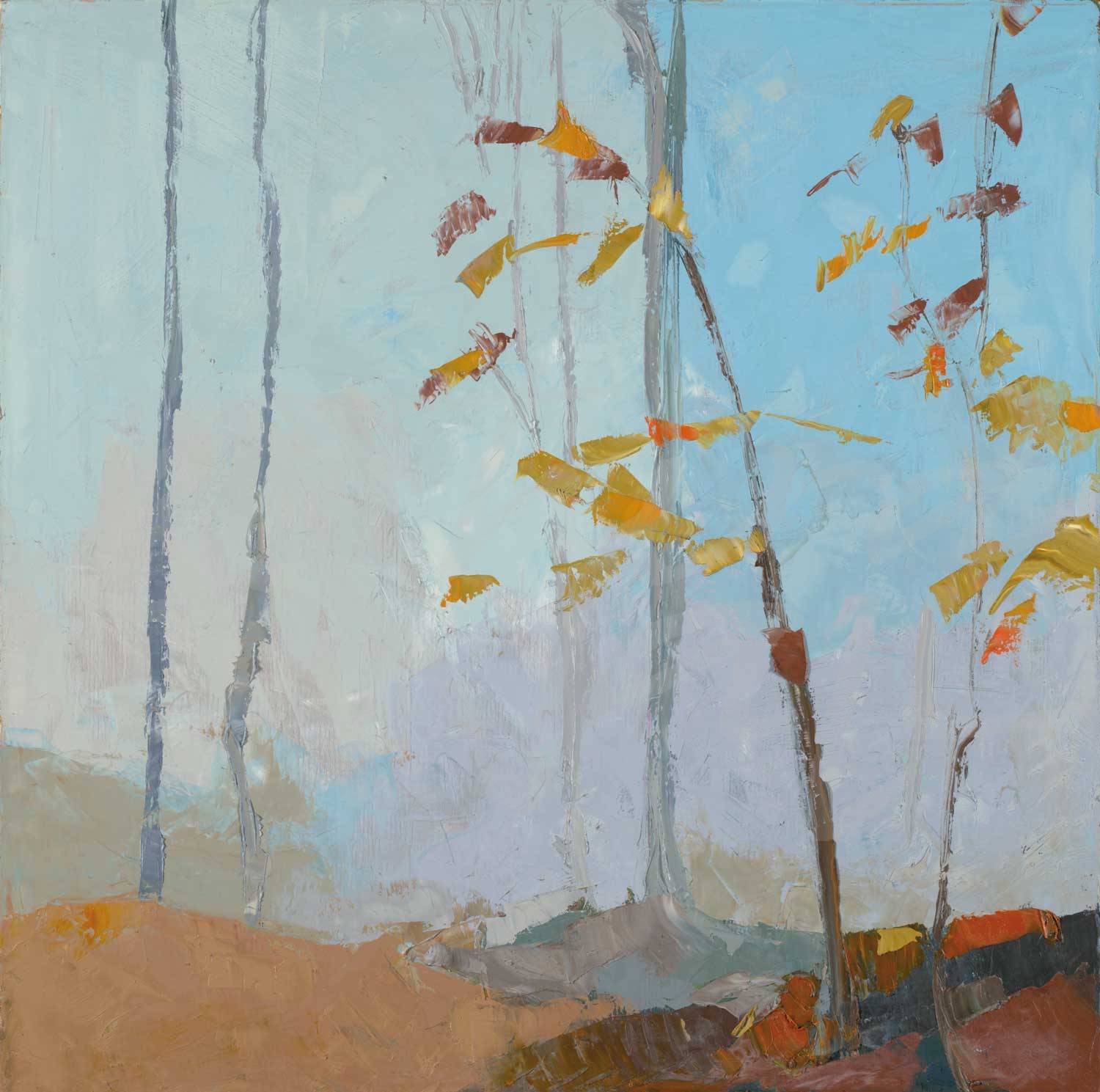
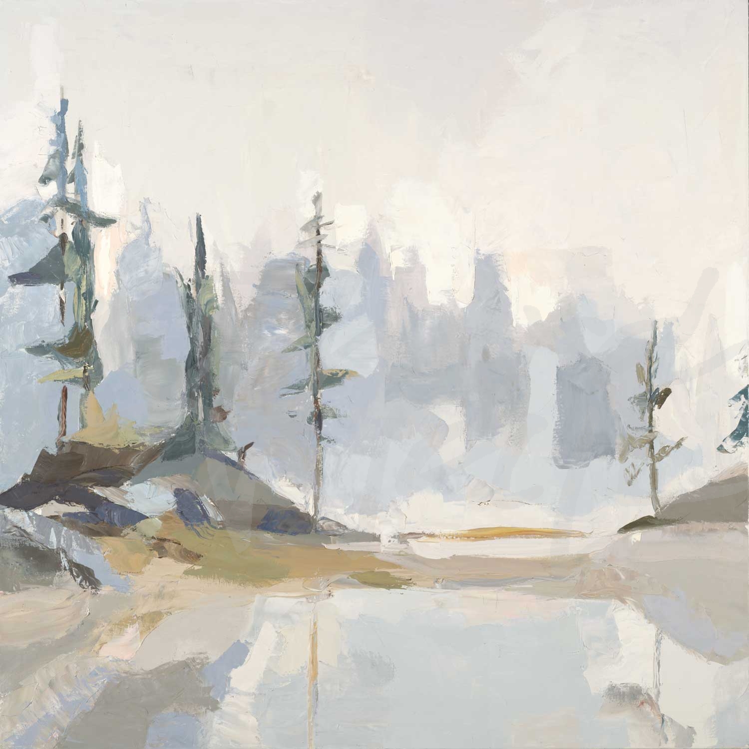
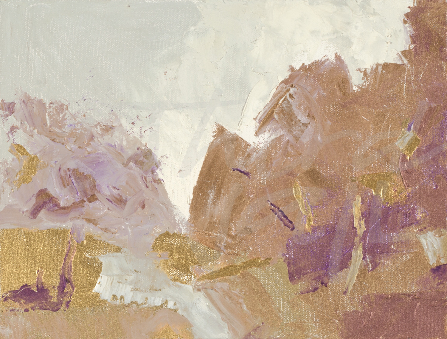
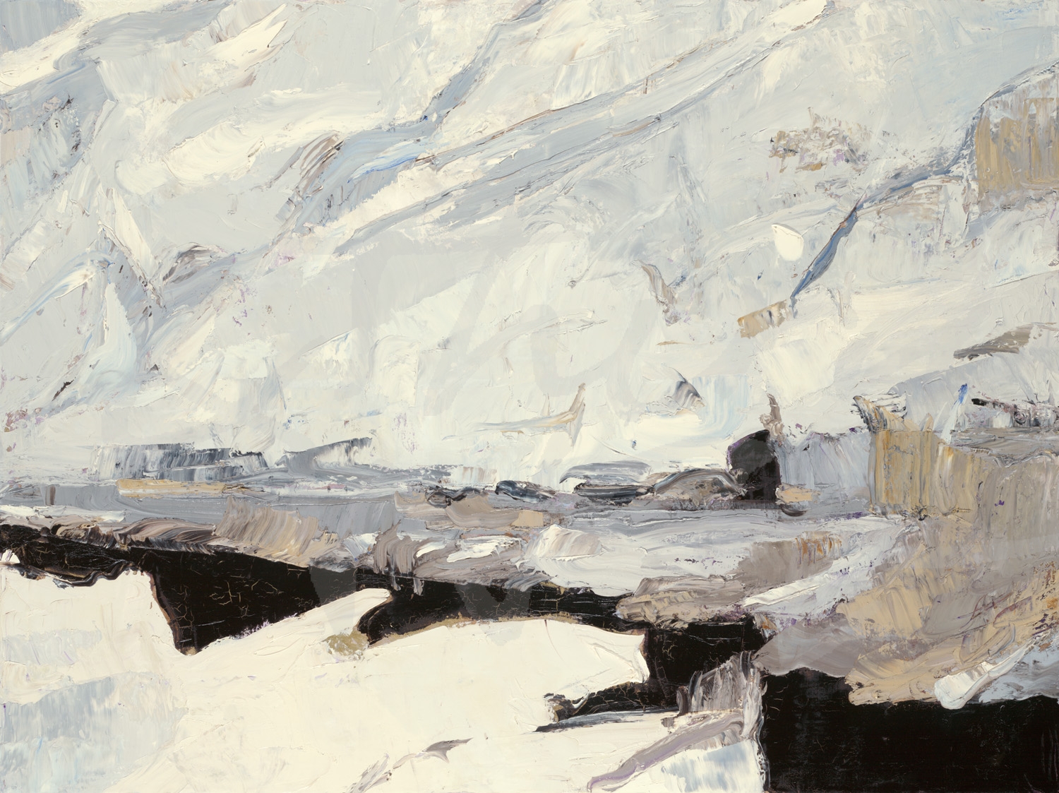
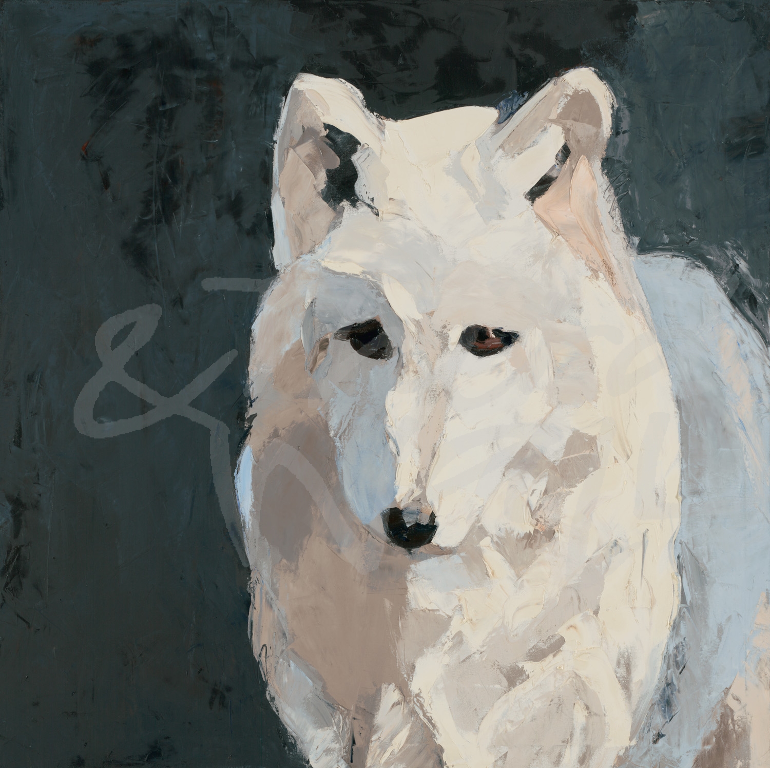

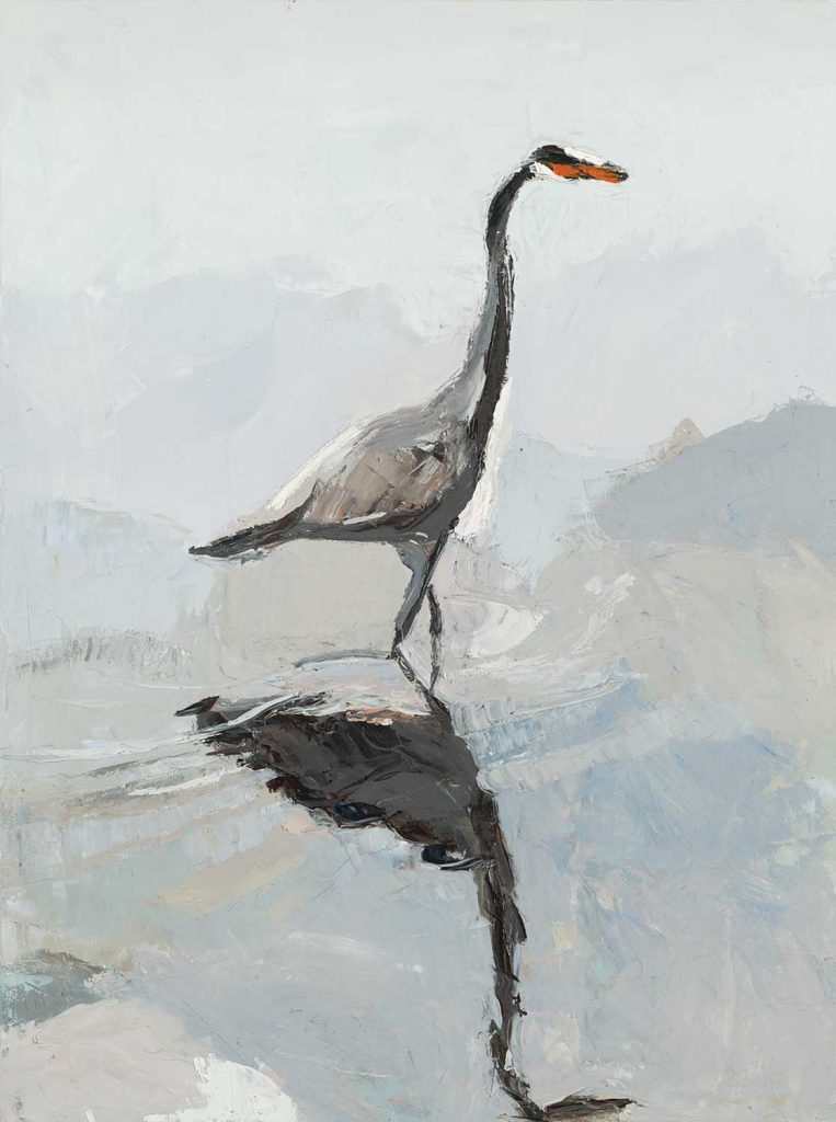
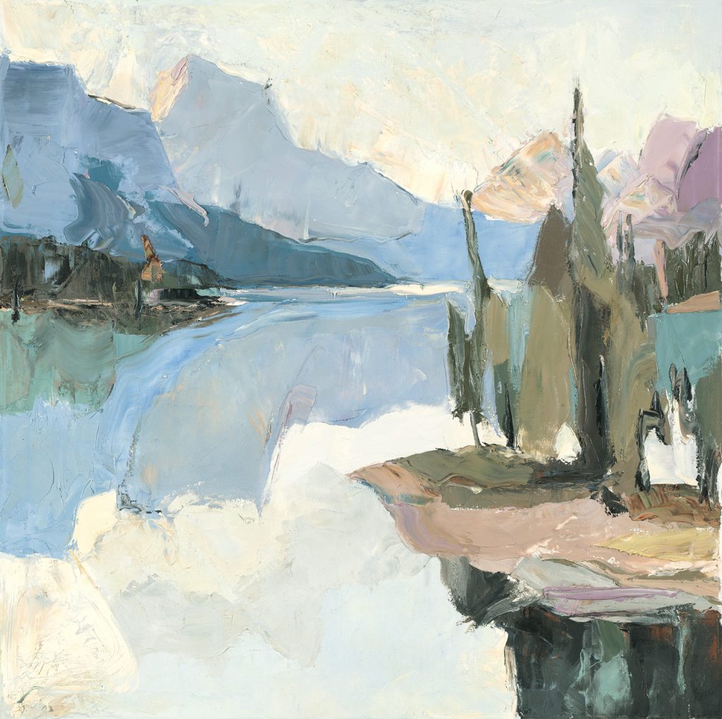
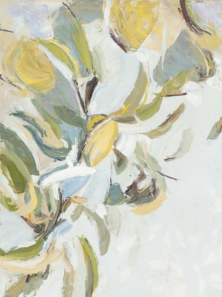
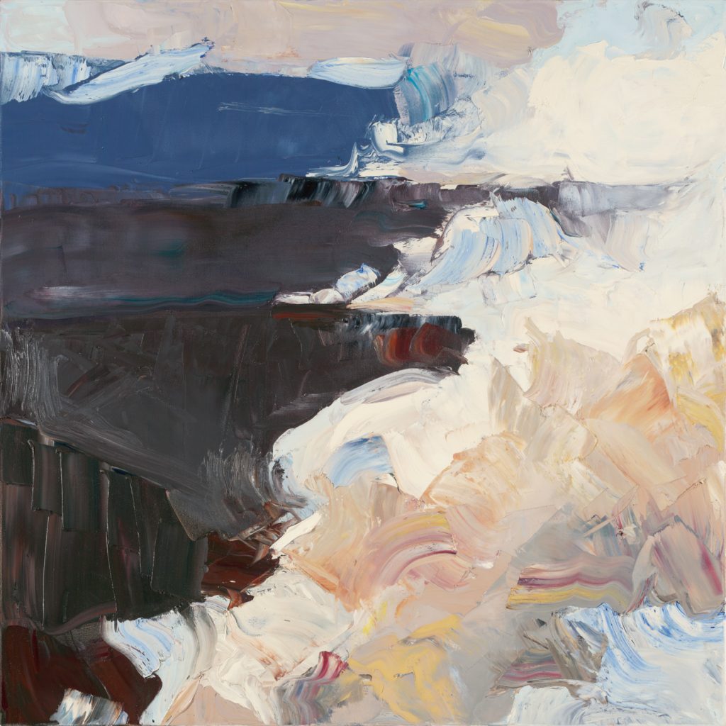
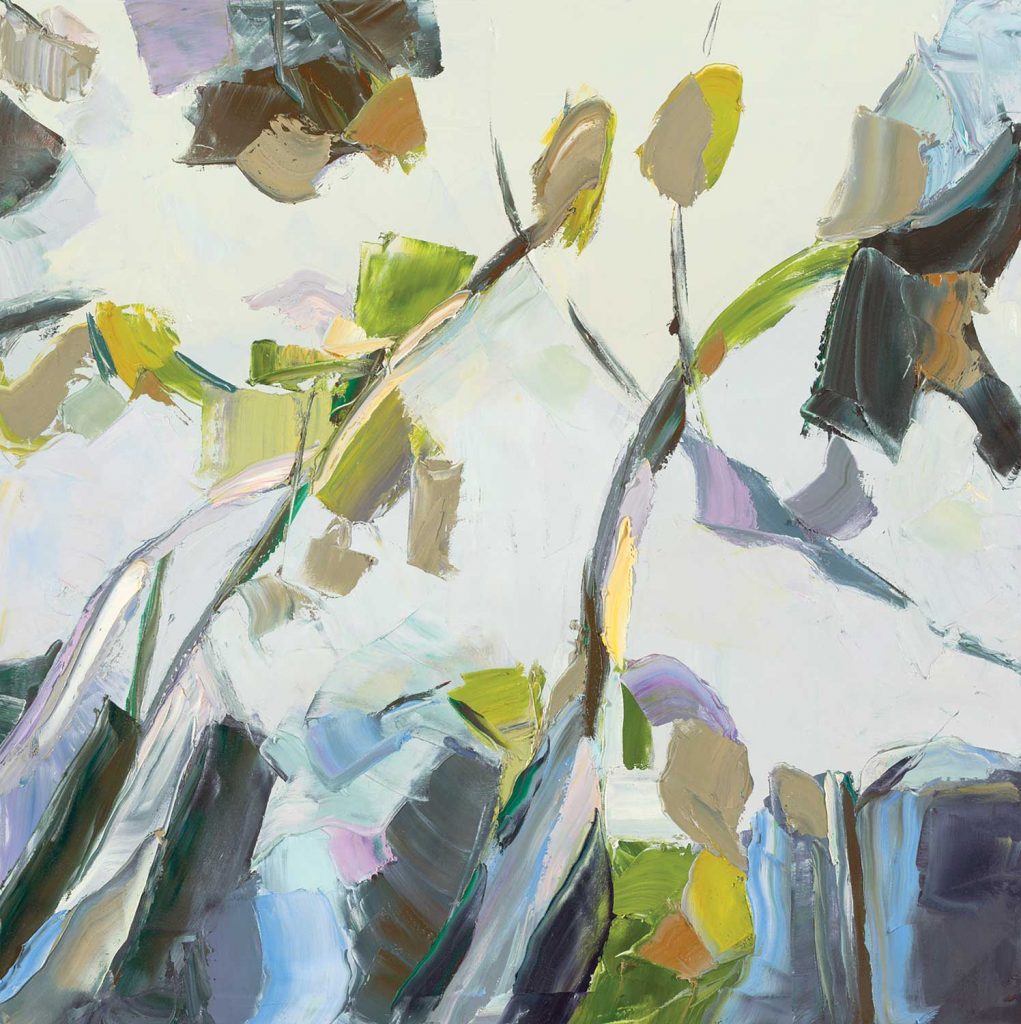
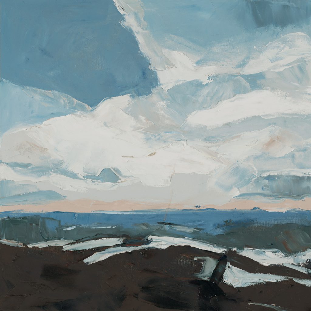
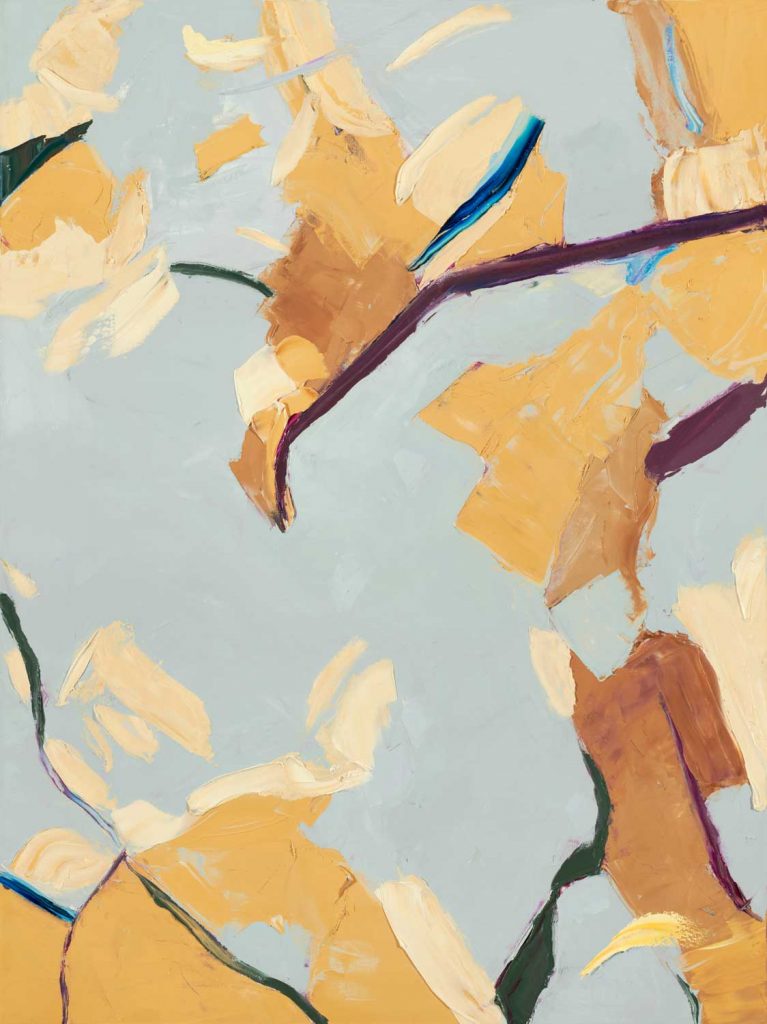
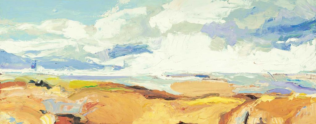
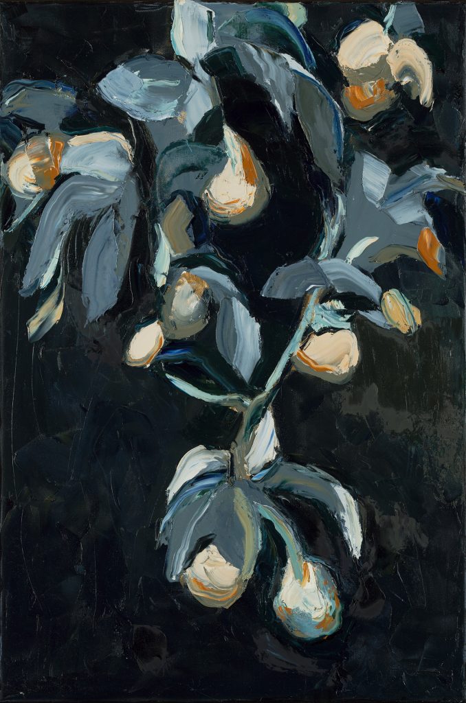
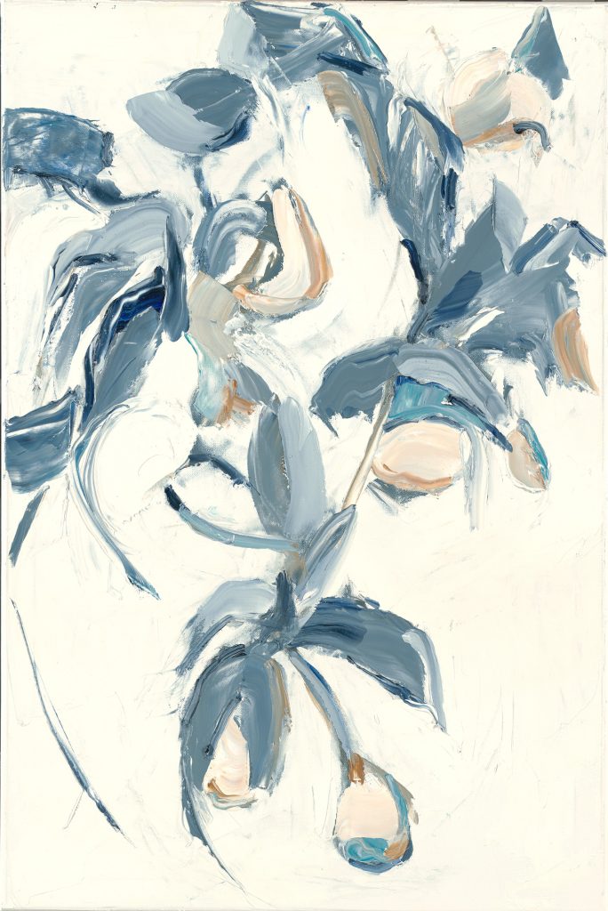
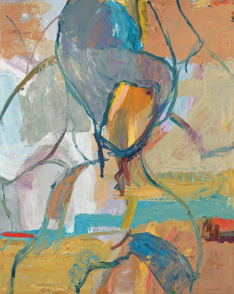
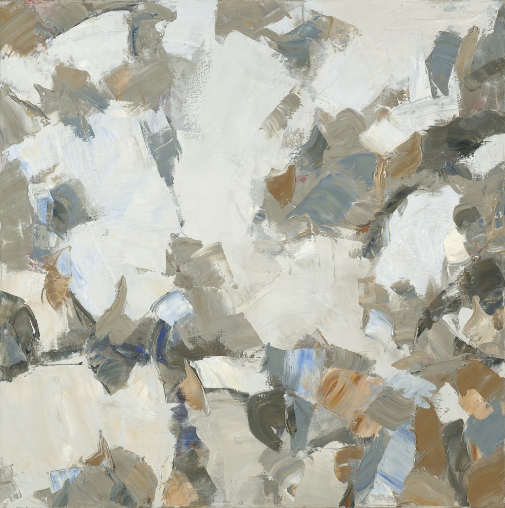
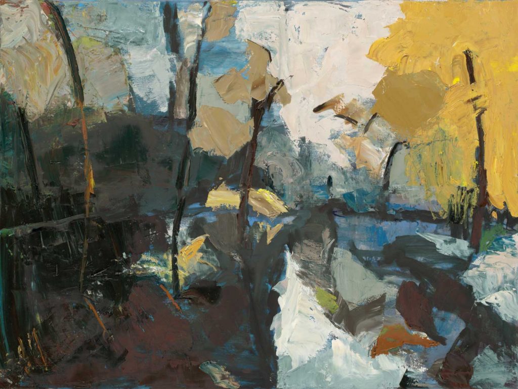
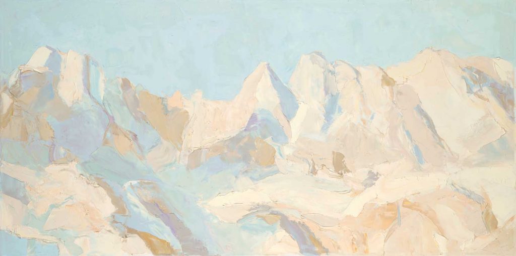
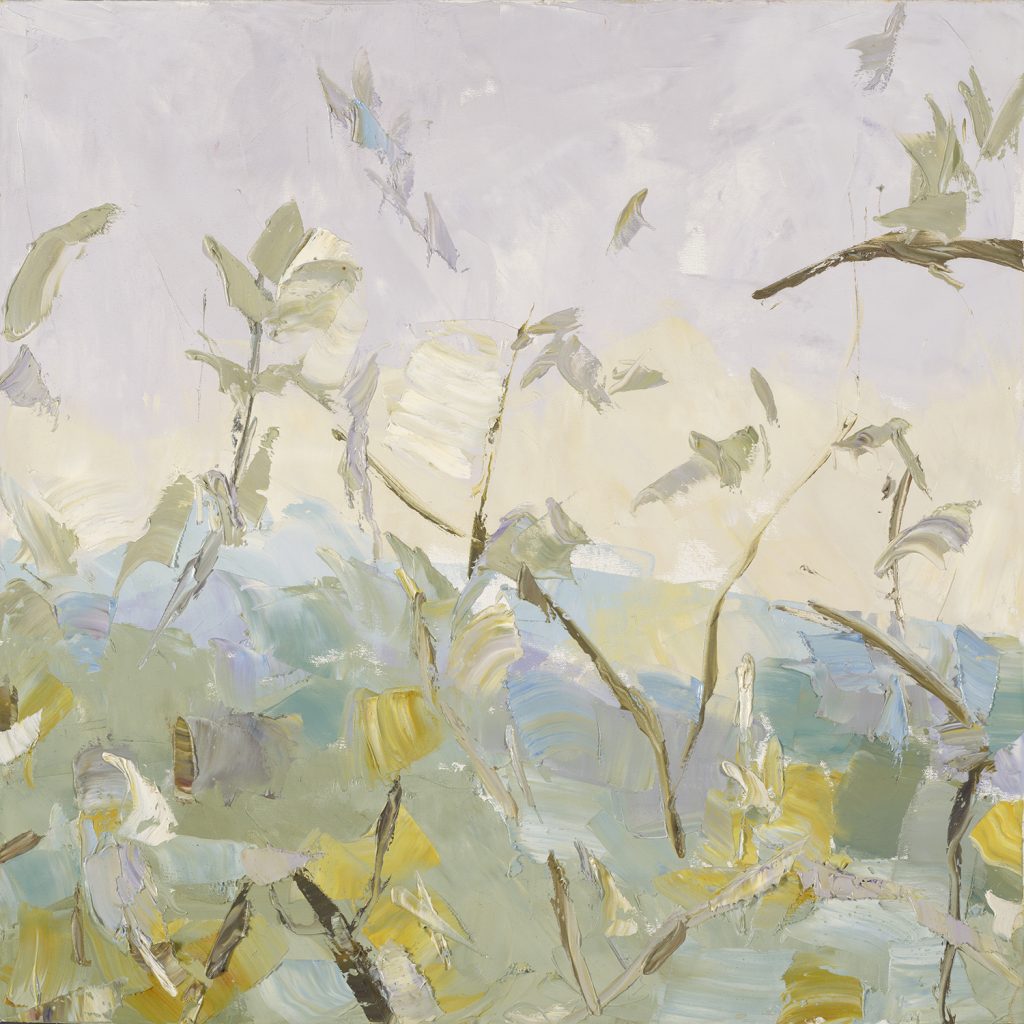
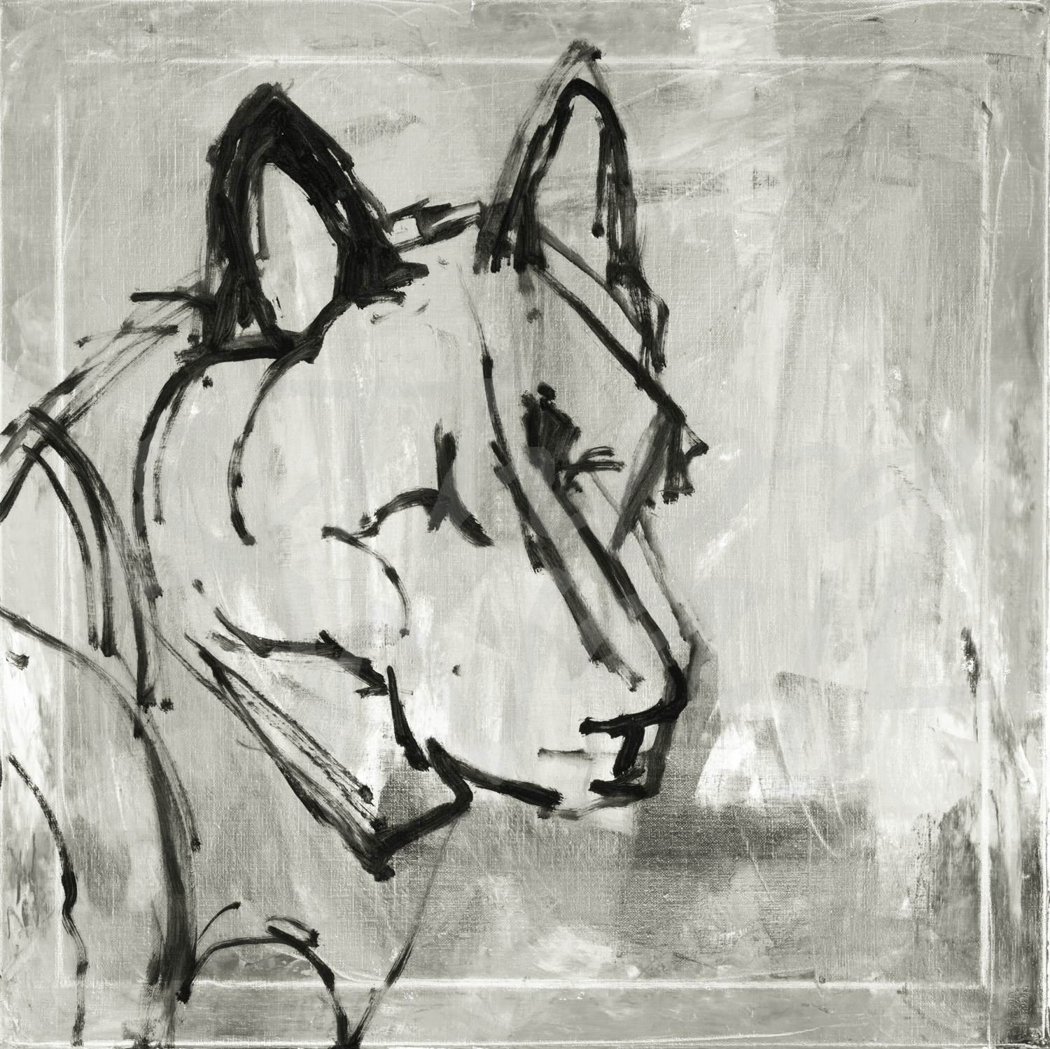
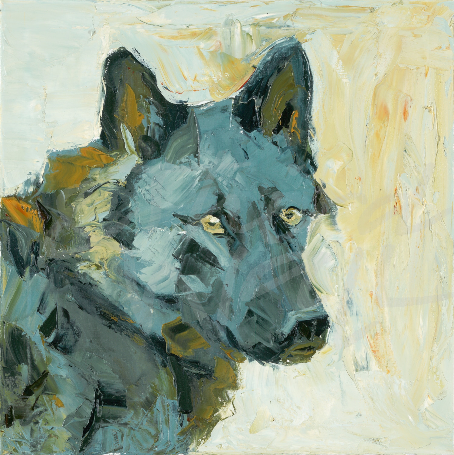
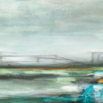
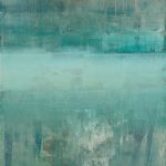
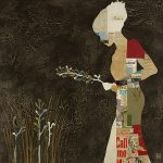
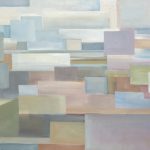


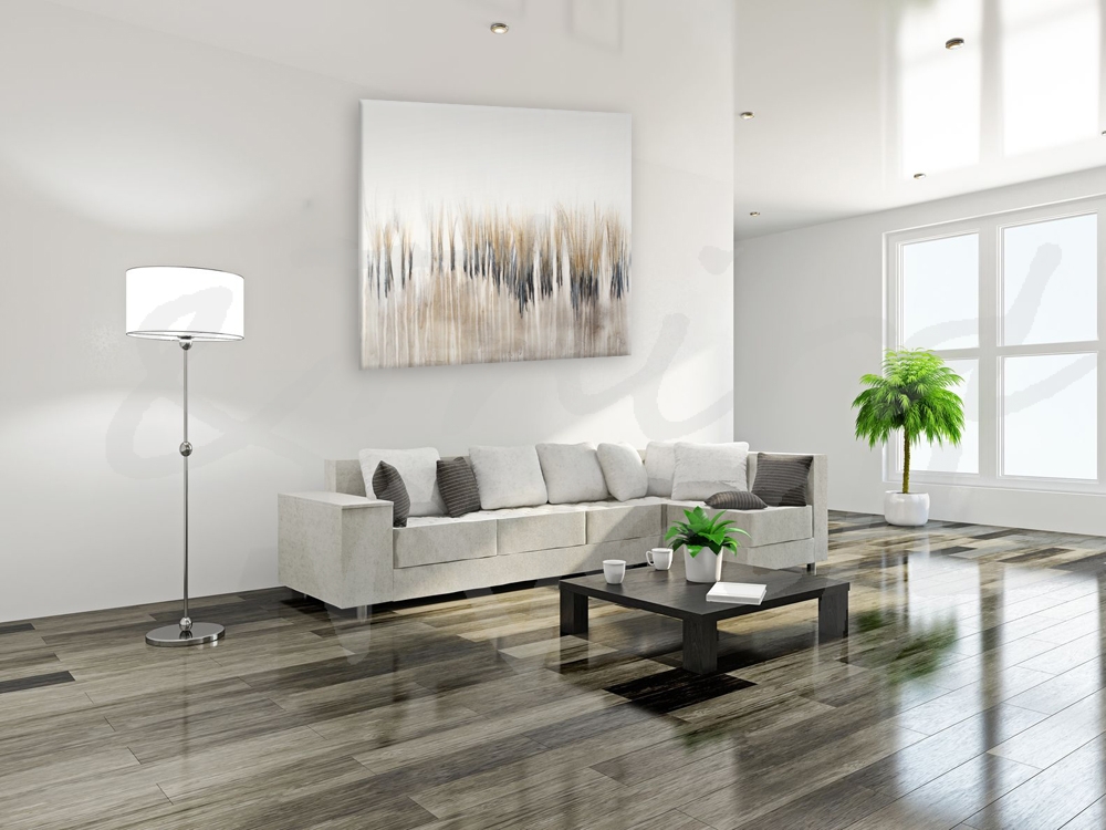
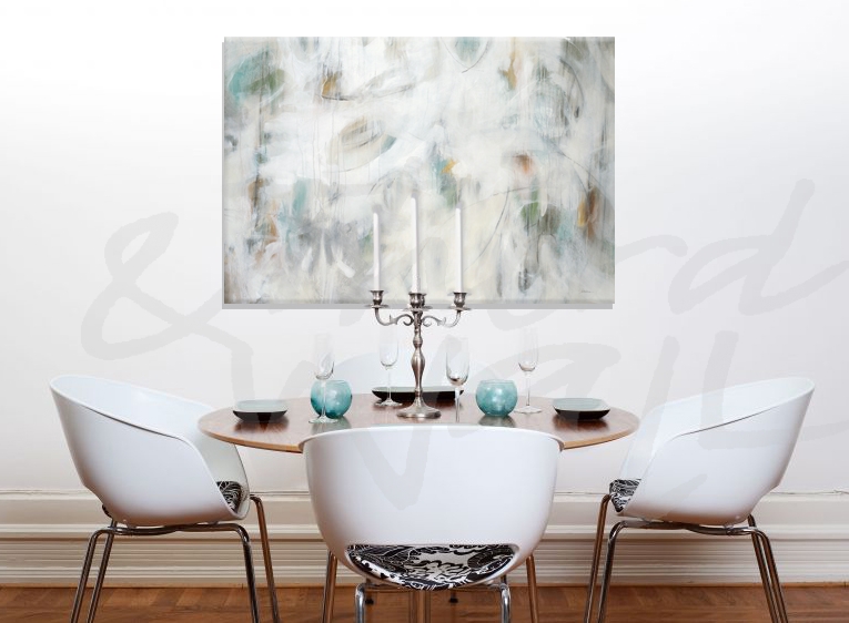


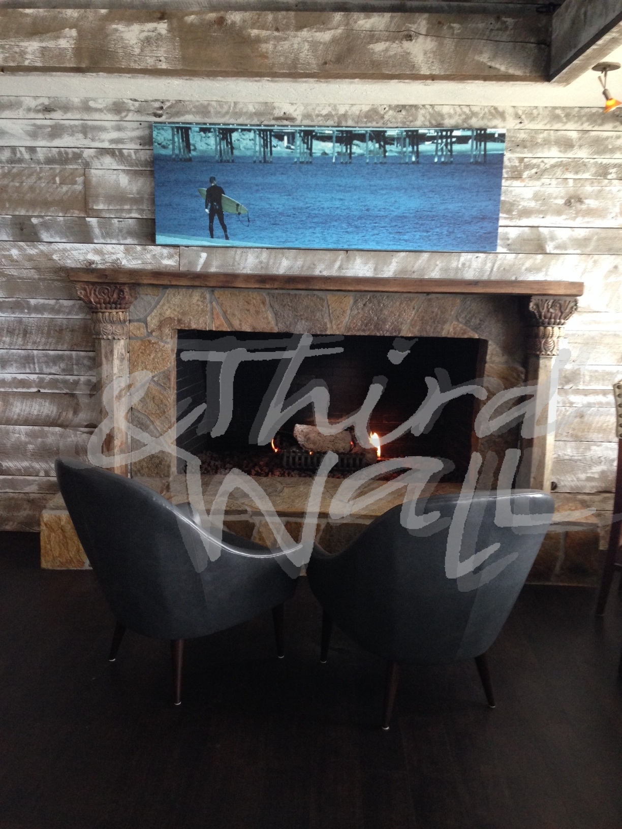
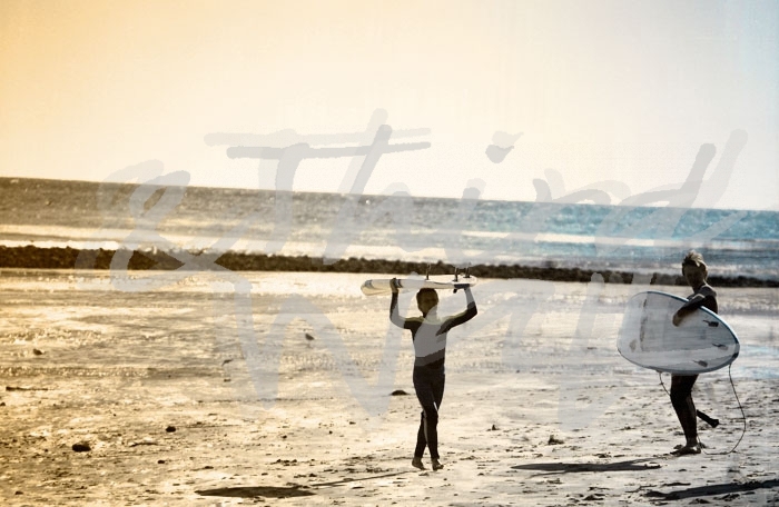

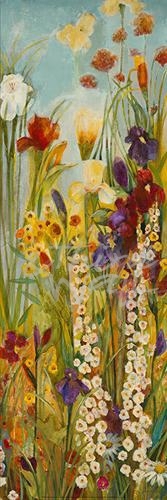
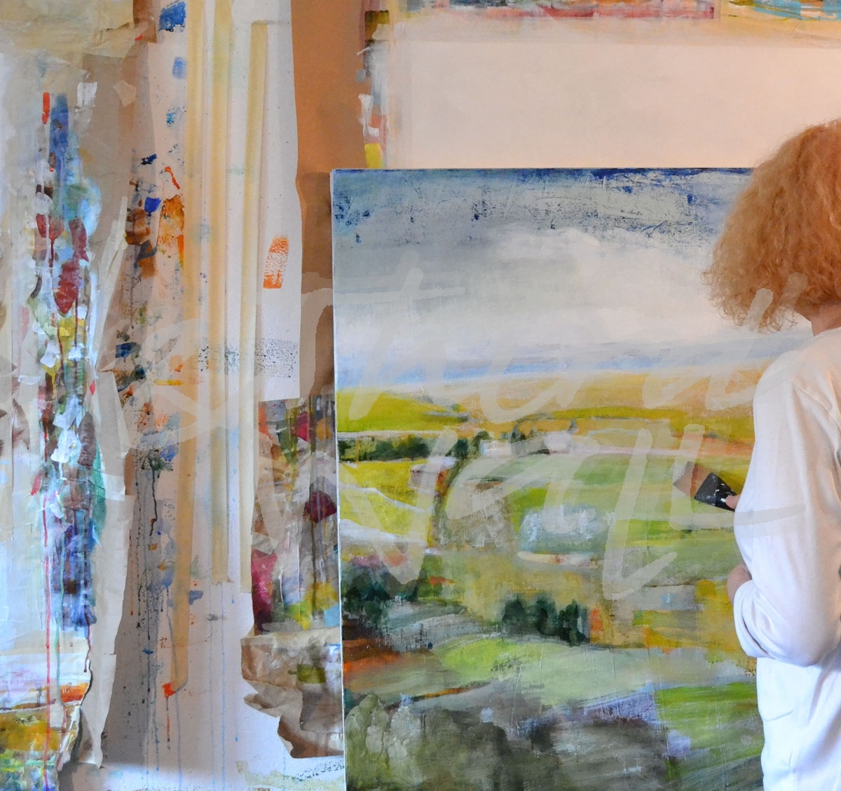


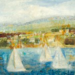
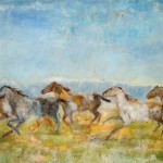
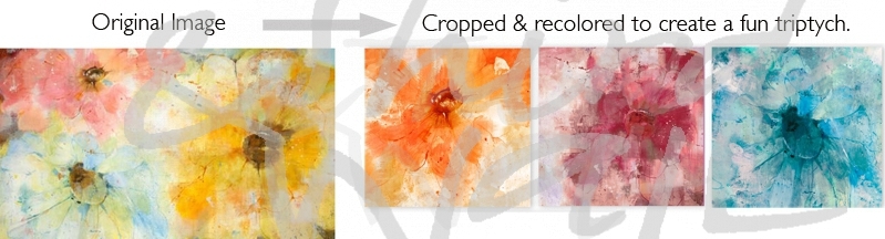
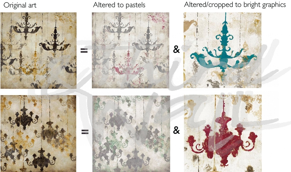


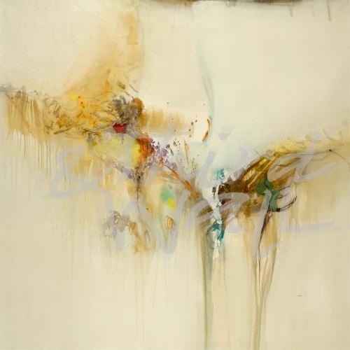


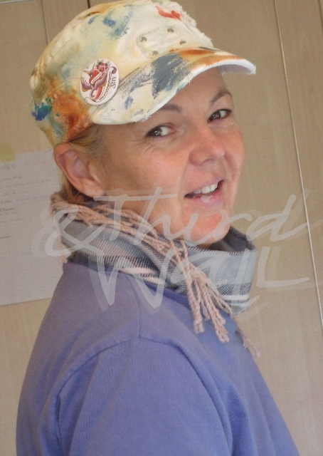
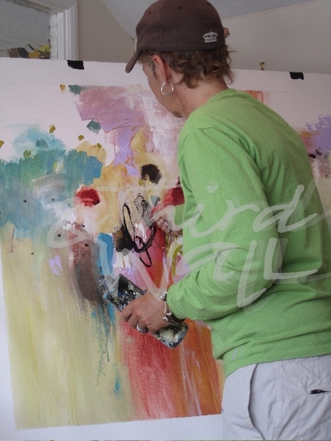

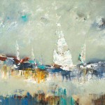
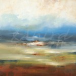
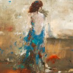
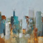
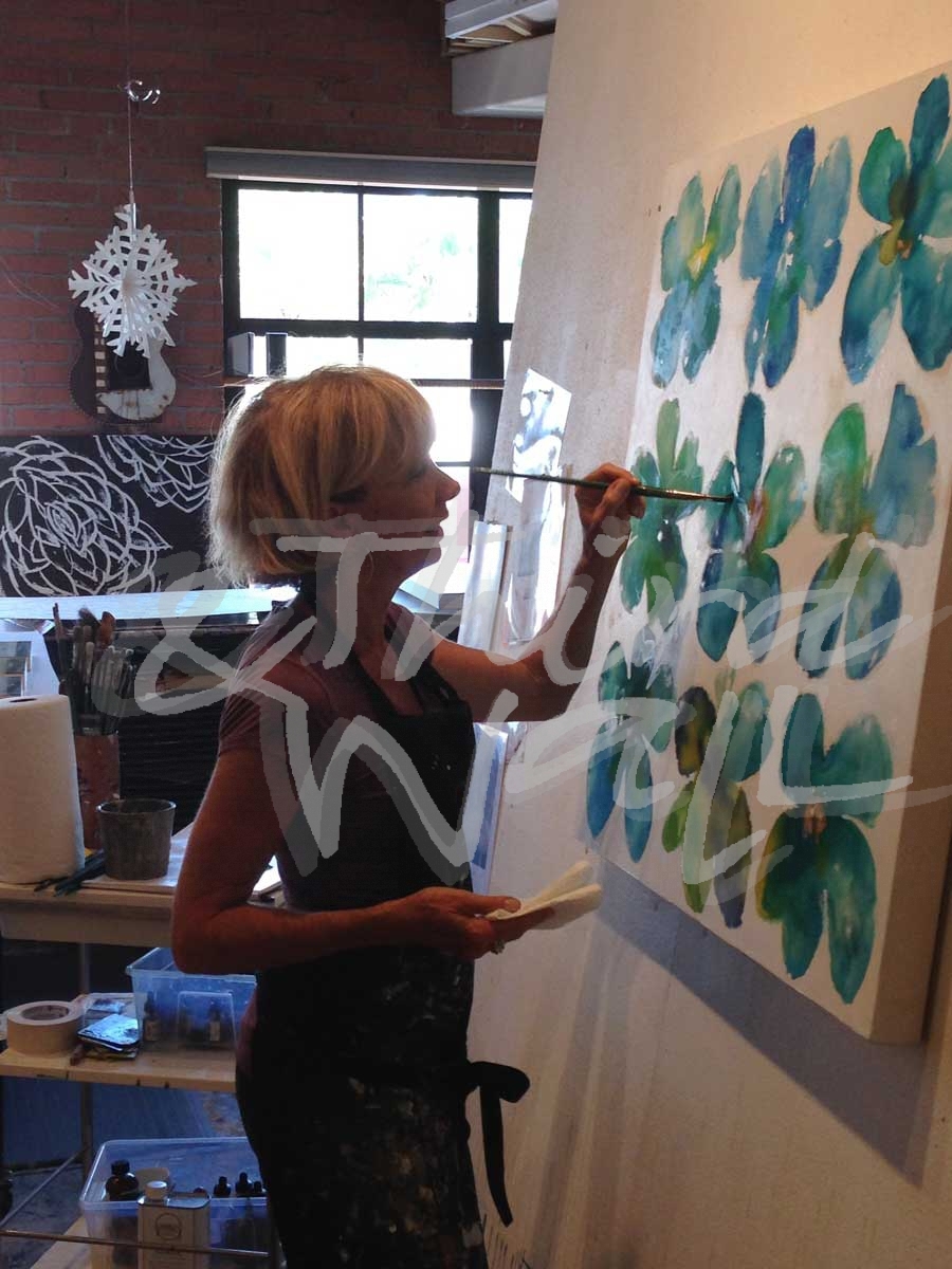 w imagery all the time, and of course our team of artists provide us with a steady stream of exceptional artwork, but what is the inspiration behind each new painting? How is it developed? One of my favorite things to do is to open the shipping tubes containing new artwork that we receive from our artists. I find it exciting to unroll and reveal the new images, smell the paints, touch the canvas. I truly enjoy this.