Pantone just announced the 2016 Color of the Year and for the first time it’s two colors – Rose Quartz and Serenity. Each December, Pantone chooses a color that’s meant to capture the spirit of the times. For 2016, the two pastel tones are intended to represent gender equality. Side by side, they are warm and cool, and according to Pantone they “demonstrate… connection and wellness as well as a soothing sense of order and peace.”
[youtube https://www.youtube.com/watch?v=AAJ1vPe4w2c&w=854&h=480]
We’re looking forward to watching how the design and art worlds incorporate these colors into their work next year.
Take a look at how Third and Wall Artists use Rose Quartz and Serenity together:


-

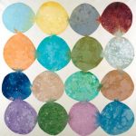
- “Shades of Gray” Alt V 2 by Liz Jardine
-
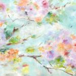
- “Bit of Spring” by Jill Martin